> ## Documentation Index
> Fetch the complete documentation index at: https://developers.hubspot.com/docs/llms.txt
> Use this file to discover all available pages before exploring further.
---
id: 0851a84a-2907-4f2e-bdb6-9e253fcda000
---
# CurrencyInput
> An input field with currency formatting
export const Tag = ({children, type = 'default', className = ''}) => {
return
{children}
;
};
The `CurrencyInput` component renders an input field with currency formatting, symbols, and locale-specific display patterns.
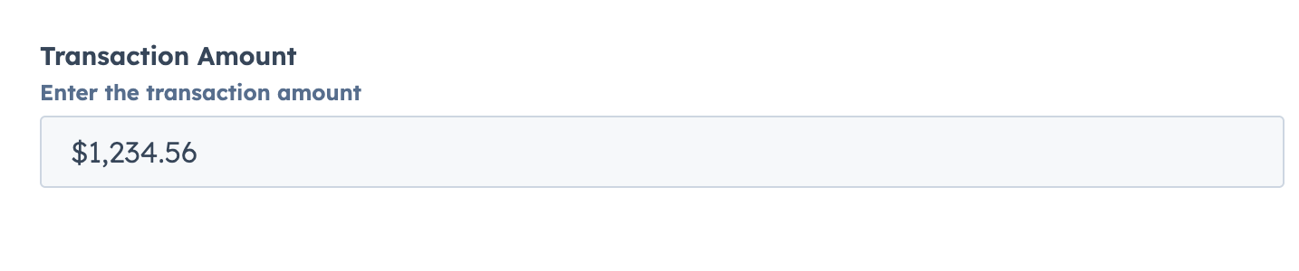 ```jsx theme={null}
import { CurrencyInput } from "@hubspot/ui-extensions";
const Extension = () => {
const [amount, setAmount] = useState(1234.56);
return (
setAmount(value)}
description="Enter the transaction amount"
/>
);
};
```
## Props
| Prop | Type | Description |
| - | - | - |
| `currency` Required | String | ISO 4217 currency code (e.g., "USD", "EUR", "JPY") |
| `label` Required | String | The label text to display for the form input element |
| `name` Required | String | The unique identifier for the input element (like HTML name attribute) |
| `defaultValue` | Number \| undefined | The value of the input on the initial render. |
| `description` | String | Instructional message to help understand the input's purpose. |
| `error` | Boolean | If `true`, shows validation message as error; if `false`, shows as success. Default is `false`. |
| `max` | Number | Sets the upper bound of the input (handled by underlying component). |
| `min` | Number | Sets the lower bound of the input (handled by underlying component). |
| `onBlur` | `(value: number) => void` | Callback when the input loses focus. |
| `onChange` | `(value: number) => void` | Callback when the value changes. |
| `onFocus` | `(value: number) => void` | Callback when the input gains focus. |
| `placeholder` | String | Text that appears when the input has no value. |
| `precision` | Number | Sets the number of decimal places for the currency. If not provided, defaults to currency-specific precision. |
| `readOnly` | Boolean | Determines if the field is editable. Default is `false`. |
| `required` | Boolean | Determines if the required indicator should be displayed. Default is `false`. |
| `tooltip` | String | Text that appears in a tooltip next to the input label. |
| `validationMessage` | String | Text to show under the input for error/success validation. Default is `''`. |
| `value` | Number \| undefined | The current value of the input |
## Related components
* [Input](/docs/apps/developer-platform/add-features/ui-extensions/ui-components/standard-components/input)
* [TextArea](/docs/apps/developer-platform/add-features/ui-extensions/ui-components/standard-components/text-area)
* [Form](/docs/apps/developer-platform/add-features/ui-extensions/ui-components/standard-components/form)
```jsx theme={null}
import { CurrencyInput } from "@hubspot/ui-extensions";
const Extension = () => {
const [amount, setAmount] = useState(1234.56);
return (
setAmount(value)}
description="Enter the transaction amount"
/>
);
};
```
## Props
| Prop | Type | Description |
| - | - | - |
| `currency` Required | String | ISO 4217 currency code (e.g., "USD", "EUR", "JPY") |
| `label` Required | String | The label text to display for the form input element |
| `name` Required | String | The unique identifier for the input element (like HTML name attribute) |
| `defaultValue` | Number \| undefined | The value of the input on the initial render. |
| `description` | String | Instructional message to help understand the input's purpose. |
| `error` | Boolean | If `true`, shows validation message as error; if `false`, shows as success. Default is `false`. |
| `max` | Number | Sets the upper bound of the input (handled by underlying component). |
| `min` | Number | Sets the lower bound of the input (handled by underlying component). |
| `onBlur` | `(value: number) => void` | Callback when the input loses focus. |
| `onChange` | `(value: number) => void` | Callback when the value changes. |
| `onFocus` | `(value: number) => void` | Callback when the input gains focus. |
| `placeholder` | String | Text that appears when the input has no value. |
| `precision` | Number | Sets the number of decimal places for the currency. If not provided, defaults to currency-specific precision. |
| `readOnly` | Boolean | Determines if the field is editable. Default is `false`. |
| `required` | Boolean | Determines if the required indicator should be displayed. Default is `false`. |
| `tooltip` | String | Text that appears in a tooltip next to the input label. |
| `validationMessage` | String | Text to show under the input for error/success validation. Default is `''`. |
| `value` | Number \| undefined | The current value of the input |
## Related components
* [Input](/docs/apps/developer-platform/add-features/ui-extensions/ui-components/standard-components/input)
* [TextArea](/docs/apps/developer-platform/add-features/ui-extensions/ui-components/standard-components/text-area)
* [Form](/docs/apps/developer-platform/add-features/ui-extensions/ui-components/standard-components/form)