TheDocumentation Index
Fetch the complete documentation index at: https://developers.hubspot.com/docs/llms.txt
Use this file to discover all available pages before exploring further.
ErrorState component sets the content of an erroring extension. Use this component to guide users through resolving errors that your extension might encounter.
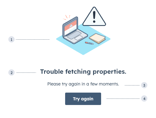
- Illustration: one of three error-themed illustrations.
- Title: the main error message to explain the root cause if known.
- Additional text: an additional
Textcomponent to provide further guidance. This does not come with the component by default. Error text should use the following formats:- Known cause: [what failed] + [why it failed] + [next steps]. For example, Failed to load extension due to outage, please wait a few minutes and try again.
- Unknown cause: [what failed] + [next steps]. For example, Couldn’t load data, try refreshing the page or contacting IT.
- Additional button: an additional
Buttoncomponent to can help users take action. This does not come with the component by default.
Props
| Prop | Type | Description |
|---|---|---|
title | String | The text of the component header. |
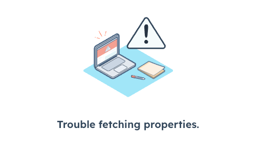
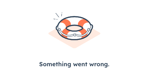
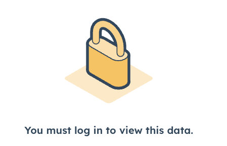
type | 'support' | 'lock' | 'error' (default) | The type of image that will be displayed. |
Variants
Using thetype prop, you can set one of three illustrations.
Usage examples
- Use the
defaulterror type when a card encounters an error when fetching data. - Use the
supporterror type when the user should contact internal or external support to resolve an error. - Use the
lockerror type when the user needs to log in or doesn’t have permission to access the card’s data.
Guidelines
- DO: use text that’s clear, direct, brief, and helpful.
- DON’T: use technical jargon.
- DON’T: say “sorry” or use frivolous language such as “oops,” “uh-oh,” and “it’s us, not you.”
- DON’T: use exclamation points.