> ## Documentation Index
> Fetch the complete documentation index at: https://developers.hubspot.com/docs/llms.txt
> Use this file to discover all available pages before exploring further.
---
id: 23ea5f0f-3e76-45f0-a83e-a0e87f13b72c
---
# StepperInput
> Learn about the StepperInput component for use in UI extensions.
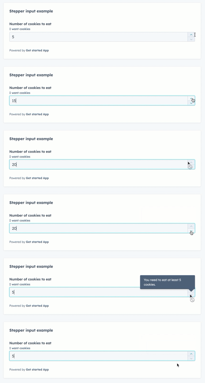
The `StepperInput` component renders a number input field that can be increased or decreased by a set number.
This component inherits many of its props from the `NumberInput` component, with an additional set of props to control the increase/decrease interval.
 ```jsx theme={null}
import { StepperInput } from "@hubspot/ui-extensions";
return (
{
setCookieCount(value);
}}
/>
);
```
## Props
| Prop | Type | Description |
| - | - | - |
| `defaultValue` | String | The default input value. |
| `description` | String | Text that describes the field's purpose. |
| `error` | Boolean | When set to `true`, `validationMessage` is displayed as an error message if provided. The input will also render its error state to let the user know there's an error. If left `false` (default), `validationMessage` is displayed as a success message. |
| `formatStyle` | `'decimal'` (default) \| `'percentage'` | Formats the number as a decimal or percentage. |
| `label` | String | The text that displays above the input. |
| `max` | Number | The highest number allowed in the input. |
| `maxValueReachedTooltip` | String | Text that will appear in a tooltip when the user has reached the maximum value. |
| `min` | Number | The lowest number allowed in the input. |
| `minValueReachedTooltip` | String | Text that will appear in a tooltip when the user has reached the minimum value. |
| `name` | String | The input's unique identifier. |
| `onBlur` | `(value: number) => void` | A function that is called and passes the value when the field loses focus. |
| `onChange` | `(value: number) => void` | A callback function that is called with the new value or values when the list is updated. |
| `onFocus` | `(value: number) => void` | A function that is called and passed the value when the field gets focused. |
| `placeholder` | String | Text that appears in the input when no value is set. |
| `precision` | Number | The number of digits to the right of the decimal point. |
| `readOnly` | Boolean | When set to `true`, the checkbox cannot be selected. Default is `false`. |
| `required` | Boolean | When set to `true`, displays a required field indicator. Default is `false`. |
| `stepSize` | Number | The amount that the current value will increase or decrease by. Default is `1`. |
| `tooltip` | String | The text that displays in a tooltip next to the label. |
| `validationMessage` | String | The text to display if the input has an error. |
| `value` | String | The value of the input. |
## Related components
* [Form](/docs/apps/developer-platform/add-features/ui-extensions/ui-components/standard-components/form)
* [DateInput](/docs/apps/developer-platform/add-features/ui-extensions/ui-components/standard-components/date-input)
* [NumberInput](/docs/apps/developer-platform/add-features/ui-extensions/ui-components/standard-components/number-input)
```jsx theme={null}
import { StepperInput } from "@hubspot/ui-extensions";
return (
{
setCookieCount(value);
}}
/>
);
```
## Props
| Prop | Type | Description |
| - | - | - |
| `defaultValue` | String | The default input value. |
| `description` | String | Text that describes the field's purpose. |
| `error` | Boolean | When set to `true`, `validationMessage` is displayed as an error message if provided. The input will also render its error state to let the user know there's an error. If left `false` (default), `validationMessage` is displayed as a success message. |
| `formatStyle` | `'decimal'` (default) \| `'percentage'` | Formats the number as a decimal or percentage. |
| `label` | String | The text that displays above the input. |
| `max` | Number | The highest number allowed in the input. |
| `maxValueReachedTooltip` | String | Text that will appear in a tooltip when the user has reached the maximum value. |
| `min` | Number | The lowest number allowed in the input. |
| `minValueReachedTooltip` | String | Text that will appear in a tooltip when the user has reached the minimum value. |
| `name` | String | The input's unique identifier. |
| `onBlur` | `(value: number) => void` | A function that is called and passes the value when the field loses focus. |
| `onChange` | `(value: number) => void` | A callback function that is called with the new value or values when the list is updated. |
| `onFocus` | `(value: number) => void` | A function that is called and passed the value when the field gets focused. |
| `placeholder` | String | Text that appears in the input when no value is set. |
| `precision` | Number | The number of digits to the right of the decimal point. |
| `readOnly` | Boolean | When set to `true`, the checkbox cannot be selected. Default is `false`. |
| `required` | Boolean | When set to `true`, displays a required field indicator. Default is `false`. |
| `stepSize` | Number | The amount that the current value will increase or decrease by. Default is `1`. |
| `tooltip` | String | The text that displays in a tooltip next to the label. |
| `validationMessage` | String | The text to display if the input has an error. |
| `value` | String | The value of the input. |
## Related components
* [Form](/docs/apps/developer-platform/add-features/ui-extensions/ui-components/standard-components/form)
* [DateInput](/docs/apps/developer-platform/add-features/ui-extensions/ui-components/standard-components/date-input)
* [NumberInput](/docs/apps/developer-platform/add-features/ui-extensions/ui-components/standard-components/number-input)