`, `
`, or ``:
```jsx theme={null}
// Incorrect
function App() {
return Hello World
;
}
```
Use [``](/docs/apps/developer-platform/add-features/ui-extensions/ui-components/standard-components/box):
```jsx theme={null}
import { Box } from '@hubspot/ui-extensions';
function App() {
return Hello World ;
}
```
### Text and heading elements
Instead of using ``, ` `, or other text elements:
```jsx theme={null}
// Incorrect
function App() {
return (
My Title
Some text content
);
}
```
Use [``](/docs/apps/developer-platform/add-features/ui-extensions/ui-components/standard-components/heading) and [``](/docs/apps/developer-platform/add-features/ui-extensions/ui-components/standard-components/text):
```jsx theme={null}
import { Box, Heading, Text } from '@hubspot/ui-extensions';
function App() {
return (
My Title
Some text content
);
}
```
### Interactive elements
Instead of using ``:
```jsx theme={null}
// Incorrect
function App() {
return alert('clicked')}>Click me ;
}
```
Use [``](/docs/apps/developer-platform/add-features/ui-extensions/ui-components/standard-components/button):
```jsx theme={null}
import { Button } from '@hubspot/ui-extensions';
const Extension = ({ actions }) => {
return (
actions.addAlert({ type: 'success', message: 'Clicked!' })}>
Click me
);
};
hubspot.extend(({ actions }) => `](/docs/apps/developer-platform/add-features/ui-extensions/ui-components/standard-components/image):
```jsx theme={null}
import { Image } from '@hubspot/ui-extensions';
function App() {
return `](/docs/apps/developer-platform/add-features/ui-extensions/ui-components/standard-components/image) components uses valid URLs. Some invalid code flagged by this rule is eligible for fixing via the [`--fix` option](https://eslint.org/docs/latest/use/command-line-interface#--fix) provided by the ESLint CLI.
## Rule details
HubSpot's [``](/docs/apps/developer-platform/add-features/ui-extensions/ui-components/standard-components/image) component has specific requirements for the `src` attribute when using string values. This rule enforces those requirements to ensure images load correctly at runtime.
The rule validates that the `src` attribute:
1. Contains no leading or trailing whitespace (auto-fixable).
2. Uses absolute URLs, not relative paths.
3. Uses only allowed protocols: `http://`, `https://`, or `data:`.
4. Points to a valid image file type: `.jpg`, `.jpeg`, `.png`, `.gif`, `.svg`, `.webp`.
Dynamic values, such as variables, are not validated by this rule.
## Examples
### Whitespace in URLs
**Invalid:** extra space around the URL.
```jsx theme={null}
// Incorrect - whitespace around URL
import { Image } from '@hubspot/ui-extensions';
function App() {
return not validated by this rule:
```jsx theme={null}
import { Image } from '@hubspot/ui-extensions';
function App({ imageUrl }) {
return
`hubspot.fetch()` is not a one-to-one replacement for the browser `fetch()` method. For example, `hubspot.fetch()` can only call URLs that have been added to `permittedUrls` in your app's configuration. Learn more about [fetching data in UI extensions](/docs/apps/developer-platform/add-features/ui-extensions/fetching-data).
## Examples
### Browser fetch()
Instead of using `fetch()`:
```jsx theme={null}
// Incorrect
async function getData() {
const response = await fetch('https://api.example.com/data');
return response.json();
}
```
Use [`hubspot.fetch()`](/docs/apps/developer-platform/add-features/ui-extensions/ui-extensions-sdk#hubspot-fetch):
```jsx theme={null}
import { hubspot } from '@hubspot/ui-extensions';
async function getData() {
const response = await hubspot.fetch('https://api.example.com/data');
return response.json();
}
```
Destructuring from `hubspot` is also allowed:
```jsx theme={null}
import { hubspot } from '@hubspot/ui-extensions';
const { fetch } = hubspot;
async function getData() {
const response = await fetch('https://api.example.com/data');
return response.json();
}
```
### XMLHttpRequest
Instead of using `XMLHttpRequest`:
```jsx theme={null}
// Incorrect
function getData() {
const xhr = new XMLHttpRequest();
xhr.open('GET', 'https://api.example.com/data');
xhr.send();
}
```
Use [`hubspot.fetch()`](/docs/apps/developer-platform/add-features/ui-extensions/ui-extensions-sdk#hubspot-fetch):
```jsx theme={null}
import { hubspot } from '@hubspot/ui-extensions';
async function getData() {
const response = await hubspot.fetch('https://api.example.com/data');
return response.json();
}
```
## Related resources
* [Fetching data in UI extensions](/docs/apps/developer-platform/add-features/ui-extensions/fetching-data)
* [hubspot.fetch() API](/docs/apps/developer-platform/add-features/ui-extensions/ui-extensions-sdk#hubspot-fetch)
# no-parent-imports
Source: https://developers.hubspot.com/docs/apps/developer-platform/add-features/ui-extensions/tools/linting/rules/no-parent-imports
Prevent importing files from outside the extension point root directory.
The `no-parent-imports` rule prevents importing files from outside the extension point root directory using relative paths.
## Rule details
Extension points are self-contained architectural units. Each extension point (e.g., *Settings*, *Pages*) is built and deployed independently, which means all code for an extension must live within its root directory. Files outside this boundary are not included when the extension is packaged for deployment.
This rule prevents relative imports (`../`) that escape your extension point's directory. While these imports work during local development (when your full project structure is available), they fail at runtime because the referenced files don't exist in the deployed extension package.
## Example
As an example, consider the following project structure:
```tsx wrap highlight={1} theme={null}
import { formatData } from '../shared/utils';
function Widget() {
const data = formatData(props.data);
return {data} ;
}
```
```tsx wrap highlight={1} theme={null}
import { CONSTANTS } from '../../lib/constants';
function Config() {
return {CONSTANTS.APP_NAME} ;
}
```
Because `Widget.tsx` imports from `../shared/utils.ts`, the app card will work locally, as the `utils.ts` file is available within the development environment. However, once built and deployed, the `shared/` directory won't be included in either the `cards/` or `settings/` builds, and `utils.ts` will no longer be available to either one.
### Solving with npm workspaces (recommended)
If you need to share code between multiple extension points, use [npm workspaces](/docs/apps/developer-platform/add-features/ui-extensions/tools/code-sharing-with-npm-workspaces):
1. Create a shared workspace `package` directory at the root of your project:
2. Configure your root `package.json`:
```json theme={null}
{
"name": "my-ui-extensions-app",
"workspaces": [
"packages/*"
]
}
```
3. In your UI extension code, import from the shared package:
```tsx theme={null}
// In: src/app/cards/Widget.tsx
import { formatData } from '@my-app/shared-utils'; // ✓ Using workspace package
function Widget() {
const data = formatData(props.data);
return {data} ;
}
```
### Solving with extension point-specific code
Move shared code into the extension point directory and use relative imports freely:
```tsx theme={null}
// In: src/app/cards/Widget.tsx
import { formatData } from './utils/format'; // ✓ Stays within cards directory
function Widget() {
const data = formatData(props.data);
return {data} ;
}
```
You can use relative imports anywhere within your extension point:
```tsx theme={null}
// In: src/app/cards/components/Widget.tsx
import { useCardData } from '../hooks/useCardData'; // ✓ Stays within cards directory
import { Button } from './Button'; // ✓ Stays within cards directory
function Widget() {
const data = useCardData();
return {}}>{data.title} ;
}
```
### Valid relative import patterns
The following patterns are all valid because they stay within the extension point:
```tsx theme={null}
// All in src/app/cards/ directory structure
// From: src/app/cards/components/Widget.tsx
import { util } from './Button'; // ✓ Same directory
import { util } from '../utils'; // ✓ Parent directory, still in cards
import { util } from '../../cards/hooks'; // ✓ Goes up but comes back to cards
```
## Common scenarios
### Sharing constants
Instead of importing constants from outside the extension point:
```tsx theme={null}
// Incorrect
// src/app/cards/Widget.tsx
import { API_URL } from '../config/constants'; // ❌ Escapes extension point
```
Define constants within the extension point:
```tsx theme={null}
// src/app/cards/constants.ts
export const API_URL = 'https://api.example.com';
// src/app/cards/Widget.tsx
import { API_URL } from './constants'; // ✓ Stays within cards
```
### Sharing utility functions
Instead of importing utilities from outside the extension point:
```tsx theme={null}
// Incorrect
// src/app/settings/Config.tsx
import { formatDate } from '../utils/date'; // ❌ Escapes extension point
```
Use npm workspaces to share utilities across extension points:
```tsx theme={null}
// packages/shared-utils/src/date.ts
export const formatDate = (date: Date) => { /* ... */ };
// src/app/settings/Config.tsx
import { formatDate } from '@my-app/shared-utils'; // ✓ Using workspace
```
### Sharing types/interfaces
Instead of importing types from outside the extension point:
```tsx theme={null}
// Incorrect
// src/app/cards/Widget.tsx
import type { UserData } from '../../types/user'; // ❌ Escapes extension point
```
Use npm workspaces to share types across extension points:
```tsx theme={null}
// packages/shared-types/src/user.ts
export interface UserData { /* ... */ }
// src/app/cards/Widget.tsx
import type { UserData } from '@my-app/shared-types'; // ✓ Using workspace
```
## Related resources
* [UI extensions SDK overview](/docs/apps/developer-platform/add-features/ui-extensions/ui-extensions-sdk)
* [Extension point locations](/docs/apps/developer-platform/add-features/ui-extensions/overview#supported-locations)
* [npm workspaces documentation](/docs/apps/developer-platform/add-features/ui-extensions/tools/code-sharing-with-npm-workspaces)
# no-restricted-globals
Source: https://developers.hubspot.com/docs/apps/developer-platform/add-features/ui-extensions/tools/linting/rules/no-restricted-globals
Prevent usage of browser globals that are not available in the sandboxed web worker environment.
The `no-restricted-globals` rule prevents usage of browser globals that are not available in the sandboxed web worker environment.
## Rule details
This rule blocks usage of the following globals:
* `importScripts()`: a worker function that doesn't work in the UI extensions environment.
* `addEventListener()` / `removeEventListener()`: global event listeners don't work for DOM events.
* `location`: not available in workers.
* `history`: not available in workers.
* `navigator`: `WorkerNavigator` in workers, missing most browser `Navigator` APIs.
Instead of the above browser globals, use the following UI extension alternatives:
| Restricted Global | Alternative | Purpose |
| ------------------------------------ | ---------------------------------------------------------------------------------------------------------------------------------------------------------------------------------------------------------------------------------------- | ------------------------------------------------------------------ |
| `importScripts('script.js')` | `import { module } from './script.js'` | Use ES modules instead. |
| `addEventListener('click', handler)` | `` | Use React component event props. |
| `location` | [`context`](/docs/apps/developer-platform/add-features/ui-extensions/ui-extensions-sdk#access-context-data) | Access location information through context. |
| `history` | [`Click Me
Current path: {currentLocation} in portal {portalId}
);
};
hubspot.extend(({ context }) => View Site
User locale: {locale} ;
};
hubspot.extend(({ context }) =>
A renderer created with `createRenderer('crm.record.tab')` will provide different context and actions than one created with `createRenderer('settings')`. Always use the extension point location that matches where your component will be used.
## Mocking React hooks
### Default mock implementations
The testing SDK automatically provides default mock implementations for supported hooks. These defaults allow your components to render without additional configuration:
* **`useCrmProperties()`**: Returns fake property values based on property names (e.g., `firstname` → `fake_firstname`)
* **`useAssociations()`**: Returns a single fake association result with fake property values
```tsx theme={null}
import { createRenderer } from '@hubspot/ui-extensions/testing';
import { useCrmProperties } from '@hubspot/ui-extensions/crm';
import { Text } from '@hubspot/ui-extensions';
function MyComponent() {
const { properties, isLoading, error } = useCrmProperties([
'firstname',
'lastname',
]);
if (isLoading) {
return Loading... ;
}
if (error) {
return Something went wrong! ;
}
return (
<>
First name: {properties.firstname}
Last name: {properties.lastname}
);
}
const { render, findAll } = createRenderer('crm.record.tab');
render(Loading... ;
}
if (error) {
return Something went wrong! ;
}
return (
<>
First name: {properties.firstname}
Last name: {properties.lastname}
);
}
const {find, render, mocks } = createRenderer('crm.record.tab');
// Mock an error state
mocks.useCrmProperties.nextResult({
properties: {},
error: new Error('Something went wrong!'),
isLoading: false,
});
render(Loading... ;
}
if (error) {
return Something went wrong! ;
}
return (
<>
First name: {properties.firstname}
Last name: {properties.lastname}
);
}
const { render, mocks, findAll } = createRenderer('crm.record.tab');
// Provide a custom mock implementation
mocks.useCrmProperties.willCall((propertyNames) => {
const properties = propertyNames.reduce(
(acc, propertyName) => {
acc[propertyName] = propertyName.toUpperCase();
return acc;
},
{} as Record
);
return {
properties,
error: null,
isLoading: false,
};
});
render(Loading... ;
}
if (error) {
return Something went wrong! ;
}
return (
<>
{results.map((result) => (
{result.properties.firstname} {result.properties.lastname}
))}
);
}
const { find, render, mocks } = createRenderer('crm.record.tab');
// Mock an error state for the next call only
mocks.useAssociations.nextResult({
results: [],
error: new Error('Something went wrong!'),
isLoading: false,
});
render(User: {context.user.firstName} {context.user.lastName}
Email: {context.user.email}
Portal ID: {context.portal.id}
{context.crm && Object ID: {context.crm.objectId} }
);
}
const { render, mocks, findAll } = createRenderer('crm.record.tab');
// Access and verify the mock context values
expect(mocks.context.user.email).toEqual('fake_email@example.com');
expect(mocks.context.user.firstName).toEqual('fake_firstName');
expect(mocks.context.portal.id).toEqual(123);
expect(mocks.context.crm.objectId).toEqual(123);
render( {
actions.addAlert({
type: 'success',
message: 'Action completed!',
});
}}
>
Trigger Alert
);
}
const { render, mocks, find } = createRenderer('crm.record.tab');
render(Fetch Data
{data && {data.message} }
);
}
const { render, mocks, find, waitFor } = createRenderer('crm.record.tab');
// Mock the serverless function response
mocks.runServerlessFunction.nextResult(
Promise.resolve({
status: 'SUCCESS',
response: { message: 'Hello from serverless!' },
})
);
render({properties.firstname} ;
}
const { render, mocks } = createRenderer('crm.record.tab');
render(
Create a new renderer for each test to ensure test isolation. This prevents state from leaking between tests and makes your tests more reliable and maintainable.
```tsx theme={null}
import { createRenderer } from '@hubspot/ui-extensions/testing';
import { Button, ButtonRow } from '@hubspot/ui-extensions';
test('renders the correct primary button', () => {
const { render, find } = createRenderer('crm.record.tab');
render(
<>
Click me!
);
const button = find(Button);
expect(button.props.variant).toEqual('primary');
expect(button.text).toEqual('Click me!');
});
```
The extension point location (e.g., `'crm.record.tab'`) is required because it determines the shape of the `context`, `actions`, and `runServerlessFunction` mocks that are automatically provided to your components during testing. Valid extension point locations include:
* `'crm.record.tab'`
* `'crm.record.sidebar'`
* `'crm.preview'`
* `'helpdesk.sidebar'`
* `'settings'`
* `'home'`
## Querying components
### findByTestId
`findByTestId(component, testId)`
Finds a component by its `testId` prop. This is the recommended way to precisely find rendered components. This method throws an error if no match is found.
The non-throwing variant is [`maybeFindByTestId()`](#maybefind-non-throwing-variants).
```tsx theme={null}
test('finds button by test ID', () => {
const { render, findByTestId } = createRenderer('crm.record.tab');
render(
<>
Submit
Cancel
);
// Find by test ID - fast and unambiguous
const submitButton = findByTestId(Button, 'submit-button');
expect(submitButton.props.variant).toEqual('primary');
});
```
It's recommended to use test IDs because they provide a stable, explicit way to identify components in your tests. Unlike matchers based on props or text content, test IDs won't break when you change the component's appearance or behavior. This makes your tests more maintainable and less brittle.
### find
`find(component, matcher?)`
Finds the first descendant element that matches the given component and an optional [matcher](#element-matchers). Throws an error if no match is found.
The non-throwing variant is [`maybeFind()`](#maybefind-non-throwing-variants).
```tsx theme={null}
test('finds buttons using various matchers', () => {
const { render, find } = createRenderer('crm.record.tab');
render(
<>
Button 1
Button 2
);
// Find any button
const button = find(Button);
// Find a button with specific props
find(Button, { variant: 'primary' })
// Find a button using a predicate function
find(
Button,
(node) => node.props.variant === 'primary'
)
// Find a parent element and then query within it
const buttonRow = find(ButtonRow);
buttonRow.find(Button); // Find the first Button nested in ButtonRow
});
```
### findAll
`findAll(component, matcher?)`
Finds all descendant elements that match the given component and an optional [matcher](#element-matchers). Returns an array of all matching elements, or an empty array if no matches are found.
```tsx theme={null}
test('finds all buttons', () => {
const { render, findAll } = createRenderer('crm.record.tab');
render(
<>
Button 1
Button 2
);
const buttons = findAll(Button);
expect(buttons).toHaveLength(2);
expect(buttons[0].props.variant).toEqual('secondary');
expect(buttons[1].props.variant).toEqual('primary');
});
```
### findChild
`findChild(component, matcher?)`
Finds the first direct child element that matches the given component and an optional [matcher](#element-matchers). Only searches immediate children, not descendants. Throws an error if no match is found.
The non-throwing variant is [`maybeFindChild()`](#maybefind-non-throwing-variants).
```tsx theme={null}
test('finds direct children', () => {
const { render, find, findChild } = createRenderer('crm.record.tab');
render(
<>
Click me!
);
// Find ButtonRow as a direct child of root
const buttonRow = findChild(ButtonRow);
// Find Button as a direct child of ButtonRow
const button = buttonRow.findChild(Button);
expect(button.props.variant).toEqual('primary');
});
```
### findAllChildren
`findAllChildren(component, matcher?)`
Finds all direct child elements that match the given component and an optional [matcher](#element-matchers). Only searches immediate children, not descendants. This combines the behavior of `findAll()` (returning all matches) with `findChild()` (searching only direct children).
```tsx theme={null}
test('finds all direct children', () => {
const { render, find, findAllChildren } = createRenderer('crm.record.tab');
render(
<>
Button 1
Button 2
Click me! );
const button = find(Button, { variant: 'primary' });
});
```
* **Predicate function:** match elements using a custom function.
```tsx theme={null}
test('finds button by predicate', () => {
const { render, find } = createRenderer('crm.record.tab');
render(Click me! );
const button = find(Button, (node) => {
return node.props.variant === 'primary' && node.text?.includes('Click');
});
});
```
## Interacting with components
### Accessing element properties
Rendered elements expose several properties:
```tsx theme={null}
test('accesses element properties', () => {
const { render, find } = createRenderer('crm.record.tab');
render(Click me! );
const button = find(Button);
// Access props (with fragment props converted to RenderedFragmentNode)
button.props.variant; // 'primary'
// Access text content
button.text; // 'Click me!'
// Access component name
button.name; // 'Button'
// Access child nodes
button.childNodes; // Array of child nodes
// Node type
button.nodeType; // RenderedNodeType.Element
});
```
### Triggering events
Use the `trigger()` method to invoke event handlers:
```tsx theme={null}
function Counter() {
const [count, setCount] = useState(0);
const handleClick = () => {
setCount(count + 1);
};
return (
Clicked {count} times
);
}
test('triggers click event', () => {
const { render, find } = createRenderer('crm.record.tab');
render(Count: {count} ;
}
test('waits for async updates', async () => {
const { render, find, waitFor } = createRenderer('crm.record.tab');
render(
Item 1
Item 2
}
>
Click me!
);
const button = find(Button);
// overlay prop is now a RenderedFragmentNode
const overlayFragment = button.props.overlay;
const listInOverlay = overlayFragment.find(List);
const texts = listInOverlay.findAll(Text);
expect(texts).toHaveLength(2);
});
```
## Debugging
### debugLog
Log a string representation of the rendered output:
```tsx theme={null}
test('debugs rendered output', () => {
const { render, debugLog, find } = createRenderer('crm.record.tab');
render(
Click me!
);
// Debug the entire tree
debugLog('MY COMPONENT');
/*
Console output:
============
MY COMPONENT
"Click me!"
============
*/
// Debug a specific element
find(Button).debugLog('MY BUTTON');
/*
Console output:
=========
MY BUTTON
"Click me!"
=========
*/
});
```
### toString
Get a string representation of a node:
```tsx theme={null}
test('converts nodes to string', () => {
const { render, getRootNode, find } = createRenderer('crm.record.tab');
render(
Click me!
);
// Convert root to string
const rootStr = getRootNode().toString();
/*
rootStr:
`
"Click me!"
`
*/
// Convert element to string
const buttonStr = find(Button).toString();
/*
buttonStr:
`
"Click me!"
`
*/
});
```
### getRootNode
Access the root node directly:
```tsx theme={null}
test('accesses root node', () => {
const { render, getRootNode } = createRenderer('crm.record.tab');
render(Click me! );
const root = getRootNode();
root.childNodes; // Access all child nodes
root.text; // Access all text content
});
```
## Type guards
The testing SDK provides type guard functions to help narrow TypeScript types when working with rendered nodes. These are useful when you need to perform type-specific operations on nodes.
### isRenderedElementNode
Check if a node is a rendered element node:
```tsx theme={null}
import { createRenderer, isRenderedElementNode } from '@hubspot/ui-extensions/testing';
test('checks if node is element', () => {
const { render, getRootNode } = createRenderer('crm.record.tab');
render(Click me! );
const { childNodes } = getRootNode();
const firstChild = childNodes[0];
if (isRenderedElementNode(firstChild)) {
// TypeScript now knows firstChild is a RenderedElementNode
console.log(firstChild.name); // 'Button'
console.log(firstChild.props); // { variant: 'primary' }
}
});
```
### isRenderedTextNode
Check if a node is a rendered text node:
```tsx theme={null}
import { createRenderer, isRenderedTextNode } from '@hubspot/ui-extensions/testing';
test('checks if node is text', () => {
const { render, find } = createRenderer('crm.record.tab');
render(Click me! );
const button = find(Button);
const firstChild = button.childNodes[0];
if (isRenderedTextNode(firstChild)) {
// TypeScript now knows firstChild is a RenderedTextNode
console.log(firstChild.text); // 'Click me!'
}
});
```
### isRenderedRootNode
Check if a node is a rendered root node:
```tsx theme={null}
import { createRenderer, isRenderedRootNode } from '@hubspot/ui-extensions/testing';
test('checks if node is root', () => {
const { render, getRootNode } = createRenderer('crm.record.tab');
render(Click me! );
const root = getRootNode();
if (isRenderedRootNode(root)) {
// TypeScript now knows root is a RenderedRootNode
console.log(root.nodeType); // RenderedNodeType.Root
}
});
```
### isRenderedFragmentNode
Check if a node is a rendered fragment node:
```tsx theme={null}
import { createRenderer, isRenderedFragmentNode } from '@hubspot/ui-extensions/testing';
test('checks if node is fragment', () => {
const { render, find } = createRenderer('crm.record.tab');
render(
Item 1
Item 2
}
>
Click me!
);
const button = find(Button);
const overlay = button.props.overlay;
if (isRenderedFragmentNode(overlay)) {
// TypeScript now knows overlay is a RenderedFragmentNode
const texts = overlay.findAll(Text);
console.log(texts.length); // 2
}
});
```
### isMatch
Check if a node matches a specific component and optional matcher criteria. This is particularly useful when iterating over child nodes where you need to check the type and properties of each node.
The `isMatch` function is available in two ways:
1. **As a standalone exported function**: useful for checking nodes when iterating over child nodes
2. **As a method on all rendered nodes**: convenient for chaining from an already-found node
#### Standalone function
```tsx theme={null}
import { createRenderer, isMatch } from '@hubspot/ui-extensions/testing';
test('uses isMatch standalone function', () => {
const { render, getRootNode } = createRenderer('crm.record.tab');
render(
<>
Click me!
console.log(firstChild.props.variant); // 'primary'
}
// Check if it's a Button with specific props
if (isMatch(firstChild, Button, { variant: 'primary' })) {
console.log('Found a primary button!');
}
// Check if it's a Button using a predicate function
if (isMatch(firstChild, Button, (node) => node.props.variant === 'primary')) {
console.log('Found a primary button!');
}
});
```
#### Node method
All rendered nodes (including `RenderedRootNode`, `RenderedFragmentNode`, `RenderedElementNode`, and `RenderedTextNode`) have an `isMatch` method:
```tsx theme={null}
test('uses isMatch node method', () => {
const { render, find, getRootNode } = createRenderer('crm.record.tab');
render(
<>
Click me!
Click me );
```
## Common query methods
The following query methods are available on [`Renderer`](#renderer) and select node types ([`RenderedRootNode`](#renderedrootnode), [`RenderedElementNode`](#renderedelementnode), [`RenderedFragmentNode`](#renderedfragmentnode)):
**Common parameters:**
* `component`: [`HubSpotReactComponent`](#hubspotreactcomponent): the component type to find.
* `matcher?`: [`ElementMatcher`](#elementmatcher): an optional matcher to filter the elements.
### find
`find()`
Find a single element matching the component type. Throws an error if not found or multiple matches exist.
**Parameters:**
* `component`: [`HubSpotReactComponent`](#hubspotreactcomponent)
* `matcher?`: [`ElementMatcher`](#elementmatcher)
**Return:** [`RenderedElementNode`](#renderedelementnode)
### findAll
`findAll()`
Find all elements matching the component type. Returns an array.
**Parameters:**
* `component`: [`HubSpotReactComponent`](#hubspotreactcomponent)
* `matcher?`: [`ElementMatcher`](#elementmatcher)
**Return:** [`RenderedElementNode`](#renderedelementnode)`[]`
### findChild
`findChild()`
Find a direct child element matching the component type. Throws an error if not found or multiple matches exist.
**Parameters:**
* `component`: [`HubSpotReactComponent`](#hubspotreactcomponent)
* `matcher?`: [`ElementMatcher`](#elementmatcher)
**Return:** [`RenderedElementNode`](#renderedelementnode)
### findAllChildren
`findAllChildren()`
Find all direct child elements matching the component type. Returns an array.
**Parameters:**
* `component`: [`HubSpotReactComponent`](#hubspotreactcomponent)
* `matcher?`: [`ElementMatcher`](#elementmatcher)
**Return:** [`RenderedElementNode`](#renderedelementnode)`[]`
### maybeFind
`maybeFind()`
Find a single element matching the component type. Returns `null` if not found or multiple matches exist.
**Parameters:**
* `component`: [`HubSpotReactComponent`](#hubspotreactcomponent)
* `matcher?`: [`ElementMatcher`](#elementmatcher)
**Return:** [`RenderedElementNode`](#renderedelementnode)` | null`
### maybeFindChild
`maybeFindChild()`
Find a direct child element matching the component type. Returns `null` if not found or multiple matches exist.
**Parameters:**
* `component`: [`HubSpotReactComponent`](#hubspotreactcomponent)
* `matcher?`: [`ElementMatcher`](#elementmatcher)
**Return:** [`RenderedElementNode`](#renderedelementnode)` | null`
## Renderer
`Renderer`
The object returned by `createRenderer()` with the following methods and properties:
### render
`render()`
Renders a UI extension component and returns the root node.
**Parameters:**
* `node: ReactNode`: the React component to render
**Return:** [`RenderedRootNode`](#renderedrootnode)
### Query methods
All [common query methods](#common-query-methods) are available: `find()`, `findAll()`, `findChild()`, `findAllChildren()`, `maybeFind()`, `maybeFindChild()`
### findByTestId
`findByTestId()`
Find a component by its `testId` prop. This is the recommended way to find components when you have control over the component's props.
**Parameters:**
* `component`: [`HubSpotReactComponent`](#hubspotreactcomponent): the component type to find.
* `testId: string`: the test ID to search for.
**Return:** [`RenderedElementNode`](#renderedelementnode)
**Throws:**
* `ComponentNotFoundByTestIdError` if no component with the specified `testId` is found.
* `ComponentMismatchedByTestIdError` if a component with the `testId` exists but the component type doesn't match.
* `FindInvalidComponentError` if the target component is invalid.
**Example:**
```tsx theme={null}
const { render, findByTestId } = createRenderer('crm.record.tab');
render(
<>
Submit
Cancel
);
const submitButton = findByTestId(Button, 'submit-button');
expect(submitButton.props.variant).toEqual('primary');
```
### maybeFindByTestId
`maybeFindByTestId()`
Find a component by its `testId` prop. Returns `null` if no match is found. Still throws an error if the test ID exists but the component type doesn't match.
**Parameters:**
* `component`: [`HubSpotReactComponent`](#hubspotreactcomponent): the component type to find.
* `testId: string`: the test ID to search for.
**Return:** [`RenderedElementNode`](#renderedelementnode)` | null`
**Throws:**
* `ComponentMismatchedByTestIdError` if a component with the `testId` exists but the component type doesn't match.
* `FindInvalidComponentError` if the target component is invalid.
**Example:**
```tsx theme={null}
const { render, maybeFindByTestId } = createRenderer('crm.record.tab');
render(`
### debugLog
`debugLog()`
Log the rendered tree to the console for debugging.
**Parameters:**
* `label?: string`: an optional label for the log output.
**Return:** `void`
### getRootNode
`getRootNode()`
Get the root node of the rendered tree.
**Return:** [`RenderedRootNode`](#renderedrootnode)
### mocks
Object containing mock implementations and spies (see [Mocking](/docs/apps/developer-platform/add-features/ui-extensions/tools/testing/mocking) for detailed usage).
**Properties:**
* `mocks.useCrmProperties()`: [`FunctionSpy`](#functionspy) for the `useCrmProperties()` hook.
* `mocks.useAssociations()`: [`FunctionSpy`](#functionspy) for the `useAssociations()` hook.
* `mocks.context`: mock `context` object for the [Extension Point API](#extensionpointlocation)
* `mocks.actions`: object containing [`FunctionSpy`](#functionspy) instances for [Extension Point API](#extensionpointlocation) actions.
* `mocks.runServerlessFunction()`: [`FunctionSpy`](#functionspy) for the `runServerlessFunction()` function.
## FunctionSpy
`FunctionSpy`
Each mocked function (hooks, actions, `runServerlessFunction()`) is a [tinyspy](https://github.com/tinylibs/tinyspy) spy that provides inspection and control over function calls.
### called
`called`
Boolean indicating if the function was called at least once.
**Type:** `boolean`
### callCount
`callCount`
Number of times the function was called.
**Type:** `number`
### calls
`calls`
Array of argument arrays for each call. Access arguments via `spy.calls[0][0]`, `spy.calls[0][1]`, etc.
**Type:** `any[][]`
### results
`results`
Array of tuples representing each call's result:
* Success: `['ok', returnValue]`
* Error: `['error', errorValue]`
**Type:** `(['ok', any] | ['error', any])[]`
### returns
`returns`
Array of return values for each successful call (shorthand for filtering `results` by `'ok'`).
**Type:** `any[]`
### nextResult
`nextResult()`
Set the return value for the next invocation only.
**Parameters:**
* `value: any`: the value to return on the next call.
**Return:** `FunctionSpy`
### willCall
`willCall()`
Replace the mock implementation with a custom function.
**Parameters:**
* `fn: Function`: the custom implementation function
**Return:** `FunctionSpy`
### reset
`reset()`
Clear all call history while preserving the mock implementation.
**Return:** `FunctionSpy`
### restore
`restore()`
Restore the spy to its original default implementation and clear call history.
**Return:** `FunctionSpy`
**Example:**
```ts theme={null}
const renderer = createRenderer('crm.record.tab');
// Mock return value
renderer.mocks.useCrmProperties().nextResult({
propertyName: { value: 'Test Value' }
});
// Check if called
expect(renderer.mocks.useCrmProperties().called).toBe(true);
expect(renderer.mocks.useCrmProperties().callCount).toBe(1);
// Check arguments
const [propertyNames] = renderer.mocks.useCrmProperties().calls[0];
expect(propertyNames).toEqual(['firstName', 'lastName']);
```
## HubSpotReactComponent
`HubSpotReactComponent`
Any of the HubSpot UI component types exported by the UI Extensions SDK. These are used with query methods to find rendered components.
**Import:**
```ts theme={null}
import { Alert, Button, Text, Box, Flex, /* etc. */ } from '@hubspot/ui-extensions';
```
**Example:**
```ts theme={null}
const renderer = createRenderer('crm.record.tab');
renderer.render(Click me );
const button = renderer.find(Button);
expect(button.props.variant).toBe('primary');
```
## RenderedElementNode
`RenderedElementNode`
Represents a rendered HubSpot UI component element in the tree.
### nodeType
`nodeType`
Always [`RenderedNodeType`](#renderednodetype)`.Element`
**Type:** `RenderedNodeType.Element`
### name
`name`
Component name (e.g., `'Button'`, `'Text'`).
**Type:** `string`
### props
`props`
Component props object (fragments in props are converted to [`RenderedFragmentNode`](#renderedfragmentnode)).
**Type:** `Record`
### text
`text`
Concatenated text content of all descendant text nodes, or `null` if none.
**Type:** `string | null`
### childNodes
`childNodes`
Array of child nodes.
**Type:** [`RenderedNode`](#renderednode)`[]`
### Query methods
All [common query methods](#common-query-methods) are available: `find()`, `findAll()`, `findChild()`, `findAllChildren()`, `maybeFind()`, `maybeFindChild()`
### isMatch
`isMatch()`
Check if this node matches a component type and optional matcher.
**Parameters:**
* `component:` [`HubSpotReactComponent`](#hubspotreactcomponent)
* `matcher?:` [`ElementMatcher`](#elementmatcher)
**Return:** `boolean`
### trigger
`trigger()`
Trigger an event handler prop (e.g., `node.trigger('onClick')`).
**Parameters:**
* `eventPropName: string`: the name of the event handler prop.
* `eventArg?: any`: an optional argument to pass to the event handler.
**Return:** `void`
### debugLog
`debugLog()`
Log the element tree to the console for debugging.
**Parameters:**
* `label?: string`: an optional label for the log output
**Return:** `void`
### toString
`toString()`
Get string representation of the node.
**Return:** `string`
## RenderedFragmentNode
`RenderedFragmentNode`
Represents the root of the rendered fragment.
### nodeType
`nodeType`
Always [`RenderedNodeType`](#renderednodetype)`.Fragment`
**Type:** `RenderedNodeType.Fragment`
### childNodes
`childNodes`
Array of child nodes.
**Type:** [`RenderedNode`](#renderednode)`[]`
### Query methods
All [common query methods](#common-query-methods) are available: `find()`, `findAll()`, `findChild()`, `findAllChildren()`, `maybeFind()`, `maybeFindChild()`
### isMatch
`isMatch()`
Check if this node matches a component type and optional matcher (will always return `false`).
**Parameters:**
* `component:` [`HubSpotReactComponent`](#hubspotreactcomponent)
* `matcher?:` [`ElementMatcher`](#elementmatcher)
**Return:** `boolean`
### debugLog
`debugLog()`
Log the element tree to the console for debugging.
**Parameters:**
* `label?: string`: an optional label for the log output.
**Return:** `void`
### toString
`toString()`
Get string representation of the node.
**Return:** `string`
## RenderedRootNode
`RenderedRootNode`
Represents the root of the entire rendered tree. This is the node returned by `renderer.render()`.
### nodeType
`nodeType`
Always [`RenderedNodeType`](#renderednodetype)`.Root`
**Type:** `RenderedNodeType.Root`
### childNodes
`childNodes`
Array of child nodes.
**Type:** [`RenderedNode`](#renderednode)`[]`
### Query methods
All [common query methods](#common-query-methods) are available: `find()`, `findAll()`, `findChild()`, `findAllChildren()`, `maybeFind()`, `maybeFindChild()`
### isMatch
`isMatch()`
Check if this node matches a component type and optional matcher (will always return `false`).
**Parameters:**
* `component:` [`HubSpotReactComponent`](#hubspotreactcomponent)
* `matcher?:` [`ElementMatcher`](#elementmatcher)
**Return:** `boolean`
### debugLog
`debugLog()`
Log the element tree to the console for debugging.
**Parameters:**
* `label?: string`: an optional label for the log output.
**Return:** `void`
### toString
`toString()`
Get string representation of the node.
**Return:** `string`
## RenderedTextNode
`RenderedTextNode`
Represents a text node in the rendered tree. Text nodes are leaf nodes automatically created when rendering string content in your components.
**Note:** Text nodes do not have `childNodes` or query methods since they are leaf nodes.
### nodeType
`nodeType`
Always [`RenderedNodeType`](#renderednodetype)`.Text`
**Type:** `RenderedNodeType.Text`
### text
`text`
The text content as a string.
**Type:** `string`
### isMatch
`isMatch()`
Check if this node matches a component type and optional matcher (will always return `false`).
**Parameters:**
* `component:` [`HubSpotReactComponent`](#hubspotreactcomponent)
* `matcher?:` [`ElementMatcher`](#elementmatcher)
**Return:** `boolean`
### toString
`toString()`
Get string representation of the node.
**Return:** `string`
## RenderedNode
`RenderedNode`
Union type representing any node in the rendered tree:
```ts theme={null}
type RenderedNode =
| RenderedElementNode
| RenderedRootNode
| RenderedFragmentNode
| RenderedTextNode;
```
(See [`RenderedElementNode`](#renderedelementnode), [`RenderedRootNode`](#renderedrootnode), [`RenderedFragmentNode`](#renderedfragmentnode), [`RenderedTextNode`](#renderedtextnode))
## RenderedNodeType
`RenderedNodeType`
Enum of all possible node types in the rendered tree:
```ts theme={null}
enum RenderedNodeType {
Root = 'root',
Fragment = 'fragment',
Element = 'element',
Text = 'text',
}
```
## ElementMatcher
`ElementMatcher`
Optional parameter for query methods to filter elements beyond just component type.
A matcher can be:
* **Partial props object**: matches if the element has all specified prop values
* **Predicate function**: matches if the function returns `true` for the element node
**Examples:**
```ts theme={null}
// Match by partial props
const primaryButton = renderer.find(Button, { variant: 'primary' });
// Match using predicate function
const disabledButtons = renderer.findAll(
Button,
(node) => node.props.disabled === true
);
// Match by multiple props
const specificText = renderer.find(Text, {
format: 'bold',
variant: 'microcopy'
});
```
## ExtensionPointLocation
`ExtensionPointLocation`
A string literal union type representing valid extension point locations where UI extensions can be rendered.
**Type definition:**
```ts theme={null}
type ExtensionPointLocation =
| 'crm.preview'
| 'crm.record.sidebar'
| 'crm.record.tab'
| 'helpdesk.sidebar'
| 'settings'
| 'home';
```
The extension point location determines which extension point-specific APIs are available in the automatically created mocks for `context`, `actions`, and `runServerlessFunction`.
**Example:**
```ts theme={null}
// Creating a renderer for a CRM record tab extension
const renderer = createRenderer('crm.record.tab');
// Creating a renderer for a settings page extension
const settingsRenderer = createRenderer('settings');
// Creating a renderer for an app home extension
const homeRenderer = createRenderer('home');
```
## WaitForOptions
`WaitForOptions`
Options for the `waitFor()` function.
### timeoutInMs
`timeoutInMs`
Maximum time to wait in milliseconds (default: `1000`).
**Type:** `number | undefined`
**Default:** `1000`
## Utility Functions
Type guard functions for narrowing TypeScript types of rendered nodes and checking component matches.
**Import:**
```ts theme={null}
import {
isRenderedElementNode,
isRenderedTextNode,
isRenderedRootNode,
isRenderedFragmentNode,
isMatch
} from '@hubspot/ui-extensions/testing';
```
### isRenderedElementNode
`isRenderedElementNode()`
Check if a node is a [`RenderedElementNode`](#renderedelementnode) and narrow its type.
**Parameters:**
* `node:` [`RenderedNode`](#renderednode)` | null | undefined`
**Return:** `node is RenderedElementNode`
### isRenderedTextNode
`isRenderedTextNode()`
Check if a node is a [`RenderedTextNode`](#renderedtextnode) and narrow its type.
**Parameters:**
* `node:` [`RenderedNode`](#renderednode)` | null | undefined`
**Return:** `node is RenderedTextNode`
### isRenderedRootNode
`isRenderedRootNode()`
Check if a node is a [`RenderedRootNode`](#renderedrootnode) and narrow its type.
**Parameters:**
* `node:` [`RenderedNode`](#renderednode)` | null | undefined`
**Return:** `node is RenderedRootNode`
### isRenderedFragmentNode
`isRenderedFragmentNode()`
Check if a node is a [`RenderedFragmentNode`](#renderedfragmentnode) and narrow its type.
**Parameters:**
* `node:` [`RenderedNode`](#renderednode)` | null | undefined`
**Return:** `node is RenderedFragmentNode`
### isMatch
`isMatch()`
Check if a node matches a specific component type and optional matcher criteria, narrowing to [`RenderedElementNode`](#renderedelementnode)``. Also available as a method on all rendered nodes.
**Type Parameters:**
* `TProps`: the props type of the component.
**Parameters:**
* `node:` [`RenderedNode`](#renderednode)` | null | undefined`
* `component:` [`HubSpotReactComponent`](#hubspotreactcomponent)
* `matcher?:` [`ElementMatcher`](#elementmatcher)
**Return:** `node is RenderedElementNode`
**Example:**
```ts theme={null}
const nodes = renderer.getRootNode().childNodes;
for (const node of nodes) {
if (isRenderedElementNode(node)) {
// TypeScript knows node is RenderedElementNode here
console.log(node.name, node.props);
} else if (isRenderedTextNode(node)) {
// TypeScript knows node is RenderedTextNode here
console.log(node.text);
}
}
// Using isMatch for component-specific type narrowing
const maybeButton = renderer.maybeFind(Button);
if (isMatch(maybeButton, Button, { variant: 'primary' })) {
// TypeScript knows maybeButton is RenderedElementNode
console.log(maybeButton.props.variant); // 'primary'
}
```
# Figma Design Kit | UI extensions
Source: https://developers.hubspot.com/docs/apps/developer-platform/add-features/ui-extensions/ui-components/figma-design-kit
Learn about using the Figma Design Kit for designing UI extensions.
The Figma Design Kit is a visual representation of the [UI components](/docs/apps/developer-platform/add-features/ui-extensions/ui-components/overview) you can include in React-based app cards in UI extensions. Using this kit, you can create more detailed designs to plan out UI extensions, and can be particularly helpful when needing to share demos with stakeholders or keep teams aligned during the development process.
Along with containing visual examples of UI components, the kit also contains high-level UI extension design information, such as a breakdown of app card anatomy and examples of available locations. Note that HubSpot will update this kit over time as new components are added, but the [UI component documentation](/docs/apps/developer-platform/add-features/ui-extensions/ui-components/overview) will be the most up to date source of truth for available components. Be sure to [check the changelog](#using-the-kit) for any recent or upcoming additions.
Item 1
Item 2
Item 3
Item 4
;
```
| Prop | Type | Description |
| ------------- | -------------------------------------------------------------------------------------------------------------------------------- | ------------------------------------------------------------------------------------------------------------------------------------------------------------------ |
| `columnWidth` | Number | Sets width of each column in pixels. When `flexible` is `true`, acts as minimum width before expanding. |
| `flexible` | Boolean | When `false`, columns have exact `columnWidth`. When `true`, columns expand equally to fill available space with `columnWidth` as the minimum. Default is `false`. |
| `gap` | `flush` (default) \| `'xs'`, `'extra-small'` \| `'sm'`, `'small'` \| `'med'`, `'medium'` \| `lg`, `large` \| `xl`, `extra-large` | Sets spacing between grid items. |
## Flex
The [`Flex` component](/docs/apps/developer-platform/add-features/ui-extensions/ui-components/overview#layout-flex) renders an empty `div` container set to `display=flex`. When wrapped around other components, this enables those child components to be arranged using props.
Below are the available `Flex` props. To review all `Flex` prop definitions, check out the [components reference guide](/docs/apps/developer-platform/add-features/ui-extensions/ui-components/overview#layout-flex).
| Prop | Values | Description |
| ----------- | ------------------------------------------------------------------------------------- | ------------------------------------------------------------------------------------------------------------------------------------------------------------------------------------------------------------------------ |
| `align` | `start` \| `center` \| `baseline` \| `end` \| `stretch` (default) | Distributes components along the cross-axis using the available free space. |
| `alignSelf` | `start` \| `center` \| `baseline` \| `end` \| `stretch` | Distributes a child component along the cross-axis using the available free space. Use this prop for nested child `Flex` and `Box` components to align them differently from other child components in the `Flex` group. |
| `direction` | `row` (default) \| `column` | Arranges components horizontally or vertically by setting the main axis. |
| `gap` | `flush` (default) \| `extra-small` \| `small` \| `medium` \| `large` \| `extra-large` | Sets the spacing between components. |
| `justify` | `start` (default) \| `center` \| `end` \| `around` \| `between` | Distributes components along the main axis using the available free space. |
| `wrap` | `wrap` \| `nowrap` | Whether components will wrap instead of trying to fit on one line. |
Review the examples below to see how the [Flex component](/docs/apps/developer-platform/add-features/ui-extensions/ui-components/overview#layout-flex) can be used to arrange components in various ways.
### Horizontal layout
To arrange components horizontally, set `direction` to `row`. Then, use `justify` to configure the horizontal distribution. By default, components will stretch across the container if `justify` is not specified.
To arrange components horizontally and evenly spaced:
Tile 1
Tile 2
Tile 3
;
```
To arrange components horizontally, evenly spaced, and with equal spacing on the left and right margins:
Tile 1
Tile 2
Tile 3
;
```
To arrange components horizontally at the end of the extension container:
Tile 1
Tile 2
Tile 3
;
```
To arrange components horizontally at the center of the extension container:
Tile 1
Tile 2
Tile 3
;
```
To arrange components horizontally at the start of the extension container:
Tile 1
Tile 2
Tile 3
;
```
### Wrap
By default, components in a `row` will be arranged on one line when possible. Use the `wrap` prop to wrap components onto new lines when needed.
One
Two
Three
Four
Five
Six
Seven
Eight
;
```
### Vertical layout
To arrange components vertically, set direction to `column`, then use the `align` prop to distribute them. By default, components will stretch across the extension container width when `align` is not specified.
To arrange components vertically at the start of the extension container:
Tile 1
Tile 2
Tile 3
;
```
To arrange components vertically at the center of the extension container:
Tile 1
Tile 2
Tile 3
;
```
To arrange components vertically at the end of the extension container:
Tile 1
Tile 2
Tile 3
;
```
### Spacing
In the `Flex` component, you can use the `gap` prop to apply even spacing between the tiles. This prop will apply spacing equally for both `row` and `column` directions.
Tile 1
Tile 2
Tile 3
;
```
### Using Flex in Flex
You can wrap child `Flex` components with `Flex` to set more specific rules for individual components. A child `Flex` component will not inherit props specified in the parent `Flex` component, so you'll need to repeat any props you've previously defined to maintain them.
Left
Right
Bottom
;
```
## Box
When wrapping components with `Flex`, you can further configure individual component layout by wrapping a child of `Flex` in a [Box component](/docs/apps/developer-platform/add-features/ui-extensions/ui-components/overview#layout-box).
This component supports the following props. To review all `Box` prop definitions, check out the [components reference guide](/docs/apps/developer-platform/add-features/ui-extensions/ui-components/overview#layout-box).
| Prop | Values | Description |
| ----------- | ------------------------------------------------------- | ------------------------------------------------------------------------------------------------------------------------------------------------------------------------------------------------------------------------ |
| `alignSelf` | `start` \| `center` \| `baseline` \| `end` \| `stretch` | Distributes a child component along the cross-axis using the available free space. Use this prop for nested child `Flex` and `Box` components to align them differently from other child components in the `Flex` group. |
| `flex` | `initial` (default) \| `auto` \| `none` \| number | Distributes components based on the available empty space around them. |
Use the `flex` prop in a `Box` component to assign any extra spacing to components using either a default value (e.g. `auto`) or a specific number. When using a number, the components will be distributed based on the ratio of their assigned numbers.
For example, the four tiles below take up an increasing amount of space based on their `flex` values.
flex = 1
flex = 2
flex = 3
flex = 4
;
```
When using `Box`, you only need to wrap components that you want to adjust. For example, if you wrap one component in a `Box` with a `flex` value, only that one component will have its width adjusted based on the available empty space.
Tile 1
Tile 2
Tile 3
;
```
When setting a `flex` value for only one `Box`, you can use any number. This is because any number on its own will result in all available space being assigned to that one component.
You can also use the `alignSelf` prop to override alignment rules for individual `Box` components.
Top right
Middle
Bottom left
;
```
## Inline
Use the [`Inline` component](/docs/apps/developer-platform/add-features/ui-extensions/ui-components/standard-components/inline) to organize child components into a horizontal row.
Search
);
}
```
| Prop | Type | Description |
| --------- | ----------------------------------------------------------------------------------------------------------------------------------------- | --------------------------------------------------------------------------- |
| `align` | `'start'` \| `'center'` \| `'end'` \| `'baseline'` \| `'stretch'` (default) | Distributes components along the cross-axis using the available free space. |
| `gap` | `'flush'` (default) \| `'extra-small'`, `'xs'` \| `'small'`, `'sm'` \| `'medium'`, `'md'` \| `'large'`, `'lg'` \| `'extra-large'`, `'xl'` | The amount of spacing between components. |
| `justify` | `'start'` (default) \| `'center'` \| `'end'` \| `'around'` \| `'between'` | Distributes components along the main axis using the available free space. |
# UI extension components
Source: https://developers.hubspot.com/docs/apps/developer-platform/add-features/ui-extensions/ui-components/overview
Learn about the components that you can use to build UI extensions.
When building a UI extension, you can include any number of HubSpot-provided reusable components. These components range from simple text fields to out-of-the-box CRM object reports, and each component offers customization options through properties.
**Please note:**
To access the latest components, ensure that you've installed the latest npm package by running `npm i @hubspot/ui-extensions` in the `cards`, `settings`, and/or `pages` directory.
Components are imported at the top of your `tsx` or `jsx` extension file. Depending on the type of component, you'll need to import them from one of two SDK directories.
* [Standard components](#standard-components) are imported from `'@hubspot/ui-extensions'`
* [CRM data](#crm-data-components) and [CRM action components](#crm-action-components) are imported from `'@hubspot/ui-extensions/crm'`
```js theme={null}
import { Alert, Text } from "@hubspot/ui-extensions";
import { CrmAssociationPivot, CrmActionLink } from "@hubspot/ui-extensions/crm";
```
For a visual library of these UI components, check out HubSpot's [Figma Design Kit](/docs/apps/developer-platform/add-features/ui-extensions/ui-components/figma-design-kit).
## Standard components
Standard components are components that can be used for both internal and external data. These components do not fetch data on their own, but are more flexible in their implementation.
These components are imported from `'@hubspot/ui-extensions'`.
| Component | Description |
| ------------------------------------------------------------------------------------------------------------------------- | ----------------------------------------------------------------------------------------------------------------------------------------------------------------------------------------------------------------------------------------------------------------------------------------------------------------------------------------------------------------------------------------------------------------------------------------------------------------------------------------------------------------------------------------------------------------------------------------------------------------------------------------------------------------------------------- |
| [Accordion](/docs/apps/developer-platform/add-features/ui-extensions/ui-components/standard-components/accordion) | A collapsible accordion section that can contain other components. |
| [Alert](/docs/apps/developer-platform/add-features/ui-extensions/ui-components/standard-components/alert) | Alerts for indicating statuses and action outcomes, such as success and error messages. |
| [AutoGrid](/docs/apps/developer-platform/add-features/ui-extensions/ui-components/standard-components/autogrid) | A layout component for arranging components into columns based on available space and specified column width restraints. |
| [BarChart](/docs/apps/developer-platform/add-features/ui-extensions/ui-components/standard-components/charts/bar-chart) | A bar chart used for visualizing categorical data. |
| [Box](/docs/apps/developer-platform/add-features/ui-extensions/ui-components/standard-components/box) | A layout component used with [Flex](/docs/apps/developer-platform/add-features/ui-extensions/ui-components/standard-components/flex). Learn more about [managing extension layout](/docs/apps/developer-platform/add-features/ui-extensions/ui-components/manage-ui-extension-layout). |
| [Button](/docs/apps/developer-platform/add-features/ui-extensions/ui-components/standard-components/button) | Buttons that enable users to perform actions, such as sending or retrieving data. |
| [ButtonRow](/docs/apps/developer-platform/add-features/ui-extensions/ui-components/standard-components/button-row) | For rendering multiple buttons. |
| [Checkbox](/docs/apps/developer-platform/add-features/ui-extensions/ui-components/standard-components/checkbox) | A single checkbox input. To display multiple checkboxes, use [ToggleGroup](/docs/apps/developer-platform/add-features/ui-extensions/ui-components/standard-components/toggle-group) instead. |
| [CurrencyInput](/docs/apps/developer-platform/add-features/ui-extensions/ui-components/standard-components/currency-input) | An input field with currency formatting, symbols, and locale-specific display patterns. |
| [DateInput](/docs/apps/developer-platform/add-features/ui-extensions/ui-components/standard-components/date-input) | A field that enables users to select a date. |
| [DescriptionList](/docs/apps/developer-platform/add-features/ui-extensions/ui-components/standard-components/description-list) | Displays pairs of custom labels and values, similar to how HubSpot properties appear in the left sidebar of CRM records. |
| [Divider](/docs/apps/developer-platform/add-features/ui-extensions/ui-components/standard-components/divider) | A horizontal line for separating components within an extension. |
| [Dropdown](/docs/apps/developer-platform/add-features/ui-extensions/ui-components/standard-components/dropdown) | A dropdown menu for selecting values, styled as either buttons or hyperlinks. |
| [EmptyState](/docs/apps/developer-platform/add-features/ui-extensions/ui-components/standard-components/empty-state) | A labeled illustration to indicate a component without content. |
| [ErrorState](/docs/apps/developer-platform/add-features/ui-extensions/ui-components/standard-components/error-state) | Labeled illustrations to indicate errors. |
| [Flex](/docs/apps/developer-platform/add-features/ui-extensions/ui-components/standard-components/flex) | A layout component that wraps components in a `div` set to `display=flex`. Use this component and [Box](/docs/apps/developer-platform/add-features/ui-extensions/ui-components/standard-components/box) to [manage extension layout](/docs/apps/developer-platform/add-features/ui-extensions/ui-components/manage-ui-extension-layout). |
| [Form](/docs/apps/developer-platform/add-features/ui-extensions/ui-components/standard-components/form) | A form for submitting data, which can contain other related components such as [Input](/docs/apps/developer-platform/add-features/ui-extensions/ui-components/standard-components/input), [Select](/docs/apps/developer-platform/add-features/ui-extensions/ui-components/standard-components/select), and [Button](/docs/apps/developer-platform/add-features/ui-extensions/ui-components/standard-components/button). |
| [Heading](/docs/apps/developer-platform/add-features/ui-extensions/ui-components/standard-components/heading) | Renders large text for titles. |
| [Icon](/docs/apps/developer-platform/add-features/ui-extensions/ui-components/standard-components/icon) | Renders a visual icon within other components. |
| [Illustration](/docs/apps/developer-platform/add-features/ui-extensions/ui-components/standard-components/illustration) | Renders an image from HubSpot's illustration library. |
| [Image](/docs/apps/developer-platform/add-features/ui-extensions/ui-components/standard-components/image) | An image, primarily used for adding logos or other visual brand identity assets, or to accentuate other extension content. |
| [Inline](/docs/apps/developer-platform/add-features/ui-extensions/ui-components/standard-components/inline) | A layout component to arrange components in a horizontal row. |
| [Input](/docs/apps/developer-platform/add-features/ui-extensions/ui-components/standard-components/input) | A text input field where users can enter custom text values. Primarily used within [Form](/docs/apps/developer-platform/add-features/ui-extensions/ui-components/standard-components/form) components. |
| [LineChart](/docs/apps/developer-platform/add-features/ui-extensions/ui-components/standard-components/charts/line-chart) | A line chart used for visualizing time series plots or trend data. |
| [Link](/docs/apps/developer-platform/add-features/ui-extensions/ui-components/standard-components/link) | A clickable hyperlink for navigating to external and HubSpot app pages, or for triggering functions. |
| [List](/docs/apps/developer-platform/add-features/ui-extensions/ui-components/standard-components/list) | An ordered or unordered list of items. |
| [LoadingButton](/docs/apps/developer-platform/add-features/ui-extensions/ui-components/standard-components/loading-button) | Similar to a [Button](/docs/apps/developer-platform/add-features/ui-extensions/ui-components/standard-components/button) component with additional loading state options. |
| [LoadingSpinner](/docs/apps/developer-platform/add-features/ui-extensions/ui-components/standard-components/loading-spinner) | A visual indicator that the card is loading or processing. |
| [Modal](/docs/apps/developer-platform/add-features/ui-extensions/ui-components/standard-components/modal) | A pop-up overlay containing other components. Useful for short messages and action confirmation boxes. Can be opened with [Button](/docs/apps/developer-platform/add-features/ui-extensions/ui-components/standard-components/button), [LoadingButton](/docs/apps/developer-platform/add-features/ui-extensions/ui-components/standard-components/loading-button), [Link](/docs/apps/developer-platform/add-features/ui-extensions/ui-components/standard-components/link), [Tag](/docs/apps/developer-platform/add-features/ui-extensions/ui-components/standard-components/tag), and [Image](/docs/apps/developer-platform/add-features/ui-extensions/ui-components/standard-components/image) components. |
| [MultiSelect](/docs/apps/developer-platform/add-features/ui-extensions/ui-components/standard-components/multi-select) | A dropdown select field where users can select multiple values. To allow only one value to be selected, use [Select](/docs/apps/developer-platform/add-features/ui-extensions/ui-components/standard-components/select) instead. Primarily used within [Form](/docs/apps/developer-platform/add-features/ui-extensions/ui-components/standard-components/form) components. |
| [NumberInput](/docs/apps/developer-platform/add-features/ui-extensions/ui-components/standard-components/number-input) | A number input field. Primarily used within [Form](/docs/apps/developer-platform/add-features/ui-extensions/ui-components/standard-components/form) components. |
| [Panel](/docs/apps/developer-platform/add-features/ui-extensions/ui-components/standard-components/panel) | A panel that opens on the right side of the page, containing other components. Can be opened with [Button](/docs/apps/developer-platform/add-features/ui-extensions/ui-components/standard-components/button), [LoadingButton](/docs/apps/developer-platform/add-features/ui-extensions/ui-components/standard-components/loading-button), [Link](/docs/apps/developer-platform/add-features/ui-extensions/ui-components/standard-components/link), [Tag](/docs/apps/developer-platform/add-features/ui-extensions/ui-components/standard-components/tag), and [Image](/docs/apps/developer-platform/add-features/ui-extensions/ui-components/standard-components/image) components. |
| [ProgressBar](/docs/apps/developer-platform/add-features/ui-extensions/ui-components/standard-components/progress-bar) | A visual representation of data in motion toward a positive or negative target. Can display both numbers and percentages. |
| [RadioButton](/docs/apps/developer-platform/add-features/ui-extensions/ui-components/standard-components/radio-button) | A radio select button. If you want to include more than two radio buttons, or are building a [Form](/docs/apps/developer-platform/add-features/ui-extensions/ui-components/standard-components/form), it's recommended to use [ToggleGroup](/docs/apps/developer-platform/add-features/ui-extensions/ui-components/standard-components/toggle-group) instead. |
| [ScoreCircle](/docs/apps/developer-platform/add-features/ui-extensions/ui-components/standard-components/scorecircle) | Visualize performance metrics, completion percentages, or quality scores with color-coded circles. |
| [SearchInput](/docs/apps/developer-platform/add-features/ui-extensions/ui-components/standard-components/search-input) | An input field that enables users to search, including props for validation. |
| [Select](/docs/apps/developer-platform/add-features/ui-extensions/ui-components/standard-components/select) | A dropdown select field where a user can select a single value. To allow selecting multiple values, use [MultiSelect](/docs/apps/developer-platform/add-features/ui-extensions/ui-components/standard-components/multi-select) instead. |
| [Spacer](/docs/apps/developer-platform/add-features/ui-extensions/ui-components/standard-components/spacer) | A layout component that adds vertical spacing between components. |
| [Statistics](/docs/apps/developer-platform/add-features/ui-extensions/ui-components/standard-components/statistics) | A visual spotlight of one or more data points. Includes numeric values and trend indicators (increasing/decreasing percentage). |
| [StatusTag](/docs/apps/developer-platform/add-features/ui-extensions/ui-components/standard-components/status-tag) | A visual indicator to display the current status of an item. |
| [StepIndicator](/docs/apps/developer-platform/add-features/ui-extensions/ui-components/standard-components/step-indicator) | A visual indicator to describe the progress within a multi-step process. |
| [StepperInput](/docs/apps/developer-platform/add-features/ui-extensions/ui-components/standard-components/stepper-input) | Similar to the [NumberInput](/docs/apps/developer-platform/add-features/ui-extensions/ui-components/standard-components/number-input) component, but this field enables users to increase or decrease the value by a set amount. |
| [Tabs](/docs/apps/developer-platform/add-features/ui-extensions/ui-components/standard-components/tabs) | Renders a tabbed container with options for visual styling, tooltips, and more. |
| [Table](/docs/apps/developer-platform/add-features/ui-extensions/ui-components/standard-components/table) | Displays data in columns and rows. Tables can be paginated and sortable. |
| [Tag](/docs/apps/developer-platform/add-features/ui-extensions/ui-components/standard-components/tag) | Colored labels for categorizing information or other components. Can be static or clickable for triggering functions. |
| [Text](/docs/apps/developer-platform/add-features/ui-extensions/ui-components/standard-components/text) | Renders text with formatting options. |
| [Tile](/docs/apps/developer-platform/add-features/ui-extensions/ui-components/standard-components/tile) | A rectangular, bordered container for creating groups of related components. |
| [TextArea](/docs/apps/developer-platform/add-features/ui-extensions/ui-components/standard-components/text-area) | Similar to [Text](/docs/apps/developer-platform/add-features/ui-extensions/ui-components/standard-components/text), but for longer sets of text. Includes props for configuring field size, maximum characters, and resizeability. |
| [Toggle](/docs/apps/developer-platform/add-features/ui-extensions/ui-components/standard-components/toggle) | A boolean toggle switch that can be configured with sizing and label options. |
| [ToggleGroup](/docs/apps/developer-platform/add-features/ui-extensions/ui-components/standard-components/toggle-group) | A list of selectable checkboxes or radio buttons. |
| [Tooltip](/docs/apps/developer-platform/add-features/ui-extensions/ui-components/standard-components/tooltip) | A tooltip overlay that appears when hovering over the parent element. Supported in [Button](/docs/apps/developer-platform/add-features/ui-extensions/ui-components/standard-components/button), [Image](/docs/apps/developer-platform/add-features/ui-extensions/ui-components/standard-components/image), [Link](/docs/apps/developer-platform/add-features/ui-extensions/ui-components/standard-components/link), [LoadingButton](/docs/apps/developer-platform/add-features/ui-extensions/ui-components/standard-components/loading-button), and [Tag](/docs/apps/developer-platform/add-features/ui-extensions/ui-components/standard-components/tag) components. |
## CRM data components
CRM data components can pull data directly from the currently displaying CRM record, including information about associated records and single object reports. These components can only be placed in the middle column of CRM records. Learn more about [CRM data components](/docs/apps/developer-platform/add-features/ui-extensions/ui-components/crm-data-components/overview).
These components are imported from `@hubspot/ui-extensions/crm`.
| Component | Description |
| ------------------------------------------------------------------------------------------------------------------------------------------------- | ------------------------------------------------------------------------------------------------------------------------------------------------------------------- |
| [CrmAssociationPivot](/docs/apps/developer-platform/add-features/ui-extensions/ui-components/crm-data-components/crm-association-pivot) | A list of records associated with the currently displaying record, organized by their association label. |
| [CrmAssociationPropertyList](/docs/apps/developer-platform/add-features/ui-extensions/ui-components/crm-data-components/crm-association-property-list) | An editable list of CRM properties belonging to a record associated with the currently displaying record. |
| [CrmAssociationStageTracker](/docs/apps/developer-platform/add-features/ui-extensions/ui-components/crm-data-components/crm-association-stage-tracker) | A lifecycle or pipeline stage progress bar that displays data from associated records. Can include a list of properties which can be edited inline. |
| [CrmAssociationTable](/docs/apps/developer-platform/add-features/ui-extensions/ui-components/crm-data-components/crm-association-table) | A table of records associated with the currently displaying record. |
| [CrmDataHighlight](/docs/apps/developer-platform/add-features/ui-extensions/ui-components/crm-data-components/crm-data-highlight) | A list of CRM properties belonging to the currently displaying record or another specified record. |
| [CrmPropertyList](/docs/apps/developer-platform/add-features/ui-extensions/ui-components/crm-data-components/crm-property-list) | An editable list of CRM properties belonging to the currently displaying record or another specified record. |
| [CrmReport](/docs/apps/developer-platform/add-features/ui-extensions/ui-components/crm-data-components/crm-report) | Display an existing single object report. Includes filtering options, or can display all report data unfiltered. |
| [CrmStageTracker](/docs/apps/developer-platform/add-features/ui-extensions/ui-components/crm-data-components/crm-stage-tracker) | A lifecycle or pipeline stage progress bar with a list of properties. |
| [CrmStatistics](/docs/apps/developer-platform/add-features/ui-extensions/ui-components/crm-data-components/crm-statistics) | Display summaries of data calculated from the currently displaying record's associations. For example, the average revenue across a contact's associated companies. |
## CRM action components
CRM action components provide a built-in set of CRM-related actions, including adding notes to records, opening a one-to-one email composition window, creating new records, and more. Each component can perform the same set of actions, so which component to choose will depend on your needs and preferences. Learn more about [CRM action components](/docs/apps/developer-platform/add-features/ui-extensions/ui-components/crm-action-components/overview).
CRM action components are imported from `@hubspot/ui-extensions/crm`.
| Component | Description |
| ---------------------------------------------------------------------------------------------------------------------------- | ---------------------------------------------------------------------------------- |
| [CrmActionButton](/docs/apps/developer-platform/add-features/ui-extensions/ui-components/crm-action-components/crm-action-button) | A button that can execute a built-in set of CRM actions. |
| [CrmActionLink](/docs/apps/developer-platform/add-features/ui-extensions/ui-components/crm-action-components/crm-action-link) | A clickable link that can execute a built-in set of CRM actions. |
| [CrmCardActions](/docs/apps/developer-platform/add-features/ui-extensions/ui-components/crm-action-components/crm-card-actions) | Smaller standalone or dropdown menu buttons that can contain multiple CRM actions. |
# Button design patterns
Source: https://developers.hubspot.com/docs/apps/developer-platform/add-features/ui-extensions/ui-components/patterns/buttons
Learn about the design patterns HubSpot recommends for using buttons in app cards.
Include `Button` components to enable users to perform actions in app cards, such as submitting a form, sending data to an external system, or deleting data.
Follow the design patterns below to keep your app card consistent with HubSpot's designs. To learn more about implementation, check out the [Button component reference documentation](/docs/apps/developer-platform/add-features/ui-extensions/ui-components/standard-components/button).
## Patterns
* Only include one `primary` button per surface (e.g., one per panel, one per modal). The button should be reserved for the main action that a user can perform.
* To avoid confusion, don’t pair `destructive` variant buttons with `primary` buttons. Limit button pairings to either `primary` and `secondary` or `destructive` and `secondary`.
* In general, use the default button size. You should only be sizing down if it’s necessary for the space that the button is being placed in (e.g., in a table with narrow rows).
* Always position buttons at the bottom of
[Form](/docs/apps/developer-platform/add-features/ui-extensions/ui-components/standard-components/form), [Modal](/docs/apps/developer-platform/add-features/ui-extensions/ui-components/standard-components/modal) and [Panel](/docs/apps/developer-platform/add-features/ui-extensions/ui-components/standard-components/panel) components.
* Buttons should always be aligned to the left. When pairing `primary` and
`secondary` variant buttons, the `primary` button should appear as the
leftmost button. The only time you should align a button to the right of
a container is for buttons that navigate through multi-step forms, as
this is where the user will intuitively click.
## Examples
The examples below are taken from HubSpot's [design patterns example app](https://github.com/HubSpot/ui-extensions-examples/tree/main/design-patterns) and [Figma design kit](/docs/apps/developer-platform/add-features/ui-extensions/ui-components/crm-data-components/overview).
### Buttons in modals
[View code in GitHub](https://github.com/HubSpot/ui-extensions-examples/blob/main/design-patterns/src/app/extensions/components/ModalExample.tsx)
### Buttons in panels
[View code in GitHub](https://github.com/HubSpot/ui-extensions-examples/blob/main/design-patterns/src/app/extensions/components/PanelExample.tsx)
# Form design patterns
Source: https://developers.hubspot.com/docs/apps/developer-platform/add-features/ui-extensions/ui-components/patterns/forms
Learn about the design patterns HubSpot recommends for using forms in app cards.
Use forms to enable users to submit data to HubSpot or an external system. For example, include a form in an app card to submit customer information to an external database, or to place a product order on behalf of a customer.
Follow the design patterns below to keep your app card consistent with HubSpot's designs. To learn more about implementation, check out the [Form component reference documentation](/docs/apps/developer-platform/add-features/ui-extensions/ui-components/standard-components/form).
## Patterns
* Form fields should be stacked vertically, as most people are used to a vertical scroll and may not have wide enough screens to fully display horizontally stacked inputs. A good principle to follow is to include only one input per line.
* If stacking form fields vertically would make the app card too long, break the form up into multiple steps so that the content isn't overwhelming.
* Always include a submit button with each form.
* For multi-step forms, include a "Next" button at the bottom of each step to guide users to the next step, with the last step ending with a submit button. See the [multi-step form in panels example](#multi-step-forms) below.
## Examples
The examples below are taken from HubSpot's [design patterns example app](https://github.com/HubSpot/ui-extensions-examples/tree/main/design-patterns) and [Figma design kit](/docs/apps/developer-platform/add-features/ui-extensions/ui-components/crm-data-components/overview).
### Forms in modals
[View code in GitHub](https://github.com/HubSpot/ui-extensions-examples/blob/main/design-patterns/src/app/extensions/FormModal.tsx)
### Multi-step forms
[View code in GitHub](https://github.com/HubSpot/ui-extensions-examples/blob/main/design-patterns/src/app/extensions/FormMultistep.tsx)
# Table design patterns
Source: https://developers.hubspot.com/docs/apps/developer-platform/add-features/ui-extensions/ui-components/patterns/tables
Learn about the design patterns HubSpot recommends for using tables in app cards.
Use `Table` components to render tables in app cards for displaying sets of data. Tables can be useful for when your app card needs to display a set of raw data that is too detailed or complicated to be described with text only, or when a user needs to compare sets of data.
Follow the design patterns below to keep your app card consistent with HubSpot's designs. To learn more about implementation, check out the [Table component reference documentation](/docs/apps/developer-platform/add-features/ui-extensions/ui-components/standard-components/table).
## Patterns
A row should only contain a button if there's an action directly associated with the row. If needed, use the `xs` button size and `secondary` variant. Keep table row buttons right-aligned to the information they are relevant to, enabling the user to read the information from left to right, then decide to take action.
Don't overwhelm users with too much information. Long form content should instead be contained in a `Panel` that can be opened from the row to prevent information from crowding the table itself.
## Example
The example below is taken from HubSpot's [design patterns example app](https://github.com/HubSpot/ui-extensions-examples/tree/main/design-patterns) and [Figma design kit](/docs/apps/developer-platform/add-features/ui-extensions/ui-components/crm-data-components/overview).
[View code in GitHub](https://github.com/HubSpot/ui-extensions-examples/blob/main/design-patterns/src/app/extensions/Table.jsx)
# Accordion
Source: https://developers.hubspot.com/docs/apps/developer-platform/add-features/ui-extensions/ui-components/standard-components/accordion
Learn about the accordion component for use in UI extensions.
The `Accordion` component renders an expandable and collapsable section that can contain other components. This component can be helpful for saving space and breaking up extension content.
Call me Ishmael. Some years ago—never mind how long precisely—having little or no money in my purse, and
nothing particular to interest me on shore, I thought I would sail about a little and see the watery part of
the world.
Second inner text
);
};
```
## Props
ReactNode} description={<>The main content of the accordion when it opens.} />
string} description={<>The accordion's title text.} />
boolean} description={<>When set to true, the accordion will be open on initial page load. The open prop takes precedence over this prop.} />
boolean} description={<>When set to true, the accordion's state cannot be changed.} />
() => void} description={<>A function that will be invoked when the accordion title is clicked. This function receives no arguments and its returned value is ignored.} />
boolean} description={<>Controls the accordion's open state programmatically. When set to true, the accordion will open. Takes precedence over defaultOpen.} />
"extra-small" | "md" | "medium" | "sm" | "small" | "xs"} description={<>The size of the accordion title.} />
string} description={<>Used by findByTestId() to locate this component in tests.} />
## Related components
* [Box](/docs/apps/developer-platform/add-features/ui-extensions/ui-components/standard-components/box)
* [Divider](/docs/apps/developer-platform/add-features/ui-extensions/ui-components/standard-components/divider)
* [Heading](/docs/apps/developer-platform/add-features/ui-extensions/ui-components/standard-components/heading)
# Alert
Source: https://developers.hubspot.com/docs/apps/developer-platform/add-features/ui-extensions/ui-components/standard-components/alert
Learn about the Alert component for use in UI extensions.
Use the `Alert` component to render an alert within a card. Use this component to give usage guidance, notify users of action results, or warn them about potential issues or failures. Alerts can be placed in components statically or triggered dynamically as the result of an action.
If you want to render an alert banner at the top of the page, Learn more about the [AddAlert method](/docs/apps/developer-platform/add-features/ui-extensions/ui-extensions-sdk#display-alert-banners).
This is an informative message.
Double check fields before submitting.
Operation completed successfully.
Proceed with caution.
This action cannot be undone. Be careful.
);
};
```
## Props
string} description={<>The bolded text of the alert.} />
ReactNode} description={<>The main content of the alert message.} />
string} description={<>Used by findByTestId() to locate this component in tests.} />
"danger" | "error" | "info" | "success" | "tip" | "warning"} description={<>The color of the alert. See variants for more information.} />
## Variants
There are five alert types, which can be set using the `variant` prop.
* `'info'`: a blue alert for general messages to inform the user.
Item 1
Item 2
Item 3
Item 4
;
```
## Props
number} description={<>Sets width of each column in pixels. When flexible is true, acts as minimum width before expanding.} />
ReactNode} description={<>Sets the content that will render inside the component. This prop is passed implicitly by providing sub-components.} />
boolean} description={<>When false, columns have exact columnWidth. When true, columns expand equally to fill available space with columnWidth as the minimum.} />
"extra-large" | "extra-small" | "flush" | "large" | "lg" | "md" | "medium" | "sm" | "small" | "xl" | "xs"} description={<>Sets spacing between grid items.} />
string} description={<>Used by findByTestId() to locate this component in tests.} />
## Examples
### Flexible grid with minimum column width
With `flexible` set to `true`, the specified `columnWidth` is used as a minimum width. Compare the width of the tiles in this example to the example at the top of the page, which doesn't include `flexible={true}`.
Item 1
Item 2
Item 3
Item 4
;
```
### Fixed card layout with large gap
Product A
Description here
Product B
Description here
;
```
###
## Related components
* [Flex](/docs/apps/developer-platform/add-features/ui-extensions/ui-components/standard-components/flex)
* [Divider](/docs/apps/developer-platform/add-features/ui-extensions/ui-components/standard-components/divider)
* [Tile](/docs/apps/developer-platform/add-features/ui-extensions/ui-components/standard-components/tile)
# Box
Source: https://developers.hubspot.com/docs/apps/developer-platform/add-features/ui-extensions/ui-components/standard-components/box
Learn about the Box component for configuring UI extension layout.
The `Box` component renders an empty `div` container for fine tuning the spacing of components. Commonly used with the [Flex](/docs/apps/developer-platform/add-features/ui-extensions/ui-components/standard-components/flex) component.
flex = 1
flex = 2
flex = 3
flex = 4
);
};
```
## Props
| Prop | Type | Description |
| ----------- | --------------------------------------------------------------------------- | -------------------------------------------------------------------------------------------------------------------------------------------------------------------------------------------------------------------------------------------------------------------------------------------------------------------------------------------------------------------------------------------------------------------------------------------------------------------------------------------------------------------------------------------------------------------------------------------------------------------------------------------------------------------------------------------------------------------------------------------------------------------------------------------------------------------------------------------------------------------------------------------------------------------- |
| `alignSelf` | `'start'` \| `'center'` \| `'end'` \| `'baseline'` \| `'stretch'` \| 'auto' | Distributes a child component along the cross-axis using the available free space. Use this prop for nested `Box` components to align them differently from other child components in the `Flex` group. |
| `flex` | `'initial'` \| `'auto'` (default) \| `'none'` \| Number | Distributes components based on the available empty space around them. Options are as follows:`initial` (default): the item is sized according to its height and width. It shrinks to its minimum size to fit the container, but does not grow to absorb any extra free space in the flex container. `auto`: the item is sized according to its height and width, but grows to absorb any extra free space in the flex container, and shrinks to its minimum size to fit the container. `none`: the item is sized according to its height and width. It is fully inflexible: it neither shrinks nor grows in relation to the flex container. Number: tells a component to fill all available space, shared evenly amongst other components with the same parent. The larger the flex given, the higher the ratio of space a component will take compared to its siblings.
Tile 1
Tile 2
Tile 3
;
```
## Usage examples
### Using numbers in flex
Use the `flex` prop in a `Box` component to assign any extra spacing to components using either a default value (e.g. `auto`) or a specific number. When using a number, the components will be distributed based on the ratio of their assigned numbers. This also means that, when assigning a `flex` value for only one `Box`, you can use any number, because any number by itself will result in all available space being assigned to that `Box`.
For example, the four tiles below take up an increasing amount of space based on their `flex` values.
flex = 1
flex = 2
flex = 3
flex = 4
;
```
### Using alignSelf
Use the `alignSelf` prop to override alignment rules for individual `Box` components.
Top right
Middle
Bottom left
;
```
## Related components
* [Flex](/docs/apps/developer-platform/add-features/ui-extensions/ui-components/standard-components/flex)
* [Divider](/docs/apps/developer-platform/add-features/ui-extensions/ui-components/standard-components/divider)
* [Tile](/docs/apps/developer-platform/add-features/ui-extensions/ui-components/standard-components/tile)
# Button
Source: https://developers.hubspot.com/docs/apps/developer-platform/add-features/ui-extensions/ui-components/standard-components/button
Learn about the Button component for use in UI extensions.
The `Button` component renders a single button. Use this component to enable users to perform actions, such as submitting a form, sending data to an external system, or deleting data. Button text is passed into the component like a standard HTML element, rather than through a prop.
Below, learn how to implement buttons in a UI extension. For guidance on button design, check out the [Button design patterns](/docs/apps/developer-platform/add-features/ui-extensions/ui-components/patterns/buttons).
{
console.log("Someone clicked the button!");
}}
href={{
url: "https://wikipedia.org",
external: true,
}}
variant="primary"
size="md"
type="button"
>
Click me!
);
};
```
## Props
| **Prop** | **Type** | **Description** |
| ---------- | ----------------------------------------------------------------------------- | ---------------------------------------------------------------------------------------------------------------------------------------------------------------------------------------------------------------------------------------------------------------------------------------------------------------------------------------------------------------------------------------------------------------------------------------------------------------------------------------------------------------------------------------------------------------------------------------------------------- |
| `disabled` | Boolean | When set to `true`, the button will render in a greyed-out state and cannot be clicked. |
| `href` | String \| Object | Include this prop to open a URL on click. Can be set to a URL string or an object with the following fields:`url` (string): the URL that will open on click. `external` (boolean, optional): set to `true` to open the URL in a new tab and display an external link icon. By default:Links to HubSpot app pages will open in the same tab and will not include an icon. Links to non-HubSpot app pages will open in a new tab and include the icon.
**Please note:**
HubSpot does not provide variant options for the orange buttons you’ll find across the app (both solid and outlined). Those color variants are reserved for the HubSpot product, which helps to maintain the hierarchy of available actions on a given page.
## Usage examples
* Use a `'primary'` button at the end of a form to submit data to another system.
* Use a `'secondary'` button next to a primary form submit button to reset form fields.
* Use a `'destructive'` button to enable users to delete a contact's data from an external system.
* Set a button to `'disabled'` when a contact doesn't qualify for a form submission due to missing criteria or other ineligibility.
## Guidelines
* **DO:** set button text that clearly communicates what action will occur when a user clicks it. Text should be unambiguous and concise (\~2-4 words).
* **DO:** use sentence-casing for button text (only the first word capitalized).
* **DO:** minimize the number of buttons that appear on a page record across all extensions.
* **DO:** always open links to pages outside of the HubSpot app in a new tab (`external: true`).
* **DON'T:** include multiple primary buttons in a single extension.
* **DON'T:** use a destructive button unless the consequences are significant or irreversible.
## Related components
* [ButtonRow](/docs/apps/developer-platform/add-features/ui-extensions/ui-components/standard-components/button-row)
* [CRM action components](/docs/apps/developer-platform/add-features/ui-extensions/ui-components/crm-action-components/overview)
* [CrmActionButton](/docs/apps/developer-platform/add-features/ui-extensions/ui-components/crm-action-components/crm-action-button)
* [Panel](/docs/apps/developer-platform/add-features/ui-extensions/ui-components/standard-components/panel)
# ButtonRow
Source: https://developers.hubspot.com/docs/apps/developer-platform/add-features/ui-extensions/ui-components/standard-components/button-row
Learn about the ButtonRow component for use in UI extensions.
The `ButtonRow` component renders a row of specified [Button](/docs/apps/developer-platform/add-features/ui-extensions/ui-components/standard-components/button) components. Use this component when you want to include multiple buttons in a row.
When the number of included buttons exceeds the available space, the extra buttons will be presented as a [Dropdown](/docs/apps/developer-platform/add-features/ui-extensions/ui-components/standard-components/dropdown) style button, which you can configure using the `dropDownButtonOptions` prop.
{
console.log("Regular button clicked");
}}
>
Regular Button
{
console.log("Reset button clicked");
}}
variant="destructive"
type="reset"
>
Reset
{
console.log("Submit button clicked");
}}
variant="primary"
type="submit"
>
Submit
);
};
```
## Props
ReactNode} description={<>Sets the content that will render inside the component. This prop is passed implicitly by providing sub-components.} />
boolean} description={<>By default, when the number of buttons exceeds the available horizontal space, the extra buttons will collapse into a single dropdown menu button. Set this prop to true to prevent the dropdown button from being interacted with.} />
{ text: string, size: "extra-small" | "md" | "medium" | "sm" | "small" | "xs", variant: "primary" | "secondary" | "transparent" }}
description={<>When the included buttons exceed the available space, use this prop to customize the dropdown button. This prop takes an object containing the following key: 'value' pairs:
size: the size of the button. Can be 'xs', 'sm', or 'md' (default).text: the button's text. By default, is set to More. If set to an empty value, will display a gear icon.variant: the button variation. Can be 'primary', 'secondary' (default), or 'transparent'. }
/>
string} description={<>Used by findByTestId() to locate this component in tests.} />
## Dropdown variants
Buttons that exceed available space will be presented in one [Dropdown](/docs/apps/developer-platform/add-features/ui-extensions/ui-components/standard-components/dropdown) style button. You can use the `dropDownButtonOptions` prop to customize its appearance. This prop takes an object that can include `size`, `text`, and `variant` fields. The `size` and `variant` fields use the same options available for those props in the `Dropdown` component.
Primary
Destructive
Submit
Other
);
};
```
## Usage examples
* A `'primary'` and `'secondary'` button in a row to progress through a multi-step form.
Super Admin
);
};
```
## Props
| Prop | Type | Description |
| ------------------ | ------------------------------------------- | ------------------------------------------------------------------------------------------------------------------------------------------- |
| `aria-label` | String | The checkbox's accessibility label. |
| `checked` | Boolean | When set to `true`, the checkbox is selected. Default is `false`. |
| `description` | String | Text that describes the field's purpose. |
| `initialIsChecked` | Boolean | When set to `true`, the checkbox is selected by default. Default is `false`. |
| `inline` | Boolean | When set to `true`, arranges checkboxes side by side. Default is `false`. |
| `name` | String | The checkbox's unique identifier. |
| `onChange` | `(checked: boolean, value: string) => void` | A callback function that is called when the checkbox is selected or cleared. Passes the new value. |
| `readOnly` | Boolean | When set to `true`, the checkbox cannot be selected. |
| `value` | String | The checkbox value. This value is not displayed on the card, but is passed on the server side when submitted, along with the checkbox name. |
| `variant` | `'sm'`, `'small'` \| `'default'` | The size of the checkbox |
## Related components
* [RadioButton](/docs/apps/developer-platform/add-features/ui-extensions/ui-components/standard-components/radio-button)
* [ToggleGroup](/docs/apps/developer-platform/add-features/ui-extensions/ui-components/standard-components/toggle-group)
* [TextArea](/docs/apps/developer-platform/add-features/ui-extensions/ui-components/standard-components/text-area)
# CurrencyInput
Source: https://developers.hubspot.com/docs/apps/developer-platform/add-features/ui-extensions/ui-components/standard-components/currency-input
An input field with currency formatting
The `CurrencyInput` component renders an input field with currency formatting, symbols, and locale-specific display patterns.
setAmount(value)}
description="Enter the transaction amount"
/>
);
};
```
## Props
| Prop | Type | Description |
| ------------------------------------------- | ------------------------- | ------------------------------------------------------------------------------------------------------------- |
| `currency` Required | String | ISO 4217 currency code (e.g., "USD", "EUR", "JPY") |
| `label` Required | String | The label text to display for the form input element |
| `name` Required | String | The unique identifier for the input element (like HTML name attribute) |
| `defaultValue` | Number \| undefined | The value of the input on the initial render. |
| `description` | String | Instructional message to help understand the input's purpose. |
| `error` | Boolean | If `true`, shows validation message as error; if `false`, shows as success. Default is `false`. |
| `max` | Number | Sets the upper bound of the input (handled by underlying component). |
| `min` | Number | Sets the lower bound of the input (handled by underlying component). |
| `onBlur` | `(value: number) => void` | Callback when the input loses focus. |
| `onChange` | `(value: number) => void` | Callback when the value changes. |
| `onFocus` | `(value: number) => void` | Callback when the input gains focus. |
| `placeholder` | String | Text that appears when the input has no value. |
| `precision` | Number | Sets the number of decimal places for the currency. If not provided, defaults to currency-specific precision. |
| `readOnly` | Boolean | Determines if the field is editable. Default is `false`. |
| `required` | Boolean | Determines if the required indicator should be displayed. Default is `false`. |
| `tooltip` | String | Text that appears in a tooltip next to the input label. |
| `validationMessage` | String | Text to show under the input for error/success validation. Default is `''`. |
| `value` | Number \| undefined | The current value of the input |
## Related components
* [Input](/docs/apps/developer-platform/add-features/ui-extensions/ui-components/standard-components/input)
* [TextArea](/docs/apps/developer-platform/add-features/ui-extensions/ui-components/standard-components/text-area)
* [Form](/docs/apps/developer-platform/add-features/ui-extensions/ui-components/standard-components/form)
# DateInput | UI components
Source: https://developers.hubspot.com/docs/apps/developer-platform/add-features/ui-extensions/ui-components/standard-components/date-input
Learn about the date input component for use in UI extensions.
The `DateInput` component renders an input field where a user can select a date.
{
setDateValue(value);
}}
value={dateValue}
format="ll"
/>
);
}
```
## Props
| Prop | Type | Description |
| ---------------------- | ------------------------------------------------------------------------------------------------------ | -------------------------------------------------------------------------------------------------------------------------------------------------------------------------------------------------------------------------------------------------------------------------------------------------------------------------------------------------------------------- |
| `clearButtonLabel` | String | Sets the label of the button that clears the date. |
| `defaultValue` | Object | The default date value. Uses the same format as the `value` field. |
| `description` | String | Text that describes the field's purpose. |
| `error` | Boolean | When set to `true`, `validationMessage` is displayed as an error message if provided. The input will also render its error state to let the user know there's an error. If left `false` (default), `validationMessage` is displayed as a success message. |
| `format` | `'short'` (default) \| `'long'` \| `'medium'` \| `'standard'` \| `'YYYY-MM-DD'` \| `L` \| `LL` \| `ll` | The date format.`short`: 09/04/1986 `long`: September 4, 1986 `medium`: Sep 4, 1986 `standard`: 1986-09-04 `YYYY-MM-DD`: 1986-09-04 `L`: 09/04/1986 `LL`: September 4, 1986 `ll`: Sep 4, 1986 `userTz` (default): the user's time zone. `portalTz`: the portal's default time zone. `year`: the four-digit year (e.g., `2023`). `month`: starting at `0`, the number of the month (e.g., `0` = January, `11` = December). `date`: the number of the day (e.g., `1` = the first day of the month).
Alan
Turing
);
};
```
## Props
**`` props**
| **Prop** | **Type** | **Description** |
| ----------- | --------------------------- | ----------------------------------------------------------- |
| `direction` | `column` (default) \| `row` | The direction that the label and value pairs are displayed. |
**`` props**
| **Prop** | **Type** | **Description** |
| -------- | -------- | ----------------------------- |
| `label` | String | Text to display as the label. |
## Variants
By default, list items will be stacked vertically. You can use the `direction` prop to stack them horizontally.
* `row`:
Text above the divider.
Text below the divider.
);
};
```
## Props
"extra-large" | "extra-small" | "flush" | "large" | "lg" | "md" | "medium" | "sm" | "small" | "xl" | "xs"} description={<>The space between the divider and the content above and below it.} />
string} description={<>Used by findByTestId() to locate this component in tests.} />
## Variants
Using the `size` prop, you can set the amount of padding above and below the divider. Values range from `'extra-small'` to `'extra-large'` (`'small'` by default).
` with optional `onClick` handlers and `overlay` definitions for displaying tooltips and opening modals and panels.
console.log("clicked")}>Basic Action
console.log("clicked")}
overlay={This action does something important }
>
Action with Tooltip
);
};
```
## Props
**`` props**
The `options` prop has been deprecated. Define options using `` child components instead, which provide more flexibility for [using overlays](#adding-overlays).
| **Prop** | **Type** | **Description** |
| ---------------------------------------------- | --------------------------------------------------------- | -------------------------------------------------------------------------------------------------------------------------------------------------------------------------------------------------------- |
| `buttonSize` | `'xs'` \| `'sm'` \| `'md'` (default) | The size of the button. |
| `buttonText` | String | The button text. |
| `disabled` | Boolean | When set to `true`, the dropdown button cannot be focused or clicked. Set to `false` by default. |
| `options` Deprecated | Object | The options included in the dropdown menu. Each option includes:`label`: the text label for the option. `onClick`: the function that gets invoked when the option is selected. ` props**
| Prop | Type | Description |
| --------- | ----------------- | ------------------------------------------------------------------------------------------------------------------------------------------------------------------------------------------------------------------------------------------------------------------------------------------------------------------------------------------------------------------------------ |
| `onClick` | `() => void` | The function invoked when the item is clicked. |
| `overlay` | Overlay component | An overlay component to attach to the item, such as a [Tooltip](/docs/apps/developer-platform/add-features/ui-extensions/ui-components/standard-components/tooltip), [Modal](/docs/apps/developer-platform/add-features/ui-extensions/ui-components/standard-components/modal), or [Panel](/docs/apps/developer-platform/add-features/ui-extensions/ui-components/standard-components/panel). |
## Adding overlays
Similar to the example above, which adds a `Tooltip` overlay to a dropdown item, you can open modals and panels via dropdown items by defining the `Modal` or `Panel` within a `Dropdown.ButtonItem` component's `overlay` prop.
Learn more about opening overlays in the [UI extension SDK reference](/docs/apps/developer-platform/add-features/ui-extensions/ui-extensions-sdk#open-overlays).
console.log('clicked')}>
Basic Action
This action does something important}
>
Action with Tooltip
Modal Content
actions.closeOverlay('my-modal')}>Close
}
>
Open modal
);
};
```
## Variants
Using the `variant` and `buttonSize` props, you can set the type of button along with its size.
* `'primary'` buttons with size set to `'xs'`, `'sm'`, and `'md'` respectively:
Go out there and get some leads!
)
}
return (
{data.map(...)}
);
}
```
## Props
| **Prop** | **Type** | **Description** |
| -------------- | ---------------------------------------- | ----------------------------------------------------------------------------------------------------------------------------------------------------------------------------------------------------------- |
| `flush` | Boolean | When set to `true`, removes the default vertical margins for the component. By default, set to `false`. |
| `imageName` | String | The name of the image. See [available images](#available-images). By default, set to `'emptyStateCharts'`. |
| `imageWidth` | Number | The max-width for the image container. By default, set to `250`. |
| `layout` | `'horizontal'` (default) \| `'vertical'` | The layout direction of the content. |
| `reverseOrder` | Boolean | When set to `true`, swaps out the visual order of the text (primary) and image (secondary) content. This ensures that the primary content is presented first to screen readers. By default, set to `false`. |
| `title` | String | The text for the title header. |
## Available images
`addOnReporting`
`announcement`
`api`
`automatedTesting`
`beta`
`building`
`callingSetUp`
`companies`
`components`
`cone`
`contacts`
`contentStrategy`
`customObjects`
`customerExperience`
`customerSupport`
`deals`
`developerSecurityUpdate`
`electronicSignature`
`electronicSignatureEmptyState`
`emailConfirmation`
`emptyStateCharts`
`idea`
`integrations`
`leads`
`lock`
`meetings`
`missedGoal`
`multipleObjects`
`object`
`productsShoppingCart`
`registration`
`sandboxAddOn`
`social`
`store`
`storeDisabled`
`successfullyConnectedEmail`
`target`
`task`
`tickets`
`voteAndSearch`
## Usage examples
* Display when it's the first use of a feature.
* Show when the user is required to take action in order to populate the card with information.
## Guidelines
* **DO:** make empty states informative so that users understand what will appear when the extension is not empty.
* **DO:** make empty states actionable. If relevant, explain the benefits of this area and how to add content or data.
* **DON'T:** make empty states too long.
## Related components
* [Alert](/docs/apps/developer-platform/add-features/ui-extensions/ui-components/standard-components/alert)
* [ErrorState](/docs/apps/developer-platform/add-features/ui-extensions/ui-components/standard-components/error-state)
* [LoadingSpinner](/docs/apps/developer-platform/add-features/ui-extensions/ui-components/standard-components/loading-spinner)
# Error state | UI components
Source: https://developers.hubspot.com/docs/apps/developer-platform/add-features/ui-extensions/ui-components/standard-components/error-state
Learn about the ErrorState component for use in UI extensions.
The `ErrorState` component sets the content of an erroring extension. Use this component to guide users through resolving errors that your extension might encounter.
Please try again in a few moments.
Try again
)
}
return (
{data.map(...)}
);
}
```
## Props
| **Prop** | **Type** | **Description** |
| -------- | ---------------------------------------------- | ----------------------------------------- |
| `title` | String | The text of the component header. |
| `type` | `'support'` \| `'lock'` \| `'error'` (default) | The type of image that will be displayed. |
## Variants
Using the `type` prop, you can set one of three illustrations.
)
}
return (
{data.map(...)}
);
}
```
)
}
return (
{data.map(...)}
);
}
```
)
}
return (
{data.map(...)}
);
}
```
## Usage examples
* Use the `default` error type when a card encounters an error when fetching data.
* Use the `support` error type when the user should contact internal or external support to resolve an error.
* Use the `lock` error type when the user needs to log in or doesn't have permission to access the card's data.
## Guidelines
* **DO:** use text that's clear, direct, brief, and helpful.
* **DON'T:** use technical jargon.
* **DON'T:** say "sorry" or use frivolous language such as "oops," "uh-oh," and "it's us, not you."
* **DON'T:** use exclamation points.
## Related components
* [Alert](/docs/apps/developer-platform/add-features/ui-extensions/ui-components/standard-components/alert)
* [EmptyState](/docs/apps/developer-platform/add-features/ui-extensions/ui-components/standard-components/empty-state)
* [LoadingSpinner](/docs/apps/developer-platform/add-features/ui-extensions/ui-components/standard-components/loading-spinner)
# Flex
Source: https://developers.hubspot.com/docs/apps/developer-platform/add-features/ui-extensions/ui-components/standard-components/flex
Learn about the Flex component for configuring UI extension layout.
The `Flex` component renders an empty `div` container set to `display=flex`. When wrapped around other components, it enables those child components to be arranged using props. `Flex` can contain other `Flex` or `Box` components.
Left
Right
Bottom
);
};
```
## Props
"baseline" | "center" | "end" | "start" | "stretch"} description={<>Distributes components along the cross-axis using the available free space.} />
"baseline" | "center" | "end" | "start" | "stretch"} description={<>Distributes a child component along the cross-axis using the available free space. Use this prop for nested Flex and Box components to align them differently from other child components in the Flex group.} />
ReactNode} description={<>Sets the content that will render inside the component. This prop is passed implicitly by providing sub-components.} />
"column" | "row"} description={<>Arranges the components horizontally or vertically by setting the main axis.} />
"extra-large" | "extra-small" | "flush" | "large" | "lg" | "md" | "medium" | "sm" | "small" | "xl" | "xs"} description={<>Sets the spacing between components.} />
"around" | "between" | "center" | "end" | "start"} description={<>Distributes components along the main axis using the available free space.} />
string} description={<>Used by findByTestId() to locate this component in tests.} />
"nowrap" | "wrap" | false | true} description={<>Whether components will wrap rather than trying to fit on one line.} />
## Usage examples
### Horizontal layout
To arrange components horizontally, set `direction` to `row`. Then, use `justify` to configure the horizontal distribution. By default, components will stretch across the container if `justify` is not specified.
justify=\{'between'}
justify=\{'around'}
justify=\{'start'}
justify=\{'center'}
justify=\{'end'}
### Wrap
By default, components in a `row` will be arranged on one line when possible. Use the `wrap` prop to wrap components onto new lines when needed.
One
Two
Three
Four
Five
Six
Seven
Eight
;
```
### Vertical layout
To arrange components vertically, set direction to `column`, then use the `align` prop to distribute them. By default, components will stretch across the extension container width when `align` is not specified.
align=\{'start'}
align=\{'center'}
align=\{'end'}
### Spacing
In the `Flex` component, you can use the `gap` prop to apply even spacing between the tiles. This prop will apply spacing equally for both `row` and `column` directions.
Tile 1
Tile 2
Tile 3
;
```
### Using Flex in Flex
You can wrap child `Flex` components with `Flex` to set more specific rules for individual components. A child `Flex` component will not inherit props specified in the parent `Flex` component, so you'll need to repeat any props you've previously defined to maintain them.
Left
Right
Bottom
;
```
## Related components
* [Tile](/docs/apps/developer-platform/add-features/ui-extensions/ui-components/standard-components/tile)
* [Box](/docs/apps/developer-platform/add-features/ui-extensions/ui-components/standard-components/box)
* [Divider](/docs/apps/developer-platform/add-features/ui-extensions/ui-components/standard-components/divider)
* [Inline](/docs/apps/developer-platform/add-features/ui-extensions/ui-components/standard-components/inline)
# Form
Source: https://developers.hubspot.com/docs/apps/developer-platform/add-features/ui-extensions/ui-components/standard-components/form
Learn about the Form component for use in UI extensions.
The `Form` component renders a form that can contain other subcomponents, such as [Input](/docs/apps/developer-platform/add-features/ui-extensions/ui-components/standard-components/input), [Select](/docs/apps/developer-platform/add-features/ui-extensions/ui-components/standard-components/select), and [Button](/docs/apps/developer-platform/add-features/ui-extensions/ui-components/standard-components/button). Use this component to enable users to submit data to HubSpot or an external system.
Below, learn how to implement a form in a UI extension. For guidance on form design, check out the [Form design patterns](/docs/apps/developer-platform/add-features/ui-extensions/ui-components/patterns/forms).
Heading text ;
};
```
## Props
ReactNode} description={<>Sets the content that will render inside the component. This prop is passed implicitly by providing sub-components.} />
boolean} description={<>When set to true, text will not line break.} />
string} description={<>Used by findByTestId() to locate this component in tests.} />
## Usage example
The title at the top of an extension to introduce its content.
## Guidelines
* **DO:** use headers to give users a summary of the information that the extension contains.
* **DON'T:** use more than one heading for each page or section in the extension.
* **DON'T:** use headers for paragraphs or long sentences.
## Related components
* [Text](/docs/apps/developer-platform/add-features/ui-extensions/ui-components/standard-components/text)
* [Link](/docs/apps/developer-platform/add-features/ui-extensions/ui-components/standard-components/link)
* [Accordion](/docs/apps/developer-platform/add-features/ui-extensions/ui-components/standard-components/accordion)
# Icon
Source: https://developers.hubspot.com/docs/apps/developer-platform/add-features/ui-extensions/ui-components/standard-components/icon
Learn about the Icon component for use in UI extensions.
Use the `Icon` component to render a visual icon within other components. It can generally be used inside most components, excluding ones that don't support child components (e.g., the `Input` component does not support icons).
Always pair icons with text. If that's not possible, include the `screenReaderText` prop to convey the icon's meaning for users with screen readers.
);
};
```
## Props
"add" | "appointment" | "approvals" | "artificialIntelligence" | "artificialIntelligenceEnhanced" | "attach" | "bank" | "block" | "book" | "bulb" | "calling" | "callingHangup" | "callingMade" | "callingMissed" | "callingVoicemail" | "callTranscript" | "campaigns" | "cap" | "checkCircle" | "circleFilled" | "circleHollow" | "clock" | "comment" | "contact" | "copy" | "crm" | "dataSync" | "date" | "delay" | "delete" | "description" | "developerProjects" | "documents" | "downCarat" | "download" | "edit" | "ellipses" | "email" | "emailOpen" | "emailThreadedReplies" | "enrichment" | "enroll" | "exclamation" | "exclamationCircle" | "facebook" | "faceHappy" | "faceHappyFilled" | "faceNeutral" | "faceNeutralFilled" | "faceSad" | "faceSadFilled" | "favoriteHollow" | "file" | "filledXCircleIcon" | "filter" | "flame" | "folder" | "folderOpen" | "forward" | "gauge" | "generateChart" | "gift" | "globe" | "globeLine" | "goal" | "googlePlus" | "guidedActions" | "hash" | "hide" | "home" | "hubDB" | "image" | "imageGallery" | "inbox" | "info" | "infoNoCircle" | "insertVideo" | "instagram" | "integrations" | "invoice" | "key" | "language" | "left" | "lessCircle" | "lesson" | "light" | "link" | "linkedin" | "listView" | "location" | "locked" | "mention" | "messages" | "mobile" | "moreCircle" | "notEditable" | "notification" | "notificationOff" | "objectAssociations" | "objectAssociationsManyToMany" | "objectAssociationsManyToOne" | "office365" | "order" | "paymentSubscriptions" | "pin" | "pinterest" | "powerPointFile" | "presentation" | "product" | "publish" | "question" | "questionAnswer" | "questionCircle" | "quickbooks" | "quote" | "readMore" | "readOnlyView" | "realEstateListing" | "recentlySelected" | "record" | "redo" | "refresh" | "registration" | "remove" | "replace" | "reports" | "right" | "robot" | "rotate" | "rss" | "salesQuote" | "salesTemplates" | "save" | "search" | "send" | "sequences" | "settings" | "shoppingCart" | "signal" | "signalPoor" | "signature" | "snooze" | "sortAlpAsc" | "sortAlpDesc" | "sortAmtAsc" | "sortAmtDesc" | "sortNumAsc" | "sortNumDesc" | "sortTableAsc" | "sortTableDesc" | "spellCheck" | "sprocket" | "star" | "stopRecord" | "strike" | "styles" | "success" | "tablet" | "tag" | "tasks" | "test" | "text" | "textBodyExpanded" | "textColor" | "textDataType" | "textSnippet" | "thumbsDown" | "thumbsUp" | "ticket" | "translate" | "trophy" | "twitter" | "undo" | "upCarat" | "upload" | "video" | "videoFile" | "videoPlayerSubtitles" | "view" | "viewDetails" | "warning" | "website" | "workflows" | "x" | "xCircle" | "xing" | "youtube" | "youtubePlay" | "zoomIn" | "zoomOut"} description={<>Sets the icon to display. See all available icons .} />
"alert" | "inherit" | "success" | "warning"} description={<>The color of the icon. See the colors section for details.} />
string} description={<>Sets the text that screen readers will read for the icon.} />
"large" | "lg" | "md" | "medium" | "sm" | "small"} description={<>By default, the size of the icon is set automatically based on the parent component. If you need to override the default size, you can specify one to use instead.} />
string} description={<>Used by findByTestId() to locate this component in tests.} />
## Colors
Using the `color` prop, you can set an icon to one of the following colors:
Default
`color="inherit"`
Warning
`color="warning"`
Success
`color="success"`
## Spacing
By default, spacing is not added around the icon. However, To add a space between the icon and adjacent text, you can manually add a space with the space bar, or by using ` ` and `{" "}` as shown below.
```jsx highlight={3, 6, 9} theme={null}
<>
```
## Available icons
Below are the currently available icons and their `name` values, which you can copy by clicking the icon.
illustration`. |
| `height` | Number | The height of the illustration in pixels. |
| `name` | String | The name of the illustration. See [available illustrations](#available-illustrations). |
| `width` | Number | The width of the illustration in pixels. |
## Available illustrations
`addOnReporting`
`api`
`automatedTesting`
`callingSetUp`
`companies`
`contacts`
`contentStrategy`
`customObjects`
`customerExperience`
`customerSupport`
`deals`
`developerSecurityUpdate`
`electronicSignature`
`electronicSignatureEmptyState`
`emailConfirmation`
`emptyStateCharts`
`errorGeneral`
`errorHourglass`
`integrations`
`leads`
`lock`
`meetings`
`middlePaneCards`
`multipleObjects`
`object`
`paymentsButton`
`productsShoppingCart`
`propertiesSidebar`
`registration`
`sandboxAddOn`
`sidebar`
`social`
`store`
`storeDisabled`
`successfullyConnectedEmail`
`target`
`task`
`tickets`
`unlock`
## Related components
* [Icon](/docs/apps/developer-platform/add-features/ui-extensions/ui-components/standard-components/icon)
* [EmptyState](/docs/apps/developer-platform/add-features/ui-extensions/ui-components/standard-components/empty-state)
* [ErrorState](/docs/apps/developer-platform/add-features/ui-extensions/ui-components/standard-components/error-state)
# Image
Source: https://developers.hubspot.com/docs/apps/developer-platform/add-features/ui-extensions/ui-components/standard-components/image
Learn about the Image component for use in UI extensions.
The `Image` component renders an image. Use this component to add a logo or other visual brand identity asset, or to accentuate other content in the extension.
Images cannot exceed the width of the extension's container at various screen sizes, and values beyond that maximum width will not be applied to the image.
{
console.log("Someone clicked the image!");
}}
width={200}
/>
);
};
```
## Props
| **Prop** | **Type** | **Description** |
| --------- | ---------------- | -------------------------------------------------------------------------------------------------------------------------------------------------------------------------------------------------------------------------------------------------------------------------------------------------------------------------------------------------------------------------------------------------------------------------------------------------------------------------------------------------------------------------------------------------- |
| `alt` | String | The alt text for the image, similar to the `alt` attribute for the HTML [img tag](https://developer.mozilla.org/en-US/docs/Web/HTML/Reference/Elements/img#attributes). |
| `height` | Number | The pixel height of the image. |
| `href` | String \| Object | When provided, sets the URL that will open when the image is clicked. Can be set to a URL string or an object with the following fields:`url` (string): the URL that will open on click. `external` (boolean, optional): set to `true` to open the URL in a new tab. By default:Links to HubSpot app pages will open in the same tab. Links to non-HubSpot app pages will open in a new tab.
Search
);
}
```
## Props
| Prop | Type | Description |
| --------- | ----------------------------------------------------------------------------------------------------------------------------------------- | --------------------------------------------------------------------------- |
| `align` | `'start'` \| `'center'` \| `'end'` \| `'baseline'` \| `'stretch'` (default) | Distributes components along the cross-axis using the available free space. |
| `gap` | `'flush'` (default) \| `'extra-small'`, `'xs'` \| `'small'`, `'sm'` \| `'medium'`, `'md'` \| `'large'`, `'lg'` \| `'extra-large'`, `'xl'` | The amount of spacing between components. |
| `justify` | `'start'` (default) \| `'center'` \| `'end'` \| `'around'` \| `'between'` | Distributes components along the main axis using the available free space. |
## Related components
* [Flex](/docs/apps/developer-platform/add-features/ui-extensions/ui-components/standard-components/flex)
* [Divider](/docs/apps/developer-platform/add-features/ui-extensions/ui-components/standard-components/divider)
* [Tile](/docs/apps/developer-platform/add-features/ui-extensions/ui-components/standard-components/tile)
# Input
Source: https://developers.hubspot.com/docs/apps/developer-platform/add-features/ui-extensions/ui-components/standard-components/input
Learn about the Input component for use in UI extensions.
The `Input` component renders a text input field where a user can enter a custom text value. Like other inputs, this component should only be used within a [Form](/docs/apps/developer-platform/add-features/ui-extensions/ui-components/standard-components/form) that has a submit button.
string} description={<>The text that displays above the input. Required if inputType is not set to hidden.} />
string} description={<>The input's unique identifier, similar to the HTML input element name attribute.} />
string} description={<>The value of the input on the first render.} />
string} description={<>Displayed text that describes the field's purpose.} />
boolean} description={<>When set to true, validationMessage is displayed as an error message if provided. The input will also render in an error state so that users are aware. If left false, validationMessage is displayed as a success message.} />
(value: string) => void} description={<>A function that is called and passes the value when the field loses focus.} />
(value: string) => void} description={<>A callback function that is invoked when the value is committed. Currently, these are onBlur of the input and when the user submits the form.} />
(value: string) => void} description={<>A function that is called and passed the value when the field gets focused.} />
(value: string) => void} description={<>A function that is called and passes the value when the field is edited by the user. Should be used for validation. It's recommended that you don't use this value to update state (use onChange instead).} />
string} description={<>The text that appears in the input before a value is set.} />
boolean} description={<>When set to true, users will not be able to enter a value into the field.} />
boolean} description={<>When set to true, displays a required field indicator.} />
string} description={<>Used by findByTestId() to locate this component in tests.} />
string} description={<>The text that displays in a tooltip next to the input label.} />
"password" | "text"} description={<>The type of input. An input with the 'password' type will hide the characters that the user types.} />
string} description={<>The text to show if the input has an error.} />
string} description={<>The value of the input.} />
## Usage example
Use for form fields where a user can enter any text value, such as email address or name.
## Guidelines
* **DO:** make label and description text concise and clear.
* **DO:** include placeholder text to help users understand what's expected in the field.
* **DO:** indicate if a field is required.
* **DO:** include clear validation error messages so that users know how to fix errors.
* **DON'T:** use this component for long responses, such as open-ended comments or feedback. Instead, use the [TextArea component](/docs/apps/developer-platform/add-features/ui-extensions/ui-components/standard-components/text-area).
* **DON'T:** use placeholder text for critical information, as it will disappear once users begin to type. Critical information should be placed in the label and descriptive text, with additional context in the tooltip if needed.
## Related components
* [Select](/docs/apps/developer-platform/add-features/ui-extensions/ui-components/standard-components/select)
* [TextArea](/docs/apps/developer-platform/add-features/ui-extensions/ui-components/standard-components/text-area)
* [Form](/docs/apps/developer-platform/add-features/ui-extensions/ui-components/standard-components/form)
# Link
Source: https://developers.hubspot.com/docs/apps/developer-platform/add-features/ui-extensions/ui-components/standard-components/link
Learn about the link component for use in UI extensions.
The `Link` component renders a clickable hyperlink. Use links to direct users to a web page, another part of the HubSpot app, or use them as buttons.
`url` (string): the URL that will open on click. `external` (boolean, optional): set to `true` to open the URL in a new tab and display an external link icon. By default:Links to HubSpot app pages will open in the same tab and will not include an icon. Links to non-HubSpot app pages will open in a new tab and include the icon. ` tags. A list can be styled as inline, ordered, or unordered with the `variant` prop.
);
}
```
## Props
ReactNode} description={<>The content of the list. Each child will be wrapped in an li tag.} />
string} description={<>Used by findByTestId() to locate this component in tests.} />
"inline-divided" | "inline" | "ordered-styled" | "ordered" | "unordered-styled" | "unordered"} description={<>The type of list to render.} />
## Variants
By default, lists will be configured as vertically stacked list items without bullets. To customize the styling, use the `variant` prop, as shown below.
To create a bulleted unordered list:
;
```
To create a numbered list without styling:
;
```
To create a numbered list with styling:
;
```
To stack list items horizontally:
;
```
To stack list items horizontally with a divider between each item:
;
```
## Related components
* [Text](/docs/apps/developer-platform/add-features/ui-extensions/ui-components/standard-components/text)
* [Accordion](/docs/apps/developer-platform/add-features/ui-extensions/ui-components/standard-components/accordion)
* [DescriptionList](/docs/apps/developer-platform/add-features/ui-extensions/ui-components/standard-components/description-list)
# LoadingButton | UI components
Source: https://developers.hubspot.com/docs/apps/developer-platform/add-features/ui-extensions/ui-components/standard-components/loading-button
Learn about the LoadingButton component for use in UI extensions.
The `LoadingButton` component renders a button with loading state options. It includes the same props as the [Button component](/docs/apps/developer-platform/add-features/ui-extensions/ui-components/standard-components/button) with a few additional props for managing loading state.
Fetch Name
{!isFetching && contactName !== "" && {contactName} }
);
}
```
## Props
| Prop | Type | Description |
| ---------------- | ----------------------------------------------------------------------------- | ---------------------------------------------------------------------------------------------------------------------------------------------------------------------------------------------------------------------------------------------------------------------------------------------------------------------------------------------------------------------------------------------------------------------------------------------------------------------------------------------------------------------------------------------------------------------------------------------------------- |
| `disabled` | Boolean | When set to `true`, the button will render in a greyed-out state and cannot be clicked. |
| `href` | String \| Object | Include this prop to open a URL on click. Can be set to a URL string or an object with the following fields:`url` (string): the URL that will open on click. `external` (boolean, optional): set to `true` to open the URL in a new tab and display an external link icon. By default:Links to HubSpot app pages will open in the same tab and will not include an icon. Links to non-HubSpot app pages will open in a new tab and include the icon.
{contactName !== "" && {contactName} }
}
>
Fetch name (overlay)
);
}
```
## Variants
Using the `variant` prop, you can set the color of the button.
* **Primary:** a dark blue button for the most frequently used or most important action on an extension. Each extension should only have one primary button.
**Please note:**
HubSpot does not provide variant options for the orange buttons you’ll find across the app (both solid and outlined). Those color variants are reserved for the HubSpot product, which helps to maintain the hierarchy of available actions on a given page.
## Usage examples
* Use a `'primary'` button at the end of a form to submit data to another system.
* Use a `'secondary'` button next to a primary form submit button to reset form fields.
* Use a `'destructive'` button to enable users to delete a contact's data from an external system.
* Set a button to `disabled={true}` when a contact doesn't qualify for a form submission due to missing criteria or other ineligibility.
## Guidelines
* **DO:** set button text that clearly communicates what action will occur when a user clicks it. Text should be unambiguous and concise (\~2-4 words).
* **DO:** use sentence-casing for button text (only the first word capitalized)
* **DO:** minimize the number of buttons that appear on a page record across all extensions.
* **DO:** always open links to pages outside of the HubSpot app in a new tab (`external: true`).
* **DON'T:** include multiple primary buttons in a single extension.
* **DON'T:** use a destructive button unless the consequences are significant or irreversible.
## Related components
* [ButtonRow](/docs/apps/developer-platform/add-features/ui-extensions/ui-components/standard-components/button-row)
* [Button](/docs/apps/developer-platform/add-features/ui-extensions/ui-components/standard-components/button)
* [CrmActionButton](/docs/apps/developer-platform/add-features/ui-extensions/ui-components/crm-action-components/crm-action-button)
* [Panel](/docs/apps/developer-platform/add-features/ui-extensions/ui-components/standard-components/panel)
# LoadingSpinner
Source: https://developers.hubspot.com/docs/apps/developer-platform/add-features/ui-extensions/ui-components/standard-components/loading-spinner
Learn about the LoadingSpinner component for use in UI extensions.
The `LoadingSpinner` component renders a visual indicator for when an extension is loading or processing data.
Welcome to my modal. Thanks for stopping by!
Close the modal by clicking the X in the top right.
}
>
Open modal
);
};
```
## Props
| Prop | Type | Description |
| ------------ | ---------------------------------------------------------------------- | ------------------------------------------------------------------------------ |
| `aria-label` | String | The modal's accessibility label. |
| `id` | String | The unique identifier for the modal. |
| `onClose` | `() => void` | A function that will be invoked when the modal has finished closing. |
| `onOpen` | `() => void` | A function that will be invoked when the modal has finished opening. |
| `title` | String | The title of the modal, displayed at in the modal's top bar. |
| `variant` | `'default'` (default) \| `'danger'` | The type of modal. See the [variants section](#variants) for more information. |
| `width` | `'small'`, `'sm'` (default) \| `'medium'`, `'md'` \| `'large'`, `'lg'` | The width of the modal. |
## Opening and closing modals
By default, HubSpot handles opening the modal when the user clicks the parent [Button](/docs/apps/developer-platform/add-features/ui-extensions/ui-components/standard-components/button), [LoadingButton](/docs/apps/developer-platform/add-features/ui-extensions/ui-components/standard-components/loading-button), [Link](/docs/apps/developer-platform/add-features/ui-extensions/ui-components/standard-components/link), [Tag](/docs/apps/developer-platform/add-features/ui-extensions/ui-components/standard-components/tag), or [Image](/docs/apps/developer-platform/add-features/ui-extensions/ui-components/standard-components/image) component. A close button will also be included in the top right of the modal.
Welcome to my modal. Thanks for stopping by!
Close the modal by clicking the X in the top right, or using the button below
actions.closeOverlay("default-modal")}>Close modal
}
>
Open modal
);
};
```
**Please note:**
* You can only have one modal open at a time. Opening a modal while another is already open will cause the first one to close.
* A `Modal` can be opened from a `Panel`, but a `Panel` cannot be opened from a `Modal`.
## Variants
Use the `variant` prop to configure the style of modal.
By default, the modal will include a blue colored top bar where the `title` displays.
setPortalCount(value)}
/>
);
};
```
## Props
| Prop | Type | Description |
| ------------------- | ----------------------------- | ------------------------------------------------------------------------------------------------------------------------------------------------------------------------------------------------------------------------------------------------------ |
| `defaultValue` | Number | The value of the input on initial render. |
| `description` | String | Text that describes the field's purpose. |
| `error` | Boolean | When set to `true`, `validationMessage` is displayed as an error message if provided. The input will also render its error state to let the user know there's an error. When `false` (default), `validationMessage` is displayed as a success message. |
| `formatStyle` | `'decimal'` \| `'percentage'` | Formats the input as a decimal or percentage. |
| `label` | String | The text that displays above the dropdown menu. |
| `max` | Number | Sets the upper bound of the input. |
| `min` | Number | Sets the lower bound of the input. |
| `name` | String | The input's unique identifier. |
| `onBlur` | `(value: number) => void` | A function that is called every time the field loses focus, passing the value. |
| `onChange` | `(value: number) => void` | A callback function that is invoked when the value is committed. Currently these times are `onBlur` of the input and when the user submits the form. |
| `onFocus` | `(value: number) => void` | A function that is called every time the field gets focused on, passing the value. |
| `placeholder` | String | The text that appears in the input before a value is set. |
| `precision` | Number | Sets the number of digits to the right of the decimal point. |
| `readOnly` | Boolean | When set to `true`, users will not be able to enter a value into the field. Set to `false` by default. |
| `required` | Boolean | When set to `true`, displays a required field indicator. |
| `tooltip` | String | The text that displays in a tooltip next to the label. |
| `validationMessage` | String | The text to display if the input has an error. |
| `value` | String \| number | The value of the input. |
## Usage example
A field in a form where salespeople can enter the total deal amount.
## Guidelines
* **DO:** make label and description text concise and clear.
* **DO:** include placeholder text to help users understand what's expected in the field.
* **DO:** indicate if there is a minimum or maximum number requirement.
* **DO:** indicate if a field is required.
* **DO:** include clear validation error messages so that users know how to fix errors.
* **DON'T:** use this component for long responses, such as open-ended comments or feedback. Instead, use the [TextArea component](/docs/apps/developer-platform/add-features/ui-extensions/ui-components/standard-components/text-area).
* **DON'T:** use placeholder text for critical information, as it will disappear once users begin to type. Critical information should be placed in the label and descriptive text, with additional context in the tooltip if needed.
## Related components
* [Form](/docs/apps/developer-platform/add-features/ui-extensions/ui-components/standard-components/form)
* [DateInput](/docs/apps/developer-platform/add-features/ui-extensions/ui-components/standard-components/date-input)
* [MultiSelect](/docs/apps/developer-platform/add-features/ui-extensions/ui-components/standard-components/multi-select)
# Panel
Source: https://developers.hubspot.com/docs/apps/developer-platform/add-features/ui-extensions/ui-components/standard-components/panel
Learn about the Panel component for use in UI extensions.
The `Panel` component renders a panel overlay on the right side of the page and contains other components. Like the [Modal](/docs/apps/developer-platform/add-features/ui-extensions/ui-components/standard-components/modal) component, you'll include the `Panel` component in an `overlay` prop within a [Button](/docs/apps/developer-platform/add-features/ui-extensions/ui-components/standard-components/button), [LoadingButton](/docs/apps/developer-platform/add-features/ui-extensions/ui-components/standard-components/loading-button), [Link](/docs/apps/developer-platform/add-features/ui-extensions/ui-components/standard-components/link), [Tag](/docs/apps/developer-platform/add-features/ui-extensions/ui-components/standard-components/tag), or [Image](/docs/apps/developer-platform/add-features/ui-extensions/ui-components/standard-components/image) component.
`: the outermost container. It must be a top-level component. You cannot put a `Panel` inside another component, such as `Flex`.
* ``: the container that wraps the panel's content and makes it scrollable. Include only one `PanelBody` per `Panel`.
* ``: a container that adds padding and bottom margin to provide spacing between content. You can use [Flex](/docs/apps/developer-platform/add-features/ui-extensions/ui-components/standard-components/flex) and [Box](/docs/apps/developer-platform/add-features/ui-extensions/ui-components/standard-components/box) to further customize content layout.
* ``: a sticky footer component at the bottom of the panel. Include only one `PanelFooter` per `Panel`.
```jsx theme={null}
import { Button, Panel, PanelSection, PanelBody, PanelFooter, Text, hubspot } from "@hubspot/ui-extensions";
hubspot.extend(() =>
Welcome to my panel. Thanks for stopping by!
Close the panel by clicking the X in the top right.
}
>
Open panel
);
};
```
## Props
Below are the props available for `Panel` and `PanelSection`.
**`` props**
| Prop | Type | Description |
| ------------ | ---------------------------------------------------------------------- | ----------------------------------------------------------------------------------------------------------------------------------------------------------------------------------------------------------------- |
| `aria-label` | String | The panel's accessibility label. |
| `id` | String | A unique ID for the panel. |
| `onClose` | `onClose() => void` | A function that will be invoked when the panel has finished closing. |
| `onOpen` | `onOpen() => void` | A function that will be invoked when the panel has finished opening. |
| `title` | String | The text that displays at the top of the panel. |
| `variant` | `'modal'` \| `'default'` (default) | The panel variant. The `modal` variant includes better screen reader focus on the panel and is recommended for visual and motor accessibility and tab navigation. See [variants](#variants) for more information. |
| `width` | `'sm'`, `'small'` (default) \| `'md'`, `'medium'` \| `'lg'`, `'large'` | The width of the panel. |
**`` props**
| Prop | Type | Description |
| ------- | ------- | ------------------------------------------------------------------------------- |
| `flush` | Boolean | When set to `true`, the section will have no bottom margin. Default is `false`. |
## Opening and closing panels
By default, HubSpot handles opening the panel when the user clicks the parent [Button](/docs/apps/developer-platform/add-features/ui-extensions/ui-components/standard-components/button), [LoadingButton](/docs/apps/developer-platform/add-features/ui-extensions/ui-components/standard-components/loading-button), [Link](/docs/apps/developer-platform/add-features/ui-extensions/ui-components/standard-components/link), [Tag](/docs/apps/developer-platform/add-features/ui-extensions/ui-components/standard-components/tag), or [Image](/docs/apps/developer-platform/add-features/ui-extensions/ui-components/standard-components/image) component. A close button will also be included in the top right of the panel.
Welcome to my panel. Thanks for stopping by!
Close the panel by clicking the X in the top right, or using the button below
{
actions.closeOverlay("my-panel");
}}
>
Close
}
>
Open panel
);
};
```
**Please note:**
* You can only have one panel open at a time. Opening a panel while another is already open will cause the first one to close.
* A `Modal` can be opened from a `Panel`, but a `Panel` cannot be opened from a `Modal`.
## Variants
By default, the panel will only obscure the content on the right side of the page where it opens. Using the `variants` prop, you can add an additional overlay behind the panel to blur the rest of the page. This variant puts more focus on the panel and improves accessibility for users with screen readers. Because the `modal` variant obscures the rest of the page's content, use it only when users don't need other context from the page.
{
setRoleType("superAdmin");
}}
>
Super Admin
{
setRoleType("support");
}}
>
Customer Support
);
}
```
## Props
| Prop | Type | Description |
| ------------------ | ------------------------------------------- | ------------------------------------------------------------------------------------------------------------------------ |
| `checked` | Boolean | Whether the radio button is currently selected. Default is `false`. |
| `description` | String | Text that describes the field's purpose. |
| `initialIsChecked` | Boolean | When set to `true`, the option will be selected by default. Default is `false`. |
| `inline` | Boolean | When set to `true`, arranges radio buttons side by side. Default is `false`. |
| `name` | String | The input's unique identifier. |
| `onChange` | `(checked: boolean, value: string) => void` | A callback function that is invoked when the radio button is selected. Passes the new value. |
| `readonly` | Boolean | When set to `true`, users will not be able to enter a value into the field. Set to `false` by default. |
| `value` | String \| number | The radio button value. This value is not displayed, but is passed on the server side when submitted, along with `name`. |
| `variant` | `'sm'`, `'small'` \| `'default'` (default) | The size of the checkbox. |
## Related components
* [Checkbox](/docs/apps/developer-platform/add-features/ui-extensions/ui-components/standard-components/checkbox)
* [ToggleGroup](/docs/apps/developer-platform/add-features/ui-extensions/ui-components/standard-components/toggle-group)
* [TextArea](/docs/apps/developer-platform/add-features/ui-extensions/ui-components/standard-components/text-area)
# ScoreCircle
Source: https://developers.hubspot.com/docs/apps/developer-platform/add-features/ui-extensions/ui-components/standard-components/scorecircle
Learn about the ScoreCircle component for use in UI extensions.
The `ScoreCircle` component displays a score value (0-100) as a circular progress indicator with color-coded status. Color is automatically applied based on the [score value](#score-values).
Use this component to provide data visualization for use cases such as:
* Completion percentages for tasks or projects.
* Quality scores or performance metrics.
* Health scores or ratings.
));
```
## Props
number} description={<>The score value to display. Must be a number between 0 and 100. Decimal values are automatically rounded down to the nearest integer.} />
## Score values
The component automatically validates score values and applies color-coded statuses based on the score value:
* **Success (green):** score >= 66
* **Warning (yellow):** score >= 33 and \< 66
* **Alert (red):** score \< 33
The component includes automatic handling for invalid scores:
* If the score is less than 0 or greater than 100, an error is logged and the component displays `–` instead of the score.
* If the score is a decimal value, it is automatically rounded down to the nearest integer and a warning is logged.
## Accessibility
The component includes the following accessibility features:
* Uses the `meter` [ARIA role](https://developer.mozilla.org/en-US/docs/Web/Accessibility/ARIA/Reference/Roles/meter_role) to indicate a scalar measurement.
* Provides `aria-valuenow`, `aria-valuemin`, and `aria-valuemax` attributes for screen readers.
* Includes an accessible label describing the score value or error state.
## Guidelines
* **DO:** provide context around the score with additional text or labels.
* **DO:** use the automatic color coding to communicate status at a glance.
* **DON'T:** use `ScoreCircle` for values outside the 0-100 range.
## Related components
* [Statistics](/docs/apps/developer-platform/add-features/ui-extensions/ui-components/standard-components/statistics)
* [ProgressBar](/docs/apps/developer-platform/add-features/ui-extensions/ui-components/standard-components/progress-bar)
* [Text](/docs/apps/developer-platform/add-features/ui-extensions/ui-components/standard-components/text)
# SearchInput | UI components
Source: https://developers.hubspot.com/docs/apps/developer-platform/add-features/ui-extensions/ui-components/standard-components/search-input
Learn about the SearchInput component for enabling search in UI extensions.
The `SearchInput` component renders an input field that enables users to search. The component doesn't provide search functionality out of the box, but includes props for managing input state and validation.
```jsx theme={null}
import React, { useState } from "react";
import { Button, Flex, Form, SearchInput, Text, hubspot } from "@hubspot/ui-extensions";
hubspot.extend(({ actions }) =>
Note that some UI components include a set of actions separate from the SDK actions below, such as the [CRM action components](/docs/apps/developer-platform/add-features/ui-extensions/ui-components/crm-data-components/overview).
Both approaches to access actions provide identical functionality, so the choice is a matter of preference. As a general guideline:
* **Hook-based approach:** cleaner component APIs, no prop drilling.
* **Props-based approach:** explicit dependency injection.
Either way, the data is the same, as shown in the code example below.
```tsx expandable theme={null}
// Props-based approach - destructure context/actions and pass as props
hubspot.extend(({ context, actions }) => (
actions.addAlert({ message: "Hello!" })}>
User: {context.user.firstName} from {context.location}
);
}
// Hook-based approach - call hooks directly in your component
hubspot.extend(() => actions.addAlert({ message: "Hello!" })}>
User: {context.user.firstName} from {context.location}
);
}
```
## Universal actions
**Universal actions**
Supported in all extension points: `settings`, `home`, `crm.record.tab`, `crm.record.sidebar`, `crm.preview`, `helpdesk.sidebar`
| Action | Description |
| ------------------------------------------------ | ---------------------------------- |
| [`addAlert`](#display-alert-banners) | Display alert banners to the user. |
| [`reloadPage`](#reload-page) | Reload the current page. |
| [`copyTextToClipboard`](#copy-text-to-clipboard) | Copy text to the user's clipboard. |
| [`closeOverlay`](#open-overlays) | Close an open overlay or modal. |
| [`openIframeModal`](#open-an-iframe-in-a-modal) | Open an iframe in a modal window. |
### Display alert banners
Use the `addAlert` method to send alert banners as a feedback for any actions to indicate success or failure. `addAlert` is a part of the `actions` object that can be passed to extension via `hubspot.extend`. If you instead want to render an alert within a card, check out the [Alert component](/docs/apps/developer-platform/add-features/ui-extensions/ui-components/standard-components/alert).
);
const Extension = ({ addAlert }) => {
const [totalUsers, setTotalUsers] = useState(null);
const [loading, setLoading] = useState(false);
const [error, setError] = useState(null);
const fetchUserData = async () => {
try {
setLoading(true);
setError(null);
const response = await hubspot.fetch('https://myExternalData.com/api/data');
if (!response.ok) {
throw new Error(`HTTP error! status: ${response.status}`);
}
const result = await response.json();
setTotalUsers(result.stats.totalUsers);
// Show success alert banner
addAlert({
title: "Data fetched successfully",
message: `Retrieved total users from API`,
type: "success"
});
} catch (err) {
setError(err.message);
console.error('Error fetching data:', err);
// Show error alert banner
addAlert({
title: "Data Fetch Failed",
message: `Failed to retrieve data: ${err.message}`,
type: "danger"
});
} finally {
setLoading(false);
}
};
if (loading) {
return (
<>
Fetching user data...
);
}
return (
<>
Click the button to fetch the total number of registered users from the API.
Fetch user data
{totalUsers !== null && (
Number of users: {totalUsers}
)}
);
};
```
| Prop | Type | Description |
| --------- | ------------------------------------------------------------------------- | ---------------------------------------------------------------------------------------------------------------------------------------------------------------------------------------------------------------------------------------------------------------------------------------------------------------------------------- |
| `title` | String | The bolded text of the alert. |
| `message` | String | The main alert text. |
| `type` | `'info'` (default) \| `'tip'` \| `'success'` \| `'warning'` \| `'danger'` | The color of the alert.`info`: a blue alert to provide general information. `success`: a green alert indicating a positive outcome. `warning`: a yellow alert indicating caution. `danger`: a red alert indicating a negative outcome. `tip`: a white alert to provide guidance. actions.reloadPage()}>
Reload page
);
}
```
### Copy text to clipboard
Use the `copyTextToClipboard` action to copy text to your clipboard. This action can be accessed through the actions argument (`actions.copyTextToClipboard`) and returns a promise that resolves once the system clipboard has been updated. Its functionality is provided by the [Clipboard: writeText() method](https://developer.mozilla.org/en-US/docs/Web/API/Clipboard/writeText) and follows the same requirements.
This action only works after the user has interacted with the page after loading ([transient activation](https://developer.mozilla.org/en-US/docs/Web/Security/Defenses/User_activation#transient_activation)).
```jsx theme={null}
import React from "react";
import { Button, Flex, hubspot, TextArea } from "@hubspot/ui-extensions";
hubspot.extend(({ actions }) =>
Copy text
);
}
```
This action should be run by explicit user interaction, otherwise the action will fail by running before the page has rendered. For example, the following implementation would fail:
```jsx theme={null}
function CopyButtonBadExample({ actions }) {
const textToCopyWithoutUserPermission = `Please don't try this, it will fail`;
useEffect(() => {
/**
* Don't run copyTextToClipboard without explicit interaction.
* This will fail because the action will run before the page
* has rendered.
*/
async function badStuff() {
try {
await actions.copyTextToClipboard(textToCopyWithoutUserPermission);
actions.addAlert({
type: 'success',
message: 'text copied to clipboard',
});
} catch (error) {
console.log(error);
actions.addAlert({
type: 'warning',
message: "can't copy value",
});
}
}
badStuff();
}, []);
```
### Open overlays
To add another layer of UI to your extension, you can include overlays using the [Modal](/docs/apps/developer-platform/add-features/ui-extensions/ui-components/standard-components/modal) and [Panel](/docs/apps/developer-platform/add-features/ui-extensions/ui-components/standard-components/panel) components.
* `Modal`: a pop-up dialog box best suited for short messages and action confirmations. A `'danger'` variant is included for destructive actions, such as deleting a contact.
* `Panel`: a slide-out sidebar best suited for longer, compartmentalized tasks that users might need to perform, such as multi-step forms. Includes a `'modal'` variant to obscure page content outside of the panel to focus the user on the panel task.
To add either type of overlay to an extension:
* Add the `overlay` prop to a [Button](/docs/apps/developer-platform/add-features/ui-extensions/ui-components/standard-components/button), [LoadingButton](/docs/apps/developer-platform/add-features/ui-extensions/ui-components/standard-components/loading-button), [Link](/docs/apps/developer-platform/add-features/ui-extensions/ui-components/standard-components/link), [Tag](/docs/apps/developer-platform/add-features/ui-extensions/ui-components/standard-components/tag), or [Image](/docs/apps/developer-platform/add-features/ui-extensions/ui-components/standard-components/image) component.
* Add the `Modal` or `Panel` component into the `overlay` prop.
Welcome to my panel. Thanks for stopping by!
Close the panel by clicking the X in the top right, or using the button below
{
actions.closeOverlay("my-panel");
}}
>
Close
}
>
Open panel
);
};
```
Welcome to my modal. Thanks for stopping by!
Close the modal by clicking the X in the top right, or using the button below
actions.closeOverlay("default-modal")}>Close modal
}
>
Open modal
);
};
```
By default, overlays include a close button in the top right, as shown in the example below.
* Only one `Modal` can be open at a time per extension. Opening a `Modal` when another one is already open will cause the first one to close.
* A `Modal` can be opened from a `Panel`, but a `Panel` can't be opened from a `Modal`.
### Open an iframe in a modal
Use the `openIframeModal` action to open an iframe in a modal window. This action accepts two arguments: a payload object that describes the modal, and an optional callback function that runs when the modal is closed.
The payload object for `openIframeModal` includes the following fields:
| Field | Type | Description |
| -------- | --------------------------------------- | ------------------------------------------------------------------- |
| `uri` | String Required | The URL to load in the iframe. |
| `height` | Number Required | The height of the modal in pixels. |
| `width` | Number Required | The width of the modal in pixels. |
| `title` | String | The title displayed at the top of the modal. |
| `flush` | Boolean | When `true`, removes the default padding around the iframe content. |
For example, the following code would result in an extension that opens an iframe on button click. The iframe is configured to contain the Wikipedia homepage with a height and width of 1000px and no padding. Upon closing the modal, a message will be logged to the console.
```jsx expandable wrap theme={null}
import { Link, Button, Text, Box, Flex, hubspot } from "@hubspot/ui-extensions";
hubspot.extend(({ actions }) =>
Clicking the button will open a modal dialog with an iframe that displays the content at the provided URL. Get
more info on how to do this:
Click me
);
};
```
When the user completes an action inside the iframe, the modal should close returning the user to the main page. To close the modal, the integration can use `window.postMessage` to signal that the user is done. The following messages are accepted:
* `{"action": "DONE"}`: the user has successfully completed the action.
* `{"action": "CANCEL"}`: the user has canceled the action.
```json theme={null}
window.top.postMessage(JSON.stringify({"action": "DONE"}), "*");
```
**Note:** The domain where the action originates must match the domain of the `uri` you passed into the `openIframeModal` action. If the domains do not match, the message will be ignored.
## CRM property actions
**CRM property actions**
Only available in `crm.record.tab`, `crm.record.sidebar`, `crm.preview`, `helpdesk.sidebar`
| Action | Description |
| ----------------------------------------------------------- | -------------------------------------------------- |
| [`fetchCrmObjectProperties`](#fetch-crm-property-data) | Fetch property values from the current CRM record. |
| [`refreshObjectProperties`](#refresh-crm-record-properties) | Refresh CRM record properties on the page. |
| [`onCrmPropertiesUpdate`](#listen-for-property-updates) | Listen for updates to CRM record properties. |
While there isn't a dedicated UI component for uploading files, learn about options for [uploading files](#upload-files) in UI extensions.
### Fetch CRM property data
There are multiple ways to fetch CRM property data via the SDK:
* The [`useCrmProperties`](/docs/apps/developer-platform/add-features/ui-extensions/ui-extensions-sdk/hooks#usecrmproperties) hook, which fetches properties from the current CRM record.
* The `fetchCrmObjectProperties` action, which fetches property data client-side at extension load time. This method is described below.
* `propertiesToSend`, which can be included in your `hubspot.fetch()` functions to fetch property data on the back-end at function invocation time.
* Use GraphQL to query CRM data through the `/collector/graphql` endpoint. Learn more about [querying CRM data using GraphQL](/docs/cms/start-building/features/data-driven-content/graphql/query-hubspot-data-using-graphql#query-hubspot-data-using-graphql).
To make GraphQL requests, your app must include the following scopes:
* `collector.graphql_schema.read`
* `collector.graphql_query.execute`
**fetchCrmObjectProperties**
While this method is still supported, you may want to switch to using the [`useCrmProperties`](/docs/apps/developer-platform/add-features/ui-extensions/ui-extensions-sdk/hooks#usecrmproperties) hook instead
Using the `fetchCrmObjectProperties` method, you can get property values from the currently displaying CRM record without having to use HubSpot's APIs. This method is a part of the `actions` object that can be passed to the extension via `hubspot.extend`. You'll first need to add the object to `objectTypes` inside the card's `.json` config file. The objects you specify in `objectTypes` will also set which CRM objects will display the extension.
```jsx theme={null}
hubspot.extend(({ actions }) =>
Hello {firstName} {lastName}
);
};
```
You can specify individual properties or fetch all properties with an asterisk:
```jsx wrap theme={null}
fetchCrmObjectProperties("*").then(properties => console.log(properties));
```
The response for `fetchCrmObjectProperties` is formatted as:
```json theme={null}
{
"property1Name": "property1Value",
"property2Name": "property2Value"
}
```
`fetchCrmObjectProperties` returns raw property values. To apply HubSpot's display formatting to these values (for example, resolving enumeration values to their display labels), pass the results to the [`formatCrmProperties`](/docs/apps/developer-platform/add-features/ui-extensions/ui-extensions-sdk/utilities) utility.
### Refresh properties on the CRM record
Use `refreshObjectProperties` to refresh the property data on the CRM record, and any CRM data components on the record without needing to refresh the page. This includes [cards added to the record through HubSpot's UI](https://knowledge.hubspot.com/object-settings/customize-records#manage-cards-in-the-middle-column). This method will work for the CRM objects that you include in the extension's `.json` file in the `objectTypes` array.
This method will not refresh property values in app cards that are fetched using HubSpot's APIs. Only HubSpot's built-in property fields and properties in CRM data components will be refreshed.
```jsx theme={null}
import React, { useState } from 'react';
import {
Divider,
Button,
Input,
Flex,
hubspot
} from '@hubspot/ui-extensions';
hubspot.extend(({ actions }) => (
,
error?: { message: string }
) => void
) => void;
```
As an example, the following function subscribes to updates made to the contact's first and last name properties, then logs those properties to the console.
```jsx theme={null}
onCrmPropertiesUpdate(["firstname", "lastname"], properties => console.log(properties));
```
You can subscribe to all properties by using an asterisk.
```jsx theme={null}
onCrmPropertiesUpdate("*", properties => console.log(properties));
```
To handle potential errors, pass the `error` argument to the callback.
```jsx theme={null}
onCrmPropertiesUpdate(['firstname','lastname'], (properties, error) => {
if(error) {
console.log(error.message}
}
else {
console.log(properties)
}
})
```
### Upload files
While there is no [UI component](/docs/apps/developer-platform/add-features/ui-extensions/ui-components/overview) for uploading files, there are a few ways you can upload files:
* [Create a custom file type property](https://knowledge.hubspot.com/properties/create-and-edit-properties), then use a [CRM property list component](/docs/apps/developer-platform/add-features/ui-extensions/ui-components/crm-data-components/crm-property-list) to display and manage the property from CRM records. You can upload up to 10 files per file property, and file uploaded via file properties have the same [size and type limitations](https://knowledge.hubspot.com/files/supported-file-types) as files uploaded to the file manager.
* Include an [iframe modal](#open-an-iframe-in-a-modal) in the extension that loads an upload page, then upload files through the iframe.
# Context
Source: https://developers.hubspot.com/docs/apps/developer-platform/add-features/ui-extensions/ui-extensions-sdk/context
Reference information for the context object provided by the UI extensions SDK.
The `context` object in the UI extensions SDK contains data related to the authenticated user and HubSpot account, along with data about where the extension was loaded.
## Access context data
You can access context data using either approach:
* **Props-based approach:** destructure `context` from the callback passed to `hubspot.extend()`, then pass it to your component as a prop.
* **Hook-based approach:** call the [`useExtensionContext`](/docs/apps/developer-platform/add-features/ui-extensions/ui-extensions-sdk/hooks#useextensioncontext) hook directly within your component.
## Fields
The `context` object has the following fields.
### Universal fields
| Field | Type | Description |
| ---------------------------- | ------------------------------------------------------------------------------------------------------------------- | -------------------------------------------------------------------------------------------------------------------------------------------------------------------------------------------------------------------------------------------------------------------------------------------------------------------------------------------------------------------------------------------------------- |
| `location` | `'crm.record.tab'` \| `'crm.record.sidebar'` \| `'crm.preview'` \| `'helpdesk.sidebar'` \| `'settings'` \| `'home'` | The UI extension's location. |
| `portal.id` | Number | The ID of the HubSpot account. |
| `portal.timezone` | String | The account's timezone. |
| `portal.dataHostingLocation` | `'na1'` \| `'na2'` \| `'na3'` \| `'ap1'` \| `'eu1'` | Geographic identifier that denotes the region where the current portal is hosted. See [HubSpot Cloud Infrastructure FAQ](https://knowledge.hubspot.com/account-security/hubspot-cloud-infrastructure-and-data-hosting-frequently-asked-questions) for more details. |
| `user.id` | Number | The user's ID. |
| `user.email` | String | The user's primary email address. |
| `user.emails` | Array | All of the user's associated email addresses. |
| `user.firstName` | String | The user's first name. |
| `user.lastName` | String | The user's last name. |
| `user.locale` | String | The user's locale. |
| `user.language` | String | The user's UI display language, as selected in their HubSpot profile preferences. Represented as a BCP 47 language code (e.g., `"en"`, `"de"`, `"fr"`). Note that this differs from `user.locale`, which controls date and number formatting — `language` reflects the actual UI language the user has selected in HubSpot. Defaults to `"en"` if the user has not opted into a non-English UI language. |
| `user.teams` | Array | An array containing information about teams that the user is assigned to. Each team object contains the `id` and `name` of the team, along with a `teammates` array that lists the IDs of other users on the team. |
| `user.permissions` | Array | An array of permission strings (e.g., `'integrations-management-write'`). |
| `variables` | Object | All of the project's [config profile](/docs/developer-tooling/local-development/build-with-config-profiles) variables. |
### CRM-specific fields
The following fields are only available in CRM extension points (`crm.record.tab`, `crm.record.sidebar`, `crm.preview`, `helpdesk.sidebar`):
| Field | Type | Description |
| --------------------- | ------ | --------------------------------------------------------------------------------------------------------------------------------------------------------- |
| `crm.objectId` | Number | The ID of the CRM record (e.g., contact ID). |
| `crm.objectTypeId` | String | The ID of the CRM record's object type (e.g., `0-1`). See the [full list of object IDs](/docs/guides/crm/understanding-the-crm#object-type-ids) for reference. |
| `extension.appId` | Number | The extension's app ID. |
| `extension.appName` | String | The name of the extension's app. |
| `extension.cardTitle` | String | The extension's title. |
# Hooks
Source: https://developers.hubspot.com/docs/apps/developer-platform/add-features/ui-extensions/ui-extensions-sdk/hooks
Reference information for hooks provided by the UI extensions SDK.
Hooks are used to simplify accessing context, performing actions, and fetching CRM data within UI extensions. The hooks provided by the UI extensions SDK are optimized to prevent unnecessary re-renders and automatically clean up resources when components unmount. You can pass inline arrays and objects to the hooks directly, as memoization is not required.
## Universal hooks
**Universal hooks**
Supported in all extension points: `crm.record.tab`, `crm.record.sidebar`, `crm.preview`, `helpdesk.sidebar`, `settings`, `home`
| Hook | Description |
| --------------------------------------------- | -------------------------------------------------------------- |
| [`useExtensionApi`](#useextensionapi) | Access both context and actions from a single hook. |
| [`useExtensionContext`](#useextensioncontext) | Access contextual information about the extension environment. |
| [`useExtensionActions`](#useextensionactions) | Access actions that can be performed within HubSpot. |
| [`useCrmSearch`](#usecrmsearch) | Search CRM records by query or structured filters. |
| [`useDebounce`](#usedebounce) | Debounce a rapidly-changing value. |
```jsx wrap theme={null}
import {
useExtensionApi,
// OR
useExtensionContext,
useExtensionActions,
useCrmSearch,
useDebounce
} from "@hubspot/ui-extensions";
```
### useExtensionApi
The `useExtensionApi` hook provides access to available actions and contextual information from a single hook, for extension components that need access to both actions and context.
Otherwise, it's best practice to use the more specific `useExtensionActions` or `useExtensionContext`, depending on your use case.
* For a complete list of available context properties, see the [context reference documentation](/docs/apps/developer-platform/add-features/ui-extensions/ui-extensions-sdk/context).
* For a complete list of available actions, see the [actions reference documentation](/docs/apps/developer-platform/add-features/ui-extensions/ui-extensions-sdk/actions). The actions available depend on the extension point location.
The following example uses the `useExtensionApi` hook to display an alert (action) containing the user's first name (context) when a button is clicked.
```jsx theme={null}
import { Button, hubspot, useExtensionApi } from '@hubspot/ui-extensions';
hubspot.extend(() => actions.addAlert({ message: `Hello ${context.user.firstName}!` })}>
Click me
);
}
```
```tsx theme={null}
import { Button, hubspot, useExtensionApi } from '@hubspot/ui-extensions';
hubspot.extend<'crm.record.tab'>(() => actions.addAlert({ message: `Hello ${context.user.firstName}!` })}>
Click me
);
}
```
### useExtensionContext
The `useExtensionContext` hook provides access to contextual information about the current extension environment, including location and other relevant data.
For a complete list of available context properties, see the [context reference documentation](/docs/apps/developer-platform/add-features/ui-extensions/ui-extensions-sdk/context).
The following example accesses the current extension location and renders it in a `Text` component:
```jsx theme={null}
import { Text, hubspot, useExtensionContext } from '@hubspot/ui-extensions';
hubspot.extend(() => Current location: {context.location}
);
}
```
```tsx theme={null}
import { Text, hubspot, useExtensionContext } from '@hubspot/ui-extensions';
hubspot.extend<'crm.record.tab'>(() => Current location: {context.location}
);
}
```
### useExtensionActions
The `useExtensionActions` hook provides access to various actions that can be performed within the HubSpot interface. It's a generic hook that can be typed with specific extension point locations for better TypeScript support.
For a complete list of available actions, see the [actions reference documentation](/docs/apps/developer-platform/add-features/ui-extensions/ui-extensions-sdk/actions). The actions available depend on the extension point location.
The following example displays an alert when a button is clicked:
```jsx theme={null}
import { Button, hubspot, useExtensionActions } from '@hubspot/ui-extensions';
hubspot.extend(() => addAlert({ message: "Action completed!" })}>
Click me
);
}
```
```tsx theme={null}
import { Button, hubspot, useExtensionActions } from '@hubspot/ui-extensions';
hubspot.extend<'crm.record.tab'>(() => addAlert({ message: "Action completed!" })}>
Click me
);
}
```
### useCrmSearch
The `useCrmSearch` hook searches CRM records of a given object type. The search is built using any combination of text query and structured filters, and returns record IDs, formatted properties, and optional associations.
```jsx wrap theme={null}
useCrmSearch(
{
objectType: "contact",
properties: ["firstname", "lastname", "email"],
query: "john",
filterGroups: [
{
filters: [
{ propertyName: "createdate", operator: "GT", value: "1704067200000" }
]
}
],
sorts: [{ propertyName: "createdate", direction: "DESCENDING" }],
pageLength: 20,
},
{
propertiesToFormat: "all",
formattingOptions: {
date: {
format: "MM-DD-YYYY",
relative: false,
},
dateTime: {
format: "MM-DD-YYYY hh:mm",
relative: false,
},
currency: {
addSymbol: true,
},
},
}
);
```
Configures the search request with the following parameters:
* `objectType`
Either `'all'` or an array of property names to format.
Contains formatting options for the values returned from date, datetime, and currency properties.
* The `date` and `dateTime` objects can include `format` and `relative` subfields:
* `format` (string): a date or datetime string like `MM-DD-YYYY` or `MM-DD-YYYY:mm:ss`. Supports [standard date time string formats](https://developer.mozilla.org/en-US/docs/Web/JavaScript/Reference/Global_Objects/Date#date_time_string_format).
* `relative` (boolean): set to `true` to display the amount of time passed since the returned value (e.g., `(1 day ago)` or `(1 hour ago)`).
* The `currency` object can include `addSymbol` (boolean), which sets whether the currency symbol should display with the number. Set to `true` to display the currency symbol.
**Please note:** formatting is applied based on property type (`date`, `datetime`, `currency`) rather than content. For example, `date` formatting will not apply to a string type property containing a date value.
```jsx theme={null}
{
isLoading: false,
error: null,
results: [
{
"objectId": 123456,
"properties": {
"email": "john@example.com",
"firstname": "John",
"lastname": "Smith"
}
}
],
total: 342,
pagination: {
"hasNextPage": true,
"hasPreviousPage": false,
"currentPage": 1,
"pageSize": 10,
"nextPage": () => {}, // function to fetch results for next page
"previousPage": () => {}, // function to fetch results for previous page
"reset": () => {} // function to reset to page one of results
},
isRefetching: false,
refetch: () => {} // function to refetch the latest search results
}
```
Indicates whether the data is being fetched.
For failed fetch requests, an object with error details. Will be `null` for successful requests.
The matching CRM records for the current page. Each item includes:
* `objectId`: the ID of the CRM record.
* `properties`: an object containing the requested property data, listed in alphabetical order.
The total number of matching records across all pages.
An object with pagination utilities, including:
* `hasNextPage`: a boolean indicating if more pages are available.
* `hasPreviousPage`: a boolean indicating if previous pages exist.
* `currentPage`: the current page number.
* `pageSize`: the number of items per page.
* `nextPage()`: the function to go to the next page.
* `previousPage()`: the function to go to the previous page.
* `reset()`: the function to reset to the first page.
Indicates whether a refetch request is in progress.
A function to refetch the latest search results, with formatting applied as specified in the original hook call. The current page will be preserved.
```jsx wrap highlight={10-22} theme={null}
import {
hubspot,
Text,
Button,
Flex,
useCrmSearch
} from "@hubspot/ui-extensions";
const Extension = () => {
const { results, total, isLoading, error, pagination, isRefetching, refetch } = useCrmSearch(
{
objectType: 'contact',
properties: ['firstname', 'lastname', 'email'],
filterGroups: [{
filters: [
{ propertyName: 'lifecyclestage', operator: 'EQ', value: 'lead' }
]
}],
sorts: [{ propertyName: 'createdate', direction: 'DESCENDING' }],
pageLength: 10,
}
);
if (isLoading) {
return Loading results... ;
}
if (isRefetching) {
return Refetching results... ;
}
if (error) {
return Error loading results: {error.message} ;
}
return (
{total} records found. Displaying page {pagination.currentPage}.
{results.map(record => (
{record.properties.firstname} {record.properties.lastname}: {record.properties.email}
))}
Previous page
Next page
Reset to first page
Fetch latest data
);
};
hubspot.extend(() =>
```jsx theme={null}
import { useState } from 'react';
import { hubspot, Input, Text, useCrmSearch, useDebounce } from '@hubspot/ui-extensions';
const Extension = () => {
const [query, setQuery] = useState('');
// Waits for the user to stop typing before triggering a new search request
const debouncedQuery = useDebounce(query);
const { results, isLoading } = useCrmSearch({
objectType: 'contact',
properties: ['firstname', 'lastname', 'email'],
query: debouncedQuery,
});
return (
<>
Loading... }
{results.map(record => (
{record.properties.firstname} {record.properties.lastname}
))}
);
};
hubspot.extend(() =>
```jsx theme={null}
import React from 'react';
import { hubspot, Text, useCrmSearch, useExtensionContext } from '@hubspot/ui-extensions';
const Extension = () => {
const { crm } = useExtensionContext();
const { results, isLoading } = useCrmSearch(
{
objectType: 'deal',
properties: ['dealname', 'amount', 'dealstage'],
filterGroups: [
{
filters: [
{
// 'associations.{objectType}' is a pseudo-property that filters by association
propertyName: 'associations.contact',
operator: 'EQ',
value: crm.objectId,
},
],
},
],
},
{
propertiesToFormat: 'all',
formattingOptions: {
currency: {
addSymbol: true,
},
},
},
);
if (isLoading) return Loading associated deals... ;
return (
<>
{results.map((deal) => (
{deal.properties.dealname}
Amount: {deal.properties.amount}
Stage: {deal.properties.dealstage}
))}
);
};
hubspot.extend(() =>
### useDebounce
The `useDebounce` hook prevents a rapidly-changing value from propagating until it has stopped changing for a given number of milliseconds. Use it to avoid triggering expensive operations (like [CRM search API](/docs/api-reference/latest/crm/search-the-crm) requests) on every change, and instead wait until the user has paused.
```jsx wrap theme={null}
import { useDebounce } from '@hubspot/ui-extensions';
const [searchText, setSearchText] = useState('');
// debouncedQuery only updates after searchText has been stable for 300ms
const debouncedQuery = useDebounce(searchText, 300);
```
The hook accepts any JSON-serializable value: strings, numbers, booleans, `null`, arrays, and objects. Objects and arrays are compared by deep equality, so a new object reference with the same content won't reset the debounce timer. Passing a non-serializable value (e.g., a function or a `Date` object) will result in incorrect deep equality comparisons.
```jsx wrap theme={null}
const [filters, setFilters] = useState({ status: 'OPEN', assignee: null });
const debouncedFilters = useDebounce(filters, 500);
```
| Parameter | Type | Description |
| ----------------------------- | ------------------------------------------------------------------ | ---------------------------------------------------------------------------------------------------------------------------------------------------------------------------------------------------------------------------------------------------------------------------------- |
| `value`
Pair `useDebounce` with `useCrmSearch` (or any data-fetching hook) to avoid firing a request on every keystroke:
```jsx theme={null}
import { useState } from 'react';
import { Input, Text, useDebounce, useCrmSearch, hubspot } from '@hubspot/ui-extensions';
const Extension = () => {
const [query, setQuery] = useState('');
const debouncedQuery = useDebounce(query, 300);
const { results, isLoading } = useCrmSearch({
objectType: '0-1',
query: debouncedQuery,
properties: ['firstname', 'lastname', 'email'],
});
return (
<>
Searching... }
{results.map((r) => (
{r.properties.firstname} {r.properties.lastname}
))}
);
};
hubspot.extend(() =>
Debounce validation to avoid showing an error message on every keystroke and instead waiting until the user has finished typing. In this example, the error only appears after the user pauses for 400ms.
```jsx theme={null}
import { useState } from 'react';
import { Input, Alert, useDebounce, hubspot } from '@hubspot/ui-extensions';
const EMAIL_PATTERN = /^[^\s@]+@[^\s@]+\.[^\s@]+$/;
const Extension = () => {
const [email, setEmail] = useState('');
const debouncedEmail = useDebounce(email, 400);
const isInvalid =
debouncedEmail.length > 0 && !EMAIL_PATTERN.test(debouncedEmail);
return (
<>
Don't forget to add a valid email address!
)}
);
};
hubspot.extend(() =>
## CRM-specific hooks
These hooks are only available in CRM extension points (`crm.record.tab`, `crm.record.sidebar`, `crm.preview`, and `helpdesk.sidebar`).
* [`useCrmProperties`](#usecrmproperties): fetch properties from the current CRM record
* [`useAssociations`](#useassociations): fetch associated CRM records
```jsx wrap theme={null}
import {
useCrmProperties,
useAssociations
} from "@hubspot/ui-extensions/crm";
```
### useCrmProperties
The `useCrmProperties` hook fetches properties from the current CRM record with optional formatting. It accepts an array of properties to fetch, along with an optional object to format the returned data.
```jsx theme={null}
useCrmProperties(["firstname", "lastname", "email"], {
propertiesToFormat: "all",
formattingOptions: {
date: {
format: "MM-DD-YYYY",
relative: false,
},
dateTime: {
format: "MM-DD-YYYY hh:mm",
relative: false,
},
currency: {
addSymbol: true,
},
},
});
```
Either `'all'` or an array of property names to format.
Contains formatting options for the values returned from date, datetime, and currency properties.
* The `date` and `dateTime` objects can include `format` and `relative` subfields:
* `format` (string): a date or datetime string like `MM-DD-YYYY` or `MM-DD-YYYY:mm:ss`. Supports [standard date time string formats](https://developer.mozilla.org/en-US/docs/Web/JavaScript/Reference/Global_Objects/Date#date_time_string_format).
* `relative` (boolean): set to `true` to display the amount of time passed since the returned value (e.g., `(1 day ago)` or `(1 hour ago)`).
* The `currency` object can include `addSymbol` (boolean), which sets whether the currency symbol should display with the number. Set to `true` to display the currency symbol.
Formatting is applied based on property type (`date`, `datetime`, `currency`) rather than content. For example, `date` formatting will not apply to a string type property containing a date value.
```jsx theme={null}
{
isLoading: false,
error: null,
properties: {
"firstname": "Joe",
"lastname": "Smith",
"email": "joe@joebiz.com"
},
isRefetching: false,
refetch: () => {} // function to refetch properties
}
```
Indicates whether the data is being fetched.
For failed fetch requests, an object with error details. Will be `null` for successful requests.
An object with key-value pairs of returned properties, as formatted by `formattingOptions`. Properties are returned in alphabetical order.
Indicates whether a refetch request is in progress.
A function to refetch the latest property values, with formatting applied as specified in the original hook call.
```jsx highlight={8-26} theme={null}
import {
hubspot,
Text,
Button
} from "@hubspot/ui-extensions";
import { useCrmProperties } from "@hubspot/ui-extensions/crm";
const Extension = () => {
const { properties, isLoading, error, refetch, isRefetching } = useCrmProperties(
// Array of properties to return
['firstname', 'lastname', 'email'],
// Optional formatting options for returned data
{
propertiesToFormat: 'all',
formattingOptions: {
date: {
format: 'MM-DD-YYYY',
relative: false
},
dateTime: {
format: 'MM-DD-YYYY hh:mm',
relative: false
},
currency: {
addSymbol: true
}
}
}
);
if (isLoading) {
return Loading properties... ;
}
if (isRefetching) {
return Refetching properties... ;
}
if (error) {
return Error loading properties: {error.message} ;
}
return (
<>
The contact is "{properties.firstname} {properties.lastname}"
with email "{properties.email}".
Refetch property data
);
};
hubspot.extend(() =>
### useAssociations
The `useAssociations` hook fetches CRM records of a specific object type associated with the currently displaying record. It accepts an object containing configuration details for the association fetch request, and an optional object that formats returned property data.
```jsx theme={null}
useAssociations(
{
// Object type ID to fetch associations for
toObjectType: "0-1",
// Optional properties to fetch from associated records
properties: ["firstname", "lastname", "email", "phone"],
// Optional pagination settings
pageLength: 25,
},
// Optional formatting configuration (same as useCrmProperties)
{
propertiesToFormat: "all",
formattingOptions: {
date: {
format: "MM-DD-YYYY",
relative: false,
},
dateTime: {
format: "MM-DD-YYYY hh:mm",
relative: false,
},
currency: {
addSymbol: true,
},
},
}
);
```
Configures the association data fetch request with:
* `toObjectType`: the object type ID to fetch associations from (e.g., '0-1' for contacts).
* `properties`: an optional array of properties to fetch from associated records.
* `pageLength`: an optional number of items per page (defaults to 10).
Either `'all'` or an array of property names to format.
Contains formatting options for the values returned from date, datetime, and currency properties.
* The `date` and `dateTime` objects can include `format` and `relative` subfields:
* `format` (string): a date or datetime string like `MM-DD-YYYY` or `MM-DD-YYYY:mm:ss`. Supports [standard date time string formats](https://developer.mozilla.org/en-US/docs/Web/JavaScript/Reference/Global_Objects/Date#date_time_string_format).
* `relative` (boolean): set to `true` to display the amount of time passed since the returned value (e.g., `(1 day ago)` or `(1 hour ago)`).
* The `currency` object can include `addSymbol` (boolean), which sets whether the currency symbol should display with the number. Set to `true` to display the currency symbol.
```jsx theme={null}
{
isLoading: false,
error: null,
results: [
{
"toObjectId": 70284463640,
"associationTypes": [
{
"category": "HUBSPOT_DEFINED",
"typeId": 449,
"label": ""
}
],
"properties": {
"email": "emailmaria@hubspot.com",
"firstname": "Maria",
"lastname": "Johnson (Sample Contact)"
}
}
],
pagination: {
"hasNextPage": true,
"hasPreviousPage": false,
"currentPage": 1,
"pageSize": 1,
"nextPage": () => {}, // function to fetch results for next page
"previousPage": () => {}, // function to fetch results for previous page
"reset": () => {} // function to reset to page one of results
},
isRefetching: false,
refetch: () => {} // function to refetch the latest associations data
}
```
Indicates whether the data is being fetched.
For failed fetch requests, an object with error details. Will be `null` for successful requests.
Association details of the returned CRM records. Includes the following fields:
* `toObjectId`: the ID of the CRM record.
* `associationTypes`: an array of [association type](/docs/api-reference/latest/crm/associations/associate-records/guide) information.
* `properties`: an object containing the requested property data, listed in alphabetical order.
An object with pagination utilities, including:
* `hasNextPage`: a boolean indicating if more pages are available.
* `hasPreviousPage`: a boolean indicating if previous pages exist.
* `currentPage`: the current page number.
* `pageSize`: the number of items per page.
* `nextPage()`: the function to go to next page.
* `previousPage()`: the function to go to previous page.
* `reset()`: the function to reset to first page.
Indicates whether a refetch request is in progress.
A function to refetch the latest associations data, with formatting applied as specified in the original hook call. The current page will be preserved.
```jsx wrap highlight={10-37} theme={null}
import {
Text,
Button,
Flex,
hubspot
} from "@hubspot/ui-extensions";
import { useAssociations } from "@hubspot/ui-extensions/crm";
const Extension = () => {
const { results, error, isLoading, pagination, isRefetching, refetch } = useAssociations(
{
// Object type ID to fetch associations for
toObjectType: '0-1',
// Optional properties to fetch from associated objects
properties: ['firstname', 'lastname', 'email', 'phone'],
// Optional pagination settings
pageLength: 25,
},
// Optional formatting configuration (same as useCrmProperties)
{
propertiesToFormat: 'all',
formattingOptions: {
date: {
format: 'MM-DD-YYYY',
relative: false
},
dateTime: {
format: 'MM-DD-YYYY hh:mm',
relative: false
},
currency: {
addSymbol: true
}
}
}
);
if (isLoading) {
return Loading associations... ;
}
if (isRefetching) {
return Refetching associations... ;
}
if (error) {
return Error loading associations: {error.message} ;
}
return (
Associations (Page {pagination.currentPage})
{results.map((association, index) => (
Association {index + 1}: Object ID {association.toObjectId}
Association Types: {association.associationTypes.map(type => type.label).join(', ')}
{Object.entries(association.properties).map(([key, value]) => (
{key}: {value || 'N/A'}
))}
))}
Previous Page
Next Page
Reset to First Page
Fetch Latest Data
);
};
hubspot.extend(() =>
## Best practices
### Always use TypeScript generics
```tsx theme={null}
// ✅ Good - Typed for better IntelliSense and type safety
const actions = useExtensionActions<'crm.record.tab'>();
const context = useExtensionContext<'crm.record.tab'>();
// ❌ Avoid - Less type safety and IntelliSense
const actions = useExtensionActions();
const context = useExtensionContext();
```
### Extract hook calls to component level
```tsx theme={null}
// ✅ Good - Hooks at component level
function MyExtension() {
const { addAlert } = useExtensionActions<'crm.record.tab'>();
const context = useExtensionContext<'crm.record.tab'>();
const handleClick = () => {
addAlert({ message: `Action from ${context.location}` });
};
return Click me ;
}
// ❌ Avoid - Don't call hooks in event handlers
function MyExtension() {
const handleClick = () => {
const { addAlert } = useExtensionActions(); // Wrong!
addAlert({ message: "Hello" });
};
return Click me ;
}
```
# Logging
Source: https://developers.hubspot.com/docs/apps/developer-platform/add-features/ui-extensions/ui-extensions-sdk/logging
Reference information for the logger API provided by the UI extensions SDK.
In addition to the logs that are automatically surfaced by the extension logs panel, you can send your own log messages using the `logger` API provided by the UI extensions SDK.
When an extension fails to load on a CRM record, an error message will display. This error message will contain a trace ID, which you can use to locate the custom log messages within the extension's logs.
Test out the logger with the following buttons.
The browser's developer console will show your events in local dev.
Test fetch functions
Fetch success ✅
Fetch error ❌
Test different log levels.
logger.info("Logging an info!")}>logger.info()
logger.debug("Logging a debug!")}>logger.debug()
logger.warn("Logging a warning!")}>logger.warn()
logger.error("Logging an error!")}>logger.error()
Deploy the app and crash the card. Use the Trace ID to see what happened in the Log Traces tab in your private
app's dashboard.
{
throw new Error("Card crashed");
}}
>
Crash the card
);
};
```
## Notes and limitations
* Custom log messages are not sent while in local development mode. They are logged to the browser console instead.
* All logs are sent as batches with a maximum of 100 logs per batch.
* Each HubSpot account is rate limited to 1,000 logs per minute. After exceeding that limit, all logging is stopped until the page is reloaded.
* The logger will queue a maximum of 10,000 pending messages. Any subsequent logs will be dropped until the queue is below the maximum.
* Queued logs are processed at a rate of five seconds per log batch.
* Queued logs are dropped when the page or is refreshed or closed.
# UI extensions SDK overview
Source: https://developers.hubspot.com/docs/apps/developer-platform/add-features/ui-extensions/ui-extensions-sdk/overview
Learn more about the UI extensions SDK, which provides utilities for app cards.
The UI extensions SDK is the foundation for adding [app card](/docs/apps/developer-platform/add-features/ui-extensions/extension-points/app-cards/overview) functionality, providing methods and utilities that enable you to:
* Access account, extension, and user context
* Perform actions like displaying alert banners
* Access context, perform actions, or fetch data using hooks
* Render the UI through UI components
* Use tooling for testing, linting, and sharing code
* Log custom messages for debugging
## Register the extension
UI extensions, like any React front-end, are written as React components. However, unlike typical React components, you must register your UI extension with HubSpot by including `hubspot.extend()` inside the component file instead of exporting it. This is not required when you create a sub-component. For cleaner code, reuse and include them inside your extension.
The `hubspot.extend()` function receives the following arguments:
* `context`: provides account, extension, and user context to the extension.
* `actions`: makes actions available to the extension.
```jsx wrap theme={null}
hubspot.extend(({ context, actions }) =>
Note that some UI components include a set of actions separate from the SDK actions below, such as the [CRM action components](/docs/apps/developer-platform/add-features/ui-extensions/ui-components/crm-data-components/overview).
**Universal actions**
Supported in all extension points: `settings`, `home`, `crm.record.tab`, `crm.record.sidebar`, `crm.preview`, `helpdesk.sidebar`
| Action | Description |
| ----------------------------------------------------------------------------------------------------------------------------- | ---------------------------------- |
| [`addAlert`](/docs/apps/developer-platform/add-features/ui-extensions/ui-extensions-sdk/actions#display-alert-banners) | Display alert banners to the user. |
| [`reloadPage`](/docs/apps/developer-platform/add-features/ui-extensions/ui-extensions-sdk/actions#reload-page) | Reload the current page. |
| [`copyTextToClipboard`](/docs/apps/developer-platform/add-features/ui-extensions/ui-extensions-sdk/actions#copy-text-to-clipboard) | Copy text to the user's clipboard. |
| [`closeOverlay`](/docs/apps/developer-platform/add-features/ui-extensions/ui-extensions-sdk/actions#open-overlays) | Close an open overlay or modal. |
| [`openIframeModal`](/docs/apps/developer-platform/add-features/ui-extensions/ui-extensions-sdk/actions#open-an-iframe-in-a-modal) | Open an iframe in a modal window. |
**CRM property actions**
Only available in `crm.record.tab`, `crm.record.sidebar`, `crm.preview`, `helpdesk.sidebar`
| Action | Description |
| ---------------------------------------------------------------------------------------------------------------------------------------- | -------------------------------------------------- |
| [`fetchCrmObjectProperties`](/docs/apps/developer-platform/add-features/ui-extensions/ui-extensions-sdk/actions#fetch-crm-property-data) | Fetch property values from the current CRM record. |
| [`refreshObjectProperties`](/docs/apps/developer-platform/add-features/ui-extensions/ui-extensions-sdk/actions#refresh-crm-record-properties) | Refresh CRM record properties on the page. |
| [`onCrmPropertiesUpdate`](/docs/apps/developer-platform/add-features/ui-extensions/ui-extensions-sdk/actions#listen-for-property-updates) | Listen for updates to CRM record properties. |
While there isn't a dedicated UI component for uploading files, learn about options for [uploading files](/docs/apps/developer-platform/add-features/ui-extensions/ui-extensions-sdk/actions#upload-files) in UI extensions.
## Hooks
The SDK provides hooks to simplify accessing context, performing actions, and fetching CRM data within UI extensions. These hooks are optimized to prevent unnecessary re-renders and automatically clean up resources when components unmount. You can pass inline arrays and objects to the hooks directly, as memoization is not required.
For more detail about using the hooks, refer to the [hooks reference documentation](/docs/apps/developer-platform/add-features/ui-extensions/ui-extensions-sdk/hooks).
**Universal hooks**
Supported in all extension points: `crm.record.tab`, `crm.record.sidebar`, `crm.preview`, `helpdesk.sidebar`, `settings`, `home`
| Hook | Description |
| ------------------------------------------------------------------------------------------------------------------------ | -------------------------------------------------------------- |
| [`useExtensionApi`](/docs/apps/developer-platform/add-features/ui-extensions/ui-extensions-sdk/hooks#useextensionapi) | Access both context and actions from a single hook. |
| [`useExtensionContext`](/docs/apps/developer-platform/add-features/ui-extensions/ui-extensions-sdk/hooks#useextensioncontext) | Access contextual information about the extension environment. |
| [`useExtensionActions`](/docs/apps/developer-platform/add-features/ui-extensions/ui-extensions-sdk/hooks#useextensionactions) | Access actions that can be performed within HubSpot. |
| [`useCrmSearch`](/docs/apps/developer-platform/add-features/ui-extensions/ui-extensions-sdk/hooks#usecrmsearch) | Search CRM records by query or structured filters. |
| [`useDebounce`](/docs/apps/developer-platform/add-features/ui-extensions/ui-extensions-sdk/hooks#usedebounce) | Debounce a rapidly-changing value. |
```jsx wrap theme={null}
import {
useExtensionApi,
useExtensionContext,
useExtensionActions,
useCrmSearch,
useDebounce
} from "@hubspot/ui-extensions";
```
**CRM-specific hooks**
Only available in `crm.record.tab`, `crm.record.sidebar`, `crm.preview`, `helpdesk.sidebar`
| Hook | Description |
| ------------------------------------------------------------------------------------------------------------------ | --------------------------------------------- |
| [`useCrmProperties`](/docs/apps/developer-platform/add-features/ui-extensions/ui-extensions-sdk/hooks#usecrmproperties) | Fetch properties from the current CRM record. |
| [`useAssociations`](/docs/apps/developer-platform/add-features/ui-extensions/ui-extensions-sdk/hooks#useassociations) | Fetch associated CRM records. |
```jsx wrap theme={null}
import {
useCrmProperties,
useAssociations
} from "@hubspot/ui-extensions/crm";
```
## Utilities
The SDK provides utility functions for working with CRM data outside of hooks and actions. Currently, this includes `formatCrmProperties`, which applies HubSpot's display formatting to raw CRM property values you've retrieved from an action like [`fetchCrmObjectProperties`](/docs/apps/developer-platform/add-features/ui-extensions/ui-extensions-sdk/actions#fetch-crm-property-data), or from `hubspot.fetch()` and serverless function requests.
For more detail, refer to the [utilities reference documentation](/docs/apps/developer-platform/add-features/ui-extensions/ui-extensions-sdk/utilities).
## UI components
When building a UI extension, you can include HubSpot-provided reusable components, ranging from simple text fields to out-of-the-box CRM object reports.
Components are imported at the top of your `tsx` or `jsx` extension file from one of two SDK directories:
* [Standard components](/docs/apps/developer-platform/add-features/ui-extensions/ui-components/overview#standard-components) are imported from `'@hubspot/ui-extensions'`
* [CRM data](/docs/apps/developer-platform/add-features/ui-extensions/ui-components/overview#crm-data-components) and [CRM action components](/docs/apps/developer-platform/add-features/ui-extensions/ui-components/overview#crm-action-components) are imported from `'@hubspot/ui-extensions/crm'`
For documentation on the UI components included in the SDK, check out the [UI components reference documentation](/docs/apps/developer-platform/add-features/ui-extensions/ui-components/overview).
## Tools
Tooling is available to improve the extension development experience and catch issues before deployment.
* **[Linting](/docs/apps/developer-platform/add-features/ui-extensions/tools/linting/overview):** platform-specific constraints and best practices enforced by the `@hubspot/eslint-config-ui-extensions` ESLint plugin. These rules catch issues and give immediate feedback so you can fix problems before deploying an extension. The linting tools catch common platform violations, like using document, fetch, or native HTML elements.
* **[Testing](/docs/apps/developer-platform/add-features/ui-extensions/tools/testing/overview):** automated tests to help catch regressions before deploying. The `@hubspot/ui-extensions/testing` module provides a test renderer that simulates the extension environment, so you can render components, trigger events, and assert on output without deploying.
* **TypeScript:** TypeScript helps catch platform constraint violations while editing, before you run code. For the best experience, configure your `tsconfig.json` with `"lib": ["ES2020", "WebWorker"]`. This excludes DOM types from the type checker, so your editor treats document, window, and native fetch as errors, matching the actual runtime environment.
## Custom log messages
Using `logger` methods, you can send custom log messages to HubSpot for more in-depth troubleshooting of deployed extensions. Custom log messages will appear in the [app's logs in HubSpot](/docs/apps/developer-platform/add-features/ui-extensions/logging-and-monitoring).
The following methods are available:
* `logger.info`
* `logger.debug`
* `logger.warn`
* `logger.error`
Each method accepts a single string argument. Learn more about [creating custom log messages for debugging](/docs/apps/developer-platform/add-features/ui-extensions/logging-and-monitoring#custom-log-messages).
# Utilities
Source: https://developers.hubspot.com/docs/apps/developer-platform/add-features/ui-extensions/ui-extensions-sdk/utilities
Reference information for utilities provided by the UI extensions SDK.
The UI extensions SDK provides a `formatCrmProperties` utility that applies HubSpot's standard display formatting to CRM property values. This helps keep your extension consistent with HubSpot's UI, and is particularly useful when you get raw property values from:
* The [`fetchCrmObjectProperties` action](/docs/apps/developer-platform/add-features/ui-extensions/ui-extensions-sdk/actions#fetch-crm-property-data)
* [`hubspot.fetch()`](/docs/apps/developer-platform/add-features/ui-extensions/fetching-data) or [serverless function](/docs/apps/developer-platform/add-features/serverless-functions/overview) requests
You don't need to use this function for values returned by the [`useCrmProperties`](/docs/apps/developer-platform/add-features/ui-extensions/ui-extensions-sdk/hooks#usecrmproperties) or [`useCrmSearch` hooks](/docs/apps/developer-platform/add-features/ui-extensions/ui-extensions-sdk/hooks#usecrmsearch), as they provide their own formatting options.
## Usage
`formatCrmProperties` accepts raw property values and returns them with HubSpot's standard display formatting applied. By default, it formats recognized [property types](/docs/api-reference/legacy/crm/properties/guide#property-type-and-fieldtype-values). For example, it formats phone numbers and numeric values, and resolves enumeration values to their display labels. You can optionally use the `formattingOptions` prop to customize how dates, datetimes, and currencies display.
The function accepts either a single property map or an array of property maps, and returns the same shape it receives.
```jsx theme={null}
import { formatCrmProperties } from '@hubspot/ui-extensions';
// Format a single record
const formatted = await formatCrmProperties({
properties: { firstname: 'john', createdate: '1704067200000' },
objectType: '0-1',
formattingOptions: {
dateTime: {
format: 'MM-DD-YYYY'
}
}
});
// Output: { firstname: 'John', createdate: '01-01-2024' }
// Format multiple records in one call
const results = await formatCrmProperties({
properties: [
{ firstname: 'john', createdate: '1704067200000' },
{ firstname: 'jane', createdate: '1706745600000' },
],
objectType: '0-1',
});
// Output: [{ firstname: 'John', createdate: 'January 1, 2024' }, ...]
```
## Parameters
| Parameter | Type | Description |
| ---------------------------------- | --------------------------------------------------------------------------- | ------------------------------------------------------------------------------------------------------------------------------------------------------------------------------------------------------------------------------------------------------------------------------------------- |
| `properties` ` or `Array>` | One or more CRM property maps to format. Each map is an object of property internal names to raw string values (or `null` for empty properties). If you pass a single map, a single formatted map is returned. If you pass an array, a formatted array is returned. |
| `objectType`
`formatCrmProperties` fetches property definitions for the object type over the network. Because calls can fail, it's best to wrap them in a `try/catch` to handle rejections.
### Formatting options
The `formatCrmProperties` function applies HubSpot's standard display formatting to recognized [property types](/docs/api-reference/legacy/crm/properties/guide#property-type-and-fieldtype-values) even without `formattingOptions`. However, you can use the `formattingOptions` prop to customize how date, datetime, and currency properties display.
Below are the available options for the `formattingOptions` parameter.
| Field | Type | Description |
| -------------------- | --------- | --------------------------------------------------------------------------------------- |
| `date.format` | `string` | Display format for date properties (e.g., `'MM-DD-YYYY'`). |
| `date.relative` | `boolean` | When `true`, returns relative date strings (e.g., `'3 days ago'`). |
| `dateTime.format` | `string` | Display format for datetime properties (e.g., `'MM-DD-YYYY hh:mm'`). |
| `dateTime.relative` | `boolean` | When `true`, returns relative datetime strings. |
| `currency.addSymbol` | `boolean` | When `true`, includes the currency symbol in the formatted value (e.g., `'$1,200.00'`). |
The following example applies currency, date, and datetime formatting to a deal's properties:
```jsx theme={null}
const formatted = await formatCrmProperties({
properties: {
amount: '1200',
closedate: '1704067200000',
last_modified_date: '1735689600000',
},
objectType: '0-3',
formattingOptions: {
currency: { addSymbol: true },
date: { format: 'MM-DD-YYYY' },
dateTime: { relative: true },
},
});
```
## Return value
The function returns a `Promise` that resolves to:
* A single `Record` when `properties` is a single object.
* An `Array>` when `properties` is an array.
The result order matches the input order when an array is provided. Property values that are `null` in the input are preserved as `null` in the output.
The function handles the following edge cases:
* If you pass an unknown property name, the function will return its value unchanged.
* If you pass an empty array, the function will return `[]`.
* If you pass an invalid `objectType`, the promise will reject.
# App configuration
Source: https://developers.hubspot.com/docs/apps/developer-platform/build-apps/app-configuration
Reference information for configuration options for apps built on the new developer platform
Below, find reference information for developer platform app features, including configuration file definitions, scopes details, and more.
## Project structure
* All project components must live within the `src` directory specified in the top-level `hsproject.json` config file.
* All app features and components must live within the `src/app/` directory. Within this `app/` directory, you'll define subdirectories for each feature you want your app to support:
* App events are configured within `app-events/`.
* App objects are defined within `app-objects/`.
* All card features are defined within `cards/` .
* Settings page features are defined within `settings/`.
* Serverless functions are configured within `functions/`.
* Telemetry is configured within `telemetry/`.
* Webhook subscriptions are defined within `webhooks/`.
* Custom workflow actions are defined within `workflow-actions/`.
* Within each feature subdirectory, you'll configure the feature are using a `*-hsmeta.json` file. You can prefix the file name with something meaningful to your app (e.g., `my-app-hsmeta.json`), as long as the file ends with `-hsmeta.json`. These files must live at the root level of their respective folder (e.g., `app/my-app-hsmeta.json`, `cards/my-card-hsmeta.json`).
The example directory structure below outlines all available features. Details for configuring the top-level app schema `app-hsmeta.json` file are provided in the [app schema section](#app-schema) below. Once you're ready to add app features, check out the [adding app features](#adding-app-features) section.
```shell theme={null}
my-project-folder/
└── hsproject.json
└── src
└── app/
└── app-hsmeta.json/
└── app-events/
└── my-event-type-hsmeta.json
└── app-objects/
└── my-app-object-hsmeta.json
└── cards/
└── MyCard.jsx
└── my-app-card-hsmeta.json
└── package.json
└── functions/
└── NewFunction.js
└── private-function-hsmeta.json
└── package.json
└── settings/
└── Settings.tsx
└── settings-hsmeta.json
└── package.json
└── telemetry/
└── telemetry-hsmeta.json
└── webhooks/
└── webhooks-hsmeta.json
└── workflow-actions/
└── custom-action-hsmeta.json
```
The HubSpot Visual Studio Code extension provides [type checking](/docs/developer-tooling/local-development/vs-code-extension#validate-hs-meta-json-config-files) for each of the properties in your `*-hsmeta.json` configuration files.
## Specifying UIDs
The `uid` field is an internally unique identifier for your specific app, and must also be globally unique within the project. Any [app features](#adding-app-features) will each have their own `uid` defined in their respective `*-hsmeta.json` files, which must be distinct from the top-level `uid` you choose in your app's `app-hsmeta.json` file.
## App schema
The top-level configuration for your app is specified within an `app-hsmeta.json` configuration file in the `app` directory.
```shell theme={null}
my-project-folder/
└── src
└── app/
└── app-hsmeta.json/
```
Below are the configuration options available for `app-hsmeta.json`.
```json theme={null}
{
"uid": "new_developer_platform_app",
"type": "app",
"config": {
"description": "An example to demonstrate how to build an app with developer projects.",
"name": "my first app",
"logo": "/app/app-logo.png",
"distribution": "marketplace",
"auth": {
"type": "oauth",
"redirectUrls": ["http://localhost:3000/oauth-callback"],
"requiredScopes": ["crm.objects.contacts.read", "crm.objects.contacts.write"],
"optionalScopes": [],
"conditionallyRequiredScopes": []
},
"permittedUrls": {
"fetch": ["https://api.hubapi.com"],
"iframe": [],
"img": []
},
"support": {
"supportEmail": "support@example.com",
"documentationUrl": "https://example.com/docs",
"supportUrl": "https://example.com/support",
"supportPhone": "+18005555555"
}
}
}
```
Each of the configuration options are detailed in the table below. More context on [distributing your app](#distribution), configuring [authentication](#authentication), and specifying [scopes](#scopes) are provided in the sections below the table.
| Field | Type | Description |
| ------------------------------------ | ------ | ------------------------------------------------------------------------------------------------------------------------------------------------------------------------------------------------------------------------------------------------------------------------------------------------------------------------------------------------------------------------------------------------------ |
| `uid` `marketplace`: used if you want the app to be eligible for listing in the HubSpot Marketplace. `private`: used if you only want to install your app in a specific set of allowlisted accounts, or a single account at a time. Learn more in the [distribution](#distribution) section below.
|
| `auth` `oauth`: allow installation via OAuth, either to a specific set of allowlisted accounts or listing it in the HubSpot Marketplace. `static`: restrict installation of your app to a single account that the installing user has access to.
This functionality is currently in public beta. By participating in this beta, you agree to HubSpot's [Developer Terms](https://legal.hubspot.com/hs-developer-terms) and [Developer Beta Terms](https://legal.hubspot.com/hubspot-beta-terms). Note that the functionality is still under active development and is subject to change based on testing and feedback.
## Before you get started
The following users in your account have access to create and manage service keys:
* [Super admins](https://knowledge.hubspot.com/user-management/hubspot-user-permissions-guide#super-admin)
* Users with the Developer tools access [permission](https://knowledge.hubspot.com/user-management/hubspot-user-permissions-guide#settings-access) in your account settings.
You cannot use service keys to authenticate webhooks, make calls within a UI extension, or leverage other developer platform functionality other than making REST API requests. If you want to leverage these features, you should [create an app](/docs/apps/developer-platform/build-apps/create-an-app) and use its static access token or OAuth access token to make API requests instead.
## Limits
Service keys are subject to the [same limits](/docs/developer-tooling/platform/usage-guidelines#privately-distributed-app-limits) as [privately distributed apps](/docs/apps/developer-platform/build-apps/app-configuration#distribution) built on version `2025.2` and `2026.03` of the developer platform.
## Create a service key
To create a new service key:
* In your HubSpot account, navigate to **Development**.
* In the left sidebar menu, navigate to **Keys** > **Service keys**.
* In the top right, click **Create service key**.
You must be a [Super Admin](https://knowledge.hubspot.com/user-management/hubspot-user-permissions-guide#super-admin) to install an app in a HubSpot account.
### How it works
HubSpot supports the [OAuth 2.0 Authorization Code grant type](https://developer.okta.com/blog/2018/04/10/oauth-authorization-code-grant-type), which can be broken down into four basic steps:
1. Your app opens a browser window to send the user to the HubSpot OAuth 2.0 server
2. The user reviews the requested permissions and grants the app access
3. The user is redirected back to the app with an authorization code in the query string
4. The app sends a request to the OAuth 2.0 server to exchange the authorization code for an access token
### In this guide
* [Quickstart App](#quickstart-app): A Node.js demo app that authenticates with HubSpot's OAuth 2.0 server
* [Getting OAuth tokens](#getting-oauth-tokens): How to authorize your app with users
* [Using OAuth tokens](#using-oauth-tokens): How to make queries with a token
* [Refreshing OAuth tokens](#refreshing-oauth-tokens): How to use the refresh token provided by HubSpot
All code examples in this guide are written in JavaScript (Node.js)
## Quickstart app
If this is your first time using OAuth authentication with HubSpot's APIs, it's strongly recommended that you check out the [OAuth 2.0 Quickstart App](https://github.com/HubSpot/oauth-quickstart-nodejs), written in Node.js. This sample app is designed to get you started using OAuth 2.0 as quickly as possible by demonstrating all the steps outlined below in the [getting OAuth tokens section](#getting-oauth-tokens) below.
Fields marked with \* are required.
| Parameter | Description | Example |
| ----------------------------- | ------------------------------------------------------------------------------------------------------------------------------------------------------------------------- | --------------------------------------- |
| `client_id`\* | The client ID identifies your app. Find it on your app's settings page. | `7fff1e36-2d40-4ae1-bbb1-5266d59564fb` |
| `scope`\* | The [scopes](/docs/apps/developer-platform/build-apps/authentication/scopes#list-of-available-scopes) your application is requesting, separated by URL-encoded spaces (`%20`). | `oauth%20crm.objects.contacts.read` |
| `redirect_uri`\* | The URL that the user will be redirected to after they authorize your app for the requested scopes. **For production applications, `https` is required.** | `https://www.example.com/auth-callback` |
| `optional_scope` | The scopes that are optional for your app, and will be dropped if the selected HubSpot portal does not have access to those products | `automation` |
| `state` | A unique string value that can be used to maintain the user's state when they're redirected back to your app. | `WeHH_yy2irpl8UYAvv-my` |
Once you've created your URL, start the OAuth connection process by sending the user to it.
The code blocks below provide examples of using different redirect types:
**Using a server-side redirect:**
```js theme={null}
// Build the auth URL
const authUrl =
"https://app.hubspot.com/oauth/authorize" +
`?client_id=${encodeURIComponent(CLIENT_ID)}` +
`&scope=${encodeURIComponent(SCOPES)}` +
`&redirect_uri=${encodeURIComponent(REDIRECT_URI)}` +
`&state=${encodeURIComponent(STATE)}`;
// Redirect the user
return res.redirect(authUrl);
```
**Using an HTML link:**
```html theme={null}
Install
```
**Encoding an additional redirect user state:**
Some apps may need to redirect the user to different locations. For example, an app may wish to redirect users to different subdomains of their integration (e.g. `userA.integration.com` and `userB.integration.com`). To do so, use the `state` parameter to encode more information about the user state:
1\. Generate and store a nonce value for the state parameter.
2\. Store the user's state in a local datastore using the nonce as its key.
3\. Include the nonce value as the state parameter in the authorization URL.
4\. When the user authenticates and is redirected to your redirect URL, validate the state parameter and use it as the key to retrieve the user state that was stored.
5\. From there, redirect the user as needed (e.g. redirecting again to a user specific URL).
### 2. HubSpot prompts user for consent
HubSpot displays a consent window to the user showing the name of your app and a short description of the HubSpot API services it's requesting permission to access. The user can then grant access to your app.
**Please note:**
The access token will expire after the number of seconds given in the `expires_in` field of the response, currently 30 minutes. For details on getting a new access token, see the [refreshing OAuth tokens](#refreshing-oauth-tokens) section below.
## Using OAuth tokens
Once the authorization code flow is completed, your app is authorized to make requests on behalf of the user. To do this, provide the `access_token` that's returned from the `/oauth/v3/token` endpoint as a bearer token in the `Authorization` HTTP header. Specific details can be found in the [reference doc](/docs/api-reference/legacy/authentication/manage-oauth-tokens).
**Example:**
```js theme={null}
request.get(
"https://api.hubapi.com/crm/v3/objects/contacts",
{
headers: {
Authorization: `Bearer ${ACCESS_TOKEN}`,
"Content-Type": "application/json",
},
},
(err, data) => {
// Handle the API response
}
);
```
**Please note:**
Access tokens reflect the scopes requested from the app and do not reflect the permissions or limitations of what a user can do in their HubSpot account. For example, if a user has permissions to view only owned contacts but authorizes a request for the `crm.objects.contacts.read` scope, the resulting access token can view all contacts in the account and not only those owned by the authorizing user.
## Refreshing OAuth tokens
OAuth access tokens expire periodically. This is to make sure that if they're compromised, attackers will only have access for a short time. The token's lifespan in seconds is specified in the `expires_in` field when an authorization code is exchanged for an access token.
Your app can exchange the received refresh token for a new access token by sending a URL-form encoded `POST` request to `https://api.hubapi.com/oauth/v3/token` and provide the values in the table below within the body of your request. For more detailed information on this step, check out the [API guide](/docs/api-reference/legacy/authentication/manage-oauth-tokens#refresh-an-access-token).
| Parameter | Description | Example |
| --------------- | ------------------------------------------------------------ | --------------------------------------- |
| `grant_type` | Must be `refresh_token` | `refresh_token` |
| `client_id` | Your app's client ID | `7fff1e36-2d40-4ae1-bbb1-5266d59564fb` |
| `client_secret` | Your app's client secret | `7c3ce02c-0f0c-4c9f-9700-92440c9bdf2d` |
| `redirect_uri` | The redirect URI from when the user authorized your app | `https://www.example.com/auth-callback` |
| `refresh_token` | The refresh token received when the user authorized your app | `b9443019-30fe-4df1-a67e-3d75cbd0f726` |
**Example:**
```js theme={null}
const formData = {
grant_type: 'refresh_token',
client_id: CLIENT_ID,
client_secret: CLIENT_SECRET,
redirect_uri: REDIRECT_URI,
refresh_token: REFRESH_TOKEN
};
request.post('https://api.hubapi.com/oauth/v3/token', { form: formData }, (err, data) => {
// Handle the returned tokens
});
```
The body of the token response will resemble the following:
```json theme={null}
{
"token_type": "bearer",
"refresh_token": "na1-aaaa-bbbb-cccc-dddd-eeeeeeeeeeee",
"access_token": "xxxxxxxxxxxxxxxxxxxxxxxxxxxxxxxxxxxxxxxxxxxxxxxxxxxxxxxxxxxxxxxxxxxxxxxxxxxxxxxxxxxxxxxxxxxxxxxxxxxxxxxxxxxxxxxxxxxxxxxxxxxxxxxxxxxxxxxxxxxxxxxxxxxxxxxxxxxxxxxxxxxxxxxxxxx",
"hub_id": 1234567,
"scopes": [
"oauth",
"crm.objects.contacts.write",
"crm.objects.contacts.read"
],
"expires_in": 1800
}
```
The new access token can then be used to make calls on behalf of the user. When the new token expires, you can follow the same steps again to retrieve a new one.
## Related articles
* [Working with OAuth](/docs/apps/developer-platform/build-apps/authentication/oauth/working-with-oauth)
* [OAuth v3 API guide](/docs/api-reference/legacy/authentication/manage-oauth-tokens)
# Working with OAuth
Source: https://developers.hubspot.com/docs/apps/developer-platform/build-apps/authentication/oauth/working-with-oauth
OAuth is a secure means of authentication for your app. It uses authorization tokens rather than a password to connect your app to a user account.
OAuth is a secure means of authentication that uses authorization tokens rather than a password to connect your app to a user account. Initiating OAuth access is the first step towards allowing users to install your app in their HubSpot accounts.
**Please note:**
* Any app designed for installation by multiple HubSpot accounts or listing on the HubSpot Marketplace must use OAuth.
* Users installing apps in their HubSpot account must either be a [Super Admin](https://knowledge.hubspot.com/user-management/hubspot-user-permissions-guide#super-admin) or have [HubSpot Marketplace Access](https://knowledge.hubspot.com/user-management/hubspot-user-permissions-guide#settings) permissions.
## Recommended resources
The [OAuth Quickstart Guide](/docs/apps/developer-platform/build-apps/authentication/oauth/oauth-quickstart-guide) will get you up and running with a working example app.
You can also check out the blog post linked below for a full walkthrough of how OAuth works and guidance on setting up a backend service for storing OAuth tokens:
**Please note:**
* Your app will not appear as a *Connected App* in a user's account unless you generate the refresh token and initial access token.
* Access tokens reflect the scopes requested from the app and do not reflect the permissions or limitations of what a user can do in their HubSpot account. For example, if a user has permissions to view only owned contacts but authorizes a request for the `crm.objects.contacts.read` scope, the resulting access token can view all contacts in the account and not only those owned by the authorizing user.
## Query parameters
The following query parameters are required when building an authorization URL for your app:
| **Parameter** | **Description** | **How to use** |
| -------------- | ------------------------------------------------------------------------- | ----------------------------------------------------------------------------------------------------------------------------------------------------------------------------------------------------------------------------------------------------------------------------------------------------------------------------------------------------------------------------------------------------------------------------------------------------------------------------------------------------------------------------------------------- |
| `client_id` | An ID that serves as a unique identifier for your app. | Get this from your app's Auth settings page (as described above). |
| `redirect_uri` | The URL visitors will be redirected to after granting access to your app. | You'll also designate this on your app's Auth settings page. **Note:** For security reasons, this URL must use `https` in production. (When testing using `localhost`, `http` can be used.) You also must use a domain, as IP addresses are not supported. |
| `scope` | A space-separated set of permissions that your app needs access to. | Any scopes that you've checked off in your app's *Auth* settings will be treated as required, and you'll need to include them in this parameter or the authorization page will display an error. Additionally, users will get an error if they try to install your app in an account that doesn't have access to an included scope. Consult the [scopes reference documentation](/docs/apps/developer-platform/build-apps/authentication/scopes#list-of-available-scopes) for more details about which endpoints can be accessed by specific scopes. |
The following parameters are optional:
| **Parameter** | **How to use** | **Description** |
| ---------------- | -------------------------------------------------------------------------------------------------------------------------------------------------------------- | ----------------------------------------------------------------------------------------------------------------------------------------------------------------------------------------------------------------------------------------------------------------------------------------------------------------------------------------------------------------------------------------------------------------------------------------------------------------------------------------------------- |
| `optional_scope` | A space-separated set of optional permissions for your app. | Optional scopes will be automatically dropped from the authorization request if the user selects a HubSpot account that doesn't have access to that tool (e.g., authorizing a ***Content Hub** Enterprise* scope in a HubSpot free account). If you're using optional scopes, you will need to check the access token or refresh token to see which ones were granted. Check out the [reference documentation on scopes](/docs/apps/developer-platform/build-apps/authentication/scopes) for more details. |
| `state` | If this parameter is included in the authorization URL, the value will be included in a state query parameter when the user is directed to the `redirect_uri`. | A string value that can be used to maintain the user's state when they're redirected back to your app. |
## Configure scopes
OAuth requires you to set scopes, or permissions, for your app. Each scope provides access to a set of HubSpot API endpoints and allows users to grant your app access to specific tools in their HubSpot account.
You can review your app's current scopes in the development settings in your HubSpot account:
1. In your HubSpot account, navigate to **Development**.
2. In the left sidebar menu, click **Projects**.
3. Click the **name** of the project configured with OAuth authentication.
4. Under *Project Components*, click the `UID` of your app.
5. Click the *Auth* tab, then review your app's required, conditionally required, and optional scopes in the *Scopes* section.
# Authentication overview
Source: https://developers.hubspot.com/docs/apps/developer-platform/build-apps/authentication/overview
Learn how to manage authentication for your apps and when developing locally.
While building apps on the developer platform, you can configure authentication based on how you plan to install your app. HubSpot also provides local authentication tooling via the HubSpot CLI.
## App authentication
There are two authentication types available based on how you plan to distribute your app: OAuth is required for multiple accounts, while static auth access tokens are used for installing in a single account at a time.
### OAuth
If you plan to distribute your app to multiple accounts (either through listing on the HubSpot Marketplace or by managing specific authorized accounts), your app must be built using OAuth authentication. You'll need to set up and host an OAuth backend service (e.g., hosted as a Docker instance using a cloud service provider) to initiate the OAuth process and manage token data for users installing your app in their account.
HubSpot provides a Node.js quickstart guide [here](/docs/apps/developer-platform/build-apps/authentication/oauth/oauth-quickstart-guide), which includes code you can run in a Docker instance with full OAuth support. Authentication configuration details for your app are available on the app details page in the [developer overview](/docs/apps/developer-platform/build-apps/manage-apps-in-hubspot) of your HubSpot account.
Once you've set up an OAuth backend, you can make API requests using the OAuth access token that corresponds to a user who installed your app. This access token is provided using the `Bearer` HTTP authorization header. For example, if you wanted to retrieve contacts for the account with an access token of `00000000-aaaa-xxx-yyyy-zzzzzzzzzzzz`, your request would resemble the following:
```shell theme={null}
curl --request GET \
--header "Authorization: Bearer 00000000-aaaa-xxx-yyyy-zzzzzzzzzzzz" \
--url "https://api.hubapi.com/crm/objects/2026-03/contacts?limit=10&archived=false"
```
Configure your app to use OAuth by setting the `type` subproperty within the `auth` field of your app's `app-hsmeta.json` config to `oauth`. You'll also need to set the `distribution` property to `marketplace` or `private` based on how you plan to distribute your app:
* `marketplace`: used if you want the app to be eligible for listing on the HubSpot Marketplace.
* `private`: used if you only want to install your app in a specific set of allowlisted accounts. If you choose this option, you can install your app in a maximum of 10 accounts at a time.
Learn more in the [app configuration guide](/docs/apps/developer-platform/build-apps/app-configuration).
### Static auth
If you want to limit distribution of your app to a single authorized account, you'll use a static auth access token. This token can be found in your [app settings](/docs/apps/developer-platform/build-apps/manage-apps-in-hubspot). An example request is provided below using a placeholder static auth access token.
```shell theme={null}
curl --request GET \
--header "Authorization: Bearer ***-***-*********-****-****-****-************" \
--url "https://api.hubapi.com/crm/objects/2026-03/contacts?limit=10&archived=false"
```
Configure your app to use static auth by setting the `type` subproperty (within the `auth` field) in your app's `app-hsmeta.json` config to `static`, and set the `distribution` field to `private`.
Learn more in the [app configuration guide](/docs/apps/developer-platform/build-apps/app-configuration).
## Developer API keys
Some app features and settings require a developer API key, which is available in the developer overview of your HubSpot account.
If a feature or endpoint requires a developer API key, it'll be documented in the associated guide or reference article. You'll provide the key value in the `hapikey` query parameter, usually with the `appId` query parameter which corresponds to the app you're making changes to. For example, the `cURL` snippet below provides an example of using the [custom channel registration](/docs/api-reference/latest/conversations/guide) endpoint:
```shell theme={null}
curl --request POST \
--url "https://api.hubapi.com/conversations/custom-channels/2026-03?hapikey={YOUR_DEVELOPER_API_KEY}&appId={appId}"
```
## Client credentials
Similar to HubSpot developer API keys, HubSpot uses client credential tokens to take an action on behalf of your app. These tokens are OAuth 2.0 tokens with short-term expiry windows that must be refreshed after a certain amount of time.
Unlike the OAuth tokens used for app authentication, client credential tokens aren't used to act on behalf of users who install your app. Instead, they're used to manage your app's global configuration for specific features.
Currently, the only feature using client credential tokens is the [webhooks journal API](/docs/api-reference/latest/webhooks-journal/guide). For example, to generate a client credentials token with all available webhook journal and management permissions, you'd make the following API call:
```shell theme={null}
curl --location 'https://api.hubapi.com/oauth/2026-03/token' \
--header 'Content-Type: application/x-www-form-urlencoded' \
--data-urlencode 'grant_type=client_credentials' \
--data-urlencode 'client_id=XXXXXXXX-XXXX-XXXX-XXXX-XXXXXXXXXXXX' \
--data-urlencode 'client_secret=XXXXXXXX-XXXX-XXXX-XXXX-XXXXXXXXXXXX' \
--data-urlencode 'scope=developer.webhooks_journal.read developer.webhooks_journal.subscriptions.read developer.webhooks_journal.subscriptions.write developer.webhooks_journal.snapshots.read developer.webhooks_journal.snapshots.write'
```
## Scopes
Based on the HubSpot data and functionality that your app will require access to, you'll provide a list of scopes in your app's `app-hsmeta.json` authentication config. For example, if your app required access to create contacts, you'd need to include the `crm.objects.contacts.write`.
Learn more about [scopes](/docs/apps/developer-platform/build-apps/authentication/scopes).
## Local authentication
While you develop your app locally using the HubSpot CLI, you can use the `hs accounts auth` command. If you're configuring local authentication for the first time, you can also use the `hs init` command. After authenticating, a [personal access key](/docs/developer-tooling/local-development/hubspot-cli/personal-access-key) will be associated with your account that will be used to authenticate CLI commands.
Learn more about [installing the HubSpot CLI](/docs/developer-tooling/local-development/hubspot-cli/install-the-cli). A full list of CLI commands is provided [here](/docs/developer-tooling/local-development/hubspot-cli/reference).
## Client secret rotation
A client secret is a confidential value specific to your app, which is used for managing [OAuth tokens](/docs/api-reference/latest/authentication/manage-oauth-tokens), validating [requests from HubSpot](/docs/apps/developer-platform/build-apps/authentication/request-validation), and generating a [client credentials token](#client-credentials).
If this secret is compromised (e.g., you mistakenly committed the secret to a git repository), you can rotate the secret to ensure the old one is invalidated and cannot be used.
Client secret rotation is supported for [legacy public apps](/docs/apps/legacy-apps/public-apps/overview), project-based apps on the [developer platform](/docs/apps/developer-platform/overview), and [MCP auth apps](/docs/apps/developer-platform/build-apps/integrate-with-the-remote-hubspot-mcp-server).
Learn how to rotate a [client secret](/docs/apps/developer-platform/build-apps/manage-apps-in-hubspot#rotate-client-secret) in a project-based app.
# Validating Requests
Source: https://developers.hubspot.com/docs/apps/developer-platform/build-apps/authentication/request-validation
An overview on validating requests originating from HubSpot to your backend service.
To ensure that the requests that your integration is receiving from HubSpot are actually coming from HubSpot, several headers are populated in the request. You can use these headers, along with fields of the incoming request, to verify the signature of the request.
The method used to verify the signature depends on the version of the signature:
* To validate a request using the latest version of the HubSpot signature, use the `X-HubSpot-Signature-V3` header and follow the [associated instructions for validating the v3 version of the signature](#validate-the-v3-request-signature).
* For backwards compatibility, requests from HubSpot also include older versions of the signature. To validate an older version of the signature, check the `X-HubSpot-Signature-Version` header, then follow the associated instructions below based on whether the version is [v2](#validate-requests-using-the-v2-request-signature) or [v1](#validate-requests-using-the-v1-request-signature).
In the instructions below, learn how to derive a hash value from your app's client secret and the fields of an incoming request. Once you compute the hash value, compare it to the signature. If the two are equal, then the request has passed validation. Otherwise, the request may have been tampered with in transit or someone may be spoofing requests to your endpoint.
If you're [building an app](/docs/apps/developer-platform/build-apps/create-an-app) with OAuth authentication, check out the blog post below for guidance on how to validate requests from HubSpot:
Keep in mind that the code blocks below omit certain dependencies you might need to run a fully-featured backend service. Confirm that you're running the latest stable and secure libraries when implementing request validation for your specific service.
### v3 request signature examples
The code blocks in the tabs below provide examples of validating the v3 request signature using Node.js, Java, and PHP.
```js theme={null}
// Introduce any dependencies. Only several dependencies related to this example are included below:
require("dotenv").config();
const express = require("express");
const bodyParser = require("body-parser");
const crypto = require("crypto");
const app = express();
const port = process.env.PORT || 4000;
app.use(bodyParser.urlencoded({ extended: false }));
app.use(bodyParser.json());
app.post("/webhook-test", (request, response) => {
response.status(200).send("Received webhook subscription trigger");
const { url, method, body, headers, hostname } = request;
// Parse headers needed to validate signature
const signatureHeader = headers["x-hubspot-signature-v3"];
const timestampHeader = headers["x-hubspot-request-timestamp"];
// Validate timestamp
const MAX_ALLOWED_TIMESTAMP = 300000; // 5 minutes in milliseconds
const currentTime = Date.now();
if (currentTime - timestampHeader > MAX_ALLOWED_TIMESTAMP) {
console.log("Timestamp is invalid, reject request");
// Add any rejection logic here
}
// Concatenate request method, URI, body, and header timestamp
let uri = `https://${hostname}${url}`;
// Drop fragment
uri = uri.split('#')[0];
// Decode only the query string portion
const queryPos = uri.indexOf('?');
if (queryPos !== -1) {
const decodeMap = {
'%3A': ':', '%2F': '/', '%3F': '?', '%40': '@',
'%21': '!', '%24': '$', '%27': "'", '%28': '(',
'%29': ')', '%2A': '*', '%2C': ',', '%3B': ';',
};
const path = uri.slice(0, queryPos + 1);
const query = uri.slice(queryPos + 1).replace(
/%3A|%2F|%3F|%40|%21|%24|%27|%28|%29|%2A|%2C|%3B/g,
m => decodeMap[m]
);
uri = path + query;
}
const rawString = `${method}${uri}${JSON.stringify(body)}${timestampHeader}`;
// Create HMAC SHA-256 hash from resulting string above, then base64-encode it
const hashedString = crypto.createHmac("sha256", process.env.CLIENT_SECRET).update(rawString).digest("base64");
// Validate signature: compare computed signature vs. signature in header
if (crypto.timingSafeEqual(Buffer.from(hashedString), Buffer.from(signatureHeader))) {
console.log("Signature matches! Request is valid.");
// Proceed with any request processing as needed.
} else {
console.log("Signature does not match: request is invalid");
// Add any rejection logic here.
}
});
```
```java theme={null}
import javax.crypto.Mac;
import javax.crypto.spec.SecretKeySpec;
import java.security.InvalidKeyException;
import java.security.NoSuchAlgorithmException;
import java.security.MessageDigest;
import java.nio.charset.StandardCharsets;
import java.util.Base64;
public class HubSpotV3SignatureValidator {
// 5 minutes in milliseconds
private static final long MAX_ALLOWED_TIMESTAMP = 300000;
public static boolean validateV3Signature(String clientSecret, String method,
String uri, String requestBody,
long timestamp, String receivedSignature) {
try {
// Validate timestamp (reject if older than 5 minutes)
long currentTime = System.currentTimeMillis();
if (currentTime - timestamp > MAX_ALLOWED_TIMESTAMP) {
System.out.println("Timestamp is invalid, rejecting request");
return false;
}
// Drop fragment
uri = uri.split("#")[0];
// Decode only the query string portion
int queryPos = uri.indexOf('?');
if (queryPos != -1) {
String path = uri.substring(0, queryPos + 1);
String query = uri.substring(queryPos + 1)
.replace("%3A", ":").replace("%2F", "/")
.replace("%3F", "?").replace("%40", "@")
.replace("%21", "!").replace("%24", "$")
.replace("%27", "'").replace("%28", "(")
.replace("%29", ")").replace("%2A", "*")
.replace("%2C", ",").replace("%3B", ";");
uri = path + query;
}
// Create concatenated string: method + uri + body + timestamp
String rawString = method + uri + requestBody + timestamp;
System.out.println("Raw string: " + rawString);
// Create HMAC SHA-256 hash
Mac hmacSha256 = Mac.getInstance("HmacSHA256");
SecretKeySpec secretKey = new SecretKeySpec(clientSecret.getBytes(StandardCharsets.UTF_8), "HmacSHA256");
hmacSha256.init(secretKey);
byte[] hash = hmacSha256.doFinal(rawString.getBytes(StandardCharsets.UTF_8));
// Base64 encode the result
String expectedSignature = Base64.getEncoder().encodeToString(hash);
// Compare signatures using constant-time comparison
return MessageDigest.isEqual(expectedSignature.getBytes(), receivedSignature.getBytes());
} catch (NoSuchAlgorithmException | InvalidKeyException e) {
throw new RuntimeException("Error creating HMAC SHA-256 hash", e);
}
}
// Example usage
public static void main(String[] args) {
String clientSecret = "cfc68c0b-4b4e-4ef8-b764-95350e4ea479";
String method = "POST";
String uri = "https://webhook.site/335453f5-94b3-49d9-b684-a55354d4b8df";
String requestBody = "[{\"eventId\":531833541,\"subscriptionId\":3923621,\"portalId\":48807704,\"appId\":16111050,\"occurredAt\":1752613920733,\"subscriptionType\":\"contact.creation\",\"attemptNumber\":0,\"objectId\":138017612137,\"changeFlag\":\"CREATED\",\"changeSource\":\"CRM_UI\",\"sourceId\":\"userId:76023669\"}]";
long timestamp = 1752613922216L; // Example timestamp in milliseconds
// This would typically come from the X-HubSpot-Signature-v3 header
String signatureFromHeader = "gbj1XPRvUt0noT7i7fXfTzOD4sLzQmf0VT28ZYq0EYg=";
boolean isValid = validateV3Signature(clientSecret, method, uri, requestBody, timestamp, signatureFromHeader);
if(isValid) {
System.out.println("Signature is valid! Proceed with request processing.");
}
// Proceed with any request processing as needed.
else {
System.out.println("Signature is invalid! Reject the request.");
// Add any rejection logic here, e.g., throw 400 Bad Request
}
}
}
```
```php theme={null}
$signature = $_SERVER['HTTP_X_HUBSPOT_SIGNATURE_V3'] ?? null;
$timestamp = $_SERVER['HTTP_X_HUBSPOT_REQUEST_TIMESTAMP'] ?? null;
if (!$signature || !$timestamp) {
http_response_code(403);
exit('Missing signature or timestamp.');
}
// Validate timestamp (within 5 minutes)
$maxSkew = 300;
if (abs(time() - ((int)($timestamp / 1000))) > $maxSkew) {
http_response_code(403);
exit('Expired timestamp.');
}
$method = $_SERVER['REQUEST_METHOD'];
$domain = 'https://' . $_SERVER['HTTP_HOST'];
$uri = $_SERVER['REQUEST_URI'];
// Decode URL-encoded characters
$decodeMap = [
'%3A' => ':', '%2F' => '/', '%3F' => '?',
'%40' => '@', '%21' => '!', '%24' => '$',
'%27' => "'", '%28' => '(', '%29' => ')',
'%2A' => '*', '%2C' => ',', '%3B' => ';',
];
// Drop fragment
$uri = preg_replace('/#.*$/', '', $uri);
// Decode only the query string portion
$queryPos = strpos($uri, '?');
if ($queryPos !== false) {
$path = substr($uri, 0, $queryPos + 1);
$query = substr($uri, $queryPos + 1);
$query = strtr($query, $decodeMap);
$uri = $path . $query;
}
// Final URI string used in the signature
$fullUri = $domain . $uri;
$body = file_get_contents('php://input'); // Raw JSON string
$clientSecret = 'YOUR_CLIENT_SECRET'; // Replace with the client secret from your app
$rawString = $method . $fullUri . $body . $timestamp;
$expectedSignature = base64_encode(
hash_hmac('sha256', $rawString, $clientSecret, true)
);
if (!hash_equals($expectedSignature, $signature)) {
http_response_code(403);
exit('Invalid signature.');
}
http_response_code(200);
echo 'Valid webhook';
```
## Validate requests using the v2 request signature
If your app is handling data from a [webhook action in a workflow](https://knowledge.hubspot.com/workflows/how-do-i-use-webhooks-with-hubspot-workflows), or if you're returning data for an [app card](/docs/apps/developer-platform/add-features/ui-extensions/extension-points/app-cards/overview), the request from HubSpot is sent with the `X-HubSpot-Signature-Version` header set to `v2`. The `X-HubSpot-Signature` header will be an SHA-256 hash built using the client secret of your app combined with details of the request.
To verify this signature, perform the following steps:
* Create a string that concatenates together the following: `Client secret` + `http method` + `URI` + `request body` (if present)
* Create a SHA-256 hash of the resulting string.
* Compare the hash value to the signature.
* If they're equal then this request has passed validation.
* If these values do not match, then this request may have been tampered with in-transit or someone may be spoofing requests to your endpoint.
**Please note:**
* The URI used to build the source string must exactly match the original request, including the protocol. If you're having trouble validating the signature, ensure that any query parameters are in the exact same order they were listed in the original request.
* The source string should be UTF-8 encoded before calculating the SHA-256 hash.
### Example for a GET request
For a `GET` request, you'd need your app's client secret and specific fields from the metadata of your request. These fields are listed below with placeholder values included:
* **Client secret:** `yyyyyyyy-yyyy-yyyy-yyyy-yyyyyyyyyyyy`
* **HTTP method:** `GET`
* **URI:** `https://www.example.com/webhook_uri`
* **Request body: `""`**
The resulting concatenated string would be: `yyyyyyyy-yyyy-yyyy-yyyy-yyyyyyyyyyyyGEThttps://www.example.com/webhook_uri`
After calculating a SHA-256 hash of the concatenated string above, the resulting signature you'd expect to match to the one in the header would be: `eee2dddcc73c94d699f5e395f4b9d454a069a6855fbfa152e91e88823087200e`
### Example for a POST request
For a `POST` request, you'd need your app's client secret, specific fields from the metadata of your request, and a string representation of the body of the request (e.g., using `JSON.stringify(request.body)` for a Node.js service). These fields are listed below with placeholder values included:
* **Client secret:** `yyyyyyyy-yyyy-yyyy-yyyy-yyyyyyyyyyyy`
* **HTTP method:** `POST`
* **URI:** `https://www.example.com/webhook_uri`
* **Request body:** `{"example_field":"example_value"}`
The resulting concatenated string would be: `yyyyyyyy-yyyy-yyyy-yyyy-yyyyyyyyyyyyPOSThttps://www.example.com/webhook_uri{"example_field":"example_value"}`
After calculating a SHA-256 hash of the concatenated string above, the resulting signature you'd expect to match to the one in the header would be:`9569219f8ba981ffa6f6f16aa0f48637d35d728c7e4d93d0d52efaa512af7900`
After \[SHA-ing] the signature, you could then compare the resulting expected signature to the one provided in the x-hubspot-signature header of the request:
The code snippets below details how you could incorporate `v2` request validation for a `GET` request if you were running a backend service to handle incoming requests. Keep in mind that the code block below is an example and omits certain dependencies you might need to run a fully-featured backend service. Confirm that you're running the latest stable and secure libraries when implementing request validation for your specific service.
### v2 request signature examples
The code blocks in the tabs below provide examples of validating the v2 request signature using Node.js or Java.
```js theme={null}
// Introduce any dependencies. Only several dependencies related to this example are included below:
const express = require("express");
const bodyParser = require("body-parser");
const crypto = require("crypto");
const app = express();
// Add any custom handling or setup code for your Node.js service here.
app.use(bodyParser.urlencoded({ extended: false }));
app.use(bodyParser.json());
// Example Node.js request validation code.
app.get("/example-service", (request, response, next) => {
const { url, method, headers, hostname } = request;
const requestSignature = headers["x-hubspot-signature"];
// Compute expected signature
const uri = `https://${hostname}${url}`;
const encodedString = Buffer.from(`${process.env.CLIENT_SECRET}${method}${uri}`, "ascii").toString("utf-8");
const expectedSignature = crypto.createHash("sha256").update(encodedString).digest("hex");
console.log("Expected signature: %s", requestSignature);
console.log("Request signature: %s", expectedSignature);
// Add your custom handling to compare request signature to expected signature
if (requestSignature !== expectedSignature) {
console.log("Request of signature does NOT match!");
response.status(400).send("Bad request");
} else {
console.log("Request of signature matches!");
response.status(200).send();
}
});
```
```java theme={null}
import java.security.MessageDigest;
import java.security.NoSuchAlgorithmException;
import java.nio.charset.StandardCharsets;
public class HubSpotV2SignatureValidator {
public static boolean validateV2Signature(String clientSecret, String method,
String uri,
String receivedSignature) {
try {
// Create concatenated string: client_secret + method + uri + body
String sourceString = clientSecret + method + uri;
System.out.println("Source string: " + sourceString);
// Create SHA-256 hash
MessageDigest digest = MessageDigest.getInstance("SHA-256");
byte[] hash = digest.digest(sourceString.getBytes(StandardCharsets.UTF_8));
// Convert to hex string (Java 17+)
String expectedSignature = java.util.HexFormat.of().formatHex(hash);
// Compare signatures using constant-time comparison
return MessageDigest.isEqual(expectedSignature.getBytes(), receivedSignature.getBytes());
} catch (NoSuchAlgorithmException e) {
throw new RuntimeException("SHA-256 algorithm not available", e);
}
}
// Example usage
public static void main(String[] args) {
String clientSecret = "yyyyyyyy-yyyy-yyyy-yyyy-yyyyyyyyyyyy";
String method = "GET";
String uri = "https://www.example.com/webhook_uri";
// Expected signature: 9569219f8ba981ffa6f6f16aa0f48637d35d728c7e4d93d0d52efaa512af7900
String expectedSignature = "9569219f8ba981ffa6f6f16aa0f48637d35d728c7e4d93d0d52efaa512af7900";
boolean isValid = validateV2Signature(clientSecret, method, uri, expectedSignature);
if (isValid) {
System.out.println("Signature is valid!");
}
// Proceed with any request processing as needed.
else {
System.out.println("Signature is invalid!");
// Add any rejection logic here. e.g, throw 400
}
}
}
```
## Validate requests using the v1 request signature
Some requests from HubSpot's legacy APIs or older webhook formats will be sent with the `X-HubSpot-Signature-Version` header set to `v1`. The `X-HubSpot-Signature` header will be an SHA-256 hash built using the client secret of your app combined with details of the request.
To verify this version of the signature, perform the following steps:
* Create a string that concatenates together the following: `Client secret` + `request body` (if present).
* Create a SHA-256 hash of the resulting string.
* Compare the hash value to the value of the `X-HubSpot-Signature` header:
* If they're equal then this request has passed validation.
* If these values do not match, then this request may have been tampered with in-transit or someone may be spoofing requests to your endpoint.
**Example for a request with a body:**
```json theme={null}
// Client secret : yyyyyyyy-yyyy-yyyy-yyyy-yyyyyyyyyyyy
// Request body:
[
{
"eventId": 1,
"subscriptionId": 12345,
"portalId": 62515,
"occurredAt": 1564113600000,
"subscriptionType": "contact.creation",
"attemptNumber": 0,
"objectId": 123,
"changeSource": "CRM",
"changeFlag": "NEW",
"appId": 54321
}
]
```
### v1 request signature examples
The code blocks in the tabs below provide examples of validating the v2 request signature using Node.js, Java, Python, and Ruby.
```js theme={null}
NOTE: This is only an example for generating the expected hash.
You will need to compare this expected hash with the actual hash in the
X-HubSpot-Signature header.
> const crypto = require('crypto')
undefined
> client_secret = 'yyyyyyyy-yyyy-yyyy-yyyy-yyyyyyyyyyyy'
'yyyyyyyy-yyyy-yyyy-yyyy-yyyyyyyyyyyy'
> request_body = '[{"eventId":1,"subscriptionId":12345,"portalId":62515,"occurredAt":1564113600000,"subscriptionType":"contact.creation","attemptNumber":0,"objectId":123,"changeSource":"CRM","changeFlag":"NEW","appId":54321}]'
'[{"eventId":1,"subscriptionId":12345,"portalId":62515,"occurredAt":1564113600000,"subscriptionType":"contact.creation","attemptNumber":0,"objectId":123,"changeSource":"CRM","changeFlag":"NEW","appId":54321}]'
> source_string = client_secret + request_body
'yyyyyyyy-yyyy-yyyy-yyyy-yyyyyyyyyyyy[{"eventId":1,"subscriptionId":12345,"portalId":62515,"occurredAt":1564113600000,"subscriptionType":"contact.creation","attemptNumber":0,"objectId":123,"changeSource":"CRM","changeFlag":"NEW","appId":54321}]'
> hash = crypto.createHash('sha256').update(source_string).digest('hex')
'232db2615f3d666fe21a8ec971ac7b5402d33b9a925784df3ca654d05f4817de'
```
```java theme={null}
// NOTE: This is only an example for generating the expected hash.
// You will need to compare this expected hash with the actual hash in the
// X-HubSpot-Signature header.
import java.security.MessageDigest;
import java.security.NoSuchAlgorithmException;
import java.io.UnsupportedEncodingException;
public class HubSpotSignatureValidator {
public static void main(String[] args) throws NoSuchAlgorithmException, UnsupportedEncodingException {
String clientSecret = "yyyyyyyy-yyyy-yyyy-yyyy-yyyyyyyyyyyy";
String requestBody = "[{\"eventId\":1,\"subscriptionId\":12345,\"portalId\":62515,\"occurredAt\":1564113600000,\"subscriptionType\":\"contact.creation\",\"attemptNumber\":0,\"objectId\":123,\"changeSource\":\"CRM\",\"changeFlag\":\"NEW\",\"appId\":54321}]";
String sourceString = clientSecret + requestBody;
System.out.println("Source string: " + sourceString);
MessageDigest digest = MessageDigest.getInstance("SHA-256");
byte[] hash = digest.digest(sourceString.getBytes("UTF-8"));
// Convert to hex string (Java 17+)
String hexString = java.util.HexFormat.of().formatHex(hash);
System.out.println("Hash: " + hexString);
// Output: 232db2615f3d666fe21a8ec971ac7b5402d33b9a925784df3ca654d05f4817de
}
}
```
```py theme={null}
NOTE: This is only an example for generating the expected hash.
You will need to compare this expected hash with the actual hash in the
X-HubSpot-Signature header.
>>> import hashlib
>>> client_secret = 'yyyyyyyy-yyyy-yyyy-yyyy-yyyyyyyyyyyy'
>>> request_body = '[{"eventId":1,"subscriptionId":12345,"portalId":62515,"occurredAt":1564113600000,"subscriptionType":"contact.creation","attemptNumber":0,"objectId":123,"changeSource":"CRM","changeFlag":"NEW","appId":54321}]'
>>> source_string = client_secret + request_body
>>> source_string
'yyyyyyyy-yyyy-yyyy-yyyy-yyyyyyyyyyyy[{"eventId":1,"subscriptionId":12345,"portalId":62515,"occurredAt":1564113600000,"subscriptionType":"contact.creation","attemptNumber":0,"objectId":123,"changeSource":"CRM","changeFlag":"NEW","appId":54321}]'
>>> hashlib.sha256(source_string).hexdigest()
'232db2615f3d666fe21a8ec971ac7b5402d33b9a925784df3ca654d05f4817de'
```
```ruby theme={null}
NOTE: This is only an example for generating the expected hash.
You will need to compare this expected hash with the actual hash in the
X-HubSpot-Signature header.
irb(main):003:0> require 'digest'
=> true
irb(main):004:0> client_secret = 'yyyyyyyy-yyyy-yyyy-yyyy-yyyyyyyyyyyy'
=> "yyyyyyyy-yyyy-yyyy-yyyy-yyyyyyyyyyyy"
irb(main):005:0> request_body = '[{"eventId":1,"subscriptionId":12345,"portalId":62515,"occurredAt":1564113600000,"subscriptionType":"contact.creation","attemptNumber":0,"objectId":123,"changeSource":"CRM","changeFlag":"NEW","appId":54321}]'
=> "[{\"eventId\":1,\"subscriptionId\":12345,\"portalId\":62515,\"occurredAt\":1564113600000,\"subscriptionType\":\"contact.creation\",\"attemptNumber\":0,\"objectId\":123,\"changeSource\":\"CRM\",\"changeFlag\":\"NEW\",\"appId\":54321}]"
irb(main):006:0> source_string = client_secret + request_body
=> "yyyyyyyy-yyyy-yyyy-yyyy-yyyyyyyyyyyy[{\"eventId\":1,\"subscriptionId\":12345,\"portalId\":62515,\"occurredAt\":1564113600000,\"subscriptionType\":\"contact.creation\",\"attemptNumber\":0,\"objectId\":123,\"changeSource\":\"CRM\",\"changeFlag\":\"NEW\",\"appId\":54321}]"
irb(main):007:0> Digest::SHA256.hexdigest source_string
=> "232db2615f3d666fe21a8ec971ac7b5402d33b9a925784df3ca654d05f4817de"
```
For each of the examples above, the resulting hash would be: `232db2615f3d666fe21a8ec971ac7b5402d33b9a925784df3ca654d05f4817de`
# Scopes
Source: https://developers.hubspot.com/docs/apps/developer-platform/build-apps/authentication/scopes
Learn about the different scopes available for apps in HubSpot.
Scopes provide access to a specific set of HubSpot API endpoints and the associated data from a HubSpot account.
## Find required scopes for an endpoint
Any scopes required to make a request to a specific endpoint will be listed under the *Required Scopes* section in a reference article or the expandable *Scope requirements* section of the corresponding API guide. These API resources can be accessed by navigating to the [APIs section](/docs/api-reference/latest/overview) of HubSpot's developer documentation, then drilling down into the specific API you need (e.g., the [contacts API guide](/docs/api-reference/latest/crm/objects/contacts/guide) or the [retrieve contacts reference page](/docs/api-reference/latest/crm/objects/contacts/get-contact)).
## App scope types
When you specify the scopes within the `auth` property of your `app-hsmeta.json` [configuration file](/docs/apps/developer-platform/build-apps/app-configuration#authentication), there are three different scope types available for you to configure. You must specify the scopes your app will require for installation, but you can also specify two other scope types: conditionally required scopes and optional scopes.
* **Required scopes:** scopes that must be authorized by the user and must be present in the `scope` query parameter in your app's install URL for successful installation. Apps configured with [static auth](/docs/apps/developer-platform/build-apps/authentication/overview#static-auth) can only define required scopes.
If your app uses [OAuth authentication](/docs/apps/developer-platform/build-apps/authentication/overview#oauth), you can also specify conditionally required scopes and optional scopes, which provide more flexibility and control for the permissions that users grant to your app.
* **Conditionally required scopes:** scopes that must be authorized by the user only if they're present in the `scope` query parameter in your app's install URL for successful installation.
* This scope type allows you to be flexible and provide a separate install URL for tiered features or scopes that are only required when users enable certain features in your app. For example, you could offer two install URLs to your users: one install URL could include the conditionally required scope in the `scope` query parameter for users with access to a feature, while another install URL omits that scope in the `scope` query parameter for users without access.
* If a conditionally required scope is present in your app install URL and a user without access to the associated feature attempts to install your app using that URL, the installation will fail.
* **Optional scopes:** scopes that are not required to successfully install your app. These scopes are included in the `optional_scope` query parameter in your app's install URL. For example, if you want your app to be able to fetch [custom object](/docs/api-reference/latest/crm/objects/custom-objects/guide) data (which is only available to *Enterprise* HubSpot accounts), you could add the `crm.objects.custom.read` scope as an optional scope. Then, when a user attempts to install your app, they'll be prompted with the optional scopes you specified, and can customize and confirm each optional permission they grant to your app.
| **Scope** | **Description** |
| ---------------------------------------------------- | --------------------------------------------------------------------------------------------------------------------------------------------------------------------------------------------------------------------------------------------------------------------------------------------------------------------------------------------------------------------------------------------------------------------------------------------------------------------------------------------------- |
| `account-info.security.read` | Includes access to [account activity logs](/docs/api-reference/latest/account/audit-logs/guide) and other account security information.
**Please note:** the scopes listed below may appear on certain app configuration pages but do not currently have a corresponding API available:
* `cms.knowledge_base.articles.write`
* `cms.knowledge_base.articles.publish`
* `cms.knowledge_base.settings.read`
* `cms.knowledge_base.settings.write`
* `ctas.read`
## Deprecated scopes
The following scopes are associated with deprecated APIs and should not be used for new app development:
* `accounting`
* `actions`
* `e-commerce`
* `integration-sync`
* `social`
# Configure user-level access for an app (BETA)
Source: https://developers.hubspot.com/docs/apps/developer-platform/build-apps/authentication/user-level-apps
Learn about how to manage user API access in your app using user-level access.
**Please note:** existing apps using account-level access cannot currently be migrated to user-level access. You'll need to create a new app with user-level access to leverage this functionality.
## Supported platform features
The sections below outline the platform feature support for user-level access.
### Platform features
| Feature | Account-level | User-level |
| ----------------------------------------------------------------------------------------------------------- | ------------- | -------------------------------------------- |
| [APIs](/docs/api-reference/latest/overview) | Yes | Yes ([partial](#api-support)) |
| [MCP](/docs/apps/developer-platform/build-apps/integrate-with-the-remote-hubspot-mcp-server) | No | Yes |
| [App pages](/docs/apps/developer-platform/add-features/ui-extensions/extension-points/app-pages/overview) | Yes | Yes ([partial](#ui-extension-point-support)) |
| [App cards](/docs/apps/developer-platform/add-features/ui-extensions/extension-points/app-cards/overview) | Yes | No |
| [App settings](/docs/apps/developer-platform/add-features/ui-extensions/extension-points/create-a-settings-page) | Yes | Yes ([partial](#ui-extension-point-support)) |
| [`hubspot.fetch()`](/docs/apps/developer-platform/add-features/ui-extensions/fetching-data#hubspot-fetch) | Yes | Yes |
| [UIE hooks](/docs/apps/developer-platform/add-features/ui-extensions/ui-extensions-sdk/hooks) | Yes | Yes |
| [Serverless functions](/docs/apps/developer-platform/add-features/serverless-functions/overview) | Yes | Yes |
| [Webhooks](/docs/apps/developer-platform/add-features/configure-webhooks) (v3, v4) | Yes | No |
| [Custom workflow actions](/docs/apps/developer-platform/add-features/custom-workflow-actions) | Yes | No |
| [Agent tools](/docs/apps/developer-platform/add-features/agent-tools/overview) | Yes | No |
| [App events](/docs/apps/developer-platform/add-features/app-events/overview) | Yes | No |
| [App objects](/docs/apps/developer-platform/add-features/app-objects/overview) | Yes | No |
| [CMS](/docs/cms/start-building/introduction/overview) | Yes | No |
| [SCIM](/docs/apps/developer-platform/add-features/scim) | Yes | No |
All [distribution options](/docs/apps/developer-platform/build-apps/app-configuration#distribution) and [authentication methods](/docs/apps/developer-platform/build-apps/app-configuration#authentication) support user-level access.
### UI extension point support
For [app pages](/docs/apps/developer-platform/add-features/ui-extensions/extension-points/app-pages/overview) and [app settings](/docs/apps/developer-platform/add-features/ui-extensions/extension-points/create-a-settings-page), you'll need to set up and manage a separate backend service yourself to provide user-specific functionality and ensure you're not sharing data between individual user installs.
### API support
The following REST APIs are currently supported with user-level apps:
* [CRM objects](/docs/api-reference/latest/crm/understanding-the-crm)
* [CRM properties and property groups](/docs/api-reference/latest/crm/properties/guide)
* [CRM object schemas](/docs/api-reference/latest/crm/objects/schemas/guide)
* [Scheduler](/docs/api-reference/latest/scheduler/guide)
* [Sales email templates (2026-09-beta)](/docs/api-reference/2026-09-beta/sales/templates/guide)
* [Sequences (2026-09-beta)](/docs/api-reference/2026-09-beta/automation/sequences/guide)
# Create a new app using the CLI
Source: https://developers.hubspot.com/docs/apps/developer-platform/build-apps/create-an-app
Learn how to create and customize a new app using the HubSpot CLI
Apps on the new developer platform (versions `2025.2` and `2026.03`) are initialized using the HubSpot CLI, via a series of streamlined commands. The app's configuration (name, authentication type, etc.) and any features are specified using individual configuration files, which are bundled into a project.
The steps below walk you through the process of creating a new app using the CLI, uploading the associated project to your HubSpot account, which you can install and test in a developer test account.
This article provides a full setup guide to customize and deploy a new app using the `hs project create` command.
If you're new to building apps on HubSpot, check out the [quickstart guide](/docs/getting-started/quickstart) that will get you up and running with a demo app using the streamlined `hs get-started` command.
## Prerequisites
* To create an app on the latest version of the developer platform, you'll need to [install the HubSpot CLI](/docs/developer-tooling/local-development/hubspot-cli/install-the-cli) and authenticate it with your account using the `hs account auth` command. Make sure you're using v7.6.0 of the HubSpot CLI before proceeding. If you've already installed the CLI, you can update to the latest version of the CLI by running `npm install -g @hubspot/cli@latest`.
* You may want to [create a configurable test account](/docs/developer-tooling/local-development/configurable-test-accounts) so that you can build and test in an isolated environment.
## Create a new boilerplate project
* Run the command below in your terminal to create a new project with a boilerplate template to get you started.
```shell theme={null}
hs project create
```
* Follow the commands to set up your project. When prompted to select the base contents of your project, select **App**.
* Continue to follow the CLI prompts to configure your app details, including:
* **\[--distribution]:** select whether you plan to distribute your app on the [HubSpot Marketplace](https://ecosystem.hubspot.com/marketplace/apps) or if want to restrict installation to specific HubSpot accounts.
* **\[--auth]:** select whether you want to use OAuth for the ability to authenticate multiple accounts, or opt for a static token to limit installation to a specific account.
* **\[--features]:** select which app features to include, which will create a directory for each feature, along with the respective config files you'll need to get started. Press **spacebar** to select a feature, the **a** key to toggle all features, the **i** key to invert your current selection, and the **enter** key to proceed. The following app features are available:
* **Card:** an [app card](/docs/apps/developer-platform/add-features/ui-extensions/extension-points/app-cards/create-an-app-card) that will appear on a CRM record page.
* **App Function:** add support for [serverless functions](/docs/cms/start-building/features/serverless-functions/overview).
* **Settings:** add an [app settings page](/docs/apps/developer-platform/add-features/ui-extensions/extension-points/create-a-settings-page).
* **Webhooks:** add a configuration file to specify [webhook subscriptions](/docs/apps/developer-platform/add-features/configure-webhooks).
* **Custom Workflow Action:** add a [custom workflow action](/docs/apps/developer-platform/add-features/custom-workflow-actions).
After selecting your app features, the HubSpot CLI will create a top-level project directory, as well as subdirectories for the app features you chose.
Next, you'll customize the configuration for the app and any of its associated features.
You can add a boilerplate feature to your app at any time by running the `hs project add` command in the root directory of the project.
## Configure the newly created project and upload it to your developer account
The projects framework moves app features that were previously configured in the UI or via the API over to source code files, typically defined as `-hsmeta.json` configuration files.
App features are then created using a combination of subfolders from the main `/src/app` directory and other configuration files as needed. Learn more about your app's project structure and schema options in the [app configuration reference documentation](/docs/apps/developer-platform/build-apps/app-configuration).
### Configure UIDs and initial app features
Update the [UIDs](/docs/apps/developer-platform/build-apps/app-configuration#specifying-uids) of your app and any features:
* Change the `uid` property of the app in the top-level `app-hsmeta.json` file and give a unique name to represent your new app.
* If you opted for `static` [authentication](/docs/apps/developer-platform/build-apps/app-configuration#authentication) for a [privately distributed](/docs/apps/developer-platform/build-apps/app-configuration#distribution) app, remove the `redirectUrls` sub-property within the `auth` field of your `app-hsmeta.json` configuration (see line 10 in the example code block below).
```json lines Highlight={2} title="Example app-hsmeta.json" theme={null}
{
"uid": "new_developer_platform_app",
"type": "app",
"config": {
"description": "An example to demonstrate how to build an app with developer projects.",
"name": "my first app",
"distribution": "marketplace",
"auth": {
"type": "oauth",
"redirectUrls": ["http://localhost:3000/oauth-callback"],
"requiredScopes": [
"crm.objects.contacts.read",
"crm.objects.contacts.write"
],
"optionalScopes": [],
"conditionallyRequiredScopes": []
},
"permittedUrls": {
"fetch": ["https://api.hubapi.com"],
"iframe": [],
"img": []
},
"support": {
"supportEmail": "support@example.com",
"documentationUrl": "https://example.com/docs",
"supportUrl": "https://example.com/support",
"supportPhone": "+18005555555"
}
}
}
```
* For any features you want to include (e.g., app cards), update the UID within any associated `*-hsmeta.json` configuration files in your project.
Keep in mind that UIDs are used as a unique identifier for all your project's components and features. Once your app or any of its features has been uploaded with a specific UID, changing it in subsequent deployments will force the platform to recognize it as different from previous builds, which may not be intended.
### Set up OAuth (if applicable)
If you plan on distributing your app to multiple accounts (either with a specific set of allowlisted accounts or via the HubSpot app marketplace), you'll need to set up OAuth for your app by following the steps below. Otherwise, you can skip this step and proceed to [upload your project](#upload-your-project).
* Add one or more valid redirect URLs to the `app-hsmeta.json` file based on your local (or another non-production) OAuth server configuration.
* If you don't have a backend service set up already, you can get started by using the [sample OAuth Node.js example](http://github.com/hubspot/oauth-quickstart-nodejs) and run it locally. It's already set up to work with `https://localhost:3000/oauth-callback` as the redirect URL configured in the boilerplate example code from the `hs project create` command you ran in the previous step.
```json expandable Highlight={7-10} title="Example app-hsmeta.json" theme={null}
{
"uid": "new_developer_platform_app",
"type": "app",
"config": {
"description": "An example to demonstrate how to build an app with developer projects.",
"name": "my first app",
"distribution": "marketplace",
"auth": {
"type": "oauth",
"redirectUrls": ["http://localhost:3000/oauth-callback"],
"requiredScopes": [
"crm.objects.contacts.read",
"crm.objects.contacts.write"
],
"optionalScopes": [],
"conditionallyRequiredScopes": []
},
"permittedUrls": {
"fetch": ["https://api.hubapi.com"],
"iframe": [],
"img": []
},
"support": {
"supportEmail": "support@example.com",
"documentationUrl": "https://example.com/docs",
"supportUrl": "https://example.com/support",
"supportPhone": "+18005555555"
}
}
}
```
### Upload your project
After you've updated your app and feature schemas, run the `hs project upload` CLI command to upload your project to your HubSpot account and automatically trigger a new build.
If your app is configured to use OAuth authentication, proceed to the next step to retrieve the app's authentication details. Otherwise, you can proceed to [app installation](#install-your-app).
## Add the client ID and client secret of your app to your app
If you configured the [authentication type](/docs/apps/developer-platform/build-apps/app-configuration#authentication) to use `oauth`, you'll need to set up your backend OAuth server to use your app's client ID and secret, which you can find in HubSpot:
* In the terminal, run `hs project open` from within your local project directory to open the project details page in HubSpot.
* Under *Project Components*, click the **name** of your app.
The HubSpot MCP server documented on this page is separate from the [developer MCP server](/docs/developer-tooling/local-development/developer-mcp/setup). The developer MCP server helps developers build apps and CMS content assets locally on HubSpot's developer platform. In contrast, the HubSpot MCP server is intended for making requests to an account's CRM data, similar to using HubSpot's APIs.
## Implementation overview
At a high level, integrating with the HubSpot MCP server involves:
1. Creating an MCP auth app in your HubSpot account.
2. Configuring your MCP client to connect to the HubSpot MCP server at `https://mcp.hubspot.com` using your app's OAuth credentials.
3. Prompting your MCP client using natural language to query your HubSpot data.
Once you've created your MCP auth app, you can use it with any MCP client that supports OAuth authentication with [PKCE](https://datatracker.ietf.org/doc/html/rfc7636) (Proof Key for Code Exchange). PKCE is required for authenticating with HubSpot's MCP server.
Some MCP clients, like the [MCP Inspector](https://github.com/modelcontextprotocol/inspector), handle PKCE automatically. If you're building a custom integration, ensure your OAuth implementation includes PKCE support. Learn more about [OAuth 2.1 authorization in the MCP specification](https://modelcontextprotocol.io/specification/2025-06-18/basic/authorization).
## Supported data and permissions
The following data is accessible via the remote MCP server.
**Read access:**
* **CRM records:** contacts, companies, deals, tickets, users, carts, invoices, orders, line items, products, quotes, subscriptions, and segments (lists)
* **Activities:** calls, emails, meetings, notes, and tasks
* **Content and marketing:** blog posts, landing pages, site pages, campaigns, and marketing events
* **Conversations:** messages and threads from live chat, team email, WhatsApp, SMS, Facebook Messenger, and custom channels connected to help desk or conversations inbox
Conversations access has additional restrictions based on your HubSpot inbox configuration.
* Help desk conversations are visible to all users.
* For the conversations inbox, if access has been restricted to specific users or teams, only those users can query those conversations through the MCP server.
* **Marketing emails:** draft emails and previews, email analytics data including aggregate send statistics (sends, opens, clicks, bounces, unsubscribes, and deliveries), account email health diagnostics, and per-contact delivery and engagement details
**Write access:**
* **CRM records:** contacts, companies, deals, tickets, line items, and products
* **Activities:** calls, emails, meetings, notes, and tasks
* **Marketing emails:** create and update email drafts
All actions respect your existing HubSpot user permissions. Users can only view and modify records they have access to in HubSpot.
When creating an MCP auth app, it's important to note that you don't explicitly define the app's scopes. Instead, available scopes are automatically determined by two factors:
* The tools available in the MCP server at the time of installation.
* The permissions that the user chooses to grant during installation.
As the MCP server's tools are updated, the available scopes may change. In the event of scope updates, users who have already installed the app will need to re-install to grant any new scopes.
Behind the scenes, the HubSpot MCP server is based on the [CRM search API](/docs/api-reference/latest/crm/search-the-crm), which currently doesn't include vector search capabilities.
**Please note:** if your HubSpot account has [Sensitive Data](/docs/api-reference/latest/crm/properties/sensitive-data) turned on, activity objects (such as calls, emails, meetings, notes, and tasks) and conversation data will be blocked from access through the MCP server. This restriction is specific to the MCP server and does not apply to the standard CRM APIs.
### Available tools
Below is a list of the tools provided by the remote MCP server.
Returns the authenticated user's information, account details, and per-object access (read and write).
Search and filter CRM records using filter groups, text queries, sorting, and pagination. Based on the [CRM search API](/docs/api-reference/latest/crm/search-the-crm). Supports up to five filter groups with up to six filters each. Filters within a group use AND logic, and groups are combined using OR logic. Maximum 200 results per page.
Fetch one or more CRM objects by their IDs in a single request. Maximum 100 object IDs per request.
Create or update CRM records or activities.
Find property definitions for an object type using keyword search. Returns property names, labels, and descriptions. Maximum 5 keywords per request.
Get full property definitions, including data types and enumeration values. Responses can be large, so it's recommended to fetch specific properties by name when possible.
Find CRM record owners by name or email, or look up owners by ID. Maximum 100 results.
Fetch paginated contact IDs for a campaign filtered by attribution type.
Get campaign analytics (metrics or revenue attribution) for one or more campaigns.
List the asset type names available as campaign assets (e.g., landing pages or blog posts).
Get metrics and properties for specific CRM objects associated with a campaign.
Search conversations and messages from HubSpot inboxes. Supports lookup by CRM object, time range, or keyword, and aggregation by channel, inbox, or status.
List the inboxes, channels, and channel instances available in the portal. Call this before using search\_conversations to filter by channel, inbox, or instance IDs.
Get analytics data for marketing emails based on sends within a given date range. Supports three modes: account-level aggregate statistics (sends, deliveries, opens, clicks, bounces, and unsubscribes), account email health diagnostics by MX group, and per-contact delivery and engagement details for a specific email send.
Manage marketing email settings and content. Supports:
* Listing available templates, subscription types, and from addresses
* Creating, updating, and cloning email drafts
* Retrieving, editing, and previewing email content
* Managing A/B variants.
Creating and updating email drafts requires the following app permissions:
* View properties about the installing account including primary domain and user emails
* See details about this account's teams
* Create and edit marketing email content
Send feedback about the MCP server experience to HubSpot.
## Create an MCP auth app
Create an MCP auth app [in your HubSpot account](https://app.hubspot.com/l/mcp-auth-apps/).
* In the main navigation bar of your HubSpot account, navigate to **Development**.
If you're including multiple redirect URLs, the first redirect URL will be used as the default redirect.
Not sure where to start with MCP clients? Check out [this list](https://modelcontextprotocol.io/docs/2026-07-28/getting-started/intro) of applications that support MCP integrations.
## Troubleshooting
### PKCE-related authentication failures
HubSpot's MCP server requires [PKCE](https://datatracker.ietf.org/doc/html/rfc7636) (Proof Key for Code Exchange) for all OAuth authentication flows. If your MCP client doesn't handle PKCE automatically, you'll need to implement it yourself:
* Generate a random `code_verifier` (43-128 characters).
* Derive the `code_challenge` from the verifier using the S256 method.
* Include the `code_challenge` and `code_challenge_method=S256` in the authorization request.
* Include the `code_verifier` in the token exchange request.
If you see authentication errors during the OAuth flow, verify that your client is correctly generating and sending the PKCE parameters. Some MCP clients, like the [MCP Inspector](https://github.com/modelcontextprotocol/inspector), handle PKCE automatically.
### Token refresh failures
OAuth access tokens expire after a set period. If your MCP client stops working after a period of inactivity:
* Ensure your client is using the `refresh_token` returned during the initial OAuth flow to request a new access token.
* If the refresh token has also expired or been invalidated, you'll need to re-run the full OAuth authorization flow.
* Check that your redirect URL in the MCP client matches the redirect URL configured in your MCP auth app in HubSpot.
# Manage apps in HubSpot
Source: https://developers.hubspot.com/docs/apps/developer-platform/build-apps/manage-apps-in-hubspot
Learn how to manage authentication, installation, and other settings for your app on the new developer platform
After you upload your app to HubSpot using the [app creation guide](/docs/apps/developer-platform/build-apps/create-an-app), migrating it from a legacy app, or manually running the command `hs project upload`, you can manage your app on the projects index page in your HubSpot account. On the details page for your app, you can view its build and deploy history, confirm active app features, and manage authentication.
## View your app on the project details page
To review your app details:
* In your HubSpot account, navigate to **Development**.
* On the **Projects** page, click the **name** of your project. On the project details page, review and manage your app:
* In the left sidebar menu, you can click **Details** to jump straight to recent build and deploy history, or click an app feature to check the configuration as detailed in its associated `*-hsmeta.json` file.
* Click the **Settings** tab to toggle your auto-deploy settings, or if you need to delete your app.
* Under *Project Components*, click your app's \`name (as specified in your app's [top-level schema](/docs/apps/developer-platform/build-apps/app-configuration#app-schema)) to review the most recently deployed app schema, the currently configured app features, and manage authentication settings.
not including developer test accounts).
* **Marketplace OAuth app prior to listing:** can be installed in up to 25 accounts (not including developer test accounts).
* **Marketplace OAuth app after being listed:** can be installed in unlimited accounts.
### Permission requirements
The following users can install an app in a standard HubSpot account:
* [Super admins](https://knowledge.hubspot.com/user-management/hubspot-user-permissions-guide#super-admin)
* Users with the *HubSpot Marketplace access* [permission](https://knowledge.hubspot.com/user-management/hubspot-user-permissions-guide#settings-access) along with any scope groups requested by the app (e.g., if your app requires the `crm.import` scope, the user must have the *Import* permission in the account to install the app)
### Navigate to your app distribution settings
After you [upload your app's project](/docs/developer-tooling/local-development/hubspot-cli/project-commands#upload-to-hubspot) or [deploy a new build](/docs/developer-tooling/local-development/hubspot-cli/project-commands#deploy-to-hubspot) to HubSpot, navigate to the distribution settings of your app.
* In your HubSpot account, navigate to **Development**.
* In the left sidebar menu, click **Projects**, then click the *name* of the project associated with your app.
* On the *Overview* tab of the project details page, under *Project Components*, click the top-level app name as defined in the `name` field in your app's [top-level schema file](/docs/apps/developer-platform/build-apps/app-configuration#app-schema).
* Click the **Distribution** tab.
Then, consult the corresponding section below to install your app based on your app's configuration.
### Install an app with a static token
Apps built with a static auth token can be installed in a single [standard account](/docs/getting-started/account-types#standard-hubspot-accounts) at a time.
**Please note:** you can also use your static token to install your app in up to 10 [developer test accounts](/docs/getting-started/account-types#developer-test-accounts).
To install an app with a static token:
* Under *Manage distribution* on the *Distribution* tab, your current HubSpot account will appear. Click **Install now**.
**Please note:**
* To view or rotate your access token, you must be a super admin or have a developer seat for the associated account.
* It's recommended you rotate your token every 6 months for security purposes.
* If you need to install the app on a different account, the app must first be uninstalled from the first account.
* If you update the scopes for your app, you'll need to reinstall the static token app using the *Reinstall URL* on the *Distribution tab* to apply the changes.
### Install a privately distributed OAuth app
To install an OAuth app in a set of allowlisted accounts, make sure your OAuth server is fully set up, then proceed to the following steps:
* On the *Distribution* tab of your app settings, a summary of currently installed accounts will appear at the top of the page. For apps with a `private` distribution, you can install your app in a maximum of 10 HubSpot accounts.
* To add allowlisted accounts, click **Add approved account(s)**.
* In the right panel, under *Other production accounts*, review the list of production accounts that your HubSpot user currently has access to.
* Select the **checkbox** next to any account you want to add to the allowlisted accounts that can install your app.
* When you're done, click **Save changes**.
all details of the app to confirm that the unverified app matches what you expect. Then type **I accept the risk**, and click **Connect** to authorize the app.
**Please note:** it's highly recommended to build your app card in a [separate testing environment](/docs/developer-tooling/local-development/configurable-test-accounts) prior to adding it to your app.
When creating your replacement app card, you can either:
* **[Start from scratch](#redesign-by-creating-a-new-app-card)**: create a new app card. Choose this option if you want to use new functionality and design elements to redesign your card.
* **[Use HubSpot's converter app card as an example](#convert-a-legacy-crm-card-into-an-app-card)**: use the [Legacy CRM Card Converter GitHub sample code](https://github.com/HubSpot/ui-extensions-examples/tree/main/legacy-card-converter) to create an app card based on the design and functionality of a legacy CRM card. Choose this option if you want to quickly add a replacement that works and looks as close as possible to your legacy CRM card.
### Redesign by creating a new app card
To start from scratch, follow the instructions to [create a new app card](/docs/apps/developer-platform/add-features/ui-extensions/extension-points/app-cards/create-an-app-card#create-an-app-card).
React-based app cards can include more design elements than your existing legacy card, such as [images](/docs/apps/developer-platform/add-features/ui-extensions/ui-components/standard-components/image), [forms](/docs/apps/developer-platform/add-features/ui-extensions/ui-components/standard-components/form), and [tables](/docs/apps/developer-platform/add-features/ui-extensions/ui-components/standard-components/table). With more UI components and data fetching capabilities, app cards give you the opportunity to design dynamic experiences embedded within HubSpot to meet your users where they work.
Use the [Figma design kit](/docs/apps/developer-platform/add-features/ui-extensions/ui-components/figma-design-kit#figma-design-kit-ui-extensions) to plan your designs, or refer to the [components reference](/docs/apps/developer-platform/add-features/ui-extensions/ui-components/overview) to get started. During beta testing, you can enable the app card for a subset of your users by using [feature flags](/docs/api-reference/latest/app-management/feature-flags/guide#gradually-roll-out-app-cards).
Once your new app card is ready, you can [add it to the app with the legacy CRM card](#add-the-app-card-to-the-app-with-the-legacy-crm-card) to begin the migration process.
### Convert a legacy CRM card into an app card
If you want to quickly convert your legacy CRM card to an app card, refer to the [Legacy CRM Card Converter GitHub sample](https://github.com/HubSpot/ui-extensions-examples/tree/main/legacy-card-converter) for guidance. This sample provides an app card that works like a legacy CRM card to help you test and develop a new app card before migrating. The converter fetches data from an API endpoint to display tiles, expandable content, and action buttons that work almost identically to your legacy CRM card. Refer to the [README.md](https://github.com/HubSpot/ui-extensions-examples/tree/main/legacy-card-converter#readme) for instructions and more details, including the [differences between the legacy CRM card and the converter app card](https://github.com/HubSpot/ui-extensions-examples/tree/main/legacy-card-converter#differences-from-legacy-crm-cards).
Once your new app card is ready, you can [add it to the app with the legacy CRM card](#add-the-app-card-to-the-app-with-the-legacy-crm-card) to begin the migration process. If you want to redesign the card later, you can [update the app card design](/docs/apps/developer-platform/add-features/ui-extensions/extension-points/app-cards/reference) as needed.
## Add the app card to the app with the legacy CRM card
Once you've set up the replacement app card, add it to the project with the legacy CRM card.
1. Copy the contents of the `cards` folder of the development project.
2. Paste the card content in the `cards` folder of the app with the legacy CRM card.
3. Upload the project (`hs project upload`). The `uid` of the replacement card will be shown as processing during build and deploy.
4. Verify the app card displays in installs with scopes by [adding it to views](https://knowledge.hubspot.com/integrations/install-and-manage-app-cards).
**Please note:** if your migrated app is listed on the [HubSpot Marketplace](https://ecosystem.hubspot.com/marketplace/apps), the `hs-release-app-cards` flag is initialized during migration, keeping your app cards hidden by default. Use the [feature flag API](/docs/api-reference/latest/app-management/feature-flags/guide#gradually-roll-out-app-cards) to make the app card available for select users to add to their views for beta testing. Enabling the flag makes the card available to add to views — it does not replace the legacy CRM card in existing views. Once you're ready to replace the legacy card in all user views, delete the feature flag, then use the migration described below. The feature flag must be deleted prior to starting the migration.
If you've used the `hs-hide-crm-cards` flag, it must also be deleted prior to migration. Use the [feature flag API](/docs/api-reference/latest/app-management/feature-flags/flags/delete-feature-flag) to delete the flags from your app.
## Replace the legacy CRM card with the app card in user accounts
Once the [new app card is included in your app](#add-the-app-card-to-the-app-with-the-legacy-crm-card), migrate the legacy card to the new app card.
* **During the migration**: users will continue to see the legacy CRM card in their views. Some users may temporarily see both the legacy CRM card and the app card in some views, but they will not lose access to the cards in your app.
* **When a migration is complete**: the legacy CRM card will be replaced by the app card in all user views. The legacy CRM card will be hidden and users will not be able to add it to views.
**Please note:** once the card view migration has started, it cannot be reversed. Be sure the app card works as intended through beta testing before replacing the card in all user views.
**Please note:** if your legacy CRM card supports tickets, an app card must be enabled for the `helpdesk.sidebar` location for it to appear in the [help desk workspace](https://knowledge.hubspot.com/help-desk/overview-of-the-help-desk-workspace). This means you need two app cards to support existing legacy CRM cards for tickets: one for the `crm.record.sidebar` location and one for the `helpdesk.sidebar` location. They will need different titles, and you need both app card IDs to undertake migration.
### Replace a card in the projects UI
To migrate from within HubSpot:
1. In your HubSpot account, navigate to **Development**. Then, click the **name** of your project.
2. If your project has legacy CRM cards, a migration banner is displayed with a list of the cards to migrate. At the bottom of the banner, click **Review & migrate**.
Migrating a legacy non-project-based [private app](/docs/apps/legacy-apps/private-apps/overview) to `2026.03` is not currently supported.
## Prerequisites
* Before proceeding with the steps below, confirm that you're on the latest version of the [HubSpot CLI](/docs/developer-tooling/local-development/hubspot-cli/install-the-cli#install-the-latest-version-of-the-hubspot-cli). Version `8.4.0` or above is recommended.
* Review the migration overview for more details on previous app versions, legacy apps, and other important context.
## Determine your migration path
After you've installed the latest version of the CLI and reviewed the migration overview to check your existing app's [version](/docs/apps/developer-platform/build-apps/migrate-an-app/overview#check-your-app-type-and-project-version) follow one of the sections below based on the existing app you want to migrate:
* If you're on version `2025.2` of the developer platform, follow the steps in the [first section](#migrate-from-2025-2) below.
* If you're on version `2023.1`, `2023.2`, or `2025.1`, follow the steps in the [second section below](#migrate-from-an-older-project). This section also covers project-based apps that predate platform versioning.
* If you're migrating a legacy public app that's not managed via an existing project, follow the steps in the [third section below](#migrate-a-legacy-public-app-non-project-based).
## Migrate from 2025.2
If your app is already on version 2025.2 of the developer platform, you'll first need to update the `platformVersion` property in the top-level `hsproject.json` file of your project from `2025.2` to `2026.03`:
```json highlight={4} theme={null}
{
"name": "my_project",
"srcDir": "src",
"platformVersion": "2025.2"
}
```
Once you've updated the `platformVersion` to `2026.03`, run the following command to re-upload the project to your HubSpot account:
```shell theme={null}
hs project upload
```
## Migrate from an older project version
If your app is on version `2023.1`, `2023.2`, `2025.1`, you can automatically migrate to the latest version of the developer platform by running the following command in the working directory of your project:
```shell theme={null}
hs project migrate
```
Follow the prompts to confirm the features that will be migrated from your existing app. After confirming, all components of your project should automatically be migrated to `2026.03`.
If your previous legacy app included serverless functions, and defined environment variables via the `environment` property in your project's `serverless.json` file, these variables will not be automatically migrated over to your new project.
You'll need to redefine the variables as secrets using the `hs secret add` [command](/docs/apps/developer-platform/add-features/serverless-functions/reference#managing-and-referencing-secrets).
## Migrate a legacy public app (non-project-based)
If you have an existing [legacy public app](/docs/apps/legacy-apps/public-apps/overview) that's not managed via a project, you can migrate it automatically by following the instructions below. This process will preserve the original authentication credentials, app features, and installs for the app. No changes are required in your app's backend.
To get started, open a terminal, navigate to the directory where you plan on managing your HubSpot projects, then run the following command:
```shell theme={null}
hs app migrate
```
* You'll be prompted to choose the app you want to migrate. This will create a new project in your local filesystem containing an app, along with its features that represent its currently configured state.
* After selecting the app, you'll be prompted for confirmation of the components that will be migrated. Make sure you fully understand the migration process before confirming to the next step.
* Next, you'll be prompted to provide a project name, a local path to the new project, and any required UIDs.
UIDs should be used as a unique identifier for all of your app’s features. Once a UID is defined for a specific feature, changing or modifying it in subsequent builds will force the platform to recognize it as “new” or different from previous builds, which might not be intended.
*Build #1* of the new project captures the app's configuration state for all supported features as baseline you can return to. If needed, you can safely revert any future changes to this project (e.g., adding React-based app cards) by redeploying **build #1**.
After migration, features represented in project source files must be managed locally through the project. These features are no longer editable through the app management UI within HubSpot or previous developer APIs. App features that aren't represented in project source files should continue to be managed through their existing APIs.
## Next steps
After you've successfully migrated your app, check out the resources below to start building on version `2026.03`:
* Review the [supported features](/docs/apps/developer-platform/overview#features) on the developer platform.
* Learn about using [serverless functions](/docs/apps/developer-platform/add-features/serverless-functions/overview).
* Review the [app configuration](/docs/apps/developer-platform/build-apps/app-configuration) reference.
* Create an [app card](/docs/apps/developer-platform/add-features/ui-extensions/extension-points/app-cards/overview), [settings page](/docs/apps/developer-platform/add-features/ui-extensions/extension-points/create-a-settings-page), or [app page](/docs/apps/developer-platform/add-features/ui-extensions/extension-points/app-pages/create-app-pages) using UI extensions.
# Determine your migration path to 2026.03
Source: https://developers.hubspot.com/docs/apps/developer-platform/build-apps/migrate-an-app/overview
Learn how to determine the right migration path for your legacy app to the latest version of the developer platform.
Multiple migration options are available to upgrade an older version of an app to [version 2026.03](/docs/apps/developer-platform/build-apps/create-an-app) of the developer platform, based on the type of your app, whether the app was already using the projects framework, as well as the existing functionality your app is leveraging.
If your public app doesn't have a `hsproject.json` file, it's not on the projects framework and you can use the `hs app migrate` command, subject to a few considerations outlined in the [diagram below](#review-your-app-migration-options).
Learn more about [platform versioning](/docs/developer-tooling/platform/versioning).
### Confirm serverless function usage
If your app is on the projects framework and you're leveraging [serverless functions](/docs/apps/legacy-apps/private-apps/build-with-projects/serverless-functions), some restrictions currently apply to the migration process.
To check whether your app is actively using serverless functions, confirm both of the following:
* The `src/app/app.functions/` directory exists within your project.
* At least one entry exists in the `appFunctions` property in your `hsproject.json` file.
The tabs below compare the structure of projects using serverless functions before `2026.03` to the latest structure in `2026.03`, along with the corresponding configuration changes:
```json serverless.json theme={null}
{
"appFunctions": {
"functionName": {
"file": "example-function.js",
"secrets": [],
"endpoint": {
"path": "fetch-quote",
"method": ["GET"]
}
}
}
}
```
```json function-with-endpoint-hsmeta.json theme={null}
{
"uid": "app_function",
"type": "app-function",
"config": {
"entrypoint": "/app/functions/FunctionWithEndpoint.js",
"secretKeys": []
}
}
```
### Check public app installs
If your legacy public app isn't on the projects framework, you can migrate using the `hs app migrate` command, subject to whether your app is public and the number of active installs.
To check your public app's number of active installs:
* In your HubSpot account, navigate to **Development**.
* In the left sidebar menu, click **App listings**.
* Locate your app, then check the *Installs* column for the number of installs.
at least 10 different HubSpot accounts, you'll need to list your app on the marketplace first, then proceed with migration.
## Review your app migration options
After confirming your app configuration details from the sections above, consult the paths detailed in the tabs below based on whether your app is already on the projects framework:
```mermaid actions={false} theme={null}
flowchart TB
A[Which version of the platformVersion in hsproject.json to 2026.03 then run hs project upload]
B -- No --> E[Is your app using legacy CRM cards ?]
B -- Yes --> G
E -- No --> G[Run hs project migrate]
E -- Yes --> H[Convert to app cards
```mermaid actions={false} theme={null}
flowchart TB
A[Is your app privatehs app migrate]
D -- 10 or more --> E[List on marketplace first]
D -- Less than 10 --> F
E --> F
```
## Next steps
After you've reviewed your migration path options above, you can proceed to [migrate your app to 2026.03](/docs/apps/developer-platform/build-apps/migrate-an-app/migrate-to-the-latest-platform-version).
If you have an unlisted legacy public app with fewer than 10 installs, [list your app on the HubSpot Marketplace](/docs/apps/developer-platform/list-apps/listing-your-app/listing-your-app) first.
The previous migration guides to 2025.2 for legacy [private apps](/docs/apps/developer-platform/build-apps/migrate-an-app/migrate-an-existing-private-app) and [public apps](/docs/apps/developer-platform/build-apps/migrate-an-app/migrate-an-existing-public-app) are still available, but it's highly recommended you [migrate to 2026.03](/docs/apps/developer-platform/build-apps/migrate-an-app/migrate-to-the-latest-platform-version) to leverage the latest functionality, including support for serverless functions.
# Manage developer seats
Source: https://developers.hubspot.com/docs/apps/developer-platform/developer-seats
Learn how to manage developer platform access using developer seats
To streamline access and permissions to developers within accounts with seat-based pricing, you can assign developer seats to users in your account. This seat type provides dedicated access to the developer platform without needing to use one of your [paid Core seats](https://knowledge.hubspot.com/account-management/manage-seats#seat-types) or other seat types.
Note that if a user has already been assigned a seat, you can't assign a developer seat in tandem with the existing seat. If you want to keep the user's existing seat, you can always grant them the *Developer tools access* [permission](https://knowledge.hubspot.com/user-management/hubspot-user-permissions-guide#settings-access).
Learn more about seats on HubSpot's [Knowledge Base](https://knowledge.hubspot.com/account-management/manage-seats#seat-types).
**Please note:**
* If your account doesn't use seat-based pricing, you'll have to grant a user the *Developer tools access* [permission](https://knowledge.hubspot.com/user-management/hubspot-user-permissions-guide#settings-access) in your account settings, in order for them to access the developer platform.
* By default, all [super admins](https://knowledge.hubspot.com/user-management/hubspot-user-permissions-guide#super-admin) and [partner admins](https://knowledge.hubspot.com/user-management/hubspot-user-permissions-guide#partner-admin) have access to the developer platform.
## Benefits of Developer seats
Developer seats provide an unlimited number of users access to the developer platform in accounts with seat-based pricing. This is particularly useful for accounts such as free [standard HubSpot accounts](/docs/getting-started/account-types#standard-hubspot-accounts), which are limited to two [Core seats](https://knowledge.hubspot.com/account-management/manage-seats#seat-types).
Developer seats offer the following key benefits:
* **Comprehensive access to the developer platform:** users who are assigned a Developer seat gain full access to the developer platform, including projects, apps, monitoring, and settings to manage HubSpot Marketplace listings.
* **No impact to CRM users:** Developer seats don't count towards your CRM user limitations, which allows you to add developers to your HubSpot account without affecting your total CRM user count or incur additional subscription costs.
## Using developer seats
To grant a user access to the developer platform, they must be assigned a Developer seat in your HubSpot account.
### Invite a new user with a Developer seat
If you're a [Super admin](https://knowledge.hubspot.com/user-management/hubspot-user-permissions-guide#super-admin) in a HubSpot account that's opted into the new developer platform, you can invite new users with a developer seat:
* In your HubSpot account, click the **settings icon** in the main navigation bar.
* In the left sidebar menu, navigate to **Users & Teams**.
* Click **Add user**.
* Under *Assign a seat*, click the **Seat assignment** dropdown menu and select **Developer Seat**.
* Click **Next**, then click **Create user** to send the new user an invite email.
Developer platform apps (v2025.2 and v2026.03) are created and deployed via the [HubSpot CLI](/docs/developer-tooling/local-development/hubspot-cli/install-the-cli). If you're less familiar with using the CLI and you only need an access token for a few HubSpot APIs, you may want to create a [legacy private app](/docs/apps/legacy-apps/private-apps/overview).
To review any previously created private or public apps in your HubSpot account, navigate to **Development**, then click **Legacy Apps**.
You can also [migrate](#migration-guides) an existing legacy app to the latest version of the developer platform.
## Create an app
The [app creation guide](/docs/apps/developer-platform/build-apps/create-an-app) walks you through how to get up and running with a proof-of-concept app that uses a boilerplate example project and schema definition. You can then upload the associated configuration files to a project in your developer account, and test out an install using a developer test account.
The app creation article linked above provides a full setup guide to customize and deploy a new app using the `hs project create` command.
If you're new to building apps on HubSpot, check out the [quickstart guide](/docs/getting-started/quickstart) that will get you up and running with a demo app using the streamlined `hs get-started` command.
## Migration guides
If you have an existing app built using a project on the old version of the developer platform, you can migrate the app to the new version of the platform by consulting the resources below:
* [Migration overview](/docs/apps/developer-platform/build-apps/migrate-an-app/overview)
* [Migrate an app to 2026.03](/docs/apps/developer-platform/build-apps/migrate-an-app/migrate-to-the-latest-platform-version)
## App configuration
Whether you're starting from scratch with the [quickstart guide](/docs/getting-started/quickstart), creating an app using the [full setup guide](/docs/apps/developer-platform/build-apps/create-an-app), or migrating an existing legacy app, you can consult the [app configuration](/docs/apps/developer-platform/build-apps/app-configuration) reference article for details on all available fields in your app's top-level `app-hsmeta.json` schema file.
## Features
Once you've got your new app up and running, you can add features such as app cards and webhooks. The features available to an app depend on the app's [distribution](/docs/apps/developer-platform/build-apps/app-configuration#distribution) and [authentication](/docs/apps/developer-platform/build-apps/app-configuration#authentication) configuration, as shown in the table below.
**Please note:**
Developer test accounts will expire after 90 days if no API calls are made to the account. You can either manually renew the account from the *Test accounts* page in HubSpot, or by making an API call to the account.
When renewing via API call, you must use an [OAuth token](/docs/api-reference/legacy/authentication/manage-oauth-tokens) generated from an application in the same developer account as the test account you want to renew. In addition, renewals must be done no more than 30 days before the test account's expiration date.
You can also create configurable test accounts via the [HubSpot CLI](/docs/developer-tooling/local-development/configurable-test-accounts).
## Sandbox accounts
Sandbox accounts allow you to test out changes without impacting your standard account. Learn more about the different types of sandbox accounts in the sections below.
### Standard sandbox accounts
If you have an *Enterprise* subscription, you can create a standard sandbox account that provides a safe and secure environment where you can test new workflows, integrations, website pages, and other important changes without impacting anything in your standard account. These sandboxes copy the structure of your standard account.
A banner will be displayed at the top of your sandbox to indicate that you are in a sandbox portal. You can use the account picker to return to your production account.
Learn more about standard sandbox accounts on [HubSpot's Knowledge Base](https://knowledge.hubspot.com/account-management/set-up-a-hubspot-standard-sandbox-account).
### CMS sandbox accounts
CMS sandboxes are free accounts intended for building and testing website changes without impacting your standard account or live website. Similar to developer accounts, CMS sandbox accounts are not connected to your standard HubSpot account.
You can [create a CMS sandbox account for free](https://offers.hubspot.com/free-cms-developer-sandbox).
CMS sandboxes don’t have a banner, but they only have access to HubSpot’s free tools and ***CMS Hub*** *Enterprise*, minus the ability to connect a domain.
### Development sandbox accounts
If you have an *Enterprise* subscription, you can create a development sandbox account through the CLI for local development.
A banner will appear at the top of your sandbox to indicate that you are in a sandbox account. You can use the account picker to return to your production account.
Development sandbox accounts can only be managed via the HubSpot CLI. Check out the available commands in [this reference article](/docs/developer-tooling/local-development/hubspot-cli/project-commands#create-and-use-development-sandboxes).
## Marketplace provider accounts
Marketplace Provider accounts are intended for creating and managing [Template Marketplace listings](/docs/cms/marketplace/template-guidelines) and transactions. To get started selling on the Template Marketplace, [create a Template Marketplace provider account](https://app.hubspot.com/signup-hubspot/asset-provider). If you're a [HubSpot Partner](https://www.hubspot.com/partners), you already have Marketplace Provider functionality in your Partner account.
A Marketplace Provider account can be identified by a **Marketplace** menu item in the main navigation bar.
**Please note:** as of March 9, 2026, all legacy developer accounts were migrated to standard HubSpot accounts. None of your existing apps, developer test accounts, or keys were impacted by the change and are fully [accessible](/docs/getting-started/developer-overview#navigate-to-the-development-overview-in-your-account) after your account was converted to the new experience.
# Development overview
Source: https://developers.hubspot.com/docs/getting-started/developer-overview
Learn about the development overview page in HubSpot.
The development overview in your HubSpot account provides a centralized page to manage apps, authentication details, app monitoring, app marketplace listings, and more.
Super admins, partner admins, and users with either a [developer seat](/docs/apps/developer-platform/developer-seats) or the *Developer tools access* [permission](https://knowledge.hubspot.com/user-management/hubspot-user-permissions-guide#settings-access) can access the development overview page.
**Please note:** as of March 9, 2026, all legacy developer accounts were migrated to standard HubSpot accounts, which provides access to the latest development overview page. None of your existing apps, developer test accounts, or keys were impacted by the change and are fully accessible after your account was converted to the new experience.
## Navigate to the development overview in your account
Manage your apps and other developer features in your HubSpot account.
Create your first app using the HubSpot CLI.
Review the various account types available to test and install your apps.
Authenticate API requests to retrieve and manage HubSpot data.
Discover the features available on HubSpot's developer platform.
Install HubSpot's local development MCP server for AI-assisted coding in your IDE.
## Other resources
Explore supplemental developer resources in the HubSpot developer ecosystem.
Watch demos and discussions of the latest features on the HubSpot Developers YouTube channel.
Read the latest announcements on HubSpot Developer Blog.
Join the HubSpot developer community.
# Quickstart
Source: https://developers.hubspot.com/docs/getting-started/quickstart
Get up and running on the latest version of HubSpot's developer platform.
Get started with app development by building and deploying a simple boilerplate app.
If you don't have a HubSpot account yet, [create an account](https://app.hubspot.com/signup-hubspot/crm?intent=developer) before proceeding with the steps below.
## Set up your local environment
Before getting started, install the latest version of the [HubSpot CLI](/docs/developer-tooling/local-development/hubspot-cli/install-the-cli). In a terminal window, run the following command:
```shell theme={null}
npm install -g @hubspot/cli
```
With the CLI installed, run `hs get-started` to initialize your project.
```shell theme={null}
hs get-started
```
You'll be greeted with a welcome message, then you can begin setting up your project and app.
* Following the prompts, select **App**.
## Install the app and set up the card
After your project builds and deploys, you'll be prompted to navigate to your HubSpot account to walk through installing and previewing your app.
* In the terminal, press **Enter** to confirm that you want to install the app in your account. A browser window will open to the app installation page.
The "unverified app" warning on the installation page is expected. Apps that haven't been submitted to and reviewed through HubSpot's app marketplace verification process display this warning to protect users from installing apps from unknown developers. Since this is an app you built, it's safe to proceed.
* Select the **checkbox** to confirm that you want to install the app, then click **Connect App**.
* On the installation success page, click **Continue to manage App Card view**.
You'll then be redirected to the app card settings page, where you'll walk through configuring the card's display location.
* Click **Manage locations**.
* In the right sidebar, select the **checkbox** next to *Get Started App Card* to add the card to the middle column of the default contact record view.
* Click **Save** to save your changes and close the sidebar.
* In the *Get Started App Card* section, click **Complete card setup** to finish the walkthrough.
## Run the local development server
With the app installed and card location set, use the command below to switch back to the terminal to navigate into your project directory and start the local development server (`hs project dev`). The development server command will automatically check for dependencies and install them as needed.
```shell theme={null}
cd your-project-name
hs project dev
```
When prompted, select the account you want to use for the testing session. You can select an account you've already connected to the CLI, or create a new test or sandbox account by following the additional prompts. Learn more about [the different account types](/docs/getting-started/account-types).
* Click **Preview** next to *Get Started App Card*.
The local development server will automatically pick up any changes you make to frontend React/TypeScript files (e.g., `get-started-app-card.tsx`). Any changes made to other file types, such as `.json` configuration files, will need to be uploaded to HubSpot before they can be picked up. You can either do this by running the `hs project upload` command in the terminal, or by clicking the **Upload and build** button on the *Local Dev Panel* page.
Add a layer of UI customization to your app by including app cards
that can display data, allow users to perform actions, and more. Visit
the
);
};
```
You can learn more about each of the components used in the quickstart app card, including usage examples and available parameters, in the docs below:
* [EmptyState](/docs/apps/developer-platform/add-features/ui-extensions/ui-components/standard-components/empty-state)
* [Text](/docs/apps/developer-platform/add-features/ui-extensions/ui-components/standard-components/text)
* [List](/docs/apps/developer-platform/add-features/ui-extensions/ui-components/standard-components/list)
* [Link](/docs/apps/developer-platform/add-features/ui-extensions/ui-components/standard-components/link)
## Next steps
Now that you've successfully deployed your quickstart app, check out the following resources to continue building on HubSpot's developer platform:
* [App configuration](/docs/apps/developer-platform/build-apps/app-configuration)
* [Manage apps in HubSpot](/docs/apps/developer-platform/build-apps/manage-apps-in-hubspot)
* [Create app cards](/docs/apps/developer-platform/add-features/ui-extensions/extension-points/app-cards/create-an-app-card)
* [Fetching data for UI extensions](/docs/apps/developer-platform/add-features/ui-extensions/fetching-data)
* [UI extension components](/docs/apps/developer-platform/add-features/ui-extensions/ui-components/overview)
# HubSpot Developer Documentation
Source: https://developers.hubspot.com/docs/index
Bring Productivity To Life Through Code
Welcome to the HubSpot Developer Documentation. Build custom CRM and data-driven website experiences on HubSpot. Follow the steps below to get started, or jump directly into a quickstart that fits your build.
1. Install the HubSpot CLI globally
2. Authorize your HubSpot account
3. Start building
```bash npm theme={null}
npm install -g @hubspot/cli && hs init
```
```bash yarn theme={null}
yarn global add @hubspot/cli && hs init
```
```bash pnpm theme={null}
pnpm add -g @hubspot/cli && hs init
```
```bash ruby theme={null}
gem install hubspot-cli && hs init
```
```bash Build your first project theme={null}
hs get-started
```
Resources
Create your first app or template in minutes
Get to know HubSpot's development platform and tools
Integrate with HubSpot's APIs
Learn about new changes and releases
Explore educational developer content
Join the HubSpot Community
# Add telemetry
Source: https://developers.hubspot.com/docs/apps/developer-platform/add-features/add-telemetry
Learn how to set up telemetry for your app so you can send logging information to an external service.
You can set up telemetry for your app, which acts as a log sink to pipe out log data to an external observability provider. [Honeycomb](https://www.honeycomb.io/) and [Sentry](https://sentry.io/welcome/) are supported as third-party providers.
You can also specify a custom backend with an endpoint URL pointed at a specific backend provider of your choice. Note that using a custom backend provider for app telemetry is currently in beta, and is subject to HubSpot's Developer Terms and Developer Beta Terms .
## Create and set up telemetry component files
In your project's `src/app/` directory, create a `telemetry/` directory, then add a `telemetry-hsmeta.json` configuration file within it.
```shell theme={null}
└── src/
└── app/
└── telemetry/
└── telemetry-hsmeta.json
```
Edit the `telemetry-hsmeta.json` file to configure your provider, log level settings, and more. An example file is provided below, along with a table that details each of the available fields.
**Please note**: by default, all log types and levels will be synced with your provider via the `logTypes` and `logLevels` fields, which may result in a very high volume of data being sent. It's strongly recommended you start with configuring only the log types you're interested in, and setting the log levels to filter for errors only.
### telemetry-hsmeta.json
The code block below demonstrates an example `telemetry-hsmeta.json` file configured for Sentry:
```json theme={null}
{
"uid": "telemetry",
"type": "telemetry",
"config": {
"providerType": "SENTRY",
"datasetName": "my-app-telemetry",
"logTypes": [
"API_CALL",
"EXTENSION_LOG",
"EXTENSION_RENDER",
"DATA_FETCH",
"ENDPOINT_FUNCTION",
"APP_FUNCTION",
"WEBHOOKS",
"APP_SETTINGS",
"CRM_LEGACY_CARD"
],
"logLevels": ["ERROR", "WARN", "INFO"]
}
}
```
| Field | Type | Description |
| ------------------------------------ | ------ | ----------------------------------------------------------------------------------------------------------------------------------------------------------------------------------------------------------------------------------------------------------------------------------------------------------------------------------------------------------------------- |
| `uid` `API_CALL` `EXTENSION_LOG` `EXTENSION_RENDER` `DATA_FETCH` `ENDPOINT_FUNCTION` `APP_FUNCTION` `WEBHOOKS` `APP_SETTINGS` `CRM_LEGACY_CARD` must use `TELEMETRY_SECRET` for log data to be synced correctly.
```shell theme={null}
hs app secrets add
```
# Create an agent tool (BETA)
Source: https://developers.hubspot.com/docs/apps/developer-platform/add-features/agent-tools/create-an-agent-tool
Follow this tutorial to build an agent tool, which is a custom workflow action tailored to AI agents.
In HubSpot, you can create an AI agent that will perform various actions based on your instructions. For example, you can create an agent to send an email to you every morning with notes about the day’s upcoming meetings.
To perform tasks, agents rely on agent tools. Tools are like functions in a programming language: they have parameters you pass into the tool, and the tool returns an output. Tools in HubSpot are similar to the concept of tools in MCP (Model Context Protocol). An agent tool will package API calls, LLM steps, and other supporting context to enable the AI to do the job. Tools are designed to perform specific, well-defined tasks, such as querying a database, performing CRUD (Create, Read, Update, Delete) operations, or using generative AI to summarize content.
In implementation terms, an agent tool is an enhanced version of a custom workflow action, which you’ll build using HubSpot’s developer project framework. This tutorial will guide you through how to start building an agent tool.
## Prerequisites
Before getting started, you'll need to:
* Install the latest version of the HubSpot CLI by running `npm install -g @hubspot/cli`. If you've already installed the CLI, you can update to the latest version by running `npm install -g @hubspot/cli@latest`.
* Create a [developer test account](/docs/getting-started/account-types#developer-test-accounts) from within the developer account that's opted in to the beta.
* Authenticate the test account with the CLI by running the [`hs account auth` command](/docs/developer-tooling/local-development/hubspot-cli/reference#authenticate-an-account) in your terminal.
## Build and deploy an agent tool
If you're starting from scratch, you'll first need to create a new project. Alternatively, if you'd like to use an existing project (project version `2025.2` or `2026.03` required), [skip to the next section](#add-an-agent-tool).
To create a new project:
1. In the terminal, run the command below to create a new project from one of the boilerplate quickstart templates.
```shell theme={null}
hs project create
```
2. Follow the terminal prompts to configure the project name and location, then select a template. Several template options are provided depending on how you plan to [distribute](/docs/apps/developer-platform/build-apps/app-configuration#distribution) your app. For the purposes of this tutorial, select the **Getting started project with marketplace app** template.
3. The project template will then be downloaded to your working directory where you can view its contents.
This project template includes all the files needed to upload a project with an app that includes a few example app features. These features include a boilerplate [app card](/docs/apps/developer-platform/add-features/ui-extensions/extension-points/app-cards/create-an-app-card), [webhook](/docs/apps/developer-platform/add-features/configure-webhooks), and [workflow action](/docs/apps/developer-platform/add-features/custom-workflow-actions). For the purposes of this tutorial, these components aren’t needed, but may be helpful to review should you want to experiment with them later.
not set your input fields to required, as required fields cannot be updated or removed once uploaded.
* Requests to public endpoints will be made as `POST` requests.
* Unlike custom workflow actions, you cannot include functions in agent tools.
* The agent does not have access to CRM data unless explicitly given tools to get that data.
* The agent can't request information from the user after it's invoked if given insufficient information to complete the task.
When you're ready to upload to your test account, save your files, then run `hs project upload`. If you started with a new project, you'll be prompted press `y` to create the project in the account.
## Testing agent tools in HubSpot
There are multiple aspects of your agent tool that you'll want to test before making it available to users. HubSpot provides two primary methods for testing: the workflows tool, and the developer tool testing agent.
### Test with workflows
It's recommended to start testing with a workflow to evaluate the core logic of your tool. Using workflows for testing is especially useful for testing input and output behavior, such as providing both correct and incorrect inputs to see what the result is.
This is the same type of testing you would perform for a custom workflow action, as tools are custom workflow actions with additional fields for agent configuration.
To test with workflows:
1. [Create a workflow](https://knowledge.hubspot.com/workflows/create-workflows).
2. Add your tool as a workflow action.
3. Ensure you're passing the inputs and outputs you want to pass, then execute the workflow.
4. Iterate on your back-end code to ensure the logic is properly handling the inputs and returning the expected outputs.
### Test with the developer tool testing agent
Using HubSpot's [Developer Tool Testing Agent](https://ecosystem.hubspot.com/marketplace/listing/developer-tool-tester-agent), you can test how your tool works in the context of an agent. Testing with this method will help you to better understand the LLM side of your agent tool and how it will behave for end-users prompting the agent.
To use the Developer Tool Testing Agent:
* Navigate to the [Developer Tool Testing Agent](https://ecosystem.hubspot.com/marketplace/listing/developer-tool-tester-agent) in the HubSpot Marketplace.
* Click **Sign in to add** to navigate to the install page in your account. Once in your account, click **Add** to install the agent.
* In the pop-up banner, click **Configure**. Alternatively, you can click **Open** to open the agent page, then click **Configure** in the top right.
* In the *What this agent can access* section, click **Add tool**.
Note the following limits at this time of the beta:
* The agent does not have access to CRM data unless explicitly given tools to get that data.
* The agent can't request information from the user after it's invoked if given insufficient information to complete the task.
## Building tools
To build a tool, check out the [Create an agent tool guide](/docs/apps/developer-platform/add-features/agent-tools/create-an-agent-tool) along with the [reference documentation](/docs/apps/developer-platform/add-features/agent-tools/reference), which includes information about configuration options, best practices, and request validation.
## Testing your agent tools
Agent tools should be tested in two phases:
1. **Core logic testing** using HubSpot workflows to validate the tool's functionality with correct and incorrect inputs
2. **LLM integration testing** using the Developer Tool Testing Agent to verify that the agent correctly understands when and how to use your tool
Learn more about testing strategies in the [Create an agent tool guide](/docs/apps/developer-platform/add-features/agent-tools/create-an-agent-tool#testing-your-agent-tool).
# Agent tools reference (BETA)
Source: https://developers.hubspot.com/docs/apps/developer-platform/add-features/agent-tools/reference
Learn how to build agent tools, which are custom workflow actions that can be used by AI agents.
HubSpot agents are AI-powered assistants that users can chat with to perform tasks. Each agent includes a series of actions, called tools, that they'll use according to the user's instructions. As a developer, you can create custom agent tools to perform specific, well-defined tasks depending on the agent's intended use case.
Behind the scenes, tools are custom workflow actions that are configured to be available in the agent context. Tools can be used across multiple agents, and can be configured to work in both agents and workflows.
At a high level, creating an agent tool consists of:
* Adding a workflow action component to an app by including a `workflow-actions` [directory in the project](#project-setup), along with a `*-hsmeta.json` configuration file for the tool. Each tool and workflow action you create should have its own `*-hsmeta.json` configuration file.
* [Configuring the action](#agent-tool-definition) to be available in AI agents via the `supportedClients` field.
As you build your tools, you should also keep in mind a set of [best practices](#best-practices) to ensure higher quality performance.
Note the following limits at this time of the beta:
* The agent does not have access to CRM data unless explicitly given tools to get that data.
* The agent can't request information from the user after it's invoked if given insufficient information to complete the task.
## Project setup
To build tools, your `hsproject.json` must have its `platformVersion` set to `2025.2` or `2026.03`. This version is set automatically on all of the [boilerplate project types](/docs/apps/developer-platform/build-apps/create-an-app), but will need to be manually updated for projects on older versions.
Note that, when upgrading an older project to version `2025.2` or `2026.03` you'll need to adhere to the new `*-hsmeta.json` configuration file standards for your [app configuration](/docs/apps/developer-platform/build-apps/app-configuration) and its features.
Agent tools and custom workflow actions are both contained within the app's `workflow-actions` directory.
```shell theme={null}
myProject
└── src/
└── app/
└── workflow-actions/
└── agent-tool-hsmeta.json
```
## Agent tool configuration
Configuration options for agent tools are similar to [custom workflow actions](/docs/apps/developer-platform/add-features/custom-workflow-actions#custom-workflow-action-definition), with a few notable differences:
* The `supportedClients` field must include the `AGENTS` client, along with other agent-specific fields, such as `toolType`.
* Functions are not supported in agent tools.
```json theme={null}
{
"uid": "agent_tool_action",
"type": "workflow-action",
"config": {
"actionUrl": "https://example.com/api-endpoint",
"supportedClients": [
{
"client": "AGENTS",
"toolType": "TAKE_ACTION",
"llmConfig": {
"actionDescription": "Use this tool to fetch data from an external API."
}
}
],
"inputFields": [
{
"typeDefinition": {
"name": "message",
"type": "string",
"fieldType": "textarea"
},
"supportedValueTypes": ["STATIC_VALUE"],
"isRequired": true
},
{
"typeDefinition": {
"name": "priority",
"type": "enumeration",
"fieldType": "select",
"options": [
{
"value": "high",
"label": "High Priority"
},
{
"value": "normal",
"label": "Normal Priority"
},
{
"value": "low",
"label": "Low Priority"
}
]
},
"supportedValueTypes": ["STATIC_VALUE"],
"isRequired": true
}
],
"outputFields": [
{
"typeDefinition": {
"name": "errorCode",
"type": "string",
"externalOptions": false
}
},
{
"typeDefinition": {
"name": "apiResponse",
"type": "string",
"externalOptions": false
}
}
],
"labels": {
"en": {
"actionName": "My custom agent tool",
"actionDescription": "A description of the tool.",
"actionCardContent": "Send {{priority}} priority notification",
"inputFieldLabels": {
"message": "Notification Message",
"priority": "Priority Level"
},
"inputFieldDescriptions": {
"message": "Enter the message to be sent in the notification",
"priority": "Select the priority level for this notification"
},
"outputFieldLabels": {
"apiResponse": "API Response",
"errorCode": "Error Code"
}
}
},
"objectTypes": ["CONTACT"]
}
}
```
Fields marked with \* are required
| Field | Type | Description |
| ----------------------------------------------- | ------- | ------------------------------------------------------------------------------------------------------------------------------------------------------------------------------------------------------------------------------------------------------------------------------------------------------------------------------------------------------------------------------------------------------------------------------------------------------------------------------------------------------------------------------------------------------------------------------------------------------------------------------------------------------------------ |
| `uid`\* | String | An internal unique identifier for the agent tool. |
| `type`\* | String | The type of component, which should be `workflow-action` in this case. |
| `actionUrl`\* | String | The URL that the tool will make a `POST` request to. The URL must be a publicly accessible endpoint and cannot be a serverless function defined within the developer project. |
| `supportedClients`\* | Array | An array of objects that specifies the clients that support the action. Each object in the array should have a `client` key with a string value indicating the client type. Values include: `WORKFLOWS`: enables the action for workflows. `AGENTS`: enables the action for agents. \* | String | The category of tool functionality. Can be one of: `GET_DATA`: retrieves information from HubSpot or external sources. `GENERATE`: generates content, summaries, analyses, or suggestions based on the provided inputs. `TAKE_ACTION`: performs an action, such as CRM actions like creating notes, assigning tasks to owners, or actions in external systems like creating tasks in an external project management system. By default, this type of action requires users to review the output before approving the tool execution. This setting can be changed in the Agent editor after the tool has been added to the agent. \* | String | The `llmConfig` object contains the `actionDescription` field, which describes the tool to the AI agent. This allows the agent to determine how and when to invoke the tool, along with how to structure the input data. This description is only visible to the agent and will never be shown to users. Learn more about [writing effective tool descriptions](#writing-effective-tool-descriptions). |
| `isPublished` | Boolean | Determines whether the definition is visible in accounts that installed your app. By default, this is set to `false`. |
| `inputFields` | Array | The fields that will be sent to the external service via the `actionUrl`. |
| `labels.`\* | String | Locale key that maps to the locale definition. At a minimum, an english label (`en`) and its definition must be defined. |
| `labels..inputFieldDescriptions` | Object | An object that defines the details for the inputs for your action. In the example above, this object includes `message` and `priority` fields. |
| `labels..inputFieldOptionLabels` | Object | An object that's required if your input field(s) have options. Provides a map of input field option labels, keyed by the option's value or label. |
| `labels..outputFieldLabels` | Object | An object that maps the definitions from `outputFields` to the corresponding labels that appear in the agent UI. |
| `labels..actionName`\* | String | The action's name as displayed in the agent UI. |
| `labels..appDisplayName`\* | String | The name of the section in the tool selection panel where all tools appear. If `appDisplayName` is defined for multiple tools, the first one found will be used. |
| `labels..actionCardContent` | String | A summarized description shown in the action's card. |
| `labels..executionRules` | Object | An object that maps the definitions from your `executionRules` to messages that will appear in the agent UI. |
| `objectTypes` | Array | The available CRM object types that this action can be used with. If empty, the action will be available for all object types. |
| `outputFields` | Array | An array containing the fields and values that the tool will output. Response data must be formatted as comma separated string-string value pairs. Learn more about [output fields](#output-fields). |
| `executionRules` | Object | A list of definitions you can specify to surface errors from your service to the user in the agent UI. |
### Writing effective tool descriptions
In the `llmConfig.actionDescription` field, you can help agents understand how and when to invoke a tool, and how to structure input data. The description is only ever visible to the agent.
When writing the description:
* Describe when the tool should be used so that the agent understands what types of user requests or contexts should trigger the tool.
* Explain how to use the tool, including any technical guidance that the agent should consider when constructing inputs. For example, include details such as:
* Supported input types (e.g., "Accepts video URLs or uploaded .mp4 files.")
* Format constraints (e.g., ""Date must be in ISO 8601 format.")
* Default parameter behavior (e.g., If no contact is specified, the tool will not return any results.")
* Error-tolerant suggestions (e.g., "If company name is ambiguous, prompt user for clarification.")
* Highlight required fields, expected input formats, or default behaviors.
* Provide fallback logic or edge-case handling if applicable (e.g., "If no date range is provided, default to the last 30 days").
* Do not include branding, UI labels, or customer-facing copy, as this field is only for agent reasoning.
Below are two examples of effective agent tool descriptions:
1. **Generate meeting summary tool**
`actionDescription`: Use this tool when the user asks for a summary of one or more meetings. Provide a list of meeting IDs or transcript URLs as input. If no specific meeting is identified, use the most recent one. Summaries should include key topics, action items, and assigned responsibilities.
2. **Generate invoice PDF tool**
`actionDescription`: Use this tool when the user needs to create an invoice document. Inputs should include `recipient`, `items` (with description, quantity, and price), and `dueDate`. All currency values must be in USD unless otherwise specified. If `items` are missing, do not generate a document. Returns a downloadable PDF link.
## Output fields
In the agent tool schema, `outputFields` is an array that defines the fields that can contain values returned by the response when the tool is executed. Output field definitions are similar to input field definitions:
```json theme={null}
"outputFields": [
{
"typeDefinition": {
"name": "errorCode",
"type": "string",
"externalOptions": false
}
},
{
"typeDefinition": {
"name": "apiResponse",
"type": "string",
"externalOptions": false
}
}
]
```
To populate these output fields with data, the `outputFields` response sent to HubSpot must be structured as a JSON object with key-value pairs, where both keys and values are strings, as shown below. The keys should correspond with your defined output field names, with the values containing the actual returned data.
```json theme={null}
{
"outputFields": {
"apiResponse": "agentResponseData",
"systemStatus": "statusReport"
}
}
```
Including non-string values in the response will result in a failure to parse, and cause all outputs to be ignored.
```json theme={null}
// Non-working example (array is invalid)
{
"outputFields": {
"my_output_field": ["my", "output", "value"]
}
}
```
For tools where the `toolType` is set to `TAKE_ACTION`, you can include a follow-up CTA that lets users navigate to a HubSpot CRM record on click. To do so, add the following fields to the `outputFields` object in the response sent to HubSpot.
```json theme={null}
{
"outputFields": {
...
"ctaCrmObjectType": "contact",
"ctaCrmObjectId": "123456",
}
}
```
| Field | Type | Description |
| ------------------ | ------ | ------------------------------------------------------------------------------------------ |
| `ctaCrmObjectType` | String | The type of CRM record (e.g., contact) |
| `ctaCrmObjectId` | String | The ID of the CRM record to navigate to. |
| `ctaLabel` | String | Optionally, you can specify a label. By default, HubSpot will try to autogenerate a label. |
## Execution
When an agent request executes, a `POST` request is sent to the `actionUrl`. The request will include the `v2` `x-hubspot-signature`, which you can use to [validate the request](/docs/apps/legacy-apps/authentication/validating-requests#validate-requests-using-the-v2-request-signature).
The request body will include the input field values along with context about the account, user, and agent.
```json theme={null}
{
"callbackId": "68f5c9cjk1251j5-8363-4-1asdf0dja-4-1",
"origin": {
"portalId": 123456,
"userId": 987654,
"userEmail": "userEmail@website.com",
"actionDefinitionId": 8675309,
"actionDefinitionVersion": 4,
"actionExecutionIndexIdentifier": null,
"extensionDefinitionId": 8675309,
"extensionDefinitionVersionId": 4
},
"context": {
"agentId": 8997212,
"source": "AGENTS"
},
"fields": {
"input_field_name": "input_value"
},
"inputFields": {
"input_field_name": "input_value"
}
}
```
| Field | Type | Description |
| ------------- | ------ | ---------------------------------------------------------------------------------------------------------------- |
| `callbackId` | String | A unique ID assigned to the execution. You can use this value for [execution blocking](#asynchronous-execution). |
| `origin` | Object | Metadata about the account, user, and tool associated with the request. |
| `context` | Object | Additional context about the agent and tool. |
| `inputFields` | Object | Input field data included in the request. |
### Execution state
You can manage execution state by returning the `hs_execution_state` field in your response to HubSpot. This field can be set to one of the following values:
* `SUCCESS`: the execution has completed successfully and can proceed.
* `FAIL_CONTINUE`: the execution has failed, but will proceed.
* `BLOCK`: the execution is temporarily blocked and will not proceed until it's updated via the automation API or when the block expires.
Blocking action execution enables you to prevent the agent from continuing to run until the state is updated. To put an execution block in place, configure your response's `outputFields` to include an `hs_execution_state` of `BLOCK`:
```json theme={null}
"outputFields": {
"hs_execution_state": "BLOCK",
"hs_expiration_duration": "P1WT1H"
}
```
| Prop | Type | Description |
| ------------------------ | ------ | ------------------------------------------------------------------------------------------------------------------------------------------------------------------------------------ |
| `hs_execution_state` | String | Set to `BLOCK` to prevent the action from continuing to execute. |
| `hs_expiration_duration` | String | By default, actions are blocked for one week. Use this field to specify a different block expiration ([ISO 8601 duration format](https://en.wikipedia.org/wiki/ISO_8601#Durations)). |
To unblock the execution, make a `POST` request to `https://api.hubspot.com/callbacks/{callbackId}/complete`, where `callbackId` is the value provided in the original request body sent by HubSpot to your service.
In the request body, set the `hs_execution_state` to either `SUCCESS` or `FAIL_CONTINUE`, depending on the execution status.
```json theme={null}
{
"outputFields": {
"hs_execution_state": "SUCCESS"
}
}
```
## Best practices
When building agent tools, keep the following best practices checklist in mind:
* Start with optional fields, then set to required only when stable.
* Label and describe fields for both humans and AI.
* Test with fewer agent instructions at first to understand how the AI interprets a tool.
* Keep tools focused and be mindful of field quantity.
* Use field descriptions to control agent creativity.
Learn more about each best practice in the sections below.
### Develop with optional fields
Do not set action fields (`inputFields`) to be required during active development. Once a field has been set to required and the project is uploaded, you cannot remove or update the field. You should only set a field to required once you're confident in the field's details, such as its `name` and `type`. The reason for this limitation is that changing required fields would break any active workflows that include the action.
### Build for human and AI understanding
The `actionName`, `inputFields`, and `labels` should clearly communicate their usage and utility to both humans and the agent. These fields in particular are used by the agent to understand when to invoke the action and how to pass data to the tool. As you build your tools, keep in mind that LLMs may need more explicit descriptions than human users. For example, while a human might intuitively understand a field labeled `Date`, an LLM might prefer `Event start date (YYYY-MM-DD)`.
Ideally, tools should be built so that agents don’t require additional instructions to use it. However, there are cases where field details alone may not be sufficient for the agent. For example, it may not understand the intended order of operations for executing tools that are dependent on the output of other tools (e.g., a 'Send Email' tool might depend on a 'Get Contact Info' tool running first).
While building a tool, you should test it in the agent without adding to the agent's instructions first to better understand how it interprets the tool. Through testing, you'll be able to determine whether the reasoning engine performs correctly on its own or if it needs additional instructions.
### Be mindful of the number of input fields
Agents can handle a high number of input fields in each tool (more than 26 unique inputs). However, the more input fields there are in a tool, the clearer you need to be when assigning `actionName`, `inputField`, and `label` values. Tools are most effective and reliable when they're designed for specific tasks with a focused set of parameters. For complex operations, consider whether it would be more effective to create multiple, simpler tools versus a single tool with an excessive number of inputs.
**Please note:** it's possible that HubSpot will restrict the number of inputs in the future based on the feedback around the quality of agents handling large numbers of inputs.
### Control agent creativity and improvisation
In some scenarios, you might want an agent to be creative and improvisational. However, there may be scenarios where you don't want the agent to improvise. Experiment with instructing the LLM in your input field names, labels, and descriptions. If you require stricter guidance, add instructions to the agent to set clear expectations.
For example, let's say you give an agent the task of generating a blog post, with one of the fields being the blog post title. Depending on how much you want the agent to improvise, you could label the field permissively or more restrictively:
* **Permissive:** `"Blog title"`
* **Restrictive:** `"Blog title (must include the product name 'HubSpot CRM')"`
As another example, consider the following input field labels intended for social media post content:
* **Permissive:** `"Social post content"`
* **Moderate:** `"Social post content (keep under 280 characters)"`
* **Restrictive:** `"Social post content (must mention our Q4 sale, include #HubSpot, and stay under 280 characters)"`
## Testing and validation
Agent tools require two-phase testing to ensure both functional correctness and proper AI integration:
### Phase 1: Workflow testing
Test your tool's core logic using HubSpot workflows:
1. Create a test workflow and add your tool as a workflow action
2. Test with both correct and incorrect inputs
3. Verify expected outputs and error handling
4. Iterate on your backend code based on results
### Phase 2: Agent integration testing
Use the Developer Tool Testing Agent (available in the Agent Marketplace) to test AI-specific functionality:
**Tool Recognition Testing:**
* Test whether the agent correctly identifies when to use your tool based on its name and description
* Compare performance against other available tools to ensure clear differentiation
**Parameter Extraction Testing:**
* Test both direct commands ("Use Tool X with parameter Y") and indirect prompts ("Help me accomplish goal Z")
* Verify the agent correctly extracts all required parameters from natural language
* The testing agent reports exactly what parameters it passes to help with verification
**Sequential Operations Testing:**
* Test scenarios where your tool works in sequence with other tools
* Verify the agent can correctly pass outputs from one tool as inputs to another
**Based on testing results, refine:**
* `llmConfig.actionDescription` for clearer tool purpose and usage
* `labels` properties for better parameter extraction
* Field descriptions to guide agent behavior
## Verifying agent tool request origin
When an agent uses a tool to make a request, it makes a `POST` request to the tool's `actionUrl`. Agent tool invocation is authenticated by validating the `X-HubSpot-Signature` header sent with the request. This is the same system HubSpot uses for [validating webhook requests](/docs/apps/legacy-apps/authentication/validating-requests#validate-the-v3-request-signature).
**Please note:** you should not create input fields for secrets or API keys, as this is insecure and not the intended authentication pattern, especially because the LLM would need to be given the secret/API key in its instructions or receive it from another tool.
# Create and manage event types
Source: https://developers.hubspot.com/docs/apps/developer-platform/add-features/app-events/create-and-manage-event-types
Learn how to define app event types so that you can send event occurrence data into HubSpot.
This feature is intended only for [technology partners](https://www.hubspot.com/partners/technology/join), and requires approval from HubSpot to use. To apply for app events access, or if you want to learn more about the functionality, please submit [this in-app form](https://app.hubspot.com/l/developer-overview/appObjectsEventsRequest).
To send app event data to HubSpot, you'll first create an event type using a developer project. The event type is a JSON schema that defines the structure, properties, and validation rules for the event occurrence data you'll be sending. This includes the event name, display label, target CRM object, and event properties. Event types also include definitions for display templates for CRM record timeline rendering.
The app events described in this documentation are intended for apps built for the [HubSpot Marketplace](https://ecosystem.hubspot.com/marketplace/apps) using developer projects. To build custom event reporting for other types of integrations, you can instead use [custom events](/docs/api-reference/latest/events/define-events/guide).
## Prerequisites
To include an app event type definition in your project:
* You must be using HubSpot CLI version `7.6.0` or later. You can check which version of the CLI you have by running `hs --version`, and update by running `npm install -g @hubspot/cli@latest`.
* Your project must be deployed before you can update it to include an app event component.
## Set up your project files
If you previously created a public app with a timeline event, learn more about [migrating it to the developer platform](#migrate-an-existing-timeline-event-type).
To create a new app event type definition in your project, update your [app configuration](/docs/apps/developer-platform/build-apps/app-configuration) `hsmeta.json` file to include the `timeline` scope in the `requiredScopes` field. This is required for app event data to appear on CRM record timelines. Installers must grant this scope for your event data to send successfully.
```json theme={null}
"requiredScopes": [
"timeline"
],
```
Note that you may need to add other [scopes](/docs/apps/legacy-apps/authentication/scopes#list-of-available-scopes), depending on the features your app includes.
Then, in the `app/` directory of your project, add an `app-events` directory. In `app-events/`, add a JSON configuration file to define the app event type. This file can have any name, but must end in `*-hsmeta.json`. You can include up to 750 event types per app, with each having its own `*-hsmeta.json` file.
In the event type `*-hsmeta.json` file, set up your [event type schema](/docs/apps/developer-platform/add-features/app-events/reference#event-type-schema). This schema will configure event type attributes such as name, CRM record timeline display template, and the CRM object type to associate event data with.
While some of these fields can be updated after creation, the `name` and `objectType` fields cannot be changed once the event type is created.
For example, the following event type schema could be used for tracking customer login events.
```json theme={null}
{
"uid": "customer_login_event",
"type": "app-event",
"config": {
"name": "Customer login",
"description": "Tracks when a customer logs into their account including the method of login.",
"headerTemplate": "{{customerName}} logged in",
"detailTemplate": "{{customerName}} logged in via the {{loginLocation}}.",
"objectType": "CONTACT",
"properties": [
{
"name": "customerName",
"label": "Customer Name",
"description": "The full name of the customer who logged in.",
"type": "string"
},
{
"name": "loginLocation",
"label": "Login location",
"description": "Where the customer logged in from.",
"type": "enumeration",
"options": [
{
"value": "mobileApp",
"label": "Mobile app"
},
{
"value": "website",
"label": "Website"
}
]
}
]
}
}
```
| Field | Type | Description |
| ----------------------------------- | ------- | -------------------------------------------------------------------------------------------------------------------------------------------------------------------------------------------------------------------------------------------------------------------------------------------------------------------------------------------------------------------------------------------------------------------------------------------------------------------------------------------------------------------------- |
| `uid` The event type will be enabled for all custom objects in the account. You cannot specify another `objectType` in addition to custom objects (i.e., the `objectType` cannot be set to `CONTACT` and support custom objects). You cannot copy event property values to object property values via [property stamping](/docs/apps/developer-platform/add-features/app-events/reference#property-stamping).
Upload your project to HubSpot with the `hs project upload` command.
```shell theme={null}
hs project upload
```
During the build phase, HubSpot will validate the event type. If there are any schema validation errors, the CLI will return an error indicating what to fix.
By default, after a successful build, HubSpot will automatically deploy the project. If you've turned this off in your [project settings](/docs/apps/developer-platform/build-apps/manage-apps-in-hubspot#view-your-app-on-the-project-details-page), you can manually deploy using `hs project deploy`.
After deploying, your app event type will now be available and can be used for receiving event occurrence data.
## Retrieve the fullyQualifiedName (optional)
To send event occurrence data for the event type, you can either use your app's `uid` that's [set in the top-level](/docs/apps/developer-platform/build-apps/app-configuration#specifying-uids) `app-hsmeta.json` file, or you can use the `fullyQualifiedName`, which is retrievable via the app events API. This name identifies the event type, and will need to be included with all app event API operations.
If you want to use the `fullyQualifiedName` when sending occurrence data:
* To retrieve the `eventTypeName`, make a `POST` request to `https://api.hubapi.com/integrators/timeline/v4/types/projects`. In the request body, include:
* A `projectName` field, which should be set to the `name` value from the `hsproject.json` file of your project.
* A `developerSymbol` field, which should be set to the `uid` value from the event type `*-hsmeta.json` configuration file.
```json theme={null}
{
"projectName": "my-marketplace-app",
"developerSymbol": "customer_login_event"
}
```
The response will return the project name, event type name, and the `fullyQualifiedName`.
```json highlight={6} theme={null}
{
"developerQualifiedSymbol": {
"projectName": "marketplace",
"developerSymbol": "customer_login_event"
},
"fullyQualifiedName": "ae000000_integrators-timeline-event-type-id-0000000"
}
```
The `fullyQualifiedName` value will never change, so you can safely hard code it into your implementation. The API limits the number of times you can retrieve this value per day, and cannot be used programmatically.
## Managing event types
To update an event type after creation, you'll just need to update the event type schema in your project, then re-upload to build and deploy the app.
If you no longer wish to use an event type, you can delete it from your project. However, before deleting an event type, note the following:
* Deleting an event type is a permanent and irreversible action.
* Deleting an event type removes both the event type and all occurrences of that type from all accounts that have installed the app.
* Deleting an event type will break other HubSpot tools that rely on that event type, such as reports and workflows.
To delete the event type, delete the `*-hsmeta.json` event type configuration file from your project, then upload and deploy the project.
## Migrate an existing timeline event type
If you have an existing public app with a timeline event, you can migrate it to the developer platform using the CLI.
Before migrating your app:
* Check out the [public app migration guide](/docs/apps/developer-platform/build-apps/migrate-an-app/migrate-an-existing-public-app) to review the current considerations and limitations of the developer platform beta.
* Once you've migrated an existing timeline event type (`v1`/`v3`) to the developer platform, you'll have 7 days to change existing `v1`/`v3` timeline event API requests to the new `v4` endpoints, including both event type event occurrence/instance API requests. After 7 days, any existing calls to `v1`/`v3` event occurrence endpoints will return `401` errors.
* For creating and updating event types and templates, you'll no longer need to use the API. Instead, you'll manage them directly in the project via the [event type configuration file](/docs/apps/developer-platform/add-features/app-events/reference#event-type-schema).
* For sending event occurrence data, you'll need to use the `v4` endpoints, which offers both [single and batch send endpoints](/docs/apps/developer-platform/add-features/app-events/send-event-occurrences).
To migrate your app:
* In the terminal, run `hs app migrate`, then follow the terminal prompts to migrate your app and timeline event.
* Once the migration process is done, your app will now live in a developer project, and a local project directory will be created for you.
* To open the project in HubSpot, navigate into the local project directory, then run `hs project open`.
Note that the generated configuration files (`*-hsmeta.json`) may contain fields with `null` values. These fields are an artifact from the migration, and it's safe to remove them.
## Next Steps
After creating an event type, learn how to [send event occurrence data via the API](/docs/apps/developer-platform/add-features/app-events/send-event-occurrences).
You can also check out the [app events reference documentation](/docs/apps/developer-platform/add-features/app-events/reference) to continue building and customizing your app events.
# App events overview
Source: https://developers.hubspot.com/docs/apps/developer-platform/add-features/app-events/overview
Learn how to define app events on the latest version of the developer platform.
This feature is intended only for [technology partners](https://www.hubspot.com/partners/technology/join), and requires approval from HubSpot to use. To apply for app events access, or if you want to learn more about the functionality, please submit [this in-app form](https://app.hubspot.com/l/developer-overview/appObjectsEventsRequest).
Using app events, you can send enriched activity data from your external systems directly into HubSpot. App event data is associated with CRM records, and can be used across HubSpot's automation, analytics, and reporting tools.
Below, learn more about how app events work. To start building app events into your project:
* [Create an event type](/docs/apps/developer-platform/add-features/app-events/create-and-manage-event-types)
* [Send event occurrence data](/docs/apps/developer-platform/add-features/app-events/send-event-occurrences)
* Review the [app events reference documentation](/docs/apps/developer-platform/add-features/app-events/reference)
The app events described in this documentation are intended for apps built by [technology partners](https://www.hubspot.com/partners/technology/join) for the [HubSpot Marketplace](https://ecosystem.hubspot.com/marketplace/apps). To build custom event reporting for other types of integrations, you can instead use [custom events](/docs/api-reference/latest/events/define-events/guide).
## How app events work
Events are data points that capture what occurred at a specific moment in time, often related to user actions, such as submitting a form, sending an SMS message, or viewing a page. Unlike CRM records, which are intended to show the current state of an entity, events can give you a better understanding of activity patterns, behavioral changes over time, and other trends.
App events are ideal when your data:
* Represents actions or activities that happen repeatedly.
* Needs to be analyzed for changes or volume over time.
* Doesn't require updating after creation.
At a high level, an app event consists of:
* **Event type definition:** a JSON schema that defines the structure, properties, and validation rules for the event. This includes the event name, display label, target CRM object, and event properties. Event types also include definitions for display templates for CRM record timeline rendering. Event types are defined using developer projects.
* **Event occurrences:** individual instances of events that contain actual data, validated against your event type schema. Event occurrence data is sent via the app events API, and includes the event type identifier, property values, timestamps and additional metadata, and CRM object reference data for CRM record association.
**Timeline events vs. app events**
Previously, HubSpot released timeline events to enable you to surface event data on CRM object timelines. App events allow for that same functionality across an expanded list of supported objects, while also being available in other HubSpot tools. App events also now have their own index page alongside custom events, providing a unified view of event activities.
Existing timeline event integrations will continue to function and will be visible in the same places as app events. However, to create new event types or make changes to existing types, you must recreate it as an app event in your developer project.
## Supported objects and tools
When defining an event type, you'll configure it to associate with a specific CRM object, enabling you to tie event data to its source, such as the contacts who log in to your website. Event occurrences can then be associated with CRM records of that type. App events can be associated with the following CRM objects:
* App objects
* Appointments
* Companies
* Contacts
* Courses
* Custom objects
* Deals
* Leads
* Listings
* Orders
* Projects
* Services
* Tickets
App events can be used in the following HubSpot tools:
* **Event management interface:** view and analyze app event data in the custom events dashboard alongside custom event data by navigating to **Data Management** > **Event management** in your account.
* **CRM record timelines:** view chronological app event activity on the timelines of CRM records associated with event occurrences.
* **Reporting tools:** use app event data to build custom reports, customer journey analytics, and datasets for analysis and visualization.
* **Lead scores, lists, and workflows:** segment your CRM database using events for dynamic lists, lead scoring, and triggering workflows.
## Best practices
When building event types:
* Use clear, descriptive names for [event types](/docs/apps/developer-platform/add-features/app-events/reference#event-type-schema) and [properties](/docs/apps/developer-platform/add-features/app-events/reference#event-properties), as they'll appear as filters in workflows, lists, reports, and the custom events dashboard.
* Choose appropriate property types (string, number, datetime, etc.) that match your data and enable proper filtering and analysis.
* Include properties that will be useful for segmentation, reporting, and automation triggers (e.g., transaction amounts, user roles, action categories).
* Design event types with reporting and workflow use cases in mind, considering how users will filter and group event data.
* Avoid making breaking changes to existing event type schemas, as this can disrupt existing workflows and reports that depend on the event structure.
To maintain high quality event data:
* Review any programmatic event occurrence data requests to ensure they will properly validate against your event type schema.
* Use consistent formatting for event property values, especially for dates, numbers, and categorical data.
* Ensure event occurrences are associated with [valid CRM record IDs](/docs/apps/developer-platform/add-features/app-events/send-event-occurrences#crm-record-association).
* Monitor event submission success rates and [error responses](/docs/apps/developer-platform/add-features/app-events/reference#occurrence-send-errors).
* Regularly review event data on CRM record timelines and in the custom events dashboard for accuracy.
Optimize event submission performance by:
* [Batching multiple event occurrences](/docs/apps/developer-platform/add-features/app-events/send-event-occurrences#sending-event-occurrences) in single API requests when possible (up to 500 events per batch).
* Keeping event occurrence payloads lean by only including necessary property data.
* Implementing exponential backoff retry logic for failed event submissions.
## Limitations
Keep in mind the following limitations when planning and building app events.
### Version requirements
* App events can only be created through the latest versions of the developer project platform (`2025.2` and `2026.03`).
* For existing event types, you can continue to use the [v1](/docs/api-reference/legacy/crm/extensions/timeline/v1/get-integrations-v1-application-id-timeline-event-event-typeid-event-id) and [v3 timeline events API](/docs/api-reference/legacy/crm/extensions/timeline/guide). However, you cannot create new event types using the `v1` and `v3` APIs.
* For existing event types that have been migrated to app events on the developer platform, see the [migration restrictions](/docs/apps/developer-platform/add-features/app-events/create-and-manage-event-types#migrate-an-existing-timeline-event-type) for more information about accessing the legacy API versions.
### Event type constraints
* Event occurrences must conform to the defined event type schema or they will be rejected.
* Some [event type fields](/docs/apps/developer-platform/add-features/app-events/reference#event-type-schema) cannot be updated after the event type is created (e.g., `name` and `objectType`).
* New event types are subject to a review process before they can be activated.
### Data limitations
* Individual properties are limited to 510KB, with total event size capped at 1MB.
* App events are intended for HubSpot Marketplace providers, and will only work with apps configured to use OAuth authentication. Internal systems should instead use [custom events](/docs/api-reference/latest/events/define-events/guide).
## Getting started
To get started working with app events, you'll need to:
* [Create an event type](/docs/apps/developer-platform/add-features/app-events/create-and-manage-event-types) to define the structure of your event data using a developer project.
* [Send event occurrence data](/docs/apps/developer-platform/add-features/app-events/send-event-occurrences#send-a-single-occurrence) to the app using the [app events API]().
* Leverage the data in HubSpot as needed using reporting, automation, or analytics tools.
# App events reference
Source: https://developers.hubspot.com/docs/apps/developer-platform/add-features/app-events/reference
Reference information for app events on the latest version of the developer platform.
This feature is intended only for [technology partners](https://www.hubspot.com/partners/technology/join), and requires approval from HubSpot to use. To apply for app events access, or if you want to learn more about the functionality, please submit [this in-app form](https://app.hubspot.com/l/developer-overview/appObjectsEventsRequest).
Below, find reference information for using app events, including event type schemas, event timeline rendering templates, event occurrence fields, and more.
## Project structure
To define an app event type, create an `app-events` directory within `src/app/`. Then, add a configuration file to that directory for each event type you want to define, using the naming convention `*-hsmeta.json`.
To include event type definitions in a project requires the following:
* Your app must use OAuth authentication and be configured for HubSpot Marketplace distribution. In addition, the app must include `timeline` in its `requiredScopes`. Learn more about [app configuration](/docs/apps/developer-platform/build-apps/app-configuration).
* Your project must successfully deploy before you can include an app event component.
## Event type configuration
Below are the configuration options available for event type schemas (`*-hsmeta.json`). Note that `objectType` cannot be changed after the event type is created.
Each app is limited to 750 event types.
```json theme={null}
{
"uid": "customer_login_event",
"type": "app-event",
"config": {
"name": "Customer login",
"description": "Tracks when a customer logs into their account including the method of login.",
"headerTemplate": "{{customerName}} logged in.",
"detailTemplate": "{{customerName}} logged in via the {{loginLocation}}.",
"objectType": "CONTACT",
"properties": [
{
"name": "customerName",
"label": "Customer Name",
"description": "The full name of the customer who logged in.",
"type": "string"
},
{
"name": "loginLocation",
"label": "Login location",
"description": "Where the customer logged in from.",
"type": "enumeration",
"options": [
{
"value": "mobileApp",
"label": "Mobile app"
},
{
"value": "website",
"label": "Website"
}
]
}
]
}
}
```
| Field | Type | Description |
| ----------------------------------- | ------- | ---------------------------------------------------------------------------------------------------------------------------------------------------------------------------------------------------------------------------------------------------------------------------------------------------------------------------------------------------------------------------------------------------------------------------------------------------------------- |
| `uid` The event type will be enabled for all custom objects in the account. You cannot specify another `objectType` in addition to custom objects (i.e., the `objectType` cannot be set to `CONTACT` and support custom objects). You cannot copy event property values to object property values via [property stamping](#property-stamping).
**Please note:** once you create a property, you cannot change its `type`.
```json theme={null}
"properties": [
{
"name": "customerName",
"label": "Customer Name",
"description": "The full name of the customer who logged in.",
"type": "string"
},
{
"name": "loginLocation",
"label": "Login location",
"description": "Where the customer logged in from.",
"type": "enumeration",
"options": [
{
"value": "mobileApp",
"label": "Mobile app"
},
{
"value": "website",
"label": "Website"
}
]
}
]
```
| Field | Type | Description |
| ----------------------------- | ------- | --------------------------------------------------------------------------------------------------------------------------------------------------------------------------------------------------------------------------------------------------------------------------------------------------------------------------------------------------------------------------------------------------------------------------------------------------------------------------------------------------------------------------------------------------------------------------------------------------------------------------------------------------------------- |
| `name` `applicationId` `domain` `email` `eventTemplateId` `eventTypeId` `extraData` `id` `log` `lookup` `objectType` `objectId` `portalId` `properties` `timelineIFrame` `timestamp` `tokens` `utk` `name`: the label for the option displayed in HubSpot. `value`: the internal value provided by the event occurrence.
Property stamping is not available for event types configured for custom objects.
To update CRM record properties via event occurrences, you can link an event property to a CRM property within the event type schema. In the definition fields for a given event property, include the `objectProperty` field and specify the CRM property to link. Once a property is linked, HubSpot will always update the property value on the CRM record using the value from the most recent occurrence based on the `timestamp` field.
For example, the event type schema below links the event property `customerName` with a custom contact property named `custom_property_name`. When event occurrence data includes a value for `customerName`, `custom_property_name` will be updated for the associated CRM record.
```json theme={null}
"properties": [
{
"name": "customerName",
"label": "Customer Name",
"type": "string",
"objectProperty": "custom_property_name"
}
]
```
### Rendering templates
Event type schemas can include the `headerTemplate` and `detailTemplate` fields to configure how event occurrences renders on CRM record timelines.
* `headerTemplate`: a one-line description of the event at the top of the activity card (up to 1,000 characters).
* `detailTemplate`: the details of the event in the body of the activity card (up to 10,000 characters).
Rendering templates are written using [Markdown](https://www.markdownguide.org/basic-syntax/) (excluding inline HTML and HTML blocks) with [Handlebars](https://handlebarsjs.com/guide/) templates. These templates can render event occurrence data as follows:
* In both templates, you can access any `property` data passed by the event occurrence using the syntax `{{propertyName}}`.
* In the `detailTemplate`, you can additionally access `extraData` values passed by the event occurrence using the syntax `{{extraData.fieldName}}`. You can access any tier of attribute in `extraData` through dot notation, such as `{{extraData.person1.preferredName}}`.
The `extraData` object can only contain valid JSON. If the JSON is malformed, the occurrence will be rejected and you'll receive an error response.
For example, the templates below use the `customerName` and `loginLocation` property data, along with the `surveyData` field from `extraData` [sent via the event occurrence](#event-occurrences).
**Please note:** each event occurrence (including all properties and metadata) cannot exceed 1 MB in size. Individual property values cannot exceed 512 KB.
To send a single event occurrence, make a `POST` request to `/integrators/timeline/v4/events`.
In the request body, include the event occurrence data, adhering to the event type's defined schema.
```json theme={null}
{
"eventTypeName": "ae000000_integrators-timeline-event-type-id-0000000",
"objectId": "123456",
"id": "login-1",
"properties": {
"customerName": "Mark S.",
"loginLocation": "mobileApp",
"preferredDevice": "iPhone;MacBook"
}
},
```
To send a batch of event occurrences, make a `POST` request to `/integrators/timeline/v4/events/batch`.
In the request body, include up to 500 comma-separated event occurrence objects within an `inputs` array. If any occurrences in the batch fail to validate, no occurrences from the batch will be accepted.
```json theme={null}
{
"inputs": [
{
"EventTypeName": "ae000000_integrators-timeline-event-type-id-0000000",
"id": "login_event_100",
"objectId": "769851",
"properties": {
"customerName": "Tim",
"loginLocation": "mobileApp"
},
"extraData": {
"surveyData": [
{
"question": "How was your login experience?",
"answer": "Fine!"
},
{
"question": "How likely are you to recommend logging in to a co-worker?",
"answer": "Extremely likely"
}
]
}
},
{
"EventTypeName": "ae000000_integrators-timeline-event-type-id-0000000",
"id": "login_event_101",
"objectId": "769851",
"properties": {
"customerName": "Tim",
"loginLocation": "website"
},
"extraData": {}
}
]
}
```
In the request body, include data based on the defined event type schema. The request body must include the `eventTypeName`, which can either be your app's `uid` [defined](/docs/apps/developer-platform/build-apps/app-configuration#specifying-uids) in the top-level `*-hsmeta.json` file, or `fullyQualifiedName` returned from the `/integrators/timeline/v4/types/projects` [API](/docs/apps/developer-platform/add-features/app-events/create-and-manage-event-types#retrieve-the-fullyqualifiedname-optional).
```json theme={null}
{
"eventTypeName": "ae000000_integrators-timeline-event-type-id-0000000",
"objectId": "8675309",
"properties": {
"customerName": "Mark S.",
"loginLocation": "mobileApp"
},
"id": "login-1529a3gda23",
"extraData": {
"surveyData": [
{
"question": "How was your login experience?",
"answer": "Fine!"
},
{
"question": "How likely are you to recommend logging in to a co-worker?",
"answer": "Extremely likely"
}
]
}
}
```
| Field | Type | Description |
| ------------------------------------- | ------ | ------------------------------------------------------------------------------------------------------------------------------------------------------------------------------------------------------------------------------------------------------------------------------------------------------------------------------------------------------------------------------------------------------------------------------------------------------------------------------------------------------------ |
| `eventTypeName`
This feature is intended only for [technology partners](https://www.hubspot.com/partners/technology/join), and requires approval from HubSpot to use. To apply for app events access, or if you want to learn more about the functionality, please submit [this in-app form](https://app.hubspot.com/l/developer-overview/appObjectsEventsRequest).
After [defining an event type schema](/docs/apps/developer-platform/add-features/app-events/create-and-manage-event-types) and [retrieving its fullyQualifiedName](/docs/apps/developer-platform/add-features/app-events/create-and-manage-event-types#retrieve-the-fullyqualifiedname), you can send event occurrence data via the app events API. When sending event data, you'll need to adhere to the schema you created earlier. Requests that don't match the schema will fail validation and will not be captured by the app.
**Please note:** event occurrences are immutable. Once created, they cannot be updated or removed.
## Sending event occurrences
To send a single event occurrence, make a `POST` request to `/integrators/timeline/v4/events`.
In the request body, include the following:
* The event data following the event type's defined schema, along with the `id` of the CRM record to associate with the event occurrence.
* The `fullyQualifiedName` value in a `eventTypeName` field. This value can either be your app's `uid` [defined](/docs/apps/developer-platform/build-apps/app-configuration#specifying-uids) in the top-level `*-hsmeta.json` file, or `fullyQualifiedName` returned from the `/integrators/timeline/v4/types/projects` [API](/docs/apps/developer-platform/add-features/app-events/create-and-manage-event-types#retrieve-the-fullyqualifiedname-optional).
```json theme={null}
{
"eventTypeName": "ae000000_integrators-timeline-event-type-id-0000000",
"objectId": "123456",
"id": "login-1",
"properties": {
"customerName": "Mark S.",
"loginLocation": "mobileApp"
}
}
```
To send a batch of event occurrences, make a `POST` request to `/integrators/timeline/v4/events/batch`.
In the request body, include up to 500 comma-separated event occurrence objects within an `inputs` array:
* Each event occurrence object should adhere to your event type's defined schema, and should also include the `id` of the CRM record to associate with the event occurrence.
* Each occurrence object should also include the `fullyQualifiedName` value in a `eventTypeName` field. This value can either be your app's `uid` [defined](/docs/apps/developer-platform/build-apps/app-configuration#specifying-uids) in the top-level `*-hsmeta.json` file, or `fullyQualifiedName` returned from the `/integrators/timeline/v4/types/projects` [API](/docs/apps/developer-platform/add-features/app-events/create-and-manage-event-types#retrieve-the-fullyqualifiedname-optional).
* If any occurrences in the batch fail to validate, no occurrences from the batch will be accepted.
```json theme={null}
{
"inputs": [
{
"eventTypeName": "ae000000_integrators-timeline-event-type-id-0000000",
"id": "login_event_100",
"objectId": "769851",
"properties": {
"customerName": "Tim",
"loginLocation": "mobileApp"
},
"extraData": {
"surveyData": [
{
"question": "How was your login experience?",
"answer": "Fine!"
},
{
"question": "How likely are you to recommend logging in to a co-worker?",
"answer": "Extremely likely"
}
]
}
},
{
"eventTypeName": "ae000000_integrators-timeline-event-type-id-0000000",
"id": "login_event_101",
"objectId": "769851",
"properties": {
"customerName": "Tim",
"loginLocation": "website"
},
"extraData": {}
}
]
}
```
Fields marked with \* are required.
| Field | Type | Description |
| ------------------------------ | ------ | ------------------------------------------------------------------------------------------------------------------------------------------------------------------------------------------------------------------------------------------------------------------------------------------------------------------------------------------------------------------------------------------------------------------------------------------------------------------------------------------------------------ |
| `eventTypeName`\* | String | The fully qualified name of the event type, which you'll use to identify the event via the API. \* | String | The ID of the CRM record to associate with the event occurrence. This field can be used for all types of CRM records, and is the recommended identifier. Learn more about [CRM record association](#crm-record-association). |
| `objectTypeFullyQualifiedName` | Type | This field is required when the event type is configured for custom objects. Specifies the target custom object by its [fullyQualifiedName](/docs/api-reference/latest/crm/objects/custom-objects/guide#retrieve-custom-object-records), using the format `p{accountId}_{objectName}` (e.g., `p1234567_Cats`). Including this field when targeting a non-custom object event type will result in a rejected data send. |
| `email` | String | For contact association, you can provide the email address of the contact to associate. Learn more about [CRM record association](#crm-record-association). |
| `utk` | String | For contact association, you can provide the usertoken of an existing contact to associate. Learn more about [CRM record association](#crm-record-association). |
| `domain` | String | Include this field in addition to `objectId` to set the company's `domain` property value. Learn more about [CRM record association](#crm-record-association). |
| `timestamp` | String | Sets the time of the event occurrence ([ISO 8601](https://en.wikipedia.org/wiki/ISO_8601) format). If not provided, HubSpot will default to the timestamp of when the event occurrence data is sent. |
| `properties` | Object | Key-value pairs of property names and values for properties you've configured for the event type. An occurrence will be rejected if it contains properties not defined in the event type schema, or if the property type in the occurrence doesn’t match the property type defined in the event type schema. Learn more about [event properties](/docs/apps/developer-platform/add-features/app-events/reference#event-properties). |
| `extraData` | Object | Additional information which will be available to [timeline rendering templates](/docs/apps/developer-platform/add-features/app-events/reference#rendering-templates). Must be in valid JSON format. |
| `timelineIFrame` | Object | When included, the timeline card will include a hyperlink that allows users to open the linked contents in an iframe. Learn more about [using iframes](/docs/apps/developer-platform/add-features/app-events/reference#using-iframes). |
| `id` | String | A unique identifier for the event occurrence. Must be unique within the event type across all accounts. If not provided, HubSpot will generate a random UUID. When multiple events have the same ID within a year, the first will be accepted and all others will be rejected. |
## CRM record association
Each event occurrence must be associated with a CRM record, with the CRM object type defined by the event type schema. The app events API includes multiple fields for associating event occurrence data with CRM records. For all supported CRM objects, it's recommended to use the `objectId` field. However, there are some situations where you may want to use the other fields.
* `utk`/`email`: if you don't know the contact's ID, use the `utk` and/or `email` field for identification. Providing both of these identifiers also enables you to create and update contacts. For example:
* If `utk` matches an existing contact but the `email` doesn't match, HubSpot will update the contact (by `utk`) with the new email address.
* If no `objectId` is provided, the event occurrence will associate with an existing contact that matches the `utk`/`email`, or HubSpot will create a new contact if no match is found.
* Note that the `utk` alone cannot create new contacts. You should always include `email` with `utk` to ensure proper association.
* `domain`: for company association, you must provide the `objectId`, but you can also include `domain` to update the `domain` property of that company.
When the `email` field is provided with other identifiers (`objectId`, `utk`), HubSpot will always update the email property on the contact record. For example, if the contact's email is `test@hubspot.com` and you send an occurrence with the `objectId` and `email` as `test-updated@hubspot.com`, the contact's email address property will be updated to `test-updated@hubspot.com`.
Below is the priority order for the CRM record association properties, with the lowest number being the highest priority:
| Field | Priority | Description |
| ---------- | -------- | ------------------------------------------ |
| `objectId` | 1 | The CRM record ID (recommended). |
| `utk` | 2 | The contact usertoken (contacts only). |
| `email` | 3 | The contact email address (contacts only). |
| `domain` | 4 | The company domain (companies only). |
## Sending additional data
Beyond sending data to [event properties](/docs/apps/developer-platform/add-features/app-events/reference#event-properties) and [updating CRM properties via event occurrences](/docs/apps/developer-platform/add-features/app-events/reference#property-stamping), you can include additional data for [timeline rendering](/docs/apps/developer-platform/add-features/app-events/reference#rendering-templates) via the `extraData` object.
The `extraData` object can only contain valid JSON. If the JSON is malformed, the occurrence will be rejected and you'll receive an error response.
`extraData` field values can be accessed by the event type's `detailTemplate` using `{{extraData.fieldName}}` syntax. All attribute levels of `extraData` are available through dot notation, such as `{{extraData.person1.preferredName}}`.
For example, the templates below use the `customerName` and `loginLocation` property data, along with the `surveyData` field from `extraData` [sent via the event occurrence](#event-occurrences).
```json theme={null}
{
"eventTemplateId": "5488733",
"objectId": "769851",
"tokens": {
"customerName": "Tim",
"loginLocation": "mobileApp"
},
"extraData": {
"surveyData": [
{
"question": "How was your login experience?",
"answer": "Fine!"
},
{
"question": "How likely are you to recommend logging in to a co-worker?",
"answer": "Extremely likely"
}
]
}
}
```
```json theme={null}
"headerTemplate": "{{customerName}} logged in via the {{loginLocation}}.",
"detailTemplate": "#### Post-login survey\n{{#each extraData.surveyData}}\n- **{{question}}**: {{answer}}\n{{/each}}",
```
# Overview of app objects
Source: https://developers.hubspot.com/docs/apps/developer-platform/add-features/app-objects/overview
Learn how to define app objects on the latest version of the developer platform.
This feature requires approval from HubSpot to use. If you're interested in applying to get access to app objects, or if you want to learn more about the functionality, please submit [this in-app form](https://app.hubspot.com/l/developer-overview/appObjectsEventsRequest).
App objects provide the same flexibility of custom objects (i.e., a unique name and customized schema definition) in tandem with the ability to standardize and manage that schema definition across all accounts that install your app.
After a HubSpot user installs an app with support for app objects, they can consult [this Knowledge Base](https://knowledge.hubspot.com/integrations/use-app-objects-from-connected-apps) article for details on how to use them in different tools within their account.
## Quickstart guide to using app objects
The [quickstart guide](/docs/apps/developer-platform/add-features/app-objects/quickstart-guide-to-app-objects) walks you through how to get up and running with a proof-of-concept app that uses a boilerplate example project and schema definition for an app object. You can then upload the associated configuration files to a project in your developer account, and test out an install using a developer test account.
## Reference
The app objects [reference article](/docs/apps/developer-platform/add-features/app-objects/reference) provides details for the required directory structure of your app, along with example schema files, including configuration file definitions. The article also provides important caveats such as limits imposed for app objects, and additional callouts you should keep in mind as you build your app.
# Get started with app objects
Source: https://developers.hubspot.com/docs/apps/developer-platform/add-features/app-objects/quickstart-guide-to-app-objects
Learn how to build a new proof-of-concept app with support for app objects.
This feature requires approval from HubSpot to use. If you're interested in applying to get access to app objects, or if you want to learn more about the functionality, please submit [this in-app form](https://app.hubspot.com/l/developer-overview/appObjectsEventsRequest).
Learn how to build a proof-of-concept app where you'll configure an app object that you can test and use in a developer test account.
You'll need the latest version of the [HubSpot CLI](/docs/developer-tooling/local-development/hubspot-cli/install-the-cli) to create an app. In a terminal window, run the following command to update your version of the CLI:
```shell theme={null}
npm install -g @hubspot/cli@latest
```
You'll then need to authenticate your developer account by running the following command:
```shell theme={null}
hs account auth
```
* Follow the prompts to generate a Personal Access Key in your account, then copy and paste it into the terminal to save your configuration.
* It's recommended that you make this account your default by running the `hs account use` [command](/docs/developer-tooling/local-development/hubspot-cli/reference#set-default-account).
Run the command below in your terminal to create a new project and marketplace app with either the currently compatible features or an app object reference schema. You'll be prompted to provide a **name** and **folder** for the project.
```shell theme={null}
hs project create --project-base app --features app-object --distribution marketplace
```
Apps created using version 2025.2 of the developer platform use source code files, typically defined as `-hsmeta.json` configuration files, to configure the various features of your project.
App features are then created using a combination of subfolders from the main `/src/app` directory and other configuration files as needed. A full reference for your project structure can be found in the \[app configuration] guide.
To configure your project:
* Add one or more valid redirect URLs to the `src/app/app-hsmeta.json` file based on your local (or another non-production) OAuth server configuration.
To get started, you can use the [sample OAuth Node.js example](http://github.com/hubspot/oauth-quickstart-nodejs) and run it locally. It's already set up to work with `https://localhost:3000/oauth-callback` as the redirect URL configured in the boilerplate example code from the `hs project create` command you ran in the previous step.
* Change the `uid` property of the app in the `src/app/app-hsmeta.json` file and the other `*-hsmeta.json` configuration files in your project.
UIDs are used as a unique identifier for all your project's components and features. Once a feature and UID are created, changing or modifying the UID in subsequent deployments will force the platform to recognize it as different from previous features, which may not be intended.
When using app objects for your app, only the authorized "name" property definitions will be allowed based on your object request. As part of app object approval process, you should have separately received confirmation of your app's approved "name". For reference, the fully-qualified name (FQN) for your app object will be `a_`. For example, if your `appId` is `16858319` and your `name` property was `CARS`, then your FQN would be `a16858319_cars`.
Next you'll configure your app object schema:
* The configuration for your app object is defined within the `/src/app/app-objects` directory of your project. This directory is automatically included within the boilerplate project created by running the `hs project create` command above.
```shell theme={null}
project-folder/
└──src/
└── app/
├── app-hsmeta.json
└── app-objects/
└── app-object-hsmeta.json
```
* Within the `/src/app/app-objects` directory, an example `app-object-hsmeta.json` is defined as a starting point for configuring your actual app object schema. Open this file in your preferred editor, then update the schema accordingly:
* Consult the [app object component definition](/docs/apps/developer-platform/add-features/app-objects/reference#app-schema) reference file and customize the fields to the corresponding values for your app object.
* You should use the object name granted to your app during the preview process as the prefix for the file name, followed by `-object-hsmeta.json`. For example, if your app object name is "CAR", the resulting configuration file should be named `car-object-hsmeta.json`.
* Within the `config` object of your definition, the `name` field must match the name that was granted to your app during the review process, formatted in `UPPER_SNAKE_CASE` format.
* Note that once the properties and fields have been added to your app object schema and uploaded to your project in the next step, they cannot be removed.
For convenience during testing, the same app object name can be used across multiple apps to support your development lifecycle. Start with this proof-of-concept app, then as migrations become available, you can use the same name and schema definitions across your development, staging, and production apps. UIDs for each of these instances will need to be unique.
* When you're done editing your app object schema definition, and you're ready to commit these changes, run the following commands to save your changes:
```shell theme={null}
hs project upload
hs project deploy
```
* In a browser window, navigate to `https://app.hubspot.com/developer_projects/` to visit the projects UI and confirm the app and project have been created, built, and deployed correctly.
Now that your app object schema has been uploaded, you'll need to update the scopes defined in your `app-hsmeta.json` file to reflect the scopes created from the previous step. These scopes should be visible in the CLI logs after you ran `hs project upload`.
* Edit the `app-hsmeta.json` file and add the new scopes to the array of `requiredScopes` within the `auth` definition. For example, if your `appId` was `a12345`, then you'd edit the `auth` definition to the following:
```json theme={null}
"auth": {
"type" : "oauth",
"redirectUrls": ["http://localhost:3000/oauth-callback"],
"requiredScopes": [
"crm.objects.contacts.read",
"crm.objects.contacts.write",
"crm.app.objects.a12345_my_app_object.view",
"crm.app.objects.a12345_my_app_object.create",
"crm.app.objects.a12345_my_app_object.edit",
"crm.app.schemas.a12345_my_app_object.read",
"crm.app.objects.a12345_my_app_object.merge",
"crm.app.objects.a12345_my_app_object.delete",
"crm.app.schemas.a12345_my_app_object.properties.write"
],
"optionalScopes": [],
"conditionallyRequiredScopes": []
},
```
**Please note:**
Customers will only be able to see your app object if the `schemas.read`
scope is included in your app settings, and is requested during the
installation/reauthorization OAuth flow. It's highly recommended including
all app object scopes in your settings, but `schemas.read` is mandatory for
customers to be able to access it. For example, for an `appId` of `12345`,
you'd include `crm.app.schemas.a12345_MY_APP_OBJECT.read` as a required
scope.
Depending on the app you're testing with (prototype, development, staging,
production), you'll need to be mindful of where you add your scope
definitions. It's generally safest to include these
scopes as `conditionallyRequiredScopes` when you're ready for production.
Learn more about these [app scope types](/docs/apps/developer-platform/build-apps/authentication/scopes#scope-types).
* When you're done adding these scopes and you've saved your changes, run the following commands to commit your changes to the platform:
```shell theme={null}
hs project upload
hs project deploy
```
After uploading your project, you'll need to get the auth details for your app to copy over to your OAuth configuration:
* Click **Projects** in the *Development* navigation menu.
* Click the **name** of your new project.
* Click the **UID** of your app, then click the **Auth** tab.
* Copy the *Client ID* and *Client secret* from your new app and paste them into the corresponding locations in your local OAuth server's configuration, then restart your OAuth server.
Your app and the corresponding app object are now ready to test with an installed account.
If don't already have a [test account](/docs/getting-started/account-types#developer-test-accounts), you can create one in HubSpot:
* Navigate to **Test accounts** in the *Development* navigation menu, then click **Create developer test account**. Follow the prompts to create your new test account.
* In the left sidebar menu, navigate to **Projects**, click the **name** of your new project, then click the **UID** of your app in the component list.
* On the *Auth* tab, copy your app's install link.
* Use this link to install the app in your developer test account.
* Open the test account and navigate to the *Connected Apps* page, where you should see your installed app listed.
* In your test account, navigate to **CRM** > **Contacts**, then click the CRM object dropdown menu and confirm that your app object is available.
* You can then confirm that your schema definition conforms to your configuration file by creating a new record of your app object.
Now that you've successfully created your app object and you've tested it in a developer test account, you can use the OAuth access token associated with the installed test account to make requests to update data in the account directly via the objects API.
Read through the [objects API](/docs/guides/crm/using-object-apis) for more information on the API, but any requests specific to your app object will follow the same conventions as other standard objects in HubSpot. You'll need to use your app object's `objectTypeId` or `fullyQualifiedName` as the `objectType` path parameter in your request.
For example, the following code block demonstrates how to make cURL request to create a new record of your app object:
```shell theme={null}
curl --request POST \
--url https://api.hubapi.com/crm/v3/objects/ \
--header 'authorization: Bearer YOUR_ACCESS_TOKEN' \
--header 'content-type: application/json' \
--data '{
"properties": {
"additionalProp1": "string",
"additionalProp2": "string",
"additionalProp3": "string"
}
}'
```
You can find the `objectTypeId` for your app object by navigating to the records index page:
* Navigate to **CRM** > **Contacts** in the developer test account that you installed your app.
* Click the **dropdown** menu at the top of the page and select your **app object**.
* The `objectTypeId` will appear in the URL between the `/objects//views` portion.
## Next steps
Check out the [reference documentation](/docs/apps/developer-platform/add-features/app-objects/reference) for next steps on how to use app objects with different developer platform features:
* [Configure an app card](/docs/apps/developer-platform/add-features/app-objects/reference#app-card-schema)
* [Configure webhook subscriptions](/docs/apps/developer-platform/add-features/app-objects/reference#webhooks-component-definition)
* [Enable associations with other CRM object types](/docs/apps/developer-platform/add-features/app-objects/reference#app-object-associations)
# App objects reference
Source: https://developers.hubspot.com/docs/apps/developer-platform/add-features/app-objects/reference
Reference information for building app objects, including configuration options for your project.
This feature requires approval from HubSpot to use. If you're interested in applying to get access to app objects, or if you want to learn more about the functionality, please submit [this in-app form](https://app.hubspot.com/l/developer-overview/appObjectsEventsRequest).
Below, find reference information for developer platform app features with app objects, including configuration file definitions, scopes details, and more.
## Project structure
* All project components must live within the `src` directory specified in the `hsproject.json` config file.
* All app features and components must live within the `app/` directory.
* App objects are defined within the `app-objects/` directory.
* App object associations are defined within the `app-object-associations/` directory.
* All component and feature instances are declared using `*-hsmeta.json` files. You can use any file name you'd like, as long as it ends in `-hsmeta.json` (e.g., `my-cool-object-hsmeta.json`). These files must live at the root level of their respective folder.
```shell theme={null}
project-folder/
└──src/
└── app/
├── app-hsmeta.json
└── app-objects/
└── app-object-hsmeta.json
└── app-object-associations/
└── app-object-to-contact-hsmeta.json
```
## App objects
To create an app object, include an `app-objects` component directory in the project, along with a configuration file.
```shell theme={null}
project-folder/
└───src/
└── app/
└── app-hsmeta.json
└── app-objects/
└── my-cool-object-hsmeta.json
```
Below are the configuration options available for `*-object-hsmeta.json`.
```json theme={null}
{
"uid": "car-app-object",
"type": "app-object",
"config": {
"name": "CAR",
"appPrefix": "Vroom",
"description": "An automobile in our warehouse.",
"singularForm": "Car",
"pluralForm": "Cars",
"primaryDisplayLabelPropertyName": "model",
"secondaryDisplayLabelPropertyNames": ["make"],
"settings": {
"hasRecordPage": true,
"allowsUserCreatedRecords": true,
"hasEngagements": true
},
"properties": [
{
"type": "string",
"fieldType": "text",
"name": "model",
"label": "Model",
"description": "The model of the car"
},
{
"type": "enumeration",
"fieldType": "select",
"name": "make",
"label": "Make",
"description": "The manufacturer of the car.",
"options": [
{
"label": "Ford",
"value": "ford",
"displayOrder": 0
},
{
"label": "Toyota",
"value": "toyota",
"displayOrder": 1
},
{
"label": "Chevrolet",
"value": "chevrolet",
"displayOrder": 2
}
]
}
]
}
}
```
Fields marked with \* are required.
| Field | Type | Description |
| --------------------------------------------------- | ------- | --------------------------------------------------------------------------------------------------------------------------------------------------------------------------------------------------------------------------------------------------------------------------------------------------------------------------------------------------------------------------------------- |
| `uid`\* | String | A unique identifier for the app object. Must be globally unique within the project. |
| `type`\* | String | The type of component. Must match the name of the parent folder (`app-object`). |
| `name`\* | String | The name of your app object. Use the approved name that you received in your approved app confirmation. Must be uppercase snake case (`MY_OBJECT_NAME`). |
| `appPrefix` | String | A string that precedes the singular or plural name of the object in HubSpot's UI to help differentiate it from other objects. In this example, the `appPrefix` of `Vroom` and `singularForm` of `Car` would result in "Vroom Car" displaying in the UI. |
| `description`\* | String | the description of the object, which will display in HubSpot. |
| `singularForm`\* | String | The singular form of the object name. |
| `pluralForm`\* | String | The plural form of the object name. |
| `properties`\* | Array | A list of CRM properties defined for the object. Properties are defined using the same fields as the [properties API](/docs/api-reference/latest/crm/properties/guide). The resulting properties will automatically have `a_` prepended to it (e.g., `a12345_make`) on creation. You should not include the prefix in the config file. |
| `primaryDisplayLabelPropertyName`\* | String | The name of the property that should be used as the [primary display property](https://knowledge.hubspot.com/object-settings/create-custom-objects#:~:text=object%27s%20singular%20name.-,Primary%20display%20property,-%3A%20the%20property%20used). The value should match the name provided in the `properties` list (i.e., it should not include the generated `a_` prefix.) |
| `secondaryDisplayLabelPropertyNames`\* | Array | The list of properties that should be used as [secondary display properties](https://knowledge.hubspot.com/object-settings/create-custom-objects#:~:text=Secondary%20properties%3A). The value should match the name provided in the `properties` list (i.e., it should not include the generated `a_` prefix.) |
| `settings`\* | Object | An object containing object settings. |
| `hasRecordPage`\* | Boolean | Whether record pages exist for instances of this app object. When set to `false`, the index page will still exist, but it will not include links to individual record pages. |
| `allowsUserCreatedRecords`\* | Boolean | Whether end-users will be able to create records using the object. When set to `false`, users will not be able to create records in HubSpot |
| `hasEngagements`\* | Boolean | Whether the app object records support activities/engagements. When set to `false`, app object record pages will not include any engagement functionalities, such as the activity tab or activity-related timeline filters. |
The fully-qualified name (FQN) for your app object will be `a_`. For example: if your `appId` is `16858319` and the app object name is `CARS`, then the FQN would be `a16858319_CARS`. You'll use the FQN when setting scope values for your app objects.
## App schema
To create an app object, include an `app-hsmeta.json` configuration file in the `app` directory.
```shell theme={null}
project-folder/
└── src/
└── app/
└── app-hsmeta.json
```
Below are the configuration options available for `app-hsmeta.json`.
```json theme={null}
{
"uid": "app_object_poc_app",
"type": "app",
"config": {
"description": "An example to demonstrate how to build an app with an app object on developer projects.",
"name": "my first app object app",
"distribution": "marketplace",
"auth": {
"type": "oauth",
"redirectUrls": ["http://localhost:3000/oauth-callback"],
"requiredScopes": ["crm.objects.contacts.read", "crm.objects.contacts.write"],
"optionalScopes": [],
"conditionallyRequiredScopes": []
},
"permittedUrls": {
"fetch": ["https://api.hubapi.com"],
"iframe": [],
"img": []
},
"support": {
"supportEmail": "support@example.com",
"documentationUrl": "https://example.com/docs",
"supportUrl": "https://example.com/support",
"supportPhone": "+18005555555"
}
}
}
```
### App schema \*-hsmeta.json fields
Fields marked with \* are required
| Field | Type | Description |
| ----------------------------- | ------ | ---------------------------------------------------------------------------------------------------------------------------------------------------------------------------------------------------------------------------------------------------------------------------------------- |
| `uid`\* | String | An internal unique identifier for the app. Must be globally unique within the project. Can be any string up to 64 characters. Characters can be uppercase or lowercase, and can include numbers, underscores (`_`), dashes (`-`), and periods (`.`). |
| `type`\* | String | The type of component. Must match the name of the parent folder (`app`). |
| `description`\* | String | A description of what the app does for the installing user. Can be any string up to 8192 characters. |
| `name`\* | String | The name of the app, which will display in HubSpot. Can be any string up to 200 characters. Must not start or end with a whitespace character. |
| `distribution`\* | String | The method of app distribution. Must be set to `marketplace` for the app to be eligible for HubSpot Marketplace listing. |
| `auth`\* | Object | An object containing the app's authentication method details. See the [auth table](#auth-fields) for details. |
| `permittedUrls` | Object | An array containing the URLs that the app is allowed to call. URLs must use the HTTPS scheme and must contain an [authority](https://developer.mozilla.org/en-US/docs/Learn_web_development/Howto/Web_mechanics/What_is_a_URL#authority), followed by an optional path prefix if needed. |
| `supportEmail` | String | A valid email address that users can contact for support. |
| `documentationUrl` | String | The external URL that users can navigate to for supporting documentation. Must use HTTPS. |
| `supportUrl` | String | The external URL that users can navigate to for additional support. Must use HTTPS. |
| `supportPhone` | String | The phone number that users can contact for support. Must start with a plus sign (`+`). |
### auth fields
Fields marked with \* are required.
| Field | Type | Description |
| ------------------------------- | ------ | ----------------------------------------------------------------------------------------------------------------------------------------------------------------------------------------------------------------------------------------------------------------------------------------------------------------------------------- |
| `type`\* | String | The type of authentication. Must be set to `oauth` for the app to use OAuth authentication. |
| `redirectUrls`\* | Array | A list of URLs that the OAuth process is allowed to reroute back to. Each app must have at least one auth redirect URL, and it must use HTTPS. The only exception is that `http://localhost` is allowed for testing. |
| `requiredScopes`\* | Array | A list of your app's required scopes. Each app must include at least one scope, and the installing user must grant these scopes to successfully install the app. [Learn more about scopes below](#scopes). |
| `optionalScopes` | Array | A list of your app's optional scopes. These scopes can be excluded from the authorization during installation if the account or user installing the app doesn't have the proper permissions. In that case, the scope will not be included in the resulting refresh token or access token. [Learn more about scopes below](#scopes). |
| `conditionallyRequiredScopes` | Array | A list of scopes that are required only when included in the `scope` query parameter of the install URL. [Learn more about scopes below](#scopes). |
### Scopes
In the `auth` field of an app configuration file, you can specify three [types of scopes](/docs/apps/legacy-apps/public-apps/overview#scope-types): required scopes, conditionally required scopes, and optional scopes. If you're just getting started with app objects, you should only include your app object scopes as `conditionallyRequiredScopes`. This will allow you to silo your new features to specific customers by including the app object scopes in the install URL.
App object scopes use the following format:
`crm.app.schemas..read`
For example, for an app object with the FQN `a16858319_cars`, the `read` scope would be:
`crm.app.schemas.a16858319_cars.read`.
At a minimum, your app must include the above `read` scope to enable customers to access the object. It's recommended to include all app object scopes in your app, as shown below.
```json theme={null}
"auth": {
"type" : "oauth",
"redirectUrls": ["http://localhost:3000/oauth-callback"],
"requiredScopes": [
"crm.objects.contacts.read",
"crm.objects.contacts.write",
"crm.app.objects.a12345_MY_APP_OBJECT.view",
"crm.app.objects.a12345_MY_APP_OBJECT.create",
"crm.app.objects.a12345_MY_APP_OBJECT.edit",
"crm.app.schemas.a12345_MY_APP_OBJECT.read",
"crm.app.objects.a12345_MY_APP_OBJECT.merge",
"crm.app.objects.a12345_MY_APP_OBJECT.delete",
"crm.app.schemas.a12345_MY_APP_OBJECT.properties.write"
],
"optionalScopes": [],
"conditionallyRequiredScopes": []
},
```
For a full list of available scopes, see the [scopes reference](/docs/apps/legacy-apps/authentication/scopes).
## Webhooks component definition
To define a set of webhook subscriptions for your app, include a `webhooks` directory in the project, along with a `*-hsmeta.json` configuration file.
```shell theme={null}
project-folder/
└── src/
└── app/
├── app-hsmeta.json
└── webhooks/
└── webhook-hsmeta.json
```
Below are the available configuration options for the `*-hsmeta.json` file.
```json theme={null}
{
"uid": "webhooks",
"type": "webhooks",
"config": {
"settings": {
"targetUrl": "https://example.com/webhook",
"maxConcurrentRequests": 10
},
"subscriptions": {
"crmObjects": [
{
"subscriptionType": "object.creation",
"objectType": "contact",
"active": true
},
{
"subscriptionType": "object.propertyChange",
"objectType": "car_app_object",
"propertyName": "carProperty",
"active": true
}
],
"legacyCrmObjects": [
{
"subscriptionType": "contact.propertyChange",
"propertyName": "lastname",
"active": true
},
{
"subscriptionType": "contact.deletion",
"active": true
}
],
"hubEvents": [
{
"subscriptionType": "contact.privacyDeletion",
"active": true
}
]
}
}
}
```
### Webhook \*-hsmeta.json fields
Fields marked with \* are required.
| Field | Type | Description |
| ------------------------------ | ------ | ------------------------------------------------------------------------------------------------------------------------------------------------------------------------------------------------------------------------------------------------------------------------------------------------ |
| `uid`\* | String | An internal unique identifier for the webhook component. |
| `type`\* | String | The type of component, which should be `webhooks` in this case. |
| `settings`\* | Object | An object that specifies two fields: `targetUrl`, which is the publicly available URL for HubSpot to call where event payloads will be delivered, and `maxConcurrentRequests`, which is the upper threshold of HTTP requests that HubSpot will make in a given time frame. |
| `subscriptions`\* | Object | An object that specifies the subscription types your app will subscribe to. |
| `crmObjects` | Array | An array containing event subscription definitions. This is the standard array to include, and should be used for all events in the new format (`object.*`). Classic webhook subscription types should instead be included in `legacyCrmObjects` and `hubEvents` arrays, depending on the event. |
| `legacyCrmObjects` | Array | An array containing classic subscription types, such as `contact.creation` and `deal.deletion`. |
| `hubEvents` | Array | An array containing the classic subscription types `contact.privacyDeletion` and `conversation.*` |
**Please note:** the `associationChange` event is not currently supported for app objects.
For each `subscription` object, the following fields can be specified, based on the subscription definition type you're subscribed to (i.e., `crmObjects`, `legacyCrmObjects`, or `hubEvents`) or whether you're subscribing to a specific property change (e.g., `contact.propertyChange`).
| Field | Type | Description |
| ------------------ | ------- | --------------------------------------------------------------------------------------------------------------------------------------------------------------------------------------------------------------------------------------- |
| `subscriptionType` | String | The type of event being subscribed to. |
| `objectType` | String | For subscriptions specified within the `crmObjects` array, this specifies the CRM object your app is subscribing to. For subscribing to changes to an app object, include your app object name for this field (e.g., `car_app_object`). |
| `propertyName` | String | For property change subscriptions, this specifies which property will trigger the webhook event. |
| `active` | Boolean | Whether webhook events will be triggered for this subscription. |
## App card schema
To create an app card that appears on an app object record page, include a `cards` component directory in the project, along with a configuration file.
```shell theme={null}
project-folder/
└── src/
└── app/
├── app-hsmeta.json
└── cards/
└── my-app-card-hsmeta.json
└── my-app-card.jsx
```
* Make sure you've run `hs project upload` after you created your app object component and the associated configuration files.
* In your `my-app-card-hsmeta.json` file, add your app object UID to the `objectTypes` array (e.g., `"app_object_uid"` in this example). Each of the available fields in the `.json` file are detailed in the [table](#app-card-*-hsmeta.json-fields) below.
```json theme={null}
{
"uid": "my-app-card",
"type": "card",
"config": {
"name": "My app card",
"description": "An example description of the card, which lives on contact records.",
"previewImage": {
"file": "./preview.png",
"altText": "A short description of the preview image"
},
"entrypoint": "/app/cards/MyCard.jsx",
"location": "crm.record.tab",
"objectTypes": ["contacts", "app_object_uid"]
}
}
```
* After you've saved the changes to your `example-card-hsmeta.json` file, run `hs project upload`.
Cards are added automatically to the default view for app objects. If the card doesn't automatically show up, learn how to [add cards to CRM records](/docs/apps/developer-platform/add-features/ui-extensions/extension-points/app-cards/create-an-app-card#view-the-card-in-hubspot).
### App card \*-hsmeta.json fields
Fields marked with \* are required.
| Field | Type | Description |
| ---------------------------- | -------------------------------------------------------------- | ------------------------------------------------------------------------------------------------------------------------------------------------------------------------------------------------------------------------------------------------------------------------ |
| `uid`\* | String | The card's unique identifier. This can be any string, but should meaningfully identify the card. HubSpot will identify the card by this ID so that you can change the card's title without removing historical or stateful data, such as the position on the CRM record. |
| `type` | String | The type of component, which should be `card` in this case. |
| `config` | Object | An object containing configuration details. |
| `name`\* | String | The card's title, as displayed in HubSpot's UI. |
| `description` | String | A description of the card. |
| `previewImage` | Object | An object containing the `file` and `altText` fields. The `file` field is the relative path to the preview image. Valid file extensions are png, jpeg, jpg, or gif. The maximum file size is 5.0 MB. The `altText` field is a short description of the image. |
| `entrypoint`\* | String | The file path of the card's front-end React code. |
| `location`\* | `crm.record.tab` \| `crm.record.sidebar` \| `helpdesk.sidebar` | Where the card appears in HubSpot's UI. Learn more about [extension location](/docs/apps/developer-platform/add-features/ui-extensions/extension-points/app-cards/reference#supported-locations). |
| `objectTypes`\* | Array | The types of CRM records that the card will appear on. |
## App object associations
To enable associations between your app object and other CRM objects, include an `app-object-associations` component directory in the project, along with a `*-hsmeta.json` configuration file for each record type you want to define an association for.
The directory structure and example `*-hsmeta.json` file below provide an example of defining an association between an app object with a `uid` of `car-app-object` and contacts.
```shell theme={null}
project-folder/
└── src/
└── app/
├── app-hsmeta.json
└── app-object-associations/
└── car-to-contact-hsmeta.json
```
Below are the available configuration options for your app object association details in the corresponding `*-hsmeta.json` file.
```json theme={null}
{
"uid": "car_to_contact_association",
"type": "app-object-association",
"config": {
"firstObjectType": "car-app-object",
"secondObjectType": "CONTACT",
"firstToSecondBaseLimit": 5000,
"secondToFirstBaseLimit": 100,
"labels": [
{
"name": "product_manager",
"firstObjectTypeLabel": "Managed Widget",
"secondObjectTypeLabel": "Product Manager",
"firstToSecondLabelLimit": 1,
"secondToFirstLabelLimit": 50
},
{
"name": "quality_inspector",
"firstObjectTypeLabel": "Inspected Widget",
"secondObjectTypeLabel": "Quality Inspector"
},
{
"name": "technical_support",
"firstObjectTypeLabel": "Supported Widget",
"secondObjectTypeLabel": "Technical Support Rep",
"firstToSecondLabelLimit": 3
}
]
}
}
```
### Association \*-hsmeta.json fields
Fields marked with \* are required.
| Field | Type | Description |
| ------------------------ | ------ | --------------------------------------------------------------------------------------------------------------------------------------------------------------------------------------------------------------------------------------------------------------------------------------------------------------------------------------------------------------------------------------------------------------------------------------------------------------------------------------------------------------------------------------------------------------------------------------------------------------------------------------------------------------------------------------------------------------------------------------------------------------------------------------------------------------------------------------------------------------------------------------------------------------------------------------------------------------------------------------------------------------------------------------------------------------------------------------------------------------------------------------------------------------------------------------------------------------------------------------------------------------------------------------------------------------------------------------------- |
| `uid`\* | String | An internal unique identifier for the association. Must be globally unique within the project. |
| `type`\* | String | The type of component. Must match the name of the parent folder (`app-object-association`). |
| `config`\* | Object | An object containing the object association configuration. `name`\* : Unique identifier for the first object type in this association. `firstObjectTypeLabel`\* : Display label for the first object type in this association. `secondObjectTypeLabel`\* : Display label for the second object type in this association. `firstToSecondLabelLimit`: The maximum number of `secondObjectType` records that a single `firstObjectType` record can be associated with using this label. Cannot be greater than the base limit. `secondToFirstLabelLimit`: The maximum number of `firstObjectType` records that a single `secondObjectType` record can be associated with using this label. Cannot be greater than the base limit.
Fields marked with \* are required.
| Field | Type | Description |
| ------------------------------ | ------ | -------------------------------------------------------------------------------------------------------------------------------------------------------------------------------------------------------------------------------------------------------------------------------------------------------------------------------------------------------------------------------------------------------------------------------------------- |
| `uid`\* | String | An internal unique identifier for the webhook component. |
| `type`\* | String | The type of component, which should be `webhooks` in this case. |
| `settings`\* | Object | An object that specifies two fields: `targetUrl`, which is the publicly available URL for HubSpot to call where event payloads will be delivered, and `maxConcurrentRequests`, which is the upper threshold of HTTP requests that HubSpot will make in a given time frame. |
| `subscriptions`\* | Object | An object that specifies the subscription types your app will subscribe to. |
| `crmObjects` | Array | An array containing event subscription definitions. This is the standard array to include, and should be used for all events in the [new format](/docs/apps/legacy-apps/public-apps/create-generic-webhook-subscriptions) (`object.*`).
[Classic webhook subscription types](/docs/api-reference/latest/webhooks#webhook-subscriptions) should instead be included in `legacyCrmObjects` and `hubEvents` arrays, depending on the event.
|
| `legacyCrmObjects` | Array | An array containing [classic subscription types](/docs/api-reference/latest/webhooks#webhook-subscriptions), such as `contact.creation` and `deal.deletion`. |
| `hubEvents` | Array | An array containing the classic subscription types `contact.privacyDeletion` and `conversation.*` |
For each `subscription` object, the following fields can be specified, based on the subscription definition type you're subscribed to (i.e., `crmObjects`, `legacyCrmObjects`, or `hubEvents`) or whether you're subscribing to a specific property change (e.g., `contact.propertyChange`).
| Field | Type | Description |
| ------------------ | ------- | -------------------------------------------------------------------------------------------------------------------- |
| `subscriptionType` | String | The type of event being subscribed to. |
| `objectType` | String | For subscriptions specified within the `crmObjects` array, this specifies the CRM object your app is subscribing to. |
| `propertyName` | String | For property change subscriptions, this specifies which property will trigger the webhook event. |
| `active` | Boolean | Whether webhook events will be triggered for this subscription. |
# Define a custom workflow action
Source: https://developers.hubspot.com/docs/apps/developer-platform/add-features/custom-workflow-actions
Learn how to define a custom workflow action on the latest version of the developer platform.
Custom workflow actions extend HubSpot's automation capabilities by allowing your app to perform specialized tasks within workflows. When users build workflows in HubSpot, your custom actions will appear in the action selection panel alongside other workflow actions, enabling seamless integration of your app's functionality into HubSpot's automation ecosystem.
## When to use custom workflow actions
Use custom workflow actions when you need to:
* Integrate external services into HubSpot workflows (e.g., sending data to a third-party API, creating records in external systems).
* Perform complex calculations or data transformations that aren't available in standard workflow actions.
* Automate app-specific tasks that users would otherwise need to do manually (e.g., generating documents or triggering notifications in your platform).
Custom workflow actions are ideal when your app needs to be part of HubSpot's automation ecosystem, rather than just responding to events (which is better handled by [webhooks](/docs/apps/developer-platform/add-features/configure-webhooks)).
## Project structure
To define a custom workflow action for an app, create a `workflow-actions` directory within `src/app/`. Then, add a configuration file to that directory using the naming convention `*-hsmeta.json`.
```shell theme={null}
project-folder/
└── src/
└── app/
└── app-hsmeta.json
└── workflow-actions/
└── workflow-action-hsmeta.json
```
## Custom workflow action configuration
Below are the available configuration options for the `*-hsmeta.json` file.
You can also use the in-app [custom action builder](/docs/api-reference/latest/automation/workflow-actions/custom-action-builder) to create workflow actions using a visual tool, then export the JSON to use in the workflow action configuration file.
```json theme={null}
{
"uid": "simple_notification_action",
"type": "workflow-action",
"config": {
"actionUrl": "https://example.com",
"isPublished": false,
"supportedClients": [
{
"client": "WORKFLOWS"
}
],
"inputFields": [
{
"typeDefinition": {
"name": "message",
"type": "string",
"fieldType": "textarea"
},
"supportedValueTypes": ["STATIC_VALUE"],
"isRequired": true
},
{
"typeDefinition": {
"name": "priority",
"type": "enumeration",
"fieldType": "select",
"options": [
{
"value": "high",
"label": "High Priority"
},
{
"value": "normal",
"label": "Normal Priority"
},
{
"value": "low",
"label": "Low Priority"
}
]
},
"supportedValueTypes": ["STATIC_VALUE"],
"isRequired": true
}
],
"labels": {
"en": {
"actionName": "My Custom Action (via Projects V2)",
"actionDescription": "Sends a notification with custom message and priority level",
"actionCardContent": "Send {{priority}} priority notification",
"inputFieldLabels": {
"message": "Notification Message",
"priority": "Priority Level"
},
"inputFieldDescriptions": {
"message": "Enter the message to be sent in the notification",
"priority": "Select the priority level for this notification"
}
}
},
"objectTypes": ["CONTACT"]
}
}
```
Fields marked with \* are required.
| Field | Type | Description |
| ----------------------------------------------- | ---------------- | -------------------------------------------------------------------------------------------------------------------------------------------------------------------------------------------------------------------------------- |
| `uid`\* | String | An internal unique identifier for the workflow action. |
| `type`\* | String | The type of component, which should be `workflow-action` in this case. |
| `actionUrl`\* | String | The webhook URL of the API to deliver a workflow execution request. |
| `isPublished` | Boolean | Determines whether the definition is visible in accounts that installed your app. By default, this is set to `false`. |
| `supportedClients`\* | Array of objects | Specifies the clients that the custom workflow action supports. Each object in the array should have a client key with a string value indicating the client type (e.g., `WORKFLOWS`). |
| `inputFields` | Array | The values for the inputs that the user has filled out. |
| `typeDefinition.name` | String | The name or key of the input field. |
| `typeDefinition.type` | String | The value type that the input field should expect. |
| `typeDefinition.fieldType` | String | The type of field that appears to users creating the workflow. |
| `typeDefinition.options` | Array | For enumeration types, this field provides a list of options. Each option must have a `value`, based on the input the user provides, and a `label`, which identifies the option in the workflows tool. |
| `inputFieldDependencies` | Array | A list of rules that define the relationships between two or more inputs, based on their `dependencyType`. Learn more in the example [here](/docs/api-reference/latest/automation/workflow-actions/custom-action-guide#example-%233). |
| `labels.`\* | String | Locale key that maps to the locale definition. At a minimum, an english label (`en`) and its definition must be defined. |
| `labels..inputFieldDescriptions` | Object | An object that defines the details for the inputs for your action. In the example above, this object includes `message` and `priority` fields. |
| `labels..inputFieldOptionLabels` | Object | An object that's required if your input field(s) have options. Provides a map of input field option labels, keyed by the option's value or label. |
| `labels..outputFieldLabels` | Object | An object that maps the definitions from `outputFields` to the corresponding labels that appear in the workflows tool. |
| `labels..actionName`\* | String | The action's name as shown in the *Choose an action* panel in the workflows editor. |
| `labels..appDisplayName`\* | String | The name of the section in the *Choose an action* panel where all actions for the app appear. If `appDisplayName` is defined for multiple actions, the first one found will be used. |
| `labels..actionCardContent` | String | A summarized description shown in the action's card. |
| `labels..executionRules` | Object | An object that maps the definitions from your `executionRules` to messages that will appear for execution results in the workflow's history. |
| `objectTypes` | Array | The available CRM object types that this action can be used with. If empty, the action will be available for all object types. |
| `outputFields` | Array | The values that the action will output that can be used by later actions in the workflow. A custom action can have 0, 1, or many outputs. |
| `executionRules` | Object | A list of definitions you can specify to surface errors from your service to the user creating the workflow. |
# Connect external MCP servers to HubSpot agents (BETA)
Source: https://developers.hubspot.com/docs/apps/developer-platform/add-features/mcp-server
Add an MCP server component to your app to connect external MCP servers to HubSpot agents.
By adding a Model Context Protocol (MCP) server component to your app, you can connect external MCP servers to HubSpot agents. Once defined and installed in a customer account, these servers become available as agent tools within Agent Builder, allowing agents to interface with external data and functionality provided by your MCP server.
**Please note:** this functionality is currently in public beta. By participating in this beta, you agree to HubSpot's [Developer Terms](https://legal.hubspot.com/hs-developer-terms) and [Developer Beta Terms](https://legal.hubspot.com/hubspot-beta-terms). The functionality is still under active development and is subject to change based on testing and feedback.
## Prerequisites
To get started with MCP server components, you'll need:
* A HubSpot account with access to the MCP server public beta.
* The HubSpot CLI installed and authenticated with your HubSpot account.
* A HubSpot app that's configured for private or marketplace distribution.
* The project's `hsproject.json` file must be configured to use the latest beta platform version (`2026.09-beta` or newer).
* The app's scopes must include `oauth` at a minimum, even if your MCP server does not read HubSpot data.
* A functioning MCP server that's deployed and accessible via a public URL. Note that HubSpot's authorization flow does not support Dynamic Client Registration (DCR). You will need to generate a valid client ID for customers to connect to your MCP server, and this is a required field in the component schema.
**Please note:** your MCP server must be reachable from the public internet, not just your local machine. During the connection flow, HubSpot's backend performs OAuth metadata discovery and token exchange server-side. URLs pointing to `localhost` or private networks will fail with a generic "Authentication failed" error, even if the server is running locally.
For local development, use a tunneling service such as [ngrok](https://ngrok.com/) or [Cloudflare Tunnel](https://developers.cloudflare.com/cloudflare-one/networks/connectors/cloudflare-tunnel/do-more-with-tunnels/local-management/create-local-tunnel/) to expose your server via a public HTTPS URL, and set `mcpUrl` to the tunnel URL.
## Marketplace distribution
Marketplace-distributed apps with MCP server components must complete Ecosystem review and approval before installed customers can access the server. You can use feature flags to test the component with up to five installed accounts before approval. Learn more about [distribution and feature flags](#distribution-and-feature-flags).
## Integration overview
At a high level, integrating with MCP server components involves:
1. **[Update your project to 2026.09-beta](#update-your-project-to-202609-beta):** update your app and project to the `2026.09-beta` platform version before adding an MCP server component.
2. **[Defining the server](#define-an-mcp-server-component):** in your HubSpot project, add an MCP server component and configure it with your MCP server's connection details.
3. **[Implementing OAuth](#mcp-server-oauth-requirements):** ensure your server implements the OAuth endpoint requirements, including discovery, PKCE support, and the fixed redirect URI.
4. **Deploying to HubSpot:** upload your project to your HubSpot account using the HubSpot CLI.
5. **[Installing the app](#install-the-app):** install the app into a target HubSpot account.
6. **[Testing the connection](#test-the-connection-in-hubspot):** test the connection to the MCP server from your HubSpot account.
7. **[Distribution and feature flags](#distribution-and-feature-flags):** for marketplace-distributed apps, enable testing for selected installed accounts and complete Ecosystem review before broader release.
8. **[Testing agents with your MCP tools](#testing-agents-with-your-mcp-tools):** test your MCP tools in the Agent Builder.
For example:
```json theme={null}
{
"name": "mcp-server-project",
"platformVersion": "2026.09-beta",
"srcDir": "src"
}
```
## Define an MCP server component
To define an MCP server component, you must create a `*-hsmeta.json` file within the `mcp-server` directory within `app/`. This file will contain your MCP server configuration options.
Below are the configuration options available for MCP server type schemas (`*-hsmeta.json`).
```json theme={null}
{
"uid": "my-mcp-server",
"type": "mcp-server",
"config": {
"name": "My MCP Server",
"description": "Provides context and tools for specific external data.",
"mcpUrl": "https://api.myserver.com/mcp",
"mcpClientId": "xxxxxxxx-xxxx-xxxx-xxxx-xxxxxxxxxxxx",
"version": "1.0.0",
"requiredScopes": ["data:read", "data:write"],
"logoUrl": "https://image.com/image",
"enabled": true,
"websiteUrl": "https://www.mysite.com",
"privacyPolicyUrl": "https://www.mysite.com/privacy"
}
}
```
A unique identifier for this component within your project.
The type of component. Must be set to `mcp-server`.
The human-readable name of the server, which will appear in the agent tool selector.
A brief description of the server's capabilities, used by customers to understand when to use your MCP server.
The full HTTPS URL to your MCP server's endpoint. This URL must be publicly accessible from HubSpot's servers. See the [reachability warning above](#prerequisites) for details.
The client ID registered to your MCP OAuth server to be used with the HubSpot app this component belongs to. This ID will be used to identify all requests being made by agents to your MCP server. For more control and visibility into underlying customer requests, you can use multiple apps and client IDs to monitor this traffic in more detail.
The version of the MCP server definition. Default is `1.0.0`.
A list of OAuth scopes accepted by your MCP server's authorization system, which correspond to a permission boundary enforced by your MCP server (e.g., `["data:read", "data:write"]`). These are not HubSpot scopes. Configure the scopes that your authorization server requires or supports, whether or not it lists every supported scope in its [OAuth authorization server metadata](#mcp-server-oauth-requirements). These scopes will be presented during the connection flow and determine which tools and data are accessible to authenticated clients. Set to an empty array (`[]`) to connect without requesting specific scopes, which allows access to all tools the server exposes.
URL to a public image file for the server logo, which will be displayed in the agent tool selector.
Whether the MCP server is enabled. Default is `true`.
URL of your server's website or external documentation.
URL of your server's privacy policy.
Once you've defined your MCP server component, upload your project to HubSpot using the `hs project upload` command.
If you receive an error of `unsupported type: mcp-server`, ensure the `platformVersion` in your project's `hsproject.json` file is configured to `2026.09-beta` or newer.
## MCP server OAuth requirements
HubSpot connects to your MCP server using an OAuth 2.1 authorization code flow with PKCE. HubSpot's backend initiates and coordinates this flow: it fetches OAuth metadata and exchanges the authorization code for tokens server-side. However, the authorization step where the user grants access happens through their browser, which is redirected to your MCP server's authorization endpoint.
```mermaid actions={false} theme={null}
sequenceDiagram
participant B as User's Browser
participant H as HubSpot Backend
participant M as Your MCP Server
B->>H: User clicks "Connect and add"
H->>M: GET /.well-known/oauth-authorization-server
M->>H: Authorization Server Metadata (JSON)
H->>B: Redirect to MCP server's authorization endpoint
Note over H: Includes client_id, code_challenge (S256),`mcpUrl`: `https://api.myserver.com/mcp` Fetched URL: `https://api.myserver.com/.well-known/oauth-authorization-server`
**Please note:** the redirect URI `https://oauth-redirect.hubspot.com/callback/mcp_server` is fixed and cannot be customized. You must register this URI in your MCP server's OAuth configuration, or the authorization flow will fail.
### Token exchange
After the user authorizes, HubSpot's backend exchanges the authorization code for tokens by sending a `POST` request to your token endpoint. This request includes the PKCE `code_verifier` for validation. Because this exchange happens server-side, your token endpoint must be publicly reachable.
HubSpot currently requires the authorization code exchange to return both an access token and a refresh token. Your authorization server must also support the `refresh_token` grant so HubSpot can obtain a new access token after the current one expires.
### Refresh tokens and `offline_access`
The refresh token requirement is specific to HubSpot's MCP OAuth client. [OAuth 2.1](https://datatracker.ietf.org/doc/draft-ietf-oauth-v2-1/) allows the authorization server to decide whether to issue refresh tokens, and the [MCP authorization specification](https://modelcontextprotocol.io/specification/2026-07-28/basic/authorization/index#refresh-tokens) states that clients must not assume they will receive one.
Some authorization servers use the optional OpenID Connect [`offline_access` scope](https://openid.net/specs/openid-connect-core-1_0.html#OfflineAccess) to request a refresh token. Other authorization servers issue refresh tokens without this scope or may reject or ignore it. HubSpot does not automatically add `offline_access` to the authorization request.
Add `offline_access` to `requiredScopes` only when your authorization provider requires or accepts it. For example:
```json theme={null}
{
"requiredScopes": ["data:read", "data:write", "offline_access"]
}
```
If the authorization server metadata includes `offline_access` in `scopes_supported`, you can use that as a signal that the server supports the scope. Its absence does not necessarily mean the scope is unsupported, so confirm the expected configuration in your provider's documentation and verify that the token response includes a refresh token.
### Example metadata response
Below is an example of the JSON your `/.well-known/oauth-authorization-server` endpoint should return:
```json theme={null}
{
"issuer": "https://api.myserver.com",
"authorization_endpoint": "https://api.myserver.com/authorize",
"token_endpoint": "https://api.myserver.com/token",
"scopes_supported": ["data:read", "data:write"],
"response_types_supported": ["code"],
"grant_types_supported": ["authorization_code", "refresh_token"],
"code_challenge_methods_supported": ["S256"]
}
```
## Install the app
With your project deployed, you can install the app into a target HubSpot account. To do this, you'll navigate into HubSpot to get the install URL, along with the app's client ID and secret for your OAuth server. For private distribution, use the [privately distributed OAuth app install flow](/docs/apps/developer-platform/build-apps/manage-apps-in-hubspot#install-a-privately-distributed-oauth-app). For marketplace distribution, use the [OAuth marketplace app install flow](/docs/apps/developer-platform/build-apps/manage-apps-in-hubspot#install-an-oauth-marketplace-app).
* To open the project in HubSpot from the terminal, run `hs project open` from within the project directory.
* From the project page, navigate to the **App** in the left sidebar.
* Click the **Distribution** tab.
* Click **Copy install link**, then paste it into your browser to install the app into the desired target account.
* To get your app's client ID and secret for your OAuth server, click the **Auth** tab, then copy the *Client ID* and *Client secret* values.
## Test the connection in HubSpot
Once the app is installed, test the connection to the MCP server from your HubSpot account:
* In the account where you uploaded the project, navigate to **Development** > **Projects**, then click the **name** of the project where the app is installed.
* In the left sidebar, navigate to the **MCP server component**.
* Click **Test connection**.
**Please note:** this guide is intended for HubSpot customers who use an Identity Provider (IdP) other than Google or Okta. To set up SCIM through Google or Okta, check out the Knowledge Base articles below:
* [Provision HubSpot users with SCIM through Google](https://knowledge.hubspot.com/account-security/provision-hubspot-users-with-scim-through-google)
* [Provision HubSpot users with SCIM through Okta](https://knowledge.hubspot.com/user-management/provision-hubspot-users-with-scim-through-okta)
## Prerequisites
Keep the following requirements and caveats in mind when setting up SCIM:
* [Single sign-on (SSO)](https://knowledge.hubspot.com/account-security/set-up-single-sign-on-sso) must be enabled in your HubSpot account.
* It's recommended to set up [user permission sets](https://knowledge.hubspot.com/user-management/create-permission-sets) in HubSpot based on your team's IdP Roles before setting up SCIM. Your IdP can then assign permissions to a user if their roles in the IdP matches the name of the HubSpot permission set.
* To verify your domain, you will need to update your DNS records. Ensure you have the login details for your DNS provider and have access to the TXT records.
* Assigning seats will vary depending on whether or not you're on the seats-based pricing model:
* **If you are not on a seats-based pricing model:** to assign paid seats for users set up with SCIM, [purchase the seats in HubSpot](https://knowledge.hubspot.com/account-management/manage-seats#assign-add-or-remove-sales-hub-or-service-hub-seats) and create a permission set with a paid seat. Navigate back to your IdP and set the user's Roles to be the same as the permission set.
* **If you are using the seats-based pricing model:** you cannot assign seats such as core seats, Sales or Service Hub seats, or view-only seats, based on permission sets assigned in your IdP. Before assigning permissions through your IdP, you will need to [update a user's seat in HubSpot](https://knowledge.hubspot.com/account-management/manage-seats).
**Please note:** if you're setting up SCIM with Microsoft Entra, you should disable group sync in the [provisioning settings](https://learn.microsoft.com/en-us/entra/identity/app-provisioning/configure-automatic-user-provisioning-portal) of your Entra account. Otherwise, the Entra ID service will enter a quarantine state after you finish configuring SCIM in your HubSpot account.
## Limitations and user syncing
For users created through SCIM in your HubSpot account:
* Only user permissions can be edited in HubSpot, and only if permission set management is not configured. All other user information, including name and email address, can only be updated through your identity provider.
* To sync identity provider roles with HubSpot permission sets, turn on permission set management in HubSpot. The permission set name in HubSpot must match the exact role name in your identity provider, including any space characters and capital letters.
* Your identity provider can't automatically assign users to teams, but after the user is added, you can [update their team manually](https://knowledge.hubspot.com/user-management/create-and-manage-teams) in HubSpot.
* Deleting a user in HubSpot will not delete the user in your identity provider. However, if you remove a user's access to HubSpot from your identity provider, or deactivate the user in your identity provider, the user will be deactivated in HubSpot as well.
* Adding a user to HubSpot will not add the user to your identity provider.
After setting up SCIM through your identity provider, any existing HubSpot users who match users in your identity provider wil automatically be converted to SCIM users. HubSpot will attempt to assign the user a permission set based on the corresponding roles in your identify provider. If the user doesn't have roles in your identity provider that match a permission set in HubSpot, the user will only have minimal permissions in HubSpot.
## Set up SCIM with a new app
To create a new app to set up SCIM in your account:
* If you haven't already authenticated your account using the HubSpot CLI, run [`hs init`](/docs/developer-tooling/local-development/hubspot-cli/reference#hs-init-command). Learn more about [installing the HubSpot CLI](/docs/developer-tooling/local-development/hubspot-cli/install-the-cli).
* Run the following command to create a project with configured with a boilerplate SCIM configuration file and set up the required project directory structure:
```shell theme={null}
hs project create --name scim-app --dest scim-app --project-base app --distribution private --auth static --features scim
```
A new project will be created in the working directory with the required [app configuration](/docs/apps/developer-platform/build-apps/app-configuration) files and directories. The [next section](#manage-your-scim-configuration-in-your-project) provides details on how to update these project files with the required information before you upload the project to your account.
## Manage your SCIM configuration in your project
Your app's top-level configuration is specified using the `app-hsmeta.json` configuration file in the `src/app/` directory. The SCIM feature is configured via a `scim/` directory in your project's `src/app/` directory, which includes a `scim-hsmeta.json` configuration file within it.
```shell theme={null}
└── src/
└── app/
└── app-hsmeta.json
└── scim/
└── scim-hsmeta.json
```
First, open your app configuration file located at `src/app/app-hsmeta.json`, then replace the boilerplate content with the following:
```json theme={null}
{
"uid": "scim-app",
"type": "app",
"config": {
"description": "A private app for integrating an IdP with SCIM.",
"name": "scim app",
"distribution": "private",
"auth": {
"type": "static",
"requiredScopes": [
"crm.objects.users.read",
"crm.objects.users.write",
"settings.users.read",
"settings.users.write"
],
"optionalScopes": [],
"conditionallyRequiredScopes": []
},
"permittedUrls": {
"fetch": [],
"iframe": [],
"img": []
}
}
}
```
Note that you can update the `uid`, `description`, and `name` if needed, but all other fields should not be changed. The `uid` serves to uniquely identify this app from others in your account, so make sure to provide a distinct name from any existing apps you may have.
Next, within the `src/app/scim/` directory, edit the `scim-hsmeta.json` file and review the `uid`, `type`, and `config` properties. The `config` property has a single subproperty, `roleSyncEnabled`, which determines whether to sync user role data (if supported by your provider).
```json theme={null}
{
"uid": "scim",
"type": "scim",
"config": {
"roleSyncEnabled": false
}
}
```
| Field | Type | Description |
| -------- | ------ | ---------------------------------------------------------------------------------------------------------------------------------------------------------------------------------------------------------------------------------------------------------------------------------------------------------------------------------------------------------------------------------------------------------------------------------------------------------------------------------------------------------------------------- |
| `uid` | String | A unique identifier for your SCIM configuration. This can be set to any value, but it will appear in your project settings in your account, so it should be different from other `uid` values of other app components. |
| `type` | String | The type of component, which should be `scim` in this case. |
| `config` | Object | An object containing a single SCIM configuration field, `roleSyncEnabled`, which is used to control whether or not you want roles from your identity provider synced to permission sets in HubSpot. `roleSyncEnabled` is set to `false` by default, but you can set it to `true` at any time then upload the changes by running `hs project upload`. Note that for syncing to work properly, the role name in your identifier provider must exactly match the permission set in HubSpot, including letter-casing and spaces. |
Once you've updated the project's top-level `app-hsmeta.json` file and reviewed your `scim-hsmeta.json` configuration, run the following command to upload the project to your account:
```shell theme={null}
hs project upload
```
To open a browser window and navigate directly to your project details page in HubSpot you can run the `hs project open` command, or consult the [section below](#install-and-manage-scim-in-your-hubspot-account) to learn how to navigate to your app details page from within your HubSpot account.
**Please note:** there's a limit of one SCIM app in your HubSpot account. Attempting to upload a second project with SCIM configured will fail.
## Install and manage SCIM in your HubSpot account
Once uploaded, you can manage your SCIM configuration on the app details page:
* In your HubSpot account, navigate to **Development**.
* On the **Projects** page, click the **name** of your project.
* On the *Overview* tab of the project details page, under *Project Components*, click the top-level app name as defined in the `name` field in your app's [top-level schema file](/docs/apps/developer-platform/build-apps/app-configuration#app-schema).
* Under *App Features* click the **scim** component, as defined by the `uid` field of your `scim-hsmeta.json` file.
### Add a verified domain
To verify a domain:
* On the SCIM component details page, click **Add domain**.
* In the right panel, enter the **domain**, then click **Next**.
* In the DNS settings of your domain provider, you'll need to set up a TXT record with the provided *Host (name)* and *Value* fields with the values provided. Once configured in your domain provider, click **Next**.
* The verification process usually completes within an hour, but you may need to wait up to 48 hours for the new DNS information to propagate. Once verified, you'll see the domain appear with a success state on the SCIM component details page.
**Please note:** if you notice the error *This domain couldn't be verified*, ensure you entered your domain correctly with no spelling mistakes. You should also confirm that you copied the exact value for the TXT record from the domain setup in HubSpot into your DNS provider.
### Install the app in your account
To install the SCIM app you created in your HubSpot account:
* Click the *Distribution* tab on the SCIM component details page.
* Under the *Manage distribution* section, click **Install now** next to your account.
If you're building UI extensions, such as app cards, an app home, or app settings page, you can leverage serverless functions to retrieve or write data when an end-user triggers an action from your UI extension. When the serverless function executes, HubSpot runs the function server-side using JavaScript, and mitigates the need to manage your own server.
This guide will walk you through how to add an app card with a serverless function that creates a contact when the user clicks a button within your app card.
## Prerequisites
Review the following prerequisites before proceeding with the steps below:
* Confirm that you're on the latest version of the [HubSpot CLI](/docs/developer-tooling/local-development/hubspot-cli/install-the-cli#install-the-latest-version-of-the-hubspot-cli). Version `8.4.0` or above is recommended.
* An ***Enterprise*** subscription is required to install an app with serverless functions. While developing your app, you can use a [developer test account](/docs/getting-started/account-types#developer-test-accounts) to test your app's functionality without the need for an ***Enterprise*** subscription.
## Create a new app with a serverless function
To get started, run the command below to create a new project with scaffolding for an app card and support for serverless functions.
```shell wrap theme={null}
hs project create --project-base app --features app-function card --auth static --distribution private
```
The command above configures a project with [static auth](/docs/apps/developer-platform/build-apps/authentication/overview#static-auth). 2026.03 apps with serverless functions do not currently support using [OAuth authentication](/docs/apps/developer-platform/build-apps/authentication/overview#oauth).
Follow the prompts to provide a **name** and **location** for your new project.
Your new project will have the following structure:
```shell theme={null}
my-project-folder/
└── hsproject.json
└── src
└── app/
└── app-hsmeta.json/
└── cards/
└── MyCard.jsx
└── card-hsmeta.json
└── package.json
└── functions/
└── NewFunction.js
└── private-function-hsmeta.json
└── package.json
```
## Wire up your app card and serverless function
Next, edit the following files to include the contents of the respective code blocks below:
```shell highlight={7,11,12} theme={null}
my-project-folder/
└── hsproject.json
└── src
└── app/
└── app-hsmeta.json/
└── cards/
└── MyCard.jsx
└── card-hsmeta.json
└── package.json
└── functions/
└── NewFunction.js
└── private-function-hsmeta.json
└── package.json
```
```jsx theme={null}
import React, { useState } from 'react';
import { Button, Input, hubspot } from '@hubspot/ui-extensions';
// Define the extension to be run within HubSpot
hubspot.extend(({ context, actions }) => (
{loading ? 'Creating...' : 'Create Contact'}
);
};
```
```js theme={null}
const axios = require('axios');
exports.main = async (context) => {
const { parameters, crm } = context;
const { email, firstname, lastname } = parameters;
// Validate input
if (!email || !firstname || !lastname) {
return {
statusCode: 400,
body: {
success: false,
error: 'Missing required parameters: email, firstname, lastname'
}
};
}
try {
// Get token to make API requests on behalf of your app
const accessToken = process.env.PRIVATE_APP_ACCESS_TOKEN;
// Create contact in HubSpot
const response = await axios.post(
'https://api.hubapi.com/crm/v3/objects/contacts',
{
properties: {
email,
firstname,
lastname
}
},
{
headers: {
'Authorization': `Bearer ${accessToken}`,
'Content-Type': 'application/json'
}
}
);
console.log('Contact created:', response.data.id);
return {
statusCode: 200,
body: {
success: true,
contactId: response.data.id,
message: 'Contact created successfully'
}
};
} catch (error) {
console.error('Error creating contact.');
const { response } = error;
return {
statusCode: (response && response.status) ? response.status : 500,
body: {
success: false,
error: (response && response.data) ? response.data.message : 'Unknown error occurred'
}
};
}
};
```
```json theme={null}
{
"uid": "app_function_private",
"type": "app-function",
"config": {
"entrypoint": "/app/functions/NewFunction.js",
"secretKeys": []
}
}
```
Note that a reserved secret named `PRIVATE_APP_ACCESS_TOKEN` is accessible by default in every private serverless function. If needed, you can manage additional secrets by following the instructions [here](/docs/apps/developer-platform/add-features/serverless-functions/reference#managing-and-referencing-secrets).
After updating the files above, save your changes. Since the example code in `NewFunction.js` uses the third-party `axios` dependency, you'll also need to install the package locally by navigating to the `functions/` directory, then running `npm install axios`. For example, in the terminal, if you're already in the root directory of your project, you'd run the following two commands:
```shell theme={null}
cd src/app/functions
npm install axios
```
After `axios` is installed, run the following command to upload your project to your HubSpot account:
```shell theme={null}
hs project upload
```
## Install your app and locate your access token
With your project uploaded, you can install your app in either your standard HubSpot account, or a developer test account:
If you have the [required user permissions](/docs/apps/developer-platform/build-apps/manage-apps-in-hubspot#permission-requirements), you can install your app directly in your [standard account](/docs/getting-started/account-types#standard-hubspot-accounts):
* In your HubSpot account, navigate to **Development**.
* In the left sidebar menu, navigate to **Projects**, click the **name** of your new project, then click the **UID** of your app in the component list.
* On the *Distribution* tab, under *Standard install*, click **Install now**.
* Navigate to **Test accounts** in the *Development* navigation menu, then click **Create developer test account**. Follow the prompts to create your new test account.
* In the left sidebar menu, navigate to **Projects**, click the **name** of your new project, then click the **UID** of your app in the component list.
* Click the *Distribution* tab, under *Test installs*, click **Add test installs**.
## Test out your app card
You can now test out the serverless function on a contact record.
First, you'll need to add the app card to the default contact record view:
* In your HubSpot account, navigate to **CRM** > **Contacts**.
* Click the **name** of an existing contact.
* In the middle column of the record, to the right of the existing tabs, click **Customize**.
Note that changes to your serverless functions in `/src/app/functions` will not automatically update your app and you'll need to run `hs project upload` to ensure your changes are deployed to the account where you installed your app.
## Next steps
Check out the following resources as you develop your app:
* [Serverless function reference](/docs/apps/developer-platform/add-features/serverless-functions/reference)
* [App card reference](/docs/apps/developer-platform/add-features/ui-extensions/extension-points/app-cards/reference)
* [UI components overview](/docs/apps/developer-platform/add-features/ui-extensions/ui-components/overview)
* [UI extensions SDK](/docs/apps/developer-platform/add-features/ui-extensions/ui-extensions-sdk)
# Serverless functions overview
Source: https://developers.hubspot.com/docs/apps/developer-platform/add-features/serverless-functions/overview
Learn how more about serverless function support on version 2026.03 of the developer platform.
Starting with version `2026.03`, apps built on the developer platform fully support and deploy serverless functions. These server-side JavaScript functions execute within HubSpot's infrastructure, which eliminates the need to manage your own external server while still providing enhancements over older versions of the platform (e.g., `2025.1`).
An ***Enterprise*** subscription is required to install an app with serverless functions. While developing your app, you can use a [developer test account](/docs/getting-started/account-types#developer-test-accounts) to test your app's functionality without the need for an ***Enterprise*** subscription.
## Comparison of serverless function options
2026.03 serverless functions are best suited if you want to work with UI extensions and leverage HubSpot's REST APIs, while CMS serverless functions are better used in tandem with your CMS website.
The table below provides more details on the advantages offered both serverless function options:
| Feature | 2026.03 serverless functions | CMS serverless functions |
| -------------------------------------------------------------------------------------------------- | ----------------------------------------- | ------------------------ |
| Private functions | ✅ Yes | ❌ No |
| Public endpoints | ✅ Yes (***Content Hub** Enterprise* only) | ✅ Yes |
| [UI extension](/docs/apps/developer-platform/add-features/ui-extensions/ui-components/overview) support | ✅ Yes | ❌ No |
| [Test account](developer-tooling/local-development/configurable-test-accounts) support | ✅ Yes | ❌ No |
| NPM packages | ✅ Yes | ✅ Yes |
## Get started
To get started with serverless functions for 2026.03 apps, check out the articles below:
* Check out the [serverless functions](/docs/apps/developer-platform/add-features/serverless-functions/create-serverless-functions) guide for a walkthrough of how to create a new app that includes an app card wired up to an example serverless function.
* Consult the [serverless function reference article](/docs/apps/developer-platform/add-features/serverless-functions/reference) for information on project structure, schema details, limits, and more.
# Serverless functions reference
Source: https://developers.hubspot.com/docs/apps/developer-platform/add-features/serverless-functions/reference
Reference information for serverless functions on version 2026.03 of the developer platform.
This article provides reference information for configuring serverless functions on version 2026.03 of the developer platform.
Using serverless functions with 2026.03 apps requires that you're on the latest version of the [HubSpot CLI](/docs/developer-tooling/local-development/hubspot-cli/install-the-cli#install-the-latest-version-of-the-hubspot-cli). Version `8.4.0` or above is recommended.
You can check the version you're using by running `hs --version`.
## Project structure
To add serverless function support to an existing project, run the following command:
```shell theme={null}
hs project add --features app-function
```
This command will create the following directory and files in your project:
```shell highlight={6-9} theme={null}
project-folder/
└── src/
└── app/
├── app-hsmeta.json
...
└── functions/
└── private-function-hsmeta.json
└── NewFunction.js
└── package.json
```
## Function configuration
The `src/app/functions/private-function-hsmeta.json` file provides the main configuration for your serverless functions, while the code for your serverless function is defined in the `NewFunction.js` file. These boilerplate files are meant as a starting point for your app, which can be adapted to fit your app's needs.
```json theme={null}
{
"uid": "app_function_private",
"type": "app-function",
"config": {
"entrypoint": "/app/functions/NewFunction.js",
"secretKeys": []
}
}
```
```js theme={null}
exports.main = async () => {
return "New Private Function!";
};
```
The table below provides details on each of the available properties you can configure in your `function-hsmeta.json` file:
| Field | Type | Description |
| ---------------------------------- | ------ | -------------------------------------------------------------------------------------------------------------------------------------------------------------------------------------------------------------------------------------------------------------------------------------------------------------------------------- |
| `uid` without authentication), which requires ***Content Hub** Enterprise*. This object includes the following properties: `path`: The URL path for the public endpoint. `method`: the HTTP method for the endpoint (e.g., `"POST"`, `"GET"`).
```json highlight={2,5} theme={null}
{
"uid": "second_app_function_private",
"type": "app-function",
"config": {
"entrypoint": "/app/functions/SecondFunction.js",
"secretKeys": []
}
}
```
## Managing and referencing secrets
Secrets provide secure storage for any API keys, tokens, or other sensitive data your serverless function might need to use when making an external request.
By default, a reserved secret named `PRIVATE_APP_ACCESS_TOKEN` is accessible by default in every private serverless function to make HubSpot API requests on behalf of your app, but you can add new secrets if your serverless function needs to make other external requests.
To add a secret, use the `hs secret add` command. The example below would add a secret with a name of `THIRD_PARTY_ACCESS_TOKEN`:
```shell theme={null}
hs secret add THIRD_PARTY_ACCESS_TOKEN
```
You'd then be prompted to enter or paste in the value of the secret (which will not appear in the terminal).
You should then add the secret name to the `secretKeys` array in the corresponding `private-function-hsmeta.json` file:
```json highlight={6} theme={null}
{
"uid": "app_function_private",
"type": "app-function",
"config": {
"entrypoint": "/app/functions/NewFunction.js",
"secretKeys": ["THIRD_PARTY_ACCESS_TOKEN"]
}
}
```
The secret is then injected as an environment variable in your serverless function:
```js highlight={5} theme={null}
exports.main = async (context) => {
// ...
// Get third-party access token
const accessToken = process.env.THIRD_PARTY_ACCESS_TOKEN;
// ...
};
```
After adding a secret, you may need to run `hs project upload` to ensure your secret can be correctly referenced in a deployed UI extension.
Learn more about [managing secrets](/docs/developer-tooling/local-development/hubspot-cli/commands/account-commands#managing-secrets) using the HubSpot CLI.
## Calling serverless functions
The way you invoke your serverless function depends on whether you configured a private function to run in a UI extension or whether you configured a publicly accessible endpoint.
### Private functions in UI extensions
To execute your serverless function from one of your UI extensions (e.g., an [app card](/docs/apps/developer-platform/add-features/ui-extensions/extension-points/app-cards/overview), [app pages](/docs/apps/developer-platform/add-features/ui-extensions/extension-points/app-pages/create-app-pages), or [app settings page](/docs/apps/developer-platform/add-features/ui-extensions/extension-points/create-a-settings-page)), use the `hubspot.serverless()` API, as demonstrated in the code block below:
```jsx theme={null}
import { hubspot } from '@hubspot/ui-extensions';
// In your React component (App Card, App Home, App Settings, etc.)
const handleSubmit = async () => {
try {
const result = await hubspot.serverless('app_function_private', {
parameters: {
customParam: 'value'
},
propertiesToSend: ['firstname', 'lastname', 'email']
});
console.log('Function result:', result);
} catch (error) {
console.error('Function error:', error);
}
};
```
Learn more about how to [use serverless functions](/docs/apps/developer-platform/add-features/serverless-functions/create-serverless-functions) in an app card.
### Endpoint functions via public HTTP request
**Please note:** public endpoints require ***Content Hub** Enterprise*, and are accessible without authentication. Only add endpoint configuration if you intentionally need to create a public API. Consider implementing your own authentication logic (API keys, tokens, etc.) within the function if you need to restrict access.
If you configured a public endpoint, you can make HTTP requests to the endpoint that you specified by the `config.endpoint.path` property in your `function-hsmeta.json` file.
The `cURL` example below demonstrates how to make a request to a function with a `path` of `https://your-domain.com/hs/serverless/api/app_function_endpoint`:
```shell theme={null}
curl -X POST https://your-domain.com/hs/serverless/api/app_function_endpoint \
-H "Content-Type: application/json" \
-d '{"key": "value"}'
```
## Function context
Serverless functions are passed a `context` object, which contains metadata based on whether you configure your function to be private or public.
### Private function
When your function is called from a UI extension (e.g., an app card, app home, or app settings page), the `context` object can be deconstructed to reference the properties shown below:
```js highlight={5} theme={null}
exports.main = async (context) => {
const {
accountId, userId, userEmail, // User and account information
parameters, // Parameters passed from your frontend code
propertiesToSend // CRM properties
} = context;
// ...
};
```
The `propertiesToSend` field is only available when your function is invoked from a CRM record context (like an App Card on a contact record). It will not be present when called from App Homes or App Settings.
Learn more about using `context` in the UI extensions SDK [reference](/docs/apps/developer-platform/add-features/ui-extensions/ui-extensions-sdk).
### Public function
If your serverless function is a publicly accessible endpoint, the `context` object contains the following fields:
| Field | Type | Description |
| ----------- | ------ | ----------------------------------------- |
| `accountId` | Number | The HubSpot account ID (if authenticated) |
| `method` | String | The HTTP request method. |
| `body` | Object | Request body, if provided. |
| `query` | Object | Request query parameters, if provided. |
| `headers` | Object | Request headers. |
## Add NPM packages
Serverless functions support custom NPM dependencies. You can add them by running `npm install ` in the `src/app/functions/` directory.
For example, if you wanted to add axios as a dependency, you'd run `npm install axios` in the `src/app/functions/` directory, which would install `axios` and update the `package.json` file in the `functions/` directory automatically:
```json highlight={5} theme={null}
{
"name": "example-function",
"version": "0.1.0",
"dependencies": {
"axios": "^1.13.6"
}
}
```
## Limitations
Keep the following limits in mind as you develop and test your function:
* Functions have a 15 second execution timeout
* Functions may experience "cold starts" after periods of inactivity.
* Only privately distributed apps with static auth are currently supported. Apps using [OAuth](/docs/apps/developer-platform/build-apps/authentication/overview#oauth) for authentication cannot use 2026.03 serverless functions.
To help mitigate both limitations above, keep your functions lightweight, minimize the number of external API calls, and assign variables within functions instead of at the module level.
## Troubleshooting
The table below outlines common errors you might encounter while you develop and test your serverless function:
| Error | Details |
| ------------------------------------- | ----------------------------------------------------------------------------------------------------------------------------------------------------------------------------------------------------------------------------------------------------------------------- |
| `Function "[name]" not found` | Occurs when the `uid` in your `functions/*-hsmeta.json` file doesn't match the function name. Double-check that the `uid` matches, then check for any errors when running `hs project upload`. |
| `Function execution timed out` | The function didn't complete within 15 seconds. Try reducing any unnecessary external API calls, breaking larger functions into separate functions, or cache results from your requests. |
| `Build failed: invalid configuration` | Results from project configuration issues. Run the `hs project validate` command to identify any schema errors, then address any missing fields in your project's `*-hsmeta.json` files. You should also confirm that all `uid` values are unique across all functions. |
## Related resources
Check out the following resources as you develop your app:
* [Create an app card with a serverless function](/docs/apps/developer-platform/add-features/serverless-functions/create-serverless-functions)
* [App card reference](/docs/apps/developer-platform/add-features/ui-extensions/extension-points/app-cards/reference)
* [UI extensions SDK](/docs/apps/developer-platform/add-features/ui-extensions/ui-extensions-sdk)
# PageBreadcrumbs
Source: https://developers.hubspot.com/docs/apps/developer-platform/add-features/ui-extensions/ui-components/app-page-components/page-breadcrumbs
Learn about the PageBreadcrumbs component for breadcrumb navigation in app pages.
The `PageBreadcrumbs` component is used to display breadcrumb navigation at the top of your page, helping users understand their current location in your app's hierarchy and navigate back to parent pages.
```tsx theme={null}
import { PageBreadcrumbs } from "@hubspot/ui-extensions/pages";
Home
Support
Contact Us
```
To use this component, you'll need to be on version `0.13.0` or later of the `ui-extensions` NPM package. You can check your current version by running `npm list` or `npm list -g`, and install the latest version by running `npm i @hubspot/ui-extensions`.
## Basic usage
The `PageBreadcrumbs` component should be placed at the top of your page component, before the `PageTitle`. It typically contains a combination of `PageBreadcrumbs.PageLink` components (for navigable breadcrumbs) and a `PageBreadcrumbs.Current` component (for the current page).
```tsx theme={null}
import { Text } from "@hubspot/ui-extensions";
import { PageBreadcrumbs, PageTitle } from "@hubspot/ui-extensions/pages";
const ContactDetailsPage = () => {
return (
<>
Home
Contacts
Contact Details
Contact Details
Contact information goes here...
);
};
```
## Props
ReactNode} description={<>The links and text to render as breadcrumbs.PageBreadcrumbs.PageLink for navigable crumbs and PageBreadcrumbs.Current for the current page.} />
string} description={<>Used by findByTestId() to locate this component in tests.} />
## Examples
### Simple breadcrumb trail
```tsx theme={null}
import { PageBreadcrumbs } from "@hubspot/ui-extensions/pages";
Home
Documentation
```
### Multi-level breadcrumb trail
```tsx theme={null}
import { PageBreadcrumbs } from "@hubspot/ui-extensions/pages";
Home
Contacts
Companies
ACME Corporation
```
### Breadcrumbs with dynamic content
```tsx theme={null}
import { PageBreadcrumbs, usePageRoute } from "@hubspot/ui-extensions/pages";
const ContactPage = () => {
const { params: { contactId } } = usePageRoute();
return (
<>
Home
Contacts
Contact {contactId}
Contact Details
{/* Rest of page content */}
);
};
```
### Complete page example
Here's a full example showing breadcrumbs, title, and page content together:
```tsx theme={null}
import React from "react";
import { Text, Heading, Flex } from "@hubspot/ui-extensions";
import { PageBreadcrumbs, PageTitle, usePageRoute } from "@hubspot/ui-extensions/pages";
const DealNotePage = () => {
const { params: { dealId, noteId } } = usePageRoute();
return (
<>
Home
Deals
Deal {dealId}
Note {noteId}
Deal Note
Note content goes here...
);
};
```
### Breadcrumbs in a layout component using route IDs
When using a layout component, you can use `routeId` from `usePageRoute()` to render different breadcrumb trails based on the active route:
```tsx theme={null}
import type { ReactNode } from "react";
import { Flex } from "@hubspot/ui-extensions";
import { createPageRouter, PageRoutes, PageBreadcrumbs, PageTitle, usePageRoute } from "@hubspot/ui-extensions/pages";
const BREADCRUMBS: Record = {
home: Home ,
docs: (
<>
Home
Documentation
),
support: (
<>
Home
Support
),
};
function AppLayout({ children }: { children: ReactNode }) {
const { routeId } = usePageRoute();
return (
{BREADCRUMBS[routeId]}
{children}
);
}
const PageRouter = createPageRouter(
);
```
## Breadcrumb patterns
### Pattern: All links except current page
The most common pattern is to make all breadcrumb items clickable except the current page, which is displayed as plain text:
```tsx theme={null}
Home {/* Clickable */}
Section {/* Clickable */}
Current Page {/* Not clickable */}
```
### Pattern: Minimal breadcrumbs
For shallow hierarchies, you might only show the home link and current page:
```tsx theme={null}
Home
Settings
```
### Pattern: Resource hierarchy
Show the hierarchy when viewing a specific resource:
```tsx theme={null}
Home
All Contacts
John Doe
```
## Guidelines
* **DO:** place `PageBreadcrumbs` at the top of your page component, before `PageTitle`.
* **DO:** use `PageBreadcrumbs.PageLink` for all breadcrumb items except the current page.
* **DO:** use `PageBreadcrumbs.Current` for the current page (the last breadcrumb item).
* **DO:** keep breadcrumb labels concise and descriptive.
* **DO:** include breadcrumbs on all pages except the home page.
* **DON'T:** make the current page clickable in the breadcrumbs.
* **DON'T:** create excessively deep breadcrumb trails (more than 4-5 levels).
* **DON'T:** use breadcrumbs for linear processes - use step indicators instead.
## Accessibility
The `PageBreadcrumbs` component automatically provides proper accessibility features:
* Uses semantic HTML breadcrumb navigation
* Includes proper ARIA labels for screen readers
* Provides clear visual hierarchy
* Supports keyboard navigation through the links
## Related components
* [PageTitle](/docs/apps/developer-platform/add-features/ui-extensions/ui-components/app-page-components/page-title)
* [Text](/docs/apps/developer-platform/add-features/ui-extensions/ui-components/standard-components/text)
* [PageHeader](/docs/apps/developer-platform/add-features/ui-extensions/ui-components/app-page-components/page-header)
* [Page linking guide](/docs/apps/developer-platform/add-features/ui-extensions/extension-points/app-pages/page-linking)
# PageHeader
Source: https://developers.hubspot.com/docs/apps/developer-platform/add-features/ui-extensions/ui-components/app-page-components/page-header
Learn about the PageHeader component and action buttons for app pages.
The `PageHeader` component and its sub-components are used to add action links to the header area of app pages. These components allow you to create primary and secondary actions that users can take within your app.
Home
Documentation
Support
External Link
```
To use these components, you'll need to be on version `0.13.0` or later of the `ui-extensions` NPM package. You can check your current version by running `npm list` or `npm list -g`, and install the latest version by running `npm i @hubspot/ui-extensions`.
## PageHeader
The `PageHeader` component is the main wrapper component for primary and secondary header actions. It's recommended to only include one instance of `PageHeader` in your app, and to avoid adding/removing it dynamically which can result in unexpected behavior.
Only `PageHeader.PrimaryAction` and `PageHeader.SecondaryActions` are supported as children.
```tsx theme={null}
import { PageHeader } from "@hubspot/ui-extensions/pages";
Home
```
### Props
ReactNode} description={<>} />
string} description={<>Used by findByTestId() to locate this component in tests.} />
## PageHeader.PrimaryAction
The `PageHeader.PrimaryAction` component is a wrapper for the primary action in the page header. It can contain a `PageHeader.PageLink` component (for navigating to another page in your app) or a `PageHeader.Link` component (for URLs outside your app pages). The primary action is displayed as a button.
`PageHeader` can contain only one instance of `PageHeader.PrimaryAction`.
Documentation
// Primary action as external URL
View Details
```
`PageHeader.PrimaryAction` can only contain `PageHeader.PageLink` or `PageHeader.Link` components. No other component types are supported.
### Props
ReactNode} description={<>The content to render inside the primary action container.} />
string} description={<>Used by findByTestId() to locate this component in tests.} />
## PageHeader.SecondaryActions
The `PageHeader.SecondaryActions` component is a wrapper for secondary actions that appear in an *Actions* dropdown menu next to the primary action. It can contain multiple `PageHeader.PageLink` components (for navigating to other pages in your app) or `PageHeader.Link` components (for URLs outside your app pages).
Home
Documentation
Support
External Resource
);
}
```
`PageHeader.SecondaryActions` can only contain `PageLink` or `Link` components. No other component types are supported.
### Props
ReactNode} description={<>The content to render inside the secondary actions container.} />
string} description={<>Used by findByTestId() to locate this component in tests.} />
## PageHeader.PageLink
The `PageHeader.PageLink` component renders a button that navigates to another page within your app when clicked. Use this component inside `PageHeader.PrimaryAction` or `PageHeader.SecondaryActions` for in-app navigation.
```tsx theme={null}
import { PageHeader } from "@hubspot/ui-extensions/pages";
// Navigate to a static path
Documentation
// Navigate with path parameters
View Contact
// Navigate with query string parameters
Search
```
### Props
ReactNode} description={<>Sets the content that will render inside the PageHeader action. This prop is passed implicitly by providing sub-components.} />
string} description={<>The path to navigate to when the link is clicked. Supports path parameters (e.g. /view-contact/:contactId).} />
Record<string, string>} description={<>Values for path parameters and query string entries.:paramName tokens in to are substituted into the path.string} description={<>Used by findByTestId() to locate this component in tests.} />
## PageHeader.Link
The `PageHeader.Link` component renders a button that opens a URL outside your app when clicked. It behaves like the standard [`Link`](/docs/apps/developer-platform/add-features/ui-extensions/ui-components/standard-components/link) component, but is rendered as a button when used inside `PageHeader.PrimaryAction` or `PageHeader.SecondaryActions`.
```tsx theme={null}
import { PageHeader } from "@hubspot/ui-extensions/pages";
Visit HubSpot
```
### Props
ReactNode} description={<>Sets the content that will render inside the PageHeader action. This prop is passed implicitly by providing sub-components.} />
boolean} description={<>Determines whether or not the button should be disabled.} />
string} description={<>A URL that will be opened when the button is clicked. If the value is a URL external to hubspot.com it will be opened in a new tab.} />
(event: { type: string, bubbles: boolean, timeStamp: number, id: string }, reactions: { openPanel: (panelId: string) => void, closePanel: (panelId: string) => void, openModal: (modalId: string) => void, closeModal: (modalId: string) => void }) => Promise<void> | void} description={<>A function that will be invoked when the button is clicked. Do not use this function for submitting a form; use Form's onSubmit function instead.} />
string} description={<>Used by findByTestId() to locate this component in tests.} />
## Guidelines
* **DO:** use `PageHeader.PrimaryAction` for the most important action on the page.
* **DO:** use `PageHeader.PageLink` for navigating to pages within your app and `PageHeader.Link` for any URLs outside your app pages.
* **DO:** keep link labels short and action-oriented (e.g., "Documentation", "Support").
* **DO:** use `PageHeader.SecondaryActions` for additional or less common actions.
* **DON'T:** include more than one `PageHeader.PrimaryAction` in a PageHeader.
* **DON'T:** include components other than `PageHeader.PageLink` or `PageHeader.Link` in `PageHeader.PrimaryAction` or `PageHeader.SecondaryActions`.
## Related components
* [PageLink](/docs/apps/developer-platform/add-features/ui-extensions/ui-components/app-page-components/page-link)
* [Link](/docs/apps/developer-platform/add-features/ui-extensions/ui-components/standard-components/link)
* [Button](/docs/apps/developer-platform/add-features/ui-extensions/ui-components/standard-components/button)
* [PageRoutes](/docs/apps/developer-platform/add-features/ui-extensions/ui-components/app-page-components/page-routes)
# PageLink
Source: https://developers.hubspot.com/docs/apps/developer-platform/add-features/ui-extensions/ui-components/app-page-components/page-link
Learn about the PageLink component for navigating between pages in your app.
The `PageLink` component is used to create clickable links that navigate to other pages within your app. Use `PageLink` for internal page navigation and the standard `Link` component for external URLs.
```tsx theme={null}
import { PageLink } from "@hubspot/ui-extensions/pages";
// Basic link to another page
Documentation
// Link with parameters
Active Contacts
```
To use this component, you'll need to be on version `0.13.0` or later of the `ui-extensions` NPM package. You can check your current version by running `npm list` or `npm list -g`, and install the latest version by running `npm i @hubspot/ui-extensions`.
## Basic usage
Here's a complete example showing how to use `PageLink` within a page component:
```tsx theme={null}
import React from "react";
import { Text, Heading } from "@hubspot/ui-extensions";
import { PageLink, PageBreadcrumbs, PageTitle } from "@hubspot/ui-extensions/pages";
const DocsPage = () => {
return (
<>
Home
Documentation
Documentation
Getting Started
Check out our support page for help.
);
};
```
## Props
ReactNode} description={<>The content to render inside the link.} />
string} description={<>The path to navigate to when the link is clicked. Supports path parameters (e.g. /view-contact/:contactId).} />
Record<string, string>} description={<>Values for path parameters and query string entries.:paramName tokens in to are substituted into the path.string} description={<>Used by findByTestId() to locate this component in tests.} />
## Examples
### Simple page navigation
```tsx theme={null}
Documentation
Support
Analytics
```
### Navigation with query parameters
```tsx theme={null}
// Navigate to /docs?section=getting-started
Getting Started Guide
// Navigate to /analytics?view=dashboard&period=30d
Dashboard (Last 30 Days)
```
### Navigation with path parameters
```tsx theme={null}
// Navigate to /view-contact/12345
View Contact
// Navigate to /deals/456/notes/789?highlight=comments
View Note
```
## PageLink vs Link
Use the right component for your navigation needs:
| Component | Use for | Import from |
| ---------- | -------------------------------------------- | ------------------------------ |
| `PageLink` | Internal navigation to pages within your app | `@hubspot/ui-extensions/pages` |
| `Link` | External URLs outside your app | `@hubspot/ui-extensions` |
```tsx theme={null}
import { Link } from "@hubspot/ui-extensions";
import { PageLink } from "@hubspot/ui-extensions/pages";
// Internal navigation - use PageLink
Documentation
// External URL - use Link
);
```
## Basic example
Here's a complete example showing how to create multiple pages in your app with routing:
```tsx theme={null}
import React from "react";
import { Text, Heading, hubspot } from "@hubspot/ui-extensions";
import { createPageRouter, PageHeader, PageRoutes, PageLink, PageBreadcrumbs, PageTitle } from "@hubspot/ui-extensions/pages";
const AppHomePage = () => {
return (
<>
Home
Home
This is the home page of your app.
View Documentation
);
};
const AppDocsPage = () => {
return (
<>
Home
Documentation
Documentation
Welcome to the documentation page!
Back to Home
);
};
const AppNotFoundPage = () => {
return (
<>
Home
Not Found
Page Not Found
The page you're looking for doesn't exist.
Go to Home
);
};
const PageRouter = createPageRouter(
);
const AppPages = () => {
return (
<>
Home
Documentation
` tree:
```jsx theme={null}
import { createPageRouter, PageRoutes } from "@hubspot/ui-extensions/pages";
const PageRouter = createPageRouter(
);
function App() {
return ` JSX tree defining all routes for your app. |
### Returns
A React component (`PageRouter`) that you render in your app to activate routing.
## PageRoutes
The `PageRoutes` component is the container for route definitions. When used as the root element passed to `createPageRouter`, it defines the top-level routes. When nested inside another ``, it defines a group of sub-routes under a shared path prefix.
```jsx theme={null}
import { createPageRouter, PageRoutes } from "@hubspot/ui-extensions/pages";
const PageRouter = createPageRouter(
);
```
### Props
ReactNode} description={<>Sets the content that will render inside the component. Should contain PageRoutes.IndexRoute, PageRoutes.Route, PageRoutes.AnyRoute, and/or nested PageRoutes components.} />
string} description={<>The path prefix for nested routes. Required when nesting PageRoutes inside another PageRoutes. Child routes will be scoped under this path.} />
ComponentType<{ children: ReactNode }>} description={<>A React component that wraps all child routes. Receives the matched page as children. Useful for shared navigation, sidebars, or other persistent UI.} />
string} description={<>Used by findByTestId() to locate this component in tests.} />
## PageRoutes.IndexRoute
The `PageRoutes.IndexRoute` component defines the home page (index route) of your app or a nested section. This is the page that will be rendered when users navigate to the base URL of the enclosing `PageRoutes`.
```jsx theme={null}
string} description={<>A stable identifier for this route. When the route matches, the id value is available as routeId from the usePageRoute hook. Useful for determining which route is active in layout components.} />
ComponentType} description={<>The React component to render when the index route matches. Pass the component reference, not a JSX element.} />
string} description={<>Used by findByTestId() to locate this component in tests.} />
## PageRoutes.Route
The `PageRoutes.Route` component defines a named page route in your app. Users can navigate to these routes using the path specified in the `path` prop.
```jsx theme={null}
string} description={<>A stable identifier for this route. When the route matches, the id value is available as routeId from the usePageRoute hook. Useful for determining which route is active in layout components.} />
string} description={<>The path for this route. Paths are automatically normalized, so both "docs" and "/docs" work equivalently.} />
ComponentType} description={<>The React component to render when this route matches. Pass the component reference, not a JSX element.} />
string} description={<>Used by findByTestId() to locate this component in tests.} />
## PageRoutes.AnyRoute
The `PageRoutes.AnyRoute` component defines a catch-all route that will be rendered when no other routes match. This is useful for displaying a custom 404 or "page not found" message.
```jsx theme={null}
string} description={<>A stable identifier for this route. When the route matches, the id value is available as routeId from the usePageRoute hook. Useful for determining which route is active in layout components.} />
ComponentType} description={<>The React component to render when no other routes match. Pass the component reference, not a JSX element.} />
string} description={<>Used by findByTestId() to locate this component in tests.} />
## Guidelines
* **DO:** use `createPageRouter` to define your routes and render the returned component.
* **DO:** use `PageRoutes.IndexRoute` to define your app's home page.
* **DO:** use meaningful path names that describe the page content (e.g., "/docs", "/settings", "/support").
* **DO:** include a `PageRoutes.AnyRoute` to handle unmatched routes gracefully.
* **DO:** use `layoutComponent` to share common UI across groups of routes.
* **DO:** assign an `id` to each route when you need to identify the active route in layout components.
## Related components
* [PageHeader](/docs/apps/developer-platform/add-features/ui-extensions/ui-components/app-page-components/page-header)
* [PageLink](/docs/apps/developer-platform/add-features/ui-extensions/ui-components/app-page-components/page-link)
* [PageBreadcrumbs](/docs/apps/developer-platform/add-features/ui-extensions/ui-components/app-page-components/page-breadcrumbs)
* [PageTitle](/docs/apps/developer-platform/add-features/ui-extensions/ui-components/app-page-components/page-title)
## Related guides
* [Create app pages](/docs/apps/developer-platform/add-features/ui-extensions/extension-points/app-pages/create-app-pages)
* [Page routing guide](/docs/apps/developer-platform/add-features/ui-extensions/extension-points/app-pages/page-routing)
* [Page linking guide](/docs/apps/developer-platform/add-features/ui-extensions/extension-points/app-pages/page-linking)
* [App pages reference](/docs/apps/developer-platform/add-features/ui-extensions/extension-points/app-pages/reference)
# PageTitle
Source: https://developers.hubspot.com/docs/apps/developer-platform/add-features/ui-extensions/ui-components/app-page-components/page-title
Learn about the PageTitle component for displaying page titles in app pages.
The `PageTitle` component is used to display the main title heading on your page and automatically updates the browser tab's `document.title` to match. This provides both visual page identification and improved user experience when users have multiple browser tabs open.
```tsx theme={null}
import { PageTitle } from "@hubspot/ui-extensions/pages";
Contact Us
```
To use this component, you'll need to be on version `0.10.0` or later of the `ui-extensions` NPM package. You can check your current version by running `npm list` or `npm list -g`, and install the latest version by running `npm i @hubspot/ui-extensions`.
## What PageTitle does
The `PageTitle` component serves two key functions:
1. **Visual page heading**: Renders the main title heading at the top of your page
2. **Browser document title**: Automatically updates the browser tab's `document.title` to match the page title
This dual functionality helps users understand which page they're viewing, both within your app and when switching between browser tabs.
## Basic usage
The `PageTitle` component should be placed near the top of your page component, immediately after `PageBreadcrumbs` (if present). It works alongside `PageHeader` - use `PageTitle` for the page title and `PageHeader` for action buttons.
```tsx theme={null}
import React from "react";
import { Text, Heading } from "@hubspot/ui-extensions";
import { PageBreadcrumbs, PageTitle } from "@hubspot/ui-extensions/pages";
const SupportPage = () => {
return (
<>
Home
Support
Support
How can we help?
Browse our support resources...
);
};
```
## Props
string} description={<>The text to display as the page heading. Also sets the browser tab title.} />
string} description={<>Used by findByTestId() to locate this component in tests.} />
## Examples
### Simple page title
```tsx theme={null}
import { PageTitle } from "@hubspot/ui-extensions/pages";
Documentation
```
### Title with breadcrumbs
```tsx theme={null}
import { PageBreadcrumbs, PageTitle } from "@hubspot/ui-extensions/pages";
<>
Home
Documentation
Documentation
```
### Dynamic page title
```tsx theme={null}
import { PageBreadcrumbs, PageTitle, usePageRoute } from "@hubspot/ui-extensions/pages";
const ContactPage = () => {
const { params: { contactId } } = usePageRoute();
return (
<>
Home
Contacts
Contact {contactId}
Contact {contactId}
{/* Rest of page content */}
);
};
```
### Title in a layout component using route IDs
When using a layout component, you can use `routeId` from `usePageRoute()` to set the page title based on the active route:
```tsx theme={null}
import { ReactNode } from "react";
import { Flex } from "@hubspot/ui-extensions";
import { createPageRouter, PageRoutes, PageTitle, usePageRoute } from "@hubspot/ui-extensions/pages";
const TITLES: Record = {
home: "Home",
docs: "Documentation",
support: "Support",
"not-found": "Page Not Found",
};
function AppLayout({ children }: { children: ReactNode }) {
const { routeId } = usePageRoute();
return (
{TITLES[routeId]}
{children}
);
}
const PageRouter = createPageRouter(
);
```
### Complete page structure
Here's a complete example showing how `PageTitle` works with `PageBreadcrumbs` and `PageHeader`:
```tsx theme={null}
import React from "react";
import { Text, Heading, Flex, Link } from "@hubspot/ui-extensions";
import { PageHeader, PageBreadcrumbs, PageTitle, hubspot } from "@hubspot/ui-extensions/pages";
hubspot.extend<"pages">(() =>
Home
Documentation
Export Data
Home
Analytics
Analytics Dashboard
Performance Metrics
Your analytics data appears here...
);
};
```
## How document.title works
When you use `PageTitle`, the browser tab title automatically updates to match:
```tsx theme={null}
Contact Details
// Browser tab shows: "Contact Details"
```
This is particularly helpful when users have multiple tabs open, as they can easily identify which tab contains which page of your app.
## PageTitle vs PageHeader
`PageTitle` and `PageHeader` serve different purposes and should be used together:
| Component | Purpose | Location |
| ------------ | -------------------------------------------------- | -------------------------------------- |
| `PageTitle` | Displays the page title and sets browser tab title | Inside page content, after breadcrumbs |
| `PageHeader` | Provides action buttons in the page header | At the app level, outside page routes |
```tsx theme={null}
// Routes are defined with createPageRouter
const PageRouter = createPageRouter(
);
const AppPages = () => {
return (
<>
{/* PageHeader is defined once at the app level */}
Home
Documentation
Preview deal
;
```
## Props
| Prop | Type | Description |
| --------------- | ---------------------------------------------------------------------------- | ------------------------------------------------------------------------------------------------------------------------------------------------------------------------------------------------------------------------------------------------------------------ |
| `actionContext` | Object | An object containing the CRM object and record context for performing the action. See [list of available actions](/docs/apps/developer-platform/add-features/ui-extensions/ui-components/crm-action-components/overview#available-actions) for required context values. |
| `actionType` | String | The type of action to perform. See [list of available actions](/docs/apps/developer-platform/add-features/ui-extensions/ui-components/crm-action-components/overview#available-actions) for more information. |
| `disabled` | Boolean | When set to `true`, button renders in a disabled, greyed-out state and cannot be clicked. |
| `onClick` | `() => void` | A function that will be invoked when the button is clicked. It receives no arguments and its return value is ignored. |
| `onError` | `(errors: string[]) => void` | An optional callback that will pass any error messages that were generated. Common errors include missing required context values or the user not having sufficient permissions to perform an action. |
| `size` | `'xs'`, `'extra-small'` \| `'sm'`, `'small'` \| `'md'`, `'medium'` (default) | The size of the button. |
| `type` | `'button'` (default) \| `'reset'` \| `'submit'` | The button's HTML `role` attribute. |
| `variant` | `'primary'` \| `'secondary'` (default) \| `'destructive'` | The color variation of the button. |
## Variants
Using the `variant` prop, you can set the color of the button.
* `'primary'`: a dark blue button for the most frequently used or most important action on an extension. Each extension should only have one primary button.
Add a note about this deal to the record
);
});
```
## Props
| Prop | Type | Description |
| --------------- | ----------------------------------------------------------------- | ------------------------------------------------------------------------------------------------------------------------------------------------------------------------------------------------------------------------------------------------------------------ |
| `actionContext` | Object | An object containing the CRM object and record context for performing the action. See [list of available actions](/docs/apps/developer-platform/add-features/ui-extensions/ui-components/crm-action-components/overview#available-actions) for required context values. |
| `actionType` | String | The type of action to perform. See [list of available actions](/docs/apps/developer-platform/add-features/ui-extensions/ui-components/crm-action-components/overview#available-actions) for more information. |
| `onClick` | `() => void` | A function that will be invoked when the button is clicked. It receives no arguments and its return value is ignored. |
| `onError` | `(errors: string[]) => void` | An optional callback that will pass any error messages that were generated. Common errors include missing required context values or the user not having sufficient permissions to perform an action. |
| `variant` | `'primary'` (default) \| `'light'` \| `'dark'` \| `'destructive'` | The color variation of the link. See the [variants section](#variants) for more information. |
## Variants
Using the `variant` prop, you can control the color of the link.
* `'primary'`: the default blue (`#0091ae`).
Unlike [CrmActionButton](/docs/apps/developer-platform/add-features/ui-extensions/ui-components/crm-action-components/crm-action-button) and [CrmActionLink](/docs/apps/developer-platform/add-features/ui-extensions/ui-components/crm-action-components/crm-action-link) where props such as `actionType` are accepted at the top level, `CrmCardActions` includes an `actionConfigs` prop which accepts fields for action configuration.
| Prop | Type | Description |
| --------------- | ---------------------------- | ----------------------------------------------------------------------------------------------------------------------------------------------------------------------------------------------------- |
| `actionConfigs` | Array | An array that stores fields for configuration button actions. See below for list of supported fields. |
| `label` | String | The button's label text. |
| `onError` | `(errors: string[]) => void` | An optional callback that will pass any error messages that were generated. Common errors include missing required context values or the user not having sufficient permissions to perform an action. |
In the `actionConfigs` array, you can include the following fields:
| Field | Type | Description |
| --------------- | ----------------------------------------- | ------------------------------------------------------------------------------------------------------------------------------------------------------------------------------------------------------------------------------------------------------------------------------------------------------------------ |
| `type` | `'action-library-button'` \| `'dropdown'` | The type of button to render:`action-library-button`: a standalone button that can perform one action. `dropdown`: a dropdown menu button containing multiple `'action-library-button'` actions. When using this type, you'll need to include an `options` array containing each action.
Preview deal
;
```
### Create a note
The `ADD_NOTE` action opens a note composition window, enabling users to add a note to the specified CRM record.
Requires the following `actionContext`:
* `objectTypeId`: the CRM record's object type (e.g., `0-1` for contacts). See [full list of object IDs](/docs/guides/crm/understanding-the-crm#object-type-id).
* `objectId`: the ID of the CRM record.
```jsx theme={null}
Create note
;
```
### Create a task
The `ADD_TASK` action opens a task composition window, enabling users to add a task to the specified CRM record.
Requires the following `actionContext`:
* `objectTypeId`: the CRM record's object type (e.g., `0-1` for contacts). See [full list of object IDs](/docs/guides/crm/understanding-the-crm#object-type-id).
* `objectId`: the ID of the CRM record.
```jsx theme={null}
Create task
;
```
### Send a one-to-one-email
The `SEND_EMAIL` action opens a one-to-one email composition window, enabling users to send an email to the specified contact or the contacts associated with the specified record.
Requires the following `actionContext`:
* `objectTypeId`: the CRM record's object type (e.g., `0-1` for contacts). See [full list of object IDs](/docs/guides/crm/understanding-the-crm#object-type-id).
* `objectId`: the ID of the CRM record to send the email to.
* `initialEmailSubject`: optionally, set to a string to prefill the email subject line in the composition window.
* `initialEmailBody`: optionally, set to a string to prefill the email body in the composition window.
```jsx theme={null}
Send email
;
```
### Schedule a meeting
The `SCHEDULE_MEETING` action opens a window for [scheduling a meeting](https://knowledge.hubspot.com/meetings-tool/create-and-edit-scheduling-pages).
Requires the following `actionContext`:
* `objectTypeId`: the CRM record's object type (e.g., `0-1` for contacts). See [full list of object IDs](/docs/guides/crm/understanding-the-crm#object-type-id).
* `objectId`: the ID of the CRM record to schedule the meeting with.
```jsx theme={null}
Schedule meeting
;
```
### Create an associated record
The `OPEN_RECORD_ASSOCIATION_FORM` action opens a side panel for creating a new record to be associated with another.
Requires the following `actionContext`:
* `objectTypeId`: the type of CRM record to create (e.g., `0-2` for companies). See [full list of object IDs](/docs/guides/crm/understanding-the-crm#object-type-id).
* `association`: an object containing information about the record that the new one will be associated with. This is typically the currently displaying record. Contains:
* `objectTypeId`: the type of CRM record to associate the new one with.
* `objectId`: the ID of the CRM record to associate the new one with.
```jsx theme={null}
Create new record
;
```
### Navigate to an engagement
The `ENGAGEMENT_APP_LINK` action navigates the user to a specific engagement on a CRM record timeline, such as a call or task.
Requires the following `actionContext`:
* `objectTypeId`: the type of CRM record to navigate to (e.g., `0-2` for companies). See [full list of object IDs](/docs/guides/crm/understanding-the-crm#object-type-id).
* `objectId`: the ID of the CRM record to navigate to.
* `engagementId`: the ID of the engagement, such as a task or note.
* `external`: optionally, set to `true` to navigate to the engagement in a new browser tab.
```jsx theme={null}
Open note
;
```
### Navigate to a CRM record
The `RECORD_APP_LINK` action navigates the user to a specific CRM record.
Requires the following `actionContext`:
* `objectTypeId`: the type of CRM record to navigate to (e.g., `0-2` for companies). See [full list of object IDs](/docs/guides/crm/understanding-the-crm#object-type-id).
* `objectId`: the ID of the CRM record to navigate to.
* `external`: optionally, set to `true` to navigate to the record in a new browser tab.
* `includeEschref`: optionally, set to `true` to include a *Back* button in the top left corner of the opened CRM record to navigate the user back to the original record.
View company
;
```
### Navigate to a HubSpot page
The `PAGE_APP_LINK` navigates the user to any page within the HubSpot account. Use this action when a user would need to navigate to a non-CRM record account page, such as the email tool.
Requires the following `actionContext`:
* `path`: the URL path of the HubSpot page. This path is relative to `https://app.hubspot.com` and should begin with `/`.
* `external`: optionally, set to `true` to navigate to the page in a new browser tab.
```jsx theme={null}
Open email dashboard
;
```
### Navigate to an external page
The `EXTERNAL_URL` action navigates the user to a website page in a new tab.
Requires the following `actionContext`:
* `href`: the URL, which must begin with `http` or `https`. When protocol is not specified, HubSpot will automatically prefix the URL with `https`.
```jsx theme={null}
Open Google
;
```
# CrmAssociationPivot
Source: https://developers.hubspot.com/docs/apps/developer-platform/add-features/ui-extensions/ui-components/crm-data-components/crm-association-pivot
Learn about the AssociationPivot component for use in UI extensions.
The `CrmAssociationPivot` component is a CRM data component that renders a list of associated records organized by their assigned [association label](https://knowledge.hubspot.com/object-settings/create-and-use-association-labels). You'll specify the type of records that you want to appear along with table attributes such as pagination, sorting, and more. You can either return all labels or specify the labels to return.
Required | String | The numeric ID of the type of associated object to display (e.g., `0-1` for contacts). See [complete list](/docs/guides/crm/understanding-the-crm#object-type-id) of object IDs. |
| `associationLabels` | Array | Filters results by specific association labels. By default, all association labels will appear. |
| `maxAssociations` | Number | The number of items to return in each association label group before displaying a "Show more" button. |
| `preFilters` | Array | Filters the data by specific values of the associated records. Review the [CRM data filter options](/docs/apps/developer-platform/add-features/ui-extensions/ui-components/crm-data-components/overview#filtering-data) for more information. |
| `sort` | Array | The default sorting behavior for the table. In the array, you'll include an object for the column you want to sort by, which specifies:`columnName`: the column to sort by. `direction`: the direction to sort by. Can be either `1` (ascending) or `-1` (descending). By default, order is ascending. `columnName`: the column to sort by. `direction`: the direction to sort by. Can be either `1` (ascending) or `-1` (descending). By default, order is ascending. `columnName`: the column to sort by. `direction`: the direction to sort by. Can be either `1` (ascending) or `-1` (descending). By default, order is ascending. `columnName`: the column to sort by. `direction`: the direction to sort by. Can be either `1` (ascending) or `-1` (descending). By default, order is ascending.
**Please note:**
For `quickFilterProperties`:
* By default, four quick filters will display automatically depending on the object type.
* **Contacts (`0-1`):** `[ 'hubspot_owner_id', 'createdate', 'hs_lead_status', 'notes_last_updated' ]`
* **Companies (`0-2`):** `[ 'hubspot_owner_id', 'hs_lead_status', 'notes_last_updated', 'createdate' ]`
* **Deals (`0-3`):** `[ 'hubspot_owner_id', 'closedate', 'createdate', 'dealstage' ]`
* **Tickets (`0-5`):** `[ 'hubspot_owner_id', 'createdate', 'hs_pipeline_stage', 'hs_lastactivitydate' ]`
* Custom objects do not have default quick filters.
* An empty array (`[]`) will remove any default quick filters except for "Association label."
## Related components
* [CrmAssociationPivot](/docs/apps/developer-platform/add-features/ui-extensions/ui-components/crm-data-components/crm-association-pivot)
* [CrmAssociationPropertyList](/docs/apps/developer-platform/add-features/ui-extensions/ui-components/crm-data-components/crm-association-property-list)
* [CrmReport](/docs/apps/developer-platform/add-features/ui-extensions/ui-components/crm-data-components/crm-report)
# CrmDataHighlight
Source: https://developers.hubspot.com/docs/apps/developer-platform/add-features/ui-extensions/ui-components/crm-data-components/crm-data-highlight
Learn about the CrmDataHighlight component for use in UI extensions.
The `CrmDataHighlight` component renders a list of properties along with their values. You can use this component to surface important property data from either the currently displaying record or another specified record.
**Please note:**
Report data will only display for users with [permissions to view reports](https://knowledge.hubspot.com/user-management/hubspot-user-permissions-guide#reports).
```js theme={null}
import { CrmReport } from '@hubspot/ui-extensions/crm';
const Extension = () => {
return (
`associations`: report will only include data from records associated with the currently displaying record. `subject`: report will only include data from the currently displaying record. Will not include data from associated records. `unfiltered`: report will display all data regardless of the currently displaying record and its associations. = 10,000
// - Deal must not be closed
filterGroups: [
{
filters: [
{
operator: "GTE",
property: "amount",
value: 10000,
},
{
operator: "EQ",
property: "hs_is_closed",
value: "false",
},
],
},
],
},
]}
/>
);
};
```
## Props
| Prop | Type | Description |
| -------------- | ------ | --------------------------------------------------------------------------------------------------------------------------------------------------------------------------------------------------------------------------------------------------------- |
| `objectTypeId` | String | The numeric ID of the type of object to fetch statistics about (e.g., `0-1` for contacts). See [complete list](/docs/guides/crm/understanding-the-crm#object-type-ids) of object IDs. |
| `statistics` | Array | An array of objects that define each statistic to fetch. Supports the following fields:`label` `propertyName` `statisticType` `filterGroups` `SUM`: the sum of the values of the specified property. `AVG`: the average of the values of the specified property. `MIN`: the smallest value of the specified property. `MAX`: the largest value of the specified property. `COUNT`: the number of CRM records with a value for the specified property. `DISTINCT_APPROX`: an approximate count of distinct values for the specified property. `PERCENTILES`: the property value at which a certain percentage of observed values occur. `EQ`: is equal to `value`. `NEQ`: is not equal to `value`. `LT`: is less than `value`. `LTE`: is less than or equal to `value`. `GT`: is greater than `value`. `GTE`: is greater than or equal to `value`. `BETWEEN`: is within the specified range between `value` and `highValue`. `IN`: is included in the specified `values` array. This operator is case-sensitive, so inputted values must be in lowercase. `NOT_IN`: is not included in the specified `values` array. `HAS_PROPERTY`: has a value for the specified property. `NOT_HAS_PROPERTY`: does not have a value for the specified property. Data should be formatted as comma-separated objects containing key-value pairs. Data will be displayed in the order it's provided, so any sorting will need to be done before passing it to the component. While it's recommended to pre-format your data to be human-readable, you can also provide the `propertyLabels` parameter via this prop's `options` to relabel data values. See example in the [Stacking section](#stacking) below. `field` (Required): the field from your dataset to use. This value will be used as the displayed axis label if no `label` is specified. `fieldType` (Required): the type of field. Can be `category`, `datetime`, or `linear`. Learn more about [field types](/docs/apps/developer-platform/add-features/ui-extensions/ui-components/standard-components/charts/overview#configuring-axes). `label`: the axis label. If not specified, the `field` value will be used. `groupFieldByColor` (string): specify a field to [apply color](#colors) to for visual clarity.[](#color-grouping) `stacking` (boolean): [stack grouped data](#stacking) instead of always rendering separate bars. `colors` (object): [specify colors for values](#specify-colors-per-field-value) in the field specified in `groupFieldByColor`. `title` (string): a title for the chart. `showLegend` (boolean): set to `true` to display a legend above the chart. `showDataLabels` (boolean): set to `true` to display labels above data points. `showTooltips` (boolean): set to `true` to display tooltips for data points on hover. `colorList` (array): specify a custom order for colors to used in the report.
Because the `dealstage` field data is not written in a human-readable format (e.g., `appointmentScheduled`), the data prop includes `propertyLabels` in its `options` to convert the labels. Note that the data prop formatting is slightly different to accommodate both the dataset and its `options`. Learn more about [data options](/docs/apps/developer-platform/add-features/ui-extensions/ui-components/standard-components/charts/overview#data-options).
For comparison, below is the same chart without stacking. In this version, each sales rep has their own bar in the deal stage category.
Data should be formatted as comma-separated objects containing key-value pairs. Data will be displayed in the order it's provided, so any sorting will need to be done before passing it to the component. While it's recommended to pre-format your data to be human-readable, you can also provide the `propertyLabels` parameter via this prop's `options` to relabel data values. See example in the [Stacking section](#stacking) below. `field` (Required): the field from your dataset to use. This value will be used as the displayed axis label if no `label` is specified. `fieldType` (Required): the type of field. Can be `category`, `datetime`, or `linear`. Learn more about [field types](/docs/apps/developer-platform/add-features/ui-extensions/ui-components/standard-components/charts/overview#configuring-axes). `label`: the axis label. If not specified, the `field` value will be used. `groupFieldByColor` (string): specify a field to [apply color](#colors) to for visual clarity.[](#color-grouping) `stacking` (boolean): [stack grouped data](#stacking) instead of always rendering separated lines. `colors` (object): [specify colors for values](#specify-colors-per-field-value) in the field specified in `groupFieldByColor`. `title` (string): a title for the chart. `showLegend` (boolean): set to `true` to display a legend above the chart. `showDataLabels` (boolean): set to `true` to display labels above data points. `showTooltips` (boolean): set to `true` to display tooltips for data points on hover. `colorList` (array): specify a custom order for colors to used in the report.
Because the `breakdown` field data is all lowercase (e.g., `direct`), the data prop includes `propertyLabels` in its `options` to convert the labels. Note that the data prop formatting is slightly different to accommodate both the dataset and its `options`. Learn more about [data options](/docs/apps/developer-platform/add-features/ui-extensions/ui-components/standard-components/charts/overview#data-options).
## Guidelines
* **DO:** title your data categories with human-readable text so they are easy to understand.
* **DO:** use sentence-casing for the data categories and chart title (only first letter capitalized).
* **DO:** sort your data in ascending/descending order of your x-axis field to prevent unordered rendering prior to passing it to a charting component. If you intend to display information over time, your data will be displayed in the order you provide it.
* **DO:** display the chart legend if you’re graphing more than one category of data. This prevents your users from having to rely only on color to identify different data on your chart.
* **DO:** for readability, use larger surfaces to showcase charts, such as the record page middle column. Avoid using charts with many data points on smaller surfaces such as the preview panel or sidebar.
* **DON’T:** use more than 14 data categories unless it cannot be avoided for your use case.
* **DON’T:** use the same colors to indicate different data categories.
## Related components
* [LineChart](/docs/apps/developer-platform/add-features/ui-extensions/ui-components/standard-components/charts/line-chart)
* [Statistics](/docs/apps/developer-platform/add-features/ui-extensions/ui-components/standard-components/statistics)
* [Table](/docs/apps/developer-platform/add-features/ui-extensions/ui-components/standard-components/table)
# Charts overview | UI components
Source: https://developers.hubspot.com/docs/apps/developer-platform/add-features/ui-extensions/ui-components/standard-components/charts/overview
Learn about the available chart components for visualizing data in UI extensions.
Use charts to display data visualizations in UI extensions. HubSpot provides two chart components: [BarChart](/docs/apps/developer-platform/add-features/ui-extensions/ui-components/standard-components/charts/bar-chart) and [LineChart](/docs/apps/developer-platform/add-features/ui-extensions/ui-components/standard-components/charts/line-chart). Both components use the same API, but the each type is better suited for different types of data. For example, a bar chart is generally recommended for comparing categorical data, while a line chart is recommended for time series plots or visualizing trends. To see an example of how to implement charts in a UI extension, check out [HubSpot's Charts example projects](https://github.com/HubSpot/ui-extensions-examples/tree/main/charts-example). Note that this is a version `2025.1` project, but the chart component implementation would be similar for projects on version `2025.2` or `2026.03`.
Learn more about creating custom charts with UI extensions by watching [this video](https://www.youtube.com/watch?v=5P6WuKyOiDE) on the HubSpot Developers YouTube channel.
On this page:
* [Formatting data](#formatting-data)
* [Configuring axes](#configuring-axes)
* [Stacking](#stacking)
* [Chart options](#chart-options)
* [Colors](#colors)
* [Design guidelines](#design-guidelines)
```js theme={null}
import { BarChart, LineChart } from "@hubspot/ui-extensions";
```
For both types of charts, there are three main props:
* `data`: an object containing the chart data, with additional `options`. Learn more about [data formatting](#formatting-data).
* `axes`: an object that specifies for the `x` and `y` axes, with additional `options`. Learn more about [configuring axes](#configuring-axes).
* `options`: an object that specifies options for the chart, such as showing data labels and tooltips. Learn more about [chart options](#chart-options).
## Formatting data
Data should be provided to a chart component in an array of objects containing key-value pairs, matching the following format `{string: number | string}`. Data will be displayed in the order it's provided to the component, so you will need to sort data beforehand if necessary. For example, to display data over time in a `LineChart`, you should sort the data in ascending/descending order of your `datetime` axis field before passing it to the chart component.
```jsx theme={null}
[
{
type: "referral",
count: 35,
location: "location_A",
},
{
type: "direct",
count: 12,
location: "location_B",
},
];
```
When building out a chart, keep the following in mind:
* A chart can only graph one dataset, so you'll need multiple charts if you're working with multiple datasets.
* For performance and readability, it's recommended for a chart to include no more than a few hundred entries, depending on the data. When working with larger datasets, it's important to consider the information you want to convey with the chart. You'll likely encounter issues with visual clarity before you encounter performance issues. For example, a `BarChart` with hundreds of bars on it will likely not be readable even if it renders quickly.
* Chart components do not support nested fields in data. Rather, all fields will need to be stored at the same level. For example, the following data format is not supported because it introduces a secondary level of data in the `type` field.
```jsx theme={null}
[
{
type: {
value: "referral",
subType: "subtypeValue",
},
count: 35,
location: "location_A",
},
];
```
### datetime values
For charts that include datetime data, you can use the following formats:
* Unix millisecond timestamp (`1758791725`)
* ISO 8601 timestamp (`2025-09-25T09:15:25+0000`)
* ISO 8601 date (`2024-09-25`)
### Data options
It's recommended to pre-format your data into human-readable text so that it doesn't need any additional relabeling. However, if there are times when you can't pre-format certain values in your data, you can include an `options` field in the `data` prop to set `propertyLabels`. Including `options` will slightly change the way you format `data`:
* When only including a dataset array, you'll format the `data` prop as `data={dataArray}`.
* When including `options`, you'll need to format the `data` prop as an object containing both `data` and `options` fields as shown below. In `options`, you'll include a `propertyLabels` object, which then contains an object for each field and labels for each value.
For example, the following chart is configured to relabel the `dealstage` and `user_id` values.
```jsx theme={null}
**Please note:**
One axis must have a `fieldType` of `linear`.
```jsx theme={null}
`category`: data that can be bucketed into categories or types, such as different types of products. `datetime`: date and time data. Charts support the following datetime formats:JavaScript timestamp (`1758791725`) ISO 8601 timestamp (`2025-09-25T09:15:25+0000`) ISO 8601 date (`2024-09-25`) `linear`: numerical data, such as quantity. One of the axes must have this `fieldType`. `groupFieldByColor` (string): specify a `field` to group by color. When not specified, only one color will be used for data visualization. `stacking` (boolean): when set to `true`, grouped data will be stacked. Default is `false`.
For consistent spacing between multiple components, use the [Flex](/docs/apps/developer-platform/add-features/ui-extensions/ui-components/standard-components/flex) component with the `direction="column"` and the `gap` props instead. Flex automatically applies uniform spacing between children, which makes layout easier to maintain.
These buttons have medium spacing between them:
Button
Button
);
};
```
## Props
"extra-large" | "extra-small" | "large" | "medium" | "small"} description={<>The amount of vertical space to render.} />
string} description={<>Used by findByTestId() to locate this component in tests.} />
## Distances
The `size` prop controls how much vertical space is rendered. Each size maps to a consistent spacing value from the HubSpot design system:
* `extra-small`: minimal spacing for tightly grouped elements.
* `small`: default spacing suitable for most use cases.
* `medium`: moderate spacing for separating related content sections.
* `large`: generous spacing for creating clear visual breaks.
* `extra-large`: maximum spacing for major section divisions.
## Spacer vs. Flex
For most layouts, you should use [Flex](/docs/apps/developer-platform/add-features/ui-extensions/ui-components/standard-components/flex) with `direction="column"` and a `gap` value instead of `Spacer`, as it provides uniform spacing between all children without needing to manually insert `Spacer` components.
```jsx wrap theme={null}
import { Flex, Text } from '@hubspot/ui-extensions';
const Extension = () => {
return (
First section
Second section
Third section
);
};
```
Use `Spacer` for situations where you need non-uniform spacing or a one-off adjustment:
```jsx highlight={8} wrap theme={null}
import { Flex, Text, Spacer } from '@hubspot/ui-extensions';
const Extension = () => {
return (
First section
Second section
Final section with extra space above
);
};
```
## Guidelines
* **DO:** use `Spacer` for one-off vertical spacing adjustments where you need different spacing at a specific point.
* **DO:** use the smallest `Spacer` size that creates adequate visual separation.
* **DON'T:** use multiple `Spacer` components when `Flex` with `gap` would achieve the same result more cleanly.
* **DON'T:** use `Spacer` for horizontal spacing. Use `Flex` with `direction="row"` and `gap` instead.
* **DON'T:** use `Spacer` when a `Divider` would better communicate the separation between sections.
## Related components
* [AutoGrid](/docs/apps/developer-platform/add-features/ui-extensions/ui-components/standard-components/autogrid)
* [Flex](/docs/apps/developer-platform/add-features/ui-extensions/ui-components/standard-components/flex)
* [Box](/docs/apps/developer-platform/add-features/ui-extensions/ui-components/standard-components/box)
* [Divider](/docs/apps/developer-platform/add-features/ui-extensions/ui-components/standard-components/divider)
* [Inline](/docs/apps/developer-platform/add-features/ui-extensions/ui-components/standard-components/inline)
# Statistics
Source: https://developers.hubspot.com/docs/apps/developer-platform/add-features/ui-extensions/ui-components/standard-components/statistics
Learn about the Statistics component for use in UI extensions.
The `Statistics` component renders a visual spotlight of one or more data points. Includes the `StatisticsItem` and `StatisticsTrend` subcomponents.
);
};
```
## Props
**`` props**
| Prop | Type | Description |
| -------- | ---------------- | -------------------------------------------------------- |
| `id` | String | The statistic item's unique identifier. |
| `label` | String | The item's label. |
| `number` | String \| number | The string to be displayed as the item's primary number. |
**`` props**
| Prop | Type | Description |
| ----------- | -------------------------------------- | -------------------------------------------- |
| `color` | `'red'` \| `'green'` | The color of the trend arrow. |
| `direction` | `'increase'` (default) \| `'decrease'` | The direction of the trend arrow. |
| `value` | String | The text to be displayed as the trend value. |
## Variants
In `StatisticsTrend` components, use the `direction` prop to describe whether the data is trend upwards or downwards.
* `increase`: for additions or positive progression for a given time period.
Account status
Billing: Good standing
Outreach: > 2 weeks since last check-in
Support: 1 escalated support ticket
Upgrades: No upgrades
Referrals: 1 recent referral
);
};
```
## Props
| Prop | Type | Description |
| ---------------- | ----------------------------------------------------------------------------- | ------------------------------------------------------------------------------------------------------------------------- |
| `hollow` | Boolean | When set to `true`, the status tag's dot will be a ring instead of a filled-in circle. |
| `onClick` | `() => void;` | A function that will be invoked when the status tag is clicked. It receives no arguments and its return value is ignored. |
| `onRemoveClick` | `() => void;` | A function that will be invoked when the remove icon is clicked. |
| `showRemoveIcon` | Boolean | When set to `true`, the status tag will include a small, clickable x icon to remove it. Default is `false`. |
| `variant` | `'default'` (default) \| `'info'` \| `'danger'` \| `'warning'` \| `'success'` | The color of the dot indicator. See the [variants section](#variants) for more information. |
## Variants
* Using the `variant` prop, you can configure the indicator severity color:
* `'danger'`: a red dot indicating a negative state, such as error or failure.
* `'default'` (default): a grey dot indicating a neutral state.
* `'info'`: a blue dot indicating a general or informative state.
* `'success'`: a green dot indicating a positive state, such as confirming success or completion.
* `'warning'`: a yellow dot indicating a cautionary state, for when something needs attention or is time-sensitive.
setCurrentStep(currentStep - 1)}>Previous
setCurrentStep(currentStep + 1)}>Next
);
}
```
## Props
| Prop | Type | Description |
| ------------- | ----------------------------------------------------------------------------------------------------------------------------- | ------------------------------------------------------------------------------------------------------------------------------------------------------------------------------------------------------------ |
| `circleSize` | `'xs'`, `'extra-small'`, \| `'sm'`, `'small'` (default) \| `'md'`, `'medium'` \| `'lg'`, `'large'` \| `'xl'`, `'extra-large'` | The size of the indicator circles. See the [variants section](#variants) for examples of sizing. |
| `currentStep` | Number | The currently active step. Steps are zero-based, meaning the first step is assigned `0`. |
| `direction` | `'horizontal'` (default) \| `'vertical'` | The orientation of the indicator. |
| `onClick` | `(stepIndex: number) => void` | A function that is invoked when a step in the indicator is clicked. The function receives the current step index as an argument (zero-based). Use this to update the currently active step. |
| `stepNames` | Array | An array containing the name of each step. |
| `variant` | `'flush'` \| `'default'` (default) \| `'compact'` | Sets component spacing.`compact`: only shows the title of the currently active step. `flush`: only shows the title of the currently active step and removes left and right margin. {
setCookieCount(value);
}}
/>
);
```
## Props
| Prop | Type | Description |
| ------------------------ | --------------------------------------- | --------------------------------------------------------------------------------------------------------------------------------------------------------------------------------------------------------------------------------------------------------- |
| `defaultValue` | String | The default input value. |
| `description` | String | Text that describes the field's purpose. |
| `error` | Boolean | When set to `true`, `validationMessage` is displayed as an error message if provided. The input will also render its error state to let the user know there's an error. If left `false` (default), `validationMessage` is displayed as a success message. |
| `formatStyle` | `'decimal'` (default) \| `'percentage'` | Formats the number as a decimal or percentage. |
| `label` | String | The text that displays above the input. |
| `max` | Number | The highest number allowed in the input. |
| `maxValueReachedTooltip` | String | Text that will appear in a tooltip when the user has reached the maximum value. |
| `min` | Number | The lowest number allowed in the input. |
| `minValueReachedTooltip` | String | Text that will appear in a tooltip when the user has reached the minimum value. |
| `name` | String | The input's unique identifier. |
| `onBlur` | `(value: number) => void` | A function that is called and passes the value when the field loses focus. |
| `onChange` | `(value: number) => void` | A callback function that is called with the new value or values when the list is updated. |
| `onFocus` | `(value: number) => void` | A function that is called and passed the value when the field gets focused. |
| `placeholder` | String | Text that appears in the input when no value is set. |
| `precision` | Number | The number of digits to the right of the decimal point. |
| `readOnly` | Boolean | When set to `true`, the checkbox cannot be selected. Default is `false`. |
| `required` | Boolean | When set to `true`, displays a required field indicator. Default is `false`. |
| `stepSize` | Number | The amount that the current value will increase or decrease by. Default is `1`. |
| `tooltip` | String | The text that displays in a tooltip next to the label. |
| `validationMessage` | String | The text to display if the input has an error. |
| `value` | String | The value of the input. |
## Related components
* [Form](/docs/apps/developer-platform/add-features/ui-extensions/ui-components/standard-components/form)
* [DateInput](/docs/apps/developer-platform/add-features/ui-extensions/ui-components/standard-components/date-input)
* [NumberInput](/docs/apps/developer-platform/add-features/ui-extensions/ui-components/standard-components/number-input)
# Table | UI components
Source: https://developers.hubspot.com/docs/apps/developer-platform/add-features/ui-extensions/ui-components/standard-components/table
Learn about the Table component for use in UI extensions.
The `Table` component renders a table for displaying and organizing data.
Below, learn how to implement buttons in a UI extension. For guidance on table design, check out the [Table design patterns](/docs/apps/developer-platform/add-features/ui-extensions/ui-components/patterns/tables).
To format the table, you can use the following subcomponents:
* `TableHead`: the header section of the table containing column labels.
* `TableRow`: individual table rows.
* `TableHeader`: cells containing bolded column labels.
* `TableBody`: container for the main table contents (rows and cells).
* `TableCell`: individual cells within the main body.
* `TableFooter`: a row at the bottom of the table, typically to summarize the columns.
Name
Role
Tim Robinson
Driver's Ed. Instructor
Patti Harrison
Tables (vendor)
Sam Richardson
Show host
Ruben Rabasa
Car imagineer
);
};
```
## Props
**`` props**
| Prop | Type | Description |
| ----------- | ----------------------------------------------- | ---------------------------------------------------------------------------------------------------------------------------------------------------------------- |
| `bordered` | Boolean | When set to `false`, the table will not include borders. Default is `true`. |
| `density` | `default` (default) \| `condensed` \| `compact` | Use `condensed` to reduce the padding in Table rows; use `compact` to display minimal padding for readability. |
| `flush` | Boolean | When set to `true`, the table will not include bottom margin. Default is `false`. |
| `paginated` | Boolean | When set to `true`, the table will include pagination navigation. Default is `false`.See the [paginated tables](#paginated-tables) section for pagination props. |
**`` props**
| Prop | Type | Description |
| --------------- | ------------------------------------------------------------------ | ---------------------------------------------------------------------------------------------------------------------------------------------------------------------------------------------------------------------------------------------------------------------------------------------------------------------------------------------------------------------------------------------------------------------------- |
| `align` | `'center'` \| `'left'` \| `'right'` | Sets the alignment of a table header. |
| `sortDirection` | `'none'` (default) \| `'ascending'` \| `'descending'` \| `'never'` | A visual indicator of the current direction in which the column is sorted. Does not modify the table data. See the [sortable tables](#sortable-tables) section for more sorting props. |
| `width` | Number \| `'min'` \| `'max'` \| `'auto'` | Sets the width of a table header.`min`: the content will only be as wide as required, overflowing if the content is wider than the table. A horizontal scrollbar will appear when there is overflow. `max`: the content will expand to occupy the maximum available width without overflowing. `auto`: the content will adjust its width based on the available space without overflowing. ` props**
| Prop | Type | Description |
| --------- | ---------------------------------------- | -------------------------------------------------------------------------------------------------------------------------------------------------------------------------------------------------------------------------------------------------------------------------------------------------------------------------------------------------------------------------------------------------------------------------- |
| `align` | `'center'` \| `'left'` \| `'right'` | Sets the alignment of a table cell. |
| `colSpan` | Number | Sets the number of columns a cell should span. |
| `width` | Number \| `'min'` \| `'max'` \| `'auto'` | Sets the width of a table cell.`min`: the content will only be as wide as required, overflowing if the content is wider than the table. A horizontal scrollbar will appear when there is overflow. `max`: the content will expand to occupy the maximum available width without overflowing. `auto`: the content will adjust its width based on the available space without overflowing.
handleOnSort("name", sortDirection)}>
Series
handleOnSort("yearsOnAir", sortDirection)}>
Years on air
handleOnSort("emmys", sortDirection)}>
Emmys
{data.map(({ name, yearsOnAir, emmys }) => {
return (
{name}
{yearsOnAir}
{emmys}
);
})}
Totals
43
50
);
}
```
| Prop | Type | Description |
| --------------- | -------------------------------------------------------- | -------------------------------------------------------------------------------------------------------------------------------------------------- |
| `disabled` | Boolean | When set to `true`, users cannot change the sort ordering. It has no effect if `sortDirection` is set to `never` or undefined. Default is `false`. |
| `onSortChange` | `(value: "none" \| "ascending" \| "descending") => void` | A function that will be invoked when the header is clicked. It receives a `sortDirection` as an argument (cannot be none or a null value). |
| `sortDirection` | `'none'` (default) \| `'ascending'` \| `'descending'` | Visually indicates with an arrow which way the rows are sorted. |
## Usage examples
* A client list containing names, phone numbers, job positions, and email addresses that salespeople can use to prioritize outreach.
* A summary table of the deals closed last quarter.
## Guidelines
* **DO:** keep text within data cells clear and concise for easier scanning.
* **DO:** always include a table header row to label columns.
* **DO:** limit the use of links in table cells.
* **DON'T:** use multiple tables on one screen when possible.
* **DON'T:** render a blank table if there's no potential for no data to display, such as with search or filters. Instead, use the [EmptyState component](/docs/apps/developer-platform/add-features/ui-extensions/ui-components/standard-components/empty-state) when there are no results to display.
## Related components
* [DescriptionList](/docs/apps/developer-platform/add-features/ui-extensions/ui-components/standard-components/description-list)
* [Statistics](/docs/apps/developer-platform/add-features/ui-extensions/ui-components/standard-components/statistics)
* [CrmPropertyList](/docs/apps/developer-platform/add-features/ui-extensions/ui-components/crm-data-components/crm-property-list)
# Tabs | UI components
Source: https://developers.hubspot.com/docs/apps/developer-platform/add-features/ui-extensions/ui-components/standard-components/tabs
Learn about the Tabs component for use in UI extensions.
The `Tabs` component allows you to group related content into clickable tabs, with each `Tab` child component creating a new tab. Options are provided for visual variants, tooltip configuration, and more.
Your email address was successfully updated.
Tab 2's content
);
};
```
## Props
**`` props**
| Prop | Type | Description |
| ------------------ | ---------------------------------------- | ------------------------------------------------------------------------------------------------------------------ |
| `defaultSelected` | String \| Number | The ID of the tab to display by default (as set by the `Tab`'s `tabId` prop). |
| `fill` | Boolean | Whether the tabs should fill the available space. |
| `onSelectedChange` | `(selectedId: string \| number) => void` | A function that gets invoked when the selected tab changes. |
| `selected` | String \| Number | The currently selected tab ID, for [controlling the component via React state](#controlling-tabs-via-react-state). |
| `variant` | `default` \| `enclosed` | Visual style of the tabs. See [variants](#variants) for more information. |
**`` props**
| Prop | Type | Description |
| ------------------ | --------------------------------------------------- | -------------------------------------------------------------------------------------------------- |
| `disabled` | Boolean | Whether the tab should be disabled. When set to `false`, tab will be greyed out and not clickable. |
| `tabId` | String \| Number | The tab's unique identifier. |
| `title` | String | The tab's title text. |
| `tooltip` | String | The text that appears in a tooltip on hover. Learn more about [tooltips](#tooltips). |
| `tooltipPlacement` | `top` (default) \| `bottom` \| `left` \| `right` \| | Where the [tooltip](#tooltips) should appear, relative to the tab. |
Once there are enough tabs to exceed the width of the container, HubSpot will automatically put overflowing tabs into a *More* dropdown menu, which users can click to select from the remaining tabs.
Your email address was successfully updated.
Tab 2's content
```
Your email address was successfully updated.
Tab 2's content
```
You can also set the `fill` prop to `true` to configure the tabs to take up the full width of the container.
Your email address was successfully updated.
Tab 2's content
```
## Tooltips
Use the `tooltip` prop to add tooltips to tabs on hover. By default, the tooltip will appear above the tab, but you can use the `tooltipPlacement` prop to configure it further.
Your email address was successfully updated.
Tab 2's content
```
Your email address was successfully updated.
Tab 2's content
```
## Controlling tabs via React state
In addition to being able to switch tabs by clicking on each tab, you can also control tab select via React state using the `selected` and `onSelectedChange` props.
1st tab content
2nd tab content
3rd tab content
Selected: {selected}
setSelected("third")}>Select third tab
);
};
```
# Tag
Source: https://developers.hubspot.com/docs/apps/developer-platform/add-features/ui-extensions/ui-components/standard-components/tag
Learn about the Tag component for use in UI extensions.
The `Tag` component renders a tag to label or categorize information or other components. Tags can be static or clickable for invoking functions.
{
console.log("Tag clicked!");
}}
inline={true}
>
Success
);
};
```
## Props
| Prop | Type | Description |
| --------- | ---------------------------------------------------------------------------- | ------------------------------------------------------------------------------------------------------------------------------------------------------------------------------------------------------------------------------------------------------------------------------------------------------------------------------------------------------------------------------------------------------------------------------------------------------------------------------------------------------------------------------ |
| `onClick` | `() => void` | A function that will be invoked when the tag is clicked. The function receives no arguments and its return value is ignored. |
| `overlay` | Object | Include a [Modal](/docs/apps/developer-platform/add-features/ui-extensions/ui-components/standard-components/modal), [Panel](/docs/apps/developer-platform/add-features/ui-extensions/ui-components/standard-components/panel), or [Tooltip](/docs/apps/developer-platform/add-features/ui-extensions/ui-components/standard-components/tooltip) component in this object to open it as an overlay on click or hover. Learn more about [using overlays](/docs/apps/developer-platform/add-features/ui-extensions/ui-extensions-sdk#open-overlays). |
| `variant` | `'default'` (default) \| `'warning'` \| `'success'` \| `'error'` \| `'info'` | The color of the alert. See the [variants section](#variants) for more information. |
## Variants
Using the `variant` prop, you can choose from one of five tag colors:
Some text over here ;
```
Lorem ipsum dolor sit amet, consectetur adipiscing elit. Nam ac rhoncus velit, non tincidunt tortor. Aliquam nec
ligula quis risus vehicula mattis id vitae orci. Suspendisse sed mattis metus, id iaculis enim.
;
```
Lorem ipsum dolor sit amet, consectetur adipiscing elit. Nam ac rhoncus velit, non tincidunt tortor. Aliquam nec
ligula quis risus vehicula mattis id vitae orci. Suspendisse sed mattis metus, id iaculis enim. Cras nisl erat,
pulvinar sit amet nisl sit amet, feugiat pharetra urna.
;
```
## Usage examples
* Use a `default` tag to indicate that a customer is active.
* Use a `success` tag to indicate that an item in a to-do list has been completed.
* Use a `warning` tag to indicate that a deal is expiring soon.
* Use an `error` tag to indicate that an error happened when trying to sync a specific property in a table.
## Guidelines
* **DO:** make tag text concise and clear.
* **DO:** ensure that tag variants are used consistently across the extension.
* **DON'T:** use tags in place of buttons or links.
* **DON'T:** rely on color alone to communicate the tag's meaning. Ensure that tag text is clear and helpful.
## Related components
* [Toggle](/docs/apps/developer-platform/add-features/ui-extensions/ui-components/standard-components/toggle)
* [Alert](/docs/apps/developer-platform/add-features/ui-extensions/ui-components/standard-components/alert)
* [ProgressBar](/docs/apps/developer-platform/add-features/ui-extensions/ui-components/standard-components/progress-bar)
# Text
Source: https://developers.hubspot.com/docs/apps/developer-platform/add-features/ui-extensions/ui-components/standard-components/text
Learn about the Text component for use in UI extensions.
The `Text` component renders text with formatting options.
Truncated text
Plain text
Bold
Italics
Bold and Italic text
Strikethrough Text
Microcopy text
with inner bold
);
};
```
## Props
| Prop | Type | Description |
| ---------- | --------------------------------------- | ---------------------------------------------------------------------------------------------------------------------------------------------------------------------------------------------------------------------------------------------------------------------------------------------------------------------------------------------------------------------------------------------------------------------------------------------------------------------------------------------------------------------------------------------------------------------- |
| `format` | Object | Text formatting options, which include:`{ fontWeight: 'bold' }` `{ fontWeight: 'demibold' }` `{ italic: true }` `{ lineDecoration: 'strikethrough' }` `{ lineDecoration: 'underline' }` `{ textTransform: '...' }` - Controls text capitalization `false` (default): text is not truncated. `true`: truncates text to a single line. Full text will display in a tooltip on hover. `{tooltipText: 'string'}`: truncates the string and sets the contents of the tooltip. `{maxWidth: number}`: sets the width of the line in pixels. `: enables you to set text styling within the same line by adding more text without breaking the line if possible. Line will still break when text content would extend past the boundaries of its container. For example: `Text with inner bold. `.
| Parameter | Type | Description | Default |
| ------------- | -------------------- | ------------------------------------------------------------------------------------------------------------------------------------------------------------------------------------------------------------------------------------------- | --------- |
| `limit` | Number | Sets maximum number of comments. | `5000` |
| `select_blog` | "default" or blog ID | Specifies which blog is connected to the comments embed. This parameter accepts arguments of either `"default"` or a blog ID (available in the URL of the Blog dashboard). If want to use your default blog, this parameter is unnecessary. | `default` |
| `skip_css` | Boolean | Setting this option to True will stop the blog comments CSS from loading. | `false` |
| `message` | String | The message to display when there are no comments. By default, appears as empty (no text) | `""` |
## Blog content
While [drag and drop layouts](/docs/cms/start-building/building-blocks/drag-and-drop/drag-and-drop-templates) include a blog content module, these modules are not created with a single tag. They instead use conditional logic to define how a blog post and a blog listing should render. [You can learn more about coding blog templates here.](/docs/cms/start-building/building-blocks/templates/blog)
## Blog post filter
Creates a linked listing of posts by tag, posts by month, or posts by author.
**Please note:**
This module can only be used in blog post templates.
```jinja theme={null}
{% post_filter "post_filter" %}
{% post_filter
"posts_by_tag"
select_blog="default",
expand_link_text="see all",
overrideable=False,
list_title="Posts by Tag",
max_links=5,
filter_type="tag",
label="Posts by Tag"
%}
```
```html theme={null}
```
| Parameter | Type | Description | Default |
| ------------------ | -------------------- | ---------------------------------------------------------------------------------------------------- | ----------- |
| `select_blog` | "default" or blog ID | Selects the HubSpot blog to use. This parameter uses either an blog ID or "default" value. | `"default"` |
| `expand_link_text` | String | Text link to display if more posts than max\_links number available. Exclude parameter to omit link. | `"see all"` |
| `list_title` | String | List title to display. | `""` |
| `list_tag` | String | Sets the tag used for the list. Value should generally be `"ul"` or `"ol"`. | `"ul"` |
| `title_tag` | String | Sets the tag used for the list title. | `"h3"` |
| `max_links` | Number | Maximum number of filter values to display. Exclude parameter to show all. | `5` |
| `filter_type` | Enumeration | Selects the type of filter. Possible values include `"tag"`, `"month"`, and `"author"`. | `"tag"` |
## Blog post listing
Adds a listing of most popular or top posts.
**Please note:**
This tag can only be used in blog post templates. The tag's content is loaded asynchronously on the client-side. As a result, if you want to manipulate the feed after it's loaded, you'll need to define a global JS function to handle that manipulation. Use the function `hsPostListingComplete(feeds)`, where `feeds` is the jQuery selector on all feeds that have been completed. You will want to directly manipulate the DOM object in that function.
```jinja theme={null}
{% post_listing "post_listing" %}
{% post_listing "top_posts"
select_blog="default",
label="Recent Posts",
overrideable=False,
list_title="Recent Posts",
listing_type="recent",
max_links=5
%}
```
```html theme={null}
```
| Parameter | Type | Description | Default |
| ------------------------ | -------------------- | -------------------------------------------------------------------------------------------------------------------------------------------------------------------------------------------------- | ----------- |
| `select_blog` | "default" or blog ID | Selects the HubSpot blog to use for the listing. This parameter uses either an blog ID or `"default"` value. | `"default"` |
| `list_title` | String | List title to display. | `""` |
| `list_tag` | String | Sets the tag used for the list. Value should generally be `"ul"` or `"ol"`. | `"ul"` |
| `title_tag` | String | Sets the tag used for the list title. | `"h3"` |
| `listing_type` | String | List the blog posts by most recent or most popular in a time range. Possible values include recent, popular\_all\_time, popular\_past\_year, popular\_past\_six\_months, and popular\_past\_month. | `"recent"` |
| `max_links` | Number | Maximum number of blog posts to list. | `5` |
| `include_featured_image` | Boolean | Display featured image along with post link. | `False` |
## Blog related posts
Adds a listing of blog posts based off of a set of parameters shared by posts across blogs. Posts are selected based off of their relevance to the set parameters.
This tag does not generate a page/post-level editable module, it is entirely configured with HubL.
```jinja theme={null}
{% related_blog_posts
limit=2,
blog_ids="1,2",
tags="Sales
enablement,Marketing",
blog_authors="John Smith,Frank Smith",
path_prefixes="/business-blog",
start_date="2018-04-10",
end_date="2018-04-10",
blog_post_override="2783035366"
%}
```
```html expandable theme={null}
Sales is fun
by Frank Smith
posted on
June 7, 2018
Tags: Sales enablement
```
| Parameter | Type | Description | Default |
| -------------------- | -------- | ----------------------------------------------------------------------------------------------------------------------------------------------------------------------------------------------------------------------------------------------------------------------------------------------------------------------------------------- | --------- |
| `blog_ids` | Number | The IDs of the blogs to include posts from. If not specified, it will include posts from the default blog. | |
| `blog_post_ids` | String | The IDs of the blog posts to use when finding relevant blog posts to list, separated by commas.Use this parameter only when the widget is appearing on pages. When used on blog posts, it will look for relevant posts based on the currently displaying blog post. | |
| `blog_post_override` | String | The IDs of the blog posts which should always show up in the returned listing, despite all other parameter values and filters (comma separated). | |
| `limit` | Number | The maximum number of blog posts to list. | `3` |
| `tags` | String | The blog tags that should be used to determine if a post is relevant (comma separated). Blog posts with the specified tags will rank higher for relevancy. | |
| `tag_boost` | Number | Increases the weight given to the tags specified in the `tags` parameter to generate related posts. Include this parameter to pull in posts more closely related to the currently displaying or specified posts. Accepts positive numbers. | |
| `start_date` | datetime | Earliest published date.See an [example below](#examples). | |
| `end_date` | datetime | Latest published date.See an [example below](#examples). | |
| `blog_authors` | String | The names of authors to include posts from (comma separated).See an [example below](#examples). | |
| `path_prefixes` | String | URL paths or subdirectories to include posts from (comma separated). If a blog post has a similar prefix in its path, the post’s relevancy is increased, improving its ranking in the listing. | |
| `callback` | String | The name of a JavaScript function to render returned blog posts. The function is passed an array of blog post objects to format. If neither the `callback` nor `post_formatter` parameter is specified, the tag will generate HTML in a default format.See an [example below](#examples). | `none` |
| `post_formatter` | String | The name of a custom macro to render returned blog posts. The macro is passed three parameters which are the blogs blog post object to format, the count in the iteration of blog posts, and the total count of blog posts in the results. If not specified or set to `default`, the built-in formatter will be used to format each post. | `default` |
| `allow_any_language` | Boolean | When set to `false`, only posts in the same language as the page the tag is used on will appear. When set to `true`, the language restriction is ignored and all related posts are pulled in regardless of the page language. | `False` |
We strongly recommend using the `callback` parameter instead of
`post_formatter` to improve page loading speed.
### Examples
The following example generates a listing of posts written by one of the three specified `blog_authors` across two different blogs:
```jinja wrap theme={null}
{% related_blog_posts
blog_ids="3241539189,3261083894",
limit=6,
blog_authors="John Smith,Joe Smith,Frank Smith"
%}
```
The following example generates a listing of 10 posts related to a specific blog post, with the blog tag "sales enablement," and restricted to a specific publish date time frame. This example specifies the `blog_post_ids` parameter, so it would be used on a page:
```jinja theme={null}
{% related_blog_posts
blog_post_ids="3267910554",
limit=10,
tags="sales enablement",
start_date="2018-02-05",
end_date="2018-06-10"
%}
```
The following example generates a listing of five posts using the `callback` parameter to control the HTML output of the post listing:
```html theme={null}
{% related_blog_posts limit=5, callback="blog_post_formatter" %}
```
## Blog social sharing
Blog social sharing renders share counters on your blog posts (if enabled in Content Settings).
```jinja theme={null}
{% blog_social_sharing "blog_social_sharing"
select_blog="359485112"
%}
```
```html theme={null}
```
| Parameter | Type | Description | Default |
| ---------------------- | ------- | --------------------------------------------------------------------------------------------------------------------------------------------------------------------------------------------------------------------------------- | --------- |
| `select_blog` | String | Specifies which blog is connected to the share counters. This parameter can either be `"default"` or a blog ID (available in the URL of the blog dashboard). If you want to use your default blog, this parameter is unnecessary. | `default` |
| `downgrade_shared_url` | Boolean | Use HTTP in the URL sent to the social media networks. Used to preserve counts when upgrading domains to HTTPS only. | `false` |
## Blog subscription
A blog subscription tag renders the blog subscriber form for a particular blog. This form is automatically created whenever a blog is created in Content Settings, and there is always one subscription form per blog. Please note that the subscribe form's fields are configured within the Forms editor UI.
```jinja theme={null}
{% blog_subscribe "blog_subscribe" %} {% blog_subscribe
"subscribe_designers_blog" select_blog="default", title="Subscribe to the
Designers Blog", response_message="Thanks for Subscribing!", label="Blog Email
Subscription", overrideable=False %}
```
```html theme={null}
Subscribe to Designers Blog
```
| Parameter | Type | Description | Default |
| ------------------ | -------------------- | ---------------------------------------------------------------------------------------------------------------------------------------------------------------------------------------------------------------------------------------------------------------------------------------------------------------------------------------------------------------------------------------------------------------------------------------------------------------------------------------------------------------------------------------------------------------------------------------------------- | --------------------------- |
| `select_blog` | "default" or blog ID | Selects which blog subscription form to render. This parameter accepts arguments of either `"default"` or a blog ID (available in the URL of the Blog dashboard). If want to use your default blog, this parameter is unnecessary. | `default` |
| `title` | String | Defines text in an h3 tag title above the subscribe form. | `"Subscribe Here!"` |
| `no_title` | Boolean | If True, the h3 tag above the title is removed. | `false` |
| `response_message` | String | Defines the inline thank-you message that is rendered when a user submits a form. Supports HTML. | `"Thanks for Subscribing!"` |
| `edit_form_link` | String | This parameter generates a link that allows users to click through to the corresponding Form editor screen. This option will only show in the editor UI if the modules has the parameter `overrideable=True`.
```jinja theme={null}
{% boolean "boolean" %} {% boolean "nav_toggle" label="Hide navigation",
value=False, no_wrapper=True %}
```
```html theme={null}
false
```
| Parameter | Type | Description | Default |
| --------- | ------- | -------------------------------------------------------- | ------- |
| `value` | Boolean | Determines whether the checkbox is checked or unchecked. | `False` |
## Choice
A choice tag creates a dropdown in the content editor UI that prints the value selected by the user. Choice tags are great for giving your users a preset set of options, such as printing the type of page as a page header.
In addition to printing the choice value, this tag is useful for defining conditional template logic, when combined with the parameter [`export_to_template_context`](/docs/cms/reference/modules/export-to-template-context).
```jinja theme={null}
{% choice "choice" %} {% choice "type_of_page" label="Choose the type of page",
value="About", choices="About, Careers, Contact, Store" %}
```
```html theme={null}
About
```
| Parameter | Type | Description |
| --------- | -------- | ----------------------------------------------------------------------------------------------------------------------------------------------------------------------------------------------------------------------------------------------------------------- |
| `value` | Boolean | The default field value for the dropdown |
| `choices` | Sequence | A comma-separated list of values, or list of value-label pairs. The syntax for value label pairs is as follows: `choices="[[\"value1\", \"Label 1\"], [\"value2\", \"Label 2\"]]"`. The editor will display the label, while it will print the value to the page. |
## Color
The color tag generates a color picker in the page editor UI that prints a HEX color value to a template. Please note that this module can only be used in templates, not CSS files. If using this tag in a `
" "
Dharmesh Shah, HubSpot
```
| Parameter | Type | Description |
| ----------- | ------ | ------------------------------------------------------------------------------------------------------------------------------------------------------------------------------------------------------------------------------------------------------------ |
| `module_id` | String | The id of the module to render. |
| `path` | String | The path of the module to render. Include leading slash for absolute path, otherwise path is relative to template. Reference HubSpot default modules with paths corresponding to their HubL tags such as `@hubspot/rich_text`, `@hubspot/linked_image`, etc. |
## Editor placeholders
To render placeholder content for a module in the editor, you can either add default content to module fields or use the `editor_placeholder` HubL tag. This can be useful when the module doesn't have or need default content, or to streamline module building.
The first `if` statement identifies whether the module is present. Then, the
`elif` statement identifies if the module is being rendered in the context of
the editor using the `is_in_editor` variable. This variable returns `true` if
the content is being rendered in any content editor, but you can be more
specific with other [in-app editor and preview
variables](/docs/cms/reference/hubl/variables#in-app-editor-and-preview-variables).
Then, define the placeholder content in the module's `meta.json` file.
```json theme={null}
{
"global": false,
"host_template_types": ["PAGE"],
"module_id": 62170380654,
"is_available_for_new_content": true,
"placeholder": {
"show_module_icon": true,
"title": "Call to action",
"description": "Select a CTA"
}
}
```
| Parameter | Type | Description |
| ------------------ | ------- | ------------------------------------------------ |
| `show_module_icon` | Boolean | Whether to display the module's icon. |
| `title` | String | The title that appears in the placeholder. |
| `description` | String | The description that appears in the placeholder. |
## Flexible column
Flexible columns are vertical columns in a template that enable content creators to insert and remove modules to the page using the [content editor](https://knowledge.hubspot.com/website-pages/edit-page-content-in-a-drag-and-drop-area). When coding a flexible column with HubL, you can choose to wrap other HubL modules to make them appear in the flexible column by default. The sample code below shows the basic syntax and a sample flexible column with a rich text and form module contained as default content.
Please note that flexible columns can only be added to page templates, not blog or email templates. Modules cannot contain flexible columns, but they can instead contain [repeatable fields and groups](/docs/cms/reference/fields/module-theme-fields#repeaters), which provide a similar functionality.
```jinja theme={null}
{% widget_container "my_flexible_column" label="My flex column"%}
{% module "rich_text" path="@hubspot/rich_text" %}
{% module "linked_image" path="@hubspot/linked_image" %}
{% end_widget_container %}
```
```html theme={null}
Something Powerful
Tell The Reader More
The headline and subheader tells us what you're
offering , and the form header closes the deal. Over here
you can explain why your offer is so great it's worth filling out a form
for.
Remember:
Bullets are great
For spelling out benefits and
Turning visitors into leads.
**Please note:**
When using this tag, the `label` must follow the `name` value for the flexible column to function in the content editor. For example, the following syntax is invalid:
`[% widget_container label="My label" "my_flexible_column" %}`
## Form
Allows users to select a HubSpot form to add to their page. The code below includes an example of using the standard HubL tag syntax and an example of using [block syntax](/docs/cms/reference/modules/using-modules-in-templates#block-syntax).
```jinja theme={null}
{% form "my_form" form_to_use="{formID}", title="Free Trial" %}
{% module_block form "my_form" form_follow_ups_follow_up_type="",
form_to_use="9e633e9f-0634-498e-917c-f01e355e83c6", title="Free Trial",
notifications_are_overridden=True, response_message="Thanks for submitting the
form.", response_type="inline", overrideable=True, gotowebinar_webinar_key="",
webinar_id="", webinar_source"", label="Form" %} {% module_attribute
"notifications_override_email_addresses" is_json=True %}
["email_address@website.com"] {% end_module_attribute %} {% end_module_block %}
```
```html expandable theme={null}
```
| Parameter | Type | Description |
| ---------------------------------------- | ----------- | ------------------------------------------------------------------------------------------------------------------------------------------------------------------------------------------------------------------------------------------------------------------------------------------------------------------------------------------------------------------------------------------------------------------------------------------------------------------------------------------------------------------------------------------------ |
| `form_key` | String | Specifies a unique ID for the form at the page level. |
| `form_to_use` | String | Specifies which form to load by default, based on the Form ID. This ID is available in the form editor URL of a each form. |
| `title` | String | Populates an `h3` header tag above the form. |
| `no_title` | Boolean | If `True`, the h3 tag above the title is removed. |
| `form_follow_ups_follow_up_type` | Enumeration | Specifies follow up actions such as enrolling a contact into a workflow or sending a simple follow up email. Possible values include: `no_action`, `simple`, and `automation`. |
| `simple_email_for_live_id` | Number | Specifies the ID of the simple follow-up email for the live page. |
| `simple_email_for_buffer_id` | Number | Specifies the ID of the simple follow-up email for the auto-save version of a page. |
| `follow_up_type_simple` | Boolean | If true, enables a simple follow-up email. Alternative to `form_follow_ups_follow_up_type`. |
| `follow_up_type_automation` | Boolean | If true, enrolls submissions in a workflow. Alternative to `form_follow_ups_follow_up_type`. |
| `simple_email_campaign_id` | Number | Specifies the ID of the simple follow-up email. Alternative to `simple_email_for_live_id`. |
| `form_follow_ups_workflow_id` | Number | Specifies the ID of the workflow in which to enroll submissions. |
| `response_redirect_url` | String | If redirecting to an external page, this parameter specifies the URL to redirect to. |
| `response_redirect_id` | Number | If redirecting to HubSpot hosted page, this parameter specifies the page ID of that page. The page ID is available in the page editor URL of each page. |
| `response_response_type` | Enumeration | Determines whether to redirect to another page or to display an inline thank you message on submission. The value of this parameter should either be `"redirect"` or `"inline"` (default). |
| `response_message` | String | Sets an inline thank you message. This parameter supports HTML. |
| `notifications_are_overridden` | Boolean | If set to `True`, the form will send form notifications to specified email addresses selected in the `notifications_override_email_addresses` parameter, instead of the form defaults. Default is `False`. |
| `notifications_override_guid_buffer` | String | ID of override settings in auto-save version of page. |
| `notifications_override_guid` | String | ID of override settings in live version of page. |
| `notifications_override_email_addresses` | JSON | Block syntax supports a JSON list of email recipients that will be notified upon form submission. These email addresses will override the email notification settings set in the form. |
| `sfdc_campaign` | String | Specifies the Salesforce campaign to enroll contacts who submit the form into. This parameter's value should be the SFDC campaign ID and is only available for accounts that are [integrated with Salesforce](https://knowledge.hubspot.com/salesforce/install-the-hubspot-salesforce-integration). |
| `gotowebinar_webinar_key` | String | Specifies the GoToWebinar webinar to enroll contacts into after submitting the form. Only available for accounts using the [GoToWebinar integration](https://knowledge.hubspot.com/integrations/use-the-gotowebinar-integration-with-hubspot). |
| `webinar_id` | String | A more generic field that specifies the ID of the Microsoft Teams or GoToWebinar webinar to enroll contacts into after submiting the form. Only available in accounts using the [GoToWebinar](https://knowledge.hubspot.com/integrations/use-the-gotowebinar-integration-with-hubspot) or [Microsoft Teams](https://knowledge.hubspot.com/integrations/connect-hubspot-and-microsoft-teams) integrations, and when `support_all_webinar_types` is set to `true` in the [form fields definition](/docs/cms/reference/fields/module-theme-fields#form). |
| `webinar_source` | String | The ID of the integration app, either GoToWebinar (`35161`) or Microsoft Teams (`221635`). |
## Footer
Renders copyright information with the year and company name specified in the account's [marketing email settings](https://knowledge.hubspot.com/marketing-email/edit-email-footer-addresses#edit-your-default-email-footer-information-in-your-settings).
```jinja theme={null}
{% page_footer "page_footer" %}
```
```html theme={null}
```
## Gallery
Generates a HubSpot gallery tag. This gallery tag is based on [Slick](http://kenwheeler.github.io/slick/). While you can create a gallery module with standard module HubL syntax, If you want to predefine default slides using HubL, you must use block syntax. Both methods are shown below. Gallery images are lazy loaded using JavaScript.
```jinja theme={null}
{% gallery "crm_gallery" %}
{% widget_block
gallery "Gallery"
display_mode="standard",
sizing="static",
transition="slide",
caption_position="below",
auto_advance=True,
overrideable=True,
description_text="",
show_pagination=True,
label="Gallery",
loop_slides=True,
num_seconds=5
%}
{% widget_attribute "slides" is_json=True %}
[
{ "caption": "CRM Contacts App","show_caption": true,
"link_url": "http://www.hubspot.com/crm",
"alt_text": "Screenshot of CRM Contacts",
"img_src": "http://go.hubspot.com/hubfs/Contacts-View-1.png?t=1430860504240",
"open_in_new_tab": true },
{ "caption": "HubSpot CRM Contact Profile",
"show_caption": true, "link_url": "http://www.hubspot.com/", "alt_text": "HubSpot CRM Contact Profile",
"img_src": "http://cdn2.hubspot.net/hubfs/53/Contact-Profile.png?t=1430860504240",
"open_in_new_tab": true }
]
{% end_widget_attribute %}
{% end_widget_block %}
```
```html expandable theme={null}
HubSpot CRM Contact Profile
CRM Contacts App
HubSpot CRM Contact Profile
CRM Contacts App
1 2
```
| Parameter | Type | Description | Default |
| ------------------ | ----------- | ---------------------------------------------------------------------------------------------------------------------------------------- | ------------ |
| `slides` | JSON | A JSON list of the default caption, the link url, the alt text, the image src, and whether to open in a new tab. See block syntax above. | |
| `loop_slides` | Boolean | When True, continuously loop through slides. | `True` |
| `num_seconds` | Number | Time in seconds to pause between slides. | `5` |
| `show_pagination` | Boolean | Provide buttons below slider to navigate among slides. | `True` |
| `sizing` | Enumeration | Determines whether the slider changes sizes, based on the height of the slides. Possible values include: "static" or "resize". | `"static"` |
| `auto_advance` | Boolean | Automatically advance slides after the time set in num\_seconds. | `False` |
| `transition` | Enumeration | Sets the type of slide transition. Possible values include: "fade" or "slide". | `"slide"` |
| `caption_position` | Enumeration | Affects positioning of caption on or below the slide. Possible values include "below" or "superimpose". | `"below"` |
| `display_mode` | Enumeration | Determines how the image gallery will be displayed. Possible values include: "standard", "lightbox", "thumbnail". | `"standard"` |
| `lightboxRows` | Number | If "display\_mode" is set to "lightbox", this parameter will control the number of rows displayed within the lightbox. | `3` |
## Header
Generates a header module that will render text as an h1-h6 tag.
```jinja theme={null}
{% header "header" %} {% header "my_header" header_tag="h1", overrideable=True,
value="A clear and bold header", label="Header" %}
```
```html theme={null}
```
| Parameter | Type | Description | Default |
| ------------ | ------ | ------------------------------------------------------------------------------------ | ----------------------- |
| `header_tag` | String | Select which heading tag to render. Possible values include: h1, h2, h3, h4, h5, h6. | `h1` |
| `value` | String | Renders default text within the heading module. | `"A clear bold header"` |
## Icon
Adds an icon tag that allows users to select and icon for use. Supported icons sets are FontAwesome [5.0.10](https://github.com/FortAwesome/Font-Awesome/releases/tag/5.0.10), [5.14.0](https://github.com/FortAwesome/Font-Awesome/releases/tag/5.14.0), and [6.4.2](https://github.com/FortAwesome/Font-Awesome/releases/tag/6.4.2).
This tag cannot be used in modules enabled for email.
```jinja theme={null}
{% icon name="Accessible Icon" style="REGULAR" unicode="f368"
icon_set="fontawesome-5.14.0" purpose="decorative" title="Accessible Icon" %}
```
```html theme={null}
```
| Parameter | Type | Description | Default |
| ---------- | ------ | --------------------------------------------------------------------------------------------------------------------------------------------------------------------------------------------------------------------------------------------------------------------- | ------------ |
| `name` | String | Name of the icon. | |
| `style` | String | Style of the icon. Possible values: `REGULAR` or `SOLID` | `REGULAR` |
| `unicode` | String | The Unicode character representation of the icon. | |
| `icon_set` | String | The FontAwesome icon set to use. Possible values are:`fontawesome-5.14.0` `fontawesome-5.0.10` `fontawesome-6.4.2`
```jinja theme={null}
{% image "image" %} {% image "executive_image" label="Executive photo",
alt="Photo of Brian Halligan",
src="//cdn2.hubspot.net/hub/53/file-733888619-jpg/assets/hubspot.com/about/management/brian-home.jpg",
width="300" %}
```
```html theme={null}
```
| Parameter | Type | Description | Default |
| --------- | ------ | -------------------------------------------------------------------------------------------------------------------------------------------- | ------------------------- |
| `alt` | String | Sets the default alt text for the image. | |
| `src` | String | Populates the src attribute of the img tag. | |
| `width` | Number | Sets the width attribute of the img tag. | `The width of the image` |
| `height` | Number | Sets a min-height in a style attribute of the img tag **for email templates only**. | `The height of the image` |
| `hspace` | Number | Sets the hspace attribute of the img tag. | |
| `align` | String | Sets the align attribute of the img tag. Possible values include: left, right, & center. | |
| `style` | String | Adds inline CSS declarations to the img tag. For example style="border:1px solid blue; margin:10px" | |
| `loading` | String | Controls img element loading attribute. [Used for browser based lazy loading.](/docs/cms/best-practices/testing-staging-performance/lazy-loading) | |
## Image src
An image src module creates a image selector in the content editor, but rather than printing a img tag, it renders the URL of the image. This tag is generally used with `no_wrapper=True` parameter, so that the image src can be added to inline CSS or other markup. An alternative to using this tag is to use the [`export_to_template_context`](/docs/cms/reference/modules/export-to-template-context) parameter.
```jinja theme={null}
{% image_src "image_src" %} {% image_src "executve_image_src"
src="//cdn2.hubspot.net/hub/53/file-733888614-jpg/assets/hubspot.com/about/management/dharmesh-home.jpg",
no_wrapper=True %}
```
```html theme={null}
//cdn2.hubspot.net/hub/53/file-733888614-jpg/assets/hubspot.com/about/management/dharmesh-home.jpg
```
| Parameter | Type | Description |
| --------- | ------ | ------------------------------------ |
| `src` | String | Specifies the default URL image src. |
## Language switcher
Adds a Globe Icon with links to the translated versions of a given CMS page. Learn more about [multi-language content here](https://knowledge.hubspot.com/website-and-landing-pages/create-pages-in-multiple-languages).
```jinja theme={null}
{% language_switcher "language_switcher" overrideable=false,
display_mode="localized", label="Language Switcher" %}
```
```html theme={null}
```
| Parameter | Type | Description | Default |
| -------------- | ----------- | --------------------------------------------------------------------------------------------------------------------------------------------------------------------------------------------------------------------------------------------------------------------------------------------------------------------- | ----------- |
| `display_mode` | Enumeration | The language of the text in the language switcher. Values are:`Pagelang` means the names of languages will display in the language of the page the switcher is on. `Localized` means the name of each language will display in that language. `Hybrid` is a combination of the two.
```jinja theme={null}
{% linked_image "linked_image" %} {% linked_image "executive_image"
label="Executive photo", link="https://twitter.com/bhalligan", \
open_in_new_tab=True, alt="Photo of Brian Halligan",
src="//cdn2.hubspot.net/hub/53/file-733888619-jpg/assets/hubspot.com/about/management/brian-home.jpg",
width="300" %}
```
```html theme={null}
```
| Parameter | Type | Description | Default |
| ----------------- | ------- | -------------------------------------------------------------------------------------------------------------------------------------------- | ------------------------- |
| `alt` | String | Sets the default alt text for the image. | |
| `src` | String | Populates the src attribute of the img tag. | |
| `width` | Number | Sets the width attribute of the img tag. | `The width of the image` |
| `height` | Number | Sets a min-height in a style attribute of the img tag for **email templates only.** | `The height of the image` |
| `hspace` | Number | Sets the hspace attribute of the img tag. | |
| `align` | String | Sets the align attribute of the img tag. Possible values include: left, right, & center. | |
| `style` | String | Adds inline CSS declarations to the img tag. For example style="border:1px solid blue; margin:10px" | |
| `open_in_new_tab` | Boolean | Selects whether or not to open the destination URL in another tab. | `False` |
| `link` | String | Sets the destination URL of the link that wraps the img tag. | |
| `target` | String | Sets the target attribute of the link tag. | |
| `loading` | String | Controls img element loading attribute. [Used for browser based lazy loading.](/docs/cms/best-practices/testing-staging-performance/lazy-loading) | |
## Logo
A logo tag renders your company's logo from the account's [brand kit settings](https://knowledge.hubspot.com/branding/edit-your-logo-favicon-and-brand-colors#edit-your-logo).
```jinja theme={null}
{% logo "logo" %} {% logo "my_logo" width="200" %}
```
```html theme={null}
```
| Parameter | Type | Description | Default |
| ------------------------ | ------- | -------------------------------------------------------------------------------------------------------------------------------------------------------- | ----------------------------- |
| `alt` | String | Sets the default alt text for the image. | `Value in brand kit settings` |
| `src` | String | Populates the src attribute of the img tag. | `Value in brand kit settings` |
| `link` | String | Sets the destination URL of the link that wraps the img tag. | |
| `width` | Number | Sets the width attribute of the img tag. | `The width of the image` |
| `height` | Number | Sets a min-height in a style attribute of the img tag for **email templates only.** | `The height of the image` |
| `hspace` | Number | Sets the hspace attribute of the `img` tag. | |
| `align` | String | Sets the align attribute of the `img` tag. Possible values include: `left`, `right`, and `center`. | |
| `style` | String | Adds inline CSS declarations to the img tag. For example:`style="border:1px solid blue; margin:10px"` | |
| `suppress_company_name` | Boolean | Hides company name if an image logo isn't set. | `False` |
| `use_account_default` | Boolean | Set to `true` to use the company name from the account's default settings. | `False` |
| `open_in_new_tab` | Boolean | Selects whether or not to open the destination URL in another tab. | `False` |
| `override_inherited_src` | Boolean | When set to `true`, use src from logo widget rather than src inherited from settings or template. | `True` |
| `heading_level` | String | When using non-linked text-based logos, this wraps the text-based logo in one of the following available options as an HTML tag: `h1`, `h2`, `h3`, `h4`. | `h1` |
| `loading` | String | Controls img element loading attribute for [browser based lazy loading.](/docs/cms/best-practices/testing-staging-performance/lazy-loading) | |
## Menu
Generates an advanced menu based on a menu tree in **Content Settings > Advanced Menus**. See [menus and navigation](/docs/cms/start-building/building-blocks/modules/menus-and-navigation) for more information on using menus in [templates](/docs/cms/start-building/building-blocks/templates/overview) and [modules](/docs/cms/start-building/building-blocks/modules/overview). If `id` is set to `null` the menu tag will render the default menu for the HubSpot account.
```jinja theme={null}
{% menu "my_menu"
id=456,
site_map_name="Default",
overrideable=False,
root_type="site_root",
flyouts="true",
max_levels="2",
flow="horizontal",
label="Advanced Menu"
%}
```
```html theme={null}
```
| Parameter | Type | Description | Default | |
| --------------- | ----------- | ------------------------------------------------------------------------------------------------------------------------------------------------------------- | -------------------------------------------------------------------------- | - |
| `flow` | Enumeration | `horizontal` \| `vertical` | This adds classes to the menu tree so that they can be styled accordingly. | |
| `root_type` | Enumeration | `site_root` \| `top_parent` \| `parent` \| `page_id` \| `page_name` \| `breadcrumb` | Specifies the type of advanced menu. | |
| `root_key` | String | Used to find the menu root. When `root_type` is set to `page_id` or `page_name`, this parameter should be the page ID or the label of the page, respectively. | | |
| `max_levels` | Number | Determines how many levels of nested menus render in the markup. | | |
| `flyouts` | Boolean | When true, a class is added to the menu tree that can be styled to allow child menu items to appear when you hover over the parent. | | |
| `site_map_name` | String | Name of menu tree from Advanced Menus. | | |
| `id` | String | The ID of the navigation menu to use, which you can [find in HubSpot](/docs/cms/start-building/building-blocks/modules/menus-and-navigation#navigation-settings). | | |
## Require\_css
A HubL tag that enqueues a style element to be rendered in the ``.
This tag is similar to the [require\_css function](/docs/cms/reference/hubl/functions#require-css), except that this tag inserts styling inline rather than from a stylesheet. This tag also does not deduplicate against other instances of the CSS on the same page. If you're building a module and want to insert a stylesheet, but you might use that module multiple times on a single page, you may want to use the `require_css` function instead.
```jinja theme={null}
{{ standard_header_includes }}
{% require_css %}
{% end_require_css %} {{ standard_footer_includes }}
```
```html theme={null}
```
## Require\_head
A HubL tag that enqueues anything placed inside of it into the `standard_header_includes` which is in the template's ``. For most Javascript and CSS see `require_js` and `require_css`. Some use-cases for `require_head` include supplying meta tags, and special link tags (like prefetch and preconnect) from modules.
```jinja theme={null}
{% require_head %}
`from a different file via a `` element (as opposed to inline as shown here), use the HubL function [`require_js(absolute_url)`](/docs/cms/reference/hubl/functions#require-js) instead.
```jinja theme={null}
{{ standard_header_includes }}
{% require_js position="footer" %}
{% end_require_js %} {{ standard_footer_includes }}
```
```html theme={null}
```
| Parameter | Type | Description | Default |
| ---------- | ------ | ---------------------------------------------------------------------------------------------------- | ---------- |
| `position` | String | Set the position where the inline script will be rendered. Options include: `"head"` and `"footer"`. | `"footer"` |
## Rich text
Creates a WYSIWYG content editor.
```jinja theme={null}
{% rich_text "rich_text" %} {% rich_text "left_column" label="Enter HTML here"
html="
My rich text default content
" %} Block Syntax Example: {% widget_block rich_text "right_column"
overrideable=True, label="Right Column" %} {% widget_attribute "html" %}
Something Powerful
Tell The Reader More
The headline and subheader tells us what you're offering, and the form header
closes the deal. Over here you can explain why your offer is so great it's
worth filling out a form for.
Remember:
Bullets are great
For spelling out benefits and
Turning visitors into leads.
{% end_widget_attribute %} {% end_widget_block %}
```
```html theme={null}
Something Powerful
Tell The Reader More
The headline and subheader tells us what you're offering, and the form
header closes the deal. Over here you can explain why your offer is so great
it's worth filling out a form for.
Remember:
Bullets are great
For spelling out benefits and
Turning visitors into leads.
```
| Parameter | Type | Description | Default |
| --------- | ------ | ------------------------------------- | -------------------------------------------------------------------------------------------------------------------------------------------------------------------------------------------------------------------------------------------------------------------------------------------------------------------------------------------------------------------------------------------------- |
| `html` | String | Default rich text content for module. | `Something Powerful Tell The Reader More The headline and subheader tells us what you're offering, and the form header closes the deal. Over here you can explain why your offer is so great it's worth filling out a form for.
Remember:
Bullets are great For spelling out [benefits](#) and Turning visitors into leads.
**Please note:**
This module loads asynchronously on the client-side. As a result, if you want to manipulate the feed after it's loaded, you'll need to define a global JS function to handle that manipulation. Use the function `hsRssFeedComplete(feeds)`, where `feeds` is the jQuery selector on all feeds that have been completed. You can directly manipulate the DOM object in that function.
```jinja theme={null}
{% rss_listing "rss_listing" %}
{% rss_listing "my_rss_listing"
rss_url="",
publish_date_text="posted at",
feed_source={
rss_url="",
is_external=False,
content_group_id="30808594297",
}
click_through_text="Read more",
show_date=True,
include_featured_image=True,
overrideable=False,
publish_date_format="short",
show_detail=True,
show_author=True,
number_of_items="3",
is_external=False,
title="",
content_group_id="24732847",
label="RSS Listing",
limit_to_chars="200",
attribution_text="by"
%}
```
```html expandable theme={null}
```
| Parameter | Type | Description | Default |
| ------------------------ | ------- | --------------------------------------------------------------------------------------------------------------------------------------------------------------------------------------------------------------------------------------- | ------------- |
| `show_title` | Boolean | Shows or hides RSS feed title. | `True` |
| `show_date` | Boolean | Displays post date. | `True` |
| `show_author` | Boolean | Displays author name. | `True` |
| `show_detail` | Boolean | Display post summary up to number of characters set by `limit_to_chars` parameter. | `True` |
| `title` | String | Populates a heading above the RSS feed listing. | |
| `limit_to_chars` | Number | Maximum number of characters to display in summary. | `200` |
| `publish_date_format` | String | Format for the publish date. Possible values include `"short"`, `"medium"` and `"long"`. Also accepts custom formats including `"MMMM d, yyyy 'at' h:mm a"`. | `"short"` |
| `attribution_text` | String | The text which attributes an author to a post. | `"by"` |
| `click_through_text` | String | The text which will be displayed for the click through link at the end of a post summary. | `"Read more"` |
| `publish_date_text` | String | The text which indicates when a post was published. | `"posted at"` |
| `include_featured_image` | Boolean | Displays featured image with post link for HubSpot generated RSS feeds. | `False` |
| `item_title_tag` | String | Specifies HTML tag of each post title. | `span` |
| `is_external` | Boolean | RSS feed is from an external blog. | `False` |
| `number_of_items` | Number | Maximum number of posts to display. | `5` |
| `publish_date_language` | String | Specifies the language of the publish date. | `en_US` |
| `rss_url` | String | The URL where the RSS feed is located. | |
| `content_group_id` | String | ID for blog when feed source is internal blog. | |
| `select_blog` | String | Can be used to select an internal HubSpot blog feed. | `default` |
| `feed_source` | String | Set source for RSS feed. When internal, general format is `{rss_url="", is_external=False, content_group_id="2502431580"}`. When external, general format is `{rss_url="http://blog.hubspot.com/marketing/rss.xml", is_external=True}`. | |
| `tag_id` | Number | ID for tag when feed source is internal blog. | |
## Section header
Generates an html heading and `` subheader.
```jinja theme={null}
{% section_header "section_header" %} {% section_header "my_section_header"
subheader="A more subdued subheader", header="A clear and bold header",
label="Section Header" %}
```
```html theme={null}
```
| Parameter | Type | Description | Default |
| --------------- | ------ | -------------------------------------------------------- | ---------------------------- |
| `header` | String | Text to display in header. | `"A clear and bold header"` |
| `subheader` | String | Text to display in subheader. | `"A more subdued subheader"` |
| `heading_level` | String | The semantic HTML heading level. h1 to h6 are supported. | `"h1"` |
## Simple menu
Simple menus allow you to create basic [navigation menus](/docs/cms/start-building/building-blocks/modules/menus-and-navigation) that can be modified at the page level. Unlike regular menu modules, simple menus are not managed from the Navigation screen in Website Settings, but rather from the template and page editors. You can use [block syntax](/docs/cms/reference/modules/using-modules-in-templates#block-syntax) to set up a default menu tree.
```jinja theme={null}
{% simple_menu "simple_menu" %} {% simple_menu "my_simple_menu"
orientation="horizontal", label="Simple Menu" %} Block Syntax Example: {%
widget_block simple_menu "block_simple_menu" overrideable=True,
orientation="horizontal", label="Simple Menu" %} {% widget_attribute "menu_tree"
is_json=True %}[{"contentType": null, "subCategory": null, "pageLinkName": null,
"pageLinkId": null, "isPublished": false, "categoryId": null, "linkParams":
null, "linkLabel": "Home", "linkTarget": null, "linkUrl":
"http://www.hubspot.com", "children": [], "isDeleted": false}, {"contentType":
null, "subCategory": null, "pageLinkName": null, "pageLinkId": null,
"isPublished": false, "categoryId": null, "linkParams": null, "linkLabel":
"About", "linkTarget": null, "linkUrl":
"http://www.hubspot.com/internet-marketing-company", "children":
[{"contentType": null, "subCategory": null, "pageLinkName": null, "linkUrl":
"http://www.hubspot.com/company/management", "isPublished": false, "children":
[], "linkParams": null, "linkLabel": "Our Team", "linkTarget": null,
"pageLinkId": null, "categoryId": null, "isDeleted": false}], "isDeleted":
false}, {"contentType": null, "subCategory": null, "pageLinkName": null,
"pageLinkId": null, "isPublished": false, "categoryId": null, "linkParams":
null, "linkLabel": "Pricing", "linkTarget": null, "linkUrl":
"http://www.hubspot.com/pricing", "children": [], "isDeleted": false}]{%
end_widget_attribute %} {% end_widget_block %}
```
```html theme={null}
```
| Parameter | Type | Description | Default |
| ------------- | ----------- | ---------------------------------------------------------------------------------------------------------------------------------------------------- | -------------- |
| `orientation` | Enumeration | Defines classes of menu markup to allow to style the orientation of menu items on the page. Possible values include `"horizontal"` and `"vertical"`. | `"horizontal"` |
| `menu_tree` | JSON | Menu structure including page link names and target URLs. | `[]` |
## Social sharing
Social sharing tags generate social media icons that can be used to share a particular page. This module can be used with [block syntax](/docs/cms/reference/modules/using-modules-in-templates#block-syntax) to customize the icon images and more.
```jinja theme={null}
{% social_sharing "social_sharing" %}
{% social_sharing "my_social_sharing" use_page_url=True %}
{% widget_block social_sharing "my_social_sharing"
label="Social Sharing",
use_page_url=True, overrideable=True
%}
{% widget_attribute "pinterest" is_json=True %}
{"custom_link_format": "",
"pinterest_media":"http://cdn1.hubspot.com/hub/158015/305390_10100548508246879_837195_59275782_6882128_n.jpg",
"enabled": true, "network": "pinterest", "img_src":
"https://static.hubspot.com/final/img/common/icons/social/pinterest-24x24.png"}
{% end_widget_attribute %}
{% widget_attribute "twitter" is_json=True %}
{"custom_link_format": "", "enabled": true, "network": "twitter", "img_src":
"https://static.hubspot.com/final/img/common/icons/social/twitter-24x24.png"}{%
end_widget_attribute %} {% widget_attribute "linkedin" is_json=True
%}{"custom_link_format": "", "enabled": true, "network": "linkedin", "img_src":
"https://static.hubspot.com/final/img/common/icons/social/linkedin-24x24.png"}{%
end_widget_attribute %}
{% widget_attribute "facebook" is_json=True %}
{"custom_link_format": "", "enabled": true, "network": "facebook",
"img_src":
"https://static.hubspot.com/final/img/common/icons/social/facebook-24x24.png"}{% end_widget_attribute %}
{% widget_attribute "email" is_json=True %}
{"custom_link_format": "", "enabled": true, "network": "email", "img_src":
"https://static.hubspot.com/final/img/common/icons/social/email-24x24.png"}
{% end_widget_attribute %}
{% end_widget_block %}
```
```html expandable theme={null}
```
| Parameter | Type | Description | Default |
| -------------- | ------- | --------------------------------------------------------------- | --------------------------------- |
| `use_page_url` | Boolean | If true, the module shares the URL of the page by default. | `True` |
| `link` | String | Specifies a different URL to share, if `use_page_url` is false. | |
| `pinterest` | JSON | Parameters for Pinterest link format and icon image source. | `See block syntax example, above` |
| `twitter` | JSON | Parameters for Twitter link format and icon image source. | `See block syntax example, above` |
| `linked_in` | JSON | Parameters for LinkedIn link format and icon image source. | `See block syntax example, above` |
| `facebook` | JSON | Parameters for Facebook link format and icon image source. | `See block syntax example, above` |
| `email` | JSON | Parameters for email sharing link format and icon image source. | `See block syntax example, above` |
## Spacer
A spacer tag generates an empty span tag. This tag can be styled to act as a spacer. In drag and drop layouts, the spacer module is wrapped in a container with a class of span1-span12 to determine how much space the module should take up in the twelve column responsive grid.
```jinja theme={null}
{% space "space" %} {% space "spacer" label="Horizontal Spacer" %}
```
```html theme={null}
## System page tags
The following tags can be used on [system pages](/docs/cms/start-building/building-blocks/templates/overview#system-pages), such as the password reset or email subscription pages.
### Email backup unsubscribe
The backup unsubscribe tag renders for email recipients, if HubSpot is unable to determine their email address, when that recipient tries to unsubscribe. This tag renders a form for the contact to enter his or her email address to unsubscribe from email communications. It should be used on an [Unsubscribe Backup system template.](https://knowledge.hubspot.com/design-manager/use-system-templates-to-customize-error-subscription-and-password-prompt-pages)
```jinja theme={null}
{% email_simple_subscription "email_simple_subscription" %}
{% email_simple_subscription "email_simple_subscription"
header="Email Unsubscribe",
input_help_text="Your email address:",
input_placeholder="email@example.com",
button_text="Unsubscribe",
label="Backup Unsubscribe"
%}
```
```html expandable theme={null}
```
| Parameter | Type | Description | Default |
| ------------------- | ------ | ----------------------------------------------------------------------- | ----------------------- |
| `header` | String | Renders text in an h1 tag above the unsubscribe form. | `"Email Unsubscribe"` |
| `input_help_text` | String | Renders help text in an h3 tag above your email unsubscribe form field. | `"Your email address:"` |
| `input_placeholder` | String | Adds placeholder text within the email address form field. | `"email@example.com"` |
| `button_text` | String | Changes the text of the unsubscribe form submit button. | `"Unsubscribe"` |
### Email subscriptions
This module renders when an email recipient goes to edit his or her subscription preferences. It should be used on a [Subscription Preference system template.](https://knowledge.hubspot.com/design-manager/use-system-templates-to-customize-error-subscription-and-password-prompt-pages)
```jinja theme={null}
{% email_subscriptions "email_subscriptions" %} {% email_subscriptions
"email_subscriptions" resubscribe_button_text="Yes, resubscribe me!",
unsubscribe_single_text="Uncheck the types of emails you do not want to
receive:", subheader_text="\n If this is not your email address, please ignore
this page since the email associated with this page was most likely forwarded to
you.\n", unsubscribe_all_unsubbed_text="You are presently unsubscribed from all
of our emails. Would you like to receive our emails again?", button_text="Update
email preferences", label="Subscription Preferences", header="Communication
Preferences", unsubscribe_all_option="Unsubscribe me from all mailing lists.",
unsubscribe_all_text="Or check here to never receive any emails:" %}
```
```html expandable theme={null}
```
| Parameter | Type | Description | Default |
| ------------------------------- | ------ | --------------------------------------------------------------------------------------------------- | ------------------------------------------------------------------------------------------------------------------------------------------------- |
| `header` | String | Renders text in an h1 tag above the subscription preferences form. | `"Communication Preferences"` |
| `subheader_text` | String | Populates text below the heading above the unsubscribe preferences. | `"
If this is not your email address, please ignore this page since the email associated with this page was most likely forwarded to you.
"` |
| `unsubscribe_single_text` | String | Renders text in a `` that renders, if a contact is currently unsubscribed from all emails. | `"You are presently unsubscribed from all of our emails. Would you like to receive our emails again?"` |
| `unsubscribe_all_option` | String | Sets the text next to the unsubscribe from all emails checkbox input. | `"Unsubscribe me from all mailing lists."` |
| `button_text` | String | Sets the text of the submit button that updates subscription preferences. | `"Update email preferences"` |
| `resubscribe_button_text` | String | Sets the text of the submit button for when contacts are resubscribing. | `"Yes, resubscribe me!"` |
### Email subscriptions confirmation
The email subscriptions update confirmation is a module that can be added to the thank you template for when a recipient updates his or her subscription preferences or unsubscribes. It should be used on a [Subscription Preference system template.](https://knowledge.hubspot.com/design-manager/use-system-templates-to-customize-error-subscription-and-password-prompt-pages)
```jinja theme={null}
{% email_subscriptions_confirmation "email_subscriptions_confirmation" %} {%
email_subscriptions_confirmation "email_subscriptions_confirmation"
label="Subscriptions Update Confirmation", unsubscribe_all_success="You have
successfully unsubscribed from all email communications.",
subscription_update_success="You have successfully updated your email
preferences.", subheader_text="\n If this is not your email address, please
ignore this page since the email associated with this page was most likely
forwarded to you.\n" %}
```
```html expandable theme={null}
You have successfully updated your email preferences.
```
| Parameter | Type | Description | Default |
| ----------------------------- | ------ | ---------------------------------------------------------------------------------------- | ------------------------------------------------------------------------------------------------------------------------------------------------- |
| `header` | String | Renders text in an h1 tag above the unsubscribe form. | `"Communication Preferences"` |
| `subheader_text` | String | Populates text above the confirmation message. | `"
If this is not your email address, please ignore this page since the email associated with this page was most likely forwarded to you.
"` |
| `unsubscribe_all_success` | String | Sets the text that will display when someone unsubscribes from all email communications. | `"You have successfully unsubscribed from all email communications."` |
| `subscription_update_success` | String | Sets the text when a recipient updates his or her subscription preferences. | `"You have successfully updated your email preferences."` |
### Membership login
Creates a login form to provide access to [private content](https://knowledge.hubspot.com/website-pages/require-member-registration-to-access-private-content).
```jinja theme={null}
{% member_login "my_login"
email_label="Email",
password_label="Password",
remember_me_label="Remember Me",
reset_password_text="Forgot your password?",
submit_button_text="Login",
show_password="Show password"
%}
```
```html expandable theme={null}
Email*
Remember Me
or
Try going password-less. Get a link sent to your email that'll sign you in.
Email*
I agree to allow HubSpot to store and process my personal data.
You've made too many attempts at this request. Please try this action again in a few minutes.
```
| Parameter | Type | Description | Default |
| --------------------- | ------ | ------------------------------------------------------ | ------------------------------------------------------------------------------------------------- |
| `email_label` | String | The label for the email input field. | `"Email"` |
| `password_label` | String | The label for the password input field. | `"Password"` |
| `remember_me_label` | String | The label for the *Remember Me* checkbox. | `"Remember Me"` |
| `submit_button_text` | String | The label for the form submit button | `"Login"` |
| `reset_password_text` | String | The label for the password reset link. | `"Forgot your password?"` |
| `reset_password_link` | String | The link to the password reset request page. | `/_hcms/mem/reset/request` |
| `show_password` | String | The label for the *Show password* buttons. | `"Show password"` |
| `rate_limit_error` | String | Error message shown when login rate limit is exceeded. | `"You've made too many attempts at this request. Please try this action again in a few minutes."` |
### Membership register
Creates a registration form to provide access to [private content](https://knowledge.hubspot.com/website-pages/require-member-registration-to-access-private-content).
```jinja theme={null}
{% member_register "my_register"
email_label="Email",
password_label="Password",
password_confirm_label="Confirm Password",
submit_button_text="Save Password",
show_password="Show password",
password_requirements="Password must be at least 12 characters long and include at least 3 of the following: a lowercase letter, an uppercase letter, a number, or a special character"
%}
```
```html expandable theme={null}
Email*
```
| Parameter | Type | Description | Default |
| ------------------------ | ------ | ---------------------------------------------- | ------------------------------------------------------------------------------------------------------------------------------------------------------------------- |
| `email_label` | String | The label for the email entry field. | `"Email"` |
| `password_label` | String | The label for the password entry field. | `"Password"` |
| `password_confirm_label` | String | The label for the password confirmation field. | `"Confirm Password"` |
| `submit_button_text` | String | The text for the submit button. | `"Save password"` |
| `show_password` | String | The text for the password reveal link. | `"Show password"` |
| `password_requirements` | String | The text that describes password requirements. | `"Password must be at least 12 characters long and include at least 3 of the following: a lowercase letter, an uppercase letter, a number, or a special character"` |
### Password reset request
Creates a form to send a password reset email for accessing password-protected pages.
```jinja theme={null}
{% password_reset_request "my_password_reset_request"
email_label="Email",
submit_button_text="Send reset email"
%}
```
```html expandable theme={null}
Email*
```
| Parameter | Type | Description | Default |
| ------------------------ | ------ | -------------------------------------------------------------------- | ------------------------------------------------------------------------------------------------------------------------------------------------------------------------------------ |
| `email_label` | String | The label for the email entry field. | `"Email"` |
| `submit_button_text` | String | The text for the submit button. | `"Send reset email"` |
| `password_reset_message` | String | The message that displays after requesting the password reset email. | `"You'll receive a password reset email shortly if there is an account associated with your email. Please contact your administrator if you haven't received it within 20 minutes."` |
### Password reset
Renders a password reset form for accessing password-protected pages.
```jinja theme={null}
{% password_reset "my_password_reset"
password_label="Password",
password_confirm_label="Confirm Password",
submit_button_text="Save password",
show_password="Show password"
%}
```
```html theme={null}
```
| Parameter | Type | Description | Default |
| ------------------------ | ------ | --------------------------------------------------------------- | ------------------------------------------------------------------------------------------------------------------------------------------------------------------- |
| `password_label` | String | The label for the password input field. | `"Password"` |
| `password_confirm_label` | String | The label for the password confirm field. | `"Confirm Password"` |
| `submit_button_text` | String | The label for the form submit button. | `"Save password"` |
| `show_password` | String | The label for the button that reveals the password input value. | `"Show password"` |
| `password_requirements` | String | The label that describes the password requirements. | `"Password must be at least 12 characters long and include at least 3 of the following: a lowercase letter, an uppercase letter, a number, or a special character"` |
### Password prompt
Adds a password prompt to password-protected pages.
```jinja theme={null}
{% password_prompt "my_password_prompt"
submit_button_text="Submit",
bad_password_message="Sorry, please try again.\n",
label="Password Prompt"
%}
```
```html theme={null}
```
| Parameter | Type | Description | Default |
| ---------------------- | ------ | --------------------------------------------------- | ----------------------------------- |
| `submit_button_text` | String | Label for button below password entry field. | `"Submit"` |
| `bad_password_message` | String | Message displayed if incorrect password entered. | `"Sorry, please try again.
"` |
| `password_placeholder` | String | Defines placeholder text within the password field. | `"Password"` |
## Text
Creates a single line of text. This tag can be useful to be mixed into your markup, when used in conjunction with the `no_wrapper=True` parameter. For example, if you wanted your end users to be able to define a destination of a predefined anchor, you could populate the `href` with a text module with `no_wrapper=True`.
```jinja theme={null}
{% text "text" %}
{% text "simple_text_field"
label="Enter text here",
value="This is the default value for this text field"
%}
```
```html theme={null}
This is the default value for this text field
```
| Parameter | Type | Description |
| --------- | ------ | ---------------------------------------------------- |
| `value` | String | Sets the default text of the single line text field. |
## Textarea
A textarea is similar to a text module in that it allows users to enter plain text, but it gives them a larger area to work in the content editor. This module does not support HTML. If you want to use directly within a predefined wrapping tag, add the `no_wrapper=true` parameter.
```jinja theme={null}
{% textarea "my_textarea"
label="Enter plain text block",
value="Lorem ipsum dolor sit amet, consectetur adipiscing elit. Aenean a
urna quis lacus vehicula rutrum.",
no_wrapper=True
%}
```
```html theme={null}
Lorem ipsum dolor sit amet, consectetur adipiscing elit. Aenean a urna quis
lacus vehicula rutrum.
```
| Parameter | Type | Description |
| --------- | ------ | -------------------------------------- |
| `value` | String | Sets the default text of the textarea. |
## Video Player
Render a video player for a video file from the file manager that has the *Allow embedding, sharing, and tracking* setting turned on.
```jinja theme={null}
{% video_player "embed_player" %}
{% video_player "embed_player" overrideable=False, type="scriptV4", hide_playlist=True, viral_sharing=False, embed_button=False, width="600", height="375", player_id="6178121750", style="", conversion_asset="{"type":"FORM","id":"9a77c63f-bee6-4ff8-9202-b0af020ea4b2","position":"POST"}" %}
```
| Parameter | Type | Description | Default |
| ---------------------- | ------- | --------------------------------------------------------------------------------------------------------------------------------------------------------------------------------------------------------------------- | ------------------- |
| `hide_playlist` | Boolean | Hide the video playlist. | `True` |
| `playlist_color` | String | A HEX color value for the playlist. | |
| `play_button_color` | String | A HEX color value for the play and pause buttons. | `#2A2A2A` |
| `embed_button` | Boolean | Display embed button on the player | `False` |
| `viral_sharing` | Boolean | Display the social networks sharing button on the player. | `False` |
| `width` | Number | Width of the embedded video player. | `Auto` |
| `height` | Number | Height of the embedded video player. | `Auto` |
| `player_id` | Number | The `player_id` of the video to embed. | |
| `style` | String | Additional style for player. | |
| `conversion_asset` | JSON | Event setting for player. Can render CTA or Form before or after video plays. This parameter takes a JSON object with three parameters: type (FORM or CTA), id (The guid of the type object), position (POST or PRE). | `See above example` |
| `placeholder_alt_text` | String | The video's alt text. | |
# HubL variables
Source: https://developers.hubspot.com/docs/cms/reference/hubl/variables
HubSpot templates can use a host of predefined variables that can be used to render useful website and email elements. This page is a reference listing of those variables.
HubSpot templates can use a host of predefined variables that can be used to render useful website and email elements. This page is a reference listing of those variables. [Learn more about creating your own variables](/docs/cms/reference/hubl/variables-macros-syntax) in a [HubL template](/docs/cms/start-building/building-blocks/templates/html-hubl-templates) or [module](/docs/cms/start-building/building-blocks/modules/overview).
While most of the variables listed on this page are optional, there are a few variables that are required for creating emails and pages from your templates.
The variables listed below can be used individually by wrapping them in the `}}` delimiter as noted on the [variables and macros page](/docs/cms/reference/hubl/variables-macros-syntax). You can optionally use these variables with other parts of the HubL templating language such as [loops](/docs/cms/reference/hubl/loops), [filters](/docs/cms/reference/hubl/filters), [functions](/docs/cms/reference/hubl/functions), [tags](/docs/cms/reference/hubl/tags/standard-tags), and more.
## Variables available in all templates
The HubL variables below can be used in email, page, or blog templates.
To see additional information about what these variables output, you can use the [pprint filter](/docs/cms/reference/hubl/filters#pprint), as shown below.
```jinja theme={null}
{% set variable = content %}
{{variable|pprint}}
```
```html theme={null}
(ContentMeta: { "canonicalUrl" : "https://www.website.com/url-slug",
"deferDynamicValues" : false, "featuredImageAltText" : "", "featuredImageHeight"
: 0, "featuredImageUrl" : "", "featuredImageWidth" : 0, "htmlTitle" : "",
"linkRelCanonicalUrl" : "https://www.website.com/url-slug", "metaDescription" :
"", "metaKeywords" : "", "name" : "", "unescapedHtmlTitle" : "",
"unescapedMetaDescription" : null })
```
| Variable | Type | Description |
| --------------------------------- | -------- | --------------------------------------------------------------------------------------------------------------------------------------------------------------------------------------------------------------------------------------------------------------------------------------------------------------------------------------------------------------------------------------------------------------------------------------------------------------------------------------------------------------------------------------------------------------------------------------------------------------------------------------------------------------------------------------------------------- |
| `account` | Dict | A dictionary that stores [company property values](/docs/api-reference/latest/crm/properties/guide) from a known contact's [primary associated company](https://knowledge.hubspot.com/records/associate-records#understand-the-primary-company-association). You can access specific company properties (both custom and default) via this variable by adding a period followed by the internal property name. For example, `account.name` would print the name of the primary company associated with the contact. \|between\_times](/docs/cms/reference/hubl/filters#between-times) filter to test if a post has been updated after publishing. |
| `content_id` | String | Prints the unique ID for a page, post, or email. This ID can be found in the URL of the editor. You can use this variable as an alias for `content.id`. |
| `favicon_link` | String | Prints the source URL of the favicon. Learn more about [setting favicons in HubSpot](https://knowledge.hubspot.com/branding/edit-your-logo-favicon-and-brand-colors#add-or-edit-your-favicon). |
| `hub_id` | String | The ID of your HubSpot account. |
| `hubspot_analytics_tracking_code` | String | Includes the analytics tracking code. This tag is not necessary, because `standard_footer_includes`, already renders the tracking code. |
| `local_dt` | Datetime | A datetime object in the account's [time zone](https://knowledge.hubspot.com/account-management/change-your-language-and-region-settings). On pages, it reflects the current time, which [disables page caching](/docs/cms/best-practices/testing-staging-performance/prerendering). In email templates, it reflects the time the email was scheduled or sent, not the time the recipient views the email. For scheduled emails, this is the time the send was scheduled, not the future send time. |
| `local_time_zone` | String | The time zone, as configured in your HubSpot Report Settings. |
| `page_meta.canonical_url` | String | The official URL that this page should be accessed at. Usually does not include any query string parameters. Use this for the `rel="canonical"` tag. HubSpot automatically canonicalizes URLs. |
| `page_meta.html_title` | String | The title of the page. This variable should be used in the `` tag of HTML templates. |
| `page_meta.meta_description` | String | The meta description of a page. This variable should be used in the "description" `<meta>` tag of HTML templates. |
| `page_meta.name` | String | An alias for `content.name`. |
| `portal_id` | String | An alias for the `hub_id` variable. |
| `request_contact` | Dict | A dictionary containing data about the requested contact. Not available in email templates. Using this variable will disable page caching. Learn more about [page prerendering and JavaScript alternatives](/docs/cms/best-practices/testing-staging-performance/prerendering). |
| `site_settings` | Dict | A dictionary containing various page, blog, and email settings, including [colors and fonts](#color-and-font-settings) and [email footer details](#email-variables). |
| `year` | String | Prints the current year. |
## Email variables
Below are the HubL variables that can be used in email templates. Some variables, such as the [color and font settings variables](#color-and-font-settings), can be used in other content types if you want to reference your email color and font settings elsewhere.
### Required email template variables
To be [CAN-SPAM](https://knowledge.hubspot.com/marketing-email/edit-email-footer-addresses) compliant, all emails sent through HubSpot require certain company and opt-out information. This information is set by the following variables, which must be included. Values for these tokens are pulled from the account's [marketing email settings](https://knowledge.hubspot.com/marketing-email/edit-email-footer-addresses#edit-your-default-email-footer-information-in-your-settings).
There are additional email variables that are optional which are listed [further down this page](#email-content).
| Variable | Type | Description |
| ---------------------------------------- | ------ | --------------------------------------------------------------------------------------------------------------------------------------------------------------------------------------------------------------------------------------------------------------------------------------------------------------------------------------------------- |
| `site_settings.company_city` | String | Prints the company city. |
| `site_settings.company_name` | String | Prints the company name. |
| `site_settings.company_state` | String | Prints the company state. |
| `site_settings.company_street_address_1` | String | Prints the company address. |
| `unsubscribe_link` | String | Prints the URL of the page that allows recipients to manage subscription preferences or unsubscribe from email communications. This variable should be used in the `href` attribute of an `<a>` anchor tag.<br /><br />See [Email content variables](#email-content) for additional `unsubscribe_link_single` and `unsubscribe_link_all` variables. |
### Color and font settings
There are several basic color and font controls in your [marketing email settings](https://knowledge.hubspot.com/marketing-email/manage-marketing-email-open-and-click-tracking) that can be printed to emails. Where noted, you can use some of these variables on page and blog templates by adding `site_settings.` before the variable.
| Variable | Type | Description |
| -------------------------- | ----------- | ----------------------------------------------------------------------------------------------------------------------------------------------------------------------------------------------------------------------------------------------------------------------------- |
| `background_color` | String | Background color setting as a hex value. To print this value in page or blog templates, use `site_settings.background_color`. |
| `body_border_color` | String | Body border color setting as a hex value. This option becomes available when you select **Manually set email border color** under the *Border color options* dropdown menu in settings. To print this value in page or blog templates, use `site_settings.body_border_color`. |
| `body_border_color_choice` | String | The value for this variable is controlled by the *Border color options* dropdown menu in settings. Values are: `BORDER_AUTOMATIC`, `BORDER_MANUAL`, `BORDER_NONE`. To print this value in page or blog templates, use `site_settings.body_border_color_choice`. |
| `body_color` | String | Body color setting as a hex value. To print this value in page or blog templates, use `site_settings.body_color`. |
| `primary_accent_color` | String | Primary accent color setting as a hex value. To print this value in page or blog templates, use `site_settings.primary_accent_color`. |
| `primary_font` | Enumeration | Primary font setting as a string. To print this value in page or blog templates, use `site_settings.primary_font`. |
| `primary_font_color` | String | Primary font color setting as a hex value. To print this value in page or blog templates, use `site_settings.primary_font_color`. |
| `primary_font_size` | String | Primary font size setting as a `px` value. For blog templates, use `site_settings.primary_font_size`. |
| `primary_font_size_num` | Number | Primary font size number, excluding `px`. |
| `secondary_accent_color` | String | Secondary accent color setting as a hex value. To print this value in page or blog templates, use `site_settings.secondary_accent_color`. |
| `secondary_font` | Enumeration | Secondary font setting as a string. To print this value in page or blog templates, use `site_settings.secondary_font`. |
| `secondary_font_color` | String | Secondary font color setting as a hex value. To print this value in page or blog templates, use `site_settings.secondary_font_color`. |
| `secondary_font_size_num` | String | Secondary font size number, excluding `px`. |
### Email content
| Variable | Type | Description |
| ---------------------------------------- | -------- | ------------------------------------------------------------------------------------------------------------------------------------------------------------------------------------------------------------------------------- |
| `content.create_page` | Boolean | Will be `True` if there is a web page version of the email. |
| `content.email_body` | Richtext | The main body of the email. This variable renders a rich text module. |
| `content.emailbody_plaintext` | String | The optional override of the plain text email body. |
| `content.from_name` | String | The from name of the email sender. |
| `content.reply_to` | String | The reply-to address for the email. |
| `content.subject` | String | The subject of the email. |
| `email_body_padding` | string | The [email body padding setting](https://knowledge.hubspot.com/marketing-email/manage-marketing-email-open-and-click-tracking#size). |
| `email_body_width` | String | The [email body width setting](https://knowledge.hubspot.com/marketing-email/manage-marketing-email-open-and-click-tracking#size). |
| `site_settings.company_street_address_2` | String | Prints the address line 2 from the account's [CAN-SPAM footer settings](https://knowledge.hubspot.com/marketing-email/edit-email-footer-addresses). |
| `site_settings.office_location_name` | String | Prints the office location name from the account's [CAN-SPAM footer settings](https://knowledge.hubspot.com/marketing-email/edit-email-footer-addresses). |
| `subscription_confirmation_url` | String | Prints the URL of the subscription preferences confirmation page. This URL is dynamically generated on send. |
| `subscription_name` | String | Prints the name of the email type specified for that email. |
| `unsubscribe_anchor` | String | Generates an anchor tag with the word "unsubscribe" linked to your unsubscribe page. |
| `unsubscribe_link_single` | String | Prints the URL of the page that allows recipients to unsubscribe from email communications for the individual subscription type of the sent email. This variable should be used in the `href` attribute of an `<a>` anchor tag. |
| `unsubscribe_link_all` | String | Prints the URL of the page that allows recipients to unsubscribe from email communications for all subscription types. This variable should be used in the `href` attribute of an `<a>` anchor tag. |
| `unsubscribe_section` | String | Renders an unsubscribe section that includes an unsubscribe link, as well as help text. |
| `view_as_page_section` | String | Generates a link with help text that leads to a webpage version of an email. |
| `view_as_page_url` | String | Generates a link that leads to a webpage version of an email. |
### Private content email variables
The following list of variables are only available inside of email templates that are used for [private content email templates](https://knowledge.hubspot.com/website-pages/require-member-registration-to-access-private-content#customize-your-membership-registration-page-and-email-templates).
| Variable | Type | Description |
| ------------------------------------- | ------ | --------------------------------------------------------------------------------------------------------------------------------------------------------------------------------------------------------- |
| `membership_company_name` | String | The company name, as set in the account's [private content settings](https://knowledge.hubspot.com/website-pages/manage-private-content-settings#edit-general-settings-for-private-content). |
| `membership_domain` | String | The domain of the private content website. |
| `membership_logo_src` | String | The URL of the logo to display, as set in the account's [brand kit settings](https://knowledge.hubspot.com/branding/edit-your-logo-favicon-and-brand-colors). |
| `membership_logo_alt` | String | The logo's `alt` attribute, as set in the account's [brand kit settings](https://knowledge.hubspot.com/branding/edit-your-logo-favicon-and-brand-colors). |
| `membership_registration_link` | URL | Link to the registration page for the private content website. |
| `membership_password_saved_link` | URL | Link to the password saved page. The link will redirect the visitor to a random restricted page that they have access to. |
| `membership_password_reset_link` | URL | Link to the reset password page for the private content website. |
| `membership_passwordless_auth_link` | URL | Link to the password-less member login page. |
| `membership_verify_registration_link` | URL | Link for the registration verification page. |
| `membership_website_admin` | String | The name of the website admin, as set in the account's [private content settings](https://knowledge.hubspot.com/website-pages/manage-private-content-settings#edit-general-settings-for-private-content). |
## Website page variables
The following variables are available for site pages, landing pages, system pages, and blogs.
### Required page template variables
To publish a coded file as an editable page or blog template, the following variables must be included. To publish an HTML file without these variables, to use within another template, include `isAvailableForNewContent: false` in the [template annotations](/docs/cms/start-building/building-blocks/templates/html-hubl-templates#template-annotations).
| Variable | Type | Description |
| -------------------------- | ------ | ------------------------------------------------------------------------------------------------------------------------------------------------------------------------------------------------------------------------------------------------------------------------------------------------------------------------------------------------------------------------------- |
| `standard_footer_includes` | String | Renders the [HubSpot tracking code](/docs/cms/start-building/building-blocks/templates/overview#hubspot-tracking-code) and any other code included in your Footer HTML in [**Content Settings**](https://app.hubspot.com/l/settings/website/pages/all-domains/page-templates) or the options of a particular page. This tag should be inserted directly before the closing body tag. |
| `standard_header_includes` | String | Adds [jQuery, layout.css](/docs/cms/start-building/building-blocks/templates/overview#included-cms-files), any attached stylesheets, a meta viewport tag, Google Analytics tracking code, other page meta information, and code added to the head tag at the domain/template/page level. This variable should be added to the `<head>` of HTML templates. |
### Content and contact variables
| Variable | Type | Description |
| ---------------------------------- | ------ | -------------------------------------------------------------------------------------------------------------------------------------------------------------------------------------------------------------------------------------------------------------------------------------------------------------------------------------------------------------------------------------------------------------------------------------------------------------------------------------------------------------------------------------------------------------------------------------------------------------------------------------------------------------------------------------------------------------------------------------------------- |
| `builtin_body_classes` | String | Dynamically prints helpful classes that differentiate the markup of content created with that template (i.e., type of content and content name). This makes styling different types of content or particular pages easier. This variable should be used in the class attribute of the body tag on coded templates. |
| `request_contact.is_logged_in` | String | Whether or not the requesting contact is logged in to a website's [private content](https://knowledge.hubspot.com/website-pages/require-member-registration-to-access-private-content). The value of this variable will return `true` if the requesting contact is logged in, and `false` if the requesting contact has logged out. A contact can be logged out by directing them to `https://<www.yourdomain.com>/_hcms/mem/logout` using one of your [connected domains](https://knowledge.hubspot.com/domains-and-urls/connect-a-domain-to-hubspot). <br /><br />Using this variable will disable page caching. Learn more about [page prerendering and JavaScript alternatives](/docs/cms/best-practices/testing-staging-performance/prerendering). |
| `request_contact.list_memberships` | String | A dictionary of IDs that represents the lists of which the contact is a member. Using this variable will disable page caching. Learn more about [page prerendering and JavaScript alternatives](/docs/cms/best-practices/testing-staging-performance/prerendering) |
| `content.language` | Dict | A dictionary of information about the language settings of a page. <ul><li>`content.language.languageTag` returns the language identifier of a page (e.g., `"en"` or `"es"`).</li><li>`content.language.textDirection.value` returns the text direction of the language of the page (e.g., `"rtl"` or `"ltr"`).</li></ul> |
## HTTP request variables
The following variables print information about the HTTP page request. Some of these variables will prevent page caching due to needing to dynamically populate data at page load. Learn more about [page prerendering and JavaScript alternatives](/docs/cms/best-practices/testing-staging-performance/prerendering).
| Variable | Type | Description |
| ------------------------ | ------ | ---------------------------------------------------------------------------------------------------------------------------------------------------------------------------------- |
| `request.cookies` | Dict | A dictionary of cookie names mapped to cookie values. Using this variable will disable page caching. |
| `request.domain` | String | The domain used to access this page. |
| `request.full_url` | String | The URL used to access this page. |
| `request.path` | String | The path component of the URL. |
| `request.path_and_query` | String | The path and query component of the URL. |
| `request.query` | String | The query string component of the URL. `request.query_dict` automatically splits the query strings into key value pairs, and is recommended over the raw query for most use-cases. |
| `request.query_dict` | Dict | The query string converted into a name->value dictionary. |
| `request.referrer` | String | The HTTP referrer, the url of the page that linked to the current page. Using this variable will disable page caching. |
| `request.remote_ip` | String | The IP address of the visitor. Using this variable will disable page caching. |
| `request.scheme` | String | The protocol of the request (either `http` or `https`). |
| `request.search_engine` | String | The search engine used to find this page, if applicable (e.g., `google`, `aol`, `live`, `yahoo`, `images.google`). |
| `request.search_keyword` | String | The keyword phrase used to find this page, if applicable. |
| `request.headers` | String | A dictionary of available request headers. Usage of this variable will disable page caching in order to interpret individualized headers for each request. |
## Blog variables
The following variables are available for blog templates. Some variables are only available for post listings, while others may only be available for blog posts.
<Note>
Variables related to blog tags (e.g., `content.tag_list`), include an alias of `topic` for older implementations (e.g., `content.topic_list`).
</Note>
| Variable | Type | Description |
| ----------------------------------------------- | ------- | ----------------------------------------------------------------------------------------------------------------------------------------------------------------------------------------------------------------------------------------------------------------------------------------------------------------------------------------------------------------------------------------------------------------------------------------------------------------------------------------------------------------------------------------------------------------------------------------------------------------------------------------------------------------------------------------------------------------------------------------------------------------- |
| `blog_author` | String | This variable contains blog author information for blog author listing pages. It can be used to create conditional logic to [render markup for blog author listings](/docs/cms/start-building/building-blocks/templates/blog#if-blog-author-statement). It also contains the following properties:<ul><li>`blog_author.avatar`</li><li>`blog_author.bio`</li><li>`blog_author.display_name`</li><li>`blog_author.email`</li><li>`blog_author.facebook`</li><li>`blog_author.google_plus`</li><li>`blog_author.has_social_profiles`</li><li>`blog_author.linkedin`</li><li>`blog_author.twitter`</li><li>`blog_author.website`</li></ul> |
| `content.blog_post_author` | String | This variable contains individual blog post author information for a given post. Returns only the first author when multiple are assigned (use `content.blog_author_list` instead for multi-author support). It contains the following properties:<ul><li>`content.blog_post_author.avatar`</li><li>`content.blog_post_author.bio`</li><li>`content.blog_post_author.display_name`</li><li>`content.blog_post_author.email`</li><li>`content.blog_post_author.facebook`</li><li>`content.blog_post_author.google_plus`</li><li>`content.blog_post_author.has_social_profiles`</li><li>`content.blog_post_author.linkedin`</li><li>`content.blog_post_author.slug`</li><li>`content.blog_post_author.twitter`</li><li>`content.blog_post_author.website`</li></ul> |
| `content.blog_author_list` | List | A list of blog author objects assigned to a given post. Returns all authors, including a single author when only one is set. Use instead of `content.blog_post_author` when building templates that support multiple authors. Each object in the list contains the following properties:<ul><li>`avatar`</li><li>`bio`</li><li>`display_name`</li><li>`email`</li><li>`facebook`</li><li>`gravatar_url`</li><li>`has_social_profiles`</li><li>`linkedin`</li><li>`name`</li><li>`slug`</li><li>`twitter`</li><li>`twitter_username`</li><li>`website`</li></ul> |
| `blog` | String | An alias for `group`. For example, you can use either `blog.absolute_url` or `group.absolute_url`. |
| `content.comment_count` | Integer | The number of comments for the current blog post. |
| `content.comment_list` | String | A list of the comments for the current blog post. |
| `current_page_num` | Integer | The integer index of the current page of blog posts in the view. |
| `content.featured_image` | String | The source URL of the featured image, selected when the blog was published. |
| `content.featured_image_alt_text` | String | The alt text of the featured image. |
| `last_page_num` | Integer | The integer index of the last page of blog posts in the view. |
| `next_page_num` | Integer | The integer index of the next page of blog posts in the view. |
| `content.next_post_featured_image` | String | The URL of the featured image of the next blog post, if one exists. |
| `content.next_post_featured_image_alt_text` | String | Alt text for the next post's featured image if alt text exists. |
| `content.next_post_name` | String | The name of the next blog post, if one exists. |
| `content.next_post_slug` | String | The URL slug of the next blog post, if one exists. |
| `content.post_body` | String | The body of the blog post. |
| `content.post_list_content` | String | The body blog post content, modified for the listing page. The final output is affected by the [blog's summary settings](https://knowledge.hubspot.com/blog/manage-your-blog-template-and-settings#select-your-blog-templates). If featured images are enabled in settings, this variable will remove any images above the [read more separator](http://knowledge.hubspot.com/blog/create-and-publish-blog-posts) automatically. |
| `content.post_list_summary_featured_image` | String | The featured image of post summaries to be used in the blog listing template, as set in [blog settings](https://knowledge.hubspot.com/blog/manage-your-blog-template-and-settings#select-your-blog-templates). |
| `content.post_summary` | String | The blog post summary. This content is determined by the [read more separator](http://knowledge.hubspot.com/blog/create-and-publish-blog-posts) in the blog editor. |
| `content.previous_post_featured_image` | String | The URL of the featured image of the previous blog post, if one exists. |
| `content.previous_post_featured_image_alt_text` | String | Alt text for the previous post's featured image if alt text exists. |
| `content.previous_post_name` | String | The name of the previous blog post, if one exists. |
| `content.previous_post_slug` | String | The URL slug of the previous blog post, if one exists. |
| `content.publish_date_localized` | String | A string representing the date/time when the blog post was published, formatted according to the blog's [language and date formatting settings](https://knowledge.hubspot.com/blog/manage-your-blog-template-and-settings#set-your-blog-s-date-formats). |
| `simple_list_page` | Boolean | Whether the requested page is the 'all posts' page containing links to all blog posts. |
| `content.tag_list` | Dict | Can be used to render markup for listing blog tags by looping through it (e.g., `{% for tag in content.tag_list %}`). |
| `contents` | String | A sequence of your blog posts that are iterated through using a for loop, available on [blog listing pages](/docs/cms/start-building/building-blocks/templates/blog#if-is-listing-view-statement). |
| `contents.total_count` | Integer | Total number of posts in a listing (blog listing, topic listing, author listing). |
| `contents.total_page_count` | Integer | Total number of pages of posts based on your number of posts per page. |
| `contents_tags` | String | Get a list of all blog tags in the contents sequence of posts. |
| `group` | Dict | A dictionary containing variables that pertain to an entire blog. |
| `group.absolute_url` | String | The base URL of a blog. |
| `group.allow_comments` | Boolean | Evaluates to `true` if comments are allowed. |
| `group.description` | String | The meta description of the blog, as set in [blog settings](https://knowledge.hubspot.com/blog/manage-your-blog-template-and-settings#select-your-blog-templates). Used for the meta description on certain listing pages. |
| `group.header` | String | The header of the blog. |
| `group.html_title` | String | The title of this blog as it should appear in the `<title>` tag. |
| `group.id` | String | The unique ID of a blog. This ID can be found in the URL of the Blog Dashboard for a particular blog. |
| `group.language` | Dict | A dictionary containing information about a blog's language. `group.language.languageTag` can be used in conditionals to render different content on the different language variations of a multi-language blog. |
| `group.public_title` | String | The title of this blog as it should appear at the top of rendered pages. |
| `group.show_summary_in_listing` | Boolean | Whether post summaries are displayed on the blog listing page, as set in [blog settings](https://knowledge.hubspot.com/blog/use-a-featured-image-on-a-page-or-blog-post#display-featured-images-on-a-blog-listing-page). |
| `group.slug` | String | The path to this blog. |
| `group.use_featured_image_in_summary` | Boolean | Whether featured images are shown in post summaries, as set in [blog settings](https://knowledge.hubspot.com/blog/manage-your-blog-template-and-settings#select-your-blog-templates). |
| `archive_list_page` | Boolean | Evaluates to `true` if page is a blog archived page. Ex: `https://www.example.com/blog/archive/2020/02` would return `true`. |
## CRM object dynamic pages
The following variables are used to [build dynamic pages with CRM objects](/docs/cms/start-building/features/data-driven-content/hubdb/overview). These variables are only available for CRM object dynamic pages.
| Variable | Type | Description |
| ---------------------------------- | ------ | ---------------------------------------------------------------------------------------------------------------------------------------------------------------------------------------------------------------------------------------------------------------- |
| `dynamic_page_crm_object` | Dict | The CRM object of the dynamic page that matches with the page request path. If the request is to the listing page, this value will be `null`. |
| `dynamic_page_crm_object_type_fqn` | String | The fully qualified name (FQN) of the crm object. The FQN is an assigned unique ID for the object, including the ID of your HubSpot account and the object name. The FQN can be used in the [`crm_objects` function](/docs/cms/reference/hubl/functions#crm-objects). |
## HubDB variables
The following variables are used to build dynamic pages with [HubDB](/docs/cms/start-building/features/storage/hubdb). These variables are only available for [HubDB dynamic pages](/docs/cms/start-building/features/data-driven-content/crm-objects#hubdb-dynamic-pages).
| Variable | Type | Description |
| ----------------------------- | ------- | -------------------------------------------------------------------------------------------------------------------------------------------- |
| `dynamic_page_hubdb_table_id` | Long | The ID of the table selected in the *Advanced settings* tab of the page editor. |
| `dynamic_page_hubdb_row` | Dict | The HubDB row of the dynamic page that matches with the page request path. If the request is to the listing page, this value will be `null`. |
| `row.hs_id` | Long | The internal ID of a HubDB row. |
| `row.hs_name` | String | The name of the HubDB row. |
| `row.hs_path` | String | The path of the HubDB row. Used to resolve a request to one row in the table specified by `dynamic_page_hubdb_table_id`. |
| `row.hs_child_table_id` | Long | The child table ID of the HubDB row. Can be used to build nested templates. |
| `row.hs_parent_row` | Dict | The parent row of the HubDB row. Can only be used when using child tables for nested templates. |
| `dynamic_page_route_level` | Integer | Current depth of a page in a multi-level dynamic template. The value starts at `0` and increments with each additional table layer. |
## Menu node variables
The following variables are available to use on the object returned by the [HubL menu function](/docs/cms/reference/hubl/functions#menu).
| Variable | Type | Description |
| --------------------- | ------- | ----------------------------------------------------------------------------------------------------------- |
| `node.label` | String | The menu label of the page. |
| `node.url` | String | URL of the page. |
| `node.pageId` | Number | ID of the page if within HubSpot. |
| `node.contentGroupId` | Number | Blog ID of the page if it is a HubSpot blog post. |
| `node.parentNode` | Object | The parent node of the current node. The parent node will have the current node in its `children` property. |
| `node.children` | List | The list of child nodes for the current node. |
| `node.activeBranch` | Boolean | Evaluates to `true` if the node is in the top-level branch that the current page is in. |
| `node.activeNode` | Boolean | Evaluates to `true` if the node is the current page. |
| `node.level` | Number | The number of levels deep the current node is from the top-level nodes. |
| `node.pageTitle` | String | Name of the content page if within HubSpot. |
| `node.slug` | String | Path slug of the page. |
| `node.linkTarget` | String | Link target of the page. |
## In-app editor and preview variables
You can use the following variables to check if the content is being rendered in the content editor or previewer. For example, you may want to use these to prevent running code in the editor while still running the code on live pages.
```hubl theme={null}
{% if is_in_page_editor %}
Display something different within the page editor.
{% endif %}
```
| Variable | Type | Description |
| ----------------------------- | ------ | ----------------------------------------------------------------------------- |
| `is_in_hs_app` | String | Returns `true` if content is being rendered within the HubSpot app. |
| `is_in_editor` | String | Returns `true` if content is being rendered within any content editor. |
| `is_in_global_content_editor` | String | Returns `true` if content is being rendered within the global content editor. |
| `is_in_theme_editor` | Number | Returns `true` if content is being rendered within the theme editor. |
| `is_in_page_editor` | String | Returns `true` if content is being rendered within the page editor. |
| `is_in_blog_post_editor` | String | Returns `true` if content is being rendered within the blog post editor. |
| `is_in_email_editor` | String | Returns `true` if content is being rendered within the email editor. |
| `is_in_previewer` | Number | Returns `true` if content is being rendered within any preview context. |
| `is_in_theme_previewer` | Object | Returns `true` if content is being rendered within the theme previewer. |
| `is_in_template_previewer` | String | Returns `true` if content is being rendered within the template previewer. |
| `is_in_page_previewer` | String | Returns `true` if content is being rendered within the page previewer. |
| `is_in_blog_post_previewer` | String | Returns `true` if content is being rendered within the blog post previewer. |
| `is_in_email_previewer` | String | Returns `true` if content is being rendered within the email previewer. |
| `is_in_module_previewer` | String | Returns `true` if content is being rendered within the module previewer. |
# HubL variables & macros syntax
Source: https://developers.hubspot.com/docs/cms/reference/hubl/variables-macros-syntax
Learn how to use HubL variables & macros to build dynamic pages on HubSpots CMS and emails.
HubL uses variables to store and output values to the template. Variables can be used in template logic or iterated through with for loops. In addition to variables, macros are another useful tool for printing repetitive yet dynamic sections of code throughout your templates.
Variables are expressions delimited by `{{` and `}}`. The basic syntax of variables is as follows:
```hubl theme={null}
// variables
{{ variable }}
{{ dict.attribute }}
```
## Variables
Variables are either a single word in an expression or an attribute of a dictionary. HubL uses Python-based data structures called dictionaries or **dicts** to store various sets of variables. For example, HubSpot uses a dictionary "content" to house many attributes that pertain to the content created with that template. For example the `content.absolute_url` prints the URL of the specific piece of content.
HubSpot has many predefined variables that can be used throughout your page, blog, and email templates. We have a [reference list of variables](/docs/cms/reference/hubl/variables), you can also view the [developer info](/docs/cms/start-building/introduction/developer-environment/troubleshooting#developer-info) when browsing any page from your account to see the variables available within that page..
In addition to printing the values of variables and dictionary attributes in a template, you can also define your own variables. You can store strings, booleans, integers, sequences, or create dictionaries within a single variable. Variables are defined within statement delimiters using the word "set". Once stored, variables can then be printed by stating the variable name as an expression. Below you can see various types of information stored in variables and then printed.
Variables should either be single words or use underscores for spaces (ie my\_variable). **HubL does not support hyphenated variable names.**
<Tabs>
<Tab title="Hubl">
```
{% set string_var = "This is a string value stored in a variable" %}
{{ string_var}}
{% set bool_var = True %}
{{ bool_var}}
{% set int_var = 53 %}
{{ int_var}}
{% set seq_var = ["Item 1", "Item 2", "Item 3"] %}
{{ seq_var}}
{% set var_one = "String 1" %}
{% set var_two = "String 2" %}
{% set sequence = [var_one, var_two] %}
{{ sequence }}
{% set dict_var = {"name": "Item Name", "price": "$20", "size":"XL"} %}
{{ dict_var.price }}
```
</Tab>
<Tab title="Output">
```
This is a string value stored in a variable
True
53
[Item1, Item2, Item3]
[String 1, String 2]
$20
```
</Tab>
</Tabs>
Each example above stores a different type of variable, with the final example storing two different variables in a sequence.
In addition to printing values, variables can be used in [if statements](/docs/cms/reference/hubl/if-statements), as [filter](/docs/cms/reference/hubl/filters) parameters, as [function](/docs/cms/reference/hubl/functions) parameters, as well as iterated through with [for loops](/docs/cms/reference/hubl/loops) (sequence variables only).
One common usage is to use variables to define common CSS values in your stylesheet. For example, if you have a color that you use over and over again throughout your CSS file. That way, if you need to change that color, you can change the variable value, and all references to that variable will be updated, the next time that you publish the file.
<Tabs>
<Tab title="HubL">
```
<!-- defines variable and assigns HEX color -->
{% set primary_color = "#F7761F" %}
a {
color: {{ primary_color }}; {# prints variable HEX value #}
}
```
</Tab>
<Tab title="Output">
```css theme={null}
a {
color: #f7761f;
}
```
</Tab>
</Tabs>
## Macros
HubL macros allow you to print multiple statements with a dynamic value. For example, if there is a block of code that you find yourself writing over and over again, a macro may be a good solution, because it will print the code block while swapping out certain arguments that you pass it.
The macro is defined, named, and given arguments within a HubL statement. The macro is then called in a statement that passes its dynamic values, which prints the final code block with the dynamic arguments. The basic syntax of a macro is as follows:
```hubl theme={null}
{% macro name_of_macro(argument_name, argument_name2) %}
{{ argument_name }}
{{ argument_name2 }}
{% endmacro %}
{{ name_of_macro("value to pass to argument 1", "value to pass to argument 2") }}
```
If your macro is returning whitespace in the form of new lines, you can strip whitespace in templates by hand. If you add a minus sign (`-`) to the start or end of a block, a comment, or a variable expression, the whitespaces before or after that block will be removed.
```hubl theme={null}
{% macro name_of_macro(argument_name, argument_name2) -%}
{{ argument_name }}
{{ argument_name2 }}
{%- endmacro %}
```
Below shows a practical application of a macro to print a CSS3 properties with the various vendor prefixes, with a dynamic value. This allows you to print 5 lines of code with a single macro tag.
<Tabs>
<Tab title="HubL">
```css theme={null}
{% macro trans(value) %}
-webkit-transition: {{value}};
-moz-transition: {{value}};
-o-transition: {{value}};
-ms-transition: {{value}};
transition: {{value}};
{% endmacro %}
a {
{{ trans("all .2s ease-in-out") }}
}
```
</Tab>
<Tab title="Output">
```css theme={null}
a {
-webkit-transition: all 0.2s ease-in-out;
-moz-transition: all 0.2s ease-in-out;
-o-transition: all 0.2s ease-in-out;
-ms-transition: all 0.2s ease-in-out;
transition: all 0.2s ease-in-out;
}
```
</Tab>
</Tabs>
<Warning>
Macros introduce the ability to have recursive code. To prevent reliability and performance issues you can only nest macros 20 levels deep. If you go over this limit you will get the error: `max recursion limit of 20 reached for macro <your macro name>`
</Warning>
## Call
In some instances, you may want to pass additional dynamic information back into the macro block. For example, you may have a large piece of code that you want to feed back into the macro, in addition to the arguments. You can do this using call block and caller(). A call block works essentially like a macro but does not get its own name. The expression caller() specifies where the contents of the call block will render.
In the example below, a `<p>` is added into a macro in addition to the two arguments.
<Tabs>
<Tab title="HubL">
```
{% macro render_dialog(title, class) %}
<div class="{{ class }}">
<h2>{{ title }}</h2>
<div class="contents">
{{ caller() }}
</div>
</div>
{% endmacro %}
{% call render_dialog("Hello World", "greeting") %}
<p>This is a paragraph tag that I want to render in my.</p>
{% endcall %}
```
</Tab>
<Tab title="Output">
```html theme={null}
<div class="greeting">
<h2>Hello World</h2>
<div class="contents">
<p>This is a simple dialog rendered by using a macro and a call block.</p>
</div>
</div>
```
</Tab>
</Tabs>
## Import
Another useful feature of macros is that they can be used across templates by importing one template file into another. To do this you will need to use the **import** tag. The import tag will let you specify a Design Manager file path to the template that contains your macros and give the macros a name in the template that you are including them in. You can then pass values into these macros without needing to redefine them.
For example, let's say that you have a .html template file that contains the following 2 macros. One macro is defined to set up a header tag and one is defined to generate a footer tag. This file is saved in Design Manager with the name `my_macros.html`.
```hubl theme={null}
<!-- my_macros.html file -->
{% macro header(tag, title_text) %}
<header> <{{ tag }}>{{ title_text }} </{{tag}}> </header>
{% endmacro %}
{% macro footer(tag, footer_text) %}
<footer> <{{ tag }}>{{ footer_text }} </{{tag}}> </footer>
{% endmacro %}
```
In the template that will use these macros, an import tag is used that specifies the file path to the `my_macros.html` file. It also names the group of macros (in this example `header_footer`). Macros can then be executed by appending the macro name to the name given to the imported template. See the example below.
<Tabs>
<Tab title="HubL">
```
{% import "custom/page/web_page_basic/my_macros.html" as header_footer %}
{{ header_footer.header("h1", "My page title") }}
<p>Some content</p>
{{ header_footer.footer("h3:", "Company footer info") }}
```
</Tab>
<Tab title="Output">
```html theme={null}
<header><h1>My page title</h1></header>
<p>Some content</p>
<footer><h3>Company footer info</h3></footer>
```
</Tab>
</Tabs>
## From
If you want to only import specific macros, instead of all macros contained in a separate .html file, you can use the **from** tag. With the from tag, specify only the macros that you want to import. Generally, using **import** will provide more flexibility, but this alternative is also supported.
The example below accesses the same `my_macros.html` file from the previous section of this article. But this time instead of importing all macros, it accesses only the footer macro.
<Tabs>
<Tab title="HubL">
```
{% from "custom/page/web_page_basic/my_macros.html" import footer %}
{{ footer("h2", "My footer info") }}
```
</Tab>
<Tab title="Output">
```
<footer><h2>My footer info</h2></footer>
```
</Tab>
</Tabs>
## Variables within loops
<Warning>
Any variables defined within loops are limited to the scope of that loop and cannot be called from outside of the loop.
</Warning>
You can call variables that are defined outside of a loop, from within a loop, but not the other way around.
You can also use functions in order to mutate objects for settings values on dict's or performing list operations. The following example is using the [`.update` list operation](/docs/cms/reference/hubl/functions#update):
<Tabs>
<Tab title="HubL">
```
{% set obj = {val : 0} %}
{% for i in range(0, 10) %}
{% do obj.update({val: obj.val + i }) %}
{% endfor %}
{{ obj.val }}
```
</Tab>
<Tab title="Output">
```
45
```
</Tab>
</Tabs>
# Configuring a module
Source: https://developers.hubspot.com/docs/cms/reference/modules/configuration
Learn how to a configure a custom module.
When creating a module, there are a number of options available that impact where a module is visible, how it's identified, and how it can be edited.
When [developing locally](/docs/developer-tooling/local-development/hubspot-cli/install-the-cli), modules are stored as folders with a `.module` suffix. These folders contain the files that make up the module's settings and the code used to render it. A module's configuration is kept in the [meta.json](#meta-json) file, while fields are configured separately in a [fields.json](/docs/cms/start-building/building-blocks/modules/overview#fields-json) file.
Most configuration can also be modified using the module editor in the [Design Manager](/docs/cms/start-building/introduction/developer-environment/design-manager).
<Frame>
<img alt="Module folder structure displayed locally" />
</Frame>
At a high level, you configure module options locally within the `meta.json` file, which can include the following properties:
| Parameter | Type | Description | Default |
| ------------------------------ | ------- | ----------------------------------------------------------------------------------------------------------------------------------------------------------------------------------------------------------------------------------------------------------------------------------------------------------------------------------------------------------------------------------------------------------------------------------------------------------------------------------------------------------------------------------------------------------------------------------------------------------------------------------------------------------------------------------------------------------------------------------------------------------------------------------------------------------------------------------------------------------------------------------------------------------------------------------------------------------------------------------------------------------------------------------------------------------------------------- | ----------------------- |
| `icon` | String | URL to an image to use as the icon for a module. | |
| `label` | String | Label used when modules are shown in the content editors | |
| `module_id` | Number | Unique id for the module that is independent from the path. | |
| `is_available_for_new_content` | Boolean | The value for the toggle in the top right corner of the module editor in HubSpot. Determines if the module can be used in content. | `true` |
| `global` | Boolean | Indicates whether the module is global or not | `false` |
| `content_types` | Array | An `array` of [content types](/docs/cms/start-building/building-blocks/drag-and-drop/tutorial) that the module can be used within. One or more of:<ul><li>`ANY`: any of the types listed below.</li><li>`LANDING_PAGE`: landing pages.</li><li>`SITE_PAGE`: website pages and templates.</li><li>`BLOG_POST`: blog posts and templates.</li><li>`BLOG_LISTING`: blog listing templates.</li><li>`EMAIL`: emails and email templates.</li><li>`KNOWLEDGE_BASE`: knowledge base pages and templates.</li><li>`QUOTE_TEMPLATE`: quote templates.</li><li>`CUSTOMER_PORTAL`: customer portal templates.</li><li>`WEB_INTERACTIVE`: web interactives.</li><li>`SUBSCRIPTION`: subscription templates.</li><li>`MEMBERSHIP`: membership templates.</li></ul>If a module is not to be used in any area within HubSpot, you would set the value to an empty array `[]` instead of `["NONE"]`.Note that this field was previously named `host_template_types`. Modules using the previous field name will continue to function, but it's recommended to use `content_types` moving forward. | |
| `css_assets` | Array | An `array` of CSS files that the module depends on. Supports relative paths.e.g. `"css_assets": [{ "path": "../path/to/file.css" }]` | `[]` |
| `css_render_options` | Object | Set whether the module CSS renders asynchronously with `async`: `true`, `false` | `{"async": false}` |
| `js_assets` | Array | An `array` of JavaScript files that the module depends on. Supports relative paths.e.g. `"js_assets": [{ "path": "../path/to/file.js" }]` | `[]` |
| `js_render_options` | Object | Modifies the module JavaScript tag added to the rendered page. Options include:<ul><li>`position`: `head` , `footer`</li><li>`async`: `true`, `false`</li><li>`defer`: `true`, `false`</li><li>`type`: `string`</li></ul> | `{"position":"footer"}` |
| `inline_help_text` | String | Help text that will be shown at the top of the module in a blue info box (limit 400 characters).Provides information necessary to use the module. If you have field-specific help text information to convey, refer to the [help text field documentation](/docs/cms/reference/fields/module-theme-fields#properties-used-by-all-fields). | `null` |
| `master_language` | String | With [translations enabled](https://knowledge.hubspot.com/design-manager/create-translations-of-your-modules#:~:text=To%20create%20translations%20of%20a,the%20right%2C%20click%20Add%20translations.), the language code of the language the module's fields were originally written in.e.g. `en` | |
| `placeholder` | Object | Sets [placeholder content](/docs/cms/reference/hubl/tags/standard-tags#editor-placeholders) for the module. Includes the following properties:<ul><li>`show_module_icon`: whether the module icon displays. `true`, `false`.</li><li>`title`: the title that appears on the module in the editor. String.</li><li>`description`: the description that appears on the module in the editor. String.</li></ul> | |
| `categories` | Array | An array containing up to three [module categories](#add-categories).For example: `"categories":["FORMS_AND_BUTTONS"]` | |
| `content_tags` | Array | An array of [module tag objects](#adding-categories-and-tags) containing the tag name and `source` of `"USER"`.For example: `"content_tags": [{` `"name" : "BUTTONS",` `"source" : "USER"``}]` | |
Below, learn more about individual module configuration options.
## Adding an Icon
Modules can include an icon that appears in the [Design Manager](/docs/cms/start-building/introduction/developer-environment/design-manager) and the page and email editors to provide visual context for content creators. It's recommended to have different icons for the different types of modules in your theme. Icons are [required for marketplace providers](/docs/cms/marketplace/template-guidelines).
There are two ways to add an icon, through the [design manager](#add-an-icon-using-the-design-manager) or the [CMS CLI](#add-an-icon-using-the-cli).
Module icons must be an `.svg` file and no larger in size than 10kb. For best results your icon should be simple and use only one color. Icons that use more than one color will be automatically converted for you. The default module icon that displays is a wrench and paint brush icon.
To add an icon using the design manager:
1. In your HubSpot account, navigate to **Marketing** > **Files and Templates** > **Design Tools**.
2. Use the left sidebar to locate the **module** you want to edit, then click the **module name**.
3. In the right sidebar of the module editor, click the **icon** next to the module title.
4. Upload/select your icon. After publishing your changes, the icon will appear within the page editors and design manager.
<Frame>
<img alt="edit-module-icon-crop" />
</Frame>
To add an icon when developing locally, open the module's `meta.json` file and add or edit the `icon` parameter's value to be an SVG from the file manager.
```json theme={null}
// meta.json
{
"global": false,
"content_types": ["PAGE"],
"icon": "http://example.com/hubfs/code.svg",
"label": "Code block",
"smart_type": "NOT_SMART",
"is_available_for_new_content": true,
"inline_help_text": "This module is for code snippets."
}
```
## Changing the label
The label used when modules are displayed in the editor can be adjusted separately from the name for the module. This is useful when developing locally as you can have a name that makes sense to you while having a different one content creators see.
Locally you change the `label` parameter to set the label. In the design manager there's a field in the module editor below the module name.
<Frame>
<img alt="edit-module-label" />
</Frame>
## Making a module global
For normal modules, the content of each instance of a module in a page, email or template is independent. For some use cases, it is useful to be able to have all instances of a module share the same content. When developing locally, you can make a module global by setting `global` to `true`.
You can also [convert modules in a drag-and-drop template to global](https://knowledge.hubspot.com/design-manager/use-global-content-across-multiple-templates#create-new-global-content-in-the-design-manager:~:text=To%20convert%20an%20existing%20local%20module%20or%20group) using the design manager.
## Controlling where a module is available for use
When developing locally, you can control which types of content a module can be used in through the `hostTemplateTypes` property. Learn more about the [available template types](/docs/cms/start-building/building-blocks/templates/overview#template-types). Modules also can be hidden so that they can't be added directly to pages through setting `is_available_for_new_content` to `false`. For example, this can be helpful for modules built for navigation menus and search.
You can update this in the design manager by clicking the **Template type** option in the right sidebar.
<Frame>
<img alt="edit-module-template-type" />
</Frame>
## Adding CSS and JavaScript dependencies
In addition to using `module.css` and `module.js` to add CSS and JavaScript that will be added to all pages that include a module instance, dependencies that are shared between modules can be attached using `css_assets` and `js_assets`. Paths can be absolute or relative to the `meta.json` file.
```json theme={null}
{
"css_assets": [
{
"path": "../path/to/file.css"
}
],
"js_assets": [
{
"path": "../path/to/file.js"
}
]
}
```
<Warning>
**Warning:** When using relative paths to reference dependencies, running `hs fetch --overwrite` to update the module for local development will overwrite the relative paths with absolute paths.
</Warning>
Using the design manager, you can link CSS and JavaScript files to a module using the *Linked files* section in the right sidebar of the module editor.
<Frame>
<img alt="edit-module-linked-files" />
</Frame>
## Adding categories and tags
You can assign categories and tags to modules to organize them within HubSpot tools:
* [Categories](#categories): assign categories to a modules to organize them into groups within the content editor UI. This enables content creators to find modules more easily while building content in HubSpot. Note the following about categories:
* A module can have up to three categories, which are pre-defined and cannot be customized.
* Currently, categories are not surfaced in the content editor UI. However, you can assign categories for when categorization is available in editors.
* Uncategorized modules will be available under an *All* category.
* [Tags](#tags): assign tags to organize modules within the design manager. This enables you to find modules more easily while building templates.
In the design manager, you can assign categories and tags using the *Filter tags* section of the right sidebar in the module editor. Learn more about the available categories and tags below.
<Frame>
<img alt="edit-module-filter-tags" />
</Frame>
Locally, you can add categories and tags to a module's `meta.json` file as follows:
```json theme={null}
{
"label": "Custom module",
"categories": ["image_and_video", "commerce"],
"content_tags": [
{
"name": "BUTTONS",
"source": "USER"
},
{
"name": "CTA",
"source": "USER"
}
],
"is_available_for_new_content": true
}
```
### Categories
A module's `categories` array can contain up to three of the following categories (case-insensitive):
| Category | Description |
| ------------------- | ------------------------------------------------------------------------------------- |
| `blog` | Blog-specific modules, such as a recent post listing. |
| `body_content` | Modules that are formatted to graphically showcase content, such as an image gallery. |
| `commerce` | Commerce-specific modules, such as pricing cards. |
| `design` | Modules that affect content structure and layout, such as accordions. |
| `functionality` | Modules that include dynamic responses or behavior on the page, such as menus. |
| `forms_and_buttons` | Modules that allow site visitors to input and submit data. |
| `media` | Modules that contain elements such as images, icons, video, and banners. |
| `social` | Social media-specific modules, such as social sharing. |
| `text` | Modules that contain only text. |
### Tags
A module's `content_tags` array can contain any of the following module tag objects (case sensitive):
**Content types:**
* `ACCORDION`
* `ANIMATION`
* `BLOG_POST`
* `BUTTONS`
* `CODE`
* `CTA`
* `FEED`
* `FORM`
* `ICON`
* `IMAGE`
* `LISTS`
* `LOGO`
* `MENU`
* `RICH_TEXT`
* `SLIDER`
* `TEXT`
* `VIDEO`
**Functions:**
* `BANNER`
* `BLOG`
* `BRANDING`
* `CALCULATOR`
* `CONVERSION`
* `EMAIL`
* `GALLERY`
* `HEADERS`
* `INTERACTION`
* `LAYOUT`
* `MAP`
* `MULTIMEDIA`
* `NAVIGATION`
* `PROGRESS_BAR`
* `SEARCH`
* `SETTINGS`
* `SOCIAL`
* `TRANSLATION`
# Default module versioning
Source: https://developers.hubspot.com/docs/cms/reference/modules/default-module-versioning
Learn about versioning, and how to develop a theme to account for multiple versions of assets.
Releasing a new version of a module, rather than update the existing version, enables HubSpot to make significant updates without impacting existing content. For example, HubSpot may release a new version of a particular module to better organize fields and provide more styling options, or to improve functionality by adding JavaScript.
New versions of modules are first released to new HubSpot accounts created after a certain date. This means that different accounts may be using different versions of the same default module. If multiple accounts are using a theme that you built, you'll need to take module versioning into consideration so that the theme works as expected across all accounts. Below, learn more about how to develop your theme with versioning in mind, and which modules have multiple versions.
## How versioning works
HubSpot's [existing default modules](/docs/cms/reference/modules/default-modules) are treated as `v0` modules, while new versions are released started at `v1`. For compatibility, HubSpot automatically maps `v0` fields to `v1` fields, which means that references to module fields are forward compatible. However, field references are <u>not</u> backwards compatible, meaning that `v1` field references won't map to `v0` fields.
To account for changes in an module's HTML, CSS, and JavaScript, you can use conditional statements to configure it depending on the account's available versions.
To add add a conditional statement, use `get_asset_version("@hubspot/module-name")` within an HTML, CSS, or JavaScript file. The module's version will be returned as a string, enabling you to configure module options based on the returned version.
```jinja theme={null}
{% if get_asset_version("@hubspot/module-name") == "1" %}
hr {
border-bottom-width: 5px;
}
{% endif %}
```
## Specifying versions in themes
When developing a theme, you can specify which module versions that you want to support within the `theme.json` file. When a version is specified, content editors will only allow access to that version in the editor, and the template will render that version accordingly. On upload via the CLI, or when making changes in the design manager, specified module versions will be validated to ensure validity of the modules and their version definitions.
<Warning>
**Please note:**
This feature is not available for child themes. Instead, child themes will inherit module versions based on the parent theme when provided.
</Warning>
You can specify supported module versions in `theme.json` by including a `pinned_module_versions` object. For each module, you can specify a version or a range of versions.
For example, the code below would result in the theme allowing access to either `v0` or `v1` of the divider module, but only `v1` of the search input module.
```json theme={null}
"pinned_module_versions": {
"@hubspot/divider": "0-1",
"@hubspot/search_input": "0"
}
```
Any default modules not included in the `pinned_module_versions` object will not be restricted to a particular version. In addition, you shouldn't specify versions of default modules that don't currently support versioning, and you can only specify versions that are available (e.g. you can't specify `2` for a module that doesn't have a `v2`).
Learn more about submitting to [HubSpot's Template Marketplace](/docs/cms/marketplace/template-guidelines).
## Manage an account's module versions
In an account's *Themes & Modules* settings (**Settings** >\*\* Content\*\* > **Themes & Modules**) users can opt into new module versions, revert modules updated within the past 30 days, and view the version information for all default modules.
### Update a module's version
To opt into a new version of a module:
* In your HubSpot account, click the **settings icon** in the top navigation bar.
* In the left sidebar menu, navigate to **Content** > **Themes & Modules**.
* On the *Alerts* tab, the latest updates for default modules will appear with an *Update Available* tag. Click **View update** next to a module to view more details about the update.
<Frame>
<img alt="themes-and-modules-settings-alerts-tab-view-update" />
</Frame>
* In the panel, review the changes. The panel will include a high-level summary of the update, along with a detailed breakdown of the changes and the assets that will be affected.
<Frame>
<img alt="versioning-details-sidebar-panel" />
</Frame>
* To update the module, click **Install update**. Then, in the dialog box, click **Confirm update**. Note that it can take up to 10 minutes for pages and templates to reflect the updated module.
After updating the module, you'll be taken to the *Modules* tab of the *Themes & Modules* settings page. On this page, you can see recently updated modules, modules with available updates, and version information for all your account's default modules.
<Frame>
<img alt="themes-and-modules-settings-modules-tab-recently-updated" />
</Frame>
### Revert an updated module
Within 30 days of updating a module, you can revert it to a previous version if needed:
* On the *Modules* tab, next to the module that you want to revert, click **Roll back recent update**.
<Frame>
<img alt="roll-back-recent-update-button" />
</Frame>
* In the panel, review the module's version history, then click **Roll back this update**.
<Frame>
<img alt="roll-back-recent-update-button" />
</Frame>
* Review the information in the right sidebar to confirm that you'd like to roll back the update, then click **Roll back**.
* In the dialog box, click **Confirm**.
After reverting the update, it may take some time for your templates and pages to reflect the reverted module. At any point, you can update the module again by following the [update steps above](#update-a-module-s-version).
## Modules with version support
Below, learn more about the modules that currently support versioning.
* [Divider](#divider)
* [Language switcher](#language-switcher)
* [Post listing](#post-listing)
* [Search input](#search-input)
* [Search results](#search-results)
## Divider
A new version of the [default divider module](/docs/cms/reference/modules/default-modules#divider) has been released to accounts created after August 25th, 2022 ([changelog announcement](https://developers.hubspot.com/changelog/divider-module-v1)).
This version update impacts the following module files:
* `fields.json`
* `module.html`
Below, learn more about the new `v1` version updates in each file, along with the original `v0` version for comparison.
### v1
* All fields that were previously in the *Content* tab have been moved to the *Styles* tab.
* The following fields have moved, but HubSpot automatically links the previous references to the new field names, so you don't need to make any manual updates:
* The `height` field has been moved to `styles.line.thickness`.
* The `width` field has been moved to `styles.size.width`.
* The `color` field has been moved to `styles.line.color`.
* The `line` type field has been moved to `styles.line.style`.
* The `alignment` field, which was previously a choice field, has been replaced by a new field type of *Alignment*, and can be accessed under `styles.alignment.alignment`.
* The `padding` field, which was previously a number field, has been replaced by a new field type of *Spacing*, and can be accessed under `styles.spacing.spacing`.
* The `show_padding` field has been removed.
<Tabs>
<Tab title="v1 fields.json">
```json expandable theme={null}
[
{
"label": "Styles",
"name": "styles",
"type": "group",
"tab": "STYLE",
"children": [
{
"label": "Line",
"name": "line",
"type": "group",
"children": [
{
"label": "Color",
"name": "color",
"type": "color",
"required": true,
"aliases": ["color"],
"default": {
"color": "#000000",
"opacity": 100
}
},
{
"label": "Style",
"name": "style",
"type": "choice",
"choices": [
["solid", "Solid"],
["dotted", "Dotted"],
["dashed", "Dashed"]
],
"display": "select",
"required": true,
"aliases": ["line_type"],
"default": "solid"
},
{
"label": "Thickness",
"name": "thickness",
"type": "number",
"display": "text",
"max": 10,
"min": 1,
"required": true,
"step": 1,
"default": 1,
"aliases": ["height"],
"suffix": "px"
}]
},
{
"label": "Size",
"name": "size",
"type": "group",
"children": [
{
"label": "Width",
"name": "width",
"id": "styles.size.width",
"type": "number",
"help_text": "Percentage of the area the divider is placed into.",
"max": 100,
"min": 1,
"required": true,
"step": 1,
"suffix": "%",
"aliases": ["width"],
"default": 50
}]
},
{
"label": "Alignment",
"name": "alignment",
"type": "group",
"visibility":{
"controlling_field": "styles.size.width",
"controlling_value_regex": "100",
"operator": "NOT_EQUAL"
},
"children": [
{
"label": "Alignment",
"name": "alignment",
"type": "alignment",
"default":{
"horizontal_align": "CENTER"
},
"alignment_direction": "HORIZONTAL"
}]
},
{
"label": "Spacing",
"name": "spacing",
"type": "group",
"children": [
{
"label": "Spacing",
"name": "spacing",
"type": "spacing",
"visibility":{
"hidden_subfields":{"padding": true}
},
"default":
{
"margin":{
"top":{
"value": "10",
"units": "px"
},
"bottom":{
"value": "10",
"units": "px"
}
}
}
}]
}]
}]
```
</Tab>
<Tab title="v1 module.html">
```html theme={null}
{% require_css %}
<style>
{% scope_css %}
hr {
border: 0 none;
border-bottom-width: {{ module.styles.line.thickness ~ "px" }};
border-bottom-style: {{ module.styles.line.style }};
border-bottom-color: rgba({{ module.styles.line.color.color|convert_rgb }}, {{ module.styles.line.color.opacity / 100 }});
margin-left: {{ "auto" if (module.styles.alignment.alignment.horizontal_align == "CENTER" or module.styles.alignment.alignment.horizontal_align == "RIGHT") else "0" }};
margin-right: {{ "auto" if (module.styles.alignment.alignment.horizontal_align == "CENTER" or module.styles.alignment.alignment.horizontal_align == "LEFT") else "0" }};
{% if module.styles.spacing.spacing.css %}
{{ module.styles.spacing.spacing.css }}
{% endif %}
width: {{ module.styles.size.width ~ "%" }};
}
{% end_scope_css %}
</style>
{% end_require_css %}
<hr />
```
</Tab>
</Tabs>
### v0
<Tabs>
<Tab title="v0 fields.json">
```json expandable theme={null}
[
{
"label": "Height",
"name": "height",
"id": "f25c7200-c134-2cd0-ebac-2f2e7152c0a9",
"type": "number",
"display": "text",
"max": 8,
"min": 1,
"required": true,
"step": 1,
"suffix": "px",
"default": 1
},
{
"label": "Width",
"name": "width",
"id": "69957b03-2442-9cc8-3666-c67e96f37645",
"type": "number",
"help_text": "Percentage of the area the divider is placed into.",
"display": "slider",
"max": 100,
"min": 1,
"required": true,
"step": 1,
"suffix": "%",
"default": 50
},
{
"label": "Color",
"name": "color",
"id": "a3f3e26c-5bca-611e-ea99-c91d4f1c88bb",
"type": "color",
"required": true,
"default": {
"color": "#000000",
"opacity": 100
}
},
{
"label": "Line type",
"name": "line_type",
"id": "5dfe1bf6-99b3-5339-3a05-db1aee413317",
"type": "choice",
"choices": [
["solid", "Solid"],
["dotted", "Dotted"],
["dashed", "Dashed"]
],
"display": "select",
"required": true,
"default": "solid"
},
{
"label": "Alignment",
"name": "alignment",
"id": "2919e8d6-68f4-9cfc-5253-8e36d3f54807",
"type": "choice",
"choices": [
["left", "Left"],
["center", "Center"],
["right", "Right"]
],
"display": "select",
"required": true,
"default": "center"
},
{
"label": "Show padding?",
"name": "show_padding",
"id": "c2849a01-3d7b-a5b7-8d80-969f2a3e65f0",
"type": "boolean",
"default": false
},
{
"label": "Padding",
"name": "padding",
"id": "14154310-667e-8128-0394-96c83342c964",
"type": "number",
"inline_help_text": "Max of 20 pixels",
"visibility": {
"controlling_field": "c2849a01-3d7b-a5b7-8d80-969f2a3e65f0",
"controlling_value_regex": "true",
"operator": "EQUAL"
},
"display": "text",
"max": 20,
"min": 1,
"required": true,
"step": 1,
"suffix": "px",
"default": 5
}
]
```
</Tab>
<Tab title="v0 module.html">
```html theme={null}
{% macro buildStyles() %}
width: {{ module.width ~ "%" }};
border: 0 none;
border-bottom-width: {{ module.height ~ "px" }};
border-bottom-style: {{module.line_type }};
border-bottom-color: rgba({{ module.color.color|convert_rgb
}},{{ module.color.opacity / 100 }});
margin-left: {{ "auto" if (
module.alignment == "center" or
module.alignment == "right") else "0"}};
margin-right: {{"auto" if (
module.alignment == "center" or
module.alignment == "left") else "0"
}};
margin-top: {{ module.padding ~ "px" if module.show_padding
else "0" }};
margin-bottom: {{ module.padding ~ "px" if module.show_padding else
"0"
}};
{% endmacro %}
<hr style="{{ buildStyles() }}" />
```
</Tab>
</Tabs>
## Language switcher
A new version of the [language switcher module](/docs/cms/reference/modules/default-modules#language-switcher) has been released.
<Frame>
<img alt="language-switcher-in-editor" />
</Frame>
This version update impacts the following module files:
* `meta.json`
* `fields.json`
* `module.html`
* `module.css`
* `module.js`
Below, learn more about the new `v1` version updates in each file, along with the original `v0` version for comparison.
### v1
A `placeholder` field has been added with the following options:
* `show_module_icon` (boolean): when set to `false`, no icon will appear.
* `title` (string): the placeholder title.
* `description` (string): the placeholder descriptive text.
<Tabs>
<Tab title="v1 meta.json">
```json theme={null}
{
"label": "Language Switcher",
"host_template_types": ["PAGE", "BLOG_POST", "BLOG_LISTING"],
"icon": "../img/icon/edited-language.svg",
"extra_classes": "widget-type-language_switcher",
"smart_type": "NOT_SMART",
"master_language": "en",
"placeholder": {
"show_module_icon": true,
"title": "No language variant setup",
"description": "This page does not have a language variant setup."
},
"categories": ["functionality"],
"content_tags": [
{
"name": "OTHER_INDUSTRY",
"source": "MARKETPLACE"
},
{
"name": "COMPATIBLE_PAGE",
"source": "MARKETPLACE"
}
],
"editable_contexts": ["TEMPLATE"]
}
```
</Tab>
<Tab title="v1 fields.json">
```json expandable theme={null}
[
{
"label": "Add chevron down",
"name": "add_chevron_down",
"type": "boolean",
"default": true
},
{
"label": "Display mode",
"name": "display_mode",
"type": "choice",
"help_text": "Allows you to choose in which language the languages of your pages are displayed on your website. <a href="
https: //knowledge.hubspot.com/website-pages/create-pages-in-multiple-languages#add-a-language-switcher-to-your-template" target='blank' rel='noopener noreferrer'>Learn more</a>",
"choices": [
["pagelang", "Page language"],
["localized", "Localized"],
["hybrid", "Hybrid"]
],
"display": "select",
"placeholder": "Search",
"required": true,
"default": "localized"
},
{
"label": "Icon options",
"name": "icon_options",
"type": "choice",
"choices": [
["none", "None"],
["icon", "Icon"],
["custom_icon", "Custom icon"]
],
"display": "select",
"placeholder": "",
"default": "icon"
},
{
"label": "Icon",
"name": "icon",
"type": "icon",
"visibility":
{
"controlling_field_path": "icon_options",
"controlling_value_regex": "icon",
"operator": "EQUAL"
},
"default":
{
"name": "globe",
"type": "SOLID",
"unicode": "f0ac"
}
},
{
"label": "Custom Icon",
"name": "custom_icon",
"type": "image",
"visibility":{
"controlling_field_path": "icon_options",
"controlling_value_regex": "custom_icon",
"operator": "EQUAL"
},
"resizable": false,
"responsive": false,
"show_loading": true,
"default":{
"size_type": "auto",
"src": "",
"alt": null,
"loading": "lazy"
}
},
{
"label": "Styles",
"name": "styles",
"type": "group",
"tab": "STYLE",
"children": [
{
"label": "Button",
"name": "group_button",
"type": "group",
"children": [
{
"label": "Icon",
"name": "group_icon",
"type": "group",
"children": [
{
"label": "Size",
"name": "size",
"type": "number",
"display": "text",
"max": 100,
"min": 1,
"step": 1,
"suffix": "px",
"default": 22
},
{
"label": "Spacing",
"name": "spacing",
"type": "number",
"help_text": "Spacing between the icon and button text.",
"display": "text",
"max": 100,
"step": 1,
"suffix": "px",
"default": 15
},
{
"label": "Color",
"name": "color",
"type": "color",
"visibility":
{
"controlling_field_path": "icon_options",
"controlling_value_regex": "icon",
"operator": "EQUAL"
},
"default":
{
"color": "#000000",
"opacity": 100
}
}]
},
{
"label": "Chevron",
"name": "group_chevron",
"type": "group",
"visibility":
{
"controlling_field_path": "add_chevron_down",
"controlling_value_regex": "true",
"operator": "EQUAL"
},
"children": [
{
"label": "Size",
"name": "size",
"type": "number",
"help_text": "Size of the chevron icon.",
"display": "text",
"max": 100,
"min": 1,
"step": 1,
"suffix": "px",
"default": 13
},
{
"label": "Spacing",
"name": "spacing",
"type": "number",
"help_text": "Spacing between the chevron and button text.",
"display": "text",
"max": 100,
"step": 1,
"suffix": "px",
"default": 15
},
{
"label": "Color",
"name": "color",
"type": "color",
"default":
{
"color": "#000000",
"opacity": 100
}
}],
"default":
{}
},
{
"label": "Text",
"name": "group_text",
"type": "group",
"children": [
{
"label": "Font",
"name": "font",
"type": "font",
"default":
{
"size_unit": "px"
}
},
{
"label": "Transform",
"name": "transform",
"type": "choice",
"choices": [
["capitalize", "Capitalize"],
["uppercase", "Uppercase"],
["lowercase", "Lowercase"]
],
"display": "select",
"placeholder": "None"
}]
},
{
"label": "Background",
"name": "group_background",
"type": "group",
"children": [
{
"label": "Color",
"name": "color",
"type": "color"
}]
},
{
"label": "Border",
"name": "group_border",
"type": "group",
"children": [
{
"label": "Border",
"name": "border",
"type": "border"
}]
},
{
"label": "Corner",
"name": "group_corner",
"type": "group",
"children": [
{
"label": "Radius",
"name": "radius",
"type": "number",
"display": "text",
"max": 100,
"min": 0,
"step": 1,
"suffix": "px"
}]
},
{
"label": "Spacing",
"name": "group_spacing",
"type": "group",
"children": [
{
"label": "Spacing",
"name": "spacing",
"type": "spacing"
}]
},
{
"label": "Hover",
"name": "group_hover",
"type": "group",
"children": [
{
"label": "Icon",
"name": "group_icon",
"type": "group",
"children": [
{
"label": "Color",
"name": "color",
"type": "color",
"visibility":
{
"controlling_field_path": "icon_options",
"controlling_value_regex": "icon",
"operator": "EQUAL"
}
}]
},
{
"label": "Chevron",
"name": "group_chevron",
"type": "group",
"children": [
{
"label": "Color",
"name": "color",
"type": "color",
"visibility":
{
"controlling_field_path": "add_chevron_down",
"controlling_value_regex": "true",
"operator": "EQUAL"
}
}],
"default":
{}
},
{
"label": "Text",
"name": "group_text",
"type": "group",
"children": [
{
"label": "Font",
"name": "font",
"type": "font",
"visibility":
{
"hidden_subfields":
{
"size": true,
"font": true
}
}
}]
},
{
"label": "Background",
"name": "group_background",
"type": "group",
"children": [
{
"label": "Color",
"name": "color",
"type": "color"
}]
},
{
"label": "Border",
"name": "group_border",
"type": "group",
"children": [
{
"label": "Border",
"name": "border",
"type": "border"
}]
}]
},
{
"label": "Alignment",
"name": "group_alignment",
"type": "group",
"children": [
{
"label": "Alignment",
"name": "alignment",
"type": "alignment",
"alignment_direction": "HORIZONTAL",
"default":
{
"horizontal_align": "CENTER"
}
}]
}]
},
{
"label": "Dropdown",
"name": "group_dropdown",
"type": "group",
"children": [
{
"label": "Text",
"name": "group_text",
"type": "group",
"children": [
{
"label": "Font",
"name": "font",
"type": "font",
"default":
{
"size_unit": "px"
}
},
{
"label": "Transform",
"name": "transform",
"type": "choice",
"choices": [
["capitalize", "Capitalize"],
["uppercase", "Uppercase"],
["lowercase", "Lowercase"]
],
"display": "select",
"placeholder": "None"
}]
},
{
"label": "Background",
"name": "group_background",
"type": "group",
"children": [
{
"label": "Color",
"name": "color",
"type": "color"
}]
},
{
"label": "Border",
"name": "group_border",
"type": "group",
"children": [
{
"label": "Border",
"name": "border",
"type": "border",
"default":{
"top": {
"width":{
"value": 1,
"units": "px"
},
"opacity": 100,
"style": "solid",
"color": "#000000"
},
"bottom": {
"width":{
"value": 1,
"units": "px"
},
"opacity": 100,
"style": "solid",
"color": "#000000"
},
"left": {
"width":{
"value": 1,
"units": "px"
},
"opacity": 100,
"style": "solid",
"color": "#000000"
},
"right": {
"width":{
"value": 1,
"units": "px"
},
"opacity": 100,
"style": "solid",
"color": "#000000"
}
}
}]
},
{
"label": "Box shadow",
"name": "group_box_shadow",
"type": "group",
"children": [
{
"label": "Add box shadow",
"name": "add_box_shadow",
"type": "boolean",
"default": false
},
{
"label": "Offset x",
"name": "offset_x",
"type": "number",
"help_text": "Specifies the horizontal position of the shadow. Negative values shift the shadow left. Positive values shift the shadow right.",
"visibility":{
"controlling_field_path": "styles.group_dropdown.group_box_shadow.add_box_shadow",
"controlling_value_regex": "true",
"operator": "EQUAL"
},
"display": "text",
"max": 100,
"min": -100,
"step": 1,
"default": 2
},
{
"label": "Offset y",
"name": "offset_y",
"type": "number",
"help_text": "Specifies the vertical position of the shadow. Negative values shift the shadow up. Positive values shift the shadow down.",
"visibility":{
"controlling_field_path": "styles.group_dropdown.group_box_shadow.add_box_shadow",
"controlling_value_regex": "true",
"operator": "EQUAL"
},
"display": "text",
"max": 100,
"min": -100,
"step": 1,
"default": 2
},
{
"label": "Blur radius",
"name": "blur_radius",
"type": "number",
"help_text": "Controls the blur of the shadow. A larger value makes the shadow bigger and lighter. Negative values are not allowed.",
"visibility":{
"controlling_field_path": "styles.group_dropdown.group_box_shadow.add_box_shadow",
"controlling_value_regex": "true",
"operator": "EQUAL"
},
"display": "text",
"max": 100,
"min": 0,
"step": 1,
"default": 6
},
{
"label": "Spread radius",
"name": "spread_radius",
"type": "number",
"help_text": "Adjusts the overall size of the shadow. Positive values will cause the shadow to expand. Negative values will cause the shadow to shrink.",
"visibility":{
"controlling_field_path": "styles.group_dropdown.group_box_shadow.add_box_shadow",
"controlling_value_regex": "true",
"operator": "EQUAL"
},
"display": "text",
"max": 100,
"min": -100,
"step": 1,
"default": 1
},
{
"label": "Color",
"name": "color",
"type": "color",
"help_text": "Controls the color of the shadow.",
"visibility":{
"controlling_field_path": "styles.group_dropdown.group_box_shadow.add_box_shadow",
"controlling_value_regex": "true",
"operator": "EQUAL"
},
"default":
{
"color": "#000000",
"opacity": 10
}
}],
"default":{}
},
{
"label": "Corner",
"name": "group_corner",
"type": "group",
"children": [
{
"label": "Radius",
"name": "radius",
"type": "number",
"display": "text",
"max": 100,
"min": 0,
"step": 1,
"suffix": "px"
}]
},
{
"label": "Spacing",
"name": "group_spacing",
"type": "group",
"children": [
{
"label": "Top margin",
"name": "margin",
"type": "number",
"help_text": "Adjusts the margin between the dropdown and the button.",
"display": "text",
"max": 100,
"step": 1,
"suffix": "px"
},
{
"label": "",
"name": "item_spacing",
"type": "spacing",
"visibility":
{
"hidden_subfields":
{
"margin": true
}
}
}]
},
{
"label": "Hover",
"name": "group_hover",
"type": "group",
"children": [
{
"label": "Text",
"name": "group_text",
"type": "group",
"children": [
{
"label": "Font",
"name": "font",
"type": "font",
"visibility":
{
"hidden_subfields":{
"size": true,
"font": true
}
}
}]
},
{
"label": "Background",
"name": "group_background",
"type": "group",
"children": [
{
"label": "Color",
"name": "color",
"type": "color"
}]
}]
},
{
"label": "Alignment",
"name": "group_alignment",
"type": "group",
"children": [
{
"label": "Alignment",
"name": "alignment",
"type": "alignment",
"alignment_direction": "HORIZONTAL",
"default": {"horizontal_align": "LEFT"}
}]
}]
}]
},
{
"label": "Default Text",
"name": "default_text",
"type": "group",
"locked": true,
"children": [
{
"label": "Select your language",
"name": "select_your_language",
"type": "text",
"locked": true,
"default": "Select your language"
}]
}
]
```
</Tab>
<Tab title="v1 module.html">
```html expandable theme={null}
{# Language switcher - version 1 #} {% set button = module.styles.group_button
%} {% set menu = module.styles.group_dropdown %} {% set languages =
language_variants(module.display_mode) %} {% set activeLanguage =
languages|selectattr('isActive', true)|first %} {% macro build_module_styles()
%} {% require_css %}
<style>
{% scope_css %}
.hs-language-switcher {
text-align: {{ button.group_alignment.alignment.horizontal_align|lower }};
}
.hs-language-switcher__button {
{{ button.group_text.font.css }}
{% if button.group_text.transform %}
text-transform: {{ button.group_text.transform }};
{% endif %}
{% if button.group_background.color.color %}
background-color: rgba({{ button.group_background.color.color|convert_rgb }}, {{ button.group_background.color.opacity / 100 }});
{% endif %}
{{ button.group_border.border.css }}
{% if button.group_corner.radius %}
border-radius: {{ button.group_corner.radius ~ 'px' }};
{% endif %}
{% if
button.group_spacing.spacing.padding.left.value
or button.group_spacing.spacing.padding.right.value
or button.group_spacing.spacing.padding.top.value
or button.group_spacing.spacing.padding.bottom.value
%}
padding-left: {{ button.group_spacing.spacing.padding.left.value|default(0, true) ~ "px" }};
padding-bottom: {{ button.group_spacing.spacing.padding.bottom.value|default(0, true) ~ "px" }};
padding-top: {{ button.group_spacing.spacing.padding.top.value|default(0, true) ~ "px" }};
padding-right: {{ button.group_spacing.spacing.padding.right.value|default(0, true) ~ "px" }};
{% endif %}
}
.hs-language-switcher__inner-wrapper {
margin-top: {{ button.group_spacing.spacing.margin.top.value|default(0, true) ~ "px"}};
margin-bottom: {{ button.group_spacing.spacing.margin.bottom.value|default(0, true) ~ "px" }};
}
.hs-language-switcher__button:hover,
.hs-language-switcher.menu-open .hs-language-switcher__button {
{{ button.group_hover.group_text.font.css }}
{% if button.group_hover.group_background.color.color %}
background-color: rgba({{ button.group_hover.group_background.color.color|convert_rgb }}, {{ button.group_hover.group_background.color.opacity / 100 }});
{% endif %}
{{ button.group_hover.group_border.border.css }}
}
{% if module.add_chevron_down %}
.hs-language-switcher__icon--dropdown {
margin-left: {{ button.group_chevron.spacing ~ "px" }};
margin-right: 0;
display: block;
width: {{ button.group_chevron.size ~ "px" }};
height: auto;
fill: rgba({{ button.group_chevron.color.color|convert_rgb }}, {{ button.group_chevron.color.opacity / 100 }});
transition: transform .2s ease;
}
.hs-language-switcher__icon--dropdown.active {
transform: rotate(180deg);
}
{% if button.group_hover.group_chevron.color.color %}
.hs-language-switcher__button:hover .hs-language-switcher__icon--dropdown {
fill: rgba({{ button.group_hover.group_chevron.color.color|convert_rgb }}, {{ button.group_hover.group_chevron.color.opacity / 100 }});
}
{% endif %}
{% endif %}
{% if module.icon_options == "custom_icon" and module.custom_icon.src %}
.hs-language-switcher__icon--custom {
width: {{ button.group_icon.size ~ "px" }};
max-width: 40px;
height: auto;
margin-right: {{ button.group_icon.spacing ~ "px" }};
}
{% endif %}
{% if (module.icon_options == "icon" and module.icon) or (module.icon_options == "custom_icon" and module.custom_icon.src )%}
.hs-language-switcher__icon {
display: flex;
height: auto;
width: {{ button.group_icon.size ~ "px" }};
fill: rgba({{ button.group_icon.color.color|convert_rgb }}, {{ button.group_icon.color.opacity / 100 }});
margin-right: {{ button.group_icon.spacing ~ "px" }};
}
.hs-language-switcher__inner-wrapper:hover .hs-language-switcher__icon,
.hs-language-switcher.menu-open .hs-language-switcher__icon {
{% if button.group_hover.group_icon.color.color %}
fill: rgba({{ button.group_hover.group_icon.color.color|convert_rgb }}, {{ button.group_hover.group_icon.color.opacity / 100 }});
{% endif %}
}
{% endif %}
{# Menu Options #}
.hs-language-switcher__menu {
{% if menu.group_background.color.color %}
background-color: rgba({{ menu.group_background.color.color|convert_rgb }}, {{ menu.group_background.color.opacity / 100 }});
{% endif %}
{{ menu.group_border.border.css }}
{% if menu.group_box_shadow.add_box_shadow %}
box-shadow: {{ menu.group_box_shadow.offset_x ~ "px" }} {{ menu.group_box_shadow.offset_y ~ "px" }} {{ menu.group_box_shadow.blur_radius ~ "px" }} {{ menu.group_box_shadow.spread_radius ~ "px" }} rgba({{ menu.group_box_shadow.color.color|convert_rgb }}, {{ menu.group_box_shadow.color.opacity / 100 }});
{% endif %}
{% if menu.group_corner.radius %}
border-radius: {{ menu.group_corner.radius ~ 'px' }};
{% endif %}
margin-top: {{ menu.group_spacing.margin }}px;
{% if menu.group_alignment.alignment.horizontal_align == "RIGHT" %}
right: 0;
{% elif menu.group_alignment.alignment.horizontal_align == "CENTER" %}
left: 50%;
transform: translateX(-50%);
{% else %}
left: 0;
{% endif %}
}
.hs-language-switcher__item {
{% if menu.group_spacing.item_spacing.css %}
{{ menu.group_spacing.item_spacing.css }}
{% endif %}
}
.hs-language-switcher__item a {
text-align: {{ menu.group_alignment.alignment.horizontal_align|lower }};
{{ menu.group_text.font.css }}
{% if menu.group_text.transform %}
text-transform: {{ menu.group_text.transform }};
{% endif %}
}
.hs-language-switcher__item:focus,
.hs-language-switcher__item.active,
.hs-language-switcher__menu.mousemove .hs-language-switcher__item:hover {
{% if menu.group_hover.group_background.color.color %}
background: rgba({{ menu.group_hover.group_background.color.color|convert_rgb }}, {{ menu.group_hover.group_background.color.opacity / 100 }});
{% endif %}
}
.hs-language-switcher__item:focus a,
.hs-language-switcher__item.active a,
.hs-language-switcher__menu.mousemove .hs-language-switcher__item:hover a {
{{ menu.group_hover.group_text.font.css }}
}
{% end_scope_css %}
</style>
{% end_require_css %}
{% endmacro %}
{% macro build_custom_icon() %}
{% set sizeAttrs =
'width="{{ button.group_icon.size }}"
height="{{
button.group_icon.size }}"' %}
{% set image_src =
resize_image_url(module.custom_icon.src, 0, 0, 50) %}
{% set loadingAttr =
module.custom_icon.loading != 'disabled' ? 'loading="{{
module.custom_icon.loading }}"' : '' %}
<img
class="hs-language-switcher__icon--custom"
src="{{ image_src }}"
alt="{{ module.custom_icon.alt }}"
{{loadingAttr}}
{{sizeAttrs}}
/>
{% endmacro %} {% macro build_chevron_down() %}
<svg
version="1.0"
xmlns="http://www.w3.org/2000/svg"
viewBox="0 0 448 512"
class="hs-language-switcher__icon--dropdown"
aria-hidden="true"
>
<g>
<path
d="M207.029 381.476L12.686 187.132c-9.373-9.373-9.373-24.569 0-33.941l22.667-22.667c9.357-9.357 24.522-9.375 33.901-.04L224 284.505l154.745-154.021c9.379-9.335 24.544-9.317 33.901.04l22.667 22.667c9.373 9.373 9.373 24.569 0 33.941L240.971 381.476c-9.373 9.372-24.569 9.372-33.942 0z"
></path>
</g>
</svg>
{% endmacro %} {# When page is first created, languages will be null. After the
language for the page is set, languages will contain one language, so both
checks are required #} {% if is_in_editor && (!languages || languages|length <=
1) %} {% editor_placeholder %} {% elif languages|length >= 2 %} {{-
build_module_styles() -}}
<nav
class="hs-language-switcher"
aria-label="{{ module.default_text.select_your_language }}"
>
<div class="hs-language-switcher__inner-wrapper">
<button
class="hs-language-switcher__button"
aria-label="{{ activeLanguage.languageDisplayName }}"
aria-expanded="false"
>
<span aria-hidden="true" class="hs-language-switcher__label">
{% if module.icon_options == "icon" && module.icon %}
{% icon extra_classes='hs-language-switcher__icon'
name='{{ module.icon.name }}'
purpose='decorative' style='{{ module.icon.type }}'
title='{{module.icon.name }}'
unicode='{{ module.icon.unicode }}'
%}
{% elif module.icon_options == "custom_icon" && module.custom_icon.src %}
{{ build_custom_icon() }}
{% endif %}
<span class="hs-language-switcher__current-language">
{{ activeLanguage.languageDisplayName}}
</span>
{{ build_chevron_down() if module.add_chevron_down }}
</span>
</button>
<ul class="hs-language-switcher__menu" role="menu">
{% for language in languages %}
<li class="hs-language-switcher__item" role="menuitem">
<a
lang="{{ language.languageCode }}"
hreflang="{{ language.languageCode }}"
href="{{ language.localizedUrl }}"
data-value="{{ language.languageDisplayName }}"
>
{{ language.languageDisplayName }}
</a>
</li>
{% endfor %}
</ul>
</div>
</nav>
{% endif %}
```
</Tab>
<Tab title="v1 module.css">
```css theme={null}
.hs-language-switcher {
display: block;
}
.hs-language-switcher__inner-wrapper {
position: relative;
display: inline-block;
}
/* Button */
.hs-language-switcher__button {
cursor: pointer;
}
.hs-language-switcher__label {
display: flex;
align-items: center;
font-size: 1em;
line-height: 1;
}
.hs-language-switcher__icon {
height: 20px;
width: 20px;
}
/* Menu */
.hs-language-switcher__menu {
position: absolute;
top: 100%;
display: none;
overflow: hidden;
box-sizing: border-box;
min-width: 100%;
padding: 0;
margin: 0;
background: #fff;
list-style-type: none;
white-space: nowrap;
}
.hs-language-switcher__menu.visible {
display: block;
}
.hs-language-switcher__item {
width: 100%;
padding: 10px 20px;
margin: 0;
text-align: left;
}
.hs-language-switcher__item:focus,
.hs-language-switcher__item.active,
.hs-language-switcher__menu.mousemove .hs-language-switcher__item:hover {
background: #efefef;
}
.hs-language-switcher__item a {
display: block;
height: 100%;
color: #000;
text-decoration: none;
}
```
</Tab>
<Tab title="v1 module.js">
```javascript expandable theme={null}
/* eslint-disable no-use-before-define */
const KEYS = {
SPACE: ' ',
ENTER: 'Enter',
TAB: 'Tab',
ESCAPE: 'Escape',
UP: 'Up', // IE11 & Edge 16 value for Arrow Up
ARROW_UP: 'ArrowUp',
DOWN: 'Down', // IE11 & Edge 16 value for Arrow Down
ARROW_DOWN: 'ArrowDown',
};
const HsLanguageSwitcher = (element) => {
const button = element.querySelector('.hs-language-switcher__button');
const menu = element.querySelector('.hs-language-switcher__menu');
const options = Array.from(menu.children);
const chevron = element.querySelector(
'.hs-language-switcher__icon--dropdown'
);
let selectedIndex = -1;
let optionMousemoveHandlers = [];
function onDocumentClick(e) {
const target = e.target;
if (element === target || !element.contains(target)) {
hideMenu();
}
}
function onKeyDown(e) {
menu.classList.remove('mousemove');
switch (e.key) {
case KEYS.SPACE:
case KEYS.ENTER:
if (selectedIndex >= 0) {
e.preventDefault();
const selectedOption = options[selectedIndex];
window.location.href = selectedOption.children[0].href;
}
break;
case KEYS.DOWN:
case KEYS.ARROW_DOWN:
e.preventDefault();
selectNextOption();
break;
case KEYS.UP:
case KEYS.ARROW_UP:
e.preventDefault();
selectPreviousOption();
break;
case KEYS.TAB:
case KEYS.ESCAPE:
hideMenu();
break;
default:
// nothing
}
}
function onOptionMousemove(index) {
menu.classList.add('mousemove');
selectedIndex = index;
updateSelectedOption();
}
function showMenu() {
selectedIndex = 0;
menu.classList.add('visible');
button.setAttribute('aria-expanded', true);
element.addEventListener('keydown', onKeyDown);
element.classList.add('menu-open');
options.forEach((option, index) => {
/*
* The mousemove handler has custom arguments, given via bind
* Bind returns a new instance of the function, so in order to remove the event listener handler from the element,
* the references must be stored in an array for removal later
*/
const handler = onOptionMousemove.bind(null, index);
optionMousemoveHandlers.push(handler);
option.addEventListener('mousemove', handler);
});
if (chevron) {
rotateChevron();
}
document.addEventListener('click', onDocumentClick);
updateSelectedOption();
}
function hideMenu() {
// Hide the dropdown
menu.classList.remove('visible');
button.setAttribute('aria-expanded', false);
element.classList.remove('menu-open');
options.forEach((option, index) => {
// Remove class for option background highlight
option.classList.remove('active');
// Remove mousemove event handlers stored in array
option.removeEventListener('mousemove', optionMousemoveHandlers[index]);
});
if (chevron) {
rotateChevron();
}
optionMousemoveHandlers = [];
element.removeEventListener('keydown', onKeyDown);
document.removeEventListener('click', onDocumentClick);
button.focus();
}
function toggleMenu() {
if (menu.classList.contains('visible')) {
hideMenu();
} else {
showMenu();
}
}
function selectNextOption() {
if (selectedIndex + 1 === options.length) {
selectedIndex = 0;
} else {
selectedIndex += 1;
}
updateSelectedOption();
}
function selectPreviousOption() {
if (selectedIndex - 1 < 0) {
selectedIndex = options.length - 1;
} else {
selectedIndex -= 1;
}
updateSelectedOption();
}
function updateSelectedOption() {
options.forEach((option, index) => {
if (index === selectedIndex) {
option.classList.add('active');
option.children[0].focus();
} else {
option.classList.remove('active');
}
});
}
function rotateChevron() {
chevron.classList.contains('active') ?
chevron.classList.remove('active') :
chevron.classList.add('active');
}
// Allows clicking & enter key to open the menu
button.addEventListener('click', () => {
toggleMenu();
});
// Allows the arrow down key to open the menu
button.addEventListener('keydown', (e) => {
if (e.key === KEYS.ARROW_DOWN) {
showMenu();
e.preventDefault(); // Prevent the page from scrolling down
e.stopPropagation(); // Prevent the wrapper element from handling this keydown after the menu opens
}
});
};
document.addEventListener('DOMContentLoaded', () => {
Array.from(document.querySelectorAll('.hs-language-switcher')).forEach(
(languageSwitcher) => HsLanguageSwitcher(languageSwitcher)
);
});
```
</Tab>
</Tabs>
### v0
<Tabs>
<Tab title="v0 meta.json">
```json theme={null}
{
"label": "Language Switcher",
"host_template_types": ["PAGE", "BLOG_POST", "BLOG_LISTING"],
"icon": "../img/icon/edited-language.svg",
"extra_classes": "widget-type-language_switcher",
"smart_type": "NOT_SMART",
"master_language": "en",
"categories": ["functionality"],
"content_tags": [
{
"name": "OTHER_INDUSTRY",
"source": "MARKETPLACE"
},
{
"name": "COMPATIBLE_PAGE",
"source": "MARKETPLACE"
}
],
"editable_contexts": ["TEMPLATE"]
}
```
</Tab>
<Tab title="v1 fields.json">
```json theme={null}
[
{
"id": "2e71f343-859b-8c20-1f17-587a747ebc21",
"name": "display_mode",
"label": "Display mode",
"help_text": "The language of the text in the language switcher. PageLang means the names of languages will display in the language of the page the switcher is on. Localized means the name of each language will display in that language. Hybrid is a combination of the two.",
"sortable": false,
"required": true,
"locked": false,
"display": "select",
"placeholder": "Search",
"choices": [
["localized", "Localized"],
["pagelang", "PageLang"],
["hybrid", "Hybrid"]
],
"type": "choice",
"default": "localized"
}
]
```
</Tab>
<Tab title="v1 module.html">
```html theme={null}
{% language_switcher display_mode='{{ module.display_mode }}' %}
```
</Tab>
</Tabs>
## Post listing
A new version of the [default post\_listing](/docs/cms/reference/modules/default-modules#site-search-input) module was released at the end of March 2024. The new version of this module is built with JavaScript and React as opposed to HubL, and module code is now rendered server-side to improve performance.
It preserves all of the previous module fields while bringing in some modern styling options for the user with new fields for text and layout.
Below, learn more about the new `v1` version updates in each file, along with the original `v0` version for comparison.
### v1
The `fields.json` is file replaced by `fields.tsx`.
The new version of the module includes all existing module fields.
* `selectBlog`: a field for selecting the blog to display posts from (aliased to the existing `select_blog` field).
* `listingType`: a field for selecting the attribute to list posts by (aliased to the existing `listing_type` field).
* `postsHeading`: a field for setting the heading text at the top of the listing (aliased to the existing `list_title` field).
* `maxLinks`: a field for setting the maximum number of blog posts to display (aliased to the existing `max_links` field).
**New fields**
* A `displayForEachListItem` choice field has been added to enable selecting the elements that will display for each blog post, including:
* Featured image (`image`)
* Post title (`title`)
* Author name (`authorName`)
* Publish date (`publishDate`)
* A `headingLevel` choice field has been added to enable selecting the `postsHeading` level (`h1` - `h6`).
**Style fields**
The following styling fields have been added:
* **Layout styling:** a `groupLayout` field group contains a `style` choice field for selecting whether the posts will display as rows or 2-column tiles.
* **Heading styling:** a `groupHeading` field group contains a `font` field for styling `postsHeading`.
* **Post title styling:** a `groupTitle` field group contains `font`, `spacing`, and `hoverFont` fields for styling post titles.
* **Author styling:** a `groupAuthor` field group contains a `font` field for styling the post author name text.
* **Publish date styling:** a `groupPublishDate` field group contains a `font` field for styling the publish date text.
* **Background styling:** a background field group contains `backgroundColor` and `spacing` fields to style the module background.
<Tabs>
<Tab title="v1 fields.jsx">
```jsx expandable theme={null}
import {
FieldGroup,
ModuleFields,
TextField,
FontField,
SpacingField,
BlogField,
ChoiceField,
NumberField,
} from '@hubspot/cms-components/fields';
import { Island } from '@hubspot/cms-components';
import blogIcon from './assets/blog.svg';
import StyledComponentsRegistry from '../../StyledComponentRegistry.jsx';
import PostListingIsland from './islands/PostListingIsland.js?island';
import { styled } from 'styled-components';
import { ModuleMeta } from '../../../types/modules.js';
import { StyleFields } from './types.js';
import { FontFieldType } from '@hubspot/cms-components/fields';
type HeadingLevel = 'h1' | 'h2' | 'h3' | 'h4' | 'h5' | 'h6';
interface FontProps {
$fontStyle: string;
$fontHoverStyle?: string;
}
const HeadingWrapper = styled.span<FontProps>`
${props => props.$fontStyle}
`;
interface BlogPostHeadingProps {
headingLevel: HeadingLevel;
postsHeading: string;
headingStyle: {
font: FontFieldType;
};
}
const BlogPostHeading = ({
headingLevel,
postsHeading,
headingStyle,
}: BlogPostHeadingProps) => {
const HeadingLevel = headingLevel;
return (
<HeadingLevel>
<HeadingWrapper $fontStyle={headingStyle.font.css}>
{postsHeading}
</HeadingWrapper>
</HeadingLevel>
);
};
function stripPublicFromUrl(signedUrl) {
if (signedUrl) {
return signedUrl.replace(/^public/, '');
}
}
interface ComponentProps {
hublData: string;
headingLevel: HeadingLevel;
postsHeading: string;
groupStyle: StyleFields;
displayForEachListItem: string[];
}
export function Component(props: ComponentProps) {
const {
hublData,
headingLevel,
postsHeading,
groupStyle,
displayForEachListItem,
} = props;
return (
<StyledComponentsRegistry>
<section>
<BlogPostHeading
headingLevel={headingLevel}
postsHeading={postsHeading}
headingStyle={groupStyle.groupHeading}
/>
<Island
wrapperTag="article"
groupStyle={groupStyle}
module={PostListingIsland}
layout={groupStyle.groupLayout.style}
signedUrl={stripPublicFromUrl(hublData)}
displayForEachListItem={displayForEachListItem}
headingLevel={headingLevel}
/>
</section>
</StyledComponentsRegistry>
);
}
export { fields } from './fields.jsx';
export const meta: ModuleMeta = {
label: 'Post listing',
host_template_types: ['BLOG_LISTING', 'BLOG_POST', 'PAGE'],
icon: blogIcon,
categories: ['blog'],
};
export { default as hublDataTemplate } from './hubl_data.hubl.html?raw';
```
</Tab>
<Tab title="v1 module.css">
```css expandable theme={null}
.hsPostListingWrapper--tiles {
display: grid;
justify-content: center;
grid-template-columns: repeat(auto-fit, minmax(250px, calc(100% / 3 - 20px)));
gap: 20px;
}
.hsPostListingWrapper--minimal {
display: grid;
grid-template-columns: 1fr;
gap: 20px;
}
.hsPostListingHeading {
display: block;
}
.hsPostListing--image {
max-width: 250px;
}
.hsPostListingFeaturedImage {
height: 10rem;
max-height: 100%;
margin-bottom: 1rem;
}
.hsPostListingImage {
height: 100%;
width: 100%;
-o-object-fit: cover;
object-fit: cover;
}
.hsPostListingBody {
display: flex;
flex-direction: column;
}
.hsPostListingTitle {
display: block;
}
.hsPostListingAuthor {
display: block;
}
.hsPostListingPublishDate {
display: block;
}
.hsPostListingAuthorDate {
display: flex;
justify-content: space-between;
}
```
</Tab>
</Tabs>
### v0
<Tabs>
<Tab title="v0 meta.json">
```json theme={null}
[
{
"id": "5c3b2c23-6585-a913-cabe-1d5ba025a1b9",
"name": "select_blog",
"label": "Select blog to display",
"help_text": "Default will use the current blog when used in a blog template or the primary blog when used elsewhere.",
"sortable": false,
"required": false,
"locked": false,
"type": "blog",
"default": null
},
{
"id": "f245b59c-d2ea-08ab-a40a-e545bc71d2cf",
"name": "listing_type",
"label": "List blog posts by",
"sortable": false,
"required": true,
"locked": false,
"display": "select",
"placeholder": "Search",
"choices": [
["recent", "Most recent"],
["popular_all_time", "Most popular - all time"],
["popular_past_year", "Most popular - past year"],
["popular_past_six_months", "Most popular - past six months"],
["popular_past_month", "Most popular - past month"]
],
"type": "choice",
"default": "recent"
},
{
"id": "643831b9-0aa6-a0ef-f3db-b5a71143168e",
"name": "list_title",
"label": "List title to display",
"sortable": false,
"required": false,
"locked": false,
"validation_regex": "",
"allow_new_line": false,
"show_emoji_picker": false,
"type": "text",
"default": "Recent Posts"
},
{
"id": "1417ad86-21ca-17b6-09a8-65ca54def75b",
"name": "max_links",
"label": "Maximum blog posts to list",
"sortable": false,
"required": false,
"locked": false,
"display": "text",
"min": 1,
"step": 1,
"type": "number",
"default": 5
}
]
```
</Tab>
<Tab title="v0 module.html">
```html theme={null}
{% if module.select_blog is number %}
{% set select_blog = module.select_blog %}
{% else %}
{% set select_blog = 'default' %}
{% endif %}
{% post_listing
select_blog='{{ select_blog }}',
listing_type='{{module.listing_type}}',
list_title='{{ module.list_title }}',
max_links={{ module.max_links }}
%}
```
</Tab>
</Tabs>
## Search input
A new version of the [default search input](/docs/cms/reference/modules/default-modules#site-search-input) module has been released. This version update impacts the following module files:
* `fields.json`
* `module.html`
* `module.css`
* `module.js`
Below, learn more about the new `v1` version updates in each file, along with the original `v0` version for comparison.
### v1
**Existing fields**
* The `field_label` and `placeholder` text fields have been moved into the `search` group.
* The `include_search_button` toggle has been removed.
* The `content_types` group has been moved into the `results` group.
**New fields**
* A `button` group has been added, which enables controls for:
* `icon`: the search button's icon.
* `button_label`: the search button's text label.
* A `results` group has been added, which enables controls for:
* `use_custom_search_results_template`: toggle to choose which template is used for the search results page.
* `path_id`: the ID of the page that will be used for search results. The referenced page must contain the search results module.
* A `default_text` group has been added, which allows for the translation of default content.
**Style fields**
The following style field groups have been added:
* `container`: fields for styling the module container's background color, border radius, and spacing.
* `field_label`: fields for styling the module's label font and spacing.
* `input`: fields for styling the search input's font, spacing, background color, border, and corner radius.
* `button`: fields for styling the button's font, background color, border, corner radius, and spacing. Also includes options for hover styling and button positioning.
* `autosuggest_results`: fields for styling the auto-suggested results box's background color, border, border radius, spacing, header font, suggestion link font, hover font, and hover background color.
<Tabs>
<Tab title="v1 fields.json">
```json expandable theme={null}
[
{
"label": "Search input field",
"name": "input",
"type": "group",
"children": [
{
"label": "Label text",
"name": "field_label",
"type": "text",
"aliases": [
"field_label"
]
},
{
"label": "Placeholder text",
"name": "placeholder",
"type": "text",
"aliases": [
"placeholder"
],
"default": "Search"
}
]
},
{
"label": "Button",
"name": "button",
"type": "group",
"children": [
{
"label": "Icon",
"name": "icon",
"type": "icon",
"default": {
"name": "search",
"unicode": "f002",
"type": "SOLID"
}
},
{
"label": "Button text",
"name": "button_label",
"type": "text"
}
]
},
{
"label": "Results",
"name": "results",
"type": "group",
"children": [
{
"label": "Use custom search results page",
"name": "use_custom_search_results_template",
"id": "results.user_custom_search_results_template",
"type": "boolean",
"display": "toggle",
"inline_help_text": "Turn this setting on to use a custom search results page instead of the default global search results page.",
"default": false
},
{
"label": "Search results page",
"name": "path_id",
"type": "page",
"visibility": {
"operator": "EQUAL",
"controlling_field": "results.user_custom_search_results_template",
"controlling_value_regex": "true"
},
"inline_help_text": "This is where people will go when they click to search their search term. Make sure to choose a page that contains the search results module."
},
{
"label": "Search results include",
"name": "content_types",
"type": "group",
"children": [
{
"label": "Website pages",
"name": "website_pages",
"type": "boolean",
"visibility": {
"access": {
"operator": "HAS_ALL",
"scopes": [
"sitepages-access"
]
},
"operator": "NOT_EMPTY"
},
"display": "checkbox",
"aliases": [
"content_types.website_pages"
],
"default": true
},
{
"label": "Landing pages",
"name": "landing_pages",
"type": "boolean",
"display": "checkbox",
"aliases": [
"content_types.landing_pages"
],
"default": false
},
{
"label": "Blog posts",
"name": "blog_posts",
"type": "boolean",
"display": "checkbox",
"aliases": [
"content_types.blog_posts"
],
"default": true
},
{
"label": "Knowledge articles",
"name": "knowledge_articles",
"type": "boolean",
"visibility": {
"access": {
"operator": "HAS_ALL",
"scopes": [
"service-knowledge-access"
]
}
},
"display": "checkbox",
"aliases": [
"content_types.knowledge_articles"
],
"default": false
}
],
"default": {
"use_custom_search_results_template": false
}
}
]
},
{
"label": "Default text",
"name": "default_text",
"type": "group",
"children": [
{
"label": "Autosuggest results message",
"name": "autosuggest_results_message",
"type": "text",
"default": "Results for “[[search_term]]”"
},
{
"label": "Autosuggest no results message",
"name": "autosuggest_no_results_message",
"type": "text",
"default": "There are no autosuggest results for “[[search_term]]”"
},
{
"label": "Screen reader empty search field message",
"name": "sr_empty_search_field_message",
"type": "text",
"default": "There are no suggestions because the search field is empty."
},
{
"label": "Screen reader autosuggest results message",
"name": "sr_autosuggest_results_message",
"type": "text",
"default": "There are currently [[number_of_results]] auto-suggested results for [[search_term]]. Navigate to the results list by pressing the down arrow key, or press return to search for all results."
},
{
"label": "Screen reader search field aria-label",
"name": "sr_search_field_aria_label",
"type": "text",
"default": "This is a search field with an auto-suggest feature attached."
},
{
"label": "Screen reader search button aria-label",
"name": "sr_search_button_aria_label",
"type": "text",
"default": "Search"
},
{
"label": "Auto suggest results for example search term",
"name": "as_example_search_results",
"type": "text",
"default": "Results for “example search term”"
},
{
"label": "Auto suggest line 1 for example search term",
"name": "as_example_line_1",
"type": "text",
"default": "This is where suggested results appear as your visitor types their search term"
},
{
"label": "Auto suggest line 2 for example search term",
"name": "as_example_line_2",
"type": "text",
"default": "Here's another suggested search result"
},
{
"label": "Auto suggest line 3 for example search term",
"name": "as_example_line_3",
"type": "text",
"default": "Configure the type of content that appears in your search results using the “search results include” option"
}
],
"locked": true
},
{
"label": "Styles",
"name": "styles",
"type": "group",
"tab": "STYLE",
"children": [
{
"label": "Container",
"name": "container",
"type": "group",
"children": [
{
"label": "Background color",
"name": "color",
"type": "color"
},
{
"label": "Corner",
"name": "radius",
"type": "number",
"display": "text",
"max": 100,
"step": 1,
"suffix": "px"
},
{
"label": "Spacing",
"name": "spacing",
"type": "group",
"children": [
{
"label": "Spacing",
"name": "spacing",
"type": "spacing"
}
]
}
]
},
{
"label": "Label",
"name": "field_label",
"type": "group",
"children": [
{
"label": "Text",
"name": "text",
"type": "group",
"children": [
{
"label": "Font",
"name": "font",
"type": "font",
"default": {
"size_unit": "px"
}
}
]
},
{
"label": "Spacing",
"name": "spacing",
"type": "group",
"children": [
{
"label": "Spacing",
"name": "spacing",
"type": "spacing"
}
]
}
]
},
{
"label": "Field",
"name": "input",
"type": "group",
"children": [
{
"label": "Text",
"name": "text",
"type": "group",
"children": [
{
"label": "Font",
"name": "font",
"type": "font",
"default": {
"size_unit": "px"
}
}
]
},
{
"label": "Spacing",
"name": "spacing",
"type": "group",
"children": [
{
"label": "Spacing",
"name": "spacing",
"type": "spacing"
}
]
},
{
"label": "Background",
"name": "background",
"type": "group",
"children": [
{
"label": "Color",
"name": "color",
"type": "color"
}
]
},
{
"label": "Border",
"name": "border",
"type": "group",
"children": [
{
"label": "Border",
"name": "border",
"type": "border"
}
]
},
{
"label": "Corner",
"name": "corner",
"type": "group",
"children": [
{
"label": "Radius",
"name": "radius",
"type": "number",
"display": "text",
"max": 100,
"step": 1,
"suffix": "px"
}
]
}
]
},
{
"label": "Button",
"name": "button",
"type": "group",
"children": [
{
"label": "Text",
"name": "text",
"type": "group",
"children": [
{
"label": "Font",
"name": "font",
"type": "font",
"default": {
"size_unit": "px"
}
},
{
"label": "Transform",
"name": "transform",
"type": "choice",
"choices": [
[
"none",
"None"
],
[
"capitalize",
"Capitalize"
],
[
"uppercase",
"Uppercase"
],
[
"lowercase",
"Lowercase"
]
],
"display": "select"
}
]
},
{
"label": "Background",
"name": "background",
"type": "group",
"children": [
{
"label": "Color",
"name": "color",
"type": "color"
}
]
},
{
"label": "Border",
"name": "border",
"type": "group",
"children": [
{
"label": "Border",
"name": "border",
"type": "border"
}
]
},
{
"label": "Corner",
"name": "corner",
"type": "group",
"children": [
{
"label": "Radius",
"name": "radius",
"type": "number",
"display": "text",
"max": 100,
"step": 1,
"suffix": "px"
}
]
},
{
"label": "Spacing",
"name": "spacing",
"type": "group",
"children": [
{
"label": "Spacing",
"name": "spacing",
"type": "spacing"
}
]
},
{
"label": "Hover",
"name": "hover",
"type": "group",
"children": [
{
"label": "Text",
"name": "text",
"type": "group",
"children": [
{
"label": "Font",
"name": "font",
"type": "font",
"visibility": {
"hidden_subfields": {
"size": true
}
}
}
]
},
{
"label": "Background",
"name": "background",
"type": "group",
"children": [
{
"label": "Color",
"name": "color",
"type": "color"
}
]
},
{
"label": "Border",
"name": "border",
"type": "group",
"children": [
{
"label": "Border",
"name": "border",
"type": "border"
}
]
}
]
},
{
"label": "Position",
"name": "position",
"type": "group",
"children": [
{
"label": "Button position",
"name": "button_position",
"id": "button_position",
"type": "choice",
"choices": [
[
"inline",
"In line with search field"
],
[
"beneath",
"Beneath search field"
]
],
"display": "radio",
"default": "inline"
},
{
"label": "Button alignment",
"name": "button_alignment",
"type": "choice",
"visibility": {
"operator": "EQUAL",
"controlling_field": "button_position",
"controlling_value_regex": "beneath"
},
"choices": [
[
"left",
"Left"
],
[
"right",
"Right"
]
],
"display": "radio",
"default": "left"
}
]
}
]
},
{
"label": "Suggested results",
"name": "autosuggest_results",
"type": "group",
"children": [
{
"label": "Background",
"name": "background",
"type": "group",
"children": [
{
"label": "Color",
"name": "color",
"type": "color"
}
]
},
{
"label": "Border",
"name": "border",
"type": "group",
"children": [
{
"label": "Border",
"name": "border",
"type": "border"
}
]
},
{
"label": "Corner",
"name": "corner",
"type": "group",
"children": [
{
"label": "Radius",
"name": "radius",
"type": "number",
"display": "text",
"max": 100,
"step": 1,
"suffix": "px"
}
]
},
{
"label": "Spacing",
"name": "spacing",
"type": "group",
"children": [
{
"label": "Spacing",
"name": "spacing",
"type": "spacing"
}
]
},
{
"label": "Text",
"name": "text",
"type": "group",
"children": [
{
"label": "Header font",
"name": "header_font",
"type": "font",
"default": {
"size_unit": "px"
}
},
{
"label": "Suggestion font",
"name": "suggestion_font",
"type": "font",
"default": {
"size_unit": "px"
}
}
]
},
{
"label": "Hover",
"name": "hover",
"type": "group",
"children": [
{
"label": "Text",
"name": "text",
"type": "group",
"children": [
{
"label": "Font",
"name": "font",
"type": "font",
"visibility": {
"hidden_subfields": {
"size": true
}
}
}
]
},
{
"label": "Background",
"name": "background",
"type": "group",
"children": [
{
"label": "Color",
"name": "color",
"type": "color"
}
]
}
]
}
]
}
]
}
]
```
</Tab>
<Tab title="v1 module.html">
```html expandable theme={null}
{% set hide_search_label = module.input.field_label is truthy ? false : true %}
{% set button_position_class = "hs-search-field__bar--button-" ~ module.styles.button.position.button_position %}
{% set button_alignment_class = module.styles.button.position.button_position == "beneath" ? "hs-search-field__bar--button-align-" ~ module.styles.button.position.button_alignment : "" %}
{% set has_search_icon = module.button.icon.name is truthy ? true : false %}
{% set show_suggest_in_editor_class = is_in_editor ? "hs-search-field--open": "" %}
{% set button_label_class = module.button.button_label is truthy ? "hs-search-field__button--labelled" : "" %}
{% set search_page = module.results.use_custom_search_results_template is truthy and module.results.path_id ? content_by_id(module.results.path_id).absolute_url : site_settings.content_search_results_page_path %}
{% unless (search_page is string_containing "//") %}
{% set search_page = "/" ~ search_page %}
{% endunless %}
{% set search_page = search_page|regex_replace("http:", "") %}
{% require_css %}
<style>
{% scope_css %}
.hs-search-field__bar > form {
{% if module.styles.container.color.color %}
background-color: {{ module.styles.container.color.css }};
{% endif %}
{% if module.styles.container.radius >= 0 %}
border-radius: {{ module.styles.container.radius ~ "px" }};
{% endif %}
{{ module.styles.container.spacing.spacing.css }}
}
.hs-search-field__bar > form > label {
{{ module.styles.field_label.spacing.spacing.css }}
{{ module.styles.field_label.text.font.css }}
}
.hs-search-field__bar > form > .hs-search-field__input {
{{ module.styles.input.spacing.spacing.css }}
{{ module.styles.input.text.font.css }}
{% if module.styles.input.background.color.css %}
background-color: {{ module.styles.input.background.color.css }};
{% endif %}
{{ module.styles.input.border.border.css }}
{% if !module.styles.input.border.border.css and module.styles.input.border.border %}
{% for side, border in module.styles.input.border.border.items() %}
border-{{ side }}: 1px {{ border.style }} {{ theme.colors.primary.color }};
{% endfor %}
{% endif %}
{% if module.styles.input.corner.radius >= 0 %}
border-radius: {{ module.styles.input.corner.radius ~ "px" }};
{% endif %}
}
.hs-search-field__button {
{% if module.styles.button.background.color.css %}
background-color: {{ module.styles.button.background.color.css }};
{% endif %}
{{ module.styles.button.border.border.css }}
{% if !module.styles.button.border.border.css and module.styles.button.border.border %}
{% for side, border in module.styles.button.border.border.items() %}
border-{{ side }}: 1px {{ border.style }} {{ theme.colors.primary.color }};
{% endfor %}
{% endif %}
{% if module.styles.button.corner.radius >= 0 %}
border-radius: {{ module.styles.button.corner.radius ~ "px" }};
{% endif %}
{{ module.styles.button.spacing.spacing.css }}
{{ module.styles.button.text.font.css }}
{% if module.styles.button.text.transform %}
text-transform: {{ module.styles.button.text.transform }};
{% endif %}
}
.hs-search-field__button:hover, .hs-search-field__button:focus {
{% if module.styles.button.hover.background.color.css %}
background-color: {{ module.styles.button.hover.background.color.css }};
{% endif %}
{{ module.styles.button.hover.text.font.css }}
{{ module.styles.button.hover.border.border.css }}
{% if !module.styles.button.hover.border.border.css and module.styles.button.hover.border.border %}
{% for side, border in module.styles.button.hover.border.border.items() %}
border-{{ side }}: 1px {{ border.style }} {{ theme.colors.primary.color }};
{% endfor %}
{% endif %}
}
{% if has_search_icon and module.styles.button.hover.text.font.color %}
.hs-search-field__button:hover svg,
.hs-search-field__button:focus svg {
fill: {{ module.styles.button.hover.text.font.color }};
}
{% endif %}
.hs-search-field__button:active {
{% if module.styles.button.hover.background.color.color %}
background-color: rgba({{ color_variant(module.styles.button.hover.background.color.color, 80)|convert_rgb }}, {{ module.styles.button.hover.background.color.opacity / 100 }});
{% endif %}
{{ module.styles.button.hover.border.border.css }}
{% if module.styles.button.hover.border.border %}
border-color: {{ color_variant(module.styles.button.hover.border.border.top.color, 80) }};
{% endif %}
{% if !module.styles.button.hover.border.border.css and module.styles.button.hover.border.border %}
{% for side, border in module.styles.button.hover.border.border.items() %}
border-{{ side }}: 1px {{ border.style }} {{ theme.colors.primary.color }};
{% endfor %}
{% endif %}
{% if module.styles.button.hover.text.font.color %}
color: {{ module.styles.button.hover.text.font.color }};
{% endif %}
{{ module.styles.button.hover.text.font.css }}
}
{% if has_search_icon and module.styles.button.hover.text.font.color %}
.hs-search-field__button:active svg {
fill: {{ module.styles.button.hover.text.font.color }};
}
{% endif %}
.hs-search-field--open .hs-search-field__suggestions {
{% if module.styles.autosuggest_results.background.color.css %}
background-color: {{ module.styles.autosuggest_results.background.color.css }};
{% endif %}
{{ module.styles.autosuggest_results.spacing.spacing.css }}
{{ module.styles.autosuggest_results.border.border.css }}
{% if !module.styles.autosuggest_results.border.border.css and module.styles.autosuggest_results.border.border %}
{% for side, border in module.styles.autosuggest_results.border.border.items() %}
border-{{ side }}: 1px {{ border.style }} {{ theme.colors.primary.color }};
{% endfor %}
{% endif %}
{% if module.styles.autosuggest_results.corner.radius >= 0 %}
border-radius: {{ module.styles.autosuggest_results.corner.radius ~ "px" }};
{% endif %}
{{ module.styles.autosuggest_results.text.header_font.css }}
}
.hs-search-field--open .hs-search-field__suggestions a {
{{ module.styles.autosuggest_results.text.suggestion_font.css }}
}
.hs-search-field--open .hs-search-field__suggestions a:hover {
{% if module.styles.autosuggest_results.hover.text.font.color %}
color: {{ module.styles.autosuggest_results.hover.text.font.color }};
{% endif %}
{{ module.styles.autosuggest_results.hover.text.suggestion_font.css }}
{% if module.styles.autosuggest_results.hover.background.color.color %}
background-color: rgba({{ color_variant(module.styles.autosuggest_results.hover.background.color.color, 80)|convert_rgb }}, {{ module.styles.autosuggest_results.hover.background.color.opacity / 100 }});
{% endif %}
}
{% end_scope_css %}
</style>
{% end_require_css %}
<div class="hs-search-field">
<div class="hs-search-field__bar {{ button_position_class }} {{ button_alignment_class }} {{ show_suggest_in_editor_class }}">
<form data-hs-do-not-collect="true" class="hs-search-field__form" action="{{ search_page }}">
<label class="hs-search-field__label {% if hide_search_label %}show-for-sr{% endif %}" for="{{ name ~ "-input" }}">{{ module.input.field_label or module.default_text.sr_search_field_aria_label }}</label>
<input
role="combobox"
aria-expanded="false"
aria-controls="autocomplete-results"
aria-label="{{ module.default_text.sr_search_field_aria_label }}"
type="search"
class="hs-search-field__input"
id="{{ name ~ "-input" }}"
name="q"
autocomplete="off"
aria-autocomplete="list"
placeholder="{{ module.input.placeholder }}">
{% if module.results.content_types.website_pages %}
<input type="hidden" name="type" value="SITE_PAGE">
{% endif %}
{% if module.results.content_types.landing_pages %}
<input type="hidden" name="type" value="LANDING_PAGE">
{% endif %}
{% if module.results.content_types.blog_posts %}
<input type="hidden" name="type" value="BLOG_POST">
<input type="hidden" name="type" value="LISTING_PAGE">
{% endif %}
{% if module.results.content_types.knowledge_articles %}
<input type="hidden" name="type" value="KNOWLEDGE_ARTICLE">
{% endif %}
<button class="hs-search-field__button {{ button_label_class }}" aria-label="{{ module.default_text.sr_search_button_aria_label }}">{% if has_search_icon %}
{% icon
name={{ module.button.icon.name }}
style={{ module.button.icon.type }}
unicode={{ module.button.icon.unicode }}
icon_set={{ module.button.icon.icon_set }}
%}
{% endif %} {{ module.button.button_label }}</button>
<div class="hs-search-field__suggestions-container {% if is_in_editor %} hs-editor-hide-until-active {% endif %}">
<ul
id="autocomplete-results"
role="listbox"
aria-label="term"
class="hs-search-field__suggestions">
{% if is_in_editor %}
<li role="option" tabindex="-1" aria-posinset="1" aria-setsize="3" class="results-for">{{ module.default_text.as_example_search_results }}</li>
<li role="option" aria-posinset="2" tabindex="1"><a href="#">{{ module.default_text.as_example_line_1 }}</a></li>
<li role="option" aria-posinset="3" tabindex="2"><a href="#">{{ module.default_text.as_example_line_2 }}</a></li>
<li role="option" aria-posinset="4" tabindex="3"><a href="#">{{ module.default_text.as_example_line_3 }}</a></li>
{% else %}
<li role="option" tabindex="-1" aria-posinset="1" aria-setsize="0" class="results-for show-for-sr">{{ module.default_text.sr_empty_search_field_message }}</li>
{% endif %}
</ul>
</div>
</form>
</div>
<div id="sr-messenger" class="hs-search-sr-message-container show-for-sr"
role="status"
aria-live="polite"
aria-atomic="true">
</div>
</div>
{% require_js position="head" %}
<script data-search_input-config="config_{{ name }}" type="application/json">
{
"autosuggest_results_message": "{{ module.default_text.autosuggest_results_message }}",
"autosuggest_no_results_message": "{{ module.default_text.autosuggest_no_results_message }}",
"sr_empty_search_field_message": "{{ module.default_text.sr_empty_search_field_message }}",
"sr_autosuggest_results_message": "{{ module.default_text.sr_autosuggest_results_message }}",
"sr_search_field_aria_label": "{{ module.default_text.sr_search_field_aria_label }}",
"sr_search_button_aria_label": "{{ module.default_text.sr_search_button_aria_label }}"
}
</script>
{% end_require_js %}
```
</Tab>
<Tab title="v1 module.css">
```css expandable theme={null}
.hs-editor-hide-until-active {
display: none;
}
.inpage-editor-active-field .hs-editor-hide-until-active {
display: block;
}
.hs-search-field {
position: relative;
}
.hs-search-field__input {
box-sizing: border-box;
width: 100%;
flex: 1;
}
.hs-search-field__bar button svg {
height: 10px;
}
.hs-search-field__suggestions {
padding: 0;
margin: 0;
list-style: none;
}
.hs-search-field--open .hs-search-field__suggestions,
.inpage-editor-active-field .hs-search-field__suggestions {
position: absolute;
width: 100%;
border: 1px solid #cdcdcd;
background-color: #fff;
box-shadow: 1px 10px 16px -9px rgba(122, 122, 122, 0.75);
}
.hs-search-field__suggestions li {
display: block;
padding: 0;
margin: 0;
}
.hs-search-field__suggestions .results-for {
font-weight: bold;
}
.hs-search-field__suggestions a,
.hs-search-field__suggestions .results-for {
display: block;
padding: 0 10px;
line-height: 1.7rem;
}
.hs-search-field__suggestions a:hover,
.hs-search-field__suggestions a:focus {
background-color: rgba(0, 0, 0, 0.1);
outline: none;
}
.hs-search-field__input:focus {
outline-style: solid;
}
.hs-search-field__suggestions-container {
position: relative;
flex-basis: 100%;
}
.hs-search-field__form {
display: flex;
flex-wrap: wrap;
}
.hs-search-field__label {
flex-basis: 100%;
}
.hs-search-field__bar--button-beneath .hs-search-field__input {
flex-basis: 100%;
}
.hs-search-field__bar--button-beneath .hs-search-field__button {
margin-top: 0.725rem;
margin-right: 0.725rem;
}
.hs-search-field__bar--button-align-right .hs-search-field__button {
margin-right: 0;
margin-left: 0.725rem;
order: 2;
}
.hs-search-field__bar--button-beneath .hs-search-field__suggestions-container {
min-width: 75%;
flex-basis: auto;
flex-grow: 1;
}
.hs-search-field__button--labelled .hs_cos_wrapper_type_icon {
margin-right: 0.5rem;
}
/* stylelint-disable declaration-no-important */
.show-for-sr {
position: absolute !important;
overflow: hidden !important;
height: 1px !important;
width: 1px !important;
padding: 0 !important;
border: 0 !important;
clip: rect(0, 0, 0, 0) !important;
white-space: nowrap !important;
}
/* stylelint-enable declaration-no-important */
```
</Tab>
<Tab title="v1 module.js">
```javascript expandable theme={null}
// This is a fallback config in the event that the module json config is not found in the DOM.
/* eslint-disable camelcase */
const DEFAULT_MODULE_CONFIG = Object.freeze({
autosuggest_results_message: 'Results for “[[search_term]]”',
sr_autosuggest_results_message:
'There are currently [[number_of_results]] auto-suggested results for [[search_term]].',
sr_search_field_aria_label:
'This is a search field with an auto-suggest feature attached.',
sr_search_button_aria_label: 'Search',
});
/* eslint-enable camelcase */
const SEARCH_URL_BASE = '/_hcms/v3/site-search/search';
// Add a variable so we can clear the autosuggest announcement timeout if the user keeps typing.
let srAnnounceTimeout;
/**
* Grab JSON configuration for the module from the HubL data.
*/
const getModuleConfig = (moduleName) => {
const configJSONScript = document.querySelector(
`[data-${moduleName}-config]`
);
if (configJSONScript) {
return JSON.parse(configJSONScript.textContent);
}
return DEFAULT_MODULE_CONFIG;
};
const moduleConfig = getModuleConfig('search_input');
const TYPEAHEAD_LIMIT = 3;
const KEYS = Object.freeze({
TAB: 'Tab',
ESC: 'Esc', // IE11 & Edge 16 value for Escape
ESCAPE: 'Escape',
UP: 'Up', // IE11 & Edge 16 value for Arrow Up
ARROW_UP: 'ArrowUp',
DOWN: 'Down', // IE11 & Edge 16 value for Arrow Down
ARROW_DOWN: 'ArrowDown',
});
const debounce = (func, wait) => {
let timer;
return (...args) => {
clearTimeout(timer);
timer = setTimeout(() => {
func.apply(this, args);
}, wait);
};
};
const emptySearchSuggestions = (suggestionsResponse, searchInputElements) => {
const { searchForm, searchSuggestions, searchInput, srMessageContainer } =
searchInputElements;
const { searchTerm } = suggestionsResponse;
const noSearchResultsMessage = searchTerm
? moduleConfig.autosuggest_no_results_message.replace(
'[[search_term]]',
searchTerm
)
: moduleConfig.sr_empty_search_field_message;
const emptyResultsItem = `<li role="option"
tabindex="-1"
aria-posinset="1"
aria-setsize="0"
class="results-for ${
!searchTerm ? 'show-for-sr' : ''
}">${noSearchResultsMessage}</li>`;
searchSuggestions.innerHTML = emptyResultsItem;
srMessageContainer.innerHTML = noSearchResultsMessage;
searchInput.focus();
searchForm.classList.remove('hs-search-field--open');
};
const trapFocus = (searchInputElements) => {
const { searchInput, searchSuggestions, searchInputContainer } =
searchInputElements;
const tabbable = [];
tabbable.push(searchInput);
const suggestions = searchSuggestions.querySelectorAll('a');
suggestions.forEach((suggestion) => tabbable.push(suggestion));
const firstTabbable = tabbable[0];
const lastTabbable = tabbable[tabbable.length - 1];
const tabResult = (e) => {
if (e.target === lastTabbable && !e.shiftKey) {
e.preventDefault();
firstTabbable.focus();
} else if (e.target === firstTabbable && e.shiftKey) {
e.preventDefault();
lastTabbable.focus();
}
};
const nextResult = (e) => {
e.preventDefault();
if (e.target === lastTabbable) {
firstTabbable.focus();
} else {
tabbable.forEach((el) => {
if (el === e.target) {
tabbable[tabbable.indexOf(el) + 1].focus();
}
});
}
};
const previousResult = (e) => {
e.preventDefault();
if (e.target === firstTabbable) {
lastTabbable.focus();
} else {
tabbable.forEach((el) => {
if (el === e.target) {
tabbable[tabbable.indexOf(el) - 1].focus();
}
});
}
};
searchInputContainer.removeEventListener('keydown', window.captureKeyDown);
window.captureKeyDown = (e) => {
switch (e.key) {
case KEYS.TAB:
tabResult(e);
break;
case KEYS.ESC:
case KEYS.ESCAPE:
emptySearchSuggestions({}, searchInputElements);
break;
case KEYS.UP:
case KEYS.ARROW_UP:
previousResult(e);
break;
case KEYS.DOWN:
case KEYS.ARROW_DOWN:
nextResult(e);
break;
default:
break;
}
};
searchInputContainer.addEventListener('keydown', window.captureKeyDown);
};
const announceSearchSuggestions = (suggestionsResponse, srMessageContainer) => {
const { results, searchTerm } = suggestionsResponse;
if (srMessageContainer) {
srMessageContainer.innerHTML = `${moduleConfig.sr_autosuggest_results_message
.replace('[[number_of_results]]', results.length)
.replace('[[search_term]]', searchTerm)}`;
}
};
const renderSearchSuggestions = (suggestionsResponse, searchInputElements) => {
const { searchSuggestions, srMessageContainer, searchInputContainer } =
searchInputElements;
const { results, searchTerm } = suggestionsResponse;
const searchResultsMessage = moduleConfig.autosuggest_results_message.replace(
'[[search_term]]',
searchTerm
);
const items = [
`<li role="option"
tabindex="-1"
aria-posinset="1"
aria-setsize="${results.length}"
class="results-for">${searchResultsMessage}</li>`,
...results.map((result, index) => {
return `<li role="option"
aria-posinset="${index + 2}"
tabindex="${index + 1}"><a href="https://developers.hubspot.com/docs${result.url}">${
result.title
}</a></li>`;
}),
];
emptySearchSuggestions({}, searchInputElements);
searchSuggestions.innerHTML = items.join('');
searchInputContainer.classList.add('hs-search-field--open');
srAnnounceTimeout = setTimeout(() => {
announceSearchSuggestions(suggestionsResponse, srMessageContainer);
}, 1500);
};
const getSearchSuggestions = (searchInputElements) => {
const { searchForm } = searchInputElements;
const data = new FormData(searchForm);
data.set('limit', TYPEAHEAD_LIMIT);
data.set('autocomplete', true);
data.set('analytics', true);
const queryString = new URLSearchParams(data).toString();
const searchUrl = `${SEARCH_URL_BASE}?${queryString}`;
const request = new XMLHttpRequest();
request.open('GET', searchUrl, true);
request.onload = function () {
if (request.status >= 200 && request.status < 400) {
const resultData = JSON.parse(request.responseText);
if (srAnnounceTimeout) {
clearTimeout(srAnnounceTimeout);
}
if (resultData.results.length > 0) {
renderSearchSuggestions(resultData, searchInputElements);
trapFocus(searchInputElements);
} else {
emptySearchSuggestions(resultData, searchInputElements);
}
} else {
console.error('Server reached, error retrieving results.'); // eslint-disable-line no-console
}
};
request.onerror = function () {
console.error('Could not reach the server.'); // eslint-disable-line no-console
};
request.send();
};
const initializeSearchInput = (searchInputContainer) => {
let searchTerm = '';
if (searchInputContainer.classList.contains('hs-search-field--initialized')) {
return;
}
searchInputContainer.classList.add('hs-search-field--initialized');
const searchForm = searchInputContainer.querySelector('form');
const searchInput = searchForm.querySelector('.hs-search-field__input');
const searchSuggestions = searchInputContainer.querySelector(
'.hs-search-field__suggestions'
);
const srMessageContainer = searchInputContainer.querySelector(
'.hs-search-sr-message-container'
);
const searchInputElements = {
searchInputContainer,
searchForm,
searchSuggestions,
srMessageContainer,
searchInput,
};
const isSearchTermPresent = debounce(() => {
searchTerm = searchInput.value;
if (searchTerm.length > 2) {
getSearchSuggestions(searchInputElements);
} else if (searchTerm.length === 0) {
emptySearchSuggestions({}, searchInputElements);
}
}, 250);
searchInput.addEventListener('input', () => {
if (searchTerm !== searchInput.value) {
isSearchTermPresent();
}
});
};
document.addEventListener('DOMContentLoaded', () => {
const searchInputContainers = document.querySelectorAll('.hs-search-field');
if (searchInputContainers.length > 0) {
searchInputContainers.forEach((searchInputContainer) => {
initializeSearchInput(searchInputContainer);
});
}
});
```
</Tab>
</Tabs>
### v0
<Tabs>
<Tab title="v0 fields.json">
```json expandable theme={null}
[
{
"id": "d7644a33-944a-3b21-7faa-133195962602",
"name": "field_label",
"label": "Label text",
"required": false,
"locked": false,
"validation_regex": "",
"allow_new_line": false,
"show_emoji_picker": false,
"type": "text",
"default": null
},
{
"id": "e75bef76-6568-6550-8840-1d97bfc93c0b",
"name": "placeholder",
"label": "Placeholder text",
"required": false,
"locked": false,
"validation_regex": "",
"allow_new_line": false,
"show_emoji_picker": false,
"type": "text",
"default": "Search"
},
{
"id": "132b5655-eccf-c251-9ed4-d04901e91987",
"name": "include_search_button",
"label": "Include search button",
"required": false,
"locked": false,
"type": "boolean",
"default": false
},
{
"id": "346180f5-0d36-e8df-aca9-a74bfa2d79a4",
"name": "content_types",
"label": "Search results include",
"required": false,
"locked": false,
"children": [
{
"id": "71d525ff-37c4-6c64-1f96-d99dbb529816",
"name": "website_pages",
"label": "Website pages",
"required": false,
"locked": false,
"visibility": {
"controlling_field": null,
"controlling_value_regex": null,
"operator": "NOT_EMPTY",
"access": {
"operator": "HAS_ALL",
"scopes": [
"sitepages-access"
]
},
"hidden_subfields": null
},
"type": "boolean",
"default": true
},
{
"id": "d6212113-19b5-c9b9-2f92-12dfc122d00c",
"name": "landing_pages",
"label": "Landing pages",
"required": false,
"locked": false,
"type": "boolean",
"default": false
},
{
"id": "7535615c-ed26-2e34-87ef-21c5c87ccbcb",
"name": "blog_posts",
"label": "Blog posts",
"required": false,
"locked": false,
"type": "boolean",
"default": true
},
{
"id": "307d0eed-0cf9-7465-5715-a75c378ec61f",
"name": "knowledge_articles",
"label": "Knowledge articles",
"required": false,
"locked": false,
"visibility": {
"controlling_field": null,
"controlling_value_regex": null,
"operator": null,
"access": {
"operator": "HAS_ALL",
"scopes": [
"service-knowledge-access"
]
},
"hidden_subfields": null
},
"type": "boolean",
"default": false
}
],
"type": "group",
"default": {
"website_pages": true,
"landing_pages": false,
"blog_posts": true,
"knowledge_articles": false
}
}
]
```
</Tab>
<Tab title="v0 module.html">
```html expandable theme={null}
<div class="hs-search-field">
<div class="hs-search-field__bar">
<form data-hs-do-not-collect="true" action="/{{ site_settings.content_search_results_page_path }}">
{% if module.field_label %}
<label for="term">{{ module.field_label }}</label>
{% endif %}
<input type="text" class="hs-search-field__input" name="term" autocomplete="off" aria-label="{{ module.field_label || "Search" }}" placeholder="{{ module.placeholder }}">
{% if module.content_types.website_pages %}
<input type="hidden" name="type" value="SITE_PAGE">
{% endif %}
{% if module.content_types.landing_pages %}
<input type="hidden" name="type" value="LANDING_PAGE">
{% endif %}
{% if module.content_types.blog_posts %}
<input type="hidden" name="type" value="BLOG_POST">
<input type="hidden" name="type" value="LISTING_PAGE">
{% endif %}
{% if module.content_types.knowledge_articles %}
<input type="hidden" name="type" value="KNOWLEDGE_ARTICLE">
{% endif %}
{% if module.include_search_button %}
<button aria-label="Search">{% icon name="search" style="solid" %}</button>
{% endif %}
</form>
</div>
<ul class="hs-search-field__suggestions"></ul>
</div>
```
</Tab>
<Tab title="v0 module.css">
```css theme={null}
.hs-search-field {
position: relative;
}
.hs-search-field__input {
box-sizing: border-box;
width: 100%;
}
.hs-search-field__bar button svg {
height: 10px;
}
.hs-search-field__suggestions {
margin: 0;
padding: 0;
list-style: none;
}
.hs-search-field--open .hs-search-field__suggestions {
border: 1px solid #000;
}
.hs-search-field__suggestions li {
display: block;
margin: 0;
padding: 0;
}
.hs-search-field__suggestions #results-for {
font-weight: bold;
}
.hs-search-field__suggestions a,
.hs-search-field__suggestions #results-for {
display: block;
}
.hs-search-field__suggestions a:hover,
.hs-search-field__suggestions a:focus {
background-color: rgba(0, 0, 0, 0.1);
outline: none;
}
```
</Tab>
<Tab title="v0 module.js">
```javascript expandable theme={null}
var hsSearch = function (_instance) {
var TYPEAHEAD_LIMIT = 3;
var KEYS = {
TAB: 'Tab',
ESC: 'Esc', // IE11 & Edge 16 value for Escape
ESCAPE: 'Escape',
UP: 'Up', // IE11 & Edge 16 value for Arrow Up
ARROW_UP: 'ArrowUp',
DOWN: 'Down', // IE11 & Edge 16 value for Arrow Down
ARROW_DOWN: 'ArrowDown',
};
var searchTerm = '',
searchForm = _instance,
searchField = _instance.querySelector('.hs-search-field__input'),
searchResults = _instance.querySelector('.hs-search-field__suggestions'),
searchOptions = function () {
var formParams = [];
var form = _instance.querySelector('form');
for (
var i = 0;
i < form.querySelectorAll('input[type=hidden]').length;
i++
) {
var e = form.querySelectorAll('input[type=hidden]')[i];
if (e.name !== 'limit') {
formParams.push(
encodeURIComponent(e.name) + '=' + encodeURIComponent(e.value)
);
}
}
var queryString = formParams.join('&');
return queryString;
};
var debounce = function (func, wait, immediate) {
var timeout;
return function () {
var context = this,
args = arguments;
var later = function () {
timeout = null;
if (!immediate) {
func.apply(context, args);
}
};
var callNow = immediate && !timeout;
clearTimeout(timeout);
timeout = setTimeout(later, wait || 200);
if (callNow) {
func.apply(context, args);
}
};
},
emptySearchResults = function () {
searchResults.innerHTML = '';
searchField.focus();
searchForm.classList.remove('hs-search-field--open');
},
fillSearchResults = function (response) {
var items = [];
items.push(
"<li id='results-for'>Results for \"" + response.searchTerm + '"</li>'
);
response.results.forEach(function (val, index) {
items.push(
"<li id='result" +
index +
"'><a href='" +
val.url +
"'>" +
val.title +
'</a></li>'
);
});
emptySearchResults();
searchResults.innerHTML = items.join('');
searchForm.classList.add('hs-search-field--open');
},
getSearchResults = function () {
var request = new XMLHttpRequest();
var requestUrl =
'/_hcms/search?&term=' +
encodeURIComponent(searchTerm) +
'&limit=' +
encodeURIComponent(TYPEAHEAD_LIMIT) +
'&autocomplete=true&analytics=true&' +
searchOptions();
request.open('GET', requestUrl, true);
request.onload = function () {
if (request.status >= 200 && request.status < 400) {
var data = JSON.parse(request.responseText);
if (data.total > 0) {
fillSearchResults(data);
trapFocus();
} else {
emptySearchResults();
}
} else {
console.error('Server reached, error retrieving results.');
}
};
request.onerror = function () {
console.error('Could not reach the server.');
};
request.send();
},
trapFocus = function () {
var tabbable = [];
tabbable.push(searchField);
var tabbables = searchResults.getElementsByTagName('A');
for (var i = 0; i < tabbables.length; i++) {
tabbable.push(tabbables[i]);
}
var firstTabbable = tabbable[0],
lastTabbable = tabbable[tabbable.length - 1];
var tabResult = function (e) {
if (e.target == lastTabbable && !e.shiftKey) {
e.preventDefault();
firstTabbable.focus();
} else if (e.target == firstTabbable && e.shiftKey) {
e.preventDefault();
lastTabbable.focus();
}
},
nextResult = function (e) {
e.preventDefault();
if (e.target == lastTabbable) {
firstTabbable.focus();
} else {
tabbable.forEach(function (el) {
if (el == e.target) {
tabbable[tabbable.indexOf(el) + 1].focus();
}
});
}
},
lastResult = function (e) {
e.preventDefault();
if (e.target == firstTabbable) {
lastTabbable.focus();
} else {
tabbable.forEach(function (el) {
if (el == e.target) {
tabbable[tabbable.indexOf(el) - 1].focus();
}
});
}
};
searchForm.addEventListener('keydown', function (e) {
switch (e.key) {
case KEYS.TAB:
tabResult(e);
break;
case KEYS.ESC:
case KEYS.ESCAPE:
emptySearchResults();
break;
case KEYS.UP:
case KEYS.ARROW_UP:
lastResult(e);
break;
case KEYS.DOWN:
case KEYS.ARROW_DOWN:
nextResult(e);
break;
}
});
},
isSearchTermPresent = debounce(function () {
searchTerm = searchField.value;
if (searchTerm.length > 2) {
getSearchResults();
} else if (searchTerm.length == 0) {
emptySearchResults();
}
}, 250),
init = (function () {
searchField.addEventListener('input', function (e) {
if (searchTerm != searchField.value) {
isSearchTermPresent();
}
});
})();
};
if (
document.attachEvent
? document.readyState === 'complete'
: document.readyState !== 'loading'
) {
var searchResults = document.querySelectorAll('.hs-search-field');
Array.prototype.forEach.call(searchResults, function (el) {
var hsSearchModule = hsSearch(el);
});
} else {
document.addEventListener('DOMContentLoaded', function () {
var searchResults = document.querySelectorAll('.hs-search-field');
Array.prototype.forEach.call(searchResults, function (el) {
var hsSearchModule = hsSearch(el);
});
});
}
```
</Tab>
</Tabs>
## Search results
A new version of the [default search results module](/docs/cms/reference/modules/default-modules#search-results) module has been released. This version update impacts the following module files:
* `fields.json`
* `module.html`
* `module.css`
* `module.js`
Below, learn more about the new `v1` version updates in each file, along with the original `v0` version for comparison.
### v1
**Existing fields**
* The `display_featured_images` field has been renamed to `display_for_each_result` and moved to the `results` group.
**New fields**
* A `title` group has been added, which enables controls for:
* `show_title`: a toggle for whether the title displays.
* `heading_tag`: the search results heading level (`h1` by default).
* A `pagination` group has been added, which enables controls for pagination, such as showing the number of pages and the previous/next arrows and labels.
* A `default_text` group has been added, which allows for the translation of default content.
* In `display_for_each_result`, a `category` option has been added, which displays the category for each result.
**Style fields**
The following style field groups have been added:
* `container`: a field for styling the module container's spacing.
* `title`: fields for styling the page's title font and capitalization options.
* `results_count_message`: fields for styling the page's result count font and capitalization.
* `featured_image`: fields for styling the featured image's size, aspect ratio, border, radius, and spacing.
* `results`: fields for styling the returned result title, category, and description fonts (family and size), as well as spacing between each result.
* `pagination`: fields for styling the pagination fonts, icon size, background colors, spacing, border, and corner radius. Includes options for hover styling.
<Tabs>
<Tab title="v1 fields.json">
```json expandable theme={null}
[
{
"label": "Title",
"name": "title",
"type": "group",
"children": [
{
"label": "Show title",
"name": "show_title",
"type": "boolean",
"display": "toggle",
"default": false
},
{
"label": "Heading tag",
"name": "heading_tag",
"type": "choice",
"help_text": "Choose a heading level. H1 is the largest, followed by H2, and so on.",
"visibility": {
"controlling_field": "title.show_title",
"controlling_value_regex": "true",
"operator": "MATCHES_REGEX"
},
"choices": [
[
"h1",
"H1"
],
[
"h2",
"H2"
],
[
"h3",
"H3"
],
[
"h4",
"H4"
],
[
"h5",
"H5"
],
[
"h6",
"H6"
]
],
"display": "select",
"placeholder": "Select a heading type",
"default": "h1"
}
]
},
{
"label": "Results",
"name": "results",
"type": "group",
"children": [
{
"label": "",
"name": "display_for_each_result",
"id": "results.display_for_each_result",
"type": "choice",
"choices": [
[
"image",
"Display an image preview for each result"
]
],
"display": "checkbox",
"multiple": true,
"reordering_enabled": false
}
]
},
{
"label": "Pagination",
"name": "pagination",
"type": "group",
"children": [
{
"label": "Numbers",
"name": "numbers",
"id": "pagination.numbers",
"type": "choice",
"choices": [
[
"show_numbers",
"Show numbers"
]
],
"display": "checkbox",
"multiple": true,
"reordering_enabled": false,
"default": [
"show_numbers"
]
},
{
"label": "First and last",
"name": "first_and_last",
"id": "first_and_last",
"type": "choice",
"choices": [
[
"show_arrows",
"Show arrows"
],
[
"show_labels",
"Show labels"
]
],
"display": "checkbox",
"multiple": true,
"reordering_enabled": false,
"default": [
"show_arrows",
"show_labels"
]
},
{
"label": "First label",
"name": "first_label",
"type": "text",
"visibility": {
"controlling_field": "first_and_last",
"controlling_value_regex": "show_labels",
"operator": "MATCHES_REGEX"
},
"default": "First"
},
{
"label": "Last label",
"name": "last_label",
"type": "text",
"visibility": {
"controlling_field": "first_and_last",
"controlling_value_regex": "show_labels",
"operator": "MATCHES_REGEX"
},
"default": "Last"
},
{
"label": "Previous and next",
"name": "previous_and_next",
"id": "previous_and_next",
"type": "choice",
"choices": [
[
"show_arrows",
"Show arrows"
],
[
"show_labels",
"Show labels"
]
],
"display": "checkbox",
"multiple": true,
"reordering_enabled": false,
"default": [
"show_arrows",
"show_labels"
]
},
{
"label": "Previous label",
"name": "previous_label",
"type": "text",
"visibility": {
"controlling_field": "previous_and_next",
"controlling_value_regex": "show_labels",
"operator": "MATCHES_REGEX"
},
"default": "Previous"
},
{
"label": "Next label",
"name": "next_label",
"type": "text",
"visibility": {
"controlling_field": "previous_and_next",
"controlling_value_regex": "show_labels",
"operator": "MATCHES_REGEX"
},
"default": "Next"
}
],
"inline_help_text": "Pagination helps users browse long lists of results by organizing them into pages."
},
{
"label": "Default text",
"name": "default_text",
"type": "group",
"children": [
{
"label": "Results title",
"name": "results_title",
"type": "text",
"help_text": "Enter the title you would like to display above the search results.",
"placeholder": "Search results for “{{ searched_term|escape }}”",
"default": "Search results for “{{ searched_term|escape }}”"
},
{
"label": "Search results count",
"name": "results_count_message",
"type": "text",
"placeholder": "Displaying [[offset]] – [[limit]] of [[total]] results",
"default": "Displaying [[offset]] – [[limit]] of [[total]] results"
},
{
"label": "Featured Image",
"name": "featured_image",
"type": "text",
"default": "Featured Image"
},
{
"label": "Search Results Article Title",
"name": "search_results_article_title",
"type": "text",
"default": "Search Results Article Title"
},
{
"label": "Search result article description.",
"name": "search_results_article_description",
"type": "text",
"default": "Some preview text from each page will be displayed here to help your visitors browse through the search results quickly and find the page they need."
},
{
"label": "Navigation aria label",
"name": "navigation_aria_label",
"type": "text",
"default": "Paging navigation"
},
{
"label": "No results message",
"name": "no_results_message",
"type": "richtext",
"default": "<p>Sorry. There were no results for [[search_term]].</p><p>Try rewording your query, or browse through our site.</p>"
},
{
"label": "First page link text",
"name": "first_page_link_text",
"type": "text",
"default": "First Page"
},
{
"label": "Current page aria label",
"name": "current_page_aria_label",
"type": "text",
"default": "Current Page"
},
{
"label": "Page number aria label",
"name": "page_number_aria_label",
"type": "text",
"default": "Page"
},
{
"label": "Last page link text",
"name": "last_page_link_text",
"type": "text",
"default": "Last Page"
},
{
"label": "Previous page link text",
"name": "previous_page_link_text",
"type": "text",
"default": "Previous"
},
{
"label": "Next page link text",
"name": "next_page_link_text",
"type": "text",
"default": "Next"
}
],
"locked": true
},
{
"label": "Styles",
"name": "styles",
"type": "group",
"tab": "STYLE",
"children": [
{
"label": "Container",
"name": "container",
"type": "group",
"children": [
{
"label": "Spacing",
"name": "spacing",
"type": "group",
"children": [
{
"label": "Spacing",
"name": "spacing",
"type": "spacing"
}
]
}
]
},
{
"label": "Title",
"name": "title",
"type": "group",
"visibility": {
"operator": "EQUAL",
"controlling_field": "title.show_title",
"controlling_value_regex": "true"
},
"children": [
{
"label": "Font",
"name": "font",
"type": "font",
"default": {
"size_unit": "px"
}
},
{
"label": "Transform",
"name": "transform",
"type": "choice",
"choices": [
[
"none",
"None"
],
[
"capitalize",
"Capitalize"
],
[
"uppercase",
"Uppercase"
],
[
"lowercase",
"Lowercase"
]
],
"display": "select"
}
]
},
{
"label": "Results count message",
"name": "results_count_message",
"type": "group",
"children": [
{
"label": "Font",
"name": "font",
"type": "font",
"default": {
"size_unit": "px"
}
},
{
"label": "Transform",
"name": "transform",
"type": "choice",
"choices": [
[
"none",
"None"
],
[
"capitalize",
"Capitalize"
],
[
"uppercase",
"Uppercase"
],
[
"lowercase",
"Lowercase"
]
],
"display": "select"
}
]
},
{
"label": "Results",
"name": "results",
"type": "group",
"children": [
{
"label": "Image",
"name": "featured_image",
"type": "group",
"visibility": {
"controlling_field": "results.display_for_each_result",
"controlling_value_regex": "image",
"operator": "MATCHES_REGEX"
},
"children": [
{
"label": "Size",
"name": "size",
"type": "group",
"children": [
{
"label": "Aspect ratio",
"name": "aspect_ratio",
"type": "choice",
"choices": [
[
"1/1",
"1:1"
],
[
"3/2",
"3:2"
],
[
"2/3",
"2:3"
],
[
"4/3",
"4:3"
],
[
"3/4",
"3:4"
],
[
"16/9",
"16:9"
]
],
"display": "select"
},
{
"label": "Width",
"name": "width",
"type": "number",
"display": "text",
"max": 75,
"min": 25,
"step": 5,
"suffix": "%"
}
]
},
{
"label": "Corner",
"name": "corner",
"type": "group",
"children": [
{
"label": "Radius",
"name": "radius",
"type": "number",
"display": "text",
"max": 100,
"step": 1,
"suffix": "px"
}
]
},
{
"label": "Spacing",
"name": "spacing",
"type": "group",
"children": [
{
"label": "Spacing",
"name": "spacing",
"type": "spacing",
"visibility": {
"hidden_subfields": {
"padding": true
}
}
},
{
"label": "Between image and content",
"name": "between_image_and_content",
"type": "number",
"display": "text",
"max": 50,
"min": 0,
"step": 1,
"suffix": "px"
}
]
}
]
},
{
"label": "Title",
"name": "title",
"type": "group",
"children": [
{
"label": "Font",
"name": "font",
"type": "font",
"default": {
"size_unit": "px"
}
}
]
},
{
"label": "Preview text",
"name": "description",
"type": "group",
"children": [
{
"label": "Font",
"name": "font",
"type": "font",
"default": {
"size_unit": "px"
}
}
]
},
{
"label": "Spacing",
"name": "spacing",
"type": "group",
"children": [
{
"label": "Space between results",
"name": "space_between_results",
"type": "number",
"display": "text",
"max": 48,
"min": 12,
"step": 2,
"suffix": "px"
}
]
}
]
},
{
"label": "Pagination",
"name": "pagination",
"type": "group",
"children": [
{
"label": "Numbers",
"name": "numbers",
"type": "group",
"visibility": {
"controlling_field": "pagination.numbers",
"controlling_value_regex": "show_numbers",
"operator": "MATCHES_REGEX"
},
"children": [
{
"label": "Text",
"name": "text",
"type": "group",
"children": [
{
"label": "Font",
"name": "font",
"type": "font",
"default": {
"size_unit": "px"
}
}
]
},
{
"label": "Background",
"name": "background",
"type": "group",
"children": [
{
"label": "Color",
"name": "color",
"type": "color"
}
]
},
{
"label": "Spacing",
"name": "spacing",
"type": "group",
"children": [
{
"label": "Spacing",
"name": "spacing",
"type": "spacing",
"visibility": {
"hidden_subfields": {
"margin": true
}
}
}
]
},
{
"label": "Border",
"name": "border",
"type": "group",
"children": [
{
"label": "Border",
"name": "border",
"type": "border"
}
]
},
{
"label": "Corner",
"name": "corner",
"type": "group",
"children": [
{
"label": "Radius",
"name": "radius",
"type": "number",
"display": "text",
"max": 100,
"step": 1,
"suffix": "px"
}
]
},
{
"label": "Hover",
"name": "hover",
"type": "group",
"children": [
{
"label": "Text color",
"name": "text_color",
"type": "color",
"visibility": {
"hidden_subfields": {
"opacity": true
}
}
},
{
"label": "Background color",
"name": "background_color",
"type": "color"
},
{
"label": "Border color",
"name": "border_color",
"type": "color",
"visibility": {
"hidden_subfields": {
"opacity": true
}
}
}
]
},
{
"label": "Active",
"name": "active",
"type": "group",
"help_text": "Styles the numbered link matching the page that you're currently on.",
"children": [
{
"label": "Text color",
"name": "text_color",
"type": "color",
"visibility": {
"hidden_subfields": {
"opacity": true
}
}
},
{
"label": "Background color",
"name": "background_color",
"type": "color"
},
{
"label": "Border color",
"name": "border_color",
"type": "color",
"visibility": {
"hidden_subfields": {
"opacity": true
}
}
}
]
}
]
},
{
"label": "Previous and next",
"name": "previous_and_next",
"type": "group",
"advanced_visibility": {
"boolean_operator": "OR",
"criteria": [
{
"controlling_field": "previous_and_next",
"controlling_value_regex": "show_arrows",
"operator": "MATCHES_REGEX"
},
{
"controlling_field": "previous_and_next",
"controlling_value_regex": "show_labels",
"operator": "MATCHES_REGEX"
}
]
},
"children": [
{
"label": "Text",
"name": "text",
"type": "group",
"visibility": {
"controlling_field": "previous_and_next",
"controlling_value_regex": "show_labels",
"operator": "MATCHES_REGEX"
},
"children": [
{
"label": "Font",
"name": "font",
"type": "font",
"default": {
"size_unit": "px"
}
}
]
},
{
"label": "Icon",
"name": "icon",
"type": "group",
"visibility": {
"controlling_field": "previous_and_next",
"controlling_value_regex": "show_arrows",
"operator": "MATCHES_REGEX"
},
"children": [
{
"label": "Size",
"name": "size",
"type": "number",
"display": "text",
"max": 100,
"step": 1,
"suffix": "px"
}
]
},
{
"label": "Background",
"name": "background",
"type": "group",
"children": [
{
"label": "Color",
"name": "color",
"type": "color"
}
]
},
{
"label": "Spacing",
"name": "spacing",
"type": "group",
"children": [
{
"label": "Space between text and icon",
"name": "space_between_text_and_icon",
"type": "number",
"advanced_visibility": {
"boolean_operator": "AND",
"criteria": [
{
"controlling_field": "previous_and_next",
"controlling_value_regex": "show_arrows",
"operator": "MATCHES_REGEX"
},
{
"controlling_field": "previous_and_next",
"controlling_value_regex": "show_labels",
"operator": "MATCHES_REGEX"
}
]
},
"display": "slider",
"max": 25,
"step": 1,
"suffix": "px",
"visibility_rules": "ADVANCED"
},
{
"label": "Spacing",
"name": "spacing",
"type": "spacing",
"visibility": {
"hidden_subfields": {
"margin": true
}
}
}
]
},
{
"label": "Border",
"name": "border",
"type": "group",
"children": [
{
"label": "Border",
"name": "border",
"type": "border"
}
]
},
{
"label": "Corner",
"name": "corner",
"type": "group",
"children": [
{
"label": "Radius",
"name": "radius",
"type": "number",
"display": "text",
"max": 100,
"step": 1,
"suffix": "px"
}
]
},
{
"label": "Hover",
"name": "hover",
"type": "group",
"children": [
{
"label": "Text color",
"name": "text_color",
"type": "color",
"visibility": {
"hidden_subfields": {
"opacity": true
},
"controlling_field": "previous_and_next",
"controlling_value_regex": "show_labels",
"operator": "MATCHES_REGEX"
}
},
{
"label": "Background color",
"name": "background_color",
"type": "color"
},
{
"label": "Border color",
"name": "border_color",
"type": "color",
"visibility": {
"hidden_subfields": {
"opacity": true
}
}
}
]
}
],
"visibility_rules": "ADVANCED"
},
{
"label": "First and last",
"name": "first_and_last",
"type": "group",
"advanced_visibility": {
"boolean_operator": "OR",
"criteria": [
{
"controlling_field": "first_and_last",
"controlling_value_regex": "show_arrows",
"operator": "MATCHES_REGEX"
},
{
"controlling_field": "first_and_last",
"controlling_value_regex": "show_labels",
"operator": "MATCHES_REGEX"
}
]
},
"children": [
{
"label": "Text",
"name": "text",
"type": "group",
"visibility": {
"controlling_field": "first_and_last",
"controlling_value_regex": "show_labels",
"operator": "MATCHES_REGEX"
},
"children": [
{
"label": "Font",
"name": "font",
"type": "font",
"default": {
"size_unit": "px"
}
}
]
},
{
"label": "Icon",
"name": "icon",
"type": "group",
"visibility": {
"controlling_field": "first_and_last",
"controlling_value_regex": "show_arrows",
"operator": "MATCHES_REGEX"
},
"children": [
{
"label": "Size",
"name": "size",
"type": "number",
"display": "text",
"max": 100,
"step": 1,
"suffix": "px"
}
]
},
{
"label": "Background",
"name": "background",
"type": "group",
"children": [
{
"label": "Color",
"name": "color",
"type": "color"
}
]
},
{
"label": "Spacing",
"name": "spacing",
"type": "group",
"children": [
{
"label": "Space between text and icon",
"name": "space_between_text_and_icon",
"type": "number",
"advanced_visibility": {
"boolean_operator": "AND",
"criteria": [
{
"controlling_field": "first_and_last",
"controlling_value_regex": "show_arrows",
"operator": "MATCHES_REGEX"
},
{
"controlling_field": "first_and_last",
"controlling_value_regex": "show_labels",
"operator": "MATCHES_REGEX"
}
]
},
"display": "slider",
"max": 25,
"step": 1,
"suffix": "px",
"visibility_rules": "ADVANCED"
},
{
"label": "Spacing",
"name": "spacing",
"type": "spacing",
"visibility": {
"hidden_subfields": {
"margin": true
}
}
}
]
},
{
"label": "Border",
"name": "border",
"type": "group",
"children": [
{
"label": "Border",
"name": "border",
"type": "border"
}
]
},
{
"label": "Corner",
"name": "corner",
"type": "group",
"children": [
{
"label": "Radius",
"name": "radius",
"type": "number",
"display": "text",
"max": 100,
"step": 1,
"suffix": "px"
}
]
},
{
"label": "Hover",
"name": "hover",
"type": "group",
"children": [
{
"label": "Text color",
"name": "text_color",
"type": "color",
"visibility": {
"hidden_subfields": {
"opacity": true
},
"controlling_field": "first_and_last",
"controlling_value_regex": "show_labels",
"operator": "MATCHES_REGEX"
}
},
{
"label": "Background color",
"name": "background_color",
"type": "color"
},
{
"label": "Border color",
"name": "border_color",
"type": "color",
"visibility": {
"hidden_subfields": {
"opacity": true
}
}
}
]
}
],
"visibility_rules": "ADVANCED"
},
{
"label": "Spacing",
"name": "spacing",
"type": "group",
"children": [
{
"label": "Space between links",
"name": "space_between_links",
"type": "number",
"display": "slider",
"max": 50,
"min": 0,
"step": 5,
"suffix": "px"
},
{
"label": "Spacing",
"name": "spacing",
"type": "spacing",
"visibility": {
"hidden_subfields": {
"padding": true
}
}
}
]
}
]
}
]
}
]
```
</Tab>
<Tab title="v1 module.html">
```jinja expandable theme={null}
{% set heading_tag = module.heading_tag %}
{% set searched_term = request.query_dict.term ? request.query_dict.term : request.query_dict.q %}
{% set results_title = module.default_text.results_title %}
{% set results_count_message = module.default_text.results_count_message %}
{% if module.pagination.numbers.index("show_numbers") >= 0 %}
{% set show_numbers = true %}
{% endif %}
{% if module.pagination.previous_and_next.index("show_labels") >= 0 %}
{% set show_next_and_previous_labels = true %}
{% endif %}
{% if module.pagination.previous_and_next.index("show_arrows") >= 0 %}
{% set show_next_and_previous_arrows = true %}
{% endif %}
{% if module.pagination.first_and_last.index("show_labels") >= 0 %}
{% set show_first_and_last_labels = true %}
{% endif %}
{% if module.pagination.first_and_last.index("show_arrows") >= 0 %}
{% set show_first_and_last_arrows = true %}
{% endif %}
{% if module.results.display_for_each_result.index("image") >= 0 %}
{% set show_featured_images = true %}
{% endif %}
{# Module styles #}
{% require_css %}
<style>
{% scope_css %}
{# Search results container #}
.hs-search-results {
{{ module.styles.container.spacing.spacing.css }}
}
{# Search results title #}
.hs-search-results-title {
{{ module.styles.title.font.css }}
{% if module.styles.title.transform %}
text-transform: {{ module.styles.title.transform }};
{% endif %}
}
{# Results #}
{# Results count message #}
.hs-search-results__message {
{{ module.styles.results_count_message.font.css }}
{% if module.styles.results_count_message.transform %}
text-transform: {{ module.styles.results_count_message.transform }};
{% endif %}
}
{% if module.styles.results.spacing.space_between_results %}
.hs-search-results__listing {
gap: {{ module.styles.results.spacing.space_between_results }}px;
}
{% endif %}
{# Image #}
.hs-search-results__featured-image-wrapper {
{{ module.styles.results.featured_image.spacing.spacing.css }}
{% if module.styles.results.featured_image.size.width %}
flex-basis: {{ module.styles.results.featured_image.size.width ~ "%" }};
min-width: {{ module.styles.results.featured_image.size.width ~ "%" }};
{% endif %}
{% if module.styles.results.featured_image.spacing.between_image_and_content > 0 %}
margin-right: {{ module.styles.results.featured_image.spacing.between_image_and_content ~ "px" }};
{% endif %}
}
.hs-search-results__featured-image {
{% if module.styles.results.featured_image.size.aspect_ratio %}
aspect-ratio: {{ module.styles.results.featured_image.size.aspect_ratio }};
{% endif %}
{% if module.styles.results.featured_image.corner.radius >= 0 %}
border-radius: {{ module.styles.results.featured_image.corner.radius ~ "px" }};
{% endif %}
}
{# Results title #}
.hs-search-results__title {
{{ module.styles.results.title.font.css }}
}
{# Results body copy #}
.hs-search-results__description {
{{ module.styles.results.description.font.css }}
}
{# Pagination #}
.hs-search-results__pagination {
{{ module.styles.pagination.spacing.spacing.css }}
}
.hs-search-results__pagination__link {
{{ module.styles.pagination.text.font.css }}
{% if module.styles.pagination.spacing.space_between_links %}
margin-right: {{ module.styles.pagination.spacing.space_between_links ~ "px" }};
{% endif %}
}
{# Pagination links #}
{% if module.styles.pagination.spacing.space_between_links %}
.hs-search-results__pagination__link {
margin-right: {{ module.styles.pagination.spacing.space_between_links ~ "px" }};
}
{% endif %}
{% if module.pagination.first_and_last || module.pagination.previous_and_next %}
.hs-search-results__pagination__link-icon svg {
{% if module.styles.pagination.text.font.size %}
height: {{ module.styles.pagination.text.font.size ~ module.styles.pagination.text.font.size_unit }};
width: {{ module.styles.pagination.text.font.size ~ module.styles.pagination.text.font.size_unit }};
{% endif %}
}
{% endif %}
{% if module.styles.pagination.text.font.color %}
.hs-search-results__pagination__link--number:hover,
.hs-search-results__pagination__link--number:focus,
.hs-search-results__pagination__link:hover .hs-search-results__pagination__link-text,
.hs-search-results__pagination__link:focus .hs-search-results__pagination__link-text {
color: {{ color_variant(module.styles.pagination.text.font.color, -80) }};
}
.hs-search-results__pagination__link:hover .hs-search-results__pagination__link-icon svg,
.hs-search-results__pagination__link:focus .hs-search-results__pagination__link-icon svg {
fill: {{ color_variant(module.styles.pagination.text.font.color, -80) }};
}
.hs-search-results__pagination__link--number:active,
.hs-search-results__pagination__link:active .hs-search-results__pagination__link-text {
color: {{ color_variant(module.styles.pagination.text.font.color, 80) }};
}
.hs-search-results__pagination__link:active .hs-search-results__pagination__link-icon svg {
fill: {{ color_variant(module.styles.pagination.text.font.color, 80) }};
}
{% endif %}
{# Active pagination link #}
{% if show_numbers %}
.hs-search-results__pagination__link--active {
{{ module.styles.pagination.active.border.border.css }}
{% if module.styles.pagination.active.corner.radius >= 0 %}
border-radius: {{ module.styles.pagination.active.corner.radius ~ "px" }};
{% endif %}
}
{% endif %}
{# Numbers #}
{% if show_numbers %}
.hs-search-results__pagination__link--number {
{% if module.styles.pagination.numbers.background.color.color %}
background-color: rgba({{ module.styles.pagination.numbers.background.color.color|convert_rgb }}, {{ module.styles.pagination.numbers.background.color.opacity / 100 }});
{% endif %}
{{ module.styles.pagination.numbers.border.border.css }}
{% if module.styles.pagination.numbers.corner.radius >= 0 %}
border-radius: {{ module.styles.pagination.numbers.corner.radius ~ "px" }};
{% endif %}
{{ module.styles.pagination.numbers.text.font.css }}
{{ module.styles.pagination.numbers.spacing.spacing.css }}
}
.hs-search-results__pagination__link--ellipsis {
{{ module.styles.pagination.numbers.text.font.css }}
}
.hs-search-results__pagination__link--active {
{% if module.styles.pagination.numbers.active.background.color.color %}
background-color: rgba({{ module.styles.pagination.numbers.active.background.color.color|convert_rgb }}, {{ module.styles.pagination.numbers.active.background.color.opacity / 100 }});
{% endif %}
{% if module.styles.pagination.numbers.active.border.color.color %}
border-color: {{ module.styles.pagination.numbers.active.border.color.color }};
{% endif %}
{% if module.styles.pagination.numbers.active.text.color.color %}
color: {{ module.styles.pagination.numbers.active.text.color.color }};
{% endif %}
}
.hs-search-results__pagination__link--number:hover,
.hs-search-results__pagination__link--number:focus {
{% if module.styles.pagination.numbers.hover.background_color.color %}
background-color: rgba({{ module.styles.pagination.numbers.hover.background_color.color|convert_rgb }}, {{ module.styles.pagination.numbers.hover.background.color.opacity / 100 }});
{% endif %}
{% if module.styles.pagination.numbers.hover.border_color.color %}
border-color: {{ module.styles.pagination.numbers.hover.border_color.color }};
{% endif %}
{% if module.styles.pagination.numbers.hover.text_color.color %}
color: {{ module.styles.pagination.numbers.hover.text_color.color }};
{% endif %}
}
{% endif %}
{# Next/previous #}
{% if show_next_and_previous_arrows or show_next_and_previous_labels %}
.hs-search-results__pagination__link--prev,
.hs-search-results__pagination__link--next {
{% if module.styles.pagination.previous_and_next.background.color.color %}
background-color: rgba({{ module.styles.pagination.previous_and_next.background.color.color|convert_rgb }}, {{ module.styles.pagination.previous_and_next.background.color.opacity / 100 }});
{% endif %}
{{ module.styles.pagination.previous_and_next.border.border.css }}
{% if module.styles.pagination.previous_and_next.corner.radius >= 0 %}
border-radius: {{ module.styles.pagination.previous_and_next.corner.radius ~ "px" }};
{% endif %}
{{ module.styles.pagination.previous_and_next.spacing.spacing.css }}
}
.hs-search-results__pagination__link--prev:hover,
.hs-search-results__pagination__link--prev:focus,
.hs-search-results__pagination__link--next:hover,
.hs-search-results__pagination__link--next:focus {
{% if module.styles.pagination.previous_and_next.hover.background_color.color %}
background-color: rgba({{ module.styles.pagination.previous_and_next.hover.background_color.color|convert_rgb }}, {{ module.styles.pagination.previous_and_next.hover.background_color.opacity / 100 }});
{% endif %}
{% if module.styles.pagination.previous_and_next.hover.border_color.color %}
border-color: {{ module.styles.pagination.previous_and_next.hover.border_color.color }};
{% endif %}
}
{% if show_next_and_previous_labels %}
.hs-search-results__pagination__link--prev > .hs-search-results__pagination__link-text,
.hs-search-results__pagination__link--next > .hs-search-results__pagination__link-text {
{{ module.styles.pagination.previous_and_next.text.font.css }}
}
{% if module.styles.pagination.previous_and_next.hover.text_color.color %}
.hs-search-results__pagination__link--prev:hover > .hs-search-results__pagination__link-text,
.hs-search-results__pagination__link--prev:focus > .hs-search-results__pagination__link-text,
.hs-search-results__pagination__link--next:hover > .hs-search-results__pagination__link-text,
.hs-search-results__pagination__link--next:focus > .hs-search-results__pagination__link-text {
color: {{ module.styles.pagination.previous_and_next.hover.text_color.color }};
}
{% endif %}
{% endif %}
{% if show_next_and_previous_arrows and show_next_and_previous_labels %}
{% if module.styles.pagination.previous_and_next.spacing.space_between_text_and_icon >= 0 %}
.hs-search-results__pagination__link--text-and-icon.hs-search-results__pagination__link--prev > .hs-search-results__pagination__link-icon {
margin-right: {{ module.styles.pagination.previous_and_next.spacing.space_between_text_and_icon ~ "px" }};
}
{% endif %}
{% if module.styles.pagination.previous_and_next.spacing.space_between_text_and_icon >= 0 %}
.hs-search-results__pagination__link--text-and-icon.hs-search-results__pagination__link--next > .hs-search-results__pagination__link-icon {
margin-left: {{ module.styles.pagination.previous_and_next.spacing.space_between_text_and_icon ~ "px" }};
}
{% endif %}
{% endif %}
{% if show_next_and_previous_arrows %}
.hs-search-results__pagination__link--prev > .hs-search-results__pagination__link-icon svg,
.hs-search-results__pagination__link--next > .hs-search-results__pagination__link-icon svg {
{% if module.styles.pagination.previous_and_next.icon.size %}
height: {{ module.styles.pagination.previous_and_next.icon.size ~ "px" }};
width: {{ module.styles.pagination.previous_and_next.icon.size ~ "px" }};
{% endif %}
{% if module.styles.pagination.previous_and_next.text.font.color %}
fill: {{ module.styles.pagination.previous_and_next.text.font.color }};
{% endif %}
}
{% if module.styles.pagination.previous_and_next.hover.text.color.color %}
.hs-search-results__pagination__link--prev:hover > .hs-search-results__pagination__link-icon svg,
.hs-search-results__pagination__link--prev:focus > .hs-search-results__pagination__link-icon svg,
.hs-search-results__pagination__link--next:hover > .hs-search-results__pagination__link-icon svg,
.hs-search-results__pagination__link--next:focus > .hs-search-results__pagination__link-icon svg {
fill: {{ module.styles.pagination.previous_and_next.hover.text.color.color }};
}
{% endif %}
{% endif %}
{% endif %}
{# First/last #}
{% if show_first_and_last_arrows or show_first_and_last_labels %}
.hs-search-results__pagination__link--first,
.hs-search-results__pagination__link--last {
{% if module.styles.pagination.first_and_last.background.color.color %}
background-color: rgba({{ module.styles.pagination.first_and_last.background.color.color|convert_rgb }}, {{ module.styles.pagination.first_and_last.background.color.opacity / 100 }});
{% endif %}
{{ module.styles.pagination.first_and_last.border.border.css }}
{% if module.styles.pagination.first_and_last.corner.radius >= 0 %}
border-radius: {{ module.styles.pagination.first_and_last.corner.radius ~ "px" }};
{% endif %}
{{ module.styles.pagination.first_and_last.spacing.spacing.css }}
}
.hs-search-results__pagination__link--first:hover,
.hs-search-results__pagination__link--first:focus,
.hs-search-results__pagination__link--last:hover,
.hs-search-results__pagination__link--last:focus {
{% if module.styles.pagination.first_and_last.hover.background_color.color %}
background-color: rgba({{ module.styles.pagination.first_and_last.hover.background_color.color|convert_rgb }}, {{ module.styles.pagination.first_and_last.hover.background_color.opacity / 100 }});
{% endif %}
{% if module.styles.pagination.first_and_last.hover.border_color.color %}
border-color: {{ module.styles.pagination.first_and_last.hover.border_color.color }};
{% endif %}
}
{% if show_first_and_last_labels %}
.hs-search-results__pagination__link--first > .hs-search-results__pagination__link-text,
.hs-search-results__pagination__link--last > .hs-search-results__pagination__link-text {
{{ module.styles.pagination.first_and_last.text.font.css }}
}
{% if module.styles.pagination.first_and_last.hover.text_color.color %}
.hs-search-results__pagination__link--first:hover > .hs-search-results__pagination__link-text,
.hs-search-results__pagination__link--first:focus > .hs-search-results__pagination__link-text,
.hs-search-results__pagination__link--last:hover > .hs-search-results__pagination__link-text,
.hs-search-results__pagination__link--last:focus > .hs-search-results__pagination__link-text {
color: {{ module.styles.pagination.first_and_last.hover.text_color.color }};
}
{% endif %}
{% endif %}
{% if show_first_and_last_arrows and show_first_and_last_labels %}
{% if module.styles.pagination.first_and_last.spacing.space_between_text_and_icon >= 0 %}
.hs-search-results__pagination__link--text-and-icon.hs-search-results__pagination__link--first > .hs-search-results__pagination__link-icon {
margin-right: {{ module.styles.pagination.first_and_last.spacing.space_between_text_and_icon ~ "px" }};
}
{% endif %}
{% if module.styles.pagination.first_and_last.spacing.space_between_text_and_icon >= 0 %}
.hs-search-results__pagination__link--text-and-icon.hs-search-results__pagination__link--last > .hs-search-results__pagination__link-icon {
margin-left: {{ module.styles.pagination.first_and_last.spacing.space_between_text_and_icon ~ "px" }};
}
{% endif %}
{% endif %}
{% if show_first_and_last_arrows %}
.hs-search-results__pagination__link--first > .hs-search-results__pagination__link-icon svg,
.hs-search-results__pagination__link--last > .hs-search-results__pagination__link-icon svg {
{% if module.styles.pagination.first_and_last.icon.size %}
height: {{ module.styles.pagination.first_and_last.icon.size ~ "px" }};
width: {{ module.styles.pagination.first_and_last.icon.size ~ "px" }};
{% endif %}
{% if module.styles.pagination.first_and_last.text.font.color %}
fill: {{ module.styles.pagination.first_and_last.text.font.color }};
{% endif %}
}
{% if module.styles.pagination.first_and_last.hover.text_color.color %}
.hs-search-results__pagination__link--first:hover > .hs-search-results__pagination__link-icon svg,
.hs-search-results__pagination__link--first:focus > .hs-search-results__pagination__link-icon svg,
.hs-search-results__pagination__link--last:hover > .hs-search-results__pagination__link-icon svg,
.hs-search-results__pagination__link--last:focus > .hs-search-results__pagination__link-icon svg {
fill: {{ module.styles.pagination.first_and_last.hover.text_color.color }};
}
{% endif %}
{% endif %}
{% endif %}
{% end_scope_css %}
</style>
{% end_require_css %}
{% macro first_page_icon_markup() %}
{% icon "first_icon"
extra_classes="hs-search-results__pagination__link-icon",
name="angle-double-left",
purpose="decorative",
style="SOLID",
unicode="f100"
%}
{% endmacro %}
{% macro previous_page_icon_markup() %}
{% icon "previous_icon"
extra_classes="hs-search-results__pagination__link-icon",
name="angle-left",
purpose="decorative",
style="SOLID",
unicode="f104"
%}
{% endmacro %}
{% macro next_page_icon_markup() %}
{% icon "next_icon"
extra_classes="hs-search-results__pagination__link-icon",
name="angle-right",
purpose="decorative",
style="SOLID",
unicode="f105"
%}
{% endmacro %}
{% macro last_page_icon_markup() %}
{% icon "last_icon"
extra_classes="hs-search-results__pagination__link-icon",
name="angle-double-right",
purpose="decorative",
style="SOLID",
unicode="f101"
%}
{% endmacro %}
{% if module.title.show_title and ( request.query_dict.term or request.query_dict.q or is_in_editor ) %}
{% if !heading_tag %}
{% set heading_tag = 'h1' %}
{% endif %}
<{{ heading_tag }} class="hs-search-results-title">{{ results_title }}</{{ heading_tag }}>
{% endif %}
<div class="hs-search-results">
{% if is_in_editor or is_in_previewer %}
{% set results_count_message_with_numbers = results_count_message
|replace("[[offset]]", "1")
|replace("[[limit]]", "10")
|replace("[[total]]", "115") %}
<p class="hs-search-results__message" aria-role="status">{{ results_count_message_with_numbers }}</p>
<ul id="hsresults" class="hs-search-results__listing">
<li class="hs-search-results__listing__item">
{% if "image" in module.results.display_for_each_result %}
<div class="hs-search-results__featured-image-wrapper">
<img class="hs-search-results__featured-image" src="data:image/png;base64,iVBORw0KGgoAAAANSUhEUgAAAl0AAAHDCAMAAAAp2F+3AAAABGdBTUEAALGPC/xhBQAAAAFzUkdCAK7OHOkAAAAMUExUReLm7evv8+Hm7Nbc41BxOfAAAAABdFJOUzERONhcAAAID0lEQVR42u3dzW4cNxCF0Tus93/nOMkiDvIHO6omu3g+LwTtGtLBJT2GZ/KRuoofgegSXRJdokt0SXSJLtEl0SW6RJdEl+gSXRJdokt0SXSJLtEl0SW6JLpEl+iS6BJdokuiS3SJLoku0SW6JLpEl+iS6BJdokuiS3SJLj8C0SW6JLpEl+iS6BJdokuiS3SJLoku0SW6JLpEl+iS6BJdokuiS3RJdIku0SXRJbr0I61vf+jS16Jaq77v2/d06Utk1d93lDC63kir/rVzgNE1ZrUOBEbXqNn6LrrUZeu3AaNLXbgO4EXXWFsH+KLrLdVPtehSy3Dt90XXcFxbedE1HddOXnSNvXId8NoXXRfg2saLrhtw7eJF1+w71967F11X4NrEi647cO3hRdcluLbwomv+jX7fzZ6uW6Zrx3jRdQ2uDbzouuVc3HE20nXPdD0/XnRdNF2PjxddN+F6erzoukrXw7zouufWRZdap+vhmxddV03Xw+NF113T9ex40XXXdD07XnTRRZeD8Y1HI12XTRdd6tS16KKLLr3v2vXk0UgXXXQ5GN94NNJFF1100aU36Cq6XOptl16oy3bRRZfooosuukSX6KLL6110yetdsl100WW7RJem6vrQ5VpPl+iiy9Ho/wSJLr37aPzQRRddet/R6D1w5N3h9MLx8s6WoktvPBo/dMn71et94/WhS13j5XOC1DdeH7rUNV4futTFyycXq+9s/NClrvFadKmL1/O46LrnbPzQpS5eH7rUdTYuutTFawsuuu7gtQcXXVfw2oSLrht47cJF1wW89j03XeNfmPjQpab5Wh+61MRrKy66Rvtam5+Yrrm3r7X9eekaO1/7cdE11dcRD0vX+3ytN8wWXTOBrXXMc9I1SthBsugaQOzX6vcv5z0eXaJLdEl0iS7RJdElukSXRJfoEl0SXaJLdEl0iS7RJdElukSXRJfokugSXaJLokt0iS6JLtEluiS6RJfokugSXaJLokt0iS6JLtEl0SW6RJdEl+gSXRJdokt0SXSJLtEl0SW6RJdEl+gSXRJdokt0SXSJLoku0SW6JLpEV0dr+W3T1YYLL7oaceFFVyMuvOhqxIUXXY248KKrERdedDXiwouuRlx40dWICy+6GnHhRVcjLrzoasSFF12NuPCiqxEXXnQ14sKLrkZceNHViAsvuhpx4UVXIy686GrEhRddjbjwoqsRF150NeLCi65GXHjR1YgLL7oaceFFVyMuvOhqxIUXXY248KKrERdedDXiwouuRlx40dWI6xxeVXSNw3UKr6opvALXabyqxvAKXIfxqprDK3CdxatqEK/AdRSvqkm8AtdJvKpG8QpcB/GqmsUrcJ3Dq2oYr8B1DK+qabwC1ym8qsbxClyH8KqaxytwncGraiCvwHUEr6qJvALXCbyqRvIKXAfwqprJK3Dt51U1lFfg2s6raiqvwLWbV9VYXoFrM6+qubwC115eVYN5Ba6tvFZN5hW4dvKqH4qucbg6eVXN5hW49vGqGs4rcG3jtWo6r8C1i1f9VHSNw9XBq2o+r8C1h1fVBbwC1xZeq27gFbh28Kr/FV3jcH0lr6o7eAWu53lVXcIrcD3Oa9UtvALX07zqS6JrHK6v4FV1D6/A9Syvqot4Ba5Hea26iVfgepJXfWl0jcP1f3hV3cUrcD3Hq+oyXoHrMV6rbuMVuJ7iVS3RNQ7Xz/Cquo9X4HqGV9WFvALXI7xW3cgrcD3Bq1qjaxyuH+FVdSevwNXPq+pSXoGrnVfVrbwCVzevqmt5Ba5mXqvu5RW4ennVY9E1Dtd/8aq6mVfg6uRVdTWvwNXIq+puXoGrj1fV5bwCVxuvqtt5Ba4uXquu5xW4mnjVpugah+uvvFbhdZSutebwqo3RNQ7Xn3mtwusoXWvN4VWbo2scrj94rcLrKF1rzeFVB0TXOFy/81qF11G61prD6wxcZ/AKXF9cFV4n6YJrKq/ANdcXXeNw4XWQrrXwGssrcOE1VdeiazKvwGW9ZupaC6/RvAIXXhN1rYXXcF6BC695uhZd83kFLus1TddaeF3AK3DhNUvXousOXoHLek3StRZel/AKXHjN0bUWXttaw3Wthdc96xW4/M1xiK51bXfyClzuXiN0rYXXXesVuNy9Buha13cfr8Dl7vV6XWjduF6BC6+X68LqTl6B61Jda4gupm5dr8CF14t14XQvr8Dl7vVaXSzdvF6BC6+X6sLobl6By785vlIXQrevV+C6Xle9UBc/1itw4dV29wpceLWtV+Ciq41X4OKrjVfgwqvt7hW48Gpbr8BFVxuvwMVXG6/AhVfb3Stw4dW2XoGLrjZegYuvNl6BC6+2u1fgwqttvQIXXm3rFbjwauMVuOhqOxwDF19t6xW48Gpbr8CFV9t6BS662tYrcPHVtl6BC6+29QpceLWtV+Ciq229AhdfbesVuPBqW6/AhVfbegUuutrWK3Dx1bZegQuvtvUKXHi1rVfgoqttvQIXX23rFbjwaluvwIVX23oFLrra1itw8dW2XoELr7b1Clx4ta1X4KKrbb0CF19t6xW48Gpbr8CFV9t6BS662tYrcPHVtl6BC6+29QpceLWtV+Ciq229AhdfbesVuPBqW6/ARVfbegUuvtrWK3Dh1bZegYuutvUKXHy1rVfgwqttvQIXXW3rFbj4aluvwIVX23oFLrza1itw0dW2XoGLr7b1Clx4ta1X4KKrbb0CF19t6xW4Xs3rlAf5B11/T1HW6wuK1NYvhqKuPdC27MsAAAAASUVORK5CYII=" />
</div>
{% endif %}
<div class="hs-search-results__content">
<a href="#" class="hs-search-results__link"><h2 class="hs-search-results__title">{{ module.default_text.search_results_article_title }}</h2></a>
<p class="hs-search-results__description">{{ module.default_text.search_results_article_description }} Lorem ipsum dolor sit amet consectetur adipisicing elit. Sit dignissimos voluptate iste architecto placeat, doloribus minus laboriosam.</p>
</div>
</li>
<li class="hs-search-results__listing__item">
{% if "image" in module.results.display_for_each_result %}
<div class="hs-search-results__featured-image-wrapper">
<img class="hs-search-results__featured-image" src="data:image/png;base64,iVBORw0KGgoAAAANSUhEUgAAAl0AAAHDCAMAAAAp2F+3AAAABGdBTUEAALGPC/xhBQAAAAFzUkdCAK7OHOkAAAAMUExUReLm7evv8+Hm7Nbc41BxOfAAAAABdFJOUzERONhcAAAID0lEQVR42u3dzW4cNxCF0Tus93/nOMkiDvIHO6omu3g+LwTtGtLBJT2GZ/KRuoofgegSXRJdokt0SXSJLtEl0SW6RJdEl+gSXRJdokt0SXSJLtEl0SW6JLpEl+iS6BJdokuiS3SJLoku0SW6JLpEl+iS6BJdokuiS3SJLj8C0SW6JLpEl+iS6BJdokuiS3SJLoku0SW6JLpEl+iS6BJdokuiS3RJdIku0SXRJbr0I61vf+jS16Jaq77v2/d06Utk1d93lDC63kir/rVzgNE1ZrUOBEbXqNn6LrrUZeu3AaNLXbgO4EXXWFsH+KLrLdVPtehSy3Dt90XXcFxbedE1HddOXnSNvXId8NoXXRfg2saLrhtw7eJF1+w71967F11X4NrEi647cO3hRdcluLbwomv+jX7fzZ6uW6Zrx3jRdQ2uDbzouuVc3HE20nXPdD0/XnRdNF2PjxddN+F6erzoukrXw7zouufWRZdap+vhmxddV03Xw+NF113T9ex40XXXdD07XnTRRZeD8Y1HI12XTRdd6tS16KKLLr3v2vXk0UgXXXQ5GN94NNJFF1100aU36Cq6XOptl16oy3bRRZfooosuukSX6KLL6110yetdsl100WW7RJem6vrQ5VpPl+iiy9Ho/wSJLr37aPzQRRddet/R6D1w5N3h9MLx8s6WoktvPBo/dMn71et94/WhS13j5XOC1DdeH7rUNV4futTFyycXq+9s/NClrvFadKmL1/O46LrnbPzQpS5eH7rUdTYuutTFawsuuu7gtQcXXVfw2oSLrht47cJF1wW89j03XeNfmPjQpab5Wh+61MRrKy66Rvtam5+Yrrm3r7X9eekaO1/7cdE11dcRD0vX+3ytN8wWXTOBrXXMc9I1SthBsugaQOzX6vcv5z0eXaJLdEl0iS7RJdElukSXRJfoEl0SXaJLdEl0iS7RJdElukSXRJfokugSXaJLokt0iS6JLtEluiS6RJfokugSXaJLokt0iS6JLtEl0SW6RJdEl+gSXRJdokt0SXSJLtEl0SW6RJdEl+gSXRJdokt0SXSJLoku0SW6JLpEV0dr+W3T1YYLL7oaceFFVyMuvOhqxIUXXY248KKrERdedDXiwouuRlx40dWICy+6GnHhRVcjLrzoasSFF12NuPCiqxEXXnQ14sKLrkZceNHViAsvuhpx4UVXIy686GrEhRddjbjwoqsRF150NeLCi65GXHjR1YgLL7oaceFFVyMuvOhqxIUXXY248KKrERdedDXiwouuRlx40dWI6xxeVXSNw3UKr6opvALXabyqxvAKXIfxqprDK3CdxatqEK/AdRSvqkm8AtdJvKpG8QpcB/GqmsUrcJ3Dq2oYr8B1DK+qabwC1ym8qsbxClyH8KqaxytwncGraiCvwHUEr6qJvALXCbyqRvIKXAfwqprJK3Dt51U1lFfg2s6raiqvwLWbV9VYXoFrM6+qubwC115eVYN5Ba6tvFZN5hW4dvKqH4qucbg6eVXN5hW49vGqGs4rcG3jtWo6r8C1i1f9VHSNw9XBq2o+r8C1h1fVBbwC1xZeq27gFbh28Kr/FV3jcH0lr6o7eAWu53lVXcIrcD3Oa9UtvALX07zqS6JrHK6v4FV1D6/A9Syvqot4Ba5Hea26iVfgepJXfWl0jcP1f3hV3cUrcD3Hq+oyXoHrMV6rbuMVuJ7iVS3RNQ7Xz/Cquo9X4HqGV9WFvALXI7xW3cgrcD3Bq1qjaxyuH+FVdSevwNXPq+pSXoGrnVfVrbwCVzevqmt5Ba5mXqvu5RW4ennVY9E1Dtd/8aq6mVfg6uRVdTWvwNXIq+puXoGrj1fV5bwCVxuvqtt5Ba4uXquu5xW4mnjVpugah+uvvFbhdZSutebwqo3RNQ7Xn3mtwusoXWvN4VWbo2scrj94rcLrKF1rzeFVB0TXOFy/81qF11G61prD6wxcZ/AKXF9cFV4n6YJrKq/ANdcXXeNw4XWQrrXwGssrcOE1VdeiazKvwGW9ZupaC6/RvAIXXhN1rYXXcF6BC695uhZd83kFLus1TddaeF3AK3DhNUvXousOXoHLek3StRZel/AKXHjN0bUWXttaw3Wthdc96xW4/M1xiK51bXfyClzuXiN0rYXXXesVuNy9Buha13cfr8Dl7vV6XWjduF6BC6+X68LqTl6B61Jda4gupm5dr8CF14t14XQvr8Dl7vVaXSzdvF6BC6+X6sLobl6By785vlIXQrevV+C6Xle9UBc/1itw4dV29wpceLWtV+Ciq41X4OKrjVfgwqvt7hW48Gpbr8BFVxuvwMVXG6/AhVfb3Stw4dW2XoGLrjZegYuvNl6BC6+2u1fgwqttvQIXXm3rFbjwauMVuOhqOxwDF19t6xW48Gpbr8CFV9t6BS662tYrcPHVtl6BC6+29QpceLWtV+Ciq229AhdfbesVuPBqW6/AhVfbegUuutrWK3Dx1bZegQuvtvUKXHi1rVfgoqttvQIXX23rFbjwaluvwIVX23oFLrra1itw8dW2XoELr7b1Clx4ta1X4KKrbb0CF19t6xW48Gpbr8CFV9t6BS662tYrcPHVtl6BC6+29QpceLWtV+Ciq229AhdfbesVuPBqW6/ARVfbegUuvtrWK3Dh1bZegYuutvUKXHy1rVfgwqttvQIXXW3rFbj4aluvwIVX23oFLrza1itw0dW2XoGLr7b1Clx4ta1X4KKrbb0CF19t6xW4Xs3rlAf5B11/T1HW6wuK1NYvhqKuPdC27MsAAAAASUVORK5CYII=" />
</div>
{% endif %}
<div class="hs-search-results__content">
<a href="#" class="hs-search-results__link"><h2 class="hs-search-results__title">{{ module.default_text.search_results_article_title }}</h2></a>
<p class="hs-search-results__description">{{ module.default_text.search_results_article_description }} Lorem ipsum dolor sit amet consectetur adipisicing elit. Sit dignissimos voluptate iste architecto placeat, doloribus minus laboriosam.</p>
</div>
</li>
<li class="hs-search-results__listing__item">
{% if "image" in module.results.display_for_each_result %}
<div class="hs-search-results__featured-image-wrapper">
<img class="hs-search-results__featured-image" src="data:image/png;base64,iVBORw0KGgoAAAANSUhEUgAAAl0AAAHDCAMAAAAp2F+3AAAABGdBTUEAALGPC/xhBQAAAAFzUkdCAK7OHOkAAAAMUExUReLm7evv8+Hm7Nbc41BxOfAAAAABdFJOUzERONhcAAAID0lEQVR42u3dzW4cNxCF0Tus93/nOMkiDvIHO6omu3g+LwTtGtLBJT2GZ/KRuoofgegSXRJdokt0SXSJLtEl0SW6RJdEl+gSXRJdokt0SXSJLtEl0SW6JLpEl+iS6BJdokuiS3SJLoku0SW6JLpEl+iS6BJdokuiS3SJLj8C0SW6JLpEl+iS6BJdokuiS3SJLoku0SW6JLpEl+iS6BJdokuiS3RJdIku0SXRJbr0I61vf+jS16Jaq77v2/d06Utk1d93lDC63kir/rVzgNE1ZrUOBEbXqNn6LrrUZeu3AaNLXbgO4EXXWFsH+KLrLdVPtehSy3Dt90XXcFxbedE1HddOXnSNvXId8NoXXRfg2saLrhtw7eJF1+w71967F11X4NrEi647cO3hRdcluLbwomv+jX7fzZ6uW6Zrx3jRdQ2uDbzouuVc3HE20nXPdD0/XnRdNF2PjxddN+F6erzoukrXw7zouufWRZdap+vhmxddV03Xw+NF113T9ex40XXXdD07XnTRRZeD8Y1HI12XTRdd6tS16KKLLr3v2vXk0UgXXXQ5GN94NNJFF1100aU36Cq6XOptl16oy3bRRZfooosuukSX6KLL6110yetdsl100WW7RJem6vrQ5VpPl+iiy9Ho/wSJLr37aPzQRRddet/R6D1w5N3h9MLx8s6WoktvPBo/dMn71et94/WhS13j5XOC1DdeH7rUNV4futTFyycXq+9s/NClrvFadKmL1/O46LrnbPzQpS5eH7rUdTYuutTFawsuuu7gtQcXXVfw2oSLrht47cJF1wW89j03XeNfmPjQpab5Wh+61MRrKy66Rvtam5+Yrrm3r7X9eekaO1/7cdE11dcRD0vX+3ytN8wWXTOBrXXMc9I1SthBsugaQOzX6vcv5z0eXaJLdEl0iS7RJdElukSXRJfoEl0SXaJLdEl0iS7RJdElukSXRJfokugSXaJLokt0iS6JLtEluiS6RJfokugSXaJLokt0iS6JLtEl0SW6RJdEl+gSXRJdokt0SXSJLtEl0SW6RJdEl+gSXRJdokt0SXSJLoku0SW6JLpEV0dr+W3T1YYLL7oaceFFVyMuvOhqxIUXXY248KKrERdedDXiwouuRlx40dWICy+6GnHhRVcjLrzoasSFF12NuPCiqxEXXnQ14sKLrkZceNHViAsvuhpx4UVXIy686GrEhRddjbjwoqsRF150NeLCi65GXHjR1YgLL7oaceFFVyMuvOhqxIUXXY248KKrERdedDXiwouuRlx40dWI6xxeVXSNw3UKr6opvALXabyqxvAKXIfxqprDK3CdxatqEK/AdRSvqkm8AtdJvKpG8QpcB/GqmsUrcJ3Dq2oYr8B1DK+qabwC1ym8qsbxClyH8KqaxytwncGraiCvwHUEr6qJvALXCbyqRvIKXAfwqprJK3Dt51U1lFfg2s6raiqvwLWbV9VYXoFrM6+qubwC115eVYN5Ba6tvFZN5hW4dvKqH4qucbg6eVXN5hW49vGqGs4rcG3jtWo6r8C1i1f9VHSNw9XBq2o+r8C1h1fVBbwC1xZeq27gFbh28Kr/FV3jcH0lr6o7eAWu53lVXcIrcD3Oa9UtvALX07zqS6JrHK6v4FV1D6/A9Syvqot4Ba5Hea26iVfgepJXfWl0jcP1f3hV3cUrcD3Hq+oyXoHrMV6rbuMVuJ7iVS3RNQ7Xz/Cquo9X4HqGV9WFvALXI7xW3cgrcD3Bq1qjaxyuH+FVdSevwNXPq+pSXoGrnVfVrbwCVzevqmt5Ba5mXqvu5RW4ennVY9E1Dtd/8aq6mVfg6uRVdTWvwNXIq+puXoGrj1fV5bwCVxuvqtt5Ba4uXquu5xW4mnjVpugah+uvvFbhdZSutebwqo3RNQ7Xn3mtwusoXWvN4VWbo2scrj94rcLrKF1rzeFVB0TXOFy/81qF11G61prD6wxcZ/AKXF9cFV4n6YJrKq/ANdcXXeNw4XWQrrXwGssrcOE1VdeiazKvwGW9ZupaC6/RvAIXXhN1rYXXcF6BC695uhZd83kFLus1TddaeF3AK3DhNUvXousOXoHLek3StRZel/AKXHjN0bUWXttaw3Wthdc96xW4/M1xiK51bXfyClzuXiN0rYXXXesVuNy9Buha13cfr8Dl7vV6XWjduF6BC6+X68LqTl6B61Jda4gupm5dr8CF14t14XQvr8Dl7vVaXSzdvF6BC6+X6sLobl6By785vlIXQrevV+C6Xle9UBc/1itw4dV29wpceLWtV+Ciq41X4OKrjVfgwqvt7hW48Gpbr8BFVxuvwMVXG6/AhVfb3Stw4dW2XoGLrjZegYuvNl6BC6+2u1fgwqttvQIXXm3rFbjwauMVuOhqOxwDF19t6xW48Gpbr8CFV9t6BS662tYrcPHVtl6BC6+29QpceLWtV+Ciq229AhdfbesVuPBqW6/AhVfbegUuutrWK3Dx1bZegQuvtvUKXHi1rVfgoqttvQIXX23rFbjwaluvwIVX23oFLrra1itw8dW2XoELr7b1Clx4ta1X4KKrbb0CF19t6xW48Gpbr8CFV9t6BS662tYrcPHVtl6BC6+29QpceLWtV+Ciq229AhdfbesVuPBqW6/ARVfbegUuvtrWK3Dh1bZegYuutvUKXHy1rVfgwqttvQIXXW3rFbj4aluvwIVX23oFLrza1itw0dW2XoGLr7b1Clx4ta1X4KKrbb0CF19t6xW4Xs3rlAf5B11/T1HW6wuK1NYvhqKuPdC27MsAAAAASUVORK5CYII=" />
</div>
{% endif %}
<div class="hs-search-results__content">
<a href="#" class="hs-search-results__link"><h2 class="hs-search-results__title">{{ module.default_text.search_results_article_title }}</h2></a>
<p class="hs-search-results__description">{{ module.default_text.search_results_article_description }} Lorem ipsum dolor sit amet consectetur adipisicing elit. Sit dignissimos voluptate iste architecto placeat, doloribus minus laboriosam.</p>
</div>
</li>
</ul>
<nav class="hs-search-results__pagination" role="navigation" aria-label="{{ module.default_text.navigation_aria_label }}">
{% if module.pagination.first_and_last == true %}
<a class="hs-search-results__pagination__link hs-search-results__pagination__link--text-and-icon hs-search-results__pagination__link--first" href="#">
{% if 'show_arrows' in module.pagination.first_and_last %}
{{ first_page_icon_markup() }}
{% endif %}
{% if 'show_labels' in module.pagination.first_and_last %}
<span class="hs-search-results__pagination__link-text show-for-sr--mobile">{{ module.pagination.first_label }}</span>
{% endif %}
</a>
{% endif %}
{% if module.pagination.previous_and_next == true %}
<a class="hs-search-results__pagination__link hs-search-results__pagination__link--text-and-icon hs-search-results__pagination__link--prev" href="#">
{% if 'show_arrows' in module.pagination.previous_and_next %}
{{ previous_page_icon_markup() }}
{% endif %}
{% if 'show_labels' in module.pagination.previous_and_next %}
<span class="hs-search-results__pagination__link-text show-for-sr--mobile">{{ module.pagination.previous_label }}</span>
{% endif %}
</a>
{% endif %}
{% if show_numbers %}
<a class="hs-search-results__pagination__link hs-search-results__pagination__link--number hs-search-results__pagination__link--active" href="#">
1
</a>
<a class="hs-search-results__pagination__link hs-search-results__pagination__link--number" href="#">
2
</a>
<a class="hs-search-results__pagination__link hs-search-results__pagination__link--number" href="#">
3
</a>
<a class="hs-search-results__pagination__link hs-search-results__pagination__link--number" href="#">
4
</a>
<span class="hs-search-results__pagination__link hs-search-results__pagination__link--ellipsis">...</span>
<a class="hs-search-results__pagination__link hs-search-results__pagination__link--number" href="#">
12
</a>
{% endif %}
{% if module.pagination.previous_and_next == true %}
<a class="hs-search-results__pagination__link hs-search-results__pagination__link--text-and-icon hs-search-results__pagination__link--next" href="#">
{% if 'show_labels' in module.pagination.previous_and_next %}
<span class="hs-search-results__pagination__link-text show-for-sr--mobile">{{ module.pagination.next_label }}</span>
{% endif %}
{% if 'show_arrows' in module.pagination.previous_and_next %}
{{ next_page_icon_markup() }}
{% endif %}
</a>
{% endif %}
{% if module.pagination.first_and_last == true %}
<a class="hs-search-results__pagination__link hs-search-results__pagination__link--text-and-icon hs-search-results__pagination__link--last" href="#">
{% if 'show_labels' in module.pagination.first_and_last %}
<span class="hs-search-results__pagination__link-text show-for-sr--mobile">{{ module.pagination.last_label }}</span>
{% endif %}
{% if 'show_arrows' in module.pagination.first_and_last %}
{{ last_page_icon_markup() }}
{% endif %}
</a>
{% endif %}
</nav>
{% endif %}
<!-- Search Results Title -->
<!-- Search Results Listing -->
<!-- Search Results Pagination -->
<!-- Populated By JS -->
</div>
{% require_js position="head" %}
<script data-search_results-config="config_{{ name }}" type="application/json">
{
"search_results_heading_tag": "{{ heading_tag }}",
"search_results_page_path": "{{ request.path }}",
"search_results_count_message": "{{ results_count_message }}",
"search_results_display_featured_images": "{{ show_featured_images }}",
"featured_image_alt": "{{ module.default_text.featured_image }}",
"show_first_and_last_links": "{{ module.pagination.first_and_last }}",
"show_previous_and_next_links": "{{ module.pagination.previous_and_next }}",
"show_numbers": "{{ show_numbers }}",
"current_page_aria_label": "{{ module.default_text.current_page_aria_label }}",
"page_number_aria_label": "{{ module.default_text.page_number_aria_label }}",
"first_page_link_text": "{{ module.default_text.first_page_link_text }}",
"first_page_icon_markup": "{{ first_page_icon_markup() | escapejson }}",
"previous_page_link_text":"{{ module.default_text.previous_page_link_text }}",
"previous_page_icon_markup": "{{ previous_page_icon_markup() | escapejson }}",
"next_page_link_text":"{{ module.default_text.next_page_link_text }}",
"next_page_icon_markup": "{{ next_page_icon_markup() | escapejson }}",
"last_page_link_text":"{{ module.default_text.last_page_link_text }}",
"last_page_icon_markup": "{{ last_page_icon_markup() | escapejson }}",
"no_results_message": "{{ module.default_text.no_results_message }}",
"navigation_aria_label": "{{ module.default_text.navigation_aria_label }}"
}
</script>
{% end_require_js %}
```
</Tab>
<Tab title="v1 module.css">
```css theme={null}
.hs-search-results__listing {
display: grid;
padding: 0;
margin: 0;
gap: 2rem;
list-style: none;
}
.hs-search-results__listing__item {
display: flex;
padding: 0;
margin: 0;
}
.hs-search-results__link,
.hs-search-results__link:hover {
text-decoration: none;
}
.hs-search-highlight {
font-weight: bold;
}
.hs-search-results__pagination {
display: flex;
align-items: center;
justify-content: center;
}
.hs-search-results__pagination__link {
display: flex;
margin: 0 0.35rem;
align-items: center;
}
.hs-search-results__pagination__link,
.hs-search-results__pagination__link:hover,
.hs-search-results__pagination__link:focus,
.hs-search-results__pagination__link:active {
text-decoration: none;
}
.hs-search-results__pagination__link-icon {
display: flex;
height: 16px;
width: 16px;
justify-content: center;
}
.hs-search-results__pagination__link-icon svg {
fill: currentColor;
}
.hs-search-results__pagination__link--first,
.hs-search-results__pagination__link--prev {
margin-right: 0.7rem;
}
.hs-search-results__pagination__link--first {
margin-left: 0;
}
.hs-search-results__pagination__link--first
.hs-search-results__pagination__link-icon,
.hs-search-results__pagination__link--prev
.hs-search-results__pagination__link-icon {
margin-right: 0.35rem;
}
.hs-search-results__pagination__link--number {
padding: 0.35rem 0.7rem;
}
.hs-search-results__pagination__link--last,
.hs-search-results__pagination__link--next {
margin-left: 0.7rem;
}
.hs-search-results__pagination__link--last {
margin-right: 0;
}
.hs-search-results__pagination__link--last
.hs-search-results__pagination__link-icon,
.hs-search-results__pagination__link--next
.hs-search-results__pagination__link-icon {
margin-left: 0.35rem;
}
.hs-search-results__pagination__link--active {
border-style: solid;
border-width: 1px;
}
.hs-search-results__featured-image-wrapper {
min-width: 33.3333%;
margin-right: 1.25rem;
flex-basis: 33.3333%;
flex-shrink: 0;
}
.hs-search-results__featured-image {
height: auto;
max-width: 100%;
-o-object-fit: cover;
object-fit: cover;
}
.hs-search-results__featured-image--empty {
display: flex;
height: 191px;
width: 255px;
min-width: 255px;
margin-right: 1.25rem;
align-items: center;
justify-content: center;
background-color: #d7d7d7;
}
.hs-search-results__featured-image--empty p {
padding: 0;
margin: 0;
}
@media (max-width: 767px) {
.hs-search-results__listing li {
flex-flow: row wrap;
}
.hs-search-results__featured-image-wrapper {
max-width: 100%;
margin-right: 0;
flex-basis: 100%;
}
.hs-search-results__featured-image--empty {
height: auto;
width: 100%;
min-width: 100%;
margin-right: 0;
}
}
/* stylelint-disable declaration-no-important */
.show-for-sr {
position: absolute !important;
overflow: hidden !important;
height: 1px !important;
width: 1px !important;
padding: 0 !important;
border: 0 !important;
clip: rect(0, 0, 0, 0) !important;
white-space: nowrap !important;
}
@media (max-width: 767px) {
.show-for-sr--mobile {
position: absolute !important;
overflow: hidden !important;
height: 1px !important;
width: 1px !important;
padding: 0 !important;
border: 0 !important;
clip: rect(0, 0, 0, 0) !important;
white-space: nowrap !important;
}
}
/* stylelint-enable declaration-no-important */
```
</Tab>
<Tab title="v1 module.js">
```javascript theme={null}
/**
* URL query parameters are passed through to the HubSpot content search API.
*
* q=<search term> term to be searched for
*
* Content type to search can be specified with the following types.
* type=SITE_PAGE, LANDING_PAGE, BLOG_POST, LISTING_PAGE, and KNOWLEDGE_ARTICLE
* Multiple content types can be searched by additional "type" query params.
* ex. type=BLOG_POST&type=LISTING_PAGE
*
* offset=<offset> beginning offset of the result set
* limit=<limit> page size
*
* See: https://developers.hubspot.com/docs/api-reference/cms-site-search-v3/guide
*
*/
const SEARCH_URL_BASE = "/_hcms/v3/site-search/search";
const SURROUNDING_PAGE_NUMBERS = 1; // how many page numbers to attempt to surround the current page with.
const searchResultsContainer = document.querySelectorAll(".hs-search-results");
/**
* Grab JSON configuration for the module from the HubL data.
*/
const getModuleConfig = moduleName => {
const configJSONScript = document.querySelector(`[data-${moduleName}-config]`);
if (configJSONScript) {
return JSON.parse(configJSONScript.textContent);
}
return {
/* eslint-disable camelcase */
search_results_heading_tag: "h1",
search_results_page_path: "",
search_results_count_message: "Displaying [[offset]] – [[limit]] of [[total]] results",
search_results_display_featured_images: false,
featured_image_alt: "Featured Image",
first_page_link_text: "First page",
previous_page_link_text: "Previous",
next_page_link_text: "Next",
last_page_link_text: "Last",
no_results_message: "No results message",
navigation_aria_label: "Paging Navigation",
/* eslint-enable camelcase */
};
};
const moduleConfig = getModuleConfig("search_results");
const getSearchPageUrl = pageOffset => {
const currentPageParams = new URLSearchParams(window.location.search);
currentPageParams.set("offset", pageOffset);
return `${moduleConfig.search_results_page_path}?${currentPageParams.toString()}`;
};
/**
* Given a total number of results, an offset, and a page size, returns an object full of pagination data for display.
*
* @param {number} totalItems the total number of items to be paginated
* @param {number} currentOffset the current offset of the page
* @param {number} pageSize the number of items per page
* @returns {object} the paginator object with data for rendering pagination
*/
const getPaginator = (totalItems, currentOffset, pageSize) => {
// default page size is 10
pageSize = pageSize || 10;
/**
* Setting up variables
*/
const maxPageNumbersToDisplay = SURROUNDING_PAGE_NUMBERS * 2 + 1;
const centerPageSlot = Math.ceil(maxPageNumbersToDisplay / 2);
// calculate total pages of items
const totalPagesOfItems = Math.ceil(totalItems / pageSize);
const currentPage = currentOffset / pageSize + 1;
// calculate previous page url based on offset and page size
const prevPageUrl = currentPage > 1 ? getSearchPageUrl(currentOffset - pageSize) : "";
// calculate next page url based on offset and page size
const nextPageUrl = currentPage < totalPagesOfItems ? getSearchPageUrl(currentOffset + pageSize) : "";
/**
* Setting up functions.
*/
// Page numbers are a rolling window of the current page, and attempt to center the current page in the navigation.
const calculateBeginAndEndPageNumbers = () => {
let firstDisplayedPageNumber;
let lastDisplayedPageNumber;
// There are less total pages than the maximum number of pages to display, so we can just display all of them.
if (totalPagesOfItems <= maxPageNumbersToDisplay) {
firstDisplayedPageNumber = 1;
lastDisplayedPageNumber = totalPagesOfItems;
return { firstDisplayedPageNumber, lastDisplayedPageNumber };
}
// The current page is less than the center page slot, so we start at 1.
if (currentPage <= centerPageSlot) {
firstDisplayedPageNumber = 1;
lastDisplayedPageNumber = centerPageSlot + SURROUNDING_PAGE_NUMBERS;
return { firstDisplayedPageNumber, lastDisplayedPageNumber };
}
// The current page is one away from the last, so we can end at the total number of pages.
if (currentPage + 1 >= totalPagesOfItems) {
firstDisplayedPageNumber = totalPagesOfItems - centerPageSlot;
lastDisplayedPageNumber = totalPagesOfItems;
return { firstDisplayedPageNumber, lastDisplayedPageNumber };
}
// The current page is somewhere in the middle, so we calculate to try and keep it in the middle.
firstDisplayedPageNumber = currentPage - SURROUNDING_PAGE_NUMBERS;
lastDisplayedPageNumber = currentPage + SURROUNDING_PAGE_NUMBERS;
return { firstDisplayedPageNumber, lastDisplayedPageNumber };
};
const maybeAddLastPageLink = pages => {
// if the number of pages is less than the total pages, add an ellipsis, and link to the last page.
if (totalPagesOfItems > currentPage + SURROUNDING_PAGE_NUMBERS && totalPagesOfItems > pages.length) {
const lastPageOffset = totalPagesOfItems * pageSize - pageSize;
return [
...pages,
{ display: "..." },
{
display: totalPagesOfItems,
offset: lastPageOffset,
url: getSearchPageUrl(lastPageOffset),
},
];
}
return pages;
};
const maybeAddFirstPageLink = pages => {
if (currentPage > centerPageSlot && totalPagesOfItems > maxPageNumbersToDisplay) {
return [{ display: "1", offset: 0, url: getSearchPageUrl(0) }, { display: "..." }, ...pages];
}
return pages;
};
/**
* Putting variables and functions together to generate the paginator.
*/
const { firstDisplayedPageNumber, lastDisplayedPageNumber } = calculateBeginAndEndPageNumbers(currentPage);
const pageNumberSlots = Array(lastDisplayedPageNumber - firstDisplayedPageNumber + 1).keys();
// Fill the page number slots with display data.
let pages = [...pageNumberSlots].map(i => {
const pageOffset = (firstDisplayedPageNumber + i - 1) * pageSize;
return {
display: firstDisplayedPageNumber + i,
offset: pageOffset,
url: getSearchPageUrl(pageOffset),
};
});
pages = maybeAddLastPageLink(pages);
pages = maybeAddFirstPageLink(pages);
const firstPageUrl = getSearchPageUrl(0);
const lastPageUrl = getSearchPageUrl(totalPagesOfItems * pageSize - pageSize);
// return object with all paginator properties required by the view
return {
totalItems,
currentPage,
prevPageUrl,
nextPageUrl,
firstPageUrl,
lastPageUrl,
pageSize,
totalPagesOfItems,
firstDisplayedPageNumber,
lastDisplayedPageNumber,
pages,
};
};
const renderLabelledPageLink = (aria, label, classes, href, show) => {
if (!show) {
return "";
}
return `<a class="hs-search-results__pagination__link
hs-search-results__pagination__link--text-and-icon ${classes}"
aria-label="${aria}"
href="https://developers.hubspot.com/docs${href}">
${label}
</a>`;
};
const renderPageNumberLinks = (pages, currentPage, show) => {
if (!show) {
return "";
}
return pages
.map(page => {
const activeClass = currentPage === page.display ? "hs-search-results__pagination__link--active" : "";
const currentPageAriaLabel =
currentPage === page.display
? `${moduleConfig.current_page_aria_label}.` // add a period to the end of the aria label to have screen readers pause.
: "";
if (page.url) {
return `<a class="hs-search-results__pagination__link hs-search-results__pagination__link--number ${activeClass}"
aria-label="${currentPageAriaLabel} ${moduleConfig.page_number_aria_label} ${page.display}"
href="https://developers.hubspot.com/docs${page.url}">${page.display}</a>`;
}
return `<span class="hs-search-results__pagination__link">${page.display}</span>`;
})
.join("");
};
const renderPageNavigation = paginator => {
const disabledClass =
paginator.currentPage === 1 || paginator.currentPage === paginator.totalPagesOfItems
? "hs-search-results__pagination__link--disabled"
: "";
const firstPageLinkAriaLabel = moduleConfig.first_page_link_text;
const firstPageLinkLabel = `${moduleConfig.first_page_icon_markup} ${moduleConfig.first_page_link_text}`;
const firstPageLinkClass = `hs-search-results__pagination__link--first ${disabledClass}`;
const prevPageLinkAriaLabel = moduleConfig.previous_page_link_text;
const prevPageLinkLabel = `${moduleConfig.previous_page_icon_markup} ${moduleConfig.previous_page_link_text}`;
const prevPageLinkClass = `hs-search-results__pagination__link--prev ${disabledClass}`;
const nextPageLinkAriaLabel = moduleConfig.next_page_link_text;
const nextPageLinkLabel = `${moduleConfig.next_page_link_text} ${moduleConfig.next_page_icon_markup}`;
const nextPageLinkClass = `hs-search-results__pagination__link--next ${disabledClass}`;
const lastPageLinkAriaLabel = moduleConfig.last_page_link_text;
const lastPageLinkLabel = `${moduleConfig.last_page_link_text} ${moduleConfig.last_page_icon_markup}`;
const lastPageLinkClass = `hs-search-results__pagination__link--last ${disabledClass}`;
return `
<nav class="hs-search-results__pagination" role="navigation" aria-label="${moduleConfig.navigation_aria_label}">
${renderLabelledPageLink(
firstPageLinkAriaLabel,
firstPageLinkLabel,
firstPageLinkClass,
paginator.prevPageUrl,
moduleConfig.show_first_and_last_links
)}
${renderLabelledPageLink(
prevPageLinkAriaLabel,
prevPageLinkLabel,
prevPageLinkClass,
paginator.prevPageUrl,
moduleConfig.show_previous_and_next_links
)}
${renderPageNumberLinks(paginator.pages, paginator.currentPage, moduleConfig.show_numbers)}
${renderLabelledPageLink(
nextPageLinkAriaLabel,
nextPageLinkLabel,
nextPageLinkClass,
paginator.nextPageUrl,
moduleConfig.show_previous_and_next_links
)}
${renderLabelledPageLink(
lastPageLinkAriaLabel,
lastPageLinkLabel,
lastPageLinkClass,
paginator.lastPageUrl,
moduleConfig.show_first_and_last_links
)}
</nav>
`;
};
const renderSearchResultHeading = searchResultTitle => {
const headingLevel = (moduleConfig.search_results_heading_tag || "h2").replace("h", "");
const resultHeadingLevel = parseInt(headingLevel, 10) + 1;
return `
<h${resultHeadingLevel} class="hs-search-results__title">${searchResultTitle}</h${resultHeadingLevel}>
`;
};
const renderFeaturedImage = featuredImageUrl => {
if (!featuredImageUrl) {
return "";
}
// Alt intentionally left blank as it is not needed for decorative images.
return `<div class="hs-search-results__featured-image-wrapper">
<img class="hs-search-results__featured-image" src="${featuredImageUrl}" alt="">
</div>`;
};
const renderIndividualResult = result => {
const searchResultHeading = renderSearchResultHeading(result.title);
const featuredImage = moduleConfig.search_results_display_featured_images
? renderFeaturedImage(result.featuredImageUrl, `${moduleConfig.featured_image_alt} - ${result.title}`)
: "";
return `<li class="hs-search-results__listing__item">
${featuredImage}
<div class="hs-search-results__content">
<a class="hs-search-results__link" href="https://developers.hubspot.com/docs${result.url}">${searchResultHeading}</a>
<p class="hs-search-results__description">${result.description}</p>
</div>
</li>
`;
};
const renderEmptyResults = resultData => {
[...searchResultsContainer].forEach(resultContainer => {
const noResultsMessage = moduleConfig.no_results_message.replace("[[search_term]]", `“${resultData.searchTerm}”`);
resultContainer.innerHTML = `<div class="hs-search__no-results">
<p>${noResultsMessage}</p>
</div>`;
});
};
const renderSearchResults = resultData => {
const paginator = getPaginator(resultData.total, resultData.offset, resultData.limit);
const offsetString = parseInt(resultData.offset, 10) + 1;
const limitString = parseInt(resultData.results.length, 10) + parseInt(resultData.offset, 10);
const totalString = resultData.total;
const results = resultData.results
.map(result => {
return renderIndividualResult(result);
})
.join("");
[...searchResultsContainer].forEach(resultContainer => {
const searchResultsCountMessage = moduleConfig.search_results_count_message
.replace("[[offset]]", offsetString)
.replace("[[limit]]", limitString)
.replace("[[total]]", totalString);
resultContainer.innerHTML = `
<p class="hs-search-results__message" aria-role="status">${searchResultsCountMessage}</p>
<ul class="hs-search-results__listing">
${results}
</ul>
${renderPageNavigation(paginator)}
`;
});
};
const search = searchParams => {
const searchUrl = `${SEARCH_URL_BASE}?${searchParams.toString()}`;
const request = new XMLHttpRequest();
request.open("GET", searchUrl, true);
request.onload = function () {
if (request.status >= 200 && request.status < 400) {
const resultData = JSON.parse(request.responseText);
if (resultData.results.length > 0) {
renderSearchResults(resultData);
} else {
renderEmptyResults(resultData);
}
} else {
console.error("Server reached, error retrieving results."); // eslint-disable-line no-console
}
};
request.onerror = function () {
console.error("Could not reach the server."); // eslint-disable-line no-console
};
request.send();
};
document.addEventListener("DOMContentLoaded", () => {
const currentSearchParams = new URLSearchParams(window.location.search);
currentSearchParams.set("analytics", "true");
if (currentSearchParams.has("term")) {
currentSearchParams.set("q", currentSearchParams.get("term"));
currentSearchParams.delete("term");
}
if (currentSearchParams.get("q")?.length) {
search(currentSearchParams);
}
});
```
</Tab>
</Tabs>
### v0
<Tabs>
<Tab title="v0 meta.json">
```json theme={null}
[
{
"id": "cbd47343-8232-3ff0-5757-c0c104454ca2",
"name": "display_featured_images",
"label": "Display featured images",
"sortable": false,
"required": false,
"locked": false,
"type": "boolean",
"default": false
}
]
```
</Tab>
<Tab title="v0 module.html">
```html theme={null}
<div class="hs-search-results">
<template class="hs-search-results__template">
<li>
{% if module.display_featured_images %}
<div class="hs-search-results__featured-image">
<img src="" />
</div>
{% endif %}
<a href="#" class="hs-search-results__title">Content Title</a>
<p class="hs-search-results__description">Description</p>
</li>
</template>
<ul id="hsresults" class="hs-search-results__listing"></ul>
<div
class="hs-search-results__pagination"
data-search-path="{{ site_settings.content_search_results_page_path }}"
>
<a href="" class="hs-search-results__prev-page"></a>
<a href="" class="hs-search-results__next-page"></a>
</div>
</div>
```
</Tab>
<Tab title="v0 module.css">
```css theme={null}
.hs-search-results__listing {
margin: 0;
padding: 0;
list-style: none;
}
.hs-search-results__listing li {
margin: 0;
padding: 0;
}
.hs-search-highlight {
font-weight: bold;
}
.hs-search-results__prev-page {
float: left;
}
.hs-search-results__next-page {
float: right;
}
```
</Tab>
<Tab title="v0 module.js">
```javascript expandable theme={null}
var hsResultsPage = function (_resultsClass) {
function buildResultsPage(_instance) {
var resultTemplate = _instance.querySelector(
'.hs-search-results__template'
);
var resultsSection = _instance.querySelector('.hs-search-results__listing');
var searchPath = _instance
.querySelector('.hs-search-results__pagination')
.getAttribute('data-search-path');
var prevLink = _instance.querySelector('.hs-search-results__prev-page');
var nextLink = _instance.querySelector('.hs-search-results__next-page');
var searchParams = new URLSearchParams(window.location.search.slice(1));
/**
* v1 of the search input module uses the `q` param for the search query.
* This check is a fallback for a mixed v0 of search results and v1 of search input.
*/
if (searchParams.has('q')) {
searchParams.set('term', searchParams.get('q'));
searchParams.delete('q');
}
function getTerm() {
return searchParams.get('term') || '';
}
function getOffset() {
return parseInt(searchParams.get('offset')) || 0;
}
function getLimit() {
return parseInt(searchParams.get('limit'));
}
function addResult(title, url, description, featuredImage) {
var newResult = document.importNode(resultTemplate.content, true);
function isFeaturedImageEnabled() {
if (
newResult.querySelector('.hs-search-results__featured-image > img')
) {
return true;
}
}
newResult.querySelector('.hs-search-results__title').innerHTML = title;
newResult.querySelector('.hs-search-results__title').href = url;
newResult.querySelector('.hs-search-results__description').innerHTML =
description;
if (typeof featuredImage !== 'undefined' && isFeaturedImageEnabled()) {
newResult.querySelector(
'.hs-search-results__featured-image > img'
).src = featuredImage;
}
resultsSection.appendChild(newResult);
}
function fillResults(results) {
results.results.forEach(function (result, i) {
addResult(
result.title,
result.url,
result.description,
result.featuredImageUrl
);
});
}
function emptyPagination() {
prevLink.innerHTML = '';
nextLink.innerHTML = '';
}
function emptyResults(searchedTerm) {
resultsSection.innerHTML =
'<div class="hs-search__no-results"><p>Sorry. There are no results for "' +
searchedTerm +
'"</p>' +
'<p>Try rewording your query, or browse through our site.</p></div>';
}
function setSearchBarDefault(searchedTerm) {
var searchBars = document.querySelectorAll('.hs-search-field__input');
Array.prototype.forEach.call(searchBars, function (el) {
el.value = searchedTerm;
});
}
function httpRequest(term, offset) {
var SEARCH_URL = '/_hcms/search?';
var requestUrl = SEARCH_URL + searchParams + '&analytics=true';
var request = new XMLHttpRequest();
request.open('GET', requestUrl, true);
request.onload = function () {
if (request.status >= 200 && request.status < 400) {
var data = JSON.parse(request.responseText);
setSearchBarDefault(data.searchTerm);
if (data.total > 0) {
fillResults(data);
paginate(data);
} else {
emptyResults(data.searchTerm);
emptyPagination();
}
} else {
console.error('Server reached, error retrieving results.');
}
};
request.onerror = function () {
console.error('Could not reach the server.');
};
request.send();
}
function paginate(results) {
var updatedLimit = getLimit() || results.limit;
function hasPreviousPage() {
return results.page > 0;
}
function hasNextPage() {
return results.offset <= results.total - updatedLimit;
}
if (hasPreviousPage()) {
var prevParams = new URLSearchParams(searchParams.toString());
prevParams.set(
'offset',
results.page * updatedLimit - parseInt(updatedLimit)
);
prevLink.href = '/' + searchPath + '?' + prevParams;
prevLink.innerHTML = '< Previous page';
} else {
prevLink.parentNode.removeChild(prevLink);
}
if (hasNextPage()) {
var nextParams = new URLSearchParams(searchParams.toString());
nextParams.set(
'offset',
results.page * updatedLimit + parseInt(updatedLimit)
);
nextLink.href = '/' + searchPath + '?' + nextParams;
nextLink.innerHTML = 'Next page >';
} else {
nextLink.parentNode.removeChild(nextLink);
}
}
var getResults = (function () {
if (getTerm()) {
httpRequest(getTerm(), getOffset());
} else {
emptyPagination();
}
})();
}
(function () {
var searchResults = document.querySelectorAll(_resultsClass);
Array.prototype.forEach.call(searchResults, function (el) {
buildResultsPage(el);
});
})();
};
if (
document.attachEvent
? document.readyState === 'complete'
: document.readyState !== 'loading'
) {
var resultsPages = hsResultsPage('div.hs-search-results');
} else {
document.addEventListener('DOMContentLoaded', function () {
var resultsPages = hsResultsPage('div.hs-search-results');
});
}
```
</Tab>
</Tabs>
# Default web modules
Source: https://developers.hubspot.com/docs/cms/reference/modules/default-modules
Learn about the default modules that HubSpot provides for creating website page, blog post, and blog listing templates. These modules are separate from default email modules, which are for email templates.
Below, learn about the default modules that HubSpot provides for building templates for website pages, blog posts, and blog listing pages.
When developing locally, you can [fetch](/docs/developer-tooling/local-development/hubspot-cli/reference#fetch-files) a specific default module using the module path (e.g. `hs fetch @hubspot/linked_image.module`).
To view a default module's code, you can view and clone the module within the `@hubspot` folder of the design manager. In the code, some default modules use the default account ID 7052064, rather than the one belonging to the current account.
<Frame>
<img alt="design-manager-default-modules" />
</Frame>
<Warning>
**Please note:**
Default web modules are separate from [default email modules](/docs/cms/start-building/building-blocks/modules/default-email-modules), which are for email templates. If your email templates include any of the following default web modules, you should [replace them with the corresponding email-specific module](/docs/cms/start-building/building-blocks/modules/default-email-modules#default-email-modules):
* `cta`
* `header`
* `linked_image`
* `logo`
* `post_filter`
* `post_listing`
* `section_header`
* `social_sharing`
* `text`
</Warning>
## Blog comments
Supported in blog posts and blog listings.
```jinja theme={null}
{% module "blog_comments" path="@hubspot/blog_comments" %}
```
## Blog email subscription
Supported in pages, blog posts, and blog listings.
```jinja theme={null}
{% module "blog_subscribe" path="@hubspot/blog_subscribe" %}
```
| Parameter | Type | Description | Default |
| ------------------ | --------- | --------------------------------------------------- | ------------------------- |
| `select_blog` | Blog | The blog to use for the module. | |
| `title` | String | Title for the module (wrapped in a h3 tag) | `"Subscribe Here!"` |
| `response_message` | Rich Text | The message that is shown upon submitting the form. | `Thanks for subscribing!` |
## Blog posts
Add this module to blog listing pages to display blog post previews containing each post's title, featured image, author, publish date, and more with a clickable button that navigates to the post.
This default module has built using React, and you can [view its source code on GitHub](https://github.com/HubSpot/cms-react/tree/main/default-react-modules/src/components/modules/BlogPosts-V0).
<Warning>
**Please note:**
* This module cannot be accessed from the design manager. The module can be referenced with HubL in coded templates and added within the [blog listing page editor](https://knowledge.hubspot.com/blog/edit-a-blog-listing-page).
* This module replaces the previous `blog_listing` module, which has been deprecated.
</Warning>
```jinja theme={null}
{% module "blog_posts"
path="@hubspot/blog_posts"
layout="grid",
columns=4,
displayForEachListItem=[
"image",
"title",
"authorName",
"tags",
"publishDate",
"description",
"button"
]
%}
```
| Parameter | Type | Description | Default |
| ------------------------ | ------- | ---------------------------------------------------------------------------------------------------------------------------------------------------------------------------------------------------------------------------------------------------------------------------------------------------------------------------------------------------------------------------------------------------------------------------------------------------------------------- | --------------------------------------------------------------------------------------------------- |
| `layout` | Choice | The content layout for each blog post preview.<ul><li>`grid` (default): aligns posts in a basic grid.</li><li>`singleColumn`: aligns posts in a single column. with featured images on their own row above the rest of the post content.</li><li>`sideBySide`: aligns posts in a column with featured images aligned horizontally with the post content.</li></ul> | `grid` |
| `columns` | Number | When using the `grid` layout, the number of posts per row. Can be `2`, `3`, or `4`. | `3` |
| `alternateImage` | Boolean | When using the `sideBySide` layout, set to `true` to align the featured image on the right and left side of the post preview, alternating. | `false` |
| `fullImage` | Boolean | When using the `grid` or `singleColumn` layouts, set this field to `true` to make the featured image the background of the post preview. | `false` |
| `displayForEachListItem` | Array | The content to include in each blog post preview. Choices include:<ul><li>`image`: the post's featured image.</li><li>`title`: the post's title.</li><li>`authorImage`: the post author's image.</li><li>`authorName`: the post author's name.</li><li>`tags`: the post's blog tags.</li><li>`publishDate`: the post's publish date.</li><li>`description`: the post's meta description.</li><li>`button`: the read more button that links to the blog post.</li></ul> | `[ 'image', 'title', 'authorImage', 'authorName', 'tags', 'publishDate', 'description', 'button' ]` |
| `buttonText` | String | The text that displays on the read more button, if included. | `Read more` |
## Blog post filter
Supported in pages, blog listings, and blog posts.
```jinja theme={null}
{% module "post_filter" path="@hubspot/post_filter" %}
```
| Parameter | Type | Description | Default |
| ------------------ | ------ | --------------------------------------------------------------------------------------------------------------------------------- | ---------------- |
| `select_blog` | Blog | Select a blog to display. Default will use the current blog when used in a blog template or the primary blog when used elsewhere. | |
| `filter_type` | Choice | Type of filtering links to show. Choices include:<ul><li>`tag`</li><li>`month`</li><li>`author`</li></ul> | `tag` |
| `order_by` | Choice | Ordering for the values of filter links. Choices include:<ul><li>`post_count`</li><li>`name`</li></ul> | `post_count` |
| `list_title` | Text | An H3 heading. | `"Posts by Tag"` |
| `max_links` | Number | Number of filter links to show. Leave blank to show all. | `5` |
| `expand_link_text` | Text | Text to display if more than the `max_links` value to display are available. | `"See all"` |
## Blog post listing
Supported in pages, blog listings, and blog posts.
<Warning>
**Please note:**
A new version of this module was release at the end of March 2024. Learn more about the [new default post listing module](/docs/cms/reference/modules/default-module-versioning#post-listing).
</Warning>
```jinja theme={null}
{% module "post_listing" path="@hubspot/post_listing" %}
```
| Parameter | Type | Description | Default |
| -------------- | ------ | ------------------------------------------------------------------------------------------------------------------------------------------------------------------------------------------------------------------------------------------------------------------------------------------------------------------------------------------- | ---------------- |
| `select_blog` | Blog | Select a blog to display. Default will use the current blog when used in a blog template or the primary blog when used elsewhere. | |
| `listing_type` | Choice | The type of listing for your posts. Choices include:<ul><li>`recent`: most recent.</li><li>`popular_all_time`: most popular of all time.</li><li>`popular_past_year`: most popular the past year.</li><li>`popular_past_six_months`: most popular the past six months.</li><li>`popular_past_month`: most popular the past month.</li></ul> | `recent` |
| `list_title` | Text | An H3 heading. | `"Recent Posts"` |
| `max_links` | Number | Maximum number of posts to display. | `5` |
## Button
Supported in pages, blog posts, and blog listings.
```jinja theme={null}
{% module "button" path="@hubspot/button" %}
```
| Parameter | Type | Description | Default |
| ------------- | ------ | ---------------------------------------------------------------------------------------------------------------------------------------------------------------------------------------------------------------- | --------------------------------------------------------------------------------------------------------------------------------------------------------------------------------------------------------------------------------------------------------------------------------- |
| `link` | Link | The URL that the button redirects to. | `{ "url": { "type": "EXTERNAL", "href": "www.hubspot.com", "content_id": null }, "open_in_new_tab": false, "no_follow": false }` |
| `button_text` | Text | Text that will be displayed on the button. | `"Add a button link here"` |
| `style` | Object | <ul><li>`override_default_style` (Boolean)<br /></li><li>`button_font` (Font)<br /></li><li>`button_color` (Color)<br /></li><li>`text_hover_color` (Color)<br /></li><li>`button_hover_color` (Color)</li></ul> | `{ "override_default_style": false, "button_font": { "color": "#FFFFFF", "size_unit": "px" }, "button_color": { "color": "#000000", "opacity": 100 }, "text_hover_color": { "color": "#000000", "opacity": 100 }, "button_hover_color": { "color": "#CCCCCC", "opacity": 100 } }` |
## Call-to-Action
Supported in pages, blog listings, and blog posts.
```jinja theme={null}
{% module "cta" path="@hubspot/cta" %}
```
| Parameter | Type | Description |
| --------- | ------ | -------------------------------------- |
| `guid` | String | Globally Unique Identifier of the CTA. |
## Delete data
As of May 26th, 2025, this module has been deprecated in favor of the [data privacy request page feature](https://knowledge.hubspot.com/privacy-and-consent/manage-data-privacy-requests).
Reference information for this module has been moved to the [deprecated modules documentation](/docs/cms/versions-deprecations/deprecated/modules#delete-data).
## Divider
Supported in pages. There's a [new version of this module](/docs/cms/reference/modules/default-module-versioning#divider) available in accounts created after August 25th, 2022. [Learn more about this change](https://developers.hubspot.com/changelog/divider-module-v1).
```jinja theme={null}
{% module "divider" path="@hubspot/divider" %}
```
| Parameter | Type | Description | Default |
| -------------- | ------- | ------------------------------------------------------------------------------------------------------------------------- | ---------------------------------------- |
| `height` | Number | Pixel (px) height of the divider line. | `1` |
| `width` | Number | Percentage (%) width of the divider line. | `50` |
| `color` | Color | Color (hex) and opacity (number) of the divider line. | `{ "color": "#000000", "opacity": 100 }` |
| `line_type` | Choice | Line type. Choices include:<ul><li>`solid`</li><li>`dotted`</li><li>`dashed`</li></ul> | `solid` |
| `alignment` | Choice | Horizontal alignment of divider line. Choices include:<ul><li>`left`</li><li>`center`</li><li>`right`</li></ul> | `center` |
| `show_padding` | Boolean | Show/hide top and bottom margining on the divider. | `false` |
| `padding` | Number | Pixel (px) value for the margining on top and bottom of divider line. Option available when `show_padding` equals `true`. | `5` |
## Download data
As of May 26th, 2025, this module has been deprecated in favor of the [data privacy request page feature](https://knowledge.hubspot.com/privacy-and-consent/manage-data-privacy-requests).
Reference information for this module has been moved to the [deprecated modules documentation](/docs/cms/versions-deprecations/deprecated/modules#download-data).
## Form
Supported in pages, blog posts, and blog listings.
```jinja theme={null}
{% module "form"
path="@hubspot/form"
form={
"form_id": "9e633e9f-0634-498e-917c-f01e355e83c6",
"response_type": "redirect",
"message": "Thanks for submitting the form.",
"redirect_id": null,
"redirect_url": "http://www.google.com"
}
%}
```
| Parameter | Type | Description | Default |
| ------------------------------------------------------------------------------------------------------------------------------------------------------------ | ------------------ | --------------------------------------------------------------------------------------------------------------------------------------------------------------------------------------------------------------------------------------------------------------------------------------------------------------------------------------------------------------------------------------------------------------------------------------------------------------- | ------- |
| `title` | Text | H3 heading | |
| `form` | Object | Form object including:<ul><li>`form_id`: ID for form to use</li><li>`response_type`: what the visitor will see after submitting the form:<ul><li>`inline`</li><li>`redirect`</li></ul></li><li>`message`: inline message if `response_type` is set to `inline`</li><li>`redirect_id`: ID of page to be redirected to if `response_type` is set to `redirect`.</li><li>`redirect_url`: URL to be redirected to if `response_type` is set to `redirect`</li></ul> | |
| `{ "form_id": "", "response_type": "redirect", "message": "Thanks for submitting the form.", "redirect_id": null, "redirect_url": "http://www.google.com" }` | | | |
| `notifications_are_overridden` | Boolean | Email to send form notification to instead of form defaults. | `false` |
| `notifications_override_email_addresses` | Email | Comma-separated list of emails to send to when `notifications_are_overridden` equals `true`. | |
| `follow_up_type_simple` | Boolean | Enabled sending a follow up email. | `false` |
| `simple_email_for_live_id` | Followupemail | ID of the follow-up email. Available when `follow_up_type_simple` equals `true`. | |
| `sfdc_campaign` | Salesforcecampaign | When Salesforce integration is active, the campaign ID. | |
## Header
Supported in pages, blog listings, and blog posts.
```jinja theme={null}
{% module "header" path="@hubspot/header" %}
```
| Parameter | Type | Description | Default |
| ------------ | ------ | --------------------------------------------------------- | --------------------------- |
| `value` | Text | Text for the heading. | `"A clear and bold header"` |
| `header_tag` | Choice | Choose a heading level. Choice include `h1` through `h6`. | `h1` |
## Horizontal spacer
Supported in pages, blog listings, blog posts, and emails.
```jinja theme={null}
{% module "horizontal_spacer" path="@hubspot/horizontal_spacer" %}
```
## Icon
Supported in pages, blog listings, and blog posts. Icons can be pulled from the Font Awesome 5.0.10 and 5.14.0 icon sets.
```jinja theme={null}
{% module "icon" path="@hubspot/icon" %}
```
| Parameter | Type | Description | Default |
| --------- | ------ | ---------------------------------------------------------------------------------------------------------------------------------------------------------------------------------------------------------------------- | -------------- |
| `name` | String | The name of the icon. | `"hubspot"` |
| `purpose` | Choice | An accessibility option that categorizes the purpose of the icon for screen readers. Available values are:<ul><li>`decorative:` ignored by the screen reader.</li><li>`semantic:` read by the screen reader.</li></ul> | `"decorative"` |
| `title` | String | An accessibility option that assigns the icon a title. | |
| `style` | String | The type of icon. Can be one of `solid`, `regular`, `light`, `thin`, or `duotone`. | `"solid"` |
| `unicode` | String | The icon's unicode value. | `f3b2` |
## Image
Supported in pages, blog listings, and blog posts.
```jinja theme={null}
{% module "linked_image" path="@hubspot/linked_image" %}
```
| Parameter | Type | Description | Default |
| --------- | ------- | --------------------------------------------------------------------------------------------------------------------------------------------------------------------------------------------------------------------------------------------- | ------------------------------------------------------------------------------------------------------------------------------------------------------------------------------------------- |
| `img` | Image | Image object containing:<ul><li>`src`: image url</li><li>`alt`: alt text for image</li><li>`loading`: lazy loading options include:<ul><li>`disabled`</li><li>`lazy`</li></ul></li><li>`width`: px value</li><li>`height`: px value</li></ul> | `{ "src": "https://static.hubspot.com/final/img/content/email-template-images/placeholder_200x200.png", "alt": "placeholder_200x200", "loading": "disabled", "width": 200, "height": 200 }` |
| `link` | Text | Optional link for the image. | |
| `target` | Boolean | Opens link in a new tab. | `false` |
## Image grid
Display a grid of images (9 images by default). Includes fields for selecting images, configuring grid settings, and styling. Keep in mind the following guidelines when using this module:
* Use images with similar aspect ratios for visual consistency.
* Alt text should be provided for all images. Default text is available as a fallback.
Supported in pages, blog listings, and blog posts.
<Frame>
<img alt="Default image_grid layout in the page editor" />
</Frame>
```jinja theme={null}
{%
module "image_grid"
path="@hubspot/image_grid",
label="image_grid.module"
slides=[
{
"img": {
"src": "",
"alt": ""
},
"hover_message": "Hover message"
},
{
"img": {
"src": "",
"alt": ""
},
"hover_message": "Hover message"
},
{
"img": {
"src": "",
"alt": ""
},
"hover_message": "Hover message"
},
],
grid_settings={
"group_image_click" : {
"image_click_functionality" : "navigate"
},
"group_image_hover" : {
"image_hover_functionality" : [ "blur" ]
},
"group_uniform_display_options" : {
"mobile_columns" : true
}
}
%}
```
| Parameter | Type | Description |
| ------------------------------- | ----------- | ----------------------------------------------------------------------------------------------------------------------------------------------------------------------------------------------------------------------------------------------------------------------------------------------------------------------------------------------------------------------------------------------------------------------------------------------------------------------------------------------------- |
| `slides` | Field group | An array of image objects for the grid. Includes the following fields:<ul><li>`img`: The image URL. </li><li>`link_url`: Optional URL for image navigation.</li><li>`hover_message`: Rich text content displayed on hover, with [rich text field options](/docs/cms/reference/fields/module-theme-fields#rich-text).</li></ul> |
| `grid_settings` | Field group | Contains field groups for configuring image grid settings. |
| `group_image_click` | Field group | Contains the `image_click_functionality` field for configuring image click behavior, which can be set to:<ul><li>`lightbox` (default): Open image in a lightbox.</li><li>`navigate`: Navigate to link URL.</li><li>`nothing`: No action.</li></ul> |
| `group_image_hover` | Field group | Contains the following fields for configuring image hover behavior:<ul><li>`image_hover_functionality`: Sets the visual effects applied on hover. Options include:<ul><li>`zoom_out`: Zoom out effect.</li><li>`blur`: Blur effect.</li><li>`grayscale`: Grayscale effect.</li></ul></li><li>`overlay_show_on`: When to display hover overlay text. Options include:<ul><li>`always`: Always visible.</li><li>`hover` (default): Show on hover only.</li><li>`never`: Never show.</li></ul></li></ul> |
| `group_uniform_display_options` | Field group | Contains the following fields for configuring the number of columns in the grid: <ul><li>`number_of_columns`: The number of columns in the grid (1-10).</li><li>`mobile_columns`: a boolean for configuring a different number of columns for [mobile device display](#mobile-responsive-grids).</li><li>`mobile_number_of_columns`: The number of columns for mobile device display (when `mobile_columns` is `true`).</li></ul> |
| `group_aspect_ratio` | Field group | Contains the `aspect_ratio` field for setting the aspect ratio for grid images. Options include:<ul><li>`1/1`: Square</li><li>`3/2`: Landscape</li><li>`2/3`: Portrait</li><li>`4/3`: Standard</li><li>`3/4`: Portrait standard</li><li>`16/9`: Widescreen</li></ul> |
### Mobile responsive grids
To configure an image gallery to be mobile responsive, include the mobile `group_uniform_display_options` fields within `grid_settings`. You'll first need to set `mobile_columns` to `true`, then set the number of columns for mobile devices with `mobile_number_of_columns`.
Below is an example of an image grid that's configured to be mobile responsive, taken from the *Event Signup Two* template in the default Elevate theme. Based on the width of the viewport, the grid will either display the three images horizontally in one row (desktop) or vertically in three rows (mobile).
<Tabs>
<Tab title="Desktop">
<Frame>
<img alt="Image grid displayed horizontally for desktop" />
</Frame>
</Tab>
<Tab title="Mobile">
<Frame>
<img alt="Image grid displayed vertically for mobile" />
</Frame>
</Tab>
</Tabs>
```jinja theme={null}
{% dnd_module
path="@hubspot/image_grid",
grid_settings={
"group_uniform_display_options": {
"number_of_columns": 3,
"mobile_columns": true,
"mobile_number_of_columns": 1
},
"group_aspect_ratio": {
"aspect_ratio": "1/1"
},
"group_image_click": {
"image_click_functionality": "nothing"
},
"group_image_hover": {
"overlay_show_on": "never"
}
},
styles={
"grid_images": {
"group_gap": {
"gap": 32
}
}
},
slides=[
{
"img": scaffold_content.group_gallery.image_1 or {
"alt": "",
"src": get_asset_url("../images/gallery-1.png")
}
},
{
"img": scaffold_content.group_gallery.image_2 or {
"alt": "",
"src": get_asset_url("../images/gallery-2.png")
}
},
{
"img": scaffold_content.group_gallery.image_3 or {
"alt": "",
"src": get_asset_url("../images/gallery-3.png")
}
}
]
%}
{% end_dnd_module %}
```
## Image gallery
Supported in pages, blog posts, and blog listings.
```jinja theme={null}
{% module "gallery" path="@hubspot/gallery" %}
```
| Parameter | Type | Description | Default |
| ------------------ | ------- | ------------------------------------------------------------------------------------------------------------------------------------------------------------------------------------------------------------------------------------------------------------------------------------------------------------------------------------------ | --------------------------------------------------------- |
| `slides` | Object | Object containing information for each slide. Object contains:<ul><li>`img`: image URL.</li><li>`show_caption`: boolean to show slide caption.</li><li>`caption`: rich text for caption.</li><li>`link_url`: URL where the slide should link.</li><li>`open_in_new_tab`: boolean to direct if the link should open in a new tab.</li></ul> | `[ { "show_caption": false, "open_in_new_tab": false } ]` |
| `display_mode` | Choice | Display mode of the Image Gallery. Choices include:<ul><li>`standard`: standard slider.</li><li>`thumbnail`: thumbnail navigator.</li><li>`lightbox`: lightbox gallery.</li></ul> | `standard` |
| `lightboxRows` | Number | Number of rows in the Lightbox gallery when `display_mode` equals `lightbox`. | `3` |
| `loop_slides` | Boolean | Enables looping through the slides with next/prev when `display_mode` equals `standard` or `thumbnail`. | `true` |
| `auto_advance` | Boolean | Automatically advances to the next slide when `display_mode` equals `standard` or `thumbnail`. | `true` |
| `num_seconds` | Number | Amount of time (seconds) between advancing to the next slide when `display_mode` equals `standard` or `thumbnail`. | `5` |
| `show_pagination` | Boolean | Show navigation buttons when `display_mode` equals `standard` or `thumbnail`. | `true` |
| `sizing` | Choice | Sets the height of the slides when `display_mode` equals `standard` or `thumbnail`. Choices include:<ul><li>`static`: fixed height.</li><li>`resize`: variable height.</li></ul> | `static` |
| `transition` | Choice | Slide transition styles when `display_mode` equals `standard` or `thumbnail`. Choices include:<ul><li>`slide`: slide transition.</li><li>`fade`: fade transition.</li></ul> | `slide` |
| `caption_position` | Choice | Position of the slide captions when `display_mode` equals `standard` or `thumbnail`. Choices include:<ul><li>`below`: always keep captions below the image.</li><li>`superimpose`: superimpose captions on top of images.</li></ul> | `below` |
## Image slider gallery
Supported in pages, blog posts, and blog listings.
```jinja theme={null}
{% module "unique_name"
path="@hubspot/image_slider_gallery",
slides=[
{
"img": {
"src": "",
"alt": "Default image alt text"
},
"caption": "<strong>1</strong> An optional caption for the image that will be added to the gallery. Enter any descriptive text for this image that you would like visitors to be able to read.",
"link_url": ""
},
{
"img": {
"src": "",
"alt": "Default image alt text"
},
"caption": "<strong>2</strong> An optional caption for the image that will be added to the gallery. Enter any descriptive text for this image that you would like visitors to be able to read.",
"link_url": ""
}
]
slideshow_settings={
"slides": {
"per_page": 1,
"sizing": "natural",
"aspect_ratio": "16/9",
"show_captions": true,
"caption_position": "below"
},
"movement": {
"transition": "slide",
"loop_slides": false,
"auto_advance": false,
"auto_advance_speed_seconds": 5
},
"navigation": {
"show_main_arrows": true,
"show_thumbnails": false,
"show_dots": false
}
}
%}
```
| Parameter | Type | Description |
| -------------------- | ----------- | ---------------------------------------------------------------------------------------------------------------------------------------------------------------------------------------------------------------------------------------------------------------------------------------------------------------------------------------------------------------------------------------------------------------------------------------------------------------------------------------------------------------------------------------------------------------------------------------------------------------------------------------------------------------------------------------------------------------------------------------------------------------------------------------------- |
| `slides` | Field group | A field group containing the following fields:<ul><li>`img`: image URL.</li><li>`caption`: rich text for image caption.</li><li>`link_url`: URL that the slide links to.</li></ul> |
| `slideshow_settings` | Field group | The image slider settings field group. Includes the following field groups:<ul><li>`slides`: slide settings, including:<ul><li>`per_page`: number of slides per page.</li><li>`sizing`: image sizing.</li><li>`aspect_ratio`: image aspect ratio.</li><li>`show_captions`: a boolean</li></ul></li><li>`movement`: image sliding behavior settings.</li><li>`navigation`: image navigation settings.</li></ul> |
| `default_text` | Field group | The module's default text elements, including:<ul><li>`default_caption`: image caption.</li><li>`default_image_alt_text`: image text.</li><li>`slider_aria_label`: the module's default aria label.</li><li>`arial_label_thumbnails`: the module's default aria thumbnail.</li><li>`slider_nav_aria_label`: the module navigation's default aria label.</li><li>`prev`: previous slide text.</li><li>`next`: next slide text.</li><li>`first`: go to first slide text.</li><li>`slideX`: go to X slide text.</li><li>`pageX`: go to X page text.</li><li>`play`: start autoplay text.</li><li>`pause`: pause autoplay text.</li><li>`carousel`: carousel text.</li><li>`select`: text for selecting a slide to show.</li><li>`slide`: slide text.</li><li>`slidelabel`: slide label.</li></ul> |
## Language switcher
Supported in pages.
```jinja theme={null}
{% module "language_switcher" path="@hubspot/language_switcher" %}
```
| Parameter | Type | Description | Default |
| -------------- | ------ | -------------------------------------------------------------------------------------------------------------------------------------------------------------------------------------------------------------------------------------------------------------------------------------------------------------- | ----------- |
| `display_mode` | Choice | The language of the text in the language switcher. Options include:<ul><li>`pagelang`: the names of languages will display in the language of the page the switcher is on.</li><li>`localized`: the name of each language will display in that language.</li><li>`hybrid`: a combination of the two.</li></ul> | `localized` |
## Logo
Supported in pages, blog listings, and blog posts.
```jinja theme={null}
{% module "logo" path="@hubspot/logo" %}
```
| Parameter | Type | Description | Default |
| ----------------------- | ------- | ---------------------------------------------------------------------------------------------------------------------------------------------------------------------------------------------------------------------- | --------------------------------------------------------------- |
| `img` | Image | Image object containing:<ul><li>`override_inherited_src`: override the default logo from settings</li><li>`src`: image url</li><li>`alt`: alt text for logo</li></ul> | `{ "override_inherited_src": false, "src": null, "alt": null }` |
| `link` | Text | Optional link for the logo. If no URL is specified, your logo will link to the *Logo URL* set in your [brand settings](https://knowledge.hubspot.com/branding/edit-your-logo-favicon-and-brand-colors#edit-your-logo). | |
| `open_in_new_tab` | Boolean | Opens link in a new tab. | `false` |
| `suppress_company_name` | Boolean | Hide the company name when an image is not selected. | `true` |
| `heading_level` | Choice | Choose a heading level when no image is selected and `suppress_company_name` equals `false`. Choices include `h1` through `h6`. | `h1` |
## Logo grid
A customizable grid of containers to display logos uniformly. Supported in pages, blog listings, and blog posts.
```jinja theme={null}
{% module "logo grid"
path="@hubspot/logo_grid"
group_logos=[
{
"logo": {
"loading": "lazy",
"alt": "company_logo",
"src": "https://www.example.com/Logos/color/logo.png"
}
},
{
"logo": {
"loading": "lazy",
"alt": "company2_logo",
"src": "https://www.example.com/Logos/color/logo2.png"
}
},
{
"logo": {
"alt": "lorem-logo",
"height": 40,
"loading": "lazy",
"max_height": 40,
"max_width": 175,
"src": "https://www.example.com/Logos/color/logo3.png",
"width": 175
}
}
],
styles={
"group_logo": {
"group_background": {
"aspect_ratio": "1/1",
"background_color": {
"color": "#8E7CC3",
"opacity": 100
}
},
"group_spacing": {
"padding": {
"padding": {
"bottom": {
"units": "px",
"value": 75
},
"left": {
"units": "px",
"value": 75
},
"right": {
"units": "px",
"value": 75
},
"top": {
"units": "px",
"value": 75
}
}
}
},
"max_logo_height": 85
},
"group_logo_grid": {
"column_count": 3,
"grid_gap": 54
}
}
%}
```
| Parameter | Type | Description |
| ------------- | ------ | ---------------------------------------------------------------------------------------------------------------------------------------------------------------------------------------------------------------------------------------------------------------------------------------------------------------------------------------------------------------------------------------------------------------------------------------------------------------------------------------------------------------------------------------------------------------------------------------------------------------------------------------------------------------------------------------------------------------------------------------------------------------------------------------------------------------------------------------------- |
| `group_logos` | Array | An array containing an object for each logo in the grid. |
| `logo` | Object | In `group_logos`, an object for each logo in the grid. Each logo can include the following parameters:<ul><li>`src`: the file path of the logo.</li><li>`loading`: the [lazy load](/docs/cms/best-practices/testing-staging-performance/lazy-loading) behavior of the logo.</li><li>`alt`: the logo's alt text.</li><li>`height`: the logo's height.</li><li>`width`: the logo's width.</li><li>`max_height`: the logo's maximum height.</li><li>`max_width`: the logo's maximum width.</li></ul> |
| `styles` | Array | An array containing the style fields that affect the grid layout, logo containers, and logo images. This array contains the following style groups:<ul><li>`group_logo`: styles that affect the logo containers and logo images. Contains the following:<ul><li>`group_background`: styles that set the aspect ratio and background color of the grid containers. Aspect ratios include: `1/1`, `4/3`, `16/9`.</li><li>`group_spacing`: styles that set the inner padding of the logo container. For wider logos, higher padding value may decrease logo width.</li><li>`max_logo_height`: the maximum height of each logo.</li></ul></li><li>`group_logo_grid`: styles that set the grid layout, including:<ul><li>`column_count`: the number of columns in the grid.</li><li>`grid_gap`: the spacing between grid items.</li></ul></li></ul> |
## Meetings
Supported in pages, blog posts, and blog listings.
```jinja theme={null}
{% module "meetings" path="@hubspot/meetings" %}
```
| Parameter | Type | Description |
| --------- | ------- | ---------------------- |
| `meeting` | Meeting | Select a meeting link. |
## Membership social logins
This module provides Google and Facebook login capability to memberships sites. The user must sign-in with an account linked to the email for the contact in the CRM. You can choose which social logins to enable.
**Supported in membership login pages.**
```jinja theme={null}
{% module "social" path="@hubspot/membership_social_logins",
clientid=""
appid=""
facebook_enabled=true
google_enabled=true
%}
```
<Info>
Facebook requires having a [Facebook developer account](https://developers.facebook.com/docs/development/register), and a [facebook app created](https://developers.facebook.com/docs/development/create-an-app), with basic settings. Once you've done that your app id is what you pass to the module.
Google requires a Google account, and [authorization credentials created](https://developers.google.com/identity/sign-in/web/sign-in#create_authorization_credentials), once you have that your app's client id is what you pass to the module.
</Info>
| Parameter | Type | Description | Default |
| ------------------ | ------- | --------------------------------------------------------------------------- | ------- |
| `facebook_appid` | String | Your facebook app ID. | |
| `facebook_enabled` | boolean | Enable the button for Facebook login. `facebook_appid` is required\*\*.\*\* | `False` |
| `google_clientid` | String | Your Google client ID. | |
| `google_enabled` | Boolean | Enable the button for Google login. `google_clientid` is required\*\*.\*\* | `False` |
## Menu
Supported in pages, blog posts, and blog listings.
Looking to build your own custom menu? Try our [menu() function](/docs/cms/reference/hubl/functions#menu).
```jinja theme={null}
{% module "menu" path="@hubspot/menu" %}
```
| Parameter | Type | Description | Default |
| ------------ | ------- | ----------------------------------------------------------------------------------------------------------------------------------------------------------------------------------------------------------------------------------------------------------------------------------------------------------------------------------------------- | ------------ |
| `id` | Menu | ID of the menu. | |
| `root_type` | Choice | Advanced menu type. Choices include:<ul><li>`site_root`: always show top-level pages in menu.</li><li>`top_parent`: show pages in menu that are related to section being viewed.</li><li>`parent`: show pages in menu that are related to page being viewed.</li><li>`breadcrumb`: breadcrumb style path menu (uses horizontal flow).</li></ul> | `site_root` |
| `max_levels` | Choice | Determines the number of menu tree children that can be expanded in the menu. Choices include `1` through `10` | `2` |
| `flow` | Choice | Orientation of the menu. Choices include:<ul><li>`horizontal`</li><li>`vertical`</li></ul> | `horizontal` |
| `flyouts` | Boolean | Enabled hover over functionality for child menu items. | `true` |
## Page footer
Supported in pages, blog listings, and blog posts.
```jinja theme={null}
{% module "page_footer" path="@hubspot/page_footer" %}
```
## Password prompt
Supported in pages, blog posts, and blog listings.
```jinja theme={null}
{% module "password_prompt" path="@hubspot/password_prompt" %}
```
| Parameter | Type | Description | Default |
| ---------------------- | --------- | ------------------------------------------------------- | ----------------------------- |
| `submit_button_text` | Text | Text that appears on the submit button. | `"Submit"` |
| `password_placeholder` | Text | Placeholder text for the password field. | `"Password"` |
| `bad_password_message` | Rich Text | Message to show when a password is entered incorrectly. | `"Sorry, please try again. "` |
## Payments
Supported in pages, blog posts, and blog listings.
```jinja theme={null}
{% module "payments" path="@hubspot/payments" %}
```
| Parameter | Type | Description | Default |
| ------------------- | ------ | ------------------------------------------------------------------------------------------------------------------------------------------------------------------------------------------------------------------------ | ---------------- |
| `payment` | String | To set the module to use a specific payment link, include the ID of the payment link. You can [find the ID](/docs/cms/reference/fields/module-theme-fields#link) in the URL while editing the payment link. | |
| `checkout_location` | String | Set whether the payment form opens in a new tab or in an overlay. Available values are:<ul><li>`new_tab`: opens the payment form in a new tab.</li><li>`overlay`: opens the payment form in a sliding overlay.</li></ul> | `"new_tab"` |
| `button_text` | String | Sets the text of the checkout button. | `"Checkout"` |
| `button_target` | Choice | Whether the button uses a HubSpot payment link or an external link. Choices include:<ul><li>`payment_link`</li><li>`custom_link`</li></ul> | `"payment_link"` |
| `button_link` | Link | When `button_target` is set to `custom_link`, sets the destination of the external link. Supported link types include:<ul><li>`EXTERNAL`</li><li>`CONTENT`</li></ul> | `EXTERNAL` |
## Product
Displays a product from the account's [product library](https://knowledge.hubspot.com/products/create-and-manage-products). Supported in pages, blog posts, and blog listings.
```jinja theme={null}
{% module
path="@hubspot/product",
product={
"id" : 2124070179
},
group_button={
"button_text" : "Buy",
"override_product_button" : true,
"button_override" : {
"no_follow" : false,
"open_in_new_tab" : false,
"sponsored" : false,
"url" : {
"href" : "https://www.test.com",
"type" : "EXTERNAL"
}
},
group_description={
"description_override" : "Monthly gym membership with access to shared locker facilities.",
"override_product_description" : true
},
group_name={
"heading_level" : "h3",
"name_override" : "Gym membership",
"override_product_name" : true
},
group_image={
"image_override" : {
"alt" : "360_F_317724775_qHtWjnT8YbRdFNIuq5PWsSYypRhOmalS",
"height" : 360,
"loading" : "lazy",
"src" : "https://2272014.fs1.hubspotusercontent-na1.net/hubfs/2272014/360_F_317724775_qHtWjnT8YbRdFNIuq5PWsSYypRhOmalS.jpg",
"width" : 640
},
"override_product_image" : true
}
%}
```
| Parameter | Type | Description |
| ------------------- | ----------- | ----------------------------------------------------------------------------------------------------------------------------------------------------------------------------------------------------------------------------------------------------------------------------------------------------------------------------------------------------------------------------------------------------------------------------------------------------------------------------------------------------------------------------------------------------------------------------------------------------------------------------------------------------------------------------------------------------------------------------------------------------------------------------------------------------------------------------------------------------------------------------------------------- |
| `product` | Product | The product to display, specified by product ID. |
| `group_button` | Field group | By default, the module includes a button that directs users to the product's set URL. To customize the button destination, include this optional field group along with the following fields:<ul><li>`button_text`: a string that sets the button's text.</li><li>`override_product_button`: set to `true` to override the default button link settings. Then, include a `button_override` object. Learn more about `button_override` below.</li></ul> |
| `button_override` | Object | In the `group_button` field group, this sets the button's URL behavior when `override_product_button` is set to `true`.Includes the following fields:<ul><li>`no_follow`: boolean field for the link's [no\_follow](https://ahrefs.com/blog/nofollow-links/) behavior.</li><li>`open_link_in_new_tab`: boolean field for the link's open behavior.</li><li>`url`: an object that specifies the button's destination.</li></ul>In the `url` field, you can set the type of destination through the `type` field, which supports the following content types:<ul><li>`EXTERNAL`: a standard URL. Include the URL in an `href` field.</li><li>`CONTENT`: a HubSpot page. Include the page ID in a `content_id` field.</li><li>`PAYMENT`: a payment link. Include the payment link in an `href` field.</li><li>`EMAIL_ADDRESS`: an email address. Include the address in an `href` field.</li></ul> |
| `group_name` | Field group | By default, the module will display the product name at the top of the module as an h3. To customize the name, include this optional field group along with the following fields:<ul><li>`heading_level`: the heading size. Can be `h1` - `h6`.</li><li>`override_product_name`: set to `true` to specify text rather than the product name.</li><li>`name_override`: the string that you want to display at the top of the module.</li></ul> |
| `group_description` | Field group | By default, the module will display the product's set description. To customize the description, include this optional field group along with the following fields:<ul><li>`override_product_description`: set to `true` to customize the product description.</li><li>`description_override`: a string containing your new description.</li></ul> |
| `group_image` | Field group | By default, the module will display the product's set image. To customize this image, include this optional field group with the following fields:<ul><li>`override_product_image`: set to `true` to specify a new image. </li><li>`image_override`: an object that specifies the new image, including the following properties:<ul><li>`alt`</li><li>`height`</li><li>`loading`</li><li>`src`</li><li>`width`</li></ul></li></ul> |
## Legacy quote modules
The following modules can be used in [legacy quote templates](/docs/cms/start-building/building-blocks/templates/legacy-quotes). For building quote templates, learn how to [create quote templates in HubSpot](https://knowledge.hubspot.com/quotes/customize-quote-branding).
### Quote download
Supported in [legacy quote templates](/docs/cms/start-building/building-blocks/templates/legacy-quotes).
```jinja theme={null}
{% module "download" path="@hubspot/quote_download" %}
```
| Parameter | Type | Description |
| ---------------- | ------ | ----------------------------------------------------------------------------------------------------------------------------------- |
| `button_text` | String | The text displayed on the download button.<br /><br />Default is `Download`. |
| `download_error` | String | Error message displayed if the download fails.<br /><br />Default is `There was a problem downloading the quote. Please try again.` |
### Quote payment
Supported in [legacy quote templates](/docs/cms/start-building/building-blocks/templates/legacy-quotes).
```jinja theme={null}
{% module "payment" path="@hubspot/quote_payment" %}
```
| Parameter | Type | Description |
| ---------------------- | --------- | ------------------------------------------------------------------------------------------------------------------------------------------------------------------------------------------------- |
| `heading_text` | String | The heading displayed above the payment section of a quote template.<br /><br />Default is `Payment`. |
| `heading_tag` | Choice | The type of heading used to display `heading_text`. Values include `h1`, `h2`, `h3`, `h4`, `h5`, `h6`.<br /><br />Default is `h3`. |
| `checkout` | String | The payment button text.<br /><br />Default is `Pay now`. |
| `needs_signature` | String | Button text when a signature is required.<br /><br />Default is `Payment can't be made because the quote isn't fully signed.`. |
| `checkout_error` | Rich text | Message that displays when there's an error during checkout.<br /><br />Default is `There was a problem setting up checkout. Please contact the person who sent you this quote.` |
| `payment_status_error` | Rich text | Message that displays when there's an error when trying to make a payment.<br /><br />Default is `There was a problem loading the payment status for this quote. Please try refreshing the page.` |
| `paid` | String | A successful payment status indicator.<br /><br />Default is `Paid`. |
| `payment_processing` | String | A payment processing status indicator.<br /><br />Default is `Payment processing`. |
### Quote signature
Supported in [legacy quote templates](/docs/cms/start-building/building-blocks/templates/legacy-quotes).
```jinja theme={null}
{% module "signature" path="@hubspot/quote_signature" %}
```
When a quote requires an e-signature, the following fields are available within an `esignature` object:
| Parameter | Type | Description |
| ------------------- | --------- | ------------------------------------------------------------------------------------------------------------------------------------------------------------------------------------------------- |
| `pretext` | Rich text | E-signature explanation text.<br /><br />Default is `Before you sign this quote, an email must be sent to you to verify your identity. Find your profile below to request a verification email.`. |
| `verify_button` | String | Text that displays on the verification button.<br /><br />Default is `Verify to sign`. |
| `failure` | String | Alert text that displays when the signature information can't be retrieved.<br /><br />Default is `There was a problem retrieving the signature information. Please reload the page.`. |
| `verification_sent` | String | A status indicator that appears when the verification request has been successfully sent to the quote signer.<br /><br />Default is `Verification sent`. |
| `signed` | String | Text that displays when the quote has been successfully signed.<br /><br />Default is `Signed`. |
When a legacy quote requires a printed signature, the following fields are available within a `print_signature` object:
| Parameter | Type | Description |
| ------------------ | --------- | --------------------------------------------------------------------------------------------------------------------------------------------------------------------------------------------------------------------------------------------------------------------------------------------------------------------------------------------------------------------------------------------------------------------------------------------------------------- |
| `header` | Rich text | Text displayed at the top of the signature section.<br /><br />Default is `Signature`. |
| `signature` | String | Text that displays next to the signature field.<br /><br />Default is `Signature`. |
| `date` | String | Text that displays next to the date field.<br /><br />Default is `Date`. |
| `printed_name` | String | Text that displays next to the printed name field.<br /><br />Default is `Printed name`. |
| `countersignature` | Object | An object containing content for the countersignature section. This object can contain the following fields:<ul><li>`header`: text that displays at the top of the countersignature section.</li><li>`countersignature`: Text that displays next to the countersignature field.</li><li>`date`: text that displays next to the date field.</li><li>`printed_name`: text that displays next to the printed name field.</li></ul><br /><br />Default is `Signed`. |
### Line items
Supported in legacy quote templates. This module also includes the default text used on custom quotes.
```jinja theme={null}
{% module "module_165350106057652" path="@hubspot/line_items", label="line_items.module" %}
```
| Parameter | Type | Description |
| --------------------------------- | ------------------- | ------------------------------------------------------------------------------------------------------------------------------------------------------------------------------------------------------------------------------------------------------------------------------------------------------------------------------------------------------------------------------------------- |
| `title` | Text | The title of the line item column.<br /><br />Default is `Column description`. |
| `use_additional_product_property` | Boolean | Display checkbox to allow users to select additional line item columns from product properties.<br /><br />Default is `False`. |
| `additional_product_properties` | Choice | A product property. Choices include: <ul><li>`price`: price of line item. </li><li>`item_description`: description of line item. </li><li>`quantity`: number of line items. </li><li>`amount`: total cost of line items. </li><li>`hs_recurring_billing_start_date`: billing start date for recurring line items. </li><li>`discount`: discount amount applies to the line item. </li></ul> |
| `crm_product_property` | CRM object property | Select any product property to appear as a line item column header. |
## Rich text
Supported in all template types.
```jinja theme={null}
{% module "rich_text" path="@hubspot/rich_text" %}
```
| Parameter | Type | Description | Default |
| --------- | --------- | ----------- | ------------------------------------------------------------------------------------------------------------------------------------------------------------------------------------------------------------------------------------------------------------------------------------------------------------------------------------------------------------------------------------------------------------------------------------------------------------------------------------ |
| `html` | Rich Text | HTML block. | ` ## Something Powerful \n ### Tell The Reader More \n The headline and subheader tells us what you're [offering](https://developers.hubspot.com/docs\"#\"), and the form header closes the deal. Over here you can explain why your offer is so great it's worth filling out a form for. \n Remember: \n<ul>\n<li>Bullets are great</li>\n<li>For spelling out [benefits](https://developers.hubspot.com/docs\"#\") and</li>\n<li>Turning visitors into leads.</li>\n</ul>` |
## RSS listing
Supported in pages, blog listings, and blog posts.
```jinja theme={null}
{% module "rss_listing" path="@hubspot/rss_listing" %}
```
| Parameter | Type | Description | Default |
| ------------------------ | ------- | ----------------------------------------------------------------------------------------------------------------------------------------------------------------------------------------------------------------------------------------------------------------------------------------------------------------------------------------------------------------- | ------------- |
| `title` | Text | An H3 heading. | `"Test"` |
| `rss_feed_type` | Choice | Type of RSS feed. Choices include:<ul><li>`blog` - HubSpot hosted blog.</li><li>`external` - An external RSS feed.</li></ul> | `blog` |
| `rss_url` | Text | RSS URL to use when `rss_feed_type` equals `external`. | |
| `content_group_id` | Blog | Id of the blog to use when `rss_feed_type` equals `blog`. | |
| `topic_id` | Tag | (optional) Id of the tag to filter by when `rss_feed_type` equals `blog`. | |
| `number_of_items` | Number | Maximum number of posts to display. | `5` |
| `include_featured_image` | Boolean | Include the featured image. | `false` |
| `show_author` | Boolean | Show the author name. | `true` |
| `attribution_text` | Text | Text that attributes an author to a post. Displayed when `show_author` equals `true`. | `"by"` |
| `show_detail` | Boolean | Show post summary text. | `true` |
| `limit_to_chars` | Number | Limits the length of the summary text when `show_detail` equals `true`. | `200` |
| `click_through_text` | Text | The text which will be displayed for the clickthrough link at the end of a post summary when `show_detail` equals `true`. | `"Read more"` |
| `show_date` | Boolean | Show publish date. | `true` |
| `publish_date_format` | Choice | Format for the publish date when `show_date` equals `true`. Choices include:<ul><li>`short` (ex: 06/11/06 12:00PM)</li><li>`medium` (ex: Jun 6, 2006 12:00:00 pm)</li><li>`long` (ex: June 6, 2017 12:00:00 pm EDT)</li><li>`MMMM d, yyyy 'at' h:mm a` (ex: June 6, 2006 at 12:00 pm)</li><li>`h:mm a 'on' MMMM d, yyyy` (ex: 12:00 pm on June 6, 2006)</li></ul> | `short` |
| `publish_date_text` | Text | The text that indicates when a post was published when `show_date` equals `true`. | `"posted at"` |
## Site search input
Supported in pages, blog posts, and blog listings.
```jinja theme={null}
{% module "search_input" path="./local-search_input"
placeholder="Search"
include_search_button=true
results={
"use_custom_search_results_template": "true",
"path_id": "77977569400"
}
%}
```
| Parameter | Type | Description | Default |
| ----------------------- | ------- | --------------------------------------------------------------------------------------------------------------------------------------------------------------------------------------------------------------------------------------------------------------------------------------------------------------------------------------------------------------------------------------------------------------------------------- | ---------------------------------------------------------------------------------------------------- |
| `field_label` | Text | Search input label text | |
| `placeholder` | Text | Placeholder text for the input field. | `"Search"` |
| `include_search_button` | Boolean | Include a search button. | `false` |
| `content_types` | Object | Which content types to include in search results. Object contains the following keys with boolean values:<ul><li>`website_pages`</li><li>`landing_pages`</li><li>`blog_posts`</li><li>`knowledge_articles`</li></ul> | `{ "website_pages": true, "landing_pages": false, "blog_posts": true, "knowledge_articles": false }` |
| `results` | Object | An object that enables controls for using a custom search results page. Includes the following properties:<br /><ul><li>`use_custom_search_results_template` **(boolean):** when set to `true`, users can select a custom search results page. Default is `false`.</li><li>`path_id` **(string):** the ID of the page that will be used for search results. The referenced page must contain the search results module.</li></ul> | |
## Search results
Supported in pages, blog posts, and blog listings.
```jinja theme={null}
{% module "search_results" path="@hubspot/search_results" %}
```
| Parameter | Type | Description | Default |
| ------------------------- | ------- | ---------------------------------- | ------- |
| `display_featured_images` | Boolean | Display featured images for items. | `false` |
## Section header
Supported in pages, blog listings, and blog posts.
```jinja theme={null}
{% module "section_header" path="@hubspot/section_header" %}
```
| Parameter | Type | Description | Default |
| --------------- | ------ | ------------------------------------------------------------------ | ---------------------------- |
| `header` | Text | Section header content. | `"A clear and bold header"` |
| `heading_level` | Choice | Heading level for the `header`. Choices include `h1` through `h6`. | `h1` |
| `subheader` | Text | Subheading paragraph text for the section. | `"A more subdued subheader"` |
## Simple menu
Supported in pages, blog listings, and blog posts.
```jinja theme={null}
{% module "simple_menu" path="@hubspot/simple_menu" %}
```
| Parameter | Type | Description | Default |
| ------------- | ----------- | ------------------------------------------------------------------------------------------ | ------------ |
| `menu_tree` | Simple Menu | Simple menu object. | `[]` |
| `orientation` | Choice | Orientation of the menu. Choices include:<ul><li>`horizontal`</li><li>`vertical`</li></ul> | `horizontal` |
## Social follow
Add links to your social media profiles, with drag and drop reordering in the content editor. Automatically inserts icons based on the social URL, but icons can be overridden.
Supported in pages, blog listings, and blog posts.
```jinja theme={null}
{% module "social_follow" path="@hubspot/social_follow" %}
```
| Parameter | Type | Description | Default |
| -------------------- | ------- | ----------------------------------------------------------------------------------------------------------------------------------------------------------------------------------------------- | ------- |
| `link` | Text | The destination link for the social page added in the editor. | |
| `open_in_new_window` | Boolean | When set to `false`, link will open in the same browser tab. | `true` |
| `is_podcast` | Boolean | Set to `true` to display a podcast icon instead of a default or custom icon. | `false` |
| `customize_alt_text` | Boolean | By default, alt text is automatically generated. When set to `true`, you can override the default alt text with a custom value using the `aria_label` field. | `false` |
| `aria-label` | String | When `customize_alt_text` is `true`, this field sets the icon alt text (e.g., `Follow us on Facebook`). This is used by screen readers to describe the icon to users who are visually impaired. | `False` |
| `customize_icon` | Boolean | By default, icons are auto-populated based on the link URL. When set to `true`, you can use the `custom_icon` field to select one of the other provided icons (Font Awesome 6.4.2). | `false` |
| `custom_icon` | Icon | When `customize_icon` is `true` and `is_podcast` is `false`, use this field to specify a custom icon from the provided set. Available icons are from Font Awesome 6.4.2. | |
## Social sharing
Supported in pages, blog listings, and blog posts.
```jinja theme={null}
{% module "social_sharing" path="@hubspot/social_sharing" %}
```
Note: The variable `social_link_url` in the default column below is the same value as the `link` parameter.
| Parameter | Type | Description | Default |
| ----------- | ------ | --------------------------------------------------------------------------------------------------------------------------------------------------------------------------------------------------------------------------------------------------------------------------- | ------------------------------------------------------------------------------------------------------------------------------------------------------------------------------------------------------------------------------------------------------------------------------------------------------------ |
| `link` | Text | This is the destination link that will be shortened for easier sharing on social networks. | |
| `facebook` | Object | Object containing:<ul><li>`enabled`: boolean to enable social item</li><li>`custom_link_format`: custom URL for socials sharer URL</li></ul> | `{ "enabled": false, "custom_link_format": "http://www.facebook.com/share.php?u={{ social_link_url }}" }` |
| `twitter` | Object | Object containing:<ul><li>`enabled`: boolean to enable social item</li><li>`custom_link_format`: custom URL for socials sharer URL</li></ul> | <code>\{ "enabled": false, "custom\_link\_format": "[https://twitter.com/intent/tweet?original\_referer=\\\{\\\{](https://twitter.com/intent/tweet?original_referer=\\\{\\\{) social\_link\_url }}\&url=\{\{ social\_link\_url }}\&source=tweetbutton\&text=\{\{ social\_page\_title\|urlencode }}" }</code> |
| `linkedin` | Object | Object containing:<ul><li>`enabled`: boolean to enable social item</li><li>`custom_link_format`: custom URL for socials sharer URL</li></ul> | `{ "enabled": false, "custom_link_format": "http://www.linkedin.com/shareArticle?mini=true&url={{ social_link_url }}" }` |
| `pinterest` | Object | Object containing:<ul><li>`enabled`: boolean to enable social item.</li><li>`custom_link_format`: custom URL for socials sharer URL.</li><li>`pinterest_media`: image object including:<ul><li>`src`: image URL.</li><li>`alt`: alt text for the image.</li></ul></li></ul> | `{ "enabled": false, "custom_link_format": "http://pinterest.com/pin/create/button/?url={{ social_link_url }}&media={{ pinterest_media }}", "pinterest_media": { "src": "", "alt": null } }` |
| `email` | Object | Object containing:<ul><li>`enabled`: boolean to enable social item</li><li>`custom_link_format`: custom URL for socials sharer URL</li></ul> | `{ "enabled": false, "custom_link_format": "mailto:?subject=Check out {{ social_link_url }} &body=Check out {{ social_link_url }}" }` |
## Tabbed card
Supported in pages, blog listings, and blog posts.
```jinja theme={null}
{% module
path="@hubspot/tabbed_card",
tabs=[
{
"content" : "<p>This is the descriptive text contained in tab 1.</p>",
"tab_label" : "Tab 1 label"
},
{
"content" : "<p>This is the descriptive text contained in tab 2.</p>",
"tab_label" : "Tab 2 label"
}
],
fixed_height=false
%}
```
| Parameter | Type | Description | Default |
| -------------- | ----------- | --------------------------------------------------------------------------------------------------------------------------------------------------------------------------------------------------------------------------------------------- | ------------------------------------------- |
| `tabs` | Field group | A field group that contains the tab label and text content of each tab. Contains the following fields:<ul><li>`tab_label`: the label of the tab.</li><li>`content`: the tab's rich text content.</li></ul> | `"Some additional information in one line"` |
| `fixed_height` | Boolean | By default, the tabs will be set at a fixed height so that the container height stays the same when switching between tabs. You can set this to `false` if you want the tabbed card container height to be based on the active tab's content. | `False` |
## One line of text
Supported in pages, blog listings, and blog posts.
```jinja theme={null}
{% module "text" path="@hubspot/text" %}
```
| Parameter | Type | Description | Default |
| --------- | ---- | -------------------------------- | ------------------------------------------- |
| `value` | Text | Add your text to this parameter. | `"Some additional information in one line"` |
## Video
Supported in pages, blog listings, and blog posts.
```jinja theme={null}
{% module "video" path="@hubspot/video" %}
```
| Parameter | Type | Description | Default |
| -------------------- | ------------ | -------------------------------------------------------------------------------------------------------------------------------------------- | ------------------------------------------------------------------------------------------------------------ |
| `video_type` | Choice | Type of video. Choices include:<ul><li>`embed`: embed code from an external source.</li><li>`hubspot_video`: HubSpot hosted video.</li></ul> | `embed` |
| `hubspot_video` | Video Player | HubSpot hosted video. Used when `video_type` equals `hubspot_video`. | |
| `embed_field` | Embed | Supports embed types:<ul><li>`oembed`<ul><li>`video`: URL for video.</li></ul></li><li>`html`: embed code for video.</li></ul> | |
| `oembed_thumbnail` | Image | Override oembed thumbnail image when `video_type` equals `embed` and `embed_field` equals `oembed`. | |
| `style_options` | Object | Object containing `oembed_thumbnail_play_button_color` - Color field. | `{"oembed_thumbnail_play_button_color":"#ffffff"}` |
| `placeholder_fields` | Object | Object containing:<ul><li>`placeholder_title`: text field.</li><li>`placeholder_description`: text field.</li></ul> | `{"placeholder_title":"No video selected", "placeholder_description":"Select a video type in the sidebar."}` |
## Video embed (landing page)
Supported in pages.
```jinja theme={null}
{% module "video_embed_lp" path="@hubspot/video_embed_lp" %}
```
| Parameter | Type | Description | Default |
| --------------- | ------- | --------------------------------------------------------------------------------- | ----------------------------------------------- |
| `url` | Text | URL for video. URLs from Vimeo and YouTube are supported. | `"https://www.youtube.com/watch?v=X1Rr5BFO5rg"` |
| `is_full_width` | Boolean | Sets the video to full width (`true`) or manually set width and height (`false`). | `true` |
| `max_width` | Number | Max width (px) | `800` |
| `max_height` | Number | Max height (px) | `450` |
## WhatsApp link
Supported in pages, blog posts, and blog listing pages. Requires a [connected WhatsApp channel](https://knowledge.hubspot.com/inbox/connect-whatsapp-to-the-conversations-inbox).
```jinja theme={null}
{% module "whatsapp_link" path="@hubspot/whatsapp_link", label="whatsapp_link" %}
```
| Parameter | Type | Description | Default |
| --------------------- | ------ | ----------------------------------------------------------------------------------------------------------------------------------------------------------------------------- | ------------------ |
| `whatsapp_number` | URL | Select from the [WhatsApp channels connected to the account](https://knowledge.hubspot.com/inbox/connect-whatsapp-to-the-conversations-inbox). | |
| `optin_text` | Choice | The [opt-in and opt-out text](https://knowledge.hubspot.com/inbox/collect-consent-for-whatsapp-conversations#subscribe-a-contact-using-opt-in-keywords-in-a-whatsapp-thread). | |
| `whatsapp_display` | Choice | Select whether the button displays text, a WhatsApp icon, or both. Choices include:<ul><li>`text_and_icon`</li><li>`text`</li><li>`icon`</li></ul> | `text_and_icon` |
| `icon_position` | Choice | The position of the icon on the button. Choices include `left` and `right`. | `left` |
| `button_text` | String | The button's text. | `Chat on WhatsApp` |
| `whatsapp_icon_title` | String | The icon text for screen readers. | `WhatsApp Icon` |
# export_to_template_context
Source: https://developers.hubspot.com/docs/cms/reference/modules/export-to-template-context
Export_to_template_context is a parameter that makes a module's parameters available to the template environment without actually rendering the module. This parameter can be used all HubL module tags. The widget_data tag is used to retrieve these parameters, store them in variables, and/or incorporate them into your template's logic.
`export_to_template_context` is a parameter that makes a HubL tag's parameters available to the template environment without actually rendering the HubL tag. This parameter can be used with all [HubL tags](/docs/cms/reference/hubl/tags/standard-tags). The `widget_data` dict is used to retrieve these parameters, store them in [variables](/docs/cms/reference/hubl/variables-macros-syntax), and/or incorporate them into your template's logic.
By making a HubL tag's parameters available in the template context, without actually rendering the HubL tag, you can allow users to make decisions in the content editor that affect how the template renders. For example, let's say that you want to only render a certain code block when the user gives a value to a field. This becomes possible with this parameter.
First you must add `export_to_template_context=True` to the HubL tag. Then you must use a `widget_data.module.parameter_you_want_to_retreive`.
```hubl theme={null}
{% module "job_title" path="@hubspot/text", label="Enter a Job Title", value="Chief Morale Officer", export_to_template_context=True %}
{# Makes the parameters available to be stored and used in template logic #}
{{ widget_data.job_title.body.value }}
{# Prints the value of the HubL tag but can also be used in template logic #}
```
Below are a few applications of this concept.
## Usage within custom modules
`export_to_template_context=True` is not supported in custom modules, as it serves no real purpose for them. You do not need to use `export_to_template_context` to get the value of a module within a template, [you can already access it](#retrieving-parameters-from-modules-already-rendered-on-the-template). If you need to visually hide the module's output you could build the module to not output anything, or include a boolean field that enables or disables whether the module renders anything.
## User selectable background images
In this example, an image HubL tag is created but then exported to the context of the template rather than rendered. The `src` parameter is retrieved with the `widget_data` tag and rendered as the source of a background image in a style tag.
```hubl theme={null}
{% module "background_image" path="@hubspot/image" label='Select a background image',
src='http://cdn2.hubspot.net/hub/428357/file-2117441560-jpg/img/dev-bg-compressed.jpg',
export_to_template_context=True %}
<!--Sample markup -->
<div class="bg-image-section" style="background:url('{{ widget_data.background_image.src }}'); background-size:cover; min-height: 500px;">
<h1>Supercharge your app with HubSpot</h1>
<h3>Build powerful integrations for a global community of users</h3>
</div>
```
While this is possible to do in coded templates, generally it is better to build a custom module to give users in the page editor the best experience. HubL tags like this show up as individual fields, whereas you may have multiple related fields. Using a custom module all of its fields display grouped in the page editor.
## Choice field to render pre-defined markup
The following example uses the `export_to_template_context` parameter in conjunction with a [choice module](/docs/cms/reference/hubl/tags/standard-tags#choice) to change a banner message on a careers page. The user selects a department via the UI and the heading changes without the user having to actually edit content.
```hubl theme={null}
{% module "department" path="@hubspot/choice", label="Choose department", value="Marketing", choices="Marketing, Sales, Dev, Services" export_to_template_context=True %}
{% if widget_data.department.value == "Marketing" %}
<h3>Want to join our amazing Marketing team?!</h3>
<h4>We have exciting career opportunities on the {{ widget_data.department.value }} team.</h4>
{% elif widget_data.department.value == "Sales" %}
<h3>Are you a Sales superstar?</h3>
<h4>We have exciting career opportunities on the {{ widget_data.department.value }} team.</h4>
{% elif widget_data.department.value == "Dev" %}
<h3>Do you love to ship code?</h3>
<h4>We have exciting career opportunities on the {{ widget_data.department.value }} team.</h4>
{% else %}
<h3>Want to work with our awesome customers?</h3>
<h4>We have exciting career opportunities on the {{ widget_data.department.value }} team.</h4>
{% endif %}
```
This same functionality can actually be reproduced using a choice field inside of a custom module. The custom module UI actually makes choice options with both a value and a label pretty easy.
## Retrieving parameters from modules already rendered on the template
If you want to retrieve a parameter from a module or tag that is already rendering on a page, the module can be accessed within a dict named `widgets`. The `export_to_template_context` parameter is not required. The syntax is as follows:
```hubl theme={null}
// HubL
{{ content.widgets.name_of_module.body.parameter }}
{{ content.widgets.my_text.body.value }}
```
<Warning>
**Please note:**
The above method does not support retrieving values from fields in global modules, as `content.widgets` won't access global modules.
</Warning>
Because different fields store data in different formats it is often handy to make use of [developer Info](/docs/cms/start-building/introduction/developer-environment/troubleshooting#developer-info) to see how you access the specific data you want to display.
## Printing HubL module info on blog listing
While blog templates are generally used for blogs, they can also be repurposed to create various other types of listings. You can use the techniques described above to achieve this.
For example, you may want to create a listing layout of press that your company has received, but rather than linking to posts, you want the listing to link to another page.
You can see this concept in action at [academy.hubspot.com/projects](https://academy.hubspot.com/projects). The projects listing page is a blog listing template, but each post links to a regular HubSpot page. The content creator specifies the destination link in the editor.
Within the head of the individual blog post's code, you would define a text field. If you don't want the text to render on the post, you would use `export_to_template_context`.
```hubl theme={null}
{% module "custom_blog_link" path="@hubspot/text", label="Link to external press item", export_to_template_context=True %}
```
This text field is editable in each blog post. Next, we would need to define a link in our listing. But because the widget\_data only exists in the context of the post, we need to use different syntax to fetch the widget data to populate the link. In this case, we would use `content.widgets.custom_blog_link.body.value`. While the `widget_data` is not available to the blog listing, the value of that field is still stored within the context of the individual content's widgets.
A basic blog listing loop that renders this custom link with each post is shown below. If using this technique, you would want to ensure that you add the subdirectory automatically created for each blog post to your robots.txt file to prevent those empty posts from being crawled by Google and other crawlers.
```hubl theme={null}
{% for content in contents %}
<a href="{{ content.widgets.custom_blog_link.body.value }}">
Click here to see this press feature!
</a>
{% endfor %}
```
# Coding Custom Modules
Source: https://developers.hubspot.com/docs/cms/reference/modules/files
Custom modules are reusable components you can use across your website. Build them following best practices for speed, user experience and accessibility.
When building a module for pages, blogs, and [legacy quote templates](/docs/cms/start-building/building-blocks/templates/legacy-quotes), the module will contain three front-end related files that control the content, styling, and functionality of the module:
* module.html
* module.css
* module.js
<Info>
Email modules don't support module.css and module.js. This is because email clients don't support JavaScript and support for linked CSS files is limited.
</Info>
These files will always be rendered to the page when an instance of the module is on the page.
When a page includes multiple instances of the same module, HubSpot will only load `module.css` and `module.js` from that module once. By default, `module.css` and `module.js` do not load asynchronously, but you can change this by including [`css_render_options` and `js_render_options`](/docs/cms/reference/modules/configuration) in the module’s meta.json.
Modules can be built within the design manager or locally using [the HubSpot CLI](/docs/developer-tooling/local-development/hubspot-cli/reference). In the design manager, module files are displayed in a multi-pane editor.
<Frame>
<img alt="cms-dev-custom-module1" />
</Frame>
When viewing a module locally, the files are contained within module-name.module folders.
<Frame>
<img alt="cms-dev-custom-module0" />
</Frame>
Whether you use the design manager or CLI to create and manage modules is based on your team’s preferences. See [creating an efficient developer workflow](/docs/cms/start-building/introduction/developer-environment/creating-an-efficient-development-workflow) for recommendations.
## HTML + HubL (module.html)
The module.html file is intended for HTML and HubL. In general, wherever a module is placed in the page editor or template file determines where the contents of the module.html file are rendered.
This file acts like a [HubL include](/docs/cms/reference/hubl/overview#including-files-in-files) in the page wherever the module is placed. The module.html file [can access the module's field values through HubL](/docs/cms/start-building/building-blocks/modules/hide-modules-and-sections#using-module-field-data-to-render-html).
## CSS (module.css)
Use the `module.css` file to add CSS to a module.
In general, `module.css` supports a very limited subset of HubL. However, you can use [`module_asset_url("my-image.png")`](/docs/cms/reference/hubl/functions#module-asset-url) for images added as module linked assets. This enables linking assets such as images, packaged with the module itself. For example:
```css theme={null}
.testimonial-module__wrapper {
background: url('{{ module_asset_url('bg-pattern.png') }}');
background-repeat: repeat;
min-height: 200px;
width: 100%;
display: block;
}
```
Below, learn how to set up a module's CSS to change dynamically based on the module's fields.
### Styling based on module field values
There are a few ways you can influence the styling of your module based on the module's fields. Choose the way that works best for your specific use case.
* [CSS Classes](#css-classes)
* [`require_css` block](#require-css-block)
* [Inline styles](#inline-styles)
#### CSS Classes
To set up predefined styling for the module with the option for editors to select from those options, you can add a module field to set classes in your `module.htm`l file which correspond to CSS classes in your `module.css` file.
For example, you may have an image and text module. You want content creators to be able to position the image to the right or left of the text based on a choice field. To do this, you could set your `module.html` and `module.css` files as follows:
```jinja theme={null}
<!-- module.html -->
<section class="img-text__wrapper img-text--{{ module.positioning }}" aria-label="{{ module.heading }}">
{# module.position is a choice field with two values "img-left" or "img-right". This dictates the order they appear on desktop. Controlled by CSS #}
<div class="img-text__img">
<img src="{{ module.image.src }}" alt="{{ module.image.alt }}">
</div>
<div class="img-text__text">
<h2>
{% inline_text field="heading" value="{{ module.heading }}" %}
</h2>
{% inline_rich_text field="text" value="{{ module.text }}" %}
</div>
</section>
```
```css theme={null}
/* module.css */
/* CSS that makes the image show adjacent to the text,
and positioned based on the positioning field.*/
/* The media query ensures that on mobile the image
will always appear above the text for
visual consistency. */
@media (min-width: 768px) {
.img-text__wrapper {
display: flex;
align-items: row;
}
.img-text__img,
.img-text__text {
flex: 1;
padding: 10px;
}
.img-text--img-right {
flex-direction: row-reverse;
}
}
```
### require\_css block
When you need to give content creators direct control over specific properties and when classes are not ideal, style tags with `require_css` blocks are the best option.
To give content creators direct control over specific properties without using classes, you can instead add styling to the `module.html` file within `require_css` tags. For example:
```jinja theme={null}
<div class="img__wrapper">
{% if module.image.src %}
{% set sizeAttrs = 'width="{{ module.image.width }}" height="{{ module.image.height }}"' %}
{% if module.image.size_type == 'auto' %}
{% set sizeAttrs = 'style="max-width: 100%; height: auto;"' %}
{% elif module.image.size_type == 'auto_custom_max' %}
{% set sizeAttrs = 'width="100%" height="auto" style="max-width: {{ module.image.max_width }}px; max-height: {{ module.image.max_height }}px"' %}
{% endif %}
<img src="{{ module.image.src }}" alt="{{ module.image.alt }}" {{ sizeAttrs }}>
{% endif %}
</div>
{% require_css %}
<style>
img {
border-width:{{ module.border_width }}px;
border-color:rgba({{ module.border_color.color|convert_rgb}},{{ module.border_color.opacity/100 }});
border-style: solid;
}
</style>
{% end_require_css %}
```
Because `module.html` can render HubL, you can use module field values as CSS variables. When a content creator updates the field in the page editor, the CSS will update to match. These block move the `<style>` tags into the `<head>` of your page within the `standard_header_includes` statement.
You can also set the CSS to be scoped to only the module instance by wrapping the CSS with `scope_css` tags. For example, you could update the above module code as follows:
```jinja theme={null}
<div class="img__wrapper">
{% if module.image.src %}
{% set sizeAttrs = 'width="{{ module.image.width }}" height="{{ module.image.height }}"' %}
{% if module.image.size_type == 'auto' %}
{% set sizeAttrs = 'style="max-width: 100%; height: auto;"' %}
{% elif module.image.size_type == 'auto_custom_max' %}
{% set sizeAttrs = 'width="100%" height="auto" style="max-width: {{ module.image.max_width }}px; max-height: {{ module.image.max_height }}px"' %}
{% endif %}
<img src="{{ module.image.src }}" alt="{{ module.image.alt }}" {{ sizeAttrs }}>
{% endif %}
</div>
{% require_css %}
<style>
{% scope_css %}
img {
border-width:{{ module.border_width }}px;
border-color:rgba({{ module.border_color.color|convert_rgb}},{{ module.border_color.opacity/100 }});
border-style: solid;
}
{% end_scope_css %}
</style>
{% end_require_css %}
```
### Add inline styles
When you need to give content creators granular control over only a few properties and when classes are not ideal, you can directly add the values to a style attribute in the HTML.
```jinja theme={null}
{# Module.html #}
<div style="background: rgba({{ module.bg_color.color|convert_rgb }},{{ module.bg_color.opacity/100 }});">
{% inline_rich_text field="richtext" value="{{ module.richtext }}" %}
</div>
```
If you have many properties and the code becomes hard to read, consider switching to the `require_css` block method.
### Import specific CSS files
`require_css` is a HubL function that you can add to module.html which tells HubSpot that a particular module or template requires a particular CSS file to display. A link tag pointing to the css file is added to the page's `<head>` inside of the `standard_header_includes`.
The `require_css` function will only load that CSS file once, regardless of how many times that same file is required by modules and templates on a particular page. This makes it great for situations where styles may be shared across multiple modules, but where adding the CSS directly to the main stylesheets used on every page for your site may not make sense.
`require_css` and linked CSS files fill the same purpose, but `require_css` can be used conditionally based on field values. This prevents loading unnecessary code.
```jinja theme={null}
<!-- module.html -->
{{ require_css(get_asset_url("/modules/shared_layout_styles.css")) }}
```
## JavaScript (module.js)
Use the `module.js` file to add JavaScript to a module.
Like the `module.css` file, the `module.js` file does not support HubL.
### Scripting based on field values
There are a few ways you can build modules, where the JavaScript acts differently based on field values. Understanding which method to use and when can mean performance benefits on every page the module is used.
For example, you have a custom image module, you want to give content creators the ability to make it so the image can open in a lightbox. Content creators only want that for specific images, and not all instances of the module.
### Data attributes
Data attributes are HTML 5 standard custom attributes that developers add to elements. Just as all elements support `class="yourClassName"`, all elements support `data-your-attribute="yourValue"`.
```jinja theme={null}
<!-- module.html-->
<div class="img-module img-module__wrapper" data-lightbox="{{ module.is_lightbox_enabled }}" data-caption="above">
<!-- module.is_lightbox_enabled is a boolean field, module.caption_position is a choice field. -->
{% if module.image.src %}
{% set sizeAttrs = 'width="{{ module.image.width }}" height="{{ module.image.height }}"' %}
{% if module.image.size_type == 'auto' %}
{% set sizeAttrs = 'style="max-width: 100%; height: auto;"' %}
{% elif module.image.size_type == 'auto_custom_max' %}
{% set sizeAttrs = 'width="100%" height="auto" style="max-width: {{ module.image.max_width }}px; max-height: {{ module.image.max_height }}px"' %}
{% endif %}
<img src="{{ module.image.src }}" alt="{{ module.image.alt }}" {{ sizeAttrs }}>
{% endif %}
</div>
```
You can use data attributes to pass the field values of your module instances to be handled by your module.js file.
To use the values in your module.js file, you will need to loop through all of the instances of your module. Adding a module-specific class name to the outermost wrapper element of your module will give you a target to use, so that you can loop through each of your module instances.
```js theme={null}
// module.js
let imgModules = document.getElementsByClassName("img-module");
Array.from(imgModules).forEach(function (element) {
// loop through each of the instances of the module
// set data attributes to variables to make it easy to work with
let isLightboxEnabled = element.dataset.lightbox;
let captionStyle = element.dataset.caption;
if (isLightboxEnabled) {
element.addEventListener("click", function () {
showLightbox(captionStyle); // Execute your code for the action you want to take, you can pass your data attributes into functions from libraries.
});
}
});
```
The data attributes will allow you to retrieve the field values for each module instance in your module.js.
### require\_js block
In advanced situations, perhaps when using a JavaScript templating library or a reactive framework like Vue.js or React.js, you may prefer outputting just the data, while the framework handles rendering.
In this case, use a script tag surrounded by a [`require_js`](/docs/cms/reference/hubl/functions#require-js) block to provide variables you can access from your templating script.
```hubl theme={null}
{% require_js %}
<script>
let myArray = [
{%- for item in module.repeating_text_field -%}"{{ item }}",{%- endfor -%}
];
</script>
{% end_require_js %}
```
This technique can be useful for supplying advanced applications with an initial set of data from which to render. This eliminates an initial JavaScript call to retrieve data.
### require\_js
[`require_js`](/docs/cms/reference/hubl/functions#require-js) is a HubL function that tells HubSpot that a particular module or template requires a particular JavaScript file to load properly. The function takes two parameters: the path to the file and the location the file is to be added to ("head" or "footer").
In a module `require_js` can only be added to the module.html. The JavaScript file referred to in the `require_js` statement will only be loaded once per page, regardless of how many times it is required by modules and templates within the page. This reduces the number of HTTP requests and prevents duplicate code.
Some situations where this becomes handy:
* If you have multiple modules or templates that require the same JavaScript, you can use `require_js` to share that script across modules.
* If you're working with a JavaScript bundler like webpack, it can be easier to output your js files to one specific location. Using `require_js`, you can associate the JavaScript with your module.
`require_js` and linked javascript files serve the same purpose, but `require_js` can be done conditionally based on field values. This prevents unnecessary code from being loaded. You also have the additional option of loading JavaScript in the head, should you need that.
<Tip>
Since JavaScript is render-blocking, the default location [`require_js`](/docs/cms/reference/hubl/functions#require-js) places JavaScript is the "footer". Learn more about [optimizing for performance](/docs/cms/best-practices/testing-staging-performance/speed).
</Tip>
## Related Information
* [Optimize your CMS Hub site for speed](/docs/cms/best-practices/testing-staging-performance/speed)
* [Modules](/docs/cms/start-building/building-blocks/modules/hide-modules-and-sections)
* [Module fields](/docs/cms/reference/fields/overview)
# Using modules in templates
Source: https://developers.hubspot.com/docs/cms/reference/modules/using-modules-in-templates
Reference information for using modules in templates.
Modules can either be added directly to a template or added to individual pages with [drag and drop areas](/docs/cms/start-building/building-blocks/drag-and-drop/overview) via the content editor. When a module is added to a template, the module will appear in that location by default. In contrast, modules added to drag and drop areas can be moved and removed, and other modules can be added around them.
After a module has been defined, you can get its field values at the template level through the [content.widgets dict](/docs/cms/reference/modules/export-to-template-context#retrieving-parameters-from-modules-already-rendered-on-the-template).
## Basic module syntax
You can include a module in a template file using `{% %}` [statement delimiters](/docs/cms/reference/hubl/overview), followed by specifying either `module` or `dnd_module`, depending on the implementation. `dnd_module` denotes a module within a [drag and drop area](/docs/cms/start-building/building-blocks/drag-and-drop/overview#drag-and-drop-area-elements). Then, configure the module using a set of module detail fields, listed below. These fields can be formatted as individual lines or as a single block.
```jinja theme={null}
{% module
"unique_module_name"
path="@hubspot/module_type",
parameterString='String parameter value',
parameterBoolean=True
%}
```
| Parameter | Type | Description |
| ---------------------- | ---------------------------------------------------------- | ----------------------------------------------------------------------------------------------------------------------------------------------------------------------------------------------------------------------------------------------------------------------------------------------------------------------------------------------------------------------------------------------------------------------------------------------------------------------------------------------------------------------------------------------------------------------------------------------------------------------------------------------------------------------------------------------------------------------------------------------------------------------------------------------------------------------------------------------------------------------- |
| `"unique_module_name"` | String | A custom name to identity the module, which should be unique within the context of the template. This name is used for populating the module with content added through the page editor. The name must be in quotes, and must be the second value defined within the module (after `module`/`dnd_module`).<br /><br /> If a page contains multiple modules with the same name, content added through the page/email editor will appear in both module instances. |
| `path` | String | The path of the module, either the path [found in design manager](/docs/cms/start-building/introduction/developer-environment/design-manager#default-modules-and-themes) or a relative path when developing locally. [HubSpot default module](/docs/cms/reference/modules/default-modules) paths always start with `@hubspot/`. |
| Additional parameters | String \| Boolean \| Integer \| Enumeration \| JSON object | Additional parameters to configure the module's behavior and how it renders. <ul><li>All modules have access to a set of [common module parameters](/docs/cms/reference/modules/using-modules-in-templates#parameters-available-for-all-modules), such as `label`, along with parameters based on the [included module fields](/docs/cms/reference/modules/using-modules-in-templates#field-based-parameters).</li><li>Parameter value syntax is based on the type of parameter. String values must be in single or double quotes (`"string"`/`'string'`) while boolean parameters do not require quotes (`True`/`False`).</li><li>Note that there is no in-editor validation for field values. For example, if module has a number field that has a minimum value of `1`, and you pass into the parameter a `0`, you will not see a warning that the value is invalid.</li></ul> |
Below are some additional examples of basic syntax for a default and custom module defined in a template.
```jinja theme={null}
{# HubSpot default text module #}
{% module "job_title"
path="@hubspot/text",
label="Job Title",
value="Chief Morale Officer"
%}
{# Custom module #}
{% module "faqs"
path="/myWebsite/modules/faq_module",
label="Custom FAQ Module"
faq_group_title="Commonly Asked Questions"
%}
```
In the design manager, you can copy a module's basic HubL code by locating the module in the left sidebar, then right-clicking the module and selecting **Copy snippet**.
<Frame>
<img alt="Screenshot of the copy snippet option in the design manager" />
</Frame>
## Passing dicts to module parameters
For modules with fields that expect dicts, you can pass them like you would other parameters. If it's cleaner to you or you plan to re-use the values, you can set the dict to a variable, and pass the variable to the parameter instead.
```jinja theme={null}
{% module "social_buttons",
path="@hubspot/social_sharing",
email={
"default": true,
"enabled": false,
"img_src": "https://..."
}
%}
```
### Passing fields that have dnd associated parameters
[Drag and drop tags](/docs/cms/reference/hubl/tags/dnd-areas), such as `dnd_area`, come with a set of default parameters, such as `width`. While the design manager will prevent you from creating new fields that use one of these reserved parameters, modules created before drag and drop tags were introduced may already use a reserved parameter.
To fix this, you can use the `fields` parameter. Just like you would pass field data to a group, you can pass the field name as a key on the `fields` object. Its value must be consistent with the format the field type expects.
```jinja theme={null}
{% dnd_area "main_content" %}
{% dnd_section %}
{% dnd_column %}
{% dnd_row %}
{% dnd_module path="@hubspot/divider",
fields={width: "90"}
%}
{% end_dnd_module %}
{% end_dnd_row %}
{% end_dnd_column %}
{% end_dnd_section %}
{% end_dnd_area %}
```
## Setting default field values in templates
You can set default values for module fields at the template level by including parameters in the `dnd_module` tags. Below, learn how to set default field values in nested field groups, repeating fields, repeating field groups, and style fields.
### Nested field groups
Below is an example of a custom drag and drop module with a custom `style` field group containing other nested field groups. Compare its template-level configuration with how this same grouping would appear in the design manager.
```jinja theme={null}
{% dnd_module
path="/Nested_Module.module"
style={
"group":{
"section":{
"color_field":{
"color" : "#000",
"opacity" : 100
}
}
}
}
%}
{% end_dnd_module %}
```
<Frame>
<img alt="multi-level field nesting " />
</Frame>
### Repeating fields
You can set template-level default values for repeating fields by passing an array to the field's parameter. The array's items must be in the format expected based on the [field type](#field-based-parameters). For example:
* A simple text field only expects a string
* An image repeater field expects an image field object. This applies to [all of the other field types](#field-based-parameters).
```jinja theme={null}
{% module "recipe_card"
path='../modules/recipe_card.module',
ingredients=["Eggs","Ham","Cheese"]
%}
{% module "my_repeater_module"
path="/img_repeater_module",
label="img_repeater_module",
image=[
{
"src" : "https://www.hubspot.com/hubfs/WBZ%202025%20Rebrand/Hub%20Logos/Icons%20SVGs/marketing-hub-logo-small.svg",
"alt" : "Marketing Hub Logo",
"width" : 80,
"height" : 80
},{
"src" : "https://www.hubspot.com/hubfs/WBZ%202025%20Rebrand/Hub%20Logos/Icons%20SVGs/sales-hub-logo-small.svg",
"alt" : "Sales Hub Logo",
"width" : 80,
"height" : 80
}
]
%}
```
### Repeating field groups
Modules that contain repeating groups of fields, like you might see in a slideshow module or FAQ module, can have a template-level default set for those groups. To do this, pass an array of objects to your field group's parameter. The key-value pairs of the object are the field names and their values.
```jinja theme={null}
{% module path='../modules/slideshow.module',
slides=[
{
"caption":"Cute dog looking up",
"image_url":"http://example.com/image.jpg",
},
{
"caption":"Cuter cat not looking amused",
"image_url":"http://example.com/image2.jpg",
}
]
%}
```
### Style fields
you can explicitly set default values for [style fields](/docs/cms/reference/fields/overview#style-fields) using the `styles` parameter.
This works just like other groups do, where the parameter is the name of the group. You pass an object to that parameter with all of the fields you wish to set.
```jinja theme={null}
{% dnd_module
path="./path/to/module",
styles={
"background_color":{
"color":"#123",
"opacity":50
}
}
%}
```
## Block syntax
While most modules have parameters that control default content, there may be situations where you need to add large code blocks to the default content of a module. For example, you may want to include a large block of HTML as the default content for a rich text or HTML module. Rather than trying to write that code into a value parameter, insert the module using a `{% module_block %}` tag, then include within it a `{% module_attribute %}` tag that specifies content by the name of the field.
As an example, the following code would insert a custom `<p>` element into the `html` field of a default rich text module instance.
```jinja theme={null}
{% module_block module
"my_rich_text_module"
path="@hubspot/rich_text",
label="rich_text.module"
%}
{% module_attribute "html" %}
<p>Hello there!</p>
{% end_module_attribute %}
{% end_module_block %}
```
Older HubSpot templates may contain the deprecated `widget_block`, `widget_attribute`, and `type_of_module` parameters. These parameters have been replaced by `{% module_block %}`/`{% module_attribute %}`. Learn more by expanding the section below.
<Expandable title="legacy information">
<br />
Prior to the `module_block` syntax, `widget_block` was used. It follows the same pattern, except that it used opening tags of `widget_block`, and `widget_attribute`, and closing tags of `end_widget_attribute`, `end_widget_block`.
<br />
<br />
The `widget_block` syntax is deprecated, but supported for backwards compatibility. It's still recommended to use `module_block` moving forward.
<br />
<br />
The `type_of_module` parameter supports V1 HubSpot module names, for example: `rich_text` and `raw_html`. Additional parameters can be added to the first line of HubL. The second line defines which parameter the contents of the block will be applied to. For example, for a `rich_text` module this would be the `html` parameter. For a `raw_html` module, this would be the `value` parameter (examples below).
<Tabs>
<Tab title="HubL">
```jinja wrap theme={null}
{# widget_block is deprecated, use module_block instead.
This example is only to explain what type_of_module
was used for, for those with legacy code. #}
{% widget_block rich_text "my_rich_text_module" overrideable=True, label='My rich-text module' %}
{% widget_attribute "html" %}
<h2>New Module</h2>
<p>Add content here.</p>
{% end_widget_attribute %}
{% end_widget_block %}
```
</Tab>
<Tab title="Output">
```html theme={null}
<span
id="hs_cos_wrapper_my_rich_text_module"
class="hs_cos_wrapper hs_cos_wrapper_widget hs_cos_wrapper_type_rich_text"
style=""
data-hs-cos-general-type="widget"
data-hs-cos-type="rich_text"
>
<h2>New Module</h2>
<p>Add content here.</p>
</span>
```
</Tab>
</Tabs>
</Expandable>
## content\_attribute
In addition to regular and block syntax, there are certain instances where you may want to specify a large block default content for a predefined content variable. The most common example of this proves to be the [content.email\_body](/docs/cms/reference/hubl/variables#email-variables) variable. This variable prints a standard email body that can be altered in the content editor. Since this isn't a standard HubL module, we use a **content\_attribute** tag to specify a block of default content. The example below shows the email body variable populated with a default content code block.
```jinja theme={null}
{% content_attribute "email_body" %}
<p>Hi {{ contact.firstname }},</p>
<p>Describe what you have to offer the customer. Why should they read? What did you promise them in the subject line? Tell them something cool. Make them laugh. Make them cry. Well, maybe don't do that...</p>
<p>Use a list to:</p>
<ul>
<li>Explain the value of your offer</li>
<li>Remind the reader what they’ll get out of taking action</li>
<li>Show off your skill with bullet points</li>
<li>Make your content easy to scan</li>
</ul>
<p><a href="http://hubspot.com">LINK TO A LANDING PAGE ON YOUR SITE</a> (This is the really important part.)</p>
<p>Now wrap it all up with a pithy little reminder of how much you love them.</p>
<p>Aw. You silver-tongued devil, you.</p>
<p>Sincerely,</p>
<p>Your name</p>
{% end_content_attribute %}
```
## Parameters available for all modules
While some modules have certain [special parameters](/docs/cms/reference/hubl/tags/standard-tags), below is a list of parameters supported by all modules.
| Parameter | Type | Description | Default |
| ---------------------------- | ------- | --------------------------------------------------------------------------------------------------------------------------------------------------------------------------------------------------------------------------------------------------------------------------------------------------------------------------------------------------------------------------------------------------------------------------------------------------- | ------- |
| `label` | String | The name of the module displayed in the content editor. This parameter can also be used to give users additional instructions. | |
| `overrideable` | Boolean | Controls whether or not the module can be edited in the content editor, equivalent to the *Prevent editing in content editors* setting in the design manager. | `True` |
| `no_wrapper` | Boolean | When set to `True`, removes the wrapping markup from around the content of a module.On pages, modules are always wrapped in a `<div>` with special classes. This wrapping markup makes it so when you click the module in the preview pane, the editor scrolls to that module. There may be instances where you want to remove the wrapper, such as if you want to use a text module to populate the destination of an anchor tag `href` attribute. | `False` |
| `extra_classes` | String | Adds classes to the module wrapper. You can add multiple classes by separating the classes with spaces. For example:`extra_classes='full-width panel'` | |
| `export_to_template_context` | Boolean | When set to `True`, instead of rendering the HTML, the parameters from this widget will be available in the template context. [Learn how to use this parameter and the widget\_data tag.](/docs/cms/reference/modules/export-to-template-context) | `False` |
| `unique_in_loop` | Boolean | When the module is defined within a loop, appends the module name with the loop.index. When set to `True`, a different version of the module will print within each iteration of the loop. Appends the module name with the loop.index. | `False` |
## Field-based parameters
When defining a module in a template file, you can pass additional parameters to the module based on the module's defined fields. For HubSpot default modules, you can find available parameters in the [default web modules reference](/docs/cms/reference/modules/default-modules). When working with modules locally, you can find a module's fields in the `fields.json` file.
The format for the parameter value depends on the field's `type`. For example, the [default button module](/docs/cms/reference/modules/default-modules#button) includes a [`link` field](/docs/cms/reference/fields/module-theme-fields#link), which accepts a JSON object. In the template, you could pass those URL details as shown below.
```jinja theme={null}
{% module "button"
path="@hubspot/button",
button_text="Go Home"
link={
"url":{
"type": "EXTERNAL",
"href": "/"
},
"open_in_new_tab": false,
"no_follow": false
}
%}
```
The field's name determines how you specify it in the parameter override, so if the field were named `link_field` instead of `link`, your module code would need to include a `link_field` parameter instead.
```jinja highlight={4} theme={null}
{% module "custom_button"
path="/custom-button",
button_text="Click if you dare"
link_field={
"url":{
"type": "EXTERNAL",
"href": "/"
},
"open_in_new_tab": false,
"no_follow": false
}
%}
```
Below, learn more about the available types of fields and the values they accept. For more information about field configuration, check out the [module and field types reference](/docs/cms/reference/fields/module-theme-fields).
| Field | Type | Example |
| ------------------- | ------------------------------- | ------------------------------------------------------ |
| Blog | Integer (blog ID) | `1234567890` |
| Boolean | True/False | `False` |
| Choice | String | `"option_1"` |
| Color | Object | See [color parameters](#color-parameters) |
| CTA | String (CTA ID) | `"fb9c0055-6beb-489d-8dda-3e1222458750"` |
| Date | Integer (timestamp) | `1566360000000` |
| Datetime | Integer (timestamp) | `1566360000000` |
| Email address | Array of email address strings | `["develop@hubspot.com", "design@hubspot.com"]` |
| File | String (URL of file) | `"https://cdn2.hubspot.net/hubfs/file.pdf"` |
| Follow Up Email | Integer (follow up email ID) | `1234567890` |
| Font | Object | See [font parameters](#font-parameters) |
| Form | Object | See [form parameters](#form-parameters) |
| HubDB Table | Integer (HubDB table ID) | `123456789` |
| Icon | Object | See [icon parameters](#icon-parameters) |
| Image | Object | See [image parameters](#image-parameters) |
| Link | Object | See [link parameters](#link-parameters) |
| Logo | Object | See [logo parameters](#logo-parameters) |
| Meeting | String (meeting link) | `"https://app.hubspot.com/meetings/developers-r-kewl"` |
| Menu | Integer (menu ID) | `123456789` |
| Number | Integer | `1` |
| Page | Integer (page ID) | `1234567890` |
| richtext | String (can contain HTML) | `"# Hello, world!"` |
| Salesforce Campaign | String (Salesforce campaign ID) | `"7016A0000005S0tQAE"` |
| Simple Menu | Array of menu item objects | See [simple menu parameters](#logo-parameters) |
| Tag | Integer (tag ID) | `1234567890` |
| Text | String | `"string it together"` |
| URL | Object | See [URL parameters](#url-parameters) |
### Color parameters
Pass a color field parameter as a JSON object containing a hexadecimal color code and numerical opacity value.
```jinja theme={null}
{% module "my_module"
path="../modules/my_custom_module",
color={
"color": "#ff0000",
"opacity": 85
}
%}
```
### Font parameters
Pass a font field parameter as a JSON object containing font configuration details.
```jinja theme={null}
{% module "my_module"
path="../modules/my_custom_module",
font={
"size": 12,
"size_unit": "px",
"color": "#000",
"styles": {
"text-decoration": "underline"
},
"font": "Roboto",
"fallback": "serif",
"variant": "regular",
"font_set": "GOOGLE"
}
%}
```
### Form parameters
Pass a form field parameter as a JSON object containing form configuration details
```jinja theme={null}
{% module "my_module"
path="../modules/my_custom_module",
form={
"form_id": "9aa2e5f3-a46d-4774-897e-0bc37478521c",
"response_type": "redirect",
"redirect_url": "http://www.hubspot.com",
"redirect_id": null
}
%}
```
| Parameter | Type | Description |
| --------------- | ------ | ----------------------------------------------------------------------------------------------------------------------------------------------------------------- |
| `form_id` | String | The form's ID. Learn how to [find a form ID in HubSpot](https://knowledge.hubspot.com/forms/find-your-form-guid). |
| `response_type` | String | The behavior after form submission. Can be one of: <ul><li>`inline`: an inline text message.</li><li>`redirect`: redirect the visitor after submission.</li></ul> |
| `redirect_url` | String | The redirect URL (if redirecting) |
| `redirect_id` | String | The ID of a HubSpot page to redirect to (if redirecting) |
| `message` | String | The message to display after submission (if displaying an inline text message). |
### Icon parameters
Pass an icon field parameter as a JSON object containing FontAwesome icon configuration details.
```jinja theme={null}
{% module "my_module"
path="../modules/my_custom_module",
icon={
"name": "apple",
"unicode": "f179",
"type": "SOLID"
}
%}
```
| Parameter | Type | Description |
| ------------- | ------ | ------------------------------------------------------------------------------- |
| `name` | String | The icon's name. |
| `unicode` | String | The icon's unicode value. |
| `type` | String | The type of icon. Can be one of: `"SOLID"`, `"REGULAR"` |
| `redirect_id` | String | The ID of a HubSpot page to redirect to (if redirecting) |
| `message` | String | The message to display after submission (if displaying an inline text message). |
### Image parameters
Pass an image field parameter as a JSON object containing image configuration details.
```jinja theme={null}
{% module "my_module"
path="../modules/my_custom_module",
image={
"src": "https://cdn2.hubspot.net/hubfs/image.jpeg",
"alt": "an_image",
"width": 100,
"height": 100
}
%}
```
### Link parameters
Pass a link field parameter as a JSON object containing link configuration details. Learn more about url types in the [link field reference](/docs/cms/reference/fields/module-theme-fields#link).
```jinja theme={null}
{% module "my_module"
path="../modules/my_custom_module",
link={
"url":{
"type": "EXTERNAL",
"href": "/"
},
"open_in_new_tab": false,
"no_follow": false
}
%}
```
### Logo parameters
Pass a logo field parameter as a JSON object containing logo configuration details.
```jinja theme={null}
{% module "my_module"
path="../modules/my_custom_module",
logo={
"override_inherited_src": true,
"src": "https://cdn2.hubspot.net/hubfs/logo.png",
"alt": "best_logo_ever",
"width": 100,
"height": 100
}
%}
```
### Simple menu parameters
Pass a simple menu parameter as an array containing JSON objects of menu configuration details. You can link either to pages that are hosted in the HubSpot account, or external pages by URL.
```jinja theme={null}
{% module "my_module"
path="../modules/my_custom_module",
simplemenu=[
{
"isPublished": true,
"pageLinkId": 123456789,
"pageLinkName": "Page 1",
"isDeleted": false,
"categoryId": 1,
"subCategory": "site_page",
"contentType": "site_page",
"state": "PUBLISHED_OR_SCHEDULED",
"linkLabel": "Page 1",
"linkUrl": null,
"linkParams": null,
"linkTarget": null,
"type": "PAGE_LINK",
"children": []
},
{
"linkLabel": "Page 2",
"linkUrl": "https://www.google.com",
"linkTarget": "_blank",
"type": "URL_LINK",
"children": [
{
"linkLabel": "Child 1",
"linkUrl": "https://www.google.com",
"linkTarget": "_blank",
"type": "URL_LINK",
"children": [],
}
],
}
]
%}
```
| Parameter | Type | Description |
| -------------- | ------- | ---------------------------------------------------------------------------------------------------------------------------------------------------------------------------------------------- |
| `isPublished` | Boolean | Whether the page is published (for HubSpot-hosted pages). |
| `pageLinkId` | Integer | The page ID (for HubSpot-hosted pages). |
| `pageLinkName` | Boolean | The page's name (for HubSpot-hosted pages). |
| `isDeleted` | Boolean | Whether the page has been deleted (for HubSpot-hosted pages). |
| `categoryId` | Integer | The ID of the page category. Can be one of: <ul><li>`1`: Website page</li><li>`3`: Blog post</li><li>`12`: Knowledge base article</li><li>`4`</li></ul> |
| `subCategory` | String | The page subcategory. Can be one of: `site_page`, `landing_page`, `blog`, `normal_blog_post`. |
| `contentType` | Integer | The page's content type. Can be one of: `site_page`,`landing_page`,`blog` |
| `state` | String | The publish state of the page. Can be one of: <ul><li>`DRAFT`</li><li>`DRAFT_AB`</li><li>`PUBLISHED`</li><li>`PUBLISHED_OR_SCHEDULED`</li><li>`PUBLISHED_AB`</li><li>`SCHEDULED`</li></ul> |
| `linkLabel` | String | The text that will be displayed for the menu item. |
| `linkUrl` | String | The URL of the menu item. |
| `linkParams` | String | Query parameters appended to the link URL (for menu items of the `PAGE_LINK_WITH_PARAMS` type). |
| `linkTarget` | String | Set to `"_blank"` to open the link in a new browser tab. |
| `type` | String | The type of menu item. Can be one of: <ul><li>`"PAGE_LINK"` (HubSpot page)</li><li>`"PAGE_LINK_WITH_PARAMS"` (HubSpot page)</li><li>`"NO_LINK"`</li><li>`"URL_LINK"` (external page)</li></ul> |
| `children` | Array | An array of sub-menu items. |
### URL parameters
Pass a URL field parameter as a JSON object containing logo configuration details. Similar to link field parameters, but with fewer customization options.
```jinja theme={null}
{% module "my_module"
path="../modules/my_custom_module",
link={
"type" : "CONTENT",
"href" : null,
"content_id" : 123456789
}
%}
```
| Parameter | Type | Description |
| ------------ | ------ | ----------------------------------------------------------------------------------------------------------------------------------------------------------------------------------------------------------------------------------------------------------------------------------------------------- |
| `type` | String | The type of link. Can be one of:<ul><li>`"EXTERNAL"`: for external links</li><li>`"CONTENT"`: for website pages, landing pages, and blog posts</li><li>`"FILE"`: for files hosted in the file manager</li><li>`"EMAIL_ADDRESS"`: for email addresses</li><li>`"BLOG"`: for blog index pages</li></ul> |
| `href` | String | The URL of the link. |
| `content_id` | String | The ID of the page you're linking to (for HubSpot-hosted pages). |
# Build health checks
Source: https://developers.hubspot.com/docs/cms/reference/react/build-health-checks
Learn how HubSpot's CMS React platform uses build health checks in your CMS React project.
<RelatedApiLink />
To validate and prevent unexpected production behavior, HuSpot will automatically run a series of health checks at the end of a build for a CMS React project. These health checks are enabled but will not fail a build by default.
Build health checks look for the following:
* For every React module, HubSpot verifies that:
* The built module code can be imported.
* There is a `Component` named export and that it is a React component (a function).
* There is a `fields` named export and that it is a React element (`<ModuleFields>...</ModuleFields>`) or an array.
* There is a `meta` named export and it is a JavaScript object.
* For any island import (`?island`), client import (`?client`) or dynamic import (`import(...)`) linked from a React module's code, the code must be able to be imported.
Failed health checks are logged in the build output only when strict health checks are enabled.
## ESM and Common JS
In addition to verifying React modules, health checks will also uncover problematic [ESM and Common JS issues](https://yuzu.health/blog/cjs-vs-esm) before any code is deployed.
HubSpot's CMS React system is built on top of [Vite](https://vitejs.dev/), which can lead to complications when depending on other package that have misconfigured ESM exports. Relatedly, some packages that advertise CJS exports (i.e., `package.json` `export` / `type`) may actually include ESM `import` and `export` syntax (e.g., [`@mui/material@5.15.10`](https://publint.dev/@mui/material@5.15.10)). This can lead to situations where Vite's compiler outputs an import to that package's file in a `node/modules...`, which results in a runtime syntax error when the code is run. However, with build health checks, HubSpot can ensure that the problem is discovered at build-time rather than by visitors at runtime.
## Build health check configuration
To explicitly configure your project's build health checks, you can update the `cms-assets.json` file.
```json theme={null}
{
"label": "My CMS project",
"buildConfig": {
"healthchecks": {
"enabled": true,
"strict": true
}
}
};
```
# @hubspot/cms-components library
Source: https://developers.hubspot.com/docs/cms/reference/react/cms-components-library
Learn about the @hubspot/cms-components library
<RelatedApiLink />
`@hubspot/cms-components` is a runtime library providing primitives that interact with CMS React features and other HubSpot data from your components.
## Getters
### getHubID
`( ) => number`
Returns the ID of the HubSpot account for the page that's being rendered.
### getIsDeployed
`( ) => boolean`
Returns `true` for components rendered live for a deployed project, and `false` when rendered in the dev server.
### getSecret
`(secretName: string) => string`
Returns a value for a given secret key. The secret must be defined using the `hs secrets` [CLI command](/docs/developer-tooling/local-development/hubspot-cli/reference#add-a-secret) and the key must be included in a `secretNames` array in your `cms-assets.json` configuration.
To prevent accidentally leaking secrets, `getSecret` must be called from a React component function that is rendered on the server. In other words, `getSecret()`:
* Cannot be called at the top-level of a module
* Cannot be called from inside an island
If you want to pass a secret to client-side code, which would make it publicly viewable, you must explicitly pass the secret string via an island prop.
Learn more about [using secrets](/docs/cms/start-building/introduction/react-plus-hubl/secrets).
## Hooks
HubSpot provides the following React hooks to help write components that run on both the server and the browser.
### useAfterIslandHydration
`( ) => boolean`
Will return `true` only after hydration is completed. More specifically it will:
* Return `false` during the initial render on the server.
* Return `false` during the first render that happens inside the browser.
* Return `true` during any subsequent renders that happen after the component has been “mounted” in the browser.
This hook is useful because React requires server-rendered HTML to match the initial client render. See the [Server/Client Rendering section](https://github.hubspot.com/cms-react/appendix.html#server-side-client-side-rendering) in the appendix for more information.
### useIsServerRender
`( ) => boolean`
Returns `true` while the component is being rendered on the server and `false` in the browser. Note that in most cases, it is better to use `useAfterIslandHydration()`, since it makes it easier for your code to “do the right thing” for hydration.
### usePageUrl
`( ) => URL`
Returns the current page [URL](https://developer.mozilla.org/en-US/docs/Web/API/URL). Works on the server and is reactive to changes to the URL on client. This can be useful when components need to react to URL changes, such as query params, while also supporting server rendering. To programmatically trigger non-navigation URL changes, use `pushHistoryState()` which is identical to `window.history.pushState()` but integrates with `usePageUrl()` to ensure it receives change events.
### useInlineHeadAsset
`(renderFunc: () => JSX.Element) => void`
Provides an API to pass HTML to render in the `<head>`. This is most useful for collecting CSS from CSS-in-JS libraries and including the emitted CSS in the initial page response. See [Styling](https://github.hubspot.com/cms-react/reference/styling.html) for more details.
### useSharedIslandState
```js theme={null}
const [sharedState, updateSharedState, sharedStateID] = useSharedIslandState();
```
Returns an object that includes the state shared by multiple islands, and an updater function. It works similarly to `useState`, but updating the state via `updateSharedState(newValue)` will update all of the other islands that also use `useSharedIslandState()`. Works in coordination with the `SharedIslandState` component.
### useSharedIslandReducer
```js theme={null}
const [sharedState, dispatch] = useSharedIslandReducer();
```
Returns an object that includes the state shared by multiple islands and a dispatch function. It works similarly to `useReducer`, but actions dispatched will "reach across" and update all of the other islands that also use `useSharedIslandReducer()`. Works in coordination with the `SharedIslandReducer` component.
### useMenu
`(menuIdentifier: Token) => SiteMenu | null`
Fetches and returns [menu data](#site-menu) for a given menu identifier.
#### Example
<Tabs>
<Tab title="Using a menu ID">
```js theme={null}
import { useMenu, id } from "@hubspot/cms-components";
export function ComponentWithMenuId() {
const menu = useMenu(id("12345"));
if (!menu) {
return <div>Menu not found</div>;
}
return (
<nav>
<h2>{menu.name}</h2>
<ul>
{menu.pagesTree?.children?.map((item) => (
<li key={item.guid}>
<a href={item.url}>{item.label}</a>
</li>
))}
</ul>
</nav>
);
}
```
</Tab>
<Tab title="Using a field path">
```js theme={null}
import { useMenu, fieldPath } from "@hubspot/cms-components";
export function ComponentWithMenuField() {
const menu = useMenu(fieldPath('menu_field'));
if (!menu) {
return <div>Menu not found</div>;
}
return (
<nav>
{menu.pagesTree?.children?.map((item) => (
<a
key={item.guid}
href={item.url}
className={item.isActiveNode ? 'active' : ''}
>
{item.label}
</a>
))}
</nav>
);
}
export const fields = [
{
type: "menu",
name: "menu_field",
label: "Select Menu",
},
];
```
</Tab>
</Tabs>
#### Parameters
| Parameter | Type | Description |
| -------------------------------------- | ------- | ------------------------------------------------------------------------------------------------ |
| `menuIdentifier` <RequiredIndicator /> | `Token` | A token identifying the menu to fetch. Create using `id("menuId")` or `fieldPath('field_name')`. |
#### Return Type
Returns a `SiteMenu` object if the menu is successfully loaded, or `null` if the menu is not found or an error occurs.
<a />
**SiteMenu:**
| Property | Type | Description |
| -------------------------------- | -------------- | ---------------------------------------------------------------------------------------------- |
| `id` <RequiredIndicator /> | `number` | The unique identifier for the menu. |
| `portalId` <RequiredIndicator /> | `number` | The HubSpot account ID. |
| `name` <RequiredIndicator /> | `string` | The name of the menu. |
| `siteId` | `number` | The site ID the menu belongs to. |
| `created` | `number` | Timestamp when the menu was created. |
| `updated` | `number` | Timestamp when the menu was last updated. |
| `deletedAt` | `number` | Timestamp when the menu was deleted. |
| `createdById` | `number` | ID of the user who created the menu. |
| `updatedById` | `number` | ID of the user who last updated the menu. |
| `pagesTree` | `PageTreeNode` | The hierarchical tree structure of menu items. See [PageTreeNode properties](#page-tree-node). |
<a />
**PageTreeNode:**
| Property | Type | Description |
| ---------------------- | ---------------- | ------------------------------------------------------ |
| `label` | `string` | Display label for the menu item. |
| `url` | `string` | URL for the menu item. |
| `urlParamStr` | `string` | URL parameters as a string. |
| `pageId` | `number` | ID of the associated page. |
| `pageTitle` | `string` | Title of the associated page. |
| `contentGroupId` | `number` | Content group ID. |
| `contentType` | `string` | Type of content. |
| `subcategory` | `string` | Subcategory of the content. |
| `guid` | `string` | Globally unique identifier for the node. |
| `children` | `PageTreeNode[]` | Child menu items. |
| `isDeleted` | `boolean` | Whether the page is deleted. |
| `isPublished` | `boolean` | Whether the page is published. |
| `isNonLinkingNode` | `boolean` | Whether this is a non-linking menu item. |
| `level` | `number` | Depth level in the menu hierarchy. |
| `parentGuid` | `string` | GUID of the parent node. |
| `topLevelAncestorGuid` | `string` | GUID of the top-level ancestor. |
| `isActiveNode` | `boolean` | Whether this is the currently active node. |
| `isActiveBranch` | `boolean` | Whether this branch contains the active node. |
| `errorMessage` | `string` | Error message if there was an issue loading this node. |
| `categoryId` | `number` | Category ID. |
| `state` | `string` | State of the menu item. |
| `slug` | `string` | URL slug. |
| `linkTarget` | `string` | Target attribute for the link. |
### useEditorVariableChecks
`() => Record<string, boolean>`
Returns a map of editor variable checks that indicate the current rendering context. These checks help determine if content is being rendered within HubSpot editors or previewers.
#### Example
```js theme={null}
import { useEditorVariableChecks } from "@hubspot/cms-components";
export function Component() {
const editorChecks = useEditorVariableChecks();
if (editorChecks.is_in_editor) {
return <div>Editor-only content</div>;
}
return <div>Live content</div>;
}
```
#### Return Type
Returns a `Record<string, boolean>` mapping editor variable names to their boolean values. Returns an empty object if the checks are unavailable.
**Available Editor Variables:**
| Variable | Description |
| ----------------------------- | ----------------------------------------------------------------------------- |
| `is_in_hs_app` | Returns `true` if content is being rendered within the HubSpot app. |
| `is_in_editor` | Returns `true` if content is being rendered within any content editor. |
| `is_in_global_content_editor` | Returns `true` if content is being rendered within the global content editor. |
| `is_in_theme_editor` | Returns `true` if content is being rendered within the theme editor. |
| `is_in_page_editor` | Returns `true` if content is being rendered within the page editor. |
| `is_in_blog_post_editor` | Returns `true` if content is being rendered within the blog post editor. |
| `is_in_email_editor` | Returns `true` if content is being rendered within the email editor. |
| `is_in_previewer` | Returns `true` if content is being rendered within any preview context. |
| `is_in_theme_previewer` | Returns `true` if content is being rendered within the theme previewer. |
| `is_in_template_previewer` | Returns `true` if content is being rendered within the template previewer. |
| `is_in_page_previewer` | Returns `true` if content is being rendered within the page previewer. |
| `is_in_blog_post_previewer` | Returns `true` if content is being rendered within the blog post previewer. |
| `is_in_email_previewer` | Returns `true` if content is being rendered within the email previewer. |
| `is_in_module_previewer` | Returns `true` if content is being rendered within the module previewer. |
### useBrandSettings
`() => BrandSettings | null`
Returns the brand settings for the current HubSpot account, including colors, fonts, logos, and favicons configured in the brand settings.
#### Example
```js theme={null}
import { useBrandSettings } from "@hubspot/cms-components";
export function Component() {
const brandSettings = useBrandSettings();
if (brandSettings?.primaryColor) {
return (
<div style={{ color: brandSettings.primaryColor.hex }}>
Styled with brand color
</div>
);
}
return <div>Default styling</div>;
}
```
#### Return Type
Returns a `BrandSettings` object if brand settings are available, or `null` if they are not loaded or an error occurs.
**BrandSettings:**
| Property | Type | Description |
| -------------------------------- | ------------------- | --------------------------------------------------------------------------------------------------------------------------------- |
| `colors` <RequiredIndicator /> | `BrandingColor[]` | Array of all brand colors. Each color object has a `hex` (string) — the hexadecimal color value. |
| `fonts` <RequiredIndicator /> | `BrandingFont[]` | Array of all brand fonts. Each font object has `font` (string) — the font name, and `fontSet` (string) — the font set identifier. |
| `logos` <RequiredIndicator /> | `BrandingLogo[]` | Array of all brand logos. See [BrandingLogo properties](#branding-logo). |
| `favicons` <RequiredIndicator /> | `BrandingFavicon[]` | Array of all favicons. See [BrandingFavicon properties](#branding-favicon). |
| `primaryFont` | `BrandingFont` | The primary brand font. `font`: string, `fontSet`: string. |
| `bodyFont` | `BrandingFont` | The body text font. `font`: string, `fontSet`: string. |
| `fallbackFont` | `BrandingFont` | The fallback font. `font`: string, `fontSet`: string. |
| `primaryColor` | `BrandingColor` | The primary brand color. `hex`: the hexadecimal color value. |
| `secondaryColor` | `BrandingColor` | The secondary brand color. `hex`: the hexadecimal color value. |
| `accentColor1` | `BrandingColor` | First accent color. `hex`: the hexadecimal color value. |
| `accentColor2` | `BrandingColor` | Second accent color. `hex`: the hexadecimal color value. |
| `accentColor3` | `BrandingColor` | Third accent color. `hex`: the hexadecimal color value. |
| `primaryLogo` | `BrandingLogo` | The primary brand logo. See [BrandingLogo properties](#branding-logo). |
| `primaryFavicon` | `BrandingFavicon` | The primary favicon. See [BrandingFavicon properties](#branding-favicon). |
| `logo` | `BrandingLogo` | Deprecated: use `primaryLogo` instead. See [BrandingLogo properties](#branding-logo). |
| `favicon` | `BrandingFavicon` | Deprecated: use `primaryFavicon` instead. See [BrandingFavicon properties](#branding-favicon). |
<a />
**BrandingLogo:**
| Property | Type | Description |
| ---------------------------- | -------- | --------------------------------- |
| `name` <RequiredIndicator /> | `string` | The name of the logo. |
| `src` <RequiredIndicator /> | `string` | The URL/source of the logo image. |
| `alt` | `string` | Alt text for the logo. |
| `height` | `number` | Height of the logo in pixels. |
| `width` | `number` | Width of the logo in pixels. |
| `link` | `string` | URL the logo should link to. |
| `domain` | `string` | Domain associated with the logo. |
<a />
**BrandingFavicon:**
| Property | Type | Description |
| ---------------------------- | -------- | ------------------------------------ |
| `src` <RequiredIndicator /> | `string` | The URL/source of the favicon image. |
| `name` <RequiredIndicator /> | `string` | The name of the favicon. |
| `domain` | `string` | Domain associated with the favicon. |
## Components
### Island
Learn more about `<Island>` in the [island documentation](/docs/cms/reference/react/islands).
### SharedIslandState
Defines the initial value for the shared state accessed in `useSharedIslandState()` by other islands in this JS module or partial. All islands that are "wrapped" by `SharedIslandState` (i.e. are children or descendents of the children) will share a single state reference.
`SharedIslandState` must be rendered on the server and cannot be contained inside an island.
```js theme={null}
<SharedIslandState value={...}>
…
</SharedIslandState>
```
### SharedIslandReducer
Defines the reducer function and initial value for the shared reducer state accessed in `useSharedIslandReducer()` by other islands in this JS module or partial. All islands that are "wrapped" by `SharedIslandReducer` (i.e. are children or descendants of the children) will share a single state reference and dispatch function.
`SharedIslandReducer` must be rendered on the server and cannot be contained inside an island. The reducer function passed in must be imported with the `?client` suffix (which will automatically prepare code-splitting that function for the browser to grab it).
```js theme={null}
import reducerFuncReference from '../path/to/reducerFunc.js?client';
<SharedIslandReducer value={...} reducer={reducerFuncReference} >
…
</SharedIslandReducer>
// reducerFunc.js
export default function reducerFunc(state, action) {
if (action.type === 'increment') {
state = {
...state,
new: ‘state value’
};
}
return state;
}
```
## Field helper components
The following components are designed to be used with associated module field definitions. They cannot be used for non-field related use cases.
If an associated field is not found at the provided `fieldPath` then the components will render null.
### Icon
`@hubspot/cms-components/Icon`
The `Icon` component renders an SVG for a referenced `Icon` field.
This component also accepts and applies all valid attributes for an SVG element, such as `id` and `style`.
```js theme={null}
import { Icon } from "@hubspot/cms-components";
export function Component() {
return <Icon fieldPath="icon_field" height={10} />;
}
export const meta = {
label: `Icon Module`,
};
export const fields = [
{
type: "icon",
default: {
name: "Alternate Level Up",
unicode: "f3bf",
type: "SOLID",
},
icon_set: "fontawesome-5.14.0",
label: "Icon",
name: "icon_field",
},
];
```
| Prop | Type | Description |
| ------------- | ---------------------------------------- | --------------------------------------------------------------------------------------------------------------------------------------------------------------------------------------------------------------------------------------------------------------------------------------------------------------------------------------- |
| `fieldPath` | String | The path of the icon field to render. For example:<ul><li>Top level `fieldPath="icon_field"`</li><li>Nested in a group: `fieldPath="group_field.icon_field"`</li><li>Repeater field: `fieldPath="icon_field[1]"`</li><li>Repeater group field: `fieldPath="group_field[0].icon_field"`</li></ul> |
| `iconPurpose` | `'SEMANTIC'` (default) \| `'DECORATIVE'` | `SEMANTIC` will set the `role="img"` attribute on the SVG, as well as `aria-labelledby` pointing to the `title` element. |
| `Title` | String | If provided, will render a tag within the SVG for accessibility to be described by `aria-labelledby` via `iconPurpose`. `iconStyle` `'REGULAR'` \| `'SOLID'` \| `'LIGHT'` If provided, overrides the default icon style associated with the field. Not all icons have every style. Will only use the override if the icon style exists. |
### RichText
`@hubspot/cms-components/RichText`
The `RichText` component handles inserting the RichText HTML into your component.
This component passes through all valid attributes, such as `id` and `style`, to the wrapper tag and applies them.
```js theme={null}
import { RichText } from "@hubspot/cms-components";
export function Component() {
return <RichText fieldPath="richtext_field" tag="span" />;
}
export const meta = {
label: `RichText Module`,
};
export const fields = [
{
type: "richtext",
label: "Rich text",
name: "richtext_field",
default: "<p><em><strong>Hello, world!</strong></em></p>",
},
];
```
| Prop | Type | Description |
| ----------- | ------ | ------------------------------------------------------------------------ |
| `fieldPath` | String | The field of the Rich Text field to render. |
| `tag` | String | The HTML tag used as the wrapping element for the content (e.g., `div`). |
# Islands
Source: https://developers.hubspot.com/docs/cms/reference/react/islands
Learn more about using islands in your CMS React projects to add a layer of interactivity to your React modules.
As a HubSpot developer, many pages that you develop will be static HTML, such as blog posts, knowledge base articles, and landing pages. But other times, you'll need to build interactive page elements, such as image carousels, forms with client validation, or live chat widgets.
With traditional HubL modules, adding interactivity often requires rendering these interactive elements client-side using JavaScript. This can negatively impact page performance and SEO. By using [islands](https://www.patterns.dev/vanilla/islands-architecture/), you can avoid this issue by taking advantage of both client-side and server-side rendering.
An island is a subtree of your interactive module. When serving a page to a visitor, the page is fully rendered server-side, initially rendering the page HTML without interactivity. Then, when interaction is needed, the island’s JavaScript is loaded, run, and attached to the page. This process of [hydration](https://react.dev/reference/react-dom/client/hydrateRoot) takes advantage of client-side rendering to optimize the addition of React components to the server-rendered HTML.
Using islands comes with several benefits, including:
* Reducing the time from [first paint](https://developer.mozilla.org/en-US/docs/Glossary/First_paint) to visitor interaction.
* Improving page speed and SEO, including [First Contentful Paint](https://developer.chrome.com/docs/lighthouse/performance/first-contentful-paint), [Time to Interactive](https://developer.chrome.com/docs/lighthouse/performance/interactive), and [Cumulative Layout Shift](https://web.dev/articles/cls) scores.
* The ability to customize hydration behavior per island, also known as [progressive hydration](https://www.patterns.dev/posts/progressive-hydration/).
Below, learn how to implement islands, along with available island props and hydration behavior.
## Implementation
* Import `Island` from `@hubspot/cms-components`.
* Import the module you want to wrap, adding `?island` to the end of the import URL.
* Render the `Island` component, passing the module name into the `module` prop.
* Any serializable props that you want to pass to the module, excluding functions, can be passed as props in the `Island` component.
```jsx theme={null}
import { Island } from '@hubspot/cms-components';
import WeatherForecast from '../../islands/WeatherForecast.tsx?island';
import { ModuleFields, TextField } from '@hubspot/cms-components/fields';
export function Component({ fieldValues }: any) {
const { headline } = fieldValues;
return <Island module={WeatherForecast} headline={headline} />;
}
export const fields = (
<ModuleFields>
<TextField
label="Weather Headline"
name="headline"
default="Get the latest weather forecast"
/>
</ModuleFields>
);
export const meta = {
label: 'Weather Module',
};
```
## Available props
Below are the available `Island` component props.
| Parameter | Type | Description |
| ------------------ | --------------------------------------------- | ---------------------------------------------------------------------------------------------------------------------------------------------------------------------------------------------------------------------------------------------------------------------------------------------------------------------------------------------------------------------------------------------------------------------------------------------------------------- |
| `clientOnly` | Boolean | When set to `true`, the island won't be rendered on the server. This can be useful for components that rely on logic or libraries that can only run in the browser. Default is `false`. |
| `hydrateOn` | `"load"` (default) \| `"visible"` \| `"idle"` | Specifies the type of [type of hydration](#hydration-types) to use. When rendering a page with islands on the server, the output includes a script to initialize islands on the client. Hydrating means downloading and initializing the island component code, so using these different hydration types strategically to defer some of that work can help boost initial page load performance. |
| `id` | String | By default, HubSpot generates a unique ID for each island (e.g., `island-1234`). Use this prop to specify your own island ID. |
| `module` | `React.Component` | The component to wrap. The component must include `?island` at the end of the import URL. |
| `wrapperTag` | String | The HTML tag used as the wrapper. Must be a valid HTML element tag (e.g., `"span"`, `"article"`, or `"section"`). Default is `"div"`. |
| `wrapperClassName` | String | A class name to pass to the wrapper. |
| `wrapperStyle` | `CSSProperties` | Inline CSS properties to apply to the wrapper. |
| `wrapper` | `React.Component` | Wraps the React tree of the `Island` component to provide custom context. This can be useful for integrating with CSS-in-JS libraries, such as styled-components, or other context providers that need to encapsulate the component's subtree for applying styles or context values. When using this prop, the component import URL must include a `?client` suffix to ensure that it's bundled for the client (similar to importing with the `?island` suffix). |
## Hydration types
By default, the island initialization script will hydrate all islands as soon as possible (i.e., on load). But for more complex pages, you may want to defer hydration of non-critical page elements until the browser has finished all other work, or until the visitor scrolls down to the island.
Using the `hydrateOn` prop, you can specify one of the following hydration behaviors:
* `load` (default): hydrates the island on initial page load.
* `idle`: defers hydration by using the [requestIdleCallback](https://developer.mozilla.org/en-US/docs/Web/API/Window/requestIdleCallback) method. This can be useful for lower priority components, allowing client resources to be used first on higher priority items.
* `visible`: hydration won't occur until the element is visible on screen by using the [Intersection Observer API](https://developer.mozilla.org/en-US/docs/Web/API/Intersection_Observer_API). This can be useful for components that aren't immediately visible to the user on page load (i.e., elements farther down the page). For complex islands, this can provide a significant performance benefit: if the user never scrolls to see the island, it will never be loaded.
# JS Partials
Source: https://developers.hubspot.com/docs/cms/reference/react/js-partials
Learn more about using js_partial in your CMS React projects.
Similar to [global partials](/docs/cms/start-building/building-blocks/global-content), JavaScript partials are “slices” of your page that can be replaced with React. These can be used globally within HubL. Partials must be located in the `components/partials/` subdirectory of the JavaScript project component. For instance, if you have a file `components/partials/Header.jsx`, which default exports a React component, then you can include it in your project HubL like so:
```hubl theme={null}
{% js_partial
path="@projects/project-folder/js-package/components/partials/Header.jsx"
pageTitle="My page"
%}
```
Any parameters passed to `js_partial` alongside the `path` will be available within the React component as props.
## Directory Structure Requirements
A JS Partial file can live at either of the following paths, using the directory or file name as the partial name:
`/components/partials/ExamplePartial/index.js`
```
js-package/
└── components/
└── partials/
└── ExamplePartial/
└── index.jsx
```
`/components/partials/ExamplePartial.jsx`
```
js-package/
└── components/
└── partials/
└── ExamplePartial.jsx
```
Regardless of the path you chose, the file (i.e. either `ExamplePartial/index.jsx` or `ExamplePartial.jsx`) must contain a default export of your component.
# Local development
Source: https://developers.hubspot.com/docs/cms/reference/react/local-development
Learn how to run a local development server for building CMS React projects.
`@hubspot/cms-dev-server` is an [NPM package](https://www.npmjs.com/package/@hubspot/cms-dev-server) that facilitates starting an Express + Vite development server, enabling an auto-reloading local development workflow that is nearly identical to your deployed components. The `cms-dev-server` also enables rendering local versions of your components on live CMS pages to help with development.
Below, learn how to install and use the CMS local development server, including how to proxy pages, incorporate Storybook, generate field types, and use secrets during local development.
## Installation
You can install `@hubspot/cms-dev-server` in several ways:
* Install it globally: `npm install -g @hubspot/cms-dev-server`.
* Add it as a dependency in the project's `package.json` file (example below), then run `npm install`.
```json theme={null}
{
"name": "cms-react-theme",
"version": "1.0.0",
"description": "CMS React theme",
"scripts": {
"start": "hs-cms-dev-server .",
"deploy": "hs project upload"
},
"type": "module",
"keywords": [],
"engines": {
"node": ">=20.0.0"
},
"dependencies": {
"@hubspot/cms-components": "latest",
"react": "^18"
},
"devDependencies": {
"@hubspot/cms-dev-server": "latest"
}
}
```
## Basic usage
If you've installed the package globally, you can start the local development server by running `hs-cms-dev-server /path/`. Alternatively, use `npx`, or add a `start` script to your `package.json` to run with `npm`.
```shell theme={null}
npx hs-cms-dev-server .
# Run using `start` script in package.json
npm run start
# Run directly if only installed locally
./node_modules/.bin/hs-cms-dev-server .
```
The server will run on port `3000`, and you can access the main local development dashboard by visiting [http://localhost:3000](http://localhost:3000). This dashboard will provide details and local preview links for the project's CMS assets.
You can also use the `hslocal.net:3000` and `localhost:3000` addresses to preview pages with proxying. For example, a CMS page `https://cmssite.com/page` with React components would be accessible by visiting one of:
* `http://cmssite.com.hslocal.net:3000/page`
* `http://cmssite.com.localhost:3000/page`
Alternatively, visit `http://hslocal.net:3000/proxy` and paste in the URL of the page you want to proxy.
Similar to how previewing a page from the page editor works, you can force the page to render with the context of a known contact by passing an `email` parameter. For example `http://cmssite.com.hslocal.net:3000/page?email=bh@hubspot.com` will cause the contact object to be populated based on the email parameter value.
You may also start the dev server with the `--ssl` option, which enables:
* `https://cmssite.com.hslocal.net:3000/page`
* `https://cmssite.com.localhost:3000/page`
## Routes
When the development server starts, it will look at the `components/modules` directory, then will dynamically create routes based on the modules that it finds. There are two routes for previewing your modules: `/module/moduleName` and `/preview/module/moduleName`.
### /module/moduleName
`http/module/moduleName`
The `/module/moduleName` route is rendered entirely locally without connecting with the HubSpot backend. This enables you to work offline and unauthenticated at this route.
Field values that are used are derived entirely from the Field default values and from parameter-level overrides. Parameter-level overrides can be passed via the `fields` parameter, which expects stringified JSON of `fieldValues` that matches the passed `fieldValues` prop (matching the fields definition structure).
Using this route includes some caveats for querying data:
* GraphQL data in this context is fetched from your local machine using your local access token to authorize the collector service requests. These queries are cached, but you can bust the cache with the `?hsLocalQueryKey` query parameter.
* `hublDataTemplate` is not supported at this route.
* `Icon`, `CTA`, and other `@hubspot/cms-component` [field helpers](/docs/cms/reference/react/cms-components-library) are not supported at this route.
### /preview/module/moduleName
The `/preview/module/moduleName` route interacts with the HubSpot backend and behaves similarly to viewing a module in the design manager previewer.
Field values that are used rely on defaults, as there is no module instance to pull from. There is no `fields` parameter available for overrides.
When querying data on this route:
* GraphQL data is derived on the backend, and there is no query from the local server to the GraphQL service.
* `hublDataTemplate` is supported.
* `Icon`, `CTA`, and other `@hubspot/cms-component` field helpers are supported.
## Proxying private pages
With the local development server running, you can preview your local changes on live HubSpot pages, including [private pages](/docs/cms/start-building/features/memberships/overview) that require passwords or login to access, as well as page previews.
### Proxied membership pages
To view your local changes on a proxied membership page, first visit the page and log in with the configured method. Once authenticated, add `hslocal.net:3000` or `localhost:3000` to the root domain, just as you would with proxying a public page.
To view the page as a specific contact, you can add an `email` query parameter to the URL, followed by the contact's email address, as shown below:
`https://mydomain.hslocal.net:3000/private-page-path?email=hi@hubspot.com`
That email will be used for the [`request_contact`](/docs/cms/reference/hubl/variables-macros-syntax) HubL variable, and can be passed to React using `hublDataTemplate`.
### Proxied preview
To view your local changes on a proxied version of a page preview, first navigate to the page editor in HubSpot, then click **Preview** in the upper right, then **Open in a new tab**.
<Frame>
<img alt="page-editor-open-preview" />
</Frame>
With the page preview open in a new tab, add `hslocal.net:3000` or `localhost:3000` to the root domain. To view the page as a specific contact, you can add an `email` query parameter to the URL, followed by the contact's email address, as shown below:
`https://mydomain.hslocal.net:3000/private-page-path?hs_preview=[preview_key]&email=hi@hubspot.com`
## Storybook
The local development server includes a [Storybook](https://storybook.js.org/) integration which allows you to start a Storybook instance alongside the development server. Include a `--storybook` option when running the command to start the local development server.
Once started, you can add `.stories.jsx` files alongside your components to build stories for testing or development. At the root `http://hslocal.net:3000` page, a link will be included to the Storybook UI for your project. To make building stories for HubSpot modules easier, cms-dev-server provides helpers to auto-generate `argTypes` based on module fields. See the [GraphQL and Storybook example project](https://github.com/HubSpot/cms-react/tree/main/examples/graphql-storybook/gql-storybook-project/gql-storybook-app) for usage of `moduleStory()`.
Storybook is built with client components in mind, so components that cross island boundaries can have unexpected lifecycle behavior when rendered in a story. Because server-only components never make it to the browser, they cannot be hot reloaded, so a full re-render is necessary to update the server response. To fully emulate hybrid rendering in Storybook at the cost of hot module reloading, you can use `moduleStoryWithIsland()` in your story in place of `moduleStory()`.
## Fields type generation
If you're using TypeScript in your project, you can use the `--generateFieldsTypes` argument when starting the development server. This command will watch for changes to the `fields` object that is exported from module files and create a `.types.ts` file inside of the module directory. You can then import this module directly in your module component and use it in the generate `ModuleProps<T>` type.
For example, suppose you have the following `fields.jsx` file:
```jsx theme={null}
export const fields = (
<ModuleFields>
<ChoiceField
label="Choice Test"
name="choice"
display="select"
choices={[
["choice1", "One"],
["choice2", "Two"],
]}
default="choice1"
/>
<NumberField label="Display on each blog post" name="numberField" />
<FieldGroup name="defaultGroup" label="Default text" locked>
<TextField label="Text Field One" name="textFieldOne" default="Text Field" />
<TextField label="Text Field Two" name="textFieldTwo" />
<NumberField label="Number Field" name="numberField" />
</FieldGroup>
</ModuleFields>
);
```
Running `hs-cms-dev-server /path/to/project --generateFieldsTypes` will generate a `modules/MyModule/fields.types.ts` file with a default exported type `MyModuleFieldsType`. The above `fields.tsx` will generate the following file:
```jsx theme={null}
// THIS IS AN AUTOGENERATED FILE. DO NOT EDIT THIS FILE DIRECTLY.
// Removing the above comment will disable type generation for this module
// This file was created by @hubspot/cms-dev-server, for more information see https://github.hubspot.com/cms-react/reference/js-modules.html#module-fields
import { type DefaultValues, type ChoiceFieldType, type NumberFieldType, type TextFieldType, type GroupFieldType, type Override } from "@hubspot/cms-components/fields";
type MyModuleFieldsType = DefaultValues<{
choice: Required<ChoiceFieldType>;
numberField: NumberFieldType;
defaultGroup: Override<GroupFieldType, {
children: {
textFieldOne: Required<TextFieldType>;
textFieldTwo: TextFieldType;
numberField: NumberFieldType;
};
}>;
}>;
export default MyModuleFieldsType;
```
Then, you can import and use the type in your component as follows:
```jsx theme={null}
import { ModuleProps } from '@hubspot/cms-components';
import MyModule from './fields.types';
export const Component = ({
fieldValues,
hublParameters = {},
}: ModuleProps<MyModule>) => {
const number = fieldValues.numberField;
// ^?const number: number | number[] | null | undefined
// Note that can be undefined because no default set
const choice = fieldValues.choice;
// ^?const choice: string | number | (string | number)[]
const text = fieldValues.defaultGroup.textFieldOne
// ^?const text: string | null
}
```
Note that the generated `fields.types.ts` file will be overwritten every time there is an update made to the fields object. To disable this behavior, remove the `THIS IS AN AUTOGENERATED FILE. DO NOT EDIT THIS FILE DIRECTLY` comment at the top of the file.
## Secrets in local development
To make secrets available for local development via `@hubspot/cms-dev-server`, create a `.env` file to define secret values for local use only. Keys in this file need to be prefixed with `HS_` for the development server to recognize it as a secret.
```shell theme={null}
HS_TEST_SECRET=localsecretvalue
```
This secret will be accessible locally without the `HS_` prefix you included in your `.env` file. In the example above, the secret can be accessed with `getSecret('TEST_SECRET')`.
# CMS React styling
Source: https://developers.hubspot.com/docs/cms/reference/react/styling
Learn how to use various styling libraries in your project, including Tailwind, styled-components, styled-jsx, and CSS Modules.
In this guide, learn about the different ways to include styling in your CMS React project. You can also refer to the [styling example project](https://github.com/HubSpot/cms-react/tree/main/styling/styling-project/styling-app) for working examples of supported styling methods, including a number of major styling libraries. Below, learn more about each of the following methods:
* [Tailwind](#tailwind)
* [styled-components](#styled-components)
* [styled-jsx](#styled-jsx)
* [CSS Modules](#css-modules)
* [Dynamic styles based on props](#dynamic-styles-based-on-props)
* [Using other CSS-in-JS libraries](#using-other-css-in-js-libraries)
## Tailwind
[Tailwind CSS](https://tailwindcss.com/) is a framework designed to speed up the building process by providing utility classes for styling your markup without needing to write custom CSS. You can learn more about Tailwind CSS on [HubSpot's blog](https://blog.hubspot.com/website/what-is-tailwind-css).
To configure Tailwind for your components:
* Add the `tailwindcss` dependency to your `package.json` file in the [JavaScript asset folder](/docs/cms/start-building/introduction/react-plus-hubl/project-structure#project-structure).
```json theme={null}
{
"name": "my-react-app",
"version": "0.1.0",
"type": "module",
"dependencies": {
...
"tailwindcss": "^3.3.2"
}
...
}
```
* Add a Tailwind configuration file to your project subcomponent.
```js theme={null}
import { fileURLToPath } from "url";
const componentsDir = fileURLToPath(new URL("./components", import.meta.url));
export default {
content: [`${componentsDir}/**/*.{js,ts,jsx,tsx}`],
theme: {
extend: {},
},
plugins: [],
};
```
* Add a PostCSS configuration file to your project subcomponent, then import the Tailwind configuration file and include Tailwind as a plugin along with any Tailwind-specific configuration.
```js theme={null}
import tailwind from "tailwindcss";
import autoprefixer from "autoprefixer";
import postcssNested from "postcss-nested";
import tailwindConfig from "./tailwind.config.js";
export default {
plugins: [tailwind(tailwindConfig), postcssNested, autoprefixer()],
};
```
* Create a `tailwind.css` file in your styles directory. Then, import that file in your top-level component with the base Tailwind layer directives.
See [HubSpot's styling example](https://github.com/HubSpot/cms-react/tree/main/examples/styling/styling-project/styling-app) for more details.
## styled-components
[styled-components](https://styled-components.com/) is a library that enables you to write CSS in JavaScript and inject styles dynamically. Learn more about [the basics of styled-components](https://styled-components.com/docs/basics).
To use styled-components in your project:
* Add the `styled-components` dependency to your `package.json` file in the [JavaScript asset folder](/docs/cms/start-building/introduction/react-plus-hubl/project-structure#project-structure).
```json theme={null}
{
"name": "my-react-app",
"version": "0.1.0",
"type": "module",
"dependencies": {
...
"styled-components": "^6.0.3"
}
...
}
```
* Create a registry component using the [styled-components server-side rendering API](https://styled-components.com/docs/advanced#server-side-rendering) and [`useInlineHeadAsset()`](/docs/cms/reference/react/cms-components-library#useinlineheadasset), and wrap the components you want to style in it. See the [StyledComponentsRegistry.jsx example file](https://github.com/HubSpot/cms-react/blob/main/examples/styling/styling-project/styling-app/components/StyledComponentsRegistry.jsx) for more details.
* For each island you're using, you must wrap each subtree in a registry to capture styles when rendering on the server. To make this easier, you may use the `Wrapper` prop on the `Island` component to wrap the contents without needing to edit the island components themselves. Note that this prop also lets you configure this once by replacing all instances of `<Island />` with a `<StyledIsland />` component that looks similar to the following:
```js theme={null}
import { Island } from "@hubspot/cms-components";
import StyledComponentsRegistry from "./StyledComponentsRegistry?client";
export default function StyledIsland(props) {
return <Island {...props} Wrapper={StyledComponentsRegistry} />;
}
```
<Warning>
**Please note:**
As shown above, when using the `Wrapper` prop you must import the component with a `?client` suffix to make sure it can be bundled for the client.
</Warning>
* You can now import `styled` from `'styled-components'` and use it to style your components.
```js theme={null}
import { useState, useId } from "react";
import { styled } from "styled-components";
const StyledButton = styled.button`
padding: ${props => 10 + props.$count * 10}px;
`;
export default function InteractiveStyledComponent() {
const id = useId();
const [count, setCount] = useState(0);
return (
<StyledButton $count={count} onClick={() => setCount(prevCount => prevCount + 1)}>
Current count is: {count} {id}
</StyledButton>
);
}
```
## styled-jsx
[styled-jsx](https://github.com/vercel/styled-jsx) is a library that enables you to write encapsulated and scope CSS to style your components. By setting styles at the individual component level, you can add, change, and delete styles for one component without impacting others.
To use `styled-jsx` in your project:
* Add the `styled-jsx-components` dependency to your `package.json` file in the [JavaScript asset folder](/docs/cms/start-building/introduction/react-plus-hubl/project-structure#project-structure).
```json theme={null}
{
"name": "my-react-app",
"version": "0.1.0",
"type": "module",
"dependencies": {
...
"styled-jsx": "^5.1.2"
}
...
}
```
* Create a registry component using the [server-side rendering API](https://github.com/vercel/styled-jsx#server-side-rendering) and [`useInlineHeadAsset()`](/docs/cms/reference/react/cms-components-library#useinlineheadasset). See the [StyledJSXRegistry.jsx example file](https://github.com/HubSpot/cms-react/blob/main/examples/styling/styling-project/styling-app/components/StyledJSXRegistry.jsx) for more details.
* The `styled-jsx` registry component must also be wrapped on any `<Island>` usage to prevent hydration mismatches or missing styles on initial load. Note that `styled-jsx'`s implementation depends on `useId()` hooks in a way that can cause mismatches if not properly configured. See the [StyledJSXIsland.jsx example file](https://github.com/HubSpot/cms-react/blob/main/examples/styling/styling-project/styling-app/components/StyledJSXIsland.jsx) for an easier pattern of replacing all direct `<Island />` usage.
```js theme={null}
import { Island } from "@hubspot/cms-components";
import StyledComponentsRegistry from "./StyledComponentsRegistry?client";
export default function StyledIsland(props) {
return <Island {...props} Wrapper={StyledComponentsRegistry} />;
}
```
* You can now use `styled-jsx` to style your components, including ``<style jsx>{`/_ CSS here _/`}</style>`` patterns. See example below, which is copied from the [InteractiveStyledJSXComponent.jsx example file](https://github.com/HubSpot/cms-react/blob/main/examples/styling/styling-project/styling-app/components/InteractiveStyledJSXComponent.jsx).
```js theme={null}
import { useState, useId } from "react";
export default function InteractiveStyledJSXComponent() {
const id = useId();
const [count, setCount] = useState(0);
return (
<button onClick={() => setCount(prevCount => prevCount + 1)}>
Current count is: {count} {id}
<style jsx>
{`
button {
padding: ${10 + count * 10}px;
}
`}
</style>
</button>
);
}
```
## CSS Modules
[CSS Modules](https://github.com/css-modules/css-modules) is a CSS file where all class names and animation names are scoped locally by default. You can use CSS Modules within any React component by importing a file ending in `.module.css`, which will return a CSS module object:
<CodeGroup>
```jsx example.jsx theme={null}
import classes from './example.module.css';
export default function MyComponent() {
return <div className={classes.red}>red text</div>;
}
```
```css example.css theme={null}
.red {
color: red;
}
/* How to have global—non-namespaced—styles in CSS modules */
:global(html) {
border: 6px solid SteelBlue;
}
```
</CodeGroup>
When you import a CSS modules file from inside a React component:
* A `<style>` tag will automatically be inserted into the page when the component is rendered server-side <u>or</u> when it's dynamically rendered in the browser.
* Those styles will automatically be namespaced so they don't interfere with anything else on the page.
You can also import regular CSS files into your React components, but their selectors will not be automatically namespaced.
### Dynamic styles based on props
If you need to dynamically adjust styles based on props, try one of the following options:
* If you need conditional styling that is either on or off, you can have a `className` that the React component code conditionally renders in your JSX.
* If you need dynamic styling that is not on or off, but rather a specific color or number that you need to apply to your styles:
* You can define CSS custom properties in your CSS or CSS Modules code and inject new CSS custom property values via React.
* Or use React to set inline styles on the specific part of the module HTML.
The code below shows examples of each of the above techniques.
<CodeGroup>
```jsx example.jsx theme={null}
import styles from './example2.module.css';
export default function FancierComponent(props) {
const { hasPurpleBorder, paddingPx, customSecondTextColor } = props;
// Example: toggling styles via a prop
const classes = [styles['fancy-module-wrapper']];
if (hasPurpleBorder) {
classes.push(styles['purple-border']);
}
// Example: using inline style attribute (with React's style syntax)
const inlineStyles = { padding: paddingPx };
// Example: setting a CSS custom property value that's picked up by other CSS
const inlineAndCustomPropertyStyles = {
...inlineStyles,
'--second-text-color': customSecondTextColor,
};
return (
<div className={classes.join(' ')} style={inlineAndCustomPropertyStyles}>
<p>First text</p>
<p className={styles['second-text']}>Second text</p>
</div>
);
}
```
```css example.css theme={null}
.fancy-module-wrapper {
}
.purple-border {
border: 2px solid rebeccapurple;
}
.second-text {
color: var(--second-text-color, mediumvioletred);
}
```
</CodeGroup>
## Using other CSS-in-JS libraries
CMS React projects support any CSS-in-JS libraries that provide a server-side rendering API and don't depend on a Babel plugin. The same registry patterns described above can be generalized for other libraries to emit CSS to include as part of the server-side render. You'll also need to include the registry as a `Wrapper` on any `<Island>` component if there are styles within the island.
# Testing for CMS React
Source: https://developers.hubspot.com/docs/cms/reference/react/testing
Learn how to implement unit tests for a CMS React project.
React components are easy to unit test with [Vitest](https://vitest.dev/) and [React Testing Library](https://testing-library.com/docs/react-testing-library/intro/).
To add tests to your own project, start by adding those packages as dev dependencies, as well as `@vitejs/plugin-react` for React support.
```jsx theme={null}
import { defineConfig } from "vitest/config";
import react from "@vitejs/plugin-react";
export default defineConfig({
plugins: [react()],
});
```
For Vitest to work properly with your React components, you'll also need to add a `vitest.config.js` file in your package root.
When writing a test file that uses React Testing Library to render components or reference any browser-specific APIs, add the following to the top of the file:
```javascript theme={null}
// @vitest-environment jsdom
```
This enables React Testing Library’s [`render`](https://testing-library.com/docs/react-testing-library/api/#render) function to work. Learn more about [Vitest test environments](https://vitest.dev/guide/environment.html#test-environment)
# Serverless functions reference (design manager)
Source: https://developers.hubspot.com/docs/cms/reference/serverless-functions/serverless-functions
Reference information for serverless functions built with the design manager, including serverless.json, function files, endpoints, CLI commands, and managing packages.
<Accordion title="Supported products" icon="cubes">
<SupportedProducts />
</Accordion>
<Warning>
**Please note:**
This page contains reference information for serverless functions built using the design manager. Historically, this is the original way to build serverless functions for your CMS pages, and is still supported. However, moving forward it's recommended to [build and deploy serverless functions with HubSpot developer projects](/docs/cms/start-building/features/serverless-functions/getting-started-with-serverless-functions). Project-based serverless functions can include third-party dependencies, and have more direct access to authentication through private app access tokens.
</Warning>
<ProductTier />
In this article, learn about the files found inside of a [serverless `.functions` folder](/docs/cms/start-building/features/serverless-functions/overview#serverless-function-folders) and the CLI commands you can use with serverless functions.
For a high-level overview of serverless functions, see the [serverless functions overview](/docs/cms/start-building/features/serverless-functions/overview).
For more information about building serverless functions with projects for [JavaScript rendered modules and partials](https://github.hubspot.com/cms-js-building-block-examples/), see the [developer projects documentation](/docs/cms/reference/serverless-functions/serverless-functions-in-projects).
## Serverless.json
In the `.functions` folder, the `serverless.json` file stores the serverless function configuration. This is a required file, and maps your functions to their [endpoints](#endpoints).
```json theme={null}
{
"runtime": "nodejs20.x",
"version": "1.0",
"environment": {
"globalConfigKey": "some-value"
},
"secrets": ["secretName"],
"endpoints": {
"events": {
"file": "function1.js",
"method": "GET"
},
"events/update": {
"method": "POST",
"file": "action2.js",
"environment": {
"CONFIG_KEY": "some-other-value"
},
"secrets": ["googleKeyName", "otherkeyname"]
}
}
}
```
| key | Type | Description |
| ------------- | ------ | ------------------------------------------------------------------------------------------------------------------------------------------------------------------------------------------------------------------------------------------------------------------------------------------------------------ |
| `runtime` | String | The runtime environment. Supports [Node.js](https://nodejs.org/en/about/) v20 (`nodejs20.x`). |
| `version` | String | HubSpot serverless function schema version. (Current version 1.0) |
| `environment` | Object | Configuration variables passed to the executing function as [environment variables](https://nodejs.org/docs/latest-v10.x/api/process.html#process_process_env) at runtime. You might use this to add logic for using a testing version of an API instead of the real thing based on an environment variable. |
| `secrets` | Array | An array containing the names of the [secrets](#secrets) your serverless function will use for authentication. Do not store secret values directly in this file, only reference secret names. |
| `endpoints` | Object | Endpoints define the paths that are exposed and their mapping to specific JavaScript files, within your functions folder. Learn more about [endpoints](#endpoints). |
<Info>
HubSpot will [no longer support Node 18](https://developers.hubspot.com/changelog/deprecation-of-node-v18-in-all-serverless-functions-and-cli) beyond October 1, 2025. Beyond that date, serverless functions with a runtime below v20 will not be able to be deployed.
</Info>
<Warning>
**Please note:**
Do not assign the same name to your secrets and environment variables. Doing so will result in conflicts when returning their values in the function.
</Warning>
### Endpoints
Each endpoint can have its own [environment variables](https://nodejs.org/docs/latest-v10.x/api/process.html#process_process_env) and secrets. Variables specified outside of endpoints should be used for configuration settings that apply to all functions and endpoints.
```json theme={null}
"events/update": {
"method": "POST",
"file": "action2.js",
"environment": {
"configKey": "some-other-value"
},
"secrets": ["googleAPIKeyName","otherKeyName"]
}
```
| key | Type | Description |
| -------- | -------------------------- | --------------------------------------------------------------------------------------------------------------------------------------------------------------------------------------------------------------------- |
| `method` | String or array of strings | [HTTP method or methods](https://developer.mozilla.org/en-US/docs/Web/HTTP/Reference/Methods) that the endpoint supports. Defaults to [GET](https://developer.mozilla.org/en-US/docs/Web/HTTP/Reference/Methods/GET). |
| `file` | String | Path to JavaScript function file with the implementation for the endpoint. |
The endpoint can be invoked by calling a URL at one of the domains connected to HubSpot account, including the default `.hs-sites.com` subdomains, with the following URL structure:
`https://{domainName}/_hcms/api/{endpoint-name/path}?portalid={hubId}`.
| Parameter | Description |
| -------------------- | ------------------------------------------------------------------------------------------------------------------------------------------------------------------------- |
| `domainName` | A domain connected to the HubSpot account. |
| `/_hcms/api/` | The path reserved for serverless functions. All endpoints exist inside this path. |
| `endpoint-name/path` | The endpoint name or path that you specified in the `serverless.json` file. |
| `portalid` | An optional query parameter containing your HubSpot account ID. Providing this in the request will enable you to test your functions within module and template previews. |
For example, if both `website.com` and `subdomain.brand.com` are connected to the account, you could call the function using either `https://website.com/_hcms/api/{endpoint-name/path}` or `https://subdomain.brand.com/_hcms/api/{endpoint-name/path}`.
## Function file
In addition to the `serverless.json` configuration file, the `.functions` folder will also contain a [Node.js](https://nodejs.org/en/) JavaScript file that defines the function. You can also leverage the [request](https://github.com/request/request#readme) library to make HTTP request to [HubSpot APIs](/docs/api-reference/legacy/communication-preferences/v1/get-subscriptions-email) and other APIs.
For example:
```js theme={null}
// Require axios library, to make API requests.
const axios = require("axios");
// Environment variables from your serverless.json
// process.env.globalConfigKey
exports.main = (context, sendResponse) => {
// your code called when the function is executed
// context.params
// context.body
// context.accountId
// context.limits
// secrets created using the CLI are available in the environment variables.
// process.env.secretName
//sendResponse is what you will send back to services hitting your serverless function.
sendResponse({ body: { message: "my response" }, statusCode: 200 });
};
```
### Context object
The context object contains contextual information about the function's execution, stored in the following parameters.
| Parameter | Description |
| ----------- | ------------------------------------------------------------------------------------------------------------------------------------------------------------------------------------------------------------------------------------------------------------------------------------------------------------------------------------------------------------------------------------------------------------------------ |
| `accountId` | The HubSpot account ID containing the function. |
| `body` | Populated if the request is sent as a `POST` with a content type of `application/json`. |
| `contact` | If the request is from a cookied contact, the contact object will be populated with a set of basic contact properties along with the following information:<ul><li>`vid`: The contact’s visitor ID.</li><li>`isLoggedIn`: when using CMS Memberships, this will be `true` if the contact is logged in to the domain.</li><li>`listMemberships`: an array of contact list IDs that this contact is a member of.</li></ul> |
| `headers` | Contains the [headers](#headers) sent from the client hitting your endpoint. |
| `params` | Populated with query string values along with any HTML Form-POSTed values. These are structured as a map with strings as keys and an array of strings for each value.`context.params.yourvalue` |
| `limits` | Returns how close you are to hitting the [serverless function rate limits](/docs/cms/start-building/features/serverless-functions/overview#know-your-limits).<ul><li>`executionsRemaining`: how many executions per minute are remaining.</li><li>`timeRemaining`: how much allowed execution time is remaining.</li></ul> |
### Headers
If you need to know the headers of the client that's hitting your endpoint, you can access them through `context.headers`, similar to how you would access information through `context.body`.
Below, review some of the common headers that HubSpot provides. For a full list, see [MDN's HTTP headers documentation](https://developer.mozilla.org/en-US/docs/Web/HTTP/Reference/Headers).
| header | Description |
| --------------------------- | ----------------------------------------------------------------------------------------------------------------------------------------------------------------------------------------------------------------------------------------------- |
| `accept` | Communicates which content types expressed as [MIME types](https://developer.mozilla.org/en-US/docs/Web/HTTP/Guides/MIME_types), the client understands. [See MDN](https://developer.mozilla.org/en-US/docs/Web/HTTP/Reference/Headers/Accept). |
| `accept-encoding` | Communicates the content encoding the client understands. [See MDN](https://developer.mozilla.org/en-US/docs/Web/HTTP/Reference/Headers/Accept-Encoding). |
| `accept-language` | Communicates which human language and locale is preferred. [See MDN](https://developer.mozilla.org/en-US/docs/Web/HTTP/Reference/Headers/Accept-Language). |
| `cache-control` | Holds directives for caching. [See MDN](https://developer.mozilla.org/en-US/docs/Web/HTTP/Reference/Headers/Cache-Control). |
| `connection` | Communicates whether the network connection stays open. [See MDN](https://developer.mozilla.org/en-US/docs/Web/HTTP/Reference/Headers/Connection). |
| `cookie` | Contains cookies by sent the client. [See MDN](https://developer.mozilla.org/en-US/docs/Web/HTTP/Reference/Headers/Cookie). |
| `host` | Communicates the domain name and TCP port number of a listening server. [See MDN](https://developer.mozilla.org/en-US/docs/Web/HTTP/Reference/Headers/Host). |
| `true-client-ip` | IP address of the end-user. [See Cloudflare true-client-ip](https://developers.cloudflare.com/network/true-client-ip-header/). |
| `upgrade-insecure-requests` | Communicates the clients preference for an encrypted and authenticated response. [See MDN](https://developer.mozilla.org/en-US/docs/Web/HTTP/Reference/Headers/Upgrade-Insecure-Requests). |
| `user-agent` | Vendor defined string identifying the application, operating system, application vendor, and version. [See MDN](https://developer.mozilla.org/en-US/docs/Web/HTTP/Reference/Headers/User-Agent). |
| `x-forwarded-for` | Identifies the originating IP address of a client through a proxy or load balancer. [See MDN](https://developer.mozilla.org/en-US/docs/Web/HTTP/Reference/Headers/X-Forwarded-For). |
#### Redirect by sending a header
You can perform a redirect from your serverless function by sending a response with a *location* header and `301` statusCode.
```js theme={null}
sendResponse({
statusCode: 301,
headers: {
Location: "https://www.example.com",
},
});
```
### Set cookies from your endpoint
From your serverless function you can tell the client (web browser) to set a cookie.
```js theme={null}
exports.main = (context, sendResponse) => {
sendResponse({
body: { ... },
'Set-Cookie': 'myCookie1=12345; expires=...; Max-Age=...',
statusCode: 200
});
}
```
### Set multiple values for a single header
For headers that support multiple values, you can use `multiValueHeaders`, to pass the values. For example: you can tell the browser to set multiple cookies.
```js theme={null}
exports.main = (context, sendResponse) => {
sendResponse({
body: { ... },
multiValueHeaders: {
'Set-Cookie': [
'myCookie1=12345; expires=...; Max-Age=...',
'myCookie2=56789; expires=...; Max-Age=...'
]
},
statusCode: 200
});
}
```
## Secrets
When you need to authenticate a serverless function request, you'll use secrets to store values such as API keys or private app access tokens. Using the CLI, you can add secrets to your HubSpot account to store those values, which you can later access through environment variables (`process.env.secretName`). Secrets are managed through the HubSpot CLI using the following commands:
* [`hs secrets list`](/docs/developer-tooling/local-development/hubspot-cli/reference#list-secrets)
* [`hs secrets add`](/docs/developer-tooling/local-development/hubspot-cli/reference#add-a-secret)
* [`hs secrets delete`](/docs/developer-tooling/local-development/hubspot-cli/reference#remove-a-secret)
Once added through the CLI, secrets can be made available to functions by including a `secrets` array containing the name of the secret. This enables you to store your function code in [version control](/docs/cms/start-building/introduction/developer-environment/github-integration) and use secrets without exposing them. However, you should <u>never</u> return your secret's value through console logging or as a response, as this will expose the secret in logs or in front-end pages that call your serverless function.
<Warning>
**Please note:**
Due to caching, it can take about one minute to see updated secret values. If you've just updated a secret but are still seeing the old value, check again after about a minute.
</Warning>
## Using serverless functions with the form element
When submitting serverless functions use javascript to handle the form submission, and use the `"contentType" : "application/json"` header in your request. Do not use the `<form>` elements `action` attribute.
## CORS
[**Cross Origin Resource Sharing (CORS)**](https://developer.mozilla.org/en-US/docs/Web/HTTP/Guides/CORS) is a browser security feature. By default browsers restrict cross-origin requests initiated by javascript. This prevents malicious code running on a different domain, from affecting your site. This is called the same-origin policy. Because sending and retrieving data from other servers is sometimes a necessity, the external server, can supply HTTP headers that communicate which origins are permitted to read the information from a browser.
You should not run into CORS issues calling your serverless function within your HubSpot hosted pages. If you do, verify you are using the correct protocol.
<Info>
**Getting this CORS error?** *"Access to fetch at \[your function url] from origin \[page making request] has been blocked by CORS policy: Response to preflight request doesn't pass access control check: No 'Access-Control-Allow-Origin' header is present on the requested resource. If an opaque response serves your needs, set the request's mode to 'no-cors' to fetch the resource with CORS disabled."*
**Is your request to a different origin than the site calling it?**
* If the domain name is different, yes.
* If using a different protocol(http, https), yes.
If using a different protocol, simply change the protocol to match and that will fix it.
You can't modify HubSpot's `Access-Control-Allow-Origin` header at this time.
[See MDN for further detailed CORS error troubleshooting.](https://developer.mozilla.org/en-US/docs/Web/HTTP/Guides/CORS/Errors)
</Info>
### Get requests
Get requests may be able to make [CORS requests](https://developer.mozilla.org/en-US/docs/Web/HTTP/Guides/CORS) depending on the client. Do not make [GET](https://developer.mozilla.org/en-US/docs/Web/HTTP/Reference/Methods/GET) requests write anything, just return data.
## Preloaded packages
HubSpot serverless functions currently come preloaded with the following packages:
* [@hubspot/api-client](https://www.npmjs.com/package/@hubspot/api-client): ^1.0.0-beta
* [axios](https://www.npmjs.com/package/axios): ^0.19.2
* [request](https://www.npmjs.com/package/request): ^2.88.0
* [requests](https://www.npmjs.com/package/requests): ^0.2.2
To use the latest supported version of a preloaded package, or to use a newly added package:
1. Clone or copy your function file.
2. Change your function's endpoint in the `serverless.json` file to point to your new function file. You can safely delete the old version.
If you want to include packages outside of the preloaded package set, you can use [webpack](https://webpack.js.org/) to combine your node modules and have your bundled files be your function files.
## Limits
Serverless functions are intended to be fast and have a narrow focus. To enable quick calls and responses, HubSpot serverless functions have the following limits:
* 50 secrets per account.
* 128MB of memory.
* No more than 100 endpoints per HubSpot account.
* You must use `contentType` `application/json` when calling a function.
* Serverless function logs are stored for 90 days.
* 6MB on an AWS Lambda invocation payload.
**Execution limits**
* Each function has a maximum of 10 seconds of execution time.
* Each account is limited to 600 total execution seconds per minute.
This means either of these scenarios can happen:
* 60 function executions that take 10 seconds each to complete.
* 6,000 function executions that take 100 milliseconds to complete.
Functions that exceed those limits will throw an error. Execution count and time limits will return a `429` response. The execution time of each function is included in the [serverless function logs](/docs/developer-tooling/local-development/hubspot-cli/reference#get-logs).
To assist in avoiding these limits, limit data is provided automatically to the [function context](/docs/cms/reference/serverless-functions/serverless-functions#function-file) during execution. You can use that to influence your application to stay within those limits. For example, if your application requires polling your endpoint, then you can return with your data a variable to influence the frequency of the polling. That way when traffic is high you can slow the rate of polling avoiding hitting limits, then ramp it back up when traffic is low.
# Serverless functions reference (projects)
Source: https://developers.hubspot.com/docs/cms/reference/serverless-functions/serverless-functions-in-projects
Reference information for serverless functions built with developer projects, including serverless.json, function files, endpoints, CLI commands, and managing packages.
<Accordion title="Supported products" icon="cubes">
<SupportedProducts />
</Accordion>
<Warning>
**Please note:**
This page contains reference documentation for serverless functions in CMS projects built on [version 2025.1](/docs/developer-tooling/platform/versioning) of the developer platform. For serverless functions built using the design manager, check out the [serverless functions (design manager) reference](/docs/cms/reference/serverless-functions/serverless-functions). If you're looking to implement serverless functions in a legacy app UI extension, check out the [legacy app serverless functions guide](/docs/apps/legacy-apps/private-apps/build-with-projects/serverless-functions).
</Warning>
On this page, you'll find reference information for implementing serverless functions in CMS projects built on [version 2025.1](/docs/developer-tooling/platform/versioning) of the developer platform. Though conceptually the same as serverless functions built with the design manager, project-based serverless functions require a different `serverless.json` configuration, enable the use of third-party dependencies, and have more direct access to private app access tokens for authentication.
For a high-level overview of serverless functions, see the [serverless functions overview](/docs/cms/start-building/features/serverless-functions/overview). And to get started building project-based serverless functions, check out the [get started guide](/docs/cms/start-building/features/serverless-functions/getting-started-with-serverless-functions).
## File structure
Serverless functions are packaged within a `.functions` directory within the `app` directory of a project. The `.functions` directory can have any name you'd like, as long as it ends in `.functions`.
In the `.functions` directory, you'll need to include three files:
* `serverless.json`: the configuration file for the serverless function.
* `function.js`: A JavaScript file containing the code to execute. This file can have any name, and you'll reference the file name in `serverless.json`.
* A `package.json` configuration file to contain the dependencies needed to execute the function.
```shell theme={null}
project-folder/
│── src/
├──── app
│ ├── app.json
│ ├── app.functions/
│ ├── function.js
│ ├── package.json
│ └── serverless.json
└─ hsproject.json
```
Below, learn more about each file.
## Serverless.json
The `serverless.json` file stores the serverless function configuration. This is a required file, and maps your functions to their endpoints.
<Warning>
**Please note:**
If you're upgrading your existing serverless functions to be built using developer projects, note that the `runtime`, `environment,` and `version` fields have been removed.
</Warning>
```js theme={null}
{
"appFunctions": {
"functionName": {
"file": "function.js",
"secrets": [],
"endpoint": {
"path": "fetch-quote",
"method": ["GET"]
}
}
}
}
```
| Field | Type | Description |
| -------------- | ------ | ----------------------------------------------------------------------------------------------------------------------------------------------------------------------------------------------------------------------------------------------------------------------------- |
| `functionName` | Object | An object containing the serverless function's configuration details. This object can have any name. |
| `file` | String | The name of the JavaScript file containing the serverless function code to execute. |
| `secrets` | Array | An array containing names of secrets that the function will use for authenticating requests. Learn more about [authentication](#authentication). |
| `endpoint` | Object | An object containing details about the endpoint that you can hit to invoke the function. The `path` field defines the last value in the `/hs/serverless/<path>` endpoint path, while the `method` field defines the request method. Learn more about [endpoints](#endpoints). |
<Warning>
**Please note:**
Do not assign the same name to your secrets and environment variables. Doing so will result in conflicts when returning their values in the function.
</Warning>
### Function file
Serverless functions built with developer projects use the [NodeJS](https://nodejs.org/en/about/) runtime (version 18 and higher). Lower versions of Node cannot be specified. In addition, serverless functions should be asynchronous, using `await` and `try`/`catch` instead of promise chaining.
Below is an example of JavaScript code that can be executed by a serverless function. This code is taken from the [get started with serverless functions guide](/docs/cms/start-building/features/serverless-functions/getting-started-with-serverless-functions) and fetches a quote via the [Zen Quotes API](https://zenquotes.io/). Learn more about [authenticating requests](#authentication).
```js theme={null}
const axios = require("axios");
exports.main = async context => {
try {
// Make GET request to the ZenQuotes API
const response = await axios.get("https://zenquotes.io/api/random");
// Extract the quote data (first item in the array)
const quoteData = response.data[0];
// Log the quote and author to console
console.log(`"${quoteData.q}" — ${quoteData.a}`);
// Return a properly formatted response with status code and body
return {
statusCode: 200,
body: quoteData,
headers: {
"Content-Type": "application/json",
},
};
} catch (error) {
// Handle any errors that occur during the request
console.error("Error fetching quote:", error.message);
// Return an error response
return {
statusCode: 500,
body: { error: "Failed to fetch quote" },
headers: {
"Content-Type": "application/json",
},
};
}
};
```
### package.json
In the `package.json` file, you can specify dependencies to include in the `dependencies` field. When the app is built, dependencies will be bundled with your function code. All dependencies must be published to NPM and be public.
For example, if you wanted to add the lodash library in a serverless function, you would first update package.json to include the dependency:
```json theme={null}
{
"name": "example-serverless-function",
"version": "0.1.0",
"author": "HubSpot",
"license": "MIT",
"dependencies": {
"@hubspot/api-client": "^7.0.1",
"axios": "^0.27.2",
"lodash": "^4.17.21"
}
}
```
## Endpoints
Serverless functions for the CMS are invoked by calling its public URL, which has the following structure:
`https://<domain>/hs/serverless/<path>`.
| Parameter | Description |
| ----------------- | --------------------------------------------------------------------------------------------------------------------------------- |
| `<domain>` | A domain connected to the HubSpot account. This can be any connected domain, including the default `<hubId>.hs-sites.com` domain. |
| `/hs/serverless/` | The path reserved for serverless functions. All endpoints exist inside this path. |
| `<path>` | The `path` value specified in the `serverless.json` file. |
For example, if both website.com and subdomain.brand.com are connected to the account, you could call the function using `https://website.com/hs/serverless/<path>` or `https://subdomain.brand.com/hs/serverless/<path>`. If the serverless function's `path` field was set to `fetch-quote`, the full URL would be:
`https://website.com/hs/serverless/fetch-quote`
## Authentication
Serverless functions requests built with projects can be authenticated using either the app's private app access token or a secret. Calls authenticated with private app access tokens count against your API call limits.
* Private app access tokens can be used for authenticating HubSpot API requests, using the value `PRIVATE_APP_ACCESS_TOKEN`.
* Secrets can be referenced by name, and must also be included in the `secrets` array of the `serverless.json` file. To create, manage, and view secrets associated with your account, use the set of `hs secrets` [CLI commands](/docs/developer-tooling/local-development/hubspot-cli/reference#add-a-secret).
* In the function file, authentication for app tokens and secrets are both accessed with `process.env`.
Below is an example of the same request but using the private app access token or a secret for authentication (found in the `headers` object).
<Tabs>
<Tab title="Private app access token">
```js theme={null}
const axios = require("axios");
exports.main = async (context = {}) => {
try {
const response = await axios.get(
`https://api.hubspot.com/cms/v3/hubdb/tables/109906251/rows?sort=random()&limit=1`,
{
headers: {
Authorization: `Bearer ${process.env.PRIVATE_APP_ACCESS_TOKEN}`,
"Content-Type": "application/json",
},
}
);
return response.data.results;
} catch (error) {
console.log("Error details:", error);
}
};
```
</Tab>
<Tab title="Secret auth">
Note that, for secret authentication, if your secret name was `my_secret`, then the `serverless.json` file would need to include `"secrets": ["my_secret"]`.
```js theme={null}
const axios = require("axios");
exports.main = async (context = {}) => {
try {
const response = await axios.get(
`https://api.hubspot.com/cms/v3/hubdb/tables/109906251/rows?sort=random()&limit=1`,
{
headers: {
Authorization: `Bearer ${process.env.my_secret}`,
"Content-Type": "application/json",
},
}
);
return response.data.results;
} catch (error) {
console.log("Error details:", error);
}
};
```
</Tab>
</Tabs>
## Context object
The context object contains contextual information about the function's execution, stored in the following parameters.
| Parameter | Description |
| ----------- | ----------------------------------------------------------------------------------------------------------------------------------------------------------------------------------------------------------------------------------------------------------------------------------------------------------------------------------------------------------------------------------------------------------------------------------------------------------------------------------------------------------------------------- |
| `accountId` | The HubSpot account ID containing the function. |
| `body` | Populated if the request method is `POST` with a content type of `application/json`. |
| `contact` | If the request is from a cookied contact, the contact object will be populated with a set of basic contact properties along with the following information:<ul><li>`vid`: The contact’s visitor ID.</li><li>`isLoggedIn`: when using [CMS Memberships](https://knowledge.hubspot.com/website-pages/require-member-registration-to-access-private-content), this will be `true` if the contact is logged in to the domain.</li><li>`listMemberships`: an array of contact list IDs that this contact is a member of.</li></ul> |
| `headers` | Contains the [headers](#headers) sent from the client hitting your endpoint. |
| `params` | Populated with query string values, along with any HTML Form-POSTed values. These are structured as a map with strings as keys and an array of strings for each value. |
### Headers
If you need to know the headers of the client that's hitting your endpoint, you can access them through `context.headers`, similar to how you would access information through `context.body`.
Below, review some of the common headers that HubSpot provides. For a full list, see [MDN's HTTP headers documentation](https://developer.mozilla.org/en-US/docs/Web/HTTP/Reference/Headers).
| header | Description |
| --------------------------- | ----------------------------------------------------------------------------------------------------------------------------------------------------------------------------------------------------------------------------------------------- |
| `accept` | Communicates which content types the client understands, expressed as [MIME types](https://developer.mozilla.org/en-US/docs/Web/HTTP/Guides/MIME_types). [See MDN](https://developer.mozilla.org/en-US/docs/Web/HTTP/Reference/Headers/Accept). |
| `accept-encoding` | Communicates the content encoding the client understands. [See MDN](https://developer.mozilla.org/en-US/docs/Web/HTTP/Reference/Headers/Accept-Encoding). |
| `accept-language` | Communicates which human language and locale is preferred. [See MDN](https://developer.mozilla.org/en-US/docs/Web/HTTP/Reference/Headers/Accept-Language). |
| `cache-control` | Holds directives for caching. [See MDN](https://developer.mozilla.org/en-US/docs/Web/HTTP/Reference/Headers/Cache-Control). |
| `connection` | Communicates whether the network connection stays open. [See MDN](https://developer.mozilla.org/en-US/docs/Web/HTTP/Reference/Headers/Connection). |
| `cookie` | Contains cookies sent by the client. [See MDN](https://developer.mozilla.org/en-US/docs/Web/HTTP/Reference/Headers/Cookie). |
| `host` | Communicates the domain name and TCP port number of a listening server. [See MDN](https://developer.mozilla.org/en-US/docs/Web/HTTP/Reference/Headers/Host). |
| `true-client-ip` | IP address of the end-user. [See Cloudflare true-client-ip](https://developers.cloudflare.com/network/true-client-ip-header/). |
| `upgrade-insecure-requests` | Communicates the clients preference for an encrypted and authenticated response. [See MDN](https://developer.mozilla.org/en-US/docs/Web/HTTP/Reference/Headers/Upgrade-Insecure-Requests). |
| `user-agent` | Vendor-defined string identifying the application, operating system, application vendor, and version. [See MDN](https://developer.mozilla.org/en-US/docs/Web/HTTP/Reference/Headers/User-Agent). |
| `x-forwarded-for` | Identifies the originating IP address of a client through a proxy or load balancer. [See MDN](https://developer.mozilla.org/en-US/docs/Web/HTTP/Reference/Headers/X-Forwarded-For). |
#### Redirect by sending a header
You can perform a redirect from your serverless function by sending a response with a *location* header and `301` statusCode.
```js theme={null}
sendResponse({
statusCode: 301,
headers: {
Location: "https://www.example.com",
},
});
```
## Limits
Serverless functions are intended to be fast and have a narrow focus. To enable quick calls and responses, HubSpot serverless functions have the following limits:
* 50 secrets per account.
* 128MB of memory.
* No more than 100 endpoints per HubSpot account.
* You must use `contentType` of `application/json` when calling a function.
* Serverless function logs are stored for 90 days.
* 6MB on an AWS Lambda invocation payload.
**Execution limits**
* Each function has a maximum of 10 seconds of execution time.
* Each account is limited to 600 total execution seconds per minute.
This means either of these scenarios can happen:
* 60 function executions that take 10 seconds each to complete.
* 6,000 function executions that take 100 milliseconds to complete.
Functions that exceed those limits will throw an error. Execution count and time limits will return a `429` response. The execution time of each function is included in the [serverless function logs](/docs/developer-tooling/local-development/hubspot-cli/reference#get-logs).
To assist in avoiding these limits, limit data is provided automatically to the [function context](/docs/cms/reference/serverless-functions/serverless-functions#function-file) during execution. You can use that to influence your application to stay within those limits. For example, if your application requires polling your endpoint, then you can return with your data a variable to influence the frequency of the polling. That way when traffic is high you can slow the rate of polling avoiding hitting limits, then ramp it back up when traffic is low.
# Specify drag and drop areas in a custom email template
Source: https://developers.hubspot.com/docs/cms/start-building/building-blocks/drag-and-drop/custom-email-template
Learn how to specify drag and drop areas in a custom email template.
<Accordion title="Supported products" icon="cubes">
<SupportedProducts />
</Accordion>
[Drag and drop areas](/docs/cms/start-building/building-blocks/modules/hide-modules-and-sections) allow developers to create sections of custom email templates that support layout, stylistic and content changes directly within the email editor. This allows developers to create fewer email templates with global structure, that support content creators making a multitude of pages with various purposes and layouts.
<Warning>
**Please note:**
Custom email templates can only contain one drag and drop area.
</Warning>
<Steps>
<Step title="Create a new HTML template">
Create a new html template that will include the HubL and HTML code which will make up your drag and drop section:
* In your HubSpot account, navigate to **Content** > **Design manager.**.
* In the left sidebar, create a new file by clicking **File** > **New file**.
* In the dialog box, click the **What would you like to build today?** dropdown menu and select **HTML + HubL**.
* Click **Next**.
* Click the **Template type** dropdown menu then select **Email**.
* Enter a **name** for the template.
* To update the template's location, click **Change** under *File location*, then select a new folder where the template will be created.
* Click **Create**.
</Step>
<Step title="Add HubL tags to template head">
Review the following required and optional tags you can include in the `<head>` section of your email template for styling and compatibility purposes:
### Required tag
`{{ dnd_area_stylesheet }}`
This tag will provide the following:
* Adds associated media queries
* Fixes known styling issues in Outlook
* Resets margins and paddings
* Enables anti-aliasing
* Adds some CSS
### Optional tags
To ensure that your template renders consistently across all major email clients, you can also include the following optional HubL tags to your template:
* `{{ email_header_includes }}`: this tag injects CSS into your template to help render styling consistently, fix common styling issues, and add metadata to the email's HTML. When parsing this HubL tag, the following content will be added within the `<head>` of the email's HTML:
| Parameter | Description |
| ------------------------------------------------------------------------- | ------------------------------------------------------------------------------------------------------------------------------------------------------------------------------------------------------------------------------------------ |
| `<meta name="x-apple-disable-message-reformatting">` | Prevent iOS 11 from automatically scaling emails |
| `<meta http-equiv="Content-Type" content="text/html; charset=UTF-8">` | Informs browsers and email clients how you expect them to interpret different characters. |
| `<meta http-equiv="X-UA-Compatible" content="IE=edge">` | Enables CSS3 and media queries on Windows Phone 7.5, informs Internet Explorer to render content in the highest mode possible, and allows the browser to choose which version of Internet Explorer that the email should be rendered with. |
| `<meta name="viewport" content="width=device-width, initial-scale=1.0"/>` | Sets the viewable area to the width of the device screen, which helps make your email responsive. |
* `{{ reset_css_stylesheet }}`: including this tag will fix a number of styling issues in Outlook, and will also reset your email's margins and paddings.
* `{{ outlook_background_snippet }}`: this tag will set the background image or color in Outlook, provided that you've specified an associated background CSS rule.
</Step>
<Step title="Create a drag and drop area">
After you add the `{{ dnd_area_stylesheet }}` HubL tag and any other optional tags to the `<head>` of your template, you can configure a `dnd_area` in the template body.
### Create an empty drag and drop area
A `dnd_area` is the container that makes a portion of the web page editable in terms of its structure, design, and content. The body of a `dnd_area` tag supplies the default content for the drag-and-drop area.
The drag-and-drop area can be enclosed within either a `<div>` or a `<table>`. One constraint of the drag-and-drop area is that the minimum width is set to 624 pixels, and this value cannot be overridden.
This tag on its own will generate a drop zone for content creators to drag modules into within the email editor.
The following code would specify an empty drag and drop area:
```hubl theme={null}
{% dnd_area "main" %}
<!-- generates an empty drag and drop area drop-section -->
{% end_dnd_area %}
```
### Create a drag and drop area with empty columns
You can also customize your drag and drop area to specify default sections and columns by using the `dnd_section` and `dnd_column` fields.
For example, the following HubL code would specify a drag and drop area with 3 columns:
```hubl theme={null}
{% dnd_area "main" %}
{% dnd_section padding={'top': 25, 'bottom': '20} %}
{% dnd_column width=4 %}
{% end_dnd_column %}
{% dnd_column width=4 %}
{% end_dnd_column %}
{% dnd_column width=4 %}
{% end_dnd_column %}
{% end_dnd_section %}
{% end_dnd_area %}
```
<Warning>
The `dnd_row` HubL tag is <u>not</u> currently supported in email templates.
</Warning>
</Step>
<Step title="Add a drag and drop area with modules">
To pre-populate a section with content, you can use the `dnd_module` tag to include a module by referencing its path. The module must be added within a section and column to pre-populate the drag-and-drop area with content.
In the example below, a default HubSpot module is referenced, but you can also include modules you've built, by specifying their path within your Design Tools file tree.
To specify a default value for the `dnd_module`, you can use the `module_attribute` tag.
```hubl theme={null}
{% dnd_area "main", full_width=False %}
{% dnd_section padding={
'top':'25',
'bottom':'20'
}, full_width=False %}
{% dnd_column width=6 %}
{% dnd_module path='@hubspot/image_email', img={
'alt':'NavyLogo',
'height':38,
'src':'email_dnd_template_images/NavyLogo.png',
'width':120
}, alignment='center', hs_enable_module_padding=True, hs_wrapper_css={
'padding-bottom':'10px',
'padding-left':'20px',
'padding-right':'20px',
'padding-top':'10px'
} %}
{% end_dnd_module %}
{% end_dnd_column %}
{% dnd_column width=6 %}
{% end_dnd_column %}
{% end_dnd_section %}
{% end_dnd_area %}
```
</Step>
<Step title="Further customize and style your drag and drop template">
Each drag and drop HubL tag (e.g., `dnd_area`, `dnd_section`, `dnd_column` etc.) includes different parameters that you can use to provide default styling and specify other behavior, such as the label that will appear in the email editor sidebar.
To learn more about the parameters available for each tag, check out the links below for each tag:
* [dnd\_area](/docs/cms/reference/hubl/tags/dnd-areas#dnd-area)
* [dnd\_section](/docs/cms/reference/hubl/tags/dnd-areas#dnd-section)
* [dnd\_column](/docs/cms/reference/hubl/tags/dnd-areas#dnd-column)
* [dnd\_module](/docs/cms/reference/hubl/tags/dnd-areas#dnd-module)
</Step>
</Steps>
# Drag and Drop Templates
Source: https://developers.hubspot.com/docs/cms/start-building/building-blocks/drag-and-drop/drag-and-drop-templates
Drag and Drop Design Manager templates are templates built using a visual builder. They are not recommended for new templates as coded templates provide a better experience.
<Accordion title="Supported products" icon="cubes">
<SupportedProducts />
</Accordion>
<Warning>
**Drag and drop templates are not recommended for new templates.** These templates are not able to be part of a theme, and so they do not support theme functionality like theme fields, and theme modules. Drag and drop templates are **NOT** supported in CMS Hub Starter, use `dnd_area` instead. Drag and drop templates do not support several of the newer features of the CMS ([memberships](/docs/cms/start-building/features/memberships/overview), [drag and drop areas](/docs/cms/start-building/building-blocks/drag-and-drop/overview), [reusable sections](/docs/cms/start-building/building-blocks/sections/sections), GraphQL and many other features). They lack extensibility and do not provide as good of a content creator and developer experience as coded templates. Instead, we recommend coded [HTML + HubL templates](/docs/cms/start-building/building-blocks/templates/html-hubl-templates) with [drag and drop areas](/docs/cms/start-building/building-blocks/drag-and-drop/overview), which deliver a better experience for developers and marketers. For a quick start on the CMS, we recommend checking out the [HubSpot Theme Boilerplate](https://github.com/HubSpot/cms-theme-boilerplate) which is built using coded templates.
</Warning>
Drag and drop [templates](/docs/cms/start-building/building-blocks/templates/overview) were designed for less technical users to be able to easily create a website on the HubSpot CMS. Drag and Drop templates take advantage of a visual template builder, which generates HTML + HubL under the hood.
In order to make the visual builder work the HTML output is controlled by HubSpot and you do not have direct control over the structural portions of it. In-addition **a layout.css file is loaded onto the page which enables a basic 12 column grid** based on bootstrap 2. This makes all sites built with drag and drop templates responsive by default causing rows of content to stack vertically, for more complicated and custom responsiveness you'll want to add your own responsive styles.
Drag and Drop templates are built in the Design Manager, when interacting with them via the API or the [local development tools](/docs/developer-tooling/local-development/hubspot-cli/install-the-cli) they are represented as JSON. Due to the nature of drag and drop templates the only recommended way to edit them is through the Design Manager interface. **If you prefer to code, use version control or simply want to be able to edit using your preferred tools locally, HTML + HubL coded templates offer the best experience for developers.** The [dnd\_area](/docs/cms/reference/hubl/tags/dnd-areas) functionality for HTML + HubL templates also provides a better experience for content creators than the design manager drag and drop interface as it keeps them in the visual content editor.
## The Drag and Drop Template Builder
To create a drag and drop template, open the Design Manager and in the finder, create a new file, choose a template, and the [type of template](/docs/cms/start-building/building-blocks/templates/overview#template-types) you're creating.
Drag and drop templates are made up of building blocks, these blocks are modules, groups, global groups, and flexible columns.
[Learn how to use the Drag and Drop template builder.](https://knowledge.hubspot.com/structure-and-customize-template-layouts)
### Modules
Modules are reusable components that are editable portions of a page. Modules are made up of an HTML + HubL template fragment, CSS, JS, and fields. Modules can be placed inside of flexible columns and dnd\_areas by content editors, and are the primary way that content editors manage the content of their website. You can build modules to handle any number of functions, search, image galleries, menus, complex marketing animations, calculators, product comparisons, the possibilities are down to your imagination and what you think provides a good experience for content creators. The fields are how the content editor controls their output. Modules are not unique to drag and drop templates, they are a very important core building block for the HubSpot CMS. In Drag and Drop templates the default values for module fields can be configured in the [inspector](https://knowledge.hubspot.com/cos-general/use-the-inspector-to-style-your-template). [Learn more about Modules.](/docs/cms/start-building/building-blocks/modules/hide-modules-and-sections)
<Frame>
<img alt="Design Manager interface with modules highlighted" />
</Frame>
### Groups
Groups are wrappers for other groups and modules, they can have CSS classes, and wrapping HTML. Groups manifest themselves as wrapping HTML with layout classes to facilitate placement and sizing of the groups. Groups can also have an internal-only name. With this, you can [group modules](https://knowledge.hubspot.com/structure-and-customize-template-layouts#group-modules) in the Design Manager making it easier to visually identify parts of a page. An example of this might be for sidebars or banners.
<Warning>
Being that [HTML + HubL](/docs/cms/start-building/building-blocks/templates/html-hubl-templates) files are the recommended path for new sites, columns, sections, and rows of [Drag and drop areas](/docs/cms/start-building/building-blocks/drag-and-drop/overview) largely replace the purposes of groups.
Additionally a developer can create partials, and [global partials](/docs/cms/start-building/building-blocks/global-content), which can contain freeform code in-addition to drag and drop areas.
Drag and drop areas, partials, and global partials are not supported in drag and drop templates.
</Warning>
<Frame>
<img alt="Design manager screenshot with sidebar group selected" />
</Frame>
### Global Groups
Global groups are groups that when edited affect the entire website and not just the page they are on. Global groups can exist in multiple templates and most commonly are used for site headers and footers. Global groups are similar to partials but are limited to the structure that drag and drop templates enforce. They can be embedded into HTML + HubL files if needed, but most of the time it makes more sense to use a global partial instead.
<Frame>
<img alt="Design Manager interface with header and footer global groups highlighted" />
</Frame>
### Flexible columns
Flexible columns are a special type of group. They can contain a default set of modules, but content editors can add, remove, and move modules within them. Flexible columns allow reordering of modules in a one dimensional way, vertically up and down. [Unlike dnd\_area tags](/docs/cms/start-building/building-blocks/drag-and-drop/overview), **flexible columns do not support sections, or the styling capabilities, afforded to modules within them.** Flexible columns are not unique to drag and drop templates, there is a [HubL tag](/docs/cms/reference/hubl/tags/standard-tags#flexible-column) which can be used in [HTML + HubL](/docs/cms/start-building/building-blocks/templates/html-hubl-templates) templates. [Learn how to add a flexible column to a drag and drop template.](https://knowledge.hubspot.com/structure-and-customize-template-layouts#add-a-flexible-column)
<Tip>
It is generally recommended to use drag and drop areas, as most of the time they are more useful and provide all of the capabilities flexible columns provide.
There may still be useful times to use a flexible column, for something like a sidebar. For main content areas drag and drop areas are much more flexible.
</Tip>
<Frame>
<img alt="Design manager screenshot with Main content group selected" />
</Frame>
Why use flexible columns? Websites are not usually rigid. They are built and maintained over long periods of time. A homepage for example for a business may show off featured products, and may frequently change as the business's marketing needs change over time. Since content within a flex column can be added/removed and modified by content editors, the experience is less painful for marketers and enables developers to focus on what they enjoy, building cool stuff instead of making minor page adjustments.
Similarly, pages throughout a site may have different structural needs. Flex columns give the marketers control to create those pages using custom modules.
### Add custom code to your drag and drop templates
There are a handful of ways to add custom code to your drag and drop templates. The primary method is through custom modules. Sometimes though you may need to add code that wraps around modules or groups. In order to do this, click on the module or group to view it in the inspector and find the wrapping HTML field. Add your HTML there.
Sometimes you may need to add code to the head of your HTML or code right above the `</body>`. With your template open make sure you don't have anything selected. The inspector will show fields for the template itself. Here you can link Stylesheets, and javascript files while also adding additional HTML in the head or just before the `</body>` tag.
For this you'll use the [inspector](https://knowledge.hubspot.com/cos-general/use-the-inspector-to-style-your-template). The inspector has fields at the template level for [stylesheets, javascript](https://knowledge.hubspot.com/cos-general/use-the-inspector-to-style-your-template##attach-stylesheets-and-javascript-files), [`<head>` markup](https://knowledge.hubspot.com/cos-general/use-the-inspector-to-style-your-template#customize-your-template-s-head-and-body-options), etc.
<Frame>
<img alt="custom code inspector panel of Design Manager" />
</Frame>
# Drag and Drop areas overview
Source: https://developers.hubspot.com/docs/cms/start-building/building-blocks/drag-and-drop/overview
Drag and drop areas allow content creators to place modules, change layout, and some styling within the content editors. Developers create predefined layouts.
Drag and drop areas enable you to create areas of pages and global partials where content creators can place modules, change layout, and add styling within the content editor. Using drag and drop areas, you can create fewer templates, as content creators are able to create layouts on their own.
Below, learn more about the `dnd_area` experience and concepts. Once you're ready to build, see [getting started with dnd\_area](/docs/cms/start-building/building-blocks/drag-and-drop/tutorial), and the [dnd\_area reference](/docs/cms/reference/hubl/tags/dnd-areas).
<Warning>
*Please note:*
Drag and drop areas can't be used in [blog post](/docs/cms/start-building/building-blocks/templates/blog) and [email templates](/docs/cms/start-building/building-blocks/templates/overview#email).
</Warning>
## The content creator experience
When a content creator creates a page using a template that has drag and drop areas, they first see the page with predefined modules in the layout that you've defined as the developer. This initial layout sets the precedent for how pages using this template might look. Using drag and drop areas, the content creator can then build the page, including:
* Adding modules, sections, rows, and columns.
* Resizing modules and updating their content and styling, such as adjusting alignment and adding backgrounds.
This gives content creators enough flexibility to make simple page changes without needing a developer for small tweaks.
<Warning>
**Please note:**
A content creator can swap a page's template for another template of the same type, depending on whether it has [dnd\_area](/docs/cms/reference/hubl/tags/dnd-areas) tags.
* Templates built with the visual drag and drop layout editor can be swapped for other drag and drop templates or coded templates with or without `dnd_area` tags.
* Coded templates with *dnd\_area* tags can only be swapped for other coded templates with `dnd_area` tags.
* Coded templates <u>without</u> `dnd_area` tags can only be swapped for other coded templates without `dnd_area` tags.
When the page's template is swapped, any existing content added to drag and drop areas of the first template will be retained.
</Warning>
<Frame>
<img alt="The page editor experience for dnd_areas" />
</Frame>
## The developer experience
Developing with drag and drop areas is similar to working with common CSS frameworks and their grids. First you'll lay out the page using containers, called [sections](/docs/cms/start-building/building-blocks/sections/sections), which contain rows. Inside of those rows are modules and columns. Learn more about these [elements](#drag-and-drop-area-elements) below.
While you could hard-code nearly everything into the template, the goal of developing with drag and drop areas is that you instead build the default page content which can later be edited by a content creator.
View the [HubSpot CMS Boilerplate templates](https://github.com/HubSpot/cms-theme-boilerplate/tree/main/src/templates) to see `dnd_area` tags in use.
<Frame>
<img alt="dnd_area coded in VS Code" />
</Frame>
## Drag and drop area elements
When building a page with drag and drop areas, you'll include the following elements:
* [**dnd\_area**](/docs/cms/reference/hubl/tags/dnd-areas#dnd-area)**:** the highest-level drag and drop element which enables dragging and dropping modules in the content editor. You cannot nest drag and drop areas. For example, a `dnd_section` cannot contain a `dnd_area` tag.
* [**dnd\_section**](/docs/cms/reference/hubl/tags/dnd-areas#dnd-section)**:** the outermost container in a `dnd_area`. Can contain `dnd_row`, `dnd_column`, and `dnd_module`. You cannot nest a `dnd_section` within other drag and drop elements.
* [**dnd\_column**](/docs/cms/reference/hubl/tags/dnd-areas#dnd-column)**:** can contain `dnd_row`. Multiple columns within a `dnd_row` will align the row's contents horizontally.
* [dnd\_row](/docs/cms/reference/hubl/tags/dnd-areas#dnd-row)**:** can contain `dnd_module` and `dnd_column`.
* [dnd\_module](/docs/cms/reference/hubl/tags/dnd-areas#dnd-module)**:** a module wrapper where module layout, styles, and content can be added.
Learn more about each of these tags below. In addition, you may want to walk through the [Getting started with drag and drop areas guide](/docs/cms/start-building/building-blocks/drag-and-drop/tutorial) for a hands-on approach.
<Frame>
<img alt="Drag and Drop relationships" />
</Frame>
The diagram below further breaks down the hierarchy of the various drag and drop elements.
<Frame>
<img alt="Example structure" />
</Frame>
For a video walkthrough of how to visualize drag and drop areas, check out the video below:
<iframe />
Continue reading to learn more about drag and drop sections, rows, columns, and modules.
### Sections
Sections are a special type of row which are created using the [`dnd_section`](/docs/cms/reference/hubl/tags/dnd-areas#drag-and-drop-section-code-dnd-section-code-) tag. They are the only drag and drop element that can be a direct descendant of a `dnd_area`. You can think of sections like an outer wrapping container. They can enable content to be full width or have a confined center max-width. Because sections wrap around columns and modules, it makes it easy to rearrange and implement large portions of content. The `dnd_section` tag does not render an HTML `<section>` element.
Below is a screenshot of how a section appears in the page editor.
<Frame>
<img alt="Section in page editor" />
</Frame>
In addition to the `dnd_section` tag, you can also create [section templates](/docs/cms/start-building/building-blocks/sections/sections#create-reusable-sections) which are pre-defined reusable sections that content creators can access in the page editor. For example, you could build the section shown in the screenshot above as a section template so that a content creator could quickly add it to pages as needed. Section templates have some unique capabilities, including being able to use them similar to a standard hubL template partial.
### Columns
Columns are wrappers for rows and modules and can be placed inside of a row or section. Columns are created using the [`dnd_column`](/docs/cms/reference/hubl/tags/dnd-areas#drag-and-drop-column-code-dnd-column-code-) tag.
Use multiple columns inside of a row to place rows and the modules they contain horizontally.
Columns are vertical regions that can contain rows. You can make columns of different sizes by changing their width. A row’s size is 12 "columns" wide, this refers to the CSS grid. The columns inside of a row can be any size smaller than 12 but cannot add up to more than 12.
When multiple rows are placed inside of a column the modules inside of those rows will appear vertically stacked. Since modules are columns themselves, a module cannot be a direct descendant of a column, they must be contained within a row.
<Frame>
<img alt="dnd_area column in page editor" />
</Frame>
The appearance of a column in the page editor.
### Rows
Rows are wrappers for columns. Rows are created in templates using the [`dnd_row`](/docs/cms/reference/hubl/tags/dnd-areas#drag-and-drop-row-code-dnd-row-code-) tag. Since modules are columns you can place them directly inside of a row. This will cause the modules to appear horizontally adjacent to each other.
Modules can be organized vertically by placing them inside of rows. If you want to place a module above another you would place that module inside a row. You would then add another module in a row above or below that first row.
<Frame>
<img alt="dnd_area row in page editor" />
</Frame>
The appearance of a row in the page editor.
### Modules
[Modules](/docs/cms/start-building/building-blocks/modules/overview) are a fundamental part of the HubSpot CMS, acting as reusable building blocks that you use to piece together a site, and display content. When building a template you place modules inside of drag and drop rows and sections using the [`dnd_module`](/docs/cms/reference/hubl/tags/dnd-areas#drag-and-drop-module-code-dnd-module-code-) tag. Modules are also columns. Meaning if you place two module tags, or a module and a column directly next to each other, they will appear side-by-side horizontally.
No drag and drop elements can be placed within a module. Modules cannot be direct children of a [`dnd_area`](/docs/cms/reference/hubl/tags/dnd-areas#drag-and-drop-area-code-dnd-area-code-).
## HTML structure and styling
Drag and drop areas and their elements when rendered have class names for a 12 column grid based on bootstrap 2. To make it easy to get up and running, you can use the [\_layout.css](https://github.com/HubSpot/cms-theme-boilerplate/blob/main/src/css/objects/_layout.css) file from the [HubSpot CMS Boilerplate](https://github.com/HubSpot/cms-theme-boilerplate/). This provides default styles for those class names.
You are not required to use this stylesheet and can provide your own styles instead. If you're building your site based off of the CMS Theme Boilerplate and want to use your own CSS, you will want to [remove layout.css from being called in base.html](https://github.com/HubSpot/cms-theme-boilerplate/blob/5abaf2a4c45a95dbed1d459f7f0f6407350752ac/src/templates/layouts/base.html#L8). For your own CSS grid you will need to target those same grid class names, but the styling is up to you.
Drag and drop areas when rendered create divs with classes that are used by the page editor. Examples would be `widget-span` and `widget-type-cell`. You should not directly target these classes as they are used by page-editor and could change down the road.
Instead in your [`dnd_area`](/docs/cms/reference/hubl/tags/dnd-areas#drag-and-drop-area-code-dnd-area-code-) HubL add a class parameter with a class name you would like to use
```html theme={null}
<div class="container-fluid my-custom-class">
<div class="row-fluid-wrapper">
<div class="row-fluid">
<div
class="span12 widget-span widget-type-cell "
style=""
data-widget-type="cell"
data-x="0"
data-w="12"
></div>
<!--end widget-span -->
</div>
</div>
</div>
```
### Editor and attribute styling
With drag and drop areas content creators can have some effect on styling of the page. For example they can set a section to have a background. Developers can pass default values for those settings through attributes.
When the page is actually rendered, the styles that are generated based on those settings is added to the `standard_header_includes`.
## Migrating flexible columns
If you are changing templates built with flexible columns to now use drag and drop areas, keep the following in mind about flexible columns.
Flexible columns are not the same as drag and drop areas, and you can't swap from a template that only has a flexible column to one that only has a drag and drop area. This limitation was put in place because the content would not map from the flexible column to the drag and drop area. To illustrate why this is, suppose you built your new template so you have a sidebar and a main content area. Your sidebar is a flexible column, your main content is a drag and drop area. The swapping tool would map the flexible column to the flexible column.
Learn more about [adding drag and drop areas to existing pages](/docs/cms/start-building/introduction/developer-environment/troubleshooting).
## Related resources
* [Adding drag and drop areas to existing websites](/docs/cms/start-building/introduction/developer-environment/troubleshooting)
* [Creating a drop area](/docs/cms/start-building/building-blocks/drag-and-drop/tutorial)
* [Visualizing Drag and Drop Areas - YouTube](https://www.youtube.com/watch?v=RUs24n8DfzA\&feature=youtu.be)
# Creating a drag and drop area
Source: https://developers.hubspot.com/docs/cms/start-building/building-blocks/drag-and-drop/tutorial
Using drag and drop areas to support content creators easily making layout, style and content changes
<Accordion title="Supported products" icon="cubes">
<SupportedProducts />
</Accordion>
[Drag and drop areas](/docs/cms/start-building/building-blocks/drag-and-drop/overview) are sections of a template that act as empty containers that can be modified directly from the page editor. By building drag and drop areas into a template, it enables content creators to add and manage modules in the page editor as needed, rather than relying on static modules built into the template.
<Frame>
<img alt="Animation of modules being dragged onto a page, with columns and rows being adjusted" />
</Frame>
In addition to using drag and drop areas as empty drop zones for content creators, you can also pre-populate drag and drop areas with various modules, layouts, and content to act as a starting point.
This tutorial will take you through setting up a simple drag and drop area. For more developer resources on drag and drop areas, see the [boilerplate](https://github.com/HubSpot/cms-theme-boilerplate/blob/main/src/templates/home.html) for best practices on implementation as well as the [drag and drop area HubL tag reference documentation](/docs/cms/reference/hubl/tags/dnd-areas).
<Warning>
**Please note:**
A content creator can swap a page's template for another template of the same type, depending on whether it has [dnd\_area](/docs/cms/reference/hubl/tags/dnd-areas) tags.
* Drag and drop templates built with the visual layout editor can be swapped for other drag and drop templates or coded templates with or without *dnd\_area* tags.
* Coded templates with *dnd\_area* tags can only be swapped for other coded templates with *dnd\_area* tags.
* Coded templates without *dnd\_area* tags can only be swapped for other coded templates without *dnd\_area* tags.
When the page's template is swapped, any existing content added to drag and drop areas of the first template will be retained.
</Warning>
<Steps>
<Step title="Create a new HTML template">
Create a new HTML template to contain the HubL and HTML which will make up your drag and drop section.
<Info>
Drag and drop areas are based on a 12 column responsive grid. Drag and drop tags render markup with class names designating columns and rows. You are responsible for adding a stylesheet to target those class names. An example of layout styles you could implement can be found in the [HubSpot CMS boilerplate](https://github.com/HubSpot/cms-theme-boilerplate/blob/main/src/css/objects/_layout.css). Your stylesheet can be added to the template using [`{{ require_css() }}`](/docs/cms/reference/hubl/tags/standard-tags#require-css).
</Info>
</Step>
<Step title="Create a drag and drop area">
A `dnd_area` is the container that makes a portion of the web page editable in terms of its structure, design, and content. The body of a `dnd_area` tag supplies the default content for the drag and drop area.
This tag on its own will generate a drop zone for content creators to drag modules into within the content creator.
```hubl theme={null}
{% dnd_area "body_dnd_area" %}
<!-- generates an empty drag and drop area drop-section -->
{% end_dnd_area %}
```
</Step>
<Step title="Create a section with a module">
A `dnd_section` is a top-level row, and can only be a direct child of a `dnd_area`. Sections support a variety of parameters that control default values for stylistic controls content creators have for sections within the content creators.
As an example, the code below creates a section with a background image (`background_image`). This section is centered by a `vertical-alignment` parameter, and has a max width of `1000px` field for child content. For a full list of supported parameters on the drag and drop HubL tags, see the [drag and drop area HubL tag reference](/docs/cms/reference/hubl/tags/dnd-areas) documentation.
To pre-populate the section with content, the code also includes a `dnd_module` tag to include a module by referencing its path. For this example, the `dnd_module` is pulling in HubSpot's default rich text module, as set by the `path` parameter. A default value for the rich text module is specified using the `module_attribute` tag.
```hubl theme={null}
{% dnd_area "body_dnd_area" %}
{% dnd_section
background_image = {
'backgroundPosition': 'MIDDLE_CENTER',
'backgroundSize': 'cover',
'imageUrl': 'https://www.dragndrop.com/bg-image.jpg'
},
max_width=1000,
vertical_alignment='MIDDLE'
%}
{% dnd_module path='@hubspot/rich_text' %}
{% module_attribute "html"%}
This is your main headline.
Use this space to tell everyone about what you have to offer.
{% end_module_attribute %}
{% end_dnd_module %}
{% end_dnd_section %}
{% end_dnd_area %}
```
This results in the drag and drop area containing a module that content creators can edit within the content editor. Note how setting the `max_width` on the `dnd_section` is affecting the content.
<Frame>
<img alt="screenshot of the page editor with the module toolbar displaying" />
</Frame>
</Step>
<Step title="Include multiple modules">
To include more than one module, use multiple `dnd_module` tags. By setting the `offset` and `width` parameters, which are based off of a 12 column grid, you can place an image module next to the rich text module, as shown below.
```hubl theme={null}
{% dnd_area "body_dnd_area" %}
{% dnd_section
background_image={
'backgroundPosition': 'MIDDLE_CENTER',
'backgroundSize': 'cover',
'imageUrl': 'https://www.dragndrop.com/bg-image.jpg'
},
max_width=1000,
vertical_alignment='MIDDLE'
%}
{% dnd_module path='@hubspot/rich_text', width=8, offset=0, label="Rich Text" %}
{% module_attribute "html"%}
<h1>This is your main headline.</h1>
Use this space to tell everyone about what you have to offer.
{% end_module_attribute %}
{% end_dnd_module %}
{% dnd_module path='@hubspot/linked_image',
width=4,
offset=8,
img={
"src": "https://www.dragndrop.com/placeholder-image.jpg",
"alt": "Stock placeholder image"
}
%}
{% end_dnd_module %}
{% end_dnd_section %}
{% end_dnd_area %}
```
Now the page has an editable image module as well as a drag handle, allowing content creators to change the width and offset of the modules. Note how setting a `vertical_alignment` on the `dnd_section` is vertically centering our content.
<Frame>
<img alt="screenshot of page editor showing an image module added to a section" />
</Frame>
</Step>
<Step title="Incorporate columns and rows">
To make the drag and drop area more complex, you can incorporate rows and columns using the `dnd_row` and `dnd_column` tags. Rows and columns act similarly to sections in the content editor, where content creators can drag them around, as well as clone, delete, and style them.
```hubl theme={null}
{% dnd_area "body_dnd_area" %}
{% dnd_section
background_image={
'backgroundPosition': 'MIDDLE_CENTER',
'backgroundSize': 'cover',
'imageUrl': 'https://www.dragndrop.com/bg-image.jpg'
},
max_width=1000,
vertical_alignment='MIDDLE'
%}
{% dnd_module path='@hubspot/linked_image',
width=6,
img={
"src": "https://www.dragndrop.com/placeholder-image.jpg",
"alt": "Stock placeholder image"
}
%}
{% end_dnd_module %}
{% dnd_column width=6, offset=6 %}
{% dnd_row
padding={
'bottom': 15
}
%}
{% dnd_module path='@hubspot/rich_text' %}
{% module_attribute "html"%}
<h1>This is your main headline.</h1>
Use this space to tell everyone about what you have to offer.
{% end_module_attribute %}
{% end_dnd_module %}
{% end_dnd_row %}
{% dnd_row %}
{% dnd_module path='@hubspot/form' %}
{% end_dnd_module %}
{% end_dnd_row %}
{% end_dnd_column %}
{% end_dnd_section %}
{% end_dnd_area %}
```
Now, content creators will have further stylistic and layout control over specific rows and columns, in addition to modules and sections.
<Frame>
<img alt="screenshot of page editor showing a row with two columns, an image module left, rich text module and form module on right." />
</Frame>
</Step>
<Step title="Set generic drag and drop component styles">
The various components of drag and drop areas, sections, columns, rows and modules all have classes which can be styled using CSS. The editable styles and options for these components can be set using CSS rather than HubL. For example, default padding can be set on `dnd_sections` with the CSS:
```css theme={null}
.dnd-section {
padding: 80px 20px;
}
```
The generic CSS selectors for the drag and drop area components are `.dnd-section`, `.dnd-column`, `.dnd-row` and `.dnd-module`. Aside from these `dnd` prefixed classes, the actual grid class names in the markup are based on bootstrap 2 names. This does not mean you need to use bootstrap 2 with drag and drop areas. When you add a `dnd_area` to your page, you are responsible for providing the styles that make the grid work. An example of layout styles you could implement can be found in the [HubSpot CMS boilerplate](https://github.com/HubSpot/cms-theme-boilerplate/tree/main/src/css/objects). Your stylesheet can be added to the template using [`{{ require_css() }}`](/docs/cms/reference/hubl/tags/standard-tags#require-css).
</Step>
</Steps>
## Related tutorials
* [Getting started with themes](/docs/cms/start-building/building-blocks/themes/getting-started)
* [Getting started with custom modules](/docs/cms/start-building/building-blocks/modules/quickstart)
* [How to add theme capabilities to an existing site](/docs/cms/best-practices/improve-existing-sites/add-theme-features-to-existing-sites)
# Alias mapping
Source: https://developers.hubspot.com/docs/cms/start-building/building-blocks/fields/alias-mapping
Learn how to use alias mapping to update module fields without breaking existing content.
Alias mapping enables you to create field mappings in a module so that you can move, rename, or replace its fields without impacting pages that are using the module.
For example, a module is being used on a live page. You want to move some fields into the [*Styles* tab](/docs/cms/reference/fields/overview#style-fields), such as color or font, but a content creator has already selected values for those fields in the editor. If you were to move those fields without setting up alias mapping, HubSpot would not be able to relocate those fields and they would revert to their default values, which would undo the styling on the live page.
Instead, you can include an `aliases_mapping` property to map the field to another one in `fields.json`. Then, when a value has not been set for the original field, HubSpot will check if a value exists in the mapped field. If no value exists in the mapped field either, it will use the default value instead. This property can be used to map field values between different versions of a module only when the stored data type of the old field is the same as the new field's stored data type.
For a visual walkthrough of this feature, check out the video below.
<iframe />
To migrate existing fields to aliases:
1. Create new fields and map them to old fields using the `aliases_mapping` property in the `fields.json` file.
2. Remove the old field definition.
3. Update the `module.html` file to use the new fields definition.
<Warning>
**Please note:**
* You cannot map fields that are of a different data type to each other. For example, you can't map a background gradient field to an image field. The stored value has to be a valid value for the new field's type.
* When creating a new field with an alias mapping to an old field, the default values and required properties of both fields should be the same.
</Warning>
Below are examples of implementing this for both simple and complex changes:
* [Simple implementation](#simple-implementation): mapping a color field to another new color field.
* [Complex implementation](#complex-implementation): mapping a number field to a font field's `size` subfield to control font size.
## Simple implementation
In simple situations, the field type of the old field and the field type of the new field should be the same. For example:
* Old color field to new color field.
* Old text field to new text field.
* Old spacing field to new spacing field.
Below is an example of using `aliases_mapping` when moving a color field from the module's *Content* tab to the *Styles* tab.
Original module code:
<Tabs>
<Tab title="JSON">
```json theme={null}
[
{
"label": "Button Color",
"name": "old_button_color_field",
"type": "color",
"required": true,
"default": {
"color": "#FFFFFF",
"opacity": 100
}
}
]
```
</Tab>
</Tabs>
Updated module code:
<Tabs>
<Tab title="JSON">
```json theme={null}
[
{
"label": "Styles",
"name": "styles",
"type": "group",
"tab": "STYLE",
"children": [
{
"label": "Button Color",
"name": "new_button_color_field",
"type": "color",
"required": true,
"aliases_mapping": {
"property_aliases_paths": {
"new_button_color_field": ["old_button_color_field"]
}
},
"default": {
"color": "#FFFFFF",
"opacity": 100
}
}
]
}
]
```
</Tab>
</Tabs>
## Complex implementation
In more complex situations, you can also map fields to subfields or other module field types as long as the data type is the same, and the new field's subfield type matches. Subfields are the properties within the field's stored value object. For example:
* Mapping a *Rich text* field to a *Text* field, as the values in both fields are stored as strings.
* Consolidating typography fields, such as changing from a number field for font size, to use a font field (which has a font size sub field). You can add an alias for the `size` subfield to map it to the old number field by using dot notation.
Below is an example of changing the font sizing option from a number field to a font field which has a font size sub field.
Original module code:
<Tabs>
<Tab title="JSON">
```json theme={null}
[
{
"name": "my_number_field",
"label": "Number field",
"required": false,
"locked": false,
"display": "text",
"step": 1,
"type": "number",
"min": null,
"max": null,
"inline_help_text": "",
"help_text": "",
"default": null
}
]
```
</Tab>
</Tabs>
Updated module code:
<Tabs>
<Tab title="JSON">
```json theme={null}
[
{
"name": "my_font_field",
"label": "font_field",
"required": false,
"locked": false,
"inline_help_text": "",
"help_text": "",
"load_external_fonts": true,
"type": "font",
"aliases_mapping": {
"property_aliases_paths": {
"my_font_field.size": ["my_number_field"]
}
},
"default": {
"size": 12,
"font": "Merriweather",
"font_set": "GOOGLE",
"size_unit": "px",
"color": "#000",
"styles": {}
}
}
]
```
</Tab>
</Tabs>
# Brand settings inheritance
Source: https://developers.hubspot.com/docs/cms/start-building/building-blocks/fields/brand-and-settings-inheritance
Learn how to use brand settings, such as logos and brand colors, within a theme or across HubL/HTML and CSS files.
In HubSpot, users can configure [brand settings](https://knowledge.hubspot.com/branding/edit-your-logo-favicon-and-brand-colors) to set up the company's brand colors, logos, and favicons to be used across HubSpot content. With brand settings configured, you can access these settings via `{{brand_settings.*}}` HubL variables in HTML/HubL and CSS files, as well as theme and module field configuration files (`fields.json`).
Below, learn about the available brand setting variables along with examples of implementation.
## Quick reference
The following table lists all available brand settings HubL variables, with links to relevant sections below for more information.
| Setting | Variables |
| ---------------------------------------------------------------------- | ----------------------------------------------------------------------------------------------------- |
| [Primary color](#colors) | `{{brand_settings.primaryColor}}` `{{brand_settings.colors[0]}}` |
| [Secondary color](#colors) | `{{brand_settings.secondaryColor}}` |
| [Accent colors](#colors) | `{{brand_settings.accentColor1}}` `{{brand_settings.accentColor2}}` `{{brand_settings.accentColor3}}` |
| [Additional colors](#colors) | `{{brand_settings.colors[1-19]}}` |
| [Primary logo](#logos) | `{{brand_settings.primaryLogo}}` `{{brand_settings.logos[0]}}` |
| [Domain logo](#logos) (with [fallback](#logo-fallback-logic)) | `{{brand_settings.logo}}` |
| [Secondary logo](#logos) | `{{brand_settings.logos[1]}}` `{{brand_settings.logos[0]}}` |
| [Additional logos](#logos) | `{{brand_settings.logos[1-19]}}` |
| [Primary favicon](#favicons) | `{{brand_settings.primaryFavicon}}` `{{brand_settings.favicons[0]}}` |
| [Additional favicons](#favicons) | `{{brand_settings.favicons[1-19]}}` |
| [Domain favicon](#favicons) (with [fallback](#favicon-fallback-logic)) | `{{brand_settings.favicon}}` |
Filters are available for retrieving specific values, depending on the variable:
* **Color variables:** use the [`hex` filter](#color-filter) to access the color's hex value.
* **Logo variables:** use the [set of logo filters](#logo-filters) to access image attributes such as `src` and `width`.
* **Favicon variables:** use the [`src` filter](#favicon-filter) to access the favicon image source URL.
Implementation and usage will differ slightly between `fields.json` and HTML/HubL/CSS files:
* **Module and theme fields:** in the `fields.json` file, include `brand_settings.*` values within the `inherited_value` and `property_value_paths` fields. This configures the module or theme to use the brand kit settings by default. Users will be able to edit these values as needed in the theme settings editor. When no settings are found, HubSpot will fall back to the `default` field values.
<Warning>
**Please note:**
Favicon variables cannot be used in module or theme `fields.json` files.
</Warning>
* **HTML/HubL/CSS files:** in a HTML/HubL or CSS file, include `brand_settings.*` values within HubL tokens (e.g., `{{brand_settings.primaryColor}}`). Values will be hardcoded and cannot be modified by users in HubSpot.
See sections below for usage examples.
## Colors
Brand color variables can be used in module and theme `fields.json` files and in HTML/HubL and CSS files.
| Setting | Tokens |
| ----------------- | ----------------------------------------------------------------------------------------------------- |
| Primary color | `{{brand_settings.primaryColor}}` `{{brand_settings.colors[0]}}` |
| Secondary color | `{{brand_settings.secondaryColor}}` |
| Accent colors | `{{brand_settings.accentColor1}}` `{{brand_settings.accentColor2}}` `{{brand_settings.accentColor3}}` |
| Additional colors | `{{brand_settings.colors[1-19]}}` |
<a />
The `hex` filter is available if you need to directly access the color's hex code (see CSS example below).
<CodeGroup>
```json example.json theme={null}
{
"name": "branding_color",
"label": "branding_color",
"type": "color",
"default": {
"color": "#26ff55",
"opacity": 60
},
"inherited_value": {
"property_value_paths": {
"color": "brand_settings.primaryColor"
}
}
}
```
```css example.css theme={null}
:root {
--primary-color: {{brand_settings.primaryColor.hex}};
--secondary-color: {{brand_settings.secondaryColor.hex}};
}
.header {
background-color: var(--primary-color);
color: {{brand_settings.secondaryColor.hex}};
}
```
</CodeGroup>
### Color fallback logic
There are times when accounts may not have any additional colors configured in its brand settings. If your code is referencing an inherited color that does not exist in brand settings, the following fallback logic is used:
* `secondaryColor` falls back to the first additional color (`colors[1]`).
* `accentColor1` falls back to the second additional color (`colors[2]`).
* `accentColor2` falls back to the third additional color (`colors[3]`).
* `accentColor3` falls back to the fourth additional color (`colors[4]`).
* Additional colors (e.g., `colors[3]`) will fall back to the `default` value. If there is no default property color set, `primaryColor` will be used.
## Logos
Brand logo variables can be used in module and theme `fields.json` files, as well as within HTML/HubL and CSS files.
| Setting | Tokens |
| --------------------------------------------------- | -------------------------------------------------------------- |
| Primary logo | `{{brand_settings.primaryLogo}}` `{{brand_settings.logos[0]}}` |
| Secondary logo | `{{brand_settings.logos[1]}}` `{{brand_settings.logos[0]}}` |
| Additional logos | `{{brand_settings.logos[1-19]}}` |
| Domain logo (with [fallback](#logo-fallback-logic)) | `{{brand_settings.logo}}` |
<a />
The following filters are available if you need to directly access logo image attributes:
* **Logo URL:** `{{brand_settings.primaryLogo.link}}`
* **Logo alt text:** `{{brand_settings.primaryLogo.alt}}`
* **Logo height:** `{{brand_settings.primaryLogo.height}}`
* **Logo width:** `{{brand_settings.primaryLogo.width}}`
* **Logo image URL:** `{{brand_settings.primaryLogo.src}}`
<CodeGroup>
```json example.json theme={null}
{
"name": "site_logo",
"label": "Site Logo",
"type": "image",
"default": {
"src": "https://example.com/default-logo.png",
"alt": "Default Logo",
"width": 128,
"height": 128
},
"inherited_value": {
"property_value_paths": {
"src": "brand_settings.primaryLogo.src",
"alt": "brand_settings.primaryLogo.alt",
"width": "brand_settings.primaryLogo.width",
"height": "brand_settings.primaryLogo.height"
}
}
}
```
```html example.html theme={null}
<header class="site-header">
<div class="logo-container">
<img
src="{{brand_settings.primaryLogo.src}}"
alt="{{brand_settings.primaryLogo.alt}}"
width="{{brand_settings.primaryLogo.width}}"
height="{{brand_settings.primaryLogo.height}}"
class="site-logo"
/>
</div>
</header>
```
</CodeGroup>
### Logo fallback logic
The `{{brand_settings.logo}}` variable will render the logo set for the domain. If no logo is set for the domain, it will render the primary logo instead.
## Favicons
Brand favicon variables can only be used in HTML/HubL and CSS files.
| Setting | Tokens |
| --------------------------------------------------------- | -------------------------------------------------------------------- |
| Primary favicon | `{{brand_settings.primaryFavicon}}` `{{brand_settings.favicons[0]}}` |
| Additional favicons | `{{brand_settings.favicons[1-19]}}` |
| Domain favicon (with [fallback](#favicon-fallback-logic)) | `{{brand_settings.favicon}}` |
<a />
The `src` filter is available if you need to access the favicon image's source URL. For example: `{{brand_settings.favicon.src}}`.
```html theme={null}
<html>
<head>
<title>{{content.html_title}}
`name`: the name of the variant. `files`: an array of file paths and formats. Paths can be relative or absolute. You can reference font files stored locally or by external URL, but you cannot reference stylesheets containing `@font-face` declarations. `styles`: an object that specifies which CSS styles should be applied to the variant. If not included, no additional CSS will be applied. This field overrides conflicting styles from the top-level `styles` object. not appear in the font selector dropdown menu.
# oEmbed
Source: https://developers.hubspot.com/docs/cms/start-building/building-blocks/fields/oembed
OEmbed is a standardized format for allowing content to be embedded on a website.
## What is oEmbed and how does it work?
[oEmbed](https://oembed.com/) is a standardized format for allowing content to be embedded on a website. The end-user’s (consumer) browser sends a GET request to a provider's API endpoint with the following parameters.
* URL (required)
* maxWidth (optional)
* maxHeight (optional)
* format (optional)
The provider then returns structured data in the specified format. This data is then used to display the embedded content on the end-users (consumers) page. For more information on oEmbed, please refer to the official documentation for the [oEmbed specification](https://oembed.com/).
## How does HubSpot make use of oEmbed?
We offer two video embed modules (email and pages), one Embed field (Media URL) for custom modules, and one function (email only) that makes use of oEmbed for helping to implement embedded content on your website.
Inside of our modules, you will see a "Media URL" field. This field is equal to the "URL" parameter as mentioned above in the oEmbed specification. Our modules do all the heavy lifting of requesting the information, known as the [oEmbed Response](#the-oembed-response-explained), from the URL you specify here and making it available on your site.
When using the `oembed()` function inside of email, you simply provide a request string that includes the URL, Max Width, and Max Height. You can see [an example of this function on our developer documentation.](/docs/cms/reference/hubl/functions#oembed)
### The oEmbed response explained
An oEmbed Response is JSON data that is returned by a provider (such as YouTube, Flickr, or any [others that support oEmbed](https://oembed.com/#section7.1)) which contains various information that is related to the item being fetched. You can view the response parameters on the [oEmbed documentation under Section 2.3.4](https://oembed.com/#section2). Each response type (photo, video, link, and rich) has specific parameters that are associated with them.
An example of an oEmbed Response from YouTube is below. If you look closely, you will see that the video type provides an HTML parameter that returns the code you would want to use when embedding the video player on your website.
```json theme={null}
// oEmbed Response from YouTube
{
"title": "HubSpot Themes Challenge Workshop - Oct 1, 2020",
"author_name": "HubSpot Developers",
"author_url": "https://www.youtube.com/channel/UCT4M2Uw9rBDpa3JcKaz5UMQ",
"type": "video",
"height": 113,
"width": 200,
"version": "1.0",
"provider_name": "YouTube",
"provider_url": "https://www.youtube.com/",
"thumbnail_height": 360,
"thumbnail_width": 480,
"thumbnail_url": "https://i.ytimg.com/vi/Y4v6cKm2wqE/hqdefault.jpg",
"html": "VIDEO "
}
```
## Recommended usage of Embed Fields in your modules.
### Email only modules
If your module is being used strictly for email and you’re looking to make use of the embed field, we recommend using the embed field in conjunction with the `oembed()` function. Below is an example of this in use:
```hubl theme={null}
{{ oembed({ url: module.embed_field.oembed_url}) }}
```
This function returns a dictionary containing the parameters of the oEmbed response for the specified url. Individual parameters can be accessed using dot notation.
Below is an example of this using a YouTube video as a media url source.
```hubl theme={null}
// gets the html code for embedding
{{ oembed({ url: module.embed_field.oembed_url}).html }}
// gets the video title
{{ oembed({ url: module.embed_field.oembed_url}).title }}
// gets the thumbnail URL of the video
{{ oembed({ url: module.embed_field.oembed_url}).thumbnailURL }}
//gets the author name
{{ oembed({ url: module.embed_field.oembed_url}).authorName }}
```
### Page and/or Blog Modules
If your module is being used inside of pages and/or blogs, we recommend making use of javascript to fetch your oEmbed response. This is the recommended approach as when we fetch results through our embed field naturally, we cache them on our side which could cause the oEmbed data to become stale over time.
Below is an example of how you can fetch the results of the oEmbed response using javascript so your results are never stale (cached).
Note: this all takes place in the HTML + HubL section of the custom module and is using the `{% require %}` tags in order to place the correct CSS and JavaScript in the proper areas based on the conditional at the start of the module code.
```hubl theme={null}
{% if module.embed_field.source_type == "oembed" %}
{% require_css %}
{% end_require_css %}
{% require_js %}
{% end_require_js %}
{% else %}
{{ module.embed_field.embed_html }}
{% require_css %}
{% end_require_css %}
{% endif %}
```
### Email and Page (or Blog) Modules:
If your module is being used for email in conjunction with page and/or blog, you also have the ability to use the `oembed_response` object. Once the url is entered in the Media URL field and pulled this data is then cached on our end for use with an `oembed_response` object. Below is a sample of how you can view the `oembed_response` dict:
```hubl theme={null}
// outputs the oembed response
{{ module.embed_field.oembed_response }}
```
You can use dot notation to then grab child elements from the dict. For example when using a YouTube video as a source you can do the following:
```hubl theme={null}
// gets the html code for embedding
{{ module.embed_field.oembed_response.html }}
//outputs the title
{{ module.embed_field.oembed_response.title }}
// outputs the authors name
{{ module.embed_field.oembed_response.author_name }}
//outputs the thumbnail url (for use in the
**Please note:**
When HubSpot converts the JavaScript file into the `fields.json` file, it does not store the original JavaScript file. To maintain a source of truth, it's recommended to use a version control system like Git.
## Requirements
To use a JavaScript field file to generate fields:
* The JavaScript fields file must be contained in a module folder or at the project root to be treated as the global `fields.json` file.
* The module or theme must not also include a `fields.json` file. Including both will prompt you to select one or the other at upload.
* The JavaScript fields file must export a function as its default export. The exported function can accept an array of strings called `fieldOptions`, and must return an array of objects. Each entry in the returned array must be one of the following:
1. A JavaScript object with [valid field key-value pairs](/docs/cms/reference/fields/module-theme-fields).
2. A JavaScript object with a `.toJSON()` method. When run, this method must return a value that meets criterion 1.
3. A `Promise` that resolves to a JavaScript object that meets criterion 1.
## CLI commands
Use the following CLI commands when writing module fields with JavaScript.
### Check JavaScript file locally
Check your work locally by running `hs cms convert-fields`, which saves the output of your JavaScript fields file as `fields.output.json` in the same directory as the JavaScript fields file.
`hs cms convert-fields` accepts the following flags:
| Flag | Description |
| -------------------------- | ------------------------------------------------------------------------------------------------------------------------------------------------------------------------------------------------------------------------------------------------------------------------------------------------------------------------------------- |
| `--src` | The location of the JavaScript fields file, or a directory. |
| `--fieldOptions=[options]` | Accepts a space-separated list that will then be passed to every exported JavaScript fields function as an array before compile-time. For example, you can configure fields to have different labels depending on whether a `--fieldOptions=qa` flag is set. [View an example of this below](#change-fields-based-on-passed-options). |
### Upload to HubSpot
Upload to HubSpot to begin the process of converting the JavaScript file to a `fields.json` file by running either `hs upload` or `hs watch`.
`hs cms upload` and `hs cms watch` accept the following flags:
| Flag | Description |
| -------------------------- | ------------------------------------------------------------------------------------------------------------------------------------------------------------------------------------------------------------------------------------------------------------------------------------------------------------------------------------- |
| `--convertFields` | Enables JavaScript fields functionality. |
| `--saveOutput` | Saves the JavaScript fields file output as `fields.output.json` in the same directory as the JavaScript fields file. If not included, HubSpot will save the output of the JavaScript fields file to a temporary directory then delete it after upload. |
| `--fieldOptions=[options]` | Accepts a space-separated list that will then be passed to every exported JavaScript fields function as an array before compile-time. For example, you can configure fields to have different labels depending on whether a `--fieldOptions=qa` flag is set. [View an example of this below](#change-fields-based-on-passed-options). |
## Examples
Below, review examples of using JavaScript to write fields files.
### Regular object
The following `fields.js` file writes a regular object:
```js theme={null}
module.exports = fieldOptions => {
return [
{
required: true,
locked: false,
help_text: "",
inline_help_text: "",
name: "button_text",
label: "Button text",
type: "text",
default: "Add a button link here",
},
];
};
```
### Common fields
The following `fields.js` file creates a set of common fields to be used across multiple modules:
```js theme={null}
const setFieldParams = (field, params) => {
return { ...field, ...params };
};
const defaultRichTextField = {
type: "richtext",
enabled_features: ["font_size", "standard_emphasis", "block", "font_family", "alignment"],
display_width: null,
required: false,
locked: false,
};
module.exports = fieldOptions => {
let fields = [
setFieldParams(defaultRichTextField, {
name: "tier",
label: "Product tier",
default: "Free ",
}),
setFieldParams(defaultRichTextField, {
name: "description",
label: "Product description",
default: "For teams that need additional security, control, and support.
",
}),
];
return fields;
};
```
### Change fields based on passed options
The following `fields.js` file changes the module's fields based on whether the
`--fieldOptions=[qa]` flag was included when running `hs cms convert-fields`, `hs upload`, or `hs watch`:
```js theme={null}
module.exports = (fieldOptions) => {
let fields = [...]
if(fieldOptions.includes('qa')) {
fields = fields.map((field) => {
field["name"] += "_qa";
return field;
})
}
}
return fields
}
```
### Add JSON from other files
The following `fields.js` file includes styles from a `styles.json` file:
```js theme={null}
const fs = require('fs')
module.exports = (fieldOptions) => {
const fields = [...]
const styles = JSON.parse(fs.readFileSync('../../json/styles.json'))
return [fields, styles]
}
```
### Make async calls
The following `fields.js` file includes an asynchronous call by setting the exported function as `async`. If you return a Promise, the CLI will wait for the Promise to resolve before writing the `fields.json` file.
```js theme={null}
module.exports = async fieldOptions => {
const httpField = fetch("https://example.org/example.json").then(resp => resp.json());
return [httpField];
};
```
### Use external field object libraries
The following `fields.js` file includes an external library. Libraries such as [@iGoMoon/hubspot-fields-js](https://github.com/iGoMoon/hubspot-tools/tree/main/packages/hubspot-fields-js) are supported, as their fields objects expose a `.toJSON()` function.
```js theme={null}
const { Field, Group } = require("@iGoMoon/hubspot-fields-js");
module.exports = fieldOptions => {
return [
Field.text().name("button_text", "Button text").required(true).default("Add a button link here"),
new Group().children([
Field.boolean().id("1").name("enable", "Enable Field").set("display", "toggle").default(true),
Field.number().name("number", "Number Fields"),
Field.text()
.name("css_class_name", "CSS Class")
.set("validation_regex", "-?[a-zA-Z]+[a-zA-Z0-9- ]+")
.inlineHelpText("Enter a CSS class for additional styling"),
]),
];
};
```
# Global Content
Source: https://developers.hubspot.com/docs/cms/start-building/building-blocks/global-content
Global content is content that can be reused across your templates to create consistent pieces of information such as website headers, footers, sidebars, logos, or other components.
Global content is content that is shared across portions of a website. Common examples are website headers, footers, and sidebars. As a developer, you'll specify which components should be global by using global partials or by making modules global. HubSpot provides a different editing experience for content editors that makes it easy to edit the global content and preview the changes across pages before publishing. To learn more about how to edit your global content, check out [how to use global content across multiple templates](https://knowledge.hubspot.com/design-manager/use-global-content-across-multiple-templates) on HubSpot Knowledge Base.
Because global content is used in multiple places throughout a website, it is even more crucial to [design and build your global partials and modules for accessibility](/docs/cms/best-practices/improve-existing-sites/accessibility).
### Global partials vs global modules
As a developer, you can create global partials and global modules, with a few key differences between them:
* Global partials are a type of template built using HTML & HubL that can be reused across your entire website. The most common types of partials are website headers, sidebars, and footers.
* Global modules are modules that are made up of single or multiple pieces of content that can be used across multiple pages on your site. Some common types of global modules can be items such as blog subscribe forms, secondary navigation elements, and calls-to-action.
You should avoid including global modules within global partials, as it can create a negative content editing experience.
All modules and fields inside of your global partials and global modules are easily editable inside of the [global content editor](https://knowledge.hubspot.com/design-manager/use-global-content-across-multiple-templates).
## Global partials
### Create a global partial
A global partial is a type of template, which you can create locally through the HubSpot CLI by using the [create command](/docs/developer-tooling/local-development/hubspot-cli/reference#create-new-files), as shown below.
```shell theme={null}
hs create template
```
When prompted to pick a type of template, select `global partial`.
This will create your template in the desired directory with the following template annotations included in the HTML file.
```html theme={null}
```
To see a sample of a global content partial, [please reference our boilerplate on GitHub.](https://github.com/HubSpot/cms-theme-boilerplate/blob/main/src/templates/partials/header.html)
### Add drag and drop areas to global partials
You can enable drag and drop content capabilities inside of your global partials by adding in `dnd_area` tags similar to enabling them in page templates. View our [Drag and Drop Area documentation](/docs/cms/reference/hubl/tags/dnd-areas) for more information.
### Include a global partial in your existing template
To add a global partial into one of your existing templates, use the `global_partial` HubL tag while referencing the path to your partial. Below is an example from [the CMS boilerplate](https://github.com/HubSpot/cms-theme-boilerplate/blob/main/src/templates/layouts/base.html#L21) using this tag.
```hubl theme={null}
{% global_partial path="../partials/header.html" %}
```
When global partials are output, they contain a wrapping `` around the global partial. This is used by the page editor to identify that the piece of content is a global partial.
```html theme={null}
```
**Please note:**
Do not use `global_partial` within the `` of a template. Doing so would result in invalid HTML.
In most situations where you'd want to use a global partial in the header, it may make more sense to use a global module instead with a [`{%require_head%}`](/docs/cms/reference/hubl/tags/standard-tags#require-head) to insert custom code into the head, and still provide module fields.
## Global modules
You can create global modules like any other module using the CLI by running the `hs cms module create` [command](/docs/developer-tooling/local-development/hubspot-cli/commands/cms-commands#create-a-module), as shown below.
```shell theme={null}
hs cms module create
[flags]
```
A global module is differentiated by the `global` flag in the module's `meta.json` file.
```json theme={null}
// meta.json file
{
"css_assets": [],
"external_js": [],
"global": true,
"help_text": "",
"host_template_types": ["PAGE"],
"js_assets": [],
"other_assets": [],
"smart_type": "NOT_SMART",
"tags": [],
"is_available_for_new_content": false
}
```
You can also [create global modules in HubSpot by using the design Manager](https://knowledge.hubspot.com/design-manager/create-and-edit-modules).
Learn more about working with modules in the following related resources:
* [Modules overview](/docs/cms/start-building/building-blocks/modules/hide-modules-and-sections)
* [HubSpot's default modules](/docs/cms/reference/modules/default-modules)
* [Configuring modules](/docs/cms/reference/modules/configuration)
* [Using modules in templates](/docs/cms/reference/modules/using-modules-in-templates)
# Content Search
Source: https://developers.hubspot.com/docs/cms/start-building/building-blocks/modules/content-search
Utilizing native the site search functionality within the HubSpot CMS, Content Search. The HubSpot CMS has built-in site search functionality to allow your visitors to easily find the content they are looking for.
Site search functionality allows your visitors to search your website for specific content. All of content hosted on HubSpot is automatically indexed in HubSpot’s search engine.
**Please note:**
Content beyond an HTML size of 2 MB will be trimmed before being stored in content search.
## Searching Content
The search engine is accessible through the [site search API](/docs/api-reference/latest/cms/site-search/guide). This API supports numerous filtering options to allow you to create a highly customized and powerful search experience on your website. For example, if you wanted to build a search into your blog, you can query for `type=BLOG_POST` to only return blog posts. Or, if you wanted to build search into the Spanish version of your website, you could query `language=es` to only return Spanish pages.
The API returns JSON that can be parsed with JavaScript to display the results on your website. All content types will return the page domain, title, url and language. The description returned is a sample of text from the content which best matches the search term. A `` element will wrap perfectly matching text, allowing you to highlight matching text with CSS.
Depending on the type of content searched, the results return slightly different information, so you can display results for unique content types differently. For example, blog posts will return information on which tags the post has, who the author is, and when it was published.
```json theme={null}
// json
{
"total": 850,
"offset": 0,
"limit": 10,
"results": [
{
"id": 3761238962,
"score": 0.30858153,
"type": "SITE_PAGE",
"domain": "designers.hubspot.com",
"url": "https://developers.hubspot.com/docs/cms/search",
"language": "en",
"title": "Content Search",
"description": "Using HubSpot’s native search engine, content search, to implement search on your website "
},
{
"id": 3254581958,
"score": 0.30858153,
"type": "BLOG_POST",
"domain": "designers.hubspot.com",
"url": "https://designers.hubspot.com/blog/getting-started-with-local-development",
"featuredImageUrl":"https://designers.hubspot.com/hubfs/local-development.jpg",
"title": "Getting Started with Local Development",
"description":"The beta Local Development Tooling connects your local workflow to HubSpot, allowing you to utilize version control , your favorite text editor and various web development technologies when developing on the HubSpot CMS.",
"authorFullName": "William Spiro",
"tags": [
"Website Development",
"Local Development"
],
"publishedDate": 1447938000000
}
}
```
## Implementing search on your website
There are two default modules you can use to easily implement search on your website, which use the [site search API](/docs/api-reference/latest/cms/site-search/guide): `search_input` and `search_results`.
### Site Search Input
An input field for visitors to enter search terms into. This module can exist anywhere on your website. This module can be included in a template with `{% module "search_input" path="@hubspot/search_input" %}`.
```hubl theme={null}
{% module "search_input" path="@hubspot/search_input" %}
```
### Site Search Results
Returns a listing of content based on the search term. This module can exist anywhere on your website. This module can be included in a template with
```hubl theme={null}
{% module "search_results" path="@hubspot/search_results" %}
```
If the functionality of these modules is not how you want search to work on your website, you can build your own search modules or functionality. The default search modules are designed to be extended based on your search needs. You can view and clone these modules in the Design Manager by searching for their names in the Finder, or, you can fetch them to your local environment using the [CMS CLI](/docs/developer-tooling/local-development/hubspot-cli/reference) by running `hs fetch @hubspot/search_input.module` or `hs fetch @hubspot/search_results.module`.
If any of your pages have a meta tag specifying no index, the page will still not be indexed, even if allowed in the `robots.txt`.
Also remember to review your `robots.txt` prior to launch to ensure everything indexes how you want it to.
## Default indexing behavior
Because the CMS knows the intent of certain types of pages, content search is able to safely limit indexing to allow indexing of content type pages. Examples of content type pages:
* Site Pages
* Landing Pages
* Knowledge articles
* blog posts
**System pages and password protected pages are not indexed.** CMS Membership restricted pages will only display in hubspot content search for users that are signed in and have access to the pages.
## How can I exclude pages from being returned in search results?
If you block a page from being indexed to search engines via your websites [`robots.txt`](https://knowledge.hubspot.com/seo/prevent-content-from-appearing-in-search-results) file or via `meta` tags, they will not be indexed for site search.
In your `robots.txt` add a `disallow`.
```shell theme={null}
# Block all bots
User-agent: *
Disallow: /path-to-page
# Block just HubSpot Site Search Indexing
User-agent: HubSpotContentSearchBot
Disallow: /path-to-page
```
You can also add a `NOINDEX, NOFOLLOW` meta tag in the `` at the page or template level.
```html theme={null}
You don't need to block robots using both `robots.txt` and the meta tag. Doing so can make it confusing later if you decide to allow indexing of a page.
## How to exclude sections of a page from being indexed in search
Sometimes there are regions of a page that are not useful to return in search results. This might be content from a header, a footer, sidebar, etc. When this is the case, you can add the class `hs-search-hidden` to your HTML for those regions to have search ignore the content inside.
# Default email modules
Source: https://developers.hubspot.com/docs/cms/start-building/building-blocks/modules/default-email-modules
Learn about the default modules that HubSpot provides for building email templates. These modules are separate from the default web modules, which are used to build website pages, blog posts, and blog listing pages.
Below, learn about the modules that you can use when building email templates.
These modules are separate from [default web modules](/docs/cms/reference/modules/default-modules), which can be used to build website pages, blog posts, and blog listing pages. Many of the modules below were released to replace usage of default web modules in emails, such as the `email_logo` module replacing the `logo` module. If your email templates are still using the web versions of these modules, learn how to [update your email templates to use email-specific modules instead](/docs/cms/start-building/building-blocks/modules/default-email-modules#default-email-modules).
To view a default module's code, you can view and clone the module within the `@hubspot` folder of the design manager, or [fetch it](/docs/developer-tooling/local-development/hubspot-cli/reference#fetch-files) by its path locally using the HubSpot CLI.
`recent`: most recent. `popular_all_time`: most popular of all time. `popular_past_year`: most popular the past year. `popular_past_six_months`: most popular the past six months. `popular_past_month`: most popular the past month. `src`: image url `alt`: alt text for image `loading`: lazy loading options include: `width`: px value `height`: px value `override_inherited_src`: override the default logo from settings `src`: image url `alt`: alt-text for logo Hi {{contact.firstname}},
\nDescribe what you have to offer the customer. Why should they read? What did you promise them in the subject line? Tell them something cool. Make them laugh. Make them cry. Well, maybe don't do that...
\nUse a list to:
\n\nExplain the value of your offer \nRemind the reader what they’ll get out of taking action \nShow off your skill with bullet points \nMake your content easy to scan \n \nLINK TO A LANDING PAGE ON YOUR SITE (This is the really important part.)
\nNow wrap it all up with a pithy little reminder of how much you love them.
\nAw. You silver-tongued devil, you.
\nSincerely,
\nYour name
```
## Office location information
Office location information footer for emails (CAN-SPAM compliant).
```hubl theme={null}
{% module "email_can_spam" path="@hubspot/email_can_spam" %}
```
| Parameter | Type | Description |
| --------- | --------- | --------------------------------------------------------------------------------------------------------------------------------------------------------- |
| `html` | Rich Text | Populates required CAN-SPAM information for emails including business address and unsubscribe/preferences links.See below for this field's default value. |
```hubl theme={null}
```
## Email one line of text
A version of the [text](#one-line-of-text) module for emails.
```hubl theme={null}
{% module "text" path="@hubspot/email_text" %}
```
| Parameter | Type | Description | Default |
| --------- | ---- | -------------------------------- | ------------------------------------------- |
| `value` | Text | Add your text to this parameter. | `"Some additional information in one line"` |
## Email section header
A version of the [section header](#section-header) module for emails.
```hubl theme={null}
{% module "section_header" path="@hubspot/email_section_header" %}
```
| Parameter | Type | Description | Default |
| --------------- | ------ | ------------------------------------------------------------------ | ---------------------------- |
| `header` | Text | Section header content. | `"A clear and bold header"` |
| `heading_level` | Choice | Heading level for the `header`. Choices include `h1` through `h6`. | `h1` |
| `subheader` | Text | Subheading paragraph text for the section. | `"A more subdued subheader"` |
## Email social sharing
A version of the [social sharing](#social-sharing) module for emails.
```hubl theme={null}
{% module "social_sharing" path="@hubspot/email_social_sharing" %}
```
Note: The variable `social_link_url` in the default column below is the same value as the `link` parameter.
| Parameter | Type | Description | Default |
| ----------- | ------ | --------------------------------------------------------------------------------------------------------------------------------------------------------------------------------------------------------------------------------------------------------------------------- | ------------------------------------------------------------------------------------------------------------------------------------------------------------------------------------------------------------------------------------------------------------------------------------------------------------ |
| `link` | Text | This is the destination link that will be shortened for easier sharing on social networks. | |
| `facebook` | Object | Object containing:`enabled`: boolean to enable social item `custom_link_format`: custom URL for socials sharer URL `enabled`: boolean to enable social item `custom_link_format`: custom URL for socials sharer URL \{ "enabled": false, "custom\_link\_format": "[https://twitter.com/intent/tweet?original\_referer=\\\{\\\{](https://twitter.com/intent/tweet?original_referer=\\\{\\\{) social\_link\_url }}\&url=\{\{ social\_link\_url }}\&source=tweetbutton\&text=\{\{ social\_page\_title\|urlencode }}" } |
| `linkedin` | Object | Object containing:`enabled`: boolean to enable social item `custom_link_format`: custom URL for socials sharer URL `enabled`: boolean to enable social item. `custom_link_format`: custom URL for socials sharer URL. `pinterest_media`: image object including:`src`: image URL. `alt`: alt-text for the image. `enabled`: boolean to enable social item `custom_link_format`: custom URL for socials sharer URL `embed`: embed code from an external source. `hubspot_video`: HubSpot hosted video. `play_button_color`: color hex code. `play_button_scale`: number 0-100 ` tag with styling to add the color as a background:
* In the left sidebar design manager, navigate to the **@hubspot** folder, then right click **form.module** and select **Clone module**.
` tag around the HTML content, then include styling to reference the color field, such as:
``
**Please note:**
* Form customization options are only available for forms created in HubSpot that have been [set as raw HTML](https://knowledge.hubspot.com/forms/how-can-i-share-a-hubspot-form-if-im-using-an-external-site#with-css-in-your-external-stylesheet-marketing-hub-professional-enterprise-or-legacy-marketing-hub-basic-only). The HubSpot account must have a ***Marketing Hub*** or ***Content Hub*** *Professional* or *Enterprise* subscription.
* HubSpot forms should only be loaded using the HubSpot-hosted JavaScript file. Making a copy of the form embed code and self-hosting it is not supported. Any improvements that HubSpot makes to improve security, anti-spam, accessibility, and performance will not propagate to your form if you decide to self-host the HubSpot form embed code.
Below is a sample of a form embed code without any customization.
```html theme={null}
```
| Parameter | Type | Description |
| ---------- | ---------------- | ------------------------------------------------------------------------------------------------------------------------------------------------------------------------------------------------------------------------------------------------------------------ |
| `portalId` | Number or string | The ID of the HubSpot account that the form was created in. This is used to retrieve the form definition. |
| `formId` | String | The form's ID, which is used to retrieve the form definition. |
| `region` | String | The [region](https://knowledge.hubspot.com/account-security/hubspot-cloud-infrastructure-and-data-hosting-frequently-asked-questions) of the account where the form was created. This is used to retrieve the form definition. Possible values are `na1` or `eu1`. |
### Add internationalization
By default, HubSpot provides a number of validation messages in many different languages, which you can access using the `locale` parameter. You can also add custom languages or override the error messages and date picker months/days displayed on the form using the `translation` parameter.
Learn more about internationalization and form validation error messages in the [forms reference documentation](/docs/cms/start-building/features/forms/forms).
```js theme={null}
hbspt.forms.create({
portalId: "",
formId: "",
locale: "en",
translations: {
en: {
fieldLabels: {
email: "Electronic mail",
},
required: "Hey! That's required!",
submitText: "Custom Submit Button Text",
submissionErrors: {
MISSING_REQUIRED_FIELDS: "Please fill in all required fields!",
},
},
},
});
```
## Form events
Forms allow two ways to bind functionality onto events: callbacks in the HubSpot form embed code and global form events. Learn more about the available form embed code callbacks and global form events in the [forms reference documentation](/docs/cms/start-building/features/forms/forms).
```js theme={null}
// Example form embed code callback
hbspt.forms.create({
portalId: "",
formId: "",
onBeforeFormSubmit: function ($form) {
// YOUR SCRIPT HERE
},
});
// Example listener
window.addEventListener("message", event => {
if (event.data.type === "hsFormCallback" && event.data.eventName === "onFormSubmitted") {
someAnalyticsLib("formSubmitted");
console.log("Form Submitted! Event data: ${event.data}");
}
});
```
## Form styling
While HubSpot offers [form styling from a global setting](https://knowledge.hubspot.com/forms/set-global-form-colors-and-fonts) and [form specific setting level](https://knowledge.hubspot.com/forms/create-forms#style-and-preview-your-form), you can also style a form depending on how it's added to your CMS pages.
**Please note:**
All forms generated on the HubSpot CMS (excluding using the form embed code) will ignore any styling that is configured via the global form settings or the form's individual settings.
### Styling forms via the default form module or HubL tag
HubSpot forms added to HubSpot pages can be styled using your website's CSS. HubSpot includes a number of different classes and attributes on forms that are generated where you can apply styling. As a starting point, refer to the [HubSpot Boilerplate's form CSS](https://github.com/HubSpot/cms-theme-boilerplate/blob/main/src/css/elements/_forms.css), which represents the best practices for how to style forms.
### Styling forms via a custom module
Forms inside custom modules can be styled by CSS in the module's CSS pane within the design manager. By keeping CSS scoped to the module, you can ensure that whenever the module is added to a page, the styling comes with it. It's recommended to add a wrapper to the form, then using that wrapper as the top-level selector for the CSS. This will prevent your custom module's form styling from being overwritten by additional styles in your websites main stylesheet. Below is a screenshot of the custom module from above with form styling added to the CSS Pane.
template , ensure that the module is wrapped in single quotes (`'`). For example, `'@hubSpot/follow_me'`. This complies with YAML, which template annotations are based on.
* You must use the relative path when specifying a hidden module. Using an absolute path will result in the module not being hidden.
## Hide default modules in a theme
To hide all default modules, set `"hide_all_default_modules": true` in the `theme.json` file
To hide specific default modules in a theme, you'll need to add a list of hidden modules to a `hidden_modules` array in the `theme.json` file.
For example, if you wanted to hide HubSpot's default button and form modules from a theme, your code would look like the following:
```json theme={null}
// example theme.json
{
"label": "CMS Theme Boilerplate",
"preview_path": "./templates/home.html",
"screenshot_path": "./images/template-previews/home.png",
"enable_domain_stylesheets": false,
"license": "./license.txt",
"responsive_breakpoints": [
{
"name": "mobile",
"mediaQuery": "@media (max-width: 767px)",
"previewWidth": { "value": 477 }
}
],
"hidden_modules": ["@hubspot/button", "@hubspot/form"]
}
```
To hide all default modules, set `"hide_all_default_modules": true` in `theme.json`.
## Hide modules and sections in a template
To hide modules and sections in a specific template, you'll need to add a list of `hiddenModules` and `hiddenSections` in the template annotations. For example:
```html theme={null}
// example template file
```
# Menus and Navigation
Source: https://developers.hubspot.com/docs/cms/start-building/building-blocks/modules/menus-and-navigation
HubSpot has a few built-in tools to make the creation and management of these menus easy, and on the code side multiple solutions for displaying menus so you can pick the solution that makes the most sense for your website.
Include navigation menus on your website to help users find the information that they need. Navigation menus are often located in the headers, sidebars, and footers of a website. HubSpot provides a few built-in solutions for adding menus to your pages, depending on your use case, but you can also create your own menus when needed. Your account also includes a [settings page for creating and managing menus](#navigation-settings), which the various menu methods can reference.
* **Default menus:** HubSpot provides two default menu types that can be used as needed out of the box. These menus can be added as modules in the page editor in [drag and drop areas](/docs/cms/start-building/building-blocks/drag-and-drop/overview) or in templates, or you can add them to custom modules using [HubL tags](#menu-hubl-tags).
* **Menu:** commonly used for global navigation, such as in the website header or footer, the default standard menu enables you to select a menu that you've configured in your navigation settings, then configure it further with options such as maximum levels, display settings, and orientation.
* **Simple menu:** commonly used for page-specific navigation, such as pillar pages, the simple menu module enables you to create menus at the page level. Rather than reference a menu that you've built in your navigation settings, simple menu items are managed in the content editor and have fewer configuration options than the standard menu. This enables content creators to update menus on specific pages as needed without impacting global navigation.
* **Custom menus:** when the default menu options don't fit your needs, you can create your own custom solutions. This can range from building custom modules that include default menus using the standard [menu and simple\_menu HubL tags](#menu-hubl-tags), to using the [menu() HubL function](#menu-hubl-function) to build out a completely custom solution using repeater groups or HubDB. That being said, when building a complicated custom menu, you should keep in mind the editor experience. In many cases, it may make more sense to use the `menu` and `simple_menu` fields in tandem with the `menu()` function so that there's a balance between custom solution and intuitive editing experience.
Below, learn more about the different ways to include menus on pages and how to manage navigation settings in HubSpot.
## Navigation Settings
In each account, HubSpot includes [navigation settings](https://knowledge.hubspot.com/website-pages/set-up-your-site-s-navigation-menus) so that you can create multi-level menus to reference in menu modules and tags. This creates a single source of truth for a set of menu items, so you'll only need to update a menu once to update all pages referencing that menu. You can create as many menus as needed, and each menu comes with options for cloning, deleting, renaming, and displaying revision history.
To create and manage menus in HubSpot, navigate to **Settings** > **Website** > **Navigation menus**. Learn more about navigation settings in [HubSpot's Knowledge Base](https://knowledge.hubspot.com/website-pages/set-up-your-site-s-navigation-menus).
A best practice for site headers, which often contain the lengthy main navigation, is to provide a ["skip to content" link](/docs/cms/best-practices/improve-existing-sites/accessibility#adding-a-skip-to-content-link). This helps users navigating by keyboard, skipping over lengthy menus.
## HubL menu tags
Use the `menu` and `simple_menu` HubL tags to add menu functionality to custom modules. Adding the tag to a module will render the menu on the page. To enable content creators to configure the menu's options in the page editor, you'll need to include the [menu](/docs/cms/reference/fields/module-theme-fields#form) or [simple menu field](/docs/cms/reference/fields/module-theme-fields#simple-menu) in the module as well.
Below, learn more about each type of menu tag.
### Standard menu
The [HubL Menu tag](/docs/cms/reference/hubl/tags/standard-tags#menu) generates standard menu HTML with class names already provided for depth levels, active states, and if the item has children. The menu tag can be used within [custom modules](/docs/cms/start-building/building-blocks/modules/hide-modules-and-sections) making it an easy way to create navigation menus for main nav's and sidebar navigation. This tag expects you to provide the [menu ID](#menu-id).
```hubl theme={null}
{% menu "menu" %}
{% menu "my_menu" id=456, site_map_name='Default', overrideable=False, root_type='site_root', flyouts='true', max_levels='2', flow='horizontal', label='Advanced Menu' %}
```
### Simple menu
The [simple menu](/docs/cms/reference/hubl/tags/standard-tags#simple-menu) tag functions just like the menu tag by generating [standard menu HTML](/docs/cms/start-building/building-blocks/modules/menus-and-navigation#standard-menu-markup) with class names for depth levels, active states, and if the item has children. The difference is that this tag expects you to provide a dict of the menu structure instead of a menu ID. This is useful for when you want a module's fields to determine the structure of a menu instead of using the navigation settings. For example, you may want to use this type of module for the table of contents of a pillar page.
```hubl theme={null}
{% simple_menu menu_tree=[{"contentType": null, "subCategory": null, "pageLinkName": null, "pageLinkId": null, "isPublished": false, "categoryId": null, "linkParams": null, "linkLabel": "Home", "linkTarget": null, "linkUrl": "http://www.hubspot.com", "children": [], "isDeleted": false}, {"contentType": null, "subCategory": null, "pageLinkName": null, "pageLinkId": null, "isPublished": false, "categoryId": null, "linkParams": null, "linkLabel": "About", "linkTarget": null, "linkUrl": "http://www.hubspot.com/internet-marketing-company", "children": [{"contentType": null, "subCategory": null, "pageLinkName": null, "linkUrl": "http://www.hubspot.com/company/management", "isPublished": false, "children": [], "linkParams": null, "linkLabel": "Our Team", "linkTarget": null, "pageLinkId": null, "categoryId": null, "isDeleted": false}], "isDeleted": false}, {"contentType": null, "subCategory": null, "pageLinkName": null, "pageLinkId": null, "isPublished": false, "categoryId": null, "linkParams": null, "linkLabel": "Pricing", "linkTarget": null, "linkUrl": "http://www.hubspot.com/pricing", "children": [], "isDeleted": false}] %}
```
## Default menu modules
HubSpot provides default modules that you can add to coded templates, as well as pages through the page editor when a template includes [drag and drop areas](/docs/cms/reference/hubl/tags/dnd-areas). Each module will have a different editing experience, with the standard menu having more configuration options than the simple menu.
Because modules cannot be nested, you cannot place these modules inside of other modules. Instead, you should use the [menu or simple menu tags](#hubl-menu-tags).
```hubl theme={null}
{% module "main_nav" path="@hubspot/menu", label="Menu" id="123456" %}
{% module "menu" path="@hubspot/simple_menu", label="Simple Menu" menu_tree=[{"contentType": null, "subCategory": null, "pageLinkName": null, "pageLinkId": null, "isPublished": false, "categoryId": null, "linkParams": null, "linkLabel": "Home", "linkTarget": null, "linkUrl": "http://www.hubspot.com", "children": [], "isDeleted": false}, {"contentType": null, "subCategory": null, "pageLinkName": null, "pageLinkId": null, "isPublished": false, "categoryId": null, "linkParams": null, "linkLabel": "About", "linkTarget": null, "linkUrl": "http://www.hubspot.com/internet-marketing-company", "children": [{"contentType": null, "subCategory": null, "pageLinkName": null, "linkUrl": "http://www.hubspot.com/company/management", "isPublished": false, "children": [], "linkParams": null, "linkLabel": "Our Team", "linkTarget": null, "pageLinkId": null, "categoryId": null, "isDeleted": false}], "isDeleted": false}, {"contentType": null, "subCategory": null, "pageLinkName": null, "pageLinkId": null, "isPublished": false, "categoryId": null, "linkParams": null, "linkLabel": "Pricing", "linkTarget": null, "linkUrl": "http://www.hubspot.com/pricing", "children": [], "isDeleted": false}] %}
```
### Standard menu markup
Default menu modules are powered by their respective HubL menu tags (`menu` and `simple_menu`) to generate standard menu HTML. Like other HubSpot modules, menu modules are wrapped in module wrapper markup. These `div` and `span` tags make the module editable with the content editor. The menu markup of both the menu and simple menu modules is the same, with the exception of some of the classes applied to the wrapper and menu containers.
```html theme={null}
```
As shown above, the actual menu renders as a `ul` wrapped in a `div` with the `hs-menu-wrapper` class. This wrapper will have additional classes based on how the module is configured in the page editor, such as enabling flyouts. Learn more about [classes added by these settings](#classes-added-by-settings) below.
Within the `ul`, each menu item is an `a` tag wrapped in a `li`. The `li` tag has a class that indicates the depth of the item in the menu tree (e.g., `hs-menu-depth-1`). When a menu item contains a nested child item, the corresponding `li` will have the additional class of `hs-item-has-children`. The child menu renders as a nested `ul` with the class `hs-menu-children-wrapper`.
When you visit a page that is included in your menu tree, the class `active-branch` is added to the parent `li` items and a class of **`active`** is added to that page's particular `li` item.
### Standard menu styling
At the module level, whether editing a menu module in the page editor or editing a menu field in a custom module, you'll have a few configuration options. The *Menu*, *Advanced menu type*, and *Max levels* fields enable you to control the menu items are rendered as `li` in the page markup. But the orientation and flyouts options will impact the CSS selectors added to the menu wrapper `div`. You can then target these selectors in your CSS.
Joshua has over 20 years of experience in the tech industry. He helped start this company in 2015 with the mission of helping people grow. In his spare time he loves hanging out with his kids, going to the beach, and cooking.
"
}
]
```
To learn more about all of the fields that are available, see [Module and Theme Fields](/docs/api-reference/latest/overview).
### Using module field data to render HTML
The values for each field are available in the HTML+HubL fragment for a module via a `module` variable. The data for each field can be accessed via the properties of the module variable. Using the team member module as an example, the team member name can be accessed via `{{ module.team_member_name }}`.
```hubl theme={null}
{{ module.team_member_name }}
{{ module.team_member_position }}
{{ module.team_member_bio }}
```
## Using Modules in Templates
Modules are added to templates using the [module](/docs/cms/reference/modules/files), [module\_block](/docs/cms/reference/modules/files), or [dnd\_module](/docs/cms/reference/hubl/tags/dnd-areas) tag and specifying the path to the module as a parameter. The default values for fields in a module can also be overridden at the template level through adding parameters to the module tag that corresponds to the field name as shown in the second part of the example below.
```hubl theme={null}
{% module "unique_identifier" path="/modules/team-member.module" %}
{# override default values in a module instance #}
{% module "unique_identifier"
path="/modules/team-member.module",
team_member_name="Brian Halligan",
team_member_position="CEO"
%}
```
Modules can't be nested inside of each other. The majority of the time you would want to do this, it is usually for layout reasons. Sections in [drag and drop areas](/docs/cms/start-building/building-blocks/drag-and-drop/overview), are often the better course of action.
## Modules are a great tool in the accessibility toolbox
Modules are used throughout a website, some times on multiple pages, even multiple times on a page. Because of this [building your module's HTML, CSS, and JS, with accessibility in mind](/docs/apps/legacy-apps/public-apps/share-hubspot-reports-with-your-app) can have a profound effect on how usable your site is to those both with and without disabilities or impairments.
## Modules can make localization easier
In a similar sense to accessibility, building modules so that all content in the module is based on fields, makes it possible to localize later. For example you may have a "Featured articles" module. Instead of hard-coding the text "Featured Articles" use a text or rich text field. Then the text can be changed for other languages. To learn more about localization on the CMS see [multi-language](/docs/cms/start-building/building-blocks/modules/overview).
## Getting Started
To get started, check out our [Getting started with modules](/docs/cms/start-building/building-blocks/modules/quickstart) tutorial.
## Going Further
* [Configuring a module](/docs/cms/reference/hubl/variables)
* [Using modules in templates](/docs/cms/reference/modules/files)
* [Default modules](/docs/cms/reference/modules/default-module-versioning)
* [The module editor](/docs/cms/start-building/building-blocks/modules/overview)
# Create custom quote modules
Source: https://developers.hubspot.com/docs/cms/start-building/building-blocks/modules/quotes/create-quote-modules
Learn how to build, configure, and deploy custom coded modules for quotes.
This guide walks through building and deploying a custom module for quotes using HubSpot's [quote-dev-starter](https://github.com/HubSpot/quote-dev-starter) project. You'll download the project, learn how the example quote module works, then upload it to your account to use in quotes.
You can learn more about use cases, accessing data, and limitations in the [overview](/docs/cms/start-building/building-blocks/modules/quotes/overview).
**Please note:** at this time, creating projects with quote modules isn't supported through existing HubSpot CLI commands. Instead, use the [example project](#download-the-example-project) to get started.
## Prerequisites
* The [HubSpot CLI](/docs/developer-tooling/local-development/hubspot-cli/install-the-cli) installed and authenticated.
* A ***Revenue Hub*** *Professional* or *Enterprise* account.
* Familiarity with React and [CMS React modules](/docs/cms/start-building/introduction/react-plus-hubl/overview).
## Download the example project
To get started, download HubSpot's [quote-dev-starter](https://github.com/HubSpot/quote-dev-starter) project from GitHub. It contains a working example of a typed React module that pulls quote and CRM data from HubL and hydrates an interactive island on the client.
This will also run a `postinstall` step to install dependencies in `src/cms-assets/my-react-assets/`.
```shell theme={null}
npm install
```
Below is a high-level overview of the key project files:
* **`index.tsx`:** the module entry point. Exports the React `Component`, `fields`, `meta`, and `hublDataTemplate`. This is where you define what data the module receives and how it renders.
* **`islands/InteractiveButton.tsx`:** a client-hydrated [Island](/docs/cms/reference/react/islands) component that adds interactivity to the published quote.
* **`Globals.d.ts`:** type declarations for the project. The [`@hubspot/quote-dev-sdk`](https://www.npmjs.com/package/@hubspot/quote-dev-sdk) package provides the `QuoteTemplateContext` type used in the module, which gives you compile-time safety against the `quoteTemplateContext` shape available in HubL.
## Review the example module
### Module configuration
The module's `meta` export sets its label and the [content types](/docs/cms/reference/modules/configuration) it supports. Both `QUOTE` and `QUOTE_BLUEPRINT` are required.
```tsx index.tsx theme={null}
export const meta = {
label: 'Example Module',
content_types: ['QUOTE', 'QUOTE_BLUEPRINT'],
};
```
Fields are defined using JSX field components. The example project includes text fields for editable content and color fields in a `STYLE` tab for appearance options:
```tsx index.tsx theme={null}
export const fields = (
);
```
For the full list of available fields, see the [fields reference](/docs/cms/reference/fields/module-theme-fields).
### Accessing quote data
The `hublDataTemplate` export is a HubL string that runs server-side and passes data into your React component via `props.hublData`. The example uses it to extract specific values from `quoteTemplateContext` and to fetch data using the [`crm_object()` HubL function](/docs/cms/reference/hubl/functions#crm_object):
```tsx wrap index.tsx theme={null}
export const hublDataTemplate = `
{# quoteTemplateContext.buyerCompany is already available in the quote template context, but we use
crm_object() here as an example of querying CRM data via HubL #}
{% if quoteTemplateContext.buyerCompany.hs_object_id %}
{% set companyDetails = crm_object("company", quoteTemplateContext.buyerCompany.hs_object_id, "name,domain") %}
{% endif %}
{% set hublData = {
"quoteTitle": quoteTemplateContext.quote.hs_title,
"isQuoteBlueprint": isQuoteBlueprint,
"isInEditor": is_in_editor,
"companyName": companyDetails.name if companyDetails else null,
"companyDomain": companyDetails.domain if companyDetails else null
} %}
`;
```
`hublDataTemplate` demonstrates a few key patterns:
* **Targeted data:** `hublData` is built as a specific object with only the values the component needs, rather than passing the entire `quoteTemplateContext`. This keeps the quote clean by only exposing the properties needed.
* **Fetching data:** the example uses `crm_object()` to fetch specific property values (`name` and `domain`) from the associated company. You can use HubL functions such as `crm_object()` and `crm_associations()` to fetch data beyond what's available directly in `quoteTemplateContext`.
* **Conditional rendering:** within `hublData`, the `is_in_editor` flag is passed to React so that the component can adjust its rendering in the editor context. See [Adding client-side interactivity](#adding-client-side-interactivity) for more information.
**Please note:** passing the full `quoteTemplateContext` or any of its sub-objects (such as `quoteTemplateContext.quote`) as island props will expose all of that object's properties in the published quote's source code. This includes standard and custom properties from the quote and all associated objects, such as the deal, line items, contacts, companies, and attachments. Learn more about [passing data props](#passing-data-props) to avoid exposing sensitive information.
### Providing fallback data for templates
`isQuoteBlueprint` is a HubL global variable that is `true` when the module is rendered inside a quote template rather than an individual quote. Since quote templates are not attached to a real quote, properties like company name will be empty.
The example handles this by substituting placeholder values (e.g., `HubSpot`) when `isQuoteBlueprint` is true:
```tsx wrap index.tsx theme={null}
export function Component({ fieldValues, hublData }: any) {
const { quoteTitle, isQuoteBlueprint, companyDomain: rawCompanyDomain, companyName: rawCompanyName } = hublData;
const companyName = isQuoteBlueprint ? 'HubSpot' : rawCompanyName;
const companyDomain = isQuoteBlueprint ? 'hubspot.com' : rawCompanyDomain;
// ...
}
```
This ensures that template editors see a realistic-looking preview rather than blank fields.
### Adding client-side interactivity
React modules use server-side rendering. To add client-side interactivity, you can use [islands](/docs/cms/reference/react/islands), which hydrate server-rendered HTML with client-side JavaScript. The example project includes a simple button as an island (`InteractiveButton.tsx`), which is a standard React component with client-side state:
```tsx InteractiveButton.tsx theme={null}
import { useState } from 'react';
export default function InteractiveButton({
buttonLabel,
}: {
buttonLabel: string;
}) {
const [count, setCount] = useState(0);
return (
Click count: {count}
setCount((prev) => prev + 1)}>
{buttonLabel}
);
}
```
Note that the island is imported twice in `index.tsx`: once as a plain component (for static rendering in the editor), and once with the `?island` suffix (for client-side hydration when live):
```tsx index.tsx theme={null}
// @ts-expect-error -- ?island not typed
import InteractiveButton from './islands/InteractiveButton?island';
import InteractiveButtonComponent from './islands/InteractiveButton';
```
#### Passing data props
Any props you pass to an `Island` are serialized into the page HTML so the component can hydrate on the client. This means island prop values are visible to anyone who views the source code of the published quote page. Because quote data can include sensitive information such as line item pricing, customer details, and custom CRM properties, you should pass only the specific property values your island needs to render.
For example, to make the quote title available to an island, pass the `hs_title` string:
```tsx index.tsx wrap theme={null}
// In hublDataTemplate, extract only what the island needs:
// {% set hublData = { "quoteTitle": quoteTemplateContext.quote.hs_title } %}
This button will not be interactive until the quote is published.
) : (
{sections.map((section) => (
{section}
))}
);
}
```
To adjust styles for the printed or PDF output, use the `@media print` CSS media query. For example, to hide a navigation element that only makes sense in the browser:
```css theme={null}
@media print {
.module-nav {
display: none;
}
}
```
## Upload the project
To upload the example project to your HubSpot account, run the following CLI command:
```shell theme={null}
hs project upload
```
For the initial upload, you'll be prompted to name and create the project. The project will then build and deploy automatically, making your module available to users.
**Please note:** your project cannot be named `cpq-theme`, as this is a reserved name.
## Add the module to a quote
To see your module in the quote editor:
* In your HubSpot account, navigate to [Commerce > Quotes](https://app.hubspot.com/l/contacts/objects/0-14).
* In the upper right, click **Create quote**, then select **Create quote**.
* In the right panel, select a **deal** and **quote template** to use for the quote. Then, click **Create quote**.
* In the left sidebar of the quote editor, click the **plus** icon.
* Drag and drop the **Example Module** into the quote.
**Please note:** after deleting a module, you should edit and save any templates that previously used it. This prevents users who create quotes from those templates from being prompted about the module deletion.
### Restore a deleted module
Once a module is deleted through a deploy, it cannot be restored by adding the module file back to your local project and re-uploading. Instead, deploy an older build that still contains the module through the projects UI in HubSpot. This makes the module available again so it can be added to new quote templates and quotes. However, templates or draft quotes that were already saved with the module removed will not have the module added back automatically — the module must be re-added to those templates or drafts manually.
1. In your HubSpot account, navigate to **Development**. Then, click the **name** of your project.
2. Click the **Builds & Deploys** tab.
3. Find the build that contains the module you want to restore, then click **Deploy**.
4. Before your next CLI upload, ensure your local project includes the original module file and any changes from newer builds so they aren't lost on the next deploy.
# Custom quote modules overview
Source: https://developers.hubspot.com/docs/cms/start-building/building-blocks/modules/quotes/overview
Learn about custom coded modules for quotes, including use cases, data access, and limitations.
Build custom React-based modules that sales reps and admins can add to quote templates and individual quotes. They give developers full control over a module's appearance and behavior, while keeping the underlying code hidden from non-technical editors.
This is distinct from [legacy quote templates](/docs/cms/start-building/building-blocks/templates/legacy-quotes), which require the entire quote to be custom coded as a single HubL template. With custom coded modules, you build only the specific components you need. The rest of the quote can use standard HubSpot modules.
**Please note:** at this time, creating projects with quote modules isn't supported through existing HubSpot CLI commands. Instead, use the [example project](/docs/cms/start-building/building-blocks/modules/quotes/create-quote-modules#download-the-example-project) to get started.
## Use cases
Custom coded modules can address a wide range of quoting needs, including:
* **Custom line items table:** replace the standard *Line items* module to match your branding or add functionality not natively supported, such as:
* **Sections:** grouping line items into sections based on properties (e.g., products vs. services).
* **Optional line items:** display optional line items that buyers can opt in to.
* **Billing schedule:** display a billing schedule derived from the line items in the quote.
* **Custom parties section:** replace the standard *Parties* module with one that pulls in additional data such as shipping addresses or child company properties.
* **Conditional terms and conditions:** display specific terms based on quote properties or associations, such as buyer country or products selected.
* **Navigation menu:** add a navigation menu for long quote documents so buyers can jump between sections.
* **Bespoke styling:** apply custom image formatting, shadows, rounded corners, branding, and other visual treatments.
* **Mandatory acknowledgements:** add interactive checkboxes or buttons for buyers to acknowledge specific sections before accepting the quote.
When creating a custom version of the *Line items* or *Parties* module, you'll need to hide the default module on the quote rather than remove it to preserve functionality. Learn more about [limitations](#limitations) below.
## Data access
Custom coded modules can pull data from various sources using the following methods:
* **Object data:** the `quoteTemplateContext` HubL variable provides quote-level data, including all standard and custom properties from the quote and associated objects (e.g., deal, line items, contacts, companies, and attachments).
* **External sources:** call third-party APIs or internal data sources using [serverless functions](/docs/cms/start-building/features/serverless-functions/overview).
* **HubDB tables:** if you have a ***Content Hub*** *Professional* or *Enterprise* account, use HubL functions such as [`hubdb_table_row`](/docs/cms/reference/hubl/functions#hubdb_table_row) to fetch data from the account's HubDB tables.
**Please note:** passing the full `quoteTemplateContext` or any of its sub-objects (such as `quoteTemplateContext.quote`) as island props will expose all of that object's properties in the published quote's source code. Learn more about [passing data props](/docs/cms/start-building/building-blocks/modules/quotes/create-quote-modules#passing-data-props) to avoid exposing sensitive information.
## Limitations
* Custom coded modules cannot be added to a quote via the [quotes API](/docs/api-reference/latest/crm/objects/quotes/guide). To use custom modules in quotes created via the API, you'll need to select a quote template that already contains the custom module.
* Only a single drag-and-drop area exists, which limits complex page layouts. For example, a module cannot be pinned as a persistent sidebar for the full height of the quote.
* The status bar at the top of the quote cannot be customized without using custom CSS to hide it.
* When creating a custom version of the *Line items* or *Parties* module, the default module can be hidden but must remain on the quote. This is because the default module is the only way to modify the underlying data, while the custom module displays that data. Users will still need to use the hidden module to update values (e.g., they'll use the default *Line items* module to add, edit, or remove line items).
## Next steps
To start building, learn how to [create custom quote modules](/docs/cms/start-building/building-blocks/modules/quotes/create-quote-modules).
# Theme overview
Source: https://developers.hubspot.com/docs/cms/start-building/building-blocks/overview
Building HubSpot CMS themes that allow developers to build design systems for content creators work within.
A theme is a portable and contained collection of developer assets designed to enable a flexible content editing experience. You can [build themes locally using the HubSpot CLI](/docs/developer-tooling/local-development/hubspot-cli/install-the-cli) using the tools, technologies, and workflows that you prefer. Themes and all of their files are also portable between environments and accounts. For a video walkthrough of getting started developing themes, view the HubSpot Academy video below:
At this time .json files can only be created and uploaded to a HubSpot account through the [local development tools](/docs/developer-tooling/local-development/hubspot-cli/install-the-cli).
### theme.json
The `theme.json` file contains the meta-information for your theme directory, such as the themes readable label, its preview screenshot and various configurations for how the theme should behave. Your `theme.json` file will look similar to the following:
```json theme={null}
{
"label": "Cool Theme",
"preview_path": "./templates/home-page.html",
"screenshot_path": "./images/templates/homepage.jpg",
"enable_domain_stylesheets": false,
"version": "1.0",
"author": {
"name": "Jon McLaren",
"email": "noreply@hubspot.com",
"url": "https://theme-provider.com/"
},
"documentation_url": "https://theme-provider.com/cool-theme/documentation",
"license": "./license.txt",
"example_url": "https://theme-provider.com/cool-theme/demo",
"is_available_for_new_content": true
}
```
| Parameter | Type | Description |
| ------------------------------ | ------- | ------------------------------------------------------------------------------------------------------------------------------------------------------------------------------------------------------------------------------------------------ |
| `label` | String | The readable label of the theme, used in various places the theme is shown throughout the HubSpot app, like the template selection screen and the theme editor. |
| `preview_path` | String | A relative path to a template file in the theme which should be the default template, used when previewing a theme in the theme editor. |
| `screenshot_path` | String | A relative path to an image file that is used to give a snapshot of what the theme looks like in various places theme selection occurs, such as in the template selection screen. |
| `enable_domain_stylesheets` | Boolean | Enabling or disabling stylesheets attached to domains in Website Settings getting included on templates within the theme. The default value is `false`. |
| `version` | String | Integer version number supporting `.` versions. |
| `Author` | object | Object to provide information about yourself as the theme provider.`name`
{% dnd_area 'dnd_area'
label='Main section',
%}
{% dnd_section
background_image={
'backgroundPosition': 'MIDDLE_CENTER',
'backgroundSize': 'cover',
'imageUrl': 'https://example.com/path/to/image.jpg'
},
margin={
'top': 32,
'bottom': 32
},
padding={
'top': '1em',
'bottom': '1em',
'left': '1em',
'right': '1em'
},
max_width=1200,
vertical_alignment='MIDDLE'
%}
{% end_dnd_section %}
{% end_dnd_area %}
```
For full documentation of all available drag and drop element parameters and usage examples, learn more about [dnd\_area tags](/docs/cms/reference/hubl/tags/dnd-areas).
You can use sections to quickly scaffold out templates that are easy to read. Since you are only specifying in context where the template specific instances are different, you can still go back and modify that section template.
**Please note:**
Modifying a section will update it across all instances of that section, except for existing pages that use a template that references the section. Pages previously created with a template that had an included section in it will instead need to be manually updated to use the new version of the section. This prevents accidentally making breaking changes. To update a section to the latest version, a content creator can navigate to the page editor, add the new section to the page, then delete the old version.
## Create reusable sections
Within a theme, you can include preconfigured sections that content creators can add to pages using that theme within the page editor. These reusable sections are built as section template files and are coded within the same syntax that you would use inside a `dnd_area`.
**Please note:**
To make a section available for multiple themes, you'll need to add the section template file to each theme. Similarly, sections created by content creators in the content editor will only be available within that theme.
Below, learn how to create section template files and then reference them in other template files.
### Section template files
Section templates are denoted with `templateType: section` in their [template annotation](/docs/cms/start-building/building-blocks/templates/html-hubl-templates#template-annotations).
```html theme={null}
```
| Parameter | Type | Description | Value |
| ---------------- | ----------- | ------------------------------------------------------------------------------------------------------------------------------------ | --------- |
| `templateType` | String | Sets the template type used to determine where the template can be used and what data is available to it. | `section` |
| `label` | String | Used in the page editor to provide a human readable name of the section. | |
| `description` | String | Further description of the section beyond what you can do with a label. Displays in the page editor. 255 characters maximum. | |
| `screenshotPath` | String/path | Path to a screenshot of the section. This is used to give content creators an easy visual reference for what the section looks like. | |
A section template must begin and end with a `dnd_section` tag. Only one `dnd_section` can exist within a section template. Inside of that section, you can place modules, rows and columns, following the same `dnd_area` rules that apply when [adding a dnd\_area to a page template](/docs/cms/reference/hubl/tags/dnd-areas#dnd-area). The exception is that you are defining the content for just a section and its child drag and drop elements.
```hubl theme={null}
{% dnd_section
padding={
'top': 200,
'right': 20,
'bottom': 200,
'left': 20
},
background_image={
'backgroundPosition': 'MIDDLE_CENTER',
'backgroundSize': 'cover',
'imageUrl': context.backgroundImage || get_asset_url('../images/blank-page-banner.png')
},
max_width=778,
vertical_alignment='MIDDLE'
%}
{% dnd_column %}
{% dnd_row %}
{% dnd_module path='@hubspot/rich_text' %}
{% module_attribute 'html' %}
{{ context.content || '
Communicate Your Way Lorem ipsum dolor sit amet, consectetur adipiscing elit. Vivamus dapibus posuere mi, in pretium ante posuere a. Aliquam a risus at eros molestie pretium.
' }}
In the above example, note the context argument in the `include_dnd_partial` tag. This allows you to pass instance specific variables from the page template to the section, overriding the default values in the section file. [See section context](#section-context) for more information.
### Section context
You can use section context variables to override section level and module level default values. Section context variables are defined by you and are not associated directly with the modules and their fields.
In your page template you can set these context variables through the `context` parameter in the `include_dnd_partial` tag.
```hubl theme={null}
{% dnd_area 'dnd_area' class='body-container body-container--home-page', label='Main section' %}
{# Banner Section #}
{% include_dnd_partial path='../sections/banner.html'
context={
'content': 'Home Page Lorem ipsum dolor sit amet, consectetur adipiscing elit. Vivamus dapibus posuere mi, in pretium ante posuere a. Aliquam a risus at eros molestie pretium.
',
'buttonText': 'Buy Now'
}
%}
{# End Banner Section #}
{% end_dnd_area %}
```
Any variables you add to your `context` parameter will become available to reference within your section template. The following example shows how to set the image URL and rich text area and button content set in context if it exists.
```html theme={null}
{% dnd_section background_image={ 'backgroundPosition': 'MIDDLE_CENTER',
'backgroundSize': 'cover', 'imageUrl': context.backgroundImage ||
get_asset_url('../images/blank-page-banner.png') }, max_width=778 %} {%
dnd_column %} {% dnd_row %} {% dnd_module path='@hubspot/rich_text' %} {%
module_attribute 'html' %}
{{ context.content || '
Communicate Your Way
Lorem ipsum dolor sit amet, consectetur adipiscing elit. Vivamus dapibus
posuere mi, in pretium ante posuere a. Aliquam a risus at eros molestie
pretium.
' }}
Notice everywhere context variables are used, there is an `||` *OR* filter to provide fallback default content if none is provided. For example, in the button module, if `context.buttonText` has a value, the page will use it. Otherwise, the text is set to `Subscribe`.
### Section classes
In section templates, you can add classes to the section wrapper using the class parameter. This will add the class you specify to the class field of the dnd section's html element. It's recommended wherever possible that you use styling controls built into sections to enable content creators to be able to modify them.
**Please note:**
Section classes are only supported in section templates.
```hubl theme={null}
{% dnd_section
class='my-hero-section'
padding={
'top': 200,
'right': 20,
'bottom': 200,
'left': 20
},
background_image={
'backgroundPosition': 'MIDDLE_CENTER',
'backgroundSize': 'cover',
'imageUrl': context.backgroundImage || get_asset_url('../images/blank-page-banner.png')
},
max_width=778,
vertical_alignment='MIDDLE'
%}
...
```
Content creators can't edit, add, or remove classes. They can only be "removed" by recreating a section manually in the editor.
Additionally you should avoid changing the layout of section children using CSS or JavaScript. Doing so can create an unpleasant page editor experience for the content creator.
### Previewing your section
The easiest way to preview your section while developing, is to use the Design Manager. Open a template containing a [`dnd_area`](/docs/cms/reference/hubl/tags/dnd-areas) which calls your section template using a `include_dnd_partial` tag. In the top right corner click preview. This way you can keep updating your section and see your changes reflected right away. This is much more efficient than having to create a new page for each change you make.
## Copy section HubL
In the page editor, you can copy the HubL markup for a section to reuse the code as needed. This can be helpful when wanting to recreate drag and drop sections in a coded file.
* First, enable [developer mode](/docs/cms/start-building/introduction/developer-environment/troubleshooting#developer-mode-in-the-page-editor) in the page editor by loading the editor with the following query parameter added to the URL: `?developerMode=true`.
HubSpot blogs consist of blog listing pages and the individual blog posts. In addition to listing the individual blog posts, the blog listing template is also used for rendering the author and tag listing pages. You can either create a single template to render all listing and blog post pages, or you can create two separate templates.
Below, learn about blog template markup, template components, and customization options.
## Create a shared template for the listing and post pages
To create one template that renders the listing and post pages, add the `templateType: blog` [annotation](/docs/cms/start-building/building-blocks/templates/html-hubl-templates#template-annotations) to the top of your template file. When using one template to render both, you'll use an [if statement](/docs/cms/reference/hubl/if-statements) that evaluates whether the user is looking at a listing page or an individual post. If you are using the [drag and drop design manager layouts](/docs/cms/start-building/building-blocks/drag-and-drop/drag-and-drop-templates), this `if` statement is built into the UI of blog content module buttons.
By using the `if is_listing_view` statement, you can write your post and listing code separately.
```jinja theme={null}
{% if is_listing_view %}
Markup for blog listing template
{% else %}
Markup for blog post template
{% endif %}
```
## Create separate listing and post templates
Alternatively, you can choose to have separate templates for [blog post](/docs/cms/start-building/building-blocks/templates/overview#blog-post) and [listing pages](/docs/cms/start-building/building-blocks/templates/overview#blog-listing) which can help make your code cleaner and easier to read as a developer, while making the templates easier to select for content creators. Rather than using the `templateType: blog` annotation at the top of the one template, include the following [annotations](/docs/cms/start-building/building-blocks/templates/overview#template-types) at the top of your two templates:
* **Blog post template:** `templateType: blog_post`
* **Blog listing template:** `templateType: blog_listing`
Post item markup that renders with each iteration.
{% endfor %}
```
It's recommended to make all text strings on your blog listing template controlled by fields. This makes it easier to create [multilingual](/docs/cms/start-building/features/multi-language-content) blogs and gives content creators more control.
## Create a blog listing module
To display a series of blog post previews, it's recommended to use HubSpot's [default post\_listing module](/docs/cms/reference/modules/default-modules), or build a [for loop](/docs/cms/reference/hubl/loops) that iterates through blog posts.
Below is an example implementation of the default `post_listing` module for a blog post template. Based on the included parameters, it would display the most recent posts from the default blog (up to 5) underneath a title of "Recent Posts".
` to render additional content.
* For each blog tag assigned to the current post, create a link to that tag's listing page, where readers can view other posts with that tag. The link will use the tag's name for display.
* After each tag, add a comma when there are additional tags to display.
Because the code includes the [if statement](/docs/cms/reference/hubl/if-statements) at the top, it will only render on posts that have one or more tags.
```jinja theme={null}
{% if content.tag_list %}
{% for tag in content.tag_list %}
{{ tag.name }} {% if not loop.last %},{% endif %}
{% endfor %}
{% endif %}
```
Learn more about HubL blog variables, such as `tag_list`, in the [HubL variables reference documentation](/docs/cms/reference/hubl/variables#blog-variables).
## List authors on a blog post
To display a blog post's authors, use `content.blog_author_list` in the blog post template. This variable returns a list of all authors assigned to a post, including when only one author is set.
The example below renders each author's avatar and display name when the post has one or more authors assigned:
* If `content.blog_author_list` is populated, loop over it to render each author's avatar and display name.
* Use `loop.last` and `loop.revindex` to produce a comma-separated list with "and" before the final author (e.g., "Alice, Bob, and Carol").
```jinja theme={null}
{% if content.blog_author_list %}
{% for author in content.blog_author_list %}
{% if author.avatar %}
{% endif %}
{% endfor %}
By:
{% for author in content.blog_author_list %}
{{ author.display_name|sanitize_html }}{% if not loop.last %}{% if loop.revindex == 2 %} and {% else %}, {% endif %}{% endif %}
{% endfor %}
{% endif %}
```
Learn more about `blog_author_list` and related variables in the [HubL variables reference documentation](/docs/cms/reference/hubl/variables#blog-variables).
## Blog author, tag, and simple listing pages
In addition to the blog post and blog listing pages, HubSpot blogs also have pages for blog authors, blog post tags, and simple listing pages. These additional pages use the same template as the blog listing page to render their content.
Because the listing page template is also shared by the blog author, tag, and simple listing page, updates published to the template will also apply to those pages.
To configure the layout of these pages individually, you can use `if` statements to conditionally render content for each type of page.
### If blog\_author
Within the standard HubSpot blog listing markup, there is an `if blog_author` statement. This statement evaluates as true when viewing an author's page, which lists the posts published by the author. The boilerplate template includes the author's name, bio, and social media accounts.
```jinja theme={null}
{% if blog_author %}
{% else %}
```
### If tag
You can use an `if tag` statement to only render code on a blog tag listing page, which visitors can see when clicking a blog tag on your site. The example below is a snippet that uses the page title variable to automatically print the tag name at the top of a tag listing page.
```jinja theme={null}
{% if tag %}
Posts about {{ page_meta.html_title|split(" | ")|last }}
{% endif %}
```
### If not simple\_list\_page
There are two types of blog listing pages that can be rendered to display blog post listings: the regular listing page, and a simple listing page:
* The regular listing iterates through the number of posts specified by the post listing blog setting and paginates accordingly.
* A simple listing is a listing of all your posts and does not support pagination. The simple listing is not affected by the [post limit blog setting](/docs/cms/start-building/introduction/developer-environment/website-settings#number-of-posts-per-listing-page) and generally just contains links to the most recent 200 blog posts. The address of your simple listing page is the URL for your blog with `/all` added to the end of the path.
You can use an `if not simple_list_page` statement to determine what to render in a simple versus regular listing. A simplified version of this statement is shown below.
Note that the `if` statement uses reverse logic, which means that the `else` defines the simple listing view. Optionally, you could use an [unless statement](/docs/cms/reference/hubl/if-statements#unless-statements) instead.
```jinja theme={null}
{% if not simple_list_page %}
Iterated post markup for regular listing
{% else %}
{% endif %}
```
## Listing pagination
Blog listing pages have auto-generated pagination. Your listing template can include logic to allow visitors to easily pages through your blog posts. HubSpot provides a default pagination module that you can use to accomplish this. You can find this module in the [`@hubspot` directory of the design manager](/docs/cms/start-building/introduction/developer-environment/design-manager#default-modules-and-themes). This module includes the following HubL and HTML:
```jinja expandable theme={null}
{# Module variables #}
{% if module.numbers.index("show_numbers") >= 0 %}
{% set show_numbers = true %}
{% endif %}
{% if module.previous_and_next.index("show_labels") >= 0 %}
{% set show_next_and_previous_labels = true %}
{% endif %}
{% if module.previous_and_next.index("show_arrows") >= 0 %}
{% set show_next_and_previous_arrows = true %}
{% endif %}
{% if module.first_and_last.index("show_labels") >= 0 %}
{% set show_first_and_last_labels = true %}
{% endif %}
{% if module.first_and_last.index("show_arrows") >= 0 %}
{% set show_first_and_last_arrows = true %}
{% endif %}
{% set first_page_link = blog_page_link(1)|cut("/page/1") %}
{# Mock data for editor #}
{% if is_in_editor %}
{% set total_page_count = 6 %}
{% set current_page_num = 2 %}
{% set next_page_num = true %}
{% set last_page_num = true %}
{% else %}
{% set total_page_count = contents.total_page_count %}
{% endif %}
{# Module styles #}
{% require_css %}
{% end_require_css %}
{# Pagination #}
{% if total_page_count > 1 %}
{% endif %}
```
## Boilerplate markup
Below, view the boilerplate markup for the blog post and blog listing page templates. You can also view this markup in the CMS boilerplate on GitHub, as listed in each section.
### Post template markup
All blog posts in a blog are generated by a single blog template. Below is the blog post template from the default Elevate theme. Note that the template uses the `content.blog_author_list` variable to enable multiple authors to be configured for each post.
[View this template's source code in GitHub](https://github.com/HubSpot/cms-elevate-theme-public/blob/main/src/unified-theme/templates/blog-detail.hubl.html)
```jinja expandable theme={null}
{% set template_css = "../../assets/dist/css/blog.hubl.css" %}
{% extends "./layouts/base.hubl.html" %}
{% block body %}
{% if content.featured_image %}
{% endif %}
{% if content.topic_list|length > 0 %}
{% for topic in content.topic_list %}
{% if loop.index <= 3 %}
{{ topic.name|sanitize_html }}
{% endif %}
{% endfor %}
{% endif %}
{{ content.name|sanitize_html }}
{% set authors_to_display = content.blog_author_list if content.blog_author_list and content.blog_author_list|length > 0 else [content.blog_author] if content.blog_author else [] %}
{% if authors_to_display and authors_to_display|length > 0 %}
{% for author in authors_to_display %}
{% endfor %}
{% for author in authors_to_display %}
{% if author.display_name %}
{{ author.display_name|sanitize_html }}{% if not loop.last %}{% if loop.revindex == 2 %}, and {% else %}, {% endif %}{% endif %}
{% endif %}
{% endfor %}
{% if content.publish_date %}
{{ content.publish_date|format_date('long') }}
{% endif %}
{% endif %}
{% module "narration"
path="@hubspot/blog_audio",
overrideable=False
%}
{{ content.post_body }}
{% module "blog-share-heading-2" path="../components/modules/Heading"
headingAndTextHeadingLevel="h2",
headingAndTextHeading={{ template_translations.blog_post_share_post_heading.message }},
groupStyle={
"alignment": {
"text_align": "CENTER"
},
"headingStyleVariant": "h5",
"sectionStyleVariant": "section_variant_1"
}
%}
{% module "social_share" path="../components/modules/SocialShare"
groupStyle={
buttonStyleVariant: "secondary",
spaceBetweenIcons: "small"
}
%}
{% set rec_posts = blog_recent_posts(group.id, 3) %}
{% set posts_to_use = [] %}
{% for post in rec_posts %}
{% do posts_to_use.append(post) if post.id != content.id and posts_to_use|length < 2 %}
{% endfor %}
{% macro build_recent_post(post) %}
{% if group.use_featured_image_in_summary %}
{% endif %}
{% if post.topic_list|length > 0 %}
{% for topic in post.topic_list %}
{% if loop.index <= 3 %}
{{ topic.name|sanitize_html }}
{% endif %}
{% endfor %}
{% endif %}
{{ post.title|sanitize_html }}
{% endmacro %}
{% if group.allow_comments %}
{% endif %}
{% if posts_to_use|length > 0 %}
{{ template_translations.blog_post_recent_posts_heading.message }}
{% for post in posts_to_use %}
{{ build_recent_post(post) }}
{% endfor %}
{% endif %}
{% endblock %}
```
### Listing template markup
Below is the blog listing template from the default Elevate theme. Note that it uses the `BlogListing` module that's included in the theme to render blog post previews in cards.
**View source code in GitHub:**
* [Blog listing template](https://github.com/HubSpot/cms-elevate-theme-public/blob/main/src/unified-theme/templates/blog-listing.hubl.html)
* [BlogListing module](https://github.com/HubSpot/cms-elevate-theme-public/tree/main/src/unified-theme/components/modules/BlogListing)
```jinja theme={null}
{% extends "./layouts/base.hubl.html" %}
{% block body %}
{% dnd_area 'main'%}
{% dnd_section
padding={
"default" : {
"bottom" : spacing_32
}
}
%}
{% dnd_column
%}
{% dnd_row %}
{% dnd_module
path="../components/modules/Heading",
groupStyle={
"alignment" : {
"text_align" : "CENTER"
}
},
headingAndTextHeading={{ group.public_title }}
%}
{% end_dnd_module %}
{% end_dnd_row %}
{% dnd_row %}
{% dnd_module
path="../components/modules/RichText",
%}
{% module_attribute "richTextContentHTML" %}
{{ template_translations.blog_listing_page_description.message }}
{% end_module_attribute %}
{% end_dnd_module %}
{% end_dnd_row %}
{% end_dnd_column %}
{% end_dnd_section %}
{% dnd_section
padding={
"default" : {
"top" : spacing_32
}
}
%}
{% dnd_column
%}
{% dnd_row %}
{% dnd_module
path="../components/modules/BlogListing",
%}
{% end_dnd_module %}
{% end_dnd_row %}
{% end_dnd_column %}
{% end_dnd_section %}
{% end_dnd_area %}
{% endblock %}
```
For more post listing options, check out the following HubL tags:
* [Blog related posts](/docs/cms/reference/hubl/tags/standard-tags#blog-related-posts)
* [Blog post filter](/docs/cms/reference/hubl/tags/standard-tags#blog-post-filter)
* [Blog post listing](/docs/cms/reference/hubl/tags/standard-tags#blog-post-listing)
## Related resources
* [Blog variables](/docs/cms/reference/hubl/variables#blog-variables)
* [HubSpot CMS boilerplate](/docs/cms/start-building/building-blocks/themes/hubspot-cms-boilerplate)
* [How to create a blog](https://knowledge.hubspot.com/blog/create-a-new-blog)
* [Import your blog into HubSpot](https://knowledge.hubspot.com/blog/import-your-content-into-hubspot)
# Email template markup
Source: https://developers.hubspot.com/docs/cms/start-building/building-blocks/templates/email-template-markup
The following article includes information about how standard HubSpot email templates are coded. Since email clients only support certain HTML and CSS features, coding email templates that render consistently across clients requires a fair amount of experience and patience. To make life easier, HubSpot email templates can either be created as user friendly template layouts or as coded files.
In this article, learn about how standard HubSpot email templates are coded. When building custom email templates, keep in mind that email clients only support [certain HTML and CSS features](http://www.campaignmonitor.com/css/). Because of this, coding email templates that render consistently across clients requires a fair amount of experience and patience.
Check out HubSpot's Knowledge Base to learn how to [create template layouts in-app](https://knowledge.hubspot.com/design-manager/create-page-email-and-blog-templates-in-the-layout-editor) or how to [save an existing email as a template](https://knowledge.hubspot.com/marketing-email/save-marketing-emails-as-templates).
## Required email template variables
In order to send emails with HubSpot, your templates must include certain information. See the [required email HubL variables](/docs/cms/reference/hubl/variables#required-email-template-variables). When working with coded templates, you will also want to use [modules](/docs/cms/start-building/building-blocks/modules/hide-modules-and-sections) to ensure email content can be easily edited on a per-email basis.
## hs-inline-css and data-hse-inline-css
One challenging aspect of coding email templates that render correctly, across all clients, is [the lack of support for CSS](http://www.campaignmonitor.com/css/) in a `
{# coded OR drag-and-drop email templates: #}
```
```html theme={null}
```
## Responsive email template
HubSpot's default email template layout uses the markup below. These responsive layouts include media queries that make the images and tables responsive. The responsive layouts use [color and font variables](/docs/cms/reference/hubl/variables#color-and-font-settings) that connect to **Settings > Marketing > Email**.
When working with HubSpot's responsive layout, any `` with a class that includes the text "column" will be made responsive.
```html expandable theme={null}
{% if content.html_title and content.html_title != "" %}{{ content.html_title }}{% else %}{{ content.body.subject }}{% endif %}
{% text "preview_text" label="Preview Text This will be used as the preview text that displays in some email clients ", value="", no_wrapper=True %}
{% content_attribute "email_body" %}
Hi {{ contact.firstname }},
Describe what you have to offer the customer. Why should they read? What did you promise them in the subject line? Tell them something cool. Make them laugh. Make them cry. Well, maybe don't do that...
Use a list to:
Explain the value of your offer
Remind the reader what they’ll get out of taking action
Show off your skill with bullet points
Make your content easy to scan
LINK TO A LANDING PAGE ON YOUR SITE (This is the really important part.)
Now wrap it all up with a pithy little reminder of how much you love them.
Aw. You silver-tongued devil, you.
Sincerely,
Your name
{% end_content_attribute %}
{% text "social_sharing_label" label='Social Sharing Label' %}
```
## Basic email template
Basic HubSpot template layouts use different markup and do not include the media queries that make the email responsive. The basic layouts also use [color and font variables](/docs/cms/reference/hubl/variables#color-and-font-settings) that connect to **Settings > Marketing > Email**.
```html expandable theme={null}
{% if content.html_title and content.html_title != "" %}{{ content.html_title }}{% else %}{{ content.body.subject }}{% endif %}
{% text "preview_text" label="Preview Text This will be used as the preview text that displays in some email clients ", value="", no_wrapper=True %}
{% content_attribute "email_body" %}
Hi {{ contact.firstname }},
Describe what you have to offer the customer. Why should they read? What did you promise them in the subject line? Tell them something cool. Make them laugh. Make them cry. Well, maybe don't do that...
Use a list to:
Explain the value of your offer
Remind the reader what they’ll get out of taking action
Show off your skill with bullet points
Make your content easy to scan
LINK TO A LANDING PAGE ON YOUR SITE (This is the really important part.)
Now wrap it all up with a pithy little reminder of how much you love them.
Aw. You silver-tongued devil, you.
Sincerely,
Your name
{% end_content_attribute %}
{% text "social_sharing_label" overrideable=True, label="Social Sharing Label" %}
```
## Starting from scratch
When you start from scratch by creating a .html email in Design Manager, HubSpot will automatically generate the markup below.
```html theme={null}
{% if content.html_title and content.html_title != '' %}{{ content.html_title }}{% else %}{{ content.body.subject }}{% endif %}
{% if content.meta_description %}{% text "preview_text" label="Preview Text This will be used as the preview text that displays in some email clients ", value="", no_wrapper=True %}
{% if content.create_page %}
Not rendering correctly? View this email as a web page
here .
The above template is the [base.html template](https://github.com/HubSpot/cms-theme-boilerplate/blob/main/src/templates/layouts/base.html) included in the [HubSpot CMS boilerplate](/docs/cms/start-building/building-blocks/themes/hubspot-cms-boilerplate), which is a great way to get started developing with HubSpot.
## Familiarity and tooling
Since HTML + HubL templates are coded files, you can use your preferred tools to edit them locally. It's recommended to use HubSpot's own [local development tools](/docs/developer-tooling/local-development/hubspot-cli/reference) so that you can [upload](/docs/developer-tooling/local-development/hubspot-cli/reference#upload), [fetch](/docs/developer-tooling/local-development/hubspot-cli/reference#fetch), [watch](/docs/developer-tooling/local-development/hubspot-cli/reference#watch), [create](/docs/developer-tooling/local-development/hubspot-cli/reference#create-new-files) and otherwise securely manage files in the developer file system as well as the file manager.
Building HTML + HubL templates with HubSpot is similar to using other templating language you may have used before. The core difference is that HubSpot takes an opinionated stance on the best ways to do some things to offer the best experience for content creators, and also takes much of the maintenance and performance optimization work off of the developer.
For example, if you want to load CSS file on a page for certain modules, instead of using `Standard templates:[page](/docs/cms/start-building/building-blocks/templates/overview#page) [email](/docs/cms/start-building/building-blocks/templates/overview#email) [blog\_listing](/docs/cms/start-building/building-blocks/templates/overview#blog-listing) [blog\_post](/docs/cms/start-building/building-blocks/templates/overview#blog-post) [blog](/docs/cms/start-building/building-blocks/templates/overview#blog) Partials: [global\_partial](/docs/cms/start-building/building-blocks/templates/html-hubl-templates#global-partials) System templates:[error\_page](/docs/cms/start-building/building-blocks/templates/overview#error-pages) [password\_prompt\_page](/docs/cms/start-building/building-blocks/templates/overview#password-prompt) [membership\_login\_page](/docs/cms/start-building/building-blocks/templates/overview#membership-login) [membership\_register\_page](/docs/cms/start-building/building-blocks/templates/overview#membership-register) [membership\_reset\_page](/docs/cms/start-building/building-blocks/templates/overview#membership-password-reset) [membership\_reset\_request\_page](/docs/cms/start-building/building-blocks/templates/overview#membership-reset-request) [email\_subscription\_preferences\_page](/docs/cms/start-building/building-blocks/templates/overview#email-subscription-preferences) [email\_backup\_unsubscribe\_page](/docs/cms/start-building/building-blocks/templates/overview#email-backup-unsubscribe) [email\_subscriptions\_confirmation\_page](/docs/cms/start-building/building-blocks/templates/overview#email-subscription-unsubscribe-confirmation) [search\_results\_page](/docs/cms/start-building/building-blocks/templates/overview#search-results-page) Page Content
Bullet 1
Bullet 2
Bullet 3
{% endblock %}
```
This method is used in the [base.html](https://github.com/HubSpot/cms-theme-boilerplate/blob/main/src/templates/layouts/base.html) template of the HubSpot CMS boilerplate, which then is extended by the other templates in the [templates folder](https://github.com/HubSpot/cms-theme-boilerplate/tree/main/src/templates).
### Global groups
[Global groups](https://knowledge.hubspot.com/cms-general/use-global-content-across-multiple-templates) created using the drag and drop template builder in the Design Manager, can also be included. The syntax is displayed below:
```hubl theme={null}
{% include "/path/to/global_header.template.json" %}
```
# Legacy quote templates
Source: https://developers.hubspot.com/docs/cms/start-building/building-blocks/templates/legacy-quotes
Build custom coded templates for the HubSpot legacy quotes.
**Please note:** This documentation covers legacy quote templates only. Legacy quotes support custom coded templates built with HubL, while [quotes](/docs/api-reference/latest/crm/objects/quotes/guide) use a standardized template system that cannot be customized via code.
Legacy quotes are only available to ***Sales Hub*** accounts and certain free accounts. Learn more about [which accounts have access to legacy quotes](https://knowledge.hubspot.com/quotes/set-up-legacy-quotes-legacy).
For businesses that use quotes during the sales process, a sales rep can [create a deal](https://knowledge.hubspot.com/records/create-deals), then [create a quote associated with that deal](https://knowledge.hubspot.com/quotes/set-up-legacy-quotes) all within HubSpot. The sales rep would then send the quote to a customer using the generated URL or PDF. The prospect then accepts or declines the quote. In some cases payment is exchanged right away, in some cases an e-signature is used.
For [legacy quotes](https://knowledge.hubspot.com/quotes/set-up-legacy-quotes-legacy), you can build custom coded templates to customize the look and feel of legacy quotes.
## Overview
Legacy quote templates are built using the same underlying systems that other types of templates use. For example:
* Domain-level settings apply, including head and footer HTML and domain stylesheets. You can disable domain stylesheets using [template annotations](/docs/cms/start-building/building-blocks/templates/html-hubl-templates#template-annotations).
* Most of HubL's functionality is supported, including functions, filters, if conditions, imports, and includes.
* When using [personalization tokens](https://knowledge.hubspot.com/marketing-email/use-personalization-tokens) in a legacy quote, HubSpot will not render them dynamically. Instead, the token is rendered at the time of publishing the quote, and will not update upon signing. For this reason, you should not use personalization tokens for properties that are updated after a quote is published, including:
* Payment status
* Payment date
* Esign date
* Esign completed signatures
However, due to the specific use-case of legacy quotes, there are some key differences between their templates and page and email templates:
* More data is available to the legacy quote template that is restricted for other template types. For example, quote and deal-related data is available, and you can include contact data for quote recipients in a quote template.
* Instead of a drag and drop editor, there's a module-based editor for customizing or hiding the modules that are already in a legacy quote template.
Because more data is available to quote templates without requiring password protection. You should take care to only expose necessary information.
## Creating legacy quote templates
Legacy quote templates are contained within legacy quote themes, similar to the relationship between CMS templates and themes. HubSpot provides a set of [default modules](/docs/cms/reference/modules/default-modules#quote-download) that you can use in legacy quote templates to enable downloading to PDF form, facilitating payment, and collecting signatures. In addition, you'll use [template variables](/docs/cms/reference/hubl/legacy-quote-variables) to access legacy quote data and other CRM data directly from the legacy quote template.
To get started, you can create a legacy quotes theme, along with templates, modules, and more, using [HubSpot's boilerplate legacy quotes theme](/docs/cms/start-building/building-blocks/themes/legacy-quote-themes).
## Custom enumeration properties
Enumeration properties such as dropdown menus, or multiple checkboxes, can be incorporated into legacy quote templates. Learn more about HubSpot's [property types](https://knowledge.hubspot.com/properties/property-field-types-in-hubspot).
The JSON returned for custom enumeration properties includes both the internal value and the external label.
**Please note:**
By default, quotes created after September 13th, 2024 will display the property label rather than the internal value.
```json theme={null}
"custom_properties": {
"my_custom_property": {
"label":"Label1",
"internal":"value1"
},
"another_custom_property": {
"label":"Label99",
"internal":"value99"
}
}
```
For CMS Developers using legacy quotes templates, the [`crm_property_definition`](/docs/cms/reference/hubl/functions#crm_property_definition) function can be used to retrieve legacy quote property data, and will allow you to replace the label with the value where necessary.
```hubl theme={null}
{% set dealEnum = template_data.quote.associated_objects.deal.deal_enum %}
{% set dealEnumProp = crm_property_definition("DEAL", "deal_enum").options|selectattr('label', "equalto", dealEnum)|first %}
{{ dealEnumProp.value }}
```
## Enable e-signatures
In ***Sales Hub*** *Starter*, *Professional*, and *Enterprise* accounts, legacy quotes can be configured to include [e-signature functionality](https://knowledge.hubspot.com/quotes/use-e-signatures-with-quotes), which you can enable via the [`quote_signature` module](/docs/cms/reference/modules/default-modules#quote-signature).
```hubl theme={null}
{% module "signature" path="@hubspot/quote_signature" %}
```
Because Dropbox Sign renders the print version of a quote for signing, ensure that the signature field is displayed in the [print version](#print-and-pdf-options) of the quote. Otherwise, Dropbox Sign will display an error when the user goes to verify their signature.
[dest]
```
| Parameter | Description |
| --------- | ------------------------------------------------------------------------------------------------------------------------------------------------------------ |
| `name` | The template's name |
| `dest` | The path of the local directory that you want to create the template in. If not included, the template will be created in the directory you're currently in. |
* Using the arrow keys, navigate to the [type of template](#template-types) you want to create, then hit **enter**.
The template will then be created locally. When you want to make the template available for use in your HubSpot account, [upload](/docs/developer-tooling/local-development/hubspot-cli/reference#upload) the template to your account. You can also use the [watch](/docs/developer-tooling/local-development/hubspot-cli/reference#watch) command to automatically upload all new files and edits to existing files in the current working directory and child directories.
## Preview a template
After updating a template, you can preview it to ensure it looks and acts as you expect. There are a few ways in HubSpot to preview a template, such as:
* **Previewing a template in the design manager:** best for quick visual checks or when needing to preview a blog post/listing/combined template.
* **Creating a new asset from a template:** best for testing the drag and drop editor and content creation experience.
### Preview with the design manager
Previewing templates using the design manager can be especially helpful for quick visual checks. The template previewer also enables you to configure display options, such as viewport dimensions.
To preview a template in the design manager:
* In your HubSpot account, navigate to **Marketing** > **Files and Templates** > **Design Tools**
* Using the left sidebar file explorer, click the **template** you'd like to preview.
* In the upper right, click **Preview**.
* Select **Live preview with display options** to preview the template with options to test responsiveness and domain settings such as stylesheets. This option displays the page within an iframe. This also enables you to select between blogs and the blog post or listing view for blog templates.
* Select **Preview without display options** to preview the template without additional options.
**Please note:**
A content creator can swap a page's template for another template of the same type, depending on whether it has [dnd\_area](/docs/cms/reference/hubl/tags/dnd-areas) tags.
* Templates built with the visual drag and drop layout editor can be swapped for other drag and drop templates or coded templates with or without `dnd_area` tags.
* Coded templates with *dnd\_area* tags can only be swapped for other coded templates with `dnd_area` tags.
* Coded templates without `dnd_area` tags can only be swapped for other coded templates without `dnd_area` tags.
### Page
```html theme={null}
templateType: page
```
Page templates are the most open-ended template type. They can serve as any flavor of web page or [landing page](https://blog.hubspot.com/blog/tabid/6307/bid/7177/what-is-a-landing-page-and-why-should-you-care.aspx). Page [Layouts](#layout-css) are not pre-populated with any components. Coded page templates come pre-populated with sparse markup including suggested HubL tags for meta info, title, and required header/footer [includes](#included-cms-files). Examples of pages that would typically use a page template would include but are not limited to:
* [Homepage](https://github.com/HubSpot/cms-theme-boilerplate/blob/main/src/templates/home.html)
* [About us](https://github.com/HubSpot/cms-theme-boilerplate/blob/main/src/templates/about.html)
* [Contact](https://github.com/HubSpot/cms-theme-boilerplate/blob/main/src/templates/contact.html)
### Email
```html theme={null}
templateType: email
```
Email templates are used by the [email tool](https://www.hubspot.com/products/marketing/email). They have the most stringent set of requirements since they need to be viewed in many different email clients and conform to best practices to ensure proper deliverability. Both [HTML + HubL](/docs/cms/start-building/building-blocks/templates/html-hubl-templates) and design manager drag and drop email templates come pre-populated with baseline components upon creation. Templates with this `templateType` are only visible for template selection when [creating an email](https://knowledge.hubspot.com/marketing-email/edit-marketing-email-content-and-design).
In order to stay [CAN-SPAM](https://knowledge.hubspot.com/marketing-email/edit-office-location-information-in-email-footers) compliant, email templates have a set of [required variables](/docs/cms/reference/hubl/variables-macros-syntax#required-email-template-variables) that must be included.
Email templates also have a built-in functionality to [inline-css](/docs/cms/start-building/building-blocks/templates/email-template-markup#hs-inline-css-and-data-hse-inline-css) added to `
```
Add in your table ID and your [Google API key](https://developers.google.com/maps/documentation/javascript/get-api-key) and you should now see an interactive map in place of the listing. Your map should look like this (with your blue origin marker wherever you are).
**Please note:** debug mode isn't supported on [system pages](/docs/cms/start-building/building-blocks/templates/overview#system-pages), such as 404 and password pages.
When loading a live page with this query string, the page will be rendered:
* With non-minified files.
* With non-combined CSS files (individual CSS files served).
* Without serving cached files.
In addition, when you load a page with `?hsDebug=true`, debugging information will be added to the bottom of the page source code, including:
* Whether the page can be [prerendered](/docs/cms/best-practices/testing-staging-performance/prerendering), and the reasons why if it cannot be prerendered.
* A breakdown of rendering request timing, which can be helpful for knowing which page components take longer to render. This breakdown will also be added to the *Timing* tab in your browser's developer console under *Doc* requests.
```jinja theme={null}
{{ local_dt }}
{{ local_dt|pprint }}
{{ local_dt|datetimeformat('%B %e, %Y') }}
```
```html theme={null}
2020-02-21 12:55:13 (PyishDate: 2020-02-21 12:55:13) February 21, 2020
```
## Developer info
**Please note:** much of the data found in developer info is used internally, and is subject to change if not otherwise documented.
The developer info for a page is the context of all data available when a page is being rendered. This rendering context is all accessible via HubL. To access the developer info for a page, select the **HubSpot sprocket icon in the top right hand corner of live pages > Developer Info.**
{{ page_meta.html_title }}
Retrieve and manage author information for your blog posts.
Retrieve and manage blog posts.
Retrieve and manage settings for your blogs, including language variants.
Retrieve and manage tags for your blogs.
Download CMS source code, validate file contents, or extract files from the CMS developer file system.
Query audit logs to review which users in your account edited specific CMS assets.
Retrieve information about your connected domains.
Retrieve and manage data in the HubSpot file manager.
Read and write data in your HubDB tables.
Embed and track media files such as video and audio files within your HubSpot CMS assets.
Retrieve and manage landing pages and website pages in your account.
Search for content across your connected domains or fetch indexed data for a specific CMS asset.
Create, retrieve, and manage URL redirects in your HubSpot account.
# Set up a reverse proxy with HubSpot
Source: https://developers.hubspot.com/docs/cms/best-practices/testing-staging-performance/reverse-proxies/setup
Step-by-step instructions for configuring a reverse proxy with HubSpot, including provider-specific guidance for Amazon CloudFront and nginx.
This guide walks through the process of setting up a reverse proxy with HubSpot. By the end, you will have:
* [Configured the proxy](#1-configure-the-proxy) in your external environment.
* [Confirmed that the configuration is correct](#2-confirm-your-configuration-is-correct).
* [Added the domain to HubSpot](#3-add-the-domain-to-hubspot) to enable content publishing.
The guide includes general instructions as well as provider-specific instructions for [Amazon CloudFront](#set-up-a-reverse-proxy-in-amazon-cloudfront) and [nginx](#set-up-a-reverse-proxy-using-nginx).
## Before you begin
Before proceeding, ensure you've reviewed the [reverse proxy overview](/docs/cms/best-practices/testing-staging-performance/reverse-proxies/overview) to:
* Confirm a reverse proxy is [the right solution for your use case](/docs/cms/best-practices/testing-staging-performance/reverse-proxies/overview#when-to-use-a-reverse-proxy).
* Understand [how reverse proxies work with HubSpot](/docs/cms/best-practices/testing-staging-performance/reverse-proxies/overview#how-it-works-with-hubspot).
* Review the [considerations and trade-offs](/docs/cms/best-practices/testing-staging-performance/reverse-proxies/overview#considerations).
* Verify you meet the [prerequisites](/docs/cms/best-practices/testing-staging-performance/reverse-proxies/overview#prerequisites), including having a CDN or distributed computing environment.
Reverse proxy setup is not supported by HubSpot's support team. For implementation help, check out HubSpot's [Community forums](https://community.hubspot.com/c/hubspot-developer-support/58) or the [Solutions Directory](https://ecosystem.hubspot.com/marketplace/solutions) to find a HubSpot partner.
## 1. Configure the proxy
Adding a custom reverse proxy means that users of your website will make a request to your service, then be proxied through to HubSpot's CDN. To begin setting up the proxy, first configure it in your external environment, such as a CDN like [Amazon CloudFront](#set-up-a-reverse-proxy-in-amazon-cloudfront) or an [nginx](#set-up-a-reverse-proxy-using-nginx) server.
You should always implement the proxy in a load balanced environment so that traffic from your proxy rotates requests to the HubSpot origin domain from multiple IP addresses.
The domain needed for the proxy will be in the following format: `.`. The suffix value is determined by your account's [assigned data center](https://knowledge.hubspot.com/account-security/hubspot-cloud-infrastructure-and-data-hosting-frequently-asked-questions#how-can-i-check-my-data-center-and-where-my-account-data-is-hosted). For accounts on the US East (NA1) data center, you'll also need to append a number to the suffix, based on the last two digits of your Hub ID.
Use the tables below to find the correct suffix along with the correct numbers to include in the suffix.
**Suffixes by data center**
| Data center | Suffix |
| -------------- | ------------------------------ |
| US East | `sites-proxy.hscoscdn[##].net` |
| US West | `sites-proxy.hscoscdn-na2.net` |
| Canada | `sites-proxy.hscoscdn-na3.net` |
| European Union | `sites-proxy.hscoscdn-eu1.net` |
| Australia | `sites-proxy.hscoscdn-ap1.net` |
**Suffix numbers by Hub ID (US East only)**
For accounts on the US East (NA1) data center, append a number to the suffix based on the last two digits of your Hub ID.
| HubIDs ending with | Suffix number |
| ------------------ | ------------- |
| 00-10 | `00` |
| 11-19 | `10` |
| 20-29 | `20` |
| 30-39 | `30` |
| 40-49 | `40` |
| 50-59 | `00` |
| 60-69 | `10` |
| 70-79 | `20` |
| 80-89 | `30` |
| 90-99 | `40` |
For example, if your Hub ID is `123456` and is hosted in the US East data center, the correct origin domain would be `123456.sites-proxy.hscoscdn00.net`.
Once you've noted the correct domain to use, continue reading for general instructions for configuring a reverse proxy, as well as specific guidance for [Amazon CloudFront](#set-up-a-reverse-proxy-in-amazon-cloudfront) and [nginx](#set-up-a-reverse-proxy-using-nginx).
If you have *Cloudflare Enterprise*, you can set up an [Orange-to-Orange (O2O)](https://developers.cloudflare.com/cloudflare-for-platforms/cloudflare-for-saas/saas-customers/provider-guides/hubspot/) reverse proxy configuration for HubSpot in Cloudflare.
### General configuration instructions
In general, you can configure your proxy to forward requests using your origin CNAME and adding the following configuration settings:
1. Set your proxy to perform no caching for paths originating from HubSpot. HubSpot automatically manages the content of our CDN's cache so pages are updated automatically when content is published. Note that if the service caches responses, pages may not update for hours or days.
2. Add or prepend to a `X-Forwarded-For` header with the client IP address of the original requestor. This is required to differentiate clients from each other. Many services such as CloudFront maintain these headers automatically.
3. To ensure personalized content based on location works, pass a static header of `X-HubSpot-Trust-Forwarded-For: true`. This will trust the `X-Forwarded-For` header, which may not have been updated by all upstream proxies.
4. Pass a `X-HS-Public-Host` header with a value of your destination domain.
5. Allow all HTTP methods.
6. Ensure an SSL certificate is provisioned and installed for your proxy domain.
7. Forward all query strings.
8. Forward all other request and response headers as-is, including cookies.
9. Ideally, all paths under your domain should proxy to HubSpot. If that's not the case, then the following paths must proxy so assets load properly from your domain:
* `/_hcms/*`
* `/hs/*`
* `/hubfs/*`
* `/hs-fs/hubfs/*`
* `/hs-fs/*`
* `/cs/c/*`
* `/e3t/*`
* `/events/*`
The `hs-fs/hubfs/*` path was added as of December 20, 2024, and replaces the `hs-fs/hub/*` path. Your reverse proxy configuration should allow for the new path, and you may want to update any hard-coded references to the old path to avoid redirects. Learn more in the [developer changelog](https://developers.hubspot.com/changelog/cdn-path-for-static-assets-css-javascript-changing).
## 2. Confirm the configuration is correct
You can identify configuration issues in your HubSpot domain settings:
* In your HubSpot account, click the **settings icon** in the main navigation bar.
* In the left sidebar menu, navigate to **Website** > **Domains & URLs**.
* Next to the domain you are using for your reverse proxy, click the **Edit** dropdown menu and select **Verify Reverse Proxy Connection**.
* Click any **category** that is labeled as *Failed* to view recommendations for fixing the issue.
* Once you've implemented your fixes, click **Refresh test** to check your configuration again.
If you receive an error in your domain settings stating that “Reverse proxy domains need your action to avoid website disruption,” learn how to [set up a Domain Control Validation (DCV) record](https://knowledge.hubspot.com/domains-and-urls/ssl-and-domain-security-in-hubspot#set-up-a-domain-control-validation-dcv-record).
To further confirm your configuration, visit: `https://[yourFullDomain]/_hcms/diagnostics` and verify the following information:
* The current time value changes on every load. This confirms that the page is not cached.
* The `User-Agent` is consistent with your browser.
* The `Accept-Language` value is consistent with your browser.
* The `Accept-Encoding` header is `*`. This ensures that responses are compressed.
* The `Cookie` value is not blank.
* The `Protocol` is `https`.
* The leftmost IP address in `X-Forwarded-For` matches your IP address as reported by a service like [https://www.whatismyip.com](https://www.whatismyip.com/).
* The `IP-Determined Location` values are accurate to your location. These are based on the IP-related headers in `X-Forwarded-For`.
If you encounter a `404` error when visiting the diagnostics URL, that likely means you have an issue with your configuration. As a next step, verify that you're not sending additional or unnecessary headers, or duplicate values.
Visit `https://[yourFullDomain]/_hcms/_worker/headers` to view all the headers that HubSpot is receiving from a request through your reverse proxy.
The most important headers for proxies are:
* `X-Forwarded-For`
* `X-HubSpot-Trust-Forwarded-For`
* `X-HS-Public-Host`
## 3. Add the domain to HubSpot
With your proxy configured, you'll then add your domain to HubSpot. You will not be fully connecting the domain to HubSpot in the way that you would in the standard domain connection process. Rather, you'll start the connection process to make the domain available for publishing HubSpot content, but you will not create CNAME records in your DNS provider. By the end of this process, your proxy will receive all requests to the domain and can choose to proxy certain paths to HubSpot and other paths to other content hosts.
To add your domain to HubSpot:
* In your HubSpot account, navigate to your [domain settings](https://app.hubspot.com/login?loginRedirectUrl=https%3A%2F%2Fapp.hubspot.com%2Fshortlink%2Fdomains).
* Click **Connect a domain**.
* Select **Primary** or **Secondary**. Redirect and email sending domains are not supported for this feature.
* Click to toggle the **Connect with HubSpot's built-in content delivery network (CDN)** switch off, then click **Connect**.
* Select the **content type** you'll be hosting on the domain, then click **Next**.
* Enter the **brand domain**. For example, for *[www.website.com](http://www.website.com)*, you would enter **website.com**. This domain must match the domain being requested through your reverse proxy.
* Enter the **subdomain** that you'll be hosting content on. The subdomain needs to match the subdomain for the externally hosted domain. Then click **Next**.
* Review the domain you've entered, then click **Next**.
* Next, verify your domain so that HubSpot can confirm your domain ownership and allow content publishing:
* In your DNS provider, create the records using the provided values.
* In HubSpot, click **Verify**. It can take up to 4 hours for HubSpot to recognize changes made to your DNS provider and verify your hostname.
If you have *Cloudflare Enterprise*, you can set up an [Orange-to-Orange (O2O)](https://developers.cloudflare.com/cloudflare-for-platforms/cloudflare-for-saas/saas-customers/provider-guides/hubspot/) reverse proxy configuration for HubSpot in Cloudflare.
### Set up a reverse proxy in Amazon CloudFront
To set up a reverse proxy in Amazon CloudFront, you'll need to create a new distribution with a new alternate domain name, create a new origin, then create cache behaviors for the page paths where your HubSpot content is hosted. You can learn more about working with distributions in the [AWS documentation](https://docs.aws.amazon.com/AmazonCloudFront/latest/DeveloperGuide/distribution-working-with.html).
* Log in to your Amazon CloudFront account.
* In the left sidebar, navigate to **Distributions**.
* If you're starting from scratch, you'll first need to create a new distribution by clicking **Create Distribution**. Alternatively, you can edit an existing distribution or skip to the [origin and behaviors setup steps](#origin).
* On the *General* tab, click **Edit**.
* In the **Alternate Domain Names (CNAMEs)** field, add the domain, including the subdomain. This must match the domain you added to HubSpot.
* Confirm your changes by clicking **Yes, Edit**. You'll then be directed back to the *General* tab where your domain should now be listed next to *Alternate Domain Names (CNAMEs)*.
* You'll also need to create a new CNAME record in your DNS provider using the value from the *Domain Name* field. This value should look something like `.cloudfront.net`.
* Next, set up a new origin:
* Click the **Origins and Origin Groups** tab.
* Click **Create Origin**, then set up your origin:
* In the **Origin domain** field, enter the `.` domain value from the [table above](#1-configure-the-proxy). This value should look something like `123.sites-proxy.hscoscdn20.net`.
* Under *Add custom header*, click **Add header**. Then, add the following header details:
* To ensure personalized content based on location works, either pass a `X-Client-IP` header with a value of the end user's IP (preferred) or pass a static header of `X-HubSpot-Trust-Forwarded-For: true`. The latter will trust the `X-Forwarded-For` header, which may not have been updated by all upstream proxies.
* Pass a `X-HS-Public-Host` header with a value of your destination domain.
* Click **Create** to save your changes.
* Then, set up [cache behaviors](https://docs.aws.amazon.com/AmazonCloudFront/latest/DeveloperGuide/DownloadDistValuesCacheBehavior.html) for the page paths you'll be hosting HubSpot content on:
* Click the **Behaviors** tab.
* Click **Create Behavior**.
* In the **Path pattern** field, enter the URL path of the page that your HubSpot content is hosted on. This can be a path to a specific page, or a flexible URL such as a wildcard. Learn more about [path patterns](https://docs.aws.amazon.com/AmazonCloudFront/latest/DeveloperGuide/distribution-web-values-specify.html#DownloadDistValuesPathPattern).
* Click the **Origin and Origin Groups** field, then select the origin you created earlier.
* Click **Save changes**.
With your distribution, origin, and behaviors configured, the reverse proxy will now be available for HubSpot pages that you create at the specified paths. Proceed to the steps for [configuring your domain in HubSpot](#add-the-domain-to-hubspot).
* By default, if no *Origin Request Policy* configuration is specified, Amazon CloudFront [strips cookies, query parameters and most of headers](https://community.aws/content/2wDo9asP3jcnRwl1W9g3hqNSRag/application-performance-api-dynamic-acceleration#:~:text=By%20default%2C%20If%20you%20do%20not%20explicitly%20configure) before forwarding the request to your origin. This includes setting the User-Agent to `Amazon CloudFront`, which will result in clicks to be marked as bot events. To resolve this, you should [update origin request policies](https://docs.aws.amazon.com/AmazonCloudFront/latest/DeveloperGuide/using-managed-origin-request-policies.html#managed-origin-request-policy-user-agent-referer) to forward the visitor's User-Agent instead.
* If you're seeing clicks registered as bot events, the `User-Agent` is likely being set as Amazon CloudFront instead of the visitor's. To fix this, update your [managed origin request policies](https://docs.aws.amazon.com/AmazonCloudFront/latest/DeveloperGuide/using-managed-origin-request-policies.html) to forward the visitor's `User-Agent` instead.
### Set up a reverse proxy using nginx
To configure a reverse proxy with nginx, you'll need to create a location configuration file that includes SSL information and the location path information.
Full documentation for setting up reverse proxies with nginx can be found in the [nginx documentation](https://docs.nginx.com/nginx/admin-guide/web-server/reverse-proxy/). In particular, you may want to review documentation for settings such as [securing upstream traffic](https://docs.nginx.com/nginx/admin-guide/security-controls/securing-http-traffic-upstream/), [proxy\_ssl](http://nginx.org/en/docs/http/ngx_http_proxy_module.html#proxy_ssl_server_name), and [\$proxy\_protocol\_addr](https://docs.nginx.com/nginx/admin-guide/load-balancer/using-proxy-protocol/).
When working with nginx, there are several headers and settings required to route traffic. Below are snippets of a sample nginx location configuration file to use as a starting point.
```shell theme={null}
location ~ ^(/|/some-other-path) {
proxy_set_header Host $http_host;
proxy_set_header X-HS-Public-Host www.example.com;
proxy_pass_request_headers on;
proxy_set_header X-HubSpot-Trust-Forwarded-For true;
proxy_pass https://2XX93.sites-proxy.hscoscdnXX.net;
proxy_ssl_name www.example.com;
proxy_ssl_server_name on;
proxy_set_header X-Real-IP $proxy_protocol_addr;
proxy_set_header X-Forwarded-Proto $scheme;
proxy_set_header X-Forwarded-For $proxy_add_x_forwarded_for;
proxy_set_header X-HubSpot-Client-IP $proxy_protocol_addr;
}
location ~ ^(/hs|/_hcms|/hubfs|/hs-fs|/cs/c|/e3t|/events) {
proxy_set_header Host $http_host;
proxy_set_header X-HS-Public-Host www.example.com;
proxy_pass_request_headers on;
proxy_set_header X-HubSpot-Trust-Forwarded-For true;
proxy_pass https://2XX93.sites-proxy.hscoscdnXX.net;
proxy_ssl_name www.example.com;
proxy_ssl_server_name on;
proxy_set_header X-Real-IP $proxy_protocol_addr;
proxy_set_header X-Forwarded-Proto $scheme;
proxy_set_header X-Forwarded-For $proxy_add_x_forwarded_for;
proxy_set_header X-HubSpot-Client-IP $proxy_protocol_addr;
}
```
In the above code, note that the proxy connection and content host domain are different: one is a HubSpot provided domain ([see configuration table](#configure-the-proxy)), and the other is the domain that the content should be served from, matching the domain you'll add to HubSpot. This is due to the SNI (Server Name Indication) connection process that establishes a secure connection between your proxy and HubSpot's servers.
To enable this in your nginx proxy, ensure that you include the settings below, which are also in the above code:
```shell theme={null}
proxy_ssl_name www.example.com;
proxy_ssl_server_name on;
```
These settings instruct nginx to send the server domain name with the SNI SSL connection handshake since the origin domain is different from the Host.
# HubSpot Template Marketplace listing page requirements
Source: https://developers.hubspot.com/docs/cms/marketplace/general-requirements
Learn more about the general requirements that a template needs to meet to be submitted to the Template Marketplace.
In addition to the [Template Provider Branding Guidelines](https://www.hubspot.com/providers/template/branding-guidelines), template providers must follow the following standards when submitting templates and listing pages to the HubSpot Template Marketplace.
HubSpot reserves the right to change the information on your template listing submission to comply with the following requirements. Learn more about [best practices](https://developers.hubspot.com/blog/best-practices-for-listing-your-theme-or-module-on-hubspots-asset-marketplace) for listing an asset on the HubSpot Template Marketplace.
## List a template on the HubSpot Template Marketplace
* In your Template Marketplace provider account, navigate to **Template Marketplace** > **Listings**.
* In the upper right, click **Create listing**.
* Select either **Create theme listing** or **Create module listing**.
* Review the information on the *Provider Information* page, then click **Next**.
* Review your payment information on the *Payment Information* page, then click **Next**.
* Select the **theme or module** you want to list, then click **Save and continue**. You'll be directed to the listing editor.
### Listing Info
On the *Listing Info* tab, provide the following information:
* **Listing name:** the name that will appear on your template listing. Use a unique and descriptive name for your template. Please avoid the following:
* The words "theme," "module," or "section" to identify the template type (e.g. *Example Theme* or *Easy Accordion Module*). Listings will already be categorized by type.
* Your company name (e.g. *Growth by Sample Company* or *Slider | Sample Company*).
* Version numbers (e.g. *Growth - 1.21* or *Growth v2*), as the HubSpot Template Marketplace uses its own versioning system.
* The word *Hub* (e.g. *Hub Growth*).
* Words like "Pro," "Plus," and "Advanced" to describe free templates. These terms should only be used for the paid versions of templates that also have free versions.
* **Price:** select **Free** or **Paid**. If you’re listing a paid template, enter a **price**. After publishing, you cannot change between *Free* and *Paid* types.
* **Live example link:** a link to a live version of your template so users can test it. Do not link to an image.
* **Thumbnail image:** the image that appears in search results and on the storefront card.
* This image must showcase your theme or module as the primary focus of the image. At least 75% of the image's content should be your template.
* Images will be removed at the HubSpot Ecosystem Team's discretion if they violate the guidelines below. Images must not contain any of the following:
* Excessive marketing verbiage, slogans, text, or branding (e.g. *Over 100 features plus support!!!!* or superimposing text/branding over the image).
* Imagery of individuals (real or fictitious) posing, pointing, or holding items (e.g. an image of a person holding a computer with your template on the screen).
* Imagery that shows personal or private information.
* Badges or banners containing information related to reviews and installs of your template, or website performance grading. These types of data can fluctuate and have the potential to mislead others. If you’re a HubSpot Partner and would like to display your partner tier or badge, please ensure it’s the most current version.
**Examples of good theme thumbnail images:**
**Examples of good module thumbnail images:**
### Theme/Module Details
On the *Theme/Module Details* tab, provide the following information:
* **Demo video (optional):** the demo video should showcase your template in action and convey proper use cases. While optional, a video is recommended as buyers find them valuable when evaluating a purchase.
* Videos must be in mp4 format.
* It is recommended to use a 4:3 or 16:9 ratio for optimal viewing.
* **Theme description/module overview:** a summary of your template's key selling points. Descriptions should include the following:
* A summary
* Key selling points
* How your template can help buyers achieve their goals
* For theme descriptions, you do not need to include a listing of the modules or templates included in the theme as these are already listed on the template listing page.
* For individual modules, it must be noted in the description if the module requires the use of a 3rd party account. For example, if your module makes use of the Google Maps Platform, include the note: *The use of this module requires a Google Cloud (Google Maps Platform) account*.
* **Features:** feature titles are displayed in the Template Marketplace list view and are one of the first things your buyers see.
* You must add a minimum of two and up to five features for a template.
* Use the features section to highlight the following:
* Key features of the template
* Use cases and how it can solve your buyers' problems
* You can also add marketing-based imagery to convey feature sets.
* **Client Examples (Themes only):** examples (i.e. functional websites of your clients) are important for customers to see how other companies are using your template. It allows potential buyers to get an idea of how to use your template and also see how customizable it can be. It's strongly recommended to ensure that you have written permission from your clients to link to their websites. If requested, please make your client’s written permission available for verification.
* **Module Images (Modules only):** you may have up to 20 images in your module listing. The images should show:
* How the module integrates into a template.
* How the module will appear on the page to front-end users.
* The purpose of the module and how to use it.
### Category
On the *Category* tab, provide the following information:
* **Category and attributes:** add categories and attributes for your themes or modules.
* **Themes:** your business types, pages types, and page features must be relevant to the theme you are submitting.
* **Modules:** your template types and categories must be relevant to your module.
* **Search tags:** add up to 15 keywords for your top features and style attributes.
* A set of default tags are assigned to your theme. If a particular tag isn't available, you can add a new tag.
* Tags must be between 2–3 words long.
* Use tags that accurately show the theme or module listed.
* You may not use tags that contain the following:
* Company names such as *HubSpot* or *Example Company*.
* Subjective terms such as *top-rated*, *best*, or *number one*.
* Tags that describe the template type such as *theme*, *module*, or *email.* These are implied based on the template type being viewed.
* Profanity or derogatory language.
* If you have more than two business types for your theme, you can add the extra types as tags in your listing.
### Support
On the *Support* tab, provide the following information:
* **Free support:** select whether you offer free support to buyers of your template, and what languages you support.
* **Support channels:** all support email addresses must be working email addresses. If you offer Live Chat, Facebook Messenger or Phone support, make sure these are in working order.
* Avoid using *hubspot@\[companyname].com* as your support email address.
* **Self-support support resources:** the setup documentation URL must link to a live website page with documentation on how to set up and use your template. You cannot use a contact page or a homepage. You can have downloadable documentation as a supplemental option, but live documentation must be present.
* **Terms of Service and Privacy Policy:** all URLs entered must be linked to your website and refer to your company's terms and privacy policies. Do not use HubSpot's terms and privacy links.
### Review
On the *Review* tab, validate your template's code. To preview how your template will look like on the Marketplace, click **Preview listing**.
## General imagery requirements
Images and screenshots will be removed at HubSpot’s discretion if they violate the guidelines above. Templates must not include images from the [HubSpot-Shutterstock integration](https://knowledge.hubspot.com/files/how-can-i-use-stock-images-in-my-content-with-the-shutterstock-integration).
Use full-size images of your template to showcase appearance and functionality. The following image dimensions are strongly recommended for the best viewing experience of your template listing:
* **Storefront Card thumbnail image:**
* **Size:** minimum 480px x 360px (4:3 ratio)
* **Formats:** JPG, JPEG, PNG
* **Theme or Module images:** you must have a minimum of two and up to 20 full-size images of your template.
* **Minimum width:** 1160px
* **Formats:** JPG, JPEG, PNG
* **Feature images:**
* **Size:** minimum 480px × 360px (4:3 ratio)
* **Formats:** JPG, JPEG, PNG
* **Client examples**
* **Size:** minimum 480px x 360px (4:3 ratio)
* **Formats:** JPG, JPEG, PNG
## Other requirements
All verbiage, images, media, and default content used in the template must match what is advertised on the template listing page and demo site. For example, if your template listing is geared towards real estate with a working demo, the end user must receive that theme.
If upon purchase the end user is delivered a theme centered around fitness instead, this would be considered a bait-and-switch, which is unacceptable.
# List and update templates in the HubSpot Template Marketplace
Source: https://developers.hubspot.com/docs/cms/marketplace/listing-templates
Once you’ve created a Template Marketplace provider account, you can use it to create template listings and then submit them for approval.
Once you’ve created a [Template Marketplace provider account](https://app.hubspot.com/signup-hubspot/asset-provider), you can use it to create template listings and submit them for approval to be listed on the [HubSpot Template Marketplace](https://ecosystem.hubspot.com/marketplace/templates).
**Please note:**
You can only have **one** new submission of each type (module or template) in review at a time. A submission is considered “new” if it’s not currently published or approved.
Before listing your template on the Template Marketplace, fill out your Provider profile:
* In your Template Marketplace provider account, navigate to **Template Marketplace** > **Provider profile**.
* In the *Company Info* section, fill out all the fields. These fields will appear on your template listings. You will not be able to edit your company name once it's been chosen and will need to contact HubSpot Support to change it.
* In the *Contact Info* section, fill out all the fields for both the *Main contact* and *Developer contact* sections. This information will only be used if HubSpot needs to contact you about a listing and will not appear on any listing pages.
* In the *Payment Info* section, add your supported payment methods. You can connect either PayPal or Stripe as a payment gateway. If your payment information causes the payment gateway to stop working, your templates will be temporarily delisted to avoid a negative customer impact.
## Create a template listing
To create and submit a theme or module listing:
* In your Template Marketplace provider account, navigate to **Template Marketplace**.
* In the upper right, click **Create listing**.
* Select either **Create theme listing** or **Create module listing**.
* Review the information on the *Provider Information* page, then click **Next**.
* Review your payment information on the *Payment Information* page, then click **Next**.
* Select the **theme or module** you want to list, then click **Save and continue**. You'll then be brought to the listing editor
**Please note:**
Do not change the template folder name once submitted. The template listing is directly linked to this folder upon submission. You will not be able to resubmit or update the template after changing the folder name.
## Update a template listing
After creating a template listing, you can update it in your Template Marketplace provider account. If you've made changes to a template, you'll need to revalidate it before those changes are pushed out. If you do not revalidate, only the content on the Marketplace listing page will be updated.
To update a template listing:
1. In your Template Marketplace provider account, navigate to **Template Marketplace** > **Listings**.
2. Click the **name** of the listing you want to update. You'll be redirected to the listing editor.
3. Make any needed changes to the listing information, template details, categories, and support options, then click the **Review** tab to review your changes.
4. On the *Review* tab, check whether your template's code has changed since its last validation:
* If you've made no changes to the template, HubSpot will display a confirmation message in the *Theme source code* tile or *Module source code* tile showing that your validation is up to date.
**Please note:**
Do not use absolute URLs to assets contained within your development portal as cross-portal references will not resolve.
#### Independent modules
For independent modules, all CSS and Javascript files should be contained in either the `module.css` or `module.js`. Alternatively, include the files using the `require_js()` or `require_css()` functions with an absolute URL to the CDN where it’s hosted. It is not possible to use the Linked Files feature in the Design Manager as that is only available for theme modules.
Since `module.js` is included in the DOM before any `require_js` or `require_css` files, Javascript contained in the `module.js` section should be deferred using the annotation below:
```js theme={null}
document.addEventListener("DOMContentLoaded", function () {
// Put Javascript here
});
```
All scripts and files should be rendered in the head of the module's [HTML](/docs/cms/reference/hubl/functions#require-js).
### Code restrictions for independent modules
The following restrictions apply to only independent modules:
* It is recommended to use [vanilla JS](http://vanilla-js.com/) where possible. Adding a jQuery library to a site that is not using jQuery can potentially cause conflicts and slow down the website page.
* If using a jQuery library, use the [require\_js()](/docs/cms/reference/hubl/functions#require-js) function to include the library in the event that jQuery is turned off with the checkbox (Boolean) in account settings to avoid conflicts from multiple jQuery libraries.
```js theme={null}
{% if not site_settings.include_jquery %}
{{ require_js("https://code.jquery.com/jquery-3.7.0.min.js", "footer") }}
{% endif %}
```
### Categories
* All independent modules must have at least one category. Modules submitted as part of a theme are not required to have categories, but it's best practice to include at least one. Learn more about [adding categories to modules](/docs/cms/reference/modules/configuration).
### Class name selectors
* Any class name selectors must be prefixed with the module name, replacing spaces with hyphens. For example, below is the `module.html` file for a button named `example-button`, with each class name and CSS selector reflecting its name.
```hubl theme={null}
{% end_require_css %}
{##### Module HTML #####}
```
### Styles and Javascript
* Styles:
* Modules must have a non-empty style group.
* Hardcoding inline styles within modules is not recommended. Instead, use dynamic inline styles by enabling fields to control styling.
* JavaScript:
* JavaScript must be able to represent multiple instances of a module. JavaScript in the JS Pane will only load once per page, regardless of the number of module occurrences.
* JavaScript should reference DOM elements by module-specific class names to ensure elements outside of the module are not unintentionally affected.
When creating modules, you can use a built-in variable called `{{name}}`. This variable pulls in the module's instance ID (which can be used in the HTML+HubL panel only) to help in CSS and JS markup for complex modules. [Learn more about this in our developer documentation.](/docs/cms/reference/modules/files#require-css-block)
## Field organization
The following field organization and grouping requirements must be met.
### Content tab
* Where there is at least one control within a field group, all controls must be grouped into categories labeled by their function.
* Module fields added to the *Content* tab must give ways to customize the content of a module. For example, controls for image, icon, alt text, and link controls.
### Styles tab
Module style field groups must be consistent and follow a pattern. Below is a recommended order for your style field groups. These groups can either be at the top level or [nested one group deep](#multi-level-grouping). Empty groups may also be removed:
* [Presets](#presets)
* Text
* Background
* Border
* Hover
* Corner
* Spacing
* Alignment
* Custom style groups that don't fit the above
* Advanced
The following field types must be contained in the *Styles* tab if present:
* [Alignment](/docs/cms/reference/fields/module-theme-fields#alignment)
* [Background image](/docs/cms/reference/fields/module-theme-fields#background-image)
* [Border](/docs/cms/reference/fields/module-theme-fields#border)
* [Color](/docs/cms/reference/fields/module-theme-fields#color)
* [Font](/docs/cms/reference/fields/module-theme-fields#font)
* [Gradient](/docs/cms/reference/fields/module-theme-fields#gradient)
* [Spacing](/docs/cms/reference/fields/module-theme-fields#spacing)
* [Text alignment](/docs/cms/reference/fields/module-theme-fields#text-alignment)
When moving fields from the *Content* tab to the *Styles* tab, learn how to [use alias mapping](/docs/cms/start-building/building-blocks/fields/alias-mapping) to preserve styling for modules that are already in use on live pages.
* Animation options should always be positioned near the bottom of the field group list.
* Options that allow content creators to add code snippets or CSS should be grouped at the end of the field group list under a field labeled *Advanced*.
* Controls should be standardized across all modules. For example, all elements that can have a border radius control should offer that control. Avoid offering controls on some modules that are absent on others.
* Module fields added to the *Style* tab must provide ways to style the module. For example:
* Style options such as color, text styling, alignment, spacing, border, and corner radius.
* Animations such as hover and slide-in effects.
* Presets such as dark and light themes that are meant to change many styles at the same time.
### Examples of field organization
#### Presets
Presets can be used when wanting to give content creators a limited set of options, often tying back to theme settings. For example, the *Icon* module included in the Growth theme contains presents for *Dark* and *Light* colors, which enables consistency when used across the website.
#### Multi-level grouping
When deciding whether to keep style fields at the top level or nest them, consider the following example.
The *Icon* module included in the Growth theme lists all its styles at the top level because it's one component, and therefore its style options all impact the one component
**Please note:**
Before you begin creating templates for the marketplace, HubSpot strongly recommends reviewing the [Building for the HubSpot Template Marketplace](https://www.hubspot.com/template-providers), [Branding](https://www.hubspot.com/providers/template/branding-guidelines), [Trademark Usage](https://legal.hubspot.com/tm-usage-guidelines), and [Content Usage](https://www.hubspot.com/content-usage-guidelines) guidelines. Templates that violate these guidelines will immediately be removed from the marketplace as described in HubSpot’s additional terms.
### Theme Requirements
A portable and contained set of templates, modules, global content, and style settings designed to work together to enable a marketer-friendly content editing experience.
[View theme requirements](/docs/cms/marketplace/theme-requirements)
### Module requirements
Submitted themes will contain modules, which are reusable components that can be used in templates or added to pages through drag and drop areas and flexible columns. You can also submit standalone modules. These are modules that can be added to any theme in HubSpot's content editor.
[View module requirements](/docs/cms/marketplace/module-requirements)
### Listing Page Requirements
Requirements one must adhere to when submitting templates and their listing pages to the HubSpot Template Marketplace. These standards apply to all templates on the Marketplace.
[View listing page requirements](/docs/cms/marketplace/general-requirements)
### Template Marketplace Policies
Requirements and compliance details for listing templates in the Template Marketplace.
[View Template Marketplace policies](/docs/cms/marketplace/template-policies)
## List and update themes on the Template Marketplace
Once you've created your template, submit it for approval to be listed on the HubSpot Template Marketplace. Once submitted, templates will undergo a review and approval process by the HubSpot Template Marketplace team. [Learn how to list and update your templates in the Template Marketplace](/docs/cms/marketplace/listing-templates).
## Supported payment gateways
HubSpot currently offers the ability for marketplace providers to connect the following payment gateways to receive payments:
* PayPal ([supported countries](https://www.paypal.com/us/webapps/mpp/country-worldwide) | [cross border payments](https://www.paypal.com/us/cshelp/article/what-are-the-cross-border-fees-when-selling-internationally-help550))
* Stripe ([supported countries](https://stripe.com/global) | [cross border payments](https://docs.stripe.com/connect/cross-border-payouts))
Payments from customers are received through the payment connected in your Marketplace Provider account:
* In your HubSpot account, navigate to **Marketplace** > **Provider Info**.
* In the *Payment Method* section, view or update your payment information.
HubSpot is not responsible for any payment gateway issues that may occur during the purchase process. HubSpot does not take a cut of any transactions, and all transactions are handled independently of the HubSpot platform. If your payment method stops working for any reason, your assets may be delisted temporarily to avoid a negative customer experience.
**Please note:**
HubSpot has customers worldwide. When setting up your payment gateways, we strongly recommend accepting payments from international currencies (cross border payments).
HubSpot strongly encourages Template Marketplace Providers to use the Stripe payment gateway if it is available in their country. If Stripe is not [available in your country](https://stripe.com/global), then we recommend using the PayPal payment gateway.
## Refund requests
You may run into the occasional request from a purchaser for a refund. HubSpot recommends clearly stating your refund policy in a listing's description and providing a link to documentation about your refund policy. HubSpot encourages providers to honor valid refund requests. Learn more about general [guidelines for refund requests](https://knowledge.hubspot.com/resources/marketplace-refund-guidelines).
## Manage your transactions
A deal record is created in your Template Marketplace provider account for every template that a customer downloads. All deals will populate in a deal pipeline called *Marketplace Transactions* with the *Transactions* deal stage. When a refund is issued for a transaction, the *Refunded at* property will be set on the deal record.
Providers are able to [customize the deal pipeline and deal stages,](https://knowledge.hubspot.com/object-settings/set-up-and-customize-pipelines) and [use the deal properties in workflows](https://knowledge.hubspot.com/workflows/choose-your-workflow-actions#property-management)[.](https://knowledge.hubspot.com/object-settings/set-up-and-customize-pipelines)
## Removal of template listings
HubSpot reserves the right to remove Marketplace listings for reasons including, but not limited to:
* Bugs present in the template.
* Third-party templates in the submission break.
* The template is incompatible with [HubSpot-supported browsers.](https://knowledge.hubspot.com/account-security/browsers-supported-by-hubspot)
* Use of copyrighted material such as images, icons, fonts, audio, and video that are not licensed for distribution.
* Templates that track users without their informed, explicit opt-in consent.
* Templates (including linking to content from the Template Marketplace or from your template demo) that include:
* Promoting or engaging in illegal activities.
* Derogatory, disparaging, and/or malicious content.
* Dishonest or false claims.
* Offensive content about race, religion, age, gender, or sexual orientation.
* Modules will be removed if the module affects other elements on the page/email that it is added to.
## Frequently Asked Questions
No, the most recent European Union P2B regulation that took effect on July 12, 2020, does not apply to the HubSpot App and Template Marketplaces. [Learn More](https://wayback.archive-it.org/12090/*/https://ec.europa.eu/digital-single-market/en/business-business-trading-practices).
A [Marketplace provider account](https://www.hubspot.com/template-providers) is needed to submit to the Template Marketplace.
Some partners manage their Marketplace listings in their Partner account to use the templates in the same account. Other partners manage their listings in a separate Marketplace account to keep the templates separate from other templates in their design manager tool.
Products submitted to or published in the Marketplace live in the HubSpot Marketplace system. This ensures that providers can continue to edit them in their own account without the changes affecting customers’ purchases. To update a Marketplace listing, a provider must resubmit the listing so it can be reviewed and republished.
Customers who have purchased previous versions of a product in a listing can [update to the latest version](https://knowledge.hubspot.com/resources/marketplace-customers-frequently-asked-questions#update) free of charge.
Once you have listed a template in the marketplace, you will need to contact [HubSpot Support](https://help.hubspot.com/) to change your company name.
Possible reasons you may not see a product when trying to create a listing include:
* The template is currently listed in the Marketplace or contains elements from a currently listed template.
* The template isn't supported in the Marketplace (transactional emails, ticket emails, etc.)
* The template is a clone of a template from the Marketplace.
When creating preview URLs you must use your own domain name if available. If you don't have a domain available to use, HubSpot provides each account with a system domain in the following URL structure: `[AccountID].hs-sites.com`
**Please note**: HubSpot does not support template previews that use the `preview.hs-sites.com` subdomain.
Yes, a single template can be used in multiple themes. A common example of when a template may be used in multiple themes is if a provider offers a Starter and Premium version of the same theme.
Yes. All changes to a theme or module must be re-submitted to the Marketplace for pre-validation and approval by the quality team. Once the changes are approved, the listing and template will be updated in the Marketplace for customers.
To adjust the price of a submitted product, you must resubmit it to the Marketplace with updated information. Prices cannot be changed from free to paid, or vice versa once a template is published.
Payments are received through the payment method that you've connected in your Marketplace Provider Profile. In your HubSpot account, navigate to **Marketplace** > **Provider Info**. In the *Payment Method* section, view or update your payment information.
HubSpot doesn’t take a cut of any transactions, and all transactions are handled independently of the HubSpot platform.
Join the #marketplace channel in HubSpot's Developer Slack by signing up at [https://developers.hubspot.com/slack](https://developers.hubspot.com/community/slack).
All files associated with the template as well as any dependencies (e.g. pages created with the template, cloned templates, and modules) will be removed once the refund is initiated.
To stay informed of the latest changes, visit and subscribe to the [HubSpot Developer Changelog](https://developers.hubspot.com/changelog).
# HubSpot Template Marketplace policies
Source: https://developers.hubspot.com/docs/cms/marketplace/template-policies
Learn more about the HubSpot Template Marketplace Marketplace Policies.
Thank you for your interest in building and listing templates on the [HubSpot Template Marketplace](https://ecosystem.hubspot.com/marketplace/templates). At HubSpot, we value our developer community and focus on delighting our customers with amazing solutions. We strive to collaborate with our developers to bring new solutions to solve customer needs.
Below, you'll find details about HubSpot's Template Marketplace Policies, which outline requirements and compliance for listing templates in the Template Marketplace.
To learn more, please review additional resources for further details:
* [Theme](/docs/cms/marketplace/theme-requirements) and [module](/docs/cms/marketplace/module-requirements) technical requirements
* Theme and module [listing page requirements](/docs/cms/marketplace/general-requirements)
* [Template Branding Guidelines](https://www.hubspot.com/providers/template/branding-guidelines)
* [HubSpot Marketplace Terms of Use](https://legal.hubspot.com/marketplace-tou) for terms and conditions that apply to you when you list your template(s) on the HubSpot Template Marketplace.
Capitalized terms used but not defined in these policies have the meanings set forth in the HubSpot Marketplace Terms of Use. HubSpot uses the terms Service Offering and templates interchangeably.
## Compliance with Template Marketplace Policies
You agree to comply with the terms and conditions of the [Marketplace Terms of Use](https://legal.hubspot.com/marketplace-tou), [Developer Terms](https://legal.hubspot.com/hs-developer-terms) and [Developer Policy](https://legal.hubspot.com/hubspot-developer-policy), the Template Marketplace Policies, [Template Marketplace Guidelines](/docs/cms/marketplace/template-guidelines), and the Template Branding Guidelines at all times, which are incorporated herein by reference. The Template Marketplace Policies and Template Marketplace Guidelines may include requirements that you must complete in order to be listed in the Template Marketplace.
If you use HubSpot Products or services, you agree to the [HubSpot Customer Terms of Service](https://legal.hubspot.com/terms-of-service).
## Template Marketplace compliance
### Acceptable Template Marketplace submissions
You can submit only themes and modules to the Template Marketplace.
#### Free template limits
Template providers have the following limits for free templates:
* Twenty (20) free themes
* Twenty (20) free standalone modules
**Please note:**
Free themes or modules must be complete and fully functional without limitation, rather than incomplete or trial versions of paid assets that impose usage restrictions.
### Marketplace provider information
Marketplace providers must keep their provider information up to date at all times. Provider information must be kept accurate in the Provider Profile and Support Info sections. HubSpot reserves the right to remove or unapprove any template listing where any provider information (including email or website) is inaccurate, missing, or no longer functioning.
### Template ownership
Your template must be built or owned by you/your company.
Templates must not use elements from an existing Template Marketplace listing created by another provider. Any template that was purchased or downloaded, or is a cloned version of a template purchased or downloaded from the Template Marketplace will be rejected or removed. Please refer to the [Marketplace Terms of Use](https://legal.hubspot.com/marketplace-tou), specifically those terms addressing the Template Marketplace for more details on copyright infringement.
Templates cannot be purchased or downloaded from other marketplaces and submitted to the HubSpot Template Marketplace.
### Template variants as separate submissions are not permitted
Examples of unacceptable variations include, but are not limited to:
* **Color variations:** identical templates with different color schemes will not be counted as unique templates. For example, you cannot submit a template with a blue color theme, then submit a red version of the same template.
* **Template layouts:** submitting a template such as “Landing page with Right Sidebar” and “Landing Page with Left Sidebar” where the sidebar is simply swapped does not equate to being unique separate instances of a template.
* **Content variation:** submitting a template with content that is focused on Education and submitting the same template with content focused on Real Estate does not equate to being a unique separate instance of a template.
## Design and code requirements
The following requirements must be adhered to when designing templates for the HubSpot Template Marketplace.
### Mobile/desktop resolution and browsers
Your templates should display properly at common mobile and desktop resolutions/widths. This means templates should display properly when being viewed on both mobile and desktop screens. Your template should not require users to have to scroll off-page (unless this is the intended behavior of the template) or cause unexpected results across different browsers.
It's recommended to test using physical devices and different browsers. You can also use third-party services, such as:
* [BrowserStack](https://www.browserstack.com/)
* [Sauce Labs](https://saucelabs.com/resources/blog/getting-started-with-manual-live-testing)
All templates must be supported by [HubSpot’s supported browsers](https://knowledge.hubspot.com/account-security/browsers-supported-by-hubspot).
### Design aesthetics
Designs must display high aesthetic quality and be visually appealing. Below are some examples of poor design aesthetics that would invalidate a submission to the HubSpot Template Marketplace:
* **Designs are too similar to existing items:** your design closely resembles an existing listing and could cause confusion in differentiating them.
* **Inconsistent spacing, padding, margin, or line-heights on elements:** your design has inconsistent spacing among the elements causing users to be unable to visibly discern between sections or groups of texts.
* **Use of inappropriate, watermarked, pixelated, or unlicensed imagery:** your design must use imagery that is appropriate. Images that are found through a search engine “image” search are not licensed for public use. If you are looking for free images, we recommend reading [HubSpot’s blog post about free image sites](https://blog.hubspot.com/marketing).
* **Use of colors that are not complementary:** your design should contain a color scheme that is aesthetically pleasing. When choosing color schemes, we strongly encourage you to think of accessibility standards in order to create an inclusive design.
* **Misaligned or inconsistently-placed elements:** your design should have a logical visual flow and not cause visual clutter. An example of this would be having floating text boxes unintentionally overlapping in areas where text wouldn't be expected to be placed.
### Stylesheets and scripts
When including stylesheets or JavaScript files in your themes and modules, it's recommended to:
* Use the [require\_css function](/docs/cms/reference/hubl/functions#require-css) and [require\_js function](/docs/cms/reference/hubl/functions#require-js) to include these files.
* Load render-blocking JavaScript in the footer to improve performance.
When including style sheets or JavaScript files in a theme's module, it is strongly recommend to [link these file dependencies](/docs/cms/reference/modules/configuration#adding-css-and-javascript-dependencies) to the module.
Learn more about [module code quality requirements](/docs/cms/marketplace/module-requirements#module-code-quality).
### Classes
#### ID and class naming conventions
When applying IDs and classes, you must use appropriate names and follow a consistent naming convention. There are many different naming convention methodologies on the web. Below are a few examples:
* BEM: [https://en.bem.info/methodology/naming-convention/](https://en.bem.info/methodology/naming-convention/)
* ABEM: [https://css-tricks.com/abem-useful-adaptation-bem/](https://css-tricks.com/abem-useful-adaptation-bem/)
* ITCSS: [https://www.xfive.co/blog/itcss-scalable-maintainable-css-architecture](https://www.xfive.co/blog/itcss-scalable-maintainable-css-architecture)
* [https://www.creativebloq.com/web-design/manage-large-css-projects-itcss-101517528](https://www.creativebloq.com/web-design/manage-large-css-projects-itcss-101517528)
#### Default classes
Do not style your content based on default generated classes that are a part of your site’s structural framework. This includes but is not limited to, the following list of classes and IDs that are generated by HubSpot on templates and modules:
```css theme={null}
/* ids */
#hs_cos_wrapper*, #hs_form_target_dnd*
/* classes */
.heading-container-wrapper, .heading-container, .body-container-wrapper,
.body-container, .footer-container-wrapper, .footer-container,
.container-fluid, .row-fluid, .row-fluid-wrapper,
.row-depth-*, .row-number-*, .span*, .hs-cos-wrapper, .hs-cos-wrapper-widget,
.dnd-section, .dnd-column, .dnd-row, .dnd-module, .dnd_area*
```
HubSpot default generated classes are always subject to change. Instead, use custom classes that are assigned either through the Design Tools in the designated class fields or through local development by adding a custom class to your element tags.
#### Adding classes inside the rich text editor source code
Do not include custom classes or IDs inside of content in the rich text editor through the “Source Code” option. Classes and IDs added through this option can easily be overridden (either directly or indirectly) causing perceived issues with your template.
### Redundant and unnecessary code
Your template must not include any unnecessary code or items. This includes but is not limited to, items such as:
* Unused style sheets or scripts
* Commented out code
* Unused code
There is a difference between commented out code and comments in code. If you are providing context in your code for clarification purposes, use the [comment delimiter](/docs/cms/reference/hubl/overview#types-of-delimiters) as this will let you comment on your code while also not having these comments show in the “View Source” or “Inspect” views of a page. See below for an example.
```html theme={null}
This is a sample. When viewing source, you should only see the HTML Comment.
HTML Comment Wrapper Start
HTML Comment Wrapper End
HubL Delimiter Comment Wrapper Start
{# This comment is using the HubL Delimiter for comments. These comments appear
here but do not render in the front end #}
HubL Delimiter Comment Wrapper End
```
### Templates must load over HTTPS
If using third-party files, your listing must be loaded over HTTPS to ensure proper security. Likewise, all code must render properly when being viewed over HTTPS. This is to avoid mixed content warnings in the browser console and make sure all content displays properly.
### Third-party files
Third-party files must be loaded on the HubSpot CDN unless they are from a reputable source such as JSDelivr, Google Hosted Libraries, or CDNJS. These files can be added to the stylesheet using the @import feature.
**Please note:**
When including files in a module, you must use the [css\_assets](/docs/cms/reference/modules/configuration) and [js\_assets](/docs/cms/reference/modules/configuration) parameters in your `meta.json` file (*Linked Files* section in Design Tools). This only works with modules in themes, and will not work for standalone modules.
### Template errors
All templates must not display any errors in either the Design Tools or the browser console. An example of errors is shown below.
must be a live webpage. Tickets, phone, live chat, and Facebook Messenger are all optional forms of support.
### Self-reviews for listed templates are not allowed
Template providers and their team (including others at their company who may not have worked on their template) are not allowed to publish reviews of their own listings in the Template Marketplace. Violation of this requirement may result in removal from the Template Marketplace.
### Customer requests for receipt of purchase
If requested, template providers must be able to provide a detailed receipt that includes:
* Template Listing Name
* Template Listing Description
* Date of Template Purchase
* Price of Template
* VAT Tax Information (if applicable)
* Template Marketplace Provider Company Information
### Template listing removal and rejection
HubSpot reserves the right to remove marketplace listings for reasons including, but not limited to:
* Bugs and/or defects that are present in the templates.
* Broken third party libraries, files, and/or assets in the submission
* Incompatibility with [HubSpot's supported browsers](https://knowledge.hubspot.com/account-security/browsers-supported-by-hubspot)
* Use of copyrighted material such as images, icons, fonts, audio, and video that are not licensed for distribution
* Templates that track users without their informed, explicit opt-in consent
* Templates (including linking to content from the Template Marketplace or from your template demo) that includes:
* Promoting or engaging in illegal activities
* Derogatory, disparaging, and/or malicious content
* Dishonest or false claims
* Offensive content about race, religion, age, gender or sexual orientation
* Independent module listings will be removed if the module affects other elements of the page (see [module requirements](/docs/cms/marketplace/module-requirements#module-code-quality)).
### Template rejections
HubSpot reserves the right to reject templates for reasons not listed above or in the Template Marketplace Guidelines, Marketplace Terms of Use, Template Marketplace Policies, or Platform Policies. In all cases, if your template is rejected, a HubSpot Technical Program manager will provide feedback via email.
### For All Participants
Additionally, "inbound" is a method of attracting, engaging, and delighting people to grow a business that provides value and builds trust. This methodology extends to our Template Providers. As a Provider, your interactions with the various teams that work at HubSpot should mirror this methodology. Unsolicited outreach, whether 1:1 or through "broadcast", to HubSpot teams to promote your products and services could result in the removal of your company from the HubSpot Template Marketplace.
# HubSpot Marketplace theme requirements
Source: https://developers.hubspot.com/docs/cms/marketplace/theme-requirements
Learn more about the requirements that a theme needs to meet to be submitted to the Asset Marketplace.
Learn more about the requirements a theme must meet for submission to the HubSpot Marketplace.
If you are creating your first theme, it's recommended to use [HubSpot's free boilerplate](https://github.com/HubSpot/cms-theme-boilerplate).
In addition, review the [template listing page requirements](/docs/cms/marketplace/listing-templates) when submitting your template to the HubSpot Marketplace.
## Theme limits
Keep in mind the following limits per theme:
* A paid *CMS Hub* subscription is required to use site search, CTA functionality, or native HubSpot video.
* Themes cannot contain more than:
* 50 templates
* 50 modules (minimum of 5)
* 50 sections (minimum of 5)
* Themes **must not** contain:
* Email templates
* Serverless functions
* CRM object fields
* [Flexible columns in templates](/docs/cms/start-building/building-blocks/drag-and-drop/drag-and-drop-templates#flexible-columns)
**Modules vs. Sections**
Sections are helpful because content creators can only drop them in full-width drop zones on the page, which helps you as a developer guarantee a great finished product.
In particular, fixed-layout sections, where the content creator cannot move elements within the section around, are a great tool to provide creative formatting and layout that couldn’t otherwise be achieved using the drag-and-drop editor.
Sections also offer extra usability benefits for the content creator because they can select individual modules inside the section, making it so that their module forms are shorter and more targeted to the element they’re editing.
## Overall theme requirements
* All submitted themes must be distinct and original. For example, the same theme with different copy or placeholder content does not count as a distinct theme. Learn more about [HubSpot Marketplace compliance](/docs/cms/marketplace/template-policies#template-marketplace-compliance).
* A theme must be built with HTML and HubL templates, and `dnd_area` [tags](/docs/cms/reference/hubl/tags/dnd-areas).
* Themes must respect a 12-column grid.
### Theme file structure
All themes should contain a proper folder structure and be grouped under one parent folder, which should describe your product listing. For example, if you build a theme named “SuperAwesome” for the marketplace, your structure should look similar to the image below. Learn more about [theme file structure](/docs/cms/start-building/building-blocks/overview#theme-file-structure).
must use relative local file paths when referring to theme assets. The best way to include these is to use the [get\_asset\_url function](/docs/cms/reference/hubl/functions#get-asset-url), which returns the public URL of an asset, file, or template. You can also [generate this function](/docs/cms/reference/hubl/functions#get-asset-url) by either right-clicking a **file** and selecting **Copy public URL**, or by clicking **Actions**, then selecting **Copy public URL**.
For example, a stylesheet referenced by `require_css` and `get_asset_url` must be formatted as follows:
```jinja theme={null}
{{require_css(get_asset_url('../../css/main.css')) }}
```
```html theme={null}
//cdn2.hubspot.net/hub/1234567/hub_generated/template_assets/1565970767575/custom/styles/style.min.css
```
In the video below, review the differences in file structure in your developer account versus files delivered to a marketplace customer:
higher than the following thresholds:
* **Desktop accessibility:** 65
* **Desktop best practices:** 80
* **Desktop performance:** 70
* **Mobile performance:** 40
Learn how to [generate a Google Lighthouse report for your theme using the CLI](/docs/developer-tooling/local-development/hubspot-cli/reference#evaluate-themes-and-templates-for-seo-and-accessibility).
* Theme files should be able to be minified.
* All image files should be under 1MB in size.
* All image tags should have an `alt` attribute (a value of `""` is acceptable).
* All image tags should have a `loading` attribute (a value of `""` is acceptable).
### Preview URLs for themes
You must use your own domain name when creating preview URLs. You cannot use the HubSpot-provided domain with this URL structure: `[AccountID].hs-sites.com`
A live website and not an image of the demo site must be used.
If at any point your live demo becomes inaccessible, HubSpot reserves the right, with notification to the provider, to delist/remove your theme until the live demo becomes accessible again.
## Using jQuery
jQuery is [not enabled by default](https://knowledge.hubspot.com/website-pages/include-jquery-across-your-hubspot-pages) in a customer's HubSpot account. If your theme relies on jQuery, a version of jQuery must be included to ensure the theme works as expected.
For example, if you include a module that requires jQuery when the rest of the site doesn’t, you need to use the following code to load jQuery:
```hubl theme={null}
{# this checks if the "Include jQuery" option in Settings > CMS > Pages is checked #}
{% if not site_settings.include_jquery %}
{{ require_js("../jquery-3.4.1.js", "footer") }}
{% endif %}
```
## Theme configuration (Theme.json)
The `theme.json` file must include the following parameters:
```json theme={null}
// theme.json
{
"label": "Cool Theme",
"preview_path": "./templates/home-page.html",
"screenshot_path": "./images/templates/homepage.jpg",
"enable_domain_stylesheets": false,
"version": "1.0",
"author": {
"name": "Jon McLaren",
"email": "noreply@hubspot.com",
"url": "https://theme-provider.com/"
},
"documentation_url": "https://theme-provider.com/cool-theme/documentation",
"license": "./license.txt",
"example_url": "https://theme-provider.com/cool-theme/demo",
"is_available_for_new_content": true
}
```
Please check your `theme.json` file and ensure the following:
* The label name matches the name in your theme listing.
* If you're using HubSpot's free CMS theme boilerplate, boilerplate values must not be present. This includes author information, documentation URL, example URL, etc.
* The documentation URL resolves and has documentation on how to use your theme.
* The preview path is a valid file in your theme.
* The screenshot path is a valid file and is related to your theme.
* The example URL resolves and leads to a demo of your theme. Do not use `preview.hs-sites.com` or `[AccountID].hs-sites.com` subdomains for the example URL.
Learn more about [theme.json parameters](/docs/cms/start-building/building-blocks/overview#theme-json).
## Theme settings (Fields.json)
The `fields.json` file controls the available fields and fields groups in the theme editor, including style fields. The fields you include will depend on how much control you want content creators to have in the page editor.
* The `fields.json` file must contain at least three color fields.
* To ensure compatibility between themes and independent modules, themes must include the following font and color standard naming conventions: `primary_color`, `secondary_color`, `heading_font`, and `body_font`. Learn more about [module-theme compatibility](/docs/cms/marketplace/template-policies#module-compatibility-with-themes).
If theme fields do not have `primary_color`, `secondary_color`, `heading_font`, or `body_font` fields, they can use the `alternate_names` field.
Learn more about these [fields.json parameters](/docs/cms/start-building/building-blocks/overview#fields-json) and [review an example fields.json file](https://github.com/HubSpot/cms-theme-boilerplate/blob/main/src/fields.json) from the HubSpot CMS boilerplate.
Theme settings must also:
* Not conflict with your editor styles or styles set through a module. For example, do not use `!important` in your CSS stylesheet as it makes it difficult for end users to override and would cause a conflict.
* Use descriptive labels for each setting so that content creators know what they're updating.
* Apply to all templates in a theme, unless there's a specific use case for additional styles. For example, changes to the style and size of `h1` headings in theme settings must apply across all `h1` tags in the theme.
At a minimum, a theme **must** include the following theme fields:
**Typography fields:**
* Body text font fields (`p` tags)
* `h1` through `h6` font fields
* Hyperlink color (`a` tags), including hover styling
**Form fields:**
* Form background color
* Form border color
* Form label color
* Form field border color
* Form button - this includes settings for button text, background color, and hover styling.
In addition:
* Fields inside of your theme must be grouped logically where appropriate. For example, multiple fields related to typography should be grouped under a `Typography` group.
* Theme fields should have separate color and font controls for buttons and forms, as well as separate color, logo, and font controls for the header and footer.
* If modules within a theme are using logos, at least one logo field must inherit from the account's [brand settings](/docs/cms/start-building/building-blocks/fields/brand-and-settings-inheritance). If using an image field to render a logo, the image field does not have to inherit from the brand settings.
## Templates (CSS, Sections, Page Templates, etc.)
### Sections
* You must use [sections](/docs/cms/start-building/building-blocks/sections/sections#reusable-sections) wherever applicable. There **must** be a minimum of five sections in a theme.
* Sections must have unique and working screenshots.
* Sections and modules should not be redundant.
### Page templates
At a minimum, a theme must include the following template types:
* A website page template or landing page template.
* When including multiple-page templates, each template must have a distinct purpose. For example, a home page, an *About Us* page, a full-width landing page, and a landing page with a right sidebar.
* It is recommended to include at least eight page templates in a theme.
* Separate blog listing and blog post templates.
* **Blog listing template:** the page that shows all blog posts in a listing format (known as the blogroll). The template title must reflect that it's for the listing page.
* **Blog post template:** the blog post detail page that displays individual blog posts. The template title must reflect that it's for the blog post page.
* In addition, blog comments and blog author boxes must be styled to match the theme.
* The following system page templates:
* **404 error template:** shown when visitors hit a page that doesn't exist.
* **500 error template:** shown when the site encounters an internal error.
* **Password prompt template:** shown when a page is password protected.
* **Subscription template:** a subscription preferences page where email recipients can manage the types of emails they're subscribed to.
* **Subscriptions update template:** a confirmation page that appears when an email recipient updates their email subscription preferences.
* **Backup unsubscribe template:** the page that appears for email recipients who are trying to unsubscribe if HubSpot is unable to determine their email address.
* **Search results template:** displays search results returned when using the [site search](/docs/cms/start-building/building-blocks/modules/content-search). Available for paid ***CMS Hub*** accounts only.
### Page template naming
* If you have templates with similar names, add descriptive words that denote the difference between them.
* Keep capitalization consistent, remove hyphens, and avoid using shorthand (e.g. spell out background instead of using bg).
* Your company name or theme name does not need to be included in the template name.
## Modules
Learn more about the requirements for theme modules and individual modules [here](/docs/cms/marketplace/module-requirements).
## Global content
### Global partials
[Global partials](/docs/cms/start-building/building-blocks/global-content) are a type of template built using HTML and HubL to can be reused across your entire website. The most common type of partials are website headers, page sidebars, and website footers. Learn how to [create global partials](/docs/cms/start-building/building-blocks/global-content#creating-a-global-content-partial-template-using-local-development-tools).
* Themes must include global partials.
* Global partials must include usable [drag and drop areas](/docs/cms/start-building/introduction/developer-environment/troubleshooting). For example, you cannot hide the drag and drop area with a "hide" class.
* You must incorporate usable drag-and-drop areas in headers and footers.
* For menus that are used globally throughout a site, users must also be able to [select a HubSpot navigation menu](/docs/cms/start-building/building-blocks/modules/menus-and-navigation) they've created in their account settings.
**Please note:**
Avoid including global modules within global partials, as it can create a negative end-user experience.
## Multi-Language support
Themes must be able to support multiple language versions and should specify the languages that they support. This can be done by adding the [language switcher module](/docs/cms/reference/modules/default-modules#language-switcher) in a global header, which allows customers to easily locate the language options and choose their desired language.
* You must only display one language at a time. For example, avoid having both English and Spanish in the UI at the same time.
* Avoid using hard-coded text. For example, rather than hard-coding a blog listing button’s text as *Read More*, set the text within a field so that the end user can update the text without having to go into the code.
## Mobile and responsive elements
Themes should be capable of adapting their content to the device it is being viewed on. They should also provide a good user experience across various devices. This includes, but is not limited to:
* Main navigation
* Sliders and tabs
* Large images
* Avoiding horizontal scrolling (unless intentional)
# Deprecated HubL functions
Source: https://developers.hubspot.com/docs/cms/versions-deprecations/deprecated/hubl/filters-functions
A list of the HubL functions that have been deprecated, and the alternatives you can use.
The following is a list of HubL filters and functions that are deprecated. While these filters and functions still operate as intended, they've been replaced by newer ones that are more streamlined and optimized.
For all new and future projects we encourage using our [current HubL functions](/docs/cms/reference/hubl/functions) instead of deprecated ones.
## Deprecated filters
The following filters have been deprecated:
* [datetimeformat](#datetimeformat-filter)
* [format\_currency](#format-currency)
### datetimeformat (filter)
This function has been replaced by [format\_datetime](/docs/cms/reference/hubl/filters#format-datetime).
```jinja theme={null}
{{ content.updated|datetimeformat("%B %e, %Y") }}
{{ content.publish_date|datetimeformat("%B %e, %Y %l %p") }}
{{ content.publish_date|datetimeformat("%B %e, %Y %l %p", "America/Los_Angeles") }}
{{ content.publish_date|datetimeformat("%B %e, %Y %l %p", "America/Los_Angeles", "es-US") }}
```
```html theme={null}
October 17, 2020 October 1, 2020 4 PM October 1, 2020 9 AM octubre 1, 2020 9
a.m.
```
### format\_currency
This function has been replaced by [format\_currency\_value](/docs/cms/reference/hubl/filters#format-currency-value).
```jinja theme={null}
{% set price = 100 %}
{{ price|format_currency("en-US") }}
{{ price|format_currency("fr-FR") }}
{{ price|format_currency("jp-JP", "JPY", true) }}
```
```html theme={null}
$100
## Deprecated functions
The following functions have been deprecated:
* [blog\_post\_by\_id](#blog-post-by-id)
* [blog\_topics](#blog-topics)
* [blog\_recent\_topic\_posts](#blog-recent-topic-posts)
* [datetimeformat](#datetimeformat-function)
* [get\_public\_template\_url](#get-public-template-url)
* [include\_css](#include-css)
* [include\_javascript](#include-javascript)
* [page\_by\_id](#page-by-id)
### blog\_post\_by\_id
This function has been replaced by [**content\_by\_id()**](/docs/cms/reference/hubl/functions#content-by-id).
```jinja theme={null}
{% set my_post = blog_post_by_id(4715624297) %}
```
```html theme={null}
```
### blog\_topics
This function has been renamed to [**blog\_tags()**](/docs/cms/reference/hubl/functions#blog-tags).
```jinja theme={null}
{{ blog_topics("default", 250) }}
{% set my_tags = blog_topics("default", 250) %}
```
```html theme={null}
[Insider]
```
### blog\_recent\_topic\_posts
This function has been renamed to [blog\_recent\_tag\_posts()](/docs/cms/reference/hubl/functions#blog-recent-tag-posts).
```hubl theme={null}
{{ blog_recent_topic_posts("default", "culture", 5) }}
```
### datetimeformat (function)
This function has been replaced by [format\_datetime()](/docs/cms/reference/hubl/functions#format-datetime).
```jinja theme={null}
{{ datetimeformat(content.publish_date_local_time, "%B %e, %Y") }}
```
```html theme={null}
February 27, 2020
```
### get\_public\_template\_url
This function has been replaced by [**get\_asset\_url()**](/docs/cms/reference/hubl/functions#get-asset-url).
```jinja theme={null}
{{ get_public_template_url("custom/page/Designers_2015/designer-doc-2105.js") }}
```
```html theme={null}
//cdn2.hubspot.net/hub/327485/hub_generated/style_manager/1431479563436/custom/page/Designers_2015/designer-doc-2105.min.html
```
### include\_css
This function has been replaced by [**require\_css()**](/docs/cms/reference/hubl/functions#require-css).
```jinja theme={null}
{{ include_css("custom/page/Designers_2015/designers-doc-2015.css") }}
```
```html theme={null}
### include\_javascript
This function has been replaced by [**require\_js()**](/docs/cms/reference/hubl/functions#require-js).
```jinja theme={null}
{{ include_javascript("custom/page/Designers_2015/designer-doc-2105.js") }}
```
```html theme={null}
```
### page\_by\_id
This function has been replaced by [**content\_by\_id()**](/docs/cms/reference/hubl/functions#content-by-id).
```jinja theme={null}
{% set my_page = page_by_id(4715624297) %}
```
```html theme={null}
```
# Deprecated HubL tags
Source: https://developers.hubspot.com/docs/cms/versions-deprecations/deprecated/hubl/tags
The following is a list of HubL supported tags that are deprecated. While these tags still operate as intended, newer tags have been created to replace them that are more streamlined and optimized. These new tags are indicated below. This page is for historical reference.
The following is a list of HubL supported tags that are deprecated. While these tags still operate as intended, newer tags have been created to replace them that are more streamlined and optimized. These new tags are indicated below. This page is for historical reference.
## Custom Widgets
This tag has been replaced by [**custom module tag.**](/docs/cms/reference/hubl/tags/standard-tags#custom-modules)
## Follow Me
Follow me modules render icons that link to your various social media profiles. The icons that display are based upon your Social Settings.
This tag is replaced by the newer Follow Me default module.
```jinja theme={null}
{% follow_me "follow_me" %}
{% follow_me "follow_us" title='Follow Us', module_title_tag="h2" %}
```
```html theme={null}
Follow Us
```
## Global Widget
A global widget is one which can be shared across template
The tag has been replaced with the [custom module tag](/docs/cms/reference/hubl/tags/standard-tags#custom-modules).
```hubl theme={null}
{% global_widget "facebook_fan_box" overrideable=False, label='Facebook Fan Box' %}"
```
## Google search
The Google Search Tag and modules are no longer available. This has been replaced by HubSpot's own [content search](/docs/cms/start-building/building-blocks/modules/content-search).
## Image slider
Generates a HubSpot image slider module. This slider module is based on [FlexSlider](http://flexslider.woothemes.com/). While you can create a slider module with standard module HubL syntax, If you want to predefine default slides using HubL, you must use block syntax. Both methods are shown below.
This tag has been deprecated in favor of the [Gallery tag](/docs/cms/reference/hubl/tags/standard-tags#gallery).
```jinja theme={null}
{% image_slider "image_slider" %}
<-- Block syntax -->
{% widget_block image_slider "crm_slider" sizing='static', only_thumbnails=False, transition='slide', caption_position='below', with_thumbnail_nav=False, lightbox=False, auto_advance=True, overrideable=True, description_text='', show_pagination=True, label='Image Slider', loop_slides=True, num_seconds=5 %}
{% widget_attribute "slides" is_json=True %}[{"caption": "CRM Contacts App", "show_caption": true, "link_url": "http://www.hubspot.com/crm", "alt_text": "Screenshot of CRM Contacts", "img_src": "http://go.hubspot.com/hubfs/Contacts-View-1.png?t=1430860504240", "open_in_new_tab": true}, {"caption": "HubSpot CRM Contact Profile", "show_caption": true, "link_url": "http://www.hubspot.com/", "alt_text": "HubSpot CRM Contact Profile", "img_src": "http://cdn2.hubspot.net/hubfs/53/Contact-Profile.png?t=1430860504240", "open_in_new_tab": true}]{% end_widget_attribute %}
{% end_widget_block %}
```
```html theme={null}
HubSpot CRM Contact Profile
CRM Contacts App
HubSpot CRM Contact Profile
CRM Contacts App
1 2
```
| Parameter | Type | Description | Default |
| -------------------- | ----------- | ---------------------------------------------------------------------------------------------------------------------------------------- | ---------------- |
| `sizing` | Enumeration | Determines whether the slider changes sizes, based on the height of the slides. Possible values include: "static" or "resize" | `"static"` |
| `only_thumbnails` | Boolean | Display images as thumbnails instead of a slider. | `False` |
| `transition` | Enumeration | Sets the type of slide transition. Possible values include: "fade" or "slide" | `"slide"` |
| `caption_position` | Enumeration | Affects positioning of caption on or below the slide. Possible values include "below" or "superimpose" | `"below"` |
| `with_thumbnail_nav` | Boolean | Include thumbnails below slider for navigation (only\_thumbnails must be False for this to be True) | `False` |
| `lightbox` | Boolean | Displays thumbnail image in lightbox, when clicked (with\_thumbnail\_nav must be True for this to be True) | `False` |
| `auto_advance` | Boolean | Automatically advance slides after the time set in num\_seconds | `False` |
| `show_pagination` | Boolean | Provide buttons below slider to randomly navigate among slides | `True` |
| `label` | String | A label for this module, visible in the editor only | `"Image Slider"` |
| `loop_slides` | Boolean | When True, continuously loop through slides | `True` |
| `num_seconds` | Number | Time in seconds to pause between slides | `5` |
| `slides` | JSON | A JSON list of the default caption, the link url, the alt text, the image src, and whether to open in a new tab. See block syntax above. | |
# Deprecated default modules
Source: https://developers.hubspot.com/docs/cms/versions-deprecations/deprecated/modules
Learn more about HubSpot's deprecated web default modules.
Below, learn more about the [HubSpot default web modules](/docs/cms/reference/modules/default-modules) that have been deprecated. These modules can still be cloned in the design manager, and existing instances of these modules will continue to function on live pages, but they no longer appear in the page editor for content creators to use.
## Blog listing
As of February 2024, the Blog Listing module was deprecated in favor of the [Blog Posts module](/docs/cms/reference/modules/default-modules#blog-posts).
```hubl theme={null}
{% module "blog_listing" path="@hubspot/blog_listing", label="blog_listing.module" %}
```
| Parameter | Type | Description |
| ---------------------------- | ----------- | ------------------------------------------------------------------------------------------------------------------------------------------------------------------------------------------------------------------------------------------------------------------------------------------------------------------------------------------------------------------------------------------------------------------------------------------------------------------------------------------------------------------------------------------------------------------------------------------------------------------------------------------------------------------------------------------------------------------------------------------------------------------------------------------------------------------------------------------ |
| `layout` | Choice | The content layout for each blog post preview.`basic_grid` (default): aligns posts in a basic grid. `single_column`: aligns posts in a single column. with featured images on their own row above the rest of the post content. `side_by_side`: aligns posts in a column with featured images aligned horizontally with the post content. `image`: the post's featured image. `title`: the post's title. `author_image`: the post author's image. `author_name`: the post author's name. `tags`: the post's blog tags. `publish_date`: the post's publish date. `description`: the post's meta description. `button`: the read more button that links to the blog post. `blog_post_summary_text`: `"Blog post summary:"` `featured_image_text`: `"Featured image:"` `read_full_post_text`: `"Read full post:"` `picture_of_text`: `"Picture of"` `author_alt_text`: `"{{ picture_of_text }} {{ content.blog_author.display_name }}"` `read_full_post_aria_label`: `"{{ read_full_post_text }} {{ content.name }}"` `full_featured-image_aria_label`: `"{{ featured_image_text }} {{ content.featured_image_alt_text }}"` `full_blog_post_summary_text`: `"{{ blog_post_summary_text }} {{ content.name }}"` `gated_content_describedby_text`: `"This content is only available to logged in members."` `group_success_alert`:`content`: rich text content of success alert. `group_fail_alert`:`content`: rich text content of fail alert. `group_close_icon`:`icon`: the icon to close the alert. `group_success_alert`:`content`: rich text content of success alert. `group_fail_alert`:`content`: rich text content of fail alert. `group_close_icon`:`icon`: the icon to close the alert. `network`: a choice field for selecting the social network. `link`: the link to the profile. `network_image`: the social network image to display. `supporting_text`: text to display the name of the social network, if `display` is set to `icon_text` or `text_only`. `icon` (default) `icon_text` `text_only` `left` `center` (default) `right` `color` (default) `black` (black and white) `grey` `white` `custom` `circle` (default) `square` `original` `size``value`: the size number. `units`: the unit of measure. `color`: text color in hex value. `styles``bold`: a boolean that makes font bold. `italic`: a boolean field that makes font italicized. `underline`: a boolean field that makes font underlined. `font`: the name of the font.
**Please note:**
This also applies to the Growth theme's gallery module (`@hubspot/growth/modules/image-gallery.module`). The same replacement modules listed above are recommended.
```hubl theme={null}
{% module "gallery" path="@hubspot/gallery", label="gallery.module" %}
```
| Parameter | Type | Description |
| ------------------ | ----------- | ------------------------------------------------------------------------------------------------------------------------------------------------------------------------------------------------------------------------------------------------------------------------------------------------------------------------------------------------------------------------------------------------------------------------------------------------------ |
| `slides` | Field group | A field group containing fields for each slide. Contains the following fields:`img`: the image URL. `show_caption`: a boolean that sets whether to display the slide caption. Set to `false` by default. `caption`: the slide caption. `link_url`: the URL the slide leads to when clicked. `open_in_new_tab`: a boolean that sets whether to open the link in a new tab. Set to `false` by default. `standard` (default) `thumbnail` `lightbox` `static`: fixed height (default). `resize`: variable height. `slide`: slide transition (default). `fade`: fade transition. `below`: always keep captions below the image (default). `superimpose`: superimpose captions on top of images. not receive future updates to functionality, and in some cases, will be fully sunsetted and unavailable for use in your integrations.
It's highly recommended that you subscribe to the [HubSpot Developer Changelog](https://developers.hubspot.com/changelog) to follow along with the latest updates, breaking changes, and other significant changes to functionality.
## Sunsetted APIs
The following APIs have been fully removed, and will return an error when making a call to their associated endpoints.
| API | Sunset date | Notes |
| -------------------- | ----------------- | ------------------------------------------------------------------------------------------------------------------------------------------------------------------------------------------------------------------------------------------------------------------------------------------------------------------------- |
| HubDB v2 | December 16, 2024 | Continue working with HubDB via the [HubDB v3 API](/docs/api-reference/legacy/cms/hubdb/guide) instead, which includes many performance, usability, and API consistency improvements over v2. |
| CMS performance | April 9, 2024 | For website analytics data, use the [analytics API](/docs/api-reference/legacy/reporting/reports/get-analytics-v2-reports-breakdown_by-time_period). |
| Ecommerce bridge | February 28, 2023 | Integrations should switch to using HubSpot's [CRM v3 APIs](/docs/guides/crm/understanding-the-crm), with calls authenticated by an [app](/docs/apps/developer-platform/overview). Learn more in the [changelog announcement](https://developers.hubspot.com/changelog/upcoming-ecommerce-bridge-and-accounting-extension-sunsets). |
| Accounting extension | February 28, 2023 | Integrations should switch to using HubSpot's [CRM v3 APIs](/docs/guides/crm/understanding-the-crm), with calls authenticated by an [app](/docs/apps/developer-platform/overview). Learn more in the [changelog announcement](https://developers.hubspot.com/changelog/upcoming-ecommerce-bridge-and-accounting-extension-sunsets). |
| Marketing calendar | August 31, 2023 | You can continue to [use the marketing calendar in HubSpot](https://knowledge.hubspot.com/campaigns/use-your-marketing-calendar). |
| Contact lists v1 | April 30, 2026 | Create and manage contact lists with the [latest lists API](/docs/api-reference/latest/crm/lists/guide). Learn more in the [changelog announcement](https://developers.hubspot.com/changelog/upcoming-sunset-v1-lists-api). |
## Deprecated APIs
The legacy endpoints listed below will not be getting a version update. These endpoints are functional and stable, but won’t be updated beyond their current version. HubSpot will continue to support them for the foreseeable future and will announce any future changes with ample notice on HubSpot's [Developer Changelog](https://developers.hubspot.com/changelog).
| API | Notes |
| ------------ | ----------------------------------------------------------------------------------------------------------------------------------------------------------------------------------------------------------------------------------------------------------------------------------------------------------------- |
| Social media | Includes the following endpoints:`GET` `/broadcast/v1/channels/setting/publish/current` `GET` `/broadcast/v1/broadcasts` `GET` `/broadcast/v1/broadcasts/:broadcast_guid` `POST` `/broadcast/v1/broadcasts` `DELETE` `/broadcast/v1/broadcasts/:broadcast_guid` The request URI is too long (e.g., the length of the request URL exceeds certain limits). Try shortening the URL by reducing the number of query parameters or the payload size of any associated values. The response includes the message `Cannot have more than 250 identities on a profile`, which occurs when attempting to merge two records that were previously involved in a combined total of 250+ merges. Learn more about this behavior on the [HubSpot Knowledge Base](https://knowledge.hubspot.com/records/merge-records#merge-limit).
**Please note:** the fields in the example response above should all be treated as optional in any error parsing. The specific fields included can vary between different APIs, so any error parsing should allow for specific fields to be missing from the response.
## Multi-status errors
For the [object APIs'](/docs/guides/crm/understanding-the-crm) batch create endpoints, you can enable multi status responses that include partial failures. This means the response will show which records were created and which were not. To do so, include a unique `objectWriteTraceId` value for each input in your request. The `objectWriteTraceId` can be any unique string.
For example, a request to create tickets could look like:
```json theme={null}
{
"inputs": [
{
"objectWriteTraceId": "549b1c2a9350",
"properties": {
"hs_pipeline_stage": "1"
}
},
{
"objectWriteTraceId": "549b1c2a9351",
"properties": {
"missing": "1"
}
}
]
}
```
In the response, statuses are grouped so you can see which creates were successful and which failed. For the above request, your response would look like:
```json theme={null}
{
"status": "COMPLETE",
"results": [
{
"id": "1145814089",
"properties": {
"createdate": "2024-08-15T17:09:13.648Z",
"hs_helpdesk_sort_timestamp": "2024-08-15T17:09:13.648Z",
"hs_last_message_from_visitor": "false",
"hs_lastmodifieddate": "2024-08-15T17:09:13.648Z",
"hs_object_id": "1145814089",
"hs_object_source": "API",
"hs_object_source_label": "INTERNAL_PROCESSING",
"hs_pipeline": "0",
"hs_pipeline_stage": "1",
"hs_ticket_id": "1145814089"
},
"createdAt": "2024-08-15T17:09:13.648Z",
"updatedAt": "2024-08-15T17:09:13.648Z",
"archived": false
}
],
"numErrors": 1,
"errors": [
{
"status": "error",
"category": "VALIDATION_ERROR",
"message": "Property values were not valid: [{\"isValid\":false,\"message\":\"Property \\\"missing\\\" does not exist\",\"error\":\"PROPERTY_DOESNT_EXIST\",\"name\":\"missing\",\"localizedErrorMessage\":\"Property \\\"missing\\\" does not exist\",\"portalId\":891936587}]",
"context": {
"objectWriteTraceId": ["549b1c2a9351"]
}
}
],
"startedAt": "2024-08-15T17:09:13.610Z",
"completedAt": "2024-08-15T17:09:13.910Z"
}
```
## Retries
If your app or integration provides an endpoint that HubSpot will call, such as webhook subscriptions, any errors that your endpoint throws will cause HubSpot to retry the request.
### Webhooks
If your service has problems handling notifications at any time, HubSpot will attempt to resend failed notifications up to 10 times.
HubSpot will retry in the following cases:
* **Connection failed:** HubSpot cannot open an HTTP connection to the provided webhook URL.
* **Timeout:** Your service takes longer than 5 seconds to send back a response to a batch of notifications
* **Error codes:** Your service responds with any HTTP status code (`4xx` or `5xx`)
Workflows **will not** retry after receiving 4XX series response status codes. One exception to this rule is 429 rate limit errors; workflows will automatically retry after receiving a 429 response, and will respect the `Retry-After` header if present. Note that the `Retry-After` value is in milliseconds.
Notifications will be retried up to 10 times. These retries will be spread out over the next 24 hours, with varying delays between requests. Individual notifications will have some randomization applied, to prevent a large number of concurrent failures from being retried at the exact same time.
### Custom code workflow actions
If you're creating a [custom code action](/docs/api-reference/latest/automation/workflow-actions/custom-code-actions) in a workflow, and an API call in your action fails due to a rate limiting error, or a `429` or `5XX` error from `axios` or `@hubspot/api-client`, HubSpot will reattempt to execute your action for up to three days, starting one minute after failure. Subsequent failures will be retried at increasing intervals, with a maximum gap of eight hours between tries.
# Retrieve account details
Source: https://developers.hubspot.com/docs/api-reference/latest/account/account-information/get-account-details
specs/2026-03/account-account-info-v2026-03.json GET /account-info/2026-03/details
Retrieve account details such as the account type, time zone, currencies, and data hosting location.
# Retrieve private app daily API usage
Source: https://developers.hubspot.com/docs/api-reference/latest/account/account-information/get-usage-details
specs/2026-03/account-account-info-v2026-03.json GET /account-info/2026-03/api-usage/daily/private-apps
Retrieve the daily API usage for private apps in the account, along with information about usage limits.
# Account information API
Source: https://developers.hubspot.com/docs/api-reference/latest/account/account-information/guide
HubSpot's account information API endpoints provide account configuration and usage data.
The following endpoints provide information about a given HubSpot account, including the account settings, and the daily API usage and limits for [legacy private apps](/docs/apps/legacy-apps/private-apps/overview).
## Get account details for a HubSpot account
To retrieve details for a standard HubSpot account, make a `GET` request to `/account-info/2026-03/details`. The response will resemble the following:
```json theme={null}
{
"portalId": 123456,
"accountType": "STANDARD",
"timeZone": "US/Eastern",
"companyCurrency": "USD",
"additionalCurrencies": [
"EUR"
],
"utcOffset": "-05:00",
"utcOffsetMilliseconds": -18000000,
"uiDomain": "app.hubspot.com",
"dataHostingLocation": "na1"
}
```
A full list of properties is provided in the table below:
| Property | Type | Description |
| ----------------------- | ------ | -------------------------------------------------------------------------------------------------------------------------------------------------------------------------------------------------------------------------------------------------------------------------------------------------------------------------------------------------------------------------------------------------------------------------------------------------------------------------------------------------------------------------- |
| `portalId` | Number | The ID of the HubSpot account, sometimes referred to as the account's [Hub ID](https://knowledge.hubspot.com/account-management/manage-multiple-hubspot-accounts#check-your-current-account). |
| `accountType` | String | An enumeration corresponding to the [account type](/docs/getting-started/account-types): `STANDARD`: a [standard HubSpot account](/docs/getting-started/account-types#standard-hubspot-accounts). `DEVELOPER_TEST`: a [developer test account](/docs/getting-started/account-types#developer-test-accounts). `SANDBOX`: a [sandbox](/docs/getting-started/account-types#sandbox-accounts) account. `APP_DEVELOPER`: a [legacy developer account](/docs/getting-started/account-types#developer-accounts).
# Retrieve login activity
Source: https://developers.hubspot.com/docs/api-reference/latest/account/audit-logs/get-login
specs/2026-03/account-audit-logs-v2026-03.json GET /account-info/2026-03/activity/login
Retrieve logs of user actions related to [login activity](https://knowledge.hubspot.com/account-management/view-and-export-account-activity-history#account-login-history).
# Retrieve security history
Source: https://developers.hubspot.com/docs/api-reference/latest/account/audit-logs/get-security
specs/2026-03/account-audit-logs-v2026-03.json GET /account-info/2026-03/activity/security
Retrieve logs of user actions related to [security activity](https://knowledge.hubspot.com/account-management/view-and-export-account-activity-history#security-activity-history).
# Account activity API
Source: https://developers.hubspot.com/docs/api-reference/latest/account/audit-logs/guide
Learn more about the account activity API endpoints.
The account activity API allows you to retrieve login history and security activity related to your HubSpot account. To learn how to export this information from within the HubSpot account, check out [HubSpot's Knowledge Base](https://knowledge.hubspot.com/account-management/view-and-export-account-activity-history).
## Retrieve an audit log of user actions
**Please note:**
This endpoint is available for *Enterprise* accounts only.
To retrieve an audit log of all user actions, make a `GET` request to `/account-info/2026-03/activity/audit-logs`. You can include the following query parameters to filter the results:
* `actingUserId`: retrieve user-specific logs by specifying a user ID.
* `occurredAfter`: retrieve logs starting from a specific timestamp.
* `occurredBefore`: retrieve logs up until a specific timestamp.
The response will contain an object for each user action included in the audit log. This includes actions related to CRM object creation, property value updates, security activity, and more. Learn more about the data included in audit logs on [HubSpot's Knowledge Base](https://knowledge.hubspot.com/account-management/view-and-export-account-activity-history#data-included-in-the-centralized-audit-log).
```json theme={null}
{
"results": [
{
"id": "jAzNiQgaEZUTlJISRtESldLGFNM",
"category": "PIPELINE",
"subCategory": "DEAL",
"action": "UPDATE",
"targetObjectId": "Sales Pipeline",
"occurredAt": "2025-02-07T20:58:49.529Z",
"actingUser": {
"userId": 089274502,
"userEmail": "mark.scout@lumonindustries.com"
}
},
{
"id": "FQVHSQEHchIJDy0EB14CAhcEFC9PAAAMHEgSBjscGkQHOgoWFlkcXFZBWEZBFUNKUEEZ",
"category": "PROPERTY_VALUE",
"subCategory": "CONTACT",
"action": "UPDATE",
"targetObjectId": "97742230563",
"occurredAt": "2025-02-07T20:57:49.534Z",
"actingUser": {
"userId": 089274502,
"userEmail": "mark.scout@lumonindustries.com"
}
},
{
"id": "IiI9cjoxLzduNVhVW0UeQAZXFkgVSwoGVFVCFUtYSlFATExEUQ1HGEBUURddEB8=",
"category": "CRM_OBJECT",
"subCategory": "CONTACT",
"action": "CREATE",
"targetObjectId": "97742230563",
"occurredAt": "2025-02-07T20:57:49.534Z",
"actingUser": {
"userId": 089274502,
"userEmail": "mark.scout@lumonindustries.com"
}
},
{
"id": "IJD5yIDYwIDtjXlBQRlxGFVxUSw==",
"category": "CRITICAL_ACTION",
"subCategory": "PRIVATE_APP_ACCESS_TOKEN_VIEW",
"action": "PERFORM",
"targetObjectId": "916900",
"occurredAt": "2025-02-07T20:54:39.895Z",
"actingUser": {
"userId": 089274502,
"userEmail": "mark.scout@lumonindustries.com"
}
},
{
"id": "Ij8+eTA9MV8fUxRQlNFHF5RSlJAXX0gMSk7fikwIERFGkBdWkFcRhlbV05Y",
"category": "CONTENT",
"subCategory": "BLOG",
"action": "PUBLISH",
"targetObjectId": "92061154330",
"occurredAt": "2025-02-07T14:40:40.279Z",
"actingUser": {
"userId": 089274502,
"userEmail": "mark.scout@lumonindustries.com"
}
}
]
}
```
| Parameter | Type | Description |
| ---------------- | ------ | ----------------------------------------------------------- |
| `id` | String | The unique ID of the action event. |
| `category` | String | The type of user action. |
| `subCategory` | String | The subcategory of user action. |
| `action` | String | The action performed. |
| `targetObjectId` | String | The ID of the object that the user performed the action on. |
| `occurredAt` | String | The timestamp of when the action was performed. |
| `actingUser` | Object | An object containing the user's ID and email address. |
## Retrieve login activity
To retrieve an audit log of all user logins, make a `GET` request to `/account-info/2026-03/activity/login`. You can retrieve user-specific login history by including the `userId` query parameter followed by the user ID.
The response will include an object for each login attempt (successful and unsuccessful) made in the past 90 days, including login attempts to app.hubspot.com and the HubSpot mobile app.
```json theme={null}
{
"results": [
{
"id": "4862485159",
"loginAt": "2025-02-07T14:12:13.544Z",
"userId": 089274502,
"email": "mark.scout@lumonindustries.com",
"loginSucceeded": true,
"ipAddress": "123.45.678.90",
"location": "new jersey, united states",
"userAgent": "Mozilla/5.0 (Macintosh; Intel Mac OS X 10_15_7) AppleWebKit/537.36 (KHTML, like Gecko) Chrome/132.0.0.0 Safari/537.36",
"countryCode": "us",
"regionCode": "nj"
},
{
"id": "4861025503",
"loginAt": "2025-02-06T19:39:06.355Z",
"userId": 089274502,
"email": "mark.scout@lumonindustries.com",
"loginSucceeded": true,
"ipAddress": "123.45.678.90",
"location": "new jersey, united states",
"userAgent": "Mozilla/5.0 (Macintosh; Intel Mac OS X 10_15_7) AppleWebKit/537.36 (KHTML, like Gecko) Chrome/132.0.0.0 Safari/537.36",
"countryCode": "us",
"regionCode": "nj"
},
{
"id": "4825456493",
"loginAt": "2025-02-04T14:08:50.356Z",
"userId": 089274502,
"email": "mark.scout@lumonindustries.com",
"loginSucceeded": true,
"ipAddress": "123.45.678.90",
"location": "new jersey, united states",
"userAgent": "Mozilla/5.0 (Macintosh; Intel Mac OS X 10_15_7) AppleWebKit/537.36 (KHTML, like Gecko) Chrome/132.0.0.0 Safari/537.36",
"countryCode": "us",
"regionCode": "nj"
}
]
}
```
| Parameter | Type | Description |
| ---------------- | ------- | --------------------------------------------------------------- |
| `id` | String | The unique ID of the login event. |
| `loginAt` | String | The timestamp of when login was attempted. |
| `userId` | Integer | The ID of the user associated with the activity. |
| `email` | String | The email address of the user associated with the activity. |
| `loginSucceeded` | Boolean | Whether the login attempt was successful. |
| `ipAddress` | String | The IP address used for the login attempt. |
| `location` | String | The location where the login was attempted. |
| `userAgent` | String | User agent information about the device used for login. |
| `countryCode` | String | The country code of the location where the login was attempted. |
| `regionCode` | String | The region code of the location where the login was attempted. |
## Retrieve security activity
To retrieve a history of security-related user activity, make a `GET` request to `/account-info/2026-03/activity/security`. You can include the following query parameters to filter the results:
* `userId`: retrieve user-specific history by specifying a user ID.
* `fromTimestamp`: retrieve history starting from a specific datetime.
* `toTimestamp`: retrieve history up until a specific datetime.
The response will include an object for each activity, including CRM exports, adding and removing users, and installing integrations. Learn more about the data included in security activity history on [HubSpot's Knowledge Base](https://knowledge.hubspot.com/account-management/view-and-export-account-activity-history#security-activity-history).
```json theme={null}
{
"results": [
{
"id": "534928712",
"createdAt": "2025-02-07T20:54:39.895Z",
"userId": 089274502,
"type": "PRIVATE_APP_ACCESS_TOKEN_VIEW",
"actingUser": "mark.scout@lumonindustries.com",
"objectId": "916900",
"infoUrl": "app.hubspot.com/private-apps/123456/916900/auth",
"location": "new jersey, united states",
"ipAddress": "123.45.678.90",
"countryCode": "us",
"regionCode": "nj"
},
{
"id": "532666822",
"createdAt": "2025-01-31T21:29:33.724Z",
"userId": 089274502,
"type": "INSTALL_INTEGRATION",
"actingUser": "mark.scout@lumonindustries.com",
"objectId": "7615143",
"infoUrl": null,
"location": "new jersey, united states",
"ipAddress": "123.45.678.90",
"countryCode": "us",
"regionCode": "nj"
},
{
"id": "467517668",
"createdAt": "2025-01-16T18:11:47.494Z",
"userId": 089274502,
"type": "EXPORT_DOWNLOAD",
"actingUser": "mark.scout@lumonindustries.com",
"objectId": "74847993",
"infoUrl": "app.hubspot.com/sales-products-settings/123456/importexport",
"location": "new jersey, united states",
"ipAddress": "123.45.678.90",
"countryCode": "us",
"regionCode": "nj"
}
]
}
```
| Parameter | Type | Description |
| ------------- | ------- | --------------------------------------------------------------- |
| `id` | String | The unique ID of the login event. |
| `createdAt` | String | The timestamp of when activity occurred. |
| `userId` | Integer | The ID of the user associated with the activity. |
| `type` | String | The type of activity. |
| `actingUser` | String | The email address of the user associated with the activity. |
| `objectId` | String | The ID of the object that the activity was performed on. |
| `infoUrl` | String | The URL of the page where the activity occurred. |
| `location` | String | The location where the login was attempted. |
| `ipAddress` | String | The IP address used for the login attempt. |
| `userAgent` | String | User agent information about the device used for login. |
| `countryCode` | String | The country code of the location where the login was attempted. |
| `regionCode` | String | The region code of the location where the login was attempted. |
# Get business units for a user
Source: https://developers.hubspot.com/docs/api-reference/latest/account/brands/get-brands
specs/2026-03/business-units-business-units-v2026-03.json GET /business-units/public/2026-03/business-units/user/{userId}
Retrieve the brands that a specific user can access.
# Brands API
Source: https://developers.hubspot.com/docs/api-reference/latest/account/brands/guide
HubSpot's brands API endpoint provides information about brands tied to a user.
The following endpoint provides information about [brands](https://knowledge.hubspot.com/branding/manage-your-brands-with-hubspot-brands) tied to a user. This may also include information about [logos](https://knowledge.hubspot.com/branding/edit-your-logo-favicon-and-brand-colors).
**Please note:** the API described in this article references business units, which is the former name for [brands](https://knowledge.hubspot.com/branding/manage-your-brands-with-hubspot-brands). This change does not impact the API. When making requests to the endpoint listed below, the URL path still includes `/business-units/`, as the endpoint path uses the former product name.
This API currently only supports retrieving brand data and does not support associating assets with a brand, nor creating a new brand.
## Get brands tied to a user
To get the brands that a user has access to, you can make a `GET` request to
`/business-units/public/2026-03/business-units/user/{userId}`
The following is an example of what the response body would include:
```json theme={null}
{
"logoMetadata": {
"logoAltText": "logo sample text",
"resizedUrl": "sillystring",
"logoUrl": "examplelogourl.com"
},
"name": "sample business unit name",
"id": "101"
}
```
For more information on how to use the brands API, check out the [reference documentation](/docs/api-reference/latest/account/brands/get-brands).
# Retrieve IP ranges
Source: https://developers.hubspot.com/docs/api-reference/latest/account/ip-ranges/get-origins
specs/2026-03/meta-origins-v2026-03.json GET /meta/network-origins/2026-03/ip-ranges
Retrieve a collection of IP ranges associated with specific services and directions, such as `EMAIL`, `API`, `DNS`, or `WEB_SCRAPING`. The response includes details like CIDR notation, description, and the direction of IP traffic.
# Retrieve simplified IP ranges
Source: https://developers.hubspot.com/docs/api-reference/latest/account/ip-ranges/get-simple
specs/2026-03/meta-origins-v2026-03.json GET /meta/network-origins/2026-03/ip-ranges/simple
Retrieve a simplified list of IP ranges for specified services and directions in plain text format. This endpoint provides a straightforward representation of IP ranges without additional metadata.
# HubSpot IP ranges
Source: https://developers.hubspot.com/docs/api-reference/latest/account/ip-ranges/guide
Learn how to retrieve HubSpot's active IP addresses.
Use the IP range API to retrieve information about the IP addresses that HubSpot uses for various tools such as [marketing email](https://knowledge.hubspot.com/marketing-email/create-and-send-marketing-emails) or [one-to-one emails](https://knowledge.hubspot.com/one-to-one-email/send-and-reply-to-one-to-one-emails).
This IP address information can be useful to forward to your IT team to configure allowlist rules for your company's firewall or other network configuration purposes. Check out [this Knowledge Base article](https://knowledge.hubspot.com/marketing-email/not-receiving-hubspot-system-or-notification-emails) for related information on troubleshooting other issues with HubSpot notifications and emails.
**Please note:** the IP ranges returned from the API may change over time. By regularly retrieving the latest IP ranges using this API, you'll ensure that you're not using a stale list of HubSpot-related IP addresses in your firewall or network configuration.
## Retrieve IP range data in JSON format
To retrieve active HubSpot IP addresses, make a `GET` request to `/meta/network-origins/2026-03/ip-ranges`.
The response will resemble the following:
```json theme={null}
{
"results": [
{
"cidr": "3.127.29.218/32",
"direction": "EGRESS",
"service": "WEB_SCRAPING",
"description": "Web crawling and user-generated traffic"
},
{
"cidr": "18.159.155.92/32",
"direction": "EGRESS",
"service": "WEB_SCRAPING",
"description": "Web crawling and user-generated traffic"
},
{
"cidr": "3.125.129.244/32",
"direction": "EGRESS",
"service": "WEB_SCRAPING",
"description": "Web crawling and user-generated traffic"
},
{
"cidr": "54.174.53.218/32",
"direction": "EGRESS",
"service": "DNS",
"description": "External DNS"
}
]
}
```
Each entry in the `results` returned in the response will include the following properties:
| Property | Type | Description |
| ------------- | ------ | ---------------------------------------------------------------------------------------------------------------------- |
| `cidr` | String | The range of IP addresses used for a specific purpose in HubSpot. |
| `direction` | String | Denotes the direction of IP traffic. Available values are: `"INGRESS"`, `"EGRESS"`. |
| `service` | String | Denotes the nature of the service for the IP addresses. Values include: `"EMAIL"`, `"API"`, `"DNS"`, `"WEB_SCRAPING"`. |
| `description` | String | Details about the purpose of the set of IP addresses. |
## Retrieve IP range data in plaintext format
If you just want to retrieve HubSpot's IP address data in plaintext format, you can make a `GET` request to `/meta/network-origins/2026-03/ip-ranges/simple` and include a header of `Accept: text/plain` in your request. This will filter the results to just the IP address ranges themselves with none of the other properties in the table above.
The response will resemble the following:
```text wrap expandable theme={null}
3.127.29.218/32
141.193.185.128/25
18.159.155.92/32
141.193.184.128/25
3.127.84.21/32
18.158.38.39/32
158.247.16.0/20
54.174.53.6/31
18.157.238.182/32
3.93.157.0/24
216.157.40.0/27
216.139.64.0/19
143.244.87.0/25
18.193.15.23/32
54.174.53.242/32
143.244.80.0/20
54.174.53.52/30
54.174.53.56/30
18.185.234.1/32
216.157.42.96/28
18.192.136.149/32
54.174.62.128/26
54.174.53.46/32
54.174.53.64/28
18.156.57.155/32
141.193.185.32/27
54.174.53.217/32
54.174.53.230/32
18.208.124.128/25
54.174.53.144/32
18.184.86.102/32
54.174.53.51/32
216.157.41.64/27
54.174.53.10/32
18.192.172.225/32
18.159.93.15/32
18.159.234.92/32
54.174.60.0/23
216.157.41.112/29
3.125.100.85/32
18.157.153.160/32
216.157.42.0/27
54.174.63.0/24
18.159.128.28/32
54.174.52.0/24
54.174.53.62/32
216.157.41.96/28
141.193.184.64/26
54.174.53.44/31
216.157.40.64/27
3.126.182.232/32
54.174.53.8/32
3.127.178.149/32
54.174.58.224/27
3.126.163.49/32
18.184.24.22/32
54.174.53.38/32
18.157.252.152/32
108.179.144.0/20
54.174.53.15/32
54.174.53.244/32
54.174.53.221/32
141.193.184.0/27
18.157.207.111/32
3.210.190.0/24
216.157.40.96/28
54.174.53.142/32
54.174.53.238/32
141.193.185.0/27
3.127.31.193/32
18.192.252.214/32
139.180.17.0/24
54.174.57.0/24
54.174.53.43/32
18.192.141.124/32
216.157.41.0/27
18.158.189.225/32
3.125.72.185/32
141.193.185.64/26
18.159.231.78/32
3.127.53.179/32
18.159.199.77/32
216.157.42.112/29
216.157.40.112/29
3.126.39.79/32
141.193.184.32/27
54.174.59.0/24
216.157.42.64/27
54.174.53.60/31
54.174.53.210/32
3.125.129.244/32
54.174.53.218/32
```
# Consent banner API
Source: https://developers.hubspot.com/docs/api-reference/latest/account/settings/consent-banner/consent-banner-api
The consent banner enables you to enable/disable different analytics scripts based on user preferences.
Super admins and users with [permission to edit website settings](https://knowledge.hubspot.com/user-management/hubspot-user-permissions-guide#marketing) can customize visitor cookie tracking and consent banners to comply with EU cookie laws and the [General Data Protection Regulation (GDPR)](https://www.hubspot.com/data-privacy/gdpr).
A cookie consent banner allows visitors to opt in or opt out of being tracked in your HubSpot account with cookies. Learn more about how to customize the cookie tracking settings and cookie consent banner on the [HubSpot Knowledge Base](https://knowledge.hubspot.com/privacy-and-consent/set-up-a-consent-banner-with-the-new-editor).
In this article, learn how to programmatically manage the cookies added to a visitor's browser through the cookie consent banner. This feature works for all HubSpot pages as well as any external pages with your [HubSpot tracking code](https://knowledge.hubspot.com/reports/install-the-hubspot-tracking-code) installed, which will expose an `_hsp` object on your website that you can use to call functions to control consent and cookie settings for visitors.
You can also learn how to use a [third-party cookie consent banner](#third-party-cookie-consent) to distribute consent, disable the consent collection, and manage features within HubSpot.
## Impact of rejected cookies on HubSpot analytics
If a visitor rejects non-essential cookies (e.g., [tracking](#place-do-not-track) and [analytics](#get-privacy-consent-status) cookies), the HubSpot tracking code can still load and execute, but it won't set cookies to store unique identifiers for tracking individual behavior across sessions. This will impact the following behavior in HubSpot reporting and attribution tools:
* **Aggregated page views:** HubSpot will still register page views for analytics purposes in an aggregated and anonymized manner. The data in the [web traffic analytics tool](https://knowledge.hubspot.com/reports/analyze-your-site-traffic-with-the-traffic-analytics-tool) in HubSpot will still reflect page views and session counts, but won't associate these visits with individual visitors or existing contacts in your CRM.
* **Anonymized traffic:** a visitor's session will be treated as anonymous, and personally identifiable data (e.g., IP addresses or behavior across sessions) will not be tracked.
## Remove cookies
`_hsp.push(['revokeCookieConsent']);`
Remove the cookies created by the HubSpot tracking code that are included in the consent banner under GDPR, include the HubSpot cookies related to tracking the visitor. As a result of the cookies being removed, the visitor would see the [cookie consent banner](https://knowledge.hubspot.com/privacy-and-consent/customize-your-cookie-tracking-settings-and-consent-banner) on their next page load, as they would appear as a new visitor.
This function does not remove cookies placed by non-HubSpot banners. You can find the specific list of cookies that will be removed on [HubSpot's Knowledge Base](https://knowledge.hubspot.com/privacy-and-consent/what-cookies-does-hubspot-set-in-a-visitor-s-browser#consent-banner-cookies).
If cookie blocking is turned on, this function will revoke consent so any third-party cookies will not be updated or dropped during future visits to the website.
The code block below provides an example of defining an event handler to remove cookies when the user clicks an element (like a button) with an `id` of `removeCookies`:
```js theme={null}
/*
Example code to remove the consent banner cookies
when a visitor clicks an element with the 'removeCookies' id.
*/
var _hsp = (window._hsp = window._hsp || []);
document.getElementById("removeCookies").onclick = function () {
_hsp.push(["revokeCookieConsent"]);
};
```
## Place do not track cookie
`_hsq.push(['doNotTrack']);`
Places the `__hs_do_not_track` cookie in the visitors browser, which will prevent the HubSpot tracking code from sending any information for the visitor.
You can remove the cookie by calling the function again and including the `{track: true}` argument: `_hsq.push(['doNotTrack', {track: true}]);`
This function prevents all information from being collected by the tracking code, including anonymized traffic and [custom event](#events-js-api) data.
The code block below provides an example of defining an event handler to remove cookies when the user clicks an element (like a button) with an `id` of `removeCookies`:
```js theme={null}
document.getElementById("doNotTrack").onclick = function () {
_hsq.push(["doNotTrack"]);
};
```
## Get privacy consent status
`_hsp.push(['addPrivacyConsentListener', callbackFunction]);`
Get the privacy consent status of the current visitor. There are 3 categories of consent that can be used to provide more granular control to the user. These each have their own keys within the `consent.categories` object:
* `consent.categories.analytics`
* `consent.categories.advertisement`
* `consent.categories.functionality`
The provided `callbackFunction` will be called, depending on the state of the page:
* If the banner is not enabled, or if the visitor has previously seen the banner and clicked accept or decline:
* the *callbackFunction* will be called immediately if the banner code is already loaded.
* the *callbackFunction* will be called after the tracking code loads if the function is pushed to `_hsp` before the tracking code loads.
* If the banner is enabled, the callback function will be called when the visitor clicks on the accept or decline button.
The code block below demonstrates how to log the various category consent statuses of the current visitor to the console.
```js theme={null}
var _hsp = (window._hsp = window._hsp || []);
// analytics
_hsp.push([
"addPrivacyConsentListener",
function (consent) {
console.log(consent.categories.analytics);
},
]);
// advertisement
_hsp.push([
"addPrivacyConsentListener",
function (consent) {
console.log(consent.categories.advertisement);
},
]);
// functionality
_hsp.push([
"addPrivacyConsentListener",
function (consent) {
console.log(consent.categories.functionality);
},
]);
// or it can all be done in one call
_hsp.push([
"addPrivacyConsentListener",
function (consent) {
console.log(`analytics: ${consent.categories.analytics}`);
console.log(`advertisement: ${consent.categories.advertisement}`);
console.log(`functionality: ${consent.categories.functionality}`);
},
]);
```
## Cookies not by category
This is provided for backward compatibility with older scripts. For all new websites you should use the cookies by category method, giving more granular control over cookie activation.
`_hsp.push(['addPrivacyConsentListener', callbackFunction]);`
Allows you to get the *true* or *false* privacy consent status of the current visitor.
The *callbackFunction* will be called, depending on the state of the page:
* If the banner is not enabled, or if the visitor has previously seen the banner and clicked accept or decline:
* the *callbackFunction* will be called immediately if the banner code is already loaded.
* the *callbackFunction* will be called after the tracking code loads if the function is pushed to **hsp** before the tracking code loads.
* If the banner is enabled, the callback function will be called when the visitor clicks on the accept or decline button.
The code block below demonstrates how to log the consent status of the current visitor to the console.
```js theme={null}
var _hsp = (window._hsp = window._hsp || []);
_hsp.push([
"addPrivacyConsentListener",
function (consent) {
if (consent.allowed) {
console.log("something");
}
},
]);
```
The `callbackFunction` accepts a `consent` object as its only argument.
The `consent` object has a single `allowed` property that will be `true` if:
* The [cookie consent banner](https://knowledge.hubspot.com/privacy-and-consent/customize-your-cookie-tracking-settings-and-consent-banner) is not enabled, or is enabled in notify-only mode.
* The visitor clicks accept on the banner when opt-in mode is enabled.
* The visitor has previously clicked accept on the banner when opt-in mode is enabled.
The property will be `false` if the consent banner is enabled in opt-in mode and the visitor clicks or has previously clicked the decline button.
## Enable website visitors to manage their consent
Call the `showBanner` function to resurface the banner, enabling website visitors to make changes to their consent preferences. For example:
```js theme={null}
var _hsp = window._hsp = window._hsp || [];
_hsp.push(['showBanner']);
```
The behavior of`showBanner` varies by policy and is only available for *Opt-In* and *Cookie-By-Category* policies.
For *Opt-in* policies, calling `showBanner` will cause the banner to reappear, as shown in the video below:
For Cookies-By-Category policies, calling `showBanner` will cause the modal for selecting each category to reappear, as shown in the video below:
## UI Examples
This functionality can be made available to visitors in the form of buttons/links on your website that they can use to re-open the banner and edit their preferences. The following are examples with code.
### Button
A button, often placed in the website footer.
```html theme={null}
Cookie Settings
```
```css theme={null}
#hs_show_banner_button {
display: inline-block;
text-align: center;
height: 50px;
background-color: #425b76;
border: 1px solid #425b76;
border-radius: 3px;
padding: 10px 16px;
text-decoration: none;
color: #fff;
font-family: inherit;
font-size: inherit;
font-weight: normal;
line-height: inherit;
text-shadow: none;
}
```
### Fixed position button
A button with fixed positioning on the bottom of the screen. This kind of button has the advantage of being readily available and easy to find, while being somewhat obtrusive UX.
```html theme={null}
Cookie Settings
```
```css theme={null}
button#hs-hud-cookie-settings {
position: fixed !important;
bottom: 0px;
right: 10px;
color: white;
background-color: #425b76;
padding: 5px;
border-top-right-radius: 5px;
border-top-left-radius: 5px;
border-width: 0;
appearance: none;
}
```
### Link
A link or highlighted text.
```html theme={null}
Cookie Settings
```
```css theme={null}
#hs-cookie-settings-link {
cursor: pointer;
}
```
## Block third party cookies manually
The HubSpot Consent Banner supports manual handling of third party tracking technologies and cookies. It's recommended to use manual handling if you have a complicated website and/or a dedicated web developer. If auto-blocking does not work for your site, manual blocking is also a good option.
Manual blocking is implemented through the consent banner listener API, as described in the sections below. This API is used to prevent tracking technologies from running until they have consent.
### General usage
If you want to install a tracking script onto your website to display targeted ads to visitors. You could use something like the below:
``
When this script is pasted into the head HTML of a page on a website it would run anytime someone visits that page, regardless of their consent status. Visitors will have cookies placed on their browser without consent.
To prevent the script from running without consent, you can use the privacy consent listener API to install the script when the visitor has consented to its cookies. Consent listeners are functions that run whenever the visitor submits their consent. To use this functionality, a consent listener needs to be created that adds the script to the page if the visitor has consented to advertisement cookies.
```js theme={null}
```
This script will register the consent listener with the banner. When consent to cookies is submitted, the consent listener will run, adding HubSpot's third party ads script to the page.
### Example: Google Tag
[Google Tag or gtag.js](https://developers.google.com/tag-platform/gtagjs) can be used to add Google Analytics. For example:
```js theme={null}
```
To load Google Analytics when analytics consent has been given, the gtag script needs to be added when consent is given:
```js theme={null}
```
### Example: HotJar
[HotJar](https://help.hotjar.com/hc/en-us/articles/115009336727-How-to-Install-Your-Hotjar-Tracking-Code#manually) is another example of analytics tracking. For example:
```js theme={null}
```
To ensure Hotjar runs when analytics consent is given, the consent listener can be added.
```js theme={null}
```
## Third-party cookie consent
In the section below, learn how to use a third party cookie consent banner to:
* Distribute consent
* Disable the consent collection
* Manage features within HubSpot
### Disable the HubSpot consent banner
To disable rendering of the HubSpot consent banner, include the code below in a script near the top of your page’s head html. This will also disable any consent management.
This flag must be set before the consent banner is loaded.
```js theme={null}
window.disableHubSpotCookieBanner = true;
```
### Set consent state of the HubSpot consent banner
Set the consent value for all HubSpot, third party, or custom products integrated with the HubSpot consent banner. This function takes an object specifying the consent state of the visitor, saves that value as the current consent state, and distributes that consent to all scripts with attached consent listeners. This value isn't saved in consent cookies managed by the consent banner. Preserving consent state across sessions falls to the caller of this function.
The function accepts a consent object with the following fields:
| Field name | Type | Description |
| --------------- | ------- | ------------------------------------------------------------------------------------------------------------- |
| `analytics` | Boolean | Grants consent to use cookies to gather analytics data from the website visitor. |
| `advertisement` | Boolean | Grants consent to use cookies to help serve personalized ads to the visitor. |
| `functionality` | Boolean | Grants consent to use cookies for required functionality for your website to function (e.g., authentication). |
The example code block below initializes all consent values to `true`.
```js theme={null}
window._hsp = window._hsp || [];
window._hsp.push([
"setHubSpotConsent",
{
analytics: true,
advertisement: true,
functionality: true,
},
]);
```
**Example: Using a third-party consent banner to control HubSpot cookies**
The following code snippet and script provide an example of how to send a custom event whenever consent state changes. Note that the functionality that you want to implement for your specific use case may vary from the example code below. Consult any third-party documentation (e.g., Google’s introduction to user consent management) for more information on how to tailor behavior to your website’s needs.
```js theme={null}
CustomEvent("thirdPartyConsentEvent", {
detail: {
analytics: true,
advertisement: true,
functionality: true,
},
});
```
The following script should be placed at the top of the head html of the page.
```js theme={null}
;
```
# 'Implement Google Consent Mode'
Source: https://developers.hubspot.com/docs/api-reference/latest/account/settings/consent-banner/google-consent-mode
Google consent mode v2 is a framework designed to integrate website visitor consent preferences with Google's advertising and analytics tools. Learn how to implement Google consent mode manually.
[Google Consent Mode v2](https://support.google.com/google-ads/answer/10000067) is a framework designed to integrate website visitor consent preferences with Google's advertising and analytics tools. With it, websites can adjust how these tools behave based on the consent status of website visitors, particularly regarding cookies and data collection. When visitors don’t consent to cookies, with [advanced consent mode](https://developers.google.com/tag-platform/security/concepts/consent-mode#basic-vs-advanced), Google services can operate in a limited mode and collect basic interactions without breaching privacy expectations. With [basic consent mode](https://developers.google.com/tag-platform/security/concepts/consent-mode#basic-vs-advanced), without consent, cookielesss pings and basic interactions will not replace tracking.
## Implement Google consent mode v2 manually
If you use HubSpot's native [Google Analytics 4](https://knowledge.hubspot.com/website-pages/integrate-google-analytics-with-hubspot-content) or [Google Tag Manager](https://knowledge.hubspot.com/website-and-landing-pages/add-the-google-tag-manager-code-to-hubspot-content) integrations, learn how to [support Google consent mode v2](https://knowledge.hubspot.com/privacy-and-consent/support-google-consent-mode-v2).
You will need to manually integrate Google consent mode v2 if either of the following scenarios are true:
* You use a HubSpot consent banner on an externally-hosted website or CMS.
* You use a HubSpot consent banner on the HubSpot CMS, and you use a code snippet to integrate with either Google Analytics or Google Tag Manager.
### Integrate Google consent mode v2 with Google Analytics 4
* [In HubSpot, set up a cookie consent banner](https://knowledge.hubspot.com/privacy-and-consent/customize-your-cookie-tracking-settings-and-consent-banner#set-up-and-edit-your-cookie-consent-banner) with an opt-in policy type targeting EEA, EU, and UK visitors.
* On your website, configure on-page consent default, configure consent updates, and install Google Analytics (see below for an example).
* Add your manual implementation immediately after the `` element of your HTML.
```js theme={null}
// Step 2: This snippet sets a default consent state, instructing Google's technologies how to behave if no consent is present.
// Step 4: This snippet installs Google Analytics 4
```
Follow [Google’s instructions for installing Google Analytics 4](https://support.google.com/analytics/answer/9304153#zippy=%2Cadd-the-tag-to-a-website-builder-or-cms-hosted-website-eg-hubspot-shopify-etc)when installing Google Analytics. Remember to replace G-XXXXXXXXXX with your Google Measurement ID.
### Integrate Google consent mode v2 with Google Tag Manager
* [In HubSpot, set up a cookie consent banner](https://knowledge.hubspot.com/privacy-and-consent/customize-your-cookie-tracking-settings-and-consent-banner#set-up-and-edit-your-cookie-consent-banner) with an opt-in policy type targeting EEA, EU, and UK visitors.
* On your website, configure on-page consent default, configure consent updates, and install Google Tag Manager (see below for an example).
* Add this code as high in the `` of the page as possible.
```js theme={null}
// Step 2: This snippet sets a default consent state, instructing Google's technologies how to behave if no consent is present.
window.dataLayer = window.dataLayer || [];
function gtag() {
dataLayer.push(arguments);
}
gtag('consent', 'default', {
'analytics_storage': 'denied',
'ad_storage': 'denied',
'ad_user_data': 'denied',
'ad_personalization': 'denied',
'region': ["AT", "BE", "BG", "HR", "CY", "CZ", "DK", "EE", "FI", "FR",
"DE", "GR", "HU", "IS", "IE", "IT", "LV", "LI", "LT", "LU",
"MT", "NL", "NO", "PL", "PT", "RO", "SK", "SI", "ES", "SE",
"UK", "CH"
]
});
// Step 3: This snippet sends consent updates from the HubSpot consent banner to Google's tags using Consent Mode v2
var _hsp = window._hsp = window._hsp || [];
_hsp.push(['addPrivacyConsentListener', function(consent) {
var hasAnalyticsConsent = consent && (consent.allowed || (consent.categories && consent.categories.analytics));
var hasAdsConsent = consent && (consent.allowed || (consent.categories && consent.categories.advertisement));
gtag('consent', 'update', {
'ad_storage': hasAdsConsent ? 'granted' : 'denied',
'analytics_storage': hasAnalyticsConsent ? 'granted' : 'denied',
'ad_user_data': hasAdsConsent ? 'granted' : 'denied',
'ad_personalization': hasAdsConsent ? 'granted' : 'denied'
});
}]);
// Step 4: This snippet installs Google Tag Manager
```
* Add this code immediately after the opening `` tag
```js theme={null}
// Step 4 continued: This snippet installs Google Tag Manager
The code below is a recommendation and may not meet your regulatory requirements. Make sure to review and update the code to ensure it meets your needs.
```js theme={null}
```
### Implement advanced Google consent mode for Google Analytics 4
First, you need to [find the installation code for Google Analytics 4 in your Google Analytics account](https://support.google.com/analytics/answer/9304153#zippy=%2Cadd-the-google-tag-directly-to-your-web-pages).
This code may change as Google updates its product. Typically, you must paste two scripts in the page’s `` html (similar to the scripts below). If copying these scripts, replace `MEASUREMENT_ID` with [your measurement ID](https://support.google.com/analytics/answer/12270356).
To implement Advanced Consent Mode, add your consent mode configuration script before the installation code in your `` html.
```js theme={null}
// GA4 installation code
```
### Implement advanced Google consent mode for Google Tag Manager
The base installation code for Google Tag Manager can be found in your [Google Tag Manager account](https://support.google.com/tagmanager/answer/14842164?visit_id=638761120437592858-4282928482\&ref_topic=14841964\&rd=2).
The Google Tag Manager installation code can change as Google updates its products. Typically, you must install Google Tag Manager with two snippets. If copying these scripts, replace `CONTAINER_ID` with [your container ID](https://support.google.com/tagmanager/answer/14842164?visit_id=638761120437592858-4282928482\&ref_topic=14841964\&rd=2).
**1. Head code**: Google instructs that this code be pasted into the `` tag.
```js theme={null}
```
**2. Body code**: Google instructs that this code be pasted into the `` tag.
```js theme={null}
# Retrieve multiple rates
Source: https://developers.hubspot.com/docs/api-reference/latest/account/settings/multicurrency/batch/get-exchange-rates
specs/2026-03/settings-multicurrency-v2026-03.json POST /settings/currencies/2026-03/exchange-rates/batch/read
Retrieve the details of multiple exchange rates in a single request, specified by their IDs.
# Update multiple exchange rates
Source: https://developers.hubspot.com/docs/api-reference/latest/account/settings/multicurrency/batch/update-exchange-rates
specs/2026-03/settings-multicurrency-v2026-03.json POST /settings/currencies/2026-03/exchange-rates/batch/update
Update the conversion rates for multiple exchange rates in a batch operation.
# Add a new currency with central exchange rates.
Source: https://developers.hubspot.com/docs/api-reference/latest/account/settings/multicurrency/central-fx-rates/create-multicurrency
specs/2026-03/settings-multicurrency-v2026-03.json POST /settings/currencies/2026-03/central-fx-rates/add-currency
Create a new currency with central exchange rates in the portal. Unsupported currencies cannot be added here.
# Retrieve information about the central exchange rates feature.
Source: https://developers.hubspot.com/docs/api-reference/latest/account/settings/multicurrency/central-fx-rates/get-exchange-rates
specs/2026-03/settings-multicurrency-v2026-03.json GET /settings/currencies/2026-03/central-fx-rates/information
Retrieve details on whether the central exchange rates feature is enabled for the portal.
# Retrieve currencies not supported by central exchange rates.
Source: https://developers.hubspot.com/docs/api-reference/latest/account/settings/multicurrency/central-fx-rates/get-unsupported-currencies
specs/2026-03/settings-multicurrency-v2026-03.json GET /settings/currencies/2026-03/central-fx-rates/unsupported-currencies
Retrieve a list of currency codes that are not supported by the central exchange rates. Unsupported currencies will need to be manually updated.
# Add a new exchange rate
Source: https://developers.hubspot.com/docs/api-reference/latest/account/settings/multicurrency/exchange-rates/create-exchange-rate
specs/2026-03/settings-multicurrency-v2026-03.json POST /settings/currencies/2026-03/exchange-rates
Create a new exchange rate with specified conversion rate and currency codes.
# Change the visibility of a specific currency pairs
Source: https://developers.hubspot.com/docs/api-reference/latest/account/settings/multicurrency/exchange-rates/create-update-visibility
specs/2026-03/settings-multicurrency-v2026-03.json POST /settings/currencies/2026-03/exchange-rates/update-visibility
Change the visibility setting for a currency pair. This will hide or display a currency pair for users in the HubSpot app.
# Get all current exchange rates
Source: https://developers.hubspot.com/docs/api-reference/latest/account/settings/multicurrency/exchange-rates/get-current-exchange-rates
specs/2026-03/settings-multicurrency-v2026-03.json GET /settings/currencies/2026-03/exchange-rates/current
Retrieve all current exchange rates for all currency pairs.
# Get the details for a specific exchange rate
Source: https://developers.hubspot.com/docs/api-reference/latest/account/settings/multicurrency/exchange-rates/get-exchange-rate
specs/2026-03/settings-multicurrency-v2026-03.json GET /settings/currencies/2026-03/exchange-rates/{exchangeRateId}
Retrieve the details for a specific exchange rate specified by its ID.
# Get exchange rates
Source: https://developers.hubspot.com/docs/api-reference/latest/account/settings/multicurrency/exchange-rates/get-exchange-rates
specs/2026-03/settings-multicurrency-v2026-03.json GET /settings/currencies/2026-03/exchange-rates
Get a list of exchange rates
# Update a conversion rate
Source: https://developers.hubspot.com/docs/api-reference/latest/account/settings/multicurrency/exchange-rates/update-exchange-rate
specs/2026-03/settings-multicurrency-v2026-03.json PATCH /settings/currencies/2026-03/exchange-rates/{exchangeRateId}
Update an existing conversion rate, specified by its ID.
# Get the company currency
Source: https://developers.hubspot.com/docs/api-reference/latest/account/settings/multicurrency/get-company-currency
specs/2026-03/settings-multicurrency-v2026-03.json GET /settings/currencies/2026-03/company-currency
Get the details for the company currency. The company currency is used in deal totals, reports, and the default currency for new deals.
# Get all currency codes
Source: https://developers.hubspot.com/docs/api-reference/latest/account/settings/multicurrency/get-currency-codes
specs/2026-03/settings-multicurrency-v2026-03.json GET /settings/currencies/2026-03/codes
Retrieve a list of all available currency codes and their names.
# Settings API | Currencies
Source: https://developers.hubspot.com/docs/api-reference/latest/account/settings/multicurrency/guide
Learn more about the currencies API endpoints to view and update your account's currencies and exchange rates.
With the currencies API, you can manage the currencies used in your HubSpot account, including setting your account's company currency, creating additional currencies, and updating currency exchange rates. Learn more about [adding and editing currencies within HubSpot.](https://knowledge.hubspot.com/account-management/add-and-edit-your-account-currencies)
## Supported currencies
Only certain currencies are supported for use in HubSpot. To retrieve a list of HubSpot's supported currencies and their codes, make a `GET` request to `/settings/currencies/2026-03/codes`.
You can use any of the returned codes as values for the `currencyCode`, `fromCurrencyCode`, and `toCurrencyCode` properties.
## Add account currencies and set exchange rates
Depending on your HubSpot subscription, you can add additional currencies for use in your account, and set their exchange rates compared to your company currency. Learn more about the number of currencies you can have in your account in the [HubSpot Product & Services Catalog.](https://legal.hubspot.com/hubspot-product-and-services-catalog)
To add a currency and set the exchange rate, or add a new exchange rate for an existing currency, make a `POST` request to `/settings/currencies/2026-03/exchange-rates`. In your request, the following fields are required:
* `fromCurrencyCode`: the currency code of the currency you want to add to your account. This must be one of HubSpot's supported currency codes.
* `conversionRate`: the exchange rate from the additional currency to your company currency. The value must be greater than 0 and can contain up to 6 decimal values (e.g., `1.36`). Any values with more than 6 decimal places will be rounded (e.g., `1.2345678` becomes `1.234568`).
You can also include a timestamp using the following field:
* `effectiveAt`: the date and time the exchange rate takes effect. Values can be in either [long date](https://www.jarte.com/help_new/date_and_time_formats.html) or [ISO 8601](https://developers.hubspot.com/docs#timestamps) format.
For example, your request may look like:
```json theme={null}
{
"fromCurrencyCode": "EUR",
"conversionRate": "1.3",
"effectiveAt": "2023-05-08T14:59:19.813Z"
}
```
To add multiple currencies and set their exchange rates in bulk, make a `POST` request to `/settings/currencies/2026-03/exchange-rates/batch/create`. Your request must include the `fromCurrencyCode` and `conversionRate` properties for each currency.
For example, your request may look like:
```json theme={null}
{
"inputs": [
{
"fromCurrencyCode": "USD",
"conversionRate": 2.7
},
{ "fromCurrencyCode": "EUR", "conversionRate": 1.3 }
]
}
```
## Retrieve account currencies and exchange rates
You can view your account's current and historical currencies and exchange rates.
To view your account's company currency, make a `GET` request to `/settings/currencies/2026-03/company-currency`. To view all of your account's current currencies and exchange rates, make a `GET` request to `/settings/currencies/2026-03/exchange-rates/current`. When you make a successful request, the response will include the IDs of the exchange rates set in your account.
To view a specific currency and its exchange rate, make a `GET` request to `/settings/currencies/2026-03/exchange-rates/{exchangeRateId}`.
To view all of your account's currencies and exchange rates, including historical currencies, make a `GET` request to `/settings/currencies/2026-03/exchange-rates`. You can filter which currencies and exchange rates are returned using the `limit`, `after`, `fromCurrencyCode` and `toCurrencyCode` query parameters in your request.
## Update your account's company currency
Your account's [company currency](https://knowledge.hubspot.com/account-management/add-and-edit-your-account-currencies#company-currency) is the currency used in deal amount totals, deal reports, and when creating new deals in HubSpot.
To update your account's company currency, make a `PUT` request to `/settings/currencies/2026-03/company-currency`. In your request, include the `currencyCode` value for the currency you want to set as your company currency. For example, your request may look like:
```json theme={null}
{
"currencyCode": "AED"
}
```
**Please note:** for accounts with multiple currencies, the company currency will have an automatically generated self-referencing rate (e.g., EUR/EUR=1.0). This rate is not modifiable via API.
## Update currency exchange rates
Once currencies are set up in your HubSpot account, you can update their exchange rates. To update an individual exchange rate, make a `PATCH` request to `/settings/currencies/2026-03/exchange-rates/{exchangeRateId}`. In your request, include the new exchange rate in the `conversionRate` property. Your request may look like:
```json theme={null}
{
"conversionRate": 2
}
```
To update multiple currencies, make a `POST` request to `/settings/currencies/2026-03/exchange-rates/batch/update`. In your request, include the exchange rate IDs and the new `conversionRate` values. For example:
```json theme={null}
{
"inputs": [
{
"id": "string",
"conversionRate": 1.3
},
{
"id": "string",
"conversionRate": 2
}
]
}
```
## Hide a currency
You can hide a currency so that it's not visible in your HubSpot account. To hide an existing account currency, make a `POST` request to `/settings/currencies/2026-03/exchange-rates/update-visibility`. In your request, include the following:
* `fromCurrencyCode`: the code of the currency you want to hide or show.
* `toCurrencyCode`: the code of your company currency.
* `visibleInUI`: whether or not the currency and its exchange rate are shown in your HubSpot account. To hide a currency, the value should be `false`. To show a previously hidden currency, set the value should be set to `true`.
To hide a currency, your request may look like:
```json theme={null}
{
"fromCurrencyCode": "USD",
"toCurrencyCode": "AED",
"visibleInUI": false
}
```
## Limits and scopes
The daily limit for creating exchanges rates is 1,000. This is a total limit which includes rates created both individually and in batches.
There are different scopes that a users needs in order to view or edit currency and exchange rate data:
* `settings.currencies.read`: required to retrieve and read currency data.
* `settings.currencies.write`: required to edit currency data.
## Manage currencies with automatic exchange rate updates
If you’ve turned on [automatic exchange rate updates](https://knowledge.hubspot.com/account-management/automatic-exchange-rate-updates), you can use the currencies API to check if an account has automatic updates turned on, add new currencies with automatic exchange rate updates, and view currencies for which automatic exchange rate updates are not supported.
**Please note:** the following behavior and endpoints only apply if you’ve [turned on the *Schedule automatic exchange rate updates* setting.](https://knowledge.hubspot.com/account-management/automatic-exchange-rate-updates#manage-automatic-exchange-rate-update-settings)
### Behavior changes for existing currency endpoints
Once you’ve turned on the automatic exchange rate updates setting, the following behavior is expected:
* **Changing company currency** (`PUT` `/company-currency`): If you change your company currency to an [unsupported currency](#retrieve-unsupported-currencies), the automatic exchange rate setting will be turned off.
* **Fetching exchange rates** (`GET` `/exchange-rates`): When you retrieve all exchange rates, both manual and automatic updates to exchange rates will be returned. Changes to the company currency will not be returned. If you turn the automatic updates setting off after previously having it on, the exchange rate history will return manual updates to exchange rates and the synced rate effective at the time the setting was turned off.
* **Manually creating or updating exchange rates** (`POST` `/exchange-rates`, `POST` `/exchange-rates/batch/create`, `PATCH` `/exchange-rates`, and `POST` `/exchange-rates/batch/update`): Once automatic updates are turned on, supported currencies can only be updated by the automatic updates. You'll only be able to manually add new currencies with exchange rates or update existing currency exchange rates for [unsupported currencies](#retrieve-unsupported-currencies).
### Check if your account has turned on automatic exchange rate updates
To check if automatic exchange rate updates are enabled for your account, make a `GET` request to `/settings/currencies/2026-03/central-fx-rates/information`.
If the setting is turned on, the `centralExchangeRatesEnabled` field is returned with the value `true`.
```json theme={null}
{
"centralExchangeRatesEnabled": true
}
```
### Add a currency with automatic exchange rate updates
To add a currency with automatic updates enabled, make a `POST` request to `/settings/currencies/2026-03/central-fx-rates/add-currency`. In your request, include the `currencyCode` for the new currency. You don’t need to include an exchange rate since the rate is automatically updated, powered by Open Exchange Rates, HubSpot’s third-party provider.
For example, to add the US dollar to your account with automatic exchange rate updates:
```json theme={null}
{
"currencyCode": "USD"
}
```
### Retrieve unsupported currencies
To verify if a currency is supported for automatic exchange rate updates, make a `GET` request to `/settings/currencies/2026-03/central-fx-rates/unsupported-currencies`.
In the response, unsupported currencies are returned with their `currencyCode` and `currencyName` values. These currencies will always need manual [exchange rate updates.](#update-currency-exchange-rates)
# Set or update the company currency.
Source: https://developers.hubspot.com/docs/api-reference/latest/account/settings/multicurrency/update-company-currency
specs/2026-03/settings-multicurrency-v2026-03.json PUT /settings/currencies/2026-03/company-currency
Set or update the primary company currency.
# Get a specific tax rate
Source: https://developers.hubspot.com/docs/api-reference/latest/account/settings/tax-rates/get-tax-rate
specs/2026-03/settings-tax-rates-v2026-03.json GET /tax-rates/2026-03/tax-rates/{taxRateGroupId}
Retrieve a specific tax rate by its `taxRateGroupId`.
# Get all tax rates
Source: https://developers.hubspot.com/docs/api-reference/latest/account/settings/tax-rates/get-tax-rates
specs/2026-03/settings-tax-rates-v2026-03.json GET /tax-rates/2026-03/tax-rates
Retrieve a paginated list of all tax rates set up in the account tax rate library
# Add privacy consent listener
Source: https://developers.hubspot.com/docs/api-reference/latest/account/settings/tracking-code/add-privacy-consent-listener
Check the consent status of the visitor when using the [consent banner](/docs/api-reference/latest/account/settings/consent-banner/consent-banner-api).
## Usage
```javascript theme={null}
var _hsq = (window._hsq = window._hsq || []);
_hsq.push([
"addPrivacyConsentListener",
function (consent) {
// Handle consent status
if (consent.allowed) {
console.log("Consent granted");
// Enable additional tracking or analytics
} else {
console.log("Consent denied");
// Disable additional tracking
}
},
]);
```
## Parameters
The callback function receives a consent object with information about the visitor's consent status:
* `allowed` (boolean): Whether the visitor has granted consent.
* Additional properties may be available depending on the consent banner configuration.
## Use Cases
* Conditionally enable third-party analytics based on consent.
* Show/hide certain features that require tracking.
* Customize user experience based on privacy preferences.
* Comply with GDPR and other privacy regulations.
# Enable do not track
Source: https://developers.hubspot.com/docs/api-reference/latest/account/settings/tracking-code/do-not-track
Prevent tracking by placing a cookie in the visitor's browser.
Prevent all tracking by the HubSpot tracking code by placing a do not track cookie in the visitor's browser.
## Usage
```javascript theme={null}
var _hsq = (window._hsq = window._hsq || []);
_hsq.push(["doNotTrack"]);
```
## What this does
* Places a "do not track" cookie in the visitor's browser.
* Prevents the HubSpot tracking code from collecting any analytics data.
* Stops page view tracking, event tracking, and visitor identification.
* Honors the visitor's privacy preferences.
## Use Cases
* **Privacy Compliance**: Respect visitor's do-not-track preferences.
* **Opt-out Mechanism**: Provide a way for visitors to disable tracking.
* **Employee Exclusion**: Prevent internal traffic from being tracked.
* **Testing Environment**: Disable tracking during development/testing.
## Notes
* This is a permanent setting until the cookie is manually removed.
* The cookie persists across browser sessions.
* This affects all HubSpot tracking functionality.
* To re-enable tracking, the visitor must clear their cookies or you must provide a mechanism to remove the do-not-track cookie.
# Identify a visitor
Source: https://developers.hubspot.com/docs/api-reference/latest/account/settings/tracking-code/identify
Identify a visitor by email address. This links the visitor's `usertoken` to their email address, allowing HubSpot to update an existing contact record or create a new one.
You should only use the `identify` method when you know the identity (i.e. the email address) of the person viewing the page. Using a placeholder email for unknown visitors will create a contact record with that placeholder email.
## Usage
```javascript theme={null}
var _hsq = (window._hsq = window._hsq || []);
_hsq.push([
"identify",
{
email: "visitor@example.com",
firstname: "John",
lastname: "Doe",
},
]);
```
## Notes
* The `identify` function only sets the identities in the tracker.
* The identities do not get passed to HubSpot until you make a separate `trackPageView` or `trackCustomBehavioralEvent` call.
* HubSpot validates the email address used for any process that would create or update a contact record.
# HubSpot tracking code API
Source: https://developers.hubspot.com/docs/api-reference/latest/account/settings/tracking-code/overview
The HubSpot tracking code allows you to identify visitors, track events, and track page views.
Use the HubSpot tracking code to track page views, identify visitors, and track events.
Function calls are pushed into the `_hsq` array:
```js theme={null}
var _hsq = (window._hsq = window._hsq || []);
_hsq.push(["method", "arg1"]);
```
Anything already in the `_hsq` array is processed when the tracking code is loaded, so you can push an `identify` call to the array before the code loads to have the identity information pushed with the initial `trackPageView` call.
## Available Methods
The following methods are available in the Tracking Code API:
* [`identify`](/docs/api-reference/latest/account/settings/tracking-code/identify): identify a visitor by email
* [`trackCustomBehavioralEvent`](/docs/api-reference/latest/account/settings/tracking-code/track-event): track custom events
* [`trackPageView`](/docs/api-reference/latest/account/settings/tracking-code/track-page-view): track page views
* [`setPath`](/docs/api-reference/latest/account/settings/tracking-code/set-path): set paths for single-page applications
* [`addPrivacyConsentListener`](/docs/api-reference/latest/account/settings/tracking-code/add-privacy-consent-listener): check privacy consent status
* [`revokeCookieConsent`](/docs/api-reference/latest/account/settings/tracking-code/revoke-cookie-consent): remove consent cookies
* [`doNotTrack`](/docs/api-reference/latest/account/settings/tracking-code/do-not-track): prevent all tracking
## Visitor identification
The HubSpot analytics tool identifies unique contact records using two pieces of data: `usertoken` (stored in the visitors browser in the `hubspotutk` cookie) and `email`. When the HubSpot tracking code tracks an action (such as a page view) for a visitor, it automatically associates that action with the `usertoken`. When you use the tracking code API to identify a visitor by email address, the analytics system ties that email to the `usertoken`, allowing HubSpot to update an existing contact record or create a new one. HubSpot [validates the email address](https://developers.hubspot.com/docs/faq/how-does-hubspot-validate-email-addresses) used for any process that would create or update a contact record. Analytics data (page views, original source, etc.) associated with the `usertoken` are displayed on the contact record.
When [identifying visitors with the tracking code API](/docs/api-reference/latest/account/settings/tracking-code/identify), note the following:
* Only use the `identify` method when you know the email address of the person viewing the page. Using a placeholder email for unknown visitors creates a contact record with that placeholder email and links the visitor's `usertoken` cookie with that record. This means that all unknown visitors would be linked with that single placeholder contact moving forward.
* The `identify` function only sets the identities in the tracker. The identities do not get passed to HubSpot until you make a separate `trackPageView` or `trackCustomBehavioralEvent` call.
* The HTTP API cannot be used to link event analytics data with a contact record, but you can use the `email=` parameter in the URL to link the event with an existing contact (if the email is associated with a record in HubSpot) or create a new contact (if the email address does not belong to an existing record).
## Custom event tracking
**Please note:** `trackEvent` has been deprecated and no longer works. Use `trackCustomBehavioralEvent` instead.
The `trackCustomBehavioralEvent` function tracks [custom events](/docs/api-reference/latest/events/define-events/guide) for reporting, analytics, and more. Events track that an action occurred, and can be linked to a contact record so that you can see when a contact triggered that event.
You can also send event data via the [events API](/docs/api-reference/latest/events/send-event-data/guide).
## Tracking in single-page applications
The HubSpot tracking code automatically records a page view when the code is first loaded. You can manually track page views in a single-page application without reloading the tracking code.
Use the `setPath` and `trackPageView` functions to update and track the current page:
```html theme={null}
```
# Revoke cookie consent
Source: https://developers.hubspot.com/docs/api-reference/latest/account/settings/tracking-code/revoke-cookie-consent
Remove the consent banner cookies for a visitor, such as for GDPR deletion requests.
## Usage
```javascript theme={null}
var _hsq = (window._hsq = window._hsq || []);
_hsq.push(["revokeCookieConsent"]);
```
## Use Cases
* **GDPR Compliance**: Handle "right to be forgotten" requests.
* **Privacy Settings**: Allow users to revoke their consent.
* **Data Deletion**: Remove tracking consent as part of account deletion.
* **Privacy Reset**: Clear consent status for testing or troubleshooting.
## Notes
* This function removes the consent banner cookies from the visitor's browser.
* The visitor will see the consent banner again on their next visit.
* This does not delete historical data from HubSpot - it only affects future tracking.
* Use this in conjunction with other data deletion processes for complete GDPR compliance.
# Set the current page path
Source: https://developers.hubspot.com/docs/api-reference/latest/account/settings/tracking-code/set-path
Set the path for tracking in single-page applications. Use before calling `trackPageView` to track the correct page.
## Usage
```javascript theme={null}
var _hsq = (window._hsq = window._hsq || []);
_hsq.push(["setPath", "/about-us"]);
```
## Single-Page Application Example
```html theme={null}
```
## Notes
* Essential for tracking page views in single-page applications.
* Always call `setPath` before `trackPageView` to ensure accurate tracking.
* The path should start with a forward slash (`/`).
# Track custom events
Source: https://developers.hubspot.com/docs/api-reference/latest/account/settings/tracking-code/track-event
**Please note:** `trackEvent` has been deprecated and no longer works. Use `trackCustomBehavioralEvent` instead, as documented below.
Track custom events in your HubSpot account. Custom events can be tied to a contact record so you can see if and when a contact triggered that event.
## Parameters
| Parameter | Type | Description |
| ---------------------------- | ------ | ------------------------------------------------------------------------------------------------------------------------------------------------------------------------------------------------------------------------------------------------------------------------------------------------------------------------------------ |
| `name`
**Please note:** `trackPageView` is automatically called when the tracking code loads, so you should not push any `trackPageView` calls to `_hsq` before the page loads.
## Usage
### Basic Page View
```javascript theme={null}
var _hsq = (window._hsq = window._hsq || []);
_hsq.push(["trackPageView"]);
```
### For Single-Page Applications
```javascript theme={null}
var _hsq = (window._hsq = window._hsq || []);
// First set the path
_hsq.push(["setPath", "/about-us"]);
// Then track the page view
_hsq.push(["trackPageView"]);
```
## Notes
* Use this method when you need to track page views without reloading the page.
* Commonly used in single-page applications (SPAs).
* Use with `setPath` to track the correct page path in SPAs.
# Settings API | User provisioning
Source: https://developers.hubspot.com/docs/api-reference/latest/account/settings/user-provisioning/guide
The user provisioning endpoints allow you to provision and deprovision HubSpot users programmatically.
Use the user provisioning API to create and manage users in the account, along with their permissions. You can also set user `firstName` and `lastName` properties through this API.
To retrieve and update other user information, such as their job title and working hours, use the [users API](/docs/api-reference/latest/crm/objects/users/guide) instead.
## Specifying a user
When specifying a user with the `userId` path parameter, you can either use the user's ID or the user's email. Specifying based on the user's ID is the default behavior but if you want to use the user's email, you can use the query parameter `idProperty` to set that.
The following `GET` request would fetch a user with the email `myUser@gmail.com`:
`https://api.hubspot.com/settings/users/2026-03/myUser@gmail.com?idProperty=EMAIL`
You can set the `idProperty` query parameter in any endpoint that takes in `userId` as a path parameter.
## Permission sets
HubSpot accounts can define permission sets to easily manage multiple users' permissions at once. Once you've created a role and specified certain permissions for it, you can then assign new and existing users the role to grant them the same permissions. Permission sets that have paid seats attached to them can only be modified by applications that have the `billing-write` scope.
The following is an example of a role definition for a user:
```json theme={null}
{
"id": "1234",
"name": "a new role",
"requiresBillingWrite": false
}
```
Note that permission sets must be [created in the app](https://knowledge.hubspot.com/user-management/create-permission-sets) before attempting to assign them to users.
# Retrieve roles
Source: https://developers.hubspot.com/docs/api-reference/latest/account/settings/user-provisioning/roles/get-roles
specs/2026-03/settings-user-provisioning-v2026-03.json GET /settings/users/2026-03/roles
Retrieves the roles on an account
# Retrieve teams
Source: https://developers.hubspot.com/docs/api-reference/latest/account/settings/user-provisioning/teams/get-teams
specs/2026-03/settings-user-provisioning-v2026-03.json GET /settings/users/2026-03/teams
View teams for this account
# Create a user
Source: https://developers.hubspot.com/docs/api-reference/latest/account/settings/user-provisioning/users/create-user
specs/2026-03/settings-user-provisioning-v2026-03.json POST /settings/users/2026-03
# Archive a user
Source: https://developers.hubspot.com/docs/api-reference/latest/account/settings/user-provisioning/users/delete-user
specs/2026-03/settings-user-provisioning-v2026-03.json DELETE /settings/users/2026-03/{userId}
Removes a user identified by `userId`. `userId` refers to the user's ID by default, or optionally email as specified by the `IdProperty` query param.
# Retrieve a user
Source: https://developers.hubspot.com/docs/api-reference/latest/account/settings/user-provisioning/users/get-user
specs/2026-03/settings-user-provisioning-v2026-03.json GET /settings/users/2026-03/{userId}
Retrieves a user identified by `userId`. `userId` refers to the user's ID by default, or optionally email as specified by the `IdProperty` query param.
# Retrieve users
Source: https://developers.hubspot.com/docs/api-reference/latest/account/settings/user-provisioning/users/get-users
specs/2026-03/settings-user-provisioning-v2026-03.json GET /settings/users/2026-03
# Update a user
Source: https://developers.hubspot.com/docs/api-reference/latest/account/settings/user-provisioning/users/update-user
specs/2026-03/settings-user-provisioning-v2026-03.json PUT /settings/users/2026-03/{userId}
Modifies a user identified by `userId`. `userId` refers to the user's ID by default, or optionally email as specified by the `IdProperty` query param.
# App uninstalls API
Source: https://developers.hubspot.com/docs/api-reference/latest/app-management/app-uninstalls/guide
Learn how to use the app uninstalls API to programmatically uninstall an app from a HubSpot account.
The app uninstalls API allows you to programmatically uninstall your app from a customer's HubSpot account. This is useful for cleanup when a customer has stopped using your platform but the integration remains installed in their HubSpot account. Removing stale installs reduces unnecessary API traffic and keeps your app state accurate across systems.
## Authentication
Requests to this endpoint are authenticated with an [OAuth access token](/docs/api-reference/latest/authentication/manage-oauth-tokens) that includes the `oauth` scope. The app is uninstalled from the account associated with the access token you provide.
## Uninstall an app
To uninstall an app, make a `DELETE` request to `/appinstalls/2026-03/external-install` with the account's OAuth access token in the `Authorization` header.
```shell wrap theme={null}
curl https://api.hubapi.com/appinstalls/2026-03/external-install \
--request DELETE \
--header "Authorization: Bearer YOUR_ACCESS_TOKEN"
```
A successful request returns a `204` response with no body. The account's admins will receive an email notification that the app has been uninstalled.
# Uninstall app
Source: https://developers.hubspot.com/docs/api-reference/latest/app-management/app-uninstalls/uninstall-app
specs/2026-03/crm-app-uninstalls-v2026-03.json DELETE /appinstalls/2026-03/external-install
Use this endpoint to uninstall your app from a customer's HubSpot account. If successful, this endpoint will return a 204 and the customer will receive an email notification that the developer has uninstall the app from their account.
# Delete an app's feature flag
Source: https://developers.hubspot.com/docs/api-reference/latest/app-management/feature-flags/flags/delete-feature-flag
specs/2026-03/crm-public-app-feature-flags-v3-v2026-03.json DELETE /feature-flags/2026-03/{appId}/flags/{flagName}
Delete a feature flag in an app. For example, delete the `hs-release-app-cards` flag after all accounts have been migrated.
# Retrieve a feature flag
Source: https://developers.hubspot.com/docs/api-reference/latest/app-management/feature-flags/flags/get-feature-flag
specs/2026-03/crm-public-app-feature-flags-v3-v2026-03.json GET /feature-flags/2026-03/{appId}/flags/{flagName}
Retrieve the current status of the app's feature flags. No request body is included.
# Retrieve an app's feature flags
Source: https://developers.hubspot.com/docs/api-reference/latest/app-management/feature-flags/flags/get-feature-flags
specs/2026-03/crm-public-app-feature-flags-v3-v2026-03.json GET /feature-flags/2026-03/{appId}/flags/all
# Set an app's feature flag
Source: https://developers.hubspot.com/docs/api-reference/latest/app-management/feature-flags/flags/update-feature-flag
specs/2026-03/crm-public-app-feature-flags-v3-v2026-03.json PUT /feature-flags/2026-03/{appId}/flags/{flagName}
Set a feature flag for an app. For example, update the `hs-hide-crm-cards` flag's `defaultState` to `ON` to hide classic CRM cards from new installs.
# Feature flags
Source: https://developers.hubspot.com/docs/api-reference/latest/app-management/feature-flags/guide
Learn how to use the feature flags API to control access to supported app features for installed customer accounts.
If your app is listed on the [HubSpot Marketplace](https://ecosystem.hubspot.com/marketplace/apps), you can use the feature flags API to control which installed customer accounts can access supported app features. This helps you test new functionality with selected accounts, keep features hidden from your broader install base, and complete the required review process before wider release.
Feature flags are configured per supported app feature. Use the flag name documented for the feature you're rolling out, then manage access with app-level defaults and account-level `flagState` overrides.
| **flagName** | **Purpose** |
| ----------------------- | ------------------------------------------------------------------ |
| `hs-release-app-cards` | Gradually roll out new UI Extension app cards to specific accounts |
| `hs-hide-crm-cards` | Hide legacy CRM cards from accounts that have been migrated |
| `hs-release-mcp-server` | Release MCP server functionality |
The workflow below focuses on using feature flags to migrate legacy CRM cards to app cards in Marketplace-listed public apps.
## Migrate a public app to the developer projects framework
Using the CLI, you'll migrate an existing production public app to the projects framework. App features that are supported by projects, such as auth configuration and webhooks, will be included automatically in the migration.
### Prerequisites
This guide assumes that you meet the following criteria:
* You have an existing public app that has not yet been converted to the developer projects framework.
* You are ready to migrate your public app to the developer projects framework, enabling the creation of UI extensions for your app. If you want to start with a dry run of the migration, you can instead make a copy of your app in a project by running `hs project clone-app`.
* You have [set up your local environment for project development](/docs/developer-tooling/local-development/hubspot-cli/install-the-cli) and set your developer account as the default in the CLI.
* To view your connected accounts, run `hs accounts list` in the terminal. The terminal will list all currently connected accounts, along with the default.
* If your developer account is connected but not the default, run `hs accounts use `.
### Migrate legacy public app to the projects framework
To begin migration, you'll switch your public app to be configured using projects. This process will preserve the original auth credentials, and all other existing app features, HubSpot Marketplace listings, and app installs. No changes are required in your app backend, and customers will not experience any interruptions in service.
* Ensure you've installed the latest version (v7.6.0 or greater) of the HubSpot CLI by running the following command:
```shell theme={null}
npm i -g @hubspot/cli@latest
```
* With your developer account connected to the CLI and set as the default, run the command below:
```shell theme={null}
hs app migrate
```
* Select the **public app** that you'd like to migrate. This will create a new project containing a single public app component that represents the current state of your app.
* Enter a **name** and **local path** for your project, then press **Enter**. The terminal will then display a message to outline the migration process and confirm your intention to convert the app.
* Press **Enter** to confirm that you're ready to proceed with migration.
* The migration process will then begin, and the terminal will display the migration status. The migration includes:
* Creating the project in your HubSpot account.
* Converting the project-supported features of the app to source code files, which you can use int he future to update feature configuration.
* Building and deploying the new project (Build #1), which completes the association between the public app and its project. This will preserve the original auth credentials, all app features, HubSpot Marketplace listing, and installs.
* Downloading the new project source files to the specified local directory.
After migration, features represented in project source files must be managed locally through the project and uploaded using `hs project upload`. These features are no longer editable through HubSpot's app management UI or previous developer APIs. App features that aren't represented in project source files should continue to be managed through their existing APIs.
With the app successfully migrated, you can now update the public app with app cards. Learn more about creating app cards on the latest version of the developer platform [here](/docs/apps/developer-platform/add-features/ui-extensions/extension-points/app-cards/overview).
## Workflow for HubSpot Marketplace apps
If your app is listed on the [HubSpot Marketplace](https://ecosystem.hubspot.com/marketplace/apps), HubSpot automatically creates feature flags for supported gated features. For app cards, the `hs-release-app-cards` feature flag is created when you migrate to the projects framework. For MCP server components, the `hs-release-mcp-server` feature flag is created when you add an `mcp-server` component to a Marketplace-listed app. These flags keep the new features hidden by default so you can control access during development. You'll use the feature flag API to selectively enable installed accounts to access the new feature. By default, listed public apps are restricted to a maximum of five accounts for each gated feature.
**For app cards:** the feature flag controls whether your app card is available for users to add to their views — it does not automatically add the card to views or replace your legacy CRM card. Once you're satisfied with testing, you'll delete the feature flag and use the [migration tooling](/docs/apps/developer-platform/build-apps/migrate-an-app/migrate-legacy-crm-cards-to-app-cards#replace-the-legacy-crm-card-with-the-app-card-in-user-accounts) to replace the legacy CRM card in all user views.
### Development workflow
To start developing new app cards without impacting production accounts, first [create a test account](/docs/getting-started/account-types#developer-test-accounts) within your developer account if you haven't done so yet. Then, using your developer account's developer API key, set your test account's feature flag to `ON` by making a `PUT` request to the [feature flag API](/docs/api-reference/latest/app-management/feature-flags/flags/update-feature-flag).
```shell theme={null}
curl -XPUT -s --json '{"flagState": "ON"}' 'https://api.hubapi.com/feature-flags/2026-03/{appId}/flags/hs-release-app-cards/portals/{portalId}?hapikey={developerApiKey}'
```
With your test account feature flag configured, you'll be able to view new app cards in HubSpot as you develop your UI extensions. Note that the app card will be available for users to add to their views — it is not automatically placed in any views.
* Start the local development server by running the following command:
```shell theme={null}
hs project dev
```
* Select your developer test account, then press **Enter**. The terminal will update with a message displaying the status of the development server. You can press **q** at any time to end the server.
* When you're satisfied with your updates, upload your changes to your developer account.
```shell theme={null}
hs project upload
```
* When the build succeeds, deploy your changes by running the command below:
```shell theme={null}
hs project deploy
```
Alternatively, you can run both upload and deploy commands at the same time by running `hs project upload && hs project deploy`. You can also enable automatic deploy on successful build in the project's settings in your HubSpot account.
You can continue testing your app and its new cards in additional accounts by using the feature flag API to set the `flagState` to `ON`, as shown in the first step above. You can enable this flag for up to five accounts, including beta customers.
If at any point you want to start over, you can always safely revert the app by redeploying build #1 with the `hs project deploy --buildId=1` command.
Once you've sufficiently tested your updated app, you'll need to submit it for review by emailing the following required information to [app-card-review@hubspot.com](mailto:app-card-review@hubspot.com):
* Production app ID
* Build ID
* Hub ID of your developer account
* Hub ID of the test account where the app is installed
* Credentials or access to any third-party platform necessary to test the app card, if applicable
* Demo video or detailed instructions of how users will interact with the card (such as a quick [Loom](https://www.loom.com/))
* Additional context or details HubSpot might need that aren't covered by the above
After submitting your app for review, invite `app-card-review@hubspot.com` as a user to your test account where the app is installed. Grant this user all the permissions necessary to fully test your app cards (for simplicity, Super Admin is recommended). A member of the review team will then test your app card and provide feedback if changes are needed. You'll continue to work with [app-card-review@hubspot.com](mailto:app-card-review@hubspot.com) to address provided feedback until all additional app card criteria are met.
**Please note:** for MCP server components, contact [ecosystem-quality-review@hubspot.com](mailto:ecosystem-quality-review@hubspot.com) for review coordination. The `app-card-review@hubspot.com` inbox and test account invite instructions above are specific to App Cards.
Once your app is approved, you can begin distributing it in the HubSpot Marketplace, and you will not need to resubmit it for approval when making future changes.
After receiving approval for unlimited distribution from the App Card marketplace review process, your app will be ready for distribution. Before proceeding with app distribution, it's recommended to consider the following:
* If your app previously included a legacy CRM card in the sidebar, consider [adding card update guidance](#add-card-update-guidance) so that users can seamlessly add your new cards and remove the old ones.
* It's recommended to [gradually roll out your app card updates](#gradually-roll-out-your-app-cards) to catch any issues before distributing to the full install base. You can also [roll out to all installed accounts](#roll-out-to-all-accounts-simultaneously) at the same time.
* As your install base begins using your new app cards, you can [hide legacy CRM cards](#4.d-hiding-classic-crm-cards) from the onboarded accounts. The final step of migration is to delete the old cards from the app.
### Rollout strategies
#### Add card update guidance
To help users migrate to your new cards, HubSpot includes a default update state that you can apply to your classic cards. This update includes messaging to indicate that the card has available updates.
For account admins, a link to the app's settings page will be included. Non-admin users will see similar messaging, but will be guided to contact their account admin to assist with setup.
| Admin view | Non-admin view |
| -------------------------------------------------------------------------------------------------------------------------------------------------------------------------------------------------- | ---------------------------------------------------------------------------------------------------------------------------------------------------------------------------------------------------------- |
|  |  |
To add this state to your classic cards, include `"showMigrationMessage": "true"` in the card's JSON response. This should be included at the top-level of the response.
```json theme={null}
response.status(200).send({"showMigrationMessage": "true", "results": [crmCardDetails]});
```
Alternatively, you can build your own custom update state by manually updating the card's JSON response directly, or even using the feature flag API for conditional responses.
With the default update state enabled for your classic cards, their content will be replaced, and you can walk through what the end-user experience will be for super admins who want to upgrade to your new cards:
* In the test account, navigate to a CRM record that contains your classic card.
* On the CRM record, locate the card, then click the **Set up now** link to navigate to the app settings page.
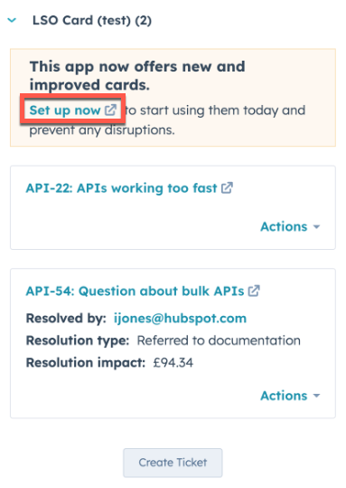
* The app settings page will display all available cards. Click the **link** provided for each card to navigate to the customization page for that object.
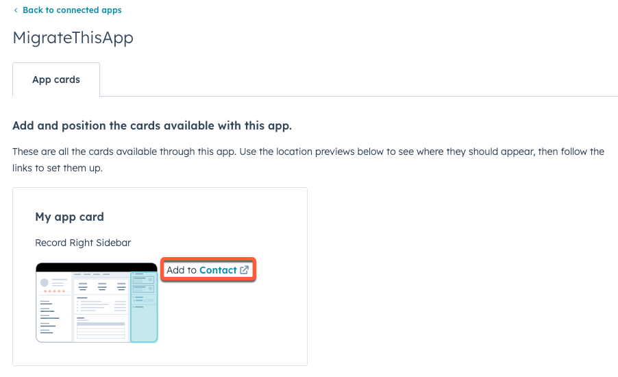
* Users can then proceed to customize their record pages as needed. They can find your new cards within the *Apps* section of the customization sidebar.
* After adding the new card, the old card can be removed by locating it in the view editor then clicking **Remove**. Alternatively, you can [hide the old card from the account](#4.d-hiding-classic-crm-cards) using the feature flag API.
Learn more about the card updating user experience on [HubSpot's Knowledge Base](https://knowledge.hubspot.com/integrations/install-and-manage-app-cards).
#### Gradually roll out app cards
Using the feature flag API endpoints, you can gradually roll out your app in two ways:
* [Roll out app cards to new installs](#roll-out-to-new-installs)
* [Roll out app cards to a subset of accounts](#roll-out-to-a-subset-of-accounts)
##### Roll out to new installs
To roll out your app cards to new installs only, you'll use the feature flag API to turn off the `hs-release-app-cards` feature flag for all existing installs. Then, you'll switch the flag's state to `ON` so that new installs have the flag enabled by default.
**Please note:** the `hs-release-app-cards` flag will apply for all app cards included in the app. You cannot selectively release individual cards within an app.
* For the first request, set the `flagState` to `OFF` for all accounts that currently have the app installed. You'll need to gather the `portalId` for all existing installed accounts, then make a `POST` request to `https://api.hubapi.com/feature-flags/2026-03/{appId}/flags/hs-release-app-cards/portals/batch/upsert?hapikey={developerAPIKey}`.
```json theme={null}
{
"portalStates": [
{
"portalId": 1234,
"flagState": "OFF"
},
{
"portalId": 4567,
"flagState": "OFF"
},
{
"portalId": 78910,
"flagState": "OFF"
}
]
}
```
```shell theme={null}
curl --request POST \
--url 'https://api.hubapi.com/feature-flags/2026-03/0/flags/hs-release-app-cards/portals/batch/upsert?hapikey={developerAPIKey}' \
--header 'content-type: application/json' \
--data '{
"portalStates": [
{
"portalId": 1234,
"flagState": "OFF"
},
{
"portalId": 4567,
"flagState": "OFF"
},
{
"portalId": 78910,
"flagState": "OFF"
}
]
}'
```
* With existing app installs set to `OFF`, you can now set the `defaultState` to `ON`. To do so, make a `PUT` request to `https://api.hubapi.com/feature-flags/2026-03/{appId}/flags/hs-release-app-cards?hapikey={developerAPIKey}`
```json theme={null}
{
"defaultState": "ON"
}
```
```shell theme={null}
curl -- request PUT \
--url 'https://api.hubapi.com/feature-flags/2026-03/{appId}/flags/hs-release-app-cards?hapikey={developerAPIKey}' \
--header 'content-type: application/json' \
--data '{
"defaultState": "ON"
}'
```
* Once you feel confident in new customer adoption, you can begin to remove customer `portalIds` that you switched to the `OFF` state by making a `POST` request to `https://api.hubapi.com/feature-flags/2026-03/{appId}/flags/hs-release-app-cards/portals/batch/delete?hapikey={developerAPIKey}` with the account IDs you want to remove from the `OFF` list.
```json theme={null}
{
"portalIds": [1234, 4567, 78910]
}
```
```shell theme={null}
curl --request POST \
--url 'https://api.hubapi.com/feature-flags/2026-03/{appId}/flags/hs-release-app-cards/portals/batch/delete?hapikey={developerAPIKey}' \
--header 'content-type: application/json; \
--data '{
"portalIds": [
1234,
4567,
78910
]
}'
```
To check which accounts still have their flag set to `OFF`, you can make a `GET` request to `/feature-flags/2026-03/{appId}/flags/hs-release-app-cards/portals/{portalId}`. Learn more in the [feature flag API reference documentation](/docs/api-reference/latest/app-management/feature-flags/portal-flag-states/get-accounts-with-flag-state).
* When all previously added accounts have been deleted using the above endpoint, you'll have successfully completed the rollout and finished migration. At this point, you can safely delete your feature flag by making a `DELETE` request to `https://api.hubapi.com/feature-flags/2026-03/{appId}/flags/hs-release-app-cards?hapikey={developerAPIKey}`.
```shell theme={null}
curl --request DELETE \
--url 'https://api.hubapi.com/feature-flags/2026-03/{appId}/flags/hs-release-app-cards?hapikey={developerAPIKey}'
```
#### Roll out to a subset of accounts
Alternatively, rather than starting with new installs, you can selectively enable your app cards for a subset of accounts that have your app installed. To do so, you'll need to have a list of the account IDs for all existing public app installs. With that list, you can make a `POST` request to `https://api.hubapi.com/feature-flags/2026-03/{appId}/flags/hs-release-app-cards/portals/batch/upsert?hapikey={developerAPIKey}` and set their `flagState` to `ON`.
```json theme={null}
{
"portalStates": [
{
"portalId": 1234,
"flagState": "ON"
},
{
"portalId": 4567,
"flagState": "ON"
},
{
"portalId": 78910,
"flagState": "ON"
}
]
}
```
```shell theme={null}
curl --request POST \
--url 'https://api.hubapi.com/feature-flags/2026-03/{appId}/flags/hs-release-app-cards/portals/batch/upsert?hapikey={developerAPIKey}' \
--header 'content-type: application/json' \
--data '{
"portalStates": [
{
"portalId": 1234,
"flagState": "ON"
},
{
"portalId": 4567,
"flagState": "ON"
},
{
"portalId": 78910,
"flagState": "ON"
}
]
}'
```
You can continue making this request for subsets of accounts until all accounts have been migrated. Then, you can delete your feature flag by making a `DELETE` request to `https://api.hubapi.com/feature-flags/2026-03/{appId}/flags/hs-release-app-cards?hapikey={developerAPIKey}`.
```shell theme={null}
curl --request DELETE \
--url 'https://api.hubapi.com/feature-flags/2026-03/{appId}/flags/hs-release-app-cards?hapikey={developerAPIKey}'
```
#### Roll out to all accounts simultaneously
To release your app cards to all installed accounts simultaneously, delete the app's feature flag by making a `DELETE` request to `https://api.hubapi.com/feature-flags/2026-03/{appId}/flags/hs-release-app-cards?hapikey={developerAPIKey}`.
```shell theme={null}
curl --request DELETE \
--url 'https://api.hubapi.com/feature-flags/2026-03/{appId}/flags/hs-release-app-cards?hapikey={developerAPIKey}'
```
### Hiding legacy CRM cards
In addition to using the feature flags API to roll out app cards to your install base, you can also use it to facilitate the removal of legacy CRM cards by setting the `hs-hide-crm-cards` flag. For example, for existing installs, you may want to continue showing the old cards to remind users to upgrade to your new cards, but then hide them from new installs and accounts that have upgraded.
**Please note:** the `hs-hide-crm-cards` flag will apply for all legacy CRM cards included in the app. You cannot selectively hide individual legacy CRM cards within an app.
To use the `hs-hide-crm-cards` flag to manage legacy CRM card access:
* Make a `PUT` request to set your app's `defaultState` to `OFF`. This initializes the app flag and ensures that the app's legacy CRM cards will be visible in every existing and new installed account.
```json theme={null}
{
"defaultState": "OFF"
}
```
```shell theme={null}
curl --request PUT \
--url 'https://api.hubapi.com/feature-flags/2026-03/{appId}/flags/hs-hide-crm-cards?hapikey={developerAPIKey}' \
--header 'content-type: application/json' \
--data '{
"defaultState": "OFF"
}'
```
* Next, set the `flagState` to `OFF` for all accounts that currently have the app installed. In the request body, you'll provide a `portalId` for each account.
```json theme={null}
{
"portalStates": [
{
"portalId": 1234,
"flagState": "OFF"
},
{
"portalId": 4567,
"flagState": "OFF"
},
{
"portalId": 78910,
"flagState": "OFF"
}
]
}
```
```shell theme={null}
curl --request POST \
--url 'https://api.hubapi.com/feature-flags/2026-03/{appId}/flags/hs-hide-crm-cards/portals/batch/upsert?hapikey={developerAPIKey}' \
--header 'content-type: application/json' \
--data '{
"portalStates": [
{
"portalId": 1234,
"flagState": "OFF"
},
{
"portalId": 4567,
"flagState": "OFF"
},
{
"portalId": 78910,
"flagState": "OFF"
}
]
}'
```
* With existing app installs set to `OFF`, make another request to set the `defaultState` to `ON`. This prevents new installs from ever seeing the app's legacy CRM cards.
```shell theme={null}
curl --request PUT \
--url 'https://api.hubapi.com/feature-flags/2026-03/{appId}/flags/hs-hide-crm-cards?hapikey={developerAPIKey}'\
--header 'content-type: application/json' \
--data '{
"defaultState": "ON"
}'
```
* As you observe customers using the new app cards, such as receiving `hubspot.fetch()` calls from their accounts, you can remove them from the `hs-hide-crm-cards` flag list using the request below. Because you hid the legacy CRM cards from new installs, you'll only need to take this step for accounts you previously set to `OFF`.
```json theme={null}
{
"portalIds": [1234, 4567, 78910]
}
```
```shell theme={null}
curl --request POST \
--url 'https://api.hubapi.com/feature-flags/2026-03/{appId}/flags/hs-hide-crm-cards/portals/batch/delete?hapikey={developerAPIKey}'\
--header 'content-type: application/json' \
--data '{
"portalIds": [
1234,
4567,
78910
]
}'
```
* When all previously added accounts have been removed from the flag list, you can be sure that your entire install base can no longer access the old legacy CRM cards. At this point, you can navigate to the app's settings page in your developer account and [delete the legacy CRM cards](/docs/api-reference/legacy/crm/extensions/crm-cards/guide#delete-a-crm-card).
* Finally, make a request to delete the `hs-hide-crm-cards` flag from the app.
```shell theme={null}
curl --request DELETE \
--url 'https://api.hubapi.com/feature-flags/2026-03/{appId}/flags/hs-hide-crm-cards?hapikey={developerAPIKey}'
```
## Feature flag API reference
Use the feature flag API to control availability of supported app features in customer accounts. All endpoints are under the `https://api.hubapi.com/feature-flags/2026-03/{appId}` root path.
Supported feature flag names include:
* `hs-release-app-cards`: gradually roll out new UI Extension app cards to specific accounts.
* `hs-hide-crm-cards`: hide legacy CRM cards from accounts that have been migrated.
* `hs-release-mcp-server`: release MCP server functionality.
View the feature flag API reference endpoint documentation:
* **App flag endpoints:**
* [Retrieve an app's feature flags](/docs/api-reference/latest/app-management/feature-flags/flags/get-feature-flag)
* [Retrieve accounts with a set flag state](/docs/api-reference/latest/app-management/feature-flags/portal-flag-states/get-accounts-with-flag-state)
* [Set an app's feature flag](/docs/api-reference/latest/app-management/feature-flags/flags/update-feature-flag)
* [Delete an app's feature flag](/docs/api-reference/latest/app-management/feature-flags/flags/delete-feature-flag)
* **Account flag state endpoints:**
* [Delete an account flag state](/docs/api-reference/latest/app-management/feature-flags/portal-flag-states/delete-portal-flag)
* [Retrieve account flag state](/docs/api-reference/latest/app-management/feature-flags/portal-flag-states/get-account-flag)
* [Batch delete account flag state](/docs/api-reference/latest/app-management/feature-flags/portal-flag-states/delete-portal-flag-batch)
* [Batch set account flag state](/docs/api-reference/latest/app-management/feature-flags/portal-flag-states/upsert-account-flag)
* [Set an account flag state](/docs/api-reference/latest/app-management/feature-flags/portal-flag-states/update-account-flag)
# Delete an account flag state
Source: https://developers.hubspot.com/docs/api-reference/latest/app-management/feature-flags/portal-flag-states/delete-portal-flag
specs/2026-03/crm-public-app-feature-flags-v3-v2026-03.json DELETE /feature-flags/2026-03/{appId}/flags/{flagName}/portals/{portalId}
Delete an account-level flag state for a specific HubSpot account. No request body is included.
# Batch delete account flag state
Source: https://developers.hubspot.com/docs/api-reference/latest/app-management/feature-flags/portal-flag-states/delete-portal-flag-batch
specs/2026-03/crm-public-app-feature-flags-v3-v2026-03.json POST /feature-flags/2026-03/{appId}/flags/{flagName}/portals/batch/delete
Delete an account-level flag state for multiple HubSpot accounts at once. Use this endpoint to manage flag exposure for groups of HubSpot accounts.
# Retrieve account flag state
Source: https://developers.hubspot.com/docs/api-reference/latest/app-management/feature-flags/portal-flag-states/get-account-flag
specs/2026-03/crm-public-app-feature-flags-v3-v2026-03.json GET /feature-flags/2026-03/{appId}/flags/{flagName}/portals/{portalId}
Retrieve the account-level flag state of a specific HubSpot account.
# Retrieve accounts with a set flag state
Source: https://developers.hubspot.com/docs/api-reference/latest/app-management/feature-flags/portal-flag-states/get-accounts-with-flag-state
specs/2026-03/crm-public-app-feature-flags-v3-v2026-03.json GET /feature-flags/2026-03/{appId}/flags/{flagName}/portals
Retrieve a list of HubSpot accounts with an account-level flag setting for the specified app. No request body is included.
# Set an account flag state
Source: https://developers.hubspot.com/docs/api-reference/latest/app-management/feature-flags/portal-flag-states/update-account-flag
specs/2026-03/crm-public-app-feature-flags-v3-v2026-03.json PUT /feature-flags/2026-03/{appId}/flags/{flagName}/portals/{portalId}
Specify an account-level flag state for a specific HubSpot account.
# Batch set account flag state
Source: https://developers.hubspot.com/docs/api-reference/latest/app-management/feature-flags/portal-flag-states/upsert-account-flag
specs/2026-03/crm-public-app-feature-flags-v3-v2026-03.json POST /feature-flags/2026-03/{appId}/flags/{flagName}/portals/batch/upsert
Set the portal flag state for multiple HubSpot accounts at once. Use this endpoint to manage flag exposure for groups of HubSpot accounts.
# Manage OAuth access tokens with the 2026-03 API
Source: https://developers.hubspot.com/docs/api-reference/latest/authentication/manage-oauth-tokens
Learn how to use the 2026-03 OAuth endpoints to manage access and refresh tokens to securely perform CRUD actions with HubSpot APIs.
The 2026-03 OAuth endpoints allow you to generate and manage access tokens for your app. To get started, you'll need to [create an app](/docs/apps/developer-platform/build-apps/create-an-app) configured for OAuth authentication.
These endpoints improve on the [v1 endpoints](/docs/api-reference/legacy/authentication/oauth-tokens/v1/guide) by requiring all parameters to be in the request body rather than as query parameters, which prevents sensitive values like your `client_id` and `client_secret` from appearing in server logs or other persistent logging.
Review the sections below on how to use these endpoints to initiate OAuth access, manage access tokens, and retrieve token metadata.
## Token types
The OAuth authorization flow involves three distinct token types:
* **Authorization code:** a temporary, single-use code that's provided in the redirect URL as a query parameter when the user approves the installation of your app. Your app then has a short window to exchange it for an access token and a refresh token, after which the authorization code cannot be reused.
* **Access token:** your app's authentication credential used for every API request made on behalf of the user and the account where they installed your app. This token is provided as a *Bearer* token in the request, and expires after 30 minutes.
* **Refresh token:** your app's long-term authentication credential that you can use to generate a new access token after the previous one expires.
If you're using the [webhooks journal API](/docs/api-reference/latest/webhooks-journal/guide), you can also generate access tokens using the [`client_credentials` grant type](#generate-a-client-credentials-access-token), which has a different authorization flow. Tokens with this grant type authenticate as your app rather than on behalf of a specific user, and can be used for managing webhook journal subscription configuration or process journal data.
Check out the blog post linked below for guidance on how to cache and auto-refresh access tokens:
OAuth access tokens have no defined maximum size, and the size may increase or decrease as HubSpot updates the information encoded in tokens. To prevent storage failures, it's strongly recommended to not impose token size limits when storing tokens.
## Refresh an access token
Using a refresh token, you can generate a new access token by making a URL-form encoded `POST` request to `/oauth/2026-03/token`. In the request body, you'll specify the `grant_type`, `client_id`, `client_secret`, and `refresh_token`.
```shell theme={null}
curl --request POST \
--url https://api.hubspot.com/oauth/2026-03/token \
--header 'content-type: application/x-www-form-urlencoded' \
--data client_id=aaaaaaaa-bbbb-cccc-dddd-eeeeeeeeeeee \
--data client_secret=aaaaaaaa-bbbb-cccc-dddd-eeeeeeeeeeee \
--data refresh_token=na1-aaaa-bbbb-cccc-dddd-eeeeeeeeeeee \
--data grant_type=refresh_token
```
| Parameter | Type | Description |
| --------------- | ------ | --------------------------------------------------------------------------------------------- |
| `grant_type` | String | Must be `refresh_token` for the request to generate new access tokens from the refresh token. |
| `refresh_token` | String | The refresh token value. |
| `client_id` | String | The app's client ID. |
| `client_secret` | String | The app's client secret. |
## Generate a client credentials access token
The `client_credentials` grant type authenticates as your app rather than on behalf of a specific user. Unlike the `authorization_code` flow, client credentials tokens are app-level tokens used for the [webhooks journal API](/docs/api-reference/latest/webhooks-journal/guide).
To generate a client credentials access token, make a URL-form encoded `POST` request to `/oauth/2026-03/token` with `grant_type=client_credentials`.
```shell theme={null}
curl --request POST \
--url https://api.hubspot.com/oauth/2026-03/token \
--header 'content-type: application/x-www-form-urlencoded' \
--data client_id=aaaaaaaa-bbbb-cccc-dddd-eeeeeeeeeeee \
--data client_secret=aaaaaaaa-bbbb-cccc-dddd-eeeeeeeeeeee \
--data grant_type=client_credentials \
--data 'scope=developer.webhooks_journal.read developer.webhooks_journal.subscriptions.read'
```
| Parameter | Type | Description |
| --------------- | ------ | ------------------------------------------------------------------------------------------------------------------------------------------- |
| `grant_type` | String | Must be `client_credentials`. |
| `client_id` | String | The app's client ID. |
| `client_secret` | String | The app's client secret. |
| `scope` | String | A space-separated list of scopes to request for the token. Must include at least one valid scope (e.g., `developer.webhooks_journal.read`). |
In the response, you'll receive an access token. No refresh token will be included, as the `client_credentials` grant type doesn't require one for generating the access token.
```json theme={null}
{
"token_type": "bearer",
"access_token": "xxxxxxxxxxxxxxxxxxxxxxxxxxxxxxxxxxxxxxxxxxxxxxxxxxxxxxxxxxxxxxxxxxxxxxxxxxxxxxxxxxxxxxxxxxxxxxxxxxxxxxxxxxxxxxxxxxxxxxxxxxxxxxxxxxxxxxxxxxxxxxxxxxxxxxxxxxxxxxxxxxxxxxxxxxx",
"expires_in": 1800
}
```
## Retrieve access token metadata
To get information about an OAuth access token, including the user that the token was created for and their corresponding Hub ID, make a `POST` request to `/oauth/2026-03/token/introspect`, providing the following form URL-encoded properties in the request body:
| Property | Type | Description |
| ----------------- | ------ | -------------------------------------------------------------------------------------------------------------------------------------- |
| `client_id` | String | The app's client ID. |
| `client_secret` | String | The app's client secret. |
| `token_type_hint` | String | The type of token you're querying, which can be either `access_token` or `refresh_token`. |
| `refresh_token` | String | If you specified `refresh_token` as the `token_type_hint`, then provide the `refresh_token` as an additional property in your request. |
| `token` | String | The `access_token` or `refresh_token` value, based on the token type you specified in the `token_type_hint` property above. |
For example, if you wanted to query for details about the `refresh_token` of `na1-aaaa-bbbb-cccc-dddd-eeeeeeeeeeee`, your form URL-encoded request body would include:
```json theme={null}
{
"client_id": "aaaaaaaa-bbbb-cccc-dddd-eeeeeeeeeeee",
"client_secret": "aaaaaaaa-bbbb-cccc-dddd-eeeeeeeeeeee",
"token_type_hint": "refresh_token",
"token": "na1-aaaa-bbbb-cccc-dddd-eeeeeeeeeeee"
}
```
You'll receive a response containing information about the user's access token and their HubSpot account. The code blocks below provide example responses when querying for both `access_token` and `refresh_token` grant types.
```json theme={null}
{
"active": true,
"token": "xxxxxxxxxxxxxxxxxxxxxxxxxxxxxxxxxxxxxxxxxxxxxxxxxxxxxxxxxxxxxxxxxxxxxxxxxxxxxxxxxxxxxxxxxxxxxxxxxxxxxxxxxxxxxxxxxxxxxxxxxxxxxxxxxxxxxxxxxxxxxxxxxxxxxxxxxxxxxxxxxxxxxxxxxxx",
"hub_id": 1234567,
"user_id": 222222,
"client_id": "aaaaaaaa-bbbb-cccc-dddd-eeeeeeeeeeee",
"app_id": 1234444,
"user": "jdoe@hubspot.com",
"hub_domain": "example.com",
"scopes": [
"oauth",
"crm.objects.contacts.read",
"crm.objects.contacts.write"
],
"signed_access_token": {
"expiresAt": 1769213087721,
"scopes": "xxxxxxxxxxxxxxxxxxxxxxxx",
"hubId": 1234567,
"userId": 222222,
"appId": 1234444,
"signature": "xxxxxxxxxxxxxxxxxxxxxxxx",
"scopeToScopeGroupPks": "xxxxxxxxxxxxxxxxxxxxxxxx",
"newSignature": "xxxxxxxxxxxxxxxxxxxxxxxx",
"hublet": "na1",
"trialScopes": "",
"trialScopeToScopeGroupPks": "",
"isUserLevel": false,
"isPrivateDistribution": true
},
"expires_in": 1789,
"is_private_distribution": true,
"token_use": "access_token",
"token_type": "Bearer"
}
```
```json theme={null}
{
"active": true,
"token": "na1-aaaa-bbbb-cccc-dddd-eeeeeeeeeeee",
"hub_id": 1234567,
"user_id": 222222,
"client_id": "aaaaaaaa-bbbb-cccc-dddd-eeeeeeeeeeee",
"app_id": 1234444,
"user": "jdoe@hubspot.com",
"hub_domain": "example.com",
"scopes": [
"crm.objects.contacts.write",
"oauth",
"crm.objects.contacts.read"
],
"token_use": "refresh_token",
"token_type": "Bearer"
}
```
## Error handling
When querying for access or refresh tokens, if an OAuth error occurs, the response will resemble the following:
```json theme={null}
{
"error": "invalid_grant",
"error_description": "refresh token is invalid, expired or revoked",
"status": "BAD_REFRESH_TOKEN",
"message": "refresh token is invalid, expired or revoked"
}
```
This response fully conforms to [RFC 6749](https://datatracker.ietf.org/doc/html/rfc6749) of the OAuth 2.0 standard, which many OAuth libraries and tools expect. Note that the HubSpot-specific `status` and `message` fields that were included in previous versions of the OAuth token API endpoints are still available for backwards compatibility.
# Refresh an access token
Source: https://developers.hubspot.com/docs/api-reference/latest/authentication/oauth-tokens/refresh-oauth-token
specs/2026-03/auth-oauth-v2026-03.json POST /oauth/2026-03/token
Authenticates a client and returns access and refresh tokens.
# Revoke an OAuth token
Source: https://developers.hubspot.com/docs/api-reference/latest/authentication/oauth-tokens/revoke-token
specs/2026-03/auth-oauth-v2026-03.json POST /oauth/2026-03/token/revoke
Deletes/Revokes provided Refresh Token
# Token introspection endpoint
Source: https://developers.hubspot.com/docs/api-reference/latest/authentication/oauth-tokens/token-introspect
specs/2026-03/auth-oauth-v2026-03.json POST /oauth/2026-03/token/introspect
Returns validity and metadata for access and refresh tokens.
# Enroll a contact into a sequence
Source: https://developers.hubspot.com/docs/api-reference/latest/automation/sequences/enroll-contact
specs/2026-03/automation-sequences-v2026-03.json POST /automation/sequences/2026-03/enrollments
Enroll a contact into a sequence using the specified user ID and sequence details.
# Retrieve a contact's enrollment status
Source: https://developers.hubspot.com/docs/api-reference/latest/automation/sequences/get-enrollment
specs/2026-03/automation-sequences-v2026-03.json GET /automation/sequences/2026-03/enrollments/contact/{contactId}
Get the enrollment status of a contact in sequences by their contact ID.
# Retrieve a sequence
Source: https://developers.hubspot.com/docs/api-reference/latest/automation/sequences/get-sequence
specs/2026-03/automation-sequences-v2026-03.json GET /automation/sequences/2026-03/{sequenceId}
Retrieve details of a specific sequence by its ID.
# Retrieve sequences
Source: https://developers.hubspot.com/docs/api-reference/latest/automation/sequences/get-sequences
specs/2026-03/automation-sequences-v2026-03.json GET /automation/sequences/2026-03
# Sequences API
Source: https://developers.hubspot.com/docs/api-reference/latest/automation/sequences/guide
Learn how to use the sequences API to retrieve sequences and manage contact enrollments.
To send a series of targeted, timed email templates to nurture contacts over time, you can [create a sequence](https://knowledge.hubspot.com/sequences/create-and-edit-sequences). You can use the sequences tool to automatically create tasks to remind you to follow up with your contacts.
To use this API, the user must have an [assigned ***Sales Hub*** *Professional* or *Enterprise*](https://knowledge.hubspot.com/account-management/manage-seats) [or ***Service Hub** Professional* or *Enterprise* seat](https://knowledge.hubspot.com/account-management/manage-seats).
With the sequences API, you can:
* Get a list of sequences
* Get a specific sequence
* Enroll a contact in a sequence
* View a contact’s enrollment status
This could be useful if you have an app that maintains a list of contacts and you want to enroll them in a HubSpot sequence. With the sequences API, from your app, you could:
* Get a list of sequences
* Enroll a contact in a sequence
* Review the enrollment status
The sections below provide a walkthrough of how to use the sequences endpoints. For a full reference of the available endpoints and their required fields, click the **Endpoints** tab at the top of this article.
## Fetch a sequence
To get details about a specific sequence in your account, make a `GET` request to `/automation/sequences/2026-03/{sequenceId}?userId={userId}`, where the sequenceId is the ID of an existing sequence in your account.
For example, to get details about a sequence that ID is `123456789` and your [user ID](/docs/api-reference/latest/crm/objects/users/guide) is `2222222`, make a `GET` request to `/automation/sequences/2026-03/123456789?userId=2222222`. Use the ID of the specific sequence as the sequenceId in the request URL and use your userId as a query parameter.
The response for fetching a sequence would resemble the following:
**Please note:**
If you've enrolled into the *Sequences unenrollment configuration* beta, when retrieving a specific sequence, the `"sellingStrategy": "LEAD_BASED"` value may not actually match the sequence. This is expected behavior.
```json expandable theme={null}
{
"id": "123456789",
"name": "Melinda's simple call sequence",
"createdAt": "2024-06-26T18:37:01.146Z",
"updatedAt": "2024-06-26T18:37:01.146Z",
"userId": "8698664",
"steps": [
{
"id": "198771535",
"stepOrder": 0,
"delayMillis": 0,
"actionType": "TASK",
"createdAt": "2024-06-26T18:37:01.146Z",
"updatedAt": "2024-06-26T18:37:01.146Z",
"taskPattern": {
"id": "23594004",
"taskType": "CALL",
"taskPriority": "LOW",
"subject": "Call contact to follow up",
"createdAt": "2024-06-26T18:37:01.146Z",
"updatedAt": "2024-06-26T18:37:01.146Z"
}
},
{
"id": "198771536",
"stepOrder": 1,
"delayMillis": 86400000,
"actionType": "TASK",
"createdAt": "2024-06-26T18:37:01.146Z",
"updatedAt": "2024-06-26T18:37:01.146Z",
"taskPattern": {
"id": "23594005",
"taskType": "EMAIL",
"taskPriority": "LOW",
"subject": "Send follow-up email",
"notes": "Send an email to thank them for their time and follow up. Use one of our templates based on the call outcome.
",
"createdAt": "2024-06-26T18:37:01.146Z",
"updatedAt": "2024-06-26T18:37:01.146Z"
}
},
{
"id": "198771537",
"stepOrder": 2,
"delayMillis": 0,
"actionType": "FINISH_ENROLLMENT",
"createdAt": "2024-06-26T18:37:01.146Z",
"updatedAt": "2024-06-26T18:37:01.146Z"
}
],
"settings": {
"id": "18167737",
"eligibleFollowUpDays": "BUSINESS_DAYS",
"sellingStrategy": "LEAD_BASED",
"sendWindowStartMinute": 480,
"sendWindowEndMinute": 1080,
"taskReminderMinute": 480,
"individualTaskRemindersEnabled": false,
"createdAt": "2024-06-26T18:37:01.146Z",
"updatedAt": "2024-06-26T18:37:01.146Z"
},
"dependencies": [
{
"id": "15241774",
"createdAt": "2024-06-26T18:37:01.146Z",
"updatedAt": "2024-06-26T18:37:01.146Z",
"dependencyType": "TASK_COMPLETION",
"requiredBySequenceStepId": "198771536",
"reliesOnSequenceStepId": "198771535",
"requiredByStepOrder": 1,
"reliesOnStepOrder": 0
},
{
"id": "15241775",
"createdAt": "2024-06-26T18:37:01.146Z",
"updatedAt": "2024-06-26T18:37:01.146Z",
"dependencyType": "TASK_COMPLETION",
"requiredBySequenceStepId": "198771537",
"reliesOnSequenceStepId": "198771536",
"requiredByStepOrder": 2,
"reliesOnStepOrder": 1
}
]
}
```
The details of each response field are outlined in the table below:
| Field | Type | Description |
| ------- | ------ | ------------------------------------------------------------------------------------------------------------------------------- |
| `id` | String | The sequence ID. |
| `name` | String | The name of the sequence. |
| `steps` | Array | The list of steps in your sequence. Each step is an object that includes details like the type, priority, and creation details. |
## List sequences
To get details about a specific sequence in your account, make a `GET` request to `/automation/sequences/2026-03?limit=#&userId={userId}`. Use the amount of sequences you want returned as the limit in the request URL and use your [userID](/docs/api-reference/latest/crm/objects/users/guide) as a query parameter.
For example, to get a list of four sequences and your user ID is `2222222`, make a `GET` request to `/automation/sequences/2026-03?limit=4&userId=2222222`.
The response for fetching a list of sequences would resemble the following:
```json expandable theme={null}
{
"total": 7,
"results": [
{
"id": "88180366",
"name": "Melinda's call sequence",
"createdAt": "2023-07-20T15:40:04.364Z",
"updatedAt": "2023-07-20T15:40:04.364Z",
"userId": "2222222"
},
{
"id": "76853632",
"name": "Melinda's Follow-up Sequence",
"createdAt": "2023-01-26T15:38:05.812Z",
"updatedAt": "2023-01-27T16:06:12.562Z",
"userId": "2222222"
},
{
"id": "76897322",
"name": "Melinda's Marketing Pro Demo Sequence",
"createdAt": "2023-01-27T16:42:29.487Z",
"updatedAt": "2023-05-03T14:40:42.507Z",
"userId": "2222222"
},
{
"id": "76849666",
"folderId": "67555200",
"name": "Melinda's Sales Sequence",
"createdAt": "2023-01-26T15:26:56.574Z",
"updatedAt": "2023-05-26T17:16:57.866Z",
"userId": "2222222"
}
],
"paging": {
"next": {
"after": "NA%3D%3D",
"link": "https://api.hubspot.com/automation/sequences/2026-03?limit=4&userId=8698664&portalId=6331522&after=NA%3D%3D"
}
}
}
```
The details of each response field are outlined in the table below:
| Field | Type | Description |
| ----------- | ------ | ----------------------------------------------------- |
| `total` | String | The number of sequences in your account. |
| `id` | String | The sequence ID. |
| `name` | String | The name of the sequence. |
| `createdAt` | String | The time the sequence was created in UTC format. |
| `updatedAt` | String | The time the sequence was last updated in UTC format. |
| `userID` | String | The userID of the user who created the sequence. |
## Enroll a contact in a sequence
To enroll a contact in a sequence, make a `POST` request to `/automation/sequences/2026-03/enrollments`. Use your [user ID](/docs/api-reference/latest/crm/objects/users/guide) as the query parameter. Specify the sequenceId, contactId, and senderEmail in the body. The senderEmail must be an email address that’s [connected](https://knowledge.hubspot.com/connected-email/connect-your-inbox-to-hubspot) to your HubSpot account.
For example, to enroll a contact whose ID is `33333` in sequence that’s ID is `44444444`, you’d make a `POST` request to `/automation/sequences/2026-03/enrollments`.
The body would resemble the following:
```json theme={null}
{
"sequenceId": "33333",
"contactId": "44444444",
"senderEmail": "menelson@hubspot.com"
}
```
The response for enrolling a contact in a sequence would resemble the following:
```json theme={null}
{
"id": "2435404604",
"toEmail": "RachelGreen.com",
"enrolledAt": "2024-06-27T20:11:02.824Z",
"updatedAt": "2024-06-27T20:11:02.824Z"
}
```
The details of each response field are outlined in the table below:
| Field | Type | Description |
| ------------ | ------ | ----------------------------------------------------------------- |
| `id` | String | The ID for the enrollment object. |
| `toEmail` | String | The email of the contact |
| `enrolledAt` | String | The time the contact was enrolled in the sequence in UTC format. |
| `updatedAt` | String | The last time the enrollment was updated (paused, unpaused, etc.) |
**Please note:**
There is a limit of 1000 enrollments per portal inbox per day.
## View a contact's sequence enrollment status
A contact's enrollment status will indicate if the contact is enrolled in any sequences at the time of the request. To get a contact's enrollment status, make a `GET` request to `/automation/sequences/2026-03/enrollments/contact/{contactId}`.
For example, to view the enrollment status of a contact whose contact ID is `33333`, make a `GET` request to `/automation/sequences/2026-03/enrollments/contact/33333`. Use the contact ID as the query parameter.
The response for viewing a contact's sequence enrollment status would resemble the following:
```json theme={null}
{
"id": "2435404604",
"toEmail": "RachelGreen@gmail.com",
"enrolledAt": "2024-06-27T20:11:02.824Z",
"updatedAt": "2024-06-27T20:11:02.824Z",
"sequenceId": "76853632",
"sequenceName": "Melinda's Sales Hub Sequence",
"enrolledBy": "8698664",
"enrolledByEmail": "menelson@hubspot.com"
}
```
The details of each response field are outlined in the table below:
| Field | Type | Description |
| ----------------- | ------ | ---------------------------------------------------------------------------------------------------------------------- |
| `id` | String | The ID for the enrollment object. |
| `toEmail` | String | The email of the contact |
| `enrolledAt` | String | The time the contact was enrolled in the sequence in UTC format. |
| `updatedAt` | String | The last time the enrollment was updated (paused, unpaused, etc.) |
| `sequenceId` | String | The ID of the sequence the contact is enrolled in. |
| `sequenceName` | String | The title of the sequence the contact is enrolled in. |
| `enrolledBy` | String | The userId of the user who enrolled the contact in the sequence. |
| `enrolledByEmail` | String | The email of the user who enrolled the contact in the sequence or the email address that email messages are sent from. |
# Create custom workflow actions with the action builder (BETA)
Source: https://developers.hubspot.com/docs/api-reference/latest/automation/workflow-actions/custom-action-builder
Use HubSpot's in-app custom action builder to build custom workflow actions.
Create and manage workflow actions from your HubSpot account using the action builder. The tool allows you to:
* Speed up development by previewing how your action will display in HubSpot before writing any code.
* Reduce errors with a guided setup that outputs the correct JSON for [workflow action schema files](/docs/apps/developer-platform/add-features/custom-workflow-actions) and makes [API requests](/docs/api-reference/latest/automation/workflow-actions/custom-action-guide) on your behalf.
* Streamline testing by ensuring your action looks and behaviors as expected before implementation.
Before you can create a custom workflow action:
* Create a [developer account](https://app.hubspot.com/signup-hubspot/crm?intent=developer).
* If you plan to add the workflow action to an app built on the developer platform, [create an app](/docs/apps/developer-platform/build-apps/create-an-app).
**Please note:**
This feature is currently in beta and is subject to change based on testing and feedback. By using these endpoints, you agree to adhere to HubSpot's [Developer Terms](https://legal.hubspot.com/hs-developer-terms) & [Developer Beta Terms](https://legal.hubspot.com/hubspot-beta-terms). Learn more about [opting your account into beta features](https://knowledge.hubspot.com/account-management/opt-your-hubspot-account-into-a-public-beta-feature).
## Use the builder
Navigate to the [custom action builder](https://app.hubspot.com/l/action-builder/). For [legacy apps](/docs/apps/legacy-apps/public-apps/overview), you can also navigate to the builder through the legacy app details page:
* In your app developer account, navigate to **Apps**.
* Click the **app** that you'd like to build the action for.
* In the left sidebar menu, click **Workflows custom action builder**.
Once in the action builder, you can either start from scratch or import your existing action definition to preview and further edit the action.
To import the JSON from an existing action:
* In the top right, click **Import action definition**.
* In the dialog box, enter your **action definition**.
* At the bottom, click **Import**. The editor will automatically be populated based on the action definition.
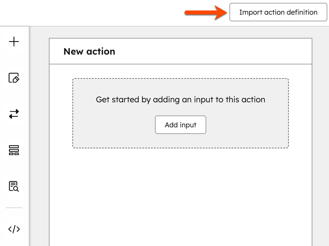
## Add inputs
* To begin building your workflow action, click **Add input** or the **+ plus icon**. These are the inputs that the action receives and will be filled by the user in-app when setting up the action.
* In the left panel, select an **input field type** for your action. Then, set up your input:
* **Field type:** the [field type](https://knowledge.hubspot.com/properties/property-field-types-in-hubspot) for your input.
* **Label:** the user-facing label for your input.
* **Key:** the key the input's data is returned under. This value must match your external API. For example, if your external API expects a user's email address to be provided using the parameter name `user_email`, the key you specify in the workflow action builder must be `user_email` exactly, or the API cannot match the data sent.
* **Tooltip:** add an information icon next to the label which displays the configured text within a tooltip.
* **Options:** set up values for your input field. This field will appear if you've selected the *Radio select*, *Dropdown select*, or *Multi-select* field type options. You can manually set up static options, or use external data to populate your options.
* **Required field:** determine if the input is required or not.
* After setting up your input, in the bottom, click **Save**. A preview of the input will appear in the right panel.
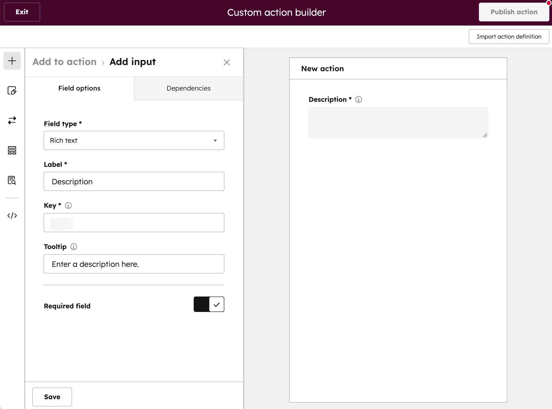
* To add another input, in the left sidebar menu, click the **+ plus icon**.
* To add any dependencies to the input field, at the top, click the **Dependencies** tab.
* Click **Add field dependencies**. For example, you can choose to hide or grey out a field, based on the value of this field.
* Set up your field dependencies:
* **Choose which inputs should be dependent on this:** select the other input fields that you want to be dependent on the field.
* **Choose what behavior you want to control:** choose if this field controls the visibility or state of the field. For example, you can choose whether the field is hidden or greyed out.
* **Only show if the current field's value is equal to:** set the value to control the dependency.
* To add another dependency, click **+ Add input field dependency**.
* To remove a dependency, click the **delete icon** next to the dependency group.
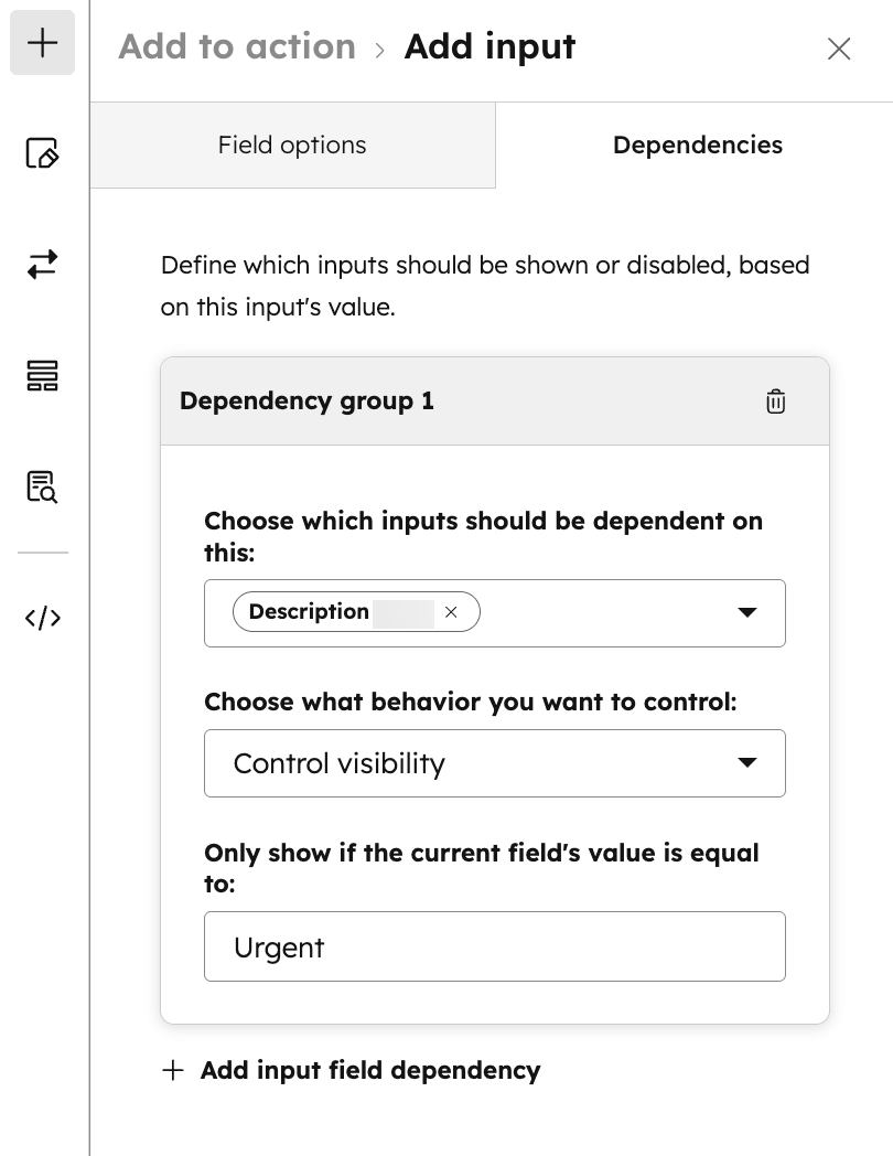
## Add action details
* In the left sidebar menu, click the **Action details icon**.
* In the *Basic info* tab, set up your action details:
* **Display name:** enter a name for your workflow action. This'll appear when selecting and setting up the workflow action.
* **Available object types:** select the CRM object types that this action can be used with. If an option isn't selected, the action will appear in all workflow types.
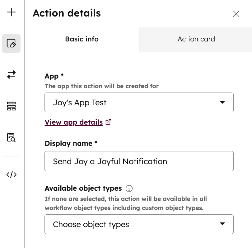
* At the top, click the **Action card** tab. You can configure how the action card appears when selecting a workflow action from the editor.
* Enter a **description** for the workflow action card. You can review your action card in the section below.
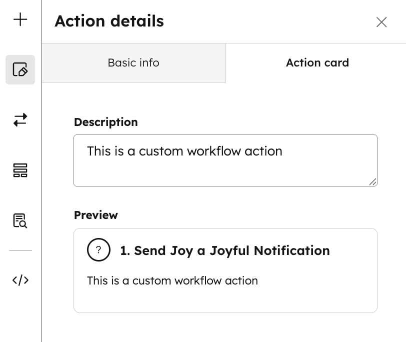
## Set up the API request triggered by your action
* In the left sidebar menu, click the **API icon**.
* In the *Request panel* tab, enter a **Request URL** for your workflow action.
* This will be the URL where an HTTPS request is sent when the action is executed.
* The request body will contain information about which user the action is executing on behalf of, and what values were entered for the input fields.
* To set up your API outputs, click the **Outputs** tab. These are values that the action will output that can be used by later actions in the workflow. An action can have zero, one, or many outputs.
* Click **Add output**. Then, set up your output:
* **Response key:** the name of the parameter that your external API returns that can be used as an input in subsequent actions. For example, if the output from your external API includes a property named `computed_output`, you'd provide that property name for the *Response key* here.
* **Label:** the user facing output label.
* **Data type:** the [field data type](https://knowledge.hubspot.com/properties/property-field-types-in-hubspot) for your output.
* After setting up your output, at the bottom, click **Save**.
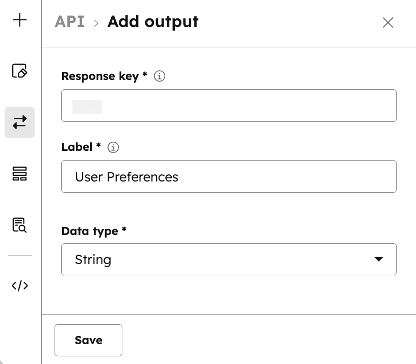
## Manage inputs
* In the left sidebar menu, click the **Inputs icon**.
* To add additional information to your workflow action, click to toggle the **Add additional info above inputs** switch on.
* In the *Additional info* field, enter any **additional information** for your workflow action. For example, you can enter a brief description of what the action does, or any additional requirements or behavior that users should note when using the action.
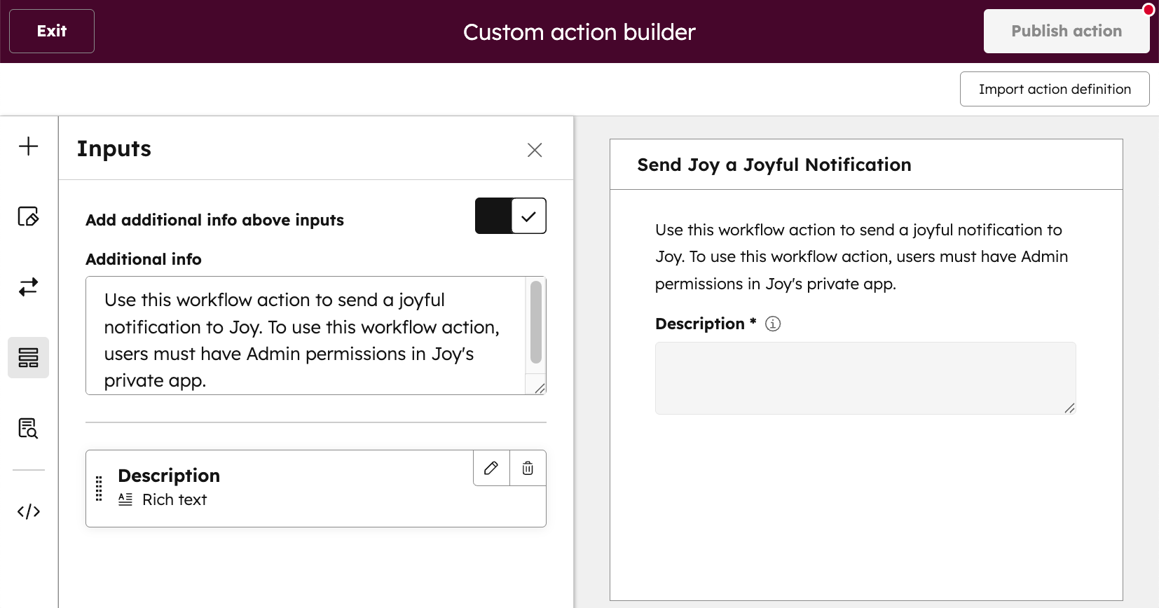
## Set up action logs
It is strongly recommended to add action logs. Once a user adds your action and begins executing their workflow, action logs let the users know if the action executed successfully, or if an issue occurred that they need to be aware of.
* In the left sidebar menu, click the **Action logs icon**.
* Click **Add action log**.
* Set up your action log:
* **Key:** the unique identifier for this action log message.
* **Message:** the message to show to users if the conditions for this action log are met.
* **Conditions:** the action's execution response determines which action log message to show. Choose what values should be present in the response object to show this log message.
* Enter a **Key** and **Value** for your condition.
* To delete a condition, click the **delete icon**.
* To add another condition for your action log, click **+ Add another condition**.
* After setting up your action log, at the bottom, click **Save**.
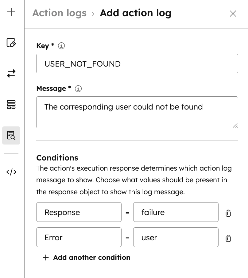
## Copy your workflow action code
To review and copy the configuration code directly:
* In the left sidebar menu, click the **Action definition icon**.
* Click **Copy**.
* You can then paste the code into your local [custom workflow action schema file](/docs/apps/developer-platform/add-features/custom-workflow-actions), or use it for making a `POST` request to the [custom workflow actions API](/docs/api-reference/latest/automation/workflow-actions/custom-action-guide).
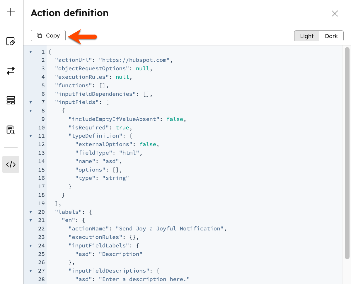
## Publish your workflow action
After setting up your action:
* In the top right, click **Publish action** to either create a new action definition or update an existing action.
* In the dialog box, select from the following:
* **Create a new action definition:** this will trigger a `POST` request on your behalf and automatically create a new action. If your app has been installed, the action will then appear in your available workflow actions in the workflow editor.
* **Patch an existing extension definition:** this will trigger a `PATCH` request on your behalf and automatically update the specified existing action. If your app has been installed, the updated action will appear in your available workflow actions in the workflow editor. You can retrieve all action definitions for your app using the [retrieve custom action definitions API](/docs/api-reference/latest/automation/workflow-actions/definitions/get-action-definitions).
* Click **Create action definition** or **Patch existing definition**.
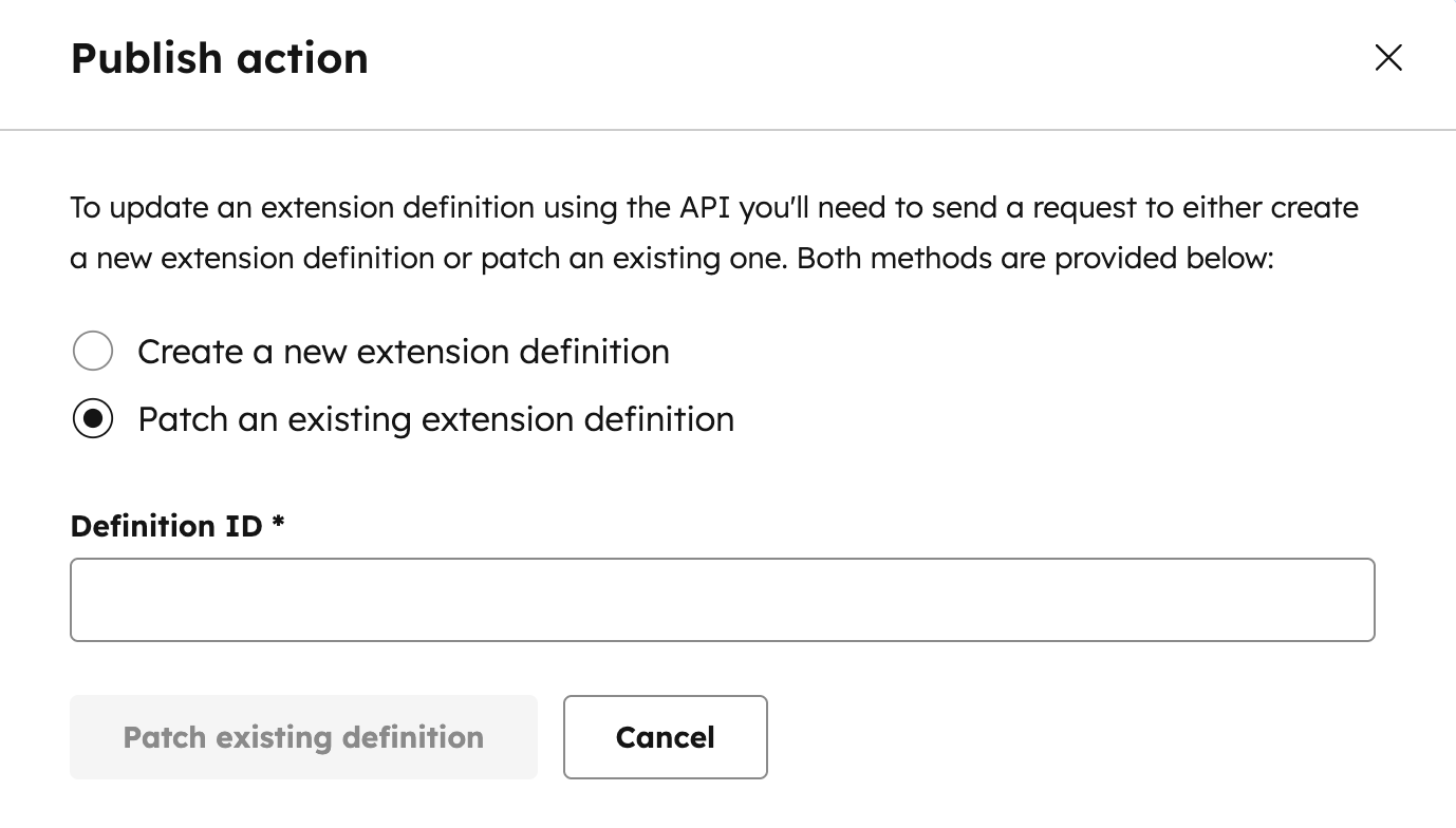
# Build custom workflow actions
Source: https://developers.hubspot.com/docs/api-reference/latest/automation/workflow-actions/custom-action-guide
An introduction and overview of workflow extensions.
Use [HubSpot's workflows tool](https://knowledge.hubspot.com/workflows/create-workflows) to automate business processes and improve team efficiency. You can create custom workflow actions to integrate your service with HubSpot's workflows.
After setting up your custom action, when users install your application, they can add the custom action to their workflows.
When those workflows execute, HTTPS requests will be sent to the configured URL with the payload that you set up. Requests made for your custom action will use the v3 version of the *X-HubSpot-Signature*. Learn more about [validating requests from HubSpot](/docs/apps/legacy-apps/authentication/validating-requests).
For more information on defining your custom workflow action, refer to the [custom workflow action reference](/docs/api-reference/latest/automation/workflow-actions/custom-action-reference).
You can also skip forward to the following sections:
* [Before you get started](#before-you-get-started)
* [Define your custom action](#define-your-custom-action)
* [Test and publish your custom action](#test-and-publish-your-custom-action)
* [Custom action examples](#custom-action-examples)
## Before you get started
* You'll need to [create an app](/docs/apps/developer-platform/build-apps/create-an-app). Your app logo will be used as the icon for the custom action.
* When your custom workflow action needs to make requests to HubSpot APIs, you must authenticate those calls using [OAuth tokens](/docs/apps/developer-platform/build-apps/authentication/overview#oauth) (for Marketplace apps) or [static auth tokens](/docs/apps/developer-platform/build-apps/authentication/overview#static-auth) (for single-account apps) based on your app's authentication configuration.
* When managing custom actions using endpoints, such as when sending a `POST` request to `/automation/actions/2026-03/{appId}`, you must use a [developer API key](/docs/apps/developer-platform/build-apps/authentication/overview#developer-api-keys) for authentication.
* For callback endpoints, such as when sending a `POST` request to `/automation/actions/callbacks/2026-03/complete`, you must authenticate those calls using [OAuth tokens](/docs/apps/developer-platform/build-apps/authentication/overview#oauth) with the `automation` scope.
## Define your custom action
To create a custom workflow action, you'll need to define the action using the following fields. This also specifies the request format for requests coming from HubSpot, as well as the handling of responses from your service.
* `actionUrl`: the URL where an HTTPS request is sent when the action is executed. The request body will contain information about which user the action is executing on behalf of, and what values were entered for the input fields.
* `objectTypes`: which CRM objects this action can be used with.
* `published`: by default, custom actions are created in an unpublished state. Unpublished actions are only visible in the developer portal associated with your HubSpot application. To make a custom action visible to users, update the published flag on your action definition to true.
* `inputFields`: the inputs that the action receives. These will be filled by the user.
* `inputFieldDependencies`: these rules define the relationships between two or more inputs, based on their `dependencyType`. You can use the following `dependencyType` options:
* `SINGLE_FIELD`: these rules allow fields to be grayed out until other fields meet specific conditions. Use this to make sure a field is pre-filled before allowing visitors to continue filling out the rest of the form. Controlling (parent) fields will provide values to the corresponding dependent (child) fields.
* `CONDITIONAL_SINGLE_FIELD`: these rules allow fields to be hidden until other fields meet specific conditions. Use this to show or hide specific fields based on a previous selection. For example, if your business is a bakery, you can add a checkbox to ask visitors if they like cake and, only if the checkbox is selected, display a field to ask what flavor of cake they like.
* `outputFields`: the values that the action will output. These values can be used by later actions in the workflow. A custom action can have zero, one, or many outputs.
* `objectRequestOptions`: properties of the enrolled object included in the payload to the `actionUrl`.
* `labels`: copy that describes to the user what the action's fields represent and what the action does. English labels are required, but labels can be specified in any of the following supported languages as well:
* French (`fr`)
* German (`de`)
* Japanese (`ja`)
* Spanish (`es`)
* Brazilian Portuguese (`pt-br`)
* Dutch (`nl`)
* Polish (`pl`)
* Swedish (`sv`)
* Italian (`it`)
* Danish - Denmark (`da_dk`)
* Finnish (`fi`)
* Norwegian (`no`)
* Traditional Chinese - Taiwan (`zh-tw`)
* `executionRules`: a list of definitions you can specify to surface errors from your service to the user creating the workflow.
* `functions`: code snippets that are run in order to transform the payload being sent to a url or transform the response from that url.
### Example custom action definition
```json theme={null}
{
"actionUrl": "https://webhook.site/1234a-567b-8910c",
"requiresObject": true,
"objectTypes": ["CONTACT", "COMPANY"],
"inputFields": [
{
"isRequired": true,
"supportedValueTypes": ["STATIC_VALUE"],
"typeDefinition": {
"fieldType": "text",
"name": "staticInput",
"type": "string"
}
},
{
"isRequired": false,
"supportedValueTypes": ["OBJECT_PROPERTY"],
"typeDefinition": {
"fieldType": "select",
"name": "objectInput",
"options": [
{
"value": "annual_revenue",
"displayOrder": 0,
"label": "Annual Revenue"
},
{
"value": "monthly_revenue",
"displayOrder": 1,
"label": "Monthly Revenue"
}
],
"type": "enumeration"
}
},
{
"isRequired": false,
"supportedValueTypes": ["STATIC_VALUE"],
"typeDefinition": {
"fieldType": "select",
"name": "externalOptionsInput",
"options": [],
"type": "enumeration",
"optionsUrl": "https://webhook.site/1234a-567b-8910c"
}
}
],
"inputFieldDependencies": [],
"outputFields": [
{
"typeDefinition": {
"externalOptions": false,
"options": [],
"label": "myOutput",
"name": "myOutput",
"type": "string"
}
}
],
"objectRequestOptions": {
"properties": ["email"]
},
"labels": {
"en": {
"inputFieldLabels": {
"staticinput": "Static Input",
"objectInput": "Object Property Input",
"optionsInput": "External Options Input",
"externalOptionsInput": "External Options Input"
},
"actionName": "My Extension 2025",
"actionDescription": "My Extension Description",
"executionRules": {},
"inputFieldDescriptions": {
"staticinput": "",
"externalOptionsInput": ""
},
"inputFieldOptionLabels": {
"staticinput": {},
"externalOptionsInput": {},
"objectInput": {
"annual_revenue": "Annual Revenue",
"monthly_revenue": "Monthly Revenue"
}
},
"outputFieldLabels": {
"myOutput": "myOutput"
}
}
},
"executionRules": null,
"functions": [
{
"functionType": "POST_FETCH_OPTIONS",
"functionSource": "exports.main = (event, callback) => {\r\n callback({\r\n \"options\": [{\r\n \"label\": \"Big Widget\",\r\n \"description\": \"Big Widget\",\r\n \"value\": \"10\"\r\n },\r\n {\r\n \"label\": \"Small Widget\",\r\n \"description\": \"Small Widget\",\r\n \"value\": \"1\"\r\n }\r\n ]\r\n });\r\n}"
}
]
}
```
The above definition will render the following in the workflows tool:
links too.",
"widgetColor": "This is the color that will be used to paint the widget."
}
}
},
"objectTypes": ["CONTACT", "DEAL"]
}
```
### Invoking a serverless function
The following custom action example uses a serverless function to transform the payload that is sent to the configured `actionUrl`.
Since the `objectTypes` field isn't specified in the custom action definition, this action will be available in all workflows types.
```json theme={null}
{
"actionUrl": "https://example.com",
"inputFields": [
{
"typeDefinition": {
"name": "widgetName",
"type": "string",
"fieldType": "text"
},
"supportedValueTypes": ["STATIC_VALUE"],
"isRequired": true
}
],
"labels": {
"en": {
"actionName": "Create Widget - Example 2",
"actionCardContent": "Create widget {{widgetName}}",
"inputFieldLabels": {
"widgetName": "Widget Name"
}
}
},
"functions": [
{
"functionType": "PRE_ACTION_EXECUTION",
"functionSource": "exports.main = function(event, callback) { return callback(transformRequest(event)); }\nfunction transformRequest(request) { return { webhookUrl: request.webhookUrl, body: JSON.stringify(request.fields), contentType: 'application/x-www-form-urlencoded', accept: 'application/json', httpMethod: 'POST' }; }"
}
]
}
```
### Defining a widget with dependencies and options from an external API
The following example sends data to create a new widget, with field dependencies and options that are fetched from an external API. In this example, because the widget size depends on the widget color, the user cannot input a value for the widget size until a widget color is chosen.
The widget cost is also dependent on the widget color, but it is conditional on the value that the user selects for the widget color. Therefore, the user cannot input a value for the widget cost unless *Red* is selected as the widget color.
```json theme={null}
{
"actionUrl": "https://example.com/hubspot",
"inputFields": [
{
"typeDefinition": {
"name": "widgetName",
"type": "string",
"fieldType": "text"
},
"supportedValueTypes": ["STATIC_VALUE"],
"isRequired": true
},
{
"typeDefinition": {
"name": "widgetColor",
"type": "enumeration",
"fieldType": "select",
"options": [
{ "value": "red", "description": "red", "label": "Red" },
{ "value": "blue", "description": "blue", "label": "Blue" },
{ "value": "green", "description": "green", "label": "Green" }
]
},
"supportedValueTypes": ["STATIC_VALUE"]
},
{
"typeDefinition": {
"name": "widgetSize",
"type": "enumeration",
"fieldType": "select",
"optionsUrl": "https://api.example.com/v1/widget-sizes"
},
"supportedValueTypes": ["STATIC_VALUE"]
},
{
"typeDefinition": {
"name": "widgetCost",
"type": "number",
"fieldType": "number"
},
"supportedValueTypes": ["OBJECT_PROPERTY"]
}
],
"inputFieldDependencies": [
{
"dependencyType": "SINGLE_FIELD",
"controllingFieldName": "widgetColor",
"dependentFieldNames": ["widgetSize"]
},
{
"dependencyType": "CONDITIONAL_SINGLE_FIELD",
"controllingFieldName": "widgetColor",
"controllingFieldValue": "red",
"dependentFieldNames": ["widgetCost"]
}
],
"labels": {
"en": {
"actionName": "Create Widget - Example 3",
"actionCardContent": "Create widget {{widgetName}}",
"inputFieldLabels": {
"widgetName": "Widget Name",
"widgetColor": "Widget Color",
"widgetSize": "Widget Size",
"widgetCost": "Widget Cost"
}
}
},
"objectTypes": ["CONTACT", "DEAL"],
"functions": [
{
"functionType": "PRE_FETCH_OPTIONS",
"id": "widgetSize",
"functionSource": "exports.main = function(event, callback) { return callback(transformRequest(event)); }\nfunction transformRequest(request) { return { webhookUrl: request.webhookUrl + '?color=' + request.fields.widgetColor.value, body: JSON.stringify(request.fields), httpMethod: 'GET' }; }"
}
]
}
```
# Custom workflow actions reference
Source: https://developers.hubspot.com/docs/api-reference/latest/automation/workflow-actions/custom-action-reference
Reference information for creating custom workflow actions.
When setting up [custom workflow actions](/docs/api-reference/latest/automation/workflow-actions/custom-action-guide) for your [workflows](https://knowledge.hubspot.com/workflows/create-workflows), you'll need to define the action. Below, find reference information for setting up custom workflow actions, including functions, input fields, and more.
You can also skip forward to the following sections:
* [Functions](#functions)
* [Input fields](#input-fields)
* [Fetch external data fields](#using-external-data)
* [Output fields](#output-fields)
* [Labels](#labels)
* [Execution](#execution)
* [Asynchronous custom action execution](#asynchronous-execution)
* [Add custom execution messages with execution rules](#add-custom-execution-messages-with-rules)
## Functions
Functions are snippets of code used to modify payloads before sending them to an API. You can also use functions to parse results from an API. HubSpot's functions are backed by [AWS Lambda](https://docs.aws.amazon.com/lambda/latest/dg/nodejs-handler.html). In the following code:
* `event`: contains the data that is passed to the function
* `exports.main`: the method that will be called when the function is run.
* `callback`: used to return a result.
The code should be formatted as follows:
```js theme={null}
exports.main = (event, callback) => {
callback({
"data": {
"field": "email",
"phone": "1234567890"
}
});
}
```
When setting up a function, the `functionSource` format will be in string. Ensure that the characters in the code have been escaped.
Generally, the definition of a function will follow the format:
```json theme={null}
{
"functionType": "PRE_ACTION_EXECUTION",
"functionSource": "exports.main = (event, callback) => {\r\n callback({\r\n \"data\": {\r\n \"field\": \"email\",\r\n \"phone\": \"1234567890\" \r\n }\r\n });\r\n"
}
```
### Example function
In the example below, examine the input code, the function used, and the output produced.
**Function input:**
```json theme={null}
{
"callbackId": "ap-102670506-56777914962-11-0",
"origin": {
"portalId": 102670506,
"actionDefinitionId": 10860211,
"actionDefinitionVersion": 1,
"extensionDefinitionId": 10860211,
"extensionDefinitionVersionId": 1
},
"context": {
"source": "WORKFLOWS",
"workflowId": 192814114
},
"object": {
"objectId": 614,
"objectType": "CONTACT"
},
"inputFields": {
"widgetOwner": "10887165",
"widgetName": "My Widget Name"
}
}
```
**Function used:**
```js theme={null}
exports.main = (event, callback) => {
callback({
"data": {
"myObjectId": event["object"]["objectId"],
"myField": event["inputFields"]["widgetName"]
}
});
}
```
**Output expected:**
```json theme={null}
{
"data": {
"myObjectId": 614,
"myField": "My Widget Name"
}
}
```
## Input fields
Input field definitions will adhere to the following format:
* `name`: the internal name of the input field, separate from its label. The label displayed in the UI must be defined using the [labels section](#labels) of the custom action definition.
* `type`: the type of value required by the input.
* `fieldType`: how the input field should be rendered in the UI. Input fields mimic CRM properties, learn more about [valid `type` and `fieldType` combinations](/docs/api-reference/latest/crm/properties/guide#property-type-and-fieldtype-values)
* `supportedValueTypes` have two valid values:
* `OBJECT_PROPERTY`: the user can select a property from the enrolled object or an output from a previous action to use as the value of the field.
* `STATIC_VALUE`: this should be used in all other cases. It denotes that the user must enter a value themselves.
* `isRequired`: this determines whether the user must give a value for this input or not
Input field definitions should be formatted as follows:
```json theme={null}
{
"typeDefinition": {
"name": "staticInput",
"type": "string",
"fieldType": "text"
},
"supportedValueTypes": ["STATIC_VALUE"],
"isRequired": true
}
```
You can also hard code options for the user to select:
```json theme={null}
{
"typeDefinition": {
"name": "widgetColor",
"type": "enumeration",
"fieldType": "select",
"options": [
{
"value": "red",
"label": "Red"
},
{
"value": "blue",
"label": "Blue"
},
{
"value": "green",
"label": "Green"
}
]
},
"supportedValueTypes": ["STATIC_VALUE"]
}
```
### Using external data
Instead of hard coding field options, you can also fetch external data with external data fields. For example, you can retrieve a list of meeting projects or a list of products to serve as inputs.
**Please note:**
To pass input data to other inputs, you must define their relationship using `inputFieldDependencies`. Learn more about [defining your custom action](/docs/api-reference/latest/automation/workflow-actions/custom-action-guide#define-your-custom-action).
The input field should be formatted as follows:
```json theme={null}
{
"typeDefinition": {
"name": "optionsInput",
"type": "enumeration",
"fieldType": "select",
"optionsUrl": "https://your-url-here.com"
},
"supportedValueTypes": ["STATIC_VALUE"]
}
```
The payload sent to the `optionsURL` will be formatted as follows:
```json theme={null}
{
"origin": {
"portalId": 1,
"actionDefinitionId": 2,
"actionDefinitionVersion": 3
},
"objectTypeId": "0-1",
"inputFieldName": "optionsInput",
"inputFields": {
"widgetName": {
"type": "OBJECT_PROPERTY",
"propertyName": "widget_name"
},
"widgetColor": {
"type": "STATIC_VALUE",
"value": "blue"
}
},
"fetchOptions": {
"q": "option label",
"after": "1234="
}
}
```
| Field | Description |
| ------------------------- | ----------------------------------------------------------------------------------------------------------------------------------------------------------------------------------------------------------------------- |
| `portalId` | The ID of the HubSpot account. |
| `actionDefinitionId` | Your custom action definition ID. |
| `actionDefinitionVersion` | Your custom action definition version. |
| `objectTypeId` | The workflow [object type](/docs/guides/crm/understanding-the-crm#object-type-ids) the action is being used in. |
| `inputFieldName` | The input field you're fetching options for. |
| `inputFields` | The values for the fields that have already been filled out by the workflow user. |
| `q` | The search query provided by the user. This should be used to filter the returned options. This will only be included if the previous option fetch returned `searchable: true` and the user has entered a search query. |
| `after` | The pagination cursor. This will be the same pagination cursor that was returned by the previous option fetch; it can be used to keep track of which options have already been fetched. |
The expected response should be formatted as follows:
```json theme={null}
{
"options": [
{
"label": "Big Widget",
"description": "Big Widget",
"value": "10"
},
{
"label": "Small Widget",
"description": "Small Widget",
"value": "1"
}
],
"after": "1234=",
"searchable": true
}
```
| Field | Description |
| ------- | ------------------------------------------------------------------------------------------------------------------------------------------------------------------------------------------------------------------------------------------------------------------------------------------------ |
| `q` | When `true`, the workflows app will render a search field to allow a user to filter the available options by a search query. When a search query is entered, options will be re-fetched with that search term in the request payload under `fetchOptions.q`.
In the code above, note that there's pagination being set to limit the number of returned options. This instructs the workflow that more options can be loaded.
In addition, the list of options is made searchable by including `searchable:true`.
### Modify external data
To manage external data, you can include two hooks to customize the field option fetch lifecycle:
* **`PRE_FETCH_OPTIONS`:** a function that configures the payload sent from HubSpot.
* **`POST_FETCH_OPTIONS`:** a function that transforms the response from your service into a format that's understood by HubSpot.
#### PRE\_FETCH\_OPTIONS
When included, this function will apply to each input field. You can apply it to a specific input field by specifying an `id` in the function definition.
```json theme={null}
{
"functionType": "PRE_FETCH_OPTIONS",
"functionSource": "...",
"id": "inputField"
}
```
The payload sent from HubSpot will be formatted as follows:
```json theme={null}
{
"origin": {
"portalId": 1,
"actionDefinitionId": 2,
"actionDefinitionVersion": 3
},
"inputFieldName": "optionsInput",
"webhookUrl": "https://myapi.com/hubspot/widget-sizes",
"inputFields": {
"widgetName": {
"type": "OBJECT_PROPERTY",
"propertyName": "widget_name"
},
"widgetColor": {
"type": "STATIC_VALUE",
"value": "blue"
},
"fetchOptions": {
"q": "option label",
"after": "1234="
}
}
}
```
| Field | Description |
| ------------------------- | ----------------------------------------------------------------------------------------------------------------------------------------------------------------------------------------------------------------------- |
| `portalId` | The ID of the HubSpot account. |
| `actionDefinitionId` | Your custom action definition ID. |
| `actionDefinitionVersion` | Your custom action definition version. |
| `objectTypeId` | The workflow [object type](/docs/guides/crm/understanding-the-crm#object-type-ids) the action is being used in. |
| `inputFieldName` | The input field you're fetching options for. |
| `inputFields` | The values for the fields that have already been filled out by the workflow user. |
| `q` | The search query provided by the user. This should be used to filter the returned options. This will only be included if the previous option fetch returned `searchable: true` and the user has entered a search query. |
| `after` | The pagination cursor. This will be the same pagination cursor that was returned by the previous option fetch; it can be used to keep track of which options have already been fetched. |
The response should then be formatted as follows:
```json theme={null}
{
"webhookUrl": "https://myapi.com/hubspot",
"body": "{\"widgetName\": \"My new widget\", \"widgetColor\": \"blue\"}",
"httpHeaders": {
"My-Custom-Header": "header value"
},
"contentType": "application/json",
"accept": "application/json",
"httpMethod": "POST"
}
```
| Field | Description |
| ------------- | -------------------------------------------------------------------------------------------------------------------------------------------------- |
| `webhookUrl` | The webhook URL for HubSpot to call. |
| `body` | The request body. This is optional. |
| `httpHeaders` | A map of custom request headers to add. This is optional. |
| `contentType` | The `Content-Type` of the request. The default value is `application/json`. |
| `accept` | The `Accept` type of the request. The default value is `application/json`. |
| `httpMethod` | The HTTP method with which to make the request. The default is `POST`, but other valid values include `GET`, `POST`, `PUT`, `PATCH`, and `DELETE`. |
#### POST\_FETCH\_OPTIONS
To parse the response into an expected format, per the external data fields, use a `POST_FETCH_OPTIONS` function. The definition for a `POST_FETCH_OPTIONS` function is the same as a `PRE_FETCH_OPTIONS` function. When external data fetch options are defined, a dropdown menu will be rendered in the input options for the action.
```json theme={null}
{
"functionType": "POST_FETCH_OPTIONS",
"functionSource": "...",
"id": "inputField"
}
```
The function input will be formatted as follows:
```json theme={null}
{
// The requested field key
"fieldKey": "widgetSize",
// The webhook response body from your service
"responseBody": "{\"widgetSizes\": [10, 1]}"
}
```
The function output will be formatted as follows:
```json theme={null}
{
"options": [
{
"label": "Big Widget",
"description": "Big Widget",
"value": "10"
},
{
"label": "Small Widget",
"description": "Small Widget",
"value": "1"
}
]
}
```
## Output fields
Use output fields to configure output values from your custom action to use in other actions. The definition for output fields is similar to the definition for input fields:
* **name:** how this field is referenced in other parts of the custom action. The label displayed in the UI must be defined using the \`labels\` section of the custom action
* **type:** the type of value required by the input.
* **fieldType:** is how the input field should be rendered in the UI. Input fields mimic CRM properties, learn more about [valid `type` and `fieldType` combinations](/docs/api-reference/latest/crm/properties/guide#property-type-and-fieldtype-values)
The output field should be formatted as follows:
```json theme={null}
{
"outputFields": [
{
"typeDefinition": {
"name": "myOutput",
"type": "string",
"fieldType": "text"
}
}
]
}
```
When using an output field, values are parsed from the response from the `actionURL`. For example, you can use the *Edit record* workflow action to copy output fields to an existing property in HubSpot.
links too."
},
"executionRules": {
"alreadyExists": "The widget with name {{ widgetName }} already exists"
}
}
}
}
```
## Execution
When an action is executed, a HTTPS request is sent to the `actionUrl`.
The execution payload will be formatted as follows:
```json theme={null}
{
"callbackId": "ap-102670506-56776413549-7-0",
"origin": {
"portalId": 102670506,
"actionDefinitionId": 10646377,
"actionDefinitionVersion": 1
},
"context": {
"source": "WORKFLOWS",
"workflowId": 192814114
},
"object": {
"objectId": 904,
"properties": {
"email": "ajenkenbb@gnu.org"
},
"objectType": "CONTACT"
},
"inputFields": {
"staticInput": "My Static Input",
"objectInput": "995",
"optionsInput": "1"
}
}
```
| Field | Description |
| ------------- | ------------------------------------------------------------------------------------------------------------------------------ |
| `callbackId` | A unique ID for the specific execution. If the custom action execution is [blocking](#blocking-action-execution), use this ID. |
| `object` | The values of the properties requested in `objectRequestOptions`. |
| `inputFields` | The values for the inputs that the user has filled out. |
The expected response should be formatted as follows:
```json theme={null}
{
"outputFields": {
"myOutput": "Some value",
"hs_execution_state": "SUCCESS"
}
}
```
When looking at the execution response:
* **`outputFields`:** the values of the output fields defined earlier. These values can be used in later actions.
* **`hs_execution_state`:** an optional special value that can added to `outputFields`. It is not possible to specify a retry, only the following values can be added:
* SUCCESS
* FAIL\_CONTINUE
* BLOCK
* ASYNC
`SUCCESS` and `FAIL_CONTINUE` indicate that the action has completed and the workflow should move on to the next action to execute. If no execution state is specified, status codes will be used to determine the result of an action:
* **2xx status codes:** the action has completed successfully.
* **4xx status codes:** the action has failed. The exception is *429 Rate Limited* status codes, which are re-treated as retries, and the *Retry-After* header is respected.
* **5xx status codes:** there was a temporary problem with the service, and the action will be retried at a later time. An exponential backoff system is used for retries. Retries will continue for up to 3 days before failing.
## PRE\_ACTION\_EXECUTION functions
Use `PRE_ACTION_EXECUTION` functions to format data before sending it to the `actionURL`
The function definition will be formatted as follows:
```json theme={null}
{
"functionType": "PRE_ACTION_EXECUTION",
"functionSource": "..."
}
```
The function input should be formatted as follows:
```json theme={null}
{
"webhookUrl": "https://actionurl.com/",
"callbackId": "ap-102670506-56776413549-7-0",
"origin": {
"portalId": 102670506,
"actionDefinitionId": 10646377,
"actionDefinitionVersion": 1
},
"context": {
"source": "WORKFLOWS",
"workflowId": 192814114
},
"object": {
"objectId": 904,
"properties": {
"email": "ajenkenbb@gnu.org"
},
"objectType": "CONTACT"
},
"inputFields": {
"staticInput": "My Static Input",
"objectInput": "995",
"optionsInput": "1"
}
}
```
The function output should be formatted as follows:
```json theme={null}
{
"webhookUrl": "https://myapi.com/hubspot",
"body": "{\"widgetName\": \"My new widget\", \"widgetColor\": \"blue\"}",
"httpHeaders": {
"My-Custom-Header": "header value"
},
"contentType": "application/json",
"accept": "application/json",
"httpMethod": "POST"
}
```
| Field | Description |
| ------------- | ----------------------------------------------------------------------------------------------------------------------- |
| `webhookUrl` | The webhook URL for HubSpot to call. |
| `body` | The request body. |
| `httpHeaders` | A map of custom request headers to add. |
| `contentType` | The `Content-Type` of the request.
**Please note:**
The v4 Associations API is supported in Version 9.0.0 or later of the Node.js HubSpot Client and in Version 8 of the Node.js HubSpot Client.
### Python supported libraries
If you're using Python, load the following libraries with an import statement at the top of your code. The import statement should be formatted as `from [libraryname] import [item]`, such as `from redis.client import redis`.
* `requests 2.28.2`
* `@hubspot/api-client ^8`
* `google-api-python-client 2.74.0`
* `mysql-connector-python 8.0.32`
* `redis 4.4.2`
* `nltk 3.8.1`
If you're using anything from the standard library, you can use `import`, such as `import os`.
## Add a custom code action to your workflow
You can add a custom code action to your workflow manually or by using Breeze Assistant. When adding [actions to your workflow with AI](https://knowledge.hubspot.com/workflows/use-ai-assistants-in-workflows#use-breeze-assistant-to-add-and-edit-workflow-actions), if Breeze Assistant is unable to identify an appropriate action, a custom code action may be automatically suggested.
### Add a custom code action using Breeze Assistant
You can use Breeze Assistant to create and add a custom code action to your workflow. For example, you can use the prompt: *I want to build a workflow that extracts the area code from the phone number of a contact and saves it to the Area Code custom property using a custom code action*.
* In your HubSpot account, navigate to **Automation** > **Workflows**.
* Click the **name** of a workflow, or [create a new workflow](https://knowledge.hubspot.com/workflows/create-workflows).
* In the workflow editor, click the **+** **plus** **icon**.
* In the left panel, in the *Build with AI* field, enter your your **prompt**.
* It is strongly recommended to include additional information in your prompt such as your preferred language, what object properties to use as inputs, and expected output data.
* If a preferred language is not specified, the generated code will default to JavaScript.
When reviewing your code, you can make updates using Breeze Assistant or directly in the code in the action panel. After adding your action with Breeze Assistant, you can add any required secrets such as API keys or tokens in the action editor. Breeze Assistant will reference secrets by name in the code but will not store or view the actual values.
You can also test the action against a sample record from Breeze Assistant via the initial prompt or a follow-up. Running a test through Breeze Assistant will execute the action against a real CRM record and can update the selected test record.
### Add a custom code action manually
You can add a custom code action to a workflow using AI or manually:
* In your HubSpot account, navigate to **Automation** > **Workflows**.
* Click the **name** of a workflow, or [create a new workflow](https://knowledge.hubspot.com/workflows/create-workflows).
* In the workflow editor, click the **+** **plus** **icon** to add a workflow action.
* In the left panel, search for and select **Custom code**.
## Set up your custom code action
After adding your custom code action, continue configuring your custom code action:
* **Language:** by default, custom code actions will use *Node.js*. If you’re in the Python beta and want to build your action with Python, click the **Language** dropdown menu, then select **Python**.
* **Description:** enter a description for your custom workflow action. This description will appear in the corresponding workflow action card.
* **Secret:** use a [secret](#secrets) with your custom code action, such as a [private app access token](/docs/apps/legacy-apps/private-apps/overview). The app must include the respective scopes of any data that you're trying to pull from HubSpot, such as `contacts` or `forms`. Learn more about [HubSpot private apps](/docs/apps/legacy-apps/private-apps/overview).
* To use an existing secret, click **Add secret**. Then, select the **checkbox** next to the secret that you'd like to add.
* To add a new secret, click **Add secret**. In the dialog box, enter the **Secret name** and **Secret value**. Then, click **Save**. You can now select this secret in future custom code actions.
* To edit or delete existing secrets, click **Manage secrets**.
* **Properties to include in code:** to include [properties](#add-hubspot-properties) in your custom code:
* Click the **Select a property**, then select a **property** from the data panel. You can use existing properties or [previously formatted property values](https://knowledge.hubspot.com/workflows/format-your-data-with-workflows) in the workflow.
* After selecting your property, enter a Property **name** to use in your code. Learn how to [reference a property in your custom code](#add-hubspot-properties-to-your-custom-code).
* To add another property, click **Add property**. Each property can only be added once and must have a unique *Variable ID*. You can use up to 50 properties with your custom code.
* To delete a property, click the **delete** icon.
* **Code:** enter your JavaScript or Python. To see examples of custom code, review [HubSpot's Programmable Automation Use Cases Library](https://www.hubspot.com/data-hub-use-cases).
* **Data outputs:** define [data outputs](#data-outputs) that can be used as inputs later in the workflow, for example with an [*Edit records*](https://knowledge.hubspot.com/workflows/choose-your-workflow-actions#edit-records) action:
* Under *Data outputs*, click **Add output**.
* Click the **Data type** dropdown menu, and select a **type** of data.
* In the **Name** field, enter a name for the data output.
* To add multiple outputs, click **Add output**.
**Please note:**
The code field will not display lint errors when using Python.
not exceed 1000 characters.
* If you're using a test account, you must use OAuth or a private app token. Developer API keys will not work for test accounts, and will result in the following error: *Authentication credentials not found. This API supports OAuth 2.0 authentication...*
50 properties in each custom code action.
```javascript example.js theme={null}
const email = event.inputFields['email'];
```
```python example.py theme={null}
email = event.get('inputFields').get('email')
```
### Data outputs
In the function, define output fields to be used later in the workflow. Then, select the data output type (e.g., number, string, boolean, datetime, enum, date phone number) and input the field you want to output.
The output fields should be part of a json object formatted accordingly, depending on the language used:
```javascript example.js theme={null}
callback({
outputFields: {
email: email,
phone: phone,
},
});
```
```python example.py theme={null}
return {
"outputFields": {
"email": email,
"phone": phone
}
}
```
only the code in your custom action, not any of the other actions in the workflow. When the code is finished running, you can view the code outputs and the log of your test.
**Please note:**
When testing your custom code, the code will run and any changes will apply to the selected test record. It's recommended to create a dedicated test record if you want to avoid updating your live records.
To test a custom code action:
* In the workflow editor, click the **custom code action**.
* At the bottom, click **Test action** to expand the testing section.
* Click the **Object** dropdown menu, then select a **record** to test your code with.
* If you're using [previously formatted property values](https://knowledge.hubspot.com/workflows/format-your-data-with-workflows) in the workflow, enter a **test value** for the formatted data.
**Please note:**
If the call fails due to a rate limiting error, or a 429 or 5XX error from [axios](https://www.npmjs.com/package/axios) or [@hubspot/api-client](https://www.npmjs.com/package/@hubspot/api-client), HubSpot will reattempt to execute your action for up to three days, starting one minute after failure. Subsequent failures will be retried at increasing intervals, with a maximum gap of eight hours between tries.
### Caveats
If you're using Node.js for your custom code, take note of the following:
* **Generating random numbers:** if you're using [Math.random](https://developer.mozilla.org/en-US/docs/Web/JavaScript/Reference/Global_Objects/Math/random) to generate random numbers, users may see the same numbers generated across different executions. This is because Math.random is seeded by the current time. Since HubSpot may enroll many objects into a workflow at the same time and clear the state on every execution, different executions end up seeding Math.random in the same way. Instead, you can use the [random-number-csprng 1.0.2](https://www.npmjs.com/package/random-number-csprng) library which guarantees cryptographically secure pseudo-random number generation.
* **Variable re-use:** to save memory, any variables declared outside the `exports.main` function may be re-used for future executions of the custom code action. This is useful when connecting to external services like a database, but any logic or information that needs to be unique to each execution of the custom code action should be inside the `exports.main` function.
If you're using Python for your custom code, take note of the following caveats:
* **Variable re-use:** similar to the above, any variables declared outside the `def main` function may be re-used for future executions of the custom code action.
* If you've declared a variable outside the `def main` function but do not plan on altering it, you can reference the variable directly.
* If you plan on altering a variable, you can declare the variable within the `def main` function with a global keyword before referencing it.
```python theme={null}
a = 1
def main(event):
global a
a += 1
```
## Code samples
Use the code samples below to begin using custom code workflow actions. Alternatively, review [HubSpot's Programmable Automation Use Cases Library](https://www.hubspot.com/data-hub-use-cases).
```js theme={null}
const hubspot = require('@hubspot/api-client');
exports.main = async (event, callback) => {
/*****
How to use secrets
Secrets are a way for you to save API keys or private apps and set them as a variable to use anywhere in your code
Each secret needs to be defined like the example below
*****/
const hubspotClient = new hubspot.Client({
accessToken: process.env.SECRET_NAME
});
let phone;
try {
const ApiResponse = await hubspotClient.crm.contacts.basicApi.getById(event.object.objectId, ["phone"]);
phone = ApiResponse.properties.phone;
} catch (err) {
console.error(err);
// We will automatically retry when the code fails because of a rate limiting error from the HubSpot API.
throw err;
}
/*****
How to use inputs
Inputs are a way for you to take data from any actions in your workflow and use it in your code instead of having to call the HubSpot API to get that same data.
Each input needs to be defined like the example below
*****/
const email = event.inputFields['email'];
/*****
How to use outputs
Outputs are a way for you to take data from your code and use it in later workflows actions
Use the callback function to return data that can be used in later actions.
Data won't be returned until after the event loop is empty, so any code after this will still execute.
*****/
callback({
outputFields: {
email: email,
phone: phone
}
});
}
// A sample event may look like:
{
"origin": {
// Your portal ID
"portalId": 1,
// Your custom action definition ID
"actionDefinitionId": 2,
},
"object": {
// The type of CRM object that is enrolled in the workflow
"objectType": "CONTACT",
// The ID of the CRM object that is enrolled in the workflow
"objectId": 4,
},
"inputFields": {
// The property name for defined inputs
},
// A unique ID for this execution
"callbackId": "ap-123-456-7-8"
}
```
```python theme={null}
import os
from hubspot import HubSpot
from hubspot.crm.contacts import ApiException
def main(event):
# How to use secrets
# Secrets are a way for you to save API keys or private apps and set them as a variable to use anywhere in your code
# Each secret needs to be defined like the example below
hubspot = HubSpot(access_token=os.getenv('SECRET_NAME'))
phone = '' try: ApiResponse = hubspot.crm.contacts.basic_api.get_by_id(event.get('object').get('objectId'), properties=["phone"]) phone = ApiResponse.properties.get('phone') except ApiException as e: print(e)
# We will automatically retry when the code fails because of a rate limiting error from the HubSpot API.
raise
# How to use inputs
# Inputs are a way for you to take data from any actions in your workflow and use it in your code instead of having to call the HubSpot API to get that same data.
# Each input needs to be defined like the example below
email = event.get('inputFields').get('email')
# How to use outputs
# Outputs are a way for you to take data from your code and use it in later workflows actions
# Use the callback function to return data that can be used in later actions.
# Data won't be returned until after the event loop is empty, so any code after this will still execute.
return { "outputFields": { "email": email, "phone": phone } }
# A sample event may look like:
# {
# "origin": {
# # Your portal ID
# "portalId": 1,
# # Your custom action definition ID
# "actionDefinitionId": 2,
# },
# "object": {
# # The type of CRM object that is enrolled in the workflow
# "objectType": "CONTACT",
# # The ID of the CRM object that is enrolled in the workflow
# "objectId": 4,
# },
# "inputFields": {
# # The property name for defined inputs
# },
# # A unique ID for this execution
# "callbackId": "ap-123-456-7-8"
# }
```
# 2026-03 API reference
Source: https://developers.hubspot.com/docs/api-reference/latest/overview
Reference documentation for HubSpot's date-versioned APIs, introduced with the 2026-03 release.
The 2026-03 APIs use a date-based versioning scheme that replaces the previous numeric version paths (e.g., `/crm/v3/`). All endpoints in this section follow the pattern:
```text theme={null}
/api-name/2026-03/resource
```
For example, to retrieve all contacts:
```bash theme={null}
GET /crm/objects/2026-03/contacts
```
All APIs, whether legacy, new, or beta, use the same root path as before: `https://api.hubapi.com/`.
This versioning model gives HubSpot the ability to ship updates on a predictable schedule. When a new date version is released, the previous version continues to work until its end-of-life date, giving you time to migrate. For new integrations, always use the latest date version. Learn more about this change on [HubSpot's Developer Changelog](https://developers.hubspot.com/changelog/introducing-date-based-api-versioning).
Across the API reference section, use the versioning dropdown menu in the top bar to switch versions. If there's an equivalent endpoint to the one you're currently viewing, you'll automatically be sent there. Otherwise, you'll land on that version's home page.
The SDKs covered in this overview are distinct from the REST client libraries, such as the [Node.js client library](https://github.com/HubSpot/hubspot-api-nodejs), which are language-specific packages that provides wrapper functions for REST API requests to HubSpot.
## Tracking code SDKs
The following SDKs extend the functionality of the HubSpot tracking code. After you've installed the tracking code on your website, you can use the SDKs below to track specific behavior when users visit your site, and build on the default functionality offered by supported HubSpot tools.
Customize the behavior of the live chat widget.
Enable or disable different analytics scripts based on user preferences.
Programmatically control HubSpot CTAs on your website.
Define custom behavior when users interact with forms on your site.
## Calling SDK
The calling SDK allows you to wire up a custom calling functionality directly in HubSpot.
Provide a custom calling option on a CRM record.
Extend a custom calling app to receive calls in HubSpot.
Set up third-party calling in help desk.
## Mobile chat SDKs
Use the mobile chat SDKs to integrate your mobile app with HubSpot's live chat features.
Integrate your Android app with HubSpot’s live chat.
Integrate your iOS app with HubSpot’s live chat.
# Complete a batch of callbacks
Source: https://developers.hubspot.com/docs/api-reference/latest/automation/workflow-actions/callbacks/batch-complete-callbacks
specs/2026-03/automation-actions-v4-v2026-03.json POST /automation/actions/callbacks/2026-03/complete
Complete a batch of blocked action executions.
# Complete a callback
Source: https://developers.hubspot.com/docs/api-reference/latest/automation/workflow-actions/callbacks/complete-callback
specs/2026-03/automation-actions-v4-v2026-03.json POST /automation/actions/callbacks/2026-03/{callbackId}/complete
Complete a specific blocked action execution by ID.
# Create a new custom action definition
Source: https://developers.hubspot.com/docs/api-reference/latest/automation/workflow-actions/definitions/create-action-definition
specs/2026-03/automation-actions-v4-v2026-03.json POST /automation/actions/2026-03/{appId}
Create a new custom workflow action.
# Delete an action definition
Source: https://developers.hubspot.com/docs/api-reference/latest/automation/workflow-actions/definitions/delete-action-definition
specs/2026-03/automation-actions-v4-v2026-03.json DELETE /automation/actions/2026-03/{appId}/{definitionId}
Delete an action definition by ID.
# Retrieve a custom action definition
Source: https://developers.hubspot.com/docs/api-reference/latest/automation/workflow-actions/definitions/get-action-definition
specs/2026-03/automation-actions-v4-v2026-03.json GET /automation/actions/2026-03/{appId}/{definitionId}
Retrieve a custom workflow action definition by ID.
# Retrieve custom action definitions
Source: https://developers.hubspot.com/docs/api-reference/latest/automation/workflow-actions/definitions/get-action-definitions
specs/2026-03/automation-actions-v4-v2026-03.json GET /automation/actions/2026-03/{appId}
Retrieve custom workflow action definitions by app ID.
# Set the object requirement for a custom action definition.
Source: https://developers.hubspot.com/docs/api-reference/latest/automation/workflow-actions/definitions/set-object-requirement
specs/2026-03/automation-actions-v4-v2026-03.json POST /automation/actions/2026-03/{appId}/{definitionId}/requires-object
Set whether a custom action definition requires an object.
# Update an existing action definition
Source: https://developers.hubspot.com/docs/api-reference/latest/automation/workflow-actions/definitions/update-action-definition
specs/2026-03/automation-actions-v4-v2026-03.json PATCH /automation/actions/2026-03/{appId}/{definitionId}
Update an existing action definition by ID.
# Insert a function for a definition
Source: https://developers.hubspot.com/docs/api-reference/latest/automation/workflow-actions/functions/add-function
specs/2026-03/automation-actions-v4-v2026-03.json PUT /automation/actions/2026-03/{appId}/{definitionId}/functions/{functionType}
Add a function for a given definition.
# Archive a function for a definition
Source: https://developers.hubspot.com/docs/api-reference/latest/automation/workflow-actions/functions/archive-function
specs/2026-03/automation-actions-v4-v2026-03.json DELETE /automation/actions/2026-03/{appId}/{definitionId}/functions/{functionType}/{functionId}
Archive a function for a specific definition.
# Delete a function for a definition
Source: https://developers.hubspot.com/docs/api-reference/latest/automation/workflow-actions/functions/delete-function
specs/2026-03/automation-actions-v4-v2026-03.json DELETE /automation/actions/2026-03/{appId}/{definitionId}/functions/{functionType}
Delete a function within a given definition.
# Retrieve a function from a given definition
Source: https://developers.hubspot.com/docs/api-reference/latest/automation/workflow-actions/functions/get-function
specs/2026-03/automation-actions-v4-v2026-03.json GET /automation/actions/2026-03/{appId}/{definitionId}/functions/{functionType}/{functionId}
Retrieve a specific function from a given definition.
# Retrieve functions by a type for a given definition
Source: https://developers.hubspot.com/docs/api-reference/latest/automation/workflow-actions/functions/get-functions-by-type
specs/2026-03/automation-actions-v4-v2026-03.json GET /automation/actions/2026-03/{appId}/{definitionId}/functions/{functionType}
Retrieve functions of a specific type for a given definition.
# Update a function for a definition
Source: https://developers.hubspot.com/docs/api-reference/latest/automation/workflow-actions/functions/update-function
specs/2026-03/automation-actions-v4-v2026-03.json PUT /automation/actions/2026-03/{appId}/{definitionId}/functions/{functionType}/{functionId}
Update a function for a given definition by ID.
# Retrieve a specific revision of a definition
Source: https://developers.hubspot.com/docs/api-reference/latest/automation/workflow-actions/revisions/get-revision
specs/2026-03/automation-actions-v4-v2026-03.json GET /automation/actions/2026-03/{appId}/{definitionId}/revisions/{revisionId}
Retrieve a specific revision of a definition by revision ID.
# Retrieve revisions for a given definition
Source: https://developers.hubspot.com/docs/api-reference/latest/automation/workflow-actions/revisions/get-revisions
specs/2026-03/automation-actions-v4-v2026-03.json GET /automation/actions/2026-03/{appId}/{definitionId}/revisions
Retrieve the versions of a definition by ID.
# Create a batch of authors
Source: https://developers.hubspot.com/docs/api-reference/latest/cms/blogs/authors/batch/create-authors
specs/2026-03/cms-authors-v2026-03.json POST /cms/blogs/2026-03/authors/batch/create
Create the Blog Author objects detailed in the request body.
# Delete a batch of authors
Source: https://developers.hubspot.com/docs/api-reference/latest/cms/blogs/authors/batch/delete-authors
specs/2026-03/cms-authors-v2026-03.json POST /cms/blogs/2026-03/authors/batch/archive
Delete the Blog Author objects identified in the request body.
# Retrieve a batch of authors
Source: https://developers.hubspot.com/docs/api-reference/latest/cms/blogs/authors/batch/get-authors
specs/2026-03/cms-authors-v2026-03.json POST /cms/blogs/2026-03/authors/batch/read
Retrieve the Blog Author objects identified in the request body.
# Update a batch of authors
Source: https://developers.hubspot.com/docs/api-reference/latest/cms/blogs/authors/batch/update-authors
specs/2026-03/cms-authors-v2026-03.json POST /cms/blogs/2026-03/authors/batch/update
Update the Blog Author objects identified in the request body.
# Create an author
Source: https://developers.hubspot.com/docs/api-reference/latest/cms/blogs/authors/create-author
specs/2026-03/cms-authors-v2026-03.json POST /cms/blogs/2026-03/authors
Create a new Blog Author.
# Delete an author
Source: https://developers.hubspot.com/docs/api-reference/latest/cms/blogs/authors/delete-author
specs/2026-03/cms-authors-v2026-03.json DELETE /cms/blogs/2026-03/authors/{objectId}
Delete the Blog Author object identified by the id in the path.
# Retrieve an author
Source: https://developers.hubspot.com/docs/api-reference/latest/cms/blogs/authors/get-author
specs/2026-03/cms-authors-v2026-03.json GET /cms/blogs/2026-03/authors/{objectId}
Retrieve the Blog Author object identified by the id in the path.
# Get all authors
Source: https://developers.hubspot.com/docs/api-reference/latest/cms/blogs/authors/get-authors
specs/2026-03/cms-authors-v2026-03.json GET /cms/blogs/2026-03/authors
Get the list of blog authors. Supports paging and filtering. This method would be useful for an integration that examined these models and used an external service to suggest edits.
# CMS API | Blog Authors
Source: https://developers.hubspot.com/docs/api-reference/latest/cms/blogs/authors/guide
The blog authors endpoints are used to create and manage hubspot blog authors
Use the blog authors API to manage author information for your blog posts. Learn more about how to create and maintain your blog on the [HubSpot Knowledge Base.](https://knowledge.hubspot.com/web-content/topics#blog)
## Changes in V3
The following properties are deprecated and will not be included in the response of any of the V3 endpoints:
* `user_id`
* `username`
* `googlePlus`
* `gravatarUrl`
* `twitterUsername`
* `hasSocialProfiles`
## Search blog authors
To retrieve an account's blog authors, make a `GET` request to `/cms/blogs/2026-03/authors`. You can filter and sort the authors returned in the response using the operators and properties described below. You can also use the standard filters using the *createdAt* and *updatedAt* dates.
### Filtering
Provide any filters as query parameters in your request, by adding the **property name**, followed by **two underscore characters**, then include the associated **operator** as a suffix. For example, you can filter the results to only include authors where the `displayName` property contains the word *J\_\_ohn* using the parameter: `&displayName__icontains=john`.
You can include any number of filters as query parameters in the request URL. All filters are ANDed together. ORing filters is not currently supported.
The available filter types are listed below:
| Operator | Description |
| ------------ | ------------------------- |
| `eq` | Equal to |
| `ne` | Not equal to |
| `contains` | Contains |
| `lt` | Less than |
| `lte` | Less than or equal to |
| `gt` | Greater than |
| `gte` | Greater than or equal to |
| `is_null` | Null |
| `not_null` | Not null |
| `like` | Is like |
| `not_like` | Not like |
| `icontains` | Contains (case sensitive) |
| `startswith` | Starts with |
| `in` | In |
The table below lists the properties that can be filtered on, along with their supported filter types.
| Operator | Description |
| ------------------ | ------------------------------ |
| `id` | `eq`, `in`, `not_in` |
| `fullName` | `eq`, `in`, `contains` |
| `email` | `eq`, `ne`, `not_null` |
| `slug` | `eq` |
| `createdAt` | `eq`, `gt`, `gte`, `lt`, `lte` |
| `updatedAt` | `eq`, `gt`, `gte`, `lt`, `lte` |
| `name` | `eq`, `in`, `contains` |
| `deletedAt` | `eq`, `gt`, `gte`, `lt`, `lte` |
| `createdById` | `eq` |
| `updatedById` | `eq` |
| `language` | `in`, `not_null` |
| `translatedFromId` | `null`, `not_null` |
To filter blog authors based on a multi-language group, you can include one of the query parameters in the table below. For example, to get blog authors associated with the German variation of your blog, you'd include `language_in=de` as a query parameter.
| Parameter | Description |
| ---------------------------- | ------------------------------------------------ |
| `translatedFromId__is_null` | Primary blog author in a multi-language group. |
| `translatedFromId__not_null` | Variation blog author in a multi-language group. |
| `language__in` | Blog author with a specific language. |
### Sorting and paginating
You can provide sorting and pagination options as query parameters. Specify the **property name** as the value to the sort query parameter to return the blog authors in the natural order of that property. You can reverse the sorting order by including a dash character before the property name (e.g., `sort=-created`).
By combining query parameters for filtering, sorting, and paging, you can retrieve blog authors that match more advanced search criteria. For example, the request below fetches blog authors that don't have a language assigned, ordered by the most recently updated. The limit and offset parameters below return the second page of results.
```shell theme={null}
curl
https://api.hubapi.com/cms/blogs/2026-03/authors?sort=-updated&language__not_null&limit=10&offset=10 \
--request GET \
--header "Authorization: Bearer YOUR_ACCESS_TOKEN"
```
## Create blog authors
To create a blog author, make a `POST` request to `/cms/blogs/2026-03/authors`, and include a JSON payload that represents the blog author model. The `fullName` field is required when creating a blog author. To set the URL of a blog author profile page, you must provide the `slug` field in your request. Review the required parameters and the structure of the blog author model in the [reference documentation](/docs/api-reference/latest/cms/blogs/authors/create-author).
You can also [create blog authors directly in your HubSpot account](https://knowledge.hubspot.com/blog/create-and-manage-your-blog-authors#create-a-new-blog-author).
## Edit blog authors
To update a blog author, make a `PATCH` request to `/cms/blogs/2026-03/authors/{objectId}`, where `objectId` is the ID of the associated author. Include a JSON payload representing the blog author model in your request. Review the required parameters and the structure of the blog author model in the [reference documentation](/docs/api-reference/latest/cms/blogs/authors/update-author).
You can also [edit a blog author's profile directly in your HubSpot account](https://knowledge.hubspot.com/blog/create-and-manage-your-blog-authors#edit-a-blog-author-s-profile).
## Multi-language management
To help you maintain blog authors across multiple languages, HubSpot's CMS allows you to group together blog authors of language variants of the same content. A blog author with a language set may only be used on blog posts of the same language. Blog authors that do not have a language set are considered global and may be used on all blog posts.
To learn more about working with multi-language blog authors, check out [this Knowledge Base article](https://knowledge.hubspot.com/blog/create-a-multi-language-blog#create-blog-authors-in-multiple-languages).
### Create a new language variant
To create a new language variant for an existing blog author, make a `POST` request to `/cms/blogs/2026-03/authors/multi-language/create-language-variation` and include a JSON payload containing the ID of the blog author to clone and the language identifier of the new variant.
### Attach a blog author to an existing multi-language group
To add a blog author to an existing multi-language group, make a `POST` request to `/cms/blogs/2026-03/authors/multi-language/attach-to-lang-group` and include a JSON payload containing the ID of the target blog author, the language identifier of the blog author being added, and the `primaryId` of the blog author designated as the primary author in the target multi-language group.
### Detach a blog author from a multi-language group
To remove a blog author from a multi-language group, make a `POST` request to `/cms/blogs/2026-03/authors/multi-language/detach-from-lang-group` endpoint, and include a JSON payload that contains the ID of the target blog author.
# Attach an author to a multi-language group
Source: https://developers.hubspot.com/docs/api-reference/latest/cms/blogs/authors/multi-language/attach-to-lang-group
specs/2026-03/cms-authors-v2026-03.json POST /cms/blogs/2026-03/authors/multi-language/attach-to-lang-group
Attach a Blog Author to a multi-language group.
# Create a new language variation
Source: https://developers.hubspot.com/docs/api-reference/latest/cms/blogs/authors/multi-language/create-language-variation
specs/2026-03/cms-authors-v2026-03.json POST /cms/blogs/2026-03/authors/multi-language/create-language-variation
Create a new language variation from an existing Blog Author.
# Detach an author from a multi-language group
Source: https://developers.hubspot.com/docs/api-reference/latest/cms/blogs/authors/multi-language/detach-from-lang-group
specs/2026-03/cms-authors-v2026-03.json POST /cms/blogs/2026-03/authors/multi-language/detach-from-lang-group
Detach a Blog Author from a multi-language group.
# Set a new primary language
Source: https://developers.hubspot.com/docs/api-reference/latest/cms/blogs/authors/multi-language/set-new-lang-primary
specs/2026-03/cms-authors-v2026-03.json PUT /cms/blogs/2026-03/authors/multi-language/set-new-lang-primary
Set a Blog Author as the primary language of a multi-language group.
# Update languages of multi-language group
Source: https://developers.hubspot.com/docs/api-reference/latest/cms/blogs/authors/multi-language/update-languages
specs/2026-03/cms-authors-v2026-03.json POST /cms/blogs/2026-03/authors/multi-language/update-languages
Explicitly set new languages for each Blog Author in a multi-language group.
# Update an author
Source: https://developers.hubspot.com/docs/api-reference/latest/cms/blogs/authors/update-author
specs/2026-03/cms-authors-v2026-03.json PATCH /cms/blogs/2026-03/authors/{objectId}
Sparse updates a single Blog Author object identified by the id in the path.
All the column values need not be specified. Only the that need to be modified can be specified.
# Retrieve a blog
Source: https://developers.hubspot.com/docs/api-reference/latest/cms/blogs/blog-settings/get-blog
specs/2026-03/cms-blog-settings-v2026-03.json GET /cms/blog-settings/2026-03/settings/{blogId}
Retrieve a specific blog by its ID.
# Get a specific blog revision
Source: https://developers.hubspot.com/docs/api-reference/latest/cms/blogs/blog-settings/get-blog-revision
specs/2026-03/cms-blog-settings-v2026-03.json GET /cms/blog-settings/2026-03/settings/{blogId}/revisions/{revisionId}
Get a specific blog revision.
# Get all blog revisions
Source: https://developers.hubspot.com/docs/api-reference/latest/cms/blogs/blog-settings/get-blog-revisions
specs/2026-03/cms-blog-settings-v2026-03.json GET /cms/blog-settings/2026-03/settings/{blogId}/revisions
Get the list of blog revisions. Results can be limited and filtered by creation or updated date.
# Retrieve all blogs
Source: https://developers.hubspot.com/docs/api-reference/latest/cms/blogs/blog-settings/get-blogs
specs/2026-03/cms-blog-settings-v2026-03.json GET /cms/blog-settings/2026-03/settings
Get the list of blogs. Results can be limited and filtered by creation or updated date.
# CMS API | Blog Settings
Source: https://developers.hubspot.com/docs/api-reference/latest/cms/blogs/blog-settings/guide
Use the blog settings endpoints to retrieve and manage HubSpot blogs
You can use the blog settings API to retrieve and manage blogs in your HubSpot account. This API allows you to list all blogs, retrieve individual blog details, access revision history, and manage multi-language blog variations.
## Retrieve blogs
You can retrieve blogs either individually by ID or by retrieving all blogs:
* To retrieve an individual blog, make a `GET` request to `/cms/blog-settings/2026-03/settings/{blogId}`.
* To retrieve all blogs, make a `GET` request to `/cms/blog-settings/2026-03/settings`.
When retrieving all blogs, you can filter and sort the returned blogs using query parameters. For example, the following request would retrieve the first 10 blogs created after January 1, 2024:
```shell wrap theme={null}
curl https://api.hubapi.com/cms/blog-settings/2026-03/settings?createdAfter=2024-01-01T00:00:00Z&limit=10 \
--request GET \
--header "Authorization: Bearer YOUR_ACCESS_TOKEN"
```
The following query parameters are available:
| Parameter | Type | Description |
| --------------- | ------- | --------------------------------------------------------------------------------------------------------- |
| `after` | String | Cursor token to get the next set of results. Available from `paging.next.after` in paginated responses. |
| `archived` | Boolean | Filter by whether the blog is archived. |
| `createdAfter` | String | Filter to blogs created after this timestamp (ISO8601 format). |
| `createdAt` | String | Filter to blogs created at this exact timestamp (ISO8601 format). |
| `createdBefore` | String | Filter to blogs created before this timestamp (ISO8601 format). |
| `limit` | Integer | Maximum number of blogs to return. |
| `sort` | Array | List of fields to sort by. Each sort specifies a property name and direction (`ASCENDING`, `DESCENDING`). |
| `updatedAfter` | String | Filter to blogs updated after this timestamp (ISO8601 format). |
| `updatedAt` | String | Filter to blogs updated at this exact timestamp (ISO8601 format). |
| `updatedBefore` | String | Filter to blogs updated before this timestamp (ISO8601 format). |
By default, results will be sorted by creation date in ascending order.
```json theme={null}
{
"total": 2,
"results": [
{
"id": "184993428780",
"name": "Company Blog",
"publicTitle": "Our Blog",
"description": "The official company blog",
"slug": "blog",
"absoluteUrl": "https://www.example.com/blog",
"language": "en",
"allowComments": true,
"created": "2024-01-15T10:30:00Z",
"updated": "2024-06-20T14:45:00Z"
}
]
}
```
## Retrieve a single blog
To retrieve details for a specific blog, make a `GET` request to `/cms/blog-settings/2026-03/settings/{blogId}`.
For example, the request below would retrieve the details for the blog with ID `184993428780`:
```shell wrap theme={null}
curl https://api.hubapi.com/cms/blog-settings/2026-03/settings/184993428780 \
--request GET \
--header "Authorization: Bearer YOUR_ACCESS_TOKEN"
```
## Retrieve blog revisions
You can access the revision history of a blog to view previous versions and track changes over time.
### List all revisions
To retrieve all revisions for a blog, make a `GET` request to `/cms/blog-settings/2026-03/settings/{blogId}/revisions`.
The following query parameters are available:
| Parameter | Type | Description |
| --------- | ------- | ---------------------------------------------------- |
| `after` | String | Cursor token to get the next set of results. |
| `before` | String | Cursor token to get the previous set of results. |
| `limit` | Integer | Maximum number of results to return. Default is 100. |
### Retrieve a specific revision
To retrieve a specific revision, make a `GET` request to `/cms/blog-settings/2026-03/settings/{blogId}/revisions/{revisionId}`.
For example, the request below would retrieve the revision with ID `12345` for the blog with ID `184993428780`:
```shell wrap theme={null}
curl https://api.hubapi.com/cms/blog-settings/2026-03/settings/184993428780/revisions/12345 \
--request GET \
--header "Authorization: Bearer YOUR_ACCESS_TOKEN"
```
The following response body is returned:
```json theme={null}
{
"id": "12345",
"updatedAt": "2024-06-20T14:45:00Z",
"user": {
"id": "123456",
"email": "user@example.com",
"fullName": "John Doe"
},
"object": {
"id": "184993428780",
"name": "Company Blog",
"slug": "blog"
}
}
```
## Multi-language management
HubSpot's CMS allows you to group together language variants of the same blog. You can learn more about working with multi-language content in [HubSpot's Knowledge Base](https://knowledge.hubspot.com/blog/create-a-multi-language-blog).
### Create a new language variation
To create a new language variation from an existing blog, make a `POST` request to `/cms/blog-settings/2026-03/settings/multi-language/create-language-variation`.
For example, the request below would create a Spanish language variation for the blog with ID `184993428780`:
```shell wrap theme={null}
curl https://api.hubapi.com/cms/blog-settings/2026-03/settings/multi-language/create-language-variation \
--request POST \
--header "Authorization: Bearer YOUR_ACCESS_TOKEN" \
--header "Content-Type: application/json" \
--data '{
"id": "184993428780",
"language": "es",
"slug": "blog-es"
}'
```
The following request body parameters are available:
| Parameter | Type | Description |
| ------------------------------------- | ------ | -------------------------------------- |
| `id` Required | String | ID of the blog to clone. |
| `language` | String | Target language of the new variant. |
| `primaryLanguage` | String | Language of the primary blog to clone. |
| `slug` | String | Path to the new blog. |
### Attach a blog to a multi-language group
To add a blog to an existing multi-language group, make a `POST` request to `/cms/blog-settings/2026-03/settings/multi-language/attach-to-lang-group`.
For example, the request below would add the blog with ID `184993428781` to the multi-language group with the primary blog ID `184993428780`:
```shell wrap theme={null}
curl https://api.hubapi.com/cms/blog-settings/2026-03/settings/multi-language/attach-to-lang-group \
--request POST \
--header "Authorization: Bearer YOUR_ACCESS_TOKEN" \
--header "Content-Type: application/json" \
--data '{
"id": "184993428781",
"language": "fr",
"primaryId": "184993428780"
}'
```
The following request body parameters are available:
| Parameter | Type | Description |
| -------------------------------------------- | ------ | ------------------------------------------------------------ |
| `id` Required | String | ID of the blog to add to the multi-language group. |
| `language` Required | String | Designated language of the blog being added. |
| `primaryId` Required | String | ID of the primary language blog in the multi-language group. |
| `primaryLanguage` | String | Primary language of the multi-language group. |
### Detach a blog from a multi-language group
To remove a blog from a multi-language group, make a `POST` request to `/cms/blog-settings/2026-03/settings/multi-language/detach-from-lang-group`.
For example, the request below would remove the blog with ID `184993428781` from the multi-language group:
```shell wrap theme={null}
curl https://api.hubapi.com/cms/blog-settings/2026-03/settings/multi-language/detach-from-lang-group \
--request POST \
--header "Authorization: Bearer YOUR_ACCESS_TOKEN" \
--header "Content-Type: application/json" \
--data '{
"id": "184993428781"
}'
```
The following request body parameters are available:
| Parameter | Type | Description |
| ------------------------------------- | ------ | ------------------------------------------------------- |
| `id` Required | String | ID of the blog to remove from the multi-language group. |
# Add a blog to a multi-language group
Source: https://developers.hubspot.com/docs/api-reference/latest/cms/blogs/blog-settings/multi-language/attach-to-lang-group
specs/2026-03/cms-blog-settings-v2026-03.json POST /cms/blog-settings/2026-03/settings/multi-language/attach-to-lang-group
Attach a blog to a multi-language group.
# Update blog languages
Source: https://developers.hubspot.com/docs/api-reference/latest/cms/blogs/blog-settings/multi-language/create-blog-setting
specs/2026-03/cms-blog-settings-v2026-03.json POST /cms/blog-settings/2026-03/settings/multi-language/update-languages
Explicitly set new languages for each blog in a multi-language group.
# Create a language variation from an existing blog
Source: https://developers.hubspot.com/docs/api-reference/latest/cms/blogs/blog-settings/multi-language/create-language-variation
specs/2026-03/cms-blog-settings-v2026-03.json POST /cms/blog-settings/2026-03/settings/multi-language/create-language-variation
Create a new language variation from an existing blog.
# Remove a blog from a multi-language group
Source: https://developers.hubspot.com/docs/api-reference/latest/cms/blogs/blog-settings/multi-language/detach-from-lang-group
specs/2026-03/cms-blog-settings-v2026-03.json POST /cms/blog-settings/2026-03/settings/multi-language/detach-from-lang-group
Detaches a blog from a multi-language group.
# Set primary language to match a specific blog
Source: https://developers.hubspot.com/docs/api-reference/latest/cms/blogs/blog-settings/multi-language/set-new-lang-primary
specs/2026-03/cms-blog-settings-v2026-03.json PUT /cms/blog-settings/2026-03/settings/multi-language/set-new-lang-primary
Set a blog as the primary language of a multi-language group.
# Create a batch of posts
Source: https://developers.hubspot.com/docs/api-reference/latest/cms/blogs/posts/batch/create-posts
specs/2026-03/cms-posts-v2026-03.json POST /cms/blogs/2026-03/posts/batch/create
Create a batch of blog posts, specifying their content in the request body.
# Delete a batch of posts
Source: https://developers.hubspot.com/docs/api-reference/latest/cms/blogs/posts/batch/delete-posts
specs/2026-03/cms-posts-v2026-03.json POST /cms/blogs/2026-03/posts/batch/archive
Delete a blog post by ID.
Note: This is not the same as the in-app `archive` function. To perform a dashboard `archive` send an normal update with the `archivedInDashboard` field set to `true`.
# Retrieve a batch of posts
Source: https://developers.hubspot.com/docs/api-reference/latest/cms/blogs/posts/batch/get-posts
specs/2026-03/cms-posts-v2026-03.json POST /cms/blogs/2026-03/posts/batch/read
Retrieve a batch of blog posts by ID. identified in the request body.
# Update a batch of posts
Source: https://developers.hubspot.com/docs/api-reference/latest/cms/blogs/posts/batch/update-posts
specs/2026-03/cms-posts-v2026-03.json POST /cms/blogs/2026-03/posts/batch/update
Update a batch of blog posts.
# Clone a post
Source: https://developers.hubspot.com/docs/api-reference/latest/cms/blogs/posts/clone-post
specs/2026-03/cms-posts-v2026-03.json POST /cms/blogs/2026-03/posts/clone
Clone a blog post, making a copy of it in a new blog post.
# Create a new post
Source: https://developers.hubspot.com/docs/api-reference/latest/cms/blogs/posts/create-post
specs/2026-03/cms-posts-v2026-03.json POST /cms/blogs/2026-03/posts
Create a new blog post, specifying its content in the request body.
# Delete a post
Source: https://developers.hubspot.com/docs/api-reference/latest/cms/blogs/posts/delete-post
specs/2026-03/cms-posts-v2026-03.json DELETE /cms/blogs/2026-03/posts/{objectId}
Delete a blog post by ID.
# Retrieve the full draft version of a post
Source: https://developers.hubspot.com/docs/api-reference/latest/cms/blogs/posts/drafts/get-post-draft
specs/2026-03/cms-posts-v2026-03.json GET /cms/blogs/2026-03/posts/{objectId}/draft
Retrieve the full draft version of a blog post.
# Publish a post draft
Source: https://developers.hubspot.com/docs/api-reference/latest/cms/blogs/posts/drafts/publish-draft
specs/2026-03/cms-posts-v2026-03.json POST /cms/blogs/2026-03/posts/{objectId}/draft/push-live
Publish the draft version of the blog post, sending its content to the live page.
# Update the draft of a post
Source: https://developers.hubspot.com/docs/api-reference/latest/cms/blogs/posts/drafts/update-post-draft
specs/2026-03/cms-posts-v2026-03.json PATCH /cms/blogs/2026-03/posts/{objectId}/draft
Partially updates the draft version of a single blog post by ID. You only need to specify the values that you want to update.
# Retrieve a post
Source: https://developers.hubspot.com/docs/api-reference/latest/cms/blogs/posts/get-post
specs/2026-03/cms-posts-v2026-03.json GET /cms/blogs/2026-03/posts/{objectId}
Retrieve a blog post by the post ID.
# Get all posts
Source: https://developers.hubspot.com/docs/api-reference/latest/cms/blogs/posts/get-posts
specs/2026-03/cms-posts-v2026-03.json GET /cms/blogs/2026-03/posts
Retrieve all blog posts, with paging and filtering options. This method would be useful for an integration that ingests posts and suggests edits.
# CMS API | Blog Posts
Source: https://developers.hubspot.com/docs/api-reference/latest/cms/blogs/posts/guide
Use the blog posts API to create, manage, and publish blog posts on your website.
You can use the blog post API to publish and manage blog posts. Learn more about how to create and maintain your blog on the [HubSpot Knowledge Base.](https://knowledge.hubspot.com/web-content/topics#blog)
## Changes in V3
* The following properties are deprecated and will not be included in the response of any of the V3 endpoints:
* `campaign_name`
* `is_draft`
* `keywords`
* The `topicIds` property has been renamed to `tagIds`.
## Retrieve blog posts
You can retrieve blog posts either individually by ID or by retrieving all blog posts:
* To retrieve all blog posts, make a `GET` request to `/cms/blogs/2026-03/posts`.
* To retrieve an individual blog post, make a `GET` request to `/cms/blogs/2026-03/posts/{postId}`.
### Retrieve all blog posts
When retrieving all blog posts, you can [filter](#filtering) and [sort](#sorting-and-paginating) the returned results using query parameters.
For example, the following request would retrieve the first 10 blog posts created after January 1, 2024:
```shell wrap theme={null}
curl https://api.hubapi.com/cms/blogs/2026-03/posts?createdAfter=2024-01-01T00:00:00Z&limit=10 \
--request GET \
--header "Authorization: Bearer YOUR_ACCESS_TOKEN"
```
The following query parameters are available:
| Parameter | Type | Description |
| --------------- | ------- | --------------------------------------------------------------------------------------------------------------------------------------------------------------------------------------------------------- |
| `after` | String | The paging cursor token of the last successfully read resource. Available from `paging.next.after` in paginated responses. |
| `archived` | Boolean | Whether to return only results that have been archived. Defaults to `false`. |
| `createdAfter` | String | Only return blog posts created after this date (ISO 8601 format). |
| `createdAt` | String | Only return blog posts created at exactly this date (ISO 8601 format). |
| `createdBefore` | String | Only return blog posts created before this date (ISO 8601 format). |
| `limit` | Integer | Maximum number of results per page. Default is `20`. |
| `property` | String | Specify specific properties to return from the posts. |
| `sort` | Array | Specify the order in which the blog posts are returned. Valid fields are `createdAt` (default), `name`, `updatedAt`, `createdBy`, `updatedBy`. Prefix with `-` to reverse the order (e.g., `-createdAt`). |
| `updatedAfter` | String | Only return blog posts last updated after this date (ISO 8601 format). |
| `updatedAt` | String | Only return blog posts last updated at exactly this date (ISO 8601 format). |
| `updatedBefore` | String | Only return blog posts last updated before this date (ISO 8601 format). |
The response includes a `total` count and an array of blog post objects:
```json expandable theme={null}
{
"total": 2,
"results": [
{
"id": "184993428780",
"slug": "example-blog-post",
"contentGroupId": "184993428123",
"campaign": "3b56cd5e-2c88-4b01-aed0-0d5a5e5e5e5e",
"categoryId": 3,
"state": "PUBLISHED",
"name": "Example Blog Post",
"mabExperimentId": "",
"authorName": "John Doe",
"abTestId": "",
"createdById": "12345678",
"updatedById": "12345678",
"domain": "",
"abStatus": "master",
"folderId": "",
"widgetContainers": {},
"widgets": {},
"language": "en",
"translatedFromId": "",
"translations": {},
"dynamicPageHubDbTableId": "",
"blogAuthorId": "4183274253",
"tagIds": [12345678901],
"htmlTitle": "Example Blog Post | My Company Blog",
"enableGoogleAmpOutputOverride": false,
"useFeaturedImage": true,
"postBody": "Welcome to my blog post! Neat, huh?
",
"postSummary": "A summary of my blog post.",
"rssBody": "",
"rssSummary": "",
"currentlyPublished": true,
"archivedInDashboard": false,
"createdAt": "2024-01-15T10:30:00.000Z",
"updatedAt": "2024-01-15T14:45:00.000Z",
"publishDate": "2024-01-15T12:00:00.000Z",
"currentState": "PUBLISHED",
"url": "https://www.example.com/blog/example-blog-post",
"featuredImage": "https://www.example.com/hubfs/featured-image.jpg",
"featuredImageAltText": "Featured image alt text",
"metaDescription": "This is the meta description for the blog post."
}
],
"paging": {
"next": {
"after": "Mg%3D%3D",
"link": "https://api.hubspot.com/cms/blogs/2026-03/posts?after=Mg%3D%3D"
}
}
}
```
The `authorName` field returns the name of the user who most recently published the blog post, not the name of the blog author associated with the post. To get the blog author's information, use the `blogAuthorId` field to look up the author via the [blog authors API](/docs/api-reference/latest/cms/blogs/authors/guide).
### Retrieve a single blog post
To retrieve details for a specific blog post, make a `GET` request to `/cms/blogs/2026-03/posts/{postId}`.
For example, the request below would retrieve the details for the blog post with ID `184993428780`:
```shell wrap theme={null}
curl https://api.hubapi.com/cms/blogs/2026-03/posts/184993428780 \
--request GET \
--header "Authorization: Bearer YOUR_ACCESS_TOKEN"
```
You can optionally include the `property` query parameter to return only specific properties.
### Filtering
You can filter blog posts using query parameters. Provide the property name, followed by two underscore characters, then include the associated operator as a suffix. For example, you can filter the results to only include blog posts where the `name` property contains the word `marketing` using the parameter: `&name__contains=marketing`.
| Filter | Operator |
| --------------------------- | -------------- |
| Equals | `eq` (or none) |
| Not equal | `ne` |
| Contains | `contains` |
| Contains (case insensitive) | `icontains` |
| Less than | `lt` |
| Less than or equal | `lte` |
| Greater than | `gt` |
| Greater than or equal | `gte` |
| Null | `is_null` |
| Not null | `not_null` |
| Like | `like` |
| Not like | `not_like` |
| Starts with | `startswith` |
| In | `in` |
| Not in | `nin` |
The table below lists the properties that can be filtered on, along with their supported filter types.
| Property | Supported filters |
| ------------------ | ----------------------------------- |
| `id` | `eq`, `in` |
| `slug` | `eq`, `in`, `nin`, `icontains` |
| `campaign` | `eq`, `in` |
| `state` | `eq`, `ne`, `in`, `nin`, `contains` |
| `publishDate` | `eq`, `gt`, `gte` , `lt` ,`lte` |
| `createdAt` | `eq`, `gt`, `gte` , `lt` ,`lte` |
| `updatedAt` | `eq`, `gt`, `gte` , `lt` ,`lte` |
| `name` | `eq`, `in`, `icontains` |
| `archivedAt` | `eq`, `gt`, `gte`, `lt` ,`lte` |
| `createdById` | `eq` |
| `updatedById` | `eq` |
| `blogAuthorId` | `eq`, `in` |
| `translatedFromId` | `is_null`, `not_null` |
| `contentGroupId` | `eq`, `in` |
| `tagId` | `eq`, `in` |
#### Filtering by publish state
| Publish State | Query parameters |
| ------------- | ----------------- |
| Draft | `state=DRAFT` |
| Scheduled | `state=SCHEDULED` |
| Published | `state=PUBLISHED` |
The `currentState` field on the blog post object is a generated field which also reflects the blog's publish state, but you cannot use it as a property to filter against in your requests.
#### Filtering for multi-language posts
| Description | Query parameters |
| --------------------------------------------- | ---------------------------- |
| Primary blog post in a multi-language group | `translatedFromId__is_null` |
| Variation blog post in a multi-language group | `translatedFromId__not_null` |
| Blog post with specific language | `contentGroupId__eq` |
### Sorting and paginating
You can provide sorting and pagination options as query parameters. Specify the property name as the value to the `sort` query parameter to return the blog posts in the natural order of that property. You can reverse the sorting order by including a dash character before the property name (e.g., `sort=-createdAt`).
By combining query parameters for filtering, sorting, and pagination, you can retrieve blog posts that match more advanced search criteria. For example, the request below fetches blog posts that have a language assigned, ordered by the most recently updated, and returns the second page of results:
```shell wrap theme={null}
curl 'https://api.hubapi.com/cms/blogs/2026-03/posts?sort=-updatedAt&language__not_null&limit=10&after=MTA%3D' \
--request GET \
--header "Authorization: Bearer YOUR_ACCESS_TOKEN"
```
## Create a blog post
To create a new blog post, make a `POST` request to `/cms/blogs/2026-03/posts`.
For example, the request below would create a new draft blog post:
```shell wrap theme={null}
curl https://api.hubapi.com/cms/blogs/2026-03/posts \
--request POST \
--header "Authorization: Bearer YOUR_ACCESS_TOKEN" \
--header "Content-Type: application/json" \
--data '{
"name": "Example blog post",
"contentGroupId": "184993428780",
"slug": "slug-at-the-end-of-the-url",
"blogAuthorId": "4183274253",
"metaDescription": "My meta description.",
"useFeaturedImage": false,
"postBody": "Welcome to my blog post! Neat, huh?
"
}'
```
The following request body parameters are available:
| Parameter | Type | Description |
| ------------------------------------------------- | ------- | ------------------------------------------------------------------------------------------------------------------------------------------------------------------------------------------------------------------------------------------------------------------------------------------------------------- |
| `name` Required | String | The title of the blog post. |
| `contentGroupId` Required | String | The ID of the parent blog to publish the post to. You can retrieve the ID using the [blog settings API](guides/cms-api/blog-settings). |
| `slug` | String | The URL slug of the blog post. HubSpot will automatically generate the full URL using this value, along with the parent blog domain and slug. If no value is provided, the `name` value will be used as a temporary slug (hyphenated). You will need to set a specific slug before the post can be published. |
| `blogAuthorId` | String | The ID of the blog author. You can retrieve this value using the [blog authors API](/docs/api-reference/latest/cms/blogs/authors/guide). |
| `metaDescription` | String | The post's meta description. |
| `useFeaturedImage` | Boolean | Whether to include a featured image for the blog post. By default, this field is set to `true`. To include a featured image, include a value for the `featuredImage` parameter. |
| `featuredImage` | String | The URL of the featured image. |
| `featuredImageAltText` | String | Alt text for the featured image. |
| `postBody` | String | The HTML content of the blog post. |
| `postSummary` | String | The summary of the blog post that will appear on the main listing page. |
| `htmlTitle` | String | The HTML title of the post. |
| `tagIds` | Array | An array of tag IDs to associate with the post. |
| `language` | String | The ISO 639 language code of the post (e.g., `en`, `de`, `fr`). |
| `publishDate` | String | The date (ISO 8601 format) the blog post is to be published at. |
By default, the post will be created as an unpublished draft. If needed, a blog post can be published at the time of creation as long as the [properties necessary for publishing](#publishing-blog-posts) are set.
Editing blog post content directly in HubSpot using the content editor is the simplest way to modify content. While you can use the API to create and update blog post, it's not recommended over using the editor, especially for blogs that rely on more complex modules.
## Update a blog post
To update an existing blog post, make a `PATCH` request to `/cms/blogs/2026-03/posts/{postId}`.
For example, the request below would update the title and URL slug of a blog post:
```shell wrap theme={null}
curl https://api.hubapi.com/cms/blogs/2026-03/posts/184993428780 \
--request PATCH \
--header "Authorization: Bearer YOUR_ACCESS_TOKEN" \
--header "Content-Type: application/json" \
--data '{
"name": "Updated blog post title",
"slug": "my-updated-post"
}'
```
This request updates both the draft and live versions of the post. To update only the draft version without affecting the live content, make a `PATCH` request to `/cms/blogs/2026-03/posts/{postId}/draft` instead.
The following request body parameters are available:
| Parameter | Type | Description |
| ---------------------- | ------- | -------------------------------------------------------------------------------- |
| `name` | String | The title of the blog post. |
| `slug` | String | The URL slug of the blog post. |
| `blogAuthorId` | String | The ID of the blog author. |
| `metaDescription` | String | The post's meta description. |
| `useFeaturedImage` | Boolean | Whether to include a featured image for the blog post. |
| `featuredImage` | String | The URL of the featured image. |
| `featuredImageAltText` | String | Alt text for the featured image. |
| `postBody` | String | The HTML content of the blog post. |
| `postSummary` | String | The summary of the blog post. |
| `htmlTitle` | String | The HTML title of the post. |
| `tagIds` | Array | An array of tag IDs to associate with the post. |
| `language` | String | The ISO 639 language code of the post. |
| `publishDate` | String | The date (ISO 8601 format) the blog post is to be published at. |
| `archivedInDashboard` | Boolean | Set to `true` to archive the post in the dashboard (the post may still be live). |
Properties you provide in the request payload will override existing draft properties without any complex merging logic. As a result, if you're updating nested properties, you should provide the full definition of the object. Partial updates are not supported for nested objects.
## Delete a blog post
To delete an existing blog post, make a `DELETE` request to `/cms/blogs/2026-03/posts/{postId}`.
For example, the request below would delete the blog post with ID `184993428780`:
```shell wrap theme={null}
curl https://api.hubapi.com/cms/blogs/2026-03/posts/184993428780 \
--request DELETE \
--header "Authorization: Bearer YOUR_ACCESS_TOKEN"
```
A successful deletion returns a `204 No Content` response with no body.
This is not the same as the in-app archive function. To perform a dashboard archive, send a normal update with the `archivedInDashboard` field set to `true`.
## Draft and live versions
Blog posts in HubSpot have both draft and live versions.
* **Draft blog posts** appear in HubSpot's editor, but are not live on the website. They can be reviewed and edited by users in HubSpot or via the API, and can be published when needed. After a blog post is published, the draft version can be updated as needed, then later published to update the live content.
* **Live blog posts** are blog posts that appear on the website. The draft version can be updated without affecting the live blog post content. Published posts can be unpublished to remove them from the website and return them to a draft version.
### Retrieve the draft version
To retrieve the draft version of a blog post, make a `GET` request to `/cms/blogs/2026-03/posts/{postId}/draft`.
```shell wrap theme={null}
curl https://api.hubapi.com/cms/blogs/2026-03/posts/184993428780/draft \
--request GET \
--header "Authorization: Bearer YOUR_ACCESS_TOKEN"
```
### Update the draft version
To update only the draft version of a blog post (without affecting the live content), make a `PATCH` request to `/cms/blogs/2026-03/posts/{postId}/draft`.
```shell wrap theme={null}
curl https://api.hubapi.com/cms/blogs/2026-03/posts/184993428780/draft \
--request PATCH \
--header "Authorization: Bearer YOUR_ACCESS_TOKEN" \
--header "Content-Type: application/json" \
--data '{
"name": "Updated draft title",
"postBody": "Updated draft content.
"
}'
```
Because this request only updates the draft, you would need to make a second request to [publish the changes](#publishing-blog-posts) to the website.
### Reset a draft
To reset the draft version of a blog post back to its current live version, make a `POST` request to `/cms/blogs/2026-03/posts/{postId}/draft/reset`. This endpoint does not require a request body.
```shell wrap theme={null}
curl https://api.hubapi.com/cms/blogs/2026-03/posts/184993428780/draft/reset \
--request POST \
--header "Authorization: Bearer YOUR_ACCESS_TOKEN"
```
## Publishing blog posts
Depending on the state of the blog post, there are different endpoints you can use to publish it.
### Publish a draft
If the blog post is currently a draft (not yet published), make a `PATCH` request to the `/cms/blogs/2026-03/posts/{postId}` endpoint. In the request body, include a JSON payload that sets the `state` to `PUBLISHED`:
```shell wrap theme={null}
curl https://api.hubapi.com/cms/blogs/2026-03/posts/184993428780 \
--request PATCH \
--header "Authorization: Bearer YOUR_ACCESS_TOKEN" \
--header "Content-Type: application/json" \
--data '{
"state": "PUBLISHED"
}'
```
The post must have the following properties set in order to be published:
| Property | Type | Description |
| -------------------------------------------------- | ------ | ---------------------------------------------------------------------------------------------------------------------------------------------------------------------------------------------------------------------------------------- |
| `name` Required | String | The title of the blog post. |
| `contentGroupId` Required | String | The ID of the parent blog to publish the post to. You can retrieve the ID using the [blogs API](guides/cms-api/blog-settings). |
| `slug` Required | String | The URL slug of the blog post. If no slug was specified at the time of creation, HubSpot will have assigned a temporary slug to the post. This temporary slug must be updated to a specific value in order for the post to be published. |
| `blogAuthorId` Required | String | The ID of the blog author. You can retrieve this value using the [blog authors API](/docs/api-reference/latest/cms/blogs/authors/guide). |
| `metaDescription` Required | String | The post's meta description. |
| `featuredImage` | String | An image to use as the post's featured image. Alternatively, you can opt to not include a featured image by omitting this field and instead setting `useFeaturedImage` to `false`. |
| `state` Required | String | The publish state of the post. Must be set to `PUBLISHED`. |
### Push draft changes live
If the blog post is currently published, you can publish any content that's currently drafted by making a `POST` request to `/cms/blogs/2026-03/posts/{postId}/draft/push-live`. This endpoint does not require a request body.
```shell wrap theme={null}
curl https://api.hubapi.com/cms/blogs/2026-03/posts/184993428780/draft/push-live \
--request POST \
--header "Authorization: Bearer YOUR_ACCESS_TOKEN"
```
### Schedule a draft to be published
As an alternative to immediate publishing, you can schedule the draft version of your blog post to be published later by making a `POST` request to `/cms/blogs/2026-03/posts/schedule`. In the request body, include a JSON payload that contains the `id` of the target blog post and a `publishDate` (ISO 8601 format).
```shell wrap theme={null}
curl https://api.hubapi.com/cms/blogs/2026-03/posts/schedule \
--request POST \
--header "Authorization: Bearer YOUR_ACCESS_TOKEN" \
--header "Content-Type: application/json" \
--data '{
"id": "184993428780",
"publishDate": "2024-06-01T12:00:00Z"
}'
```
## Clone a blog post
To create a copy of an existing blog post, make a `POST` request to `/cms/blogs/2026-03/posts/clone`.
```shell wrap theme={null}
curl https://api.hubapi.com/cms/blogs/2026-03/posts/clone \
--request POST \
--header "Authorization: Bearer YOUR_ACCESS_TOKEN" \
--header "Content-Type: application/json" \
--data '{
"id": "184993428780",
"cloneName": "Copy of Example Blog Post"
}'
```
| Parameter | Type | Description |
| ------------------------------------- | ------ | ---------------------------------- |
| `id` Required | String | The ID of the blog post to clone. |
| `cloneName` | String | The name for the cloned blog post. |
## Revisions
You can access previous versions of a blog post and restore them if needed.
### Get all revisions
To retrieve all previous versions of a blog post, make a `GET` request to `/cms/blogs/2026-03/posts/{postId}/revisions`.
```shell wrap theme={null}
curl https://api.hubapi.com/cms/blogs/2026-03/posts/184993428780/revisions \
--request GET \
--header "Authorization: Bearer YOUR_ACCESS_TOKEN"
```
### Get a specific revision
To retrieve a specific previous version, make a `GET` request to `/cms/blogs/2026-03/posts/{postId}/revisions/{revisionId}`.
### Restore a revision
To restore a blog post to a previous version, make a `POST` request to `/cms/blogs/2026-03/posts/{postId}/revisions/{revisionId}/restore`. This will update both the draft and live versions.
To restore a previous version to the draft only (without affecting the live content), make a `POST` request to `/cms/blogs/2026-03/posts/{postId}/revisions/{revisionId}/restore-to-draft`.
## Multi-language management
To help you maintain blog posts across multiple languages, HubSpot's CMS allows you to group together language variants of the same content. You can learn more about working with multi-language blog posts in [on HubSpot's Knowledge Base](https://knowledge.hubspot.com/blog/create-a-multi-language-blog#create-a-blog-post-in-multiple-languages).
### Create a new language variant
You can create a new language variant for an existing blog post by making a `POST` request to the `/cms/blogs/2026-03/posts/multi-language/create-language-variation` endpoint.
```shell wrap theme={null}
curl https://api.hubapi.com/cms/blogs/2026-03/posts/multi-language/create-language-variation \
--request POST \
--header "Authorization: Bearer YOUR_ACCESS_TOKEN" \
--header "Content-Type: application/json" \
--data '{
"id": "184993428780",
"language": "de"
}'
```
| Parameter | Type | Description |
| ------------------------------------------- | ------ | -------------------------------------------------------------- |
| `id` Required | String | The ID of the blog post to clone. |
| `language` Required | String | The language code of the new variant (e.g., `de`, `fr`, `es`). |
### Attach a blog post to an existing multi-language group
You can add a blog post to an existing multi-language group by making a `POST` request to the `/cms/blogs/2026-03/posts/multi-language/attach-to-lang-group` endpoint.
```shell wrap theme={null}
curl https://api.hubapi.com/cms/blogs/2026-03/posts/multi-language/attach-to-lang-group \
--request POST \
--header "Authorization: Bearer YOUR_ACCESS_TOKEN" \
--header "Content-Type: application/json" \
--data '{
"id": "184993428781",
"language": "de",
"primaryId": "184993428780"
}'
```
| Parameter | Type | Description |
| -------------------------------------------- | ------ | ----------------------------------------------------------------------------------------------- |
| `id` Required | String | The ID of the target blog post to attach. |
| `language` Required | String | The language identifier of the blog post being added. |
| `primaryId` Required | String | The ID of the blog post designated as the primary blog post in the target multi-language group. |
### Detach a blog post from a multi-language group
To detach a blog post from a multi-language group, make a `POST` request to the `/cms/blogs/2026-03/posts/multi-language/detach-from-lang-group` endpoint.
```shell wrap theme={null}
curl https://api.hubapi.com/cms/blogs/2026-03/posts/multi-language/detach-from-lang-group \
--request POST \
--header "Authorization: Bearer YOUR_ACCESS_TOKEN" \
--header "Content-Type: application/json" \
--data '{
"id": "184993428781"
}'
```
### Set a new primary language
To change the primary language of a multi-language group, make a `PUT` request to `/cms/blogs/2026-03/posts/multi-language/set-new-lang-primary`:
```shell wrap theme={null}
curl https://api.hubapi.com/cms/blogs/2026-03/posts/multi-language/set-new-lang-primary \
--request PUT \
--header "Authorization: Bearer YOUR_ACCESS_TOKEN" \
--header "Content-Type: application/json" \
--data '{
"id": "184993428781"
}'
```
### Update languages in a multi-language group
To explicitly set new languages for each post in a multi-language group, make a `POST` request to `/cms/blogs/2026-03/posts/multi-language/update-languages`:
```shell wrap theme={null}
curl https://api.hubapi.com/cms/blogs/2026-03/posts/multi-language/update-languages \
--request POST \
--header "Authorization: Bearer YOUR_ACCESS_TOKEN" \
--header "Content-Type: application/json" \
--data '{
"primaryId": "184993428780",
"languages": {
"184993428780": "en",
"184993428781": "de",
"184993428782": "fr"
}
}'
```
| Parameter | Type | Description |
| -------------------------------------------- | ------ | ------------------------------------------------------------ |
| `primaryId` Required | String | The ID of the primary blog post in the multi-language group. |
| `languages` Required | Object | A map of blog post IDs to their associated language codes. |
# Attach post to a multi-language group
Source: https://developers.hubspot.com/docs/api-reference/latest/cms/blogs/posts/multi-language/attach-to-lang-group
specs/2026-03/cms-posts-v2026-03.json POST /cms/blogs/2026-03/posts/multi-language/attach-to-lang-group
Attach a blog post to a [multi-language group](https://developers.hubspot.com/docs/guides/cms/content/multi-language-content).
# Create a language variation
Source: https://developers.hubspot.com/docs/api-reference/latest/cms/blogs/posts/multi-language/create-language-variation
specs/2026-03/cms-posts-v2026-03.json POST /cms/blogs/2026-03/posts/multi-language/create-language-variation
Create a new language variation from an existing blog post
# Detach post from a multi-language group
Source: https://developers.hubspot.com/docs/api-reference/latest/cms/blogs/posts/multi-language/detach-from-lang-group
specs/2026-03/cms-posts-v2026-03.json POST /cms/blogs/2026-03/posts/multi-language/detach-from-lang-group
Detach a blog post from a [multi-language group](https://developers.hubspot.com/docs/guides/cms/content/multi-language-content).
# Set a new primary language
Source: https://developers.hubspot.com/docs/api-reference/latest/cms/blogs/posts/multi-language/set-new-lang-primary
specs/2026-03/cms-posts-v2026-03.json PUT /cms/blogs/2026-03/posts/multi-language/set-new-lang-primary
Set the primary language of a [multi-language group](https://developers.hubspot.com/docs/guides/cms/content/multi-language-content) to the language of the provided post (specified as an ID in the request body)
# Update languages of multi-language group
Source: https://developers.hubspot.com/docs/api-reference/latest/cms/blogs/posts/multi-language/update-languages
specs/2026-03/cms-posts-v2026-03.json POST /cms/blogs/2026-03/posts/multi-language/update-languages
Explicitly set new languages for each post in a [multi-language group](https://developers.hubspot.com/docs/guides/cms/content/multi-language-content).
# Retrieve a previous version of a post
Source: https://developers.hubspot.com/docs/api-reference/latest/cms/blogs/posts/revisions/get-post-version
specs/2026-03/cms-posts-v2026-03.json GET /cms/blogs/2026-03/posts/{objectId}/revisions/{revisionId}
Retrieve a previous version of a blog post.
# Retrieves all previous versions of a post
Source: https://developers.hubspot.com/docs/api-reference/latest/cms/blogs/posts/revisions/get-post-versions
specs/2026-03/cms-posts-v2026-03.json GET /cms/blogs/2026-03/posts/{objectId}/revisions
Retrieve all the previous versions of a blog post.
# Restore a previous version
Source: https://developers.hubspot.com/docs/api-reference/latest/cms/blogs/posts/revisions/restore-post
specs/2026-03/cms-posts-v2026-03.json POST /cms/blogs/2026-03/posts/{objectId}/revisions/{revisionId}/restore
Restores a blog post to one of its previous versions.
# Restore a draft to a previous version
Source: https://developers.hubspot.com/docs/api-reference/latest/cms/blogs/posts/revisions/restore-to-draft
specs/2026-03/cms-posts-v2026-03.json POST /cms/blogs/2026-03/posts/{objectId}/revisions/{revisionId}/restore-to-draft
Takes a specified version of a blog post, sets it as the new draft version of the blog post.
# Schedule a post to be published
Source: https://developers.hubspot.com/docs/api-reference/latest/cms/blogs/posts/schedule-post
specs/2026-03/cms-posts-v2026-03.json POST /cms/blogs/2026-03/posts/schedule
Schedule a blog post to be published at a specified time.
# Update a post
Source: https://developers.hubspot.com/docs/api-reference/latest/cms/blogs/posts/update-post
specs/2026-03/cms-posts-v2026-03.json PATCH /cms/blogs/2026-03/posts/{objectId}
Partially updates a single blog post by ID. You only need to specify the values that you want to update.
# Create a batch of tags
Source: https://developers.hubspot.com/docs/api-reference/latest/cms/blogs/tags/batch/create-tags
specs/2026-03/cms-tags-v2026-03.json POST /cms/blogs/2026-03/tags/batch/create
Create the Blog Tag objects detailed in the request body.
# Delete a batch of tags
Source: https://developers.hubspot.com/docs/api-reference/latest/cms/blogs/tags/batch/delete-tags
specs/2026-03/cms-tags-v2026-03.json POST /cms/blogs/2026-03/tags/batch/archive
Delete the Blog Tag objects identified in the request body.
# Retrieve a batch of tags
Source: https://developers.hubspot.com/docs/api-reference/latest/cms/blogs/tags/batch/get-tags
specs/2026-03/cms-tags-v2026-03.json POST /cms/blogs/2026-03/tags/batch/read
Retrieve the Blog Tag objects identified in the request body.
# Update a batch of tags
Source: https://developers.hubspot.com/docs/api-reference/latest/cms/blogs/tags/batch/update-tags
specs/2026-03/cms-tags-v2026-03.json POST /cms/blogs/2026-03/tags/batch/update
Update the Blog Tag objects identified in the request body.
# Create a tag
Source: https://developers.hubspot.com/docs/api-reference/latest/cms/blogs/tags/create-tag
specs/2026-03/cms-tags-v2026-03.json POST /cms/blogs/2026-03/tags
Create a new Blog Tag.
# Delete a tag
Source: https://developers.hubspot.com/docs/api-reference/latest/cms/blogs/tags/delete-tag
specs/2026-03/cms-tags-v2026-03.json DELETE /cms/blogs/2026-03/tags/{objectId}
Delete the Blog Tag object identified by the id in the path.
# Retrieve a tag
Source: https://developers.hubspot.com/docs/api-reference/latest/cms/blogs/tags/get-tag
specs/2026-03/cms-tags-v2026-03.json GET /cms/blogs/2026-03/tags/{objectId}
Retrieve the Blog Tag object identified by the id in the path.
# Retrieve all tags
Source: https://developers.hubspot.com/docs/api-reference/latest/cms/blogs/tags/get-tags
specs/2026-03/cms-tags-v2026-03.json GET /cms/blogs/2026-03/tags
Get the list of blog tags. Supports paging and filtering. This method would be useful for an integration that examined these models and used an external service to suggest edits.
# CMS API | Blog tags
Source: https://developers.hubspot.com/docs/api-reference/latest/cms/blogs/tags/guide
Use the blog tags API to create, manage, and organize blog post tags.
Use the blog tags API to manage tags for your blog posts. Tags help organize your blog content and make it easier for visitors to find related posts. Learn more about how to create and maintain your blog on the [HubSpot Knowledge Base](https://knowledge.hubspot.com/web-content/topics#blog).
## Changes in V3
The `description` property has been deprecated and will not be included in the response of any of the V3 endpoints.
## Retrieve blog tags
You can retrieve blog tags either individually by ID or by retrieving all blog tags:
* To retrieve all blog tags, make a `GET` request to `/cms/blogs/2026-03/tags`.
* To retrieve an individual blog tag, make a `GET` request to `/cms/blogs/2026-03/tags/{tagId}`.
### Retrieve all blog tags
When retrieving all blog tags, you can [filter](#filtering) and [sort](#sorting-and-paginating) the returned results using query parameters.
For example, the following request would retrieve the first 10 blog tags created after January 1, 2024:
```shell wrap theme={null}
curl https://api.hubapi.com/cms/blogs/2026-03/tags?createdAfter=2024-01-01T00:00:00Z&limit=10 \
--request GET \
--header "Authorization: Bearer YOUR_ACCESS_TOKEN"
```
The following query parameters are available:
| Parameter | Type | Description |
| --------------- | ------- | -------------------------------------------------------------------------------------------------------------------------------------------------------------------------------------------------------- |
| `after` | String | The paging cursor token of the last successfully read resource. Available from `paging.next.after` in paginated responses. |
| `archived` | Boolean | Whether to return only results that have been archived. Defaults to `false`. |
| `createdAfter` | String | Only return blog tags created after this date (ISO 8601 format). |
| `createdAt` | String | Only return blog tags created at exactly this date (ISO 8601 format). |
| `createdBefore` | String | Only return blog tags created before this date (ISO 8601 format). |
| `limit` | Integer | Maximum number of results per page. Default is `100`. |
| `property` | String | Specify specific properties to return from the tags. |
| `sort` | String | Specify the order in which the blog tags are returned. Valid fields are `name`, `createdAt` (default), `updatedAt`, `createdBy`, `updatedBy`. Prefix with `-` to reverse the order (e.g., `-createdAt`). |
| `updatedAfter` | String | Only return blog tags last updated after this date (ISO 8601 format). |
| `updatedAt` | String | Only return blog tags last updated at exactly this date (ISO 8601 format). |
| `updatedBefore` | String | Only return blog tags last updated before this date (ISO 8601 format). |
The response includes a `total` count and an array of blog tag objects:
```json theme={null}
{
"total": 2,
"results": [
{
"id": "184993428780",
"name": "Marketing",
"language": "en",
"translatedFromId": null,
"created": "2024-01-15T10:30:00.000Z",
"updated": "2024-01-15T14:45:00.000Z",
"deletedAt": null
},
{
"id": "184993428781",
"name": "Sales",
"language": "en",
"translatedFromId": null,
"created": "2024-01-16T09:00:00.000Z",
"updated": "2024-01-16T09:00:00.000Z",
"deletedAt": null
}
],
"paging": {
"next": {
"after": "Mg%3D%3D",
"link": "https://api.hubspot.com/cms/blogs/2026-03/tags?after=Mg%3D%3D"
}
}
}
```
### Retrieve a single blog tag
To retrieve details for a specific blog tag, make a `GET` request to `/cms/blogs/2026-03/tags/{tagId}`.
For example, the request below would retrieve the details for the blog tag with ID `184993428780`:
```shell wrap theme={null}
curl https://api.hubapi.com/cms/blogs/2026-03/tags/184993428780 \
--request GET \
--header "Authorization: Bearer YOUR_ACCESS_TOKEN"
```
You can optionally include the `property` query parameter to return only specific properties.
### Filtering
You can filter blog tags using query parameters. Provide the property name, followed by two underscore characters, then include the associated operator as a suffix. For example, you can filter the results to only include blog tags where the `name` property contains the word `marketing` using the parameter: `&name__icontains=marketing`.
You can include any number of filters as query parameters in the request URL. Filters will be combined as AND criteria (you cannot specify filters as OR).
The table below lists the properties that can be filtered on, along with their supported filter types.
| Property | Supported filters |
| ------------------ | ------------------------------ |
| `id` | `eq`, `in` |
| `name` | `eq`, `contains` |
| `slug` | `eq` |
| `createdAt` | `eq`, `gt`, `gte`, `lt`, `lte` |
| `deletedAt` | `eq`, `gt`, `gte`, `lt`, `lte` |
| `createdById` | `eq` |
| `updatedById` | `eq` |
| `language` | `in`, `not_null` |
| `translatedFromId` | `is_null`, `not_null` |
Below are the definitions for each operator.
| Filter | Operator |
| --------------------------- | ------------ |
| Equals | `eq` |
| Not equal | `ne` |
| Contains | `contains` |
| Contains (case insensitive) | `icontains` |
| Less than | `lt` |
| Less than or equal | `lte` |
| Greater than | `gt` |
| Greater than or equal | `gte` |
| Null | `is_null` |
| Not null | `not_null` |
| Like | `like` |
| Not like | `not_like` |
| Starts with | `startswith` |
| In | `in` |
### Filtering for multi-language tags
To filter blog tags based on a multi-language group, you can include one of the query parameters from the table below. For example, to get blog tags from the German variation of your blog, you'd include `language__in=de` as a query parameter.
| Description | Query parameters |
| -------------------------------------------- | ---------------------------- |
| Primary blog tag in a multi-language group | `translatedFromId__is_null` |
| Variation blog tag in a multi-language group | `translatedFromId__not_null` |
| Blog tag with specific language | `language__in=de` |
Languages with locales (e.g., `en-us`) are not supported with the `language` filter.
### Sorting and paginating
You can provide sorting and pagination options as query parameters. Specify the property name as the value to the `sort` query parameter to return the blog tags in the natural order of that property. You can reverse the sorting order by including a dash character before the property name (e.g., `sort=-createdAt`).
By combining query parameters for filtering, sorting, and pagination, you can retrieve blog tags that match more advanced search criteria. For example, the request below fetches blog tags that have a language assigned, ordered by the most recently updated, and returns the second page of results:
```shell wrap theme={null}
curl 'https://api.hubapi.com/cms/blogs/2026-03/tags?sort=-updatedAt&language__not_null&limit=10&after=MTA%3D' \
--request GET \
--header "Authorization: Bearer YOUR_ACCESS_TOKEN"
```
## Create a blog tag
To create a new blog tag, make a `POST` request to `/cms/blogs/2026-03/tags`.
For example, the request below would create a new blog tag:
```shell wrap theme={null}
curl https://api.hubapi.com/cms/blogs/2026-03/tags \
--request POST \
--header "Authorization: Bearer YOUR_ACCESS_TOKEN" \
--header "Content-Type: application/json" \
--data '{
"name": "Marketing Tips",
"language": "en"
}'
```
The following request body parameters are available:
| Parameter | Type | Description |
| --------------------------------------- | ------ | ------------------------------------------------------------------------------------------------------------------------------------------- |
| `name` Required | String | The name of the blog tag. |
| `language` | String | The ISO 639 language code for the tag (e.g., `en`, `de`, `fr`). If not set, the tag is considered global and can be used on all blog posts. |
A tag with a language set may only be used on blog posts of the same language. Tags that do not have a language set are considered global and may be used on all blog posts.
## Update a blog tag
To update an existing blog tag, make a `PATCH` request to `/cms/blogs/2026-03/tags/{tagId}`.
For example, the request below would update the name of a blog tag:
```shell wrap theme={null}
curl https://api.hubapi.com/cms/blogs/2026-03/tags/184993428780 \
--request PATCH \
--header "Authorization: Bearer YOUR_ACCESS_TOKEN" \
--header "Content-Type: application/json" \
--data '{
"name": "Marketing Strategies"
}'
```
The following request body parameters are available:
| Parameter | Type | Description |
| ---------- | ------ | -------------------------------------- |
| `name` | String | The name of the blog tag. |
| `language` | String | The ISO 639 language code for the tag. |
## Delete a blog tag
To delete an existing blog tag, make a `DELETE` request to `/cms/blogs/2026-03/tags/{tagId}`.
For example, the request below would delete the blog tag with ID `184993428780`:
```shell wrap theme={null}
curl https://api.hubapi.com/cms/blogs/2026-03/tags/184993428780 \
--request DELETE \
--header "Authorization: Bearer YOUR_ACCESS_TOKEN"
```
A successful deletion returns a `204 No Content` response with no body.
## Multi-language management
To help you maintain blog tags across multiple languages, HubSpot's CMS allows you to group together language variants of the same tag. A tag with a language set may only be used on blog posts of the same language. Tags that do not have a language set are considered global and may be used on all blog posts.
To learn more about working with multi-language blog tags, check out [this Knowledge Base article](https://knowledge.hubspot.com/blog/create-a-multi-language-blog#create-blog-authors-in-multiple-languages).
### Create a new language variant
You can create a new language variant for an existing blog tag by making a `POST` request to the `/cms/blogs/2026-03/tags/multi-language/create-language-variation` endpoint.
```shell wrap theme={null}
curl https://api.hubapi.com/cms/blogs/2026-03/tags/multi-language/create-language-variation \
--request POST \
--header "Authorization: Bearer YOUR_ACCESS_TOKEN" \
--header "Content-Type: application/json" \
--data '{
"id": "184993428780",
"name": "Marketing-Tips",
"language": "de"
}'
```
| Parameter | Type | Description |
| ------------------------------------------- | ------ | -------------------------------------------------------------- |
| `id` Required | String | The ID of the blog tag to clone. |
| `name` Required | String | The name for the new language variant. |
| `language` Required | String | The language code of the new variant (e.g., `de`, `fr`, `es`). |
### Attach a blog tag to an existing multi-language group
You can add a blog tag to an existing multi-language group by making a `POST` request to the `/cms/blogs/2026-03/tags/multi-language/attach-to-lang-group` endpoint.
```shell wrap theme={null}
curl https://api.hubapi.com/cms/blogs/2026-03/tags/multi-language/attach-to-lang-group \
--request POST \
--header "Authorization: Bearer YOUR_ACCESS_TOKEN" \
--header "Content-Type: application/json" \
--data '{
"id": "184993428781",
"language": "de",
"primaryId": "184993428780"
}'
```
| Parameter | Type | Description |
| -------------------------------------------- | ------ | --------------------------------------------------------------------------------------------- |
| `id` Required | String | The ID of the target blog tag to attach. |
| `language` Required | String | The language identifier of the blog tag being added. |
| `primaryId` Required | String | The ID of the blog tag designated as the primary blog tag in the target multi-language group. |
### Detach a blog tag from a multi-language group
To detach a blog tag from a multi-language group, make a `POST` request to `/cms/blogs/2026-03/tags/multi-language/detach-from-lang-group`.
```shell wrap theme={null}
curl https://api.hubapi.com/cms/blogs/2026-03/tags/multi-language/detach-from-lang-group \
--request POST \
--header "Authorization: Bearer YOUR_ACCESS_TOKEN" \
--header "Content-Type: application/json" \
--data '{
"id": "184993428781"
}'
```
### Set a new primary language
To change the primary language of a multi-language group, make a `PUT` request to `/cms/blogs/2026-03/tags/multi-language/set-new-lang-primary`:
```shell wrap theme={null}
curl https://api.hubapi.com/cms/blogs/2026-03/tags/multi-language/set-new-lang-primary \
--request PUT \
--header "Authorization: Bearer YOUR_ACCESS_TOKEN" \
--header "Content-Type: application/json" \
--data '{
"id": "184993428781"
}'
```
### Update languages in a multi-language group
To explicitly set new languages for each tag in a multi-language group, make a `POST` request to `/cms/blogs/2026-03/tags/multi-language/update-languages`:
```shell wrap theme={null}
curl https://api.hubapi.com/cms/blogs/2026-03/tags/multi-language/update-languages \
--request POST \
--header "Authorization: Bearer YOUR_ACCESS_TOKEN" \
--header "Content-Type: application/json" \
--data '{
"primaryId": "184993428780",
"languages": {
"184993428780": "en",
"184993428781": "de",
"184993428782": "fr"
}
}'
```
| Parameter | Type | Description |
| -------------------------------------------- | ------ | ----------------------------------------------------------- |
| `primaryId` Required | String | The ID of the primary blog tag in the multi-language group. |
| `languages` Required | Object | A map of blog tag IDs to their associated language codes. |
# Attach a tag to a multi-language group
Source: https://developers.hubspot.com/docs/api-reference/latest/cms/blogs/tags/multi-language/attach-to-lang-group
specs/2026-03/cms-tags-v2026-03.json POST /cms/blogs/2026-03/tags/multi-language/attach-to-lang-group
Attach a Blog Tag to a multi-language group.
# Create a new language variation
Source: https://developers.hubspot.com/docs/api-reference/latest/cms/blogs/tags/multi-language/create-language-variation
specs/2026-03/cms-tags-v2026-03.json POST /cms/blogs/2026-03/tags/multi-language/create-language-variation
Create a new language variation from an existing Blog Tag
# Detach a tag from a multi-language group
Source: https://developers.hubspot.com/docs/api-reference/latest/cms/blogs/tags/multi-language/detach-from-lang-group
specs/2026-03/cms-tags-v2026-03.json POST /cms/blogs/2026-03/tags/multi-language/detach-from-lang-group
Detach a Blog Tag from a multi-language group.
# Set a new primary language
Source: https://developers.hubspot.com/docs/api-reference/latest/cms/blogs/tags/multi-language/set-new-lang-primary
specs/2026-03/cms-tags-v2026-03.json PUT /cms/blogs/2026-03/tags/multi-language/set-new-lang-primary
Set a Blog Tag as the primary language of a multi-language group.
# Update languages of multi-language group
Source: https://developers.hubspot.com/docs/api-reference/latest/cms/blogs/tags/multi-language/update-languages
specs/2026-03/cms-tags-v2026-03.json POST /cms/blogs/2026-03/tags/multi-language/update-languages
Explicitly set new languages for each Blog Tag in a multi-language group.
# Update a tag
Source: https://developers.hubspot.com/docs/api-reference/latest/cms/blogs/tags/update-tag
specs/2026-03/cms-tags-v2026-03.json PATCH /cms/blogs/2026-03/tags/{objectId}
Sparse updates a single Blog Tag object identified by the id in the path.
All the column values need not be specified. Only the that need to be modified can be specified.
# Export content audit logs
Source: https://developers.hubspot.com/docs/api-reference/latest/cms/content-audit/export-content-audit
specs/2026-03/cms-cms-content-audit-v2026-03.json POST /cms/audit-logs/2026-03/export
# Retrieve content audit logs
Source: https://developers.hubspot.com/docs/api-reference/latest/cms/content-audit/get-content-audit
specs/2026-03/cms-cms-content-audit-v2026-03.json GET /cms/audit-logs/2026-03
# CMS content audit API
Source: https://developers.hubspot.com/docs/api-reference/latest/cms/content-audit/guide
The CMS content audit API allows you to filter and sort on content changes by type, time period, or HubSpot user ID to understand content change history.
The CMS content audit API allows you to query audit logs of CMS changes that occurred within your HubSpot account. Use this API to track content changes by type, time period, object, or user. For example, you can find out which user most recently made changes to a list of pages, or identify all content that was deleted within a specific time window.
## Query audit logs
To retrieve audit logs, make a `GET` request to `/cms/audit-logs/2026-03/`.
For example, the following request retrieves audit logs for landing page updates made by a specific user:
```shell wrap theme={null}
curl 'https://api.hubapi.com/cms/audit-logs/2026-03/?objectType=LANDING_PAGE,BLOG_POST&eventType=UPDATED,CREATED&userId=1011561&limit=10' \
--request GET \
--header "Authorization: Bearer YOUR_ACCESS_TOKEN"
```
The following query parameters are available for filtering and paginating results:
| Parameter | Type | Description |
| ------------ | ------ | ------------------------------------------------------------------------------------------------------------------------------------------------------------------------------------------------------------ |
| `after` | String | Timestamp after which audit logs will be returned. Use for filtering by time range (e.g., `2024-01-01T00:00:00Z`). |
| `before` | String | Timestamp before which audit logs will be returned. Use for filtering by time range. |
| `eventType` | String | Comma-separated list of event types to filter by. See [event types](#event-types) below. |
| `limit` | String | The number of logs to return per page. |
| `objectId` | String | Comma-separated list of object IDs to filter by. |
| `objectType` | String | Comma-separated list of object types to filter by. See [object types](#object-types) below. |
| `sort` | String | The sort direction for the audit logs. Can only sort by timestamp. Use `timestamp` for ascending or `-timestamp` for descending. |
| `userId` | String | Comma-separated list of HubSpot user IDs to filter by. To [retrieve user IDs](/docs/api-reference/latest/account/settings/user-provisioning/users/get-users), make a `GET` request to `/settings/users/2026-03/`. |
The response will include details for each event that meets the filter criteria.
```json theme={null}
{
"results": [
{
"objectId": "4065364319",
"objectName": "My Landing Page",
"fullName": "John Doe",
"event": "UPDATED",
"userId": "1011561",
"timestamp": "2024-03-10T15:24:34.672Z",
"objectType": "LANDING_PAGE"
},
{
"objectId": "4065364320",
"objectName": "Homepage",
"fullName": "John Doe",
"event": "PUBLISHED",
"userId": "1011561",
"timestamp": "2024-03-10T14:12:18.123Z",
"objectType": "LANDING_PAGE"
}
],
"paging": {
"next": {
"after": "1710081138123",
"link": "https://api.hubapi.com/cms/audit-logs/2026-03/?after=1710081138123"
}
}
}
```
| Field | Type | Description |
| ------------ | ------ | ------------------------------------------------------------------------------------------------------------------------------------------------------------------------------ |
| `objectId` | String | The ID of the content object that was changed. |
| `objectName` | String | The internal name of the object in HubSpot. |
| `objectType` | String | The type of object. See [object types](#object-types) below. |
| `event` | String | The type of event. See [event types](#event-types) below. |
| `userId` | String | The ID of the user who made the change. |
| `fullName` | String | The name of the user who made the change. |
| `timestamp` | String | The timestamp when the event occurred (ISO 8601 format). |
| `meta` | Object | Supplementary metadata about the event. For example, HubDB events may include rows deleted/updated, and Content Settings events include the specific fields that were changed. |
### Pagination
Results are paginated using cursor-based pagination. To retrieve the next page of results, include an `after` query parameter with the value from the `paging.next` object in the response.
For example, in the example response above, the `after` value is `1710081138123`. To retrieve the next page of results, you would make a `GET` request to `/cms/audit-logs/2026-03/?objectType=BLOG_POST&limit=10&after=1710081138123`.
```shell wrap theme={null}
curl 'https://api.hubapi.com/cms/audit-logs/2026-03/?objectType=BLOG_POST&limit=10&after=1710081138123' \
--request GET \
--header "Authorization: Bearer YOUR_ACCESS_TOKEN"
```
## Example use cases
### Find recent changes to a specific page
To find all changes made to a specific page, use the `objectId` parameter:
```shell wrap theme={null}
curl 'https://api.hubapi.com/cms/audit-logs/2026-03/?objectId=4065364319&sort=-timestamp&limit=20' \
--request GET \
--header "Authorization: Bearer YOUR_ACCESS_TOKEN"
```
### Find all deleted content in a time range
To find all content that was deleted within a specific time window:
```shell wrap theme={null}
curl 'https://api.hubapi.com/cms/audit-logs/2026-03/?eventType=DELETED&after=2024-01-01T00:00:00Z&before=2024-02-01T00:00:00Z' \
--request GET \
--header "Authorization: Bearer YOUR_ACCESS_TOKEN"
```
### Audit changes by a specific user
To see all changes made by a specific user across all content types:
```shell wrap theme={null}
curl 'https://api.hubapi.com/cms/audit-logs/2026-03/?userId=1011561&sort=-timestamp&limit=50' \
--request GET \
--header "Authorization: Bearer YOUR_ACCESS_TOKEN"
```
## Event types
The `eventType` parameter accepts the following values. You can specify multiple values as comma-separated strings (e.g., `eventType=CREATED,UPDATED`).
| Event Type | Description |
| ------------- | ------------------------------------------- |
| `CREATED` | An object has been created. |
| `DELETED` | An object has been deleted or disconnected. |
| `PUBLISHED` | An object has been published. |
| `UNPUBLISHED` | An object has been unpublished. |
| `UPDATED` | An object has been updated. |
## Object types
The `objectType` parameter accepts the following values. You can specify multiple values as comma-separated strings (e.g., `objectType=BLOG,LANDING_PAGE`).
| Object Type | Description |
| ------------------------ | ----------------------------------------------------------------------------------------------------------------------------------------------------------------------------------------------------------------------------------- |
| `BLOG` | Changes made to your blog settings in your account settings. |
| `BLOG_POST` | Blog posts associated with your blog(s). |
| `CONTENT_SETTINGS` | Changes made to your website settings in your account settings. The values changed will appear in the `meta` JSON object. |
| `CTA` | Changes made to your [Calls-to-action (CTAs)](https://knowledge.hubspot.com/cta/get-started-with-calls-to-action-ctas). |
| `DOMAIN` | Changes made to the domains connected in your Domains & URLs settings in your account settings. |
| `EMAIL` | Changes made to emails in the email editor. |
| `FILE` | Changes made to files in the [files tool](https://knowledge.hubspot.com/files/organize-edit-and-delete-files). |
| `GLOBAL_MODULE` | Changes made to [global modules](https://knowledge.hubspot.com/design-manager/make-changes-to-a-global-module-in-only-one-template). |
| `HUBDB_TABLE` | Changes made to HubDB tables. |
| `KNOWLEDGE_BASE` | Changes made to your knowledge base settings in your account settings. |
| `KNOWLEDGE_BASE_ARTICLE` | Changes made to knowledge base articles in the content editor. |
| `LANDING_PAGE` | Changes made to landing pages in the content editor. |
| `MODULE` | Changes made to [modules](/docs/cms/start-building/building-blocks/modules/overview). |
| `SERVERLESS_FUNCTION` | Changes made to [serverless functions](/docs/cms/start-building/features/serverless-functions/overview). |
| `TEMPLATE` | Changes made to [templates](/docs/cms/start-building/building-blocks/templates/overview). |
| `THEME` | Changes made to [Theme Settings](https://knowledge.hubspot.com/website-and-landing-pages/edit-your-theme-settings) and when [Themes](https://knowledge.hubspot.com/website-and-landing-pages/edit-your-theme-settings) are created. |
| `URL_MAPPING` | Changes made to your URL Redirects in URL Redirects settings in your account settings. |
| `WEBSITE_PAGE` | Changes made to website pages in the content editor. |
# Retrieve a domain
Source: https://developers.hubspot.com/docs/api-reference/latest/cms/domains/get-domain
specs/2026-03/cms-domains-v2026-03.json GET /cms/domains/2026-03/{domainId}
Returns a single domains with the id specified.
# Retrieve all domains
Source: https://developers.hubspot.com/docs/api-reference/latest/cms/domains/get-domains
specs/2026-03/cms-domains-v2026-03.json GET /cms/domains/2026-03
# CMS API | Domain management
Source: https://developers.hubspot.com/docs/api-reference/latest/cms/domains/guide
Retrieve domains and their associated details from a HubSpot account.
Use the domains API to retrieve information about the domains connected to a HubSpot account. You can return data for a list of domains or specify a domain by ID.
Learn more about [setting up domains for your site](https://knowledge.hubspot.com/reports/set-up-sources-tracking).
## Retrieve domains
To retrieve all domains, make a `GET` request to `/cms/domains/2026-03`.
You can filter and sort the returned domains using query parameters. For example, the following request would retrieve the first 10 domains created after January 1, 2024:
```shell wrap theme={null}
curl https://api.hubapi.com/cms/domains/2026-03?createdAfter=2024-01-01T00:00:00Z&limit=10 \
--request GET \
--header "Authorization: Bearer YOUR_ACCESS_TOKEN"
```
The following query parameters are available:
| Parameter | Type | Description |
| --------------- | ------- | ------------------------------------------------------------------------------------------------------- |
| `after` | String | Cursor token to get the next set of results. Available from `paging.next.after` in paginated responses. |
| `archived` | Boolean | Filter by whether the domain is archived. |
| `createdAfter` | String | Filter for domains created after a given date (ISO 8601 format). |
| `createdAt` | String | Filter for domains created at a given date (ISO 8601 format). |
| `createdBefore` | String | Filter for domains created before a given date (ISO 8601 format). |
| `limit` | Integer | Maximum number of domains to return. |
| `sort` | Array | List of fields to sort by. |
| `updatedAfter` | String | Filter for domains updated after a given date (ISO 8601 format). |
| `updatedAt` | String | Filter for domains updated at a given date (ISO 8601 format). |
| `updatedBefore` | String | Filter for domains updated before a given date (ISO 8601 format). |
A `200` response will return a JSON object with details for each connected domain.
```json theme={null}
{
"total": 1,
"results": [
{
"id": "1234",
"createdAt": "2017-07-24T17:24:09.141Z",
"updatedAt": "2017-07-25T18:20:00.000Z",
"domain": "234.hs-sites.com",
"isPrimaryBlogPost": true,
"isPrimarySitePage": false,
"isPrimaryLandingPage": false,
"isPrimaryEmail": false,
"isPrimaryKnowledge": false,
"isResolving": true,
"isManuallyMarkedAsResolving": false,
"isHttpsEnabled": true,
"isHttpsOnly": false,
"isUsedForBlogPost": true,
"isUsedForSitePage": false,
"isUsedForLandingPage": false,
"isUsedForEmail": false,
"isUsedForKnowledge": false,
"expectedCname": "234.group34.sites.hubspot.net",
"redirectTo": ""
}
]
}
```
## Retrieve a single domain
To retrieve details for a specific domain, make a `GET` request to `/cms/domains/2026-03/{domainId}`.
For example, the request below would retrieve the details for the domain with ID `3210329704`:
```shell wrap theme={null}
curl https://api.hubapi.com/cms/domains/2026-03/3210329704 \
--request GET \
--header "Authorization: Bearer YOUR_ACCESS_TOKEN"
```
A `200` response will return a JSON object with details for the specified domain.
```json theme={null}
{
"id": "3210329704",
"createdAt": "2017-07-11T13:00:52.928Z",
"updatedAt": "2019-10-08T16:54:57.165Z",
"domain": "8675309.hubspot.com",
"isPrimaryBlogPost": true,
"isPrimarySitePage": false,
"isPrimaryLandingPage": false,
"isPrimaryEmail": false,
"isPrimaryKnowledge": false,
"isResolving": true,
"isManuallyMarkedAsResolving": false,
"isHttpsEnabled": true,
"isHttpsOnly": false,
"isUsedForBlogPost": true,
"isUsedForSitePage": false,
"isUsedForLandingPage": false,
"isUsedForEmail": false,
"isUsedForKnowledge": false,
"expectedCname": "8675309.group39.sites.hubspot.net",
"redirectTo": ""
}
```
# CMS API | HubDB
Source: https://developers.hubspot.com/docs/api-reference/latest/cms/hubdb/guide
The HubDB endpoints are used to get and manage data in your HubDB data tables.
HubDB is a relational data store that presents data as rows, columns, and cells in a table, much like a spreadsheet. HubDB tables can be added or modified [within your HubSpot account](/docs/cms/start-building/features/storage/hubdb#create-a-hubdb-table), but you can also use the HubDB API to create and manage your HubDB tables. For information on using data from HubDB tables on your website or in [programmable emails](/docs/cms/start-building/features/data-driven-content/emails-with-programmable-content), check out [HubSpot's CMS developer documentation](/docs/cms/start-building/features/storage/hubdb).
Similar to HubSpot website pages, HubDB tables support `draft` and `published` versions. This allows you to update data in the table, either for testing or to allow for a manual approval process, without affecting any live pages. Learn more about [drafted versus live tables](#draft-vs-live-tables).
If a table is set to be [allowed for public access](https://knowledge.hubspot.com/website-and-landing-pages/create-and-hubdb-tables#manage-table-settings-content-hub-professional-and-enterprise-only), you can access the published version of the table and rows without any authentication by specifying your HubSpot account ID via the query parameter `portalId`.
**Please note:**
Endpoints that support `GET` also support `CORS`, so you can access data in a table client-side using JavaScript and your account ID. Other methods and the *Get all tables* endpoint require authentication and do not support `CORS`.
## Rate limits
HubDB API requests have different rate limits, depending on the type of request:
* Any `GET` requests made that don't require authentication (including client-side JavaScript requests) are limited to 10 requests per second. These requests won't count towards the daily limit.
* All other requests [using authentication](/docs/api-reference/latest/authentication/manage-oauth-tokens) follow the [standard limits](/docs/developer-tooling/platform/usage-guidelines).
## Draft vs live tables
HubDB tables have both draft and live versions and live versions can be published or unpublished. This will allow you to update data in the table, either for page previews or testing or to allow for a manual approval process, without affecting any live pages.
In this API, separate endpoints are designated for the draft and published versions of a table. For example, you can retrieve the published version of a table by making a `GET` request to `/cms/hubdb/2026-03/tables/{tableIdOrName}`.
To retrieve any content that has been drafted but not yet published, you would add `/draft` to the end of the URL: `/cms/hubdb/2026-03/tables/{tableIdOrName}/draft`.
Draft data can be reviewed and then pushed in HubSpot, or with the `/push-live` endpoint. The draft data can also be discarded via the `/reset` endpoint, allowing you to revert to the current live version of the data without disruption.
## Create a HubDB table
To create a HubDB table, make a `POST` request to `/cms/hubdb/2026-03/tables`.
In the request body, specify the following required fields:
| Field | Type | Description | Example |
| ------- | ------ | ---------------------------------------------------------------------------------------------------------------------------------------------------------------------------------------- | -------------------- |
| `name` | String | The internal name of the table. This name cannot be changed once the table is created. Names can only include lowercase letters, digits, and underscores and cannot begin with a number. | `"name": "my_table"` |
| `label` | String | The label of the table that users see when editing the table in HubSpot. | `"label":"My table"` |
In addition, you can specify the following optional fields:
| Field | Type | Description | Example |
| ----------------------- | ------- | ------------------------------------------------------------------------------------------------------------------------------------------- | --------------------------------------- |
| `useForPages` | Boolean | Whether the table can be used for [creating dynamic pages](#configuring-hubdb-tables-for-dynamic-pages). | `"useForPages": false` |
| `allowPublicAPIAccess` | Boolean | Whether the table can be read without authorization. | `"allowPublicApiAccess": false` |
| `allowChildTables` | Boolean | Whether child tables can be created for the table. | `"allowChildTables": false` |
| `enableChildTablePages` | Boolean | Whether [multilevel dynamic pages](/docs/cms/start-building/features/data-driven-content/hubdb/multilevel) should be created using child tables. | `"enableChildTablePages": false` |
| `columns` | Object | The columns of the table. Learn more about column properties in the [Add table columns](#add-table-columns) sections. | `See "Add table columns" section below` |
Without any columns added yet, your create request might look like the following:
```json theme={null}
{
"name": "test_table",
"label": "Test Table",
"useForPages": false,
"allowPublicApiAccess": false,
"allowChildTables": true,
"enableChildTablePages": false,
"columns": []
}
```
### Add table columns
Each column in a HubDB table can be defined with the following properties:
| Field | Type | Description | Example |
| --------- | ------ | -------------------------------------------------------------------------------------------------------------------------------------------------------------------------------------------------------------------------------------------------------------------------------------------------------------------------------------------------------------------------------------------------------------------------------------------------------------------------------------------------------------------------------------------------------------------------------------------------------------------------------------------------------------------------------------------------------------------------------------------------------------------------------------------------------------------------------------------------------------------------------------------------------------------------------------------------------------------------------------------------------------------------------------------------------------------------------------------------------------------------------------------------------------------------------------------------------------------------------------------------------------------------------------------------------------------------------------------------------------------------------------------------------------------------------------------------------------------------------------------------------------------------------------------------------------------------------------------------------------------------------------------------------------------------------------- | ------------------------------------------------------------------------------------------ |
| `name` | String | Required. The internal name of the column. Cannot be changed after the column is created. | `"name": "row_name"` |
| `label` | String | Optional. The label for the column that users will see when editing the table in HubSpot. | `"label": "Row label"` |
| `type` | String | The data type of the column. Must be one of the following:`TEXT`: a text field. `RICHTEXT`: a text field that supports basic HTML formatting. Not recommended for raw HTML, as it may impact whether the HTML is editable in HubSpot. Editing the code in HubSpot may also impact the way the code is rendered. `NUMBER`: a number field. `BOOLEAN`: represented as a checkbox in HubSpot. Use `0` for unchecked and `1` for checked. `DATE`: stores a specific date as a millisecond timestamp set to midnight UTC. `DATETIME`: stores a date and a time as a millisecond timestamp. `SELECT`: the column can only be set to one of a set of options. See the `options` field below for required properties. `MULTISELECT`: the column can be set to one or more of a set of options. See the `options` field below for required properties. `LOCATION`: stores a latitude and longitude location. `IMAGE`: stores the URL of an image. `VIDEO`: stores the player ID of the video. `FOREIGN_ID`: the column will reference a column from another HubDB table. In addition, you must define the other HubDB table with the following properties:foreignTableId: the ID of the other HubDB table. foreignColumnId: the ID of the column in the other HubDB table. `CURRENCY`: stores the number as a currency value. `FILE`: stores a file from the file manager. You'll also need to include a `fileType` field to specify whether the field can store all file types (`FILE`) or only document types such as PDF (`DOCUMENT`). This is a styled paragraph. ",
"date_column": 1591228800000,
"date_time_column": 1604450520000,
"boolean_column": 1,
"select_column": {
"name": "option 1",
"type": "option"
},
"multiselect_column": [
{
"name": "Option 1",
"type": "option"
},
{
"name": "Option 2",
"type": "option"
}
],
"url_column": "https://www.hubspot.com/marketing",
"video_column": 3392210008,
"image_column": {
"url": "https://f.hubspotusercontentqa00.net/hubfs/99992002/image3%20(1).jpg",
"width": 1600,
"height": 900,
"type": "image"
},
"foreign_id_column": [
{
"id": "4364402239",
"type": "foreignid"
},
{
"id": "4364402240",
"type": "foreignid"
}
]
},
"path": "test_path",
"name": "test_title",
"childTableId": "1902373"
}
```
### Import rows from CSV
To import data into a HubDB table from a CSV file, make a `POST` request to `/cms/hubdb/2026-03/tables/{tableIdOrName}/draft/import`.
The import endpoint takes a `multipart/form-data` `POST` request:
* `config`: a set of JSON-formatted options for the import.
* `file`: the CSV file that you want to import.
In `config`, include the following fields as a JSON string:
| Field | Type | Description | Example |
| ------------------------ | ------- | ------------------------------------------------------------------------------------------------------------------------------------------------------------------------------------------------------------------------------------------------------------------------------------------------------------------------------------------------------------------------------------------------------------------------------------------------------------------------------------------------------------------------------------------------------------------------------------------------------------------------- | --------------------------------------------------------------------------------------- |
| `skipRows` | Number | The number of header rows that should be skipped over. This field defaults to `1`, skipping the first row and treating it as a header. Set this to `0` if all of the rows are valid data. | `"skipRows": 0` |
| `separator` | String | The column delimiter in the CSV file. Set to `","` by default. | `"separator": ","` |
| `idSourceColumn` | Number | The index of the column in the source file containing the row’s ID (`hs_id`).If this column is specified, the import will update the existing rows in the table for the matching row IDs from the CSV file. This is optional and you can ignore this during the first time you import data into a table.See the [Reset options](#reset-options) section below more detailed information. | `"idSourceColumn": 1` |
| `resetTable` | Boolean | Defaults to `false`, meaning that the table's rows will be updated without removing any existing rows. If set to `true`, the spreadsheet rows will overwrite table data, meaning that any rows in the table that aren't in the spreadsheet will be deleted.See the [Reset options](#reset-options) section below more detailed information. | `"resetTable": true` |
| `nameSourceColumn` | Number | For tables [enabled for dynamic pages](/docs/cms/start-building/features/data-driven-content/hubdb/overview), `nameSourceColumn` specifies the column in the CSV file that contains the row's `name`. Column numbers are in ascending order, with the first column being `1`. | `"nameSourcecolumn": 5` |
| `pathSourceColumn` | Number | For tables [enabled for dynamic pages](/docs/cms/start-building/features/data-driven-content/hubdb/overview), `pathSourceColumn` specifies the column in the CSV file that contains the row's `path`. Column numbers are in ascending order, with the first column being `1`. | `"pathSourcecolumn": 6` |
| `childTableSourceColumn` | Number | Specifies the column in the CSV file that contains the row's `childTableId`. Column numbers are in ascending order, with the first column being `1`. | `"childTableSourcecolumn": 3` |
| `columnMappings` | Array | A list of mappings for the columns in the source file to the columns in the destination HubDB table.Each mapping must have the following format: `{"source":1,"target”:"columnIdOrName"}` `source`: the column index in the source file. For example, `2` for the second column. `target`: the ID or name of the HubDB table column. You can get the ID or name of a column by [getting the details for the table](#retrieve-hubdb-data). case sensitive . |
| `lt` | Less than | Number, date, and datetime. |
| `lte` | Less than or equal to | Number, date, and datetime. |
| `gt` | Greater than | Number, date, and datetime. |
| `gte` | Greater than or equal to | Number, date, and datetime. |
| `is_null` | Null | All column types except boolean.This filter doesn't require a value (e.g. `&exampleColumn__is_null=`). |
| `not_null` | Not null | All column types except boolean.This filter doesn't require a value (e.g. `&exampleColumn__not_null=`). |
| `like` | Like | Text and richtext. |
| `not_like` | Not like | Text and richtext. |
| `icontains` | Contains | Text and richtext.This filter is case insensitive . |
| `startswith` | Starts with | Text and richtext. |
| `in` | In | Number, select, and multiselect.Returns rows where the column includes at least one of the passed options. When there is no other `sort` in the query parameter, the results will be sorted in the order in which values are specified in the `in` operator. |
### Sort returned rows
When retrieving HubDB data, you can apply sorting as a query parameter to determine the order of the returned data. To sort data, add a `sort` query parameter and specify the column name: `&sort=columnName`.
By default, data will be returned in the natural order of the specified column. You can reverse the sort by adding a `-` before the column name: `&sort=-columnName`.
You can include this parameter multiple times to sort by multiple columns.
In addition to sorting by a column, there are three functions that can be used:
* `geo_distance(location_column_name, latitude, longitude)`: takes the name of a location column and coordinates, returns the rows ordered by how far away the values of the specified location column are from the provided coordinates.
* `length(column_name)`: takes the name of a column, returns the rows ordered by the length of the column value (calculated as a string)
* `random()`: returns the rows in random order.
These functions also support reverse ordering. For example, the following `geo_distance` sort returns items that are the farthest away first:
`sort=-geo_distance(location_column,42.37,-71.07)`
Sorting methods can vary slightly depending on how you're fetching HubDB data. For example, to sort results returned by the [`hubdb_table_rows` function](/docs/cms/reference/hubl/functions#hubdb-table-rows), you'll use the `orderBy` parameter instead of `sort`.
## Configuring HubDB tables for dynamic pages
Using HubSpot's CMS, you can use a HubDB table as a data source to [generate dynamic pages](/docs/cms/start-building/features/data-driven-content/hubdb/overview). For example, you can create a table that contains a row for each member of your executive team, with columns containing information that you want to display on a page. After selecting that table as the dynamic data source for a page, that page will generate a listing page that displays all rows as summary items, along with separate pages for each row, similar to a blog listing page and blog post pages.
To enable a table to be selected as a data source in the content editor, you'll need to set `useForPage` to `true`. You can optionally include `dynamicMetaTags` to specify which columns to use for each page's metadata.
**Please note:**
When specifying `dynamicMetaTags`, you'll need to ensure that the page is using `page_meta` HubL tags instead of `content`. Learn more in the [dynamic pages guide](/docs/cms/start-building/features/data-driven-content/hubdb/overview#metadata).
For example, the code below would create a table that can be used for dynamic pages, and specifies the three columns to use for page metadata.
```json theme={null}
{
"name": "dynamic_page_table",
"label": "Dynamic page table",
"useForPages": true,
"columns": [
{
"name": "meta_description",
"label": "Meta description",
"archived": false,
"type": "TEXT"
},
{
"name": "featured_image",
"label": "Featured image",
"archived": false,
"type": "IMAGE"
},
{
"name": "canonical_url",
"label": "Canonical URL",
"archived": false,
"type": "URL"
}
],
"dynamicMetaTags": {
"DESCRIPTION": 1,
"FEATURED_IMAGE_URL": 2,
"LINK_REL_CANONICAL_URL": 3
}
}
```
| Parameter | Type | Description |
| ------------------------ | ------- | ------------------------------------------------------------------------------------------------------------------------------------------------------------------------------------------------------------------------------------------------------------------------------------ |
| `useForPages` | Boolean | Set to `true` to enable the table to be used as a data source for dynamic pages. |
| `dynamicMetaTags` | Object | Specifies the columns by ID to use for metadata on each dynamic page. Can contain:`DESCRIPTION` `FEATURED_IMAGE_URL` `LINK_REL_CANONICAL_URL`
# Create a table
Source: https://developers.hubspot.com/docs/api-reference/latest/cms/hubdb/tables/create-table
specs/2026-03/cms-hubdb-v2026-03.json POST /cms/hubdb/2026-03/tables
Creates a new draft HubDB table given a JSON schema. The table name and label should be unique for each account.
# Archive a table
Source: https://developers.hubspot.com/docs/api-reference/latest/cms/hubdb/tables/delete-table
specs/2026-03/cms-hubdb-v2026-03.json DELETE /cms/hubdb/2026-03/tables/{tableIdOrName}
Archive (soft delete) an existing HubDB table. This archives both the published and draft versions.
# Export a published version of a table
Source: https://developers.hubspot.com/docs/api-reference/latest/cms/hubdb/tables/export-table
specs/2026-03/cms-hubdb-v2026-03.json GET /cms/hubdb/2026-03/tables/{tableIdOrName}/export
Exports the published version of a table in a specified format.
# Export a draft table
Source: https://developers.hubspot.com/docs/api-reference/latest/cms/hubdb/tables/export-table-draft
specs/2026-03/cms-hubdb-v2026-03.json GET /cms/hubdb/2026-03/tables/{tableIdOrName}/draft/export
Exports the draft version of a table to CSV / EXCEL format.
# Return all draft tables
Source: https://developers.hubspot.com/docs/api-reference/latest/cms/hubdb/tables/get-hubdb-draft
specs/2026-03/cms-hubdb-v2026-03.json GET /cms/hubdb/2026-03/tables/draft
Returns the details for each draft table defined in the specified account, including column definitions.
# Get details for a draft table
Source: https://developers.hubspot.com/docs/api-reference/latest/cms/hubdb/tables/get-hubdb-draft-tableIdOrName
specs/2026-03/cms-hubdb-v2026-03.json GET /cms/hubdb/2026-03/tables/{tableIdOrName}/draft
Get the details for the draft version of a specific HubDB table. This will include the definitions for the columns in the table and the number of rows in the table.
# Get details of a published table
Source: https://developers.hubspot.com/docs/api-reference/latest/cms/hubdb/tables/get-table
specs/2026-03/cms-hubdb-v2026-03.json GET /cms/hubdb/2026-03/tables/{tableIdOrName}
Returns the details for the published version of the specified table. This will include the definitions for the columns in the table and the number of rows in the table.
**Note:** This endpoint can be accessed without any authentication if the table is set to be allowed for public access. To do so, you'll need to include the HubSpot account ID in a `portalId` query parameter.
# Get all published tables
Source: https://developers.hubspot.com/docs/api-reference/latest/cms/hubdb/tables/get-tables
specs/2026-03/cms-hubdb-v2026-03.json GET /cms/hubdb/2026-03/tables
Returns the details for the published version of each table defined in an account, including column definitions.
# Import data into draft table
Source: https://developers.hubspot.com/docs/api-reference/latest/cms/hubdb/tables/import-table-draft
specs/2026-03/cms-hubdb-v2026-03.json POST /cms/hubdb/2026-03/tables/{tableIdOrName}/draft/import
Import the contents of a CSV file into an existing HubDB table. The data will always be imported into the draft version of the table. Use the `/publish` endpoint to push these changes to the published version.
This endpoint takes a multi-part POST request. The first part will be a set of JSON-formatted options for the import and you can specify this with the name as `config`. The second part will be the CSV file you want to import and you can specify this with the name as `file`. Refer the [overview section](https://developers.hubspot.com/docs/api/cms/hubdb#importing-tables) to check the details and format of the JSON-formatted options for the import.
# Publish a table from draft
Source: https://developers.hubspot.com/docs/api-reference/latest/cms/hubdb/tables/publish-table-draft
specs/2026-03/cms-hubdb-v2026-03.json POST /cms/hubdb/2026-03/tables/{tableIdOrName}/draft/publish
Publishes the table by copying the data and table schema changes from draft version to the published version, meaning any website pages using data from the table will be updated.
# Reset a table draft
Source: https://developers.hubspot.com/docs/api-reference/latest/cms/hubdb/tables/reset-table-draft
specs/2026-03/cms-hubdb-v2026-03.json POST /cms/hubdb/2026-03/tables/{tableIdOrName}/draft/reset
Replaces the data in the draft version of the table with values from the published version. Any unpublished changes in the draft will be lost after this call is made.
# Update an existing table
Source: https://developers.hubspot.com/docs/api-reference/latest/cms/hubdb/tables/update-hubdb-draft
specs/2026-03/cms-hubdb-v2026-03.json PATCH /cms/hubdb/2026-03/tables/{tableIdOrName}/draft
Update an existing HubDB table. You can use this endpoint to add or remove columns to the table as well as restore an archived table. Tables updated using the endpoint will only modify the draft verion of the table. Use the `/publish` endpoint to push all the changes to the published version. To restore a table, include the query parameter `archived=true` and `"archived": false` in the json body.
**Note:** You need to include all the columns in the input when you are adding/removing/updating a column. If you do not include an already existing column in the request, it will be deleted.
# Clone rows in batch
Source: https://developers.hubspot.com/docs/api-reference/latest/cms/hubdb/rows/batch-clone-rows-draft
specs/2026-03/cms-hubdb-v2026-03.json POST /cms/hubdb/2026-03/tables/{tableIdOrName}/rows/draft/batch/clone
Clones rows in the draft version of the specified table, given a set of row ids. Maximum of 100 row ids per call.
# Create rows in batch
Source: https://developers.hubspot.com/docs/api-reference/latest/cms/hubdb/rows/batch-create-rows-draft
specs/2026-03/cms-hubdb-v2026-03.json POST /cms/hubdb/2026-03/tables/{tableIdOrName}/rows/draft/batch/create
Creates rows in the draft version of the specified table, given an array of row objects. Maximum of 100 row object per call. See the overview section for more details with an example.
# Get a set of rows
Source: https://developers.hubspot.com/docs/api-reference/latest/cms/hubdb/rows/batch-read-rows
specs/2026-03/cms-hubdb-v2026-03.json POST /cms/hubdb/2026-03/tables/{tableIdOrName}/rows/batch/read
Returns rows in the published version of the specified table, given a set of row IDs.
**Note:** This endpoint can be accessed without any authentication if the table is set to be allowed for public access.
# Get a set of rows from draft table
Source: https://developers.hubspot.com/docs/api-reference/latest/cms/hubdb/rows/batch-read-rows-draft
specs/2026-03/cms-hubdb-v2026-03.json POST /cms/hubdb/2026-03/tables/{tableIdOrName}/rows/draft/batch/read
Returns rows in the draft version of the specified table, given a set of row IDs.
# Replace rows in batch in draft table
Source: https://developers.hubspot.com/docs/api-reference/latest/cms/hubdb/rows/batch-replace-rows-draft
specs/2026-03/cms-hubdb-v2026-03.json POST /cms/hubdb/2026-03/tables/{tableIdOrName}/rows/draft/batch/replace
Replaces multiple rows as a batch in the draft version of the table, with a maximum of 100 rows per call. See the endpoint `PUT /tables/{tableIdOrName}/rows/{rowId}/draft` for details on updating a single row.
# Update rows in batch in draft table
Source: https://developers.hubspot.com/docs/api-reference/latest/cms/hubdb/rows/batch-update-rows
specs/2026-03/cms-hubdb-v2026-03.json POST /cms/hubdb/2026-03/tables/{tableIdOrName}/rows/draft/batch/update
Updates multiple rows as a batch in the draft version of the table, with a maximum of 100 rows per call. See the endpoint `PATCH /tables/{tableIdOrName}/rows/{rowId}/draft` for details on updating a single row.
# Clone a row
Source: https://developers.hubspot.com/docs/api-reference/latest/cms/hubdb/rows/clone-row-draft
specs/2026-03/cms-hubdb-v2026-03.json POST /cms/hubdb/2026-03/tables/{tableIdOrName}/rows/{rowId}/draft/clone
Clones a single row in the draft version of a table.
# Add a row to a table
Source: https://developers.hubspot.com/docs/api-reference/latest/cms/hubdb/rows/create-row
specs/2026-03/cms-hubdb-v2026-03.json POST /cms/hubdb/2026-03/tables/{tableIdOrName}/rows
Add a new row to a HubDB table. New rows will be added to the draft version of the table. Use the `/publish` endpoint to push these changes to published version.
# Permanently deletes a row
Source: https://developers.hubspot.com/docs/api-reference/latest/cms/hubdb/rows/delete-hubdb-draft
specs/2026-03/cms-hubdb-v2026-03.json DELETE /cms/hubdb/2026-03/tables/{tableIdOrName}/rows/{rowId}/draft
Permanently deletes a row from a table's draft version.
# Delete rows
Source: https://developers.hubspot.com/docs/api-reference/latest/cms/hubdb/rows/delete-row-draft
specs/2026-03/cms-hubdb-v2026-03.json POST /cms/hubdb/2026-03/tables/{tableIdOrName}/rows/draft/batch/purge
Permanently deletes rows from the draft version of the table, given a set of row IDs. Maximum of 100 row IDs per call.
# Get a row from the draft table
Source: https://developers.hubspot.com/docs/api-reference/latest/cms/hubdb/rows/get-hubdb-draft
specs/2026-03/cms-hubdb-v2026-03.json GET /cms/hubdb/2026-03/tables/{tableIdOrName}/rows/{rowId}/draft
Get a single row by ID from a table's draft version.
# Get a table row
Source: https://developers.hubspot.com/docs/api-reference/latest/cms/hubdb/rows/get-row
specs/2026-03/cms-hubdb-v2026-03.json GET /cms/hubdb/2026-03/tables/{tableIdOrName}/rows/{rowId}
Get a single row by ID from the published version of a table.
**Note:** This endpoint can be accessed without any authentication, if the table is set to be allowed for public access.
# Get rows for a table
Source: https://developers.hubspot.com/docs/api-reference/latest/cms/hubdb/rows/get-rows
specs/2026-03/cms-hubdb-v2026-03.json GET /cms/hubdb/2026-03/tables/{tableIdOrName}/rows
Returns a set of rows in the published version of the specified table. Row results can be filtered and sorted. Filtering and sorting options will be sent as query parameters to the API request. For example, by adding the query parameters `column1__gt=5&sort=-column1`, API returns the rows with values for column `column1` greater than 5 and in the descending order of `column1` values. Refer to the [overview section](https://developers.hubspot.com/docs/api/cms/hubdb#filtering-and-sorting-table-rows) for detailed filtering and sorting options.
**Note:** This endpoint can be accessed without any authentication, if the table is set to be allowed for public access.
# Get rows from draft table
Source: https://developers.hubspot.com/docs/api-reference/latest/cms/hubdb/rows/get-rows-draft
specs/2026-03/cms-hubdb-v2026-03.json GET /cms/hubdb/2026-03/tables/{tableIdOrName}/rows/draft
Returns rows in the draft version of the specified table. Row results can be filtered and sorted. Filtering and sorting options will be sent as query parameters to the API request. For example, by adding the query parameters `column1__gt=5&sort=-column1`, API returns the rows with values for column `column1` greater than 5 and in the descending order of `column1` values. Refer to the [overview section](https://developers.hubspot.com/docs/api/cms/hubdb#filtering-and-sorting-table-rows) for detailed filtering and sorting options.
# Replace an existing row
Source: https://developers.hubspot.com/docs/api-reference/latest/cms/hubdb/rows/update-hubdb-draft
specs/2026-03/cms-hubdb-v2026-03.json PUT /cms/hubdb/2026-03/tables/{tableIdOrName}/rows/{rowId}/draft
Replace a single row in the draft version of a table. All column values must be specified. If a column has a value in the target table and this request doesn't define that value, it will be deleted.
See the "Create a row" endpoint for instructions on how to format the JSON row definitions.
# Update a row
Source: https://developers.hubspot.com/docs/api-reference/latest/cms/hubdb/rows/update-hubdb-draft-rowId
specs/2026-03/cms-hubdb-v2026-03.json PATCH /cms/hubdb/2026-03/tables/{tableIdOrName}/rows/{rowId}/draft
Partially update a single row in the table's draft version.
All the column values need not be specified. Only the columns or fields that needs to be modified can be specified.
See the "Create a row" endpoint for instructions on how to format the JSON row definitions.
# Delete a table version
Source: https://developers.hubspot.com/docs/api-reference/latest/cms/hubdb/tables/delete-table-version
specs/2026-03/cms-hubdb-v2026-03.json DELETE /cms/hubdb/2026-03/tables/{tableIdOrName}/versions/{versionId}
Delete a specific version of a table
# Unpublish a table
Source: https://developers.hubspot.com/docs/api-reference/latest/cms/hubdb/tables/unpublish-table
specs/2026-03/cms-hubdb-v2026-03.json POST /cms/hubdb/2026-03/tables/{tableIdOrName}/unpublish
Unpublishes the table, meaning any website pages using data from the table will not render any data.
# Create multiple properties
Source: https://developers.hubspot.com/docs/api-reference/latest/cms/media-bridge/batch/create-properties
specs/2026-03/cms-media-bridge-v2026-03.json POST /media-bridge/2026-03/{appId}/properties/{objectType}/batch/create
Create multiple properties in a batch for a specified object type within a given app. This endpoint is useful for efficiently setting up multiple properties at once, reducing the need for multiple individual API calls.
# Archive multiple properties
Source: https://developers.hubspot.com/docs/api-reference/latest/cms/media-bridge/batch/delete-properties
specs/2026-03/cms-media-bridge-v2026-03.json POST /media-bridge/2026-03/{appId}/properties/{objectType}/batch/archive
Archive multiple properties for a specified object type within a given app. This endpoint is useful for managing large sets of properties that are no longer needed or should be hidden from active use. It requires specifying the app ID and object type in the path parameters.
# Get the details for multiple properties
Source: https://developers.hubspot.com/docs/api-reference/latest/cms/media-bridge/batch/get-properties
specs/2026-03/cms-media-bridge-v2026-03.json POST /media-bridge/2026-03/{appId}/properties/{objectType}/batch/read
Retrieve a batch of properties for a specified object type within a given app. This endpoint is useful for fetching multiple properties efficiently in a single request, especially when dealing with large datasets or when specific properties are needed for processing.
# Create a media bridge object
Source: https://developers.hubspot.com/docs/api-reference/latest/cms/media-bridge/create-media-bridge
specs/2026-03/cms-media-bridge-v2026-03.json POST /media-bridge/2026-03/objects
# Delete a media bridge object
Source: https://developers.hubspot.com/docs/api-reference/latest/cms/media-bridge/delete-mediatype-object
specs/2026-03/cms-media-bridge-v2026-03.json DELETE /media-bridge/2026-03/objects/{mediaType}/{objectId}
# Retrieve media bridge objects by type
Source: https://developers.hubspot.com/docs/api-reference/latest/cms/media-bridge/get-media-bridge
specs/2026-03/cms-media-bridge-v2026-03.json GET /media-bridge/2026-03/objects/{mediaType}
# Retrieve a media bridge object
Source: https://developers.hubspot.com/docs/api-reference/latest/cms/media-bridge/get-mediatype-object
specs/2026-03/cms-media-bridge-v2026-03.json GET /media-bridge/2026-03/objects/{mediaType}/{objectId}
# CMS API | Media Bridge
Source: https://developers.hubspot.com/docs/api-reference/latest/cms/media-bridge/guide
The media bridge API allows integrators to push media objects such as video and audio files, and media consumption data into HubSpot. It also creates the following features in the user’s HubSpot account:
* Modules to embed media objects in HubSpot’s drag and drop editors for pages and emails.
* CRM timeline events that show when prospects or customers have engaged with videos, audio, and other media types.
* Segmented lists for targeted and personalized experiences.
* Workflows to automate interactions based on media consumption events.
* Reports to measure the impact of media assets.
The media bridge uses both [custom objects](/docs/api-reference/latest/crm/objects/custom-objects/guide) and unified events, HubSpot’s events tracking system. This means you can use both the media bridge API and the custom objects API to build your integration.
## Use the media bridge API
You need a [HubSpot developer account](/docs/getting-started/account-types) to register your media bridge app and set up your initial media object definitions before connecting your app to a HubSpot user’s account.
## Create and customize your media object definitions
To define a media object, make a `POST` request to `/media-bridge/v1/{appId}/settings/object-definitions`. In the request body, include any of the following media type values within the `mediaTypes` array: `VIDEO`, `AUDIO`, `DOCUMENT`, `IMAGE`, or `OTHER`.
After defining your media objects, create and modify the media object properties by making a `PATCH` request to `/media-bridge/v1/{appId}/schemas/{objectType}` and a `POST` request to `/media-bridge/v1/{appId}/properties/{objectType}`.
## Connect your media bridge app to a HubSpot user’s account
To connect your media bridge app to a HubSpot user’s account, you must create an app definition in your HubSpot developer’s account for it. App definitions include:
* Details such as the logo and text to be shown to the HubSpot user when your integration attempts to make an initial connection to their account.
* Scopes your integration needs in the user’s HubSpot account.
To connect your media bridge app to a HubSpot user's account:
* Create an [application definition](/docs/apps/legacy-apps/public-apps/overview) in your developer account for the media bridge app.
* Include the following scopes when defining your application:
* `media_bridge.read`
* `media_bridge.write`
* Use [OAuth](/docs/api-reference/legacy/authentication/manage-oauth-tokens) authentication when authenticating calls made by your app. Learn more about [authentication methods](/docs/apps/developer-platform/build-apps/authentication/overview).
To verify the app is installed correctly in a customer's HubSpot account:
* Visit `https://app.hubspot.com/media-bridge-demo/{HubID}`, replacing `{HubID}` with the account ID.
* In the upper right, click the **App** dropdown menu and select your **media bridge app**.
* In the app, you can view the app’s supported media types and create example media.
Once the media bridge app has been installed in a customer’s HubSpot account, you can:
* [Create media objects](#create-your-media-objects)
* [Create CMS Modules for embedding your media objects](#create-cms-modules-to-embed-media)
* [Send media events](#send-your-media-events)
## Create your media objects
After creating your media object definitions and installing your media bridge app in a user’s account, you can use the [OAuth token](/docs/apps/developer-platform/build-apps/authentication/oauth/working-with-oauth) to create and modify media objects in the account. Since media objects are custom objects, use the [custom objects API endpoints](/docs/api-reference/latest/crm/objects/custom-objects/guide#tab-2) to create them:
* Make a `GET` request to `/media-bridge/v1/{appId}/settings/object-definitions/{mediaType}` to find the `objectType`.
* Make a `POST` request to `/crm/objects/2026-03/{objectType}` to create the media object in the user’s account.
A media object represents a piece of embeddable content in a third-party system. Once a media object is added to the media bridge, it can be embedded in HubSpot’s CMS content and associated with media events.
For `VIDEO` and `AUDIO` media objects, the tables below list out all available properties:
Fields marked with \* are required.
| Parameter | Type | Description |
| ------------------------------ | ------ | ------------------------------------------------------------------------------------------------------------------------------------------------------------------------------------------------------------------------------------------------------------------------------------------------------------------------------------------- |
| `id` | Number | An ID used to identify the specific piece of media in HubSpot’s media bridge system. This is autogenerated by HubSpot and cannot be set by developers. |
| `hs_duration` | Number | The duration of the media in milliseconds. |
| `hs_oembed_url`\* | String | A URL that must return a valid oEmbed response that follows the [oEmbed spec.](https://oembed.com/#section2) Requires `video` or `rich` type with an iframe in `html`. |
| `hs_file_url` | String | URL of the raw media file. This may be used in the future to help support social embedding. |
| `hs_thumbnail_url` | String | URL of an image used as the thumbnail for embedding the media into content. The ideal size for this thumbnail is 640x480 pixels. |
| `hs_poster_url` | String | URL of an image representing the media. This image should be the same dimensions as the original media, and may be used in places where an image placeholder is needed (for example, when the media is inserted in an email). |
| `hs_external_id` | String | The ID of the media in the third party’s system. This gives integrators the ability to fetch media from the media bridge based on the same ID that they use in their own system. (This is the API endpoint that leverages this mapping) |
| `hs_folder_path` | String | A provider-supplied path to the object, intended to represent the object’s location in the third party’s folder system (if any). HubSpot will attempt to represent this directory structure when displaying these objects to the user, but may nest each provider’s objects and folders within a top-level folder named after the provider. |
| `hs_title`\* | String | The name of the media. This will be shown inside of the HubSpot UI in places such as the media picker. |
| `hs_details_page_link` | String | URL that allows a user to view or interact with the media in the media provider’s system. This is used in the HubSpot UI to give users the ability to identify the media without relying on just the title. |
For `IMAGE` media objects, the tables below list out all available properties:
Fields marked with \* are required.
| Parameter | Type | Description |
| ------------------------------ | ------ | ------------------------------------------------------------------------------------------------------------------------------------------------------------------------------------------------------------------------------------------------------------------------------------------------------------------------------------------- |
| `id` | Number | An ID used to identify the specific piece of media in HubSpot’s media bridge system. This is autogenerated by HubSpot, and cannot be set by developers. |
| `hs_oembed_url`\* | String | A URL that must return a valid oEmbed response that follows the [oEmbed spec.](https://oembed.com/#section2) Requires `video` or `rich` type with an iframe in `html`. |
| `hs_file_url`\* | String | The URL of the raw media file. This may be used in the future to help support social embedding. |
| `hs_thumbnail_url` | String | URL to an image that will be used as the thumbnail for embedding the media into content in places such as the media picker. The ideal size for this thumbnail is 640x480 pixels. |
| `hs_poster_url` | String | URL of an image representing the media. This image should be the same dimensions as the original media, and may be used in places where an image placeholder is needed (for example, when the media is inserted in an email). |
| `hs_external_id` | String | The ID of the media in the third party’s system. This gives integrators the ability to fetch media from the media bridge based on the same ID that they use in their own system. (This is the api endpoint that leverages this mapping) |
| `hs_folder_path` | String | A provider-supplied path to the object, intended to represent the object’s location in the third party’s folder system (if any). HubSpot will attempt to represent this directory structure when displaying these objects to the user, but may nest each provider’s objects and folders within a top-level folder named after the provider. |
| `hs_title`\* | String | The name of the media. This will be shown inside of the HubSpot UI in places such as the media picker. |
| `hs_details_page_link` | String | A URL that allows a user to view or interact with the media in the media provider’s system. This is used in the HubSpot UI to give users the ability to identify the media without relying on just the title. |
## Create CMS Modules to embed media
Each media bridge app provider is responsible for creating their own [module](/docs/cms/start-building/building-blocks/modules/overview) to render their media in the HubSpot CMS.
When a media bridge app is installed in a HubSpot account, the [Embed field](/docs/cms/reference/fields/module-theme-fields#embed) on the module has an additional *Media integration* source type. This allows the user to select media from the installed app to be embedded on their website page.
After the user selects a piece of media to be embedded, the media’s `oembed_url` and `oembed_response` are available in HubL to easily render players. Additionally, the `id` and `media_type` of selected media are stored to enable querying for the underlying CRM object via the `crm_objects` HubL function. This can be used to fetch any or all of the properties that are part of a media object.
An example use of the crm\_objects HubL function with a media object where the IDs are **459** and **922**:
`{% set objects = crm_objects("a123_Videos", [459,922]) %} {{ objects }}`
To fetch a specific image with the same object: `{% set object = crm_object("a123_Images", 459) %} {{ object }}`
Apps can fetch the object type (“a123\_Videos” in the example) by making a `GET` request to `/media-bridge/{appId}/settings/object-definitions/{mediaType}`.
Developers should use the [CMS Source Code API](/docs/api-reference/latest/cms/source-code/guide) endpoints to push their custom module code into customers' accounts once customers have connected via oAuth. Once the module code is pushed into the customer’s account, they will automatically be able to start using the developer’s module in their content.
### Set up an oEmbed domain
To use the [oEmbed](/docs/cms/reference/hubl/functions#oembed) HubL function, the domain being used to fetch the oEmbed response must be registered by making a request to `/media-bridge/v1/{appId}/settings/oembed-domains`. The following parameters must be included:
* **Scheme:** the URL pattern for the media URLs. This URL pattern is used to match the URL passed into the oEmbed HubL function to your oEmbed API. Wildcard values are supported using `*` (e.g. `www.domain.com/*`).
* **URL:** the URL of your oEmbed API. The media URL is passed to this URL via a `URL` parameter.
* **Discovery (Boolean):** determines whether or not your oEmbed API supports oEmbed’s [Discovery](https://oembed.com/#section4) feature.
By default, the oEmbed domains registered will be made available to all customers who have installed your app. If you have custom domains that are unique to each customer, you can specify which account an oEmbed domain should be allowed to be used in by passing a `portalId` value into the API request when setting up the oEmbed domain. This will ensure that only the specified HubSpot account can use that oEmbed domain.
## Create a custom module
To create a custom module:
* Navigate to **Marketing** > **Files and Templates** > **Design Tools**.
* On the upper left, click **File** > **New file**.
* In the dialog box, click the **What would you like to build today?** dropdown menu and select **Module**.
* Click **Next**.
* Select the checkbox next to each type of content where your module will be used: *pages*, *blog posts*, *blog listings*, *emails*, or *quotes*. Modules used in email templates cannot include CSS or JavaScript.
* Select whether this module will be a **local module** or **global module**. If you create a [global module](https://knowledge.hubspot.com/design-manager/use-global-content-across-multiple-templates), editing this module's content will update every location where the module is used.
* Enter a **file name** for your module, then click **Create**.
* In the *Fields* section on the right, click the **Add field** dropdown menu and select **Embed**.
only available on the contact timeline.
* **Attention span event**: represents when a user has fully consumed a piece of media, or once the user has completed their session. This event is only available within the reports tool.
Events can be sent by making a `POST` request to `/media-bridge/v2/events/media-played`, `/media-bridge/v2/events/media-played-percent` and `/media-bridge/v2/events/attention-span respectively`.
For media events to be displayed on the user’s contact timeline in HubSpot, a played event must be sent to the media bridge app for every session. Events from a single session will be shown in one card on the contact activity timeline.
When events are sent using the v2 event endpoints, they are processed asynchronously, unlike those sent via the v1 endpoints. As such, we recommend the following:
* The v1 version of the endpoints should be used for any testing as an erroneous request will immediately error out.
* The v2 version of the endpoints should be used in production as its asynchronous nature will help prevent delays in the client while the event is being written to the media bridge. Events are also retained and retried in case of a temporary failure in the media bridge’s server.
### Connect an event to a contact record
To connect a media event to a contact record, you must provide either the `contactId` or a `contactUtk`. If only a `contactUtk` is provided, it will be converted into a `contactId`. If both are provided in the request, the `contactId` will be used as the source of truth. This parameter allows the media bridge app to create an association between the contact record and the event.
Once a media event has been connected to a contact record, the event can be used in [cross-object reports](https://knowledge.hubspot.com/reports/create-reports-with-the-custom-report-builder). This allows customers to tie their media events to contact records, as well as associated companies and deals.
### Connecting an event to a piece of media
To associate a media event to a piece of media, either the `mediaID` or `externalID` parameters must be included in the request. If both are provided, the `mediaID` will be used as the source of truth.
**Please note:**
HubSpot only supports the associations of *Played events* and *Quartile Events* with a piece of media.
### Connect an event to a page
To associate a media event to a HubSpot page, the following parameters must be included in the request:
* If the page is hosted on the HubSpot CMS, the `pageId` must be provided.
* If the page is not hosted on the HubSpot CMS, the `pageName` and `pageUrl` must be included.
The table below outlines supported properties for the three media events:
| Property | Event Type | Description |
| ---------------------------- | -------------- | ---------------------------------------------------------------------------------------------------------------------------------------------------------------------------------------------------------------------------------------------------------------------------------------------------------------------------------------------------------------------------------------------------------------------------------------------------------------- |
| `mediaBridgeObjectId` | All Events | The ID of the media that this event is related to. |
| `externalId` | String | The ID of the media in the third party’s system. This gives developers the ability to refer to media in the media bridge based on the same ID that they use in their own system. This can be used instead of the `mediaBridgeObjectId` in events. If both an `externalId` and `mediaBridgeObjectId` are provided, the `mediaBridgeObjectId` will be used and the externalId will be ignored.
# Delete an oEmbed domain
Source: https://developers.hubspot.com/docs/api-reference/latest/cms/media-bridge/integrator-settings/delete-oembed-domain
specs/2026-03/cms-media-bridge-v2026-03.json DELETE /media-bridge/2026-03/{appId}/settings/oembed-domains
Delete oEmbed domains associated with a specific app in HubSpot. This operation allows you to manage and remove domains that are no longer needed for embedding media content within the app's settings.
# Get object types for a supported media
Source: https://developers.hubspot.com/docs/api-reference/latest/cms/media-bridge/integrator-settings/get-object-types
specs/2026-03/cms-media-bridge-v2026-03.json GET /media-bridge/2026-03/{appId}/settings/object-definitions/{mediaType}
Retrieve the object definitions for a specified media type within an app. This endpoint allows you to access the settings related to the object definitions of various media types such as VIDEO, AUDIO, DOCUMENT, OTHER, and IMAGE. It is useful for understanding the structure and properties associated with different media types in your application.
# Get an oEmbed domain
Source: https://developers.hubspot.com/docs/api-reference/latest/cms/media-bridge/integrator-settings/get-oembed-domain
specs/2026-03/cms-media-bridge-v2026-03.json GET /media-bridge/2026-03/{appId}/settings/oembed-domains/{oEmbedDomainId}
Retrieve details of a specific oEmbed domain for a given app. This endpoint is useful for fetching configuration or settings related to oEmbed domains associated with a particular application.
# Update the media bridge app name
Source: https://developers.hubspot.com/docs/api-reference/latest/cms/media-bridge/integrator-settings/update-app-name
specs/2026-03/cms-media-bridge-v2026-03.json PUT /media-bridge/2026-03/{appId}/settings
Update the settings for a specific app in the MediaBridgeService. This endpoint allows you to modify the configuration settings associated with the specified appId. It is useful for updating app-specific settings to ensure they align with your current requirements.
# Update an oEmbed domain
Source: https://developers.hubspot.com/docs/api-reference/latest/cms/media-bridge/integrator-settings/update-oembed-domain
specs/2026-03/cms-media-bridge-v2026-03.json PATCH /media-bridge/2026-03/{appId}/settings/oembed-domains/{oEmbedDomainId}
Update the settings for a specific oEmbed domain associated with a given app. This endpoint allows you to modify the configuration of an oEmbed domain, which can be useful for managing how media content is embedded across different domains.
# Create a new property
Source: https://developers.hubspot.com/docs/api-reference/latest/cms/media-bridge/properties/create-property
specs/2026-03/cms-media-bridge-v2026-03.json POST /media-bridge/2026-03/{appId}/properties/{objectType}
Create a new property for a specified object type within a given app in the MediaBridge service. This endpoint allows you to define new properties that can be used to store additional information related to the object type. The request must include the necessary property details in the request body.
# Create a new property group
Source: https://developers.hubspot.com/docs/api-reference/latest/cms/media-bridge/properties/create-property-group
specs/2026-03/cms-media-bridge-v2026-03.json POST /media-bridge/2026-03/{appId}/properties/{objectType}/groups
Create a new property group for a specified object type within a given app. This endpoint allows you to organize properties into groups, making it easier to manage and categorize them within your application.
# Delete a property
Source: https://developers.hubspot.com/docs/api-reference/latest/cms/media-bridge/properties/delete-property
specs/2026-03/cms-media-bridge-v2026-03.json DELETE /media-bridge/2026-03/{appId}/properties/{objectType}/{propertyName}
Delete a specific property from a given object type within an app. This operation is useful for removing properties that are no longer needed or were created in error. The endpoint requires specifying the app ID, object type, and property name to identify the property to be deleted.
# Delete a property group
Source: https://developers.hubspot.com/docs/api-reference/latest/cms/media-bridge/properties/delete-property-group
specs/2026-03/cms-media-bridge-v2026-03.json DELETE /media-bridge/2026-03/{appId}/properties/{objectType}/groups/{groupName}
Delete a specific property group for a given object type within an app. This operation is useful for removing unnecessary or obsolete property groups, helping to maintain a clean and organized structure within your app's properties.
# Get the properties for an object type.
Source: https://developers.hubspot.com/docs/api-reference/latest/cms/media-bridge/properties/get-properties
specs/2026-03/cms-media-bridge-v2026-03.json GET /media-bridge/2026-03/{appId}/properties/{objectType}
Retrieve properties for a specified object type within a given app. This endpoint allows you to filter properties based on whether they are archived and to specify which properties to include in the response. It is useful for accessing and managing the properties associated with different object types in your application.
# Get the details for a property
Source: https://developers.hubspot.com/docs/api-reference/latest/cms/media-bridge/properties/get-property-details
specs/2026-03/cms-media-bridge-v2026-03.json GET /media-bridge/2026-03/{appId}/properties/{objectType}/{propertyName}
Retrieve a specific property for a given object type within a specified app. This endpoint allows you to access details about a property, including its configuration and settings, for a particular object type identified by the property name. This can be useful for understanding property configurations or for integration purposes.
# Get a specific property group
Source: https://developers.hubspot.com/docs/api-reference/latest/cms/media-bridge/properties/get-property-group
specs/2026-03/cms-media-bridge-v2026-03.json GET /media-bridge/2026-03/{appId}/properties/{objectType}/groups/{groupName}
Retrieve a specific property group for a given object type within an app. This endpoint is useful for accessing detailed information about how properties are grouped under a specific group name for a particular object type in your application.
# Update a property
Source: https://developers.hubspot.com/docs/api-reference/latest/cms/media-bridge/properties/update-property
specs/2026-03/cms-media-bridge-v2026-03.json PATCH /media-bridge/2026-03/{appId}/properties/{objectType}/{propertyName}
Update an existing property for a specified object type within a given app. This operation allows you to modify the details of a property, such as its label, type, or description, to better fit your application's requirements.
# Update a property group
Source: https://developers.hubspot.com/docs/api-reference/latest/cms/media-bridge/properties/update-property-group
specs/2026-03/cms-media-bridge-v2026-03.json PATCH /media-bridge/2026-03/{appId}/properties/{objectType}/groups/{groupName}
Update the properties of a specific group within a specified object type for a given app. This operation allows you to modify the details of a property group, such as its label or display order, within the context of the MediaBridge service.
# Create association definition
Source: https://developers.hubspot.com/docs/api-reference/latest/cms/media-bridge/schemas/create-association-definition
specs/2026-03/cms-media-bridge-v2026-03.json POST /media-bridge/2026-03/{appId}/schemas/{objectType}/associations
Create new associations for a specified object type within a given app. This endpoint allows you to define relationships between different object types, enhancing data connectivity and integration within your HubSpot account.
# Create a new object type
Source: https://developers.hubspot.com/docs/api-reference/latest/cms/media-bridge/schemas/create-object-type
specs/2026-03/cms-media-bridge-v2026-03.json POST /media-bridge/2026-03/{appId}/settings/object-definitions
Create new object definitions for a specific app in the HubSpot Media Bridge. This endpoint is used to define new objects that can be utilized within the app, allowing for customization and integration of media-related functionalities.
# Create a video association definition
Source: https://developers.hubspot.com/docs/api-reference/latest/cms/media-bridge/schemas/create-video-association-definition
specs/2026-03/cms-media-bridge-v2026-03.json POST /media-bridge/2026-03/{appId}/settings/video-association-definition
Create a video association definition for a specific application in the HubSpot Media Bridge. This endpoint is used to define how videos are associated with other objects within the specified app. It is particularly useful for applications that need to manage video content and its relationships programmatically.
# Delete an association definition
Source: https://developers.hubspot.com/docs/api-reference/latest/cms/media-bridge/schemas/delete-association-definition
specs/2026-03/cms-media-bridge-v2026-03.json DELETE /media-bridge/2026-03/{appId}/schemas/{objectType}/associations/{associationId}
Remove an existing association between schemas for a specified app in the MediaBridge service. This operation is useful when you need to disassociate entities that are no longer related or to clean up outdated associations.
# Get all schemas
Source: https://developers.hubspot.com/docs/api-reference/latest/cms/media-bridge/schemas/get-schemas
specs/2026-03/cms-media-bridge-v2026-03.json GET /media-bridge/2026-03/{appId}/schemas
Retrieve the schemas associated with a specific app in the HubSpot account. This endpoint allows you to fetch schema details, which can be useful for understanding the data structure and properties associated with the app. You can optionally filter the results to include only archived schemas.
# Update the schema for an object type
Source: https://developers.hubspot.com/docs/api-reference/latest/cms/media-bridge/schemas/update-schema
specs/2026-03/cms-media-bridge-v2026-03.json PATCH /media-bridge/2026-03/{appId}/schemas/{objectType}
Update the schema for a specific object type within a given app. This operation allows you to modify the existing schema details, which can be useful for adapting to changes in data structure requirements or business logic.
# Update a media bridge object
Source: https://developers.hubspot.com/docs/api-reference/latest/cms/media-bridge/update-media-bridge
specs/2026-03/cms-media-bridge-v2026-03.json PATCH /media-bridge/2026-03/objects/{objectId}
# CMS API | Pages
Source: https://developers.hubspot.com/docs/api-reference/latest/cms/pages/guide
The pages endpoint is used to create and manage HubSpot pages
Use this API to create, manage, and publish website and landing pages. Learn more about [creating and customizing pages within HubSpot](https://knowledge.hubspot.com/website-and-landing-pages/create-and-customize-pages). For example, fetch a currently drafted page, then publish it so that it's live on your website.
## Changes in v3
The following properties are deprecated and no longer included within the response:
* `campaign_name`
* `is_draft`
* `style_override_id`
* `meta_keywords`
## Retrieve pages
To retrieve an account's pages, make a `GET` request to `cms/pages/2026-03/{landing-pages|site-pages}`. You can filter and sort the returned pages by adding query parameters to the request URL, which are described below. For example, to retrieve all website pages that are currently published or scheduled to publish, you would make a `GET` request to the following URL:`cms/pages/2026-03/site-pages?state__in=PUBLISHED_OR_SCHEDULED`You'll receive a response containing information about the page, along with the page's content.
```json theme={null}
// Example response
{
"total": 1,
"results": [
{
"archivedAt": "1970-01-01T00:00:00Z",
"archivedInDashboard": false,
"attachedStylesheets": [],
"authorName": "Eric D.",
"categoryId": 1,
"contentTypeCategory": 4,
"createdAt": "2024-02-06T19:02:33.991Z",
"createdById": "2931299",
"currentState": "PUBLISHED",
"domain": "",
"featuredImage": "",
"featuredImageAltText": "",
"htmlTitle": "My test page",
"id": "155890290211",
"layoutSections": {
"dnd_area": {
"cells": [],
"cssClass": "",
"cssId": "",
"cssStyle": "",
"label": "Main section",
"name": "dnd_area",
"params": {},
"rowMetaData": [
{
"cssClass": "dnd-section",
"styles": {
"backgroundColor": {
"a": 1,
"b": 250,
"g": 248,
"r": 245
},
"forceFullWidthSection": false
}
},
{
"cssClass": "dnd-section",
"styles": {
"backgroundColor": {
"a": 1,
"b": 255,
"g": 255,
"r": 255
},
"forceFullWidthSection": false
}
}
],
"rows": [
{
"0": {
"cells": [],
"cssClass": "",
"cssId": "",
"cssStyle": "",
"name": "dnd_area-column-2",
"params": {
"css_class": "dnd-column"
},
"rowMetaData": [
{
"cssClass": "dnd-row"
},
{
"cssClass": "dnd-row"
},
{
"cssClass": "dnd-row"
}
],
"rows": [
{
"0": {
"cells": [],
"cssClass": "",
"cssId": "",
"cssStyle": "",
"name": "dnd_area-module-3",
"params": {
"child_css": {},
"css": {},
"css_class": "dnd-module",
"extra_classes": "widget-type-rich_text",
"html": "\n
About Add a short description about the work that you do at your company. Try to narrow in on your specialization so that you can capture the attention of your clients. Talk about the value that you can deliver through a paid consultation.
",
"path": "@hubspot/rich_text",
"schema_version": 2,
"smart_objects": [],
"smart_type": "NOT_SMART",
"wrap_field_tag": "div"
},
"rowMetaData": [],
"rows": [],
"type": "custom_widget",
"w": 12,
"x": 0
}
}
],
"type": "cell",
"w": 6,
"x": 6
}
},
{
"0": {
"cells": [],
"cssClass": "",
"cssId": "",
"cssStyle": "",
"name": "dnd_area-module-8",
"params": {
"button_link": {
"no_follow": false,
"open_in_new_tab": false,
"rel": "",
"sponsored": false,
"url": {
"href": "#book"
},
"user_generated_content": false
},
"button_text": "Book a consultation",
"child_css": {},
"css": {},
"css_class": "dnd-module",
"path": "../modules/button",
"schema_version": 2,
"smart_objects": [],
"smart_type": "NOT_SMART",
"styles": {
"alignment": {
"alignment": {
"css": "",
"horizontal_align": "CENTER"
}
}
},
"wrap_field_tag": "div"
},
"rowMetaData": [],
"rows": [],
"type": "custom_widget",
"w": 12,
"x": 0
}
}
],
"styles": {},
"type": "cell",
"w": 12,
"x": 0
}
},
{
"0": {
"cells": [],
"cssClass": "",
"cssId": "",
"cssStyle": "",
"name": "dnd_area-column-9",
"params": {
"css_class": "dnd-column"
},
"rowMetaData": [
{
"cssClass": "dnd-row",
"styles": {}
},
{
"cssClass": "dnd-row"
},
{
"cssClass": "dnd-row"
}
],
"rows": [
{
"0": {
"cells": [],
"cssClass": "",
"cssId": "",
"cssStyle": "",
"name": "dnd_area-module-10",
"params": {
"child_css": {},
"css": {},
"css_class": "dnd-module",
"extra_classes": "widget-type-rich_text",
"html": "\n
A suite of tools at your disposal \n
Lorem ipsum dolor sit amet, consectetur adipiscing elit.
\n
Service Summarize the service you provide. Add a message about the value that you can provide to your customers.
"
},
"css": {},
"css_class": "dnd-module",
"icon": {
"icon": {
"icon_set": "fontawesome-5.0.10",
"name": "balance-scale",
"type": "SOLID",
"unicode": "f24e"
}
},
"path": "../modules/service-card",
"schema_version": 2,
"smart_objects": [],
"smart_type": "NOT_SMART",
"styles": {
"card": {
"spacing": {
"spacing": {
"css": "margin-bottom: 22px;\n",
"margin": {
"bottom": {
"units": "px",
"value": 22
}
}
}
}
},
"icon": {
"background": {
"color": {
"color": "#494a52",
"css": "#494a52",
"hex": "#494a52",
"opacity": 100,
"rgb": "rgb(73, 74, 82)",
"rgba": "rgba(73, 74, 82, 1)"
}
}
}
},
"wrap_field_tag": "div"
},
"rowMetaData": [],
"rows": [],
"type": "custom_widget",
"w": 4,
"x": 0
},
"4": {
"cells": [],
"cssClass": "",
"cssId": "",
"cssStyle": "",
"name": "dnd_area-module-12",
"params": {
"child_css": {},
"content": {
"content": "Service Summarize the service you provide. Add a message about the value that you can provide to your customers.
"
},
"css": {},
"css_class": "dnd-module",
"icon": {
"icon": {
"icon_set": "fontawesome-5.0.10",
"name": "industry",
"type": "SOLID",
"unicode": "f275"
}
},
"path": "../modules/service-card",
"schema_version": 2,
"smart_objects": [],
"smart_type": "NOT_SMART",
"styles": {
"card": {
"spacing": {
"spacing": {
"css": "margin-bottom: 22px;\n",
"margin": {
"bottom": {
"units": "px",
"value": 22
}
}
}
}
},
"icon": {
"background": {
"color": {
"color": "#494a52",
"css": "#494a52",
"hex": "#494a52",
"opacity": 100,
"rgb": "rgb(73, 74, 82)",
"rgba": "rgba(73, 74, 82, 1)"
}
}
}
},
"wrap_field_tag": "div"
},
"rowMetaData": [],
"rows": [],
"type": "custom_widget",
"w": 4,
"x": 4
},
"8": {
"cells": [],
"cssClass": "",
"cssId": "",
"cssStyle": "",
"name": "dnd_area-module-13",
"params": {
"child_css": {},
"content": {
"content": "Service Summarize the service you provide. Add a message about the value that you can provide to your customers.
"
},
"css": {},
"css_class": "dnd-module",
"icon": {
"icon": {
"icon_set": "fontawesome-5.0.10",
"name": "server",
"type": "SOLID",
"unicode": "f233"
}
},
"path": "../modules/service-card",
"schema_version": 2,
"smart_objects": [],
"smart_type": "NOT_SMART",
"styles": {
"card": {
"spacing": {
"spacing": {
"css": "margin-bottom: 22px;\n",
"margin": {
"bottom": {
"units": "px",
"value": 22
}
}
}
}
},
"icon": {
"background": {
"color": {
"color": "#494a52",
"css": "#494a52",
"hex": "#494a52",
"opacity": 100,
"rgb": "rgb(73, 74, 82)",
"rgba": "rgba(73, 74, 82, 1)"
}
}
}
},
"wrap_field_tag": "div"
},
"rowMetaData": [],
"rows": [],
"type": "custom_widget",
"w": 4,
"x": 8
}
},
{
"0": {
"cells": [],
"cssClass": "",
"cssId": "",
"cssStyle": "",
"name": "dnd_area-module-14",
"params": {
"button_link": {
"no_follow": false,
"open_in_new_tab": false,
"rel": "",
"sponsored": false,
"url": {
"href": "#book"
},
"user_generated_content": false
},
"button_text": "Book a consultation",
"child_css": {},
"css": {},
"css_class": "dnd-module",
"path": "../modules/button",
"schema_version": 2,
"smart_objects": [],
"smart_type": "NOT_SMART",
"styles": {
"alignment": {
"alignment": {
"css": "",
"horizontal_align": "CENTER"
}
}
},
"wrap_field_tag": "div"
},
"rowMetaData": [],
"rows": [],
"type": "custom_widget",
"w": 12,
"x": 0
}
}
],
"type": "cell",
"w": 12,
"x": 0
}
}
],
"type": "cell",
"w": 12,
"x": 0
}
},
"name": "My test page",
"pageRedirected": false,
"publicAccessRules": [],
"publicAccessRulesEnabled": false,
"publishDate": "2024-03-28T18:48:55Z",
"publishImmediately": true,
"published": true,
"slug": "my-test-page",
"state": "PUBLISHED_OR_SCHEDULED",
"subcategory": "site_page",
"templatePath": "@hubspot/growth/templates/paid-consultation.html",
"translations": {},
"updatedAt": "2024-03-28T18:49:44.134Z",
"updatedById": "2931299",
"url": "https://www.website.com/my-test-page",
"useFeaturedImage": false,
"widgetContainers": {},
"widgets": {}
}
]
}
```
## Filtering
When retrieving pages, you can add query parameters to the request URL to filter the results. Each filter will follow the same general syntax: `propertyName__operator=value`. You can include as many filters as you'd like, and all specified filters will be applied to narrow down the results.For example, you can filter the results to only include pages where the name property contains the word `marketing` using this parameter: `name__icontains=marketing`.The table below lists the page properties that can be used as filters, along with which operators each property can use.
| Property | Available operators |
| ------------------------- | ------------------------------------------------------------------------------------------------------------------------------- |
| `id` | `eq`, `in`, `not_in` |
| `slug` | `eq`, `in`, `nin`, `icontains` |
| `campaign` | `eq`, `in` |
| `state` | `eq`, `ne`, `in`, `nin`, `contains`See [available states](#state-values) for filtering options. |
| `publishDate` | `eq`, `gt`, `gte`, `lt`, `lte` |
| `createdAt` | `eq`, `gt`, `gte`, `lt`, `lte` |
| `updatedAt` | `eq`, `gt`, `gte`, `lt`, `lte` |
| `templatePath` | `eq`, `contains`, `startswith` |
| `name` | `eq`, `in`, `icontains` |
| `mabExperimentId` | `eq`, `in` |
| `abTestId` | `eq`, `in` |
| `archivedAt` | `eq`, `gt`, `gte`, `lt`, `lte` |
| `createdById` | `eq` |
| `updatedById` | `eq` |
| `domain` | `eq`, `not_like`, `contains`This will display as blank for content published on a domain that is primary for that content type. |
| `subcategory` | `eq`, `ne`, `in`, `nin` |
| `folderId` | `eq`, `in`, `null`, `not_null` |
| `language` | `in`, `not_null` |
| `translatedFromId` | `null`, `not_null` |
| `dynamicPageHubDbTableId` | `eq`, `not_null` |
Below are the definitions for each operator, along with any available synonyms.
| Operator | Description |
| ------------ | --------------------------------------------------------------------------------------------------------------------------- |
| `eq` | Filters for results that are equal to the specified value. Synonyms: `exact`, `is` |
| `ne` | Filters for results that are not equal to the specified value. Synonyms: `neq`, `not` |
| `contains` | Filters for results that contain the specified, case-sensitive value. Not accepted for the `name` property.Synonym: `like`. |
| `icontains` | Filters for results by the specified value, not case sensitive. Synonym: `ilike`. |
| `not_like` | Filters for results that don't contain a specified value. Synonym: `nlike` |
| `lt` | Filters for results that are less than a specified number value, such as a unix timestamp in milliseconds. |
| `lte` | Filters for results that are less than or equal to a specified value. |
| `gt` | Filters for results that are greater than a specified value. |
| `gte` | Filters for results that are greater than or equal to a specified value. |
| `is_null` | Filters for results that do not have a value for the specified property. |
| `not_null` | Filters for results that have any value for the specified property. |
| `startswith` | Filters for results that start with a specified value. |
| `in` | In |
| `nin` | Not in |
### State values
To retrieve pages with a given publish state, include the `state__in=` query parameter with the following values:
**Draft:** `DRAFT`, `DRAFT_AB`, `DRAFT_AB_VARIANT`, `LOSER_AB_VARIANT`
**Scheduled:** `PUBLISHED_OR_SCHEDULED`, `SCHEDULED_AB`
**Published:** `PUBLISHED_OR_SCHEDULED`, `PUBLISHED_AB`, `PUBLISHED_AB_VARIANT`
Because both scheduled and published pages will reflect a `PUBLISHED_OR_SCHEDULED` state, it's recommended to also include a `publishDate` parameter to better understand the page's current state.
For example, to identify the pages that are currently scheduled but not yet published, your request URL should include a `publishDate` parameter that uses the `gt` (greater than) operator with the current datetime specified. This will filter for pages with a publish time in the future: `state__in=PUBLISHED_OR_SCHEDULED&publishDate__gt={currentTime}`
To identify the pages that are already published, your request URL would similarly include a publishDate parameter, but you would use the `lt` (less than) operator with the current datetime specified. `state__in=PUBLISHED_OR_SCHEDULED&publishDate__lt={currentTime}`
**Please note:**
`currentState` is a generated field which cannot be used as a filter. This field will reflect the page's current publish state.
### A/B filters
When filtering for A/B test pages, you can use the following filters:
| Description | Query Params |
| -------------------------------------------------------- | ---------------------------- |
| Active A page or winning variant of a completed A/B test | `abStatus__eq=MASTER` |
| Active B page | `abStatus__eq=VARIANT` |
| Losing variant of a completed A/B test | `abStatus__eq=LOSER_VARIANT` |
**Please note:**
* An A/B test is running only when there are published, active A and B pages.
* An A/B test is complete when a winning and losing variant have been selected, i.e. there isn’t an active B page.
### Multi-language filters
When filtering for multi-language pages, you can use the following filters:
| Description | Query Params |
| ---------------------------------------- | ------------------------------------------------------------------------ |
| Primary page in a multi-language group | `translatedFromId__is_null` |
| Variation page in a multi-language group | `translatedFromId__not_null` |
| Page with specific Language\* (German) | `language__in=de`Does not support language locale values (e.g., `en-us`) |
## Sorting
To sort results, you can add a `sort` query parameter to your request URL, followed by the property name. You can reverse the sort by adding a `-` to the property name. For example: `sort=-publishDate`.By combining query parameters for filtering, sorting and paging, you can retrieve the pages that match your search criteria. For example, the request below fetches landing pages that do not have a language assigned, ordered by most recently updated. The limit and offset parameters below return the second page of results.
```shell theme={null}
curl https://api.hubapi.com/cms/pages/2026-03/landing-pages?sort=-updatedAt&&language__not_null&limit=10&offset=10 \
--request POST \
--header "Content-Type: application/json"
```
## Create pages
To create a website page, make a `POST` request to `/cms/pages/2026-03/site-pages`. In the request body, you'll include a JSON payload that sets the page's details along with the page content contained in the `layoutSections` object. The required fields when creating a page are `name` and `templatePath`.For `templatePath`, the path should not include a slash (`/`) at the start. When using the *Copy path* function in the design manager, this slash will be included automatically but should be removed after pasting it into your request body.To set the URL of a page, set the `domain` and `slug` fields. Note that the `url` field is generated and cannot be updated. Learn more about [creating and customizing pages within HubSpot](https://knowledge.hubspot.com/website-and-landing-pages/create-and-customize-pages). You can create the page as a draft so that it's not yet published by setting the `state` to `DRAFT`. See [available states](#state-values) for more information.
```json theme={null}
// Example request body
{
"domain": "",
"htmlTitle": "My draft",
"name": "My test page",
"slug": "my-test-page",
"state": "DRAFT",
"templatePath": "@hubspot/growth/templates/paid-consultation.html",
"url": "https://www.bird.estate/my-draft",
"useFeaturedImage": false,
"layoutSections": {
"dnd_area": {
"cells": [],
"cssClass": "",
"cssId": "",
"cssStyle": "",
"label": "Main section",
"name": "dnd_area",
"params": {},
"rowMetaData": [
{
"cssClass": "dnd-section",
"styles": {
"backgroundColor": {
"a": 1,
"b": 250,
"g": 248,
"r": 245
},
"forceFullWidthSection": false
}
},
{
"cssClass": "dnd-section",
"styles": {
"backgroundColor": {
"a": 1,
"b": 255,
"g": 255,
"r": 255
},
"forceFullWidthSection": false
}
}
],
"rows": [
{
"0": {
"cells": [],
"cssClass": "",
"cssId": "",
"cssStyle": "",
"name": "dnd_area-column-2",
"params": {
"css_class": "dnd-column"
},
"rowMetaData": [
{
"cssClass": "dnd-row"
},
{
"cssClass": "dnd-row"
},
{
"cssClass": "dnd-row"
}
],
"rows": [
{
"0": {
"cells": [],
"cssClass": "",
"cssId": "",
"cssStyle": "",
"name": "dnd_area-module-3",
"params": {
"child_css": {},
"css": {},
"css_class": "dnd-module",
"extra_classes": "widget-type-rich_text",
"html": "\n
About Add a short description about the work that you do at your company. Try to narrow in on your specialization so that you can capture the attention of your clients. Talk about the value that you can deliver through a paid consultation.
",
"path": "@hubspot/rich_text",
"schema_version": 2,
"smart_objects": [],
"smart_type": "NOT_SMART",
"wrap_field_tag": "div"
},
"rowMetaData": [],
"rows": [],
"type": "custom_widget",
"w": 12,
"x": 0
}
}
],
"type": "cell",
"w": 6,
"x": 6
}
},
{
"0": {
"cells": [],
"cssClass": "",
"cssId": "",
"cssStyle": "",
"name": "dnd_area-module-8",
"params": {
"button_link": {
"no_follow": false,
"open_in_new_tab": false,
"rel": "",
"sponsored": false,
"url": {
"href": "#book"
},
"user_generated_content": false
},
"button_text": "Book a consultation",
"child_css": {},
"css": {},
"css_class": "dnd-module",
"path": "../modules/button",
"schema_version": 2,
"smart_objects": [],
"smart_type": "NOT_SMART",
"styles": {
"alignment": {
"alignment": {
"css": "",
"horizontal_align": "CENTER"
}
}
},
"wrap_field_tag": "div"
},
"rowMetaData": [],
"rows": [],
"type": "custom_widget",
"w": 12,
"x": 0
}
}
],
"styles": {},
"type": "cell",
"w": 12,
"x": 0
}
},
{
"0": {
"cells": [],
"cssClass": "",
"cssId": "",
"cssStyle": "",
"name": "dnd_area-column-9",
"params": {
"css_class": "dnd-column"
},
"rowMetaData": [
{
"cssClass": "dnd-row",
"styles": {}
},
{
"cssClass": "dnd-row"
},
{
"cssClass": "dnd-row"
}
],
"rows": [
{
"0": {
"cells": [],
"cssClass": "",
"cssId": "",
"cssStyle": "",
"name": "dnd_area-module-10",
"params": {
"child_css": {},
"css": {},
"css_class": "dnd-module",
"extra_classes": "widget-type-rich_text",
"html": "\n
A suite of tools at your disposal \n
Lorem ipsum dolor sit amet, consectetur adipiscing elit.
\n
Service Summarize the service you provide. Add a message about the value that you can provide to your customers.
"
},
"css": {},
"css_class": "dnd-module",
"icon": {
"icon": {
"icon_set": "fontawesome-5.0.10",
"name": "balance-scale",
"type": "SOLID",
"unicode": "f24e"
}
},
"path": "../modules/service-card",
"schema_version": 2,
"smart_objects": [],
"smart_type": "NOT_SMART",
"styles": {
"card": {
"spacing": {
"spacing": {
"css": "margin-bottom: 22px;\n",
"margin": {
"bottom": {
"units": "px",
"value": 22
}
}
}
}
},
"icon": {
"background": {
"color": {
"color": "#494a52",
"css": "#494a52",
"hex": "#494a52",
"opacity": 100,
"rgb": "rgb(73, 74, 82)",
"rgba": "rgba(73, 74, 82, 1)"
}
}
}
},
"wrap_field_tag": "div"
},
"rowMetaData": [],
"rows": [],
"type": "custom_widget",
"w": 4,
"x": 0
},
"4": {
"cells": [],
"cssClass": "",
"cssId": "",
"cssStyle": "",
"name": "dnd_area-module-12",
"params": {
"child_css": {},
"content": {
"content": "Service Summarize the service you provide. Add a message about the value that you can provide to your customers.
"
},
"css": {},
"css_class": "dnd-module",
"icon": {
"icon": {
"icon_set": "fontawesome-5.0.10",
"name": "industry",
"type": "SOLID",
"unicode": "f275"
}
},
"path": "../modules/service-card",
"schema_version": 2,
"smart_objects": [],
"smart_type": "NOT_SMART",
"styles": {
"card": {
"spacing": {
"spacing": {
"css": "margin-bottom: 22px;\n",
"margin": {
"bottom": {
"units": "px",
"value": 22
}
}
}
}
},
"icon": {
"background": {
"color": {
"color": "#494a52",
"css": "#494a52",
"hex": "#494a52",
"opacity": 100,
"rgb": "rgb(73, 74, 82)",
"rgba": "rgba(73, 74, 82, 1)"
}
}
}
},
"wrap_field_tag": "div"
},
"rowMetaData": [],
"rows": [],
"type": "custom_widget",
"w": 4,
"x": 4
},
"8": {
"cells": [],
"cssClass": "",
"cssId": "",
"cssStyle": "",
"name": "dnd_area-module-13",
"params": {
"child_css": {},
"content": {
"content": "Service Summarize the service you provide. Add a message about the value that you can provide to your customers.
"
},
"css": {},
"css_class": "dnd-module",
"icon": {
"icon": {
"icon_set": "fontawesome-5.0.10",
"name": "server",
"type": "SOLID",
"unicode": "f233"
}
},
"path": "../modules/service-card",
"schema_version": 2,
"smart_objects": [],
"smart_type": "NOT_SMART",
"styles": {
"card": {
"spacing": {
"spacing": {
"css": "margin-bottom: 22px;\n",
"margin": {
"bottom": {
"units": "px",
"value": 22
}
}
}
}
},
"icon": {
"background": {
"color": {
"color": "#494a52",
"css": "#494a52",
"hex": "#494a52",
"opacity": 100,
"rgb": "rgb(73, 74, 82)",
"rgba": "rgba(73, 74, 82, 1)"
}
}
}
},
"wrap_field_tag": "div"
},
"rowMetaData": [],
"rows": [],
"type": "custom_widget",
"w": 4,
"x": 8
}
},
{
"0": {
"cells": [],
"cssClass": "",
"cssId": "",
"cssStyle": "",
"name": "dnd_area-module-14",
"params": {
"button_link": {
"no_follow": false,
"open_in_new_tab": false,
"rel": "",
"sponsored": false,
"url": {
"href": "#book"
},
"user_generated_content": false
},
"button_text": "Book a consultation",
"child_css": {},
"css": {},
"css_class": "dnd-module",
"path": "../modules/button",
"schema_version": 2,
"smart_objects": [],
"smart_type": "NOT_SMART",
"styles": {
"alignment": {
"alignment": {
"css": "",
"horizontal_align": "CENTER"
}
}
},
"wrap_field_tag": "div"
},
"rowMetaData": [],
"rows": [],
"type": "custom_widget",
"w": 12,
"x": 0
}
}
],
"type": "cell",
"w": 12,
"x": 0
}
}
],
"type": "cell",
"w": 12,
"x": 0
}
}
}
```
## Editing pages
Pages in HubSpot have both draft and live versions. The draft version may be updated without affecting the live page content. Drafts can be reviewed and then published by a user working in HubSpot. They may also be scheduled for publication at a future time via the `/schedule` endpoint. Draft changes can be discarded via the `/reset` endpoint, allowing users to go back to the current live version of the page without disruption.
### Edit Draft
The draft version of a page can be updated via a `PATCH` request to the `{objectid}/draft` endpoint. This endpoint accepts a JSON payload representing the page model.Modifying the content of a page via these APIs is *not* recommended -- the content editor in HubSpot is the simplest way to modify website content. You can modify the `widgets`, `widgetContainers`, and `layoutSections` properties via this endpoint. They store page-level module data, contained directly in the template (`widgets`), within flex columns (`widgetContainers`) and in drag-and-drop areas (`layoutSections`).The properties provided in the supplied payload will override the existing draft properties without any complex merging logic. Consequently, when updating nested properties such as those within the `widgets`, `widgetContainers`, or `layoutSections` of the page, you must include the full definition of the object. Partial updates are not supported.
### Reset Draft
The draft version of a page can be reset to the current live version via a `POST` request to the `{objectId}/draft/reset` endpoint. This endpoint accepts no payload and simply reverts the draft version of the target page to match the current live version.
## Publishing pages
Unpublished changes to a published page can be pushed live via a `POST` request to the `{objectId}/draft/push-live` endpoint. This endpoint accepts no payload and will only update an already published page, not publish a drafted page.
### Publish Draft (Scheduled)
The draft version of a page can be scheduled for publication at a future time via a `POST` request to the `schedule` endpoint. This endpoint accepts a JSON payload containing the `id` of the target page and a `publishDate`. Learn more about [scheduling page publication.](https://knowledge.hubspot.com/website-pages/use-advanced-publishing-features)
## A/B testing
A/B tests can be used to tune and optimize content by splitting traffic to a page across two variants of differing formats. Conversion rate of each page is monitored over time so that a winner can be chosen based on the relative success of each variant. Learn more about [running A/B tests in HubSpot](https://knowledge.hubspot.com/website-pages/run-an-a-b-test-on-your-page). The following properties will be populated on pages with active or completed A/B tests:
* `abTestId`: Unique identifier for the page’s associated A/B test
* `abStatus`: Indicates whether the page is an A/B primary, variant, or loser variant
#### Create Test
An A/B test variant can be created via a `POST` request to the `ab-test/create-variation` endpoint. This endpoint accepts a JSON payload containing the `contentId` of the page to test and a `variationName` for the variant to be created.Upon creation, the new test variant can be [updated](#editing-pages) and [published](#publishing-pages) in the same manner as a standard page.
#### End Test
Once enough traffic has been monitored across each variant and a clear winner has been determined, an A/B test can be terminated via a `POST` request to the `ab-test/end` endpoint. This endpoint accepts a JSON payload containing the `abTestId` of the target A/B test and the `winnerId` of the content deemed the winner.
## Multi-language content
In HubSpot, you can group together language variants of the same content. Learn more about [working with multi-language pages in HubSpot](https://knowledge.hubspot.com/website-and-landing-pages/create-pages-in-multiple-languages#create-a-multi-language-variation-of-a-page). The following properties will be populated on pages within a multi-language group:
* `translatedFromId`: unique identifier for the primary language page of the multi-language group. This property will be null on the primary page itself.
* `language`: the ISO 639 code representing the language of the page.
* `translations`: a map of ISO 639 codes to variant page objects within the multi-language group.
#### Create a New Language Variant
A new language variant of an existing page can be created via a `POST` request to the `multi-language/create-language-variant` endpoint. This endpoint accepts a JSON payload containing the `id` of the page to clone and the `language` identifier of the new variant.
#### Attach a Page to an Existing Multi-Language Group
A page can be added to an existing multi-language group via a `POST` request to the `multi-language/attach-to-lang-group` endpoint. This endpoint accepts a JSON payload containing the `id` of the target page, the `language` identifier of the page being added, and the `primaryId` of the page designated as the primary page in the target multi-language group.
#### Detach a Page from a Multi-Language Group
A page can be removed from a multi-languages group via a `POST` request to the `multi-language/detach-from-lang-group` endpoint. This endpoint accepts a JSON payload containing the `id` of the target page.
# Create a new A/B test variation
Source: https://developers.hubspot.com/docs/api-reference/latest/cms/pages/landing-pages/ab-tests/create-variation
specs/2026-03/cms-pages-v2026-03.json POST /cms/pages/2026-03/landing-pages/ab-test/create-variation
Create a new A/B test variation based on the information provided in the request body.
# POST /cms/pages/2026-03/landing-pages/ab-test/end
Source: https://developers.hubspot.com/docs/api-reference/latest/cms/pages/landing-pages/ab-tests/end-ab-test
specs/2026-03/cms-pages-v2026-03.json POST /cms/pages/2026-03/landing-pages/ab-test/end
End an active A/B test and designate a winner.
# POST /cms/pages/2026-03/landing-pages/ab-test/rerun
Source: https://developers.hubspot.com/docs/api-reference/latest/cms/pages/landing-pages/ab-tests/rerun-ab-test
specs/2026-03/cms-pages-v2026-03.json POST /cms/pages/2026-03/landing-pages/ab-test/rerun
Rerun a previous A/B test.
# Delete landing pages
Source: https://developers.hubspot.com/docs/api-reference/latest/cms/pages/landing-pages/batch/archive-landing-pages
specs/2026-03/cms-pages-v2026-03.json POST /cms/pages/2026-03/landing-pages/batch/archive
Delete landing pages specified by ID in the request body. Note: this is not the same as the dashboard `archive` function. To perform a dashboard `archive` send an normal update with the `archivedInDashboard` field set to `true`.
# Create landing pages
Source: https://developers.hubspot.com/docs/api-reference/latest/cms/pages/landing-pages/batch/create-landing-pages
specs/2026-03/cms-pages-v2026-03.json POST /cms/pages/2026-03/landing-pages/batch/create
Create a batch of landing pages as detailed in the request body.
# Retrieve landing pages
Source: https://developers.hubspot.com/docs/api-reference/latest/cms/pages/landing-pages/batch/read-landing-pages
specs/2026-03/cms-pages-v2026-03.json POST /cms/pages/2026-03/landing-pages/batch/read
Retrieve a batch of landing pages as specified in the request body.
# Update landing pages
Source: https://developers.hubspot.com/docs/api-reference/latest/cms/pages/landing-pages/batch/update-landing-pages
specs/2026-03/cms-pages-v2026-03.json POST /cms/pages/2026-03/landing-pages/batch/update
Update a batch of landing pages as specified in the request body.
# Clone a landing page
Source: https://developers.hubspot.com/docs/api-reference/latest/cms/pages/landing-pages/clone-landing-page
specs/2026-03/cms-pages-v2026-03.json POST /cms/pages/2026-03/landing-pages/clone
Create a copy of an existing landing page.
# Create a landing page
Source: https://developers.hubspot.com/docs/api-reference/latest/cms/pages/landing-pages/create-landing-page
specs/2026-03/cms-pages-v2026-03.json POST /cms/pages/2026-03/landing-pages
Create a new landing page.
# Delete a landing page
Source: https://developers.hubspot.com/docs/api-reference/latest/cms/pages/landing-pages/delete-landing-page
specs/2026-03/cms-pages-v2026-03.json DELETE /cms/pages/2026-03/landing-pages/{objectId}
Delete a landing page, specified by its ID.
# Retrieve a landing page draft
Source: https://developers.hubspot.com/docs/api-reference/latest/cms/pages/landing-pages/drafts/get-landing-page-draft
specs/2026-03/cms-pages-v2026-03.json GET /cms/pages/2026-03/landing-pages/{objectId}/draft
Retrieve the full draft version of a landing page, specified by page ID.
# Publish a landing page draft
Source: https://developers.hubspot.com/docs/api-reference/latest/cms/pages/landing-pages/drafts/publish-landing-page-draft
specs/2026-03/cms-pages-v2026-03.json POST /cms/pages/2026-03/landing-pages/{objectId}/draft/push-live
Take any changes from the draft version of the Landing Page and apply them to the live version.
# Reset a landing page draft
Source: https://developers.hubspot.com/docs/api-reference/latest/cms/pages/landing-pages/drafts/reset-landing-page-draft
specs/2026-03/cms-pages-v2026-03.json POST /cms/pages/2026-03/landing-pages/{objectId}/draft/reset
Discards any edits and resets the draft to match the live version.
# Update the draft of a landing page
Source: https://developers.hubspot.com/docs/api-reference/latest/cms/pages/landing-pages/drafts/update-landing-page-draft
specs/2026-03/cms-pages-v2026-03.json PATCH /cms/pages/2026-03/landing-pages/{objectId}/draft
Partially updates the draft version of a single landing page, specified by its ID. You only need to specify the column values that you are modifying.
# POST /cms/pages/2026-03/landing-pages/folders/batch/archive
Source: https://developers.hubspot.com/docs/api-reference/latest/cms/pages/landing-pages/folders/batch-archive-folders
specs/2026-03/cms-pages-v2026-03.json POST /cms/pages/2026-03/landing-pages/folders/batch/archive
Delete a batch of folders as specified in the request body.
# POST /cms/pages/2026-03/landing-pages/folders/batch/create
Source: https://developers.hubspot.com/docs/api-reference/latest/cms/pages/landing-pages/folders/batch-create-folders
specs/2026-03/cms-pages-v2026-03.json POST /cms/pages/2026-03/landing-pages/folders/batch/create
Create a batch of folders as detailed in the request body.
# Retrieve folders
Source: https://developers.hubspot.com/docs/api-reference/latest/cms/pages/landing-pages/folders/batch-read-folders
specs/2026-03/cms-pages-v2026-03.json POST /cms/pages/2026-03/landing-pages/folders/batch/read
Retrieve a batch of landing page folders as identified in the request body.
# POST /cms/pages/2026-03/landing-pages/folders/batch/update
Source: https://developers.hubspot.com/docs/api-reference/latest/cms/pages/landing-pages/folders/batch-update-folders
specs/2026-03/cms-pages-v2026-03.json POST /cms/pages/2026-03/landing-pages/folders/batch/update
Update a batch of landing page folders as specified in the request body.
# Create a landing page folder
Source: https://developers.hubspot.com/docs/api-reference/latest/cms/pages/landing-pages/folders/create-folder
specs/2026-03/cms-pages-v2026-03.json POST /cms/pages/2026-03/landing-pages/folders
Create a new folder for landing pages.
# Delete a landing page folder
Source: https://developers.hubspot.com/docs/api-reference/latest/cms/pages/landing-pages/folders/delete-folder
specs/2026-03/cms-pages-v2026-03.json DELETE /cms/pages/2026-03/landing-pages/folders/{objectId}
Delete a landing page folder, specified by its ID.
# Retrieve a landing page folder
Source: https://developers.hubspot.com/docs/api-reference/latest/cms/pages/landing-pages/folders/get-folder
specs/2026-03/cms-pages-v2026-03.json GET /cms/pages/2026-03/landing-pages/folders/{objectId}
Retrieve a landing page folder, specified by its ID.
# Retrieve a previous version of a folder
Source: https://developers.hubspot.com/docs/api-reference/latest/cms/pages/landing-pages/folders/get-folder-revision
specs/2026-03/cms-pages-v2026-03.json GET /cms/pages/2026-03/landing-pages/folders/{objectId}/revisions/{revisionId}
Retrieve a previous version of a folder, specified by the folder ID and revision ID.
# Retrieves previous versions of a folder
Source: https://developers.hubspot.com/docs/api-reference/latest/cms/pages/landing-pages/folders/get-folder-revisions
specs/2026-03/cms-pages-v2026-03.json GET /cms/pages/2026-03/landing-pages/folders/{objectId}/revisions
Retrieves all the previous versions of a landing page folder.
# Get all landing page folders
Source: https://developers.hubspot.com/docs/api-reference/latest/cms/pages/landing-pages/folders/get-folders
specs/2026-03/cms-pages-v2026-03.json GET /cms/pages/2026-03/landing-pages/folders
Get the list of Landing Page Folders. Supports paging and filtering. This method would be useful for an integration that examined these models and used an external service to suggest edits.
# Restore a previous version of a folder
Source: https://developers.hubspot.com/docs/api-reference/latest/cms/pages/landing-pages/folders/restore-folder-revision
specs/2026-03/cms-pages-v2026-03.json POST /cms/pages/2026-03/landing-pages/folders/{objectId}/revisions/{revisionId}/restore
Takes a specified version of a landing page folder and restores it.
# Update a landing page folder
Source: https://developers.hubspot.com/docs/api-reference/latest/cms/pages/landing-pages/folders/update-folder
specs/2026-03/cms-pages-v2026-03.json PATCH /cms/pages/2026-03/landing-pages/folders/{objectId}
Partially update a landing page folder, specified by the folder ID. You only need to specify the details values that you are modifying.
# Retrieve a landing page
Source: https://developers.hubspot.com/docs/api-reference/latest/cms/pages/landing-pages/get-landing-page
specs/2026-03/cms-pages-v2026-03.json GET /cms/pages/2026-03/landing-pages/{objectId}
Retrieve a landing page, specified by its ID.
# Get all landing pages
Source: https://developers.hubspot.com/docs/api-reference/latest/cms/pages/landing-pages/get-landing-pages
specs/2026-03/cms-pages-v2026-03.json GET /cms/pages/2026-03/landing-pages
Retrieve a list of landing pages in your HubSpot account. This endpoint allows you to filter landing pages based on creation and update timestamps, sort them, and paginate through results. You can also choose to include archived pages or specify certain properties to be included in the response.
# Add a landing page to a multi-language group
Source: https://developers.hubspot.com/docs/api-reference/latest/cms/pages/landing-pages/multi-language/attach-to-lang-group
specs/2026-03/cms-pages-v2026-03.json POST /cms/pages/2026-03/landing-pages/multi-language/attach-to-lang-group
Attach a landing page to a multi-language group.
# Create a new language variation
Source: https://developers.hubspot.com/docs/api-reference/latest/cms/pages/landing-pages/multi-language/create-language-variation
specs/2026-03/cms-pages-v2026-03.json POST /cms/pages/2026-03/landing-pages/multi-language/create-language-variation
Create a new language variation from an existing landing page. The variation will be a copy of the draft state of the source page. To preview the content, you can [retrieve the draft of the source landing page](/api-reference/latest/cms/pages/landing-pages/drafts/get-landing-page-draft).
# Remove a landing page from a multi-language group
Source: https://developers.hubspot.com/docs/api-reference/latest/cms/pages/landing-pages/multi-language/detach-from-lang-group
specs/2026-03/cms-pages-v2026-03.json POST /cms/pages/2026-03/landing-pages/multi-language/detach-from-lang-group
Detach a landing page from a multi-language group.
# Set a new primary language
Source: https://developers.hubspot.com/docs/api-reference/latest/cms/pages/landing-pages/multi-language/set-new-lang-primary
specs/2026-03/cms-pages-v2026-03.json PUT /cms/pages/2026-03/landing-pages/multi-language/set-new-lang-primary
Set a landing page as the primary language of a multi-language group.
# Update languages of multi-language group
Source: https://developers.hubspot.com/docs/api-reference/latest/cms/pages/landing-pages/multi-language/update-languages
specs/2026-03/cms-pages-v2026-03.json POST /cms/pages/2026-03/landing-pages/multi-language/update-languages
Explicitly set new languages for each landing page in a multi-language group.
# Retrieve a previous version of a landing page
Source: https://developers.hubspot.com/docs/api-reference/latest/cms/pages/landing-pages/revisions/get-landing-page-revision
specs/2026-03/cms-pages-v2026-03.json GET /cms/pages/2026-03/landing-pages/{objectId}/revisions/{revisionId}
Retrieve a previous version of a landing page, specified by page ID and revision ID.
# Retrieve all previous versions of a landing page
Source: https://developers.hubspot.com/docs/api-reference/latest/cms/pages/landing-pages/revisions/get-landing-page-revisions
specs/2026-03/cms-pages-v2026-03.json GET /cms/pages/2026-03/landing-pages/{objectId}/revisions
Retrieve all the previous versions of a landing page, specified by page ID.
# Restore a previous version of a landing page
Source: https://developers.hubspot.com/docs/api-reference/latest/cms/pages/landing-pages/revisions/restore-landing-page-revision
specs/2026-03/cms-pages-v2026-03.json POST /cms/pages/2026-03/landing-pages/{objectId}/revisions/{revisionId}/restore
Restores a previous version of a landing page, specified by page ID and revision ID.
# Restore a previous version of a landing page
Source: https://developers.hubspot.com/docs/api-reference/latest/cms/pages/landing-pages/revisions/restore-landing-page-to-draft
specs/2026-03/cms-pages-v2026-03.json POST /cms/pages/2026-03/landing-pages/{objectId}/revisions/{revisionId}/restore-to-draft
Specify a previous version of a landing page to set as the page draft.
# Schedule landing page publishing
Source: https://developers.hubspot.com/docs/api-reference/latest/cms/pages/landing-pages/schedule-landing-page
specs/2026-03/cms-pages-v2026-03.json POST /cms/pages/2026-03/landing-pages/schedule
Schedule a landing page to be published.
# Update a landing page
Source: https://developers.hubspot.com/docs/api-reference/latest/cms/pages/landing-pages/update-landing-page
specs/2026-03/cms-pages-v2026-03.json PATCH /cms/pages/2026-03/landing-pages/{objectId}
Sparse updates a single Landing Page object identified by the id in the path.
You only need to specify the column values that you are modifying.
# Create a new A/B test variation
Source: https://developers.hubspot.com/docs/api-reference/latest/cms/pages/website-pages/ab-tests/create-variation
specs/2026-03/cms-pages-v2026-03.json POST /cms/pages/2026-03/site-pages/ab-test/create-variation
Create a new A/B test variation based on the information provided in the request body.
# End an active A/B test
Source: https://developers.hubspot.com/docs/api-reference/latest/cms/pages/website-pages/ab-tests/end-ab-test
specs/2026-03/cms-pages-v2026-03.json POST /cms/pages/2026-03/site-pages/ab-test/end
End an active A/B test and designate a winner.
# Rerun a previous A/B test
Source: https://developers.hubspot.com/docs/api-reference/latest/cms/pages/website-pages/ab-tests/rerun-ab-test
specs/2026-03/cms-pages-v2026-03.json POST /cms/pages/2026-03/site-pages/ab-test/rerun
Rerun a previous A/B test.
# Delete website pages
Source: https://developers.hubspot.com/docs/api-reference/latest/cms/pages/website-pages/batch/archive-website-pages
specs/2026-03/cms-pages-v2026-03.json POST /cms/pages/2026-03/site-pages/batch/archive
Delete a batch of website pages as specified in the request body. Note that this is not the same as the dashboard `archive` function. To perform a dashboard `archive` send an normal update with the `archivedInDashboard` field set to `true`.
# Create website pages
Source: https://developers.hubspot.com/docs/api-reference/latest/cms/pages/website-pages/batch/create-website-pages
specs/2026-03/cms-pages-v2026-03.json POST /cms/pages/2026-03/site-pages/batch/create
Create a batch of website pages as specified in the request body.
# Clone a website page
Source: https://developers.hubspot.com/docs/api-reference/latest/cms/pages/website-pages/clone-website-page
specs/2026-03/cms-pages-v2026-03.json POST /cms/pages/2026-03/site-pages/clone
Create a copy of an existing website page.
# Create a website page
Source: https://developers.hubspot.com/docs/api-reference/latest/cms/pages/website-pages/create-website-page
specs/2026-03/cms-pages-v2026-03.json POST /cms/pages/2026-03/site-pages
Create a new website page.
# Delete a website page
Source: https://developers.hubspot.com/docs/api-reference/latest/cms/pages/website-pages/delete-website-page
specs/2026-03/cms-pages-v2026-03.json DELETE /cms/pages/2026-03/site-pages/{objectId}
Delete a website page, specified by its ID.
# Retrieve a website page
Source: https://developers.hubspot.com/docs/api-reference/latest/cms/pages/website-pages/get-website-page
specs/2026-03/cms-pages-v2026-03.json GET /cms/pages/2026-03/site-pages/{objectId}
Retrieve a website page by its ID.
# Retrieve all website pages
Source: https://developers.hubspot.com/docs/api-reference/latest/cms/pages/website-pages/get-website-pages
specs/2026-03/cms-pages-v2026-03.json GET /cms/pages/2026-03/site-pages
Retrieve all website pages. Supports paging and filtering. This method would be useful for an integration that examined these models and used an external service to suggest edits.
# Schedule a website page to be published
Source: https://developers.hubspot.com/docs/api-reference/latest/cms/pages/website-pages/schedule-website-page
specs/2026-03/cms-pages-v2026-03.json POST /cms/pages/2026-03/site-pages/schedule
Schedule a website page to published at a future time.
# Update a website page
Source: https://developers.hubspot.com/docs/api-reference/latest/cms/pages/website-pages/update-website-page
specs/2026-03/cms-pages-v2026-03.json PATCH /cms/pages/2026-03/site-pages/{objectId}
Partially updates a single website page, specified by its ID. You only need to specify the column values that you are modifying.
# Retrieve website pages
Source: https://developers.hubspot.com/docs/api-reference/latest/cms/pages/website-pages/batch/read-website-pages
specs/2026-03/cms-pages-v2026-03.json POST /cms/pages/2026-03/site-pages/batch/read
Retrieve a batch of website pages as specified in the request body.
# Update website pages
Source: https://developers.hubspot.com/docs/api-reference/latest/cms/pages/website-pages/batch/update-website-pages
specs/2026-03/cms-pages-v2026-03.json POST /cms/pages/2026-03/site-pages/batch/update
Update a batch of website pages as specified in the request body.
# Retrieve a website page draft
Source: https://developers.hubspot.com/docs/api-reference/latest/cms/pages/website-pages/drafts/get-website-page-draft
specs/2026-03/cms-pages-v2026-03.json GET /cms/pages/2026-03/site-pages/{objectId}/draft
Retrieve the full draft version of a website page, specified by its ID.
# Publish website page draft
Source: https://developers.hubspot.com/docs/api-reference/latest/cms/pages/website-pages/drafts/publish-website-page-draft
specs/2026-03/cms-pages-v2026-03.json POST /cms/pages/2026-03/site-pages/{objectId}/draft/push-live
Take any changes from the draft version of the website page and apply them to the live version.
# Reset the draft of a website page
Source: https://developers.hubspot.com/docs/api-reference/latest/cms/pages/website-pages/drafts/reset-website-page-draft
specs/2026-03/cms-pages-v2026-03.json POST /cms/pages/2026-03/site-pages/{objectId}/draft/reset
Discards any edits and resets the draft to match the live version.
# Update a website page draft
Source: https://developers.hubspot.com/docs/api-reference/latest/cms/pages/website-pages/drafts/update-website-page-draft
specs/2026-03/cms-pages-v2026-03.json PATCH /cms/pages/2026-03/site-pages/{objectId}/draft
Partially update the draft version of a website page, specified by page ID. You only need to specify the values for the details that you're modifying.
# Add a website page to a multi-language group
Source: https://developers.hubspot.com/docs/api-reference/latest/cms/pages/website-pages/multi-language/attach-to-lang-group
specs/2026-03/cms-pages-v2026-03.json POST /cms/pages/2026-03/site-pages/multi-language/attach-to-lang-group
Attach a site page to a multi-language group.
# Create a new language variation
Source: https://developers.hubspot.com/docs/api-reference/latest/cms/pages/website-pages/multi-language/create-language-variation
specs/2026-03/cms-pages-v2026-03.json POST /cms/pages/2026-03/site-pages/multi-language/create-language-variation
Create a new language variation from an existing website page. The variation will be a copy of the draft state of the source page. To preview the content, you can [retrieve the draft of the source website page](/api-reference/latest/cms/pages/website-pages/drafts/get-website-page-draft).
# Remove a website page from a multi-language group
Source: https://developers.hubspot.com/docs/api-reference/latest/cms/pages/website-pages/multi-language/detach-from-lang-group
specs/2026-03/cms-pages-v2026-03.json POST /cms/pages/2026-03/site-pages/multi-language/detach-from-lang-group
Detach a website page from a multi-language group.
# Set a new primary language
Source: https://developers.hubspot.com/docs/api-reference/latest/cms/pages/website-pages/multi-language/set-new-lang-primary
specs/2026-03/cms-pages-v2026-03.json PUT /cms/pages/2026-03/site-pages/multi-language/set-new-lang-primary
Set a site page as the primary language of a multi-language group.
# Update languages of multi-language group
Source: https://developers.hubspot.com/docs/api-reference/latest/cms/pages/website-pages/multi-language/update-languages
specs/2026-03/cms-pages-v2026-03.json POST /cms/pages/2026-03/site-pages/multi-language/update-languages
Explicitly set new languages for each site page in a multi-language group.
# Retrieve a previous version of a website page
Source: https://developers.hubspot.com/docs/api-reference/latest/cms/pages/website-pages/revisions/get-website-page-revision
specs/2026-03/cms-pages-v2026-03.json GET /cms/pages/2026-03/site-pages/{objectId}/revisions/{revisionId}
Retrieve a previous version of a website page by the revision ID.
# Retrieve all previous versions of a website page
Source: https://developers.hubspot.com/docs/api-reference/latest/cms/pages/website-pages/revisions/get-website-page-revisions
specs/2026-03/cms-pages-v2026-03.json GET /cms/pages/2026-03/site-pages/{objectId}/revisions
Retrieves all the previous versions of a website page, specified by page ID.
# Restore a previous version of a website page
Source: https://developers.hubspot.com/docs/api-reference/latest/cms/pages/website-pages/revisions/restore-website-page-revision
specs/2026-03/cms-pages-v2026-03.json POST /cms/pages/2026-03/site-pages/{objectId}/revisions/{revisionId}/restore
Restores a website page to a previous version, specified by page ID and version ID.
# Restore a previous draft of a website page
Source: https://developers.hubspot.com/docs/api-reference/latest/cms/pages/website-pages/revisions/restore-website-page-to-draft
specs/2026-03/cms-pages-v2026-03.json POST /cms/pages/2026-03/site-pages/{objectId}/revisions/{revisionId}/restore-to-draft
Takes a specified version of a website page and sets it as the new draft version of the page.
# Get indexed properties
Source: https://developers.hubspot.com/docs/api-reference/latest/cms/site-search/get-indexed-data
specs/2026-03/cms-site-search-v2026-03.json GET /cms/site-search/2026-03/indexed-data/{contentId}
Return all indexed data for an asset (e.g., page, blog post, HubDB table), specified by ID. This is useful when debugging why a particular asset is not returned from a custom search.
# Site search API
Source: https://developers.hubspot.com/docs/api-reference/latest/cms/site-search/guide
Use the site search API to search for content across your HubSpot-hosted sites and retrieve indexed data for specific assets.
The site search API allows you to search for content across HubSpot-hosted sites and retrieve indexed data for specific pages. Use this API to build custom search experiences for your website.
## Search your site
To search for content across your HubSpot-hosted sites, make a `GET` request to `/cms/site-search/2026-03/search`.
For example, the following request searches for blog posts containing "marketing" on the `blog.hubspot.com` domain:
```shell wrap theme={null}
curl 'https://api.hubapi.com/cms/site-search/2026-03/search?q=marketing&type=BLOG_POST&domain=blog.hubspot.com&limit=10' \
--request GET \
--header "Authorization: Bearer YOUR_ACCESS_TOKEN"
```
The following query parameters are available:
| Parameter | Type | Description |
| ------------- | ------- | --------------------------------------------------------------------------------------------------------------------------------------------------------------------------------------------------------------------- |
| `q` | String | The term to search for. |
| `type` | String | Specifies the type of content to search. Options include: `SITE_PAGE`, `LANDING_PAGE`, `BLOG_POST`, `LISTING_PAGE`, `KNOWLEDGE_ARTICLE`. Defaults to all content types except `LANDING_PAGE` and `KNOWLEDGE_ARTICLE`. |
| `domain` | String | A domain to match search results for. Multiple domains can be provided using `&` as a separator (e.g., `domain=blog.hubspot.com&domain=marketing.hubspot.com`). |
| `pathPrefix` | String | Specifies a path prefix to filter search results. Only returns results with URL paths that start with the specified value. |
| `matchPrefix` | Boolean | Inverts the behavior of the `pathPrefix` filter when set to `false`. Defaults to `true`. |
| `language` | String | Specifies the language of content to be searched. Must be a valid [ISO 639-1 language code](https://en.wikipedia.org/wiki/List_of_ISO_639-1_codes) (e.g., `es` for Spanish). |
| `groupId` | String | Specifies which blog(s) to search by blog ID. Can be used multiple times to search more than one blog. |
| `tableId` | Integer | Specifies a specific HubDB table to search. Only returns results from the specified table. |
| `hubdbQuery` | String | Specify a HubDB query to further filter the search results. |
| `property` | String | Specifies which properties to search. Options include `title`, `description`, and `html`. All properties are searched by default. |
| `length` | String | Specifies the length of the search results description. `SHORT` returns the first 128 characters of the meta description. `LONG` builds a more detailed snippet based on the page content. |
| `limit` | Integer | The number of results to return per page. Defaults to `10`, maximum is `100`. |
| `offset` | Integer | Used to page through results. Use the `offset` value from the previous response to get the next set of results. |
### Boosting parameters
The following parameters control how results are ranked:
| Parameter | Type | Description |
| ----------------- | ------- | ---------------------------------------------------------------------------------------------------------------------------------------------------------------------------------------------------------------------------------- |
| `autocomplete` | Boolean | Specifies whether you are showing autocomplete results. Defaults to `false`. |
| `boostLimit` | Number | The maximum amount a result will be boosted based on its view count. Defaults to `5.0`. |
| `boostRecent` | String | A relative time window where scores of content published outside this window decay. Only applies to blog posts. For example, `10d` boosts posts published within the last 10 days. Supported time units: `ms`, `s`, `m`, `h`, `d`. |
| `popularityBoost` | Number | How strongly a result is boosted based on its view count. Defaults to `1.0`. |
The response includes a `total` count and an array of search results:
```json theme={null}
{
"total": 12,
"offset": 0,
"limit": 10,
"results": [
{
"id": 24314356,
"score": 2.536124,
"type": "BLOG_POST",
"domain": "blog.hubspot.com",
"url": "https://blog.hubspot.com/blog/tabid/6307/bid/11692/Inbound-Marketing-Vs-Outbound-Marketing.aspx",
"featuredImageUrl": "https://cdn2.hubspot.net/hubfs/53/assets/hubspot.com/buzz/HubSpotOpenGraph.png",
"language": "en-us",
"title": "Inbound Marketing Vs. Outbound Marketing ",
"description": "This blog post is one of several Marketing Transformation Success Stories...",
"authorFullName": "Hobbes Baron",
"tags": ["Inbound Marketing"],
"publishedDate": 1302130260000
}
],
"searchTerm": "marketing",
"page": 0
}
```
| Field | Type | Description |
| ------------------ | ------- | ---------------------------------------------------------------------------------------------------- |
| `id` | Integer | The ID of the content. |
| `score` | Number | The matching score of the content. |
| `type` | String | The type of content (`SITE_PAGE`, `LANDING_PAGE`, `BLOG_POST`, `LISTING_PAGE`, `KNOWLEDGE_ARTICLE`). |
| `domain` | String | The domain the content is hosted on. |
| `url` | String | The URL of the content. |
| `title` | String | The title of the content. Matching terms are wrapped in `` tags for highlighting. |
| `description` | String | The description of the content. Matching terms are wrapped in `` tags for highlighting. |
| `featuredImageUrl` | String | The URL of the featured image (if applicable). |
| `language` | String | The content's language. |
| `authorFullName` | String | The name of the author (for blog posts). |
| `tags` | Array | Tags associated with the content (for blog posts). |
| `publishedDate` | Integer | The publish date as a Unix timestamp in milliseconds. |
| `category` | String | The category of the article (for knowledge articles). |
| `subcategory` | String | The subcategory of the article (for knowledge articles). |
| `tableId` | Integer | The HubDB table ID (for dynamic pages). |
| `rowId` | Integer | The row ID in the HubDB table (for dynamic pages). |
### Pagination
Results are paginated using offset-based pagination. To retrieve the next page of results, include an `offset` query parameter with the value from the previous response.
For example, if the first request returned `offset: 0` and `limit: 10`, retrieve the next page with `offset=10`:
```shell wrap theme={null}
curl 'https://api.hubapi.com/cms/site-search/2026-03/search?q=marketing&limit=10&offset=10' \
--request GET \
--header "Authorization: Bearer YOUR_ACCESS_TOKEN"
```
## Get indexed data for an asset
To retrieve all indexed data for a specific asset, make a `GET` request to `/cms/site-search/2026-03/indexed-data/{contentId}`. This is useful for debugging why a particular asset is not appearing in search results.
For example, the following request retrieves indexed data for a blog post with ID `24314356`:
```shell wrap theme={null}
curl 'https://api.hubapi.com/cms/site-search/2026-03/indexed-data/24314356?type=BLOG_POST' \
--request GET \
--header "Authorization: Bearer YOUR_ACCESS_TOKEN"
```
The following parameters are available:
| Parameter | Type | Description |
| -------------------------------------------- | ------- | ------------------------------------------------------------------------------------------------------------------ |
| `contentId` Required | Integer | The ID of the asset (page ID, blog post ID, HubDB row ID, etc.). Specified in the URL path. |
| `type` Required | String | The type of asset. Options include: `SITE_PAGE`, `BLOG_POST`, `KNOWLEDGE_ARTICLE`, `LANDING_PAGE`, `LISTING_PAGE`. |
The response includes all indexed fields for the asset:
```json theme={null}
{
"id": "24314356",
"type": "BLOG_POST",
"fields": {
"title_nested.en": {
"name": "title_nested.en",
"values": ["Inbound Marketing Vs. Outbound Marketing"],
"value": "Inbound Marketing Vs. Outbound Marketing",
"metadataField": false
},
"domain": {
"name": "domain",
"values": ["blog.hubspot.com"],
"value": "blog.hubspot.com",
"metadataField": false
},
"url": {
"name": "url",
"values": ["https://blog.hubspot.com/blog/tabid/6307/bid/11692/Inbound-Marketing-Vs-Outbound-Marketing.aspx"],
"value": "https://blog.hubspot.com/blog/tabid/6307/bid/11692/Inbound-Marketing-Vs-Outbound-Marketing.aspx",
"metadataField": false
},
"language": {
"name": "language",
"values": ["en-us"],
"value": "en-us",
"metadataField": false
},
"author_full_name": {
"name": "author_full_name",
"values": ["Hobbes Baron"],
"value": "Hobbes Baron",
"metadataField": false
},
"tag": {
"name": "tag",
"values": ["Inbound Marketing"],
"value": "Inbound Marketing",
"metadataField": false
},
"publishedDate": {
"name": "publishedDate",
"values": [1302130260000],
"value": 1302130260000,
"metadataField": false
}
}
}
```
Each field in the `fields` object contains:
| Field | Type | Description |
| --------------- | ------- | ---------------------------------------------------------------- |
| `name` | String | The name of the indexed field. |
| `value` | Any | The primary value of the field. |
| `values` | Array | All values for the field (some fields may have multiple values). |
| `metadataField` | Boolean | Whether the field is a metadata field used for internal routing. |
## Content types
The `type` parameter accepts the following values:
| Type | Description |
| ------------------- | ---------------------------------------- |
| `SITE_PAGE` | Website pages created in HubSpot. |
| `LANDING_PAGE` | Landing pages created in HubSpot. |
| `BLOG_POST` | Blog posts associated with your blog(s). |
| `LISTING_PAGE` | Blog listing pages. |
| `KNOWLEDGE_ARTICLE` | Knowledge base articles. |
# Search your site
Source: https://developers.hubspot.com/docs/api-reference/latest/cms/site-search/search-site
specs/2026-03/cms-site-search-v2026-03.json GET /cms/site-search/2026-03/search
# Create a file
Source: https://developers.hubspot.com/docs/api-reference/latest/cms/source-code/create-source-code-file
specs/2026-03/cms-source-code-v2026-03.json POST /cms/source-code/2026-03/{environment}/content/{path}
Creates a file at the specified path in the specified environment. Accepts multipart/form-data content type. Throws an error if a file already exists at the specified path.
# Delete a file
Source: https://developers.hubspot.com/docs/api-reference/latest/cms/source-code/delete-source-code-file
specs/2026-03/cms-source-code-v2026-03.json DELETE /cms/source-code/2026-03/{environment}/content/{path}
Deletes the file at the specified path in the specified environment.
# Extract source code in a zip file
Source: https://developers.hubspot.com/docs/api-reference/latest/cms/source-code/extract/extract-source-code
specs/2026-03/cms-source-code-v2026-03.json POST /cms/source-code/2026-03/extract/async
Extract a zip file in the developer file system. Extraction status can be checked with the `/extract/async/tasks/taskId/status` endpoint below.
# Get extraction status
Source: https://developers.hubspot.com/docs/api-reference/latest/cms/source-code/extract/get-extraction-status
specs/2026-03/cms-source-code-v2026-03.json GET /cms/source-code/2026-03/extract/async/tasks/{taskId}/status
Get the status of an extraction by the `taskId` returned from the initial `extract/async` request.
# Retrieve file metadata
Source: https://developers.hubspot.com/docs/api-reference/latest/cms/source-code/get-file-metadata
specs/2026-03/cms-source-code-v2026-03.json GET /cms/source-code/2026-03/{environment}/metadata/{path}
Gets the metadata object for the file at the specified path in the specified environment.
# Download a file
Source: https://developers.hubspot.com/docs/api-reference/latest/cms/source-code/get-source-code-file
specs/2026-03/cms-source-code-v2026-03.json GET /cms/source-code/2026-03/{environment}/content/{path}
Downloads the byte contents of the file at the specified path in the specified environment.
# Source Code API
Source: https://developers.hubspot.com/docs/api-reference/latest/cms/source-code/guide
Create, fetch, update, and delete, files in the HubSpot developer file system. Additionally you can validate files for different types of errors & warnings
## Basic Features
The CMS Source Code API allows you to interact with the files stored in your HubSpot [Developer File System](/docs/cms/start-building/introduction/overview#developer-file-system). These files include all of the templates, modules, CSS, JS, and other CMS assets seen in the Design Manager. Through this API, you can:
* Upload new files to their HubSpot account, or upload changes to existing files.
* Download or delete CMS assets from their account.
* Fetch metadata for each file or folder in the Design Manager.
* Validate file contents for use in HubSpot CMS, including HubL syntax.
* Upload zip files as file packages and extract them inside the account.
With this API you can edit all your CMS assets locally as well as build tooling to help you move even faster.
## Environment and path
The Source Code API endpoints use the `environment` and `path` parameters to identify files in the CMS Developer File System. These parameters are generally specified in the endpoint path itself, as in `/cms/source-code/2026-03/{environment}/content/{path}`.
The `environment` parameter refers to whether you are interacting with the unpublished or live version of each file. For unpublished changes, use `draft`. For live changes, use `published`.
Note that uploading to `published` is equivalent to pressing the “Publish” button in the Design Manager. As such, whatever is currently in `draft` will be cleared.
The `path` parameter refers to the location of the file in the CMS Developer File System. Top level assets are not preceded by a `/` character as you would see in a UNIX based operating system. When uploading a new file, this should be the desired location where the file should be created. When retrieving or uploading changes to an existing file, this should match the path of the existing file.
We use the local file formats for all asset types, which means that certain types of assets are broken up into multiple files. For instance, a module is actually represented as a directory ending in the `.module` suffix, so to retrieve the HTML for a module, one would need to use the path `foo.module/module.html`. See the [local development documentation](/docs/developer-tooling/local-development/hubspot-cli/reference) for further information.
## Downloading a file
To download a file from your HubSpot account, make a `GET` request to `/cms/source-code/2026-03/{environment}/content/{path}` and set the header to `Accept: application/octet-stream`.
File data will be downloaded in binary format. You cannot download the entire contents of a folder. Instead, you must fetch the folder metadata and retrieve each of its children individually.
## Fetching file and folder metadata
To fetch file and folder metadata, such as path, filename, and created/updated timestamps, make a `GET` request to `/cms/source-code/2026-03/{environment}/metadata/{path}` and set the header to `Accept: application/json`.
File and folder metadata will be returned in a JSON object:
* Folder metadata will be indicated by the `folder: true` property.
* The `children` array will show the names of files and subfolders within the folder. These filenames can be used to traverse the folder tree: simply fetch one folder metadata and recursively fetch the children of the folder and all subfolders.
## Uploading a file
To upload a local file to your HubSpot account, make a `PUT` request to `/cms/source-code/2026-03/{environment}/content/{path}`. You must upload the file using the `multipart/form-data` content type, and the binary file data must be included as a field named `file`.
For example:
* **Uploading a new file:** PUT `/cms/source-code/2026-03/published/content/my-new-file.html` `Content-Type: multipart/form-data` `Form Data: { file: [_binary file data_] }`
* **Updating an existing file draft:** PUT `/cms/source-code/2026-03/draft/content/path/to/existing-file.html` `Content-Type: multipart/form-data` `Form Data: { file: [_binary file data_] }`
HubSpot currently supports the following file types:
* `css`
* `js`
* `json`
* `html`
* `txt`
* `md`
* `jpg`
* `jpeg`
* `png`
* `gif`
* `map`
* `svg`
* `ttf`
* `woff`
* `woff2`
* `zip`
## Validating file contents
To validate the contents of a local file, make a `POST` request to `/cms/source-code/2026-03/{environment}/validate/{path}`. You must upload the file using the `multipart/form-data` content type, and the binary file data must be included as a field named `file`.
This can be used to validate HubL in a template/module or JSON for a theme or module. If there are validation errors, you will receive a `400` response with the list of relevant errors. These are the same warnings and errors you would see within the design manager.
Note that invalid files will be rejected if you try and publish them directly. It is recommended to validate files first before publishing.
**For example:** POST `/cms/source-code/2026-03/published/validate/my-file.html` `Content-Type: multipart/form-data` `Form Data: { file: [_binary file data_] }`
## Deleting a file
To delete a file, make a `DELETE` request to `/cms/source-code/2026-03/{environment}/content/{path}`.
Deleting from the `published` environment will remove the file entirely, while deleting from the `draft` environment will simply clear out any unpublished changes. Note that deleting published files will immediately impact live content if used anywhere, so make sure to remove all existing references to the file before deleting.
## Extracting a file package
To extract a zip file, make a `POST` request to `/cms/source-code/2026-03/extract/{path}`.
The `path` must be a zip file already uploaded to the account. The extraction process is asynchronous and can take up to a minute depending on how many and how large the compressed files are. The contents of the zip are extracted in place to the same folder that contains the zip file, and the original zip file is not deleted automatically upon successful extraction.
# Create or update a file
Source: https://developers.hubspot.com/docs/api-reference/latest/cms/source-code/update-source-code-file
specs/2026-03/cms-source-code-v2026-03.json PUT /cms/source-code/2026-03/{environment}/content/{path}
Upserts a file at the specified path in the specified environment. Accepts multipart/form-data content type.
# Validate the contents of a file
Source: https://developers.hubspot.com/docs/api-reference/latest/cms/source-code/validate-source-code-file
specs/2026-03/cms-source-code-v2026-03.json POST /cms/source-code/2026-03/{environment}/validate/{path}
Validates the file contents passed to the endpoint given a specified path and environment. Accepts multipart/form-data content type.
# Create a mapping
Source: https://developers.hubspot.com/docs/api-reference/latest/cms/url-mappings/create-url-mapping
specs/2026-03/cms-url-mappings-v2026-03.json POST /url-mappings/2026-03/url-mappings
Create a new URL mapping in your HubSpot account. This endpoint allows you to define URL redirections and mappings, which can be useful for managing site navigation and SEO. The request body must include all required properties of the UrlMapping schema.
# Delete a mapping
Source: https://developers.hubspot.com/docs/api-reference/latest/cms/url-mappings/delete-url-mapping
specs/2026-03/cms-url-mappings-v2026-03.json DELETE /url-mappings/2026-03/url-mappings/{id}
Delete a specific URL mapping in your HubSpot account using its unique identifier. This operation will remove the URL mapping permanently, and it requires appropriate write and delete permissions.
# Retrieve a mapping
Source: https://developers.hubspot.com/docs/api-reference/latest/cms/url-mappings/get-url-mapping
specs/2026-03/cms-url-mappings-v2026-03.json GET /url-mappings/2026-03/url-mappings/{id}
Retrieve a specific URL mapping by its unique identifier. This endpoint is useful for obtaining details about a particular URL mapping configuration within your HubSpot account. It requires the ID of the URL mapping as a path parameter.
# Retrieve mappings
Source: https://developers.hubspot.com/docs/api-reference/latest/cms/url-mappings/get-url-mappings
specs/2026-03/cms-url-mappings-v2026-03.json GET /url-mappings/2026-03/url-mappings
Retrieve a list of URL mappings from the HubSpot account. This endpoint provides access to URL mapping configurations, which can be used to manage and redirect URLs within the HubSpot CMS. It is useful for understanding how URLs are structured and redirected in your content management setup.
# Create a redirect
Source: https://developers.hubspot.com/docs/api-reference/latest/cms/url-redirects/create-url-redirect
specs/2026-03/cms-url-redirects-v2026-03.json POST /cms/url-redirects/2026-03
# Delete a redirect
Source: https://developers.hubspot.com/docs/api-reference/latest/cms/url-redirects/delete-url-redirect
specs/2026-03/cms-url-redirects-v2026-03.json DELETE /cms/url-redirects/2026-03/{urlRedirectId}
Delete one existing redirect, so it is no longer mapped.
# Retrieve redirect details
Source: https://developers.hubspot.com/docs/api-reference/latest/cms/url-redirects/get-url-redirect
specs/2026-03/cms-url-redirects-v2026-03.json GET /cms/url-redirects/2026-03/{urlRedirectId}
Returns the details for a single existing URL redirect by ID.
# Retrieve current redirects
Source: https://developers.hubspot.com/docs/api-reference/latest/cms/url-redirects/get-url-redirects
specs/2026-03/cms-url-redirects-v2026-03.json GET /cms/url-redirects/2026-03
# URL redirects API
Source: https://developers.hubspot.com/docs/api-reference/latest/cms/url-redirects/guide
Use the URL redirects API to manage URL redirects for HubSpot-hosted pages
URL redirects allow you to redirect traffic from a HubSpot-hosted page to any URL. In HubSpot, you can also update [URL redirects in bulk](https://knowledge.hubspot.com/domains-and-urls/bulk-upload-url-redirects) and use a [flexible pattern redirect](https://knowledge.hubspot.com/domains-and-urls/set-up-a-flexible-pattern-url-redirect) to dynamically update the structure of URLs.
## Retrieve redirects
You can retrieve URL redirects either individually by ID or by retrieving all redirects:
* To retrieve all redirects, make a `GET` request to `/cms/url-redirects/2026-03`.
* To retrieve an individual redirect, make a `GET` request to `/cms/url-redirects/2026-03/{urlRedirectId}`.
### Retrieve all redirects
When retrieving all redirects, you can filter and sort the returned results using query parameters.
For example, the following request would retrieve the first 10 redirects created after January 1, 2024:
```shell wrap theme={null}
curl https://api.hubapi.com/cms/url-redirects/2026-03?createdAfter=2024-01-01T00:00:00Z&limit=10 \
--request GET \
--header "Authorization: Bearer YOUR_ACCESS_TOKEN"
```
The following query parameters are available:
| Parameter | Type | Description |
| --------------- | ------- | -------------------------------------------------------------------------------------------------------------------------- |
| `after` | String | The paging cursor token of the last successfully read resource. Available from `paging.next.after` in paginated responses. |
| `archived` | Boolean | Whether to return only results that have been archived. |
| `createdAfter` | String | Only return redirects created after this date (ISO 8601 format). |
| `createdAt` | String | Only return redirects created on exactly this date (ISO 8601 format). |
| `createdBefore` | String | Only return redirects created before this date (ISO 8601 format). |
| `limit` | Integer | Maximum number of results per page. |
| `sort` | Array | Specify the order in which the URL redirects are returned. |
| `updatedAfter` | String | Only return redirects last updated after this date (ISO 8601 format). |
| `updatedAt` | String | Only return redirects last updated on exactly this date (ISO 8601 format). |
| `updatedBefore` | String | Only return redirects last updated before this date (ISO 8601 format). |
The response includes a `total` count and an array of redirect objects:
```json theme={null}
{
"total": 2,
"results": [
{
"id": "3212223134",
"createdAt": "2017-07-24T17:24:09.141Z",
"updatedAt": "2017-07-24T17:24:09.141Z",
"routePrefix": "http://test.hs-sites.com/(?P.*)",
"destination": "http://www.example.online/{page_slug}",
"redirectStyle": 301,
"isOnlyAfterNotFound": true,
"isMatchFullUrl": true,
"isMatchQueryString": false,
"isPattern": false,
"isTrailingSlashOptional": true,
"isProtocolAgnostic": true,
"precedence": 3
}
],
"paging": {
"next": {
"after": "Mg%3D%3D",
"link": "https://api.hubspot.com/cms/url-redirects/2026-03?after=Mg%3D%3D"
}
}
}
```
### Retrieve a single redirect
To retrieve details for a specific redirect, make a `GET` request to `/cms/url-redirects/2026-03/{urlRedirectId}`.
For example, the request below would retrieve the details for the redirect with ID `3212223134`:
```shell wrap theme={null}
curl https://api.hubapi.com/cms/url-redirects/2026-03/3212223134 \
--request GET \
--header "Authorization: Bearer YOUR_ACCESS_TOKEN"
```
## Create a redirect
To create a new URL redirect, make a `POST` request to `/cms/url-redirects/2026-03`.
For example, the request below would create a permanent redirect from `/old-page` to `/new-page`:
```shell wrap theme={null}
curl https://api.hubapi.com/cms/url-redirects/2026-03 \
--request POST \
--header "Authorization: Bearer YOUR_ACCESS_TOKEN" \
--header "Content-Type: application/json" \
--data '{
"routePrefix": "/old-page",
"destination": "/new-page",
"redirectStyle": 301
}'
```
The following request body parameters are available:
| Parameter | Type | Description |
| ------------------------------------- | ------- | --------------------------------------------------------------------------------------------------------------------------------------------------------------------------- |
| `routePrefix`
# Retrieve all subscription status definitions
Source: https://developers.hubspot.com/docs/api-reference/latest/communication-preferences/definitions/get-subscription-definitions
specs/2026-03/communication-preferences-subscriptions-v2026-03.json GET /communication-preferences/2026-03/definitions
Get a list of subscription status definitions from the account.
# Communication preferences API guide
Source: https://developers.hubspot.com/docs/api-reference/latest/communication-preferences/guide
The 2026-03 subscription preferences endpoints allow you to manage email subscription details for contacts in your account.
Subscription types represent the lawful basis to communicate with your contacts through email. Contacts can [manage their email preferences](https://knowledge.hubspot.com/marketing-email/insert-subscription-links-into-marketing-emails) so they're only opted in to emails they want to receive. The 2026-03 subscriptions APIs allow you to programmatically subscribe or unsubscribe contacts from your email subscription types, or unsubscribe a contact from all email communication. These APIs also provide support for the [Brands add-on](https://knowledge.hubspot.com/branding/associate-assets-with-brands).
**Please note:**
Some of the endpoints below provide support for a `businessUnitId` field or query parameter, which you can use if you purchased the [Brands add-on](https://knowledge.hubspot.com/branding/manage-your-brands-with-hubspot-brands). Be aware that business units is the former name for [brands](https://knowledge.hubspot.com/branding/manage-your-brands-with-hubspot-brands), but this change does not impact the API. You should continue using any previous reference to `businessUnitId`. You can get a list of brands in your account using the [brands API](/docs/api-reference/legacy/account/brands/guide).
## Scope requirements
The following scopes are required to use the `2026-03` subscription API endpoints, based on the endpoint you're using:
* `subscriptions-definition-read`: provides access to fetch subscription type definitions.
* `subscriptions-status-read`: provides access to fetch subscription preferences for a contact.
* `subscriptions-status-write`: provides access to update subscription preferences for a contact.
The scopes below are required to use the batch subscription endpoints. You must have an ***Marketing Hub** Enterprise* subscription to authorize these scopes for your app.
* `subscription-status-batch-read`: provides access to fetch subscription statuses in bulk.
* `subscription-status-batch-write`: provides access to manage and update subscription statuses in bulk.
## Get all subscription types
To get a list of all email subscription types in your account, make a `GET` request to `/communication-preferences/2026-03/definitions`.
If you have the [Brands add-on](/docs/api-reference/legacy/account/brands/guide), you can filter subscription types by brand by including the `businessUnitId` as a query parameter in your request. The default *Account* brand will always use `"businessUnitId": 0`.
The subscription types will be returned within the `results` field of the response.
```json theme={null}
{
"status": "COMPLETE",
"results": [
{
"businessUnitId": 41857,
"id": "33583163",
"name": "Marketing Information",
"description": "Marketing offers and updates.",
"purpose": "Marketing",
"communicationMethod": "Email",
"isActive": true,
"isDefault": true,
"isInternal": false,
"createdAt": "2022-02-09T21:06:59.247Z",
"updatedAt": "2022-02-09T21:06:59.247Z"
},
{
"businessUnitId": 0,
"id": "39644612",
"name": "New recipe newsletter",
"description": "Subscription for new recipes and kitchen updates",
"purpose": "Marketing",
"communicationMethod": "Email",
"isActive": true,
"isDefault": false,
"isInternal": false,
"createdAt": "2022-04-14T20:37:03.073Z",
"updatedAt": "2022-04-14T20:37:03.073Z"
}
]
}
```
You can optionally include the `includeTranslations=true` query parameter in your request to retrieve any subscription translations associated with each definition.
For example, if you made a `GET` request to `/communication-preferences/2026-03/definitions?includeTranslations=true`, the response would resemble the following:
```json theme={null}
{
"status": "COMPLETE",
"results": [
{
"subscriptionTranslations": [
{
"subscriptionId": 88249125,
"languageCode": "ar",
"name": "test",
"description": "test",
"updatedAt": 1724702359758,
"createdAt": 0
}
],
"businessUnitId": 0,
"id": "88249125",
"name": "test",
"description": "test",
"purpose": "",
"communicationMethod": "",
"isActive": false,
"isDefault": false,
"isInternal": false,
"createdAt": "2022-12-22T21:06:03.522Z",
"updatedAt": "2024-08-26T19:59:39.926Z"
}
],
"startedAt": "2024-08-30T20:17:36.744Z",
"completedAt": "2024-08-30T20:17:36.753Z"
}
```
## Get subscription preferences for a specific contact
To get the current subscription preferences for a specific contact, make a `GET` request to `/communication-preferences/2026-03/statuses/{subscriberIdString}?channel=EMAIL` where the `subscriberIdString` is the email address of the contact.
For example, to get the subscription preferences for a contact with an email address of `jdoe@example.com`, you'd make a `GET` request to `/communication-preferences/2026-03/statuses/jdoe@example.com?channel=EMAIL`.
The response will include a full list of the current subscription preferences for the contact in the `results` field. An example response is included below:
```json theme={null}
{
"status": "SUCCESS",
"results": [
{
"businessUnitId": 41857,
"channel": "EMAIL",
"subscriberIdString": "jdoe@example.com",
"subscriptionId": 33583163,
"status": "NOT_SPECIFIED",
"source": "Not specified",
"legalBasis": null,
"legalBasisExplanation": null,
"setStatusSuccessReason": null,
"timestamp": "2024-06-05T13:39:29.495Z"
},
{
"businessUnitId": 0,
"channel": "EMAIL",
"subscriberIdString": "jdoe@example.com",
"subscriptionId": 39644612,
"status": "SUBSCRIBED",
"source": "Self Service Resubscription",
"legalBasis": "CONSENT_WITH_NOTICE",
"legalBasisExplanation": "Contact provided explicit consent via form.",
"setStatusSuccessReason": null,
"timestamp": "2023-02-09T20:13:19.046Z"
}
]
}
```
Based on whether the contact explicitly opted in or opted out to a given a subscription, they can have the following `status` for a subscription type:
* `SUBSCRIBED`: contact opted into the subscription type.
* `UNSUBSCRIBED`: contact opted out of the subscription type.
* `NOT_SPECIFIED`: contact hasn't provided opt-in preference for the subscription type.
Learn more about [opt-in consent for email](https://knowledge.hubspot.com/marketing-email/understand-opt-in-consent-for-email).
## Get contacts who unsubscribed from all email communications
Contacts can also opt out of all email communications from your business. To get a list of all contacts who are currently opted out of all email subscription types, make a `POST` request to `/communication-preferences/2026-03/statuses/batch/unsubscribe-all/read`.
If you have the [Brands add-on](https://knowledge.hubspot.com/branding/manage-your-brands-with-hubspot-brands), you'll see the `wideStatusType: "BUSINESS_UNIT_WIDE"` field in the response. Note that the default *Account* brand will always use `"businessUnitId": 0`.
## Get a specific contact who unsubscribed from all email communications
To check whether a specific contact is unsubscribed from all email subscription types, make a `GET` request to `/communication-preferences/2026-03/statuses/{subscriberIdString}/unsubscribe-all`, where the subscriberIdString is the email address of the contact. You can optionally include the `verbose` query parameter to include the details of the contact's subscription statuses in the response.
If you have the [Brands add-on](https://knowledge.hubspot.com/branding/manage-your-brands-with-hubspot-brands), you'll see the `wideStatusType: "BUSINESS_UNIT_WIDE"` field in the response. Note that the default *Account* brand will always use `"businessUnitId": 0`.
For example, to check whether a contact with an email address of `jdoe@example.com` has opted out of all email communications, you'd make a `GET` request to `/communication-preferences/2026-03/statuses/jdoe@example.com/unsubscribe-all`.
## Update subscription preferences for a specific contact
To update the subscription preferences for a contact, make a `POST` request to `/communication-preferences/2026-03/statuses/{subscriberIdString}`, where the `subscriberIdString` is the email address of the contact. In the request body, you'll need to include the fields listed the table below:
| Parameter | Type | Description |
| ----------------------- | ------ | ------------------------------------------------------------------------------------------------------------------------------------------------------------------------------------------------ |
| `subscriptionId` | Number | The internal ID of the subscription type. You can get a full list of subscription IDs by making a `GET` request to `/communication-preferences/2026-03/statuses/{subscriberIdString}`. |
| `statusState` | string | The opt-in or opt-out state that you want to update the contact's subscription to. The possible values are `SUBSCRIBED`, `UNSUBSCRIBED`, or `NOT_SPECIFIED`. |
| `legalBasis` | string | The legal reason for changing the subscriber's status. If you data privacy settings turned on, this field is required, along with the `legalBasisExplanation` field. |
| `legalBasisExplanation` | string | An explanation for the legal basis you provided for updating the subscriber status. |
| `channel` | string | The channel type for the subscription type. Currently, the only supported channel type is `EMAIL`. |
For example, the request body below would subscribe a contact into the subscription associated with the internal ID of `39644612`. You can fetch a list of all subscription types available to get their IDs by making a `GET` request to `/communication-preferences/2026-03/definitions`.
```json theme={null}
{
"subscriptionId": 39644612,
"statusState": "SUBSCRIBED",
"legalBasis": "LEGITIMATE_INTEREST_OTHER",
"legalBasisExplanation": "Contact mentioned that they mistakenly unsubscribed and they'd like to opt back into our newsletter.",
"channel": "EMAIL"
}
```
## Update a contact's "Opted out of all email" status
To unsubscribe a contact from all email communication in an account or specific business unit (i.e., "Opted out of all"), make a `POST` request to `/communication-preferences/2026-03/statuses/{subscriberIdString}/unsubscribe-all`, where the `subscriberIdString` is the email address of the contact.
* If you have the [Brands add-on](https://knowledge.hubspot.com/branding/manage-your-brands-with-hubspot-brands), you'll also need to include the `businessUnitId` query parameter in your request. Note that the *Account* brand will always use `"businessUnitId": 0`.
* You can optionally include the `verbose` query parameter to include the details of the updated subscription statuses the contact has unsubscribed from in the response. If you don't use the `verbose` query parameter, the resulting response will be empty.
Following a successful `POST` request, the contact will be unsubscribed from all email communication from your account. If you have the Brands add-on, the contact will be unsubscribed from all email from the brand specified in your request, but will still be eligible to receive email from other brands in your account.
## Using batch subscription endpoints
If you have an ***Marketing Hub*** *Enterprise* account, you can use the bulk subscription endpoints detailed below to fetch and manage subscription statuses for multiple contacts in a single API request.
### Get "Opted out of all communication" subscription status for a list of contacts
To get a list of the *Opted out of all communication* statuses for multiple contacts across an account or for a specific business unit, you can make a `POST` request to `/communication-preferences/2026-03/statuses/batch/unsubscribe-all/read`, and provide the following query parameters:
* `businessUnitId`: if you have the [Brands add-on](https://knowledge.hubspot.com/branding/manage-your-brands-with-hubspot-brands), you can include this parameter to specify which business unit your contacts will be opted out of all subscription types from. If you don't provide this query parameter in the URL of your request, then all statuses for the account will be returned across all brands.
* `channel`: the communication type to unsubscribe all contacts out of. Currently, the only the supported channel is `EMAIL`.
In the body of your request, provide a list of the email addresses for the associated contacts you want to retrieve using the `inputs` field:
```json theme={null}
{
"inputs": ["test1@hubspot.com"]
}
```
For example, if you made a `POST` request to `/communication-preferences/2026-03/statuses/batch/unsubscribe-all/read?channel=EMAIL`, the resulting response would resemble the following:
```json theme={null}
{
"status": "COMPLETE",
"results": [
{
"subscriberIdString": "test1@husbpot.com",
"wideStatuses": [
{
"businessUnitId": 0,
"wideStatusType": "PORTAL_WIDE",
"subscriberIdString": "string",
"status": "SUBSCRIBED",
"channel": "EMAIL",
"timestamp": "2024-08-02T21:37:58.597Z"
}
]
},
{
"subscriberIdString": "test2@hubspot.com",
"wideStatuses": [
{
"businessUnitId": 0,
"wideStatusType": "PORTAL_WIDE",
"subscriberIdString": "string",
"status": "SUBSCRIBED",
"channel": "EMAIL",
"timestamp": "2024-05-22T12:151:01.145Z"
}
]
}
],
"startedAt": "2024-08-02T19:25:35.063Z",
"completedAt": "2024-08-02T19:25:35.114Z"
}
```
### Get specific subscription statuses for multiple contacts
To get the subscription statuses of multiple contacts in an account or for a specific business unit, make a `POST` request to `/communication-preferences/2026-03/statuses/batch/read`. If you have the Brands add-on, you can include the `businessUnitId` query parameter to specify which brand your contacts will be opted out of all subscription types from.
In the body of your request, provide a list of the email addresses for the associated contacts you want to opted out of all email communications using the `inputs` field:
```json theme={null}
{
"inputs": ["test1@hubspot.com"]
}
```
For example, if you made a `POST` request to `/communication-preferences/2026-03/statuses/batch/read?channel=EMAIL`, the resulting response would resemble the following:
```json theme={null}
{
"status": "COMPLETE",
"results": [
{
"subscriberIdString": "test@husbpot.com",
"statuses": [
{
"businessUnitId": 0,
"channel": "EMAIL",
"subscriberIdString": "test@husbpot.com",
"subscriptionId": 88221657,
"status": "UNSUBSCRIBED",
"source": "Public status API",
"legalBasis": null,
"legalBasisExplanation": null,
"setStatusSuccessReason": null,
"timestamp": "2024-08-02T19:28:39.390Z"
}
]
}
],
"startedAt": "2024-08-02T21:50:28.203Z",
"completedAt": "2024-08-02T21:50:28.245Z"
}
```
### Update the "Opted out of all email" status for multiple contacts
To unsubscribe multiple contacts from all subscription types in an account or for a specific business unit, make a `POST` request to `/communication-preferences/2026-03/statuses/batch/unsubscribe-all`, and provide the following query parameters in your request:
* `businessUnitId`: if you have the [Brands add-on](https://knowledge.hubspot.com/branding/manage-your-brands-with-hubspot-brands), you can include this parameter to specify which brand your contacts will be opted out of all subscription types from.
* `channel`: the communication type to unsubscribe all contacts out of. Currently, the only the supported channel is `EMAIL`.
* `verbose`: an optional boolean value that controls if the endpoint returns all the subscriptions that were impacted for all contacts.
In the body of your request, provide a list of the email addresses for the associated contacts you want to opted out of all email communications using the `inputs` field:
```json theme={null}
{
"inputs": ["test1@hubspot.com", "test2@hubspot.com"]
}
```
For example, if you made a `POST` request to `/communication-preferences/2026-03/statuses/batch/unsubscribe-all?channel=EMAIL&verbose=true`, the resulting response would resemble the following:
```json theme={null}
{
"status": "COMPLETE",
"results": [
{
"subscriberIdString": "test1@husbpot.com",
"statuses": [
{
"businessUnitId": 0,
"channel": "EMAIL",
"subscriberIdString": "test@husbpot.com",
"subscriptionId": 87914424,
"status": "UNSUBSCRIBED",
"source": "Public status API",
"legalBasis": null,
"legalBasisExplanation": null,
"setStatusSuccessReason": "UNSUBSCRIBE_FROM_ALL_OCCURRED",
"timestamp": "2024-08-02T19:28:39.390Z"
}
]
},
{
"subscriberIdString": "test2@husbpot.com",
"statuses": [
{
"businessUnitId": 0,
"channel": "EMAIL",
"subscriberIdString": "test2@husbpot.com",
"subscriptionId": 87914424,
"status": "UNSUBSCRIBED",
"source": "Public status API",
"legalBasis": null,
"legalBasisExplanation": null,
"setStatusSuccessReason": "UNSUBSCRIBE_FROM_ALL_OCCURRED",
"timestamp": "2024-08-02T19:28:39.390Z"
}
]
}
],
"startedAt": "2024-08-02T19:25:35.063Z",
"completedAt": "2024-08-02T19:25:35.114Z"
}
```
### Unsubscribe multiple contacts from specific subscription types
To update the specific subscription types of multiple contacts in an account or for a specific business unit, make a `POST` request to `/communication-preferences/2026-03/statuses/batch/write`, and provide the details of the subscription updates in the inputs field in the body of your request. For example, the following request body would subscribe the contact with an email address of `test@hubspot.com`[](mailto:test@hubspot.com) to the subscription with an ID of 123:
```json theme={null}
{
"inputs": [
{
"subscriptionId": 123,
"statusState": "SUBSCRIBED",
"legalBasis": "LEGITIMATE_INTEREST_PQL",
"legalBasisExplanation": "string",
"channel": "EMAIL",
"subscriberIdString": "test@hubspot.com"
}
]
}
```
For the example request body above, the resulting response would resemble the following:
```json theme={null}
{
"status": "COMPLETE",
"results": [
{
"businessUnitId": 0,
"channel": "EMAIL",
"subscriberIdString": "test@husbpot.com",
"subscriptionId": 63722844,
"status": "UNSUBSCRIBED",
"source": "Public status API",
"legalBasis": null,
"legalBasisExplanation": null,
"setStatusSuccessReason": "RESUBSCRIBE_OCCURRED",
"timestamp": "2024-08-02T21:46:29.110Z"
}
],
"startedAt": "2024-08-02T21:46:29.088Z",
"completedAt": "2024-08-02T21:46:29.228Z"
}
```
# Batch retrieve subscription statuses
Source: https://developers.hubspot.com/docs/api-reference/latest/communication-preferences/status/batch/get-subscriptions
specs/2026-03/communication-preferences-subscriptions-v2026-03.json POST /communication-preferences/2026-03/statuses/batch/read
Batch retrieve subscription statuses for a set of contacts.
# Batch unsubscribe contacts from all subscriptions
Source: https://developers.hubspot.com/docs/api-reference/latest/communication-preferences/status/batch/unsubscribe-contacts-batch
specs/2026-03/communication-preferences-subscriptions-v2026-03.json POST /communication-preferences/2026-03/statuses/batch/unsubscribe-all
Unsubscribe a set of contacts from all email subscriptions.
# Get subscription preferences for a specific contact
Source: https://developers.hubspot.com/docs/api-reference/latest/communication-preferences/status/get-subscription
specs/2026-03/communication-preferences-subscriptions-v2026-03.json GET /communication-preferences/2026-03/statuses/{subscriberIdString}
Retrieve a contact's current email subscription preferences.
# Retrieve a contact's unsubscribed status
Source: https://developers.hubspot.com/docs/api-reference/latest/communication-preferences/status/get-unsubscribed-status
specs/2026-03/communication-preferences-subscriptions-v2026-03.json GET /communication-preferences/2026-03/statuses/{subscriberIdString}/unsubscribe-all
Check whether a contact has unsubscribed from all email subscriptions. If a contact has not opted out of all communications, the response `results` array will be empty.
# Update a contact's subscription status
Source: https://developers.hubspot.com/docs/api-reference/latest/communication-preferences/status/update-subscription
specs/2026-03/communication-preferences-subscriptions-v2026-03.json POST /communication-preferences/2026-03/statuses/{subscriberIdString}
Set the subscription status of a specific contact.
# Conversations SDK
Source: https://developers.hubspot.com/docs/api-reference/latest/conversations/chat-configuration/chat-widget-sdk
HubSpot's Live Chat widget allows you to chat with customers on your website. With the Chat Widget SDK, you can customize the behavior of the chat widget.
To chat with customers and leads on your website using HubSpot's conversation inbox, you can set up a [live chat widget](https://knowledge.hubspot.com/chatflows/create-a-live-chat). With the conversations SDK, you can provide a more tailored experience for visitors by customizing the behavior of the chat widget.
At a high level, the conversations SDK enables you to do the following:
* [Configure chat widget settings](#configure-conversations-settings)
* [Control the widget's behavior](#widget-behavior)
* [Clear chat cookies](#clear-chat-cookies)
* [Listen for and respond to widget events](#chat-events)[](#widget-status)
## Initializing
The API is housed in the `window.HubSpotConversations` object, which provides access to all available methods. The object is created by the [HubSpot tracking code](https://knowledge.hubspot.com/reports/install-the-hubspot-tracking-code), but may not be available immediately on page load. To defer accessing the API until it's initialized, you can use the `window.hsConversationsOnReady` helper.
`window.hsConversationsOnReady` is an optional field you can define on the `window` object which enables you to specify code to be executed as soon as the widget becomes available. This field takes an array functions to be executed once the API has been initialized.
```js theme={null}
```
## Configure conversations settings
`hsConversationsSettings`
This optional object enables you to provide some configuration options to the widget before it initializes.
```js theme={null}
window.hsConversationsSettings = {
loadImmediately: false,
inlineEmbedSelector: "#some-id",
enableWidgetCookieBanner: true,
disableAttachment: true,
};
window.hsConversationsOnReady = [
() => {
window.HubSpotConversations.widget.load();
},
];
```
| Field | Type | Default | Description |
| -------------------------- | ----------- | ------- | ----------------------------------------------------------------------------------------------------------------------------------------------------------------------------------------------------------------------------------------------------------------------------------------------------------------------------------------------------------------------------------------------------------------------------------------- |
| `loadImmediately` | Boolean | `true` | Whether the widget should implicitly load or wait until the `widget.load` method is called. |
| `inlineEmbedSelector` | String | `""` | Specify a selector (`#some-id`) to embed the chat widget in a specific location on the page. Widget will be embedded inline within that DOM node and will remain open until it is removed with `widget.remove`. Learn more about [styling embedded chat widgets](#inline-embed-styling). |
| `enableWidgetCookieBanner` | Enumeration | `false` | Control behavior of the cookie banner for all chat widgets on the page. Options include:`false` (default): uses the [chat widget's settings](https://knowledge.hubspot.com/chatflows/create-a-live-chat#4-options). `true`: presents cookie banners when the widget is loaded. `ON_WIDGET_LOAD`: same as `true`. `ON_EXIT_INTENT`: enable cookie banners when the user exhibits an exit intent. not remove the widget when there is a currently active chat.
This method is throttled to one call per second.
```js theme={null}
window.HubSpotConversations.widget.refresh();
/* ... */
// Force the widget to open to a specific chat flow
window.HubSpotConversations.widget.refresh({ openToNewThread: true });
```
| Field | Type | Default | Description |
| ----------------- | ------- | ------- | -------------------------------------------- |
| `openToNewThread` | Boolean | `false` | Whether to force a new thread to be created. |
#### Example
Using this method, you could create buttons and links to open specific chatflows on a page by adding query parameters to the page URL.
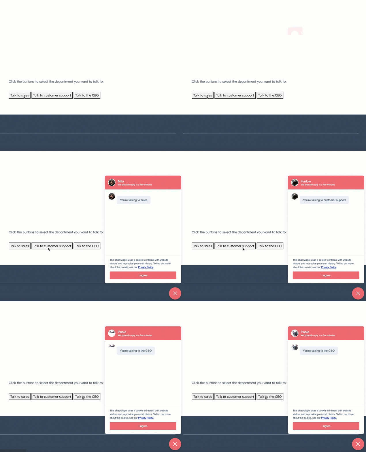For example, you could add the following code to your pages to generate the buttons:
```html theme={null}
Talk to sales
Talk to customer support
Talk to the CEO
```
Then, in each chat's [target settings](https://knowledge.hubspot.com/chatflows/create-a-live-chat#2-target---decide-where-the-live-chat-should-appear), you would set the chat to display when the query parameter matches the one you've set in your button code. 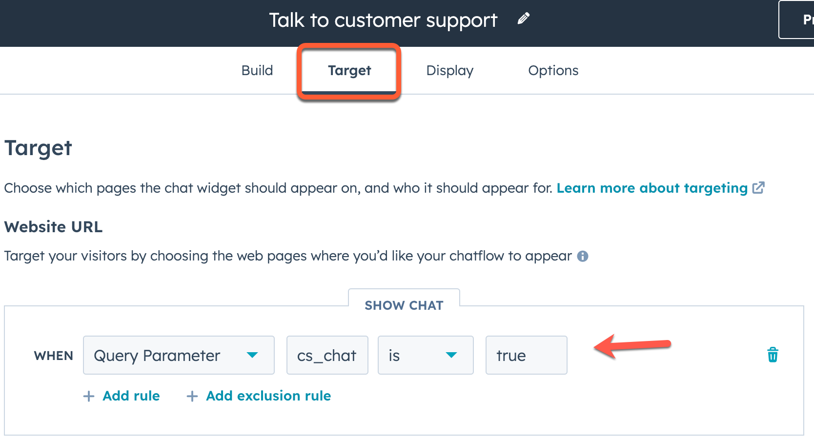
### widget.open
The `widget.open` method opens the widget if it is not already open or isn't currently loaded.
```js theme={null}
window.HubSpotConversations.widget.open();
```
### widget.close
The `widget.close` method closes the widget if it isn't already closed.
```js theme={null}
window.HubSpotConversations.widget.close();
```
### widget.remove
The `widget.remove` method removes the widget from the page. If the widget isn't present on the page, this method does nothing. The widget will display again on page refresh or if `widget.load` is invoked.
```js theme={null}
window.HubSpotConversations.widget.remove();
```
### widget.status
The `widget.status` method returns an object containing properties related to the current status of the widget.
```js theme={null}
const status = window.HubSpotConversations.widget.status();
if (status.loaded) {
window.HubSpotConversations.widget.refresh();
} else {
window.HubSpotConversations.widget.load();
}
```
| Field | Type | Default | Description |
| -------- | ------- | ------- | ------------------------------------- |
| `loaded` | Boolean | `false` | Whether the widget iframe has loaded. |
## Clear chat cookies
The `clear` method deletes cookies related to the chat widget and returns it to its default state on subsequent load.
The chat widget creates several cookies to preserve its state across site visits and page refreshes. These cookies are scoped to the domain of the page hosting the widget, and are used to support the following features:
* Referencing historical conversations.
* Persisting the open state of the chat widget across page loads.
* Persisting the open state of the welcome message across page loads.
The following cookies are cleared with this method:
* `messagesUtk`
* `hs-messages-is-open`
* `hs-messages-hide-welcome-message`
For more information about these cookies, see [check out HubSpot's Knowledge Base](https://knowledge.hubspot.com/privacy-and-consent/what-cookies-does-hubspot-set-in-a-visitor-s-browser).
```js theme={null}
window.HubSpotConversations.clear();
```
Additionally, you can pass `{resetWidget:true}` to the `clear()` function to clear all chat related cookies, remove the widget from the page, and create a new instance of the chat widget.
```js theme={null}
window.HubSpotConversations.clear({ resetWidget: true });
```
## Chat events
The chat widget emits various events you can listen and respond to throughout its lifecycle. These events include:
* [conversationStarted](#conversationstarted)
* [conversationClosed](#conversationclosed)
* [userSelectedThread](#userselectedthread)
* [unreadConversationCountChanged](#unreadconversationcountchanged)
* [contactAssociated](#contactassociated)
* [userInteractedWithWidget](#userinteractedwithwidget)
* [widgetLoaded](#widgetloaded)
* [quickReplyButtonClick](#quickreplybuttonclick)
* [widgetClosed](#widgetclosed)
To register and remove event listeners, you'll use `on` and `off`, as shown below.
```js theme={null}
const handleEvent = eventPayload => console.log(eventPayload);
window.HubSpotConversations.on("conversationStarted", handleEvent);
/* ... */
window.HubSpotConversations.off("conversationStarted", handleEvent);
```
Learn more about each event below.
### conversationStarted
The `conversationStarted` event triggers when a new conversation has been successfully started.
```js theme={null}
window.HubSpotConversations.on("conversationStarted", payload => {
console.log(`Started conversation with id ${payload.conversation.conversationId}`);
});
```
| Field | Type | Description |
| ------------------------------------- | ------ | ---------------------------------------------------------------------------------------------------------------------------------------------------------------- |
| `payload.conversation.conversationId` | Number | The thread ID of the conversation that was started. You can use this ID when making calls to the [conversations API](/docs/api-reference/legacy/conversations/guide). |
### conversationClosed
The `conversationClosed` event triggers when a new conversation has [marked as closed](https://knowledge.hubspot.com/inbox/use-the-conversations-inbox#reply-and-comment:~:text=To%20mark%20the%20conversation%20as%20closed) from the conversations inbox.
Site visitors minimizing or closing the chat widget will not trigger this event. For that event, use [widgetClosed](#widgetclosed) instead.
```js theme={null}
window.HubSpotConversations.on("conversationClosed", payload => {
console.log(`Conversation with id ${payload.conversation.conversationId} has been closed!`);
});
```
| Field | Type | Description |
| ------------------------------------- | ------ | ---------------------------------------------------------------------------------------------------------------------------------------------------------------- |
| `payload.conversation.conversationId` | Number | The thread ID of the conversation that was started. You can use this ID when making calls to the [conversations API](/docs/api-reference/legacy/conversations/guide). |
### userSelectedThread
The `userSelectedThread` event triggers when creating a thread or selecting an existing thread.
```js theme={null}
window.HubSpotConversations.on("userSelectedThread", payload => {
console.log(`User selected thread with ID ${payload.conversation.conversationId}!`);
});
```
| Field | Type | Description |
| ------------------------------------- | ------ | ---------------------------------------------------------------------------------------------------------------------------------------------------------------- |
| `payload.conversation.conversationId` | Number | The thread ID of the conversation that was started. You can use this ID when making calls to the [conversations API](/docs/api-reference/legacy/conversations/guide). |
### unreadConversationCountChanged
The `unreadConversationCountChanged` event is triggered when the number of conversations with unread messages increases or decreases.
```js theme={null}
window.HubSpotConversations.on("unreadConversationCountChanged", payload => {
console.log(`New unread count is ${payload.unreadCount}!`);
});
```
| Field | Type | Description |
| ------------- | ------ | ------------------------------------------------------------------- |
| `unreadCount` | Number | The total number of conversations with at least one unread message. |
### contactAssociated
The `contactAssociated` event is triggered when the visitor is associated with a contact in the CRM.
```js theme={null}
window.HubSpotConversations.on("contactAssociated", payload => {
console.log(payload.message);
});
```
| Field | Type | Description |
| --------- | ------ | --------------------------------------------------------------------------- |
| `message` | String | A confirmation message that the visitor has been associated with a contact. |
### userInteractedWithWidget
The `userInteractedWithWidget` event is triggered when the visitor interacts with the widget, such as clicking to open the widget or closing the initial welcome message.
```js theme={null}
window.HubSpotConversations.on("userInteractedWithWidget", payload => {
console.log(payload.message);
});
```
| Field | Type | Description |
| --------- | ------ | ---------------------------------------------------------------------------- |
| `message` | String | A confirmation message that the visitor has been interacted with the widget. |
### widgetLoaded
The `widgetLoaded` event is triggered when the widget iframe is loaded.
```js theme={null}
window.HubSpotConversations.on("widgetLoaded", payload => {
console.log(payload.message);
});
```
| Field | Type | Description |
| --------- | ------ | --------------------------------------------------------- |
| `message` | String | A confirmation message that the widget iframe has loaded. |
### quickReplyButtonClick
The `quickReplyButtonClick` event is triggered when the visitor clicks a [quick reply](https://knowledge.hubspot.com/chatflows/a-guide-to-bot-actions#ask-a-question) in a bot conversation.
| Field | Type | Description |
| ------- | ----- | ------------------------------------------------------------------------ |
| `value` | Array | An array containing the text of the quick reply option that was clicked. |
```js theme={null}
window.HubSpotConversations.on("quickReplyButtonClick", event => {
console.log(`The text content of the clicked button is ${payload.value[0]}`);
});
```
In the example screenshot above, the bot chatflow contains three quick reply options. If the user selects *Learn more*, the resulting event payload would be:
```json theme={null}
// Example event payload when a quick reply option is selected
{
"name": "QUICK_REPLIES",
"multiSelect": false,
"value": ["Learn more"]
}
```
### widgetClosed
The `widgetClosed` event is triggered when the visitor closes the chat widget.
```js theme={null}
window.HubSpotConversations.on("widgetClosed", event => {
console.log(event);
});
```
| Field | Type | Description |
| --------- | ------ | ------------------------------------------------------------------- |
| `message` | String | A confirmation message that the visitor has closed the chat widget. |
# Integrate the HubSpot mobile chat SDK into your Android app
Source: https://developers.hubspot.com/docs/api-reference/latest/conversations/chat-configuration/mobile-chat-sdk/android
Use the HubSpot mobile chat SDK to integrate your Android mobile application with HubSpot's live chat functionality.
You can use the HubSpot mobile chat SDK to integrate your Android mobile application with HubSpot's live chat functionality.
The mobile chat SDK allows you to:
* Integrate HubSpot chat into your mobile app to deliver real-time, in-app customer support.
* Leverage the [bot](https://knowledge.hubspot.com/chatflows/create-a-bot) and [knowledge base](https://knowledge.hubspot.com/knowledge-base/create-and-customize-knowledge-base-articles) tools to help deflect customer inquires when your support agents are unavailable.
* Alert users of new messages via push notifications.
* Customize the chat experience to align with your business's brand and UI.
## Set up and run the demo app
To set up the mobile chat SDK dependencies to your project:
* Add your `google-services.json` in the `app/` folder, and ensure that the `package_name` field in the file is set to `com.example.demo`.
* Create your `hubspot-info.json` file in the `app/` folder. The full path of the file should be `app/src/main/assets/hubspot-info.json`.
* Add the HubSpot package to your build gradle file:
```hubl theme={null}
implementation "com.hubspot.mobilechatsdk:mobile-chat-sdk-android::LATEST_VERSION"
```
* [Sync](https://docs.gradle.org/current/dsl/org.gradle.api.tasks.Sync.html) your Android project with its gradle files.
* Build and run the app.
## Install and configure the SDK
The SDK needs to be configured once per app launch. The most convenient time to configure the SDK is during app initialization.
Start by getting an instance of the `HubSpotManager` class, then call the `configure` method
```hubl theme={null}
val manager = HubspotManager.getInstance(context)
manager.configure()
try! HubspotManager.configure()
return true
}
```
Failure to include the config file, or forgetting to include the file as being part of your apps target will cause initialization to throw an errors. The `HubspotConfigError` class represents different errors when missing properties.
## Open HubSpot chat view
The chat view can be opened by `HubspotWebActivity` which extends the `Activity` class. You can open it by using any of the following approaches:
* Directly calling `startActivity` via intent
* Create any button type, then within an `onClick` listener of that button, open the `HubspotWebActivity`.
* Add `HubspotFloatingActionButton` in the file which handle the clicks and open the `HubspotWebActivity` automatically.
For example, if you wanted to go with the second approach above and specify the behavior within an `onClick` listener of a button:
```hubl theme={null}
binding.anybutton.setOnClickListener {
startActivity(Intent(requireContext(), HubspotWebActivity::class.java))
}
```
## Identify users with the HubSpot visitor identification token
You can identify users by using the visitor identification API, detailed in [this article](/docs/api-reference/legacy/conversations/visitor-identification/guide). This API is best implemented in your own server project, where you can pass the identity token to your app based on whether suits your specific setup (i.e., passing a token in response to a visitor going through a login page as a result of a dedicated API that you own).
Once a token is generated, it can be associated with a contact's email address by calling `HubspotManager.setUserIdentity(email, identityToken)`. This should be called before opening a chat view.
## Add custom chat data properties
The SDK supports setting key-value pairs to keep track of data you might need to track while a chat session is open. You can set your own custom values, or declare common permission preferences such as photo or notification permissions.
Use the `HubspotManager.setChatProperties(key, value)` method and provide the associated key and value you want to set. This is best called before starting a chat, and will apply to all new chats. You could set an account status, or other identifiers when setting up your user. These will then appear in all chats opened for the remainder of the app launch.
For example, the following code would set permissions for camera, photo, notifications, and location data to `"false"`.
```hubl theme={null}
val keyValuePair = mapOf(
ChatPropertyKey.CameraPermissions.chatPropertyValue to "false",
ChatPropertyKey.PhotoPermissions.chatPropertyValue to "false",
ChatPropertyKey.NotificationPermissions.chatPropertyValue to "false",
ChatPropertyKey.LocationPermissions.chatPropertyValue to "false"
)
hubspotManager.setChatProperties(keyValuePair)
```
## Clear data on logout
The SDK stores in memory identification tokens, email address, and any properties set. The push token for the app is also associated with the current user, if applicable. You may want to clear this data when a user is logging out, or changing users in a multi user app. To clear this data, call `HubspotManager.logout()` at an appropriate time in your app.
Calling the `HubspotManager.logout()` only impacts the data used for future chat sessions. It has no impact on data or chat sessions already stored in HubSpot.
## Reference documentation
You can consult the [reference documentation](https://github.hubspot.com/mobile-chat-sdk-android/) for details on how to use each of the components in the HubSpot mobile SDK. The binary file is also hosted [here](https://search.maven.org/artifact/com.hubspot.mobilechatsdk/mobile-chat-sdk-android/1.0.0/jar).
# Integrate the HubSpot mobile chat SDK into your iOS app
Source: https://developers.hubspot.com/docs/api-reference/latest/conversations/chat-configuration/mobile-chat-sdk/ios
Use the HubSpot mobile chat SDK to integrate your iOS mobile application with HubSpot's live chat functionality.
You can use the HubSpot mobile chat SDK to integrate your iOS mobile application with HubSpot's live chat functionality.
The mobile chat SDK allows you to:
* Integrate HubSpot chat into your mobile app to deliver real-time, in-app customer support.
* Leverage the [bot](https://knowledge.hubspot.com/chatflows/create-a-bot) and [knowledge base](https://knowledge.hubspot.com/knowledge-base/create-and-customize-knowledge-base-articles) tools to help deflect customer inquires when your support agents are unavailable.
* Alert users of new messages via push notifications.
* Customize the chat experience to align with your business's brand and UI.

## Installation
To get start developing with the mobile chat SDK:
* Add the [GitHub repository URL](https://github.com/HubSpot/mobile-chat-sdk-ios) of the mobile chat SDK to your project using Swift Package Manager. From your project settings, select the **Package Dependencies** tab, then search for the [HubSpot mobile chat SDK GitHub URL](https://github.com/HubSpot/mobile-chat-sdk-ios) to add it to your project.
* To add your GitHub account directly in Xcode, navigate to **Xcode** > **Settings** in the top menu bar, then click **Account**. Click the **+ icon** to add your GitHub account.
* If you're developing your app using a CLI tool like `xcodebuild`, you may need to specify the `-scmProvider system` or `-scmProvider xcode` arguments to choose whether your system git credentials or xcode credentials are used.
## Configuration
After you've added the mobile SDK to your project using the Swift Package Manager, include your `HubSpot-Info.plist config` file in your project, then mark it as included in the app target.
During app startup, or in another suitable location in your app's code where you initialize your app components, call the configure method on the SDK.
```hubl theme={null}
func application(_ application: UIApplication, didFinishLaunchingWithOptions launchOptions: [UIApplication.LaunchOptionsKey: Any]?) -> Bool {
// Override point for customization after application launch.
// This will configure the SDK using the `Hubspot-Info.plist` file that is bundled in app
try! HubspotManager.configure()
return true
}
```
## Open HubSpot Chat View
You can present the chat view modally as a [sheet](https://developer.apple.com/design/human-interface-guidelines/sheets), as a fullscreen view, or pushed into a navigation stack. The simplest way to get started is to present the chat as a sheet in response to a button press in the UI of your app.
The chat view can be initialized using the `HubSpotChatView.init(manager:pushData:chatFlow:)` method, using either default values or with customized chat settings.
### Show the chat view as a sheet in SwiftUI
The chat view is a SwiftUI View, meaning it can be the contents of a [sheet](https://developer.apple.com/design/human-interface-guidelines/sheets), or embedded in your existing UI like any other view. You can present it as a sheet using the `.sheet` modifier, in response to a user action such as tapping a button.
```hubl theme={null}
Button(action: {
showChat.toggle()
}, label: {
Text("Chat Now")
}).sheet(isPresented: $showChat, content: {
HubspotChatView(chatFlow: "support")
})
```
In the example above, `$showChat` is a state property in the view:
```hubl theme={null}
@State var showChat = false
```
### Show the chat as a presented view controller in UIKit
Although the HubSpot Chat View is a SwiftUI view, it will also work when contained in a `UIHostingController`. For example, you can present the chat view from a UIViewController button action.
```hubl theme={null}
@IBAction
func onButtonPress(_ source: Any) {
//Init chat view with no arguments , or use alternative initialiser for configuring chat specifics
let chatView = HubspotChatView()
//Create a hosting controller to hold the chat view
let hostingVC = UIHostingController(rootView: chatView)
// Present the view controller like any other (or push into a navigation stack)
self.present(hostingVC, animated: true)
}
```
## Identify users with the HubSpot visitor identification token
You can identify users by using the visitor identification API, detailed in [this article](/docs/api-reference/legacy/conversations/visitor-identification/guide). This API is best implemented in your own server project, where you can pass the identity token to your app based on whether suits your specific setup (i.e., passing a token in response to a visitor going through a login page as a result of a dedicated API that you own).
Once a token is generated, it can associated with a contact's email address by calling `HubspotManager/setUserIdentity(identityToken:email:)`. This should be called before opening a chat view.
## Add custom chat data properties
The SDK supports setting key-value pairs to keep track of data you might need to track while a chat session is open. You can set your own custom values, or declare common permission preferences such as photo or notification permissions.
Use the `HubspotManager/setChatProperties(data:)` method and provide the associated key and value you want to set. This is best called before starting a chat, and will apply to all new chats. You could set an account status, or other identifiers when setting up your user. These will then appear in all chats opened for the remainder of the app launch.
For example, the following code would set several pre-defined permissions and custom properties:
```hubl theme={null}
var properties: [String: String] = [
ChatPropertyKey.cameraPermissions.rawValue: self.checkCameraPermissions(),
"myapp-install-id": appUniqueId,
"subscription-tier": "premium"
]
HubspotManager.shared.setChatProperties(data: properties)
```
## Clearing data on logout
The SDK stores in memory identification tokens, email address, and any properties set. The push token for the app is also associated with the current user, if applicable. You may want to clear this data when a user is logging out, or changing users in a multi user app. To clear this data, call `HubspotManager/clearUserData()` at an appropriate time in your app.
Calling the `HubspotManager/clearUserData()` only impacts the data used for future chat sessions. It has no impact on data or chat sessions already stored in HubSpot.
## Reference documentation
You can consult the [reference documentation](https://github.hubspot.com/mobile-chat-sdk-ios/documentation/hubspotmobilesdk/) for details on how to use each of the components in the HubSpot mobile SDK.
# Running code snippets in bots
Source: https://developers.hubspot.com/docs/api-reference/latest/conversations/chat-configuration/working-with-chatbots
Learn how to configure code snippets in a bot action for a chatflow.
**Please note:** it's highly recommended you use the v24 runtime of Node.js for security purposes. Both previous versions (v20 and v18) will no longer be supported starting August 31, 2026.
`message`: A string that represents the last message sent to your bot. `quickReply`: A nested object that contains a `quickReplies` array if the visitor selected any quick reply options. Each entry in the array contains an object with two fields: `value`: The actual value of the quick reply (e.g., `"yes_option"`) `label`: The text that appears on the quick reply button (e.g., "Yes"). `vid`: The contact VID of the visitor, expressed as a number, if known. `properties`: A list of properties collected by the bot in the current session, such as the `firstname` and `lastname` of the contact. `value`: The actual value of the quick reply (e.g., `"yes_option"`) `label`: The text that appears on the quick reply button (e.g., "Yes").
# Get accounts for a channel
Source: https://developers.hubspot.com/docs/api-reference/latest/conversations/custom-channels/channel-accounts/get-custom-channels
specs/2026-03/conversations-custom-channels-v2026-03.json GET /conversations/custom-channels/2026-03/{channelId}/channel-accounts
Retrieve a list of accounts for a custom channel.
# Update a channel account staging token
Source: https://developers.hubspot.com/docs/api-reference/latest/conversations/custom-channels/channel-accounts/update-custom-channel
specs/2026-03/conversations-custom-channels-v2026-03.json PATCH /conversations/custom-channels/2026-03/{channelId}/channel-account-staging-tokens/{accountToken}
Update a channel account staging token's account name and delivery identifier. This information will be applied to the channel account created from this staging token. This is used for public apps.
# Update a channel account
Source: https://developers.hubspot.com/docs/api-reference/latest/conversations/custom-channels/channel-accounts/update-custom-channel-channelAccountId
specs/2026-03/conversations-custom-channels-v2026-03.json PATCH /conversations/custom-channels/2026-03/{channelId}/channel-accounts/{channelAccountId}
This API is used to update the name of the channel account and it's isAuthorized status. Setting to isAuthorized flag to False disables the channel account.
# POST /conversations/custom-channels/2026-03
Source: https://developers.hubspot.com/docs/api-reference/latest/conversations/custom-channels/channels/create-custom-channel
specs/2026-03/conversations-custom-channels-v2026-03.json POST /conversations/custom-channels/2026-03
# Archive a custom channel
Source: https://developers.hubspot.com/docs/api-reference/latest/conversations/custom-channels/channels/delete-custom-channel
specs/2026-03/conversations-custom-channels-v2026-03.json DELETE /conversations/custom-channels/2026-03/{channelId}
Archive an existing registered custom channel
# Get a custom channel
Source: https://developers.hubspot.com/docs/api-reference/latest/conversations/custom-channels/channels/get-custom-channel
specs/2026-03/conversations-custom-channels-v2026-03.json GET /conversations/custom-channels/2026-03/{channelId}
Retrieve the details about a custom channel. This API allows you to see a custom channel's current capabilties and other configuration metadata
# Get a channel account by id
Source: https://developers.hubspot.com/docs/api-reference/latest/conversations/custom-channels/channels/get-custom-channel-channelAccountId
specs/2026-03/conversations-custom-channels-v2026-03.json GET /conversations/custom-channels/2026-03/{channelId}/channel-accounts/{channelAccountId}
Retrieve the details for a specific channel account. This contains all the metadata about your channel account, including its channel, associated inbox id, and delivery identifier information.
# GET /conversations/custom-channels/2026-03
Source: https://developers.hubspot.com/docs/api-reference/latest/conversations/custom-channels/channels/get-custom-channels
specs/2026-03/conversations-custom-channels-v2026-03.json GET /conversations/custom-channels/2026-03
# Update a custom channel
Source: https://developers.hubspot.com/docs/api-reference/latest/conversations/custom-channels/channels/update-custom-channel
specs/2026-03/conversations-custom-channels-v2026-03.json PATCH /conversations/custom-channels/2026-03/{channelId}
Update the capabilities for an existing. You can also use it to update the channel's webhookUri and its channelAccountConnectionRedirectUrl.
# Custom channels API guide (2026-03)
Source: https://developers.hubspot.com/docs/api-reference/latest/conversations/custom-channels/guide
Learn how to use the latest custom channel API for the conversations inbox and help desk.
You can create custom channels to build a bridge between an external message service and HubSpot's [inbox](https://knowledge.hubspot.com/inbox/set-up-the-conversations-inbox) or [help desk](https://knowledge.hubspot.com/help-desk/overview-of-the-help-desk-workspace) features. You can then publish your custom channel app in the HubSpot Marketplace for other HubSpot admins to install and use in their own accounts.
You'll need to [create an app](/docs/apps/developer-platform/build-apps/create-an-app) if you want to define and register custom channels. The custom channel endpoints are **not** supported when building a legacy private app.
## Create an app
To get started, you'll need to create an app that you'll use to register your custom channel with HubSpot, then handle incoming and outgoing messages to an inbox.
You can follow the instructions in [this article](/docs/apps/developer-platform/build-apps/create-an-app) to create a new app. When configuring the scopes for your app, ensure that your app requests the following scopes:
* `conversations.custom_channels.read`: this scope allows you to access to read messages and threads that your custom channel has already published to HubSpot.
* `conversations.custom_channels.write`: this scope allows you to publish messages to HubSpot.
* `conversations.read`: this scope allows you to retrieve a list of conversation inboxes in an account using the [Conversations API](/docs/api-reference/legacy/conversations/guide#inboxes), so that you can connect channel accounts to specific inboxes.
* `crm.objects.contacts.write`: allows you to create contacts automatically from the conversations inbox or help desk, once they provide their email address and you have the *Email capture* [setting](https://knowledge.hubspot.com/inbox/create-contacts-in-your-conversations-inbox#create-contacts-with-the-email-capture-setting) turned on.
Once you've created your app, take note of the following app details that you'll use to identify your app when making requests to the Custom Channels API endpoints.
* App ID
* Client ID
* Client secret
## Register your custom channel in HubSpot
After creating your app, you can create your custom channel in HubSpot, using your HubSpot [developer API key](/docs/apps/developer-platform/build-apps/manage-apps-in-hubspot#developer-api-keys), and the app ID of the app you just created.
To register your channel, make a `POST` request to `https://api.hubapi.com/conversations/2026-03/custom-channels?hapikey={YOUR_DEVELOPER_API_KEY}&appId={appId}`. In the body of your request, you'll specify the configuration and capabilities for your channel:
* Specify the user-facing channel name as the value for the `name` field.
* Provide a channel schema that includes an object that details the channel capabilities as the value for the `capabilities` field.
* Certain fields are optional and can be updated later using a `PATCH` request:
* You can also specify a `webhookUrl` for handling webhook events (e.g., handling [updates to channel accounts](#handling-updates-to-channel-accounts)).
* You can include a `channelDescription` and `channelLogoUrl` that will appear in the setup flow for your channel.
* Specify a redirect URL that users will be sent to after completing your setup flow with the `channelAccountConnectionRedirectUrl` field.
For example, the following request body provides an example channel schema with a set of basic channel capabilities:
```json theme={null}
{
"name": "My new custom channel",
"webhookUrl": "https://example.com/handle-new-outgoing-message-notification",
"capabilities": {
"deliveryIdentifierTypes": [],
"richText": ["HYPERLINK", "TEXT_ALIGNMENT", "BLOCKQUOTE"],
"allowInlineImages": false,
"allowOutgoingMessages": true,
"outgoingAttachmentTypes": ["FILE"],
"allowedFileAttachmentMimeTypes": ["image/png"],
"maxFileAttachmentCount": 1,
"maxFileAttachmentSizeBytes": 1500000,
"maxTotalFileAttachmentSizeBytes": 1500000,
"threadingModel": "INTEGRATION_THREAD_ID"
},
"channelAccountConnectionRedirectUrl": "https://example.com/path-back-to-your-connection-flow",
"channelDescription": "Respond to prioritized messages via our custom channel",
"channelLogoUrl": "https://example.com/logo.png"
}
```
### Channel schema
The table below outlines each of the available parameters for the channel schema in the request body.
| Parameter | Type | Description |
| ------------------------------------- | ------ | ----------------------------------------------------------------------------------------------------------------------------------------------------------------------------------------------------------------------------------------------------------------------------------------------------------------------------------------------------- |
| `name` | String | The name of your channel, which will appear to users who install your app. |
| `webhookUrl` | String | A valid URL where HubSpot will send webhook notifications of outgoing messages that should be sent using your channel. This field is not required when initially registering the channel. |
| `capabilities` | Object | An object that specifies that the messaging content and recipient capabilities of your channel. Consult the table below for all supported fields for this object. |
| `channelAccountConnectionRedirectUrl` | String | If you're [creating a connection setup flow for your custom channel](#creating-a-connection-setup-flow-for-your-custom-channel), this is the URL that HubSpot will point to when users click the option to install your app in the inbox or help desk connection setup in HubSpot. This field is not required when initially registering the channel. |
| `channelDescription` | String | A string that will provide context under the channel when connecting it to HubSpot. This field is not required when initially registering the channel. See the [section below](#creating-a-connection-setup-flow-for-your-custom-channel) on defining a setup flow for your custom channel. |
| `channelLogoUrl` | String | A URL that points to a logo that appear for your channel when connecting it to HubSpot. This field is not required when initially registering the channel. See the [section below](#creating-a-connection-setup-flow-for-your-custom-channel) on defining a setup flow for your custom channel. |
### Channel capabilities
The table below outlines all available fields you can specify for the `capabilities` field of your channel.
| Parameter | Type | Description | Default |
| --------------------------------- | ------- | --------------------------------------------------------------------------------------------------------------------------------------------------------------------------------------------------------------------------------------------------------------------------------------------------------------------------------------------------------------------------- | ---------------------------------- |
| `deliveryIdentifierTypes` | Array | A required array that specifies the identifier types your channel supports for its senders and recipients. Consult the delivery identifier types table below for more info. | `[]` |
| `richText` | Array | An optional array of supported rich text elements presented as options in HubSpot's message composer. Available values are `"BLOCKQUOTE"`, `"BOLD"`, `"FONT_SIZE"`, `"FONT_STYLE"`, `"HYPERLINK"`, `"ITALIC"`, `"LISTS"`, `"TEXT_ALIGNMENT"`, `"TEXT_HIGHLIGHT_COLOR"`, `"TEXT_COLOR"`, and/or `"UNDERLINE"`. If left unspecified, no rich text elements will be supported. | `[]` |
| `allowInlineImages` | Boolean | Whether your channel allows inline images to be included in the message body. If set to `true`, HubSpot's message composer will present an *Insert image* option. | `false` |
| `allowOutgoingMessages` | Boolean | Whether your channel allows outgoing messages. You can set this field to `false` if you want your channel to be an "intake-only" message source. | `true` |
| `outgoingAttachmentTypes` | Array | The types of attachments your channel supports (valid values are `"FILE"` and `"QUICK_REPLIES"`). | `[]` |
| `allowedFileAttachmentMimeTypes` | Array | The file MIME types that your channel supports for file attachments, if any. This defaults to a fairly permissive list of common text, image, audio, video, and archive files. | `["image/png", "text/plain", ...]` |
| `maxFileAttachmentCount` | Integer | The maximum number of file attachments permitted for a single message. | `0` |
| `maxFileAttachmentSizeBytes` | Integer | The maximum individual file size permitted for a single attachment on a message, in bytes. | `0` |
| `maxTotalFileAttachmentSizeBytes` | Integer | The maximum cumulative file size permitted for all attachments combined for a single message, in bytes. | `0` |
| `threadingModel` | String | An enumeration denoting which threading model to use for messages. Values are: `INTEGRATION_THREAD_ID` and `DELIVERY_IDENTIFIER`. See the section below for more information. | `INTEGRATION_THREAD_ID` |
### Specifying a threading model
By default, the threading model of your custom channel is set to `INTEGRATION_THREAD_ID`, where you're required to include an `integrationThreadId` in every `POST` [message request](#incoming-message-schema). This ID will always be returned in the `channelIntegrationThreadIds` property of the `OUTGOING_CHANNEL_MESSAGE_CREATED` [webhook event](#handling-outgoing-messages-sent-from-hubspot).
You can optionally set your threading model to `DELIVERY_IDENTIFIER`, which is a good fit when there is only ever one open conversation between parties. If you set the `threadingModel` to this value within the `capabilities` [object](#channel-capabilities) of your channel, you should *not* include an `integrationThreadId` in any of your `POST` [message requests](#incoming-message-schema), because HubSpot will generate and manage its own `threadIds` based on the following rules:
* A set of `deliveryIdentifiers` (e.g., email address, phone numbers, or other identifiers in the sender and/or recipients array of a message) may have a maximum of one active thread between these delivery identifiers at once.
* Archived threads between that same set of participants are ignored.
* Outgoing messages can only be published on open threads, and there can only be one thread between a specific set of participants at a time.
* Incoming messages can only be published to the same `threadId` if either of the following conditions are met:
* The thread is already open.
* The thread was closed with the latest message activity occurring less than 24 hours ago, in which case the published incoming message will re-open the thread.
* The `channelIntegrationThreadIds` property within the payload of the `OUTGOING_CHANNEL_MESSAGE_CREATED` [webhook event](#handling-outgoing-messages-sent-from-hubspot) will contain the value of the `threadId` that HubSpot created.
### Delivery identifiers
The `deliveryIdentifierTypes` field specified within the `channelCapabilities` of your channel specifies an array of delivery identifiers.
A delivery identifier is an object that includes a `type` and `value`, that describes sender or recipient delivery details:
| Parameter | Type | Description |
| --------- | ------ | -------------------------------------------------------------------------------------------------------------------------------------------------------------------------------------------------------------------------------------------------------------------------------------------------------------------------------------------------------------------------------------------------------------------------------------------------------------------------------------------------------------------------------------------------------------------------------------------------------------------------------------------------------------------------------------------------------------------------------- |
| `type` | String | The format for an identifier of the sender or recipient. Much like a postal mail address, this identifier provides a well-defined format for sending or receiving messages to/from the individual contact. The following types are available:`HS_EMAIL_ADDRESS`: identifier value must have a valid email address. `HS_PHONE_NUMBER`: identifier value must be a valid phone number, based on the logic in libphonenumber. `CHANNEL_SPECIFIC_OPAQUE_ID`: identifier value does not require any format validation to be performed, except to check it isn't blank. This option is intended for use in channels with their own concept of "addresses" (e.g., usernames, UUIDs, or chat handles). `value`: a string that provides the text content of the reply, or the URL to visit when the option is clicked. `label`: an optional string that will appear instead of the raw `value` when presenting the option to the user. `valueType`: whether to treat the option as a hyperlink (with the value as the URL and the label as text) or as plaintext (in which case the `label` is used as the option text).
# Get a message
Source: https://developers.hubspot.com/docs/api-reference/latest/conversations/custom-channels/messages/get-custom-channel
specs/2026-03/conversations-custom-channels-v2026-03.json GET /conversations/custom-channels/2026-03/{channelId}/messages/{messageId}
Get the details for a specific message sent over a custom channel
# Update a message
Source: https://developers.hubspot.com/docs/api-reference/latest/conversations/custom-channels/messages/update-custom-channel
specs/2026-03/conversations-custom-channels-v2026-03.json PATCH /conversations/custom-channels/2026-03/{channelId}/messages/{messageId}
Update a message's status to indicate if it was successfully sent, failed to send, or was read. For failed messages, this can also include the error message for the failure.
# Conversations
Source: https://developers.hubspot.com/docs/api-reference/latest/conversations/guide
Integrate with HubSpot's conversations inbox using client SDKs or REST APIs.
HubSpot's conversations tools let you embed live chat in your website or mobile app, and programmatically read and manage inbox data. Depending on your use case, you can work with a client-side SDK or a REST API.
## SDKs
The SDKs provide client-side control over the live chat experience. They don't require REST API calls. Instead, you load the SDK in your app and interact with the chat widget or mobile chat interface directly.
* [Chat widget SDK](/docs/api-reference/latest/conversations/chat-configuration/chat-widget-sdk): customize and control the HubSpot live chat widget on your website. Use this to open or close the widget, identify visitors, listen for events, and more.
* [Android mobile SDK](/docs/api-reference/latest/conversations/chat-configuration/mobile-chat-sdk/android): embed HubSpot live chat into your Android app.
* [iOS mobile SDK](/docs/api-reference/latest/conversations/chat-configuration/mobile-chat-sdk/ios): embed HubSpot live chat into your iOS app.
## REST APIs
The conversations REST APIs let you read and manage inbox data: inboxes, channels, threads, messages, and actors.
### Beta API (2026-09)
The [2026-09-beta conversations API](/docs/api-reference/2026-09-beta/conversations/conversations) is the current recommended version for new integrations. It includes endpoints for actors, channel accounts, channels, inboxes, messages, and threads.
### Latest API (2026-03)
The latest conversations API includes endpoints for integrating custom messaging channels and identifying authenticated visitors:
* [Custom channels](/docs/api-reference/latest/conversations/custom-channels/guide): integrate your own messaging channels into the HubSpot inbox. Includes endpoints for managing channels, channel accounts, and messages.
* [Visitor identification](/docs/api-reference/latest/conversations/visitor-identification/create-visitor-identification): generate tokens to identify authenticated visitors in the chat widget.
### Legacy API
The [legacy conversations API](/docs/api-reference/legacy/conversations/guide) is the previous version of the REST API.
# Generate visitor token
Source: https://developers.hubspot.com/docs/api-reference/latest/conversations/visitor-identification/create-visitor-identification
specs/2026-03/conversations-visitor-identification-v2026-03.json POST /visitor-identification/2026-03/tokens/create
Generate an identification token for a website visitor who has been authenticated using your own system. An identification token returned from this API can be used to pass information about your already-authenticated visitor to the chat widget, so that it treats the visitor as a known contact. This allows support agents to recognize and assist the visitor more effectively.
# Create calls
Source: https://developers.hubspot.com/docs/api-reference/latest/crm/activities/calls/batch/create-calls
specs/2026-03/crm-calls-v2026-03.json POST /crm/objects/2026-03/{objectType}/batch/create
# Archive calls
Source: https://developers.hubspot.com/docs/api-reference/latest/crm/activities/calls/batch/delete-calls
specs/2026-03/crm-calls-v2026-03.json POST /crm/objects/2026-03/{objectType}/batch/archive
# Retrieve calls
Source: https://developers.hubspot.com/docs/api-reference/latest/crm/activities/calls/batch/get-calls
specs/2026-03/crm-calls-v2026-03.json POST /crm/objects/2026-03/{objectType}/batch/read
# Update calls
Source: https://developers.hubspot.com/docs/api-reference/latest/crm/activities/calls/batch/update-calls
specs/2026-03/crm-calls-v2026-03.json POST /crm/objects/2026-03/{objectType}/batch/update
# Upsert calls
Source: https://developers.hubspot.com/docs/api-reference/latest/crm/activities/calls/batch/upsert-calls
specs/2026-03/crm-calls-v2026-03.json POST /crm/objects/2026-03/{objectType}/batch/upsert
# Create a call
Source: https://developers.hubspot.com/docs/api-reference/latest/crm/activities/calls/create-call
specs/2026-03/crm-calls-v2026-03.json POST /crm/objects/2026-03/{objectType}
# Archive a call
Source: https://developers.hubspot.com/docs/api-reference/latest/crm/activities/calls/delete-call
specs/2026-03/crm-calls-v2026-03.json DELETE /crm/objects/2026-03/{objectType}/{objectId}
# Retrieve a call
Source: https://developers.hubspot.com/docs/api-reference/latest/crm/activities/calls/get-call
specs/2026-03/crm-calls-v2026-03.json GET /crm/objects/2026-03/{objectType}/{objectId}
# Retrieve calls
Source: https://developers.hubspot.com/docs/api-reference/latest/crm/activities/calls/get-calls
specs/2026-03/crm-calls-v2026-03.json GET /crm/objects/2026-03/{objectType}
# Calls API
Source: https://developers.hubspot.com/docs/api-reference/latest/crm/activities/calls/guide
Use the calls engagement API to log and manage calls on CRM records.
Use the calls engagement API to log and manage calls on CRM records and on the [calls index page](https://knowledge.hubspot.com/records/view-and-filter-records). You can log calls either [in HubSpot](https://knowledge.hubspot.com/records/manually-log-activities-on-records) or through the calls API. Below, learn the basic methods of managing calls through the API.
## Create a call engagement
To create a call engagement, make a `POST` request to `/crm/objects/2026-03/calls`.
In the request body, add call details in a **properties** object. You can also add an **associations** object to associate your new call with an existing record (e.g.,contacts, companies).
### Properties
Below is a list of HubSpot default calling properties that you can include in the properties object. You can also create custom properties using the [properties API](/docs/api-reference/latest/crm/properties/guide).
| Field | Description |
| ---------------------------- | ---------------------------------------------------------------------------------------------------------------------------------------------------------------------------------------------------------------------------------------------------------------------------------------------------------------------------------------------------------------------------------------------------------------------------------------------------------------------------------------------------------------------------------------------------------------------------------------------------------------------------------------------------------------------------------------------------------------------------------------------------------------------------------------------------------------------------------- |
| `hs_timestamp` | Required. This field marks the call's time of creation and determines where the call sits on the record timeline. You can use either a Unix timestamp in milliseconds or UTC format. |
| `hs_call_body` | The description of the call, including any notes that you want to add. |
| `hs_call_callee_object_id` | The ID of the HubSpot record associated with the call. This will be the recipient of the call for `OUTBOUND` calls, or the dialer of the call for `INBOUND` calls. |
| `hs_call_callee_object_type` | The type of the object to which the call's associated record belongs (e.g., specifies if the record is a contact or company). This will be the object of the recipient for `OUTBOUND`calls, or the object of the dialer for `INBOUND` calls. |
| `hs_call_direction` | The direction of the call from the perspective of the HubSpot user. If the user is the call recipient, the direction should be set to `INBOUND`. If the user initiated the call, the direction should be set to `OUTBOUND`. |
| `hs_call_disposition` | The outcome of the call. To set the call disposition, you need to use the internal GUID value. If your account has set up [custom call outcomes](https://knowledge.hubspot.com/calling/create-custom-call-and-meeting-outcomes), you can find their disposition GUIDs using [this API](/docs/api-reference/latest/crm/objects/communications/guide#get-call-engagement-dispositions). The default HubSpot outcome labels and their internal values are:Busy: `9d9162e7-6cf3-4944-bf63-4dff82258764` Connected: `f240bbac-87c9-4f6e-bf70-924b57d47db7` Left live message: `a4c4c377-d246-4b32-a13b-75a56a4cd0ff` Left voicemail: `b2cf5968-551e-4856-9783-52b3da59a7d0` No answer: `73a0d17f-1163-4015-bdd5-ec830791da20` Wrong number: `17b47fee-58de-441e-a44c-c6300d46f273`
# Update a call
Source: https://developers.hubspot.com/docs/api-reference/latest/crm/activities/calls/update-call
specs/2026-03/crm-calls-v2026-03.json PATCH /crm/objects/2026-03/{objectType}/{objectId}
# Create emails
Source: https://developers.hubspot.com/docs/api-reference/latest/crm/activities/emails/batch/create-emails
specs/2026-03/crm-emails-v2026-03.json POST /crm/objects/2026-03/{objectType}/batch/create
# Delete emails
Source: https://developers.hubspot.com/docs/api-reference/latest/crm/activities/emails/batch/delete-emails
specs/2026-03/crm-emails-v2026-03.json POST /crm/objects/2026-03/{objectType}/batch/archive
# Retrieve emails
Source: https://developers.hubspot.com/docs/api-reference/latest/crm/activities/emails/batch/get-emails
specs/2026-03/crm-emails-v2026-03.json POST /crm/objects/2026-03/{objectType}/batch/read
# Update emails
Source: https://developers.hubspot.com/docs/api-reference/latest/crm/activities/emails/batch/update-emails
specs/2026-03/crm-emails-v2026-03.json POST /crm/objects/2026-03/{objectType}/batch/update
# Upsert emails
Source: https://developers.hubspot.com/docs/api-reference/latest/crm/activities/emails/batch/upsert-emails
specs/2026-03/crm-emails-v2026-03.json POST /crm/objects/2026-03/{objectType}/batch/upsert
# Create an email
Source: https://developers.hubspot.com/docs/api-reference/latest/crm/activities/emails/create-email
specs/2026-03/crm-emails-v2026-03.json POST /crm/objects/2026-03/{objectType}
# Delete an email
Source: https://developers.hubspot.com/docs/api-reference/latest/crm/activities/emails/delete-email
specs/2026-03/crm-emails-v2026-03.json DELETE /crm/objects/2026-03/{objectType}/{objectId}
# Retrieve an email
Source: https://developers.hubspot.com/docs/api-reference/latest/crm/activities/emails/get-email
specs/2026-03/crm-emails-v2026-03.json GET /crm/objects/2026-03/{objectType}/{objectId}
# Retrieve emails
Source: https://developers.hubspot.com/docs/api-reference/latest/crm/activities/emails/get-emails
specs/2026-03/crm-emails-v2026-03.json GET /crm/objects/2026-03/{objectType}
# Emails API
Source: https://developers.hubspot.com/docs/api-reference/latest/crm/activities/emails/guide
Use the email engagement API to log and manage emails on CRM records.
Use the email engagement API to log and manage emails on CRM records. You can log email activities either [in HubSpot](https://knowledge.hubspot.com/records/manually-log-activities-on-records) or through the emails API.
## Create an email engagement
To create an email engagement, make a `POST` request to `/crm/objects/2026-03/emails`.
In the request body, add email details in a **properties** object. You can also add an **associations** object to associate your new email with an existing record (e.g., contacts, companies).
### Properties
In the properties object, you can include the following fields:
| Field | Description |
| -------------------- | ------------------------------------------------------------------------------------------------------------------------------------------------------------------------------------------------------------------------------------------------------------------------------------------------------------------------------------------------------------------------------------------------------------------------------------------------------------------------------------------------------- |
| `hs_timestamp` | Required. This field marks the email's time of creation and determines where the email sits on the record timeline. You can use either a Unix timestamp in milliseconds or UTC format. |
| `hubspot_owner_id` | The [ID of the owner](/docs/api-reference/latest/crm/owners/guide) associated with the email. This field determines the user listed as the email creator on the record timeline. |
| `hs_email_direction` | The direction the email was sent in. Possible values include:`EMAIL`: the email was sent from the CRM or sent and logged to the CRM with the [BCC address.](https://knowledge.hubspot.com/connected-email/log-email-in-your-crm-with-the-bcc-or-forwarding-address)`INCOMING_EMAIL`: the email was a reply to a logged outgoing email. `FORWARDED_EMAIL`: the email was [forwarded to the CRM.](https://knowledge.hubspot.com/connected-email/log-email-in-your-crm-with-the-bcc-or-forwarding-address) |
| `hs_email_html` | The body of an email if it is sent from a CRM record. |
| `hs_email_status` | The send status of the email. The value can be `BOUNCED`, `FAILED`, `SCHEDULED`, `SENDING`, or `SENT`. |
| `hs_email_subject` | The subject line of the logged email. |
| `hs_email_text` | The body of the email. |
| `hs_attachment_ids` | The IDs of the email's attachments. Multiple attachment IDs are separated by a semi-colon. |
| `hs_email_headers` | The email's headers. The value for this property will automatically populate certain read only email properties. Learn how to [set email headers.](/docs/api-reference/latest/crm/activities/emails/guide#set-email-headers) |
Learn more about batch creating email engagements by checking out the [reference documentation](/docs/api-reference/latest/crm/activities/emails/batch/create-emails).
### Read only properties
There are also some email properties that are read only, which are automatically populated by HubSpot. The properties in the table below are all automatically populated from the `hs_email_headers` value.
| Field | Description |
| ------------------------- | ---------------------------------------------- |
| `hs_email_from_email` | The email address of the email's sender. |
| `hs_email_from_firstname` | The email sender's first name. |
| `hs_email_from_lastname` | The email sender's last name. |
| `hs_email_to_email` | The email addresses of the email's recipients. |
| `hs_email_to_firstname` | The first names of the email's recipients. |
| `hs_email_to_lastname` | The last names of the email recipient. |
**Please note:**
When retrieving an email header, you may notice there are values both for `From` and `Sender`. These are often the same, but because `Sender` identifies what actually submitted an email, there are scenarios where the values may differ. For example, if an email is sent from an email alias, the `From` value will refer to the user's actual email address, and the `Sender` value will refer to the email alias.
### Set email headers
Since headers automatically populate the read only properties, you may want to manually set the email headers. To set the `hs_email_headers` value, you can use a JSON escaped string with the following data:
```json theme={null}
//Example data
{
"from": {
"email": "from@domain.com",
"firstName": "FromFirst",
"lastName": "FromLast"
},
"to": [
{
"email": "ToFirst ToLast",
"firstName": "ToFirst",
"lastName": "ToLast"
}
],
"cc": [],
"bcc": []
}
```
For example, your request to create an email may look like:
```json theme={null}
//Example request body
{
"properties": {
"hs_timestamp": "2019-10-30T03:30:17.883Z",
"hubspot_owner_id": "47550177",
"hs_email_direction": "EMAIL",
"hs_email_status": "SENT",
"hs_email_subject": "Let's talk",
"hs_email_text": "Thanks for your email",
"hs_email_headers": "{\"from\":{\"email\":\"from@domain.com\",\"firstName\":\"FromFirst\",\"lastName\":\"FromLast\"},\"sender\":{\"email\":\"sender@domain.com\",\"firstName\":\"SenderFirst\",\"lastName\":\"SenderLast\"},\"to\":[{\"email\":\"ToFirst+ToLast\",\"firstName\":\"ToFirst\",\"lastName\":\"ToLast\"}],\"cc\":[],\"bcc\":[]}"
}
}
```
### Associations
To create and associate an email with existing records, include an associations object in your request. For example, to create an email and associate it with a deal and a contact, your request body might look like the following:
```json theme={null}
// Example request body
{
"properties": {
"hs_timestamp": "2019-10-30T03:30:17.883Z",
"hubspot_owner_id": "11349275740",
"hs_email_direction": "EMAIL",
"hs_email_status": "SENT",
"hs_email_subject": "Let's talk",
"hs_email_text": "Thanks for your interest let's find a time to connect"
},
"associations": [
{
"to": {
"id": 601
},
"types": [
{
"associationCategory": "HUBSPOT_DEFINED",
"associationTypeId": 210
}
]
},
{
"to": {
"id": 602
},
"types": [
{
"associationCategory": "HUBSPOT_DEFINED",
"associationTypeId": 198
}
]
}
]
}
```
In the associations object, you should include the following:
| Field | Description |
| ------- | ------------------------------------------------------------------------------------------------------------------------------------------------------------------------------------------------------------------------------------------------------------------------------------------------------------------------------------------------------------------------------------------------------------------------------------------------------------------ |
| `to` | The record you want to associate with the email, specified by its unique `id` value. |
| `types` | The type of the association between the email and the record. Include the `associationCategory`and `associationTypeId`. Default association type IDs are listed [here](/docs/api-reference/latest/crm/associations/associate-records/guide#association-type-id-values), or you can retrieve the value for custom association types (i.e. labels) via the [associations API](/docs/api-reference/latest/crm/associations/associate-records/guide#retrieve-association-types). |
## Retrieve emails
You can retrieve emails individually or in bulk. Learn more about batch retrieval by checking out the [reference documentation](/docs/api-reference/latest/crm/activities/emails/batch/get-emails).
To retrieve an individual email by its email ID, make a `GET` request to `/crm/objects/2026-03/emails/{emailId}`. You can also include the following parameters in the request URL:
| Parameter | Description |
| -------------- | ----------------------------------------------------------------------------------------------------------------------------------------------------------------------------------------------------------------------------------------------------------------- |
| `properties` | A comma separated list of the properties to be returned. If a requested property isn't defined, it won't be included in the response. If a requested property is defined but an email doesn't have a value, it will be returned as `null`. |
| `associations` | A comma separated list of object types to retrieve associated IDs for. Any specified associations that don't exist will not be returned in the response. Learn more about the [associations API.](/docs/api-reference/latest/crm/associations/associate-records/guide) |
To request a list of all of emails, make a `GET` request to `/crm/objects/2026-03/emails`. You can include the following parameters in the request URL:
| Parameter | Description |
| ------------ | ----------------------------------------------------------------------------------------------------------------------------------------------------------------------------------------------------------------------------------------- |
| `limit` | The maximum number of results to display per page. |
| `properties` | A comma separated list of the properties to be returned.If a requested property isn't defined, it won't be included in the response. If a requested property is defined but an email doesn't have a value, it will be returned as `null`. |
## Update emails
You can update emails individually or in batches. To update an individual email by its email ID, make a `PATCH` request to `/crm/objects/2026-03/emails/{emailId}`.
In the request body, include the email properties that you want to update. For example, your request body might look similar to the following:
```json theme={null}
// Example request body
{
"properties": {
"hs_timestamp": "2019-10-30T03:30:17.883Z",
"hubspot_owner_id": "11349275740",
"hs_email_direction": "EMAIL",
"hs_email_status": "SENT",
"hs_email_subject": "Let's talk tomorrow",
"hs_email_text": "Thanks for your interest let's find a time to connect!"
}
}
```
HubSpot will ignore values for read-only and non-existent properties. To clear a property value, pass an empty string for the property in the request body.
Learn more about batch updating by checking out the [reference documentation](/docs/api-reference/latest/crm/activities/emails/batch/update-emails).
### Associate existing emails with records
To associate an email with records, such as a contact and its associated companies, make a `PUT` request to `/crm/objects/2026-03/emails/{emailId}/associations/{toObjectType}/{toObjectId}/{associationTypeId}`. The request URL contains the following fields:
| Field | Description |
| ------------------- | ---------------------------------------------------------------------------------------------------------------------------------------------------------------------------------------------------------------------------------------------------------------------------------------------------------- |
| `emailId` | The ID of the email. |
| `toObjectType` | The type of object that you want to associate the email with (e.g., contact or company) |
| `toObjectId` | The ID of the record that you want to associate the email with. |
| `associationTypeId` | A unique identifier to indicate the association type between the email and the other object. The ID can be represented numerically or in snake case (e.g., `email_to_contact`). You can retrieve the value through the [associations API](/docs/api-reference/latest/crm/associations/associate-records/guide). |
For example, your request URL might look similar to the following:
`https://api.hubspot.com/crm/objects/2026-03/emails/17691787884/associations/contact/104901/198`
### Remove an association
To remove an association between an email and a record, make a `DELETE` request to the same URL as above:
`/crm/objects/2026-03/emails/{emailId}/associations/{toObjectType}/{toObjectId}/{associationTypeId}`
## Pin an email on a record
You can [pin an email](https://knowledge.hubspot.com/records/pin-an-activity-on-a-record) on a record so it remains on the top of the record's timeline. The email must already be associated with the record prior to pinning, and you can only pin one activity per record. To pin an email, include the email's `id` in the `hs_pinned_engagement_id` field when creating or updating a record via the object APIs. Learn more about using the [companies,](/docs/api-reference/latest/crm/objects/companies/guide#pin-an-activity-on-a-company-record)[contacts](/docs/api-reference/latest/crm/objects/contacts/guide#pin-an-activity-on-a-contact-record), [deals](/docs/api-reference/latest/crm/objects/deals/guide#pin-an-activity-on-a-deal-record), [tickets](/docs/api-reference/latest/crm/objects/tickets/guide#pin-an-activity-on-a-ticket-record), and [custom objects](/docs/api-reference/latest/crm/objects/custom-objects/guide) APIs.
## Delete emails
When you delete an email, it is permanently deleted and cannot be restored. You can delete emails individually or in batches.
To delete an individual email by its email ID, make a `DELETE` request to `/crm/objects/2026-03/emails/{emailId}`.
Learn more about deleting emails by checking out the [reference documentation](/docs/api-reference/latest/crm/activities/emails/delete-email).
# Search for emails
Source: https://developers.hubspot.com/docs/api-reference/latest/crm/activities/emails/search/search-emails
specs/2026-03/crm-emails-v2026-03.json POST /crm/objects/2026-03/{objectType}/search
# Update an email
Source: https://developers.hubspot.com/docs/api-reference/latest/crm/activities/emails/update-email
specs/2026-03/crm-emails-v2026-03.json PATCH /crm/objects/2026-03/{objectType}/{objectId}
# Create meetings
Source: https://developers.hubspot.com/docs/api-reference/latest/crm/activities/meetings/batch/create-meetings
specs/2026-03/crm-meetings-v2026-03.json POST /crm/objects/2026-03/{objectType}/batch/create
# Retrieve meetings
Source: https://developers.hubspot.com/docs/api-reference/latest/crm/activities/meetings/batch/get-meetings
specs/2026-03/crm-meetings-v2026-03.json POST /crm/objects/2026-03/{objectType}/batch/read
# Create meeting
Source: https://developers.hubspot.com/docs/api-reference/latest/crm/activities/meetings/create-meeting
specs/2026-03/crm-meetings-v2026-03.json POST /crm/objects/2026-03/{objectType}
# Delete meeting
Source: https://developers.hubspot.com/docs/api-reference/latest/crm/activities/meetings/delete-meeting
specs/2026-03/crm-meetings-v2026-03.json DELETE /crm/objects/2026-03/{objectType}/{objectId}
# Retrieve meeting
Source: https://developers.hubspot.com/docs/api-reference/latest/crm/activities/meetings/get-meeting
specs/2026-03/crm-meetings-v2026-03.json GET /crm/objects/2026-03/{objectType}/{objectId}
# Retrieve meetings
Source: https://developers.hubspot.com/docs/api-reference/latest/crm/activities/meetings/get-meetings
specs/2026-03/crm-meetings-v2026-03.json GET /crm/objects/2026-03/{objectType}
# Meetings API
Source: https://developers.hubspot.com/docs/api-reference/latest/crm/activities/meetings/guide
Use the meetings engagement API to log and manage meetings on CRM records.
Use the meetings engagement API to log and manage meetings on CRM records. You can log meeting activities either [in HubSpot](https://knowledge.hubspot.com/records/manually-log-activities-on-records) or through the meetings API. You can retrieve, update, or delete meeting engagements that are manually logged on a record, scheduled using the [meetings tool](https://knowledge.hubspot.com/meetings-tool/use-meetings), or [scheduled using the Google Calendar or Office 365 calendar integration](https://knowledge.hubspot.com/meetings-tool/schedule-a-meeting-on-a-record).
## Create a meeting
To create a meeting engagement, make a `POST` request to `/crm/objects/2026-03/meetings`.
In the request body, add meeting details in a **properties** object. You can also add an **associations** object to associate your new meeting with an existing record (e.g., contacts, companies).
### Properties
In the properties object, you can include the following fields:
| Field | Description |
| --------------------------- | --------------------------------------------------------------------------------------------------------------------------------------------------------------------------------------------------------------------------------- |
| `hs_timestamp` | Required. This field marks the date and time that the meeting occurred. You can use either a Unix timestamp in milliseconds or UTC format. When the property value is missing, the value will default to `hs_meeting_start_time.` |
| `hs_meeting_title` | The title of the meeting. |
| `hubspot_owner_id` | The [ID of the owner](/docs/api-reference/latest/crm/owners/guide) associated with the meeting. This field determines the user listed as the meeting creator on the record timeline. |
| `hs_meeting_body` | The meeting description. |
| `hs_internal_meeting_notes` | The internal notes you take for your team during a meeting that are not included in the attendee meeting description. |
| `hs_meeting_external_url` | The external URL for the calendar event. For example, this could be a Google calendar link or a Microsoft Outlook calendar link. |
| `hs_meeting_location` | Where the meeting takes place. The value could be a physical address, a conference room, a videoconference link, or a phone number. This appears on the calendar invite on the attendee's calendar. |
| `hs_meeting_start_time` | The date and time when the meeting starts. The value for this property should match the value for `hs_timestamp`. |
| `hs_meeting_end_time` | The date and time when the meeting ends. |
| `hs_meeting_outcome` | The outcome of the meeting. The outcome values are scheduled, completed, rescheduled, no show, and canceled. |
| `hs_activity_type` | The type of meeting. The options are based on the [meeting types set in your HubSpot account.](https://knowledge.hubspot.com/meetings-tool/how-do-i-create-and-use-call-and-meeting-types) |
| `hs_attachment_ids` | The IDs of the meeting's attachments. Multiple attachment IDs are separated by a semi-colon. |
### Associations
To create and associate a meeting with existing records, include an associations object in your request. For example, to create and associate a meeting with contacts, your request may look similar to the following:
```json theme={null}
{
"properties": {
"hs_timestamp": "2021-03-23T01:02:44.872Z",
"hubspot_owner_id": "11349275740",
"hs_meeting_title": "Intro meeting",
"hs_meeting_body": "The first meeting to discuss options",
"hs_internal_meeting_notes": "These are the meeting notes",
"hs_meeting_external_url": "https://Zoom.com/0000",
"hs_meeting_location": "Remote",
"hs_meeting_start_time": "2021-03-23T01:02:44.872Z",
"hs_meeting_end_time": "2021-03-23T01:52:44.872Z",
"hs_meeting_outcome": "SCHEDULED"
},
"associations": [
{
"to": {
"id": 101
},
"types": [
{
"associationCategory": "HUBSPOT_DEFINED",
"associationTypeId": 200
}
]
},
{
"to": {
"id": 102
},
"types": [
{
"associationCategory": "HUBSPOT_DEFINED",
"associationTypeId": 200
}
]
}
]
}
```
The associations object should include:
| Field | Description |
| ------- | -------------------------------------------------------------------------------------------------------------------------------------------------------------------------------------------------------------------------------------------------------------------------------------------------------------------------------------------------------------------------------------------------------------------------------------------------------------------- |
| `to` | The record you want to associate with the meeting, specified by its unique `id` value. |
| `types` | The type of the association between the meeting and the record. Include the `associationCategory`and `associationTypeId`. Default association type IDs are listed [here](/docs/api-reference/latest/crm/associations/associate-records/guide#association-type-id-values), or you can retrieve the value for custom association types (i.e. labels) via the [associations API](/docs/api-reference/latest/crm/associations/associate-records/guide#retrieve-association-types). |
Learn more about batch creating meetings by checking out the [reference documentation](/docs/api-reference/latest/crm/activities/meetings/batch/create-meetings).
## Retrieve meetings
You can retrieve meetings individually or in bulk. Learn more about batch retrieval by checking out the [reference documentation](/docs/api-reference/latest/crm/activities/meetings/batch/get-meetings).
To retrieve an individual meeting by its meeting ID, make a `GET` request to `/crm/objects/2026-03/meetings/{meetingId}`. You can also include the following parameters in the request URL:
| Parameter | Description |
| -------------- | ------------------------------------------------------------------------------------------------------------------------------------------------------------------------------------------------------------------------------------------- |
| `properties` | A comma separated list of the properties to be returned. If a requested property isn't defined, it won't be included in the response. If a requested property is defined but a meeting doesn't have a value, it will be returned as `null`. |
| `associations` | A comma separated list of objects to you want to retrieve associated record IDs from. |
To request a list of all of meetings, make a `GET` request to `/crm/objects/2026-03/meetings`. You can include the following parameters in the request URL:
| Parameter | Description |
| ------------ | ------------------------------------------------------------------------------------------------------------------------------------------------------------------------------------------------------------------------------------------- |
| `limit` | The maximum number of results to display per page. |
| `properties` | A comma separated list of the properties to be returned. If a requested property isn't defined, it won't be included in the response. If a requested property is defined but a meeting doesn't have a value, it will be returned as `null`. |
## Update meetings
You can update meetings individually or in batches. To update an individual meeting by its meeting ID, make a `PATCH` request to `/crm/objects/2026-03/meetings/{meetingId}`.
In the request body, include the meeting properties that you want to update. For example, your request body might look similar to the following:
```json theme={null}
{
"properties": {
"hs_timestamp": "2019-10-30T03:30:17.883Z",
"hubspot_owner_id": "11349275740",
"hs_meeting_title": "Intro meeting",
"hs_meeting_body": "The first meeting to discuss options",
"hs_internal_meeting_notes": "These are the meeting notes",
"hs_meeting_external_url":
"https://Zoom.com/0000",
"hs_meeting_location": "Remote",
"hs_meeting_start_time": "2021-03-23T01:02:44.872Z",
"hs_meeting_end_time": "2021-03-23T01:52:44.872Z",
"hs_meeting_outcome": "SCHEDULED"
}
}'
```
HubSpot will ignore values for read-only and non-existent properties. To clear a property value, pass an empty string for the property in the request body.
Learn more about batch updating by checking out the [reference documentation](/docs/api-reference/latest/crm/activities/meetings/batch/update-meetings).
### Associate existing meetings with records
To associate a meeting with records, such as a contact and its associated companies, make a `PUT` request to `/crm/objects/2026-03/meetings/{meetingId}/associations/{toObjectType}/{toObjectId}/{associationTypeId}`. The request URL contains the following fields:
| Field | Description |
| ------------------- | --------------------------------------------------------------------------------------------------------------------------------------------------------------------------------------------------------- |
| `meetingId` | The ID of the meeting. |
| `toObjectType` | The type of object that you want to associate the meeting with (e.g., contact or company). |
| `toObjectId` | The ID of the record that you want to associate the meeting with. |
| `associationTypeId` | The ID of the association type between the meeting and the other object type. You can retrieve this value through the [associations API](/docs/api-reference/latest/crm/associations/associate-records/guide). |
For example, your request URL might look similar to the following:
`https://api.hubspot.com/crm/objects/2026-03/meetings/17612479134/associations/contact/104901/200`
### Remove an association
To remove an association between a meeting and a record, make a `DELETE` request to the same URL as above:
`/crm/objects/2026-03/meetings/{meetingId}/associations/{toObjectType}/{toObjectId}/{associationTypeId}`
## Pin a meeting on a record
You can [pin a meeting](https://knowledge.hubspot.com/records/pin-an-activity-on-a-record) on a record so it remains on the top of the record's timeline. The meeting must already be associated with the record prior to pinning, and you can only pin one activity per record. To pin a meeting, include the meeting's `id` in the `hs_pinned_engagement_id` field when creating or updating a record via the object APIs. Learn more about using the [companies](/docs/api-reference/latest/crm/objects/companies/guide#pin-an-activity-on-a-company-record), [contacts](/docs/api-reference/latest/crm/objects/contacts/guide#pin-an-activity-on-a-contact-record), [deals](/docs/api-reference/latest/crm/objects/deals/guide#pin-an-activity-on-a-deal-record), [tickets](/docs/api-reference/latest/crm/objects/tickets/guide#pin-an-activity-on-a-ticket-record), and [custom objects](/docs/api-reference/latest/crm/objects/custom-objects/guide) APIs.
## Delete meetings
You can delete meetings individually or in batches, which will add the meeting to the recycling bin in HubSpot. You can later [restore the meeting from the record timeline.](https://knowledge.hubspot.com/records/restore-deleted-activity-in-a-record)
To delete an individual meeting by its meeting ID, make a `DELETE` request to `/crm/objects/2026-03/meetings/{meetingId}`.
Learn more about batch deleting by checking out the [reference documentation](/docs/api-reference/latest/crm/activities/meetings/delete-meeting).
# Update meeting
Source: https://developers.hubspot.com/docs/api-reference/latest/crm/activities/meetings/update-meeting
specs/2026-03/crm-meetings-v2026-03.json PATCH /crm/objects/2026-03/{objectType}/{objectId}
# HubSpot CRM embed
Source: https://developers.hubspot.com/docs/api-reference/latest/crm/embed
Learn how to embed a HubSpot view such as a record timeline, property history, or meeting link in a third-party platform.
The HubSpot CRM Embed feature allows you to display interactive HubSpot interfaces inside your app. You can directly embed views from specific tools from your account, including the object timeline, along with tabs with the record's enrollment history and management for a workflow, property management, and a view to schedule and manage meetings.
This functionality is distinct from the [content embed](https://www.hubspot.com/products/content/embeddable-content-blocks) feature.
## Supported HubSpot views and tools
The following tools are available to embed within your app:
* **Object timeline:** review activities related to an object record, including any upcoming meetings or tasks, along with a fully interactive sidebar. You can apply activity filters and access association cards within the embedded view (e.g., related contacts, companies, deals, etc.).
* **Workflows tab:** track workflow enrollment history, enroll records into workflows, or search workflows by name.
* **Sequences tab:** if you're embedding the view for a contact, you can manage sequences, enroll contacts, or track progress through a sequence.
* **Properties tab:** search for and filter properties, view property history, and hide blank fields you're not actively using.
* **Meetings tab:** schedule meetings, or manage and review details of upcoming meetings.
* **Company & Deal Functionality:** if you're embedding a view for a company or deal, you can review the *Target Accounts* tab for metrics such as emails and meetings, along with other aggregate metrics.
**Please note:** only certain object types are available for embedding your app. At this time, only contacts, companies, deals, and tickets are supported.
## Linking to a specific view in your HubSpot account
To link to a specific view in your HubSpot account, you'll need to customize an embed URL based on the associated record and tool you want to appear:
Each URL will have the following structure:
`https://app.hubspot.com/embed/{hubId}/{objectType}/{recordId}/{view}`
* **hubId:** the Hub ID of the HubSpot account.
* **objectType:** the object type you want to link to (e.g., a contact, company, deal, etc.).
* **recordId:** the instance of the object you want to link to.
* **view:** the specific tool or view you want to link to. The available view types you can specify here include timeline, workflows, sequences,
For example, to embed a view for the contact timeline when the contact has an ID of 251, and the Hub ID was 12345, the resulting embed URL would be:
`https://app.hubspot.com/embed/12345/0-1/251/timeline`
A user will need to be logged into their HubSpot account to view the embedded view. If a user isn't authenticated, they'll be prompted to log in to their account.

You can follow the steps in the section below to use the embed sandbox to explore and test how different views from your account would appear in an embedded window.
## Linking to a specific view in your HubSpot account
HubSpot provides an embed sandbox environment you can use to find specific records in your account and preview how they would appear in an embedded window.
* Navigate to the [embed sandbox environment](https://app.hubspot.com/login?loginRedirectUrl=https%3A%2F%2Fapp.hubspot.com%2Fshortlink%2Fhubspot-embed-sandbox-ui) for your account. If you're prompted with an account selection page, select the specific HubSpot account with the data you want to embed in your app.
* Click the **Object Type ID** dropdown menu to select an object type, then click the **Object ID** dropdown menu and select a specific instance of that object.
* In the embedded preview, you can interactive with the object timeline, or click the tabs at the top to use other tools in the context of that record.
* You can click **Copy** to copy the associated *Embed URL* to the clipboard, where you can then embed it within your app. You'll need to append the **view** to the *Embed URL* to ensure that URL loads correctly (e.g., to link directly to the sequences associated with a specific contact, the resulting URL would be: `https://app.hubspot.com/embed/12345/0-1/251/sequences`).
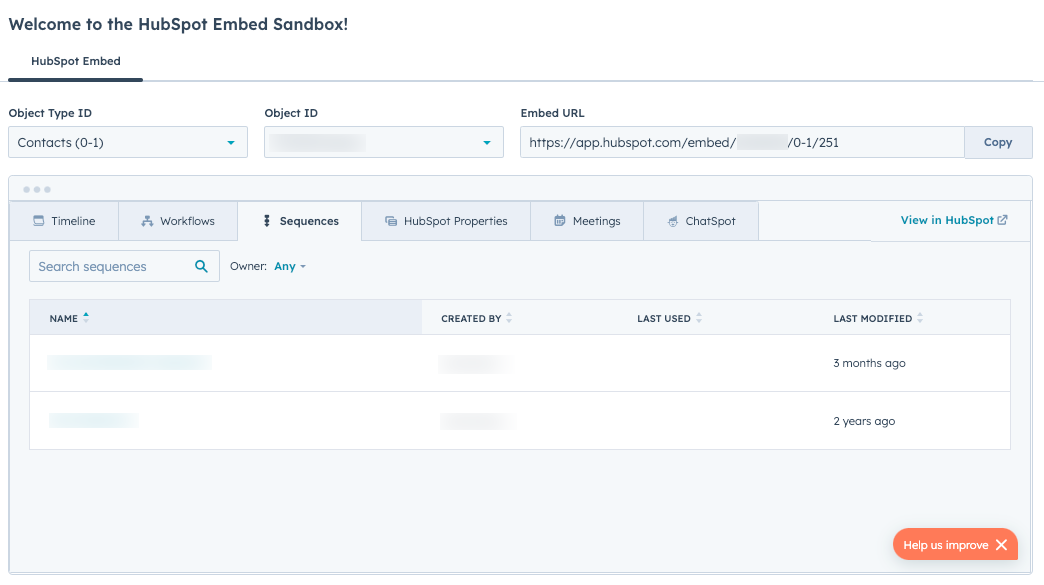
# CRM Search API
Source: https://developers.hubspot.com/docs/api-reference/latest/crm/search-the-crm
The CRM search endpoints make getting data more efficient by allowing developers to filter, sort, and search across any CRM object type.
Use the CRM search endpoints to filter, sort, and search objects, records, and engagements across your CRM. For example, use the endpoints to get a list of contacts in your account, or a list of all open deals. To use these endpoints from an app, a CRM scope is required. Refer to this [list of available scopes](/docs/apps/developer-platform/build-apps/authentication/scopes) to learn which granular CRM scopes can be used to accomplish your goal.
## Make a search request
To search your CRM, make a `POST` request to the object's search endpoint. CRM search endpoints are constructed using the following format: `/crm/objects/2026-03/{object}/search`. In the request body, you'll include [filters](#filter-search-results) to narrow your search by CRM property values. For example, the code snippet below would retrieve a list of all contacts that have a specific company email address.
```json theme={null}
{
"filterGroups": [
{
"filters": [
{
"propertyName": "email",
"operator": "CONTAINS_TOKEN",
"value": "*@hubspot.com"
}
]
}
]
}
```
Each object that you search will include a set of [default properties](#objects) that gets returned. For contacts, a search will return `createdate`, `email`, `firstname`, `hs_object_id`, `lastmodifieddate`, and `lastname`. For example, the above request would return the following response:
```json theme={null}
{
"total": 2,
"results": [
{
"id": "100451",
"properties": {
"createdate": "2024-01-17T19:55:04.281Z",
"email": "testperson@hubspot.com",
"firstname": "Test",
"hs_object_id": "100451",
"lastmodifieddate": "2024-09-11T13:27:39.356Z",
"lastname": "Person"
},
"createdAt": "2024-01-17T19:55:04.281Z",
"updatedAt": "2024-09-11T13:27:39.356Z",
"archived": false
},
{
"id": "57156923994",
"properties": {
"createdate": "2024-09-11T18:21:50.012Z",
"email": "emailmaria@hubspot.com",
"firstname": "Maria",
"hs_object_id": "57156923994",
"lastmodifieddate": "2024-10-21T21:36:02.961Z",
"lastname": "Johnson (Sample Contact)"
},
"createdAt": "2024-09-11T18:21:50.012Z",
"updatedAt": "2024-10-21T21:36:02.961Z",
"archived": false
}
]
}
```
To return a specific set of properties, include a `properties` array in the request body. For example:
```json theme={null}
{
"filterGroups": [
{
"filters": [
{
"propertyName": "annualrevenue",
"operator": "GT",
"value": "10000000"
}
]
}
],
"properties": ["annualrevenue", "name"]
}
```
The response for the above request would look like:
```json theme={null}
{
"total": 38,
"results": [
{
"id": "2810868468",
"properties": {
"annualrevenue": "1000000000",
"createdate": "2020-01-09T20:11:27.309Z",
"hs_lastmodifieddate": "2024-09-13T20:23:03.333Z",
"hs_object_id": "2810868468",
"name": "Google"
},
"createdAt": "2020-01-09T20:11:27.309Z",
"updatedAt": "2024-09-13T20:23:03.333Z",
"archived": false
},
{
"id": "2823023532",
"properties": {
"annualrevenue": "10000000000",
"createdate": "2020-01-13T16:21:08.270Z",
"hs_lastmodifieddate": "2024-09-13T20:23:03.064Z",
"hs_object_id": "2823023532",
"name": "Pepsi"
},
"createdAt": "2020-01-13T16:21:08.270Z",
"updatedAt": "2024-09-13T20:23:03.064Z",
"archived": false
},
{
"id": "5281147580",
"properties": {
"annualrevenue": "50000000",
"createdate": "2021-02-01T21:17:12.250Z",
"hs_lastmodifieddate": "2024-09-13T20:23:03.332Z",
"hs_object_id": "5281147580",
"name": "CORKCICLE"
},
"createdAt": "2021-02-01T21:17:12.250Z",
"updatedAt": "2024-09-13T20:23:03.332Z",
"archived": false
},
{
"id": "5281147581",
"properties": {
"annualrevenue": "1000000000",
"createdate": "2021-02-01T21:17:12.250Z",
"hs_lastmodifieddate": "2024-09-13T20:23:03.064Z",
"hs_object_id": "5281147581",
"name": "Ulta Beauty"
},
"createdAt": "2021-02-01T21:17:12.250Z",
"updatedAt": "2024-09-13T20:23:03.064Z",
"archived": false
},
{
"id": "5281147583",
"properties": {
"annualrevenue": "50000000",
"createdate": "2021-02-01T21:17:12.251Z",
"hs_lastmodifieddate": "2024-09-13T20:23:03.332Z",
"hs_object_id": "5281147583",
"name": "Narvar"
},
"createdAt": "2021-02-01T21:17:12.251Z",
"updatedAt": "2024-09-13T20:23:03.332Z",
"archived": false
},
{
"id": "5281496154",
"properties": {
"annualrevenue": "1000000000",
"createdate": "2021-02-01T21:17:12.267Z",
"hs_lastmodifieddate": "2024-09-13T20:23:03.332Z",
"hs_object_id": "5281496154",
"name": "Etsy Inc"
},
"createdAt": "2021-02-01T21:17:12.267Z",
"updatedAt": "2024-09-13T20:23:03.332Z",
"archived": false
},
{
"id": "5281496155",
"properties": {
"annualrevenue": "1000000000",
"createdate": "2021-02-01T21:17:12.267Z",
"hs_lastmodifieddate": "2024-09-13T20:23:03.069Z",
"hs_object_id": "5281496155",
"name": "grubhub"
},
"createdAt": "2021-02-01T21:17:12.267Z",
"updatedAt": "2024-09-13T20:23:03.069Z",
"archived": false
},
{
"id": "5281496157",
"properties": {
"annualrevenue": "1000000000",
"createdate": "2021-02-01T21:17:12.267Z",
"hs_lastmodifieddate": "2024-09-13T20:23:03.332Z",
"hs_object_id": "5281496157",
"name": "discover"
},
"createdAt": "2021-02-01T21:17:12.267Z",
"updatedAt": "2024-09-13T20:23:03.332Z",
"archived": false
},
{
"id": "5281496158",
"properties": {
"annualrevenue": "50000000",
"createdate": "2021-02-01T21:17:12.268Z",
"hs_lastmodifieddate": "2024-09-13T20:23:03.064Z",
"hs_object_id": "5281496158",
"name": "Soludos"
},
"createdAt": "2021-02-01T21:17:12.268Z",
"updatedAt": "2024-09-13T20:23:03.064Z",
"archived": false
},
{
"id": "5281499282",
"properties": {
"annualrevenue": "1000000000",
"createdate": "2021-02-01T21:17:12.285Z",
"hs_lastmodifieddate": "2024-09-13T20:23:03.066Z",
"hs_object_id": "5281499282",
"name": "AEO Management Co."
},
"createdAt": "2021-02-01T21:17:12.285Z",
"updatedAt": "2024-09-13T20:23:03.066Z",
"archived": false
}
],
"paging": {
"next": {
"after": "10"
}
}
}
```
## Searchable CRM objects and engagements
### Objects
The tables below contain the object search endpoints, the objects they refer to, and the properties that are returned by default.
| Search endpoint | Object | Default returned properties |
| -------------------------------------------------- | ------------------------ | ------------------------------------------------------------------------------------------------------------------------------------------------------- |
| `/crm/objects/2026-03/carts/search` | Carts | `createdate`, `hs_lastmodifieddate`, `hs_object_id` |
| `/crm/objects/2026-03/companies/search` | Companies | `name`, `domain`, `createdate`,`hs_lastmodifieddate`, `hs_object_id` |
| `/crm/objects/2026-03/contacts/search` | Contacts | `firstname`,`lastname`,`email`,`lastmodifieddate`,`hs_object_id`, `createdate` |
| `/crm/objects/2026-03/deals/search` | Deals | `dealname`, `amount`, `closedate`, `pipeline`, `dealstage`, `createdate`, `hs_lastmodifieddate`, `hs_object_id` |
| `/crm/objects/2026-03/deal_split/search` | Deal splits | `hs_createdate`, `hs_lastmodifieddate`, `hs_object_id` |
| `/crm/objects/2026-03/discounts/search` | Discounts | `createdate`, `hs_lastmodifieddate`, `hs_object_id` |
| `/crm/objects/2026-03/feedback_submissions/search` | Feedback submissions | `hs_createdate`,`hs_lastmodifieddate`,`hs_object_id` |
| `/crm/objects/2026-03/fees/search` | Fees | `createdate`, `hs_lastmodifieddate`, `hs_object_id` |
| `/crm/objects/2026-03/invoices/search` | Invoices | `createdate`, `hs_lastmodifieddate`, `hs_object_id` |
| `/crm/objects/2026-03/leads/search` | Leads | `createdate`, `hs_lastmodifieddate`, `hs_object_id` |
| `/crm/objects/2026-03/line_items/search` | Line items | `quantity`, `amount`, `price`, `createdate`, `hs_lastmodifieddate`, `hs_object_id` |
| `/crm/objects/2026-03/orders/search` | Orders | `createdate`, `hs_lastmodifieddate`, `hs_object_id` |
| `/crm/objects/2026-03/commerce_payments/search` | Payments | `createdate`, `hs_lastmodifieddate`, `hs_object_id` |
| `/crm/objects/2026-03/products/search` | Products | `name`, `description` ,`price`, `createdate`, `hs_lastmodifieddate`, `hs_object_id` |
| `/crm/objects/2026-03/quotes/search` | Quotes | `hs_expiration_date`, `hs_public_url_key`, `hs_status`,`hs_title`, `hs_createdate`, `hs_lastmodifieddate`,`hs_object_id` |
| `/crm/objects/2026-03/subscriptions/search` | Subscriptions (Commerce) | `hs_createdate`, `hs_lastmodifieddate`, `hs_object_id` |
| `/crm/objects/2026-03/taxes/search` | Taxes | `createdate`, `hs_lastmodifieddate`, `hs_object_id` |
| `/crm/objects/2026-03/tickets/search` | Tickets | `content`, `hs_pipeline`, `hs_pipeline_stage`,`hs_ticket_category`, `hs_ticket_priority`, `subject`,`createdate`, `hs_lastmodifieddate`, `hs_object_id` |
### Engagements
The table below contains the engagement search endpoints, the engagements they refer to, and the properties that are returned by default.
| Search endpoint | Engagement | Default returned properties |
| -------------------------------------- | ---------- | ---------------------------------------------------- |
| `/crm/objects/2026-03/calls/search` | Calls | `hs_createdate`,`hs_lastmodifieddate`,`hs_object_id` |
| `/crm/objects/2026-03/emails/search` | Emails | `hs_createdate`,`hs_lastmodifieddate`,`hs_object_id` |
| `/crm/objects/2026-03/meetings/search` | Meetings | `hs_createdate`,`hs_lastmodifieddate`,`hs_object_id` |
| `/crm/objects/2026-03/notes/search` | Notes | `hs_createdate`,`hs_lastmodifieddate`,`hs_object_id` |
| `/crm/objects/2026-03/tasks/search` | Tasks | `hs_createdate`,`hs_lastmodifieddate`,`hs_object_id` |
## Search default searchable properties
Search all default text properties in records of the specified object to find all records that have a value containing the specified string. By default, the results will be returned in order of object creation (oldest first), but you can override this with [sorting](#sorting). For example, the request below searches for all contacts with a default text property value containing the letter `X`.
```shell theme={null}
curl https://api.hubapi.com/crm/objects/2026-03/contacts/search \
--request POST \
--header "Content-Type: application/json" \
--header "authorization: Bearer YOUR_ACCESS_TOKEN" \
--data '{
"query": "x"
}'
```
Below are the properties that are searched by default through the above method:
| Search endpoint | Object | Default searchable properties |
| -------------------------------------------------- | -------------------- | ---------------------------------------------------------------------------------------------------------------------------------------------------------------- |
| `/crm/objects/2026-03/calls/search` | Calls | `hs_call_title`, `hs_body_preview` |
| `/crm/objects/2026-03/companies/search` | Companies | `website`, `phone`, `name`, `domain` |
| `/crm/objects/2026-03/contacts/search` | Contacts | `firstname`,`lastname`,`email`,`phone`,`hs_additional_emails`, `fax`, `mobilephone`, `company`, `hs_marketable_until_renewal` |
| `/crm/objects/2026-03/{objectType}/search` | Custom objects | Up to 20 selected properties. |
| `/crm/objects/2026-03/deals/search` | Deals | `dealname`,`pipeline`,`dealstage`, `description`, `dealtype` |
| `/crm/objects/2026-03/emails/search` | Emails | `hs_email_subject` |
| `/crm/objects/2026-03/feedback_submissions/search` | Feedback submissions | `hs_submission_name`, `hs_content` |
| `/crm/objects/2026-03/meetings/search` | Meetings | `hs_meeting_title`, `hs_meeting_body` |
| `/crm/objects/2026-03/notes/search` | Notes | `hs_note_body` |
| `/crm/objects/2026-03/products/search` | Products | `name`, `description` ,`price`, `hs_sku` |
| `/crm/objects/2026-03/quotes/search` | Quotes | `hs_sender_firstname`, `hs_sender_lastname`, `hs_proposal_slug`, `hs_title`, `hs_sender_company_name`, `hs_sender_email`, `hs_quote_number`, `hs_public_url_key` |
| `/crm/objects/2026-03/tasks/search` | Tasks | `hs_task_body`, `hs_task_subject` |
| `/crm/objects/2026-03/tickets/search` | Tickets | `subject`, `content`, `hs_pipeline_stage`, `hs_ticket_category`, `hs_ticket_id` |
## Filter search results
Use filters in the request body to limit the results to only records with matching property values. For example, the request below searches for all contacts with a first name of *Alice*.
**Please note:** when filtering search results for calls, conversations, emails, meetings, notes, or tasks, the property `hs_body_preview_html` is not supported. For emails, the properties `hs_email_html` and `hs_body_preview` are also not supported.
```shell theme={null}
curl https://api.hubapi.com/crm/objects/2026-03/contacts/search \
--request POST \
--header "Content-Type: application/json" \
--header "authorization: Bearer YOUR_ACCESS_TOKEN" \
--data '{
"filterGroups":[
{
"filters":[
{
"propertyName": "firstname",
"operator": "EQ",
"value": "Alice"
}
]
}
]
}'
```
To include multiple filter criteria, you can group `filters` within **`filterGroups`**:
* To apply *AND* logic, include a comma-separated list of conditions within one set of `filters`.
* To apply *OR* logic, include multiple `filters` within a `filterGroup`. You can include a maximum of five `filterGroups` with up to 6 `filters` in each group, with a maximum of 18 filters in total. If you've included too many groups or filters, you'll receive a `VALIDATION_ERROR` error response. For example, the request below searches for contacts with the first name `Alice` AND a last name other than `Smith`*,* OR contacts that don't have a value for the property `email`.
```shell theme={null}
curl https://api.hubapi.com/crm/objects/2026-03/contacts/search \
--request POST \
--header "Content-Type: application/json" \
--header "authorization: Bearer YOUR_ACCESS_TOKEN" \
--data '{
"filterGroups": [
{
"filters": [
{
"propertyName": "firstname",
"operator": "EQ",
"value": "Alice"
},
{
"propertyName": "lastname",
"operator": "NEQ",
"value": "Smith"
}
]
},
{
"filters": [
{
"propertyName": "email",
"operator": "NOT_HAS_PROPERTY"
}
]
}
]
}'
```
You can use operators in filters to specify which records should be returned. Values in filters are case-insensitive, with the following two exceptions:
* When filtering for an enumeration property, search is case-sensitive for all filter operators.
* When filtering for a string property using `IN` and `NOT_IN` operators, the searched values must be lowercase.Below are the available filter operators:
| Operator | Description |
| -------------------- | ----------------------------------------------------------------------------------------------------------------------------------------------------------------------------------------------------------------------------------------------- |
| `LT` | Less than the specified value. |
| `LTE` | Less than or equal to the specified value. |
| `GT` | Greater than the specified value. |
| `GTE` | Greater than or equal to the specified value. |
| `EQ` | Equal to the specified value. |
| `NEQ` | Not equal to the specified value. |
| `BETWEEN` | Within the specified range. In your request, use key-value pairs to set `highValue` and `value`. Refer to the example below the table. |
| `IN` | Included within the specified list. Searches by exact match. In your request, include the list values in a `values` array. When searching a string property with this operator, values must be lowercase. Refer to the example below the table. |
| `NOT_IN` | Not included within the specified list. In your request, include the list values in a `values` array. When searching a string property with this operator, values must be lowercase. |
| `HAS_PROPERTY` | Has a value for the specified property. |
| `NOT_HAS_PROPERTY` | Doesn't have a value for the specified property. |
| `CONTAINS_TOKEN` | Contains a token. In your request, you can use wildcards (\*) to complete a partial search. For example, use the value `*@hubspot.com` to retrieve contacts with a HubSpot email address. |
| `NOT_CONTAINS_TOKEN` | Doesn't contain a token. |
For example, you can use the `BETWEEN` operator to search for all tasks that were last modified within a specific time range:
```shell theme={null}
curl https://api.hubapi.com/crm/objects/2026-03/tasks/search \
--request POST \
--header "Content-Type: application/json" \
--header "authorization: Bearer YOUR_ACCESS_TOKEN" \
--data '{
"filterGroups":[{
"filters":[
{
"propertyName":"hs_lastmodifieddate",
"operator":"BETWEEN",
"highValue": "1642672800000",
"value":"1579514400000"
}
]
}]
}'
```
For another example, you can use the `IN` operator to search for companies that have specified values selected in a dropdown property.
```shell theme={null}
curl https://api.hubapi.com/crm/objects/2026-03/companies/search \
--request POST \
--header "Content-Type: application/json" \
--header "authorization: Bearer YOUR_ACCESS_TOKEN" \
--data '{
"filterGroups":[
{
"filters":[
{
"propertyName":"enumeration_property",
"operator":"IN",
"values": ["value_1", "value_2"]
}
]
}
],
"properties": ["annualrevenue", "enumeration_property", "name"]
}'
```
## Search through associations
Search for records that are associated with other specific records by using the pseudo-property `associations.{objectType}`. For example, the request below searches for all tickets associated with a contact that has the contact ID of `123`:
```shell theme={null}
curl https://api.hubapi.com/crm/objects/2026-03/tickets/search \
--request POST \
--header "Content-Type: application/json" \
--header "authorization: Bearer YOUR_ACCESS_TOKEN" \
--data '{
"filters": [
{
"propertyName": "associations.contact",
"operator": "EQ",
"value": "123"
}
]
}'
```
**Please note:** the option to search through custom object associations is not currently supported via search endpoints. To find custom object associations, you can use the [associations API](/docs/api-reference/latest/crm/associations/associate-records/guide).
## Sort search results
Use a sorting rule in the request body to list results in ascending or descending order. Only one sorting rule can be applied to any search. For example, the request below sorts returned contacts with most recently created first:
```shell theme={null}
curl https://api.hubapi.com/crm/objects/2026-03/contacts/search \
--request POST \
--header "Content-Type: application/json" \
--header "authorization: Bearer YOUR_ACCESS_TOKEN" \
--data '{
"sorts": [
{
"propertyName": "createdate",
"direction": "DESCENDING"
}
]
}'
```
## Paging through results
By default, the search endpoints will return pages of 10 records at a time. This can be changed by setting the `limit` parameter in the request body. The maximum number of supported objects per page is 200. For example, the request below would return pages containing 20 results each.
```shell theme={null}
curl https://api.hubapi.com/crm/objects/2026-03/contacts/search \
--request POST \
--header "Content-Type: application/json" \
--header "authorization: Bearer YOUR_ACCESS_TOKEN" \
--data '{
"limit": 20
}'
```
To access the next page of results, you must pass an **`after`** parameter provided in the **`paging.next.after`** property of the previous response. If the **`paging.next.after`** property isn’t provided, there are no additional results to display. You must format the value in the `after` parameter as an integer. For example, the request below would return the next page of results:
```shell theme={null}
curl https://api.hubapi.com/crm/objects/2026-03/contacts/search \
--request POST \
--header "Content-Type: application/json" \
--header "authorization: Bearer YOUR_ACCESS_TOKEN" \
--data '{
"after": "20"
}'
```
## Limits
* It may take a few moments for newly created or updated CRM objects to appear in search results.
* Archived CRM objects won’t appear in any search results.
* The search endpoints are [rate limited](/docs/developer-tooling/platform/usage-guidelines) to five requests per second per account.
* The maximum number of supported objects per page is 200.
* A query can contain a maximum of 3,000 characters. If the body of your request exceeds 3,000 characters, a 400 error will be returned.
* The search endpoints are limited to 10,000 total results for any given query. Attempting to page beyond 10,000 will result in a 400 error.
* When [filtering](#filter-search-results), you can include a maximum of five `filterGroups` with up to six `filters` in each group, with a maximum of 18 filters in total.
* When searching for phone numbers, HubSpot uses special calculated properties to standardize the format. These properties all start with `hs_searchable_calculated_*`. As a part of this standardization, HubSpot only uses the area code and local number. You should refrain from including the country code in your search or filter criteria.
# Understanding the CRM APIs
Source: https://developers.hubspot.com/docs/api-reference/latest/crm/understanding-the-crm
HubSpot’s CRM is a system for managing customer relationships and data. Learn about objects and the related CRM APIs.
The foundation of your HubSpot account is a database of your business relationships and processes, called the CRM (Customer Relationship Management). To manage this data, HubSpot accounts include objects, which represent types of relationships or processes. Individual instances of objects, called records, represent the individual entities under each object type (e.g., John Smith is a contact). To store data in each record, you'll use properties (e.g., the email property) and to represent the relationships between individual entities, you can associate records with one another (e.g., associate John Smith with a company Smith & Co.). Records can also store information about interactions through associated engagements/activities, such as emails, calls, and meetings.
In this article, learn about objects, records, properties, associations, pipelines, schemas, and searching the CRM. To learn more about managing your CRM database from within HubSpot, check out [HubSpot's Knowledge Base](https://knowledge.hubspot.com/get-started/manage-your-crm-database).
## Object APIs
You use the object APIs to create and manage an object's records. For supported objects, you can use object endpoints and replace the `{objectTypeId}` in the request URL with the desired object. For example, to create contacts, you'd make a `POST` request to `crm/objects/2026-03/0-1` and to create courses, you'd make a `POST` request to `crm/objects/2026-03/0-410`.
Refer to [this article](/docs/api-reference/latest/crm/using-object-apis) for more information about using the object endpoints for various objects.
### Object type IDs
When using CRM and other APIs, you'll need to use the `objectTypeId` field, which is a unique numerical value assigned to each object. For example, to retrieve records, you'd make a `GET` request to `/crm/objects/2026-03/{objectTypeId}`, or when creating a property for an object, you'd make a `POST` request to `/crm/properties/2026-03/{objectTypeId}`.
Expand the section below to view objects and their object type ID values.
| Object | Type ID | Description |
| -------------------- | ------- | ------------------------------------------------------------------------------------------------------------------------------------------------------------------------------------------------------------------------------------------------------------------------------------------------------------------- |
| Appointments | `0-421` | Represent encounters or services scheduled for an individual. View the [appointments API](/docs/api-reference/latest/crm/objects/appointments/guide) |
| Calls | `0-48` | A type of activity that represents phone call interactions associated with your records. View the [calls API](/docs/api-reference/latest/crm/activities/calls/guide) |
| Carts | `0-142` | Stores data related to ecommerce purchases in HubSpot. View the [carts API](/docs/api-reference/latest/crm/objects/carts/guide) |
| Communications | `0-18` | A type of activity that represents SMS, LinkedIn, and WhatsApp message interactions associated with your records. View the [communications API](/docs/api-reference/latest/crm/objects/communications/guide) |
| Companies | `0-2` | Stores information about a business or organization. View the [companies API](/docs/api-reference/latest/crm/objects/companies/guide) |
| Contacts | `0-1` | Stores information about an individual person. View the [contacts API](/docs/api-reference/latest/crm/objects/contacts/guide) |
| Courses | `0-410` | Represent structured programs or series of lessons, trainings, or educational modules. View the [courses API](/docs/api-reference/latest/crm/objects/courses/guide) |
| Custom objects | `2-XXX` | Stores data that doesn't fit in with existing objects. To find the `objectTypeId` for a custom object, make a `GET` request to `/crm-object-schemas/2026-03/schemas`. View the [objects API](/docs/guides/crm/using-object-apis) |
| Deals | `0-3` | Represent sales opportunities and transactions, tracked through pipeline stages. View the [deals API](/docs/api-reference/latest/crm/objects/deals/guide) |
| Discounts | `0-84` | Associated with quotes as part of their pricing details. View the [discounts API](/docs/api-reference/latest/crm/objects/discounts/guide) |
| Emails | `0-49` | A type of activity that represents one-to-one email interactions associated with your records. View the [email API](/docs/api-reference/latest/crm/activities/emails/guide) |
| Feedback submissions | `0-19` | Stores information submitted to a feedback survey. Feedback submissions are associated with contact records. View the [feedback submissions API](/docs/api-reference/latest/crm/objects/feedback-submissions/guide) |
| Fees | `0-85` | Associated with quotes as part of their pricing details. View the [fees API](/docs/api-reference/latest/crm/objects/fees/guide) |
| Goals | `0-74` | Represent targets for HubSpot users. View the [goals API](/docs/api-reference/latest/crm/objects/goals/guide) |
| Invoices | `0-53` | Represent the invoices sent for sales transactions. View the [invoices API](/docs/api-reference/latest/crm/objects/invoices/guide) |
| Leads | `0-136` | Represent potential customers who have shown interest in your products or services. View the [leads API](/docs/api-reference/latest/crm/objects/leads/guide) |
| Line items | `0-8` | Represent individual products and services sold in a deal. Line items can be created from existing products in your product library, or can be created standalone. View the [line items API](/docs/api-reference/latest/crm/objects/line-items/guide) |
| Listings | `0-420` | Represent properties or units to be bought, sold, or rented. View the [listings API](/docs/api-reference/latest/crm/objects/listings/guide) |
| Marketing events | `0-54` | Represent events related to your marketing efforts, specifically including events from connected integrations. You can specify whether or not a contact attended, registered for, or cancelled attending a marketing event. View the [marketing events API](/docs/api-reference/latest/marketing/marketing-events/guide) |
| Meetings | `0-47` | A type of activity that represents meeting interactions associated with your records. View the [meetings API](/docs/api-reference/latest/crm/activities/meetings/guide) |
| Notes | `0-46` | A type of activity that represents notes associated with your records. View the [notes API](/docs/api-reference/latest/crm/activities/notes/guide) |
| Orders | `0-123` | Represent ecommerce purchases in HubSpot. View the [orders API](/docs/api-reference/latest/crm/objects/orders/guide) |
| Payments | `0-101` | The payments made by buyers through invoices, payment links, and quotes. View the [payments API](/docs/api-reference/latest/crm/objects/commerce-payments/guide) |
| Postal mail | `0-116` | A type of activity that represents physical mail interactions associated with your records. View the [postal mail API](/docs/api-reference/latest/crm/activities/postal-mail/guide) |
| Products | `0-7` | Represent goods or services for sale. Products can't be associated with other objects, but you can create line items based on products and associate those with deals and quotes. View the [products API](/docs/api-reference/latest/crm/objects/products/guide) |
| Projects | `0-970` | Centralized tasks to help your team manage work. View the [projects API](/docs/guides/account/projects/guide) |
| Quotes | `0-14` | Represent pricing information shared with potential buyers. View the [quotes API](/docs/api-reference/latest/crm/objects/quotes/guide) |
| Services | `0-162` | Represent intangible offerings provided to customers. Examples include onboarding and consulting, repairs and maintenance, and personal care. View the [services API](/docs/api-reference/latest/crm/objects/services/guide) |
| Subscriptions | `0-69` | Represent recurring payments scheduled through payment links and quotes. View the [subscriptions API](/docs/api-reference/latest/crm/objects/commerce-subscriptions/guide) |
| Tasks | `0-27` | A type of activity that represents to-dos associated with your records. View the [tasks API](/docs/api-reference/latest/crm/activities/tasks/guide) |
| Taxes | `0-86` | Associated with quotes as part of their pricing details. View the [taxes API](/docs/api-reference/latest/crm/objects/taxes/guide) |
| Tickets | `0-5` | Represent customer requests for help or support, tracked through pipeline statuses. View the [tickets API](/docs/api-reference/latest/crm/objects/tickets/guide) |
| Users | `0-115` | Represent the users in your HubSpot account. Users cannot be associated with other objects, but can be retrieved and updated via API. View the [user details API](/docs/api-reference/latest/crm/objects/users/guide) |
You can always use the numerical type ID value, but for contacts, companies, deals, tickets, or notes, in some cases you can also use the object's fully qualified name (FQN). For example:
* When starting an import with the [imports API](/docs/api-reference/latest/crm/imports/guide), the `columnObjectTypeId` specifies which object the data in your file belongs to. To import data for contacts, your value for `columnObjectTypeId` could be `contact` or `0-1`.
* When using the [associations API](/docs/api-reference/latest/crm/associations/associate-records/guide), the `fromObjectType` and `toObjectType` values specify the objects and the direction of the association. To view association types for contacts to companies, your `GET` request could be to `crm/associations/2026-03/contact/company/labels` or `crm/associations/2026-03/0-1/0-2/labels`.
### Unique identifiers and record IDs
A unique identifier is a value that differentiates one record in the CRM from another, even if they have otherwise identical information. For example, a database might have records for two people named John Smith. To avoid accidentally sending money to the wrong John Smith, each record is assigned a number as their *Record ID*.
When a record is created in HubSpot, its *Record ID* (`hs_object_id`) is automatically generated and should be treated as a string. Record IDs are unique within an object, so there can be both a contact and company with the same ID. For contacts and companies, there are additional unique identifiers, including a contact's `email` and a company's `domain` name. You can also [create custom unique identifier properties](/docs/api-reference/latest/crm/pipelines/guide#create-unique-identifier-properties).
In the CRM APIs, you'll use unique identifier values to identify and manage specific records. You can always use a record's `hs_object_id` value, but can also use custom unique identifier properties for certain endpoints, specified by the `idProperty` parameter. For example, to edit a contact, you could make a `PATCH` request to `/crm/objects/2026-03/0-1/{contactId}` or `/crm/objects/2026-03/0-1/{contactEmail}?idProperty=email`. Learn more about how HubSpot handles deduplication in the [Knowledge Base](https://knowledge.hubspot.com/records/deduplication-of-records).
## Associations API
In HubSpot, you can show how objects are related to one another by associating their records. For example, you can associate multiple contacts with a company, and then associate the company and relevant contacts with a deal. You can use the associations API to manage which association types are supported between objects and to associate individual records within objects.
The Associations API includes two sets of endpoints:
* [**Association details endpoints**](/docs/api-reference/latest/crm/associations/associate-records/guide): create, edit, and remove associations between records. For example, associate a contact record with a company record.
* [**Association schema endpoints**](/docs/api-reference/latest/crm/associations/associations-schema/guide): view and manage your account’s association definitions (also known as types or labels) and set limits for associations. For example, create a custom *Decision Maker* association type to associate a contact record and a company record while labelling the contact as that company's *Decision Maker*.
When using the [associations API endpoints](/docs/api-reference/latest/crm/associations/associate-records/guide), you can substitute objects for `{toObjectTypeId}` and `{fromObjectTypeId}` in the request URLs and request bodies.
Before associating records across objects, to understand which objects can be associated to one another, you can [retrieve association types](/docs/api-reference/latest/crm/associations/associate-records/guide#retrieve-association-labels). If you have access to a HubSpot account, you can also review your account's unique object relationships by navigating to [the data model tool.](https://knowledge.hubspot.com/data-management/use-the-data-model-builder)
Learn more about object relationships and managing associations in the associations API guides:
* [Association details guide](/docs/api-reference/latest/crm/associations/associate-records/guide)
* [Association schemas guide](/docs/api-reference/latest/crm/associations/associations-schema/guide)
## Properties API
Information about records are stored in fields called properties. HubSpot provides a set of default properties for each object. In addition to each object’s default properties, you can store custom data by [creating custom properties](https://knowledge.hubspot.com/properties/create-and-edit-properties).
When using the properties API, you can substitute objects in the endpoints to create and manage an object's properties. For example, `/crm/properties/2026-03/0-1` for contact properties or `/crm/properties/2026-03/0-5` for ticket properties.
Learn more about using the properties API in [this article](/docs/api-reference/latest/crm/properties/guide).
## Schemas API
Each object in HubSpot is defined by a schema, which is a set of configuration details that define what the object is (i.e. its name and ID), the data that it can store (i.e. properties), and its relationships with other objects (i.e. associations).
The schemas API can be used to [create custom objects](/docs/api-reference/latest/crm/objects/custom-objects/guide), which includes setting up schema details such as display properties, searchable properties, unlabeled associations, and properties required to create records. Learn more about [custom objects in HubSpot](https://knowledge.hubspot.com/object-settings/create-custom-objects).
The schemas API can also be used to [retrieve schema details](/docs/api-reference/latest/crm/objects/custom-objects/guide) for custom objects, which will return those high-level object details. However, to manage an object's properties and association types, you'll use the [properties](#properties-api) and [associations](#associations-api) APIs.
## Search API
To filter and sort records and activities based on their properties and associations, you can use the search API. When using the search endpoints, substitute the `{objectTypeId}` value for the object within which you want to search. For example, to search calls, you'd make a POST request to `/crm/objects/2026-03/0-48/search`.
Learn more about using the CRM search API in [this article](/docs/api-reference/latest/crm/search-the-crm).
## Pipelines API
In HubSpot, you can use pipelines to track records through stages in your processes. For example, you can track deals through sales processes or tickets through support statuses. Using the pipelines API, you can create, retrieve, edit, and delete pipelines and pipeline stages.
Learn which objects have pipelines and how to use the pipelines API in [this article](/docs/api-reference/latest/crm/pipelines/guide).
# Using Object APIs
Source: https://developers.hubspot.com/docs/api-reference/latest/crm/using-object-apis
Learn how to use the object API endpoints to create and manage records or activities.
Using the object APIs, you can create and manage records and activities within HubSpot. The object APIs have the same basic functionality for all supported objects, so you can substitute the `objectTypeId` in the endpoints to work with different objects. For example, to create contacts, you'd make a `POST` request to `crm/objects/2026-03/0-1` and to create courses, the request would be to `crm/objects/2026-03/0-410`.
Some objects have limited API functionality. For more details, click the link to an object's endpoints reference documentation in the table below. If an object listed doesn't have its own guide, you can refer to the [objects API](/docs/apps/developer-platform/add-features/app-objects/overview#overview-of-app-objects) guide and substitute the `{objectTypeId}` in each endpoint to your desired object.
Expand the section below to view objects and their [object type ID](/docs/guides/crm/understanding-the-crm#object-type-ids) values.
| Object | Type ID |
| ------------------------------------------------------------------------------------ | ------- |
| Appointments | `0-421` |
| [Calls](/docs/api-reference/latest/crm/activities/calls/guide) | `0-48` |
| [Carts](/docs/api-reference/latest/crm/objects/carts/guide) | `0-142` |
| [Communications](/docs/api-reference/latest/crm/objects/communications/guide) | `0-18` |
| [Companies](/docs/api-reference/latest/crm/objects/companies/guide) | `0-2` |
| [Contacts](/docs/api-reference/latest/crm/objects/contacts/guide) | `0-1` |
| Courses | `0-410` |
| [Custom objects](/docs/api-reference/latest/crm/objects/custom-objects/guide) | `2-XXX` |
| [Deals](/docs/api-reference/latest/crm/objects/deals/guide) | `0-3` |
| [Discounts](/docs/api-reference/latest/crm/objects/discounts/guide) | `0-84` |
| [Emails](/docs/api-reference/latest/crm/activities/emails/guide) | `0-49` |
| [Feedback submissions](/docs/api-reference/latest/crm/objects/feedback-submissions/guide) | `0-19` |
| [Fees](/docs/api-reference/latest/crm/objects/fees/guide) | `0-85` |
| [Goals](/docs/api-reference/latest/crm/objects/goals/guide) | `0-74` |
| [Invoices](/docs/api-reference/latest/crm/objects/invoices/guide) | `0-53` |
| [Leads](/docs/api-reference/latest/crm/objects/leads/guide) | `0-136` |
| [Line items](/docs/api-reference/latest/crm/objects/line-items/guide) | `0-8` |
| Listings | `0-420` |
| [Marketing events](/docs/api-reference/latest/marketing/marketing-events/guide) | `0-54` |
| [Meetings](/docs/api-reference/latest/crm/activities/meetings/guide) | `0-47` |
| [Notes](/docs/api-reference/latest/crm/activities/notes/guide) | `0-46` |
| [Orders](/docs/api-reference/latest/crm/objects/orders/guide) | `0-123` |
| [Payments](/docs/api-reference/latest/crm/objects/commerce-payments/guide) | `0-101` |
| [Postal mail](/docs/api-reference/latest/crm/activities/postal-mail/guide) | `0-116` |
| [Products](/docs/api-reference/latest/crm/objects/products/guide) | `0-7` |
| [Projects](/docs/guides/account/projects/guide) | `0-970` |
| [Quotes](/docs/api-reference/latest/crm/objects/quotes/guide) | `0-14` |
| Services | `0-162` |
| [Subscriptions](/docs/api-reference/latest/crm/objects/commerce-subscriptions/guide) | `0-69` |
| [Tasks](/docs/api-reference/latest/crm/activities/tasks/guide) | `0-27` |
| [Taxes](/docs/api-reference/latest/crm/objects/taxes/guide) | `0-86` |
| [Tickets](/docs/api-reference/latest/crm/objects/tickets/guide) | `0-5` |
| [Users](/docs/api-reference/latest/crm/objects/users/guide) | `0-115` |
In this article, learn the basics of how to use the object APIs.
New objects (e.g., appointments, courses, listings, services) must be activated in the HubSpot account before you can manage their records via API. Learn how to check if they're activated [via API](/docs/api-reference/latest/crm/crm-data-model/guide) and [how to activate them in HubSpot](https://knowledge.hubspot.com/data-management/use-the-data-model-builder#activate-or-deactivate-an-object).
## Retrieve records
You can retrieve records individually or in batches. You can use the objects API to [retrieve all records of an object](#Retrieve-all-records-or-specific-records-by-ID) or retrieve [specific records by unique identifier values](#Retrieve-all-records-or-specific-records-by-ID). To [retrieve records based on specific criteria](#Retrieve-records-based-on-criteria), use the CRM search API.
### Retrieve all records or specific records by ID
* To retrieve an individual record, make a `GET` request to `/crm/objects/2026-03/{objectTypeId}/{recordId}`.
* To request a list of all records for an object, make a `GET` request to `/crm/objects/2026-03/{objectTypeId}`.
* To retrieve a batch of specific records by record ID or a [custom unique identifier property](/docs/api-reference/latest/crm/properties/guide#create-unique-identifier-properties), make a `POST` request to `crm/objects/2026-03/{objectTypeId}/batch/read` and include the `id` values of records in the request body.
Although the batch endpoint only retrieves records, it requires the `POST` method because batch requests send up to 100 record IDs in the request body. Using the `POST` method avoids the URL length limits that are applied to `GET` requests.
For these endpoints, you can include the following query parameters in the request URL:
| Parameter | Description |
| ----------------------- | ---------------------------------------------------------------------------------------------------------------------------------------------------------------------------------------------------------------------------------------------------------------------------------------------------------------------------------------------------------------------------------------------------------------------------------------------------------------------------------- |
| `properties` | A comma separated list of the properties to be returned in the response. If the requested record doesn't have a value for a property, it will not appear in the response. |
| `propertiesWithHistory` | A comma separated list of the current and historical properties to be returned in the response. If the requested record doesn't have a value for a property, it will not appear in the response. |
| `associations` | A comma-separated list of objects to retrieve associated IDs for. Any specified associations that don't exist will not be returned in the response. Learn more about the [associations API.](/docs/api-reference/latest/crm/associations/associate-records/guide) **Note**: this parameter is not supported in the batch read endpoint. Learn more about [batch reading associations with the associations API](/docs/api-reference/latest/crm/associations/associate-records/guide). |
| `idProperty` | Indicates the unique identifier property used to identify records. You only need to use this parameter if retrieving by a [custom unique identifier property](/docs/api-reference/latest/crm/properties/guide#create-unique-identifier-properties). |
For example, to retrieve a meeting with the meeting's text body and starting time, you'd make a `GET` request to `/crm/objects/2026-03/0-47/{meetingId}?properties=hs_meeting_body,hs_timestamp` and your response would look similar to the following:
```json theme={null}
{
"id": "65059681027",
"properties": {
"hs_createdate": "2024-11-20T20:12:09.236Z",
"hs_lastmodifieddate": "2024-11-20T20:12:10.610Z",
"hs_meeting_body": "",
"hs_object_id": "65059681027",
"hs_timestamp": "2024-11-20T20:12:03.054Z"
},
"createdAt": "2024-11-20T20:12:09.236Z",
"updatedAt": "2024-11-20T20:12:10.610Z",
"archived": false
}
```
To retrieve a batch of deals, your request could look like either of the following:
```json theme={null}
{
"properties": ["dealname", "dealstage", "pipeline"],
"inputs": [
{
"id": "7891023"
},
{
"id": "987654"
}
]
}
```
```json theme={null}
{
"properties": ["dealname", "dealstage", "pipeline"],
"idProperty": "uniqueordernumber",
"inputs": [
{
"id": "0001111"
},
{
"id": "0001112"
}
]
}
```
You can retrieve up to 100 records in a batch request.
* To retrieve a specific number of records under 100, add a value to the `limit` parameter. For example, you would use `?limit=50` to retrieve 50 records.
* To retrieve additional records in subsequent requests (i.e. the records after the limit was reached in your request), include the `after` parameter with the `after` value returned from the previous request. This value is the Record ID of the next record. For example, `?after=123456`.
For example, to retrieve 50 listings, your request URL would be `GET` `/crm/objects/2026-03/0-420?limit=50`. In your response, under the `paging` object below the list of returned listings, the `after` value is the `id` of the next listing that would’ve been returned. To request 50 more listings, starting with the next returned value, make a `GET` request to `/crm/objects/2026-03/0-420?limit=50&after={id}`.
The `after` field is highlighted in the example response below:
```json highlight={18} theme={null}
{
"results": [
{
"id": "513881705057",
"properties": {
"hs_createdate": "2025-12-22T18:16:33.376Z",
"hs_lastmodifieddate": "2025-12-22T18:16:33.376Z",
"hs_object_id": "513881705057"
},
"createdAt": "2025-12-22T18:16:33.376Z",
"updatedAt": "2025-12-22T18:16:33.376Z",
"archived": false,
"url": "https://app.hubspot.com/contacts/{HubId}/record/0-420/513881705057"
}
],
"paging": {
"next": {
"after": "513881705058",
"link": "https://api.hubapi.com/crm/objects/v3/0-420?limit=1&after=513881705058"
}
}
}
```
### Retrieve records based on criteria
To include filters that retrieve records based on specific criteria, use the [CRM search API](/docs/api-reference/latest/crm/search-the-crm#filter-search-results). The `id` values of returned records can then be used to manage records via the objects API endpoints.
For example, to retrieve all deals in the *Presentation scheduled* stage with a value over \$10,000, you'd make a `POST` request to `/crm/objects/2026-03/deals/search`, and your request would look like the following:
```json theme={null}
{
"filterGroups":[
{
"filters":[
{
"propertyName": "dealstage",
"operator": "EQ",
"value": "presentationscheduled"
},
{
"propertyName": "amount",
"operator": "GT",
"value": "10000"
}
]
}
]
}
```
## Create records
* To create a record for an object, make a `POST` request to `crm/objects/2026-03/{objectTypeId}`.
* To create multiple records, make a `POST` request to `/crm/objects/2026-03/{objectTypeId}/batch/create`.
In your request, include data for each record in a `properties` object. You can also add an `associations` object to associate your new record with existing records (e.g., companies, deals), or activities (e.g., meetings, notes).
If you want to create and update records at the same time, learn how to [upsert records](#upsert-records) below.
### Properties
Record details are stored in properties. To view all available properties for an object, you can retrieve a list of your account's properties by making a `GET` request to `/crm/properties/2026-03/{objectTypeId}`. Learn more about the [properties API](/docs/api-reference/latest/crm/properties/guide) and [how to format property values.](/docs/api-reference/latest/crm/properties/guide#update-or-clear-a-property-s-values)
Expand the section below to view the objects for which records can be created via API, and the properties required for creation.
| Object | Type ID | Required properties to create |
| ---------------- | ------- | ------------------------------------------------------------------------------------------------------------------------------------------------------------------------------------ |
| Appointments | `0-421` | `hs_appointment_name` |
| Calls | `0-48` | `hs_timestamp` |
| Carts | `0-142` | None, but recommended `hs_cart_name` |
| Communications | `0-18` | `hs_timestamp` and `hs_communication_channel_type` |
| Companies | `0-2` | At least one of `domain` (recommended) or `name` |
| Contacts | `0-1` | None, but recommended at least one of `email`, `firstname`, or `lastname` |
| Courses | `0-410` | `hs_course_name` |
| Custom objects | `2-XXX` | The [required properties](/docs/api-reference/latest/crm/objects/custom-objects/guide#properties) specified in your object's [schema](/docs/api-reference/latest/crm/objects/schemas/guide). |
| Deals | `0-3` | `dealname`, `dealstage` and `pipeline` |
| Emails | `0-49` | `hs_timestamp` and `hs_email_direction` |
| Invoices | `0-53` | `hs_currency` |
| Leads | `0-136` | `hs_associated_contact_email`, `hs_associated_contact_lastname`, `hs_lead_name`, `hs_associated_company_domain`, `hs_associated_contact_firstname`, and `hs_associated_company_name` |
| Line items | `0-8` | None, but review [recommended properties](/docs/api-reference/latest/crm/objects/line-items/guide). |
| Listings | `0-420` | `hs_name` |
| Marketing events | `0-54` | `hs_event_description` and `hs_event_name` |
| Meetings | `0-47` | `hs_timestamp` |
| Notes | `0-46` | `hs_timestamp` |
| Orders | `0-123` | `hs_order_name` |
| Payments | `0-101` | `hs_initial_amount` and `hs_initiated_date` |
| Postal mail | `0-116` | `hs_timestamp` |
| Products | `0-7` | `hs_sku`, `hs_folder`, `price`, `name`, and `description` |
| Projects | `0-970` | `hs_name`, `hs_pipeline`, and `hs_pipeline_stage` |
| Quotes | `0-14` | `hs_title` and `hs_expiration_date` |
| Services | `0-162` | `hs_name`, `hs_pipeline`, and `hs_pipeline_stage` |
| Subscriptions | `0-69` | `hs_name` |
| Tasks | `0-27` | `hs_timestamp` |
| Tickets | `0-5` | `subject` (the ticket's name), `hs_pipeline_stage` (the ticket's status), and `hs_pipeline` |
| Users | `0-115` | `hs_internal_user_id` and `hs_email` |
For example, to create a new ticket without associations, your request may look similar to the following:
```json theme={null}
{
"properties": {
"hs_pipeline": "0",
"hs_pipeline_stage": "1",
"hs_ticket_priority": "HIGH",
"subject": "troubleshoot report"
}
}
```
For example, to create multiple contacts without associations, your request may look similar to the following:
```json theme={null}
{
"inputs": [
{
"properties": {
"email": "testone@test.com",
"firstname": "Test",
"lastname": "PersonOne",
"favorite_food": "Pizza"
}
},
{
"properties": {
"email": "testtwo@test.com",
"firstname": "Test",
"lastname": "PersonTwo",
"favorite_food": "Ice cream"
}
}
]
}
```
### Associations
When creating a new record, you can also associate it with [existing records](https://knowledge.hubspot.com/records/associate-records) or [activities](https://knowledge.hubspot.com/records/associate-activities-with-records) by including an `associations` object. In the `associations` object, you should include the following:
| Parameter | Description |
| --------- | ----------------------------------------------------------------------------------------------------------------------------------------------------------------------------------------------------------------------------------------------------------------------------------------------------------------------------------------------------------------------------------------------------------------------------------------------------------------------------- |
| `to` | The record or activity you want to associate with the record, specified by its unique `id` value. |
| `types` | The type of the association between the record and the record/activity. Include the `associationCategory` and `associationTypeId`. Default association type IDs are listed [here](/docs/api-reference/latest/crm/associations/associate-records/guide#association-type-id-values), or you can retrieve the value for custom association types (i.e. labels) via the [associations API](/docs/api-reference/latest/crm/associations/associate-records/guide#retrieve-association-types). |
For example, to create a new contact and associate with an existing company and email, your request would look like the following:
```json theme={null}
{
"properties": {
"email": "example@hubspot.com",
"firstname": "Jane",
"lastname": "Doe",
"phone": "(555) 555-5555",
"company": "HubSpot",
"website": "hubspot.com",
"lifecyclestage": "marketingqualifiedlead"
},
"associations": [
{
"to": {
"id": 123456
},
"types": [
{
"associationCategory": "HUBSPOT_DEFINED",
"associationTypeId": 279
}
]
},
{
"to": {
"id": 556677
},
"types": [
{
"associationCategory": "HUBSPOT_DEFINED",
"associationTypeId": 197
}
]
}
]
}
```
For example, to create multiple deals and associate them with existing companies and meetings, your request would look similar to the following:
For batch create actions, you can enable multi-status errors which tell you which records were successfully created and which were not. Learn more about [setting up multi-status error handling](#multi-status-errors-for-batch-create-requests).
```json theme={null}
{
"inputs": [
{
"associations": [
{
"types": [
{
"associationCategory": "HUBSPOT_DEFINED",
"associationTypeId": 5
}
],
"to": {
"id": "23125848331"
}
},
{
"types": [
{
"associationCategory": "HUBSPOT_DEFINED",
"associationTypeId": 211
}
],
"to": {
"id": "65059681027"
}
}
],
"properties": {
"dealname": "New deal 1",
"dealstage": "qualifiedtobuy",
"pipeline": "default"
}
},
{
"associations": [
{
"types": [
{
"associationCategory": "HUBSPOT_DEFINED",
"associationTypeId": 5
}
],
"to": {
"id": "23125848331"
}
},
{
"types": [
{
"associationCategory": "HUBSPOT_DEFINED",
"associationTypeId": 211
}
],
"to": {
"id": "65059681027"
}
}
],
"properties": {
"dealname": "New deal 2",
"dealstage": "qualifiedtobuy",
"pipeline": "default"
}
}
]
}
```
## Update records
You can update records individually or in batches. For existing records, the Record ID is a default [unique value](/docs/guides/crm/understanding-the-crm#unique-identifiers-and-record-ids) that you can use to update the record via API, but you can also identify records using the `idProperty` parameter with a [custom unique identifier property](/docs/api-reference/latest/crm/properties/guide#create-unique-identifier-properties). If you want to create and update records at the same time, learn how to [upsert records](#upsert-records).
* To update an individual record, make a `PATCH` request to `/crm/objects/2026-03/{objectTypeId}/{recordId}`, and include the data you want to update.
* To update multiple records, make a `POST` request to `/crm/objects/2026-03/{objectTypeId}/batch/update`. In the request body, include an array with the identifiers for the records and the properties you want to update.
For example, to update a contact, your request would look similar to the following:
```json theme={null}
{
"properties": {
"favorite_food": "burger",
"jobtitle": "Manager",
"lifecyclestage": "Customer"
}
}
```
Property value updates are stored in a [record's property history](https://knowledge.hubspot.com/records/view-record-property-history). To view historical values via API, [retrieve records](#retrieve-records) with the `propertiesWithHistory` parameter. To track property updates on a record timeline, you can create a property change event [in HubSpot](https://knowledge.hubspot.com/reports/create-a-property-change-event) or use the [events API](/docs/api-reference/legacy/events/define-events/guide).
## Upsert records
You can also batch create and update records at the same time using the upsert endpoint. For this endpoint, you can use a [custom unique identifier property](/docs/api-reference/latest/crm/properties/guide#create-unique-identifier-properties) or `email` for contacts. Following the request, if the records already exist, they'll be updated and if the records don't exist, they'll be created.
To upsert records, make a `POST` request to `/crm/objects/2026-03/{objectTypeId}/batch/upsert`. In your request body, include the `idProperty` parameter to identify the unique identifier property you're using. Include that property's value as the `id` and add the other properties you want to set or update.
Partial upserts are not supported when using `email` as the `idProperty` for contacts. To complete a partial upsert, use a custom unique identifier property as the `idProperty` instead.
For example, to upsert contacts to set the phone number property using `email` as the identifier, your request would look similar to the following:
```json theme={null}
{
"inputs": [
{
"properties": {
"phone": "5555555555"
},
"id": "luke@lukesdiner.com",
"idProperty": "email"
},
{
"properties": {
"phone": "7777777777"
},
"id": "lorelai@thedragonfly.com",
"idProperty": "email"
},
{
"properties": {
"phone": "1111111111"
},
"id": "michel@thedragonfly.com",
"idProperty": "email"
}
]
}
```
## Update associations
Once records are created, you can update their associations using the [associations API](/docs/api-reference/latest/crm/associations/associate-records/guide).
* To associate a record with other records or an activity, make a `PUT` request to `/crm/objects/2026-03/{objectTypeId}/{fromRecordId}/associations/{toObjectTypeId}/{toRecordId}`.
* To remove an association between a record and a record or activity, make a `DELETE` request to the following URL: `/crm/objects/2026-03/{objectTypeId}/{fromRecordId}/associations/{toObjectTypeId}/{toRecordId}`.
To retrieve the `associationTypeId` value, refer to [this list](/docs/api-reference/latest/crm/associations/associate-records/guide#association-type-id-values) of default values, or make a `GET` request to `/crm/associations/2026-03/{fromObjectTypeId}/{toObjectTypeId}/labels`.
## Pin an activity on a record
You can [pin an activity](https://knowledge.hubspot.com/records/pin-an-activity-on-a-record) on a record by including the `hs_pinned_engagement_id` field in your create, update, or upsert request. In the field, include the `id` of the activity to pin, which can be retrieved by making a `GET` request to `/crm/objects/2026-03/{objectTypeId}/{recordId}` for calls, communications, emails, meetings, notes, postal mail, or tasks. You can pin one activity per record, and the activity must already be associated with the record prior to pinning.
For example, to set or update an existing deal's pinned activity, your request could look like:
```json theme={null}
{
"properties": {
"hs_pinned_engagement_id": 123456789
}
}
```
To create a new deal, associate it with an activity, and pin that activity, you request would look like:
```json theme={null}
{
"properties": {
"dealname": "New Deal",
"pipeline": "default",
"dealstage": "appointmentscheduled",
"hs_pinned_engagement_id": 123456789
},
"associations": [
{
"to": {
"id": 123456789
},
"types": [
{
"associationCategory": "HUBSPOT_DEFINED",
"associationTypeId": 205
}
]
}
]
}
```
## Merge records
To merge two records of the same object, make a `POST` request to `/crm/objects/2026-03/{objectTypeId}/merge`. The remaining record combines activities, associations, and most property values from both records. For example, merge duplicate contacts to preserve historical context and consolidate their activity timelines. Learn more about [what happens when you merge HubSpot records](https://knowledge.hubspot.com/records/merge-records#what-happens-when-i-merge-records).
Include the following in your request body:
| Field | Description |
| ----------------- | ------------------------------------------------------------------------------------------ |
| `objectIdToMerge` | The record ID to merge with the primary record. |
| `primaryObjectId` | The record ID of the primary record, which is the record that will remain after the merge. |
For example, to merge the record `45678` into the record `12345`, your request would look like:
```json theme={null}
{
"objectIdToMerge": "45678",
"primaryObjectId": "12345"
}
```
In a successful merge response, the `id` is the record ID of the merged record.
**Please note:** if an account is enrolled in the [*Primary ID Preservation for Merged Records* public beta](https://app.hubspot.com/l/product-updates/?rollout=318895), the primary (i.e., the remaining record after a merge) record’s Record ID value (`primaryObjectId`) is preserved instead of generating a new one. Once enrolled, this behavior applies to all merges, including [in HubSpot](https://knowledge.hubspot.com/records/merge-records) and all versions of the API.
## Delete records
You can delete records individually or in batches, which will add the record to the recycling bin in HubSpot. You can [restore the record within HubSpot](https://knowledge.hubspot.com/records/restore-deleted-records) for up to 90 days after deletion.
* To delete an individual record by its record ID, make a `DELETE` request to `/crm/objects/2026-03/{objectTypeId}/{recordId}`.
* To delete multiple records, make a `POST` request to `/crm/objects/2026-03/{objectTypeId}/batch/archive` and include the record ID values as the `id` inputs in your request body.
For example, to delete multiple appointments, your request would look like:
```json theme={null}
{
"inputs": [
{
"id": "123456"
},
{
"id": "7891011"
},
{
"id": "12123434"
}
]
}
```
## Limits
Object API batch endpoints are limited to 100 inputs per request. For example, create or retrieve up to 100 contacts per request.
## Error handling
The following are common errors you may encounter when using the object APIs. Refer to the [error handling guide](/docs/api-reference/error-handling#common-error-responses) for details about more error responses and how to resolve them.
| Error | Details |
| ----------------------- | -------------------------------------------------------------------------------------------------------------------------------------------------------------------------------------------------------------------------------------------------------- |
| `207 Multi-Status` | Returned when there are different statuses (e.g., errors and successes), which occurs when you've enabled [multi-status error handling](#multi-status-errors-for-batch-create-requests) for the object API batch create endpoints. |
| `400 Bad Request` | Returned when your request includes invalid formatting or values. The error response will include details about why the error occurred. |
| `401 Unauthorized` | Returned when the authentication provided is invalid. See the [authentication overview](/docs/apps/developer-platform/build-apps/authentication/overview) for details on authenticating API requests. |
| `403 Forbidden` | Returned when the authentication provided does not have the proper permissions to access the specific URL. See the [list of scopes](/docs/apps/developer-platform/build-apps/authentication/scopes) to understand which scopes are required for your request. |
| `423 Locked` | Returned when attempting to sync a large volume of data (e.g., upserting thousands of company records in a very short period of time). Include a delay of at least 2 seconds between your API requests. |
| `429 Too many requests` | Returned when your account or app is over its API [rate limits](/docs/developer-tooling/platform/usage-guidelines). |
For example:
* If you attempt to create a company with an invalid property name, your error response would look like:
```json title="400 Bad Request" theme={null}
{
"status": "error",
"message": "Property values were not valid: [{\"isValid\":false,\"message\":\"Property \\\"testproperty\\\" does not exist\",\"error\":\"PROPERTY_DOESNT_EXIST\",\"name\":\"testproperty\",\"localizedErrorMessage\":\"Property \\\"testproperty\\\" does not exist\",\"portalId\":{HubId}}]",
"correlationId": "8a3f6c3a-8296-4002-b0a6-2a06fecf7c0c",
"errors": [
{
"message": "Property \"testproperty\" does not exist",
"code": "PROPERTY_DOESNT_EXIST",
"context": {
"propertyName": [
"testproperty"
]
}
}
],
"category": "VALIDATION_ERROR"
}
```
* If you attempt to retrieve deals without the `crm.objects.deals.read` scope, your response would look like:
```json title="403 Forbidden" theme={null}
{
"status": "error",
"message": "This app hasn't been granted all required scopes to make this call. Read more about required scopes here: https://developers.hubspot.com/scopes.",
"correlationId": "dc49c0a8-9952-4937-aad4-e322b1e5cee0",
"errors": [
{
"message": "One or more of the following scopes are required.",
"context": {
"requiredGranularScopes": [
"crm.schemas.deals.read",
"crm.objects.deals.sensitive.read.v2",
"crm.objects.deals.read",
"crm.objects.deals.highly_sensitive.read.v2"
]
}
}
],
"links": {
"scopes": "https://developers.hubspot.com/scopes"
},
"category": "MISSING_SCOPES"
}
```
### Multi-status errors for batch create requests
For the object APIs' batch create endpoints, you can enable multi-status responses that include partial failures by including a unique `objectWriteTraceId` value for each input in your request. The `objectWriteTraceId` can be any unique string that helps you identify which records succeeded or failed.
For example, a request to create tickets could look like:
```json highlight={4, 10} theme={null}
{
"inputs": [
{
"objectWriteTraceId": "549b1c2a9350",
"properties": {
"hs_pipeline_stage": "1"
}
},
{
"objectWriteTraceId": "549b1c2a9351",
"properties": {
"missing": "1"
}
}
]
}
```
In the response, statuses are grouped so you can see which creates were successful and which failed. For the above request, your response would look like:
```json wrap theme={null}
{
"status": "COMPLETE",
"results": [
{
"id": "1145814089",
"properties": {
"createdate": "2024-08-15T17:09:13.648Z",
"hs_helpdesk_sort_timestamp": "2024-08-15T17:09:13.648Z",
"hs_last_message_from_visitor": "false",
"hs_lastmodifieddate": "2024-08-15T17:09:13.648Z",
"hs_object_id": "1145814089",
"hs_object_source": "API",
"hs_object_source_label": "INTERNAL_PROCESSING",
"hs_pipeline": "0",
"hs_pipeline_stage": "1",
"hs_ticket_id": "1145814089"
},
"createdAt": "2024-08-15T17:09:13.648Z",
"updatedAt": "2024-08-15T17:09:13.648Z",
"archived": false
}
],
"numErrors": 1,
"errors": [
{
"status": "error",
"category": "VALIDATION_ERROR",
"message": "Property values were not valid: [{\"isValid\":false,\"message\":\"Property \\\"missing\\\" does not exist\",\"error\":\"PROPERTY_DOESNT_EXIST\",\"name\":\"missing\",\"localizedErrorMessage\":\"Property \\\"missing\\\" does not exist\",\"portalId\":891936587}]",
"context": {
"objectWriteTraceId": ["549b1c2a9351"]
}
}
],
"startedAt": "2024-08-15T17:09:13.610Z",
"completedAt": "2024-08-15T17:09:13.910Z"
}
```
# Delete meetings
Source: https://developers.hubspot.com/docs/api-reference/latest/crm/activities/meetings/batch/delete-meetings
specs/2026-03/crm-meetings-v2026-03.json POST /crm/objects/2026-03/{objectType}/batch/archive
# Update meetings
Source: https://developers.hubspot.com/docs/api-reference/latest/crm/activities/meetings/batch/update-meetings
specs/2026-03/crm-meetings-v2026-03.json POST /crm/objects/2026-03/{objectType}/batch/update
# Upsert meetings
Source: https://developers.hubspot.com/docs/api-reference/latest/crm/activities/meetings/batch/upsert-meetings
specs/2026-03/crm-meetings-v2026-03.json POST /crm/objects/2026-03/{objectType}/batch/upsert
# Search for meetings
Source: https://developers.hubspot.com/docs/api-reference/latest/crm/activities/meetings/search/search-meetings
specs/2026-03/crm-meetings-v2026-03.json POST /crm/objects/2026-03/{objectType}/search
# Create notes
Source: https://developers.hubspot.com/docs/api-reference/latest/crm/activities/notes/batch/create-notes
specs/2026-03/crm-notes-v2026-03.json POST /crm/objects/2026-03/{objectType}/batch/create
# Delete notes
Source: https://developers.hubspot.com/docs/api-reference/latest/crm/activities/notes/batch/delete-notes
specs/2026-03/crm-notes-v2026-03.json POST /crm/objects/2026-03/{objectType}/batch/archive
# Retrieve notes
Source: https://developers.hubspot.com/docs/api-reference/latest/crm/activities/notes/batch/get-notes
specs/2026-03/crm-notes-v2026-03.json POST /crm/objects/2026-03/{objectType}/batch/read
# Update notes
Source: https://developers.hubspot.com/docs/api-reference/latest/crm/activities/notes/batch/update-notes
specs/2026-03/crm-notes-v2026-03.json POST /crm/objects/2026-03/{objectType}/batch/update
# Upsert notes
Source: https://developers.hubspot.com/docs/api-reference/latest/crm/activities/notes/batch/upsert-notes
specs/2026-03/crm-notes-v2026-03.json POST /crm/objects/2026-03/{objectType}/batch/upsert
# Create note
Source: https://developers.hubspot.com/docs/api-reference/latest/crm/activities/notes/create-note
specs/2026-03/crm-notes-v2026-03.json POST /crm/objects/2026-03/{objectType}
# Delete a note
Source: https://developers.hubspot.com/docs/api-reference/latest/crm/activities/notes/delete-note
specs/2026-03/crm-notes-v2026-03.json DELETE /crm/objects/2026-03/{objectType}/{objectId}
# Retrieve note
Source: https://developers.hubspot.com/docs/api-reference/latest/crm/activities/notes/get-note
specs/2026-03/crm-notes-v2026-03.json GET /crm/objects/2026-03/{objectType}/{objectId}
# Retrieve a note
Source: https://developers.hubspot.com/docs/api-reference/latest/crm/activities/notes/get-notes
specs/2026-03/crm-notes-v2026-03.json GET /crm/objects/2026-03/{objectType}
# Notes API
Source: https://developers.hubspot.com/docs/api-reference/latest/crm/activities/notes/guide
Use the notes engagement API to log and manage notes on CRM records.
You can log notes on CRM records to add information to the record timeline or associate an attachment with a record. For example, if you need to keep track of an offline conversation you had with a contact, you can add a note to their contact record with details and documents related to the conversation. Other users in the account will then be able to view and reference that note.
You can manage notes either [in HubSpot](https://knowledge.hubspot.com/records/manually-log-activities-on-records) or through the notes API. Below, learn the basic methods of managing notes through the API.
## Create a note
To create a note, make a `POST` request to `/crm/objects/2026-03/notes`.
In the request body, add note details in a **properties** object. You can also add an **associations** object to associate your new note with an existing record (e.g., contacts, companies).
### Properties
In the properties object, you can include the following fields:
| Field | Description |
| ------------------- | ------------------------------------------------------------------------------------------------------------------------------------------------------------------------------------ |
| `hs_timestamp` | Required. This field marks the note's time of creation and determines where the note sits on the record timeline. You can use either a Unix timestamp in milliseconds or UTC format. |
| `hs_note_body` | The note's text content, limited to 65,536 characters. |
| `hubspot_owner_id` | The [ID of the owner](/docs/api-reference/latest/crm/owners/guide) associated with the note. This field determines the user listed as the note creator on the record timeline in HubSpot. |
| `hs_attachment_ids` | The IDs of the note's attachments. Multiple attachment IDs are separated by a semi-colon. |
### Associations
To create and associate a note with existing records, include an associations object in your request. For example, to create a note and associate it with a company and deal, your request body might look similar to the following:
```json theme={null}
{
"properties": {
"hs_timestamp": "2021-11-12T15:48:22Z",
"hs_note_body": "Spoke with decision maker Carla. Attached the proposal and draft of contract.",
"hubspot_owner_id": "14240720",
"hs_attachment_ids": "24332474034;24332474044"
},
"associations": [
{
"to": {
"id": 301
},
"types": [
{
"associationCategory": "HUBSPOT_DEFINED",
"associationTypeId": 190
}
]
},
{
"to": {
"id": 401
},
"types": [
{
"associationCategory": "HUBSPOT_DEFINED",
"associationTypeId": 214
}
]
}
]
}
```
In the associations object, you should include the following:
| Field | Description |
| ------- | ----------------------------------------------------------------------------------------------------------------------------------------------------------------------------------------------------------------------------------------------------------------------------------------------------------------------------------------------------------------------------------------------------------------------------------------------------------------- |
| `to` | The record you want to associate with the note, specified by its unique `id` value. |
| `types` | The type of the association between the note and the record. Include the `associationCategory`and `associationTypeId`. Default association type IDs are listed [here](/docs/api-reference/latest/crm/associations/associate-records/guide#association-type-id-values), or you can retrieve the value for custom association types (i.e. labels) via the [associations API](/docs/api-reference/latest/crm/associations/associate-records/guide#retrieve-association-types). |
Learn more about batch creating notes in the [reference documentation](/docs/api-reference/latest/crm/activities/notes/guide#post-%2Fcrm%2Fobjects%2F2026-03%2Fnotes%2Fbatch%2Fcreate).
## Retrieve notes
You can retrieve notes individually or in batches. To retrieve an individual note, make a `GET` request to `/crm/objects/2026-03/notes/{noteId}`.
To request a list of all notes, make a `GET` request to `/crm/objects/2026-03/notes`.
For both endpoints, you can include the following query parameters in the request URL:
| Parameter | Description |
| -------------- | ----------------------------------------------------------------------------------------------------------------------------------------------------------------------------------------------------------------------------------------------------------------- |
| `properties` | A comma separated list of the properties to be returned in the response. If a requested property isn't defined, it won't be included in the response. If a requested property is defined but a note doesn't have a value, it will be returned as `null`. |
| `associations` | A comma separated list of object types to retrieve associated IDs for. Any specified associations that don't exist will not be returned in the response. Learn more about the [associations API.](/docs/api-reference/latest/crm/associations/associate-records/guide) |
For example, to retrieve notes with their text content and any associated contact IDs, your request URL might look similar to the following:
`https://api.hubapi.com/crm/objects/2026-03/notes?limit=10&properties=hs_note_body&associations=contact&archived=false`.
Learn more about retrieving a batch of notes by internal ID or unique property value in the [reference documentation](/docs/api-reference/latest/crm/activities/notes/guide#post-%2Fcrm%2Fobjects%2F2026-03%2Fnotes%2Fbatch%2Fread).
## Update notes
You can update notes individually or in batches. To update an individual note by its note ID, make a `PATCH` request to `/crm/objects/2026-03/notes/{noteId}`.
In the request body, include the note properties that you want to update:
```json theme={null}
{
"properties": {
"hs_note_body": "Spoke with decision maker Carla.",
"hs_attachment_ids": "24332474034;24332474044"
}
}
```
HubSpot will ignore values for read-only and non-existent properties. To clear a property value, pass an empty string for the property in the request body.
Learn more about batch updating notes in the [reference documentation](/docs/api-reference/latest/crm/activities/notes/guide#post-%2Fcrm%2Fobjects%2F2026-03%2Fnotes%2Fbatch%2Fupdate).
### Associate existing notes with records
To associate a note with other CRM records, such as a contact, make a `PUT` request to `/crm/objects/2026-03/notes/{noteId}/associations/{toObjectType}/{toObjectId}/{associationTypeId}`. The request URL contains the following fields:
| Field | Description |
| ------------------- | -------------------------------------------------------------------------------------------------------------------------------------------------------------------------------------------------------------------------------------------------------------------------------------------------------- |
| `noteId` | The ID of the note. |
| `toObjectType` | The type of object that you want to associate the note with (e.g., contact or company) |
| `toObjectId` | The ID of the record that you want to associate the note with. |
| `associationTypeId` | A unique identifier to indicate the association type between the note and the other object. The ID can be represented numerically or in snake case (e.g., `note_to_contact`). You can retrieve the value through the [associations API](/docs/api-reference/latest/crm/associations/associate-records/guide). |
For example, your request URL might look similar to the following:
`https://api.hubspot.com/crm/objects/2026-03/notes/17147287858/associations/contact/581751/202`
### Remove an association
To remove an association between a note and a record, make a `DELETE` request to the same URL as above:
`/crm/objects/2026-03/notes/{noteId}/associations/{toObjectType}/{toObjectId}/{associationTypeId}`
## Pin a note on a record
You can [pin a note](https://knowledge.hubspot.com/records/pin-an-activity-on-a-record) on a record so it remains on the top of the record's timeline. The note must already be associated with the record prior to pinning, and you can only pin one activity per record. To pin a note, include the note's `id` in the `hs_pinned_engagement_id` field when creating or updating a record via the object APIs. Learn more about using the [companies,](/docs/api-reference/latest/crm/objects/companies/guide#pin-an-activity-on-a-company-record)[contacts](/docs/api-reference/latest/crm/objects/contacts/guide#pin-an-activity-on-a-contact-record), [deals](/docs/api-reference/latest/crm/objects/deals/guide#pin-an-activity-on-a-deal-record), [tickets](/docs/api-reference/latest/crm/objects/tickets/guide#pin-an-activity-on-a-ticket-record), and [custom objects](/docs/api-reference/latest/crm/objects/custom-objects/guide) APIs.
## Delete notes
You can delete notes individually or in batches, which will add the note to the recycling bin in HubSpot. You can later [restore the note from the record timeline](https://knowledge.hubspot.com/records/restore-deleted-activity-in-a-record).
To delete an individual note by its note ID, make a `DELETE` request to `/crm/objects/2026-03/notes/{noteId}`.
Learn more about deleting notes in the [reference documentation](https://developers.hubspot.com/docs/api-reference/crm-notes-v3/basic/delete-crm-v3-objects-notes-noteId).
# Search for notes
Source: https://developers.hubspot.com/docs/api-reference/latest/crm/activities/notes/search/search-notes
specs/2026-03/crm-notes-v2026-03.json POST /crm/objects/2026-03/{objectType}/search
# Update note
Source: https://developers.hubspot.com/docs/api-reference/latest/crm/activities/notes/update-note
specs/2026-03/crm-notes-v2026-03.json PATCH /crm/objects/2026-03/{objectType}/{objectId}
# Create postal mail
Source: https://developers.hubspot.com/docs/api-reference/latest/crm/activities/postal-mail/batch/create-postal-mail
specs/2026-03/crm-postal-mail-v2026-03.json POST /crm/objects/2026-03/{objectType}/batch/create
# Archive postal mail
Source: https://developers.hubspot.com/docs/api-reference/latest/crm/activities/postal-mail/batch/delete-postal-mail
specs/2026-03/crm-postal-mail-v2026-03.json POST /crm/objects/2026-03/{objectType}/batch/archive
# Retrieve postal mail
Source: https://developers.hubspot.com/docs/api-reference/latest/crm/activities/postal-mail/batch/get-postal-mail
specs/2026-03/crm-postal-mail-v2026-03.json POST /crm/objects/2026-03/{objectType}/batch/read
# Set default association
Source: https://developers.hubspot.com/docs/api-reference/latest/crm/activities/postal-mail/batch/update-postal-mail
specs/2026-03/crm-postal-mail-v2026-03.json PUT /crm/objects/2026-03/{fromObjectType}/{fromObjectId}/associations/default/{toObjectType}/{toObjectId}
# Update postal mail
Source: https://developers.hubspot.com/docs/api-reference/latest/crm/activities/postal-mail/batch/update-postal-mail-objectType
specs/2026-03/crm-postal-mail-v2026-03.json POST /crm/objects/2026-03/{objectType}/batch/update
# Upsert postal mail
Source: https://developers.hubspot.com/docs/api-reference/latest/crm/activities/postal-mail/batch/upsert-postal-mail
specs/2026-03/crm-postal-mail-v2026-03.json POST /crm/objects/2026-03/{objectType}/batch/upsert
# Create postal mail
Source: https://developers.hubspot.com/docs/api-reference/latest/crm/activities/postal-mail/create-postal-mail
specs/2026-03/crm-postal-mail-v2026-03.json POST /crm/objects/2026-03/{objectType}
# Archive postal mail
Source: https://developers.hubspot.com/docs/api-reference/latest/crm/activities/postal-mail/delete-postal-mail
specs/2026-03/crm-postal-mail-v2026-03.json DELETE /crm/objects/2026-03/{objectType}/{objectId}
# Get all postal mail
Source: https://developers.hubspot.com/docs/api-reference/latest/crm/activities/postal-mail/get-postal-mail
specs/2026-03/crm-postal-mail-v2026-03.json GET /crm/objects/2026-03/{objectType}
# Get postal mail
Source: https://developers.hubspot.com/docs/api-reference/latest/crm/activities/postal-mail/get-postal-mail-objectId
specs/2026-03/crm-postal-mail-v2026-03.json GET /crm/objects/2026-03/{objectType}/{objectId}
# Postal Mail API
Source: https://developers.hubspot.com/docs/api-reference/latest/crm/activities/postal-mail/guide
Use the postal mail engagement API to log any postal mail you've sent to or received from contacts or companies on their CRM records.
Use the postal mail engagement API to log and manage postal mail on CRM records. You can log the mail you've sent or received [in HubSpot](https://knowledge.hubspot.com/records/manually-log-activities-on-records) or through the postal mail API. You can also retrieve, update, or delete existing postal mail engagements.
Below, learn the basic methods of managing postal mail through the API.
## Create a postal mail engagement
To create a postal mail engagement, make a `POST` request to `/crm/objects/2026-03/postal_mail`.
In the request body, add postal mail details in a **properties** object. You can also add an **associations** object to associate your new postal mail with an existing record (e.g., contacts, companies).
### Properties
In the properties object, you can include the following fields:
| Field | Description |
| --------------------- | ---------------------------------------------------------------------------------------------------------------- |
| `hs_timestamp` | The date that the postal mail was sent or received. |
| `hs_postal_mail_body` | The body text of the postal mail engagement. |
| `hubspot_owner_id` | The ID of the user that created the postal mail engagement. |
| `hs_attachment_ids` | The IDs of any attachments to the postal mail engagement. Multiple attachment IDs are separated by a semi-colon. |
### Associations
To create and associate a postal mail engagement with existing records, include an associations object in your request. For example, to create postal mail and associate it with two contacts, your request body might look similar to the following:
```json theme={null}
{
"properties": {
"hs_timestamp": "2021-11-12",
"hs_postal_mail_body": "Sent copy of contract to decision maker John",
"hubspot_owner_id": "9274996",
"hs_attachment_ids": "24332474034"
},
"associations": [
{
"to": {
"id": 501
},
"types": [
{
"associationCategory": "HUBSPOT_DEFINED",
"associationTypeId": 453
}
]
},
{
"to": {
"id": 502
},
"types": [
{
"associationCategory": "HUBSPOT_DEFINED",
"associationTypeId": 453
}
]
}
]
}
```
In the associations object, you should include the following:
| Parameter | Description |
| --------- | ------------------------------------------------------------------------------------------------------------------------------------------------------------------------------------------------------------------------------------------------------------------------------------------------------------------------------------------------------------------------------------------------------------------------------------------------------------------------ |
| `to` | The record you want to associate with the postal mail, specified by its unique `id` value. |
| `types` | The type of the association between the postal mail and the record. Include the `associationCategory`and `associationTypeId`. Default association type IDs are listed [here](/docs/api-reference/latest/crm/associations/associate-records/guide#association-type-id-values), or you can retrieve the value for custom association types (i.e. labels) via the [associations API](/docs/api-reference/latest/crm/associations/associate-records/guide#retrieve-association-types). |
## Retrieve postal mail engagements
You can retrieve postal mail engagements individually or in bulk.
To retrieve an individual postal mail engagement, make a `GET` request to `/crm/objects/2026-03/postal_mail/{postalMailId}`. You can include the following parameters in the request:
| Parameter | Description |
| -------------- | ----------------------------------------------------------------------------------------------------------------------------------------------------------------------------------------------------------------------------------------------------------------- |
| `properties` | A comma separated list of the properties to be returned. If a requested property isn't defined, it won't be included in the response. If a requested property is defined but a postal mail doesn't have a value, it will be returned as `null`. |
| `associations` | A comma separated list of object types to retrieve associated IDs for. Any specified associations that don't exist will not be returned in the response. Learn more about the [associations API.](/docs/api-reference/latest/crm/associations/associate-records/guide) |
To retrieve a list of the postal mail engagements in your account, make a `GET` request to `/crm/objects/2026-03/postal_mail`. You can include the following parameters in the request:
| Parameter | Description |
| ------------ | ----------------------------------------------------------------------------------------------------------------------------------------------------------------------------------------------------------------------------------------------- |
| `limit` | The maximum number of results to display per page. |
| `properties` | A comma separated list of the properties to be returned. If a requested property isn't defined, it won't be included in the response. If a requested property is defined but a postal mail doesn't have a value, it will be returned as `null`. |
When you make a successful batch request, the response will include the ID of each postal mail engagement, which you can use to retrieve, update, and delete postal mail engagements.
## Update postal mail engagements
You can update postal mail engagements individually or in batches. To update an individual engagement by its ID, make a `PATCH` request to `/crm/objects/2026-03/postal_mail/{postalMailId}`.
In the request body, include the properties that you want to update. For example, to update the body of the engagement, your request body might look similar to the following:
```json theme={null}
{
"properties": {
"hs_postal_mail_body": "Sent copy of contract to decision maker John. Received a call in response."
}
}
```
HubSpot will ignore values for read-only and non-existent properties. To clear a property value, pass an empty string for the property in the request body.
Learn more about batch updating by checking out the [reference documentation](/docs/api-reference/latest/crm/activities/postal-mail/batch/update-postal-mail).
### Associate existing postal mail with records
You can associate postal mail engagements with contact, company, deal, or ticket records. To associate postal mail with records, make a `PUT` request to `/crm/objects/2026-03/postal_mail/{postalMail}/associations/{toObjectType}/{toObjectId}/{associationTypeId}`.
| Parameter | Description |
| ------------------- | ---------------------------------------------------------------------------------------------------------------------------------------------------------------------------------------------------------------------------------------------------------------------------------------------------------------------- |
| `postalMail` | The unique ID of the postal mail engagement. |
| `toObjectType` | The type of object that you want to associate the postal mail with (e.g., `contact` or `company`). |
| `toObjectId` | The ID of the record that you want to associate the postal mail with. |
| `associationTypeId` | A unique identifier to indicate the association type between the postal mail and the other object. The ID can be represented numerically or in snake case (e.g., `POSTAL_MAIL_TO_CONTACT`). You can retrieve the value through the [associations API](/docs/api-reference/latest/crm/associations/associate-records/guide). |
For example, your request URL might look similar to the following:
`https://api.hubspot.com/crm/objects/2026-03/postal_mail/25727582880/associations/contact/104901/POSTAL_MAIL_TO_CONTACT`
### Remove an association
To remove an association between a postal mail engagement and a record, make a `DELETE` request to:
`/crm/objects/2026-03/postal_mail/{postalMail}/associations/{toObjectType}/{toObjectId}/{associationTypeId}`
## Pin a postal mail engagement on a record
You can [pin a postal mail engagement](https://knowledge.hubspot.com/records/pin-an-activity-on-a-record) on a record so it remains on the top of the record's timeline. The postal mail must already be associated with the record prior to pinning, and you can only pin one activity per record. To pin postal mail, include the postal mail's `id` in the `hs_pinned_engagement_id` field when creating or updating a record via the object APIs. Learn more about using the [companies,](/docs/api-reference/latest/crm/objects/companies/guide#pin-an-activity-on-a-company-record)[contacts](/docs/api-reference/latest/crm/objects/contacts/guide#pin-an-activity-on-a-contact-record), [deals](/docs/api-reference/latest/crm/objects/deals/guide#pin-an-activity-on-a-deal-record), [tickets](/docs/api-reference/latest/crm/objects/tickets/guide#pin-an-activity-on-a-ticket-record), and [custom objects](/docs/api-reference/latest/crm/objects/custom-objects/guide) APIs.
## Delete postal mail engagements
You can delete a postal mail engagement individually or in bulk, which will add the engagement to the recycling bin in HubSpot. You can later [restore the engagement from the record timeline](https://knowledge.hubspot.com/records/restore-deleted-activity-in-a-record).
To delete an individual postal mail engagement by its ID, make a `DELETE` request to `/crm/objects/2026-03/postal_mail/{postalMailId}`.
# Search for postal mail
Source: https://developers.hubspot.com/docs/api-reference/latest/crm/activities/postal-mail/search/search-postal-mail
specs/2026-03/crm-postal-mail-v2026-03.json POST /crm/objects/2026-03/{objectType}/search
# Update postal mail
Source: https://developers.hubspot.com/docs/api-reference/latest/crm/activities/postal-mail/update-postal-mail
specs/2026-03/crm-postal-mail-v2026-03.json PATCH /crm/objects/2026-03/{objectType}/{objectId}
# Update postal mail
Source: https://developers.hubspot.com/docs/api-reference/latest/crm/activities/postal-mail/update-postal-mail-objectId
specs/2026-03/crm-postal-mail-v2026-03.json PATCH /crm/objects/2026-03/{objectType}/{objectId}
# Create tasks
Source: https://developers.hubspot.com/docs/api-reference/latest/crm/activities/tasks/batch/create-tasks
specs/2026-03/crm-tasks-v2026-03.json POST /crm/objects/2026-03/{objectType}/batch/create
# Delete tasks
Source: https://developers.hubspot.com/docs/api-reference/latest/crm/activities/tasks/batch/delete-tasks
specs/2026-03/crm-tasks-v2026-03.json POST /crm/objects/2026-03/{objectType}/batch/archive
# Retrieve tasks
Source: https://developers.hubspot.com/docs/api-reference/latest/crm/activities/tasks/batch/get-tasks
specs/2026-03/crm-tasks-v2026-03.json POST /crm/objects/2026-03/{objectType}/batch/read
# Update tasks
Source: https://developers.hubspot.com/docs/api-reference/latest/crm/activities/tasks/batch/update-tasks
specs/2026-03/crm-tasks-v2026-03.json POST /crm/objects/2026-03/{objectType}/batch/update
# Upsert tasks
Source: https://developers.hubspot.com/docs/api-reference/latest/crm/activities/tasks/batch/upsert-tasks
specs/2026-03/crm-tasks-v2026-03.json POST /crm/objects/2026-03/{objectType}/batch/upsert
# Create a task
Source: https://developers.hubspot.com/docs/api-reference/latest/crm/activities/tasks/create-task
specs/2026-03/crm-tasks-v2026-03.json POST /crm/objects/2026-03/{objectType}
# Delete a task
Source: https://developers.hubspot.com/docs/api-reference/latest/crm/activities/tasks/delete-task
specs/2026-03/crm-tasks-v2026-03.json DELETE /crm/objects/2026-03/{objectType}/{objectId}
# Retrieve a task
Source: https://developers.hubspot.com/docs/api-reference/latest/crm/activities/tasks/get-task
specs/2026-03/crm-tasks-v2026-03.json GET /crm/objects/2026-03/{objectType}/{objectId}
# Retrieve tasks
Source: https://developers.hubspot.com/docs/api-reference/latest/crm/activities/tasks/get-tasks
specs/2026-03/crm-tasks-v2026-03.json GET /crm/objects/2026-03/{objectType}
# Tasks API
Source: https://developers.hubspot.com/docs/api-reference/latest/crm/activities/tasks/guide
Use the tasks engagement API to log and manage tasks on CRM records.
Use the tasks API to create and manage tasks. You can create tasks [in HubSpot](https://knowledge.hubspot.com/records/manually-log-activities-on-records) or via the tasks API.
## Create a task
To create a task, make a `POST` request to `/crm/objects/2026-03/tasks`.
In the request body, add task details in a **properties** object. You can also add an **associations** object to associate your new task with an existing record (e.g., contacts, companies).
### Properties
In the properties object, you can include the following fields:
| Field | Description |
| ------------------- | -------------------------------------------------------------------------------------------------------------------- |
| `hs_timestamp` | Required. This field marks the task's due date. You can use either a Unix timestamp in milliseconds or UTC format. |
| `hs_task_body` | The task [notes.](https://knowledge.hubspot.com/tasks/create-tasks#task-details) |
| `hubspot_owner_id` | The [owner ID](/docs/api-reference/latest/crm/owners/guide) of the user assigned to the task. |
| `hs_task_subject` | The title of the task. |
| `hs_task_status` | The status of the task, either `COMPLETED` or `NOT_STARTED`. |
| `hs_task_priority` | The priority of the task. Values include `LOW`, `MEDIUM`, or `HIGH`. |
| `hs_task_type` | The type of task. Values include `EMAIL`, `CALL`, or `TODO`. |
| `hs_task_reminders` | The timestamp for when to send a reminder for the due date of the task. You must use Unix timestamp in milliseconds. |
### Associations
To create and associate a task with existing records, include an associations object in your request. For example, to create a task and associate it with two contacts, your request body might look similar to the following:
```json theme={null}
// Example request body
{
"properties": {
"hs_timestamp": "2019-10-30T03:30:17.883Z",
"hs_task_body": "Send Proposal",
"hubspot_owner_id": "64492917",
"hs_task_subject": "Follow-up for Brian Buyer",
"hs_task_status": "WAITING",
"hs_task_priority": "HIGH",
"hs_task_type": "CALL"
},
"associations": [
{
"to": {
"id": 101
},
"types": [
{
"associationCategory": "HUBSPOT_DEFINED",
"associationTypeId": 204
}
]
},
{
"to": {
"id": 102
},
"types": [
{
"associationCategory": "HUBSPOT_DEFINED",
"associationTypeId": 204
}
]
}
]
}
```
In the associations object, you should include the following:
| Field | Description |
| ------- | ----------------------------------------------------------------------------------------------------------------------------------------------------------------------------------------------------------------------------------------------------------------------------------------------------------------------------------------------------------------------------------------------------------------------------------------------------------------- |
| `to` | The record you want to associate with the task, specified by its unique `id` value. |
| `types` | The type of the association between the task and the record. Include the `associationCategory`and `associationTypeId`. Default association type IDs are listed [here](/docs/api-reference/latest/crm/associations/associate-records/guide#association-type-id-values), or you can retrieve the value for custom association types (i.e. labels) via the [associations API](/docs/api-reference/latest/crm/associations/associate-records/guide#retrieve-association-types). |
Learn more about batch creating tasks by checking out the [reference documentation](/docs/api-reference/latest/crm/activities/tasks/batch/create-tasks).
## Retrieve tasks
You can retrieve tasks individually or in bulk. Learn more about batch retrieval by checking out the [reference documentation](/docs/api-reference/latest/crm/activities/tasks/batch/get-tasks).
To retrieve an individual task by its task ID, make a `GET` request to `/crm/objects/2026-03/tasks/{taskId}`. You can also include the following parameters in the request URL:
| Parameter | Description |
| -------------- | ----------------------------------------------------------------------------------------------------------------------------------------------------------------------------------------------------------------------------------------------------------------- |
| `properties` | A comma separated list of the properties to be returned. If a requested property isn't defined, it won't be included in the response. If a requested property is defined but a task doesn't have a value, it will be returned as `null`. |
| `associations` | A comma separated list of object types to retrieve associated IDs for. Any specified associations that don't exist will not be returned in the response. Learn more about the [associations API.](/docs/api-reference/latest/crm/associations/associate-records/guide) |
To request a list of all of tasks, make a `GET` request to `/crm/objects/2026-03/tasks`. You can include the following parameters in the request URL:
| Parameter | Description |
| ------------ | ---------------------------------------------------------------------------------------------------------------------------------------------------------------------------------------------------------------------------------------- |
| `limit` | The maximum number of results to display per page. |
| `properties` | A comma separated list of the properties to be returned. If a requested property isn't defined, it won't be included in the response. If a requested property is defined but a task doesn't have a value, it will be returned as `null`. |
## Update tasks
You can update tasks individually or in batches. To update an individual task by its task ID, make a `PATCH` request to `/crm/objects/2026-03/tasks/{taskId}`.
In the request body, include the task properties that you want to update. For example, your request body might look similar to the following:
```json theme={null}
//Example PATCH request to https://api.hubspot.com/crm/objects/2026-03/tasks/{taskId}
{
"properties": {
"hs_timestamp": "2019-10-30T03:30:17.883Z",
"hs_task_body": "Send Proposal",
"hubspot_owner_id": "64492917",
"hs_task_subject": "Close deal",
"hs_task_status": "COMPLETED",
"hs_task_priority": "HIGH"
}
}
```
HubSpot will ignore values for read-only and non-existent properties. To clear a property value, pass an empty string for the property in the request body.
Learn more about batch updating by checking out the [reference documentation](/docs/api-reference/latest/crm/activities/tasks/batch/update-tasks).
### Associate existing tasks with records
To associate an existing task with records (e.g., contacts, deals, etc.), make a `PUT` request to `/crm/objects/2026-03/tasks/{taskId}/associations/{toObjectType}/{toObjectId}/{associationTypeId}`. The request URL should contain the following fields:
| Field | Description |
| ------------------- | -------------------------------------------------------------------------------------------------------------------------------------------------------------------------------------------------------------------------------------------------------------------------------------------------------- |
| `taskId` | The ID of the task. |
| `toObjectType` | The type of object that you want to associate the task with (e.g., contact or company) |
| `toObjectId` | The ID of the record that you want to associate the task with. |
| `associationTypeId` | A unique identifier to indicate the association type between the task and the other object. The ID can be represented numerically or in snake case (e.g., `task_to_contact`). You can retrieve the value through the [associations API](/docs/api-reference/latest/crm/associations/associate-records/guide). |
For example, your request URL might look similar to the following:
`https://api.hubspot.com/crm/objects/2026-03/tasks/17687016786/associations/contacts/104901/204`
### Remove an association
To remove an association between a task and a record, make a `DELETE` request to the same URL as above:
`/crm/objects/2026-03/tasks/{taskId}/associations/{toObjectType}/{toObjectId}/{associationTypeId}`
## Pin a task on a record
You can [pin a task](https://knowledge.hubspot.com/records/pin-an-activity-on-a-record) on a record so it remains on the top of the record's timeline. The task must already be associated with the record prior to pinning, and you can only pin one activity per record. To pin a task, include the task's `id` in the `hs_pinned_engagement_id` field when creating or updating a record via the object APIs. Learn more about using the [companies,](/docs/api-reference/latest/crm/objects/companies/guide#pin-an-activity-on-a-company-record)[contacts](/docs/api-reference/latest/crm/objects/contacts/guide#pin-an-activity-on-a-contact-record), [deals](/docs/api-reference/latest/crm/objects/deals/guide#pin-an-activity-on-a-deal-record), [tickets](/docs/api-reference/latest/crm/objects/tickets/guide#pin-an-activity-on-a-ticket-record), and [custom objects](/docs/api-reference/latest/crm/objects/custom-objects/guide) APIs.
## Delete tasks
You can delete tasks individually or in batches, which will add the task to the recycling bin in HubSpot. You can later [restore the task from the record timeline](https://knowledge.hubspot.com/records/restore-deleted-activity-in-a-record).
To delete an individual task by its task ID, make a `DELETE` request to `/crm/objects/2026-03/tasks/{taskId}`.
Learn more about deleting tasks by checking out the [reference documentation](/docs/api-reference/latest/crm/activities/tasks/delete-task).
# Search for tasks
Source: https://developers.hubspot.com/docs/api-reference/latest/crm/activities/tasks/search/search-tasks
specs/2026-03/crm-tasks-v2026-03.json POST /crm/objects/2026-03/{objectType}/search
# Update a task
Source: https://developers.hubspot.com/docs/api-reference/latest/crm/activities/tasks/update-task
specs/2026-03/crm-tasks-v2026-03.json PATCH /crm/objects/2026-03/{objectType}/{objectId}
# Associate records (default)
Source: https://developers.hubspot.com/docs/api-reference/latest/crm/associations/associate-records/batch/create-associations
specs/2026-03/crm-associations-v2026-03.json POST /crm/associations/2026-03/{fromObjectType}/{toObjectType}/batch/associate/default
Create the default (most generic) association type between two object types
# Associate records (labeled)
Source: https://developers.hubspot.com/docs/api-reference/latest/crm/associations/associate-records/batch/create-associations-labeled
specs/2026-03/crm-associations-v2026-03.json POST /crm/associations/2026-03/{fromObjectType}/{toObjectType}/batch/create
Batch create associations for objects
# Delete specific labels
Source: https://developers.hubspot.com/docs/api-reference/latest/crm/associations/associate-records/batch/delete-association-labels
specs/2026-03/crm-associations-v2026-03.json POST /crm/associations/2026-03/{fromObjectType}/{toObjectType}/batch/labels/archive
Batch delete specific association labels for objects. Deleting an unlabeled association will also delete all labeled associations between those two objects
# Remove associations
Source: https://developers.hubspot.com/docs/api-reference/latest/crm/associations/associate-records/batch/delete-associations
specs/2026-03/crm-associations-v2026-03.json POST /crm/associations/2026-03/{fromObjectType}/{toObjectType}/batch/archive
Batch delete associations for objects
# Retrieve associations
Source: https://developers.hubspot.com/docs/api-reference/latest/crm/associations/associate-records/batch/get-associations
specs/2026-03/crm-associations-v2026-03.json POST /crm/associations/2026-03/{fromObjectType}/{toObjectType}/batch/read
Batch read associations for objects to specific object type. The 'after' field in a returned paging object can be added alongside the 'id' to retrieve the next page of associations from that objectId. The 'link' field is deprecated and should be ignored. Note: The 'paging' field will only be present if there are more pages and absent otherwise.
# Remove association between records
Source: https://developers.hubspot.com/docs/api-reference/latest/crm/associations/associate-records/delete-association
specs/2026-03/crm-associations-v2026-03.json DELETE /crm/objects/2026-03/{objectType}/{objectId}/associations/{toObjectType}/{toObjectId}
deletes all associations between two records.
# Associate records
Source: https://developers.hubspot.com/docs/api-reference/latest/crm/associations/associate-records/guide
Use the associations API to create, manage, and remove associations between CRM records.
For the previous version, please see the documentation for the [v3 Associations API](/docs/api-reference/latest/crm/associations/associate-records/guide).
Associations represent the relationships between objects and activities in the HubSpot CRM. Record associations can exist between records of different objects (e.g., Contact to Company), as well as within the same object (e.g., Company to Company).
The Associations API includes two sets of endpoints:
* **Association details endpoints**: create, edit, and remove associations between records. In this article, you'll learn more about using the associations details endpoints.
* **[Association schema endpoints](/docs/api-reference/latest/crm/associations/associations-schema/guide)**: view your account's association definitions (also known as types), create and manage custom association labels, and set limits for associations. Learn more about using the [associations schema endpoints](/docs/api-reference/latest/crm/associations/associations-schema/guide).
Learn more about objects, records, properties, and associations APIs in the [Understanding the CRM](/docs/guides/crm/understanding-the-crm) guide.
## Associate records
You can associate records with each other unlabeled (i.e. contact and company associated with no descriptor) or with labels (e.g., contact and company associated and the contact is the company's *Decision maker*).
The number of associations a record can have depends on [the object and your HubSpot subscription.](https://legal.hubspot.com/hubspot-product-and-services-catalog#TechnicalLimits:~:text=CRM%20Record%20Association%20Limits)
### Associate records without a label
You can create a default unlabeled association between two records, or set up unlabeled associations for records in bulk. To set up an individual default association between two records, make a `PUT` request to
`/crm/objects/2026-03/{fromObjectType}/{fromObjectId}/associations/default/{toObjectType}/{toObjectId}`
In the request URL, include:
* `fromObjectType`**:** the ID of the object you're associating. To find the ID values, refer to this [list of object type IDs,](/docs/guides/crm/understanding-the-crm#object-type-ids) or for contacts, companies, deals, tickets, and notes, you can use the object name (e.g., `contact`, `company`).
* `fromObjectId`**:** the ID of the record to associate.
* `toObjectType`**:** the ID of the object you're associating the record to. To find the ID values, refer to this [list of object type IDs,](/docs/guides/crm/understanding-the-crm#object-type-ids) or for contacts, companies, deals, tickets, and notes, you can use the object name (e.g., `contact`, `company`).
* `toObjectId`**:** the ID of the record to associate to.
For example, to associate a contact record whose ID is `12345` with a company record whose ID is `67891`, your request URL would be: `/crm/objects/2026-03/contact/12345/associations/default/company/67891`.
To associate records without a label in bulk, make a `POST` request to `/crm/associations/2026-03/{fromObjectType}/{toObjectType}/batch/associate/default`. In the request body, include `objectId` values for the records you want to associate. For example:
```json theme={null}
{
"inputs": [
{
"from": {
"id": "12345"
},
"to": {
"id": "56678"
}
},
{
"from": {
"id": "49475850"
},
"to": {
"id": "2049585"
}
},
{
"from": {
"id": "304958"
},
"to": {
"id": "204959"
}
}
]
}
```
### Associate records with a label
You can also associate records with [labels](/docs/api-reference/latest/crm/associations/associations-schema/guide#retrieve-association-labels) for individual record pairs or multiple pairs of records in bulk. For each association, depending on your [association limits](/docs/api-reference/latest/crm/associations/associations-schema/guide#set-and-manage-association-limits), you can include multiple labels.
* To associate two records and set a label to describe the association, make a `PUT` request to `/crm/objects/2026-03/{objectType}/{objectId}/associations/{toObjectType}/{toObjectId}`. In the request URL, include the `id` values of the two records you're associating.
* To bulk create labeled associations between records of the same objects, make a `POST` request to `/crm/associations/2026-03/{fromObjectType}/{toObjectType}/batch/create`. In the request body, include the `id` values of records to associate in addition to the required parameters below.
In the request body, include the following information to indicate the labeled association you want to create:
* `associationCategory`: either `HUBSPOT_DEFINED` (default label) or `USER_DEFINED` (custom label).
* `associationTypeId`: the numerical ID value for the label. If using a default label (e.g., Primary company), refer to this [list of default type IDs.](#association-type-id-values) If you're using a custom label, you'll need to [retrieve the labels](/docs/api-reference/latest/crm/associations/associations-schema/guide#retrieve-association-labels) between those objects.
For cross-object and paired label relationships, ensure you use the `typeId` that refers to the correct direction. For example, if your `fromObjectType` is `contact` and your `toObjectType` is `company`, the [`typeId`](#contact-to-object) you should use to label that company as primary is `1`.
For example, to associate a contact with a deal using a custom label:
1\. Make a `GET` request to `/crm/associations/2026-03/contact/deal/labels`.
2\. In the response, look at the `typeId` and `category` values for the label. The ID will be a number (e.g., `36`), and the category will always be `USER_DEFINED` for custom labels.
3\. Make a `PUT` request to `/crm/objects/2026-03/contact/{objectId}/associations/deal/{toObjectId}` with the following example request body:
```json theme={null}
[
{
"associationCategory": "USER_DEFINED",
"associationTypeId": 36
}
]
```
A successful response will include the `id` values of the two associated records along with the `label` for the association. For the example above, the response would look like:
```json theme={null}
{
"fromObjectTypeId": "0-1",
"fromObjectId": 29851,
"toObjectTypeId": "0-3",
"toObjectId": 21678228008,
"labels": ["Point of contact"]
}
```
## Retrieve associated records
You can retrieve a record's associations of a specific object type.
* To retrieve an individual record's associations of a specific object, make a `GET` request to `/crm/objects/2026-03/{fromObjectType}/{objectId}/associations/{toObjectType}`. In the request URL, include the record's object as the `fromObjectType` and its record ID as the `objectId`.
* To retrieve a record's associated records of a specific object, make a `POST` request to `/crm/associations/2026-03/{fromObjectType}/{toObjectType}/batch/read`. In the request body, include up to 1,000 `id` values of records whose associated records you want to retrieve.
For example, to retrieve all company associations for two contacts, make a `POST` request to `/crm/associations/2026-03/contacts/companies/batch/read`. Your request body would look like the following:
```json theme={null}
{
"inputs": [
{
"id": "33451"
},
{
"id": "29851"
}
]
}
```
For both the basic and batch endpoints, the record ID values will be returned for each associated record, along with information to describe the association between the record, including the `label`, `category`, and `typeId`. For the example batch request above, the response would be:
```json theme={null}
{
"status": "COMPLETE",
"results": [
{
"from": {
"id": "33451"
},
"to": [
{
"toObjectId": 5790939450,
"associationTypes": [
{
"category": "HUBSPOT_DEFINED",
"typeId": 1,
"label": "Primary"
},
{
"category": "HUBSPOT_DEFINED",
"typeId": 279,
"label": null
},
{
"category": "USER_DEFINED",
"typeId": 28,
"label": "Billing contact"
}
]
}
]
},
{
"from": {
"id": "29851"
},
"to": [
{
"toObjectId": 5790939450,
"associationTypes": [
{
"category": "HUBSPOT_DEFINED",
"typeId": 1,
"label": "Primary"
},
{
"category": "USER_DEFINED",
"typeId": 37,
"label": "Chef"
},
{
"category": "HUBSPOT_DEFINED",
"typeId": 279,
"label": null
}
]
},
{
"toObjectId": 6675245424,
"associationTypes": [
{
"category": "HUBSPOT_DEFINED",
"typeId": 279,
"label": null
}
]
},
{
"toObjectId": 17705714757,
"associationTypes": [
{
"category": "HUBSPOT_DEFINED",
"typeId": 279,
"label": null
},
{
"category": "USER_DEFINED",
"typeId": 30,
"label": "Decision maker"
}
]
}
]
}
],
"startedAt": "2024-10-21T20:22:42.152Z",
"completedAt": "2024-10-21T20:22:42.167Z"
}
```
## Update record association labels
For existing associations, to update the association labels, you can use the basic and batch create endpoints. If an existing labeled association exists between two records, to replace the existing label, only include the new label in the request. If you want to append labels (i.e. add a new label and keep the existing label), include both labels in your request.
For example, if records are already associated with a label with the `typeId` of `30`, to keep that label while adding another label, your request body would look like:
```json theme={null}
[
{
"associationCategory": "USER_DEFINED",
"associationTypeId": 30
},
{
"associationCategory": "USER_DEFINED",
"associationTypeId": 37
}
]
```
## Remove record associations
You can delete all associations between records, or delete only associations of specific [types](/docs/api-reference/latest/crm/associations/associate-records) (i.e. default or custom labels). When deleting all associations, the records will not be deleted, but they will no longer be associated with one another. If deleting a specific association type, the records will still be associated, but the specified labels will be removed. However, if you delete the [default unlabeled association type](#associate-records-without-a-label), this will remove all other associations.
### Remove all associations between records
To remove all associations between pairs of records:
* To remove all associations between two records, make a `DELETE` request to `/crm/objects/2026-03/{objectType}/{objectId}/associations/{toObjectType}/{toObjectId}`.
* To batch remove all associations between record pairs, make a `POST` request to `/crm/associations/2026-03/{fromObjectType}/{toObjectType}/batch/archive`. In the request body, include the `id` values of records for which you want to remove all associations. You can include a maximum of 100 unique `from` inputs per batch request (i.e. remove associations originating from 100 different records).
For example, to remove all associations between sets of contacts and companies, your request body would look like:
```json theme={null}
{
"inputs": [
{
"from": {
"id": "12345"
},
"to": [
{
"id": "67891"
}
]
},
{
"from": {
"id": "9876"
},
"to": [
{
"id": "54321"
}
]
}
]
}
```
### Remove associations with specific labels
To remove record associations with specific association labels, make a `POST` request to `/crm/associations/2026-03/{fromObjectType}/{toObjectType}/batch/labels/archive`. In the request body, include an array with `id` values of the associated records and the `associationTypeId` and `category` values of labels to remove. You can include a maximum of 100 inputs per batch request.
For example, to remove a custom label from an association, but keep the unlabeled association, your request body would look like:
```json theme={null}
{
"inputs": [
{
"types": [
{
"associationCategory": "USER_DEFINED",
"associationTypeId": 37
}
],
"from": {
"id": "29851"
},
"to": {
"id": "5790939450"
}
}
]
}
```
If you then retrieve that contact's company associations, now only the unlabeled association type will be returned for the above associated company:
```json theme={null}
{
"results": [
{
"toObjectId": 5790939450,
"associationTypes": [
{
"category": "HUBSPOT_DEFINED",
"typeId": 279,
"label": null
}
]
},
{
"toObjectId": 6675245424,
"associationTypes": [
{
"category": "HUBSPOT_DEFINED",
"typeId": 279,
"label": null
}
]
},
{
"toObjectId": 17705714757,
"associationTypes": [
{
"category": "HUBSPOT_DEFINED",
"typeId": 279,
"label": null
},
{
"category": "USER_DEFINED",
"typeId": 30,
"label": "Decision maker"
}
]
}
]
}
```
## Report on high association usage
There are technical [limits to the number of associations a record can have](https://legal.hubspot.com/hubspot-product-and-services-catalog). You can use the associations API to retrieve a report of records that are either approaching or have hit the maximum limit for associations.
To retrieve the report, make a `POST` request to `/crm/associations/2026-03/usage/high-usage-report/{userID}`. The file includes records using 80% or more of their association limit. For example, if a company can be associated with up to 50,000 contacts, the company will be included in the file if it has 40,000 or more associated contacts. The file will be sent to the email of the user whose ID was included in the request URL. Learn how to retrieve user IDs with the [users API](/docs/api-reference/latest/account/settings/user-provisioning/guide).
## Limits
The association API endpoints are subject to the following limits based on your account subscription:
* Daily limits:
* ***Professional* accounts:** 500,000 requests
* ***Enterprise* accounts:** 500,000 requests
* You can purchase an [API limit increase](https://legal.hubspot.com/hubspot-product-and-services-catalog#Addons), you can make a maximum of 1,000,000 requests per day. This maximum will not increase for association API requests if you purchase an additional API limit increase.
* Burst limits:
* ***Free*** **and *Starter* accounts:** 100 requests per 10 seconds
* ***Professional*** **and *Enterprise* accounts:** 150 requests per 10 seconds
* If you purchase the [API limit increase](https://legal.hubspot.com/hubspot-product-and-services-catalog#Addons), you can make a maximum of 200 requests per 10 seconds. This maximum will not increase for association API requests if you purchase an additional API limit increase.
The following limits apply for batch associations API endpoint requests:
* **Batch read associations**: limited to 1,000 inputs per request body.
* **Batch create associations**: limited to 2,000 inputs per request body.
Learn more about API limits in [this article](/docs/developer-tooling/platform/usage-guidelines).
## Association type ID values
The following tables include the HubSpot-defined `associationTypeId` values that specify the type of association. Association types vary depending on the included objects and the direction of the association (e.g., Contact to Company is different from Company to Contact). If you create custom objects or custom association labels, the related association types will have unique `typeId` values that you'll need to [retrieve](/docs/api-reference/latest/crm/associations/associations-schema/guide#retrieve-association-labels) or locate in your [association settings in HubSpot](https://knowledge.hubspot.com/object-settings/create-and-use-association-labels#association-label-api-details).
Default company association types include an unlabeled association type and a primary association type. If a record has more than one associated company, only one can be the primary company. The other associations can either be unlabeled or have custom association labels.
### Company to object
| TYPE ID | Association type |
| ------- | ------------------------------------------------------------- |
| `450` | Company to company |
| `14` | Child to parent company |
| `13` | Parent to child company |
| `280` | Company to contact |
| `2` | Company to primary contact |
| `930` | Company to billing contact |
| `342` | Company to deal |
| `6` | Primary company to deal |
| `340` | Company to ticket |
| `25` | Primary company to ticket |
| `181` | Company to call |
| `185` | Company to email |
| `611` | Company to lead |
| `187` | Company to meeting |
| `189` | Company to note |
| `191` | Company to task |
| `88` | Company to communication (SMS, WhatsApp, or LinkedIn message) |
| `460` | Company to postal mail |
| `180` | Company to invoice |
| `935` | Company to order |
| `510` | Primary company to order |
| `390` | Company to payment |
| `472` | Company to payment link |
| `72` | Company to quote |
| `1335` | Billing company to quote |
| `298` | Company to subscription |
| `909` | Company to appointment |
| `939` | Company to course |
| `885` | Company to listing |
| `793` | Company to service |
| `929` | Company to feedback submission |
| `1237` | Company to project |
| `1387` | Company to marketing event |
### Contact to object
\| TYPE ID | Association type |
\| ------- | ----- ------------------------------------------------------ |
\| `449` | Contact to contact |
\| `279` | Contact to company |
\| `1` | Contact to primary company |
\| `931` | Billing contact to company |
\| `4` | Contact to deal |
\| `15` | Contact to ticket |
\| `193` | Contact to call |
\| `197` | Contact to email |
\| `199` | Contact to meeting |
\| `201` | Contact to note |
\| `203` | Contact to task |
\| `82` | Contact to communication (SMS, WhatsApp, or LinkedIn message) |
\| `454` | Contact to postal mail |
\| `587` | Contact to cart |
\| `508` | Contact to order |
\| `178` | Contact to invoice |
\| `388` | Contact to payment |
\| `470` | Contact to payment link |
\| `296` | Contact to subscription |
\| `907` | Contact to appointment |
\| `861` | Contact to course |
\| `883` | Contact to listing |
\| `799` | Contact to service |
\| `97` | Contact to feedback submission |
\| `1243` | Contact to project |
\| `609` | Contact to lead |
\| `70` | Contact to quote |
\| `703` | Signer contact to quote (for e-signatures) |
\| `1227` | Billing contact to quote |
\| `1375` | Contact to marketing event |
### Deal to object
| TYPE ID | Association type |
| ------- | ---------------------------------------------------------- |
| `451` | Deal to deal |
| `3` | Deal to contact |
| `341` | Deal to company |
| `5` | Deal to primary company |
| `27` | Deal to ticket |
| `205` | Deal to call |
| `1038` | Deal to lead |
| `583` | Primary deal to lead |
| `209` | Deal to email |
| `1357` | Deal to goal |
| `211` | Deal to meeting |
| `213` | Deal to note |
| `215` | Deal to task |
| `86` | Deal to communication (SMS, WhatsApp, or LinkedIn message) |
| `458` | Deal to postal mail |
| `313` | Deal to deal split |
| `19` | Deal to line item |
| `1346` | Deal to cart |
| `176` | Deal to invoice |
| `511` | Deal to order |
| `392` | Deal to payment |
| `474` | Deal to payment link |
| `63` | Deal to quote |
| `300` | Deal to subscription |
| `945` | Deal to appointment |
| `863` | Deal to course |
| `887` | Deal to listing |
| `795` | Deal to service |
| `985` | Deal to feedback submission |
| `1239` | Deal to project |
| `1389` | Deal to marketing event |
### Ticket to object
| TYPE ID | Association type |
| ------- | ------------------------------------------------------------ |
| `452` | Ticket to ticket |
| `16` | Ticket to contact |
| `339` | Ticket to company |
| `26` | Ticket to primary company |
| `28` | Ticket to deal |
| `219` | Ticket to call |
| `223` | Ticket to email |
| `225` | Ticket to meeting |
| `227` | Ticket to note |
| `229` | Ticket to task |
| `84` | Ticket to communication (SMS, WhatsApp, or LinkedIn message) |
| `456` | Ticket to postal mail |
| `32` | Ticket to thread |
| `278` | Ticket to conversation |
| `526` | Ticket to order |
| `947` | Ticket to appointment |
| `941` | Ticket to course |
| `943` | Ticket to listing |
| `797` | Ticket to service |
| `1122` | Ticket to subscription |
| `1355` | Ticket to payment |
| `99` | Ticket to feedback submission |
| `1241` | Ticket to project |
### Lead to object
| TYPE ID | Association type |
| ------- | ---------------------------------------------------------- |
| `608` | Lead to contact |
| `578` | Lead to primary contact |
| `610` | Lead to company |
| `580` | Lead to primary company |
| `1037` | Lead to deal |
| `582` | Lead to primary deal |
| `596` | Lead to call |
| `598` | Lead to email |
| `600` | Lead to meeting |
| `854` | Lead to note |
| `646` | Lead to task |
| `602` | Lead to communication (SMS, WhatsApp, or LinkedIn message) |
| `1162` | Lead to feedback submission |
| `1391` | Lead to marketing event |
### Appointment to object
| TYPE ID | Association type |
| ------- | ----------------------------------------------------------------- |
| `906` | Appointment to contact |
| `908` | Appointment to company |
| `944` | Appointment to deal |
| `946` | Appointment to ticket |
| `912` | Appointment to call |
| `916` | Appointment to email |
| `918` | Appointment to meeting |
| `920` | Appointment to note |
| `922` | Appointment to task |
| `924` | Appointment to communication (SMS, WhatsApp, or LinkedIn message) |
| `926` | Appointment to postal mail |
| `1325` | Appointment to project |
| `2728` | Appointment to marketing event |
### Goal to object
| TYPE ID | Association type |
| ------- | ------------------------- |
| `809` | Goal to campaign |
| `1356` | Goal to deal |
| `333` | Goal to goal target group |
### Course to object
| TYPE ID | Association type |
| ------- | ------------------------------------------------------------ |
| `860` | Course to contact |
| `938` | Course to company |
| `862` | Course to deal |
| `940` | Course to ticket |
| `866` | Course to call |
| `870` | Course to email |
| `872` | Course to meeting |
| `874` | Course to note |
| `876` | Course to task |
| `878` | Course to communication (SMS, WhatsApp, or LinkedIn message) |
| `880` | Course to postal mail |
| `1323` | Course to project |
| `2760` | Course to marketing event |
### Listing to object
| TYPE ID | Association type |
| ------- | ------------------------------------------------------------- |
| `882` | Listing to contact |
| `884` | Listing to company |
| `886` | Listing to deal |
| `942` | Listing to ticket |
| `890` | Listing to call |
| `894` | Listing to email |
| `896` | Listing to meeting |
| `898` | Listing to note |
| `900` | Listing to task |
| `902` | Listing to communication (SMS, WhatsApp, or LinkedIn message) |
| `904` | Listing to postal mail |
| `1321` | Listing to project |
| `2772` | Listing to marketing event |
### Service to object
| TYPE ID | Association type |
| ------- | ------------------------------------------------------------- |
| `798` | Service to contact |
| `792` | Service to company |
| `794` | Service to deal |
| `796` | Service to ticket |
| `840` | Service to call |
| `842` | Service to email |
| `838` | Service to meeting |
| `836` | Service to note |
| `852` | Service to task |
| `846` | Service to communication (SMS, WhatsApp, or LinkedIn message) |
| `848` | Service to postal mail |
| `1245` | Service to project |
| `2782` | Service to marketing event |
### Call to object
| TYPE ID | Association type |
| ------- | --------------------------- |
| `913` | Call to appointment |
| `182` | Call to company |
| `194` | Call to contact |
| `206` | Call to deal |
| `1156` | Call to feedback submission |
| `597` | Call to lead |
| `773` | Call to order |
| `867` | Call to course |
| `891` | Call to listing |
| `1258` | Call to project |
| `841` | Call to service |
| `220` | Call to ticket |
### Email to object
| TYPE ID | Association type |
| ------- | ------------------------ |
| `917` | Email to appointment |
| `186` | Email to company |
| `198` | Email to contact |
| `871` | Email to course |
| `210` | Email to deal |
| `777` | Email to order |
| `895` | Email to listing |
| `1260` | Email to project |
| `843` | Email to service |
| `224` | Email to ticket |
| `498` | Email to marketing event |
### Feedback submission to object
| TYPE ID | Association type |
| ------- | ----------------------------------- |
| `98` | Feedback submission to contact |
| `928` | Feedback submission to company |
| `984` | Feedback submission to deal |
| `100` | Feedback submission to ticket |
| `1155` | Feedback submission to call |
| `1157` | Feedback submission to cart |
| `1173` | Feedback submission to subscription |
| `1159` | Feedback submission to invoice |
| `1161` | Feedback submission to lead |
| `1167` | Feedback submission to order |
| `1171` | Feedback submission to quote |
| `1169` | Feedback submission to payment |
### Meeting to object
| TYPE ID | Association type |
| ------- | ---------------------- |
| `200` | Meeting to contact |
| `188` | Meeting to company |
| `212` | Meeting to deal |
| `226` | Meeting to ticket |
| `601` | Meeting to lead |
| `769` | Meeting to order |
| `919` | Meeting to appointment |
| `873` | Meeting to course |
| `897` | Meeting to listing |
| `839` | Meeting to service |
### Note to object
| TYPE ID | Association type |
| ------- | ----------------------- |
| `202` | Note to contact |
| `190` | Note to company |
| `214` | Note to deal |
| `228` | Note to ticket |
| `855` | Note to lead |
| `765` | Note to order |
| `921` | Note to appointment |
| `875` | Note to course |
| `899` | Note to listing |
| `837` | Note to service |
| `1249` | Note to project |
| `260` | Note to marketing event |
### Postal mail to object
| TYPE ID | Association type |
| ------- | -------------------------- |
| `453` | Postal mail to contact |
| `459` | Postal mail to company |
| `457` | Postal mail to deal |
| `455` | Postal mail to ticket |
| `927` | Postal mail to appointment |
| `881` | Postal mail to course |
| `905` | Postal mail to listing |
| `788` | Postal mail to order |
| `849` | Postal mail to service |
| `1264` | Postal mail to project |
### Task to object
| TYPE ID | Association type |
| ------- | ----------------------- |
| `204` | Task to contact |
| `192` | Task to company |
| `216` | Task to deal |
| `230` | Task to ticket |
| `647` | Task to lead |
| `218` | Task to quote |
| `727` | Task to order |
| `923` | Task to appointment |
| `877` | Task to course |
| `901` | Task to listing |
| `853` | Task to service |
| `1247` | Task to project |
| `262` | Task to marketing event |
### Communication (SMS, WhatsApp, or LinkedIn message) to object
| TYPE ID | Association type |
| ------- | ---------------------------- |
| `81` | Communication to contact |
| `87` | Communication to company |
| `85` | Communication to deal |
| `83` | Communication to ticket |
| `603` | Communication to lead |
| `785` | Communication to order |
| `925` | Communication to appointment |
| `879` | Communication to course |
| `903` | Communication to listing |
| `847` | Communication to service |
| `1282` | Communication to project |
### Invoice to object
| TYPE ID | Association type |
| ------- | --------------------------------------- |
| `177` | Invoice to contact |
| `179` | Invoice to company |
| `175` | Invoice to deal |
| `407` | Invoice to quote |
| `622` | Invoice to subscription |
| `815` | Invoice to payment link |
| `517` | Invoice to order |
| `986` | Invoice to ticket |
| `409` | Invoice to line item |
| `411` | Invoice to discount |
| `413` | Invoice to fee |
| `415` | Invoice to tax |
| `541` | Invoice to payment |
| `691` | Invoice to payment schedule installment |
| `679` | Invoice to data sync state |
| `1160` | Invoice to feedback submission |
### Payment to object
| TYPE ID | Association type |
| ------- | ------------------------------ |
| `389` | Payment to company |
| `387` | Payment to contact |
| `391` | Payment to deal |
| `428` | Payment to discount |
| `1326` | Payment to fee |
| `1170` | Payment to feedback submission |
| `542` | Payment to invoice |
| `395` | Payment to line item |
| `524` | Payment to order |
| `476` | Payment to payment link |
| `397` | Payment to quote |
| `393` | Payment to subscription |
| `1354` | Payment to ticket |
### Payment link to object
| TYPE ID | Association type |
| ------- | ---------------------------- |
| `475` | Payment link to payment |
| `469` | Payment link to contact |
| `471` | Payment link to company |
| `473` | Payment link to deal |
| `682` | Payment link to discount |
| `686` | Payment link to fee |
| `814` | Payment link to invoice |
| `758` | Payment link to line item |
| `477` | Payment link to subscription |
| `684` | Payment link to tax |
### Quote to object
| TYPE ID | Association type |
| ------- | ------------------------------------------ |
| `69` | Quote to contact |
| `1226` | Quote to billing contact |
| `71` | Quote to company |
| `1334` | Quote to billing company |
| `64` | Quote to deal |
| `67` | Quote to line item |
| `286` | Quote to quote template |
| `362` | Quote to discount |
| `364` | Quote to fee |
| `366` | Quote to tax |
| `217` | Quote to task |
| `702` | Quote to signer contact (for e-signatures) |
| `733` | Quote to cart |
| `408` | Quote to invoice |
| `731` | Quote to order |
| `398` | Quote to payment |
| `304` | Quote to subscription |
| `1172` | Quote to feedback submission |
### Line item to object
| TYPE ID | Association type |
| ------- | ---------------------------------- |
| `571` | Line item to abandoned cart |
| `591` | Line item to cart |
| `396` | Line item to payment |
| `20` | Line item to deal |
| `368` | Line item to discount |
| `410` | Line item to invoice |
| `514` | Line item to order |
| `759` | Line item to payment link |
| `1345` | Line item to project |
| `68` | Line item to quote |
| `302` | Line item to subscription |
| `565` | Upcoming line item to subscription |
### Order to object
| TYPE ID | Association type |
| ------- | ----------------------------------------------------------- |
| `772` | Order to call |
| `593` | Order to cart |
| `507` | Order to contact |
| `784` | Order to communication (SMS, WhatsApp, or LinkedIn message) |
| `934` | Order to company |
| `509` | Order to primary company |
| `512` | Order to deal |
| `519` | Order to discount |
| `521` | Order to discount code |
| `776` | Order to email |
| `1168` | Order to feedback submission |
| `518` | Order to invoice |
| `513` | Order to line item |
| `768` | Order to meeting |
| `764` | Order to note |
| `523` | Order to payment |
| `789` | Order to postal mail |
| `730` | Order to quote |
| `516` | Order to subscription |
| `726` | Order to task |
| `525` | Order to ticket |
| `2538` | Order to marketing event |
### Cart to object
| TYPE ID | Association type |
| ------- | --------------------------- |
| `586` | Cart to contact |
| `1347` | Cart to deal |
| `588` | Cart to discount |
| `590` | Cart to line item |
| `592` | Cart to order |
| `732` | Cart to quote |
| `728` | Cart to task |
| `594` | Cart to ticket |
| `1158` | Cart to feedback submission |
### Discount to object
| TYPE ID | Association type |
| ------- | ------------------------ |
| `369` | Discount to deal |
| `361` | Discount to quote |
| `412` | Discount to invoice |
| `683` | Discount to payment link |
| `520` | Discount to order |
| `589` | Discount to cart |
| `367` | Discount to line item |
### Fee to object
| TYPE ID | Association type |
| ------- | ------------------- |
| `1327` | Fee to payment |
| `687` | Fee to payment link |
| `363` | Fee to quote |
| `414` | Fee to invoice |
### Subscription to object
| TYPE ID | Association type |
| ------- | ----------------------------------- |
| `295` | Subscription to contact |
| `297` | Subscription to company |
| `299` | Subscription to deal |
| `1121` | Subscription to ticket |
| `623` | Subscription to invoice |
| `301` | Subscription to line item |
| `303` | Subscription to quote |
| `478` | Subscription to payment link |
| `515` | Subscription to order |
| `1174` | Subscription to feedback submission |
### Tax to object
| TYPE ID | Association type |
| ------- | ------------------- |
| `685` | Tax to payment link |
| `365` | Tax to quote |
| `416` | Tax to invoice |
### Project to object
| TYPE ID | Association type |
| ------- | ------------------------------------------------------------- |
| `1324` | Project to appointment |
| `1257` | Project to call |
| `1281` | Project to communication (SMS, WhatsApp, or LinkedIn message) |
| `1236` | Project to company |
| `1299` | Project to primary company |
| `1242` | Project to contact |
| `1261` | Project to conversation session |
| `1322` | Project to course |
| `1304` | Project to data sync |
| `1238` | Project to deal |
| `1259` | Project to email |
| `1252` | Project to engagement |
| `1320` | Project to listing |
| `1250` | Project to marketing event |
| `1255` | Project to meeting event |
| `1248` | Project to note |
| `1263` | Project to postal mail |
| `1254` | Project to project |
| `1244` | Project to service |
| `1246` | Project to task |
| `1240` | Project to ticket |
| `1250` | Project to marketing event |
### Marketing event to object
| TYPE ID | Association type |
| ------- | --------------------------------------- |
| `2729` | Marketing event to appointment |
| `1228` | Marketing event to call |
| `492` | Marketing event to campaign |
| `2535` | Marketing event to commerce payment |
| `1234` | Marketing event to communication |
| `1386` | Marketing event to company |
| `1374` | Marketing event to contact |
| `1232` | Marketing event to conversation session |
| `2761` | Marketing event to course |
| `1388` | Marketing event to deal |
| `497` | Marketing event to email |
| `493` | Marketing event to engagement |
| `1390` | Marketing event to lead |
| `2773` | Marketing event to listing |
| `2563` | Marketing event to marketing event |
| `499` | Marketing event to meeting event |
| `259` | Marketing event to note |
| `2537` | Marketing event to order |
| `1251` | Marketing event to project |
| `1231` | Marketing event to publishing task |
| `2783` | Marketing event to service |
| `261` | Marketing event to task |
| `2592` | Marketing event to user |
## v1 associations (legacy)
If you're using the v1 associations API, view the table below for information about IDs to use when associating records.
| Association type | ID |
| ------------------------------- | --- |
| Contact to company | 1 |
| Company to contact (default) | 2 |
| Company to contact (all labels) | 280 |
| Deal to contact | 3 |
| Contact to deal | 4 |
| Deal to company | 5 |
| Company to deal | 6 |
| Company to engagement | 7 |
| Engagement to company | 8 |
| Contact to engagement | 9 |
| Engagement to contact | 10 |
| Deal to engagement | 11 |
| Engagement to deal | 12 |
| Parent company to child company | 13 |
| Child company to parent company | 14 |
| Contact to ticket | 15 |
| Ticket to contact | 16 |
| Ticket to engagement | 17 |
| Engagement to ticket | 18 |
| Deal to line item | 19 |
| Line item to deal | 20 |
| Company to ticket | 25 |
| Ticket to company | 26 |
| Deal to ticket | 27 |
| Ticket to deal | 28 |
# Report high usage
Source: https://developers.hubspot.com/docs/api-reference/latest/crm/associations/associate-records/report-high-usage
specs/2026-03/crm-associations-v2026-03.json POST /crm/associations/2026-03/usage/high-usage-report/{userId}
Requests a report of all objects in the portal which have a high usage of associations
# Associate records (default)
Source: https://developers.hubspot.com/docs/api-reference/latest/crm/associations/associate-records/update-association
specs/2026-03/crm-associations-v2026-03.json PUT /crm/objects/2026-03/{fromObjectType}/{fromObjectId}/associations/default/{toObjectType}/{toObjectId}
Create the default (most generic) association type between two object types
# Associate records (labeled)
Source: https://developers.hubspot.com/docs/api-reference/latest/crm/associations/associate-records/update-association-labeled
specs/2026-03/crm-associations-v2026-03.json PUT /crm/objects/2026-03/{objectType}/{objectId}/associations/{toObjectType}/{toObjectId}
Set association labels between two records.
# Configure associations
Source: https://developers.hubspot.com/docs/api-reference/latest/crm/associations/associations-schema/guide
The Associations Schema endpoints are used to manage association types across objects.
Associations represent the relationships between objects and activities in the HubSpot CRM. Record associations can exist between records of different objects (e.g., Contact to Company), as well as within the same object (e.g., Company to Company).
The Associations API includes two sets of endpoints:
* **Association schema endpoints**: view your account's association definitions (also known as types), create and manage custom association labels, and set limits for associations. In this article, you'll learn more about using the associations schema endpoints.
* **[Association details endpoints](/docs/api-reference/latest/crm/associations/associate-records)**: once association types are defined, create, edit, and remove associations between records. Learn more about using the [associations details endpoints](/docs/api-reference/latest/crm/associations/associate-records/guide).
Learn more about objects, records, properties, and associations APIs in the [Understanding the CRM](/docs/guides/crm/understanding-the-crm) guide.
## Understand association definitions, configurations, and labels
To manage association definition (a.k.a association type) configurations and labels, use the *Association schema* endpoints. These endpoints include configuration endpoints and label endpoints. You should use the endpoints for the following goals:
* **Association definitions (labels)**: create and manage association types, including creating, editing, and deleting custom association labels. For example, create a *Billing contact* label between contacts and deals or a *Manager* and *Employee* paired label between contacts.
* **Association definition configurations**: set and manage limits for how many associations can exist per association type. For example, allow up to five associated deals per company or only one associated contact with the *Decision maker* label per company.
### HubSpot-defined associations
HubSpot provides a set of predefined association types (e.g., unlabeled contact to company), but account admins can [define their own association labels](https://knowledge.hubspot.com/object-settings/create-and-use-association-labels) to provide additional context for record relationships (e.g., manager and employee). There are two HubSpot-defined association types:
* **Primary:** the main company that the other record is associated with. Primary associations can be used in HubSpot tools such as [lists and workflows](https://knowledge.hubspot.com/object-settings/create-and-use-association-labels#use-associations-in-hubspot-tools). For records with multiple associated companies, you can use the [*Primary* association type label](api-reference/latest/crm/associations/associate-records/update-association-labeled) to specify which company is considered the primary.
* **Unlabeled:** a default association added when any records are associated. This type denotes that an association exists, and will always be [returned](/docs/api-reference/latest/crm/associations/associate-records/guide#retrieve-associated-records) in responses with a `label` value of `null`. When a record has a primary association or a custom association label, those types will be [listed alongside the unlabeled association type](/docs/api-reference/latest/crm/associations/associate-records/guide#retrieve-associated-records).
You can view all of the HubSpot-defined association types in the [association details guide](/docs/api-reference/latest/crm/associations/associate-records/guide#association-type-id-values).
### Custom association labels
You can create association labels to further define record associations. For example, you could create a *Decision maker* label to indicate which contacts at a company are responsible for making purchasing decisions.
Learn more about [creating association labels below](#create-association-labels).
## Create and manage association types
Use the definitions endpoints to create custom labeled association types and review or manage existing types.
### Create association labels
You can create custom labeled association types [in HubSpot](https://knowledge.hubspot.com/object-settings/create-and-use-association-labels) or through the association schema API endpoint. You can create up to 10 association labels between each object pairing (e.g. contacts and companies, contacts and contacts).
There are two types of [association labels](https://knowledge.hubspot.com/object-settings/create-and-use-association-labels) you can use to describe the relationships between records:
* **Single:** one label that applies to both records in the relationship. For example, *Friend* or *Colleague*.
* **Paired**: a pair of labels for when different words are used to describe each side of the associated records' relationship. For example, *Parent* and *Child* or *Employer* and *Employee*. To create paired labels, you must include the `inverseLabel` field in your request to name the second label in the pair.
To create a labeled association type, make a `POST` request to `/crm/associations/2026-03/{fromObjectType}/{toObjectType}/labels` and include the following in your request:
| Parameter | Description |
| ----------------------------------- | ------------------------------------------------------------------------------------------------------------------------------------------------------ |
| `name` | The internal name of the association type. This value cannot include hyphens or begin with a numerical character. |
| `label` | The alphanumeric name of the [association label as shown in HubSpot](https://knowledge.hubspot.com/object-settings/create-and-use-association-labels). |
| `inverseLabel` (paired labels only) | The name of the second label in the pair of labels. |
Your request body could look similar to the following examples:
```json title="Single label" theme={null}
{
"label": "Partner",
"name": "partner"
}
```
```json title="Paired label" theme={null}
{
"label": "Manager",
"inverseLabel": "Employee",
"name": "manager_employee"
}
```
In the response, the new association label's `category` and unique `typeId` will be returned, which you can use to retrieve, update, or delete the label moving forward. For paired labels, there'll be a value for each direction of the association (e.g., `550` for contact to company and `551` for company to contact). For example, for the paired label request above, the response would look like:
```json theme={null}
{
"results": [
{
"category": "USER_DEFINED",
"typeId": 145,
"label": "Employee"
},
{
"category": "USER_DEFINED",
"typeId": 144,
"label": "Manager"
}
]
}
```
Once created, you can now add the label when [associating records](/docs/api-reference/latest/crm/associations/associate-records/guide#associate-records-with-a-label).
### Retrieve association labels
To view the association types between specific objects, make a `GET` request to `/crm/associations/2026-03/{fromObjectType}/{toObjectType}/labels`.
You'll receive an array, each item containing:
| Parameter | Description |
| ---------- | ------------------------------------------------------------------------------------------------------------------------------------------------------------------------------------------------------------------------------------------------------------------------------------------------------------------------------------------------------------- |
| `category` | Whether the association type was created by HubSpot (`HUBSPOT_DEFINED`) or by a user (`USER_DEFINED`). |
| `typeId` | The numeric ID for that association type. This is used to [set a label when associating records](/docs/api-reference/latest/crm/associations/associate-records/guide#associate-records-with-a-label). Refer to [this list](/docs/api-reference/latest/crm/associations/associate-records/guide#association-type-id-values) for all the HubSpot defined `typeId` values. |
| `label` | The alphanumeric label. This will be `null` for the unlabeled association type. |
You can also find these values in HubSpot [in your association settings](https://knowledge.hubspot.com/object-settings/create-and-use-association-labels#association-label-api-details).
For example, to view all association types from contacts to companies, make a `GET` request to `/crm/associations/2026-03/contacts/companies/labels`. Your response would look similar to the following:
```json theme={null}
{
"results": [
{
"category": "HUBSPOT_DEFINED",
"typeId": 1,
"label": "Primary"
},
{
"category": "USER_DEFINED",
"typeId": 28,
"label": "Billing contact"
},
{
"category": "USER_DEFINED",
"typeId": 142,
"label": "Toy Tester"
},
{
"category": "USER_DEFINED",
"typeId": 26,
"label": "Manager"
},
{
"category": "USER_DEFINED",
"typeId": 30,
"label": "Decision maker"
},
{
"category": "USER_DEFINED",
"typeId": 37,
"label": "Chef"
},
{
"category": "USER_DEFINED",
"typeId": 32,
"label": "Contractor"
},
{
"category": "HUBSPOT_DEFINED",
"typeId": 279,
"label": null
}
]
}
```
### Update association labels
You can edit the `label` field for association types, which updates the name as it appears in HubSpot in your settings and on records. You cannot change the internal `name` or `typeId`.
To update a label, make a `PUT` request to `/crm/associations/2026-03/{fromObjectType}/{toObjectType}/labels`. In the request body, including the `associationTypeId` and a new value for `label`. If editing a paired label, you can also include a new value for `inverseLabel`.
Using the example in the section above, to update the label *Contractor* to *Contract worker*, your request body would look like:
```json theme={null}
{
"associationTypeId": 32,
"label": "Contract worker"
}
```
### Delete association labels
You can delete custom association labels if they're no longer in use. If a label is used to describe associated records, you'll need to [remove the label](/docs/api-reference/latest/crm/associations/associate-records/guide#remove-record-associations) from associations before deleting. Default association types, including the *Primary company* label, cannot be deleted.
To delete an association label, make a `DELETE` request to `/crm/associations/2026-03/{fromObjectType}/{toObjectType}/labels/{associationTypeId}`. You'll no longer be able to use this label when associating records.
## Set and manage association limits
Use the definition configuration endpoints to set up [limits](https://knowledge.hubspot.com/object-settings/set-limits-for-record-associations) for the number of associated records between objects, or how often a label can be used to describe associations. There are also [technical limits and limits based on your HubSpot subscription](https://legal.hubspot.com/hubspot-product-and-services-catalog).
### Create or update association limits
You can create new or update existing association limits between objects.
* To create limits, make a `POST` request to `/crm/associations/2026-03/definitions/configurations/{fromObjectType}/{toObjectType}/batch/create`.
* To update existing limits, make a `POST` request to `/crm/associations/2026-03/definitions/configurations/{fromObjectType}/{toObjectType}/batch/update`.
In the request body, include `inputs` with the following:
| Parameter | Description |
| ---------------- | -------------------------------------------------------------------------------------------------------------------------------------------------------------------------------------------------------------------------------------------------------------------------------------------------------------------------------------------------------- |
| `category` | The category of the association you're setting a limit for, either `HUBSPOT_DEFINED` or `USER_DEFINED`. |
| `typeId` | The numeric ID for the association type you want to set a limit for. Refer to [this list](/docs/api-reference/latest/crm/associations/associate-records/guide#association-type-id-values) of default `typeId` values or [retrieve the value](/docs/api-reference/latest/crm/associations/associations-schema/guide#retrieve-association-labels) for custom labels. |
| `maxToObjectIds` | The maximum number of associations allowed for the association type. |
For example, to set limits that a deal can be associated with a maximum of five contacts with only one contact labeled *Point of contact*, your request body would look like the following:
```json theme={null}
{
"inputs": [
{
"category": "HUBSPOT_DEFINED",
"typeId": 3,
"maxToObjectIds": 5
},
{
"category": "USER_DEFINED",
"typeId": 35,
"maxToObjectIds": 1
}
]
}
```
### Retrieve association limits
* To read all defined association limits, make a `GET` request to `/crm/associations/2026-03/definitions/configurations/all`. This will return custom association limits defined across all objects.
* To read association limits between two specific objects, make a `GET` request to `/crm/associations/2026-03/definitions/configurations/{fromObjectType}/{toObjectType}`.
For both requests, the response will return the associations' values for `category`, `typeId`, `maxToObjectIds`, and `label`. For example, if retrieving limits between deals and contacts, the response would look similar to:
```json theme={null}
{
"results": [
{
"category": "HUBSPOT_DEFINED",
"typeId": 3,
"userEnforcedMaxToObjectIds": 5,
"label": null
}
]
}
```
### Delete association limits
To delete specific association limits, make a `POST` request to `/crm/associations/2026-03/definitions/configurations/{fromObjectType}/{toObjectType}/batch/purge`. In the request body, include the `category` and `typeId` values of the association types for which you want to remove limits.
For example, to remove the *Point of contact* limit between deals and contacts, the request would look like:
```json theme={null}
{
"inputs": [
{
"category": "USER_DEFINED",
"typeId": 35
}
]
}
```
If successful, you'll receive a 204 response and the included limit will return to the system default (i.e. Many contacts can have the label *Point of contact*).
# Create association label
Source: https://developers.hubspot.com/docs/api-reference/latest/crm/associations/associations-schema/labels/create-associations-label
specs/2026-03/crm-associations-schema-v2026-03.json POST /crm/associations/2026-03/{fromObjectType}/{toObjectType}/labels
Create a new label that describes the relationship between two specified CRM object types. This can help in categorizing and managing associations more effectively.
# Batch create labels
Source: https://developers.hubspot.com/docs/api-reference/latest/crm/associations/associations-schema/labels/create-associations-label-batch
specs/2026-03/crm-associations-schema-v2026-03.json POST /crm/associations/2026-03/definitions/configurations/{fromObjectType}/{toObjectType}/batch/create
Batch configure association limits between two object types.
# Delete association label
Source: https://developers.hubspot.com/docs/api-reference/latest/crm/associations/associations-schema/labels/delete-associations-label
specs/2026-03/crm-associations-schema-v2026-03.json DELETE /crm/associations/2026-03/{fromObjectType}/{toObjectType}/labels/{associationTypeId}
Remove a specific label from the association between two CRM object types.
# Retrieve association labels
Source: https://developers.hubspot.com/docs/api-reference/latest/crm/associations/associations-schema/labels/get-associations-label
specs/2026-03/crm-associations-schema-v2026-03.json GET /crm/associations/2026-03/{fromObjectType}/{toObjectType}/labels
Retrieve all labels that describe the relationships between two specified CRM object types. These labels provide context about the nature of the associations.
# Update association label
Source: https://developers.hubspot.com/docs/api-reference/latest/crm/associations/associations-schema/labels/update-associations-label
specs/2026-03/crm-associations-schema-v2026-03.json PUT /crm/associations/2026-03/{fromObjectType}/{toObjectType}/labels
Update an existing label that describes the relationship between two specified CRM object types. This allows for modifications to existing association labels to better reflect the nature of the relationship.
# Remove association limits
Source: https://developers.hubspot.com/docs/api-reference/latest/crm/associations/associations-schema/limits/delete-associations-limits
specs/2026-03/crm-associations-schema-v2026-03.json POST /crm/associations/2026-03/definitions/configurations/{fromObjectType}/{toObjectType}/batch/purge
Batch delete limits that have been defined for association types between two object types.
# Retrieve all association limits
Source: https://developers.hubspot.com/docs/api-reference/latest/crm/associations/associations-schema/limits/get-all-associations-limits
specs/2026-03/crm-associations-schema-v2026-03.json GET /crm/associations/2026-03/definitions/configurations/all
Retrieve all configured association limits between objects, which include details about how different CRM object types are associated with each other.
# Retrieve association limits
Source: https://developers.hubspot.com/docs/api-reference/latest/crm/associations/associations-schema/limits/get-associations-limits
specs/2026-03/crm-associations-schema-v2026-03.json GET /crm/associations/2026-03/definitions/configurations/{fromObjectType}/{toObjectType}
Retrieve the configuration details for associations between two specified CRM object types. Use this endpoint to understand limits that have been set for specific association types.
# Update association limits
Source: https://developers.hubspot.com/docs/api-reference/latest/crm/associations/associations-schema/limits/update-associations-limits
specs/2026-03/crm-associations-schema-v2026-03.json POST /crm/associations/2026-03/definitions/configurations/{fromObjectType}/{toObjectType}/batch/update
Batch update association limits that have been configured between two object types.
# Associations overview
Source: https://developers.hubspot.com/docs/api-reference/latest/crm/associations/overview
Learn how to create and manage associations between object records via the API.
Associations represent relationships between CRM records. For example, a contact associated with a company, or a deal linked to multiple contacts. The associations APIs are split into two distinct purposes:
* [The Associations API](/docs/api-reference/latest/crm/associations/associate-records/guide) is for working with specific records. For example, use this API to associate a contact with a deal, retrieve all companies linked to a contact, or remove a relationship between two records.
* [The Associations Schema API](/docs/api-reference/latest/crm/associations/associations-schema/guide) is for configuring the structure of associations. For example, use this API to create a custom label (e.g., "Decision maker") for a contact-to-deal association type, update limits on how many records of one type can be associated with another, or retrieve the list of available association type IDs to use in your API calls.
# Is object type is enabled
Source: https://developers.hubspot.com/docs/api-reference/latest/crm/crm-data-model/get-object-library-objectTypeId
specs/2026-03/crm-object-library-v2026-03.json GET /crm/object-library/2026-03/enablement/{objectTypeId}
Fetch whether object type is enabled
# Object Activation API
Source: https://developers.hubspot.com/docs/api-reference/latest/crm/crm-data-model/guide
Learn how to check if objects are activated for use in a HubSpot account.
Certain objects added to the [HubSpot data model](/docs/api-reference/latest/crm/understanding-the-crm) are activatable, which means you can decide whether to use them in your HubSpot account. For example, a spa uses the Appointments object, while a software company does not.
Use the object enablement endpoints to check if an object is activated for use in a HubSpot account. These endpoints can check the status of an object, but you can only [activate or deactivate an object from within HubSpot](https://knowledge.hubspot.com/data-management/use-the-data-model-builder#activate-or-deactivate-an-object).
If an object is enabled, an app will need the corresponding object [scopes](/docs/apps/legacy-apps/authentication/oauth-quickstart-guide#list-of-available-scopes) to access and manage records for the object. Learn more about creating and managing records [using the object APIs](/docs/api-reference/latest/crm/using-object-apis).
## Retrieve activation statuses of all activatable objects
To check the status of all activatable objects in a HubSpot account, make a `GET` request to `/crm/object-library/2026-03/enablement`. Only objects which can be [activated or deactivated](https://knowledge.hubspot.com/data-management/use-the-data-model-builder#activate-or-deactivate-an-object) will be returned (i.e. foundational objects such as contacts, companies, deals, and tickets will not be included).
In your response, the `enablementByObjectTypeId` object will be returned with `objectTypeId` values and a value of `true` or `false` for each. If the value is `true`, the object is activated for use in the account. If the value is `false`, the object is deactivated. You can view each object's `objectTypeId` value in [the table in this article](/docs/api-reference/latest/crm/understanding-the-crm#object-type-ids).
For example, the following response shows an account where appointments and services are activated, but courses and listings are not.
```json theme={null}
{
"enablementByObjectTypeId": {
"0-420": false,
"0-421": true,
"0-162": true,
"0-410": false
}
}
```
## Retrieve a single object's activation status
To check if a specific object is activated in a HubSpot account, make a `GET` request to `/crm/object-library/2026-03/enablement/{objectTypeId}`. Refer to [the table in this article](/docs/api-reference/latest/crm/understanding-the-crm#object-type-ids) to find an object's `objectTypeId`.
The object's `enablement` value will be returned as `true` or `false`. If the value is `true`, the object is activated for use in the account. If the value is `false`, the object is deactivated.
For example, to check if appointments are activated in an account, make a `GET` request to `/crm/object-library/2026-03/enablement/0-421`. If appointments are activated, the response will look like:
```json theme={null}
{
"enablement": true
}
```
# Start an export
Source: https://developers.hubspot.com/docs/api-reference/latest/crm/exports/create-export
specs/2026-03/crm-exports-v2026-03.json POST /crm/exports/2026-03/export/async
Begins exporting CRM data for the portal as specified in the request body
# Retrieve export details
Source: https://developers.hubspot.com/docs/api-reference/latest/crm/exports/get-export
specs/2026-03/crm-exports-v2026-03.json GET /crm/exports/2026-03/export/{exportId}
Retrieve detailed information about a specific CRM export, including its current state and properties.
# Retrieve export status
Source: https://developers.hubspot.com/docs/api-reference/latest/crm/exports/get-export-status
specs/2026-03/crm-exports-v2026-03.json GET /crm/exports/2026-03/export/async/tasks/{taskId}/status
Returns the status of the export with taskId, including the URL of the resulting file if the export status is COMPLETE
# Exports API
Source: https://developers.hubspot.com/docs/api-reference/latest/crm/exports/guide
Learn how to use the Exports API to export records in views or lists from your HubSpot account.
Use the exports API to export records and property data from your HubSpot account, retrieve a URL to download an export file, or see the status of an export. Within HubSpot, you can also [export records](https://knowledge.hubspot.com/import-and-export/export-records) or [view a log of past exports in your account.](https://knowledge.hubspot.com/import-and-export/view-a-log-of-your-users-exports-in-your-account)
When using an [OAuth](/docs/apps/developer-platform/build-apps/authentication/oauth/working-with-oauth) access token to authenticate requests to the exports API, the user installing the app must be a [Super Admin](https://knowledge.hubspot.com/user-management/hubspot-user-permissions-guide#super-admin) to grant the `crm.export` [scope](/docs/apps/developer-platform/build-apps/authentication/scopes).
## Start an export
To start an export, make a `POST` request to `/crm/exports/2026-03/export/async`. Your request body should specify information such as the file format, the object and properties you want to export, and the type of export you're completing (e.g., exporting an object view or a list). You can also filter the property data to be exported based on specific operators.
For both view and list exports, you can include the following fields in your request:
| Parameter | Description |
| --------------------------------------------------- | ---------------------------------------------------------------------------------------------------------------------------------------------------------------------------------------------------------------------------------------------------------------------------------------------------------------------------------------------------------------------------------------------------------------------------------------------- |
| `exportType` | The type of export, either `VIEW` (exports a view from an object index page) or `LIST` (exports a list). |
| `format` | The file format. Options include `XLSX`, `CSV`, or `XLS`. |
| `exportName` | The name of the export. |
| `language` | The language of the export file. Options include `DE`, `EN`, `ES`, `FI`, `FR`, `IT`, `JA`, `NL`, `PL`, `PT`, or `SV`. Learn more about [supported languages.](https://knowledge.hubspot.com/help-and-resources/hubspot-language-offerings) |
| `objectType` | The name or ID of the object you're exporting. For standard objects, you can use the object's name (e.g., `CONTACT`), but for custom objects, you must use the `objectTypeId` value. You can retrieve this value by making a `GET` request to `/crm-object-schemas/2026-03/schemas`. |
| `associatedObjectType` | The names or IDs of associated objects to include in the export. You can export up to four associated objects per request. For associated objects, the export will contain the associated record IDs of that object. If you export only one associated object or set the `includePrimaryDisplayPropertyForAssociatedObjects` field to `true`, the records' primary display property values will also be exported (e.g., `name` for companies). |
| `objectProperties` | A list of the properties you want included in your export. By default, property names and values are shown as the human-readable labels, but you can request internal names and values using the `exportInternalValuesOptions` parameter. |
| `includePrimaryDisplayPropertyForAssociatedObjects` | Include this field with the value `true` to export the primary display property values for all associated records (e.g., `name` for companies). If you're only exporting one associated object (indicated by the `associatedObjectType` field), this is set to `true` by default. If you're exporting more than one associated object, the value is set to `false` by default. |
| `includeLabeledAssociations` | Include this field with the value `true` to export [association labels](/docs/api-reference/latest/crm/associations/associations-schema/guide) to describe the relationship between associated records. |
| `exportInternalValuesOptions` | Include this array to export the internal values for property names and/or property values. In the array, include `NAMES` to export internal names of properties (shown as column headers) and/or `VALUES` to export internal property values (e.g., numerical values for custom pipeline stages or timestamps instead of human-readable dates). |
| `overrideAssociatedObjectsPerDefinitionPerRowLimit` | Include this field with the value `true` to override the default 1,000 association per row [limit](#limits). |
### Export a view
If you're exporting an [index page view](https://knowledge.hubspot.com/records/view-and-filter-records), your `exportType` value should be `VIEW`, and you can include the following field to filter and sort the records you're exporting:
| Parameter | Description |
| ------------------------ | --------------------------------------------------------------------------------------------------------------------------------------------------------------------------------------------------------------------------------------------------------------------------------------------------------------------------------------------------------------------------------------------------------------------------------------------------------------------------------------------------------------------------------------- |
| `publicCrmSearchRequest` | Indicates which data should be exported based on certain property values and search queries. You can include the following within the object:must use the ILS List ID value in your request. |
For example, to export a list with the contacts' emails, your request may look like the following:
```json theme={null}
{
"exportType": "LIST",
"listId": 1234567,
"exportName": "Marketing email contacts",
"format": "xlsx",
"language": "EN",
"objectType": "CONTACT",
"objectProperties": ["email"]
}
```
## Retrieve exports
When you successfully complete an export, the export's name, the export's `id`, and the number of records exported will be returned in the response. To retrieve an export from your HubSpot account, make a `GET` request to `/crm/exports/2026-03/export/async/tasks/{taskId}/status`.
When retrieving exports, the `status` of the export will also be returned. Possible statuses include `COMPLETE`, `PENDING`, `PROCESSING`, or `CANCELED`. For exports with a `COMPLETE` status, a URL is returned that you can use to download the exported file. The download URL will expire five minutes after the completed request. Once expired, you can perform another `GET` request to generate a new unique URL.
Prior to expiration, an export's download URL can be accessed without any additional authorization. To protect your data, proceed with caution when sharing a URL or integrating with HubSpot via this API.
For example, the output for your request may be:
```json theme={null}
{
"id": "123456",
"exportName": "test-public-export",
"exportType": "VIEW",
"objectType": "0-1",
"objectProperties": ["hs_object_id", "email", "firstname", "lastname", "createdate", "lastmodifieddate"],
"createdAt": "2025-10-03T20:04:27.428Z",
"updatedAt": "2025-10-03T20:04:28.192Z",
"exportState": "DONE",
"recordCount": 2
}
```
## Limits
The following limits apply:
* You can complete up to thirty exports within a rolling 24 hour window, and one export at a time. Additional exports will be queued until the previous export is completed.
* If you're completing a large export, you may receive multiple files delivered in a zip file. This will occur for CSV or XLSX files with more than 1,000,000 rows and XLS files with more than 65,535 rows. CSV files are also automatically zipped if the file is greater than 2MB, even if the file has less than 1,000,000 rows.
* By default, the number of associations per row is limited to 1,000 associations. If you want to override this limit, include the `overrideAssociatedObjectsPerDefinitionPerRowLimit` field with the value `true`.
# Calling extensions SDK
Source: https://developers.hubspot.com/docs/api-reference/latest/crm/extensions/calling-extensions/calling-sdk
Overview of the calling extensions SDK
The [Calling Extensions SDK](https://github.com/HubSpot/calling-extensions-sdk) enables apps to provide a custom calling option to HubSpot users directly from a CRM record, similar to [HubSpot's provided calling tool](https://knowledge.hubspot.com/calling/make-calls-in-the-hubspot-browser). When a user makes a call using your app, HubSpot will create an engagement on the activity timeline of the CRM record, then exchange data with your app to fill in the details.
A calling extension consists of three main components:
1. The [Calling Extensions SDK](https://github.com/HubSpot/calling-extensions-sdk), a JavaScript SDK that enables communication between your app and HubSpot.
2. The **calling settings endpoints**, which are used to set the calling settings for your app. Each HubSpot account that connects to your app will use these settings.
3. The **calling iframe**, which is where your app appears to HubSpot users and is configured using the calling settings endpoints.
If you don't have an app, you can [create a new app](/docs/apps/developer-platform/build-apps/create-an-app).
**Please note:**
The documentation below covers outbound calling via the SDK. Learn more about using the SDK to [receive incoming calls](/docs/api-reference/latest/crm/extensions/calling-extensions/receive-incoming-calls).
## Run the demo calling app
You have the option to test the Calling Extensions SDK on two different demo apps:
* The [demo-minimal-js](https://github.com/HubSpot/calling-extensions-sdk/tree/master/demos/demo-minimal-js) features a minimal implementation of the SDK using JavaScript, HTML, and CSS. View how the SDK is instantiated in [index.js](https://github.com/HubSpot/calling-extensions-sdk/blob/master/demos/demo-minimal-js/index.js).
* The [demo-react-ts](https://github.com/HubSpot/calling-extensions-sdk/tree/master/demos/demo-react-ts) features a real-life implementation of the SDK using React, TypeScript, and Styled Components to act as a blueprint for your app. View how the SDK is instantiated in [useCti.ts](https://github.com/HubSpot/calling-extensions-sdk/blob/master/demos/demo-react-ts/src/hooks/useCti.ts).
**Please note:**
These demo apps aren't fully functional calling apps and use mock data to provide a more realistic experience.
### Install the demo calling app
You can run the demo apps with or without installation. To install the demo on your local environment:
1. Install [Node.js](https://nodejs.org/en) on your environment.
2. Clone, fork, or [download the ZIP](https://codeload.github.com/HubSpot/calling-extensions-sdk/zip/refs/heads/master) of this repository.
3. Open your terminal, and navigate to the root directory of the project.
4. Run one of the following commands:
* For the `demo-minimal-js`:
```shell theme={null}
cd demos/demo-minimal-js && npm i && npm start
```
* For the `demo-react-ts`:
```shell theme={null}
cd demos/demo-react-ts && npm i && npm start
```
These will switch to the desired demo directory, install the [Node.js](https://nodejs.org/en/) dependencies required for the project using the [npm CLI](https://docs.npmjs.com/cli/v9/), and start the app.
**Please note:**
The `npm start` command will automatically open a new tab in your browser at [https://localhost:9025/](https://localhost:9025/), and you may need to bypass a "Your connection is not secure" warning in order to access the application.
### Launch the demo calling app from HubSpot
1. Navigate to your records:.
* **Contacts:** In your HubSpot account, navigate to **Contacts > Contacts**.
* **Company:** In your HubSpot account, navigate to **Contacts > Companies**.
2. Open your browser's developer console, and run the following command:
* If you've completed the installation steps, for the `demo-minimal-js` or the `demo-react-ts`:
```js theme={null}
localStorage.setItem("LocalSettings:Calling:installDemoWidget", "local");
```
* If you've skipped the installation steps:
* For the `demo-minimal-js`:
```js theme={null}
localStorage.setItem("LocalSettings:Calling:installDemoWidget", "app:js");
```
* For the `demo-react-ts`:
```js theme={null}
localStorage.setItem("LocalSettings:Calling:installDemoWidget", "app");
```
1. Refresh the page, and click the **Call** icon in the left sidebar. Click the **Call from** dropdown menu, and select the **name** of the demo app from step 2 (e.g. Demo App Local, Demo App JS, Demo App React).
**Please note:**
The `isReady` flag indicates whether the app is ready for production. This flag should be set to `false` during testing.
```shell theme={null}
# Example payload to add the call widget app settings
curl --request POST \
--url 'https://api.hubapi.com/crm/extensions/calling/2026-03/{appId}/settings?hapikey=DEVELOPER_ACCOUNT_API_KEY' \
--header 'accept: application/json' \
--header 'content-type: application/json' \
--data '{"name":"demo widget","url":"https://mywidget.com/widget","height":600,"width":400,"isReady":false}'
# Note that this endpoint also supports PATCH, GET and DELETE
```
### Override your extension settings using localStorage
You can override any of your extension settings for testing purposes. Open your browser developer console from a HubSpot tab, edit the settings below, and run the command:
```js theme={null}
const myExtensionSettings = {
isReady: true,
name: "My app name",
url: "My local/qa/prod URL",
};
localStorage.setItem("LocalSettings:Calling:CallingExtensions", JSON.stringify(myExtensionSettings));
```
## Get your app ready for production
Once you have set your app settings using the [calling settings endpoint](/docs/api-reference/latest/crm/extensions/calling-extensions/calling-sdk#using-the-calling-settings-endpoint), use the PATCH endpoint to change `isReady` to true.
```shell theme={null}
# Example payload to add the call widget app settings
curl --request PATCH \
--url 'https://api.hubapi.com/crm/extensions/calling/2026-03/{appId}/settings?hapikey=DEVELOPER_ACCOUNT_API_KEY' \
--header 'accept: application/json' \
--header 'content-type: application/json' \
--data '{"isReady":true}'
```
## Publish your calling app to the HubSpot marketplace
Once your app is set up, users can install it into their account using the app's install URL. If you want to list it publicly for other HubSpot users to find, you can also choose to [list it on the HubSpot Marketplace](/docs/apps/developer-platform/list-apps/listing-your-app/listing-your-app). This is not necessary if the app is for internal use only.
## Events
Available calling events:
* Send messages to HubSpot:
* [`initialized`](#initialized)
* [`userAvailable`](#useravailable)
* [`userUnavailable`](#userunavailable)
* [`userLoggedIn`](#userloggedin)
* [`userLoggedOut`](#userloggedout)
* [`incomingCall`](#incomingcall)
* [`outgoingCall`](#outgoingcall)
* [`callAnswered`](#callanswered)
* [`callTransferred`](#calltransferred)
* [`callEnded`](#callended)
* [`callCompleted`](#callcompleted)
* [`publishToChannel`](#publishtochannel) Deprecated
* [`finalizeEngagement`](#finalizeengagement) New
* [`navigateToRecord`](#navigatetorecord)
* [`sendError`](#senderror)
* [`resizeWidget`](#resizewidget)
* Receive messages from HubSpot:
* [`onReady`](#onready)
* [`onDialNumber`](#ondialnumber)
* [`onEngagementCreated`](#onengagementcreated) Deprecated
* [`onCreateEngagementSucceeded`](#oncreateengagementsucceeded)
* [`onCreateEngagementFailed`](#oncreateengagementfailed)
* [`onNavigateToRecordFailed`](#onnavigatetorecordfailed)
* [`onPublishToChannelSucceeded`](#onpublishtochannelsucceeded) Deprecated
* [`onPublishToChannelFailed`](#onpublishtochannelfailed) Deprecated
* [`onFinalizeEngagementSucceeded`](#onfinalizeengagementsucceeded) New
* [`onFinalizeEngagementFailed`](#onfinalizeengagementfailed) New
* [`onCallerIdMatchFailed`](#oncalleridmatchfailed)
* [`onCallerIdMatchSucceeded`](#oncalleridmatchsucceeded)
* [`onVisibilityChanged`](#onvisibilitychanged)
* [`defaultEventHandler`](#defaulteventhandler)
### Sending messages to HubSpot
The `extensions` object provides the following event handlers that you can invoke to send messages to HubSpot or to specify other associated behavior. See examples below.
#### initialized: Required
Send a message indicating that the soft phone is ready for interaction.
```js theme={null}
const payload = {
isLoggedIn: boolean,
engagementId: number,
isAvailable: boolean,
};
extensions.initialized(payload);
```
| Property | Type | Description |
| -------------- | ------- | ------------------------------------- |
| `isLoggedIn` | Boolean | Checks if a user is logged in or not. |
| `engagementId` | Number | A HubSpot created engagement ID. |
| `isAvailable` | Number | Checks if a user is available or not. |
#### userAvailable
Sends a message indicating that the user is available.
```js theme={null}
extensions.userAvailable();
```
#### userUnavailable
Sends a message indicating that the user is unavailable.
```js theme={null}
extensions.userUnavailable();
```
#### userLoggedIn
Sends a message indicating that the user has logged in.
```js theme={null}
// This message is only needed when user isn't logged in when initialized
extensions.userLoggedIn();
```
Both `userLoggedIn` and `userAvailable` must be called before HubSpot will route incoming call events to the extension. If either one is not called, the extension will not receive incoming call events even if it has been correctly initialized.
#### userLoggedOut
Sends a message indicating that the user has logged out.
```js theme={null}
extensions.userLoggedOut();
```
#### incomingCall
Sends a message to notify HubSpot that an incoming call has started. A *Call Started* event will then be available in the [journey analytics](https://knowledge.hubspot.com/reports/create-a-journey-report) and [workflows](https://knowledge.hubspot.com/workflows/create-workflows) tools.
```js theme={null}
const callInfo = {
externalCallId: string,
callStartTime: number,
createEngagement: boolean,
fromNumber: string,
tonumber: string,
};
extensions.incomingCall(callInfo);
```
| Property | Type | Description |
| -------------------------------------- | ------- | ---------------------------------------------------------------------------------------------------------------------------------------------------------------------------------------------------------------------------- |
| `externalCallId`
Phone numbers must be in E.164 format. A misformatted number will silently prevent [`onCallerIdMatchSucceeded`](#oncalleridmatchsucceeded) from firing.
#### outgoingCall
Sends a message to notify HubSpot that an outgoing call has started.
```js theme={null}
const callInfo = {
externalCallId: string,
phoneNumber: string /** @deprecated Use toNumber instead **/,
callStartTime: number,
createEngagement: true,
toNumber: string,
fromNumber: string,
dialingContext: onDialEventPayload,
};
extensions.outgoingCall(callInfo);
```
| Property | Type | Description |
| -------------------------------------- | ------- | ---------------------------------------------------------------------------------------------------------------------------------------------------------------------------------------------------------------------------- |
| `externalCallId`
`dialingContext` is not included in the `OnOutgoingCall` TypeScript type definition. To avoid a type error, assign your call data to a variable before passing it to `outgoingCall` instead of using an inline object literal. You can also use a type assertion (`as OnOutgoingCall`).
The following example shows how to capture the `onDialNumber` payload and pass it as `dialingContext`:
```js theme={null}
let dialingContext;
const extensions = new CallingExtensions({
eventHandlers: {
onDialNumber: (data) => {
dialingContext = data;
},
},
});
// When the call starts:
extensions.outgoingCall({
externalCallId: 'your-call-id',
toNumber: '+15551234567',
callStartTime: Date.now(),
createEngagement: true,
dialingContext,
});
```
#### callAnswered
Sends a message to notify HubSpot that an outgoing call is being answered.
```js theme={null}
const payload = {
externalCallId: string,
};
extensions.callAnswered();
```
| Property | Type | Description |
| -------------------------------------- | ------ | ------------------------------------------------------------------------------------------------------------------------------------------------------------- |
| `externalCallId` `COMPLETED` `FAILED` `CANCELED` `BUSY` `NO_ANSWER` `REJECTED` `MISSED`
**Please note:**
The `hideWidget` property will be ignored when the user is in a task queue with the `Call` task type.
```js theme={null}
// After receiving the call completed event, HubSpot will
// 1) insert the engagement into the timeline
// 2) set the default associations on the engagement
// 3) closes the widget unless `hideWidget` is set to false.
// 4) update the engagement with any engagement properties
const data = {
engagementId: number,
hideWidget: boolean,
engagementProperties: { [key: string]: string },
externalCallId: string,
}
extensions.callCompleted(data);
```
| Property | Type | Description |
| -------------------------------------- | ------- | ------------------------------------------------------------------------------------------------------------------------------------------------------------------------------------------------------------------------------------------------------------------------ |
| `engagementId` | Number | A HubSpot created engagement ID. |
| `hideWidget` | Boolean | Whether the widget should be hidden when the call is ended. Optional parameter. Defaults to true. |
| `engagementProperties` | String | Opt in to hs owned engagements by [adding properties](/docs/api-reference/latest/crm/activities/calls/guide#properties). Causes HubSpot to respond with [onUpdateEngagementSucceeded](#onUpdateEngagementSucceeded) or [onUpdateEngagementFailed](#onUpdateEngagementFailed). |
| `externalCallId`
**Please note:** this event type is deprecated in favor of the new [`finalizeEngagement`](#finalizeengagement) event, which performs the same underlying function. The `publishToChannel` event is still supported for backward capability but should not be used going forward for new integrations.
Publishes the call to a connected channel. This isn't needed for HubSpot-owned engagements.
```js theme={null}
const payload = {
externalCallId,
engagementId,
};
extensions.publishToChannel(payload);
```
| Property | Type | Description |
| -------------------------------------- | ------ | ------------------------------------------------------------------------------------------------------------------------------------------------------------- |
| `externalCallId` not required.
This event replaces the deprecated `publishToChannel` event. While both events perform the same function, `finalizeEngagement` more accurately reflects its broader purpose beyond channel publishing.
You should use this event if any of the following criteria applies:
* You are creating your own engagements manually (not using the calling SDK's engagement creation).
* You want call-related events to be published to HubSpot (e.g., for use in the journey analytics or workflows tools).
Keep the following behavior in mind when using this event:
* The `incomingCall` and `callEnded` SDK events must also be sent to generate `e_call_started` and `e_call_ended` events, respectively.
* This event is backward-compatible with the `publishToChannel` event, but any new integrations should use the `finalizeEngagement` event going forward.
```js theme={null}
const payload = {
externalCallId,
engagementId,
};
extensions.finalizeEngagement(payload);
```
| Property | Type | Description |
| -------------------------------------- | ------ | ---------------------------------------- |
| `externalCallId` `"CURRENT_TAB"`: Navigate to the record in the current tab. Note if you're using both the [calling remote and calling window](/docs/api-reference/latest/crm/extensions/calling-extensions/receive-incoming-calls#1-use-both-the-calling-remote-and-the-calling-window) in your calling app, you should trigger the `extensions.navigateToRecord` event when your app loads in the HubSpot remote and not the calling window. If you're only using the [calling remote](/docs/api-reference/latest/crm/extensions/calling-extensions/receive-incoming-calls#2-use-the-calling-remote-only), you can navigate to a record using the current tab without any restrictions. `"NEW_TAB"`: Navigate to the record in a new tab. This is the default behavior if no value is passed in. `calleeID: number` `calleeObjectTypeId: string`
**Please note:** this event type is deprecated in favor of the new [`onFinalizeEngagementSucceeded`](#onfinalizeengagementsucceeded) event.
This event is called when publishing to a channel succeeds.
```js theme={null}
onPublishToChannelSucceeded{
const {
engagementId: number,
externalCallId: string
} = data;
...
}
```
| Property | Type | Description |
| ---------------- | ------ | -------------------------------------------------------------------------------------------------------------------------------------------------- |
| `engagementId` | Number | A HubSpot created engagement ID. |
| `externalCallId` | String | A calling app created call ID. Used to enable [calling in help desk](/docs/api-reference/latest/crm/extensions/calling-extensions/third-party-calling). |
#### onPublishToChannelFailed
**Please note:** this event type is deprecated in favor of the new [`onFinalizeEngagementFailed`](#onfinalizeengagementfailed) event.
This event is called when publishing to a channel fails.
```js theme={null}
onPublishToChannelFailed{
const {
engagementId: number,
externalCallId: string
} = data;
...
}
```
| Property | Type | Description |
| ---------------- | ------ | -------------------------------------------------------------------------------------------------------------------------------------------------- |
| `engagementId` | Number | A HubSpot created engagement ID. |
| `externalCallId` | String | A calling app created call ID. Used to enable [calling in help desk](/docs/api-reference/latest/crm/extensions/calling-extensions/third-party-calling). |
#### onFinalizeEngagementSucceeded
This event is called when finalizing engagement successes.
```js theme={null}
onFinalizeEngagementSucceeded{
const {
engagementId: number,
externalCallId: string
} = data;
...
}
```
| Property | Type | Description |
| ---------------- | ------ | ---------------------------------------- |
| `engagementId` | Number | A HubSpot-created engagement ID. |
| `externalCallId` | String | A call ID created from your calling app. |
#### onFinalizeEngagementFailed
This event is called when finalizing engagement failures.
```js theme={null}
onFinalizeEngagementFailed{
const {
engagementId: number,
externalCallId: string
} = data;
...
}
```
#### onCallerIdMatchSucceeded
This event fires when HubSpot successfully matches the caller's phone number to a contact or company record in the CRM. The event payload includes the matched record's details, such as name and contact type.
```js theme={null}
onCallerIdMatchSucceeded: event => {};
```
This event will only fire if the phone number passed to `incomingCall` is in E.164 format. A misformatted number will silently prevent this event from firing.
#### onCallerIdMatchFailed
This event is called when the caller ID match fails.
```js theme={null}
onCallerIDMatchFailed: event => {};
```
#### onVisibilityChanged
Message indicating if the user has minimized or hidden the calling app.
```js theme={null}
onVisibilityChanged(data) {
const { isMinimized, isHidden } = data;
...
}
```
While a call is active, the HubSpot widget will reopen itself if the user attempts to close it. This is intentional behavior to prevent losing call state.
#### defaultEventHandler
Default handler for events.
```js theme={null}
defaultEventHandler(event) {
console.info("Event received. Do you need to handle it?", event);
}
```
## Calling SDK | Frequently Asked Questions
### How is user authentication handled?
The calling app should handle authentication.
### Is Calling Extensions hosted on a CDN?
Yes. You can install the Calling Extensions SDK via [jsDeliver](https://www.jsdelivr.com/). For example, to install calling-extensions-sdk\@0.2.2, you can use [https://cdn.jsdelivr.net/npm/@hubspot/calling-extensions-sdk@0.2.2/dist/main.js](https://cdn.jsdelivr.net/npm/@hubspot/calling-extensions-sdk@0.2.2/dist/main.js).
### When should an engagement be created versus updated?
A user can initiate a call from inside the HubSpot UI and outside the HubSpot UI (e.g. mobile app, redirected number, etc.) If a call is initiated from within HubSpot UI, HubSpot will create a call engagement and send the engagement to the calling app. Once the call finishes, the call app can update this engagement with additional call details. If a call is initiated outside of HubSpot UI, the app should create the call engagement.
### What scopes are required as a part of the integration?
Add contacts and timeline scopes are required. These scopes ensure your application has access to contacts and the ability to create and update call engagements in the CRM.
### Can this functionality be added to an already existing application in the marketplace or do I create a new app?
If you already have an existing app that serves the calling use case then you can directly add this functionality to your existing app. All customers who already have your app installed will get access to this new functionality without having to install the app again.
### Can I integrate my existing soft phone application in the SDK?
Yes, integrating your existing soft phone application should be very easy. Just follow the steps in the documentation above to have your application up and running.
### Can users use multiple integrations at the same time?
Yes, users can use multiple third-party calling integrations at the same time. They can use the provider switcher presented after clicking on the call button to seamlessly switch between providers.
### Can free users install app integrations?
Yes, all users can install the app.
### If a user already has my app installed, does the integration automatically show up?
Yes, if a user already has installed your app, and you are updating the same app with the calling extensions, the integration will automatically show up. Currently, there is no way for the developer to enable the calling app only to a subset of customers.
### Can any user install or uninstall an app?
No, only users who have necessary permissions can install and uninstall an app. Learn more about how to [review a user's permissions](https://knowledge.hubspot.com/user-management/manage-user-permissions).
### Can I create a custom calling property?
Yes, you can create a custom calling property using the [properties API](/docs/api-reference/latest/crm/properties/guide).
### Can I place a call from a custom object?
Yes, calling integrations can place calls from custom objects as long as they only use the SDK to create the call. Each integration will need to verify that they only use the Calling SDK to create calls and to notify HubSpot in the `outgoingCall` event.
First, verify that the integration is using the Calling SDK to create engagements in the outgoingCall event:
```js theme={null}
outgoingCall({ createEngagement: true });
```
If `createEngagement` is true, learn how to update your app information [here](#get-your-app-ready-for-production).
Here is the example for the entire `outgoingCall` event:
```js theme={null}
const callInfo = {
phoneNumber: string, // optional unless call is initiated by the widget
createEngagement: true // whether HubSpot should create an engagement for this call
callStartTime: number // optional unless call is initiated by the widget
};
extensions.outgoingCall(callInfo);
```
# Configure channel connection settings
Source: https://developers.hubspot.com/docs/api-reference/latest/crm/extensions/calling-extensions/channel-connection-settings/create-channel-connection-settings
specs/2026-03/crm-calling-extensions-v2026-03.json POST /crm/extensions/calling/2026-03/{appId}/settings/channel-connection
Establish new channel connection settings for the specified app.
# Delete channel connection settings
Source: https://developers.hubspot.com/docs/api-reference/latest/crm/extensions/calling-extensions/channel-connection-settings/delete-channel-connection-settings
specs/2026-03/crm-calling-extensions-v2026-03.json DELETE /crm/extensions/calling/2026-03/{appId}/settings/channel-connection
Delete the channel connection settings associated with the specified app.
# Retrieve channel connection settings
Source: https://developers.hubspot.com/docs/api-reference/latest/crm/extensions/calling-extensions/channel-connection-settings/get-channel-connection-settings
specs/2026-03/crm-calling-extensions-v2026-03.json GET /crm/extensions/calling/2026-03/{appId}/settings/channel-connection
Access the current channel connection settings for the specified app.
# Update channel connection settings
Source: https://developers.hubspot.com/docs/api-reference/latest/crm/extensions/calling-extensions/channel-connection-settings/update-channel-connection-settings
specs/2026-03/crm-calling-extensions-v2026-03.json PATCH /crm/extensions/calling/2026-03/{appId}/settings/channel-connection
Modify the existing channel connection settings for the specified app.
# Create inbound call
Source: https://developers.hubspot.com/docs/api-reference/latest/crm/extensions/calling-extensions/inbound/create-inbound-call
specs/2026-03/crm-calling-extensions-v2026-03.json POST /crm/extensions/calling/2026-03/inbound-call
This endpoint allows you to submit information about an inbound call to the CRM system. The request must include details such as the external call ID, call status, and involved phone numbers. This operation helps in logging and managing inbound call data within the CRM.
# CRM API | Receive calls in HubSpot when using calling apps
Source: https://developers.hubspot.com/docs/api-reference/latest/crm/extensions/calling-extensions/receive-incoming-calls
You can receive calls in HubSpot when using calling apps.
Developers using the [Calling SDK](/docs/api-reference/latest/crm/extensions/calling-extensions/third-party-calling) can now enable inbound calling within HubSpot. When a user receives and answers a call through your app in HubSpot, they can access call records directly in HubSpot, eliminating the need to switch back to the calling app. Calls are automatically logged in the [Call Index Page](https://knowledge.hubspot.com/calling/review-calls-in-the-call-index) where users can take real-time notes and review the call after it ends.
## Requirements
Keep the following requirements in mind when building your app:
1. **Calling app appears inline within HubSpot:** you want the users of your calling app to be anchored within HubSpot since it’s their primary workspace. To accomplish this, you’ll need to anchor the calling app to the HubSpot navigation bar via the calling remote.
2. **Calls are not interrupted by user navigation:** users should be able to move between pages in HubSpot without losing an ongoing call. To avoid triggering a full page refresh when navigating in HubSpot, which would cause calls to drop, you can leverage the detached calling window, which will hold the call connection and maintain site navigation functionality.
## Approaches to designing your app
The following approaches are available when designing the UI of your integration:
### 1. Use both the calling remote and the calling window
For a fully featured calling app experience, you can take this approach to ensure that your app appears in the calling remote, and the call connection is also held in the calling window. You'll need to ensure that your integration synchronizes the state of the calling remote and the calling window.
For a guide on how to implement this approach, check out the section on [calling state synchronization](#calling-state-synchronization).
only be received through the selected provider. HubSpot doesn't support receiving incoming calls from multiple providers in this version.
To switch providers, repeat the steps above to access the provider menu and select a different provider.
If you're switching from a provider that does not support inbound calling and still uses the drag-and-drop call widget for outbound calls, you can also find the **Change provider** button within the drag-and-drop call widget to access the provider menu.
Calling remote change provider button:
**Please note:**
* The behavior may vary slightly based on each calling apps' implementation.
* If the call widget is minimized but you're set to *Available*, you will still receive calls. If the call tab is closed during an ongoing call, the call will get disconnected.
Once the call is completed, the inbound call gets logged in the [Call Index page](https://knowledge.hubspot.com/calling/review-calls-in-the-call-index). Missed calls will also get logged here.
Once the above steps are complete, you can continue to extend the functionality of your calling app in HubSpot by [setting up third-party calling in help desk (BETA)](/docs/api-reference/latest/crm/extensions/calling-extensions/third-party-calling).
## Calling state synchronization
If you decide to take the [first approach above](#approaches-to-designing-your-app) and implement the calling remote and window functionality when building your app, calling apps will maintain their call connection in the calling window of your app.
Your integration must still handle synchronizing state between the calling window and the calling remote. The setup section below outlines how to structure an `onReady` event handler to conditionally respond to different user events. You can review [a full example](https://github.com/HubSpot/calling-extensions-sdk/tree/master/demos/demo-react-ts/src) in the calling-extensions-sdk repository.
### Setup
When HubSpot is ready to receive messages, the `onReady` event handler will be called with a set of [properties](/docs/api-reference/latest/crm/extensions/calling-extensions/third-party-calling#onready), including `iframeLocation`. You can use this property in your app to define conditions based on the value of `iframeLocation`:
* `iframeLocation = window`**:** this means your calling app is hosted in the detached calling window. It's recommended to handle the main calling logic in the calling window to maintain the call connection while navigating throughout HubSpot.
* `iframeLocation = remote`**:** this indicates that your calling app is hosted in the anchored calling remote. It's recommended that you use the remote to reflect the calling state happening in the calling window and rely on the calling window to handle the main calling logic. This ensures users can navigate freely within HubSpot without disconnecting their calls.
```js theme={null}
import CallingExtensions from "@hubspot/calling-extensions-sdk";
const options = {
...,
eventHandlers: {
...,
onReady: ({iframeLocation, ...restOfTheProperties}) => {
/* HubSpot is ready to receive messages. */
// Store the property to create different logic for different scenarios
this.iframeLocation = iframeLocation
},
}
};
const extensions = new CallingExtensions(options);
```
### Example
One option to keep instances of your calling application synchronized is to use the [broadcast channel API](https://developer.mozilla.org/en-US/docs/Web/API/Broadcast_Channel_API).
Based on whether the user is starting an outbound call from the remote or the calling window, you can structure your logic accordingly:
**When a user starts the outbound call from the remote:**
* The remote UI updates to display a ringing state.
* The remote UI sends a broadcast message to the calling window.
* When the calling window receives the broadcast message:
* The calling window UI places the call based on your app's custom routing logic.
* The calling window UI updates to display a ringing state.
* If necessary, the calling window uses any other methods from the [calling extensions SDK](/docs/api-reference/latest/crm/extensions/calling-extensions/third-party-calling) to display additional updates (e.g., recording the call)
**When a user starts the outbound call from the calling window:**
* The calling window UI places the call based on on your app's custom routing logic.
* The calling window UI updates to display a ringing state.
* The calling window UI sends a broadcast message to the remote.
* If necessary, the calling window uses the [Calling Extensions SDK](/docs/api-reference/latest/crm/extensions/calling-extensions/third-party-calling) to communicate updates.
* When the remote receives the broadcast message, the remote UI updates to display the ringing state.
The following code snippet provides an example of how you might handle the scenarios above.
```js theme={null}
private iframeLocation;
private extensions;
this.extensions = new CallingExtensions({
eventHandlers: {
...,
onReady: (data: {iframeLocation, ...restOfTheProperties}) => {
this.iframeLocation = iframeLocation
},
...
},
});
// Create a BroadcastChannel to communicate between your app
this.broadcastChannel = new BroadcastChannel("calling-app-example");
this.broadcastChannel.onmessage = (data) => {
switch(data.type) {
case 'OUTGOING_CALL_STARTED': {
if (this.iframeLocation === 'window') {
placeCall()
this.extensions.outgoingCall({externalCallId: '123'})
}
handleUIChangeToDialing()
}
...
}
}
// When users start an outbound call, this function will be called
handleOutgoingCall(callDetails: OnOutgoingCall) {
this.broadcastChannel.postMessage({
type: thirdPartyToHostEvents.OUTGOING_CALL_STARTED,
payload: callDetails,
});
if (this.iframeLocation === 'window') {
placeCall()
this.extensions.outgoingCall({externalCallId: '123'})
}
handleUIChangeToDialingState()
}
```
You can review a full implementation of [this logic](https://github.com/HubSpot/calling-extensions-sdk/blob/master/demos/demo-react-ts/src/hooks/useCti.ts) and the broadcast channel handlers in the [demo repository](https://github.com/HubSpot/calling-extensions-sdk/blob/master/demos/demo-react-ts/src/components/App.tsx#L163).
# Mark a call recording as ready
Source: https://developers.hubspot.com/docs/api-reference/latest/crm/extensions/calling-extensions/recording/call-recording-ready
specs/2026-03/crm-calling-extensions-v2026-03.json POST /crm/extensions/calling/2026-03/recordings/ready
This endpoint is used to mark a call recording as ready. It requires the engagementId to identify the specific recording.
# Call recordings and transcripts
Source: https://developers.hubspot.com/docs/api-reference/latest/crm/extensions/calling-extensions/recordings-and-transcriptions
Learn how to log call recordings and their associated transcripts in HubSpot.
Below, learn how to build on top of HubSpot's [Conversation Intelligence](https://knowledge.hubspot.com/calling/manage-phone-numbers-registered-for-calling#turn-on-conversation-intelligence-sales-hub-or-service-hub-enterprise-only) functionality by integrating external call recordings with logged call activities in HubSpot. This will allow users to play call recordings on CRM record timelines and review transcripts automatically provided by HubSpot.
## Requirements
* HubSpot will only transcribe calls associated with [users with a paid *Sales* or *Services* hub seat](https://knowledge.hubspot.com/account-management/manage-seats).
* Only `.WAV`, `.FLAC`, and `.MP4` audio files will be transcribed.
* The audio file must be downloadable as an octet-stream.
* In the transcription system, HubSpot splits the audio file into its different channels and treats each channel as a separate speaker. If all of the speakers are on the same audio channel, or if the caller or recipient are on an unexpected channel, HubSpot will not be able to transcribe the audio recording. Therefore, each speaker in an audio file should be on a separate channel. For calls with two channels, the caller should be on channel 1, and the call recipient should be on channel 2, regardless of whether the call is inbound or outbound.
* If your users want to fast forward or rewind a call recording in the HubSpot app, the recording URL needs to respect the `range` header and return a `206 partial content` (not a `200` server code).
## Create an endpoint to provide authenticated recording URLs
To list and transcribe calls on a [record's timeline](https://knowledge.hubspot.com/records/filter-activities-on-a-record-timeline) in HubSpot, create an endpoint that will be invoked to retrieve the authenticated call URLs associated with each engagement.
Your endpoint should accept the following parameters:
* `externalId`: the unique ID associated with a call URL, provided as a path parameter. This will correspond to the same parameter you include in the metadata of your `POST` request to the engagements API, which you can then use in your app's backend to associate with the recording URL.
* `externalAccountId`: a unique ID associated with the HubSpot account that made the call engagement, provided as a query parameter. You can use this parameter along with the externalId to identify the call recording.
* `appId`: the [ID of your app](/docs/apps/legacy-apps/public-apps/overview#find-an-app-s-id), provided as a query parameter.
Your endpoint should return a JSON response with an `authenticatedUrl` field that provides the recording URL.
```json theme={null}
{
"authenticatedUrl": "https://app-test.com/retrieve/authenticated/recordings/test-call-01"
}
```
## Register your endpoint with HubSpot
Once your endpoint is ready, make a `POST` request using your app's ID to `/crm/extensions/calling/2026-03/{appId}/settings/recording`. In the request body, provide the URL of your endpoint in the `urlToRetrieveAuthedRecording` field.
* Your endpoint's URL must contain the `%s` character sequence, which HubSpot will substitute with the `externalId` of the engagement when calling your endpoint. The `%s` character sequence can be located anywhere in your URL.
* Provide the full path of your endpoint URL in your `POST` request, including the `https://` prefix.
```json theme={null}
{
"urlToRetrieveAuthedRecording": "https://app-test.com/retrieve/authenticated/recordings/%s"
}
```
If you change the location of your endpoint, you can make a `PATCH` request to `/crm/extensions/calling/2026-03/{appId}/settings/recording` and provide an updated value for `urlToRetrieveAuthedRecording`.
## Log a call using the engagements API
After you've registered your calling app's endpoint with HubSpot, you can log a call by making a `POST` request to `/crm/objects/2026-03/calls`. In the request body, include the engagement data within the `properties` field.
The `hs_call_external_id`, `hs_call_external_account_id`, `hs_call_app_id`, and `hs_call_source` properties are required to ensure that HubSpot can fetch the authenticated recording URL.
```json theme={null}
{
"properties": {
"hs_timestamp": "2021-03-17T01:32:44.872Z",
"hs_call_title": "Test v3 API",
"hubspot_owner_id": "11526487",
"hs_call_body": "Decision maker out, will call back tomorrow",
"hs_call_duration": "3800",
"hs_call_from_number": "(555) 555 5555",
"hs_call_to_number": "(555) 555 5555",
"hs_call_source": "INTEGRATIONS_PLATFORM", // this has to be INTEGRATIONS_PLATFORM
"hs_call_status": "COMPLETED",
"hs_call_app_id": "test-app-01",
"hs_call_external_id": "test-call-01",
"hs_call_external_account_id": "test-account-01"
}
}
```
Next, [associate the call with a CRM record](/docs/api-reference/latest/crm/activities/calls/guide#associations) to ensure the transcript appears on the record timeline. To associate the call, make a `PUT` request to `/crm/objects/2026-03/calls/{callId}/associations/{toObjectType}/{toObjectId}`.
For example, if the ID of the logged call you created is `17591596434` and the ID of the contact you want to associate it with is `104901`, your request URL would be:
`/crm/objects/2026-03/calls/17591596434/associations/contacts/104901`
When one of your app's users navigates to the associated record timeline to view the engagement, HubSpot will call the endpoint you configured to serve the authenticated recording URL. For example, to retrieve the recording URL associated with the example engagement above, HubSpot would make a `GET` request to:
`https://app-test.com/retrieve/authenticated/recordings/test-call-01?appId=app-101&externalAccountId=test-account-01`
## Mark a call recording as ready
After logging a call, notify HubSpot that the recording is ready for transcription by making a `POST` request to `/crm/extensions/calling/2026-03/recordings/ready`. In the request body, include the call ID in the `engagementId` field.
```json theme={null}
{
"engagementId": 17591596434
}
```
## Review call recordings and transcripts in HubSpot
When a recording is ready, you can review it and the associated transcript by navigating to the record from the [calls index page](https://knowledge.hubspot.com/calling/review-calls-in-the-call-index#review-call-records). Meeting transcripts can also be reviewed from the [sales workspace](https://knowledge.hubspot.com/prospecting/use-meeting-assistant-in-the-prospecting-workspace#follow-up-after-meetings).
# Create new calling extension settings for a specific app.
Source: https://developers.hubspot.com/docs/api-reference/latest/crm/extensions/calling-extensions/settings/create-calling-extension
specs/2026-03/crm-calling-extensions-v2026-03.json POST /crm/extensions/calling/2026-03/{appId}/settings
Create new settings for the calling extension associated with the specified appId.
# Delete the calling extension settings for a specific app.
Source: https://developers.hubspot.com/docs/api-reference/latest/crm/extensions/calling-extensions/settings/delete-calling-extension
specs/2026-03/crm-calling-extensions-v2026-03.json DELETE /crm/extensions/calling/2026-03/{appId}/settings
Remove the calling extension settings associated with the specified appId. This action cannot be undone.
# Retrieve the calling extension settings for a specific app.
Source: https://developers.hubspot.com/docs/api-reference/latest/crm/extensions/calling-extensions/settings/get-calling-extensions
specs/2026-03/crm-calling-extensions-v2026-03.json GET /crm/extensions/calling/2026-03/{appId}/settings
Retrieve the current settings of the calling extension for the specified appId.
# Update the calling extension settings for a specific app.
Source: https://developers.hubspot.com/docs/api-reference/latest/crm/extensions/calling-extensions/settings/update-calling-extension
specs/2026-03/crm-calling-extensions-v2026-03.json PATCH /crm/extensions/calling/2026-03/{appId}/settings
Modify existing calling extension settings for the specified appId. Only the fields provided in the request will be updated.
# Set up third-party calling in help desk
Source: https://developers.hubspot.com/docs/api-reference/latest/crm/extensions/calling-extensions/third-party-calling
Learn how to set up third-party calling in your HubSpot help desk.
**Please note:** developers must complete the [SDK setup](/docs/api-reference/latest/crm/extensions/calling-extensions/calling-sdk) and [inbound calling API](/docs/api-reference/latest/crm/extensions/calling-extensions/receive-incoming-calls#integrate-the-hubspot-mobile-chat-sdk-into-your-ios-app-beta-) steps to proceed with the instructions outlined in this article.
To support connecting a phone number as a channel to your help desk, you’ll need to tell HubSpot how to fetch available numbers to be connected. To do this, register a webhook that'll return available numbers for the user. Whenever a HubSpot user wants to connect a device number from your extension to the help desk workspace, HubSpot will make a request to the registered webhook to get a list of available numbers that the user can select from.
## Webhook details
##### Request
To get the phone numbers available for channel connection, HubSpot will send a `POST` request to your registered webhook with the following request body parameters:
| Parameter | Type | Description |
| ---------- | ------- | --------------------------------------------------------------- |
| `appId` | Integer | The ID of the app for which this request was made. |
| `portalId` | Integer | The ID of the HubSpot portal where the request originated from. |
| `userId` | Integer | The ID of the HubSpot user making the request. |
The request will also include HubSpot signature headers to prove that the request came from HubSpot. Learn how to [validate requests](/docs/apps/legacy-apps/authentication/validating-requests).
### Expected response schema
The endpoint that you provide to HubSpot should return a JSON-formatted response that provides a list of available phone numbers. Each phone number in the list should include the following fields:
| Parameter | Type | Description |
| ----------------- | ------ | ------------------------------------------------------------------------------------------------------------------------------------------------------------------------------------------------------------------------------------- |
| `e164PhoneNumber` | String | The phone number, which will be in E.164 format (e.g., +18001231234). |
| `extension` | String | While the webhook response schema accepts phone numbers with extensions, phone numbers with extensions aren't connected to the help desk at this time. Any phone numbers with extensions won't be selectable by the user (e.g., "1"). |
| `friendlyName` | String | HubSpot enforces a 24-character limit for friendly names for phone numbers. Any friendly name that's longer than 24 characters will be truncated to the first 24 characters by HubSpot. |
For example, if your phone number is 18001231234, your extension is 1, and you want to label this number “My cell phone number”, the response you send back to HubSpot should be:
```json theme={null}
{
"phoneNumbers": [
{
"e164PhoneNumber": "+18001231234",
"extension": "1",
"friendlyName": "My cell phone number"
}
]
}
```
## Manage the webhook settings for channel connection
The following endpoints are available to specify the webhook URL for your channel connection settings, as well as specify whether your webhook is ready to be released to users via the `isReady` flag.
### Create channel connection settings
To create channel connections settings, use the appId of your public app to make a `POST` request to `crm/extensions/calling/2026-03/{appId}/settings/channel-connection`, and include the following in your request body:
| Parameter | Type | Description |
| --------- | ------- | --------------------------------------------------------------------------------------------------------------------------- |
| `url` | String | The target URL for this webhook. |
| `isReady` | Boolean | Determines whether this webhook is ready to be released to users of this extension. Learn more about [`isReady`](#isready). |
For example, if your endpoint URL was `https://example.com/my-help-desk-service` and you wanted to make it available immediately for HubSpot to call, the request body would be:
```json theme={null}
{
"url": "https://example.com/my-help-desk-service",
"isReady": true
}
```
### Fetch existing channel connection settings
To fetch existing channel connection settings, use the appId of your public app to make a `GET` request to `crm/extensions/calling/2026-03/{appId}/settings/channel-connection`
If your channel connection settings were already set up correctly, the response will resemble the following:
```json theme={null}
{
"url": "https://example.com/my-help-desk-service",
"createdAt": "2024-04-30 12:01",
"updatedAt": "2024-04-30 12:01",
"isReady": true
}
```
##### Update channel connections settings
To update channel connections settings, make a `PATCH` request to `crm/extensions/calling/2026-03/{appId}/settings/channel-connection`, and include one or both of the following fields in your request body:
| Parameter | Type | Description |
| --------- | ------- | --------------------------------------------------------------------------------------------------------------- |
| `url` | String | The target URL for this webhook. |
| `isReady` | Boolean | Determines whether this webhook is ready to be released to users of this extension. Learn more about `isReady`. |
### Delete existing channel connection settings
To delete existing channel connection settings, use the appId of your public app to make a `DELETE` request to `crm/extensions/calling/2026-03/{appId}/settings/channel-connection`
A successful `DELETE` call will result in a `204 No Content` success status response code.
## Understand the isReady flag
A third-party calling app is considered to support channel connection when the app has a webhook registered that's marked with `isReady=true`. If your app supports third-party connections, all users who have this app installed will have the option to select the app when they connect a number to their help desk. Registering your webhook with `isReady=false` at first allows you to register the webhook and test it out without releasing it to all the users of your application immediately. To test your webhook’s help desk channel connection, you can override the isReady flag in-browser by setting local storage flag `LocalSettings:Calling:supportsChannelConnection=true` (see below). Once you have determined that the webhook’s help desk channel connection is working properly and you're ready for users to use your webhook, you can send a `PATCH` request to update the `isReady` flag to `true` and release the functionality to users.
```js theme={null}
// To unlock your webhook for in-browser help desk channel connection testing, run this
// command in your browser's dev tools console
window.localStorage.setItem("LocalSettings:Calling:supportsChannelConnection", true);
```
### User experience
Below are some examples of the user experience when choosing a calling provider for help desk. Learn more about the user experience.
* If `isReady=false` and local storage flag is `false`: the app will appear greyed out for users when choosing a calling provider.
\* are required.
| Field | Type | Description |
| ------------------------------------------- | ------ | ---------------------------------------------------------------------------------------------------------------------- |
| `engagementId`\* | String | The ID of the HubSpot [call engagement](/docs/api-reference/latest/crm/activities/calls/guide) to attach the transcript to. |
| `transcriptCreateUtterances`\* | Array | A list of objects containing the transcribed call dialogue. The available fields are listed in the table below. |
### Transcript utterances
The table below outlines all available fields you can provide for the `transcriptCreateUtterances` array. Fields marked with \* are required.
| Field | Type | Description |
| -------------------------------- | ------- | ---------------------------------------------------------------------------------------------------------------------------------------------------------------------------------------------------------------------------------------------------------------------------------------------------------------------------------------------- |
| `speaker`\* | Object | Contains the following information about the speaker: `id`\* : the speaker's ID (max 100 characters). `name`\* : the speaker's name (max 100 characters). `email`: optionally, the speaker's email, which will be matched to a contact record in the account. Must be a valid email. \* | String | The transcribed text. |
| `languageCode` | String | The speaker's language. Default is `en-US`. |
| `startTimeMillis`\* | Integer | The starting time of the utterance, in milliseconds from the start of the call. Should be a positive number. |
| `endTimeMillis`\* | Integer | The end time of the utterance, in milliseconds from the start of the call. Should be greater than `startTimeMillis`. |
A successful response will return the `id` of the transcript, as generated by HubSpot.
```json theme={null}
{
"id": "5"
}
```
## Retrieve a transcript
To retrieve a transcript from HubSpot, make a `GET` request to `/crm/extensions/calling/2026-03/transcripts/{transcriptId}`.
The response will include the transcript details along with the ID of the associated call engagement.
```json theme={null}
{
"id": "5",
"engagementId": 21,
"transcriptSource": "INTEGRATOR_GENERATED",
"createdAt": "2024-12-05T16:50:00.000Z",
"updatedAt": "2024-12-05T16:50:00.000Z",
"transcriptUtterances": [
{
"id": "1",
"speaker": {
"id": "11",
"name": "Speaker_NAME1"
},
"text": "Hello. How are you?",
"languageCode": "en-US",
"startTimeMillis": 1980,
"endTimeMillis": 2090
},
{
"id": "2",
"speaker": {
"id": "12",
"name": "Speaker_NAME2",
"email": "speakerName2@gmail.com"
},
"text": "Good, and you?",
"startTimeMillis": 2090,
"endTimeMillis": 3450
}
]
}
```
| Field | Type | Description |
| ---------------------- | ------- | --------------------------------------------------------------------------------------------------------------------- |
| `id` | String | The ID of the transcript. |
| `engagementId` | Integer | The ID of the HubSpot [call engagement](/docs/api-reference/latest/crm/activities/calls/guide) attached to the transcript. |
| `transcriptSource` | String | The source of the transcript (will be set to `INTEGRATOR_GENERATED`). |
| `createdAt` | String | The datetime of when the transcript was created in HubSpot. |
| `updatedAt` | String | The datetime of when the transcript was last updated in HubSpot. |
| `transcriptUtterances` | Array | A list of objects containing the transcribed call dialogue. |
| `speaker` | Object | Contains information about the speaker, including their `id`, `name`, and an email address if previously provided. |
| `text` | String | The transcribed text. |
| `languageCode` | String | The speaker's language. Default is `en-US`. |
| `startTimeMillis` | Integer | The starting time of the utterance, in milliseconds from the start of the call. |
| `endTimeMillis` | Integer | The end time of the utterance, in milliseconds from the start of the call. |
## Delete a transcript
To delete a transcript from HubSpot, make a `DELETE` request to `/crm/extensions/calling/2026-03/transcripts/{transcriptId}`.
# Create a new card
Source: https://developers.hubspot.com/docs/api-reference/latest/crm/extensions/crm-cards/create-crm-card
specs/2026-03/crm-public-app-crm-cards-v2026-03.json POST /crm/extensions/cards-dev/2026-03/{appId}
Defines a new card that will become active on an account when this app is installed.
# Delete a card
Source: https://developers.hubspot.com/docs/api-reference/latest/crm/extensions/crm-cards/delete-crm-card
specs/2026-03/crm-public-app-crm-cards-v2026-03.json DELETE /crm/extensions/cards-dev/2026-03/{appId}/{cardId}
Permanently deletes a card definition with the given ID. Once deleted, data fetch requests for this card will no longer be sent to your service. This can't be undone.
# Get a card.
Source: https://developers.hubspot.com/docs/api-reference/latest/crm/extensions/crm-cards/get-crm-card
specs/2026-03/crm-public-app-crm-cards-v2026-03.json GET /crm/extensions/cards-dev/2026-03/{appId}/{cardId}
Returns the definition for a card with the given ID.
# Get all cards
Source: https://developers.hubspot.com/docs/api-reference/latest/crm/extensions/crm-cards/get-crm-cards
specs/2026-03/crm-public-app-crm-cards-v2026-03.json GET /crm/extensions/cards-dev/2026-03/{appId}
Returns a list of cards for a given app.
# Get sample card detail response
Source: https://developers.hubspot.com/docs/api-reference/latest/crm/extensions/crm-cards/get-sample-response
specs/2026-03/crm-public-app-crm-cards-v2026-03.json GET /crm/extensions/cards-dev/2026-03/sample-response
Returns an example card detail response. This is the payload with displayed details for a card that will be shown to a user. An app should send this in response to the data fetch request.
# Legacy CRM cards
Source: https://developers.hubspot.com/docs/api-reference/latest/crm/extensions/crm-cards/guide
Learn about CRM cards built for legacy public apps.
Starting June 16, 2025, the CRM cards described in this article will no longer be supported, and will be officially deprecated on October 31, 2026. Developers can begin using the [Legacy CRM Card Converter](https://github.com/HubSpot/ui-extensions-examples/tree/main/legacy-card-converter), which provides an example implementation for an app card that functions like a legacy CRM card. You can learn more about this announcement on the [HubSpot Developer Changelog](https://community.hubspot.com/t5/Developer-Announcements/Deprecating-Support-for-Classic-Legacy-CRM-Cards/m-p/1153039#M1048).
This API guide describes the endpoints and in-app and options available for CRM cards built for [legacy public apps](/docs/apps/legacy-apps/public-apps/overview), which are not on the developer platform. It is intended only for developers who may need reference information for an existing legacy app. You should not use this guide for building new apps or integrations.
When a legacy public app includes a CRM card, installing the app will add the cards to the right sidebar of CRM records, and can be used to retrieve and display data on CRM records. These cards also offer some interactivity via iframes and webhooks, such as allowing users to open modals for displaying the app's UI in HubSpot.
Build modern, React-based cards for CRM records, preview panels, and more with the following guides:
* Get started with the [developer platform quickstart guide](/docs/getting-started/quickstart)
* [Migrate an existing public app to the developer platform](/docs/apps/developer-platform/build-apps/migrate-an-app/migrate-an-existing-public-app)
* Learn more about [creating app cards](/docs/apps/developer-platform/add-features/ui-extensions/extension-points/app-cards/create-an-app-card)
## Required scopes
For a legacy app to include a CRM card, the app has to request the [OAuth scopes](/docs/apps/developer-platform/build-apps/authentication/oauth/working-with-oauth) needed to modify the type of CRM records where the card will appear. For example, for a CRM card to appear on contact records, the app must have the `crm.objects.contacts.read` and `crm.objects.contacts.write` scopes. If you later need to remove CRM object scopes from your app, you'll first need to delete all existing cards for those object types.
## CRM card configuration
CRM cards for legacy public apps can be managed via the API and in the HubSpot developer account where the public app was built.
To retrieve or update a legacy card's configuration via the API, make a `GET` or `PATCH` request to `/crm/extensions/cards-dev/2026-03/{appId}/{cardId}`.
To view or update a legacy card's configuration in HubSpot:
* In your HubSpot developer account, navigate to **Apps** in the main navigation.
* Click the **name** of the app that you want to delete a card from.
* In the left sidebar menu, select **CRM cards**.
Below, learn more about available CRM card configuration options both in HubSpot and the API.
## Data request
When a user HubSpot views a CRM record that the legacy CRM card is on, HubSpot will make a data fetch request to the integration. This request is made to the specified target URL, which includes a set of default query parameters, along with extra parameters containing property data as specified in the card's settings.
On the *Data request* tab, you can manage the fetch request URL along with the types of CRM records that the card will appear on.
**Please note:** a connection must be made within three seconds, and requests will timeout after five seconds.
```shell theme={null}
https://www.example.com/demo-fetch?userId=12345&userEmail=loggedinuser@hubspot.com&associatedObjectId=53701&associatedObjectType=CONTACT&portalId=987654&firstname=Tim&email=timrobinson@itysl.com&lastname=Robinson
```
| Parameter | Type | Description |
| ---------------------- | ------- | ------------------------------------------------------------------------------------------------------------------------------------------ |
| `userId` | Default | The ID of the HubSpot user that loaded the CRM record. |
| `userEmail` | Default | The email address of the user that loaded the CRM record. |
| `associatedObjectId` | Default | The ID of the CRM record that loaded. |
| `associatedObjectType` | Default | The type of CRM record that loaded (e.g., contact, company, deal). |
| `portalId` | Default | The ID of the HubSpot account where the CRM record loaded. |
| `firstname` | Custom | The contact's first name, as specified in the *Properties sent from HubSpot* dropdown menu (in-app) and `propertiesToSend` array (API). |
| `email` | Custom | The contact's email address, as specified in the *Properties sent from HubSpot* dropdown menu (in-app) and `propertiesToSend` array (API). |
| `lastname` | Custom | The contact's last name, as specified in the *Properties sent from HubSpot* dropdown menu (in-app) and `propertiesToSend` array (API). |
Below is an example response that the integrator might provide to the above request.
```json expandable theme={null}
{
"results": [
{
"objectId": 245,
"title": "API-22: APIs working too fast",
"link": "http://example.com/1",
"created": "2016-09-15",
"priority": "HIGH",
"project": "API",
"description": "Customer reported that the APIs are just running too fast. This is causing a problem in that they're so happy.",
"reporter_type": "Account Manager",
"status": "In Progress",
"ticket_type": "Bug",
"updated": "2016-09-28",
"actions": [
{
"type": "IFRAME",
"width": 890,
"height": 748,
"uri": "https://example.com/edit-iframe-contents",
"label": "Edit",
"associatedObjectProperties": []
},
{
"type": "IFRAME",
"width": 890,
"height": 748,
"uri": "https://example.com/reassign-iframe-contents",
"label": "Reassign",
"associatedObjectProperties": []
},
{
"type": "ACTION_HOOK",
"httpMethod": "PUT",
"associatedObjectProperties": [],
"uri": "https://example.com/tickets/245/resolve",
"label": "Resolve"
},
{
"type": "CONFIRMATION_ACTION_HOOK",
"confirmationMessage": "Are you sure you want to delete this ticket?",
"confirmButtonText": "Yes",
"cancelButtonText": "No",
"httpMethod": "DELETE",
"associatedObjectProperties": ["protected_account"],
"uri": "https://example.com/tickets/245",
"label": "Delete"
}
]
},
{
"objectId": 988,
"title": "API-54: Question about bulk APIs",
"link": "http://example.com/2",
"created": "2016-08-04",
"priority": "HIGH",
"project": "API",
"reported_by": "ksmith@hubspot.com",
"description": "Customer is not able to find documentation about our bulk Contacts APIs.",
"reporter_type": "Support Rep",
"status": "Resolved",
"ticket_type": "Bug",
"updated": "2016-09-23",
"properties": [
{
"label": "Resolved by",
"dataType": "EMAIL",
"value": "ijones@hubspot.com"
},
{
"label": "Resolution type",
"dataType": "STRING",
"value": "Referred to documentation"
},
{
"label": "Resolution impact",
"dataType": "CURRENCY",
"value": "94.34",
"currencyCode": "GBP"
}
],
"actions": [
{
"type": "IFRAME",
"width": 890,
"height": 748,
"uri": "https://example.com/edit-iframe-contents",
"label": "Edit"
},
{
"type": "CONFIRMATION_ACTION_HOOK",
"confirmationMessage": "Are you sure you want to delete this ticket?",
"confirmButtonText": "Yes",
"cancelButtonText": "No",
"httpMethod": "DELETE",
"associatedObjectProperties": ["protected_account"],
"uri": "https://example.com/tickets/245",
"label": "Delete"
}
]
}
],
"settingsAction": {
"type": "IFRAME",
"width": 890,
"height": 748,
"uri": "https://example.com/settings-iframe-contents",
"label": "Settings"
},
"primaryAction": {
"type": "IFRAME",
"width": 890,
"height": 748,
"uri": "https://example.com/create-iframe-contents",
"label": "Create Ticket"
}
}
```
| Prop | Type | Description |
| ------------------ | ---------- | ------------------------------------------------------------------------------------------------------------------------------------------------------------------------------------------------------------------------------------------------------------------ |
| `results` | Array | An array of up to five valid [card properties](#card-properties). If more card properties are available for a specific CRM object, your app can link to them. |
| `objectId` | Number | A unique ID for this object. |
| `title` | String | The title of this object. |
| `link` | String | The URL that the user can follow to get more details about the object. If no objects have a link, you should provide a value of `null`. |
| `created` | String | A [custom property](#card-properties) as defined in the card's settings that denotes the date of the object's creation. |
| `priority` | String | A [custom property](#card-properties) as defined in the card's settings that denotes external ticket's priority level. |
| `actions` | Array | A list of available [actions](#action-types) a user can take. |
| `properties` | Properties | A list of custom properties that aren't defined in the card settings. You can use this list to display a specific object's unique properties. These properties will be shown in the order they're provided, but after the properties defined in the card settings. |
| `settingsAction` | Object | An iframe action that enables users to update the app's settings. |
| `primaryAction` | Object | The primary action for a record type, typically a creation action. |
| `secondaryActions` | Array | A list of other actions displayed on the card. |
### Request signatures
To ensure that the requests are actually coming from HubSpot, the following request header is included. This header will contain a hash of the app secret for your application and the details of the request.
`X-HubSpot-Signature: `
To verify this signature:
1. Create a string that concatenates together the following: `` + `` + `` + ` (if present)`.
2. Create a SHA-256 hash of the resulting string.
3. Compare the hash value to the signature. If they're equal, the request passed validation. If the values do not match, the request may have been tampered with in transit or someone may be spoofing requests to your endpoint.
Learn more about [validating requests from HubSpot](/docs/apps/legacy-apps/authentication/validating-requests).
## Card properties
On the *Card Properties* tab, configure the custom properties that you want HubSpot to display on the CRM card. Once defined, the integration can fill these properties by including them in its data fetch responses.
# Update a card
Source: https://developers.hubspot.com/docs/api-reference/latest/crm/extensions/crm-cards/update-crm-card
specs/2026-03/crm-public-app-crm-cards-v2026-03.json PATCH /crm/extensions/cards-dev/2026-03/{appId}/{cardId}
Update a card definition with new details.
# Create a transcript
Source: https://developers.hubspot.com/docs/api-reference/latest/crm/extensions/transcriptions/create-transcript
specs/2026-03/crm-transcriptions-v2026-03.json POST /crm/extensions/calling/2026-03/transcripts
# Delete a transcript
Source: https://developers.hubspot.com/docs/api-reference/latest/crm/extensions/transcriptions/delete-transcript
specs/2026-03/crm-transcriptions-v2026-03.json DELETE /crm/extensions/calling/2026-03/transcripts/{transcriptId}
# Retrieve a transcript
Source: https://developers.hubspot.com/docs/api-reference/latest/crm/extensions/transcriptions/get-transcript
specs/2026-03/crm-transcriptions-v2026-03.json GET /crm/extensions/calling/2026-03/transcripts/{transcriptId}
# Transcribe inbound call
Source: https://developers.hubspot.com/docs/api-reference/latest/crm/extensions/transcriptions/transcribe-inbound
specs/2026-03/crm-transcriptions-v2026-03.json POST /crm/extensions/calling/2026-03/inbound-call
# Get settings
Source: https://developers.hubspot.com/docs/api-reference/latest/crm/extensions/video-conferencing-extension/get-video-conferencing-extension
specs/2026-03/crm-video-conferencing-extension-v2026-03.json GET /crm/extensions/videoconferencing/2026-03/settings/{appId}
Fetch video conference extension settings for your app
# Video conference extension
Source: https://developers.hubspot.com/docs/api-reference/latest/crm/extensions/video-conferencing-extension/guide
These endpoints are used to plug into the meeting creation flow within HubSpot and add video conference information.
Using the video conference API, you can configure a [public app](/docs/apps/legacy-apps/public-apps/overview) to give HubSpot users the ability to add a video conference link when [creating a meeting](https://knowledge.hubspot.com/meetings-tool/create-and-edit-scheduling-pages#overview), similar to the [Google Meet](https://knowledge.hubspot.com/integrations/use-hubspots-integration-with-google-meet) and [Zoom](https://knowledge.hubspot.com/integrations/use-hubspots-integration-with-zoom) integration. Using this API will involve:
1. Setting up your public app with video conference extension webhooks. You'll configure your app with the URIs that HubSpot will use to notify you when meetings are being created, updated, or deleted.
2. Setting up a custom back-end to handle meeting creation and update webhooks.
3. If needed, setting up your back-end to handle user identify verification webhooks.
All requests to the video conferencing API must be authenticated using your developer account's developer API key. You can include the key in a `hapikey` query parameter at the end of the request URL. You can [find your developer API key](/docs/apps/legacy-apps/public-apps/overview#developer-api-keys) in your developer account.
## Prerequisites
Before getting started, ensure you've created a [developer account](/docs/getting-started/account-types#app-developer-accounts) and a [public app](/docs/apps/legacy-apps/public-apps/overview) within it.
## Configure webhook URLs
So that HubSpot knows where to send notifications when meetings are created, updated, or deleted, you'll first configure the extension's webhook URLs.
To do so, make a `PUT` request to `/crm/extensions/videoconferencing/2026-03/settings/{appId}`.
In the request body, you'll need to include the `createMeetingUrl` field to set the URL that HubSpot will send meeting creation webhook payloads. You can optionally include additional webhook URLs. These values can be updated later using the same request URL.
```json theme={null}
{
"createMeetingUrl": "https://example.com/create-meeting",
"updateMeetingUrl": "https://example.com/update-meeting",
"deleteMeetingUrl": "https://example.com/delete-meeting"
}
```
| Field | Type | Description |
| ------------------ | ------ | --------------------------------------------------------------------------------------------------------------------------------------------------------------------------------- |
| `createMeetingUrl` | String | The URL that HubSpot will notify when a new meeting has been created. This will include a JSON payload with the meeting details. The URL must use `https` protocol. |
| `updateMeetingUrl` | String | The URL that HubSpot will notify when an existing meeting has been updated. This will include a JSON payload with the updated meeting details. The URL must use `https` protocol. |
| `deleteMeetingUrl` | String | The URL that HubSpot will notify when an existing meeting has been deleted. This will include a `conferenceId` of the deleted meeting. The URL must use `https` protocol. |
| `userVerifyUrl` | String | The URL that HubSpot will use to verify that the user exists in the external video conferencing system. |
**Example Response:**
```json theme={null}
{
"createMeetingUrl": "https://example.com/create-meeting",
"updateMeetingUrl": "https://example.com/update-meeting",
"deleteMeetingUrl": "https://example.com/delete-meeting"
}
```
### Retrieve webhook URLs
To retrieve webhook URLs configured for an existing app, make a `GET` request to `/crm/extensions/videoconferencing/2026-03/settings/{appId}`.
The response will include the currently configured webhook URLs.
```json theme={null}
{
"createMeetingUrl": "https://example.com/create-meeting",
"updateMeetingUrl": "https://example.com/update- meeting",
"deleteMeetingUrl": "https://example.com/delete-meeting",
"userVerifyUrl": "https://example.com/user-verify"
}
```
## Webhook payloads
Once webhook URLs are configured, HubSpot will send payloads to those URLs when a meeting create, update, or delete event occurs.
All webhooks sent by HubSpot are HMAC signed using your app's secret. You can learn more about this in the [webhooks security documentation](/docs/api-reference/latest/webhooks#security) (the rest of the page does not apply to these video conference extension webhooks).
### Create meeting webhook
When a meeting is created, HubSpot will send a request to the URL specified in the `createMeetingUrl` field. The request payload includes information about the HubSpot account, associated HubSpot user, and meeting details.
```json theme={null}
{
"portalId": 123123,
"userId": 123,
"userEmail": "test.user@example.com",
"topic": "A Test Meeting",
"source": "MEETINGS",
"startTime": 1534197600000,
"endTime": 1534201200000
}
```
| Field | Type | Description |
| ----------- | ------ | --------------------------------------------------------------------------------------------------------------------------------------------------------------------------------------------------------------------------------------------------------------------------------------------------------------------------- |
| `portalId` | Number | The ID of the HubSpot account that the request is coming from. |
| `userId` | Number | The ID of the HubSpot user that is assigned to the meeting. |
| `userEmail` | String | The email address of the HubSpot user assigned to the meeting. |
| `topic` | String | The title of the meeting. |
| `source` | String | Indicates where the meeting was created. Can be either:`MEETINGS`: the meeting was creating from a [meeting scheduling page](https://knowledge.hubspot.com/meetings-tool/create-and-edit-scheduling-pages#create-scheduling-pages). `MANUAL`: the meeting was created manually from a CRM record.
# Delete settings
Source: https://developers.hubspot.com/docs/api-reference/latest/crm/extensions/video-conferencing-extension/delete-video-conferencing-extension
specs/2026-03/crm-video-conferencing-extension-v2026-03.json DELETE /crm/extensions/videoconferencing/2026-03/settings/{appId}
Delete video conference extension settings for your app
# Cancel an active import
Source: https://developers.hubspot.com/docs/api-reference/latest/crm/imports/cancel-import
specs/2026-03/crm-imports-v2026-03.json POST /crm/imports/2026-03/{importId}/cancel
This allows a developer to cancel an active import.
# Start an import
Source: https://developers.hubspot.com/docs/api-reference/latest/crm/imports/create-import
specs/2026-03/crm-imports-v2026-03.json POST /crm/imports/2026-03
# Get the information on any import
Source: https://developers.hubspot.com/docs/api-reference/latest/crm/imports/get-import
specs/2026-03/crm-imports-v2026-03.json GET /crm/imports/2026-03/{importId}
A complete summary of an import record, including any updates.
# Retrieve errors for a specific import
Source: https://developers.hubspot.com/docs/api-reference/latest/crm/imports/get-import-errors
specs/2026-03/crm-imports-v2026-03.json GET /crm/imports/2026-03/{importId}/errors
Retrieves detailed error records for a specific import operation, enabling you to identify and troubleshoot records that failed during processing.
# Retrieve imports
Source: https://developers.hubspot.com/docs/api-reference/latest/crm/imports/get-imports
specs/2026-03/crm-imports-v2026-03.json GET /crm/imports/2026-03
# Imports API
Source: https://developers.hubspot.com/docs/api-reference/latest/crm/imports/guide
Imports are used to populate a HubSpot account with object data that can be used with the sales, marketing, and service tools.
Use the imports API to import CRM records and activities into your HubSpot account, such as contacts, companies, and notes. Once imported, you can access and update records and activities through the various CRM API endpoints, including the [contacts API](/docs/guides/crm/understanding-the-crm), [associations API](/docs/api-reference/latest/crm/associations/associate-records/guide), and [engagements APIs](/docs/api-reference/latest/overview). You can also [import records and activities using the guided import tool in HubSpot](https://knowledge.hubspot.com/import-and-export/import-objects).
Before starting your import, learn more about:
* [File requirements](https://knowledge.hubspot.com/import-and-export/set-up-your-import-file#file-requirements-and-technical-limits)
* [Required properties for record and activity imports](https://knowledge.hubspot.com/import-and-export/set-up-your-import-file#required-properties)
* [Required properties for marketing event participant imports](https://knowledge.hubspot.com/integrations/import-marketing-event-participants#prepare-your-import-file)
**Please note:**
To create custom events or associate events with records, use the [custom events API](/docs/api-reference/latest/events/define-events/guide) instead of importing.
## Start an import
You can start an import by making a `POST` request to `/crm/imports/2026-03` with a request body that specifies how to map the columns of your import file to the associated properties in HubSpot.
API imports are sent as form-data type requests, with the request body containing following fields:
* [importRequest](#format-the-importrequest-data): a text field that contains the request JSON.
* [files](#map-file-columns-to-hubspot-properties): a file field that contains the import file.
For the request header, add a `Content-Type` header with a value of `multipart/form-data`.
The screenshot below shows what your request might look like when using an application like Postman:
only create, or only update records](https://knowledge.hubspot.com/import-and-export/import-objects#choose-how-to-import) for a certain object or activity. Include the `objectTypeId` for the object/activity and whether you want to `UPSERT` (create and update), `CREATE`, or `UPDATE` records. For example, the field would look like this in your request: `"importOperations": {"0-1": "CREATE"}`. If you don't include this field, the default value used for the import is `UPSERT`.
* **dateFormat**: the format for dates included in the file. By default, this is set to `MONTH_DAY_YEAR`, but you can also use `DAY_MONTH_YEAR` or `YEAR_MONTH_DAY`.
* **marketableContactImport**: an optional field to indicate the [marketing status](https://knowledge.hubspot.com/records/marketing-contacts) of contacts in your import file. This is only used when importing contacts into accounts that have [access to marketing contacts](https://knowledge.hubspot.com/records/marketing-contacts#check-your-access-to-marketing-contacts). To set the contacts in the file as marketing, use the value `true`. To set the contacts in the file as non-marketing, use the value `false`.
* **createContactListFromImport**: an optional field to [create a static list of the contacts](https://knowledge.hubspot.com/import-and-export/import-objects#create-list-from-import) from your import. To create a list from your file, use the value `true`.
* **files**: an array that contains your import file information.
* **fileName**: the name of the import file.
* **fileFormat:** the import file's format. For CSV files, use a value of `CSV`. For Excel files, use a value of `SPREADSHEET`.
* **fileImportPage**: contains the `columnMappings` array required to map data from your import file to HubSpot data. Learn more about column mapping below.
### Map file columns to HubSpot properties
Within the `columnMappings` array, include an entry for each column in your import file, matching the column header order of your spreadsheet.
For each column, include the following fields:
* **columnObjectTypeId:** the name or `objectTypeId` value of the object or activity to which the data belongs. Refer to [this article](/docs/guides/crm/understanding-the-crm#object-type-id) for a full list of `objectTypeId` values.
* **columnName:** the name of the column header. This should exactly match the name of the column header in the file.
* **propertyName:** the internal name of the HubSpot property that the data will map to. For the common column in [multi-file imports](#import-multiple-files), `propertyName` should be `null` when the `toColumnObjectTypeId` field is used.
* **columnType:** used to specify that a column contains a [unique identifier property.](https://knowledge.hubspot.com/import-and-export/understand-the-import-tool#unique-identifiers) Depending on the property and goal of the import, use one of the following values:
* **HUBSPOT\_OBJECT\_ID:** the ID of a record. For example, your contact import file might contain a *Record ID* column that stores the ID of the company you want to associate the contacts with.
* **HUBSPOT\_ALTERNATE\_ID:** a unique identifier other than the record ID. For example, your contact import file might contain an *Email* column that stores the contacts' email addresses.
* **FLEXIBLE\_ASSOCIATION\_LABEL**: include this column type to indicate the column contains association labels.
* **ASSOCIATION\_KEYS**: for same object association imports only, include this column type for the unique identifier of the same object records you're associating. For example, in your request for a contacts association import, the *Associated contact \[email/Record ID]* column must have a `columnType` of `ASSOCIATION_KEYS`. Learn more about [setting up your import file for a same object association import](https://knowledge.hubspot.com/import-and-export/set-up-your-import-file#same-object-association-imports).
* **toColumnObjectTypeId**: for [multi-file](#import-multiple-files) or multiple object imports, the name or `objectTypeId` of the object the [common column](https://knowledge.hubspot.com/import-and-export/set-up-your-import-file#import-associations-in-two-files) property or association label belongs to. Include this field for the common column property in the file of the object the property does not belong to. For example, if you're associating contacts and companies in two files with the contact property *Email* as the common column, include the `toColumnObjectTypeId` for the *Email* column in the company file.
* **foreignKeyType**: for [multi-file imports](#import-multiple-files) only, the type of association the common column should use, specified by the `associationTypeId` and `associationCategory`. Include this field for the common column property in the file of the object the property does not belong to. For example, if you're associating contacts and companies in two files with the contact property *Email* as the common column, include the `foreignKeyType` for the *Email* column in the company file.
* **associationIdentifierColumn**: for [multi-file imports](#import-multiple-files) only, indicates the property used in the common column to associate the records. Include this field for the common column property in the file of the object the property belongs to. For example, if you're associating contacts and companies in two files with contact property *Email* as the common column, set the `associationIdentifierColumn` as `true` for the *Email* column in the contact file. For your common column, you must use one of the following:
* The default `hs_object_id`. This can be retrieved with a GET request for the corresponding object type.
* A special secondary identifier property such as `email` or `domain`.
* A custom property where the `hasUniqueValue` is set to `true`.
**Please note:**
You cannot use arbitrary identifiers for multi-file imports. If you do not have the identifiers above, the only method to import multiple types of records with association is a [single file import with multiple objects](#import-one-file-with-multiple-objects).
### Import one file with one object
The examples below provide guidance on how to structure your request body for a single file to create contacts:
The following JSON example shows how to specify the schema for importing a single contact from a CSV within a local file titled `Nov-event-leads.csv`.
```json theme={null}
{
"name": "November Marketing Event Leads",
"importOperations": {
"0-1": "CREATE"
},
"dateFormat": "DAY_MONTH_YEAR",
"files": [
{
"fileName": "Nov-event-leads.csv",
"fileFormat": "CSV",
"fileImportPage": {
"hasHeader": true,
"columnMappings": [
{
"columnObjectTypeId": "0-1",
"columnName": "First Name",
"propertyName": "firstname"
},
{
"columnObjectTypeId": "0-1",
"columnName": "Last Name",
"propertyName": "lastname"
},
{
"columnObjectTypeId": "0-1",
"columnName": "Email",
"propertyName": "email",
"columnType": "HUBSPOT_ALTERNATE_ID"
}
]
}
}
]
}
```
This example imports a local file named `test_import.csv`, which contains a list of contact records to import.
```python theme={null}
import requests
import json
import os
url = "https://api.hubapi.com/crm/imports/2026-03"
YOUR_ACCESS_TOKEN = "xxxxxxx"
# Content-Type header will be set automatically by the requests library
headers = {"authorization": "Bearer %s" % YOUR_ACCESS_TOKEN}
data = {
"name": "November Marketing Event Leads",
"importOperations": {"0-1": "CREATE"},
"dateFormat": "DAY_MONTH_YEAR",
"files": [
{
"fileName": "Nov-event-leads.csv",
"fileFormat": "CSV",
"fileImportPage": {
"hasHeader": True,
"columnMappings": [
{
"columnObjectTypeId": "0-1",
"columnName": "First Name",
"propertyName": "firstname",
},
{
"columnObjectTypeId": "0-1",
"columnName": "Last Name",
"propertyName": "lastname",
},
{
"columnObjectTypeId": "0-1",
"columnName": "Email",
"propertyName": "email",
"columnType": "HUBSPOT_ALTERNATE_ID",
},
],
},
}
],
}
datastring = json.dumps(data)
payload = {"importRequest": datastring}
current_dir = os.path.dirname(__file__)
relative_path = "./test_import.csv"
absolute_file_path = os.path.join(current_dir, relative_path)
files = [("files", open(absolute_file_path, "rb"))]
print(files)
response = requests.request("POST", url, data=payload, files=files, headers=headers)
print(response.text.encode("utf8"))
print(response.status_code)
```
The following shell script assigns the import payload to a variable called `myJSON`, exports the data to a file named `import_file.csv`, then sends the payload to the `/crm/imports/2026-03` using `cURL`.
```bash theme={null}
# create a variable for the importRequest JSON
myJSON=$(cat <
Below is another example, importing one file to create and update marketing event participants:
```json theme={null}
{
"name": "Marketing Events Import Example",
"marketingEventObjectId": 377224141223,
"importOperations": { "0-1": "UPSERT", "0-54": "CREATE" },
"dateFormat": "YEAR_MONTH_DAY",
"timeZone": "America/New_York",
"files": [
{
"fileName": "Marketing Events Import Example.csv",
"fileFormat": "CSV",
"fileImportPage": {
"hasHeader": true,
"columnMappings": [
{
"columnName": "First Name",
"columnObjectTypeId": "0-1",
"propertyName": "firstname",
"columnType": "STANDARD"
},
{
"columnName": "Last Name",
"columnObjectTypeId": "0-1",
"propertyName": "lastname",
"columnType": "STANDARD"
},
{
"columnName": "Email",
"columnObjectTypeId": "0-1",
"propertyName": "email",
"columnType": "HUBSPOT_ALTERNATE_ID"
},
{
"columnName": "Registered",
"columnObjectTypeId": "0-54",
"columnType": "EVENT_TIMESTAMP",
"marketingEventSubmissionType": "REGISTERED"
},
{
"columnName": "Attended",
"columnObjectTypeId": "0-54",
"columnType": "EVENT_TIMESTAMP",
"marketingEventSubmissionType": "JOINED"
},
{
"columnName": "Left",
"columnObjectTypeId": "0-54",
"columnType": "EVENT_TIMESTAMP",
"marketingEventSubmissionType": "LEFT"
},
{
"columnName": "Cancelled",
"columnObjectTypeId": "0-54",
"columnType": "EVENT_TIMESTAMP",
"marketingEventSubmissionType": "CANCELLED"
}
]
}
}
]
}
```
### Import one file with multiple objects
Below is an example request body of importing and associating contacts and companies in one file with association labels:
```json theme={null}
{
"name": "Association Label Import",
"dateFormat": "DAY_MONTH_YEAR",
"files": [
{
"fileName": "association label example.xlsx",
"fileFormat": "SPREADSHEET",
"fileImportPage": {
"hasHeader": true,
"columnMappings": [
{
"columnObjectTypeId": "0-1",
"columnName": "Email",
"propertyName": "email"
},
{
"columnObjectTypeId": "0-2",
"columnName": "Domain",
"propertyName": "domain"
},
{
"columnName": "Association Label",
"columnType": "FLEXIBLE_ASSOCIATION_LABEL",
"columnObjectTypeId": "0-1",
"toColumnObjectTypeId": "0-2"
}
]
}
}
]
}
```
### Import multiple files
Below is an example request body of importing and associating contacts and companies in two files, where the contact property *Email* is the common column in the files:
```json theme={null}
{
"name": "Contact Company import",
"dateFormat": "YEAR_MONTH_DAY",
"files": [
{
"fileName": "contact-import-file.csv",
"fileFormat": "CSV",
"fileImportPage": {
"hasHeader": true,
"columnMappings": [
{ "columnObjectTypeId": "0-1", "columnName": "First name", "propertyName": "firstname" },
{ "columnObjectTypeId": "0-1", "columnName": "Last name", "propertyName": "lastname" },
{
"columnObjectTypeId": "0-1",
"columnName": "Email",
"propertyName": "email",
"associationIdentifierColumn": true
}
]
}
},
{
"fileName": "company-import-file.csv",
"fileFormat": "CSV",
"fileImportPage": {
"hasHeader": true,
"columnMappings": [
{ "columnObjectTypeId": "0-2", "columnName": "Company name", "propertyName": "name" },
{
"columnObjectTypeId": "0-2",
"columnName": "Company domain name",
"propertyName": "domain",
"columnType": "HUBSPOT_ALTERNATE_ID"
},
{
"columnObjectTypeId": "0-2",
"toColumnObjectTypeId": "0-1",
"columnName": "Email",
"propertyName": null,
"foreignKeyType": { "associationTypeId": 280, "associationCategory": "HUBSPOT_DEFINED" }
}
]
}
}
]
}
```
On a successful request, the response will include an `importId` which you can use to retrieve or cancel the import. Once completed, you can [view the import in HubSpot](https://knowledge.hubspot.com/import-and-export/view-and-analyze-previous-imports), but imports completed via API will not be available as an option when filtering records by import in views, lists, reports, or workflows.
## Get previous imports
To retrieve all active imports from your HubSpot account, make a `GET` request to `/crm/imports/2026-03`. To retrieve information for a specific import, make a `GET` request to `/crm/imports/2026-03/{importId}`.
When you retrieve imports, information will be returned including the import's name, source, file format, language, date format, and column mappings. The import's `state` will also be returned, which can be any of the following:
* `STARTED`: HubSpot recognizes that the import exists, but the import hasn't started processing yet.
* `PROCESSING`: The import is actively being processed.
* `DONE`: The import is complete. All the objects, activities, or associations have been updated or created.
* `FAILED`: There was an error that was not detected when the import was started. The import was not completed.
* `CANCELED`: User cancelled the export while it was in any of the `STARTED`, `PROCESSING`, or `DEFERRED` states.
* `DEFERRED`: The maximum number of imports (three) are processing at the same time. The import will start once one of the other imports finishes processing.
Learn more about paging and limiting results in the [reference documentation](/docs/api-reference/latest/crm/imports/get-imports).
**Please note:**
When retrieving imports, the response will only include imports performed by the same app. Imports completed in HubSpot or via another app will not be returned.
## Cancel an import
To cancel an active import, make a `POST` request to `/crm/imports/2026-03/{importId}/cancel`.
## View and troubleshoot import errors
To view errors for a specific import, make a `GET` request to `/crm/imports/2026-03/{importId}/errors`. Learn more about [common import errors and how to resolve them](https://knowledge.hubspot.com/import-and-export/troubleshoot-import-errors).
For errors such as *Incorrect number of columns*, *Unable to parse* JSON or *404 text/html is not accepted*:
* Ensure that there is a column header for each column in your file, and that the request body contains a `columnMapping` entry for each column. The following criteria should be met:
* The column order in the request body and import file should match. If the column order doesn't match, the system will attempt to automatically reorder but may be unsuccessful, resulting in an error when the import is started.
* Every column needs to be mapped. If a column is not mapped, the import request may still be successful, but would result in the *Incorrect number of columns* error when the import is started.
* Ensure that the file's name and the `fileName` field in your request JSON match, and that you've included the file extension in the `fileName` field. For example, *import\_name.csv.*
* Ensure that your header includes `Content-Type` with a value of `multipart/form-data`.
**Please note:**
If you receive an error, check if there are any duplicate headers, such as `Content-Type`. This may occur if you're using Postman or if it's included in the header of your Python script. Remove the duplicate before completing the request.
## Examples
The following code snippets provide guidance on how to structure your import request data:
The JSON data below contains three columns:
* First name, mapped to the firstname contact property
* Email, mapped to the email contact property
* Company ID, which contains a list of company record IDs that the contact will be associated with.
```json theme={null}
{
"name": "test_import",
"files": [
{
"fileName": "final_emails.csv",
"fileImportPage": {
"hasHeader": true,
"columnMappings": [
{
"ignored": false,
"columnName": "First Name",
"idColumnType": null,
"propertyName": "firstname",
"foreignKeyType": null,
"columnObjectType": "CONTACT",
"associationIdentifierColumn": false
},
{
"ignored": false,
"columnName": "Email",
"idColumnType": "HUBSPOT_ALTERNATE_ID",
"propertyName": "email",
"foreignKeyType": null,
"columnObjectType": "CONTACT",
"associationIdentifierColumn": false
},
{
"ignored": false,
"columnName": "Company ID",
"idColumnType": "HUBSPOT_OBJECT_ID",
"propertyName": null,
"foreignKeyType": {
"associationCategory": "HUBSPOT_DEFINED",
"associationTypeId": 1
},
"columnObjectType": "CONTACT",
"associationIdentifierColumn": false
}
]
}
}
]
}
```
This example a local file named `final_emails.csv`, which contains a list of contact records to import.
Each row in the file contains a column named "Company ID" that contains the `companyId` that the contact should be associated with.
```python theme={null}
import requests
import json
post_url = 'https://api.hubapi.com/crm/imports/2026-03'
importRequest = {
"name": "test_import",
"files": [
{
"fileName": "final_emails.csv",
"fileImportPage": {
"hasHeader": True,
"columnMappings": [
{
"ignored": False,
"columnName": "First Name",
"idColumnType": None,
"propertyName": "firstname",
"foreignKeyType": None,
"columnObjectType": "CONTACT",
"associationIdentifierColumn": False
},
{
"ignored": False,
"columnName": "Email",
"idColumnType": "HUBSPOT_ALTERNATE_ID",
"propertyName": "email",
"foreignKeyType": None,
"columnObjectType": "CONTACT",
"associationIdentifierColumn": False
},
{
"ignored": False,
"columnName": "Company ID",
"idColumnType": "HUBSPOT_OBJECT_ID",
"propertyName": None,
"foreignKeyType": {
"associationCategory": "HUBSPOT_DEFINED",
"associationTypeId": 1
},
"columnObjectType": "CONTACT",
"associationIdentifierColumn": False
}
]
}
}
]
}
```
This example imports a local file named `import_file.csv`.
```php example.php theme={null}
$post_url = "https://api.hubapi.com/crm/imports/2026-03";
$csv_file = new CURLFile('import_file.csv','text/csv');
$config_json = '{"name":"test_import","files":[{"fileName":"final_emails.csv","fileImportPage":{"hasHeader":true,"columnMappings":[{"ignored":false,"columnName":"First Name","idColumnType":null,"propertyName":"firstname","foreignKeyType":null,"columnObjectType":"CONTACT","associationIdentifierColumn":false},{"ignored":false,"columnName":"Email","idColumnType":"HUBSPOT_ALTERNATE_ID","propertyName":"email","foreignKeyType":null,"columnObjectType":"CONTACT","associationIdentifierColumn":false},{"ignored":false,"columnName":"Company ID","idColumnType":"HUBSPOT_OBJECT_ID","propertyName":null,"foreignKeyType":{"associationCategory":"HUBSPOT_DEFINED","associationTypeId":1},"columnObjectType":"CONTACT","associationIdentifierColumn":false}]}}]};type=application/json';
$post_data = array(
"files" => $csv_file,
"importRequest" => $config_json
);
$ch = curl_init();
@curl_setopt($ch, CURLOPT_POST, true);
@curl_setopt($ch, CURLOPT_URL, $post_url);
@curl_setopt($ch, CURLOPT_POSTFIELDS, $post_data);
$response = @curl_exec($ch); //Log the response from HubSpot as needed.
$status_code = @curl_getinfo($ch, CURLINFO_HTTP_CODE); //Log the response status code
@curl_close($ch);
echo $status_code . " " . $response;
```
Using this endpoint requires using sending multi-part form encoded data.
```bash example.sh theme={null}
myJSON=$(cat <
## Limits
When using the imports API, you can import up to 80,000,000 rows per day. However, individual import files are limited to 1,048,576 rows or 512 MB, whichever is reached first.
If your request exceeds either the row or size limit, HubSpot will respond with a `429` HTTP error. When approaching these limits, it's recommended to split your import into multiple requests.
# Read calculation property limits
Source: https://developers.hubspot.com/docs/api-reference/latest/crm/limits-tracking/get-calculated-properties
specs/2026-03/crm-limits-tracking-v2026-03.json GET /crm/limits/2026-03/calculated-properties
Returns overall limit and per object usage for calculated properties
# Read custom object limits
Source: https://developers.hubspot.com/docs/api-reference/latest/crm/limits-tracking/get-custom-object-types
specs/2026-03/crm-limits-tracking-v2026-03.json GET /crm/limits/2026-03/custom-object-types
Returns limits and usage for custom object schemas
# Read custom property limits
Source: https://developers.hubspot.com/docs/api-reference/latest/crm/limits-tracking/get-custom-properties
specs/2026-03/crm-limits-tracking-v2026-03.json GET /crm/limits/2026-03/custom-properties
Returns limits and usage per object for custom properties
# Read record association limits
Source: https://developers.hubspot.com/docs/api-reference/latest/crm/limits-tracking/get-from
specs/2026-03/crm-limits-tracking-v2026-03.json GET /crm/limits/2026-03/associations/records/from
Returns objects with records approaching or at association limits
# Read association label limits
Source: https://developers.hubspot.com/docs/api-reference/latest/crm/limits-tracking/get-limits-tracking
specs/2026-03/crm-limits-tracking-v2026-03.json GET /crm/limits/2026-03/associations/labels
Returns limits and usage for custom association labels
# Read record association limits from an object
Source: https://developers.hubspot.com/docs/api-reference/latest/crm/limits-tracking/get-limits-tracking-fromObjectTypeId
specs/2026-03/crm-limits-tracking-v2026-03.json GET /crm/limits/2026-03/associations/records/{fromObjectTypeId}/to
Returns objects for which the from object has records approaching or at association limits
# Read record association limits between two objects
Source: https://developers.hubspot.com/docs/api-reference/latest/crm/limits-tracking/get-limits-tracking-toObjectTypeId
specs/2026-03/crm-limits-tracking-v2026-03.json GET /crm/limits/2026-03/associations/records/{fromObjectTypeId}/{toObjectTypeId}
Returns records approaching or at association limits between two objects
# Read pipeline limits
Source: https://developers.hubspot.com/docs/api-reference/latest/crm/limits-tracking/get-pipelines
specs/2026-03/crm-limits-tracking-v2026-03.json GET /crm/limits/2026-03/pipelines
Returns limits and usage per object for pipelines
# Read record limits
Source: https://developers.hubspot.com/docs/api-reference/latest/crm/limits-tracking/get-records
specs/2026-03/crm-limits-tracking-v2026-03.json GET /crm/limits/2026-03/records
Returns limits and usage per object for records
# Limits Tracking API
Source: https://developers.hubspot.com/docs/api-reference/latest/crm/limits-tracking/guide
Learn how to view an account's usage and limits for CRM data such as records, associations, pipelines, and properties.
In your HubSpot account, there are limits to the amount of CRM data you can store. Some limits are technical, but others depend on your [HubSpot subscription](https://legal.hubspot.com/hubspot-product-and-services-catalog). You can [track your usage in HubSpot](https://knowledge.hubspot.com/data-management/track-crm-data-limits) or use the limits tracking API to check your limits and usage for the following data:
* Records
* Associations
* Custom properties
* Pipelines
* Calculated properties (*Professional* and *Enterprise* only)
* Association labels (*Professional* and *Enterprise* only)
* Custom objects (*Enterprise* only)
## Retrieve record limits and usage
To view the number of records your account can store per object and how many records you're currently storing, make a `GET` request to `/crm/limits/2026-03/records`.
In the response, default objects are returned in the `hubspotDefinedObjectTypes` array. For each object, the following are returned:
* `limit`: the number of records you can store for the object.
* `usage`: the number of records in the account for the object.
* `percentage`: the percentage of the total limit used.
If applicable, custom objects are returned in the `customObjectTypes` object with individual object data and total custom object record limits and usage. Learn more about [custom object definition limits](#retrieve-custom-object-limits-and-usage).
Your response will look similar to the following:
```json theme={null}
{
"hubspotDefinedObjectTypes": [
{
"objectTypeId": "0-421",
"singularLabel": "Appointment",
"pluralLabel": "Appointments",
"limit": 500000,
"usage": 0,
"percentage": 0
},
{
"objectTypeId": "0-2",
"singularLabel": "Company",
"pluralLabel": "Companies",
"limit": 15000000,
"usage": 94,
"percentage": 0.001
},
{
"objectTypeId": "0-1",
"singularLabel": "Contact",
"pluralLabel": "Contacts",
"limit": 15000000,
"usage": 133,
"percentage": 0.001
},
{
"objectTypeId": "0-3",
"singularLabel": "Deal",
"pluralLabel": "Deals",
"limit": 15000000,
"usage": 188,
"percentage": 0.001
},
{
"objectTypeId": "0-53",
"singularLabel": "Invoice",
"pluralLabel": "Invoices",
"limit": 15000000,
"usage": 1,
"percentage": 0
},
{
"objectTypeId": "0-54",
"singularLabel": "Marketing event",
"pluralLabel": "Marketing events",
"limit": 15000000,
"usage": 2,
"percentage": 0
},
{
"objectTypeId": "0-7",
"singularLabel": "Product",
"pluralLabel": "Products",
"limit": 15000000,
"usage": 5,
"percentage": 0
},
{
"objectTypeId": "0-162",
"singularLabel": "Service",
"pluralLabel": "Services",
"limit": 500000,
"usage": 0,
"percentage": 0
},
{
"objectTypeId": "0-5",
"singularLabel": "Ticket",
"pluralLabel": "Tickets",
"limit": 15000000,
"usage": 28,
"percentage": 0
}
],
"customObjectTypes": {
"overallLimit": 1500000,
"overallUsage": 8,
"overallPercentage": 0.001,
"byObjectType": [
{
"objectTypeId": "2-19187792",
"singularLabel": "Car",
"pluralLabel": "Cars",
"usage": 1
},
{
"objectTypeId": "2-2140579",
"singularLabel": "Pet",
"pluralLabel": "Pets",
"usage": 7
}
]
}
}
```
## Retrieve record association limits and usage
In HubSpot, an individual record can only be associated to a specific number of records of the same or another object. For example, by default, a single contact record can be associated with up to 50,000 company records. You can use the association limit endpoints to check for records that are close to (80%+) or at the association limit. Learn more about technical [limits for record associations](https://legal.hubspot.com/hubspot-product-and-services-catalog#TechnicalLimits).
* To check which objects have records that are close to or at the association limit, make a `GET` request to `crm/limits/2026-03/associations/records/from`.
An object will be included in the response if it has records approaching or at the limit. If no records are close to or have reached an association limit, the response will be blank. To drill down into the specific object associations, you can use the endpoints below.
* To check which associated object types have records approaching or at the association limit for a specific object type, make a `GET` request to `crm/limits/2026-03/associations/records/{fromObjectTypeId}/to`.
If records of the `fromObjectType` are approaching or at the association limit for an associated object, that object will be included in the response. For example, if you make a request for companies (i.e. `crm/limits/2026-03/associations/records/0-2/to`) and there is a company record associated with 48,000 contacts and 46,000 deals, contacts and deals will be included in the response.
* To view a sample of specific records approaching or at an association limit between two objects, make a `GET` request to `crm/limits/2026-03/associations/records/{fromObjectTypeId}/{toObjectTypeId}`.
In the response, the following are returned:
* `limit`: refers to the number of associated records each record can have.
* `totalRecordsNearLimit`: counts the number of records using 80% or more of their association limit.
* `totalRecordsAtLimit`: counts the number of records that have reached the limit.
* If any records are near or at the limit, a sample of record `id` values will be included in the `nearLimitFromRecordSamples` and `atLimitFromRecordSamples` arrays.
For example, to retrieve records approaching limits for contacts to companies, you'd make a `GET` request to `crm/limits/2026-03/associations/records/0-1/0-2`. If no records are close to or at the limit, the response would look like the following:
```json theme={null}
{
"limit": 50000,
"totalRecordsNearLimit": 0,
"totalRecordsAtLimit": 0,
"nearLimitFromRecordSamples": [],
"atLimitFromRecordSamples": []
}
```
## Retrieve association label limits and usage
If your account has a *Professional* or *Enterprise* subscription, you can check the limits and usage for custom association labels.
* To track limits for all association labels in the account, make a `GET` request to `crm/limits/2026-03/associations/labels`.
* To track limits for association labels from one object or to all other objects, make a `GET` request to `crm/limits/2026-03/associations/labels` and include the `fromObjectTypeId` or `toObjectTypeId` parameter. For example, `crm/limits/2026-03/associations/labels/?fromObjectTypeId=0-1` or `crm/limits/2026-03/associations/labels/?toObjectTypeId=0-1`.
* To track limits for association labels from one object to another specific object, make a `GET` request to `crm/limits/2026-03/associations/labels` and include the `fromObjectTypeId` and `toObjectTypeId` parameters. For example, `crm/limits/2026-03/associations/labels/?fromObjectTypeId=0-1&toObjectTypeId=0-2`.
In the response, the following are returned:
* `limit`: refers to the number of association labels you can create between the objects.
* `usage`: the number of labels created in the account.
* `percentage`: the percentage of the total limit used.
* `allLabels`: an array with the names of the custom labels.
For example, to retrieve association label limits and usage for contacts to companies, you'd make a `GET` request to `crm/limits/2026-03/associations/labels/?fromObjectTypeId=0-1&toObjectTypeId=0-2`. Your response would look similar to the sample below. In this example, six out of 50 labels are created for contact to company associations.
```json theme={null}
{
"results": [
{
"limit": 50,
"usage": 6,
"percentage": 12,
"fromObjectType": {
"objectTypeId": "0-1",
"singularLabel": "Contact",
"pluralLabel": "Contacts"
},
"toObjectType": {
"objectTypeId": "0-2",
"singularLabel": "Company",
"pluralLabel": "Companies"
},
"allLabels": [
"Billing contact",
"Chef",
"Contract worker",
"Decision maker",
"Franchise location",
"Manager"
]
}
]
}
```
## Retrieve property limits and usage
You can view limits and usage for properties, including the number of custom properties or calculation properties you've created. The number of properties you can create depends on your [HubSpot subscription](https://legal.hubspot.com/hubspot-product-and-services-catalog).
### Custom properties
To track how many custom properties you've created overall and per object, make a `GET` request to `crm/limits/2026-03/custom-properties`.
In the response, the following are returned:
* `overallLimit`: the limit for custom properties across all objects.
* `overallUsage`: the total number of custom properties in the account.
* `overallPercentage`: the percentage of the limit used.
* The `byObjectType` array includes the following for each object:
* `limit`: the number of custom properties you can create for the object.
* `usage`: the number of custom properties you've created for the object.
* `percentage`: the percentage of the total limit used.
**Please note:**
The `overallLimit` and by object `limit` values are distinct and separate, so the overall limit may not equal the sum of by object limits.
Your response will look similar to the following:
```json theme={null}
{
"overallLimit": 10000,
"overallUsage": 59,
"overallPercentage": 0.59,
"byObjectType": [
{
"objectTypeId": "0-421",
"singularLabel": "Appointment",
"pluralLabel": "Appointments",
"limit": 1000,
"usage": 4,
"percentage": 0.4
},
{
"objectTypeId": "2-19187792",
"singularLabel": "Car",
"pluralLabel": "Cars",
"limit": 1000,
"usage": 1,
"percentage": 0.1
},
{
"objectTypeId": "0-2",
"singularLabel": "Company",
"pluralLabel": "Companies",
"limit": 1000,
"usage": 4,
"percentage": 0.4
},
{
"objectTypeId": "0-1",
"singularLabel": "Contact",
"pluralLabel": "Contacts",
"limit": 1000,
"usage": 58,
"percentage": 5.8
},
{
"objectTypeId": "0-3",
"singularLabel": "Deal",
"pluralLabel": "Deals",
"limit": 1000,
"usage": 15,
"percentage": 1.5
},
{
"objectTypeId": "2-19188239",
"singularLabel": "Dress",
"pluralLabel": "Dresses",
"limit": 1000,
"usage": 3,
"percentage": 0.3
},
{
"objectTypeId": "2-7282133",
"singularLabel": "Menu item",
"pluralLabel": "Menu items",
"limit": 1000,
"usage": 1,
"percentage": 0.1
},
{
"objectTypeId": "2-2140579",
"singularLabel": "Pet",
"pluralLabel": "Pets",
"limit": 1000,
"usage": 7,
"percentage": 0.7
},
{
"objectTypeId": "0-162",
"singularLabel": "Service",
"pluralLabel": "Services",
"limit": 1000,
"usage": 0,
"percentage": 0
},
{
"objectTypeId": "0-5",
"singularLabel": "Ticket",
"pluralLabel": "Tickets",
"limit": 1000,
"usage": 1,
"percentage": 0.1
}
]
}
```
### Calculated properties
If your account has a *Professional* or *Enterprise* subscription, you can track how many [calculation properties](https://knowledge.hubspot.com/properties/create-calculation-properties) you've created. To track calculation property usage overall and per object, make a `GET` request to `crm/limits/2026-03/calculated-properties`.
In the response, the following are returned:
* `overallLimit`: the limit for calculation properties across all objects.
* `overallUsage`: the total number of calculation properties in the account.
* `overallPercentage`: the percentage of the limit used.
* The `byObjectType` array includes each object with a `usage` value, which refers to the number of calculation properties you've created for the object.
Your response would look similar to the following:
```json theme={null}
{
"overallLimit": 200,
"overallUsage": 8,
"overallPercentage": 4,
"byObjectType": [
{
"objectTypeId": "0-421",
"singularLabel": "Appointment",
"pluralLabel": "Appointments",
"usage": 0
},
{
"objectTypeId": "2-19187792",
"singularLabel": "Car",
"pluralLabel": "Cars",
"usage": 0
},
{
"objectTypeId": "0-2",
"singularLabel": "Company",
"pluralLabel": "Companies",
"usage": 0
},
{
"objectTypeId": "0-1",
"singularLabel": "Contact",
"pluralLabel": "Contacts",
"usage": 3
},
{
"objectTypeId": "0-3",
"singularLabel": "Deal",
"pluralLabel": "Deals",
"usage": 3
},
{
"objectTypeId": "2-19188239",
"singularLabel": "Dress",
"pluralLabel": "Dresses",
"usage": 0
},
{
"objectTypeId": "2-7282133",
"singularLabel": "Menu item",
"pluralLabel": "Menu items",
"usage": 0
},
{
"objectTypeId": "2-2140579",
"singularLabel": "Pet",
"pluralLabel": "Pets",
"usage": 0
},
{
"objectTypeId": "0-162",
"singularLabel": "Service",
"pluralLabel": "Services",
"usage": 0
},
{
"objectTypeId": "0-5",
"singularLabel": "Ticket",
"pluralLabel": "Tickets",
"usage": 0
}
]
}
```
## Retrieve pipeline limits and usage
To view pipeline limits and usage per object, make a `GET` request to `crm/limits/2026-03/pipelines`.
Default objects with [pipelines](/docs/api-reference/latest/crm/pipelines/guide) will be returned in the `hubspotDefinedObjectTypes` array. For each object, the following are returned:
* `limit`: the number of pipelines you can create for the object.
* `usage`: the number of pipelines created for the object.
* `percentage`: the percentage of the total limit used.
If applicable, custom objects are returned in the `customObjectTypes` object with individual object data and total custom object pipeline limits and usage. Learn more about [custom object definition limits](#retrieve-custom-object-limits-and-usage).
Your response will look similar to the following:
```json theme={null}
{
"hubspotDefinedObjectTypes": [
{
"objectTypeId": "0-421",
"singularLabel": "Appointment",
"pluralLabel": "Appointments",
"limit": 15,
"usage": 1,
"percentage": 6.667
},
{
"objectTypeId": "0-3",
"singularLabel": "Deal",
"pluralLabel": "Deals",
"limit": 100,
"usage": 5,
"percentage": 5
},
{
"objectTypeId": "0-136",
"singularLabel": "Lead",
"pluralLabel": "Leads",
"limit": 15,
"usage": 1,
"percentage": 6.667
},
{
"objectTypeId": "0-123",
"singularLabel": "Order",
"pluralLabel": "Orders",
"limit": 50,
"usage": 1,
"percentage": 2
},
{
"objectTypeId": "0-162",
"singularLabel": "Service",
"pluralLabel": "Services",
"limit": 15,
"usage": 1,
"percentage": 6.667
},
{
"objectTypeId": "0-5",
"singularLabel": "Ticket",
"pluralLabel": "Tickets",
"limit": 100,
"usage": 4,
"percentage": 4
}
],
"customObjectTypes": {
"overallLimit": 100,
"overallUsage": 3,
"overallPercentage": 3,
"byObjectType": [
{
"objectTypeId": "2-19187792",
"singularLabel": "Car",
"pluralLabel": "Cars",
"usage": 0
},
{
"objectTypeId": "2-19188239",
"singularLabel": "Dress",
"pluralLabel": "Dresses",
"usage": 1
},
{
"objectTypeId": "2-2140579",
"singularLabel": "Pet",
"pluralLabel": "Pets",
"usage": 2
}
]
}
}
```
## Retrieve custom object limits and usage
If your account has an *Enterprise* subscription, you can view limits and usage for the number of [custom objects](/docs/api-reference/latest/crm/objects/schemas/guide#create-a-custom-object) in the account. If you want to view how many custom object records you can create, use the [record limits endpoint](#retrieve-record-limits-and-usage) instead.
To retrieve custom object limits and usage, make a `GET` request to `crm/limits/2026-03/custom-object-types`.
In the response, the following are returned:
* `limit`: the number of custom objects you can create.
* `usage`: the number of custom objects you've created.
* `percentage`: the percentage of the total limit used.
Your response would look similar to the sample below. In this example, the account has created four custom objects.
```json theme={null}
{
"limit": 20,
"usage": 4,
"percentage": 20
}
```
# Create list
Source: https://developers.hubspot.com/docs/api-reference/latest/crm/lists/create-list
specs/2026-03/crm-lists-v2026-03.json POST /crm/lists/2026-03
# Delete a list
Source: https://developers.hubspot.com/docs/api-reference/latest/crm/lists/delete-list
specs/2026-03/crm-lists-v2026-03.json DELETE /crm/lists/2026-03/{listId}
Delete a list by **ILS list ID**. Lists deleted through this endpoint can be restored up to 90-days following the delete. After 90-days, the list is purged and can no longer be restored.
# Retrieve a list by name
Source: https://developers.hubspot.com/docs/api-reference/latest/crm/lists/get-list
specs/2026-03/crm-lists-v2026-03.json GET /crm/lists/2026-03/object-type-id/{objectTypeId}/name/{listName}
Fetch a single list by list name and object type.
# Retrieve a list by ID
Source: https://developers.hubspot.com/docs/api-reference/latest/crm/lists/get-list-listId
specs/2026-03/crm-lists-v2026-03.json GET /crm/lists/2026-03/{listId}
Fetch a single list by **ILS list ID**.
# Retrieve lists
Source: https://developers.hubspot.com/docs/api-reference/latest/crm/lists/get-lists
specs/2026-03/crm-lists-v2026-03.json GET /crm/lists/2026-03
# Lists (Segments) API
Source: https://developers.hubspot.com/docs/api-reference/latest/crm/lists/guide
Learn how to create and manage segments using the Lists API.
The legacy v1 lists API has been [sunset as of April 30th, 2026](https://developers.hubspot.com/changelog/upcoming-sunset-v1-lists-api). Calls made to the v1 endpoints will no longer function. If you previously used the v1 endpoints, follow the [migration guide](/docs/api-reference/legacy/crm/lists/v1-list-api-migration-guide) to transition to the latest version of the API.
Lists (now called [segments](https://knowledge.hubspot.com/segments/create-active-or-static-lists)) are a collection of records of the same object that can be used for record segmentation, filtering, and grouping to serve your business needs. With the Lists API, you can create, edit, and fetch lists, manage list membership, and convert list types.
A list consists of a list definition and list memberships:
* **List definition**: stores essential information about the list.
* **List memberships**: mappings between the list and object record.
## List processing types
There are three types of list processing types: `MANUAL`, `DYNAMIC`, and `SNAPSHOT`.
* `MANUAL`: this processing type indicates that object records can only be added to or removed from the list via manual actions by the user or API call. There is no list processing or list membership management done in the background by HubSpot's systems. This type of list is helpful for when you need a set list of records that won't change unless manually updated.
* `DYNAMIC`: this processing type gives the possibility to specify [list filters](/docs/api-reference/latest/crm/lists/list-filters) to match records that will become list members. This type of list is processed in the background by HubSpot to ensure that the list only contains records that match the list's filters. Whenever a record changes, it is reevaluated against the list's filters and either added to or removed from it. This type of list is helpful for when you want to keep a running list that you expect to change over time.
* `SNAPSHOT`: [list filters](/docs/api-reference/latest/crm/lists/list-filters) are specified at the time of list creation. After initial processing is completed, records can only be added to or removed from the list by manual actions. This type of list is helpful for when you want to create a list of records based on specific criteria, but don't want that list to change automatically after initial processing.
## Create a list
To create a list, make a `POST` request to `/crm/lists/2026-03`.
In the request body, you must include the following fields: `name`, `objectTypeId`, and `processingType`. The `filterBranch` parameter is optional, and can be included to create branching logic for `DYNAMIC` and `SNAPSHOT` type lists. Learn more about [configuring list filters and branches](/docs/api-reference/latest/crm/lists/list-filters).
For example, the following request body would create a new static list of contacts:
```json theme={null}
{
"name": "My static list",
"objectTypeId": "0-1",
"processingType": "MANUAL"
}
```
Once created, a `listId` (the ILS list ID) will be generated. This ID is used for future updates and modifications. The following is an example response with the ILS list ID highlighted:
```json highlight={3} theme={null}
{
"list": {
"listId": "611",
"listVersion": 1,
"createdAt": "2026-02-02T16:13:48.146Z",
"updatedAt": "2026-02-02T16:13:48.146Z",
"filtersUpdatedAt": "2026-02-02T16:13:48.146Z",
"processingStatus": "COMPLETE",
"createdById": "9586504",
"updatedById": "9586504",
"processingType": "MANUAL",
"objectTypeId": "0-1",
"name": "My static list",
"listPermissions": {
"teamsWithEditAccess": [],
"usersWithEditAccess": []
},
"membershipSettings": {
"membershipTeamId": null,
"includeUnassigned": null
}
}
}
```
## Retrieve lists
Depending on your use case, there are multiple ways to retrieve lists. A list can be retrieved via the lists API by its name and object or by its ILS list ID. When retrieving lists, include a query parameter of `includeFilters=true` to return [list filter definitions](/docs/api-reference/latest/crm/lists/list-filters) in the response.
To retrieve lists by other criteria (e.g., processing type), you can use the [search API](#retrieve-by-searching-list-details).
### Retrieve by list name
To retrieve a list by name, make a `GET` request to `/crm/lists/2026-03/object-type-id/{objectTypeId}/name/{listName}`. The `objectTypeId` is the ID that corresponds to the type of object stored by the list. See the [full list of object type IDs](/docs/guides/crm/understanding-the-crm#object-type-ids).
For example, to retrieve the contact list created above, make a `GET` request to `/crm/lists/2026-03/object-type-id/0-1/name/My%20static%20list`.
### Retrieve by ILS List ID
A list's ILS ID is returned in the `listId` field when a new list is created. To find an existing list's ILS ID, you can either:
* Navigate to the lists (segments) tool in HubSpot, then hover over the **list** and click **Details**. Learn more about [viewing lists](https://knowledge.hubspot.com/segments/edit-or-delete-lists#preview-segment-details-and-filters).
* [Search for a list](#retrieve-by-searching-list-details) by other criteria, then view the `listId` in the response.
To retrieve lists by ILS ID:
* To retrieve an individual list by ILS list ID, make a `GET` request to `/crm/lists/2026-03/{listId}`.
* To retrieve multiple lists by ILS list ID, make a `GET` request to `/crm/lists/2026-03` and include a `listIds` query parameter for each list. For example: `/crm/lists/2026-03?listIds=940&listIds=938`.
### Retrieve by searching list details
You can search for lists by other criteria by making a `POST` request to `/crm/lists/2026-03/search`.
In the request body, specify the criteria that you want to search by.
* To search for lists that contain specific words in their name, include the `query` field.
* To search for lists of a specific processing type, include a `processingTypes` array with each of the processing types you want to search by.
* To search for lists of a specific object, include the `objectTypeId` field, with the [type ID value](/docs/guides/crm/understanding-the-crm#object-type-ids) for the object (e.g., `0-1` for contacts).
For example, to search for contact static lists that contain "HubSpot" in the name, your request body would look like:
```json theme={null}
{
"query": "HubSpot",
"processingTypes": ["MANUAL"],
"objectTypeId": "0-1"
}
```
## Update lists
You can update a list's name and its filters via the lists API.
### Update list name
To update a list's name, make a `PUT` request to `/crm/lists/2026-03/{listId}/update-list-name` with the `listName` query parameter. If the list with the provided ILS list ID exists, then its name will be updated to the provided `listName`. The `listName` must be unique amongst all other public lists in the account.
You can also include a query parameter of `includeFilters=true` to return list filter definitions in the response.
For example, to change a list's name (with the ILS ID `612`) to "January Event Contacts List" and return filters, the request URL would be: `/crm/lists/2026-03/612/update-list-name?listName=January%20Event%20Contacts%20List&includeFilters=true`. Expand the section below to review an example of the expected response.
```json theme={null}
{
"updatedList": {
"listId": "612",
"listVersion": 1,
"createdAt": "2026-02-02T16:34:48.872Z",
"updatedAt": "2026-02-02T16:34:48.872Z",
"filtersUpdatedAt": "2026-02-02T16:34:48.872Z",
"processingStatus": "COMPLETE",
"createdById": "9586504",
"updatedById": "9586504",
"processingType": "DYNAMIC",
"objectTypeId": "0-1",
"name": "January Event Contacts List",
"filterBranch": {
"filterBranches": [
{
"filterBranches": [],
"filters": [
{
"property": "email",
"operation": {
"operator": "IS_KNOWN",
"includeObjectsWithNoValueSet": false,
"operationType": "ALL_PROPERTY"
},
"filterType": "PROPERTY"
},
{
"property": "hs_content_membership_email_confirmed",
"operation": {
"operator": "IS_BETWEEN",
"includeObjectsWithNoValueSet": false,
"lowerBoundEndpointBehavior": "INCLUSIVE",
"upperBoundEndpointBehavior": "INCLUSIVE",
"propertyParser": "UPDATED_AT",
"lowerBoundTimePoint": {
"timezoneSource": "CUSTOM",
"zoneId": "US/Eastern",
"indexReference": {
"referenceType": "TODAY"
},
"offset": {
"days": -15
},
"timeType": "INDEXED"
},
"upperBoundTimePoint": {
"timezoneSource": "CUSTOM",
"zoneId": "US/Eastern",
"indexReference": {
"referenceType": "NOW"
},
"timeType": "INDEXED"
},
"type": "TIME_RANGED",
"operationType": "TIME_RANGED"
},
"filterType": "PROPERTY"
}
],
"filterBranchType": "AND",
"filterBranchOperator": "AND"
}
],
"filters": [],
"filterBranchType": "OR",
"filterBranchOperator": "OR"
},
"listPermissions": {
"teamsWithEditAccess": [],
"usersWithEditAccess": []
},
"membershipSettings": {
"membershipTeamId": null,
"includeUnassigned": true
}
}
}
```
### Update a list filter branch
To update a `DYNAMIC` list's [filter branches](/docs/api-reference/latest/crm/lists/list-filters), make a `PUT` request to `/crm/lists/2026-03/{listId}/update-list-filters`. In the request body, include the updated filter branch definition. This definition will replace the existing definition, so make sure to include any filters you want to keep from the previous definition. Once the filter branch is updated, the list will begin processing its new memberships.
For example, your list includes a filter based on contact's *Likelihood to close* (`hs_predictivecontactscore_v2`) that you want to keep. To add filters to include contacts with a value for `email` who also opted into certain email subscriptions, your request body would look like:
```json theme={null}
{
"filterBranch": {
"filterBranchType": "OR",
"filterBranches": [
{
"filterBranchType": "AND",
"filters": [
{
"filterType": "PROPERTY",
"operation": {
"operationType": "NUMBER",
"operator": "IS_GREATER_THAN_OR_EQUAL_TO",
"value": 12
},
"property": "hs_predictivecontactscore_v2"
},
{
"filterType": "PROPERTY",
"operation": {
"operationType": "ALL_PROPERTY",
"operator": "IS_KNOWN"
},
"property": "email"
},
{
"acceptedStatuses": [
"OPT_IN"
],
"filterType": "EMAIL_SUBSCRIPTION",
"subscriptionIds": [
"81537745",
"321981152"
]
}
]
}
]
}
}
```
## Delete and restore a list
To delete a list, make a `DELETE` request to `/crm/lists/2026-03/{listId}`.
Once deleted, lists can be restored within 90 days of deletion by making a `PUT` request to `/crm/lists/2026-03/{listID}/restore`. Lists deleted more than 90 days ago cannot be restored.
## Manage list membership
To view and manage records included in a list, you can use the `/memberships/` endpoints below. List membership endpoints that update memberships can only be used on `MANUAL` or `SNAPSHOT` list processing types.
`DYNAMIC` lists will add and remove records based on the filter criteria set. You cannot use list membership endpoints to update your list. Instead, edit the list's filters or the record you want to add or remove.
### Retrieve records with list memberships
To retrieve records with list memberships, you'll need to make two calls: one to retrieve the records, then another to retrieve their list memberships.
First, make a `POST` request to `/crm/objects/2026-03/{objectTypeId}/search` with the object for which you want to search records (e.g.,`0-1` for contacts). You can add [filters](/docs/api-reference/latest/crm/search-the-crm#filter-search-results) to specify the records you want.
* To retrieve recently created records, filter by `createdate`.
* To retrieve recently updated records, filter by `lastmodifieddate`.
You can add properties to retrieve more details about the records as needed.
For example, to search for contacts edited after May 31, 2025:
```json theme={null}
{
"properties": [
"firstname",
"lastname",
"email",
"hs_object_id",
"createdate",
"lastmodifieddate"
],
"filterGroups": [
{
"filters": [
{
"propertyName": "lastmodifieddate",
"operator": "GT",
"value": "2025-05-31"
}
]
}
]
}
```
Next, use the object endpoint to retrieve the membership details for the records individually or in bulk. From your search request, use record `id` values to retrieve list membership details.
To retrieve an individual record’s memberships, make a `GET` request to `/crm/lists/2026-03/records/{objectTypeId}/{recordId}/memberships`. For example, to retrieve an individual contact’s memberships, your request URL would look like `/crm/lists/2026-03/records/0-1/1234567/memberships`.
Your response will look like:
```json theme={null}
{
"results": [
{
"listId": "76",
"listVersion": 1,
"isPublicList": true,
"firstAddedTimestamp": "2025-07-28T13:42:08.595Z",
"lastAddedTimestamp": "2025-07-28T13:42:08.595Z"
},
{
"listId": "78",
"listVersion": 1,
"isPublicList": true,
"firstAddedTimestamp": "2025-07-28T13:42:08.595Z",
"lastAddedTimestamp": "2025-07-28T13:42:08.595Z"
},
{
"listId": "493",
"listVersion": 1,
"isPublicList": false,
"firstAddedTimestamp": "2024-07-23T19:40:36.192Z",
"lastAddedTimestamp": "2024-07-23T19:40:36.192Z"
},
{
"listId": "541",
"listVersion": 1,
"isPublicList": true,
"firstAddedTimestamp": "2025-04-21T14:01:43.475Z",
"lastAddedTimestamp": "2025-04-21T14:01:43.475Z"
},
{
"listId": "492",
"listVersion": 1,
"isPublicList": false,
"firstAddedTimestamp": "2024-07-23T19:36:11.890Z",
"lastAddedTimestamp": "2024-07-23T19:36:11.890Z"
}
]
}
```
To retrieve multiple records’ memberships, make a `POST` request to `/crm/lists/2026-03/records/memberships/batch/read`. In the request, include the `objectTypeId` value of the object for which you’re retrieving records (e.g., `0-1` for contacts) and the `id` values for the records.
For example, to retrieve memberships for contacts `12345` and `67890`, your request would look like:
```json theme={null}
{
"inputs": [
{
"objectTypeId": "0-1",
"recordId": "12345"
},
{
"objectTypeId": "0-1",
"recordId": "101112"
}
]
}
```
### View records in an existing list
To view all records in an existing list, make a `GET` request to `/crm/lists/2026-03/{listId}/memberships`. This returns all members of a list ordered by `recordId`.
### Add records to an existing list
To add records to an existing list, make a `PUT` request to `/crm/lists/2026-03/{listId}/memberships/add` with a list of record IDs in the request body. For example, your request body would look like:
```json theme={null}
[
"55555",
"69876",
"487888",
"46999874"
]
```
### Remove records from an existing list
To remove all records from an existing list, make a `DELETE` request to `/crm/lists/2026-03/{listId}/memberships`. This will not delete the list from your account, but the list will contain no records.
To remove specific records from an existing list, make a `PUT` request to `/crm/lists/2026-03/{listId}/memberships/remove` with a list of record IDs in the request body. For example, your request body would look like:
```json theme={null}
[
"12345",
"55986",
"489756"
]
```
### Add and remove records in the same request
To both add records to and remove records from a list at the same time, make a `PUT` request to `/crm/lists/2026-03/{listId}/memberships/add-and-remove`. In the request body, include the `recordIdsToAdd` and `recordIdsToRemove` fields with the IDs of records to add and remove. For example, your request body would look like:
```json theme={null}
{
"recordIdsToAdd": [
"123",
"456",
"789"
],
"recordIdsToRemove": [
"654",
"5555"
]
}
```
### Add records from one list to another
To add all records from one list to another list, make a `PUT` request to `/crm/lists/2026-03/{listId}/memberships/add-from/{sourceListId}`. The `listId` is the list to add the records to and the `sourceListId` is the list to retrieve records from. You can move a limit of 100,000 records at a time.
## Convert lists from active to static
You can [convert existing active lists into static lists](https://knowledge.hubspot.com/segments/change-list-type) by scheduling the conversion for a specific date or based on inactivity. You can use the lists endpoints to schedule conversions, retrieve scheduled or past conversions, and delete scheduled conversions.
### Schedule or update a list conversion
To schedule a conversion or update an existing scheduled conversion, make a `PUT` request to `/crm/lists/2026-03/{listId}/schedule-conversion`.
In the request body, include one of the following `conversionType` values and the type's related fields:
* `CONVERSION_DATE`: schedules the conversion for a specific date. Include `year`, `month`, and `day` fields to specify the desired date. This date must be in the future.
* `INACTIVITY`: schedules the conversion if the list hasn't been active for a set amount of time, based on when the last record was added or removed. Include the `timeUnit` field to specify the unit of time (`DAY`, `WEEK`, or `MONTH`) and the `offset` field to specify the amount of time after which the list is considered inactive. Only one `timeUnit` can be specified and the `offset` value must be positive.
For example, to schedule an active list to be converted to a static list on January 31, 2025, your request would look like the following:
```json theme={null}
{
"conversionType": "CONVERSION_DATE",
"year": 2025,
"month": 1,
"day": 31
}
```
To schedule an active list to be converted to a static list after five days of inactivity, your request would look like the following:
```json theme={null}
{
"conversionType": "INACTIVITY",
"timeUnit": "DAY",
"offset": 5
}
```
### Retrieve a list conversion
To retrieve information about a list's conversion, make a `GET` request to `/crm/lists/2026-03/{listId}/schedule-conversion`. The response will include the `requestedConversionTime` object with the `conversionType` and the relevant fields for that type. If the list was already converted, the `convertedAt` field will be returned with the timestamp of the conversion.
For example, for a list that completed a conversion, your response would look similar to the following:
```json theme={null}
{
"listId": "35",
"requestedConversionTime": {
"conversionType": "CONVERSION_DATE",
"year": 2025,
"month": 1,
"day": 1
},
"convertedAt": "2025-01-01T05:20:34.002Z"
}
```
### Delete a scheduled list conversion
To delete a conversion, make a `DELETE` request to `/crm/lists/2026-03/{listId}/schedule-conversion`. If the conversion does not exist, a 404 will be returned.
# Translate Legacy List Id to Modern List Id
Source: https://developers.hubspot.com/docs/api-reference/latest/crm/lists/id-mapping/translate-id
specs/2026-03/crm-lists-v2026-03.json GET /crm/lists/2026-03/idmapping
This API allows translation of legacy list id to list id. This is a temporary API allowed for mapping old id's to new id's and will expire on May 30th, 2025.
# Translate Legacy List Id to Modern List Id in Batch
Source: https://developers.hubspot.com/docs/api-reference/latest/crm/lists/id-mapping/translate-id-batch
specs/2026-03/crm-lists-v2026-03.json POST /crm/lists/2026-03/idmapping
This API allows translation of a batch of legacy list id's to list id's. This allows for a maximum of 10,000 id's. This is a temporary API allowed for mapping old id's to new id's and will expire on May 30th, 2025.
# List (segment) filters overview
Source: https://developers.hubspot.com/docs/api-reference/latest/crm/lists/list-filters
Learn how to structure filters when using the Lists API
This guide provides reference material and examples for how to use filters with the lists API.
If you select a `SNAPSHOT` or `DYNAMIC` list processing type when creating a list, use filters to determine which records are members of the list.
* List filters have conditional logic that is defined by filter branches which have `AND` or `OR` operation types. This is defined by the `filterBranchType` parameter.
* Within these branches, there are groups of individual filters that contain logic to assess records to determine if they should be included in the list. These are defined by the `filterType` parameter.
* Filter branches can also have nested filter branches.
The legacy v1 lists API has been [sunset as of April 30th, 2026](https://developers.hubspot.com/changelog/upcoming-sunset-v1-lists-api). Calls made to the v1 endpoints will no longer function. If you previously used the v1 endpoints, follow the [migration guide](/docs/api-reference/legacy/crm/lists/v1-list-api-migration-guide) to transition to the latest version of the API.
## Filters
There are a variety of different filter types that can be used to build out filters in a list's filter definition. These filters types can be used together in different combinations to construct the logic that is needed for a particular list definition structure.
HubSpot uses **PASS**/**FAIL** logic with filters to determine if a record should be in a list. If a record passes all filters, it will be a member of the list.
## Filter evaluation steps
To determine which records pass a list's filters, the following steps occur in order:
1. Select or fetch the relevant records based on the filter selected. For example, the property values for all records being evaluated for a [property filter.](#property-filter-options)
2. If applicable, use the `pruningRefineBy` parameter to refine the data to a specific time range (see Refine By Operation section).
3. Apply the filtering rules against the refined data to determine if the records **PASS** or **FAIL**. For example, if the filter "First Name is equal to "John"" is selected, **PASS** all records that have "John" for their First Name contact property.
4. If applicable, use the `coalescingRefineBy` parameter to further refine the data to a specific number of occurrences. For example, the filter "contact has filled out a form at least 2 times".
* If a `coalescingRefineBy` parameter is present, then **PASS** records that meet the number of occurrences selected.
* If no `coalescingRefineBy` parameter is present, then records **PASS** or **FAIL** based on the criteria set in step 3.
## Filter branches
A filter branch is a data structure used to build out the conditional logic of a list's definition. Filter branches are defined by a specific type, an operator, a list of filters, and a list of sub-branches.
The filter branch's operator `OR` or `AND` dictate how the filter branch will be evaluated relative to the rest of the branches. The list of filters and sub-filter branches determine which records will be members of a list.
* If the filter branch has an `AND` operator, then the record is accepted by the branch if it passes **all** the branch's filters and is accepted by **all** the sub-filter branches.
* If the filter branch has an `OR` operator, then the record is accepted by the branch if it passes **any** of the branch's filters or is accepted by **any** of the branch's sub-filter branches.
A record is a member of a list if it is accepted by the root filter branch in the list definition.
## Structure
All filter definitions must start with a root-level `OR` `filterBranchType` (see [filter branch types](#filter-branch-types) for more details). This root level `OR` filter branch must then have one or more `AND` sub-filter branches.
The root-level **`OR`** filter branch can be thought of as the parent filter branch while the `AND` sub-filter branches can be thought of as child filter groups. Together, these branches make up the base filter branch structure.
```json theme={null}
{
"filterBranch": {
"filterBranches": [
{
"filterBranches": [],
"filterBranchType": "AND",
"filters": [
// can have filters here
]
}
// can have more filterBranches here
],
"filterBranchType": "OR",
"filters": []
}
}
```
For example, to create a list of contacts who have the first name "John" OR do not have the last name "Smith", the `POST` body would be:
```json theme={null}
{
"filterBranch": {
"filterBranchType": "OR",
"filters": [],
"filterBranches": [
{
"filterBranchType": "AND",
"filters": [
{
"filterType": "PROPERTY",
"property": "firstname",
"operation": {
"operationType": "MULTISTRING",
"operator": "IS_EQUAL_TO",
"values": ["John"]
}
}
],
"filterBranches": []
},
{
"filterBranchType": "AND",
"filters": [
{
"filterType": "PROPERTY",
"property": "lastname",
"operation": {
"operationType": "MULTISTRING",
"operator": "IS_NOT_EQUAL_TO",
"values": ["Smith"]
}
}
],
"filterBranches": []
}
]
}
}
```
In the above example, there is one parent `OR` `filterBranchType` parameter with two nested `AND` `filterBranchType` parameters. The nested filter branches each have one `filterType` that sets the criteria for the list.
The two `filterType` parameters are nested within `AND` filter branches, rather than directly within an `OR` filter branch. This structure is enforced by HubSpot's API so that the list's filters can be properly rendered in the HubSpot user interface.
In the HubSpot user interface, the above code would look like the image below. Any contacts that meet either of the criteria will be a member of the list.
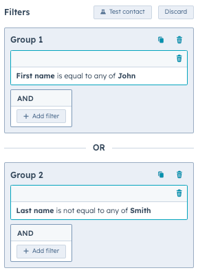
To create a list of contacts who have the first name "John" and the last name "Smith":
```json theme={null}
{
"filterBranch": {
"filterBranchType": "OR",
"filters": [],
"filterBranches": [
{
"filterBranchType": "AND",
"filters": [
{
"filterType": "PROPERTY",
"property": "firstname",
"operation": {
"operationType": "MULTISTRING",
"operator": "IS_EQUAL_TO",
"values": ["John"]
}
},
{
"filterType": "PROPERTY",
"property": "lastname",
"operation": {
"operationType": "MULTISTRING",
"operator": "IS_EQUAL_TO",
"values": ["Smith"]
}
}
],
"filterBranches": []
}
]
}
}
```
In the above example, there is one parent `OR` `filterBranchType` with one nested `AND` `filterBranchType`. The `AND` `filterBranchType` has two `filterType` parameters, one for each criteria.
In the HubSpot user interface, the above code would look like the image below. Any contacts that meet the criteria will be a member of the list.
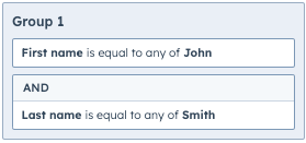
## Filtering on events and associated objects
There are two special versions of `AND` `filterBranchType` parameters:
* `UNIFIED_EVENTS`: used to filter on events.
* `ASSOCIATION`: used to filter on records that are associated with the primary record being evaluated.
These branches should be used within an `AND` filter branch. For example:
```json theme={null}
{
"filterBranches": [
{
"filterBranches": [
{
"filterBranchType": "UNIFIED_EVENTS",
"filterBranchOperator": "AND",
"filters": [
// must have one or more filters here
]
// additional UNIFIED_EVENTS filter branch details omitted
},
{
"filterBranchType": "ASSOCIATION",
"filterBranchOperator": "AND",
"filters": [
// may have one or more filters here
],
"filterBranches": [
// may have another ASSOCIATION branch here if filtering based on line item properties from a contact list
]
// additional ASSOCIATION filter branch details omitted
}
],
"filterBranchOperator": "AND",
"filterBranchType": "AND",
"filters": [
// can have filters here
]
}
// can have more filterBranches here
],
"filterBranchOperator": "OR",
"filterBranchType": "OR",
"filters": []
}
```
## Filter branch types
Below, review the different `filterBranchType` parameters that can be used to construct your list's filter definition structure.
## OR filter branch
Begin your filter definition structure with an `OR` `filterBranchType`. It is used to apply **OR** conditional logic against records that are accepted by the nested `AND` filter branches.
`OR` filter branches:
* Must have one or more `AND` type sub-filter branches.
* Cannot have any filters.
If a record is accepted by any of its nested filter branches, an `OR` filter branch will accept the record as well.
```json theme={null}
{
"filterBranchType": "OR",
"filterBranches": [], // One or more nested AND filter branches
"filters": [] // Zero filters
}
```
## AND filter branch
The `AND` `filterBranchType` is used as a nested filter branch within the parent `OR` filter branch. All filter definitions must have at least one `AND` filter branch for it to be valid. It is used to apply **AND** conditional logic against the records that pass evaluation as defined by its filters and have also been accepted by nested filter branches.
**AND** filter branches:
* Can have zero or more filters.
* Can have zero or more nested `UNIFIED_EVENTS` and/or `ASSOCIATION` `filterBranchType` parameters.
An `AND` filter branch accepts a record if the record is accepted by all of its nested filter branches and the record passes all filters in the filter branch.
```json theme={null}
{
"filterBranchType": "AND",
"filterBranches": [], // Zero or more nested UNIFIED_EVENTS or ASSOCIATION filter branches
"filters": [] // Zero or more filters
}
```
## UNIFIED\_EVENTS filter branch
The `UNIFIED_EVENTS` `filterBranchType` can only be used as a nested filter branch within an `AND` `filterBranchType`. It is used to determine which records have or have not completed a given unified event.
`UNIFIED_EVENTS` type filter branches:
* Can have one or more `PROPERTY` type filters.
* Cannot have any additional filter branches.
A `UNIFIED_EVENTS` filter branch accepts a record if the record passes all filters on the filter branch and the criteria defined by the `UNIFIED_EVENTS` filter branch.
```json theme={null}
{
"filterBranchType": "UNIFIED_EVENTS",
"filterBranches": [], // Zero filter branches
"filters": [], // Zero or more filters
"eventTypeId": "0-1",
"operator": "HAS_COMPLETED"
}
```
| Parameter | Accepted Values |
| ---------- | ------------------------------------ |
| `operator` | `HAS_COMPLETED`, `HAS_NOT_COMPLETED` |
## ASSOCIATION filter branch
The `ASSOCIATION` `filterBranchType` can only be used as a nested filter branch within an `AND` `filterBranchType`. It is used to filter on records which are associated with the primary record being evaluated.
`ASSOCIATION` filter branches:
* Must have one or more filters.
* Cannot have any additional nested filter branches.
An `ASSOCIATION` filter branch accepts a record if it is accepted by all of its nested filter branches and if the record **PASSES** all filters of the filter branch.
You can only have additional `filterBranches` in the case of a `CONTACT` to `LINE_ITEM` association.
```json theme={null}
{
"filterBranchType": "ASSOCIATION",
"filterBranches": [], // Zero or one nested ASSOCIATION filter branches
"filters": [], // Zero or more filters
"objectTypeId": "0-1",
"operator": "IN_LIST",
"associationTypeId": 280,
"associationCategory": "HUBSPOT_DEFINED"
}
```
| Parameter | Accepted Values |
| --------------------- | ------------------------------------------------------- |
| `operator` | `IN_LIST` |
| `associationCategory` | `HUBSPOT_DEFINED`, `USER_DEFINED`, `INTEGRATOR_DEFINED` |
## Filter types
Review the table below for the different types of filters that can be used. The `filterType` parameter is used to define the filter within the `filterBranch`.
| Parameter | Description |
| ------------------------- | --------------------------------------------------------------------------------------------------------------------------------------------------------------------------------------------------------- |
| `ADS_TIME` | Evaluates whether a contact has seen any ads in the timeframe defined by the `pruningRefineBy` parameter. |
| `ADS_SEARCH` | Evaluates whether a contact has performed the ad interactions as defined by the filter. |
| `CTA` | Evaluates whether a contact has or has not interacted with a specific call-to-action as defined by the filter. |
| `EMAIL_EVENT` | Evaluate the opt-in status of a contact for specific email subscriptions as defined by the filter. |
| `EVENT` | Evaluates whether a contact has or does not have a specific event as defined by the filter. |
| `FORM_SUBMISSION` | Evaluates whether a contact has or has not filled out a specific form or any form as defined by the filter. |
| `FORM_SUBMISSION_ON_PAGE` | Evaluates whether a contact has or has not filled out a specific or any form on a specific page as defined by the filter. |
| `IN_LIST` | Evaluates whether a record is or is not a member of a specific list, import, or workflow as defined by the filter. |
| `PAGE_VIEW` | Evaluates whether a contact has or has not viewed a specific page as defined by the filter. |
| `PRIVACY` | Evaluates whether a contact does or does not have privacy consent for a specific privacy type as defined by the filter. |
| `PROPERTY` | Evaluates whether a record’s property value satisfies the property filter operation as defined by the filter. See the [property filter operations](#property-filter-operations) section for more details. |
| `SURVEY_MONKEY` | Evaluates whether a contact has or has not responded to a specific Survey Monkey survey as defined by the filter. |
| `SURVEY_MONKEY_VALUE` | Evaluates whether a contact has or has not responded to a specific Survey Monkey survey’s question with a specified value as defined by the filter. |
| `WEBINAR` | Evaluates whether a contact has or has not registered or attended any webinars or a specific webinar as defined by the filter. |
| `INTEGRATION_EVENT` | Integration event filters can be used to filter specific contacts based on whether or not they have interacted with integration events that have properties as specified by the filter lines. |
## Property filter operations
When filtering for records with the `PROPERTY`, `INTEGRATION_EVENT`, or `SURVEY_MONKEY_VALUE` filter type, you'll include an `operation` object to define the parameters of the filter. This object can contain the following fields:
* `operationType`: the type of operator that you're filtering by (e.g., `NUMBER`). Each type of property supports a set of operation types, and each operation type supports a set of operators, which you'll define with the `operator` field. (e.g., `IS` and `IS_NOT`).
* `operator`: the operator that will be applied to `operationType` (e.g., `IS` and `IS_NOT`). Each property type supports a set of operators. Learn more about property types and their supporter operators in the table below.
* `value` / `values`: the value or values to filter by. Some operators can accept one value, while others can accept multiple values in an array.
* `includeObjectsWithNoValueSet`: defines how the operation should treat records that do not have a value set for the defined property.
* If `true`, a record without a value for the evaluated property will be accepted .
* If `false` (default), a record without a value for the evaluated property will be rejected .
For example, the filter below would filter for contacts with a `firstname` property value of `John`.
```json theme={null}
"filters": [
{
"filterType": "PROPERTY",
"property": "firstname",
"operation": {
"operationType": "MULTISTRING",
"operator": "IS_EQUAL_TO",
"values": ["John"]
}
}
]
```
The table below gives an overview of the available operation types.
| OperationType | Supported operators | Description |
| -------------- | ------------------- | ------------------------------------------------------------------------------------------------------------------------------------------------------------------------------------------------------------------------------------------------------------------------------------------------------------------------------------------------------------------------------- |
| `ALL_PROPERTY` | String | Used to determine whether a property value is known or is unknown as defined by the property operation. |
| `BOOL` | String | Used to determine whether a current (or historical) boolean property value is or is not (or has or has not) equaled a specific value. |
| `ENUMERATION` | String | Used to determine whether an enumeration/multi-select property value is any of, is none of, is exactly, is not exactly, contains all of, does not contain all of, has ever been any of, has never been any of, has ever been exactly, has never been exactly, has ever contained all, or has never contained all of a given set of values as defined by the property operation. |
| `MULTISTRING` | String | Used to determine whether a string property value is equal to, is not equal to, contains, does not contain, starts with, or ends with any of a given set of values as defined by the property operation. |
| `NUMBER` | String | Used to determine whether a current (or historical) number property value is or is not (or has or has not) equaled a specific value as defined by the property operation. |
| `STRING` | String | Used to determine whether a current (or historical) string property value is or is not (or has or has not) equaled a specific value as defined by the property operation. |
| `TIME_POINT` | String | Used to determine if a property has been updated before or after a specific time. That time can be specified as a specific date or relative to the current day. This operation also allows the comparison of two properties or their last updated time. |
| `TIME_RANGED` | String | Used to determine if a property has been updated between or outside of two specific times. These times can be specified as a specific date or relative to the current day. |
## TIME\_POINT and TIME\_RANGED examples
Below, review some examples when using the `TIME_POINT` and `TIME_RANGED` parameter. These parameters can be used in both time-referenced and property-referenced requests. For more information, see the
## Is equal to date
The request below filters for *Last activity date is equal to 03/11/2024 (EDT)*.
```json theme={null}
{
"name": "Sample Date Equal",
"objectTypeId": "0-1",
"processingType": "DYNAMIC",
"filterBranch": {
"filterBranches": [
{
"filterBranches": [],
"filters": [
{
"property": "notes_last_updated",
"operation": {
"operator": "IS_BETWEEN",
"includeObjectsWithNoValueSet": false,
"lowerBoundEndpointBehavior": "INCLUSIVE",
"upperBoundEndpointBehavior": "INCLUSIVE",
"propertyParser": "VALUE",
"lowerBoundTimePoint": {
"timeType": "DATE",
"timezoneSource": "CUSTOM",
"zoneId": "America/New_York",
"year": 2024,
"month": 3,
"day": 11,
"hour": 0,
"minute": 0,
"second": 0,
"millisecond": 0
},
"upperBoundTimePoint": {
"timeType": "DATE",
"timezoneSource": "CUSTOM",
"zoneId": "US/Eastern",
"year": 2024,
"month": 3,
"day": 11,
"hour": 23,
"minute": 59,
"second": 59,
"millisecond": 999
},
"type": "TIME_RANGED",
"operationType": "TIME_RANGED"
},
"filterType": "PROPERTY"
}
],
"filterBranchType": "AND",
"filterBranchOperator": "AND"
}
],
"filters": [],
"filterBranchOperator": "OR",
"filterBranchType": "OR"
}
```
## In Last X Number of Days
The example below filters for *Last activity date is less than 3 days ago*.
```json theme={null}
{
"name": "Sample Date Last 3 days",
"objectTypeId": "0-1",
"processingType": "DYNAMIC",
"filterBranch": {
"filterBranches": [
{
"filterBranches": [],
"filters": [
{
"property": "notes_last_updated",
"operation": {
"operator": "IS_BETWEEN",
"includeObjectsWithNoValueSet": false,
"lowerBoundEndpointBehavior": "INCLUSIVE",
"upperBoundEndpointBehavior": "INCLUSIVE",
"propertyParser": "VALUE",
"lowerBoundTimePoint": {
"timeType": "INDEXED",
"timezoneSource": "CUSTOM",
"zoneId": "US/Eastern",
"indexReference": {
"referenceType": "TODAY"
},
"offset": {
"days": -3
}
},
"upperBoundTimePoint": {
"timeType": "INDEXED",
"timezoneSource": "CUSTOM",
"zoneId": "America/New_York",
"indexReference": {
"referenceType": "NOW"
}
},
"type": "TIME_RANGED",
"operationType": "TIME_RANGED"
},
"filterType": "PROPERTY"
}
],
"filterBranchType": "AND",
"filterBranchOperator": "AND"
}
],
"filters": [],
"filterBranchOperator": "OR",
"filterBranchType": "OR"
}
}
```
## In Next X Number of Days
The example below filters for *Last activity date is less than 5 days from now*.
```json theme={null}
{
"name": "Sample Date Next 5 Days",
"objectTypeId": "0-1",
"processingType": "DYNAMIC",
"filterBranch": {
"filterBranches": [
{
"filterBranches": [],
"filters": [
{
"property": "notes_last_updated",
"operation": {
"operator": "IS_BETWEEN",
"includeObjectsWithNoValueSet": false,
"lowerBoundEndpointBehavior": "INCLUSIVE",
"upperBoundEndpointBehavior": "INCLUSIVE",
"propertyParser": "VALUE",
"lowerBoundTimePoint": {
"timeType": "INDEXED",
"timezoneSource": "CUSTOM",
"zoneId": "US/Eastern",
"indexReference": {
"referenceType": "NOW"
}
},
"upperBoundTimePoint": {
"timeType": "INDEXED",
"timezoneSource": "CUSTOM",
"zoneId": "US/Eastern",
"indexReference": {
"referenceType": "TODAY"
},
"offset": {
"days": 5
}
},
"type": "TIME_RANGED",
"operationType": "TIME_RANGED"
},
"filterType": "PROPERTY"
}
],
"filterBranchType": "AND",
"filterBranchOperator": "AND"
}
],
"filters": [],
"filterBranchOperator": "OR",
"filterBranchType": "OR"
}
}
```
## Updated or Not Updated in the Last X Days
The example below filters for *Last activity date updated in last 7 days*.
To filter for *Last activity date not updated in last 7 days*, change the `operator` parameter to `IS_NOT_BETWEEN`.
```json theme={null}
{
"name": "Sample Date Updated Last 7 Days",
"objectTypeId": "0-1",
"processingType": "DYNAMIC",
"filterBranch": {
"filterBranches": [
{
"filterBranches": [],
"filters": [
{
"property": "notes_last_updated",
"operation": {
"operator": "IS_BETWEEN",
"includeObjectsWithNoValueSet": false,
"lowerBoundEndpointBehavior": "INCLUSIVE",
"upperBoundEndpointBehavior": "INCLUSIVE",
"propertyParser": "UPDATED_AT",
"lowerBoundTimePoint": {
"timeType": "INDEXED",
"timezoneSource": "CUSTOM",
"zoneId": "America/New_York",
"indexReference": {
"referenceType": "TODAY"
},
"offset": {
"days": -7
}
},
"upperBoundTimePoint": {
"timeType": "INDEXED",
"timezoneSource": "CUSTOM",
"zoneId": "America/New_York",
"indexReference": {
"referenceType": "NOW"
}
},
"type": "TIME_RANGED",
"operationType": "TIME_RANGED"
},
"filterType": "PROPERTY"
}
],
"filterBranchType": "AND",
"filterBranchOperator": "AND"
}
],
"filters": [],
"filterBranchOperator": "OR",
"filterBranchType": "OR"
}
}
```
## Is After Date
The example below filters for *Last activity date is after 03/04/2024 (EST)*.
```json theme={null}
{
"name": "Sample Date After",
"objectTypeId": "0-1",
"processingType": "DYNAMIC",
"filterBranch": {
"filterBranches": [
{
"filterBranches": [],
"filters": [
{
"property": "notes_last_updated",
"operation": {
"operator": "IS_AFTER",
"includeObjectsWithNoValueSet": false,
"timePoint": {
"timeType": "DATE",
"timezoneSource": "CUSTOM",
"zoneId": "America/New_York",
"year": 2024,
"month": 3,
"day": 4,
"hour": 23,
"minute": 59,
"second": 59,
"millisecond": 999
},
"endpointBehavior": "EXCLUSIVE",
"propertyParser": "VALUE",
"type": "TIME_POINT",
"operationType": "TIME_POINT"
},
"filterType": "PROPERTY"
}
],
"filterBranchType": "AND",
"filterBranchOperator": "AND"
}
],
"filters": [],
"filterBranchOperator": "OR",
"filterBranchType": "OR"
}
}
```
## Is Relative to Today
The example below can either represent *Last activity date is more than x days from now * or *Last activity date is more than x days ago *.
To filter for the latter, set the value for the `offset` parameter to `<=0`.
```json theme={null}
{
"name": "Sample Days From Now",
"objectTypeId": "0-1",
"processingType": "DYNAMIC",
"filterBranch": {
"filterBranches": [
{
"filterBranches": [],
"filters": [
{
"property": "notes_last_updated",
"operation": {
"operator": "IS_AFTER",
"includeObjectsWithNoValueSet": false,
"timePoint": {
"timeType": "INDEXED",
"timezoneSource": "CUSTOM",
"zoneId": "America/New_York",
"indexReference": {
"referenceType": "TODAY"
},
"offset": {
"days": 2
}
},
"endpointBehavior": "EXCLUSIVE",
"propertyParser": "VALUE",
"type": "TIME_POINT",
"operationType": "TIME_POINT"
},
"filterType": "PROPERTY"
}
],
"filterBranchType": "AND",
"filterBranchOperator": "AND"
}
],
"filters": [],
"filterBranchOperator": "OR",
"filterBranchType": "OR"
}
}
```
## Is Before or After another property (value or last updated)
The example below compares the values where *Last activity date is before Latest Open Lead Date*.
To filter for *Last activity date is after Latest Open Lead Date*: set the `operator` value to `IS_AFTER`.
To filter for when the Latest Open Lead Date was updated: set the `referenceType` value to `UPDATED_AT`.
```json theme={null}
{
"name": "Sample Property Before",
"objectTypeId": "0-1",
"processingType": "DYNAMIC",
"filterBranch": {
"filterBranches": [
{
"filterBranches": [],
"filters": [
{
"property": "notes_last_updated",
"operation": {
"operator": "IS_BEFORE",
"includeObjectsWithNoValueSet": false,
"timePoint": {
"timeType": "PROPERTY_REFERENCED",
"timezoneSource": "CUSTOM",
"zoneId": "US/Eastern",
"property": "hs_latest_open_lead_date",
"referenceType": "VALUE"
},
"endpointBehavior": "EXCLUSIVE",
"propertyParser": "VALUE",
"type": "TIME_POINT",
"operationType": "TIME_POINT"
},
"filterType": "PROPERTY"
}
],
"filterBranchType": "AND",
"filterBranchOperator": "AND"
}
],
"filters": [],
"filterBranchType": "OR",
"filterBranchOperator": "OR"
}
}
```
## Refine by operation
There are two types of refine by operations that can be used in certain filters:
* `pruningRefineBy`: refine the data set to a particular timeframe.
* `coalescingRefineBy`: determines whether the record **PASSES** the filter the number of times defined.
Filters only support up to one refine by operation at a time, even if some filters allow for both a coalescing and pruning refine by operation to be passed in. This is enforced by HubSpot's API.
## Pruning Refine By operations
Pruning refine by operations are used to narrow down the dataset that will be used for filter evaluation by refining the dataset to a particular timeframe. Pruning refine by operations are classified into two types: relative and absolute.
* **Relative**: narrow the dataset down based on a time offset of a number of days or weeks in the past or in the future.
* **Absolute**: narrow the dataset down based on the data being before or after a specific timestamp
For both relative and absolute refine by operations, there are ranged and comparative derivatives.
## Absolute Comparative timestamp
Used to narrow the relevant dataset down based on whether the timestamp of the data being evaluated is before or after a specific timestamp as defined by the refine by operation.
```json theme={null}
{
"type": "ABSOLUTE_COMPARATIVE",
"comparison": "BEFORE",
"timestamp": 1698915170126
}
```
| Parameter | Description |
| ------------ | --------------------------------------------------------------------------------------------------------- |
| `comparison` | Whether the data's timestamp is before or after the defined `timestamp`. Values include:`BEFORE`, `AFTER` |
## Absolute Ranged timestamp
Used to narrow the relevant dataset down based on whether the timestamp of the data being evaluated is between or is not between an upper and lower bound timestamp as defined by the refine by operation.
```json theme={null}
{
"type": "ABSOLUTE_RANGED",
"rangeType": "BETWEEN",
"lowerTimestamp": 1698915170126,
"upperTimestamp": 1682406908449
}
```
| Parameter | Description |
| ----------- | ------------------------------------------------------------------------------------------------------------------------------------------------ |
| `rangeType` | Whether the data's timestamp is between or not between the defined `lowerTimestamp`and `upperTimestamp`. Values include:`BETWEEN`, `NOT_BETWEEN` |
## Relative Comparative timestamp
Used to narrow the relevant dataset down based on whether the timestamp of the data being evaluated is before or after a certain number of days or weeks in the past or future relative to the current timestamp as defined by the refine by operation.
```json theme={null}
{
"type": "RELATIVE_COMPARATIVE",
"comparison": "BEFORE",
"timeOffset": {
"offsetDirection": "PAST",
"timeUnit": "DAYS",
"amount": 4
}
}
```
| Parameter | Description |
| ----------------- | ------------------------------------------------------------------------------------------------------------------ |
| `comparison` | Whether the data's timestamp is before or after the defined `timeOffset` values. Values include: `BEFORE`, `AFTER` |
| `offsetDirection` | Values include:`PAST`, `FUTURE` |
| `timeUnit` | Values include:`DAYS`, `WEEKS` |
| `amount` | A number value. |
## Relative Ranged timestamp
Used to narrow the relevant dataset down based on whether the timestamp of the data being evaluated is between or is not between an upper and lower bound time offset relative to the current timestamp. The time offsets are a certain number of days or weeks in the past or the future as defined by the refine by operation.
```json theme={null}
{
"type": "RELATIVE_RANGED",
"rangeType": "BETWEEN",
"timeOffset": {
"offsetDirection": "PAST",
"timeUnit": "DAYS",
"amount": 4
}
}
```
| Parameter | Description |
| ----------------- | -------------------------------------------------------------------------------------------------------------------------------- |
| `rangeType` | Whether the data's timestamp is between or not between the defined `timeOffset` values. Values include: `BETWEEN`, `NOT_BETWEEN` |
| `offsetDirection` | Values include:`PAST`, `FUTURE` |
| `timeUnit` | Values include:`DAYS`, `WEEKS` |
| `amount` | A number value. |
## Coalescing Refine By operations
Coalescing refine by operations are used once the filter criteria has been applied to the relevant dataset. The only coalescing refine by operation supported by the Lists API is a “number of occurrences” operation that determines whether an object in the dataset **PASSED** the filter evaluation at least a minimum number of times and less than a maximum number of times.
```json theme={null}
{
"type": "NUM_OCCURRENCES",
"minOccurrences": 1, // Optional
"maxOccurrences": 4 // Optional
}
```
| Parameter | Description |
| ----------------- | ----------------------------------------------------------------------------------------------------------------------------------------------------------------------------------------------------------------------------------------------------------------------------------------------------------- |
| `NUM_OCCURRENCES` | Used to determine whether an object in the relevant dataset PASSED the filter evaluation at least a minimum number of times (or zero times if a minimum is not provided) and at most a maximum number of times (or any number of times if a maximum is not provided) as defined by the refine by operation. |
### All property types operations
For any property, filters for whether the property value is known or unknown. Available operators are: `IS_KNOWN` and `IS_NOT_KNOWN`.
```json theme={null}
// alltypes filter
{
"filterType": "PROPERTY",
"property": "any_property",
"operation": {
"propertyType": "alltypes",
"operator": "IS_KNOWN"
}
}
```
### String operations
Operations for string type properties.
Available operators are: `IS_EQUAL_TO`, `IS_NOT_EQUAL_TO`, `CONTAINS`, `DOES_NOT_CONTAIN`, `STARTS_WITH`, `ENDS_WITH`, `HAS_EVER_BEEN_EQUAL_TO`, `HAS_NEVER_BEEN_EQUAL_TO`, `HAS_EVER_CONTAINED`, `HAS_NEVER_CONTAINED`.
```json theme={null}
// string property filter
{
"filterType": "PROPERTY",
"property": "string_property_name",
"operation": {
"propertyType": "string",
"operator": "CONTAINS",
"value": "def"
}
}
```
### Multi-string operations
Operations for multiple string values.
Available operators are: `IS_EQUAL_TO`, `IS_NOT_EQUAL_TO`, `CONTAINS`, `DOES_NOT_CONTAIN`, `STARTS_WITH`, `ENDS_WITH`.
```json theme={null}
// multi-string property filter
{
"filterType": "PROPERTY",
"property": "string_property_name",
"operation": {
"propertyType": "multistring",
"operator": "CONTAINS",
"values": ["def", "abc", "123"]
}
}
```
### Number operations
Operations for number type properties.
Available operators are: `IS_EQUAL_TO`, `IS_NOT_EQUAL_TO`, `CONTAINS`, `DOES_NOT_CONTAIN`, `STARTS_WITH`, `ENDS_WITH`, `HAS_EVER_BEEN_EQUAL_TO`, `HAS_NEVER_BEEN_EQUAL_TO`, `IS_BETWEEN`, `IS_NOT_BETWEEN`.
```json theme={null}
// number property filter
{
"filterType": "PROPERTY",
"property": "number_property_name",
"operation": {
"propertyType": "number",
"operator": "IS_GREATER_THAN",
"value": 100
}
}
```
To filter for ranges, include a `lowerBound` and `upperBound`.
```json theme={null}
// number property filter
{
"filterType": "PROPERTY",
"property": "datetime_property_name",
"operation": {
"propertyType": "number-ranged",
"operator": "IS_BETWEEN",
"lowerBound": 0,
"upperBound": 10
}
}
```
### Boolean operations
Operations for boolean type properties. Can only filter for a `value` of `true` or `false`.
Available operators are: `IS_EQUAL_TO`, `IS_NOT_EQUAL_TO`, `HAS_EVER_BEEN_EQUAL_TO, HAS_NEVER_BEEN_EQUAL_TO`.
```json theme={null}
// boolean property filter
{
"filterType": "PROPERTY",
"property": "boolean_property_name",
"operation": {
"propertyType": "bool",
"operator": "IS_EQUAL_TO",
"value": true
}
}
```
### Enumeration operations
Operations for enumeration type properties.
Available operators are: `IS_EQUAL_TO`, `IS_NOT_EQUAL_TO`, `HAS_EVER_BEEN_ANY_OF, HAS_NEVER_BEEN_ANY_OF`.
```json theme={null}
// enumeration property filter
{
"filterType": "PROPERTY",
"property": "enumeration_property_name",
"operation": {
"propertyType": "enumeration",
"operator": "IS_ANY_OF",
"values": ["abc", "def", "xyz"]
}
}
```
### Datetime operations
There are five different operation types for datetime properties, as set by the `propertyType` field:
* `datetime`: compares the property value to a specific datetime stamp. Available operators are: `IS_EQUAL_TO`, `IS_BEFORE_DATE` (millisecond of day's start), `IS_AFTER_DATE` (last millisecond of day's end).
```json theme={null}
// datetime property filter
{
"filterType": "PROPERTY",
"property": "datetime_property_name",
"operation": {
"propertyType": "datetime",
"operator": "IS_EQUAL_TO",
"timestamp": 1504703360618
}
}
```
* `datetime-comparative`: compares the property value to another other datetime property on the contact record. Available operators are: `IS_BEFORE`, `IS_AFTER`.
```json theme={null}
// datetime comparative property filter
{
"filterType": "PROPERTY",
"property": "datetime_property_name",
"operation": {
"propertyType": "datetime-comparative",
"operator": "IS_AFTER",
"comparisonPropertyName": "other_datetime_property"
}
}
```
* `datetime-ranged`: compares the property value to a specific timestamp range. Available operators are: `IS_BETWEEN`, `IS_NOT_BETWEEN`.
```json theme={null}
// datetime range property filter
{
"filterType": "PROPERTY",
"property": "datetime_property_name",
"operation": {
"propertyType": "datetime-ranged",
"operator": "IS_BETWEEN",
"lowerBoundTimestamp": 1,
"upperBoundTimestamp": 2
}
}
```
* `datetime-rolling`: compares the property value to a rolling number of days. Available operators are: `IS_LESS_THAN_X_DAYS_AGO`, `IS_MORE_THAN_X_DAYS_AGO, IS_LESS_THAN_X_DAYS_FROM_NOW`, `IS_MORE_THAN_X_DAYS_FROM_NOW`.
```json theme={null}
// datetime rolling property filter
{
"filterType": "PROPERTY",
"property": "datetime_property_name",
"operation": {
"propertyType": "datetime-rolling",
"operator": "IS_LESS_THAN_X_DAYS_AGO",
"numberOfDays": 5
}
}
```
* `rolling-property-updated`: compares the last time the property was updated to a rolling number of days. Available operators are: `UPDATED_IN_LAST_X_DAYS`, `NOT_UPDATED_IN_LAST_X_DAYS`.
```json theme={null}
// datetime rolling property filter
{
"filterType": "PROPERTY",
"property": "datetime_property_name",
"operation": {
"propertyType": "rolling-property-updated",
"operator": "UPDATED_IN_LAST_X_DAYS",
"numberOfDays": 3
}
}
```
# Cancel the conversion of a list
Source: https://developers.hubspot.com/docs/api-reference/latest/crm/lists/list-management/cancel-conversion
specs/2026-03/crm-lists-v2026-03.json DELETE /crm/lists/2026-03/{listId}/schedule-conversion
Delete an existing scheduled conversion for a list.
# Creates a folder
Source: https://developers.hubspot.com/docs/api-reference/latest/crm/lists/list-management/create-folder
specs/2026-03/crm-lists-v2026-03.json POST /crm/lists/2026-03/folders
Creates a folder with the given information.
# Delete a folder
Source: https://developers.hubspot.com/docs/api-reference/latest/crm/lists/list-management/delete-folder
specs/2026-03/crm-lists-v2026-03.json DELETE /crm/lists/2026-03/folders/{folderId}
Deletes the folder with the given Id.
# Retrieve the conversion details for a list
Source: https://developers.hubspot.com/docs/api-reference/latest/crm/lists/list-management/get-conversion-details
specs/2026-03/crm-lists-v2026-03.json GET /crm/lists/2026-03/{listId}/schedule-conversion
Retrieve the conversion details for a list. This can be used to check for an upcoming conversion, or to get the details of when a list was already converted.
# Retrieve a folder
Source: https://developers.hubspot.com/docs/api-reference/latest/crm/lists/list-management/get-folder
specs/2026-03/crm-lists-v2026-03.json GET /crm/lists/2026-03/folders
Retrieves a folder and recursively includes all folders via the childNodes attribute. The child lists field will be empty in all child nodes. Only the folder retrieved will include the child lists in that folder.
# Moves a folder
Source: https://developers.hubspot.com/docs/api-reference/latest/crm/lists/list-management/move-folder
specs/2026-03/crm-lists-v2026-03.json PUT /crm/lists/2026-03/folders/{folderId}/move/{newParentFolderId}
This moves the folder from its current location to a new location. It updates the parent of this folder to the new Id given.
# Moves a list to a given folder
Source: https://developers.hubspot.com/docs/api-reference/latest/crm/lists/list-management/move-list-to-folder
specs/2026-03/crm-lists-v2026-03.json PUT /crm/lists/2026-03/folders/move-list
Given a list and a folder, the list will be moved to that folder.
# Rename a folder
Source: https://developers.hubspot.com/docs/api-reference/latest/crm/lists/list-management/rename-folder
specs/2026-03/crm-lists-v2026-03.json PUT /crm/lists/2026-03/folders/{folderId}/rename
Renames the given folderId with a new name.
# Schedule or update the conversion of a list to static
Source: https://developers.hubspot.com/docs/api-reference/latest/crm/lists/list-management/schedule-conversion
specs/2026-03/crm-lists-v2026-03.json PUT /crm/lists/2026-03/{listId}/schedule-conversion
Schedule the conversion of an active list into a static list, or update the already scheduled conversion. This can be scheduled for a specific date or based on activity.
# Add records to a list
Source: https://developers.hubspot.com/docs/api-reference/latest/crm/lists/memberships/add-to-list
specs/2026-03/crm-lists-v2026-03.json PUT /crm/lists/2026-03/{listId}/memberships/add
Add the records provided to the list. Records that do not exist or that are already members of the list are ignored.
This endpoint only works for lists that have a `processingType` of `MANUAL` or `SNAPSHOT`.
# Add All Records from a Source List to a Destination List
Source: https://developers.hubspot.com/docs/api-reference/latest/crm/lists/memberships/add-to-list-from-source-list
specs/2026-03/crm-lists-v2026-03.json PUT /crm/lists/2026-03/{listId}/memberships/add-from/{sourceListId}
Add all of the records from a *source list* (specified by the `sourceListId`) to a *destination list* (specified by the `listId`). Records that are already members of the *destination list* will be ignored. The *destination* and *source list* IDs must be different. The *destination* and *source lists* must contain records of the same type (e.g. contacts, companies, etc.).
This endpoint only works for *destination lists* that have a `processingType` of `MANUAL` or `SNAPSHOT`. The *source list* can have any `processingType`.
This endpoint only supports a `sourceListId` for lists with less than 100,000 memberships.
# Delete all records from a list
Source: https://developers.hubspot.com/docs/api-reference/latest/crm/lists/memberships/delete-list-listId
specs/2026-03/crm-lists-v2026-03.json DELETE /crm/lists/2026-03/{listId}/memberships
Remove **all** of the records from a list. ***Note:*** *The list is not deleted.*
This endpoint only works for lists that have a `processingType` of `MANUAL` or `SNAPSHOT`.
This endpoint only supports lists that have less than 100,000 memberships.
# Get lists a record is a member of
Source: https://developers.hubspot.com/docs/api-reference/latest/crm/lists/memberships/get-lists-per-record
specs/2026-03/crm-lists-v2026-03.json GET /crm/lists/2026-03/records/{objectTypeId}/{recordId}/memberships
For given record provide lists this record is member of.
# Retrieve lists
Source: https://developers.hubspot.com/docs/api-reference/latest/crm/lists/memberships/get-memberships-batch
specs/2026-03/crm-lists-v2026-03.json POST /crm/lists/2026-03/records/memberships/batch/read
# Fetch List Memberships Ordered by Added to List Date
Source: https://developers.hubspot.com/docs/api-reference/latest/crm/lists/memberships/get-memberships-by-added-date
specs/2026-03/crm-lists-v2026-03.json GET /crm/lists/2026-03/{listId}/memberships/join-order
Fetch the memberships of a list in order sorted by the time the records were added to the list.
The `recordId`s are sorted in *ascending* order if an `after` offset or no offset is provided. If only a `before` offset is provided, then the records are sorted in *descending* order.
The `after` offset parameter will take precedence over the `before` offset in a case where both are provided.
# Fetch List Memberships Ordered by ID
Source: https://developers.hubspot.com/docs/api-reference/latest/crm/lists/memberships/get-memberships-by-id
specs/2026-03/crm-lists-v2026-03.json GET /crm/lists/2026-03/{listId}/memberships
Fetch the memberships of a list in order sorted by the `recordId` of the records in the list.
The `recordId`s are sorted in *ascending* order if an `after` offset or no offset is provided. If only a `before` offset is provided, then the records are sorted in *descending* order.
The `after` offset parameter will take precedence over the `before` offset in a case where both are provided.
# Update list membership
Source: https://developers.hubspot.com/docs/api-reference/latest/crm/lists/memberships/update-list-memberships
specs/2026-03/crm-lists-v2026-03.json PUT /crm/lists/2026-03/{listId}/memberships/add-and-remove
Add and/or remove records that have already been created in the system to and/or from a list.
This endpoint only works for lists that have a `processingType` of `MANUAL` or `SNAPSHOT`.
# Restore list
Source: https://developers.hubspot.com/docs/api-reference/latest/crm/lists/restore-list
specs/2026-03/crm-lists-v2026-03.json PUT /crm/lists/2026-03/{listId}/restore
Restore a previously deleted list by **ILS list ID**. Deleted lists are eligible to be restored up-to 90-days after the list has been deleted.
# Search Lists
Source: https://developers.hubspot.com/docs/api-reference/latest/crm/lists/search/search-lists
specs/2026-03/crm-lists-v2026-03.json POST /crm/lists/2026-03/search
Search lists by list name or page through all lists by providing an empty `query` value.
# Update list filters
Source: https://developers.hubspot.com/docs/api-reference/latest/crm/lists/update-list-filters
specs/2026-03/crm-lists-v2026-03.json PUT /crm/lists/2026-03/{listId}/update-list-filters
Update the filter branch definition of a `DYNAMIC` list. Once updated, the list memberships will be re-evaluated and updated to match the new definition.
# Update list name
Source: https://developers.hubspot.com/docs/api-reference/latest/crm/lists/update-list-name
specs/2026-03/crm-lists-v2026-03.json PUT /crm/lists/2026-03/{listId}/update-list-name
Update the name of a list. The name must be globally unique relative to all other public lists in the portal.
# Create appointments
Source: https://developers.hubspot.com/docs/api-reference/latest/crm/objects/appointments/batch/create-appointments
specs/2026-03/crm-appointments-v2026-03.json POST /crm/objects/2026-03/{objectType}/batch/create
Create multiple appointments in a single request.
# Delete appointments
Source: https://developers.hubspot.com/docs/api-reference/latest/crm/objects/appointments/batch/delete-appointments
specs/2026-03/crm-appointments-v2026-03.json POST /crm/objects/2026-03/{objectType}/batch/archive
Archive multiple appointments using their IDs.
# Retrieve appointments
Source: https://developers.hubspot.com/docs/api-reference/latest/crm/objects/appointments/batch/get-appointments
specs/2026-03/crm-appointments-v2026-03.json POST /crm/objects/2026-03/{objectType}/batch/read
Retrieve records by record ID or include the `idProperty` parameter to retrieve records by a custom unique value property.
# Update appointments
Source: https://developers.hubspot.com/docs/api-reference/latest/crm/objects/appointments/batch/update-appointments
specs/2026-03/crm-appointments-v2026-03.json POST /crm/objects/2026-03/{objectType}/batch/update
# Upsert appointments
Source: https://developers.hubspot.com/docs/api-reference/latest/crm/objects/appointments/batch/upsert-appointments
specs/2026-03/crm-appointments-v2026-03.json POST /crm/objects/2026-03/{objectType}/batch/upsert
Create or update records identified by a unique property value as specified by the `idProperty` query param. `idProperty` query param refers to a property whose values are unique for the object.
# Create an appointment
Source: https://developers.hubspot.com/docs/api-reference/latest/crm/objects/appointments/create-appointment
specs/2026-03/crm-appointments-v2026-03.json POST /crm/objects/2026-03/{objectType}
Create a appointment with the given properties and return a copy of the object, including the ID. Documentation and examples for creating standard appointments is provided.
# Delete an appointment
Source: https://developers.hubspot.com/docs/api-reference/latest/crm/objects/appointments/delete-appointment
specs/2026-03/crm-appointments-v2026-03.json DELETE /crm/objects/2026-03/{objectType}/{objectId}
Move an Object identified by `{appointmentId}` to the recycling bin.
# Retrieve an appointment
Source: https://developers.hubspot.com/docs/api-reference/latest/crm/objects/appointments/get-appointment
specs/2026-03/crm-appointments-v2026-03.json GET /crm/objects/2026-03/{objectType}/{objectId}
Read an Object identified by `{appointmentId}`. `{appointmentId}` refers to the internal object ID by default, or optionally any unique property value as specified by the `idProperty` query param. Control what is returned via the `properties` query param.
# Retrieve appointments
Source: https://developers.hubspot.com/docs/api-reference/latest/crm/objects/appointments/get-appointments
specs/2026-03/crm-appointments-v2026-03.json GET /crm/objects/2026-03/{objectType}
Read a page of appointments. Control what is returned via the `properties` query param.
# Appointments API
Source: https://developers.hubspot.com/docs/api-reference/latest/crm/objects/appointments/guide
Use the appointments API to manage appointments in the HubSpot CRM.
In HubSpot, appointments store information about scheduled appointments. The appointments endpoints allow you to create and manage appointment records in your HubSpot account, as well as sync appointment data between HubSpot and other systems.
The appointment object must be [activated in the HubSpot account](https://knowledge.hubspot.com/data-management/use-the-data-model-builder#activate-or-deactivate-an-object) to manage appointment records. Learn more about objects, records, properties, and associations APIs in the [Understanding the CRM](/docs/guides/crm/understanding-the-crm) guide.
## Create appointments
To create new appointments:
* To create one appointment, make a `POST` request to `/crm/objects/2026-03/appointments`.
* To create multiple appointments, make a `POST` request to `/crm/objects/2026-03/appointments/batch/create`.
In your request, include your appointment data in a `properties` object. You can also add an `associations` object to associate your new appointment with existing records (e.g., contacts, companies), or activities (e.g., meetings, notes).
For batch create actions, you can enable multi-status errors which tell you which records were successfully created and which were not. Learn more about [setting up multi-status error handling](/docs/api-reference/error-handling#multi-status-errors).
### Create appointments with property values
When creating an appointment, include appointment properties to store the appointment's details.
For example, to create a new appointment, your request may look similar to the following:
```json theme={null}
{
"properties": {
"hs_appointment_name": "Annual checkup",
"hs_appointment_start": "2026-06-01T09:00:00Z",
"hs_appointment_end": "2026-06-01T10:00:00Z",
"hs_appointment_status": "SCHEDULED"
}
}
```
For a list of default appointment properties, refer to the [appointments object definition page](/docs/api-reference/latest/crm/objects/appointments/object-definition). To view all available appointment properties in your account, including custom properties, make a `GET` request to `/crm/properties/2026-03/appointments`. Learn more about the [properties API](/docs/api-reference/latest/crm/properties/guide).
### Create appointments with associations
When creating a new appointment, you can also associate the appointment with [existing records](https://knowledge.hubspot.com/records/associate-records) or [activities](https://knowledge.hubspot.com/records/associate-activities-with-records) by including an `associations` array.
For example, to associate a new appointment with an existing contact, your request would look like the following:
```json theme={null}
{
"properties": {
"hs_appointment_name": "Annual checkup",
"hs_appointment_start": "2026-06-01T09:00:00Z",
"hs_appointment_end": "2026-06-01T10:00:00Z"
},
"associations": [
{
"to": {
"id": "123456"
},
"types": [
{
"associationCategory": "HUBSPOT_DEFINED",
"associationTypeId": 578
}
]
}
]
}
```
| Parameter | Description |
| --------- | --------------------------------------------------------------------------------------------------------------------------------------------------------------------------------------------------------------------------------------------------------------------------------------------------------------------------------------------------------------------------------------------------------------------------------------------------------------------------------------------- |
| `to` | The record or activity you want to associate with the appointment, specified by its unique `id` value. |
| `types` | The type of the association between the appointment and the record/activity. Include the `associationCategory` and `associationTypeId`. Default association type IDs are listed on the [associations API guide](/docs/api-reference/latest/crm/associations/associate-records/guide#association-type-id-values), or you can retrieve the value for custom association types via the [associations API](/docs/api-reference/latest/crm/associations/associate-records/guide#retrieve-association-types). |
## Retrieve appointments
You can retrieve appointments individually or in batches. Include the following query parameters in your request URLs to retrieve certain data.
| Parameter | Description |
| ----------------------- | ---------------------------------------------------------------------------------------------------------------------------------------------------------------------------------------------------------------------------------------------------------------- |
| `properties` | A comma-separated list of the properties to be returned in the response. If a requested property isn't defined, it won't be included in the response. If a requested property is defined but an appointment doesn't have a value, it will be returned as `null`. |
| `propertiesWithHistory` | A comma-separated list of the current and historical properties to be returned in the response. |
| `associations` | Supported when retrieving an individual appointment or all appointments, a comma-separated list of objects to retrieve associated IDs for. Learn more about the [associations API](/docs/api-reference/latest/crm/associations/associate-records/guide). |
### Retrieve an individual appointment
To retrieve an individual appointment by its record ID, make a `GET` request to `/crm/objects/2026-03/appointments/{appointmentId}`.
### Retrieve all appointments
To request a list of all appointments, make a `GET` request to `/crm/objects/2026-03/appointments`.
You can retrieve up to 100 appointments in one request.
* To retrieve a specific amount under 100, add a value to the `limit` parameter. For example, `?limit=50`.
* To paginate through results, include the `after` parameter with the `after` value returned from the previous request.
### Retrieve a batch of appointments
To retrieve appointments in batches, make a `POST` request to `/crm/objects/2026-03/appointments/batch/read`. Include the `id` values of the appointments you want to retrieve.
**Please note:** the batch endpoint cannot retrieve associations. To view associations for a specific batch of appointments, retrieve the appointments' `id` values first, then include them in a request to the batch read associations API endpoint. Learn how to retrieve associations with the [associations API](/docs/api-reference/latest/crm/associations/associate-records/guide).
For example, to retrieve a batch of appointments by their record ID values:
```json theme={null}
{
"properties": ["hs_appointment_name", "hs_appointment_start", "hs_appointment_end"],
"inputs": [
{
"id": "1234567"
},
{
"id": "987456"
}
]
}
```
## Update appointments
You can update appointments individually or in batches.
### Update an individual appointment
To update an individual appointment by its record ID, make a `PATCH` request to `/crm/objects/2026-03/appointments/{appointmentId}`, and include the data you want to update.
For example:
```json theme={null}
{
"properties": {
"hs_appointment_status": "COMPLETED"
}
}
```
### Update a batch of appointments
To update multiple appointments, make a `POST` request to `/crm/objects/2026-03/appointments/batch/update`. In your request body, include each appointment's record ID as the `id` and include the properties you want to update.
For example:
```json theme={null}
{
"inputs": [
{
"id": "123456789",
"properties": {
"hs_appointment_status": "COMPLETED"
}
},
{
"id": "56789123",
"properties": {
"hs_appointment_status": "CANCELLED"
}
}
]
}
```
## Upsert appointments
You can batch create and update appointments at the same time using the upsert endpoint. Following the request, if the appointments already exist, they'll be updated; if they don't exist, they'll be created.
To upsert appointments, make a `POST` request to `/crm/objects/2026-03/appointments/batch/upsert`.
## Merge appointments
To merge two appointment records, make a `POST` request to `/crm/objects/2026-03/appointments/merge`. The remaining record combines activities, associations, and most property values from both records. For example, merge duplicate appointments to preserve historical context and consolidate their activity timelines. Learn more about [what happens when you merge HubSpot records](https://knowledge.hubspot.com/records/merge-records#what-happens-when-i-merge-records).
Include the following in your request body:
| Field | Description |
| ----------------- | ------------------------------------------------------------------------------------------ |
| `objectIdToMerge` | The record ID to merge with the primary record. |
| `primaryObjectId` | The record ID of the primary record, which is the record that will remain after the merge. |
For example, to merge the record `45678` into the record `12345`, your request would look like:
```json theme={null}
{
"objectIdToMerge": "45678",
"primaryObjectId": "12345"
}
```
In a successful merge response, the `id` is the record ID of the merged record.
**Please note:** if an account is enrolled in the [*Primary ID Preservation for Merged Records* public beta](https://app.hubspot.com/l/product-updates/?rollout=318895), the primary (i.e., the remaining record after a merge) record's Record ID value (`primaryObjectId`) is preserved instead of generating a new one. Once enrolled, this behavior applies to all merges, including [in HubSpot](https://knowledge.hubspot.com/records/merge-records) and all versions of the API.
## Associate existing appointments with records or activities
To associate an appointment with other CRM records or an activity, make a `PUT` request to `/crm/objects/2026-03/appointments/{appointmentId}/associations/{toObjectType}/{toObjectId}/{associationTypeId}`.
To retrieve the `associationTypeId` value, refer to the [list of default values](/docs/api-reference/latest/crm/associations/associate-records/guide#association-type-id-values), or make a `GET` request to `/crm/associations/2026-03/{fromObjectType}/{toObjectType}/labels`.
Learn more about the [associations API](/docs/api-reference/latest/crm/associations/associate-records/guide).
## Delete appointments
You can delete appointments individually or in batches, which will add the appointment to the recycling bin in HubSpot. You can later [restore the record within HubSpot](https://knowledge.hubspot.com/records/restore-deleted-records).
* To delete an individual appointment, make a `DELETE` request to `/crm/objects/2026-03/appointments/{appointmentId}`.
* To delete appointments in batches, make a `POST` request to `/crm/objects/2026-03/appointments/batch/archive`.
# Merge two appointments
Source: https://developers.hubspot.com/docs/api-reference/latest/crm/objects/appointments/merge/merge-appointments
specs/2026-03/crm-appointments-v2026-03.json POST /crm/objects/2026-03/{objectType}/merge
Merge two object types together
# Appointment object definition
Source: https://developers.hubspot.com/docs/api-reference/latest/crm/objects/appointments/object-definition
Information about the Appointment object, including identifiers, feature support, and default properties.
Below are the available default properties that can be set for each appointment. To retrieve the complete list of appointment properties available in your specific account, including any custom properties, make a `GET` request to `/crm/properties/2026-03/appointments`. See the [Properties API documentation](/docs/api-reference/latest/crm/properties/guide) for full details.
Note that your account's available properties may vary based on:
* Your HubSpot subscription level and enabled features.
* Custom properties added by your organization.
* Account age (older accounts may have slightly different property variations).
# Search for appointments
Source: https://developers.hubspot.com/docs/api-reference/latest/crm/objects/appointments/search/search-appointments
specs/2026-03/crm-appointments-v2026-03.json POST /crm/objects/2026-03/{objectType}/search
Search for appointments based on specified criteria. Learn more about [CRM search](https://developers.hubspot.com/docs/guides/api/crm/search#make-a-search-request).
# Update an appointment
Source: https://developers.hubspot.com/docs/api-reference/latest/crm/objects/appointments/update-appointment
specs/2026-03/crm-appointments-v2026-03.json PATCH /crm/objects/2026-03/{objectType}/{objectId}
Perform a partial update of an Object identified by `{appointmentId}`or optionally a unique property value as specified by the `idProperty` query param. `{appointmentId}` refers to the internal object ID by default, and the `idProperty` query param refers to a property whose values are unique for the object. Provided property values will be overwritten. Read-only and non-existent properties will result in an error. Properties values can be cleared by passing an empty string.
# Create carts
Source: https://developers.hubspot.com/docs/api-reference/latest/crm/objects/carts/batch/create-carts
specs/2026-03/crm-carts-v2026-03.json POST /crm/objects/2026-03/{objectType}/batch/create
# Archive carts
Source: https://developers.hubspot.com/docs/api-reference/latest/crm/objects/carts/batch/delete-carts
specs/2026-03/crm-carts-v2026-03.json POST /crm/objects/2026-03/{objectType}/batch/archive
# Retrieve carts
Source: https://developers.hubspot.com/docs/api-reference/latest/crm/objects/carts/batch/get-carts
specs/2026-03/crm-carts-v2026-03.json POST /crm/objects/2026-03/{objectType}/batch/read
# Update carts
Source: https://developers.hubspot.com/docs/api-reference/latest/crm/objects/carts/batch/update-carts
specs/2026-03/crm-carts-v2026-03.json POST /crm/objects/2026-03/{objectType}/batch/update
# Upsert carts
Source: https://developers.hubspot.com/docs/api-reference/latest/crm/objects/carts/batch/upsert-carts
specs/2026-03/crm-carts-v2026-03.json POST /crm/objects/2026-03/{objectType}/batch/upsert
# Create a cart
Source: https://developers.hubspot.com/docs/api-reference/latest/crm/objects/carts/create-cart
specs/2026-03/crm-carts-v2026-03.json POST /crm/objects/2026-03/{objectType}
# Archive a cart
Source: https://developers.hubspot.com/docs/api-reference/latest/crm/objects/carts/delete-cart
specs/2026-03/crm-carts-v2026-03.json DELETE /crm/objects/2026-03/{objectType}/{objectId}
# Retrieve a cart
Source: https://developers.hubspot.com/docs/api-reference/latest/crm/objects/carts/get-cart
specs/2026-03/crm-carts-v2026-03.json GET /crm/objects/2026-03/{objectType}/{objectId}
# Retrieve all carts
Source: https://developers.hubspot.com/docs/api-reference/latest/crm/objects/carts/get-carts
specs/2026-03/crm-carts-v2026-03.json GET /crm/objects/2026-03/{objectType}
# Carts API
Source: https://developers.hubspot.com/docs/api-reference/latest/crm/objects/carts/guide
Create and manage ecommerce cart data.
Use the carts API to create and manage data related to ecommerce purchases in HubSpot. This can be especially useful for keeping HubSpot data synced with external ecommerce platforms, such as Shopify and NetSuite.
For example, use the API to sync cart data with Shopify, including associating the cart with an order and contact record.
## Create carts
To create a cart, make a `POST` request to `crm/objects/2026-03/cart`.
In the request body, you can include the `properties` and `associations` objects to set property values and associate the cart with other CRM objects (e.g., contacts and line items). Learn more about order properties and associations below.
### Properties
Cart details are stored in cart properties. HubSpot provides a set of [default cart properties](#cart-properties), but you can also create your own custom properties using the [properties API](/docs/api-reference/latest/crm/properties/guide).
To include properties when creating a cart, add them as fields in a `properties` object in the request body.For example, the request body below would create a cart with some basic product details based on the information provided by the buyer at checkout.
```json theme={null}
{
"properties": {
"hs_cart_name": "name-of-cart",
"hs_external_cart_id": "1234567890",
"hs_external_status": "pending",
"hs_source_store": "name-of-store",
"hs_total_price": "500",
"hs_currency_code": "USD",
"hs_cart_discount": "12",
"hs_tax": "36.25",
"hs_shipping_cost": "0",
"hs_tags": "frames, lenses"
}
}
```
The response will include the information you provided during creation along with a few other default properties.
```json theme={null}
{
"id": "55262618747",
"properties": {
"hs_cart_discount": "12",
"hs_cart_name": "name-of-cart",
"hs_external_cart_id": "1234567890",
"hs_created_by_user_id": "959199",
"hs_createdate": "2024-04-11T20:42:01.734Z",
"hs_currency_code": "USD",
"hs_exchange_rate": "1.0",
"hs_external_status": "pending",
"hs_homecurrency_amount": "500.0",
"hs_lastmodifieddate": "2024-04-11T20:42:01.734Z",
"hs_object_id": "55262618747",
"hs_object_source": "CRM_UI",
"hs_object_source_id": "userId:959199",
"hs_object_source_label": "CRM_UI",
"hs_object_source_user_id": "959199",
"hs_shipping_cost": "0",
"hs_source_store": "name-of-store",
"hs_tags": "frames, lenses",
"hs_tax": "36.25",
"hs_total_price": "500",
"hs_updated_by_user_id": "959199"
},
"createdAt": "2024-04-11T20:42:01.734Z",
"updatedAt": "2024-04-11T20:42:01.734Z",
"archived": false
}
```
### Associations
You can associate carts with other HubSpot CRM objects at creation by including an `associations` object. You can also use the [associations API](/docs/api-reference/latest/crm/associations/associate-records/guide) to update existing carts after creation.
In the `associations` array, include the following fields:
| Fields | Type | Description |
| ------------------- | ------ | ----------------------------------------------------------------------------------------------------------------------------------------------------------------------------------------------------------------------------------------------------------------------------------------------------------------------------------------------------------------------------------------------------------------------------------------------------------------------------------------------------------------------------------------------------------------------------------------------------------------------------------------------------------------------------------------------------------------------------------------------------------------------------------------------------------------------------------------------------------------------------------------------------------------------------------------------------------------------------------------------------------------------------------------------------------------------------------------------------------------------------------------------- |
| `toObjectId` | String | The ID of the record that you want to associate the cart with. |
| `associationTypeId` | String | A unique identifier to indicate the association type between the cart and the other object. Below are the CRM objects that you can associate orders with, along with their `associationTypeId`:[Contacts](/docs/api-reference/latest/crm/objects/contacts/guide): `586` [Deals](/docs/api-reference/latest/crm/objects/deals/guide): `1347` [Discounts](/docs/api-reference/latest/crm/objects/discounts/guide): `588` [Line items](/docs/api-reference/latest/crm/objects/line-items/guide): `590` [Orders](/docs/api-reference/latest/crm/objects/orders/guide): `592` [Quotes](/docs/api-reference/latest/crm/objects/quotes/guide): `732` [Tasks](/docs/api-reference/latest/crm/activities/tasks/guide): `728` [Tickets](/docs/api-reference/latest/crm/objects/tickets/guide): `594`
See the [associations section](#associations) for `associationTypeId` values for cart-to-object associations. You can also make a `GET` request to `/crm/associations/2026-03/{fromObjectType}/{toObjectType}/labels`.
To see all a list of all values, check out the [associations API documentation](/docs/api-reference/latest/crm/associations/associate-records/guide#association-type-id-values).
For example, to associate a cart with an existing order, you would make a `PUT` request to the following URL:
`/crm/objects/2026-03/cart/{cartId}/associations/order/{orderId}/592`
The response will return a set of default properties along with an `associations` object containing information about the association that you set.
```json theme={null}
{
"id": "55262618747",
"properties": {
"hs_createdate": "2024-04-11T20:42:01.734Z",
"hs_lastmodifieddate": "2024-04-11T20:42:01.734Z",
"hs_object_id": "55262618747"
},
"createdAt": "2024-04-11T20:42:01.734Z",
"updatedAt": "2024-04-11T20:42:01.734Z",
"archived": false,
"associations": {
"orders": {
"results": [
{
"id": "54807577390",
"type": "cart_to_order"
}
]
}
}
}
```
To remove an association from an existing cart, make a `DELETE` request to the following URL:
`/crm/objects/2026-03/cart/{cartId}/associations/{toObjectType}/{toObjectId}/{associationTypeId}`
For example, if you wanted to remove an associated line item from a cart, your request URL would be the following:
`/crm/objects/2026-03/cart/{cartId}/associations/line_items/{lineItemId}/590`
## Merge carts
To merge two cart records, make a `POST` request to `/crm/objects/2026-03/cart/merge`. The remaining record combines activities, associations, and most property values from both records. For example, merge duplicate carts to preserve historical context and consolidate their activity timelines. Learn more about [what happens when you merge HubSpot records](https://knowledge.hubspot.com/records/merge-records#what-happens-when-i-merge-records).
Include the following in your request body:
| Field | Description |
| ----------------- | ------------------------------------------------------------------------------------------ |
| `objectIdToMerge` | The record ID to merge with the primary record. |
| `primaryObjectId` | The record ID of the primary record, which is the record that will remain after the merge. |
For example, to merge the record `45678` into the record `12345`, your request would look like:
```json theme={null}
{
"objectIdToMerge": "45678",
"primaryObjectId": "12345"
}
```
In a successful merge response, the `id` is the record ID of the merged record.
**Please note:** if an account is enrolled in the [*Primary ID Preservation for Merged Records* public beta](https://app.hubspot.com/l/product-updates/?rollout=318895), the primary (i.e., the remaining record after a merge) record's Record ID value (`primaryObjectId`) is preserved instead of generating a new one. Once enrolled, this behavior applies to all merges, including [in HubSpot](https://knowledge.hubspot.com/records/merge-records) and all versions of the API.
## Cart properties
When managing your cart data, you may want to use some of the common properties in the table below. To get all cart properties, make a `GET` request to `/crm/properties/2026-03/cart`. Learn more about using the [properties API](/docs/api-reference/latest/crm/properties/guide).
| Property name | Label in UI | Description |
| --------------------- | ------------- | -------------------------------------------------------------------------------- |
| `hs_cart_name` | Name | The name in an external system. |
| `hs_external_cart_id` | Cart ID | Unique identifier from an external system. |
| `hs_source_store` | Source Store | Data used to identify which store the cart came from. |
| `hs_external_status` | Status | The current status of the cart. |
| `hs_cart_url` | Cart Url | The recovery URL that's sent to a customer so they can revive an abandoned cart. |
| `hs_total_price` | Total Price | The sum total amount associated with the cart. |
| `hs_currency_code` | Currency Code | The currency code used in the cart. |
| `hs_cart_discount` | Cart Discount | Amount of discount in the cart. |
| `hs_tags` | Tags | A collection of tag strings for the cart. |
# Cart object definition
Source: https://developers.hubspot.com/docs/api-reference/latest/crm/objects/carts/object-definition
Information about the Cart object, including identifiers, feature support, and default properties.
Below are the available default properties that can be set for each cart. To retrieve the complete list of cart properties available in your specific account, including any custom properties, make a `GET` request to `/crm/properties/2026-03/carts`. See the [Properties API documentation](/docs/api-reference/latest/crm/properties/guide) for full details.
Note that your account's available properties may vary based on:
* Your HubSpot subscription level and enabled features.
* Custom properties added by your organization.
* Account age (older accounts may have slightly different property variations).
# Search for carts
Source: https://developers.hubspot.com/docs/api-reference/latest/crm/objects/carts/search/search-carts
specs/2026-03/crm-carts-v2026-03.json POST /crm/objects/2026-03/{objectType}/search
# Update a cart
Source: https://developers.hubspot.com/docs/api-reference/latest/crm/objects/carts/update-cart
specs/2026-03/crm-carts-v2026-03.json PATCH /crm/objects/2026-03/{objectType}/{objectId}
# Create payments
Source: https://developers.hubspot.com/docs/api-reference/latest/crm/objects/commerce-payments/batch/create-commerce-payments
specs/2026-03/crm-commerce-payments-v2026-03.json POST /crm/objects/2026-03/{objectType}/batch/create
# Delete payments
Source: https://developers.hubspot.com/docs/api-reference/latest/crm/objects/commerce-payments/batch/delete-commerce-payments
specs/2026-03/crm-commerce-payments-v2026-03.json POST /crm/objects/2026-03/{objectType}/batch/archive
# Retrieve payments
Source: https://developers.hubspot.com/docs/api-reference/latest/crm/objects/commerce-payments/batch/get-commerce-payments
specs/2026-03/crm-commerce-payments-v2026-03.json POST /crm/objects/2026-03/{objectType}/batch/read
# Update payments
Source: https://developers.hubspot.com/docs/api-reference/latest/crm/objects/commerce-payments/batch/update-commerce-payments
specs/2026-03/crm-commerce-payments-v2026-03.json POST /crm/objects/2026-03/{objectType}/batch/update
# Upsert payments
Source: https://developers.hubspot.com/docs/api-reference/latest/crm/objects/commerce-payments/batch/upsert-commerce-payments
specs/2026-03/crm-commerce-payments-v2026-03.json POST /crm/objects/2026-03/{objectType}/batch/upsert
# Create a payment
Source: https://developers.hubspot.com/docs/api-reference/latest/crm/objects/commerce-payments/create-commerce-payment
specs/2026-03/crm-commerce-payments-v2026-03.json POST /crm/objects/2026-03/{objectType}
# Delete a payment
Source: https://developers.hubspot.com/docs/api-reference/latest/crm/objects/commerce-payments/delete-commerce-payment
specs/2026-03/crm-commerce-payments-v2026-03.json DELETE /crm/objects/2026-03/{objectType}/{objectId}
# Retrieve a payment
Source: https://developers.hubspot.com/docs/api-reference/latest/crm/objects/commerce-payments/get-commerce-payment
specs/2026-03/crm-commerce-payments-v2026-03.json GET /crm/objects/2026-03/{objectType}/{objectId}
# Retrieve payments
Source: https://developers.hubspot.com/docs/api-reference/latest/crm/objects/commerce-payments/get-commerce-payments
specs/2026-03/crm-commerce-payments-v2026-03.json GET /crm/objects/2026-03/{objectType}
# Payments API
Source: https://developers.hubspot.com/docs/api-reference/latest/crm/objects/commerce-payments/guide
Retrieve information about payments.
Use the payments API to create and manage data related to payments in HubSpot. This API includes endpoints for creating new payments, updating existing payments, retrieving payment data, and deleting payments.
For example, use this API to:
* Create a payment record when a customer completes a transaction in an external system.
* Associate completed payment records with invoices to mark them as paid.
* [Retrieve all refunded payments](#search-for-payments-by-properties).
## Limitations
* This API cannot be used to create payments intended for payment processing. Rather, this API is intended for tracking payment data that represents external revenue.
* Payments created through HubSpot payments or Stripe payment processing cannot be modified or deleted via this API.
## Create payments
To create a payment, make a `POST` request to `/crm/objects/2026-03/commerce_payments`.
* At a minimum, the request body will need to include the `properties` object with values for the `hs_initial_amount` and `hs_initiated_date` properties. You can include other properties as needed. Note that some properties are [read-only](#read-only-properties) and cannot be set via the API.
* You can also include an `associations` array to set [associations](#associations) with other CRM records at the time of creation (e.g., contacts and orders).
For example, the `POST` request body below would create a payment with basic details that's associated with a specific contact and order.
```json theme={null}
{
"properties": {
"hs_initial_amount": "99.99",
"hs_initiated_date": "2024-03-27T18:04:11.823Z",
"hs_customer_email": "customer@example.com"
},
"associations": [
{
"to": {
"id": 70791348501
},
"types": [
{
"associationCategory": "HUBSPOT_DEFINED",
"associationTypeId": 387
}
]
},
{
"to": {
"id": 44446244097
},
"types": [
{
"associationCategory": "HUBSPOT_DEFINED",
"associationTypeId": 542
}
]
}
]
}
```
| Field | Type | Description |
| --------------------- | ------ | --------------------------------------------------------------------------------------------------------------------------------------------------------------------------------------------------------------------------------------------- |
| `properties` | Object | An object containing key-value pairs for each property to set. |
| `associations` | Array | An array containing association details. |
| `to` | Object | An object containing the ID of the CRM record you want to associate the payment with. |
| `types` | Array | An array containing association type details. To see all association types available for the payments object, check out the [Payments object definition](/docs/api-reference/latest/crm/objects/commerce-payments/object-definition#associations). |
| `associationCategory` | String | The [type of association](/docs/api-reference/latest/crm/associations/associate-records/guide#associate-records-with-a-label) (`HUBSPOT_DEFINED` or `USER_DEFINED`). |
| `associationTypeId` | Number | A unique identifier to indicate the association type between the payment and the other object. |
The response will include information you provided during creation along with the payment ID and other HubSpot-set properties.
```json theme={null}
{
"id": "383552769679",
"properties": {
"hs_created_by_user_id": "8675309",
"hs_createdate": "2025-06-10T21:39:48.394Z",
"hs_customer_email": "customer@example.com",
"hs_has_associated_invoice": "false",
"hs_hubspot_payments_enabled": "false",
"hs_initial_amount": "49.99",
"hs_initial_amount_in_portal_currency": "49.99",
"hs_initial_amount_in_settlement_currency": "49.99",
"hs_initiated_date": "2024-03-27T18:04:11.823Z",
"hs_lastmodifieddate": "2025-06-10T21:39:48.394Z",
"hs_latest_status": "processing",
"hs_net_amount": "49.99",
"hs_net_amount_after_refunds": "49.99",
"hs_net_amount_in_portal_currency": "49.99",
"hs_net_amount_in_settlement_currency": "49.99",
"hs_number_of_associated_invoices": "0",
"hs_object_id": "383552769679",
"hs_object_source": "CRM_UI",
"hs_object_source_id": "userId:959199",
"hs_object_source_label": "CRM_UI",
"hs_object_source_user_id": "959199",
"hs_payment_creation_method": "OTHER",
"hs_payment_id": "9743960263",
"hs_presentment_to_portal_currency_dated_exchange_rate": "1",
"hs_total_discounts_amount": "0",
"hs_total_discounts_amount_in_portal_currency": "0",
"hs_updated_by_user_id": "959199"
},
"createdAt": "2025-06-10T21:39:48.394Z",
"updatedAt": "2025-06-10T21:39:48.394Z",
"archived": false
}
```
## Retrieve payments
Depending on the information you need, there are a few ways to retrieve payments:
* To retrieve all payments, make a `GET` request to `crm/objects/2026-03/commerce_payments`.
* To retrieve a payment, make a `GET` request to the above URL and specify an payment ID. For example: `crm/objects/2026-03/commerce_payments/44446244097`.
* To retrieve payments that meet a specific set of criteria, you can make a `POST` request to the search endpoint and to [filter payments by property values](#search-for-payments-by-properties).
The response will include a few default properties, including the create date, last modified date.
```json theme={null}
{
"id": "44446244097",
"properties": {
"hs_createdate": "2023-03-08T14:54:17.333Z",
"hs_lastmodifieddate": "2024-03-01T22:33:09.011Z",
"hs_object_id": "44446244097"
},
"createdAt": "2023-03-08T14:54:17.333Z",
"updatedAt": "2024-03-01T22:33:09.011Z",
"archived": false
}
```
To return specific [properties](#properties), include a `properties` query parameter in the request URL along with comma-separated property names. For example, making a `GET` request to the following URL would result in the response below.
`crm/objects/2026-03/commerce_payments?properties=hs_customer_email,hs_latest_status`
```json theme={null}
{
"id": "40744976671",
"properties": {
"hs_createdate": "2022-09-02T15:03:40.828Z",
"hs_customer_email": "name@emailaddress.com",
"hs_lastmodifieddate": "2024-02-27T15:03:53.620Z",
"hs_object_id": "40744976671",
"hs_latest_status": "succeeded"
},
"createdAt": "2022-09-02T15:03:40.828Z",
"updatedAt": "2024-02-27T15:03:53.620Z",
"archived": false
}
```
### Search for payments by properties
You can use the search endpoint to retrieve payments that meet a specific set of [filter criteria](/docs/api-reference/latest/crm/search-the-crm#filter-search-results). This will be a `POST` request that includes your filter criteria in the request body.
For example, to search for all refunded payments, you would make a `POST` request to `crm/objects/2026-03/commerce_payments/search` with the following request body.
```json theme={null}
{
"filterGroups": [
{
"filters": [
{
"propertyName": "hs_latest_status",
"value": "refunded",
"operator": "EQ"
}
]
}
],
"properties": ["hs_latest_status", "hs_customer_email"]
}
```
Note that the `filters` array specifies the search criteria, while the `properties` array specifies which properties to return.
### Retrieve a payment with associated contact
To retrieve a payment and contact associated with it, make a `GET` request to:
`/crm/objects/2026-03/commerce_payments/{paymentId}/associations/contact`
This will return the IDs of the currently associated contact, along with meta information about the association type.
```json theme={null}
{
"results": [
{
"id": "301",
"type": "commerce_payment_to_contact"
}
]
}
```
You can then use the returned IDs to request more information about the contact through the [contacts API](/docs/api-reference/latest/crm/objects/contacts/guide). For example, you could retrieve the contact using its ID by making a `GET` request to `/crm/objects/2026-03/contacts/{contactId}`
```json theme={null}
{
"id": "301",
"properties": {
"createdate": "2022-09-27T13:13:31.004Z",
"email": "tom.bombadil@oldforest.com",
"firstname": "Tom",
"hs_object_id": "301",
"lastmodifieddate": "2023-11-07T17:14:00.841Z",
"lastname": "Bombadil"
},
"createdAt": "2022-09-27T13:13:31.004Z",
"updatedAt": "2023-11-07T17:14:00.841Z",
"archived": false
}
```
## Update payments
To update a payment, make a `PATCH` request to `/crm/objects/2026-03/commerce_payments/{paymentId}`. In the request body, include a `properties` object containing the properties that you want to update.
For example, if you wanted to update a payment's status from "processing" to "succeeded", you could send the following request body.
```json theme={null}
{
"properties": {
"hs_latest_status": "succeeded"
}
}
```
The response will include a set of default properties along with the property that you just updated.
```json theme={null}
{
"id": "44446244097",
"properties": {
"hs_createdate": "2023-03-08T14:54:17.333Z",
"hs_lastmodifieddate": "2024-03-27T20:03:05.890Z",
"hs_latest_status": "succeeded",
"hs_object_id": "44446244097"
},
"createdAt": "2023-03-08T14:54:17.333Z",
"updatedAt": "2024-03-27T20:03:05.890Z",
"archived": false
}
```
## Merge payments
To merge two payment records, make a `POST` request to `/crm/objects/2026-03/commerce_payments/merge`. The remaining record combines activities, associations, and most property values from both records. For example, merge duplicate payments to preserve historical context and consolidate their activity timelines. Learn more about [what happens when you merge HubSpot records](https://knowledge.hubspot.com/records/merge-records#what-happens-when-i-merge-records).
Include the following in your request body:
| Field | Description |
| ----------------- | ------------------------------------------------------------------------------------------ |
| `objectIdToMerge` | The record ID to merge with the primary record. |
| `primaryObjectId` | The record ID of the primary record, which is the record that will remain after the merge. |
For example, to merge the record `45678` into the record `12345`, your request would look like:
```json theme={null}
{
"objectIdToMerge": "45678",
"primaryObjectId": "12345"
}
```
In a successful merge response, the `id` is the record ID of the merged record.
**Please note:** if an account is enrolled in the [*Primary ID Preservation for Merged Records* public beta](https://app.hubspot.com/l/product-updates/?rollout=318895), the primary (i.e., the remaining record after a merge) record's Record ID value (`primaryObjectId`) is preserved instead of generating a new one. Once enrolled, this behavior applies to all merges, including [in HubSpot](https://knowledge.hubspot.com/records/merge-records) and all versions of the API.
## Delete payments
To delete a payment, make a `DELETE` request to `/crm/objects/2026-03/commerce_payments/{paymentId}`.
The payment will be moved to the recycling bin and can be restored within 90 days. After 90 days, the payment will be permanently deleted.
## Properties
Payment details are stored in payment properties. HubSpot provides a set of default payment properties, but you can also create your own custom properties using the [properties API](/docs/api-reference/latest/crm/properties/guide).
Below is a sample of common payment properties. For a full list of default payment properties, check out the [Payments object definition](/docs/api-reference/latest/crm/objects/commerce-payments/object-definition#properties). To retrieve all payment properties from your account, make a `GET` request to `/crm/properties/2026-03/commerce_payments`.
### Editable properties
* `hs_currency_code` (enumeration): the currency code for the payment. Options will include the currencies [configured for the account](https://knowledge.hubspot.com/payment-processing/configure-currencies-for-commerce-hub).
* `hs_customer_email` (string): the buyer's email address.
* `hs_fees_amount` (number): the total amount HubSpot charged to process this payment.
* `hs_initial_amount` (number): the total amount the customer was charged.
* `hs_initiated_date` (datetime): the date the payment was initiated.
* `hs_internal_comment` (string): an internal note/comment left by a user when creating an external payment record from an invoice.
* `hs_latest_status` (enumeration): the most recently set payment status. Options include:
* `processing`
* `succeeded`
* `failed`
* `partially_refunded`
* `refunded`
* `processing_refund`
* `disputed_won`
* `disputed_lost`
* `disputed_action_required`
* `disputed_awaiting_decision`
* `hs_payment_method_type` (enumeration): depending on your [location](https://knowledge.hubspot.com/payment-processing/configure-currencies-for-commerce-hub#enable-bank-debit-payment-methods), the payment method the customer used. Options include:
* `card`
* `ach`
* `cash`
* `check`
* `wire_transfer`
* `other`
* `sepa`
* `bacs`
* `pads`
* `hs_payout_date` (date time): the date a bank deposit associated with this payment was made.
* `hs_processor_type` (enumeration): the processor used to collect the payment. Options include:
* `hs_payments`
* `byo_stripe`
* `none`
* `quickbooks`
* `xero`
* `hs_billing_address_city` (string): the city for the payment method that the buyer used to make a payment.
* `hs_billing_address_country` (string): the country for the payment method that the buyer used to make a payment.
* `hs_billing_address_line_1` (string): the street address for the payment method that the buyer used to make a payment.
* `hs_billing_address_line_2` (string): the apartment, unit number, or building for the payment method that the buyer used to make a payment. This is an optional field.
* `hs_billing_address_state` (string): the state for the payment method that the buyer used to make a payment.
* `hs_billing_address_zip` (string): the zip code for the payment method that the buyer used to make a payment.
### Read-only properties
Below is a sample of common read-only payment properties which are reserved for payment processing and cannot be set via the API.
* `hs_digital_wallet_type` (enumeration): the type of digital wallet type used to create the payment. Options include:
* `apple_pay`
* `google_pay`
* `amex_express_checkout`
* `link`
* `masterpass`
* `samsung_pay`
* `visa_checkout`
* `hs_fees_amount_in_settlement_currency` (number): the total amount HubSpot charged to process this payment in the settlement currency.
* `hs_line_item_discounts_amount_in_portal_currency` (number): line item discount amount in the account's currency.
* `hs_max_refundable_amount_in_portal_currency` (number): the maximum amount that can be refunded in the account's default currency.
* `hs_net_amount_in_settlement_currency` (number): the total amount you collected after fees in the settlement currency.
* `hs_order_discount_code` (string): the discount code used.
* `hs_order_discount_amount` (number): the discount amount on the order.
* `hs_order_discount_percentage` (number): the discount percentage on the order.
* `hs_payment_id` (string): the ID of the payment.
* `hs_payment_method` (enumeration): how the customer made a payment, derived from an external source. Options depend on the [payment methods enabled for your account](https://knowledge.hubspot.com/payment-processing/configure-currencies-for-commerce-hub?hubs_content=knowledge.hubspot.com/payment-processing/connect-your-stripe-account-as-a-payment-processor-in-hubspot\&hubs_content-cta=international%20currencies).
* `hs_payment_source_app` (enumeration): the source that created the payment. Options include:
* `SALES_CHECKOUT`
* `QUOTE`
* `INVOICE`
* `MIGRATION`
* `SUBSCRIPTION`
* `hs_payment_source_id` (string): the ID of the source that created the payment.
* `hs_payment_source_name` (string): the internal name of the source that created the payment.
* `hs_payment_source_url` (string): the URL of the source that created the payment.
* `hs_payment_type` (enumeration): the type of payment, the line item types on the payment (`one_time_or_initial` or `recurring`).
* `hs_platform_fee` (number): the total amount charged to facilitate this payment.
* `hs_platform_fee_in_portal_currency` (number): the total amount charged to facilitate this payment in the account's default currency.
* `hs_platform_fee_in_settlement_currency` (number): the total amount charged to facilitate this payment in the settlement currency.
* `hs_refunds_amount_in_portal_currency` (number): the amount refunded in the account's default currency.
* `hs_settlement_currency_code` (enumeration): the currency code that the merchant's payments will settle in. Options will include the currencies [configured for the account](https://knowledge.hubspot.com/payment-processing/configure-currencies-for-commerce-hub).
* `hs_total_discounts_amount` (number): the sum of all discounts on a payment collected from the buyer, including line-item and order discounts.
## Associations
You can associate the payment with other HubSpot CRM objects at creation by including an `associations` array. You can also use the [associations API](/docs/api-reference/latest/crm/associations/associate-records/guide) to update payments after creation.
Below are some of the common objects you can associate payments with. To see all association types available for the payments object, check out the [Payments object definition](/docs/api-reference/latest/crm/objects/commerce-payments/object-definition#associations).
* [Companies](/docs/api-reference/latest/crm/objects/companies/guide): `389`
* [Contacts](/docs/api-reference/latest/crm/objects/contacts/guide): `387`
* [Deals](/docs/api-reference/latest/crm/objects/deals/guide): `391`
* [Discounts](/docs/api-reference/latest/crm/objects/discounts/guide): `428`
* [Invoices](/docs/api-reference/latest/crm/objects/invoices/guide): `542`
* [Line items](/docs/api-reference/latest/crm/objects/line-items/guide): `395`
* [Orders](/docs/api-reference/latest/crm/objects/orders/guide): `524`
* [Payment links](https://knowledge.hubspot.com/payment-links/create-and-share-a-products-payment-link): `476`
* [Quotes](/docs/api-reference/latest/crm/objects/quotes/guide): `397`
To see a list of all association types available in your account, check out the [associations API documentation](/docs/api-reference/latest/crm/associations/associate-records/guide#association-type-id-values). Or, you can retrieve each value by making a `GET` request to `/crm/associations/2026-03/commerce_payments/{toObjectType}/labels`.
**Please note:**
When retrieving line items from different objects created in HubSpot, you should expect to receive different IDs. This is because line items should only be associated with one object, which HubSpot handles automatically by creating copies of line items rather than using the same line item across multiple objects.
To update the associations for an existing payment, make a `PUT` request to `/crm/objects/2026-03/commerce_payments/{paymentId}/associations/{toObjectType}/{toObjectId}/{associationTypeId}`. You can also use the [associations API](/docs/api-reference/latest/crm/associations/associate-records/guide).
For example, to associate an existing payment with an existing order, you would make a PUT request to the following URL:
`/crm/objects/2026-03/commerce_payments/{paymentId}/associations/order/{orderId}/523`
To remove an association from an existing payment, make a `DELETE` request to the following URL:
`/crm/objects/2026-03/commerce_payments/{paymentId}/associations/{toObjectType}/{toObjectId}/{associationTypeId}`.
# Commerce payment object definition
Source: https://developers.hubspot.com/docs/api-reference/latest/crm/objects/commerce-payments/object-definition
Information about the Commerce payment object, including identifiers, feature support, and default properties.
Below are the available default properties that can be set for each payment. To retrieve the complete list of commerce payment properties available in your specific account, including any custom properties, make a `GET` request to `/crm/properties/2026-03/commerce_payments`. See the [Properties API documentation](/docs/api-reference/latest/crm/properties/guide) for full details.
Note that your account's available properties may vary based on:
* Your HubSpot subscription level and enabled features.
* Custom properties added by your organization.
* Account age (older accounts may have slightly different property variations).
# Search for payments
Source: https://developers.hubspot.com/docs/api-reference/latest/crm/objects/commerce-payments/search/search-commerce-payments
specs/2026-03/crm-commerce-payments-v2026-03.json POST /crm/objects/2026-03/{objectType}/search
# Update a payment
Source: https://developers.hubspot.com/docs/api-reference/latest/crm/objects/commerce-payments/update-commerce-payment
specs/2026-03/crm-commerce-payments-v2026-03.json PATCH /crm/objects/2026-03/{objectType}/{objectId}
# Create subscriptions
Source: https://developers.hubspot.com/docs/api-reference/latest/crm/objects/commerce-subscriptions/batch/create-commerce-subscriptions
specs/2026-03/crm-commerce-subscriptions-v2026-03.json POST /crm/objects/2026-03/{objectType}/batch/create
# Archive multiple subscriptions
Source: https://developers.hubspot.com/docs/api-reference/latest/crm/objects/commerce-subscriptions/batch/delete-commerce-subscriptions
specs/2026-03/crm-commerce-subscriptions-v2026-03.json POST /crm/objects/2026-03/{objectType}/batch/archive
# Retrieve subscriptions
Source: https://developers.hubspot.com/docs/api-reference/latest/crm/objects/commerce-subscriptions/batch/get-commerce-subscriptions
specs/2026-03/crm-commerce-subscriptions-v2026-03.json POST /crm/objects/2026-03/{objectType}/batch/read
# Update subscriptions
Source: https://developers.hubspot.com/docs/api-reference/latest/crm/objects/commerce-subscriptions/batch/update-commerce-subscriptions
specs/2026-03/crm-commerce-subscriptions-v2026-03.json POST /crm/objects/2026-03/{objectType}/batch/update
# Upsert subscriptions
Source: https://developers.hubspot.com/docs/api-reference/latest/crm/objects/commerce-subscriptions/batch/upsert-commerce-subscriptions
specs/2026-03/crm-commerce-subscriptions-v2026-03.json POST /crm/objects/2026-03/{objectType}/batch/upsert
# Create a subscription
Source: https://developers.hubspot.com/docs/api-reference/latest/crm/objects/commerce-subscriptions/create-commerce-subscription
specs/2026-03/crm-commerce-subscriptions-v2026-03.json POST /crm/objects/2026-03/{objectType}
# Delete a subscription
Source: https://developers.hubspot.com/docs/api-reference/latest/crm/objects/commerce-subscriptions/delete-commerce-subscription
specs/2026-03/crm-commerce-subscriptions-v2026-03.json DELETE /crm/objects/2026-03/{objectType}/{objectId}
# Retrieve a subscription
Source: https://developers.hubspot.com/docs/api-reference/latest/crm/objects/commerce-subscriptions/get-commerce-subscription
specs/2026-03/crm-commerce-subscriptions-v2026-03.json GET /crm/objects/2026-03/{objectType}/{objectId}
# Retrieve subscriptions
Source: https://developers.hubspot.com/docs/api-reference/latest/crm/objects/commerce-subscriptions/get-commerce-subscriptions
specs/2026-03/crm-commerce-subscriptions-v2026-03.json GET /crm/objects/2026-03/{objectType}
# Subscriptions API
Source: https://developers.hubspot.com/docs/api-reference/latest/crm/objects/commerce-subscriptions/guide
Retrieve information about subscriptions.
You can use the API endpoints listed below to create, update, and delete [commerce subscriptions](https://knowledge.hubspot.com/subscriptions/create-subscriptions) in an account.
**Please note:** if you're looking to manage marketing email subscriptions instead, check out the [subscription preferences API](/docs/api-reference/legacy/communication-preferences/v3/guide).
## Prerequisites
To use these APIs, the account must be set up to collect payments through either [HubSpot payments](https://knowledge.hubspot.com/payment-processing/set-up-payments) or [Stripe payment processing](https://knowledge.hubspot.com/payment-processing/connect-your-stripe-account-as-a-payment-processor-in-hubspot).
## Scope Requirements
Based on your use-case, you'll need to ensure that your app has authorized the following scopes:
* `crm.objects.subscriptions.read`: grants access to view details about existing subscriptions.
* `crm.objects.subscriptions.write`: grants access to create, update, and delete subscriptions.
* `crm.schemas.subscriptions.read`: view details about property settings for subscriptions.
* `crm.objects.line_items.read`: grants access to view details about existing line items.
* `crm.objects.line_items.write`: grants access to create, update, and delete line items.
* `crm.schemas.line_items.read`: view details about property settings for line items.
## Create a subscription with a line item
To create a subscription, you'll first need to create a line item, which you'll then associate with the subscription. Once associated, you can associate additional CRM records such as contacts or companies with your subscription.
### Create a line item
To create a line item, make a `POST` request to `/crm/objects/2026-03/line_items`. In the body of your request, include the line item's details, such as its name, quantity, and price.
```json theme={null}
{
"properties": {
"price": 10,
"quantity": 1,
"name": "New standalone line item"
}
}
```
Once you've successfully created a line item, the response will include its ID, which you can then use when you associate it with your subscription.
Learn more about the [line items API](/docs/api-reference/latest/crm/objects/line-items/guide).
### Create a subscription
To create a subscription, make a `POST` request to `/crm/objects/2026-03/subscriptions`. In the body of your request, include any details about your subscription, such as its name, collection process, and currency code. A list of common properties is provided in [the table below](#properties).
By default, a subscription is non-billable, which means its `hs_invoice_creation` property is set to `"off"`. Once your subscription has been created, you can set it to billable by following the instructions in the sections below.
An example request body for a billable subscription is provided below:
```json theme={null}
{
"properties": {
"hs_name": "New billable subscription",
"hs_collection_process": "manual_payments",
"hs_currency_code": "USD",
"hs_net_payment_terms": "30",
"hs_recurring_billing_start_date": {{startDate}},
"hs_recurring_billing_frequency": "monthly"
}
}
```
### Associate a subscription with your line item
With your subscription created, you can associate it with the line item you created.
To create this association, make a `PUT` request to `/crm/objects/2026-03/subscriptions/{subscriptionId}/associations/line_item/{lineItemId}`, using the ID of your subscription as the `subscriptionId` and the ID of your line item as the `lineItemId`.
In the request body, include the `associationCategory` and `associationTypeId` shown in the code block below that specifies the *Subscription to Line Item* association:
```json theme={null}
[
{
"associationCategory": "HUBSPOT_DEFINED",
"associationTypeId": 301
}
]
```
### Associate a subscription with a CRM record
Now that your subscription is associated with a line item, you can also associate it with other CRM records, such as a contact or company. Learn more about the associations API in [this article](/docs/api-reference/latest/crm/associations/associate-records/guide), which provides a full list of association type ID values.
For example, if you wanted to associate your subscription with a contact, you would make a `PUT` request to `/crm/objects/2026-03/subscriptions/{subscriptionId}/associations/contact/{contactId}`, using the ID of your subscription as the `subscriptionId` and the ID of the contact as the `contactId`.
In the request body, include the `associationCategory` and `associationTypeId` shown below that specifies the *Subscription to Contact* association:
```json theme={null}
[
{
"associationCategory": "HUBSPOT_DEFINED",
"associationTypeId": 295
}
]
```
## Make a subscription billable
To set the subscription as billable, make a `PATCH` request to `/crm/objects/2026-03/subscriptions/{subscriptionId}` and set the `hs_invoice_creation` property to `"on"` in the request body.
The following properties can updated on a billable subscription once it's been created:
* `hs_name`
* `hs_owner`
* `hs_automatically_email_invoices`
* `hs_allowed_payment_methods`
* `hs_collect_address_types`
* `hs_invoice_comments`
* `hs_language`
* `hs_locale`
* `hs_name`
* `hs_net_payment_terms`
* `hs_recipient_billing_address`
* `hs_recipient_billing_address2`
* `hs_recipient_billing_city`
* `hs_recipient_billing_country`
* `hs_recipient_billing_state`
* `hs_recipient_billing_zip`
* `hs_payment_enabled`
* `hs_tax_ids`
* `hubspot_owner_id`
Billable subscriptions can only be deleted if they've expired or they've been cancelled.
## Retrieve subscriptions
Depending on the information you need, there are a few ways to retrieve subscriptions:
* To retrieve all subscriptions, make a `GET` request to `crm/objects/2026-03/subscriptions`.
* To retrieve a specific subscription, make a `GET` request to the above URL and specify a subscription ID. For example: `crm/objects/2026-03/subscriptions/41112146008`.
* To retrieve subscriptions that meet a specific set of criteria, you can make a `POST` request to the search endpoint and include filters in the request body. See an example of using the [search endpoint below](#search-for-invoices-by-filter-criteria).
The response will include a few default properties, including the create date, last modified date.
```json theme={null}
{
"id": "41112146008",
"properties": {
"hs_createdate": "2023-03-08T14:54:17.333Z",
"hs_lastmodifieddate": "2024-03-01T22:33:09.011Z",
"hs_object_id": "44446244097"
},
"createdAt": "2023-03-08T14:54:17.333Z",
"updatedAt": "2024-03-01T22:33:09.011Z",
"archived": false
}
```
### Properties
To return specific properties, include a `properties` query parameter in the request URL along with comma-separated property names. For example, making a `GET` request to the following URL would result in the response below:
`crm/objects/2026-03/subscriptions?properties=hs_status,hs_last_payment_amount`
```json theme={null}
{
"id": "41112146008",
"properties": {
"hs_createdate": "2022-09-02T15:03:40.828Z",
"hs_last_payment_amount": "200.00",
"hs_lastmodifieddate": "2024-02-27T15:03:53.620Z",
"hs_object_id": "41112146008",
"hs_status": "active"
},
"createdAt": "2022-09-02T15:03:40.828Z",
"updatedAt": "2024-02-27T15:03:53.620Z",
"archived": false
}
```
To view all available subscription properties, make a `GET` request to `crm/properties/2026-03/subscriptions`. Learn more about using the [properties API](/docs/api-reference/latest/crm/properties/guide).
Below are some common subscription properties that you may want to query.
| Property name | Label in UI | Description |
| --------------------------------- | ------------------------------------------------------------------------------------------------------------------------------------------------------------------------------------------------------------------------- | ------------------------------------------------------------------------------------------------------------------------------------------------------------- |
| `hs_status` | [Status](https://knowledge.hubspot.com/payments/hubspots-payments-and-subscriptions-properties#subscription-properties:~:text=the%20status%20of%20the%20subscription) | The current status of the subscription. Values include:`active` `past_due` `canceled` `expired` `scheduled`
**Please note:**
Line items belong to one single parent object. For example, if retrieving line items from a subscription, the line item ID’s will be different to those on a deal, or a quote.
### Retrieving a subscription with associated line items
To retrieve a subscription and the line items associated with it, make a `GET` request to:
`/crm/objects/2026-03/subscriptions/{hs_object_id}/associations/line_items`
This will return the IDs of the currently associated line items, along with meta information about the association type.
```json theme={null}
{
"results": [
{
"id": "1459694380",
"type": "subscription_to_line_item"
},
{
"id": "1459694381",
"type": "subscription_to_line_item"
}
]
}
```
You can then use the returned IDs to request more information about the line items through the [line items API](/docs/api-reference/latest/crm/objects/line-items/guide). For example, you could batch retrieve line items by ID with the following `POST` request:
`/crm/objects/2026-03/line_items/batch/read`
```json theme={null}
{
"inputs": [
{
"id": "1459694380"
},
{
"id": "1459694381"
}
],
"properties": ["name", "amount"]
}
```
The response would be formatted as follows:
```json theme={null}
{
"status": "COMPLETE",
"results": [
{
"id": "1459694381",
"properties": {
"amount": "100.00",
"createdate": "2023-11-08T18:23:06.361Z",
"hs_lastmodifieddate": "2023-11-08T18:23:06.361Z",
"hs_object_id": "1459694381",
"name": "Recurring line item 2"
},
"createdAt": "2023-11-08T18:23:06.361Z",
"updatedAt": "2023-11-08T18:23:06.361Z",
"archived": false
},
{
"id": "1459694380",
"properties": {
"amount": "100.00",
"createdate": "2023-11-08T18:23:06.361Z",
"hs_lastmodifieddate": "2023-11-08T18:23:06.361Z",
"hs_object_id": "1459694380",
"name": "Recurring line item 1"
},
"createdAt": "2023-11-08T18:23:06.361Z",
"updatedAt": "2023-11-08T18:23:06.361Z",
"archived": false
}
],
"startedAt": "2024-03-14T15:43:53.179Z",
"completedAt": "2024-03-14T15:43:53.186Z"
}
```
## Update a subscription
To update other properties of a subscription after you've created it, you can make a `PATCH` request to `/crm/objects/2026-03/subscriptions/{subscriptionId}`, using the ID of the subscription as the `subscriptionId`, and including any fields you want to change in the properties field of the request body.
For example, the following request body would change several address fields for the subscription:
```json theme={null}
{
"properties": {
"hs_recipient_billing_address_source": "from_subscription",
"hs_recipient_address": "2 Canal Park",
"hs_recipient_city": "Cambridge",
"hs_recipient_country": "US",
"hs_recipient_state": "MA",
"hs_recipient_zip": "02141"
}
}
```
## Merge subscriptions
To merge two subscription records, make a `POST` request to `/crm/objects/2026-03/subscriptions/merge`. The remaining record combines activities, associations, and most property values from both records. For example, merge duplicate subscriptions to preserve historical context and consolidate their activity timelines. Learn more about [what happens when you merge HubSpot records](https://knowledge.hubspot.com/records/merge-records#what-happens-when-i-merge-records).
Include the following in your request body:
| Field | Description |
| ----------------- | ------------------------------------------------------------------------------------------ |
| `objectIdToMerge` | The record ID to merge with the primary record. |
| `primaryObjectId` | The record ID of the primary record, which is the record that will remain after the merge. |
For example, to merge the record `45678` into the record `12345`, your request would look like:
```json theme={null}
{
"objectIdToMerge": "45678",
"primaryObjectId": "12345"
}
```
In a successful merge response, the `id` is the record ID of the merged record.
**Please note:** if an account is enrolled in the [*Primary ID Preservation for Merged Records* public beta](https://app.hubspot.com/l/product-updates/?rollout=318895), the primary (i.e., the remaining record after a merge) record's Record ID value (`primaryObjectId`) is preserved instead of generating a new one. Once enrolled, this behavior applies to all merges, including [in HubSpot](https://knowledge.hubspot.com/records/merge-records) and all versions of the API.
## Delete a subscription
To delete a subscription, make a `DELETE` request to `/crm/objects/2026-03/subscriptions/{subscriptionId}` using the ID of the subscription you want to delete as the subscriptionId:
* If you're attempting to delete a billable subscription, keep in mind that you can only delete subscriptions that have expired or that've been cancelled.
* All non-billable subscriptions can be deleted, regardless of their status.
## Pause a subscription
To pause a subscription, make a `POST` request to `/payments-subscriptions/v1/subscriptions/crm/{subscriptionId}/pause` using the ID of the subscription you want to pause as the `subscriptionId`.
## Unpause a subscription
To unpause a subscription, make a `POST` request to `/payments-subscriptions/v1/subscriptions/crm/{subscriptionId}/unpause` using the ID of the subscription you want to unpause as the `subscriptionId`.
## Cancel a subscription
To cancel a subscription, make a `POST` request to `/payments-subscriptions/v1/subscriptions/crm/{subscriptionId}/cancel` using the ID of the subscription you want to cancel as the `subscriptionId`.
# Commerce subscription object definition
Source: https://developers.hubspot.com/docs/api-reference/latest/crm/objects/commerce-subscriptions/object-definition
Information about the Subscription object, including identifiers, feature support, and default properties.
Below are the available default properties that can be set for each subscription. To retrieve the complete list of commerce subscription properties available in your specific account, including any custom properties, make a `GET` request to `/crm/properties/2026-03/subscriptions`. See the [Properties API documentation](/docs/api-reference/latest/crm/properties/guide) for full details.
Note that your account's available properties may vary based on:
* Your HubSpot subscription level and enabled features.
* Custom properties added by your organization.
* Account age (older accounts may have slightly different property variations).
# Search for subscriptions
Source: https://developers.hubspot.com/docs/api-reference/latest/crm/objects/commerce-subscriptions/search/search-commerce-subscriptions
specs/2026-03/crm-commerce-subscriptions-v2026-03.json POST /crm/objects/2026-03/{objectType}/search
# Update a subscription
Source: https://developers.hubspot.com/docs/api-reference/latest/crm/objects/commerce-subscriptions/update-commerce-subscription
specs/2026-03/crm-commerce-subscriptions-v2026-03.json PATCH /crm/objects/2026-03/{objectType}/{objectId}
# Create communications
Source: https://developers.hubspot.com/docs/api-reference/latest/crm/objects/communications/batch/create-communications
specs/2026-03/crm-communications-v2026-03.json POST /crm/objects/2026-03/{objectType}/batch/create
# Archive communications
Source: https://developers.hubspot.com/docs/api-reference/latest/crm/objects/communications/batch/delete-communications
specs/2026-03/crm-communications-v2026-03.json POST /crm/objects/2026-03/{objectType}/batch/archive
# Retrieve communications
Source: https://developers.hubspot.com/docs/api-reference/latest/crm/objects/communications/batch/get-communications
specs/2026-03/crm-communications-v2026-03.json POST /crm/objects/2026-03/{objectType}/batch/read
# Update communciations
Source: https://developers.hubspot.com/docs/api-reference/latest/crm/objects/communications/batch/update-communications
specs/2026-03/crm-communications-v2026-03.json POST /crm/objects/2026-03/{objectType}/batch/update
# Upsert communications
Source: https://developers.hubspot.com/docs/api-reference/latest/crm/objects/communications/batch/upsert-communications
specs/2026-03/crm-communications-v2026-03.json POST /crm/objects/2026-03/{objectType}/batch/upsert
# Create a communication
Source: https://developers.hubspot.com/docs/api-reference/latest/crm/objects/communications/create-communication
specs/2026-03/crm-communications-v2026-03.json POST /crm/objects/2026-03/{objectType}
# Delete a communication
Source: https://developers.hubspot.com/docs/api-reference/latest/crm/objects/communications/delete-communication
specs/2026-03/crm-communications-v2026-03.json DELETE /crm/objects/2026-03/{objectType}/{objectId}
# Retrieve a communication
Source: https://developers.hubspot.com/docs/api-reference/latest/crm/objects/communications/get-communication
specs/2026-03/crm-communications-v2026-03.json GET /crm/objects/2026-03/{objectType}/{objectId}
# Retrieve communications
Source: https://developers.hubspot.com/docs/api-reference/latest/crm/objects/communications/get-communications
specs/2026-03/crm-communications-v2026-03.json GET /crm/objects/2026-03/{objectType}
# Communications API
Source: https://developers.hubspot.com/docs/api-reference/latest/crm/objects/communications/guide
Learn how to use the communication APIs, which allow you to log WhatsApp, LinkedIn, and SMS messages to the CRM record timeline.
You can log external communications via WhatsApp, LinkedIn, or SMS messages on CRM records to add information about the message to the record timeline.
You can [log a message directly in your HubSpot account](https://knowledge.hubspot.com/records/manually-log-activities-on-records) or using the API endpoints below.
**Please note:** the Communications API does not apply to marketing SMS messages. Learn how to create and view [marketing SMS messages in HubSpot](https://knowledge.hubspot.com/sms/create-and-send-sms-messages).
## Create a WhatsApp, LinkedIn, or SMS message
To create a message, make a `POST` request to `/crm/objects/2026-03/communications`.
In the request body, add message details in a **properties** object. You can also add an **associations** object to associate your new message with an existing record (e.g., contacts, companies).
### Properties
In the properties object, you can include the following fields:
| Parameter | Description |
| ------------------------------- | ----------------------------------------------------------------------------------------------------------------------------------------------------------------------------------- |
| `hs_communication_channel_type` | The channel type of the message that you sent or received from the contact. Supported values are `WHATS_APP`, `LINKEDIN_MESSAGE`, or `SMS`. |
| `hs_communication_logged_from` | Enum used to differentiate between conversations objects. This must be set to `CRM` in your request. |
| `hs_communication_body` | The text body of the message. |
| `hubspot_owner_id` | The [ID of the owner](/docs/api-reference/latest/crm/owners/guide) associated with the message. This field determines the user listed as the message creator on the record timeline. |
| `hs_timestamp` | This field marks the message's time of creation and determines where the message appears on the record timeline. You can use either a Unix timestamp in milliseconds or UTC format. |
### Associations
To create and associate a postal mail engagement with existing records, include an associations object in your request. For example, if you want to log an SMS message and associate it with a contact and company, your request body might resemble the following:
```json theme={null}
{
"properties": {
"hs_communication_channel_type": "SMS",
"hs_communication_logged_from": "CRM",
"hs_communication_body": "Texted Linda to confirm that we're ready to move forward with the contract.",
"hs_timestamp": "2022-11-12T15:48:22Z",
"hubspot_owner_id": 1234567
},
"associations": [
{
"to": {
"id": 9001
},
"types": [
{
"associationCategory": "HUBSPOT_DEFINED",
"associationTypeId": 87
}
]
},
{
"to": {
"id": 1234
},
"types": [
{
"associationCategory": "HUBSPOT_DEFINED",
"associationTypeId": 81
}
]
}
]
}
```
In the associations object, you should include the following:
| Field | Description |
| ------- | -------------------------------------------------------------------------------------------------------------------------------------------------------------------------------------------------------------------------------------------------------------------------------------------------------------------------------------------------------------------------------------------------------------------------------------------------------------------- |
| `to` | The record you want to associate with the message, specified by its unique `id` value. |
| `types` | The type of the association between the message and the record. Include the `associationCategory`and `associationTypeId`. Default association type IDs are listed [here](/docs/api-reference/latest/crm/associations/associate-records/guide#association-type-id-values), or you can retrieve the value for custom association types (i.e. labels) via the [associations API](/docs/api-reference/latest/crm/associations/associate-records/guide#retrieve-association-types). |
The response to your request will include an ID that you can use to update or associate the message with a record:
```json theme={null}
// Example response from POST request to https://api.hubapi.com/crm/objects/2026-03/communications
{
"id": "12021896773",
"properties": {
"hs_communication_channel_type": "SMS ",
"hs_communication_logged_from": "CRM",
"hs_communication_body": "Texted John to confirm that we're ready to move forward with the contract.",
"hs_timestamp": "2022-11-12T15:48:22Z",
"hs_createdate": "2022-11-29T18:35:00.484Z",
"hs_lastmodifieddate": "2022-11-29T18:35:00.484Z",
"hs_object_id": "12021896773"
},
"createdAt": "2022-11-29T18:35:00.484Z",
"updatedAt": "2022-11-29T18:35:00.484Z",
"archived": false
}
```
## Retrieve messages
You can retrieve messages individually or in batches. To retrieve an individual messages, make a `GET` request to `/crm/objects/2026-03/communication/{communicationId}`.
To request a list of all of logged WhatsApp, LinkedIn, and SMS messages, make a `GET` request to `/crm/objects/2026-03/communications`.
For both endpoints, you can include the following query parameters in the request URL:
| Parameter | Description |
| -------------- | ----------------------------------------------------------------------------------------------------------------------------------------------------------------------------------------------------------------------------------------------------------------- |
| `properties` | A comma separated list of the properties to be returned in the response. If a requested property isn't defined, it won't be included in the response. If a requested property is defined but a communication doesn't have a value, it will be returned as `null`. |
| `associations` | A comma separated list of object types to retrieve associated IDs for. Any specified associations that don't exist will not be returned in the response. Learn more about the [associations API.](/docs/api-reference/latest/crm/associations/associate-records/guide) |
For example, to retrieve messages with their text content and any associated contact IDs, your request URL might look similar to the following:
`https://api.hubapi.com/crm/objects/2026-03/communications?limit=10&properties=hs_communication_body&associations=contact&archived=false`.
Learn more about retrieving a batch of messages by internal ID or unique property value in the [reference documentation](/docs/api-reference/latest/crm/objects/communications/batch/get-communications).
## Update messages
You can update messages individually or in batches. To update an individual message by its communication ID, make a `PATCH` request to `/crm/objects/2026-03/communications/{communicationId}`.
In the request body, include the message properties that you want to update:
```json theme={null}
// Example PATCH request to https://api.hubapi.com/crm/objects/2026-03/communications/{communicationId}
{
"properties": {
"hs_communication_body": "Sent a follow-up message to Carla."
}
}
```
HubSpot will ignore values for read-only and non-existent properties. To clear a property value, pass an empty string for the property in the request body.
Learn more about batch updating messages in the [reference documentation](/docs/api-reference/latest/crm/objects/communications/batch/update-communications).
### Associate an existing message with a record
To associate a message with other CRM records, such as a contact, make a `PUT` request to `/crm/objects/2026-03/communications/{communicationId}/associations/{toObjectType}/{toObjectId}/{associationTypeId}`. The request URL contains the following fields:
| Field | Description |
| ------------------- | -------------------------------------------------------------------------------------------------------------------------------------------------------------------------------------------------------------------------------------------------------------------------------------------------------------------- |
| `communicationId` | The ID of your WhatsApp, LinkedIn, or SMS message. |
| `toObjectType` | The type of object that you want to associate the message with (e.g., contact or company) |
| `toObjectId` | The ID of the record that you want to associate the message with. |
| `associationTypeId` | A unique identifier to indicate the association type between the message and the other object. The ID can be represented numerically or in snake case (e.g., `communication_to_contact`). You can retrieve the value through the [associations API](/docs/api-reference/latest/crm/associations/associate-records/guide). |
For example, your request URL might look similar to the following:
`https://api.hubapi.com/crm/objects/2026-03/communications/12021896773/associations/contact/581751/communication_to_contact`
### Remove an association
To remove an association between a message and a record, make a `DELETE` request to the same URL as above:
`/crm/objects/2026-03/communications/{communicationId}/associations/{toObjectType}/{toObjectId}/{associationTypeId}`
## Merge communications
To merge two communications records, make a `POST` request to `/crm/objects/2026-03/communications/merge`. The remaining record combines activities, associations, and most property values from both records. For example, merge duplicate communications to preserve historical context and consolidate their activity timelines. Learn more about [what happens when you merge HubSpot records](https://knowledge.hubspot.com/records/merge-records#what-happens-when-i-merge-records).
Include the following in your request body:
| Field | Description |
| ----------------- | ------------------------------------------------------------------------------------------ |
| `objectIdToMerge` | The record ID to merge with the primary record. |
| `primaryObjectId` | The record ID of the primary record, which is the record that will remain after the merge. |
For example, to merge the record `45678` into the record `12345`, your request would look like:
```json theme={null}
{
"objectIdToMerge": "45678",
"primaryObjectId": "12345"
}
```
In a successful merge response, the `id` is the record ID of the merged record.
**Please note:** if an account is enrolled in the [*Primary ID Preservation for Merged Records* public beta](https://app.hubspot.com/l/product-updates/?rollout=318895), the primary (i.e., the remaining record after a merge) record's Record ID value (`primaryObjectId`) is preserved instead of generating a new one. Once enrolled, this behavior applies to all merges, including [in HubSpot](https://knowledge.hubspot.com/records/merge-records) and all versions of the API.
## Pin a message on a record
You can [pin a message](https://knowledge.hubspot.com/records/pin-an-activity-on-a-record) on a record so it remains on the top of the record's timeline. The message must already be associated with the record prior to pinning, and you can only pin one activity per record. To pin a message, include the message's `id` in the `hs_pinned_engagement_id` field when creating or updating a record via the object APIs. Learn more about using the [companies,](/docs/api-reference/latest/crm/objects/companies/guide#pin-an-activity-on-a-company-record)[contacts](/docs/api-reference/latest/crm/objects/contacts/guide#pin-an-activity-on-a-contact-record), [deals](/docs/api-reference/latest/crm/objects/deals/guide#pin-an-activity-on-a-deal-record), [tickets](/docs/api-reference/latest/crm/objects/tickets/guide#pin-an-activity-on-a-ticket-record), and [custom objects](/docs/api-reference/latest/crm/objects/custom-objects/guide) APIs.
## Delete messages
You can delete messages individually or in batches, which will add the message to the recycling bin in HubSpot. You can later [restore the message from the record timeline](https://knowledge.hubspot.com/records/restore-deleted-activity-in-a-record).
To delete an individual message by its ID, make a `DELETE` request to `/crm/objects/2026-03/communications/{communicationId}`.
# Communication object definition
Source: https://developers.hubspot.com/docs/api-reference/latest/crm/objects/communications/object-definition
Information about the Communication object, including identifiers, feature support, and default properties.
Below are the available default properties that can be set for each communication. To retrieve the complete list of communication properties available in your specific account, including any custom properties, make a `GET` request to `/crm/properties/2026-03/communications`. See the [Properties API documentation](/docs/api-reference/latest/crm/properties/guide) for full details.
Note that your account's available properties may vary based on:
* Your HubSpot subscription level and enabled features.
* Custom properties added by your organization.
* Account age (older accounts may have slightly different property variations).
# Search for messages
Source: https://developers.hubspot.com/docs/api-reference/latest/crm/objects/communications/search/search-communications
specs/2026-03/crm-communications-v2026-03.json POST /crm/objects/2026-03/{objectType}/search
# Update a communication
Source: https://developers.hubspot.com/docs/api-reference/latest/crm/objects/communications/update-communication
specs/2026-03/crm-communications-v2026-03.json PATCH /crm/objects/2026-03/{objectType}/{objectId}
# Create a batch of companies
Source: https://developers.hubspot.com/docs/api-reference/latest/crm/objects/companies/batch/create-companies
specs/2026-03/crm-companies-v2026-03.json POST /crm/objects/2026-03/{objectType}/batch/create
# Archive a batch of companies
Source: https://developers.hubspot.com/docs/api-reference/latest/crm/objects/companies/batch/delete-companies
specs/2026-03/crm-companies-v2026-03.json POST /crm/objects/2026-03/{objectType}/batch/archive
# Retrieve a batch of companies
Source: https://developers.hubspot.com/docs/api-reference/latest/crm/objects/companies/batch/get-companies
specs/2026-03/crm-companies-v2026-03.json POST /crm/objects/2026-03/{objectType}/batch/read
# Update a batch of companies
Source: https://developers.hubspot.com/docs/api-reference/latest/crm/objects/companies/batch/update-companies
specs/2026-03/crm-companies-v2026-03.json POST /crm/objects/2026-03/{objectType}/batch/update
# Create or update a batch of companies by unique property values
Source: https://developers.hubspot.com/docs/api-reference/latest/crm/objects/companies/batch/upsert-companies
specs/2026-03/crm-companies-v2026-03.json POST /crm/objects/2026-03/{objectType}/batch/upsert
# Create a company
Source: https://developers.hubspot.com/docs/api-reference/latest/crm/objects/companies/create-company
specs/2026-03/crm-companies-v2026-03.json POST /crm/objects/2026-03/{objectType}
# Archive a company
Source: https://developers.hubspot.com/docs/api-reference/latest/crm/objects/companies/delete-company
specs/2026-03/crm-companies-v2026-03.json DELETE /crm/objects/2026-03/{objectType}/{objectId}
# Retrieve companies
Source: https://developers.hubspot.com/docs/api-reference/latest/crm/objects/companies/get-companies
specs/2026-03/crm-companies-v2026-03.json GET /crm/objects/2026-03/{objectType}
# Retrieve a company
Source: https://developers.hubspot.com/docs/api-reference/latest/crm/objects/companies/get-company
specs/2026-03/crm-companies-v2026-03.json GET /crm/objects/2026-03/{objectType}/{objectId}
# Companies API
Source: https://developers.hubspot.com/docs/api-reference/latest/crm/objects/companies/guide
Company records store data about businesses. The companies endpoints allow you to manage this data and sync it between HubSpot and other systems.
In HubSpot, companies store information about the organizations that interact with your business. The companies endpoints allow you to create and manage company records, as well as sync company data between HubSpot and other systems.
Learn more about objects, records, properties, and associations APIs in the [Understanding the CRM](/docs/guides/crm/understanding-the-crm) guide. For more general information about objects and records in HubSpot, [learn how to manage your CRM database](https://knowledge.hubspot.com/get-started/manage-your-crm-database).
## Create companies
To create new companies, make a `POST` request to `/crm/objects/2026-03/companies`.
In your request, include your company data in a properties object. You can also add an associations object to associate your new company with existing records (e.g., contacts, deals), or activities (e.g., meetings, notes).
### Properties
Company details are stored in company properties. There are [default HubSpot company properties](https://knowledge.hubspot.com/properties/hubspot-crm-default-company-properties), but you can also [create custom properties](https://knowledge.hubspot.com/properties/create-and-edit-properties).
When creating a new company, you should include at least one of the following properties in your request: `name` or `domain`. It is recommended to always include `domain`, because domain names are the [primary unique identifier](https://knowledge.hubspot.com/records/deduplication-of-records#automatic-deduplication-in-hubspot) to avoid duplicate companies in HubSpot. If a company has [multiple domains](https://knowledge.hubspot.com/records/add-multiple-domain-names-to-a-company-record), you can add them through the API by using the `hs_additional_domains` field with semicolons separating each domain. For example: `"hs_additional_domains" : "domain.com; domain2.com; domain3.com"`.
To view all available properties, you can retrieve a list of your account's company properties by making a `GET` request to `/crm/properties/2026-03/companies`. Learn more about the [properties API](/docs/api-reference/latest/crm/properties/guide).
**Please note:**
If you've included `lifecyclestage` in your request, values must refer to the lifecycle stage's internal name. The internal names of default stages are text values, and do not change even if you edit the stage's [label](https://knowledge.hubspot.com/properties/create-and-edit-properties#:~:text=the%20properties%20settings.-,Label/Name%3A,-enter%20a%20unique)(e.g., `subscriber` or `marketingqualifiedlead`). The internal names of [custom stages](https://knowledge.hubspot.com/object-settings/create-and-customize-lifecycle-stages) are numeric values. You can find a stage's internal ID in your [lifecycle stage settings,](https://knowledge.hubspot.com/object-settings/create-and-customize-lifecycle-stages#:~:text=To%20edit%20a%20lifecycle%20stage%2C%20hover%20over%20the%20stage%20and%20click%20Edit.%20In%20the%20right%20panel%2C%20edit%20the%20Stage%20name%2C%20then%20click%20Edit%20lifecycle%20stage%20to%20confirm.%20Click%20the%20code%20codcode%20icon%20to%20view%20the%20stage%27s%20internal%20ID%2C%20which%20is%20used%20by%20integrations%20and%20APIs.) or by retrieving the lifecycle stage property via API.
For example, to create a new company, your request may look similar to the following:
```json theme={null}
{
"properties": {
"name": "HubSpot",
"domain": "hubspot.com",
"city": "Cambridge",
"industry": "Technology",
"phone": "555-555-555",
"state": "Massachusetts",
"lifecyclestage": "51439524"
}
}
```
### Associations
When creating a new company, you can also associate the company with [existing records](https://knowledge.hubspot.com/records/associate-records) or [activities](https://knowledge.hubspot.com/records/associate-activities-with-records) in an associations object. For example, to associate a new company with an existing contact and email, your request would look like the following:
```json theme={null}
{
"properties": {
"name": "HubSpot",
"domain": "hubspot.com",
"city": "Cambridge",
"industry": "Technology",
"phone": "555-555-555",
"state": "Massachusetts",
"lifecyclestage": "51439524"
},
"associations": [
{
"to": {
"id": 101
},
"types": [
{
"associationCategory": "HUBSPOT_DEFINED",
"associationTypeId": 280
}
]
},
{
"to": {
"id": 556677
},
"types": [
{
"associationCategory": "HUBSPOT_DEFINED",
"associationTypeId": 185
}
]
}
]
}
```
In the associations object, you should include the following:
| Parameter | Description |
| --------- | ----------------------------------------------------------------------------------------------------------------------------------------------------------------------------------------------------------------------------------------------------------------------------------------------------------------------------------------------------------------------------------------------------------------------------------------------------------------------------- |
| `to` | The record or activity you want to associate with the company, specified by its unique `id` value. |
| `types` | The type of the association between the company and the record/activity. Include the `associationCategory`and `associationTypeId`. Default association type IDs are listed [here](/docs/api-reference/latest/crm/associations/associate-records/guide#association-type-id-values), or you can retrieve the value for custom association types (i.e. labels) via the [associations API](/docs/api-reference/latest/crm/associations/associate-records/guide#retrieve-association-types). |
## Retrieve companies
You can retrieve companies individually or in batches.
* To retrieve an individual company, make a `GET` request to `/crm/objects/2026-03/companies/{companyId}`.
* To request a list of all companies, make a `GET` request to `/crm/objects/2026-03/companies`.
For these endpoints, you can include the following query parameters in the request URL:
| Parameter | Description |
| ----------------------- | ---------------------------------------------------------------------------------------------------------------------------------------------------------------------------------------------------------------------------------------------------------------------------------- |
| `properties` | A comma separated list of the properties to be returned in the response. If a requested property isn't defined, it won't be included in the response. If a requested property is defined but a company doesn't have a value, it will be returned as `null`. |
| `propertiesWithHistory` | A comma separated list of the current and historical properties to be returned in the response. If a requested property isn't defined, it won't be included in the response. If a requested property is defined but a company doesn't have a value, it will be returned as `null`. |
| `associations` | A comma separated list of objects to retrieve associated IDs for. Any specified associations that don't exist will not be returned in the response. Learn more about the [associations API.](/docs/api-reference/latest/crm/associations/associate-records/guide) |
* To retrieve a batch of specific companies by record ID or a [custom unique identifier property](/docs/api-reference/latest/crm/properties/guide#create-unique-identifier-properties), make a `POST` request to `crm/objects/2026-03/companies/batch/read`. The batch endpoint cannot retrieve associations. Learn how to batch read associations with the [associations API](/docs/api-reference/latest/crm/associations/associate-records/guide).
For the batch read endpoint, you can also use the optional `idProperty` parameter to retrieve companies by a custom [unique identifier property](/docs/api-reference/latest/crm/properties/guide#create-unique-identifier-properties). By default, the `id` values in the request refer to the record ID (`hs_object_id`), so the `idProperty` parameter is not required when retrieving by record ID. To use a custom unique value property to retrieve companies, you must include the `idProperty` parameter.
For example, to retrieve a batch of companies, your request could look like either of the following:
```json theme={null}
{
"properties": ["name", "domain"],
"inputs": [
{
"id": "56789"
},
{
"id": "23456"
}
]
}
```
```json theme={null}
{
"properties": ["name", "domain"],
"idProperty": "uniquepropertyexample",
"inputs": [
{
"id": "abc"
},
{
"id": "def"
}
]
}
```
To retrieve companies with current and historical values for a property, your request could look like:
```json theme={null}
{
"propertiesWithHistory": ["name"],
"inputs": [
{
"id": "56789"
},
{
"id": "23456"
}
]
}
```
## Update companies
You can update companies individually or in batches. For existing companies, the company's record ID is a unique value that you can use to update the company via API.
To update an individual company by its company ID, make a `PATCH` request to `/crm/objects/2026-03/companies/{companyId}`, and include the data you want to update.
**Please note:**
If updating the `lifecyclestage` property, you can only set the value forward in the stage order. To set the lifecycle stage backward, you'll first need to clear the record's existing lifecycle stage value. The value can be [cleared manually](https://knowledge.hubspot.com/records/update-a-property-value-for-a-record), or may be automatically cleared via a [workflow](https://knowledge.hubspot.com/records/change-record-lifecycle-stages-in-bulk) or an integration that syncs contact data.
### Associate existing companies with records and activities
To associate a company with other CRM records or an activity, make a `PUT` request to `/crm/objects/2026-03/companies/{companyId}/associations/{toObjectType}/{toObjectId}/{associationTypeId}`.
To retrieve the `associationTypeId` value, refer to [this list](/docs/api-reference/latest/crm/associations/associate-records/guide#association-type-id-values) of default values, or make a `GET` request to `/crm/associations/2026-03/{fromObjectType}/{toObjectType}/labels`.
Learn more about associating records with the [associations API](/docs/api-reference/latest/crm/associations/associate-records/guide).
### Remove an association
To remove an association between a company and a record or activity, make a `DELETE` request to the following URL: `/crm/objects/2026-03/companies/{companyId}/associations/{toObjectType}/{toObjectId}/{associationTypeId}`.
## Merge companies
To merge two company records, make a `POST` request to `/crm/objects/2026-03/companies/merge`. The remaining record combines activities, associations, and most property values from both records. For example, merge duplicate companies to preserve historical context and consolidate their activity timelines. Learn more about [what happens when you merge HubSpot records](https://knowledge.hubspot.com/records/merge-records#what-happens-when-i-merge-records).
Include the following in your request body:
| Field | Description |
| ----------------- | ------------------------------------------------------------------------------------------ |
| `objectIdToMerge` | The record ID to merge with the primary record. |
| `primaryObjectId` | The record ID of the primary record, which is the record that will remain after the merge. |
For example, to merge the record `45678` into the record `12345`, your request would look like:
```json theme={null}
{
"objectIdToMerge": "45678",
"primaryObjectId": "12345"
}
```
In a successful merge response, the `id` is the record ID of the merged record.
**Please note:** if an account is enrolled in the [*Primary ID Preservation for Merged Records* public beta](https://app.hubspot.com/l/product-updates/?rollout=318895), the primary (i.e., the remaining record after a merge) record's Record ID value (`primaryObjectId`) is preserved instead of generating a new one. Once enrolled, this behavior applies to all merges, including [in HubSpot](https://knowledge.hubspot.com/records/merge-records) and all versions of the API.
## Pin an activity on a company record
You can pin an activity on a company record via API by including the `hs_pinned_engagement_id` field in your request. In the field, include the `id` of the activity to pin, which can be retrieved via the [engagements APIs](/docs/api-reference/latest/overview). You can pin one activity per record, and the activity must already be associated with the company prior to pinning.
To set or update a company's pinned activity, your request could look like:
```json theme={null}
{
"properties": {
"hs_pinned_engagement_id": 123456789
}
}
```
You can also create a company, associate it with an existing activity, and pin the activity in the same request. For example:
```json theme={null}
{
"properties": {
"domain": "example.com",
"name": "Example Company",
"hs_pinned_engagement_id": 123456789
},
"associations": [
{
"to": {
"id": 123456789
},
"types": [
{
"associationCategory": "HUBSPOT_DEFINED",
"associationTypeId": 189
}
]
}
]
}
```
## Delete companies
You can delete companies individually or in batches, which will add the company to the recycling bin in HubSpot. You can later [restore the company within HubSpot](https://knowledge.hubspot.com/records/restore-deleted-records).
To delete an individual company by its ID, make a `DELETE` request to `/crm/objects/2026-03/companies/{companyId}`.
Learn more about batch deleting companies in the [reference documentation](/docs/api-reference/latest/crm/objects/companies/batch/delete-companies).
# Merge two companies
Source: https://developers.hubspot.com/docs/api-reference/latest/crm/objects/companies/merge-companies
specs/2026-03/crm-companies-v2026-03.json POST /crm/objects/2026-03/{objectType}/merge
# Company object definition
Source: https://developers.hubspot.com/docs/api-reference/latest/crm/objects/companies/object-definition
Information about the Company object, including identifiers, feature support, and default properties.
Below are the available default properties that can be set for each company. To retrieve the complete list of company properties available in your specific account, including any custom properties, make a `GET` request to `/crm/properties/2026-03/companies`. See the [Properties API documentation](/docs/api-reference/latest/crm/properties/guide) for full details.
Note that your account's available properties may vary based on:
* Your HubSpot subscription level and enabled features.
* Custom properties added by your organization.
* Account age (older accounts may have slightly different property variations).
# Search for companies
Source: https://developers.hubspot.com/docs/api-reference/latest/crm/objects/companies/search/search-companies
specs/2026-03/crm-companies-v2026-03.json POST /crm/objects/2026-03/{objectType}/search
# Update a company
Source: https://developers.hubspot.com/docs/api-reference/latest/crm/objects/companies/update-company
specs/2026-03/crm-companies-v2026-03.json PATCH /crm/objects/2026-03/{objectType}/{objectId}
# Create contacts
Source: https://developers.hubspot.com/docs/api-reference/latest/crm/objects/contacts/batch/create-contacts
specs/2026-03/crm-contacts-v2026-03.json POST /crm/objects/2026-03/{objectType}/batch/create
# Delete contacts
Source: https://developers.hubspot.com/docs/api-reference/latest/crm/objects/contacts/batch/delete-contacts
specs/2026-03/crm-contacts-v2026-03.json POST /crm/objects/2026-03/{objectType}/batch/archive
# Retrieve contacts
Source: https://developers.hubspot.com/docs/api-reference/latest/crm/objects/contacts/batch/get-contacts
specs/2026-03/crm-contacts-v2026-03.json POST /crm/objects/2026-03/{objectType}/batch/read
# Update contacts
Source: https://developers.hubspot.com/docs/api-reference/latest/crm/objects/contacts/batch/update-contacts
specs/2026-03/crm-contacts-v2026-03.json POST /crm/objects/2026-03/{objectType}/batch/update
# Upsert contacts
Source: https://developers.hubspot.com/docs/api-reference/latest/crm/objects/contacts/batch/upsert-contacts
specs/2026-03/crm-contacts-v2026-03.json POST /crm/objects/2026-03/{objectType}/batch/upsert
# Create a contact
Source: https://developers.hubspot.com/docs/api-reference/latest/crm/objects/contacts/create-contact
specs/2026-03/crm-contacts-v2026-03.json POST /crm/objects/2026-03/{objectType}
# Delete a contact
Source: https://developers.hubspot.com/docs/api-reference/latest/crm/objects/contacts/delete-contact
specs/2026-03/crm-contacts-v2026-03.json DELETE /crm/objects/2026-03/{objectType}/{objectId}
# Retrieve a contact
Source: https://developers.hubspot.com/docs/api-reference/latest/crm/objects/contacts/get-contact
specs/2026-03/crm-contacts-v2026-03.json GET /crm/objects/2026-03/{objectType}/{objectId}
# Retrieve contacts
Source: https://developers.hubspot.com/docs/api-reference/latest/crm/objects/contacts/get-contacts
specs/2026-03/crm-contacts-v2026-03.json GET /crm/objects/2026-03/{objectType}
# Contacts API
Source: https://developers.hubspot.com/docs/api-reference/latest/crm/objects/contacts/guide
Contact records store information about individuals. The contacts endpoints allow you to manage this data and sync it between HubSpot and other systems.
In HubSpot, contacts store information about the individual people that interact with your business. The contacts endpoints allow you to create and manage contact records in your HubSpot account, as well as sync contact data between HubSpot and other systems.
Learn more about objects, records, properties, and associations APIs in the [Understanding the CRM](/docs/guides/crm/understanding-the-crm) guide. For more general information about objects and records in HubSpot, [learn how to manage your CRM database](http://knowledge.hubspot.com/contacts-user-guide).
## Create contacts
To create new contacts:
* To create one contact, make a `POST` request to `/crm/objects/2026-03/contacts`.
* To create multiple contacts, make a `POST` request to `/crm/objects/2026-03/contacts/batch/create`.
In your request, include your contact data in a [`properties`](#create-contacts-with-property-values) object. You can also add an [`associations`](#create-contacts-with-associations) object to associate your new contact with existing records (e.g., companies, deals), or activities (e.g., meetings, notes).
For batch create actions, you can enable multi-status errors which tell you which records were successfully created and which were not. Learn more about [setting up multi-status error handling](/docs/api-reference/error-handling#multi-status-errors).
### Create contacts with property values
When creating a contact, you must include contact properties to store the contact's details. There are [default HubSpot contact properties](https://knowledge.hubspot.com/properties/hubspots-default-contact-properties), but you can also [create custom contact properties](https://knowledge.hubspot.com/properties/create-and-edit-properties).
For example, to create a new contact, your request may look similar to the following:
```json theme={null}
{
"properties": {
"email": "example@hubspot.com",
"firstname": "Jane",
"lastname": "Doe"
}
}
```
When creating a new contact, it's required to include at least one of the following properties:
| Property | Type | Description |
| ----------- | -------- | ---------------------------------------------------------------------------------------------------------------------------------------------------------------------------------------------------------------------------------------------------------------------------- |
| `email` | `string` | The contact's email address. It's recommended to always include `email`, because email address is the [primary unique identifier](https://knowledge.hubspot.com/records/deduplication-of-records#automatic-deduplication-in-hubspot) to avoid duplicate contacts in HubSpot. |
| `firstname` | `string` | The contact's first name. |
| `lastname` | `string` | The contact's last name. |
You can also include other properties as needed. Expand the section below to view a list of commonly used properties.
The contact's [lifecycle stage](https://knowledge.hubspot.com/records/use-lifecycle-stages). Default options include `subscriber`, `lead`, `marketingqualifiedlead`, `evangelist`, `salesqualifiedlead`, `opportunity`, and `customer`.
To retrieve custom lifecycle stage values, make a `GET` request to `crm/properties/2026-03/0-1/lifecyclestage`.
The contact's phone number.
The contact's mobile phone number.
The contact's fax number.
The contact's job title.
The contacts' street address.
The city in which the contact is located.
The state in which the contact is located,
The country in which the contact is located.
The postal code in which the contact is located.
The time zone in which the contact is located. This can be set manually or automatically based on a contact's IP address.
To retrieve all available time zone values, make a `GET` request to `crm/properties/2026-03/0-1/hs_timezone`.
To view all available contact properties in your account, make a `GET` request to `/crm/properties/2026-03/0-1`. Learn more about the [properties API](/docs/api-reference/latest/crm/properties/guide).
When including enumeration properties, you must use internal names to set values. The internal name stays the same even if you've changed a default value's label.
### Create contacts with associations
When creating a new contact, you can also associate the contact with [existing records](https://knowledge.hubspot.com/records/associate-records) or [activities](https://knowledge.hubspot.com/records/associate-activities-with-records) by including an associations object.
In the associations object, you should include the following:
| Parameter | Description |
| --------- | ------------------------------------------------------------------------------------------------------------------------------------------------------------------------------------------------------------------------------------------------------------------------------------------------------------------------------------------------------------------------------------------------------------------------------------------------------------------------------------------------------ |
| `to` | The record or activity you want to associate with the contact, specified by its unique `id` value. |
| `types` | The type of the association between the contact and the record/activity. Include the `associationCategory`and `associationTypeId`. Default association type IDs are listed on the [associations API guide](/docs/api-reference/latest/crm/associations/associate-records/guide#association-type-id-values), or you can retrieve the value for custom association types (i.e. labels) via the [associations API](/docs/api-reference/latest/crm/associations/associate-records/guide#retrieve-association-types). |
For example, to associate a new contact with an existing company and email, your request would look like the following:
```json theme={null}
{
"properties": {
"email": "example@hubspot.com",
"firstname": "Jane",
"lastname": "Doe",
"phone": "+18884827768",
"company": "HubSpot",
"website": "hubspot.com",
"lifecyclestage": "marketingqualifiedlead"
},
"associations": [
{
"to": {
"id": 123456
},
"types": [
{
"associationCategory": "HUBSPOT_DEFINED",
"associationTypeId": 279
}
]
},
{
"to": {
"id": 556677
},
"types": [
{
"associationCategory": "HUBSPOT_DEFINED",
"associationTypeId": 197
}
]
}
]
}
```
## Retrieve contacts
You can retrieve contacts individually or in batches. You can include the following query parameters in your request URLs to retrieve certain data.
| Parameter | Description |
| ----------------------- | ----------------------------------------------------------------------------------------------------------------------------------------------------------------------------------------------------------------------------------------------------------------------------------------------------------------------------- |
| `properties` | A comma separated list of the properties to be returned in the response. If a requested property isn't defined, it won't be included in the response. If a requested property is defined but a contact doesn't have a value, it will be returned as `null`. |
| `propertiesWithHistory` | A comma separated list of the current and historical properties to be returned in the response. If a requested property isn't defined, it won't be included in the response. If a requested property is defined but a contact doesn't have a value, it will be returned as `null`. |
| `associations` | Supported when retrieving an individual contact or all contacts, a comma separated list of objects to retrieve associated IDs for. Any specified associations that don't exist will not be returned in the response. Learn more about the [associations API.](/docs/api-reference/latest/crm/associations/associate-records/guide) |
### Retrieve an individual contact
You can retrieve individual contacts using the contact's Record ID value or their email address.
* To retrieve an individual contact by Record ID, make a `GET` request to `/crm/objects/2026-03/contacts/{recordId}`.
* To retrieve a contact by their email address, make a `GET` request to `/crm/objects/2026-03/contacts/{email}?idProperty=email`.
To retrieve contacts based on other property values, use the [search API](/docs/api-reference/latest/crm/search-the-crm).
### Retrieve all contacts
To request a list of all contacts, make a `GET` request to `/crm/objects/2026-03/contacts`.
You can retrieve up to 100 contacts in one request.
* To retrieve a specific amount under 100, add a value to the `limit` parameter. For example, `?limit=50`.
* To retrieve additional contacts in subsequent requests (i.e. the contacts after the limit was reached in your request), include the `after` parameter with the `after` value returned from the previous request. This value is the Record ID of the next contact. For example, `?after=123456`.
For example, to retrieve 50 contacts, your request URL would be `GET` `/crm/objects/2026-03/contacts?limit=50`. In your response, under the `paging` object below the list of returned contacts, the `after` value is the `id` of the next contact that would've been returned. To request 50 more contacts, starting with the next returned value, make a `GET` request to `/crm/objects/2026-03/contacts?limit=50&after={id}`.
The `after` field is highlighted in the example response below:
```json highlight={20} theme={null}
{
"results": [
{
"id": "33451",
"properties": {
"createdate": "2022-06-01T14:31:48.469Z",
"email": "lorelai@thedragonfly.com",
"firstname": "Lorelai",
"hs_object_id": "33451",
"lastmodifieddate": "2025-07-07T20:27:17.947Z",
"lastname": "Gilmore"
},
"createdAt": "2022-06-01T14:31:48.469Z",
"updatedAt": "2025-07-07T20:27:17.947Z",
"archived": false
}
],
"paging": {
"next": {
"after": "33452",
"link": "https://api.hubspot.com/crm/objects/v3/contacts?limit=1"
}
}
}
```
### Retrieve a batch of contacts
When retrieving contacts in batches, you can request contacts by their Record ID (`id`), email address (`email`), or by a [custom unique identifier property](/docs/api-reference/latest/crm/properties/guide#create-unique-identifier-properties). To request a batch of contacts, make a `POST` request to `crm/objects/2026-03/contacts/batch/read`.
For the batch read endpoint, to retrieve by email or custom [unique identifier property](/docs/api-reference/latest/crm/properties/guide#create-unique-identifier-properties), you must use the `idProperty`. By default, the `id` values in the request refer to the Record ID, so the `idProperty` parameter is not required when retrieving by Record ID, but always required when retrieving by email or a custom unique ID property.
The batch endpoint cannot retrieve associations. To view associations for a specific batch of contacts, you must retrieve the contacts' `id` values first, then include them in a `GET` request to the batch read associations API endpoint. Learn how to retrieve associations with the [associations API](/docs/api-reference/latest/crm/associations/associate-records/guide#retrieve-associations).
For example, to retrieve a batch of contacts based on their record ID values, your request could look like the following (current values only, or current and historical values):
```json theme={null}
{
"properties": ["email", "lifecyclestage", "jobtitle"],
"inputs": [
{
"id": "1234567"
},
{
"id": "987456"
}
]
}
```
```json theme={null}
{
"propertiesWithHistory": ["lifecyclestage", "hs_lead_status"],
"inputs": [
{
"id": "1234567"
},
{
"id": "987456"
}
]
}
```
To retrieve contacts based on their email address or value for a custom unique identifier property (e.g., a customer ID number unique for your business), your request would look like:
```json theme={null}
{
"properties": ["email", "lifecyclestage", "jobtitle"],
"idProperty": "email",
"inputs": [
{
"id": "lgilmore@thedragonfly.com"
},
{
"id": "sstjames@thedragonfly.com"
}
]
}
```
```json theme={null}
{
"properties": ["email", "lifecyclestage", "jobtitle"],
"idProperty": "internalcustomerid",
"inputs": [
{
"id": "12345"
},
{
"id": "67891"
}
]
}
```
## Update contacts
You can update contacts individually or in batches.
If updating the `lifecyclestage` property, you can only set the value forward in the stage order. To set the lifecycle stage backward, you'll first need to clear the record's existing lifecycle stage value. The value can be [cleared manually](https://knowledge.hubspot.com/records/update-a-property-value-for-a-record), or may be automatically cleared via a [workflow](https://knowledge.hubspot.com/records/change-record-lifecycle-stages-in-bulk) or an integration that syncs contact data.
### Update an individual contact
To update individual contacts, you can use Record ID (`id`) or the contact's email address (`email`).
* To update an individual contact by its Record ID, make a `PATCH` request to `/crm/objects/2026-03/contacts/{contactId}`, and include the data you want to update.
* To update an individual contact by its email, make a `PATCH` request to `/crm/objects/2026-03/contacts/{email}?idProperty=email`, and include the data you want to update.
For example:
```json theme={null}
{
"properties": {
"favorite_food": "burger",
"jobtitle": "Manager",
"lifecyclestage": "customer"
}
}
```
### Update a batch of contacts
To update contacts in batches, you must use the contacts' Record ID values (`id`).
To update multiple contacts, make a `POST` request to `/crm/objects/2026-03/contacts/batch/update`. In your request body, include each contact's Record ID as the `id` and include the properties you want to update.
For example:
```json theme={null}
{
"inputs": [
{
"id": "123456789",
"properties": {
"favorite_food": "burger"
}
},
{
"id": "56789123",
"properties": {
"favorite_food": "Donut"
}
}
]
}
```
## Upsert contacts
You can also batch create and update contacts at the same time using the upsert endpoint. For this endpoint, you can use `email` or a [custom unique identifier property](/docs/api-reference/latest/crm/properties/guide#create-unique-identifier-properties). Following the request, if the contacts already exist, they'll be updated and if the contacts don't exist, they'll be created.
To upsert contacts, make a `POST` request to `/crm/objects/2026-03/contacts/batch/upsert`. In your request body, include the `idProperty` parameter to identify whether you're using `email` or a custom unique identifier property. Include that property's value as the `id` and add the other properties you want to set or update.
Partial upserts are not supported when using `email` as the `idProperty` for contacts. To complete a partial upsert, use a custom unique identifier property as the `idProperty` instead.
For example, your request could look like the following:
```json theme={null}
{
"inputs": [
{
"properties": {
"phone": "+18884827768"
},
"id": "test@test.com",
"idProperty": "email"
},
{
"properties": {
"phone": "+18888888888"
},
"id": "example@hubspot.com",
"idProperty": "email"
}
]
}
```
## Merge contacts
To merge two contact records, make a `POST` request to `/crm/objects/2026-03/contacts/merge`. The remaining record combines activities, associations, and most property values from both records. For example, merge duplicate contacts to preserve historical context and consolidate their activity timelines. Learn more about [what happens when you merge HubSpot records](https://knowledge.hubspot.com/records/merge-records#what-happens-when-i-merge-records).
Include the following in your request body:
| Field | Description |
| ----------------- | ------------------------------------------------------------------------------------------ |
| `objectIdToMerge` | The record ID to merge with the primary record. |
| `primaryObjectId` | The record ID of the primary record, which is the record that will remain after the merge. |
For example, to merge the record `45678` into the record `12345`, your request would look like:
```json theme={null}
{
"objectIdToMerge": "45678",
"primaryObjectId": "12345"
}
```
In a successful merge response, the `id` is the record ID of the merged record.
**Please note:** if an account is enrolled in the [*Primary ID Preservation for Merged Records* public beta](https://app.hubspot.com/l/product-updates/?rollout=318895), the primary (i.e., the remaining record after a merge) record's Record ID value (`primaryObjectId`) is preserved instead of generating a new one. Once enrolled, this behavior applies to all merges, including [in HubSpot](https://knowledge.hubspot.com/records/merge-records) and all versions of the API.
## Associate existing contacts with records or activities
To associate a contact with other CRM records or an activity, make a `PUT` request to `/crm/objects/2026-03/contacts/{contactId}/associations/{toObjectType}/{toObjectId}/{associationTypeId}`.
To retrieve the `associationTypeId` value, refer to [this list](/docs/api-reference/latest/crm/associations/associate-records/guide#association-type-id-values) of default values, or make a `GET` request to `/crm/associations/2026-03/{fromObjectType}/{toObjectType}/labels`.
Learn more about the [associations API.](/docs/api-reference/latest/crm/associations/associate-records/guide)
### Remove an association
To remove an association between a contact and a record or activity, make a `DELETE` request to the following URL: `/crm/objects/2026-03/contacts/{contactID}/associations/{toObjectType}/{toObjectId}/{associationTypeId}`.
## Pin an activity on a contact record
You can [pin an activity](https://knowledge.hubspot.com/records/pin-an-activity-on-a-record) on a contact record by including the `hs_pinned_engagement_id` field in your request. In the field, include the `id` of the activity to pin, which can be retrieved via the [engagements APIs](/docs/api-reference/latest/overview). You can pin one activity per record, and the activity must already be associated with the contact prior to pinning.
To set or update a contact's pinned activity, your request could look like:
```json theme={null}
{
"properties": {
"hs_pinned_engagement_id": 123456789
}
}
```
You can also create a contact, associate it with an existing activity, and pin the activity in the same request. For example:
```json theme={null}
{
"properties": {
"email": "example@hubspot.com",
"firstname": "Jane",
"lastname": "Doe",
"phone": "+18884827768",
"hs_pinned_engagement_id": 123456789
},
"associations": [
{
"to": {
"id": 123456789
},
"types": [
{
"associationCategory": "HUBSPOT_DEFINED",
"associationTypeId": 201
}
]
}
]
}
```
## Delete contacts
You can delete contacts individually or in batches, which will add the contact to the recycling bin in HubSpot. You can later [restore the contact within HubSpot](https://knowledge.hubspot.com/records/restore-deleted-records).
To delete an individual contact by its ID, make a `DELETE` request to `/crm/objects/2026-03/contacts/{contactId}`.
Learn more about batch deleting contacts in the [reference documentation](/docs/api-reference/latest/crm/objects/contacts/guide).
## Additional emails
Additional email addresses are used when a contact has more than one email. These can be added [manually on a contact record in HubSpot](https://knowledge.hubspot.com/records/add-multiple-email-addresses-to-a-contact) or can be added automatically following a [contact merge](https://knowledge.hubspot.com/records/merge-records#contact-merge-exceptions). Additional emails are still unique identifiers for contacts, so multiple contacts cannot have the same additional email addresses.
To view additional emails for contacts, when you retrieve all or individual contacts, include the `properties` parameter with the properties `email` and `hs_additional_emails`. A contact's primary email address will be displayed in the `email` field and additional emails will be displayed in the `hs_additional_emails` field.
## Limits
Batch operations are limited to 100 records at a time. For example, you cannot batch update more than 100 contacts in one request. There are also limits for [contacts and form submissions](https://developers.hubspot.com/docs#limits_contacts).
# Merge two contacts
Source: https://developers.hubspot.com/docs/api-reference/latest/crm/objects/contacts/merge-contacts
specs/2026-03/crm-contacts-v2026-03.json POST /crm/objects/2026-03/{objectType}/merge
# Contact object definition
Source: https://developers.hubspot.com/docs/api-reference/latest/crm/objects/contacts/object-definition
Information about the Contact object, including identifiers, feature support, and default properties.
Below are the available default properties that can be set for each contact. To retrieve the complete list of contact properties available in your specific account, including any custom properties, make a `GET` request to `/crm/properties/2026-03/contacts`. See the [Properties API documentation](/docs/api-reference/latest/crm/properties/guide) for full details.
Note that your account's available properties may vary based on:
* Your HubSpot subscription level and enabled features.
* Custom properties added by your organization.
* Account age (older accounts may have slightly different property variations).
# Search for contacts
Source: https://developers.hubspot.com/docs/api-reference/latest/crm/objects/contacts/search/search-contacts
specs/2026-03/crm-contacts-v2026-03.json POST /crm/objects/2026-03/{objectType}/search
# Update a contact
Source: https://developers.hubspot.com/docs/api-reference/latest/crm/objects/contacts/update-contact
specs/2026-03/crm-contacts-v2026-03.json PATCH /crm/objects/2026-03/{objectType}/{objectId}
# Read retrieve contracts
Source: https://developers.hubspot.com/docs/api-reference/latest/crm/objects/contracts/batch/get-contracts
specs/2026-03/crm-contracts-v2026-03.json POST /crm/objects/2026-03/{objectType}/batch/read
# Read
Source: https://developers.hubspot.com/docs/api-reference/latest/crm/objects/contracts/get-contract
specs/2026-03/crm-contracts-v2026-03.json GET /crm/objects/2026-03/{objectType}/{objectId}
# List
Source: https://developers.hubspot.com/docs/api-reference/latest/crm/objects/contracts/get-contracts
specs/2026-03/crm-contracts-v2026-03.json GET /crm/objects/2026-03/{objectType}
# Contracts API
Source: https://developers.hubspot.com/docs/api-reference/latest/crm/objects/contracts/guide
Retrieve contract data from your HubSpot account
Contracts represent the committed revenue agreements between buyers and sellers, detailing products, billing, and payment terms. The contracts API allows you to retrieve contract data from your HubSpot account. For more information on using contracts in HubSpot, see [create and manage contracts](https://knowledge.hubspot.com/contracts/create-contracts).
## Retrieve contracts
You can retrieve all contracts or individual contracts by ID as needed.
* To retrieve all contracts, make a `GET` request to `/crm/objects/2026-03/contracts`
* To retrieve a specific contract, make a `GET` request to `/crm/objects/2026-03/contracts/{contractId}`
The response will include a few default properties, including the create date and last modified date. To return additional properties, specify the properties by name using the `?properties=` query parameter.
For example, to fetch contracts and their corresponding ID, name, and effective start date, make a `GET` request to `/crm/objects/2026-03/contracts?properties=hs_name,hs_contract_effective_date`
```json theme={null}
{
"results": [
{
"id": "398334119041",
"properties": {
"hs_contract_effective_date": "2025-11-17",
"hs_createdate": "2025-11-17T11:32:10.699Z",
"hs_lastmodifieddate": "2025-11-17T11:32:12.651Z",
"hs_name": "HubBean | Machine servicing | 2025",
"hs_object_id": "398334119041"
},
"createdAt": "2025-11-17T11:32:10.699Z",
"updatedAt": "2025-11-17T11:32:12.651Z",
"archived": false,
"url": "https://app.hubspot.com/contacts/123456/record/0-721/398334119041"
},
{
"id": "399027563070",
"properties": {
"hs_contract_effective_date": "2025-11-27",
"hs_createdate": "2025-11-27T11:26:47.649Z",
"hs_lastmodifieddate": "2025-11-27T11:26:49.449Z",
"hs_name": "HubBean coffee | Machine servicing | 2025",
"hs_object_id": "399027563070"
},
"createdAt": "2025-11-27T11:26:47.649Z",
"updatedAt": "2025-11-27T11:26:49.449Z",
"archived": false,
"url": "https://app.hubspot.com/contacts/123456/record/contracts/399027563070"
}
]
}
```
## Batch retrieve contracts
To retrieve multiple contracts in a single request, make a `POST` request to `/crm/objects/2026-03/contracts/batch/read`. In the request body, include an `inputs` array with the IDs of the contracts you want to retrieve. You can also include a `properties` array to specify which properties to return.
```json theme={null}
{
"inputs": [
{ "id": "398334119041" },
{ "id": "399027563070" }
],
"properties": ["hs_name", "hs_contract_effective_date"]
}
```
The response will include a `results` array with each requested contract:
```json theme={null}
{
"status": "COMPLETE",
"results": [
{
"id": "398334119041",
"properties": {
"hs_contract_effective_date": "2025-11-17",
"hs_createdate": "2025-11-17T11:32:10.699Z",
"hs_lastmodifieddate": "2025-11-17T11:32:12.651Z",
"hs_name": "HubBean | Machine servicing | 2025",
"hs_object_id": "398334119041"
},
"createdAt": "2025-11-17T11:32:10.699Z",
"updatedAt": "2025-11-17T11:32:12.651Z",
"archived": false
},
{
"id": "399027563070",
"properties": {
"hs_contract_effective_date": "2025-11-27",
"hs_createdate": "2025-11-27T11:26:47.649Z",
"hs_lastmodifieddate": "2025-11-27T11:26:49.449Z",
"hs_name": "HubBean coffee | Machine servicing | 2025",
"hs_object_id": "399027563070"
},
"createdAt": "2025-11-27T11:26:47.649Z",
"updatedAt": "2025-11-27T11:26:49.449Z",
"archived": false
}
],
"startedAt": "2025-11-28T09:00:00.000Z",
"completedAt": "2025-11-28T09:00:00.010Z"
}
```
## Merge contracts
To merge two contract records, make a `POST` request to `/crm/objects/2026-03/contracts/merge`. The remaining record combines activities, associations, and most property values from both records. For example, merge duplicate contracts to preserve historical context and consolidate their activity timelines. Learn more about [what happens when you merge HubSpot records](https://knowledge.hubspot.com/records/merge-records#what-happens-when-i-merge-records).
Include the following in your request body:
| Field | Description |
| ----------------- | ------------------------------------------------------------------------------------------ |
| `objectIdToMerge` | The record ID to merge with the primary record. |
| `primaryObjectId` | The record ID of the primary record, which is the record that will remain after the merge. |
For example, to merge the record `45678` into the record `12345`, your request would look like:
```json theme={null}
{
"objectIdToMerge": "45678",
"primaryObjectId": "12345"
}
```
In a successful merge response, the `id` is the record ID of the merged record.
**Please note:** if an account is enrolled in the [*Primary ID Preservation for Merged Records* public beta](https://app.hubspot.com/l/product-updates/?rollout=318895), the primary (i.e., the remaining record after a merge) record's Record ID value (`primaryObjectId`) is preserved instead of generating a new one. Once enrolled, this behavior applies to all merges, including [in HubSpot](https://knowledge.hubspot.com/records/merge-records) and all versions of the API.
# Create a batch of courses
Source: https://developers.hubspot.com/docs/api-reference/latest/crm/objects/courses/batch/create-courses
specs/2026-03/crm-courses-v2026-03.json POST /crm/objects/2026-03/{objectType}/batch/create
# Delete courses
Source: https://developers.hubspot.com/docs/api-reference/latest/crm/objects/courses/batch/delete-courses
specs/2026-03/crm-courses-v2026-03.json POST /crm/objects/2026-03/{objectType}/batch/archive
# Retrieve courses
Source: https://developers.hubspot.com/docs/api-reference/latest/crm/objects/courses/batch/get-courses
specs/2026-03/crm-courses-v2026-03.json POST /crm/objects/2026-03/{objectType}/batch/read
# Update courses
Source: https://developers.hubspot.com/docs/api-reference/latest/crm/objects/courses/batch/update-courses
specs/2026-03/crm-courses-v2026-03.json POST /crm/objects/2026-03/{objectType}/batch/update
# Upsert courses
Source: https://developers.hubspot.com/docs/api-reference/latest/crm/objects/courses/batch/upsert-courses
specs/2026-03/crm-courses-v2026-03.json POST /crm/objects/2026-03/{objectType}/batch/upsert
# Create a course
Source: https://developers.hubspot.com/docs/api-reference/latest/crm/objects/courses/create-course
specs/2026-03/crm-courses-v2026-03.json POST /crm/objects/2026-03/{objectType}
# Delete a course
Source: https://developers.hubspot.com/docs/api-reference/latest/crm/objects/courses/delete-course
specs/2026-03/crm-courses-v2026-03.json DELETE /crm/objects/2026-03/{objectType}/{objectId}
# Retrieve a course
Source: https://developers.hubspot.com/docs/api-reference/latest/crm/objects/courses/get-course
specs/2026-03/crm-courses-v2026-03.json GET /crm/objects/2026-03/{objectType}/{objectId}
# Retrieve courses
Source: https://developers.hubspot.com/docs/api-reference/latest/crm/objects/courses/get-courses
specs/2026-03/crm-courses-v2026-03.json GET /crm/objects/2026-03/{objectType}
# Courses API
Source: https://developers.hubspot.com/docs/api-reference/latest/crm/objects/courses/guide
Use the courses API to manage courses in the HubSpot CRM.
In HubSpot, courses store information about programs such as a series of lessons, trainings, or educational modules. The courses endpoints allow you to create and manage course records in your HubSpot account, as well as sync course data between HubSpot and other systems.
The course object must be [activated in the HubSpot account](https://knowledge.hubspot.com/data-management/use-the-data-model-builder#activate-or-deactivate-an-object) to manage course records. Learn more about objects, records, properties, and associations APIs in the [Understanding the CRM](/docs/guides/crm/understanding-the-crm) guide.
## Create courses
To create new courses:
* To create one course, make a `POST` request to `/crm/objects/2026-03/courses`.
* To create multiple courses, make a `POST` request to `/crm/objects/2026-03/courses/batch/create`.
In your request, include your course data in a `properties` object. You can also add an `associations` object to associate your new course with existing records (e.g., contacts, companies), or activities (e.g., meetings, notes).
For batch create actions, you can enable multi-status errors which tell you which records were successfully created and which were not. Learn more about [setting up multi-status error handling](/docs/api-reference/error-handling#multi-status-errors).
### Create courses with property values
When creating a course, include course properties to store the course's details.
For example, to create a new course, your request may look similar to the following:
```json theme={null}
{
"properties": {
"hs_course_name": "Introduction to Inbound Marketing",
"hs_course_id": "course-101",
"hs_course_description": "A foundational course covering inbound marketing principles.",
"hs_enrollment_capacity": "50"
}
}
```
For a list of default course properties, refer to the [courses object definition page](/docs/api-reference/latest/crm/objects/courses/object-definition). To view all available course properties in your account, including custom properties, make a `GET` request to `/crm/properties/2026-03/courses`. Learn more about the [properties API](/docs/api-reference/latest/crm/properties/guide).
### Create courses with associations
When creating a new course, you can also associate the course with [existing records](https://knowledge.hubspot.com/records/associate-records) or [activities](https://knowledge.hubspot.com/records/associate-activities-with-records) by including an `associations` array.
For example, to associate a new course with an existing contact, your request would look like the following:
```json theme={null}
{
"properties": {
"hs_course_name": "Introduction to Inbound Marketing",
"hs_course_id": "course-101",
"hs_course_description": "A foundational course covering inbound marketing principles."
},
"associations": [
{
"to": {
"id": "123456"
},
"types": [
{
"associationCategory": "HUBSPOT_DEFINED",
"associationTypeId": 860
}
]
}
]
}
```
| Parameter | Description |
| --------- | ---------------------------------------------------------------------------------------------------------------------------------------------------------------------------------------------------------------------------------------------------------------------------------------------------------------------------------------------------------------------------------------------------------------------------------------------------------------------------------------- |
| `to` | The record or activity you want to associate with the course, specified by its unique `id` value. |
| `types` | The type of the association between the course and the record/activity. Include the `associationCategory` and `associationTypeId`. Default association type IDs are listed on the [associations API guide](/docs/api-reference/latest/crm/associations/associate-records/guide#association-type-id-values), or you can retrieve the value for custom association types via the [associations API](/docs/api-reference/latest/crm/associations/associate-records/guide#retrieve-association-types). |
## Retrieve courses
You can retrieve courses individually or in batches. Include the following query parameters in your request URLs to retrieve certain data.
| Parameter | Description |
| ----------------------- | ---------------------------------------------------------------------------------------------------------------------------------------------------------------------------------------------------------------------------------------------------------- |
| `properties` | A comma-separated list of the properties to be returned in the response. If a requested property isn't defined, it won't be included in the response. If a requested property is defined but a course doesn't have a value, it will be returned as `null`. |
| `propertiesWithHistory` | A comma-separated list of the current and historical properties to be returned in the response. |
| `associations` | Supported when retrieving an individual course or all courses, a comma-separated list of objects to retrieve associated IDs for. Learn more about the [associations API](/docs/api-reference/latest/crm/associations/associate-records/guide). |
### Retrieve an individual course
To retrieve an individual course by its record ID, make a `GET` request to `/crm/objects/2026-03/courses/{courseId}`.
### Retrieve all courses
To request a list of all courses, make a `GET` request to `/crm/objects/2026-03/courses`.
You can retrieve up to 100 courses in one request.
* To retrieve a specific amount under 100, add a value to the `limit` parameter. For example, `?limit=50`.
* To paginate through results, include the `after` parameter with the `after` value returned from the previous request.
### Retrieve a batch of courses
To retrieve courses in batches, make a `POST` request to `/crm/objects/2026-03/courses/batch/read`. Include the `id` values of the courses you want to retrieve.
**Please note:** the batch endpoint cannot retrieve associations. To view associations for a specific batch of courses, retrieve the courses' `id` values first, then include them in a request to the batch read associations API endpoint. Learn how to retrieve associations with the [associations API](/docs/api-reference/latest/crm/associations/associate-records/guide).
For example, to retrieve a batch of courses by their record ID values:
```json theme={null}
{
"properties": ["hs_course_name", "hs_course_id", "hs_course_description"],
"inputs": [
{
"id": "1234567"
},
{
"id": "987456"
}
]
}
```
## Update courses
You can update courses individually or in batches.
### Update an individual course
To update an individual course by its record ID, make a `PATCH` request to `/crm/objects/2026-03/courses/{courseId}`, and include the data you want to update.
For example:
```json theme={null}
{
"properties": {
"hs_enrollment_capacity": "75"
}
}
```
### Update a batch of courses
To update multiple courses, make a `POST` request to `/crm/objects/2026-03/courses/batch/update`. In your request body, include each course's record ID as the `id` and include the properties you want to update.
For example:
```json theme={null}
{
"inputs": [
{
"id": "123456789",
"properties": {
"hs_enrollment_capacity": "75"
}
},
{
"id": "56789123",
"properties": {
"hs_enrollment_capacity": "30"
}
}
]
}
```
## Upsert courses
You can batch create and update courses at the same time using the upsert endpoint. Following the request, if the courses already exist, they'll be updated; if they don't exist, they'll be created.
To upsert courses, make a `POST` request to `/crm/objects/2026-03/courses/batch/upsert`.
## Merge courses
To merge two course records, make a `POST` request to `/crm/objects/2026-03/courses/merge`. The remaining record combines activities, associations, and most property values from both records. For example, merge duplicate courses to preserve historical context and consolidate their activity timelines. Learn more about [what happens when you merge HubSpot records](https://knowledge.hubspot.com/records/merge-records#what-happens-when-i-merge-records).
Include the following in your request body:
| Field | Description |
| ----------------- | ------------------------------------------------------------------------------------------ |
| `objectIdToMerge` | The record ID to merge with the primary record. |
| `primaryObjectId` | The record ID of the primary record, which is the record that will remain after the merge. |
For example, to merge the record `45678` into the record `12345`, your request would look like:
```json theme={null}
{
"objectIdToMerge": "45678",
"primaryObjectId": "12345"
}
```
In a successful merge response, the `id` is the record ID of the merged record.
**Please note:** if an account is enrolled in the [*Primary ID Preservation for Merged Records* public beta](https://app.hubspot.com/l/product-updates/?rollout=318895), the primary (i.e., the remaining record after a merge) record's Record ID value (`primaryObjectId`) is preserved instead of generating a new one. Once enrolled, this behavior applies to all merges, including [in HubSpot](https://knowledge.hubspot.com/records/merge-records) and all versions of the API.
## Associate existing courses with records or activities
To associate a course with other CRM records or an activity, make a `PUT` request to `/crm/objects/2026-03/courses/{courseId}/associations/{toObjectType}/{toObjectId}/{associationTypeId}`.
To retrieve the `associationTypeId` value, refer to the [list of default values](/docs/api-reference/latest/crm/associations/associate-records/guide#association-type-id-values), or make a `GET` request to `/crm/associations/2026-03/{fromObjectType}/{toObjectType}/labels`.
Learn more about the [associations API](/docs/api-reference/latest/crm/associations/associate-records/guide).
## Delete courses
You can delete courses individually or in batches, which will add the course to the recycling bin in HubSpot. You can later [restore the record within HubSpot](https://knowledge.hubspot.com/records/restore-deleted-records).
* To delete an individual course, make a `DELETE` request to `/crm/objects/2026-03/courses/{courseId}`.
* To delete courses in batches, make a `POST` request to `/crm/objects/2026-03/courses/batch/archive`.
# Merge two courses
Source: https://developers.hubspot.com/docs/api-reference/latest/crm/objects/courses/merge/merge-courses
specs/2026-03/crm-courses-v2026-03.json POST /crm/objects/2026-03/{objectType}/merge
# Course object definition
Source: https://developers.hubspot.com/docs/api-reference/latest/crm/objects/courses/object-definition
Information about the Course object, including identifiers, feature support, and default properties.
Below are the available default properties that can be set for each course. To retrieve the complete list of course properties available in your specific account, including any custom properties, make a `GET` request to `/crm/properties/2026-03/courses`. See the [Properties API documentation](/docs/api-reference/latest/crm/properties/guide) for full details.
Note that your account's available properties may vary based on:
* Your HubSpot subscription level and enabled features.
* Custom properties added by your organization.
* Account age (older accounts may have slightly different property variations).
# Search for objects
Source: https://developers.hubspot.com/docs/api-reference/latest/crm/objects/courses/search/search-courses
specs/2026-03/crm-courses-v2026-03.json POST /crm/objects/2026-03/{objectType}/search
# Update a course
Source: https://developers.hubspot.com/docs/api-reference/latest/crm/objects/courses/update-course
specs/2026-03/crm-courses-v2026-03.json PATCH /crm/objects/2026-03/{objectType}/{objectId}
# Create a batch of objects
Source: https://developers.hubspot.com/docs/api-reference/latest/crm/objects/custom-objects/batch/create-custom-objects
specs/2026-03/crm-custom-objects-v2026-03.json POST /crm/objects/2026-03/{objectType}/batch/create
Create multiple CRM objects in a single request by specifying the object type and providing the necessary properties and associations for each object.
# Archive a batch of objects by ID
Source: https://developers.hubspot.com/docs/api-reference/latest/crm/objects/custom-objects/batch/delete-custom-objects
specs/2026-03/crm-custom-objects-v2026-03.json POST /crm/objects/2026-03/{objectType}/batch/archive
Archive a batch of objects by their unique IDs. This operation moves the specified objects to the recycling bin, effectively marking them as archived.
# Read a batch of objects by internal ID, or unique property values
Source: https://developers.hubspot.com/docs/api-reference/latest/crm/objects/custom-objects/batch/get-custom-objects
specs/2026-03/crm-custom-objects-v2026-03.json POST /crm/objects/2026-03/{objectType}/batch/read
Retrieve records by record ID or include the `idProperty` parameter to retrieve records by a custom unique value property.
# Update a batch of objects by internal ID, or unique property values
Source: https://developers.hubspot.com/docs/api-reference/latest/crm/objects/custom-objects/batch/update-custom-objects
specs/2026-03/crm-custom-objects-v2026-03.json POST /crm/objects/2026-03/{objectType}/batch/update
Update a batch of CRM objects by their internal IDs or unique property values, allowing for efficient modifications of multiple records in a single request.
# Create or update a batch of objects by unique property values
Source: https://developers.hubspot.com/docs/api-reference/latest/crm/objects/custom-objects/batch/upsert-custom-objects
specs/2026-03/crm-custom-objects-v2026-03.json POST /crm/objects/2026-03/{objectType}/batch/upsert
Create or update records identified by a unique property value as specified by the `idProperty` query param. `idProperty` query param refers to a property whose values are unique for the object.
# Create
Source: https://developers.hubspot.com/docs/api-reference/latest/crm/objects/custom-objects/create-custom-object
specs/2026-03/crm-custom-objects-v2026-03.json POST /crm/objects/2026-03/{objectType}
Create a CRM object with the given properties and return a copy of the object, including the ID. Documentation and examples for creating standard objects is provided.
# Archive
Source: https://developers.hubspot.com/docs/api-reference/latest/crm/objects/custom-objects/delete-custom-object
specs/2026-03/crm-custom-objects-v2026-03.json DELETE /crm/objects/2026-03/{objectType}/{objectId}
Move an Object identified by `{objectId}` to the recycling bin.
# Read
Source: https://developers.hubspot.com/docs/api-reference/latest/crm/objects/custom-objects/get-custom-object
specs/2026-03/crm-custom-objects-v2026-03.json GET /crm/objects/2026-03/{objectType}/{objectId}
Read an Object identified by `{objectId}`. `{objectId}` refers to the internal object ID by default, or optionally any unique property value as specified by the `idProperty` query param. Control what is returned via the `properties` query param.
# List
Source: https://developers.hubspot.com/docs/api-reference/latest/crm/objects/custom-objects/get-custom-objects
specs/2026-03/crm-custom-objects-v2026-03.json GET /crm/objects/2026-03/{objectType}
Read a page of objects. Control what is returned via the `properties` query param.
# Custom Object Records API
Source: https://developers.hubspot.com/docs/api-reference/latest/crm/objects/custom-objects/guide
HubSpot custom objects allow organizations to represent and organize data based on unique business requirements. Create and update custom object records with the custom objects API.
Once you've defined a custom object, use the objects API to create and manage the custom object's records.
Learn how to define custom objects with the [schemas API](/docs/api-reference/latest/crm/objects/schemas/guide) or [within HubSpot](https://knowledge.hubspot.com/object-settings/create-custom-objects#create-a-custom-object).
## Retrieve custom object records
You can retrieve custom object records individually or in batches. Use the objects API to [retrieve all custom object records](#retrieve-all-custom-object-records-or-specific-records-by-id) or retrieve [specific custom object records by unique identifier values](#retrieve-all-custom-object-records-or-specific-records-by-id). To [retrieve custom object records based on specific criteria](#retrieve-custom-object-records-based-on-criteria), use the CRM search API.
### Retrieve all custom object records or specific records by ID
* To retrieve an individual custom object record, make a `GET` request to `/crm/objects/2026-03/{objectTypeId}/{recordId}`.
* To request a list of all a custom object's records, make a `GET` request to `/crm/objects/2026-03/{objectTypeId}`.
* To retrieve a batch of specific custom object records by record ID or a [custom unique identifier property](/docs/api-reference/latest/crm/properties/guide#create-unique-identifier-properties), make a `POST` request to `/crm/objects/2026-03/{objectTypeId}/batch/read` and include the `id` values of records in the request body.
For these endpoints, you can include the following query parameters in the request URL:
| Parameter | Description |
| ----------------------- | ------------------------------------------------------------------------------------------------------------------------------------------------------------------------------------------------------------------------------------------------------------------------------------------------------------------------------------------------------------------------------------------------------------------------------------------------------------------------------------------------------------------------------------------------------------------------------------------------------- |
| `properties` | A comma-separated list of the properties to be returned in the response. If the requested record doesn't have a value for a property, it will not appear in the response. |
| `propertiesWithHistory` | A comma separated list of the current and historical properties to be returned in the response. If the requested record doesn't have a value for a property, it will not appear in the response. |
| `associations` | A comma-separated list of objects to retrieve associated IDs for. Any specified associations that don't exist will not be returned in the response. Learn more about the [associations API](/docs/api-reference/latest/crm/associations/associate-records/guide) and [defining associations for custom objects with the schemas API.](/docs/api-reference/latest/crm/objects/schemas/guide) **Note**: this parameter is not supported in the batch read endpoint. Learn more about [batch reading associations with the associations API](/docs/api-reference/latest/crm/associations/associate-records/guide). |
| `idProperty` | Indicates the unique identifier property used to identify records. You only need to use this parameter if retrieving by a [custom unique identifier property](/docs/api-reference/latest/crm/properties/guide#create-unique-identifier-properties). |
For example, for a custom object Cars (`objectTypeId`= `2-3465404`), to retrieve a car record with the owner's name, make a `GET` request to `/crm/objects/2026-03/2-3465404/{carId}?properties=owner` and your response would look similar to the following:
```json theme={null}
{
"id": "65059681027",
"properties": {
"hs_createdate": "2024-11-20T20:12:09.236Z",
"hs_lastmodifieddate": "2024-11-20T20:12:10.610Z",
"owner": "John Smith",
"hs_object_id": "65059681027"
},
"createdAt": "2024-11-20T20:12:09.236Z",
"updatedAt": "2024-11-20T20:12:10.610Z",
"archived": false
}
```
To retrieve a batch of car records, your request could look like either of the following:
```json theme={null}
{
"properties": ["owner", "model"],
"inputs": [
{
"id": "7891023"
},
{
"id": "987654"
}
]
}
```
```json theme={null}
{
"properties": ["owner", "model"],
"idProperty": "VIN",
"inputs": [
{
"id": "3GTU2MEH7JG290400"
},
{
"id": "1FDYF7TX8MD923255"
}
]
}
```
You can retrieve up to 100 custom object records in a batch request.
* To retrieve a specific number of records under 100, add a value to the `limit` parameter. For example, you would use `?limit=50` to retrieve 50 records.
* To retrieve additional records in subsequent requests (i.e., the records after the limit was reached in your request), include the `after` parameter with the `after` value returned from the previous request. This value is the Record ID of the next record. For example, `?after=123456`.
For example, to retrieve 50 car records, your request URL would be `GET` `/crm/objects/2026-03/2-3465404?limit=50`. In your response, under the `paging` object below the list of returned cars, the `after` value is the `id` of the next car that would’ve been returned. To request 50 more cars, starting with the next returned value, make a `GET` request to `/crm/objects/2026-03/2-3465404?limit=50&after={id}`.
The `after` field is highlighted in the example response below:
```json highlight={30} theme={null}
{
"results":[
{
"id":"4388553737",
"properties":{
"hs_createdate":"2022-12-08T19:43:14.857Z",
"hs_lastmodifieddate":"2024-08-06T14:50:43.773Z",
"hs_object_id":"4388553737"
},
"createdAt":"2022-12-08T19:43:14.857Z",
"updatedAt":"2024-08-06T14:50:43.773Z",
"archived":false,
"url":"https://app.hubspot.com/contacts/{HubID}/record/2-3465404/4388553737"
},
{
"id":"5712789257",
"properties":{
"hs_createdate":"2023-03-27T18:47:16.490Z",
"hs_lastmodifieddate":"2023-03-27T18:47:16.490Z",
"hs_object_id":"5712789257"
},
"createdAt":"2023-03-27T18:47:16.490Z",
"updatedAt":"2023-03-27T18:47:16.490Z",
"archived":false,
"url":"https://app.hubspot.com/contacts/{HubID}/record/2-3465404/5712789257"
}
],
"paging":{
"next":{
"after":"5712789258",
"link":"https://api.hubapi.com/crm/objects/2026-03/2-3465404?limit=2&after=5712789258"
}
}
}
```
### Retrieve custom object records based on criteria
To include filters that retrieve custom object records based on specific criteria, use the [CRM search API](/docs/api-reference/latest/crm/search-the-crm#filter-search-results). The `id` values of returned records can then be used to manage records via the objects API endpoints.
For example, to retrieve all 2026 cars with a listing price over \$50,000, you'd make a `POST` request to `/crm/objects/2026-03/2-3465404/search`, and your request would look like the following:
```json theme={null}
{
"filterGroups":[
{
"filters":[
{
"propertyName": "year",
"operator": "EQ",
"value": "2026"
},
{
"propertyName": "price",
"operator": "GT",
"value": "50000"
}
]
}
]
}
```
## Create custom object records
* To create a record for a custom object, make a `POST` request to `/crm/objects/2026-03/{objectTypeId}`.
* To create multiple records, make a `POST` request to `/crm/objects/2026-03/{objectTypeId}/batch/create`.
In your request, include data for each record in a `properties` object. You can also add an `associations` object to associate your new record with existing records (e.g., companies, deals), or activities (e.g., meetings, notes).
If you want to create and update records at the same time, learn how to [upsert records](#upsert-records) below.
### Properties
Record details are stored in properties. To view all available properties for a custom object, you can retrieve a list of your account's properties by making a `GET` request to `/crm/properties/2026-03/{objectTypeId}`. The [required properties](/docs/api-reference/latest/crm/objects/custom-objects/guide#properties) for a custom object are specified in the object's [schema](/docs/api-reference/latest/crm/objects/schemas/guide).
Learn more about the [properties API](/docs/api-reference/latest/crm/properties/guide) and [how to format property values.](/docs/api-reference/latest/crm/properties/guide#update-or-clear-a-property-s-values)
For example, to create a new car record without associations, your request may look similar to the following:
```json theme={null}
{
"properties": {
"VIN": "1FT8W3A68HEC69514",
"year": "2026",
"make": "BMW",
"model": "X1",
"price": "51000"
}
}
```
For example, to create multiple cars without associations, your request may look similar to the following:
```json theme={null}
{
"inputs": [
{
"properties": {
"VIN": "1FT8W3A68HEC69514",
"year": "2017",
"make": "Ford",
"model": "F-350 SD"
}
},
{
"properties": {
"VIN": "19UNC1B07LY000049",
"year": "2020",
"make": "Acura",
"model": "NSX"
}
}
]
}
```
### Associations
When creating a new custom object record, you can also associate it with [existing records](https://knowledge.hubspot.com/records/associate-records) or [activities](https://knowledge.hubspot.com/records/associate-activities-with-records) by including an `associations` object. For custom objects, you must [define the association type](/docs/api-reference/latest/crm/objects/schemas/guide) with the desired object before associating their records.
In the `associations` object, include the following:
| Parameter | Description |
| --------- | ------------------------------------------------------------------------------------------------------------------------------------------------------------------------------------------------------------------------------------------------------------------------------------------------------------------------------------ |
| `to` | The record or activity you want to associate with the custom object record, specified by its unique `id` value. |
| `types` | The type of the association between the custom object record and the record/activity. Include the `associationCategory` and `associationTypeId`. Retrieve the value for the custom object's association types via the [associations API](/docs/api-reference/latest/crm/associations/associate-records/guide#retrieve-association-types). |
For example, to create a new car and associate it with an existing contact and ticket, your request would look like the following:
```json theme={null}
{
"properties": {
"VIN": "1FT8W3A68HEC69514",
"year": "2017",
"make": "Ford",
"model": "F-350 SD"
},
"associations": [
{
"to": {
"id": 123456
},
"types": [
{
"associationCategory": "USER_DEFINED",
"associationTypeId": 1
}
]
},
{
"to": {
"id": 556677
},
"types": [
{
"associationCategory": "USER_DEFINED",
"associationTypeId": 13
}
]
}
]
}
```
For example, to create multiple cars and associate them with existing deals and meetings, your request would look similar to the following:
For batch create actions, you can enable multi-status errors which tell you which records were successfully created and which were not. Learn more about [setting up multi-status error handling](/docs/api-reference/latest/crm/using-object-apis#multi-status-errors-for-batch-create-requests).
```json theme={null}
{
"inputs": [
{
"associations": [
{
"types": [
{
"associationCategory": "USER_DEFINED",
"associationTypeId": 6
}
],
"to": {
"id": "23125848331"
}
},
{
"types": [
{
"associationCategory": "HUBSPOT_DEFINED",
"associationTypeId": 21
}
],
"to": {
"id": "65059681027"
}
}
],
"properties": {
"VIN": "1FT8W3A68HEC69514",
"year": "2017",
"make": "Ford",
"model": "F-350 SD"
}
},
{
"associations": [
{
"types": [
{
"associationCategory": "HUBSPOT_DEFINED",
"associationTypeId": 6
}
],
"to": {
"id": "23125848331"
}
},
{
"types": [
{
"associationCategory": "HUBSPOT_DEFINED",
"associationTypeId": 21
}
],
"to": {
"id": "65059681027"
}
}
],
"properties": {
"VIN": "19UNC1B07LY000049",
"year": "2020",
"make": "Acura",
"model": "NSX"
}
}
]
}
```
## Update custom object records
You can update custom object records individually or in batches. For existing records, the Record ID is a default [unique value](/docs/guides/crm/understanding-the-crm#unique-identifiers-and-record-ids) that you can use to update the record via API, but you can also identify records using the `idProperty` parameter with a [custom unique identifier property](/docs/api-reference/latest/crm/properties/guide#create-unique-identifier-properties). If you want to create and update records at the same time, learn how to [upsert records](#upsert-records).
* To update an individual custom object record, make a `PATCH` request to `/crm/objects/2026-03/{objectTypeId}/{recordId}`, and include the data you want to update.
* To update multiple custom object records, make a `POST` request to `/crm/objects/2026-03/{objectTypeId}/batch/update`. In the request body, include an array with the identifiers for the records and the properties you want to update.
For example, to update a car, your request would look similar to the following:
```json theme={null}
{
"properties": {
"price": "45000",
"dealership": "Mountain Mazda"
}
}
```
## Upsert records
You can also batch create and update custom object records at the same time using the upsert endpoint. For this endpoint, you can use a [custom unique identifier property](/docs/api-reference/latest/crm/properties/guide#create-unique-identifier-properties). Following the request, if the records already exist, they'll be updated and if the records don't exist, they'll be created.
To upsert records, make a `POST` request to `/crm/objects/2026-03/{objectTypeId}/batch/upsert`. In your request body, include the `idProperty` parameter to identify the unique identifier property you're using. Include that property's value as the `id` and add the other properties you want to set or update.
For example, to upsert cars to set the `price` property using `VIN` as the identifier, your request would look similar to the following:
```json theme={null}
{
"inputs": [
{
"properties": {
"price": "4000"
},
"id": "1D7HU18Z42S598204",
"idProperty": "VIN"
},
{
"properties": {
"price": "50000"
},
"id": "1FDWF7DX3GDA03952",
"idProperty": "VIN"
},
{
"properties": {
"price": "8000"
},
"id": "WA1JMDFE6AD006604",
"idProperty": "VIN"
}
]
}
```
## Merge custom object records
To merge two custom object records, make a `POST` request to `/crm/objects/2026-03/{objectTypeId}/merge`. The remaining record combines activities, associations, and most property values from both records. For example, merge duplicate custom object records to preserve historical context and consolidate their activity timelines. Learn more about [what happens when you merge HubSpot records](https://knowledge.hubspot.com/records/merge-records#what-happens-when-i-merge-records).
Include the following in your request body:
| Field | Description |
| ----------------- | ------------------------------------------------------------------------------------------ |
| `objectIdToMerge` | The record ID to merge with the primary record. |
| `primaryObjectId` | The record ID of the primary record, which is the record that will remain after the merge. |
For example, to merge the record `45678` into the record `12345`, your request would look like:
```json theme={null}
{
"objectIdToMerge": "45678",
"primaryObjectId": "12345"
}
```
In a successful merge response, the `id` is the record ID of the merged record.
**Please note:** if an account is enrolled in the [*Primary ID Preservation for Merged Records* public beta](https://app.hubspot.com/l/product-updates/?rollout=318895), the primary (i.e., the remaining record after a merge) record's Record ID value (`primaryObjectId`) is preserved instead of generating a new one. Once enrolled, this behavior applies to all merges, including [in HubSpot](https://knowledge.hubspot.com/records/merge-records) and all versions of the API.
## Update custom object record associations
Once custom object records are created, you can update their associations using the [associations API](/docs/api-reference/latest/crm/associations/associate-records/guide). For custom objects, you must [define the association type](/docs/api-reference/latest/crm/objects/schemas/guide) with the desired object before you can associate their records.
* To associate a custom object record with other records or an activity, make a `PUT` request to `/crm/objects/2026-03/{objectTypeId}/{fromRecordId}/associations/{toObjectTypeId}/{toRecordId}/{associationTypeId}`.
* To remove an association between a custom object record and a record or activity, make a `DELETE` request to the following URL: `/crm/objects/2026-03/{objectTypeId}/{fromRecordId}/associations/{toObjectTypeId}/{toRecordId}/{associationTypeId}`.
To retrieve the `associationTypeId` values, make a `GET` request to `/crm/associations/2026-03/{fromObjectType}/{toObjectType}/labels/`.
## Pin an activity on a custom object record
You can [pin an activity](https://knowledge.hubspot.com/records/pin-an-activity-on-a-record) on a custom object record by including the `hs_pinned_engagement_id` field in your create, update, or upsert request. In the field, include the `id` of the activity to pin, which can be retrieved by making a `GET` request to `/crm/objects/2026-03/{objectTypeId}/{recordId}` for calls, communications, emails, meetings, notes, postal mail, or tasks. You can pin one activity per record, and the activity must already be associated with the record prior to pinning.
For example, to set or update an existing car's pinned activity, your request could look like:
```json theme={null}
{
"properties": {
"hs_pinned_engagement_id": 123456789
}
}
```
To create a new car, associate it with an activity, and pin that activity, you request would look like:
```json theme={null}
{
"properties": {
"VIN": "19UNC1B07LY000049",
"year": "2020",
"make": "Acura",
"model": "NSX"
},
"associations": [
{
"to": {
"id": 123456789
},
"types": [
{
"associationCategory": "HUBSPOT_DEFINED",
"associationTypeId": 14
}
]
}
]
}
```
## Delete custom object records
You can delete custom object records individually or in batches, which will add the record to the recycling bin in HubSpot. You can [restore the record within HubSpot](https://knowledge.hubspot.com/records/restore-deleted-records) for up to 90 days after deletion.
* To delete an individual custom object record by its record ID, make a `DELETE` request to `/crm/objects/2026-03/{objectTypeId}/{recordId}`.
* To delete multiple custom object records, make a `POST` request to `/crm/objects/2026-03/{objectTypeId}/batch/archive` and include the record ID values as the `id` inputs in your request body.
For example, to delete multiple cars, your request would look like:
```json theme={null}
{
"inputs": [
{
"id": "123456"
},
{
"id": "7891011"
},
{
"id": "12123434"
}
]
}
```
## Limits
Object API batch endpoints are limited to 100 inputs per request. For example, create or retrieve up to 100 cars per request.
# Merge two objects with same type
Source: https://developers.hubspot.com/docs/api-reference/latest/crm/objects/custom-objects/merge-custom-objects
specs/2026-03/crm-custom-objects-v2026-03.json POST /crm/objects/2026-03/{objectType}/merge
Merge two CRM objects of the same type by specifying one as the primary object and the other as the object to be merged into it.
# Search for CRM objects of a specified type.
Source: https://developers.hubspot.com/docs/api-reference/latest/crm/objects/custom-objects/search/search-custom-objects
specs/2026-03/crm-custom-objects-v2026-03.json POST /crm/objects/2026-03/{objectType}/search
Execute a search query to find CRM objects of a given type, using specified filters and properties. The search can be customized with filters, sorting, and pagination options.
# Update
Source: https://developers.hubspot.com/docs/api-reference/latest/crm/objects/custom-objects/update-custom-object
specs/2026-03/crm-custom-objects-v2026-03.json PATCH /crm/objects/2026-03/{objectType}/{objectId}
Perform a partial update of an Object identified by `{objectId}`or optionally a unique property value as specified by the `idProperty` query param. `{objectId}` refers to the internal object ID by default, and the `idProperty` query param refers to a property whose values are unique for the object. Provided property values will be overwritten. Read-only and non-existent properties will result in an error. Properties values can be cleared by passing an empty string.
# Retrieve deal splits
Source: https://developers.hubspot.com/docs/api-reference/latest/crm/objects/deal-splits/get-deal-splits
specs/2026-03/crm-deal-splits-v2026-03.json POST /deal-splits/2026-03/batch/read
Read a batch of deal split objects by their associated deal object internal ID
# Deal Splits API
Source: https://developers.hubspot.com/docs/api-reference/latest/crm/objects/deal-splits/guide
Learn how to view and edit deal splits via API.
If your HubSpot account has a ***Sales Hub** Enterprise* subscription, you can set up [deal splits](https://knowledge.hubspot.com/records/split-deal-credit-among-users) to split credit for deal amounts between multiple users. Once [deal splits are turned on](https://knowledge.hubspot.com/records/split-deal-credit-among-users#turn-on-deal-splits) in your HubSpot account, you can use the deal splits API to create new deal splits or view and update existing splits.
## Create or update deal splits
To add new splits or update existing splits for deals, make a `POST` request to `deal-splits/2026-03/batch/upsert`.
In your request, include the following fields for each deal:
| Field | Description |
| -------- | ------------------------------------------------------------------------------------------------------------------------------------------------------------------------------------------------------------------------------------------------------------------------------------------------------------------------ |
| `id` | The ID of the deal. You can retrieve this via the [deals API](/docs/api-reference/latest/crm/objects/deals/guide#retrieve-deals). |
| `splits` | An array that contains the user to assign a split to, and the percentage of the deal amount to assign. In the array, include the following fields:`ownerId`: the [owner ID](/docs/api-reference/latest/crm/owners/guide) assigned to the HubSpot user.`percentage`: the percentage of the deal amount to assign to the owner. |
When adding deal splits, the deal's owner must be included as a split owner, the split percentages must add up to 1.0, and you must meet the limits for the split user maximum and split percentage minimum set in your [deal split settings](https://knowledge.hubspot.com/records/split-deal-credit-among-users#turn-on-deal-splits). If any deals included in the batch request fail validation for these requirements, the request will result in an error.
For example, to assign even deal credit to two users on a deal, your request would look like:
```json theme={null}
///Example request body
{
"inputs": [
{
"id": 5315919905,
"splits": [
{
"ownerId": 41629779,
"percentage": 0.5
},
{
"ownerId": 60158084,
"percentage": 0.5
}
]
}
]
}
```
If a deal didn't have existing splits, the splits will appear on the deal record following your request. If the deal had existing splits, they will be replaced by the splits you created in your request.
## Retrieve deal splits
To view split information for deals, make a `POST` request to `deal-splits/2026-03/batch/read`. In your request, include the `id` values of the deals with splits you want to view. You can retrieve a deal's `id` via the [deals API](/docs/api-reference/latest/crm/objects/deals/guide#retrieve-deals).
For example, to retrieve deal splits for two deals, your request could look like:
```json theme={null}
///Example request body
{
"inputs": [
{
"id": "5315919905"
},
{
"id": "17137567105"
}
]
}
```
For each deal, the response will include the date and time the splits were created or updated, the IDs of users splitting the deal, and the percentage of the deal amount assigned to each user.
For two deals, the response would look similar to:
```json theme={null}
///Example response
{
"status": "COMPLETE",
"results": [
{
"id": "17137567105",
"splits": [
{
"id": "311226010924",
"properties": {
"hs_deal_split_percentage": "0.5",
"hubspot_owner_id": "41629779"
},
"createdAt": "2024-03-11T19:55:26.219Z",
"updatedAt": "2024-03-11T19:55:26.219Z",
"archived": false
},
{
"id": "311226010925",
"properties": {
"hs_deal_split_percentage": "0.25",
"hubspot_owner_id": "60158084"
},
"createdAt": "2024-03-11T19:55:26.219Z",
"updatedAt": "2024-03-11T19:55:26.219Z",
"archived": false
},
{
"id": "311226010926",
"properties": {
"hs_deal_split_percentage": "0.25",
"hubspot_owner_id": "61891281"
},
"createdAt": "2024-03-11T19:55:26.219Z",
"updatedAt": "2024-03-11T19:55:26.219Z",
"archived": false
}
]
},
{
"id": "5315919905",
"splits": [
{
"id": "57675010822",
"properties": {
"hs_deal_split_percentage": "0.3333",
"hubspot_owner_id": "81538190"
},
"createdAt": "2021-06-16T21:04:09.264Z",
"updatedAt": "2021-06-16T21:04:09.264Z",
"archived": false
},
{
"id": "57675010821",
"properties": {
"hs_deal_split_percentage": "0.3333",
"hubspot_owner_id": "81426347"
},
"createdAt": "2021-06-16T21:04:09.264Z",
"updatedAt": "2021-06-16T21:04:09.264Z",
"archived": false
},
{
"id": "57675010820",
"properties": {
"hs_deal_split_percentage": "0.3334",
"hubspot_owner_id": "60158084"
},
"createdAt": "2021-06-16T21:04:09.264Z",
"updatedAt": "2021-06-16T21:04:09.264Z",
"archived": false
}
]
}
],
"startedAt": "2024-03-11T19:56:42.555Z",
"completedAt": "2024-03-11T19:56:42.596Z"
}
```
# Upsert deal splits
Source: https://developers.hubspot.com/docs/api-reference/latest/crm/objects/deal-splits/upsert-deal-splits
specs/2026-03/crm-deal-splits-v2026-03.json POST /deal-splits/2026-03/batch/upsert
Create or replace deal splits for deals with the provided IDs. Deal split percentages for each deal must sum up to 1.0 (100%) and may have up to 8 decimal places
# Create a batch of deals
Source: https://developers.hubspot.com/docs/api-reference/latest/crm/objects/deals/batch/create-deals
specs/2026-03/crm-deals-v2026-03.json POST /crm/objects/2026-03/{objectType}/batch/create
# Archive a batch of deals by ID
Source: https://developers.hubspot.com/docs/api-reference/latest/crm/objects/deals/batch/delete-deals
specs/2026-03/crm-deals-v2026-03.json POST /crm/objects/2026-03/{objectType}/batch/archive
# Read a batch of deals by internal ID, or unique property values
Source: https://developers.hubspot.com/docs/api-reference/latest/crm/objects/deals/batch/get-deals
specs/2026-03/crm-deals-v2026-03.json POST /crm/objects/2026-03/{objectType}/batch/read
# Update a batch of deals by internal ID, or unique property values
Source: https://developers.hubspot.com/docs/api-reference/latest/crm/objects/deals/batch/update-deals
specs/2026-03/crm-deals-v2026-03.json POST /crm/objects/2026-03/{objectType}/batch/update
# Create or update a batch of deals by unique property values
Source: https://developers.hubspot.com/docs/api-reference/latest/crm/objects/deals/batch/upsert-deals
specs/2026-03/crm-deals-v2026-03.json POST /crm/objects/2026-03/{objectType}/batch/upsert
# Create
Source: https://developers.hubspot.com/docs/api-reference/latest/crm/objects/deals/create-deal
specs/2026-03/crm-deals-v2026-03.json POST /crm/objects/2026-03/{objectType}
# Archive
Source: https://developers.hubspot.com/docs/api-reference/latest/crm/objects/deals/delete-deal
specs/2026-03/crm-deals-v2026-03.json DELETE /crm/objects/2026-03/{objectType}/{objectId}
# Read
Source: https://developers.hubspot.com/docs/api-reference/latest/crm/objects/deals/get-deal
specs/2026-03/crm-deals-v2026-03.json GET /crm/objects/2026-03/{objectType}/{objectId}
# List
Source: https://developers.hubspot.com/docs/api-reference/latest/crm/objects/deals/get-deals
specs/2026-03/crm-deals-v2026-03.json GET /crm/objects/2026-03/{objectType}
# Deals API
Source: https://developers.hubspot.com/docs/api-reference/latest/crm/objects/deals/guide
A deal stores data about an ongoing transaction. The deals endpoints allow you to manage this data and sync it between HubSpot and other systems.
In HubSpot, deals represent transactions with contacts or companies. Deals are tracked through your sales process in [pipeline stages](https://knowledge.hubspot.com/object-settings/set-up-and-customize-pipelines) until they're won or lost. The deals endpoints allow you to create and manage deal records, as well as sync deal data between HubSpot and other systems.
Learn more about objects, records, properties, and associations APIs in the [Understanding the CRM](/docs/guides/crm/understanding-the-crm) guide. For more general information about objects and records in HubSpot, [learn how to manage your CRM database](https://knowledge.hubspot.com/get-started/manage-your-crm-database).
## Create deals
To create new deals, make a `POST` request to `/crm/objects/2026-03/deals`.
In the request body, include your deal data in a `properties` object. You can also add an `associations` object to associate your new deal with existing records (e.g., contacts, companies), or activities (e.g., meetings, notes).
### Properties
Deal details are stored in deal properties. HubSpot provides a set of [default deal properties](https://knowledge.hubspot.com/properties/hubspots-default-deal-properties), but you can also [create custom properties](https://knowledge.hubspot.com/properties/create-and-edit-properties).
When creating a new deal, you should include the following properties in the request: `dealname`, `dealstage`, and if you have multiple pipelines, `pipeline`. If a pipeline isn't specified, the default pipeline will be used.
To view all available properties, you can retrieve a list of your account's deal properties by making a `GET` request to `/crm/properties/2026-03/deals`. Learn more about the [properties API](/docs/api-reference/latest/crm/properties/guide).
**Please note:**
You must use the internal ID of a deal stage or pipeline when creating a deal via the API. The internal ID will also be returned when you retrieve deals via the API. You can find a deal stage's or pipeline's internal ID in your [deal pipeline settings](https://knowledge.hubspot.com/object-settings/set-up-and-customize-pipelines#edit-or-delete-pipelines).
For example, to create a new deal, your request may look similar to the following:
```json theme={null}
{
"properties": {
"amount": "1500.00",
"closedate": "2019-12-07T16:50:06.678Z",
"dealname": "New deal",
"pipeline": "default",
"dealstage": "contractsent",
"hubspot_owner_id": "910901",
"hs_all_collaborator_owner_ids": ";12345678;9101112"
}
}
```
### Associations
When creating a new deal, you can also associate the deal with [existing records](https://knowledge.hubspot.com/records/associate-records) or [activities](https://knowledge.hubspot.com/records/associate-activities-with-records) in an `associations` object. For example, to associate a new deal with an existing contact and company, your request would look like the following:
```json theme={null}
{
"properties": {
"amount": "1500.00",
"closedate": "2019-12-07T16:50:06.678Z",
"dealname": "New deal",
"pipeline": "default",
"dealstage": "contractsent",
"hubspot_owner_id": "910901"
},
"associations": [
{
"to": {
"id": 201
},
"types": [
{
"associationCategory": "HUBSPOT_DEFINED",
"associationTypeId": 5
}
]
},
{
"to": {
"id": 301
},
"types": [
{
"associationCategory": "HUBSPOT_DEFINED",
"associationTypeId": 3
}
]
}
]
}
```
In the `associations` object, you should include the following:
| Parameter | Description |
| --------- | -------------------------------------------------------------------------------------------------------------------------------------------------------------------------------------------------------------------------------------------------------------------------------------------------------------------------------------------------------------------------------------------------------------------------------------------------------------------------- |
| `to` | The record or activity you want to associate with the deal, specified by its unique `id` value. |
| `types` | The type of the association between the deal and the record/activity. Include the `associationCategory`and `associationTypeId`. Default association type IDs are listed [here](/docs/api-reference/latest/crm/associations/associate-records/guide#association-type-id-values), or you can retrieve the value for custom association types (i.e. labels) via the [associations API](/docs/api-reference/latest/crm/associations/associate-records/guide#retrieve-association-types). |
## Retrieve deals
You can retrieve deals individually or in batches.
* To retrieve an individual deal, make a `GET` request to `/crm/objects/2026-03/deals/{dealId}`.
* To request a list of all deals, make a `GET` request to `/crm/objects/2026-03/deals`.
For these endpoints, you can include the following query parameters in the request URL:
| Parameter | Description |
| ----------------------- | ------------------------------------------------------------------------------------------------------------------------------------------------------------------------------------------------------------------------------------------------------------------------------- |
| `properties` | A comma separated list of the properties to be returned in the response. If a requested property isn't defined, it won't be included in the response. If a requested property is defined but a deal doesn't have a value, it will be returned as `null`. |
| `propertiesWithHistory` | A comma separated list of the current and historical properties to be returned in the response. If a requested property isn't defined, it won't be included in the response. If a requested property is defined but a deal doesn't have a value, it will be returned as `null`. |
| `associations` | A comma separated list of objects to retrieve associated IDs for. Any specified associations that don't exist will not be returned in the response. Learn more about the [associations API.](/docs/api-reference/latest/crm/associations/associate-records/guide) |
* To retrieve a batch of specific deals by record ID or a [custom unique identifier property](/docs/api-reference/latest/crm/properties/guide#create-unique-identifier-properties), make a `POST` request to `crm/objects/2026-03/deals/batch/read`.
* The batch endpoint cannot retrieve associations. Learn how to batch read associations with the [associations API](/docs/api-reference/latest/crm/associations/associate-records/guide).
* To retrieve deals by a custom [unique identifier property](/docs/api-reference/latest/crm/properties/guide#create-unique-identifier-properties) rather than the deal ID, include the `idProperty` parameter in the request body to specify the property name. Then, in the `inputs` array, include the values of the unique identifier property rather than the deal ID.
For example, to retrieve a batch of deals, your request could look like either of the following:
```text get by id.txt theme={null}
{
"properties": ["dealname", "dealstage", "pipeline"],
"inputs": [
{
"id": "7891023"
},
{
"id": "987654"
}
]
}
```
```text get by unique property.txt theme={null}
{
"properties": ["dealname", "dealstage", "pipeline"],
"idProperty": "uniqueordernumber",
"inputs": [
{
"id": "0001111"
},
{
"id": "0001112"
}
]
}
```
To retrieve deals with current and historical values for a specific property, you can include the `propertiesWithHistory` parameter in the request body, as shown below.
```json theme={null}
{
"propertiesWithHistory": ["dealstage"],
"inputs": [
{
"id": "7891023"
},
{
"id": "987654"
}
]
}
```
## Update deals
You can update deals individually or in batches. For existing deals, the deal ID is a default unique value that you can use to update the deal via API, but you can also identify deals using [custom unique identifier properties.](/docs/api-reference/latest/crm/properties/guide#create-unique-identifier-properties)
* To update an individual deal by its record ID, make a `PATCH` request to `/crm/objects/2026-03/deals/{dealId}`, and include the data you want to update.
* To update multiple deals, make a `POST` request to `/crm/objects/2026-03/deals/batch/update`. In the request body, include an array with the identifiers for the deals and the properties you want to update.
### Associate existing deals with records or activities
To associate a deal with other CRM records or an activity, make a `PUT` request to `/crm/objects/2026-03/deals/{dealId}/associations/{toObjectType}/{toObjectId}/{associationTypeId}`.
To retrieve the `associationTypeId` value, refer to [this list](/docs/api-reference/latest/crm/associations/associate-records/guide#association-type-id-values) of default values, or make a `GET` request to `/crm/associations/2026-03/{fromObjectType}/{toObjectType}/labels`.
Learn more about associating records with the [associations API](/docs/api-reference/latest/crm/associations/associate-records/guide).
### Remove an association
To remove an association between a deal and a record or activity, make a `DELETE` request to the following URL: `/crm/objects/2026-03/deals/{dealId}/associations/{toObjectType}/{toObjectId}/{associationTypeId}`.
## Merge deals
To merge two deal records, make a `POST` request to `/crm/objects/2026-03/deals/merge`. The remaining record combines activities, associations, and most property values from both records. For example, merge duplicate deals to preserve historical context and consolidate their activity timelines. Learn more about [what happens when you merge HubSpot records](https://knowledge.hubspot.com/records/merge-records#what-happens-when-i-merge-records).
Include the following in your request body:
| Field | Description |
| ----------------- | ------------------------------------------------------------------------------------------ |
| `objectIdToMerge` | The record ID to merge with the primary record. |
| `primaryObjectId` | The record ID of the primary record, which is the record that will remain after the merge. |
For example, to merge the record `45678` into the record `12345`, your request would look like:
```json theme={null}
{
"objectIdToMerge": "45678",
"primaryObjectId": "12345"
}
```
In a successful merge response, the `id` is the record ID of the merged record.
**Please note:** if an account is enrolled in the [*Primary ID Preservation for Merged Records* public beta](https://app.hubspot.com/l/product-updates/?rollout=318895), the primary (i.e., the remaining record after a merge) record's Record ID value (`primaryObjectId`) is preserved instead of generating a new one. Once enrolled, this behavior applies to all merges, including [in HubSpot](https://knowledge.hubspot.com/records/merge-records) and all versions of the API.
## Pin an activity on a deal record
You can pin an activity on a deal record via API by including the `hs_pinned_engagement_id` parameter in the request. For the value of the parameter, specify the ID of the activity to pin, which can be retrieved via the [engagements APIs](/docs/api-reference/latest/overview). You can pin one activity per record, and the activity must already be associated with the deal prior to pinning.
To set or update a deal's pinned activity, your request could look like:
```json theme={null}
{
"properties": {
"hs_pinned_engagement_id": 123456789
}
}
```
You can also create a deal, associate it with an existing activity, and pin the activity in the same request. For example:
```json theme={null}
{
"properties": {
"dealname": "New deal",
"pipelines": "default",
"dealstage": "contractsent",
"hs_pinned_engagement_id": 123456789
},
"associations": [
{
"to": {
"id": 123456789
},
"types": [
{
"associationCategory": "HUBSPOT_DEFINED",
"associationTypeId": 213
}
]
}
]
}
```
## Delete deals
You can delete deals individually or in batches, which will add the deal to the recycling bin in HubSpot. You can later [restore the deal within HubSpot](https://knowledge.hubspot.com/records/restore-deleted-records).
* To [delete an individual deal](/docs/api-reference/latest/crm/objects/deals/batch/delete-deals) by its ID, make a `DELETE` request to `/crm/objects/2026-03/deals/{dealId}`. No request body is needed for this request.
* To [batch delete deals](/docs/api-reference/latest/crm/objects/deals/batch/delete-deals), make a `POST` request to `/crm/objects/2026-03/deals/batch/archive`. In the request body, include the deal ID values as the `id` inputs, as shown in the example request body below.
```json theme={null}
{
"inputs": [
{
"id": "123456"
},
{
"id": "7891011"
},
{
"id": "12123434"
}
]
}
```
# Merge two deals with same type
Source: https://developers.hubspot.com/docs/api-reference/latest/crm/objects/deals/merge-deals
specs/2026-03/crm-deals-v2026-03.json POST /crm/objects/2026-03/{objectType}/merge
# Deal object definition
Source: https://developers.hubspot.com/docs/api-reference/latest/crm/objects/deals/object-definition
Information about the Deal object, including identifiers, feature support, and default properties.
Below are the available default properties that can be set for each deal. To retrieve the complete list of deal properties available in your specific account, including any custom properties, make a `GET` request to `/crm/properties/2026-03/deals`. See the [Properties API documentation](/docs/api-reference/latest/crm/properties/guide) for full details.
Note that your account's available properties may vary based on:
* Your HubSpot subscription level and enabled features.
* Custom properties added by your organization.
* Account age (older accounts may have slightly different property variations).
# Search for deals using various filters and criteria to retrieve specific records.
Source: https://developers.hubspot.com/docs/api-reference/latest/crm/objects/deals/search-deals
specs/2026-03/crm-deals-v2026-03.json POST /crm/objects/2026-03/{objectType}/search
# Update
Source: https://developers.hubspot.com/docs/api-reference/latest/crm/objects/deals/update-deal
specs/2026-03/crm-deals-v2026-03.json PATCH /crm/objects/2026-03/{objectType}/{objectId}
# Create discounts
Source: https://developers.hubspot.com/docs/api-reference/latest/crm/objects/discounts/batch/create-discounts
specs/2026-03/crm-discounts-v2026-03.json POST /crm/objects/2026-03/{objectType}/batch/create
# Retrieve discounts
Source: https://developers.hubspot.com/docs/api-reference/latest/crm/objects/discounts/batch/get-discounts
specs/2026-03/crm-discounts-v2026-03.json POST /crm/objects/2026-03/{objectType}/batch/read
# Update discounts
Source: https://developers.hubspot.com/docs/api-reference/latest/crm/objects/discounts/batch/update-discounts
specs/2026-03/crm-discounts-v2026-03.json POST /crm/objects/2026-03/{objectType}/batch/update
# Upsert discounts
Source: https://developers.hubspot.com/docs/api-reference/latest/crm/objects/discounts/batch/upsert-discounts
specs/2026-03/crm-discounts-v2026-03.json POST /crm/objects/2026-03/{objectType}/batch/upsert
# Create a discount
Source: https://developers.hubspot.com/docs/api-reference/latest/crm/objects/discounts/create-discount
specs/2026-03/crm-discounts-v2026-03.json POST /crm/objects/2026-03/{objectType}
# Delete a discount
Source: https://developers.hubspot.com/docs/api-reference/latest/crm/objects/discounts/delete-discount
specs/2026-03/crm-discounts-v2026-03.json DELETE /crm/objects/2026-03/{objectType}/{objectId}
# Retrieve a discount
Source: https://developers.hubspot.com/docs/api-reference/latest/crm/objects/discounts/get-discount
specs/2026-03/crm-discounts-v2026-03.json GET /crm/objects/2026-03/{objectType}/{objectId}
# Retrieve discounts
Source: https://developers.hubspot.com/docs/api-reference/latest/crm/objects/discounts/get-discounts
specs/2026-03/crm-discounts-v2026-03.json GET /crm/objects/2026-03/{objectType}
# Discounts API
Source: https://developers.hubspot.com/docs/api-reference/latest/crm/objects/discounts/guide
Learn how to create and associate a discount as part of the pricing details of a quote.
When you're [creating a quote in HubSpot](/docs/api-reference/latest/crm/objects/quotes/guide), you can create and associate a discount as part of the pricing details of the quote.
## Create a discount
Discounts are used in conjunction with [fees](/docs/api-reference/latest/crm/objects/fees/guide) and [taxes](/docs/api-reference/latest/crm/objects/taxes/guide) when determining the pricing details for a quote. Any discounts you associate with your quote will be applied first, followed by associated fees, and then any associated taxes will apply.
```json theme={null}
{
"properties": {
"hs_label": "A fixed, one-time discount",
"hs_duration": "ONCE",
"hs_type": "PERCENT",
"hs_value": "50",
"hs_sort_order": "2"
}
}
```
After you create a discount, you can use its ID to associate it with a quote. To retrieve a list of discounts you've created, you can make a `GET` request to `/crm/objects/2026-03/discount`.
## Merge discounts
To merge two discount records, make a `POST` request to `/crm/objects/2026-03/discount/merge`. The remaining record combines activities, associations, and most property values from both records. For example, merge duplicate discounts to preserve historical context and consolidate their activity timelines. Learn more about [what happens when you merge HubSpot records](https://knowledge.hubspot.com/records/merge-records#what-happens-when-i-merge-records).
Include the following in your request body:
| Field | Description |
| ----------------- | ------------------------------------------------------------------------------------------ |
| `objectIdToMerge` | The record ID to merge with the primary record. |
| `primaryObjectId` | The record ID of the primary record, which is the record that will remain after the merge. |
For example, to merge the record `45678` into the record `12345`, your request would look like:
```json theme={null}
{
"objectIdToMerge": "45678",
"primaryObjectId": "12345"
}
```
In a successful merge response, the `id` is the record ID of the merged record.
**Please note:** if an account is enrolled in the [*Primary ID Preservation for Merged Records* public beta](https://app.hubspot.com/l/product-updates/?rollout=318895), the primary (i.e., the remaining record after a merge) record's Record ID value (`primaryObjectId`) is preserved instead of generating a new one. Once enrolled, this behavior applies to all merges, including [in HubSpot](https://knowledge.hubspot.com/records/merge-records) and all versions of the API.
# Discount object definition
Source: https://developers.hubspot.com/docs/api-reference/latest/crm/objects/discounts/object-definition
Information about the Discount object, including identifiers, feature support, and default properties.
Below are the available default properties that can be set for each discount. To retrieve the complete list of discount properties available in your specific account, including any custom properties, make a `GET` request to `/crm/properties/2026-03/discounts`. See the [Properties API documentation](/docs/api-reference/latest/crm/properties/guide) for full details.
Note that your account's available properties may vary based on:
* Your HubSpot subscription level and enabled features.
* Custom properties added by your organization.
* Account age (older accounts may have slightly different property variations).
# Update a discount
Source: https://developers.hubspot.com/docs/api-reference/latest/crm/objects/discounts/update-discount
specs/2026-03/crm-discounts-v2026-03.json PATCH /crm/objects/2026-03/{objectType}/{objectId}
# Delete discounts
Source: https://developers.hubspot.com/docs/api-reference/latest/crm/objects/discounts/batch/delete-discounts
specs/2026-03/crm-discounts-v2026-03.json POST /crm/objects/2026-03/{objectType}/batch/archive
# Search for a discount
Source: https://developers.hubspot.com/docs/api-reference/latest/crm/objects/discounts/search/search-discounts
specs/2026-03/crm-discounts-v2026-03.json POST /crm/objects/2026-03/{objectType}/search
# Create a batch of feedback submissions
Source: https://developers.hubspot.com/docs/api-reference/latest/crm/objects/feedback-submissions/batch/create-feedback-submissions
specs/2026-03/crm-feedback-submissions-v2026-03.json POST /crm/objects/2026-03/{objectType}/batch/create
# Archive a batch of feedback submissions by ID
Source: https://developers.hubspot.com/docs/api-reference/latest/crm/objects/feedback-submissions/batch/delete-feedback-submissions
specs/2026-03/crm-feedback-submissions-v2026-03.json POST /crm/objects/2026-03/{objectType}/batch/archive
# Read a batch of feedback submissions by internal ID, or unique property values
Source: https://developers.hubspot.com/docs/api-reference/latest/crm/objects/feedback-submissions/batch/get-feedback-submissions
specs/2026-03/crm-feedback-submissions-v2026-03.json POST /crm/objects/2026-03/{objectType}/batch/read
# Update a batch of feedback submissions by internal ID, or unique property values
Source: https://developers.hubspot.com/docs/api-reference/latest/crm/objects/feedback-submissions/batch/update-feedback-submissions
specs/2026-03/crm-feedback-submissions-v2026-03.json POST /crm/objects/2026-03/{objectType}/batch/update
# Create or update a batch of feedback submissions by unique property values
Source: https://developers.hubspot.com/docs/api-reference/latest/crm/objects/feedback-submissions/batch/upsert-feedback-submissions
specs/2026-03/crm-feedback-submissions-v2026-03.json POST /crm/objects/2026-03/{objectType}/batch/upsert
# Create
Source: https://developers.hubspot.com/docs/api-reference/latest/crm/objects/feedback-submissions/create-feedback-submission
specs/2026-03/crm-feedback-submissions-v2026-03.json POST /crm/objects/2026-03/{objectType}
# Read
Source: https://developers.hubspot.com/docs/api-reference/latest/crm/objects/feedback-submissions/get-feedback-submission
specs/2026-03/crm-feedback-submissions-v2026-03.json GET /crm/objects/2026-03/{objectType}/{objectId}
# List
Source: https://developers.hubspot.com/docs/api-reference/latest/crm/objects/feedback-submissions/get-feedback-submissions
specs/2026-03/crm-feedback-submissions-v2026-03.json GET /crm/objects/2026-03/{objectType}
# Survey Responses API
Source: https://developers.hubspot.com/docs/api-reference/latest/crm/objects/feedback-submissions/guide
Survey response records store information about individual survey responses. The API endpoints allow you to manage this data and sync it between HubSpot and other systems.
In HubSpot, survey responses store information submitted to one of your surveys. Surveys in HubSpot include [Net Promoter Score (NPS)](https://knowledge.hubspot.com/customer-feedback/how-do-i-send-a-customer-loyalty-survey), [Customer Satisfaction (CSAT)](https://knowledge.hubspot.com/customer-feedback/create-and-send-customer-satisfaction-surveys), [Customer Effort Score (CES)](https://knowledge.hubspot.com/customer-feedback/how-do-i-send-a-customer-support-survey), and [custom surveys](https://knowledge.hubspot.com/customer-feedback/create-a-custom-survey). You can use these endpoints to retrieve response data from your surveys. This API is read-only, so you cannot use it to create, update, or delete survey response data in HubSpot.
Learn more about objects, properties, and associations APIs in the [Understanding the CRM](/docs/guides/crm/understanding-the-crm) guide.
## Retrieve survey responses
To view details about your survey responses, you can retrieve data in bulk for multiple surveys, or for an individual survey. For example, you can use the API to see all survey responses for a specific NPS survey.
To retrieve submissions, make a `GET` request to `/crm/objects/2026-03/feedback_submissions/{feedbackSubmissionId}`. By default, the following properties are returned for each submission: `hs_createdate`, `hs_lastmodifieddate`, and `hs_object_id`, but you also can retrieve additional [properties](https://knowledge.hubspot.com/customer-feedback/survey-response-properties).
For example, to retrieve survey submissions with the source and sentiment of the submissions, your request URL would look like: `https://api.hubspot.com/crm/objects/2026-03/feedback_submissions?properties=hs_sentiment,hs_survey_channel`.
## Survey response properties
Survey responses have [default properties](https://knowledge.hubspot.com/customer-feedback/survey-response-properties#default-feedback-submission-properties) that contain information about the survey, submission answers, and the date the survey was submitted. You can also [create custom submissions properties](https://knowledge.hubspot.com/customer-feedback/survey-response-properties#custom-feedback-submission-properties).
Survey response properties cannot be created or edited via API. You can only create properties in the [survey response tool within HubSpot](https://knowledge.hubspot.com/customer-feedback/create-a-custom-survey#survey), and the properties cannot be edited after creation.
## Merge feedback submissions
To merge two feedback submission records, make a `POST` request to `/crm/objects/2026-03/feedback_submissions/merge`. The remaining record combines activities, associations, and most property values from both records. For example, merge duplicate feedback submissions to preserve historical context and consolidate their activity timelines. Learn more about [what happens when you merge HubSpot records](https://knowledge.hubspot.com/records/merge-records#what-happens-when-i-merge-records).
Include the following in your request body:
| Field | Description |
| ----------------- | ------------------------------------------------------------------------------------------ |
| `objectIdToMerge` | The record ID to merge with the primary record. |
| `primaryObjectId` | The record ID of the primary record, which is the record that will remain after the merge. |
For example, to merge the record `45678` into the record `12345`, your request would look like:
```json theme={null}
{
"objectIdToMerge": "45678",
"primaryObjectId": "12345"
}
```
In a successful merge response, the `id` is the record ID of the merged record.
**Please note:** if an account is enrolled in the [*Primary ID Preservation for Merged Records* public beta](https://app.hubspot.com/l/product-updates/?rollout=318895), the primary (i.e., the remaining record after a merge) record's Record ID value (`primaryObjectId`) is preserved instead of generating a new one. Once enrolled, this behavior applies to all merges, including [in HubSpot](https://knowledge.hubspot.com/records/merge-records) and all versions of the API.
# POST /crm/objects/2026-03/{objectType}/merge
Source: https://developers.hubspot.com/docs/api-reference/latest/crm/objects/feedback-submissions/merge/merge-feedback-submissions
specs/2026-03/crm-feedback-submissions-v2026-03.json POST /crm/objects/2026-03/{objectType}/merge
# Feedback submission object definition
Source: https://developers.hubspot.com/docs/api-reference/latest/crm/objects/feedback-submissions/object-definition
Information about the Feedback submission object, including identifiers, feature support, and default properties.
Below are the available default properties that can be set for each survey response. To retrieve the complete list of survey response properties available in your specific account, including any custom properties, make a `GET` request to `/crm/properties/2026-03/feedback_submissions`. See the [Properties API documentation](/docs/api-reference/latest/crm/properties/guide) for full details.
Note that your account's available properties may vary based on:
* Your HubSpot subscription level and enabled features.
* Custom properties added by your organization.
* Account age (older accounts may have slightly different property variations).
# Search for feedback submissions using specified criteria.
Source: https://developers.hubspot.com/docs/api-reference/latest/crm/objects/feedback-submissions/search/search-feedback-submissions
specs/2026-03/crm-feedback-submissions-v2026-03.json POST /crm/objects/2026-03/{objectType}/search
# Update
Source: https://developers.hubspot.com/docs/api-reference/latest/crm/objects/feedback-submissions/update-feedback-submission-objectId
specs/2026-03/crm-feedback-submissions-v2026-03.json PATCH /crm/objects/2026-03/{objectType}/{objectId}
# Create fees
Source: https://developers.hubspot.com/docs/api-reference/latest/crm/objects/fees/batch/create-fees
specs/2026-03/crm-fees-v2026-03.json POST /crm/objects/2026-03/{objectType}/batch/create
# Delete fees
Source: https://developers.hubspot.com/docs/api-reference/latest/crm/objects/fees/batch/delete-fees
specs/2026-03/crm-fees-v2026-03.json POST /crm/objects/2026-03/{objectType}/batch/archive
# Retrieve fees
Source: https://developers.hubspot.com/docs/api-reference/latest/crm/objects/fees/batch/get-fees
specs/2026-03/crm-fees-v2026-03.json POST /crm/objects/2026-03/{objectType}/batch/read
# Update fees
Source: https://developers.hubspot.com/docs/api-reference/latest/crm/objects/fees/batch/update-fees
specs/2026-03/crm-fees-v2026-03.json POST /crm/objects/2026-03/{objectType}/batch/update
# Upsert fees
Source: https://developers.hubspot.com/docs/api-reference/latest/crm/objects/fees/batch/upsert-fees
specs/2026-03/crm-fees-v2026-03.json POST /crm/objects/2026-03/{objectType}/batch/upsert
# Create a fee
Source: https://developers.hubspot.com/docs/api-reference/latest/crm/objects/fees/create-fee
specs/2026-03/crm-fees-v2026-03.json POST /crm/objects/2026-03/{objectType}
# Delete a fee
Source: https://developers.hubspot.com/docs/api-reference/latest/crm/objects/fees/delete-fee
specs/2026-03/crm-fees-v2026-03.json DELETE /crm/objects/2026-03/{objectType}/{objectId}
# Retrieve a fee
Source: https://developers.hubspot.com/docs/api-reference/latest/crm/objects/fees/get-fee
specs/2026-03/crm-fees-v2026-03.json GET /crm/objects/2026-03/{objectType}/{objectId}
# Retrieve fees
Source: https://developers.hubspot.com/docs/api-reference/latest/crm/objects/fees/get-fees
specs/2026-03/crm-fees-v2026-03.json GET /crm/objects/2026-03/{objectType}
# Fees API
Source: https://developers.hubspot.com/docs/api-reference/latest/crm/objects/fees/guide
Learn how you can create and manage fees that can be included in invoices and legacy quotes.
Use the fees API to create and manage fees that can be included in [invoices](/docs/api-reference/latest/crm/objects/invoices/guide) and [legacy quotes](/docs/api-reference/latest/crm/objects/quotes/guide).
Fees are used in conjunction with [discounts](/docs/api-reference/latest/crm/objects/discounts/guide) and [taxes](/docs/api-reference/latest/crm/objects/taxes/guide) when determining the pricing totals. Any discounts you associate with your quote will be applied first, followed by associated fees, then any associated taxes.
## Create fees
Fees can be created individually or in batches:
* To create one fee, make a `POST` request to `/crm/objects/2026-03/fees`.
* To create multiple fees, make a `POST` request to `/crm/objects/2026-03/fees/batch/create`.
In the request body, include your fee data in a [`properties`](#create-fees-with-property-values) object. You can also add an [`associations`](#create-fees-with-associations) object to associate the fee with existing objects (e.g., invoices, quotes).
For batch create actions, you can enable multi-status errors which tell you which records were successfully created and which were not. Learn more about [setting up multi-status error handling](/docs/api-reference/error-handling#multi-status-errors).
### Create fees with property values
When creating a fee, you must include a set of fee properties to store the fee's details.
For example, to create a new fee, your request may look similar to the following:
```json theme={null}
{
"properties": {
"hs_label": "Processing fee",
"hs_type": "FIXED",
"hs_value": "25"
}
}
```
The following properties are required when creating a fee:
| Parameter | Type | Description |
| -------------------------------- | ------ | ---------------------------------------------------------------------------------------------------------------------------------------------------- |
| `hs_label`
**Please note:** if an account is enrolled in the [*Primary ID Preservation for Merged Records* public beta](https://app.hubspot.com/l/product-updates/?rollout=318895), the primary (i.e., the remaining record after a merge) record's Record ID value (`primaryObjectId`) is preserved instead of generating a new one. Once enrolled, this behavior applies to all merges, including [in HubSpot](https://knowledge.hubspot.com/records/merge-records) and all versions of the API.
## Associate existing fees
To associate an existing fee with other objects, you can set the association via the [associations API](/docs/api-reference/latest/crm/associations/associate-records/guide#associate-records) by making a `PUT` request to:
`/crm/objects/2026-03/fees/{feeId}/associations/default/{toObjectType}/{toObjectId}/`
| Parameter | Description |
| -------------- | ------------------------------------------------------------------------- |
| `feeId` | The ID of the fee you want to associate. |
| `toObjectType` | The type of object that you want to associate the fee with (e.g., quote). |
| `toObjectId` | The ID of the individual object that you want to associate the fee with. |
For example, if you wanted to associate a fee with a specific quote, your request URL would look like the following:
/crm/objects/2026-03/fees/8675309 /associations/default/quote/123456
The response will return the details of the association, including the association details of each direction (quote-to-fee and fee-to-quote).
```json theme={null}
{
"completedAt": "2026-01-07T19:12:31.789Z",
"status": "COMPLETE",
"startedAt": "2026-01-07T19:12:31.695Z",
"results": [
{
"from": {
"id": "8675309"
},
"to": {
"id": "123456"
},
"associationSpec": {
"associationCategory": "HUBSPOT_DEFINED",
"associationTypeId": 363
}
},
{
"from": {
"id": "123456"
},
"to": {
"id": "8675309"
},
"associationSpec": {
"associationCategory": "HUBSPOT_DEFINED",
"associationTypeId": 364
}
}
]
}
```
### Remove an association
To remove an association between a fee and another object, make a `DELETE` request to `/crm/objects/2026-03/fees/{feeId}/associations/{toObjectType}/{toObjectId}/{associationTypeId}`.
To retrieve the `associationTypeId` value, refer to [this list](/docs/api-reference/latest/crm/associations/associate-records/guide#association-type-id-values) of default values, or make a `GET` request to /crm/associations/2026-03///labels.
| Parameter | Description |
| ------------------- | ------------------------------------------------------------------------------ |
| `feeId` | The ID of the fee you want to remove the association from. |
| `toObjectType` | The type of object that you want to remove the association from (e.g., quote). |
| `toObjectId` | The ID of the individual object that you want to remove the association from. |
| `associationTypeId` | The ID of the association type you want to remove. |
## Delete fees
To delete a fee, make a `DELETE` request to `/crm/objects/2026-03/fees/{feeId}`.
A successful request returns a `204` response with no body.
### Delete a batch of fees
To delete multiple fees with one request, make a `POST` request to `/crm/objects/2026-03/fees/batch/archive`.
In the request body, include an `inputs` array with the IDs of the fees you want to delete:
```json theme={null}
{
"inputs": [
{ "id": "512" },
{ "id": "513" }
]
}
```
A successful request returns a `204` response with no body.
# Fee object definition
Source: https://developers.hubspot.com/docs/api-reference/latest/crm/objects/fees/object-definition
Information about the Fee object, including identifiers, feature support, and default properties.
Below are the available default properties that can be set for each fee. To retrieve the complete list of fee properties available in your specific account, including any custom properties, make a `GET` request to `/crm/properties/2026-03/fees`. See the [Properties API documentation](/docs/api-reference/latest/crm/properties/guide) for full details.
Note that your account's available properties may vary based on:
* Your HubSpot subscription level and enabled features.
* Custom properties added by your organization.
* Account age (older accounts may have slightly different property variations).
# Search for fees
Source: https://developers.hubspot.com/docs/api-reference/latest/crm/objects/fees/search/search-fees
specs/2026-03/crm-fees-v2026-03.json POST /crm/objects/2026-03/{objectType}/search
# Update a fee
Source: https://developers.hubspot.com/docs/api-reference/latest/crm/objects/fees/update-fee
specs/2026-03/crm-fees-v2026-03.json PATCH /crm/objects/2026-03/{objectType}/{objectId}
# Create goal targets
Source: https://developers.hubspot.com/docs/api-reference/latest/crm/objects/goals/batch/create-goal-targets
specs/2026-03/crm-goal-targets-v2026-03.json POST /crm/objects/2026-03/{objectType}/batch/create
# Delete goal targets
Source: https://developers.hubspot.com/docs/api-reference/latest/crm/objects/goals/batch/delete-goal-targets
specs/2026-03/crm-goal-targets-v2026-03.json POST /crm/objects/2026-03/{objectType}/batch/archive
# Retrieve goal targets
Source: https://developers.hubspot.com/docs/api-reference/latest/crm/objects/goals/batch/get-goal-targets
specs/2026-03/crm-goal-targets-v2026-03.json POST /crm/objects/2026-03/{objectType}/batch/read
# Update goal targets
Source: https://developers.hubspot.com/docs/api-reference/latest/crm/objects/goals/batch/update-goal-targets
specs/2026-03/crm-goal-targets-v2026-03.json POST /crm/objects/2026-03/{objectType}/batch/update
# Create or update a batch of goal targets by unique property values
Source: https://developers.hubspot.com/docs/api-reference/latest/crm/objects/goals/batch/upsert-goal-targets
specs/2026-03/crm-goal-targets-v2026-03.json POST /crm/objects/2026-03/{objectType}/batch/upsert
# Create a goal target
Source: https://developers.hubspot.com/docs/api-reference/latest/crm/objects/goals/create-goal-target
specs/2026-03/crm-goal-targets-v2026-03.json POST /crm/objects/2026-03/{objectType}
# Delete a goal target
Source: https://developers.hubspot.com/docs/api-reference/latest/crm/objects/goals/delete-goal-target
specs/2026-03/crm-goal-targets-v2026-03.json DELETE /crm/objects/2026-03/{objectType}/{objectId}
# Retrieve goal target
Source: https://developers.hubspot.com/docs/api-reference/latest/crm/objects/goals/get-goal-target
specs/2026-03/crm-goal-targets-v2026-03.json GET /crm/objects/2026-03/{objectType}/{objectId}
# Retrieve goal targets
Source: https://developers.hubspot.com/docs/api-reference/latest/crm/objects/goals/get-goal-targets
specs/2026-03/crm-goal-targets-v2026-03.json GET /crm/objects/2026-03/{objectType}
# Goals API
Source: https://developers.hubspot.com/docs/api-reference/latest/crm/objects/goals/guide
Goals are used to create user-specific quotas for their sales and services teams based on templates provided by HubSpot. The goals endpoints allow you to sync this data between HubSpot and other systems.
In HubSpot, goals are used to create user-specific quotas for their sales and services teams based on templates provided by HubSpot. The goals API allow you to retrieve goals data in your HubSpot account.
Learn more about [using goals in HubSpot](https://knowledge.hubspot.com/reports/create-sales-goals).
## Understanding Goal Architecture
Unlike standard objects (like Deals or Contacts) which exist as single rows, a "Goal" in HubSpot is a container for multiple time-bound objects. To successfully create or manage goals, you must understand the hierarchy of the three key components: **Goal Family**, **Goal Target Group**, and **Goal Target**.
### The Goal Hierarchy
The API defines a goal using a nesting structure linked by specific IDs.
#### Goal Family (The "Goal")
This is what a user perceives as "One Goal" (e.g., "2025 Revenue Quota"). It is identified by the `hs_group_correlation_uuid`. This ID links every time-slice together into one cohesive unit.
**Please note:** if an account is enrolled in the [*Primary ID Preservation for Merged Records* public beta](https://app.hubspot.com/l/product-updates/?rollout=318895), the primary (i.e., the remaining record after a merge) record's Record ID value (`primaryObjectId`) is preserved instead of generating a new one. Once enrolled, this behavior applies to all merges, including [in HubSpot](https://knowledge.hubspot.com/records/merge-records) and all versions of the API.
## Delete Goals
To delete goals, make a request in one of the following ways:
* **Delete a single target:** `DELETE /crm/objects/2026-03/goal_targets/{goalTargetId}`
* **Batch delete multiple targets:** `POST /crm/objects/2026-03/goal_targets/batch/archive`
Because a standard goal consists of multiple distinct objects (e.g., 12 monthly targets), you must understand the scope of your deletion request.
* **Deleting a Single Target (`DELETE`):** If you use the `DELETE` endpoint on a single ID, you are removing only that specific slice of time.
* **Example:** If you delete the target for "January," the goal will still exist in the UI for February through December. The goal family remains active, but the start date or total target amount may calculate incorrectly in reports.
* **Deleting a Goal Family (`POST`):** To completely remove a goal (e.g., "2025 Revenue Quota") from the system, you must delete every target object associated with that goal's `hs_group_correlation_uuid`.
* **Example:** You must first query the goal targets to retrieve all IDs associated with the Goal Family, and then use the batch archive endpoint to delete them all simultaneously.
This example shows the deletion of an entire quarterly goal. You must include the IDs for all four quarters in the batch archive request.
`POST /crm/objects/2026-03/goal_targets/batch/archive`
```json theme={null}
{
"inputs": [
{"id": "11111"},
{"id": "22222"},
{"id": "33333"},
{"id": "44444"}
]
}
```
## Goals properties
When making a `GET` request to the Goals API, you can also request specific goal properties.
For example, if you wanted to include properties such as `hs_goal_name`, `hs_target_amount`, `hs_start_datetime`, `hs_end_datetime`, and `hs_created_by_user_id`, the request URL may resemble the following:
`https://api.hubapi.com/crm/objects/2026-03/goal_targets/44027423340?properties=hs_goal_name,hs_target_amount,hs_start_datetime,hs_end_datetime,hs_created_by_user_id`
The response may look similar to the JSON excerpt below:
```json theme={null}
{
"id": "44027423340",
"properties": {
"hs_created_by_user_id": "885536",
"hs_createdate": "2023-02-15T15:53:07.080Z",
"hs_end_datetime": "2024-01-01T00:00:00Z",
"hs_goal_name": "Revenue Goal 2023",
"hs_lastmodifieddate": "2023-02-16T10:02:21.131Z",
"hs_object_id": "44027423340",
"hs_start_datetime": "2023-12-01T00:00:00Z",
"hs_target_amount": "2000.00"
},
"createdAt": "2023-02-15T15:53:07.080Z",
"updatedAt": "2023-02-16T10:02:21.131Z",
"archived": false
}
```
See all available properties and their descriptions in the [Goal object definition page](/docs/api-reference/latest/crm/objects/goals/object-definition).
# POST /crm/objects/2026-03/{objectType}/merge
Source: https://developers.hubspot.com/docs/api-reference/latest/crm/objects/goals/merge/merge-goal-targets
specs/2026-03/crm-goal-targets-v2026-03.json POST /crm/objects/2026-03/{objectType}/merge
# Goal object definition
Source: https://developers.hubspot.com/docs/api-reference/latest/crm/objects/goals/object-definition
Information about the Goal object, including identifiers, feature support, and default properties.
Below are the available default properties that can be set for each goal. To retrieve the complete list of goal properties available in your specific account, including any custom properties, make a `GET` request to `/crm/properties/2026-03/goal_targets`. See the [Properties API documentation](/docs/api-reference/latest/crm/properties/guide) for full details.
Note that your account's available properties may vary based on:
* Your HubSpot subscription level and enabled features.
* Custom properties added by your organization.
* Account age (older accounts may have slightly different property variations).
# Search for goal targets
Source: https://developers.hubspot.com/docs/api-reference/latest/crm/objects/goals/search/search-goal-targets
specs/2026-03/crm-goal-targets-v2026-03.json POST /crm/objects/2026-03/{objectType}/search
# Update a goal target
Source: https://developers.hubspot.com/docs/api-reference/latest/crm/objects/goals/update-goal-target
specs/2026-03/crm-goal-targets-v2026-03.json PATCH /crm/objects/2026-03/{objectType}/{objectId}
# Update
Source: https://developers.hubspot.com/docs/api-reference/latest/crm/objects/goals/update-goal-target-objectId
specs/2026-03/crm-goal-targets-v2026-03.json PATCH /crm/objects/2026-03/{objectType}/{objectId}
# Create a batch of invoices
Source: https://developers.hubspot.com/docs/api-reference/latest/crm/objects/invoices/batch/create-invoices
specs/2026-03/crm-invoices-v2026-03.json POST /crm/objects/2026-03/{objectType}/batch/create
# Archive a batch of invoices by ID
Source: https://developers.hubspot.com/docs/api-reference/latest/crm/objects/invoices/batch/delete-invoices
specs/2026-03/crm-invoices-v2026-03.json POST /crm/objects/2026-03/{objectType}/batch/archive
# Read a batch of invoices by internal ID, or unique property values
Source: https://developers.hubspot.com/docs/api-reference/latest/crm/objects/invoices/batch/get-invoices
specs/2026-03/crm-invoices-v2026-03.json POST /crm/objects/2026-03/{objectType}/batch/read
# Update a batch of invoices by internal ID, or unique property values
Source: https://developers.hubspot.com/docs/api-reference/latest/crm/objects/invoices/batch/update-invoices
specs/2026-03/crm-invoices-v2026-03.json POST /crm/objects/2026-03/{objectType}/batch/update
# Create or update a batch of invoices by unique property values
Source: https://developers.hubspot.com/docs/api-reference/latest/crm/objects/invoices/batch/upsert-invoices
specs/2026-03/crm-invoices-v2026-03.json POST /crm/objects/2026-03/{objectType}/batch/upsert
# Create
Source: https://developers.hubspot.com/docs/api-reference/latest/crm/objects/invoices/create-invoice
specs/2026-03/crm-invoices-v2026-03.json POST /crm/objects/2026-03/{objectType}
# Archive
Source: https://developers.hubspot.com/docs/api-reference/latest/crm/objects/invoices/delete-invoice
specs/2026-03/crm-invoices-v2026-03.json DELETE /crm/objects/2026-03/{objectType}/{objectId}
# Read
Source: https://developers.hubspot.com/docs/api-reference/latest/crm/objects/invoices/get-invoice
specs/2026-03/crm-invoices-v2026-03.json GET /crm/objects/2026-03/{objectType}/{objectId}
# List
Source: https://developers.hubspot.com/docs/api-reference/latest/crm/objects/invoices/get-invoices
specs/2026-03/crm-invoices-v2026-03.json GET /crm/objects/2026-03/{objectType}
# Invoices API
Source: https://developers.hubspot.com/docs/api-reference/latest/crm/objects/invoices/guide
Use the invoices API to create, manage, retrieve, and delete the invoices used for billing your customers.
Use the invoices API to create, update, fetch, and delete [invoices](https://knowledge.hubspot.com/invoices/create-invoices). Once configured, an invoice can be shared with a buyer at a specified URL. Users can also [create and manage invoices in HubSpot](https://knowledge.hubspot.com/invoices/create-invoices#manage-invoices) to add details, update associations, and more. If you’ve set up either [HubSpot payments](https://knowledge.hubspot.com/payment-processing/set-up-payments) or [Stripe payment processing](https://knowledge.hubspot.com/payment-processing/connect-your-stripe-account-as-a-payment-processor-in-hubspot), you can configure an invoice to be payable through this API.
For example, use this API to [create a new invoice](#create-invoices) or [fetch all currently open invoices](#search-for-invoices-by-properties).
## Create invoices
The invoice creation process can be broken up into the following steps:
1. **Create an invoice:** create a draft invoice and set the currency.
2. **Configure the invoice:** add associations to CRM records, such as a contact and line items to the invoice, properties, and configure payment settings.
3. **Move the invoice status to open:** move the invoice status from `draft` to `open`.
4. **Share the invoice:** share the invoice with the buyer.
To create an invoice, you'll first configure its basic details by making a `POST` request to `/crm/objects/2026-03/invoices`.
In the post body, include a `properties` object to store basic invoice information.
* The only property required for creating a draft invoice is `hs_currency`, which accepts a string value of a currency code (e.g., `USD`).
* You can modify a drafted invoice’s properties any time by [updating the invoice](#update-invoice-properties).
* The invoice will inherit other property values when you later associate a contact with it, such as contact and company details, which will be required before you can set the invoice to the *Open* state. [Learn more about updating properties and adding associations](#invoice-configuration).
Depending on your preferred workflow, you can instead [create a draft invoice with associations through one POST request](#create-a-draft-with-associations-single-request), rather than making two separate requests.
```json theme={null}
{
"properties": {
"hs_currency": "USD"
}
}
```
The response will include an `id`, which you'll use to continue configuring the invoice. You can update invoice properties at any time by making a `PATCH` request to `/crm/objects/2026-03/invoices/{invoiceId}`.
### Invoice configuration
To move the invoice to the `open` status so that it can be shared and paid, you’ll need to set a few required properties and associate it with other CRM records, such as line items and a contact. If you’ve set up [HubSpot payments](https://knowledge.hubspot.com/payment-processing/set-up-payments) or [Stripe payment processing](https://knowledge.hubspot.com/payment-processing/connect-your-stripe-account-as-a-payment-processor-in-hubspot), you can also configure the invoice’s payment settings.
#### Update invoice properties
To update an invoice’s properties, make a `PATCH` request to `/crm/objects/2026-03/invoices/{invoiceId}`. In the request body, include a properties object with fields for the [properties](#common-properties) you want to update.
```json theme={null}
{
"properties": {
"hs_currency": "USD",
"hs_invoice_date": "2025-12-05T17:29:08.788Z",
"hs_due_date": "2026-01-05T17:29:08.000Z",
"hs_tax_id": "US EIN 12-3456789"
}
}
```
| Property | Type | Description |
| --------------------- | -------- | ---------------------------------------------------------------------------------------------------------------------------------------------------------------------------------------------------------------------------------------------------------------------------------------------------------- |
| `hs_currency` | String | Currency of the invoice (e.g., `USD`). |
| `hs_invoice_date` | Datetime | Date of the invoice. Can be formatted as ISO 8601 or UNIX timestamp in milliseconds. If no value is provided, this property will be set automatically to the current datetime. |
| `hs_due_date` | Datetime | Due date of the invoice. Can be formatted as ISO 8601 or UNIX timestamp in milliseconds. If no value is provided, this property will be set automatically to the current datetime. |
| `hs_net_payment_term` | Number | The net payment period in days (e.g., `30` for Net 30). On create, auto-set from the account's default invoice preset if not provided. Otherwise skipped if `hs_due_date` is already set. User-provided values take precedence over the preset default. |
| `hs_tax_id` | String | The account tax ID listed on the invoice, which includes a tax ID type and a tax ID number. If the account has a configured [default tax ID for invoices](https://knowledge.hubspot.com/invoices/set-up-the-hubspot-invoices-tool#customization), this property will be set automatically if not provided. |
#### Add associations
To associate other CRM records with the invoice, make a `PUT` request to `/crm/objects/2026-03/invoices/{invoiceId}/associations/default/{toObjectType}/{toObjectId}`.
The table below shows which CRM record associations are required to move the invoice to the Open state, and which are optional. [View a full list of the objects can be associated with invoices](/docs/api-reference/latest/crm/associations/associate-records/guide#invoice-to-object).
**Please note:** a *Draft* invoice can be created without any associations.
| Object type | Required | Description |
| -------------------------------------------------------------------------------------------------------------------------------------------------------------------------------- | -------- | --------------------------------------------------------------------------------------------------------------------------------------------------------------------------------------------------------------------------------------------------------------------------------------------------------------------------------------------- |
| [Line items](/docs/api-reference/latest/crm/objects/line-items/guide) | Yes | The goods and/or services being sold through the invoice. You can create line items from [products in your product library](/docs/api-reference/latest/crm/objects/products/guide) or create custom standalone line items. |
| [Contact](/docs/api-reference/latest/crm/objects/contacts/guide) | Yes | Specific buyers that you're addressing in the invoice. |
| [Company](/docs/api-reference/latest/crm/objects/companies/guide) | No | A specific company that you're addressing in the invoice. |
| [Discounts](/docs/api-reference/latest/crm/objects/discounts/guide), [fees](/docs/api-reference/latest/crm/objects/fees/guide), and [taxes](/docs/api-reference/latest/crm/objects/taxes/guide) | No | Any discounts, fees, and taxes to be applied at checkout. When determining the total invoice amount, HubSpot first applies discounts, followed by fees, then taxes. You can use the `hs_sort_order` field to reorder objects of the same type. Can be set to fixed values or percentages by setting `hs_type` to either `FIXED` or `PERCENT`. |
To make each association, you'll first need to retrieve the ID of each object you want to associate. To retrieve each ID, you'll make a `GET` request to the relevant object endpoint, which follows the same pattern across each CRM object.
```shell theme={null}
#GET request for line items
curl --request GET \
--url 'https://api.hubapi.com/crm/objects/2026-03/line_items?archived=false' \
--header 'authorization: Bearer YOUR_ACCESS_TOKEN'
#GET request for contacts
curl --request GET \
--url 'https://api.hubapi.com/crm/objects/2026-03/contacts?archived=false' \
--header 'authorization: Bearer YOUR_ACCESS_TOKEN'
#GET request for companies
curl --request GET \
--url 'https://api.hubapi.com/crm/objects/2026-03/companies?archived=false' \
--header 'authorization: Bearer YOUR_ACCESS_TOKEN'
#GET request for discounts
curl --request GET \
--url 'https://api.hubapi.com/crm/objects/2026-03/discounts?archived=false' \
--header 'authorization: Bearer YOUR_ACCESS_TOKEN'
#GET request for fees
curl --request GET \
--url 'https://api.hubapi.com/crm/objects/2026-03/fees?archived=false' \
--header 'authorization: Bearer YOUR_ACCESS_TOKEN'
#GET request for taxes
curl --request GET \
--url 'https://api.hubapi.com/crm/objects/2026-03/taxes?archived=false' \
--header 'authorization: Bearer YOUR_ACCESS_TOKEN'
```
Each successful call will return a `200` response with details for each fetched object type. You'll use the value in the `id` field to set associations in the next step.
```json theme={null}
{
"results": [
{
"id": "54486102441",
"properties": {
"hs_createdate": "2024-03-18T07:34:29.586Z",
"hs_lastmodifieddate": "2024-03-18T07:34:29.586Z",
"hs_object_id": "54486102441",
"hs_type": "PERCENT",
"hs_value": "20.0000"
},
"createdAt": "2024-03-18T07:34:29.586Z",
"updatedAt": "2024-03-18T07:34:29.586Z",
"archived": false
}
]
}
```
#### Make an invoice non-billable
A non-billable invoice won't render, meaning an invoice document won't be created, and other invoice functionalities, such as validation, email, and notifications, will not be included. This could be useful if you want to track invoice data in HubSpot, but manage or bill the invoices outside of HubSpot.
To make an invoice non-billable, create an invoice, making a `POST` request to `/crm/objects/2026-03/invoices` and include the `hs_invoice_billable` property.
```json theme={null}
{
"properties": {
"hs_currency": "USD",
"hs_invoice_billable": "false"
}
}
```
#### Configure payment settings
**Please note:**
* Recording payments manually is not possible via the API but is [possible in the platform](https://knowledge.hubspot.com/invoices/create-invoices#manage-finalized-invoices).
* The HubSpot account must have either [HubSpot payments](https://knowledge.hubspot.com/payment-processing/set-up-payments) or [Stripe payment processing](https://knowledge.hubspot.com/payment-processing/connect-your-stripe-account-as-a-payment-processor-in-hubspot) set up before using this capability.
If your account is set up to collect digital payments using HubSpot payments or Stripe payment processing, and the currency of the invoice is set to a [currency that is valid for transacting](https://knowledge.hubspot.com/payment-processing/configure-currencies-for-commerce-hub#available-currencies), the invoice will automatically be configured to collect payments. In addition, other properties will automatically be set based on the account [payment settings](https://knowledge.hubspot.com/payment-processing/configure-your-buyer-checkout-experience#set-the-default-payment-method-and-shipping-information).
The properties below can be amended if required. This is not an exhaustive list. To get a list of all available properties, make a `GET` request to `/crm/objects/2026-03/invoices`.
| Parameter | Type | Description |
| -------------------------------------- | ----------- | ------------------------------------------------------------------------------------------------------------------------------------------------------------------------------------------------------------------------------------------------------------------------------------------------------------------------------------------------------------------------------------------------------------------------------------------------------------------------------------------------------------------------------------------------------------------------------------------------------------------------------------------------------------------------------------------------------------------------------------------------------------------------------------------------------------------------------------------------------------------------------ |
| `hs_allowed_payment_methods` | Enumeration | The payment methods to be used. For example, `credit_or_debit_card`, `ach`. [Accepted payment methods when using HubSpot payments](https://knowledge.hubspot.com/payment-processing/set-up-payments). [Accepted payment methods when using Stripe as a payment processor](https://knowledge.hubspot.com/payment-processing/connect-your-stripe-account-as-a-payment-processor-in-hubspot#configure-currencies-and-payment-methods).
Some display-only fields such as company name, billing address, document title, and billing period are read from the preset at render time and are not stored as properties on the invoice object.
### Add taxes to an invoice
You can add taxes to an invoice in two different ways depending on your use case:
* Add taxes to individual line items by setting the `hs_tax_rate_group_id` property when you create an invoice. You'll first need to [set up tax rates](https://knowledge.hubspot.com/payments-links/create-and-use-discount-codes#add-a-tax-rate-to-the-tax-library) in your account before associating them with line items. You'll need to authorize the `tax_rates.read` scope for your app to fetch tax rates and the `crm.objects.line_items.write` scope to update or create a line item.
* Use the [tax object](/docs/api-reference/latest/crm/objects/taxes/guide) to add taxes to the entire invoice, applying taxes to the total amount of the invoice.
#### Add taxes to line items
To associate a tax rate with a line item of an invoice, first make a `GET` request to `/tax-rates/2026-03/tax-rates` to fetch all tax rates. The resulting response will resemble the following:
```json theme={null}
{
"results": [
{
"name": "state-sales-tax",
"percentageRate": 1,
"label": "State sales tax 2025",
"active": true,
"id": "15970230",
"createdAt": "2025-02-25T21:57:20.703Z",
"updatedAt": "2025-02-25T21:57:20.703Z"
}
],
"paging": {
"next": {
"after": "MTU5NzAyMzA%3D",
"link": "https://api.hubspot.com/tax-rates/v1/tax-rates?after=MTU5NzAyMzA%3D"
}
}
}
```
You can then use the `id` of one of your tax rates as the `hs_tax_rate_group_id` when creating or updating a line item. Learn more about setting up tax rates in the [line items API guide](/docs/api-reference/latest/crm/objects/line-items/guide#create-a-line-item).
#### Add taxes to the entire invoice order
Rather than apply an existing tax rate to individual line items, you can instead apply a tax to the [entire invoice order](https://knowledge.hubspot.com/products/edit-products-and-terms-in-the-line-items-editor#add-discounts-fees-and-taxes-to-an-invoice). An invoice-level tax has a 1:1 relationship with the invoice, meaning the tax must be unique to the invoice. However, an invoice can include multiple taxes.
To add taxes to an entire invoice order:
* [Create a tax](/docs/api-reference/latest/crm/objects/taxes/create-tax).
* [Create an invoice](#create-an-invoice).
* Use the [associations API to associate the invoice to the tax](/docs/api-reference/latest/crm/associations/associate-records/guide#invoice-to-object).
### Move the invoice to the Open status
An invoice can be set to one of four statuses, as set by the `hs_invoice_status` property:
| Status | Description |
| -------- | ---------------------------------------------------------------------------------- |
| `draft` | The invoice is being edited and is not yet ready to be sent. |
| `open` | The invoice has all of the details needed to be sent to the buyer, and is payable. |
| `paid` | The buyer has paid the invoice. |
| `voided` | The invoice has been voided. |
When creating an invoice, you may want to set its status to `draft` until it's ready to be sent to the buyer. Once all of the [required properties and associations](#invoice-configuration) are added to the invoice, you can update its status to `open`, meaning the invoice can be shared and is payable.
To move the invoice to the `open` status, make a `PATCH` request to `/crm/objects/2026-03/invoices` and set the `hs_invoice_status` property to `open`.
**Please note:** to move an invoice to the *Open* status, one contact and at least one line item must be associated.
```json theme={null}
{
"properties": {
"hs_invoice_status": "open"
}
}
```
## Retrieve invoices
Depending on the information you need, there are a few ways to retrieve invoices:
* To retrieve all invoices, make a `GET` request to `crm/objects/2026-03/invoices`.
* To retrieve a specific invoice, make a `GET` request to the above URL and specify an invoice ID. For example: `crm/objects/2026-03/invoices/44446244097`.
* To retrieve invoices that meet a specific set of criteria, you can make a `POST` request to the search endpoint and include filters in the request body. See an example of using the [search endpoint below](#search-for-invoices-by-properties).
The response will include a few default properties, including the create date and last modified date.
```json theme={null}
{
"id": "44446244097",
"properties": {
"hs_createdate": "2023-03-08T14:54:17.333Z",
"hs_lastmodifieddate": "2024-03-01T22:33:09.011Z",
"hs_object_id": "44446244097"
},
"createdAt": "2023-03-08T14:54:17.333Z",
"updatedAt": "2024-03-01T22:33:09.011Z",
"archived": false
}
```
For reference, review the [list of common properties](#common-properties) below. To view all available invoice properties, make a `GET` request to `crm/properties/2026-03/invoices`. Learn more about using the [properties API](/docs/api-reference/latest/crm/properties/guide).
### Search for invoices by properties
You can use the search [endpoint](/docs/api-reference/latest/crm/search-the-crm) to retrieve invoices that meet a specific set of [filter criteria](/docs/api-reference/latest/crm/search-the-crm#filter-search-results). This will be a `POST` request that includes your filter criteria in the request body.
For example, to search for all open invoices, you would make a `POST` request to `crm/objects/2026-03/invoices/search` with the following request body:
```json theme={null}
{
"filterGroups": [
{
"filters": [
{
"propertyName": "hs_invoice_status",
"value": "open",
"operator": "EQ"
}
]
}
],
"properties": ["hs_invoice_status", "hs_due_date"]
}
```
Note that the `filters` array specifies the search criteria, while the `properties` array specifies which properties to return.
#### Retrieve associations
To retrieve association information for an invoice, make a `GET` request to the following URL:
``crm/objects/2026-03/invoice/{`hs_object_id}`/associations/{associatedObjectName}``
Associated objects can include [contacts](/docs/api-reference/latest/crm/objects/contacts/guide), [companies](/docs/api-reference/latest/crm/objects/companies/guide), [deals](/docs/api-reference/latest/crm/objects/deals/guide), [line items](/docs/api-reference/latest/crm/objects/line-items/guide), [discounts](/docs/api-reference/latest/crm/objects/discounts/guide), [fees](/docs/api-reference/latest/crm/objects/fees/guide), and [taxes](/docs/api-reference/latest/crm/objects/taxes/guide).
For example, to retrieve an invoice and the line items associated with it, make a `GET` request to:
`crm/objects/2026-03/invoice/{invoiceId}/associations/line_items`
This will return the IDs of the currently associated line items, along with meta information about the association type.
```json theme={null}
{
"results": [
{
"id": "1526712436",
"type": "invoice_to_line_item"
},
{
"id": "1526712437",
"type": "invoice_to_line_item"
}
]
}
```
You can then use the returned IDs to request more information about the line items through the [line items API](/docs/api-reference/latest/crm/objects/line-items/guide). For example, you could batch retrieve line items by ID by making a `POST` request to the following URL with the request body below:
`crm/objects/2026-03/line_items/batch/read`
```json theme={null}
{
"inputs": [
{
"id": "1526712436"
},
{
"id": "1526712437"
}
],
"properties": ["name", "amount"]
}
```
The response would be formatted as follows:
```json theme={null}
{
"status": "COMPLETE",
"results": [
{
"id": "1359205183",
"properties": {
"amount": "123.00",
"createdate": "2023-04-26T14:52:35.885Z",
"hs_lastmodifieddate": "2023-04-26T14:52:35.885Z",
"hs_object_id": "1359205183",
"name": "itemname"
},
"createdAt": "2023-04-26T14:52:35.885Z",
"updatedAt": "2023-04-26T14:52:35.885Z",
"archived": false
}
],
"startedAt": "2024-03-11T20:09:44.151Z",
"completedAt": "2024-03-11T20:09:44.195Z"
}
```
**Please note:** line items belong to one single parent object. For example, if retrieving line items from an invoice, the line item IDs will be different from those on a deal or a quote.
## Merge invoices
To merge two invoice records, make a `POST` request to `/crm/objects/2026-03/invoices/merge`. The remaining record combines activities, associations, and most property values from both records. For example, merge duplicate invoices to preserve historical context and consolidate their activity timelines. Learn more about [what happens when you merge HubSpot records](https://knowledge.hubspot.com/records/merge-records#what-happens-when-i-merge-records).
Include the following in your request body:
| Field | Description |
| ----------------- | ------------------------------------------------------------------------------------------ |
| `objectIdToMerge` | The record ID to merge with the primary record. |
| `primaryObjectId` | The record ID of the primary record, which is the record that will remain after the merge. |
For example, to merge the record `45678` into the record `12345`, your request would look like:
```json theme={null}
{
"objectIdToMerge": "45678",
"primaryObjectId": "12345"
}
```
In a successful merge response, the `id` is the record ID of the merged record.
**Please note:** if an account is enrolled in the [*Primary ID Preservation for Merged Records* public beta](https://app.hubspot.com/l/product-updates/?rollout=318895), the primary (i.e., the remaining record after a merge) record's Record ID value (`primaryObjectId`) is preserved instead of generating a new one. Once enrolled, this behavior applies to all merges, including [in HubSpot](https://knowledge.hubspot.com/records/merge-records) and all versions of the API.
## Delete invoices
You can delete invoices with a `hs_invoice_status` of `draft` and `open` (if [enabled in your account settings](https://knowledge.hubspot.com/invoices/set-up-the-hubspot-invoices-tool#turn-on-the-ability-to-delete-unpaid-invoices)).
* To [delete one invoice](/docs/api-reference/latest/crm/objects/invoices/batch/delete-invoices) by ID, make a `DELETE` request to `/crm/objects/2026-03/invoices/{invoiceId}`.
* To [delete a batch](/docs/api-reference/latest/crm/objects/invoices/batch/delete-invoices) of invoices by ID, make a `POST` request to `/crm/objects/2026-03/invoices/batch/archive` with the invoice IDs specified in the request body:
```json theme={null}
{
"inputs": [
{
"id": "1234567"
},
{
"id": "8675309"
}
]
}
```
## Reference
### Common properties
Below is a list of properties commonly used. This is not an exhaustive list. To get a list of all available properties, make a `GET` request to `/crm/objects/2026-03/invoices`.
| Parameter | Type | Description |
| -------------------------------------- | ----------- | ------------------------------------------------------------------------------------------------------------------------------------------------------------------------------------------------------------------------------------------------------------------------------------------------------------------------------------------------------------------------------------------------------------------------------------------------------------------------------------------------------------------------------------------------------------------------------------------------------------------------------------------------------------------------------------------------------------------------------------------------------------------------------------------------------------------------------------------------------------------------------ |
| `hs_currency` | String | Currency of the invoice. |
| `hs_invoice_date` | Datetime | Date of the invoice. Can be formatted as ISO 8601 or UNIX timestamp in milliseconds. If no value is provided, this property will be set automatically to the current datetime. |
| `hs_due_date` | Datetime | Due date of the invoice. Can be formatted as ISO 8601 or UNIX timestamp in milliseconds. If no value is provided, this property will be set automatically to the current datetime. |
| `hs_net_payment_term` | Number | The net payment period in days (e.g., `30` for Net 30). On create, auto-set from the account's default invoice preset if not provided; skipped if `hs_due_date` is already set. User-provided values take precedence over the preset default. |
| `hs_purchase_order_number` | String | Add an associated PO number. |
| `hs_comments` | String | Add comments to the invoice for the buyer to see. |
| `hs_tax_id` | String | The account tax ID listed on the invoice, which includes a tax ID type and a tax ID number (e.g., `US EIN 12-3456789`). If the account has a configured [default tax ID for invoices](https://knowledge.hubspot.com/invoices/set-up-the-hubspot-invoices-tool#customization), this property will be set automatically if not provided. |
| `hs_allowed_payment_methods` | Enumeration | The payment methods to be used. For example, `credit_or_debit_card`, `ach`. [Accepted payment methods when using HubSpot payments](https://knowledge.hubspot.com/payment-processing/set-up-payments). [Accepted payment methods when using Stripe as a payment processor](https://knowledge.hubspot.com/payment-processing/connect-your-stripe-account-as-a-payment-processor-in-hubspot#configure-currencies-and-payment-methods). to: the ID of the record to associate with the invoice. associationCategory: the [type of association ](/docs/api-reference/latest/crm/associations/associate-records/guide#retrieve-association-types). Can be HUBSPOT\_DEFINED or USER\_DEFINED. associationTypeId: the ID of the type of association being made:
Below are the available default properties that can be set for each invoice. To retrieve the complete list of invoice properties available in your specific account, including any custom properties, make a `GET` request to `/crm/properties/2026-03/invoices`. See the [Properties API documentation](/docs/api-reference/latest/crm/properties/guide) for full details.
Note that your account's available properties may vary based on:
* Your HubSpot subscription level and enabled features.
* Custom properties added by your organization.
* Account age (older accounts may have slightly different property variations).
# Search for invoices using specified criteria.
Source: https://developers.hubspot.com/docs/api-reference/latest/crm/objects/invoices/search/search-invoices
specs/2026-03/crm-invoices-v2026-03.json POST /crm/objects/2026-03/{objectType}/search
# Update
Source: https://developers.hubspot.com/docs/api-reference/latest/crm/objects/invoices/update-invoice
specs/2026-03/crm-invoices-v2026-03.json PATCH /crm/objects/2026-03/{objectType}/{objectId}
# Update
Source: https://developers.hubspot.com/docs/api-reference/latest/crm/objects/invoices/update-invoice-objectId
specs/2026-03/crm-invoices-v2026-03.json PATCH /crm/objects/2026-03/{objectType}/{objectId}
# Create a batch of leads
Source: https://developers.hubspot.com/docs/api-reference/latest/crm/objects/leads/batch/create-leads
specs/2026-03/crm-leads-v2026-03.json POST /crm/objects/2026-03/{objectType}/batch/create
# Archive a batch of leads by ID
Source: https://developers.hubspot.com/docs/api-reference/latest/crm/objects/leads/batch/delete-leads
specs/2026-03/crm-leads-v2026-03.json POST /crm/objects/2026-03/{objectType}/batch/archive
# Read a batch of leads by internal ID, or unique property values
Source: https://developers.hubspot.com/docs/api-reference/latest/crm/objects/leads/batch/get-leads
specs/2026-03/crm-leads-v2026-03.json POST /crm/objects/2026-03/{objectType}/batch/read
# Update a batch of leads by internal ID, or unique property values
Source: https://developers.hubspot.com/docs/api-reference/latest/crm/objects/leads/batch/update-leads
specs/2026-03/crm-leads-v2026-03.json POST /crm/objects/2026-03/{objectType}/batch/update
# Create or update a batch of leads by unique property values
Source: https://developers.hubspot.com/docs/api-reference/latest/crm/objects/leads/batch/upsert-leads
specs/2026-03/crm-leads-v2026-03.json POST /crm/objects/2026-03/{objectType}/batch/upsert
# Create
Source: https://developers.hubspot.com/docs/api-reference/latest/crm/objects/leads/create-lead
specs/2026-03/crm-leads-v2026-03.json POST /crm/objects/2026-03/{objectType}
# Archive
Source: https://developers.hubspot.com/docs/api-reference/latest/crm/objects/leads/delete-lead
specs/2026-03/crm-leads-v2026-03.json DELETE /crm/objects/2026-03/{objectType}/{objectId}
# Read
Source: https://developers.hubspot.com/docs/api-reference/latest/crm/objects/leads/get-lead
specs/2026-03/crm-leads-v2026-03.json GET /crm/objects/2026-03/{objectType}/{objectId}
# List
Source: https://developers.hubspot.com/docs/api-reference/latest/crm/objects/leads/get-leads
specs/2026-03/crm-leads-v2026-03.json GET /crm/objects/2026-03/{objectType}
# Leads API
Source: https://developers.hubspot.com/docs/api-reference/latest/crm/objects/leads/guide
Leads are contacts or companies that are potential customers who have shown interest in your products or services. The leads endpoints allow you to manage this data and sync it between HubSpot and other systems.
In HubSpot, [leads](https://knowledge.hubspot.com/object-settings/sync-lead-ownership-and-activities) are contacts or companies that are potential customers who have shown interest in your products or services. The leads endpoints allow you to create and manage lead records in your HubSpot account, as well as sync lead data between HubSpot and other systems.
Before using the API, be sure leads have been [set up in your account](https://knowledge.hubspot.com/object-settings/sync-lead-ownership-and-activities).
Learn more about objects, records, properties, and associations APIs in the [Understanding the CRM](/docs/guides/crm/understanding-the-crm) guide. For more general information about objects and records in HubSpot, [learn how to manage your CRM database](https://knowledge.hubspot.com/contacts-user-guide).
## Create leads
To create new leads, make a `POST` request to `/crm/objects/2026-03/leads`.
In the request body, include any details about the lead in a `properties` object. Your new lead:
* Must have a lead name, specified using the `hs_lead_name` property.
* Must be associated with an existing contact.
* Should only be assigned to a user with a [seat](https://knowledge.hubspot.com/account-management/manage-seats). (Leads can only be worked via the workspace).
### Properties
Lead details are stored in lead properties. There are [default HubSpot lead properties](https://knowledge.hubspot.com/properties/hubspots-default-lead-properties), but you can also [create custom lead properties](https://knowledge.hubspot.com/properties/create-and-edit-properties).
To view all available properties, you can retrieve a list of your account's lead properties by making a `GET` request to `/crm/properties/2026-03/leads`.
See the table below for some common properties for leads:
| Property | Description |
| --------------- | ---------------------------------------------------------------------------------------------------------------------------------------------------------------------------------------------- |
| `hs_lead_name` | The full name of the lead. |
| `hs_lead_type` | A dropdown list of lead types. You can edit or add new types in your [lead property settings.](https://knowledge.hubspot.com/properties/create-and-edit-properties#view-and-edit-properties) |
| `hs_lead_label` | The current status of the lead. You can edit or add new labels in your [lead property settings.](https://knowledge.hubspot.com/properties/create-and-edit-properties#view-and-edit-properties) |
### Associations
When creating a new lead you must associate the lead with [existing records](https://knowledge.hubspot.com/records/associate-records) in an associations object provided in the request body.
In the associations object, you should include the following:
| Parameter | Description |
| --------- | -------------------------------------------------------------------------------------------------------------------------------------------------------------------------------------------------------------------------------------------------------------------------------------------------------------------------------------------------------------------------------------------------------------------------------------------------------------------------- |
| `to` | The record you want to associate with the lead, specified by its unique `id` value. |
| `types` | The type of the association between the lead and the record/activity. Include the `associationCategory`and `associationTypeId`. Default association type IDs are listed [here](/docs/api-reference/latest/crm/associations/associate-records/guide#association-type-id-values), or you can retrieve the value for custom association types (i.e. labels) via the [associations API](/docs/api-reference/latest/crm/associations/associate-records/guide#retrieve-association-types). |
For example, to create a warm lead named “Jane Doe” who has a type of *New Business*, your request body would resemble the following:
```json theme={null}
{
"associations": [
{
"types": [
{
"associationCategory": "HUBSPOT_DEFINED",
"associationTypeId": 578
}
],
"to": {
"id": "12345"
}
}
],
"properties": {
"hs_lead_name": "Jane Doe",
"hs_lead_type": "NEW BUSINESS",
"hs_lead_label": "WARM"
}
}
```
## Retrieve leads
You can retrieve leads individually or in batches.
* To retrieve an individual lead, make a `GET` request to `/crm/objects/2026-03/leads/{leadsId}`.
* To request a list of all leads, make a `GET` request to `/crm/objects/2026-03/leads`.
For these endpoints, you can include the following query parameters in the request URL:
| Parameter | Description |
| ----------------------- | ------------------------------------------------------------------------------------------------------------------------------------------------------------------------------------------------------------------------------------------------------------------------------- |
| `properties` | A comma separated list of the properties to be returned in the response. If a requested property isn't defined, it won't be included in the response. If a requested property is defined but a lead doesn't have a value, it will be returned as `null`. |
| `propertiesWithHistory` | A comma separated list of the current and historical properties to be returned in the response. If a requested property isn't defined, it won't be included in the response. If a requested property is defined but a lead doesn't have a value, it will be returned as `null`. |
| `associations` | A comma separated list of objects to retrieve associated IDs for. Any specified associations that don't exist will not be returned in the response. Learn more about the [associations API.](/docs/api-reference/latest/crm/associations/associate-records/guide) |
* To retrieve a batch of specific leads by ID, make a `POST` request to `crm/objects/2026-03/leads/batch/read`. The batch endpoint can't retrieve associations. Learn how to batch read associations with the [associations API](/docs/api-reference/latest/crm/associations/associate-records/guide).
For the batch read endpoint, you can use the optional `Property` parameter to retrieve leads by `leadID` or a custom [unique identifier property](/docs/api-reference/latest/crm/properties/guide#create-unique-identifier-properties). By default, the `id` values in the request refer to the record ID (`hs_object_id`), so the `idProperty` parameter isn't required when retrieving by record ID. If you're using a custom unique value property to retrieve leads, you must include the `idProperty` parameter.
## Update leads
You can update leads individually or in batches. For existing leads, the leads ID is a unique value, so you can use `leadsId` to update leads via the API.
To update an individual lead by its lead ID, make a `PATCH` request to `/crm/objects/2026-03/leads/{leadsId}`, and include the data you want to update in the request body.
### Associate existing leads with records
To associate a lead with other CRM records or an activity, make a `PUT` request to `/crm/objects/2026-03/leads/{leadsId}/associations/{toObjectType}/{toObjectId}/{associationTypeId}`.
To retrieve the `associationTypeId` value, refer to [this list](/docs/api-reference/latest/crm/associations/associate-records/guide#association-type-id-values) of default values, or make a `GET` request to `/crm/associations/2026-03/{fromObjectType}/{toObjectType}/labels`.
Learn more about the [associations API.](/docs/api-reference/latest/crm/associations/associate-records/guide)
### Remove an association
To remove an association between a lead and a record or activity, make a `DELETE` request to the following URL: `/crm/objects/2026-03/leads/{leadId}/associations/{toObjectType}/{toObjectId}/{associationTypeId}`.
If you remove all primary associations to the lead, the lead will automatically be deleted.
## Merge leads
To merge two lead records, make a `POST` request to `/crm/objects/2026-03/leads/merge`. The remaining record combines activities, associations, and most property values from both records. For example, merge duplicate leads to preserve historical context and consolidate their activity timelines. Learn more about [what happens when you merge HubSpot records](https://knowledge.hubspot.com/records/merge-records#what-happens-when-i-merge-records).
Include the following in your request body:
| Field | Description |
| ----------------- | ------------------------------------------------------------------------------------------ |
| `objectIdToMerge` | The record ID to merge with the primary record. |
| `primaryObjectId` | The record ID of the primary record, which is the record that will remain after the merge. |
For example, to merge the record `45678` into the record `12345`, your request would look like:
```json theme={null}
{
"objectIdToMerge": "45678",
"primaryObjectId": "12345"
}
```
In a successful merge response, the `id` is the record ID of the merged record.
**Please note:** if an account is enrolled in the [*Primary ID Preservation for Merged Records* public beta](https://app.hubspot.com/l/product-updates/?rollout=318895), the primary (i.e., the remaining record after a merge) record's Record ID value (`primaryObjectId`) is preserved instead of generating a new one. Once enrolled, this behavior applies to all merges, including [in HubSpot](https://knowledge.hubspot.com/records/merge-records) and all versions of the API.
## Delete leads
You can delete leads individually or in batches, which will add the lead to the recycling bin in HubSpot. You can later [restore the lead within HubSpot](https://knowledge.hubspot.com/records/restore-deleted-records).
To delete an individual lead by its ID, make a `DELETE` request to `/crm/objects/2026-03/leads/{leadId}`.
Learn more about deleting leads in the [reference documentation](/docs/api-reference/latest/crm/objects/leads/delete-lead).
## Limits
Batch operations for creating, updating, and archiving are limited to batches of 100.
# Lead object definition
Source: https://developers.hubspot.com/docs/api-reference/latest/crm/objects/leads/object-definition
Information about the Lead object, including identifiers, feature support, and default properties.
Below are the available default properties that can be set for each lead. To retrieve the complete list of lead properties available in your specific account, including any custom properties, make a `GET` request to `/crm/properties/2026-03/leads`. See the [Properties API documentation](/docs/api-reference/latest/crm/properties/guide) for full details.
Note that your account's available properties may vary based on:
* Your HubSpot subscription level and enabled features.
* Custom properties added by your organization.
* Account age (older accounts may have slightly different property variations).
# Search for leads
Source: https://developers.hubspot.com/docs/api-reference/latest/crm/objects/leads/search/search-leads
specs/2026-03/crm-leads-v2026-03.json POST /crm/objects/2026-03/{objectType}/search
# Update
Source: https://developers.hubspot.com/docs/api-reference/latest/crm/objects/leads/update-lead
specs/2026-03/crm-leads-v2026-03.json PATCH /crm/objects/2026-03/{objectType}/{objectId}
# Create a batch of line items
Source: https://developers.hubspot.com/docs/api-reference/latest/crm/objects/line-items/batch/create-line-items
specs/2026-03/crm-line-items-v2026-03.json POST /crm/objects/2026-03/{objectType}/batch/create
# Archive a batch of line items by ID
Source: https://developers.hubspot.com/docs/api-reference/latest/crm/objects/line-items/batch/delete-line-items
specs/2026-03/crm-line-items-v2026-03.json POST /crm/objects/2026-03/{objectType}/batch/archive
# Read a batch of line items by internal ID, or unique property values
Source: https://developers.hubspot.com/docs/api-reference/latest/crm/objects/line-items/batch/get-line-items
specs/2026-03/crm-line-items-v2026-03.json POST /crm/objects/2026-03/{objectType}/batch/read
# Update a batch of line items by internal ID, or unique property values
Source: https://developers.hubspot.com/docs/api-reference/latest/crm/objects/line-items/batch/update-line-items
specs/2026-03/crm-line-items-v2026-03.json POST /crm/objects/2026-03/{objectType}/batch/update
# Create or update a batch of line items by unique property values
Source: https://developers.hubspot.com/docs/api-reference/latest/crm/objects/line-items/batch/upsert-line-items
specs/2026-03/crm-line-items-v2026-03.json POST /crm/objects/2026-03/{objectType}/batch/upsert
# Create
Source: https://developers.hubspot.com/docs/api-reference/latest/crm/objects/line-items/create-line-item
specs/2026-03/crm-line-items-v2026-03.json POST /crm/objects/2026-03/{objectType}
# Archive
Source: https://developers.hubspot.com/docs/api-reference/latest/crm/objects/line-items/delete-line-item
specs/2026-03/crm-line-items-v2026-03.json DELETE /crm/objects/2026-03/{objectType}/{objectId}
# Read
Source: https://developers.hubspot.com/docs/api-reference/latest/crm/objects/line-items/get-line-item
specs/2026-03/crm-line-items-v2026-03.json GET /crm/objects/2026-03/{objectType}/{objectId}
# List
Source: https://developers.hubspot.com/docs/api-reference/latest/crm/objects/line-items/get-line-items
specs/2026-03/crm-line-items-v2026-03.json GET /crm/objects/2026-03/{objectType}
# Line Items API
Source: https://developers.hubspot.com/docs/api-reference/latest/crm/objects/line-items/guide
In HubSpot, line items represent individual instances of products on a deal, quote, or other object. The line items endpoints allow you to manage and sync this data.
In HubSpot, line items are individual instances of [products](/docs/api-reference/latest/crm/objects/products/guide). When a product is attached to a deal or quote, it becomes a line item. You can also create standalone line items that aren't based on an existing product. The line items endpoints allow you to manage this data and sync it between HubSpot and other systems.
**Example use case:** when creating a set of [quotes](/docs/api-reference/latest/crm/objects/quotes/guide) for sales reps to send to potential buyers, you can use this API to create standalone line items per quote, as well as line items based on existing products.
## Create a line item
To create a line item, make a `POST` request to `/crm/objects/2026-03/line_items`. In the request body, include the line item's details, such as name, quantity, and price. You may also want to include additional data in the request body:
* To create a line item based on an existing product (created through the [products API](/docs/api-reference/latest/crm/objects/products/guide) or [in HubSpot](https://knowledge.hubspot.com/products/create-and-manage-products)), include `hs_product_id` in the request body.
* To include the [tax rate](#retrieve-tax-rates) for your line item, include its ID as the `hs_tax_rate_group_id` within the `properties` field of the request body.
* You can also associate the line item with deals, quotes, invoices, payment links, or subscriptions by including an `associations` array in the request body. For example, the request body below would create a line item named "New standalone line item" that's associated with a deal (ID: `12345`).
```json theme={null}
{
"properties": {
"price": 10,
"quantity": 1,
"name": "New standalone line item",
"hs_tax_rate_group_id": "2148420997"
},
"associations": [
{
"to": {
"id": 12345
},
"types": [
{
"associationCategory": "HUBSPOT_DEFINED",
"associationTypeId": 20
}
]
}
]
}
```
**Please note:**
* Line items belong to one single parent object. If associating objects, line items should be individual to each object. For example, if you're creating a deal and a quote, you should create one set of line items for the deal, and another set for the quote. This will help streamline CRM data across objects and prevent unexpected data loss when needing to modify line items (e.g., deleting a quote will delete the quote's line items, and if those line items are associated with a deal, the deal's line items will also be deleted).
* The `price` specified within the `properties` field cannot be negative.
### Batch create line items
To create multiple line items in a single request, make a `POST` request to `/crm/objects/2026-03/line_items/batch/create`. In the request body, include an `inputs` array where each entry contains a `properties` object with the line item's details.
The following example creates two line items in a single request:
```json theme={null}
{
"inputs": [
{
"properties": {
"name": "Line item one",
"price": "50.00",
"quantity": "2"
}
},
{
"properties": {
"name": "Line item two",
"price": "75.00",
"quantity": "1"
}
}
]
}
```
Duplicate line item entries are silently merged. If the `inputs` array contains identical entries, the API deduplicates them and returns fewer objects in `results` than were submitted. To prevent this, ensure each input has at least one differentiating property value. For example, give each line item a distinct `name` or custom field value.
### Tiered pricing
Line items support the same tiered pricing model as products. You can create a tiered pricing line item in two ways:
* **Based on an existing product:** include `hs_product_id` in the request body. The tiered pricing properties are inherited from the product.
* **Directly on the line item:** include `hs_pricing_model`, `hs_tier_ranges`, and `hs_tier_prices` in the `properties` object of the request body, using the same format as products.
Learn more about [tiered pricing properties and models](/docs/api-reference/latest/crm/objects/products/guide#tiered-pricing) in the products API guide, including single-currency and multi-currency examples.
**Please note:** do not set the `price` property when using tiered pricing properties on a line item. The line item price will be set based on the tiered pricing properties instead.
To retrieve all tiered pricing properties for a given line item, make a `GET` request to `/crm/objects/2026-03/line_item/{lineItemId}?properties=hs_pricing_model,hs_tier_ranges,hs_tier_prices`
The response will include the tiered pricing properties:
```json theme={null}
{
"id": "53810745416",
"properties": {
"createdate": "2026-03-31T19:16:50.063Z",
"hs_lastmodifieddate": "2026-03-31T19:16:51.187Z",
"hs_object_id": "53810745416",
"hs_pricing_model": "graduated",
"hs_tier_prices": "[{\"index\":0,\"price\":100},{\"index\":1,\"price\":90},{\"index\":2,\"price\":80}]",
"hs_tier_ranges": "[{\"start\":0,\"end\":99},{\"start\":100,\"end\":199},{\"start\":200}]"
},
"createdAt": "2026-03-31T19:16:50.063Z",
"updatedAt": "2026-03-31T19:16:51.187Z",
"archived": false
}
```
### Recurring billing
When creating a line item with recurring billing, two properties control billing behavior: `recurringbillingfrequency` and `hs_recurring_billing_period`. These properties configure how frequently the customer is charged and for how long (i.e., how many payments).
* `recurringbillingfrequency`: how often the customer is billed. Valid values are `weekly`, `biweekly`, `monthly`, `quarterly`, `per_six_months`, `annually`, `per_two_years`, `per_three_years`, `per_four_years`, and `per_five_years`.
* `hs_recurring_billing_period`: the total billing duration, in [ISO 8601 duration format](https://docs.oracle.com/javase/8/docs/api/java/time/Period.html) (`PnYnMnD` or `PnW`). Setting this property alongside `recurringbillingfrequency` limits billing to a fixed number of payments. Omit this property to automatically renew billing until canceled.
The table below shows common combinations and their results. Use `PnW` (weeks) format with `weekly` or `biweekly` frequency, and `PnM` or `PnY` (months/years) format with all other frequencies.
| `recurringbillingfrequency` | `hs_recurring_billing_period` | Result |
| --------------------------- | ----------------------------- | ------------------------------------- |
| `weekly` | `P12W` | 12 weekly payments (12 weeks total) |
| `monthly` | `P8M` | 8 monthly payments (8 months total) |
| `quarterly` | `P1Y` | 4 quarterly payments (1 year total) |
| `annually` | `P3Y` | 3 annual payments (3 years total) |
| `monthly` | (not set) | billing renews monthly until canceled |
The following example creates a line item with 8 monthly payments. The period `P8M` represents 8 months, and combined with `monthly` frequency, results in 8 total payments.
```json theme={null}
{
"properties": {
"name": "Monthly subscription",
"price": "99.99",
"quantity": "1",
"recurringbillingfrequency": "monthly",
"hs_recurring_billing_period": "P8M",
"hs_recurring_billing_start_date": "2025-09-01"
}
}
```
The following example creates an auto-renewing monthly line item with no fixed end. Because `hs_recurring_billing_period` is omitted, billing continues until the subscription is canceled.
```json theme={null}
{
"properties": {
"name": "Monthly subscription",
"price": "99.99",
"quantity": "1",
"recurringbillingfrequency": "monthly",
"hs_recurring_billing_start_date": "2025-09-01"
}
}
```
* Setting `hs_recurring_billing_end_date` alone does not create fixed-term billing. Use `hs_recurring_billing_period` to limit a recurring line item to a specific number of payments.
* The `hs_recurring_billing_terms` property and `hs_recurring_billing_number_of_payments` are both calculated automatically from the period and frequency. You cannot set them directly.
## Retrieve a line item
You can retrieve line items individually or in bulk.
* To retrieve a specific line item, make a `GET` request to `/crm/objects/2026-03/line_items/{lineItemId}` where `lineItemId` is the ID of the line item.
* To retrieve all line items, make a `GET` request to `/crm/objects/2026-03/line_items`.
In the request URL, you can include the following parameters:
| Parameter | Description |
| ----------------------- | ----------------------------------------------------------------------------------------------------------------------------------------------------------------------------------------------------------------------------------------------------------------------------------------- |
| `properties` | A comma-separated list of the properties to be returned in the response. If a requested property isn't defined, it won't be included in the response. If a requested property is defined but a line item doesn't have a value, it will be returned as `null`. |
| `propertiesWithHistory` | A comma-separated list of the properties to be returned along with their history of previous values. If a requested property isn't defined, it won't be included in the response. If a requested property is defined but a line item doesn't have a value, it will be returned as `null`. |
## Update a line item
To update a line item, make a `PATCH` request to `/crm/objects/2026-03/line_items/{lineItemId}`, where `lineItemId` is the ID of the line item.
In the request body, include the property values that you want to update. You cannot update associations through this method. Instead, use the [associations API](/docs/api-reference/latest/crm/associations/associate-records/guide).
For example, your request body might look similar to the following:
```json theme={null}
{
"properties": {
"price": 25,
"quantity": 3,
"name": "Updated line item"
}
}
```
## Merge line items
To merge two line item records, make a `POST` request to `/crm/objects/2026-03/line_items/merge`. The remaining record combines activities, associations, and most property values from both records. For example, merge duplicate line items to preserve historical context and consolidate their activity timelines. Learn more about [what happens when you merge HubSpot records](https://knowledge.hubspot.com/records/merge-records#what-happens-when-i-merge-records).
Include the following in your request body:
| Field | Description |
| ----------------- | ------------------------------------------------------------------------------------------ |
| `objectIdToMerge` | The record ID to merge with the primary record. |
| `primaryObjectId` | The record ID of the primary record, which is the record that will remain after the merge. |
For example, to merge the record `45678` into the record `12345`, your request would look like:
```json theme={null}
{
"objectIdToMerge": "45678",
"primaryObjectId": "12345"
}
```
In a successful merge response, the `id` is the record ID of the merged record.
**Please note:** if an account is enrolled in the [*Primary ID Preservation for Merged Records* public beta](https://app.hubspot.com/l/product-updates/?rollout=318895), the primary (i.e., the remaining record after a merge) record's Record ID value (`primaryObjectId`) is preserved instead of generating a new one. Once enrolled, this behavior applies to all merges, including [in HubSpot](https://knowledge.hubspot.com/records/merge-records) and all versions of the API.
## Delete a line item
To delete a line item, make a `DELETE` request to `/crm/objects/2026-03/line_items/{lineItemId}`, where `lineItemId` is the ID of the line item.
## Line item properties
For a full list of default line item properties, see the [Line item object definition](/docs/api-reference/latest/crm/objects/line-items/object-definition#properties). To retrieve all line item properties from your account, including any custom properties, make a `GET` request to `/crm/properties/2026-03/line_items`. Learn more about using the [properties API](/docs/api-reference/latest/crm/properties/guide).
When line items are cloned (for example, when cloning a deal to a quote, or a quote to a new quote), properties with [unique values](/docs/api-reference/latest/crm/properties/guide#create-unique-identifier-properties) (`hasUniqueValue: true`) are not copied to the new line items. This is because uniqueness is enforced across all line items, and copying the value would cause a conflict. To set unique property values on cloned line items, update the line items after creation.
## Retrieve tax rates
You can apply a tax rate to individual line items (e.g., a MA Sales tax of 6.25%). Once you [configure your tax rate library](https://knowledge.hubspot.com/payments/set-up-automated-tax-and-tax-rates#add-a-tax-rate-to-the-tax-library) in your HubSpot account, you can then make a `GET` request to `/tax-rates/v1/tax-rates` to fetch all tax rates, or `/tax-rates/v1/tax-rates/{taxRateId}` to fetch a tax rate by its ID. Your app will need to authorize the `tax_rates.read` scope to make this request.
The resulting response will resemble the following:
```json theme={null}
{
"name": "MA Sales tax 2025",
"percentageRate": 6.25,
"label": "Sales Tax",
"active": true,
"id": "2148420997",
"createdAt": "2024-12-12T23:20:39.923Z",
"updatedAt": "2024-12-12T23:20:39.923Z"
}
```
Each tax rate object will include the following properties:
| Property name | Description |
| ---------------- | ------------------------------------------------------------------------------------------------------------------------------------------------------------------------------- |
| `name` | The internal descriptor for the tax rate. |
| `percentageRate` | The value of the tax rate, expressed as a percentage. |
| `label` | The buyer-facing descriptor of the tax rate, shown on the quote, invoice, or other parent objects. |
| `active` | A boolean that denotes whether the tax rate can be applied to a new quote or invoice. You might set this to `false` for a previous year's tax rate that's no longer applicable. |
| `id` | The ID of the tax rate. |
| `createdAt` | An ISO 8601 timestamp denoting when the tax rate was created. |
| `updatedAt` | An ISO 8601 timestamp denoting when the tax rate was last updated. |
Once you have the ID of the tax rate you want to apply, provide that `id` for the `hs_tax_rate_group_id` within the `properties` field when creating a line item. Learn more about creating line items in the [section above](#create-a-line-item).
# Line item object definition
Source: https://developers.hubspot.com/docs/api-reference/latest/crm/objects/line-items/object-definition
Information about the Line item object, including identifiers, feature support, and default properties.
Below are the available default properties that can be set for each line item. To retrieve the complete list of line item properties available in your specific account, including any custom properties, make a `GET` request to `/crm/properties/2026-03/line_items`. See the [Properties API documentation](/docs/api-reference/latest/crm/properties/guide) for full details.
Note that your account's available properties may vary based on:
* Your HubSpot subscription level and enabled features.
* Custom properties added by your organization.
* Account age (older accounts may have slightly different property variations).
# Search for line items using specified criteria.
Source: https://developers.hubspot.com/docs/api-reference/latest/crm/objects/line-items/search/search-line-items
specs/2026-03/crm-line-items-v2026-03.json POST /crm/objects/2026-03/{objectType}/search
# Update
Source: https://developers.hubspot.com/docs/api-reference/latest/crm/objects/line-items/update-line-item
specs/2026-03/crm-line-items-v2026-03.json PATCH /crm/objects/2026-03/{objectType}/{objectId}
# Create a batch of listings
Source: https://developers.hubspot.com/docs/api-reference/latest/crm/objects/listings/batch/create-listings
specs/2026-03/crm-listings-v2026-03.json POST /crm/objects/2026-03/{objectType}/batch/create
# Archive a batch of listings by ID
Source: https://developers.hubspot.com/docs/api-reference/latest/crm/objects/listings/batch/delete-listings
specs/2026-03/crm-listings-v2026-03.json POST /crm/objects/2026-03/{objectType}/batch/archive
# Read a batch of listings by internal ID, or unique property values
Source: https://developers.hubspot.com/docs/api-reference/latest/crm/objects/listings/batch/get-listings
specs/2026-03/crm-listings-v2026-03.json POST /crm/objects/2026-03/{objectType}/batch/read
# Update a batch of listings by internal ID, or unique property values
Source: https://developers.hubspot.com/docs/api-reference/latest/crm/objects/listings/batch/update-listings
specs/2026-03/crm-listings-v2026-03.json POST /crm/objects/2026-03/{objectType}/batch/update
# Create or update a batch of listings by unique property values
Source: https://developers.hubspot.com/docs/api-reference/latest/crm/objects/listings/batch/upsert-listings
specs/2026-03/crm-listings-v2026-03.json POST /crm/objects/2026-03/{objectType}/batch/upsert
# Create
Source: https://developers.hubspot.com/docs/api-reference/latest/crm/objects/listings/create-listing
specs/2026-03/crm-listings-v2026-03.json POST /crm/objects/2026-03/{objectType}
# Archive
Source: https://developers.hubspot.com/docs/api-reference/latest/crm/objects/listings/delete-listing
specs/2026-03/crm-listings-v2026-03.json DELETE /crm/objects/2026-03/{objectType}/{objectId}
# Read
Source: https://developers.hubspot.com/docs/api-reference/latest/crm/objects/listings/get-listing
specs/2026-03/crm-listings-v2026-03.json GET /crm/objects/2026-03/{objectType}/{objectId}
# List
Source: https://developers.hubspot.com/docs/api-reference/latest/crm/objects/listings/get-listings
specs/2026-03/crm-listings-v2026-03.json GET /crm/objects/2026-03/{objectType}
# Listings API
Source: https://developers.hubspot.com/docs/api-reference/latest/crm/objects/listings/guide
Use the listings API to manage listings in the HubSpot CRM.
In HubSpot, listings store information about a particular property or unit to be bought, sold, or rented. The listings endpoints allow you to create and manage listing records in your HubSpot account, as well as sync listing data between HubSpot and other systems.
The listing object must be [activated in the HubSpot account](https://knowledge.hubspot.com/data-management/use-the-data-model-builder#activate-or-deactivate-an-object) to manage listing records. Learn more about objects, records, properties, and associations APIs in the [Understanding the CRM](/docs/guides/crm/understanding-the-crm) guide.
## Create listings
To create new listings:
* To create one listing, make a `POST` request to `/crm/objects/2026-03/listings`.
* To create multiple listings, make a `POST` request to `/crm/objects/2026-03/listings/batch/create`.
In your request, include your listing data in a `properties` object. You can also add an `associations` object to associate your new listing with existing records (e.g., contacts, companies), or activities (e.g., meetings, notes).
For batch create actions, you can enable multi-status errors which tell you which records were successfully created and which were not. Learn more about [setting up multi-status error handling](/docs/api-reference/error-handling#multi-status-errors).
### Create listings with property values
When creating a listing, include listing properties to store the listing's details.
For example, to create a new listing, your request may look similar to the following:
```json theme={null}
{
"properties": {
"hs_name": "123 Main Street",
"hs_price": "450000",
"hs_listing_type": "house"
}
}
```
To view all available listing properties in your account, make a `GET` request to `/crm/properties/2026-03/listings`. Learn more about the [properties API](/docs/api-reference/latest/crm/properties/guide).
### Create listings with associations
When creating a new listing, you can also associate the listing with [existing records](https://knowledge.hubspot.com/records/associate-records) or [activities](https://knowledge.hubspot.com/records/associate-activities-with-records) by including an `associations` array.
For example, to associate a new listing with an existing contact, your request would look like the following:
```json theme={null}
{
"properties": {
"hs_name": "123 Main Street",
"hs_price": "450000",
"hs_listing_type": "house"
},
"associations": [
{
"to": {
"id": "123456"
},
"types": [
{
"associationCategory": "HUBSPOT_DEFINED",
"associationTypeId": 882
}
]
}
]
}
```
| Parameter | Description |
| --------- | ----------------------------------------------------------------------------------------------------------------------------------------------------------------------------------------------------------------------------------------------------------------------------------------------------------------------------------------------------------------------------------------------------------------------------------------------------------------------------------------- |
| `to` | The record or activity you want to associate with the listing, specified by its unique `id` value. |
| `types` | The type of the association between the listing and the record/activity. Include the `associationCategory` and `associationTypeId`. Default association type IDs are listed on the [associations API guide](/docs/api-reference/latest/crm/associations/associate-records/guide#association-type-id-values), or you can retrieve the value for custom association types via the [associations API](/docs/api-reference/latest/crm/associations/associate-records/guide#retrieve-association-types). |
## Retrieve listings
You can retrieve listings individually or in batches. Include the following query parameters in your request URLs to retrieve certain data.
| Parameter | Description |
| ----------------------- | ----------------------------------------------------------------------------------------------------------------------------------------------------------------------------------------------------------------------------------------------------------- |
| `properties` | A comma-separated list of the properties to be returned in the response. If a requested property isn't defined, it won't be included in the response. If a requested property is defined but a listing doesn't have a value, it will be returned as `null`. |
| `propertiesWithHistory` | A comma-separated list of the current and historical properties to be returned in the response. |
| `associations` | Supported when retrieving an individual listing or all listings, a comma-separated list of objects to retrieve associated IDs for. Learn more about the [associations API](/docs/api-reference/latest/crm/associations/associate-records/guide). |
### Retrieve an individual listing
To retrieve an individual listing by its record ID, make a `GET` request to `/crm/objects/2026-03/listings/{listingId}`.
### Retrieve all listings
To request a list of all listings, make a `GET` request to `/crm/objects/2026-03/listings`.
You can retrieve up to 100 listings in one request.
* To retrieve a specific amount under 100, add a value to the `limit` parameter. For example, `?limit=50`.
* To paginate through results, include the `after` parameter with the `after` value returned from the previous request.
### Retrieve a batch of listings
To retrieve listings in batches, make a `POST` request to `/crm/objects/2026-03/listings/batch/read`. Include the `id` values of the listings you want to retrieve.
**Please note:** the batch endpoint cannot retrieve associations. To view associations for a specific batch of listings, retrieve the listings' `id` values first, then include them in a request to the batch read associations API endpoint. Learn how to retrieve associations with the [associations API](/docs/api-reference/latest/crm/associations/associate-records/guide).
For example, to retrieve a batch of listings by their record ID values:
```json theme={null}
{
"properties": ["hs_name", "hs_price", "hs_listing_type"],
"inputs": [
{
"id": "1234567"
},
{
"id": "987456"
}
]
}
```
## Update listings
You can update listings individually or in batches.
### Update an individual listing
To update an individual listing by its record ID, make a `PATCH` request to `/crm/objects/2026-03/listings/{listingId}`, and include the data you want to update.
For example:
```json theme={null}
{
"properties": {
"hs_listing_type": "townhouse"
}
}
```
### Update a batch of listings
To update multiple listings, make a `POST` request to `/crm/objects/2026-03/listings/batch/update`. In your request body, include each listing's record ID as the `id` and include the properties you want to update.
For example:
```json theme={null}
{
"inputs": [
{
"id": "123456789",
"properties": {
"hs_price": "50000"
}
},
{
"id": "56789123",
"properties": {
"hs_price": "80000"
}
}
]
}
```
## Upsert listings
You can batch create and update listings at the same time using the upsert endpoint. Following the request, if the listings already exist, they'll be updated; if they don't exist, they'll be created.
To upsert listings, make a `POST` request to `/crm/objects/2026-03/listings/batch/upsert`.
## Merge listings
To merge two listing records, make a `POST` request to `/crm/objects/2026-03/listings/merge`. The remaining record combines activities, associations, and most property values from both records. For example, merge duplicate listings to preserve historical context and consolidate their activity timelines. Learn more about [what happens when you merge HubSpot records](https://knowledge.hubspot.com/records/merge-records#what-happens-when-i-merge-records).
Include the following in your request body:
| Field | Description |
| ----------------- | ------------------------------------------------------------------------------------------ |
| `objectIdToMerge` | The record ID to merge with the primary record. |
| `primaryObjectId` | The record ID of the primary record, which is the record that will remain after the merge. |
For example, to merge the record `45678` into the record `12345`, your request would look like:
```json theme={null}
{
"objectIdToMerge": "45678",
"primaryObjectId": "12345"
}
```
In a successful merge response, the `id` is the record ID of the merged record.
**Please note:** if an account is enrolled in the [*Primary ID Preservation for Merged Records* public beta](https://app.hubspot.com/l/product-updates/?rollout=318895), the primary (i.e., the remaining record after a merge) record's Record ID value (`primaryObjectId`) is preserved instead of generating a new one. Once enrolled, this behavior applies to all merges, including [in HubSpot](https://knowledge.hubspot.com/records/merge-records) and all versions of the API.
## Associate existing listings with records or activities
To associate a listing with other CRM records or an activity, make a `PUT` request to `/crm/objects/2026-03/listings/{listingId}/associations/{toObjectType}/{toObjectId}/{associationTypeId}`.
To retrieve the `associationTypeId` value, refer to the [list of default values](/docs/api-reference/latest/crm/associations/associate-records/guide#association-type-id-values), or make a `GET` request to `/crm/associations/2026-03/{fromObjectType}/{toObjectType}/labels`.
Learn more about the [associations API](/docs/api-reference/latest/crm/associations/associate-records/guide).
## Delete listings
You can delete listings individually or in batches, which will add the listing to the recycling bin in HubSpot. You can later [restore the record within HubSpot](https://knowledge.hubspot.com/records/restore-deleted-records).
* To delete an individual listing, make a `DELETE` request to `/crm/objects/2026-03/listings/{listingId}`.
* To delete listings in batches, make a `POST` request to `/crm/objects/2026-03/listings/batch/archive`.
# Search for listings using various criteria and filters.
Source: https://developers.hubspot.com/docs/api-reference/latest/crm/objects/listings/search/search-listings
specs/2026-03/crm-listings-v2026-03.json POST /crm/objects/2026-03/{objectType}/search
# Update
Source: https://developers.hubspot.com/docs/api-reference/latest/crm/objects/listings/update-listing
specs/2026-03/crm-listings-v2026-03.json PATCH /crm/objects/2026-03/{objectType}/{objectId}
# Update
Source: https://developers.hubspot.com/docs/api-reference/latest/crm/objects/listings/update-listing-objectId
specs/2026-03/crm-listings-v2026-03.json PATCH /crm/objects/2026-03/{objectType}/{objectId}
# Create
Source: https://developers.hubspot.com/docs/api-reference/latest/crm/objects/objects/create-object
specs/2026-03/crm-objects-v2026-03.json POST /crm/objects/2026-03/{objectType}
Create a record with the given properties and return a copy of the object, including the ID. Documentation and examples for creating standard objects is provided.
# Read
Source: https://developers.hubspot.com/docs/api-reference/latest/crm/objects/objects/get-object
specs/2026-03/crm-objects-v2026-03.json GET /crm/objects/2026-03/{objectType}/{objectId}
Read an record identified by `{objectId}`. `{objectId}` refers to the internal object ID by default, or optionally any unique property value as specified by the `idProperty` query param. Control what is returned via the `properties` query param.
# List
Source: https://developers.hubspot.com/docs/api-reference/latest/crm/objects/objects/get-objects
specs/2026-03/crm-objects-v2026-03.json GET /crm/objects/2026-03/{objectType}
Read a page of records for an object. Control what is returned via the `properties` query param.
# Update
Source: https://developers.hubspot.com/docs/api-reference/latest/crm/objects/objects/update-object
specs/2026-03/crm-objects-v2026-03.json PATCH /crm/objects/2026-03/{objectType}/{objectId}
Perform a partial update of a record identified by `{objectId}`or optionally a unique property value as specified by the `idProperty` query param. `{objectId}` refers to the internal object ID by default, and the `idProperty` query param refers to a property whose values are unique for the object. Provided property values will be overwritten. Read-only and non-existent properties will result in an error. Properties values can be cleared by passing an empty string.
# Create a batch of objects
Source: https://developers.hubspot.com/docs/api-reference/latest/crm/objects/objects/batch/create-objects
specs/2026-03/crm-objects-v2026-03.json POST /crm/objects/2026-03/{objectType}/batch/create
# Archive a batch of objects by ID
Source: https://developers.hubspot.com/docs/api-reference/latest/crm/objects/objects/batch/delete-objects
specs/2026-03/crm-objects-v2026-03.json POST /crm/objects/2026-03/{objectType}/batch/archive
# Read a batch of objects by internal ID, or unique property values
Source: https://developers.hubspot.com/docs/api-reference/latest/crm/objects/objects/batch/get-objects
specs/2026-03/crm-objects-v2026-03.json POST /crm/objects/2026-03/{objectType}/batch/read
Retrieve records by record ID or include the `idProperty` parameter to retrieve records by a custom unique value property.
# Update a batch of objects by internal ID, or unique property values
Source: https://developers.hubspot.com/docs/api-reference/latest/crm/objects/objects/batch/update-objects
specs/2026-03/crm-objects-v2026-03.json POST /crm/objects/2026-03/{objectType}/batch/update
# Create or update a batch of objects by unique property values
Source: https://developers.hubspot.com/docs/api-reference/latest/crm/objects/objects/batch/upsert-objects
specs/2026-03/crm-objects-v2026-03.json POST /crm/objects/2026-03/{objectType}/batch/upsert
Create or update records identified by a unique property value as specified by the `idProperty` query param. `idProperty` query param refers to a property whose values are unique for the object.
# Archive
Source: https://developers.hubspot.com/docs/api-reference/latest/crm/objects/objects/delete-object
specs/2026-03/crm-objects-v2026-03.json DELETE /crm/objects/2026-03/{objectType}/{objectId}
Move an record identified by `{objectId}` to the recycling bin.
# POST /crm/objects/2026-03/{objectType}/search
Source: https://developers.hubspot.com/docs/api-reference/latest/crm/objects/objects/search/search-objects
specs/2026-03/crm-objects-v2026-03.json POST /crm/objects/2026-03/{objectType}/search
# Create a batch of orders
Source: https://developers.hubspot.com/docs/api-reference/latest/crm/objects/orders/batch/create-orders
specs/2026-03/crm-orders-v2026-03.json POST /crm/objects/2026-03/{objectType}/batch/create
# Archive a batch of orders by ID
Source: https://developers.hubspot.com/docs/api-reference/latest/crm/objects/orders/batch/delete-orders
specs/2026-03/crm-orders-v2026-03.json POST /crm/objects/2026-03/{objectType}/batch/archive
# Read a batch of orders by internal ID, or unique property values
Source: https://developers.hubspot.com/docs/api-reference/latest/crm/objects/orders/batch/get-orders
specs/2026-03/crm-orders-v2026-03.json POST /crm/objects/2026-03/{objectType}/batch/read
# Update a batch of orders by internal ID, or unique property values
Source: https://developers.hubspot.com/docs/api-reference/latest/crm/objects/orders/batch/update-orders
specs/2026-03/crm-orders-v2026-03.json POST /crm/objects/2026-03/{objectType}/batch/update
# Create or update a batch of orders by unique property values
Source: https://developers.hubspot.com/docs/api-reference/latest/crm/objects/orders/batch/upsert-orders
specs/2026-03/crm-orders-v2026-03.json POST /crm/objects/2026-03/{objectType}/batch/upsert
# Create
Source: https://developers.hubspot.com/docs/api-reference/latest/crm/objects/orders/create-order
specs/2026-03/crm-orders-v2026-03.json POST /crm/objects/2026-03/{objectType}
# Archive
Source: https://developers.hubspot.com/docs/api-reference/latest/crm/objects/orders/delete-order
specs/2026-03/crm-orders-v2026-03.json DELETE /crm/objects/2026-03/{objectType}/{objectId}
# Read
Source: https://developers.hubspot.com/docs/api-reference/latest/crm/objects/orders/get-order
specs/2026-03/crm-orders-v2026-03.json GET /crm/objects/2026-03/{objectType}/{objectId}
# List
Source: https://developers.hubspot.com/docs/api-reference/latest/crm/objects/orders/get-orders
specs/2026-03/crm-orders-v2026-03.json GET /crm/objects/2026-03/{objectType}
# Orders API
Source: https://developers.hubspot.com/docs/api-reference/latest/crm/objects/orders/guide
Create and manage ecommerce order data.
Use the orders API to create and manage data related to ecommerce purchases in HubSpot. This can be especially useful for keeping HubSpot data synced with external ecommerce platforms, such as Shopify and NetSuite.
For example, when a buyer adds a set of products to their cart and makes a purchase, store that purchase as an individual order. You can then update that order with tracking information once the shipping label has been printed. Because this information is stored in a property, you can reference it in emails that you send to notify customers that their package is on the way.
## Create orders
To create an order, make a `POST` request to `crm/objects/2026-03/order`.
In the request body, you can include the `properties` and `associations` objects to set property values and associate the order with other CRM objects (e.g., contacts and line items). Learn more about order properties and associations below.
### Properties
Order details are stored in order properties. HubSpot provides a set of [default order properties](#order-properties), but you can also create your own custom properties using the [properties API](/docs/api-reference/latest/crm/properties/guide).
To include properties when creating an order, add them as fields in a `properties` object in the request body. For example, the request body below would create an order with some basic order and shipping details based on the information provided by the buyer at checkout.
```json theme={null}
{
"properties": {
"hs_order_name": "Camping supplies",
"hs_currency_code": "USD",
"hs_source_store": "REI - Portland",
"hs_fulfillment_status": "Packing",
"hs_shipping_address_city": "Portland",
"hs_shipping_address_state": "Maine",
"hs_shipping_address_street": "123 Fake Street"
}
}
```
The response will include the information you provided during creation along with a few other default properties.
```json theme={null}
{
"id": "54805205097",
"properties": {
"hs_created_by_user_id": "959199",
"hs_createdate": "2024-03-27T18:04:11.823Z",
"hs_currency_code": "USD",
"hs_exchange_rate": "1.0",
"hs_fulfillment_status": "Packing",
"hs_lastmodifieddate": "2024-03-27T18:04:11.823Z",
"hs_object_id": "54805205097",
"hs_object_source": "CRM_UI",
"hs_object_source_id": "userId:959199",
"hs_object_source_label": "CRM_UI",
"hs_object_source_user_id": "959199",
"hs_order_name": "Camping supplies",
"hs_shipping_address_city": "Portland",
"hs_shipping_address_state": "Maine",
"hs_shipping_address_street": "123 Fake Street",
"hs_source_store": "REI - Portland",
"hs_updated_by_user_id": "959199"
},
"createdAt": "2024-03-27T18:04:11.823Z",
"updatedAt": "2024-03-27T18:04:11.823Z",
"archived": false
}
```
### Associations
You can associate the order with other HubSpot CRM objects at creation by including an `associations` array. You can also use the [associations API](/docs/api-reference/latest/crm/associations/associate-records/guide) to update existing orders after creation.
In the `associations` array, include an object for each associated record using the following fields:
| Fields | Type | Description |
| ------------------- | ------ | ------------------------------------------------------------------------------------------------------------------------------------------------------------------------------------------------------------------------------------------------------------------------------------------------------------------------------------------------------------------------------------------------------------------------------------------------------------------------------------------------------------------------------------------------------------------------------------------------------------------------------------------------------------------------------------------------------------------------------------------------------------------------------------------------------------------------------------------------------------------------------------------------------------------------------------------------------------------------------------------------------------------------------------------------------------------------------------------------------------------------------------------------------------------------------------------------------------------------------------------------------------------------------------------------------------------------------------------------------------------------------------------------------------------------------------------------------------------------------------------------------------------------------------------------------------------------------------------------------- |
| `toObjectId` | String | The ID of the record that you want to associate the order with. |
| `associationTypeId` | String | A unique identifier to indicate the association type between the order and the other object. Below are the CRM objects that you can associate orders with, along with their `associationTypeId`:[Carts](/docs/api-reference/latest/crm/objects/carts/guide): `593` [Contacts](/docs/api-reference/latest/crm/objects/contacts/guide): `507` [Companies](/docs/api-reference/latest/crm/objects/companies/guide): `509` [Deals](/docs/api-reference/latest/crm/objects/deals/guide): `512` [Discounts](/docs/api-reference/latest/crm/objects/discounts/guide): `519` [Discount codes](https://knowledge.hubspot.com/payments-links/create-and-use-discount-codes): `521` [Invoices](/docs/api-reference/latest/crm/objects/invoices/guide): `518` [Line items](/docs/api-reference/latest/crm/objects/line-items/guide): `513` [Payments](/docs/api-reference/latest/crm/objects/commerce-payments/guide): `523` [Quotes](/docs/api-reference/latest/crm/objects/quotes/guide): `730` [Subscriptions](/docs/api-reference/latest/crm/objects/commerce-subscriptions/guide): `516` [Tasks](/docs/api-reference/latest/crm/activities/tasks/guide): `726` [Tickets](/docs/api-reference/latest/crm/objects/tickets/guide): `525`
See the [associations section](#associations) for `associationTypeId` values for order-to-object associations. You can also make a `GET` request to `/crm/associations/2026-03/{fromObjectType}/{toObjectType}/labels`.
To see all a list of all values, check out the [associations API documentation](/docs/api-reference/latest/crm/associations/associate-records/guide#association-type-id-values).
For example, to associate an existing order with an existing payment, you would make a `PUT` request to the following URL:
`/crm/objects/2026-03/order/{orderId}/associations/commerce_payments/{paymentId}/523`
The response will return a set of default properties along with an `associations` object containing information about the association that you set.
```json theme={null}
{
"id": "54767113310",
"properties": {
"hs_createdate": "2024-03-26T20:02:34.935Z",
"hs_lastmodifieddate": "2024-03-27T20:03:05.890Z",
"hs_object_id": "54767113310"
},
"createdAt": "2024-03-26T20:02:34.935Z",
"updatedAt": "2024-03-27T20:03:05.890Z",
"archived": false,
"associations": {
"payments": {
"results": [
{
"id": "50927296322",
"type": "order_to_commerce_payment"
}
]
}
}
}
```
To remove an association from an existing order, make a `DELETE` request to the following URL:
`/crm/objects/2026-03/order/{orderId}/associations/{toObjectType}/{toObjectId}/{associationTypeId}`
For example, if you wanted to remove an associated payment from an order, your request URL would be the following:
`/crm/objects/2026-03/order/{orderId}/associations/commerce_payments/{paymentId}/523`
## Merge orders
To merge two order records, make a `POST` request to `/crm/objects/2026-03/orders/merge`. The remaining record combines activities, associations, and most property values from both records. For example, merge duplicate orders to preserve historical context and consolidate their activity timelines. Learn more about [what happens when you merge HubSpot records](https://knowledge.hubspot.com/records/merge-records#what-happens-when-i-merge-records).
Include the following in your request body:
| Field | Description |
| ----------------- | ------------------------------------------------------------------------------------------ |
| `objectIdToMerge` | The record ID to merge with the primary record. |
| `primaryObjectId` | The record ID of the primary record, which is the record that will remain after the merge. |
For example, to merge the record `45678` into the record `12345`, your request would look like:
```json theme={null}
{
"objectIdToMerge": "45678",
"primaryObjectId": "12345"
}
```
In a successful merge response, the `id` is the record ID of the merged record.
**Please note:** if an account is enrolled in the [*Primary ID Preservation for Merged Records* public beta](https://app.hubspot.com/l/product-updates/?rollout=318895), the primary (i.e., the remaining record after a merge) record's Record ID value (`primaryObjectId`) is preserved instead of generating a new one. Once enrolled, this behavior applies to all merges, including [in HubSpot](https://knowledge.hubspot.com/records/merge-records) and all versions of the API.
## Order properties
When managing your order data, you may want to use some of the common properties in the table below. To get all order properties, make a `GET` request to `/crm/properties/2026-03/order`. Learn more about using the [properties API](/docs/api-reference/latest/crm/properties/guide).
| Property name | Label in UI | Description |
| --------------------------------- | ------------------------ | -------------------------------------------------------------------------------------------------------------------------------------------------------------------- |
| `hs_order_name` | Name | The name of the order. |
| `hs_currency_code` | Currency Code | The currency that the order was placed in. |
| `hs_source_store` | Source Store | The store that the order came from. |
| `hs_fulfillment_status` | Fulfillment Status | The current fulfillment / shipping status of the order. |
| `hs_shipping_status_url` | Shipping Status URL | A URL for tracking the shipment status. |
| `hs_shipping_tracking_number` | Shipping Tracking Number | The tracking number for shipping. |
| `hs_shipping_address_street` | Shipping Street | The street address for shipping. |
| `hs_shipping_address_city` | Shipping City | The city in the shipping address. |
| `hs_shipping_address_postal_code` | Shipping ZIP/Postal Code | The zip code of the shipping address. |
| `hs_pipeline` | Pipeline | The pipeline that the order is in. Pipelines contain stages for tracking the order's progress. Learn more about [pipelines and stages](#pipelines-and-stages) below. |
| `hs_pipeline_stage` | Stage | The order's progress within its current pipeline. Learn more about [pipelines and stages](#pipelines-and-stages) below. |
### Pipelines and stages
To track an order's progress, you can create pipelines with defined stages for each step of the fulfillment process. For example, you could create a pipeline for online orders with stages for when the order has been opened, paid, processed, shipped, cancelled, and refunded.
Using the [pipelines API](/docs/api-reference/latest/crm/pipelines/guide), you can create an order pipeline by making a `POST` request to `crm/pipelines/2026-03/order`. In the request body, you'll include a `label` for the pipeline, `displayOrder` for the display in HubSpot, and a `stages` array with objects for each stage.
```json theme={null}
{
"label": "Online orders",
"displayOrder": 0,
"stages": [
{
"label": "Open",
"displayOrder": 0,
"metadata": {
"state": "OPEN"
}
},
{
"label": "Paid",
"displayOrder": 1,
"metadata": {
"state": "OPEN"
}
},
{
"label": "Processed",
"displayOrder": 2,
"metadata": {
"state": "OPEN"
}
},
{
"label": "Shipped",
"displayOrder": 3,
"metadata": {
"state": "CLOSED"
}
},
{
"label": "Cancelled",
"displayOrder": 4,
"metadata": {
"state": "CLOSED"
}
},
{
"label": "Refunded",
"displayOrder": 5,
"metadata": {
"state": "CLOSED"
}
}
]
}
```
| Parameter | Type | Description |
| -------------- | ------ | ----------------------------------------------------------------------------------------------------------------------------------------------------------------------------------------------------------------------------------------------------------------------------------------------------------------------------------------------------------------------------------- |
| `label` | String | The pipeline's label as it should appear in HubSpot. |
| `displayOrder` | Number | The order for displaying the pipeline in HubSpot. If two pipelines have a matching `displayOrder`, they will be sorted alphabetically by label. |
| `stages` | Array | An array containing the pipeline stages. Each stage is an object containing the following fields:`label`: the stage's label as it should appear in HubSpot. `displayOrder`: the order in which the stage will appear in HubSpot. `metadata`: configures whether the stage is in progress (`OPEN`) or complete (`CLOSED`) using the `state` field.
# Order object definition
Source: https://developers.hubspot.com/docs/api-reference/latest/crm/objects/orders/object-definition
Information about the Order object, including identifiers, feature support, and default properties.
Below are the available default properties that can be set for each order. To retrieve the complete list of order properties available in your specific account, including any custom properties, make a `GET` request to `/crm/properties/2026-03/orders`. See the [Properties API documentation](/docs/api-reference/latest/crm/properties/guide) for full details.
Note that your account's available properties may vary based on:
* Your HubSpot subscription level and enabled features.
* Custom properties added by your organization.
* Account age (older accounts may have slightly different property variations).
# Search for orders in the CRM using various filters and sorting options to retrieve specific order data.
Source: https://developers.hubspot.com/docs/api-reference/latest/crm/objects/orders/search/search-orders
specs/2026-03/crm-orders-v2026-03.json POST /crm/objects/2026-03/{objectType}/search
# Update
Source: https://developers.hubspot.com/docs/api-reference/latest/crm/objects/orders/update-order
specs/2026-03/crm-orders-v2026-03.json PATCH /crm/objects/2026-03/{objectType}/{objectId}
# Update
Source: https://developers.hubspot.com/docs/api-reference/latest/crm/objects/orders/update-order-objectId
specs/2026-03/crm-orders-v2026-03.json PATCH /crm/objects/2026-03/{objectType}/{objectId}
# Batch create partner clients
Source: https://developers.hubspot.com/docs/api-reference/latest/crm/objects/partner-clients/batch/create-partner-clients
specs/2026-03/crm-partner-clients-v2026-03.json POST /crm/objects/2026-03/{objectType}/batch/create
# Batch delete partner clients
Source: https://developers.hubspot.com/docs/api-reference/latest/crm/objects/partner-clients/batch/delete-partner-clients
specs/2026-03/crm-partner-clients-v2026-03.json POST /crm/objects/2026-03/{objectType}/batch/archive
# Retrieve a batch of partner client objects.
Source: https://developers.hubspot.com/docs/api-reference/latest/crm/objects/partner-clients/batch/get-partner-clients
specs/2026-03/crm-partner-clients-v2026-03.json POST /crm/objects/2026-03/{objectType}/batch/read
# Update partner clients
Source: https://developers.hubspot.com/docs/api-reference/latest/crm/objects/partner-clients/batch/update-partner-clients
specs/2026-03/crm-partner-clients-v2026-03.json POST /crm/objects/2026-03/{objectType}/batch/update
# Upsert partner clients
Source: https://developers.hubspot.com/docs/api-reference/latest/crm/objects/partner-clients/batch/upsert-partner-clients
specs/2026-03/crm-partner-clients-v2026-03.json POST /crm/objects/2026-03/{objectType}/batch/upsert
# POST /crm/objects/2026-03/{objectType}
Source: https://developers.hubspot.com/docs/api-reference/latest/crm/objects/partner-clients/create-partner-client
specs/2026-03/crm-partner-clients-v2026-03.json POST /crm/objects/2026-03/{objectType}
# Delete a partner client
Source: https://developers.hubspot.com/docs/api-reference/latest/crm/objects/partner-clients/delete-partner-client
specs/2026-03/crm-partner-clients-v2026-03.json DELETE /crm/objects/2026-03/{objectType}/{objectId}
# Retrieve a partner client
Source: https://developers.hubspot.com/docs/api-reference/latest/crm/objects/partner-clients/get-partner-client
specs/2026-03/crm-partner-clients-v2026-03.json GET /crm/objects/2026-03/{objectType}/{objectId}
# Retrieve partner clients
Source: https://developers.hubspot.com/docs/api-reference/latest/crm/objects/partner-clients/get-partner-clients
specs/2026-03/crm-partner-clients-v2026-03.json GET /crm/objects/2026-03/{objectType}
# Search for partner clients
Source: https://developers.hubspot.com/docs/api-reference/latest/crm/objects/partner-clients/search/search-partner-clients
specs/2026-03/crm-partner-clients-v2026-03.json POST /crm/objects/2026-03/{objectType}/search
# Update a partner client
Source: https://developers.hubspot.com/docs/api-reference/latest/crm/objects/partner-clients/update-partner-client
specs/2026-03/crm-partner-clients-v2026-03.json PATCH /crm/objects/2026-03/{objectType}/{objectId}
# Update properties of a specific partner client.
Source: https://developers.hubspot.com/docs/api-reference/latest/crm/objects/partner-clients/update-partner-client-objectId
specs/2026-03/crm-partner-clients-v2026-03.json PATCH /crm/objects/2026-03/{objectType}/{objectId}
# Create a batch of partner services
Source: https://developers.hubspot.com/docs/api-reference/latest/crm/objects/partner-services/batch/create-partner-services
specs/2026-03/crm-partner-services-v2026-03.json POST /crm/objects/2026-03/{objectType}/batch/create
# Archive a batch of partner services by ID
Source: https://developers.hubspot.com/docs/api-reference/latest/crm/objects/partner-services/batch/delete-partner-services
specs/2026-03/crm-partner-services-v2026-03.json POST /crm/objects/2026-03/{objectType}/batch/archive
# Read a batch of partner services by internal ID, or unique property values
Source: https://developers.hubspot.com/docs/api-reference/latest/crm/objects/partner-services/batch/get-partner-services
specs/2026-03/crm-partner-services-v2026-03.json POST /crm/objects/2026-03/{objectType}/batch/read
# Update a batch of partner services by internal ID, or unique property values
Source: https://developers.hubspot.com/docs/api-reference/latest/crm/objects/partner-services/batch/update-partner-services
specs/2026-03/crm-partner-services-v2026-03.json POST /crm/objects/2026-03/{objectType}/batch/update
# Create or update a batch of partner services by unique property values
Source: https://developers.hubspot.com/docs/api-reference/latest/crm/objects/partner-services/batch/upsert-partner-services
specs/2026-03/crm-partner-services-v2026-03.json POST /crm/objects/2026-03/{objectType}/batch/upsert
# Create
Source: https://developers.hubspot.com/docs/api-reference/latest/crm/objects/partner-services/create-partner-service
specs/2026-03/crm-partner-services-v2026-03.json POST /crm/objects/2026-03/{objectType}
# Read
Source: https://developers.hubspot.com/docs/api-reference/latest/crm/objects/partner-services/get-partner-service
specs/2026-03/crm-partner-services-v2026-03.json GET /crm/objects/2026-03/{objectType}/{objectId}
# List
Source: https://developers.hubspot.com/docs/api-reference/latest/crm/objects/partner-services/get-partner-services
specs/2026-03/crm-partner-services-v2026-03.json GET /crm/objects/2026-03/{objectType}
# Search for partner services using specified criteria.
Source: https://developers.hubspot.com/docs/api-reference/latest/crm/objects/partner-services/search/search-partner-services
specs/2026-03/crm-partner-services-v2026-03.json POST /crm/objects/2026-03/{objectType}/search
# Update
Source: https://developers.hubspot.com/docs/api-reference/latest/crm/objects/partner-services/update-partner-service
specs/2026-03/crm-partner-services-v2026-03.json PATCH /crm/objects/2026-03/{objectType}/{objectId}
# Update
Source: https://developers.hubspot.com/docs/api-reference/latest/crm/objects/partner-services/update-partner-service-objectId
specs/2026-03/crm-partner-services-v2026-03.json PATCH /crm/objects/2026-03/{objectType}/{objectId}
# Create a batch of products
Source: https://developers.hubspot.com/docs/api-reference/latest/crm/objects/products/batch/create-products
specs/2026-03/crm-products-v2026-03.json POST /crm/objects/2026-03/{objectType}/batch/create
# Archive a batch of products by ID
Source: https://developers.hubspot.com/docs/api-reference/latest/crm/objects/products/batch/delete-products
specs/2026-03/crm-products-v2026-03.json POST /crm/objects/2026-03/{objectType}/batch/archive
# Read a batch of products by internal ID, or unique property values
Source: https://developers.hubspot.com/docs/api-reference/latest/crm/objects/products/batch/get-products
specs/2026-03/crm-products-v2026-03.json POST /crm/objects/2026-03/{objectType}/batch/read
# Update a batch of products by internal ID, or unique property values
Source: https://developers.hubspot.com/docs/api-reference/latest/crm/objects/products/batch/update-products
specs/2026-03/crm-products-v2026-03.json POST /crm/objects/2026-03/{objectType}/batch/update
# Create or update a batch of products by unique property values
Source: https://developers.hubspot.com/docs/api-reference/latest/crm/objects/products/batch/upsert-products
specs/2026-03/crm-products-v2026-03.json POST /crm/objects/2026-03/{objectType}/batch/upsert
# Create
Source: https://developers.hubspot.com/docs/api-reference/latest/crm/objects/products/create-product
specs/2026-03/crm-products-v2026-03.json POST /crm/objects/2026-03/{objectType}
# Archive
Source: https://developers.hubspot.com/docs/api-reference/latest/crm/objects/products/delete-product
specs/2026-03/crm-products-v2026-03.json DELETE /crm/objects/2026-03/{objectType}/{objectId}
# Read
Source: https://developers.hubspot.com/docs/api-reference/latest/crm/objects/products/get-product
specs/2026-03/crm-products-v2026-03.json GET /crm/objects/2026-03/{objectType}/{objectId}
# List
Source: https://developers.hubspot.com/docs/api-reference/latest/crm/objects/products/get-products
specs/2026-03/crm-products-v2026-03.json GET /crm/objects/2026-03/{objectType}
# Products API
Source: https://developers.hubspot.com/docs/api-reference/latest/crm/objects/products/guide
In HubSpot, products represent the goods or services you sell. The products endpoints allow you to manage and sync this data.
In HubSpot, products represent the goods or services you sell. Building a [product library](https://knowledge.hubspot.com/products/create-and-manage-products) allows you to quickly add products to deals, generate quotes, and report on product performance. The products endpoints allow you to manage this data and sync it between HubSpot and other systems.
Products, along with companies, contacts, deals, tickets, line items, and quotes, are objects in the HubSpot CRM. Learn more about object properties, associations, relationships, and more in our [Understanding the CRM Objects](/docs/guides/crm/understanding-the-crm) guide.
**Example use case:** so that sales reps can easily add goods and services to deals, quotes, and more, use the products API to import your product catalog into HubSpot.
## Create a product
To create a product make a `POST` request to `crm/objects/2026-03/products`. In the request body, include a `properties` object containing any product properties that you'd like to set on create. You can later update a product's properties through a `PATCH` request to the same endpoint.
To see all available product properties, make a `GET` request to the [properties API](/docs/api-reference/latest/crm/properties/guide). To retrieve product properties, the request URL will be `/crm/properties/2026-03/products`.
```json theme={null}
{
"properties": {
"name": "Implementation Service",
"price": "6000.00",
"hs_sku": "123456",
"description": "Onboarding service for data product",
"hs_cost_of_goods_sold": "600.00",
"hs_recurring_billing_period": "P12M"
}
}
```
Note that the value for `hs_recurring_billing_period` is formatted as `P#M`, where `#` is the number of months.
## Tiered pricing
HubSpot supports tiered pricing, which allows you to charge different rates based on the quantity purchased. Tiered pricing requires a ***Revenue Hub*** subscription and a ***Revenue Hub*** seat.
When creating a product with tiered pricing, use the following properties instead of the standard `price` property:
| Property | Type | Description |
| ------------------ | ------ | -------------------------------------------------------------------------------------------------------------------------------------------------------------------------------------------------------------------------------------------------------------------------------------------------------------------------------------------------------------------------------------------------------------------------------------------------------------------------------------------------- |
| `hs_pricing_model` | String | The pricing model. Can be one of the following: `volume`: one unit price applies to all units, determined by the total quantity purchased. `graduated`: each tier's price applies only to units sold within that tier. `stairstep`: the total price is a flat fee based on the highest tier reached.
**Please note:** if an account is enrolled in the [*Primary ID Preservation for Merged Records* public beta](https://app.hubspot.com/l/product-updates/?rollout=318895), the primary (i.e., the remaining record after a merge) record's Record ID value (`primaryObjectId`) is preserved instead of generating a new one. Once enrolled, this behavior applies to all merges, including [in HubSpot](https://knowledge.hubspot.com/records/merge-records) and all versions of the API.
## Associate products
Products themselves can't be associated with other CRM objects. However, to associate a product's information with a deal or a quote, you can create a [line item](/docs/api-reference/latest/crm/objects/line-items/guide) based on that product. Line items are individual instances of products, and are a separate object from products so that you can tailor the goods and services on a deal or quote as needed without needing to update the product itself.
For example, if you're putting together a deal where one of your products is being sold, you'd first create a line item from the product, then associate it with the deal. You can either do this with two separate calls, or with one call that creates and associates the line item. Both options are shown below.
**Please note:**
Line items belong to one single parent object. If associating objects, line items should be individual to each object. For example, if you're creating a deal and a quote, you should create one set of line items for the deal, and another set for the quote. This will help streamline CRM data across objects and prevent unexpected data loss when needing to modify line items. For example, deleting a quote will also delete the quote's line items. If those line items are also associated with a deal, the deal's line items will also be deleted.
### Create and associate a line item (multiple calls)
First, you'll create a line item based on a product with the ID of `1234567`. For a full list of available line item properties, make a `GET` request to the [properties API](/docs/api-reference/latest/crm/properties/guide). The URL for line items would be `crm/properties/2026-03/line_items`. Because you're create the line item from an existing product, it will inherit property values from the product, such as price.
```json theme={null}
{
"properties": {
"quantity": 1,
"hs_object_id": "1234567", //the object ID of the product
"name": "New line item (product-based)"
}
}
```
The response will return a line item ID which you can use to associate it with a deal using the [associations API](/docs/api-reference/latest/crm/associations/associate-records/guide). For this example, assume that the returned line item ID is `7791176460`.
To associate the line item with an existing deal (ID: `14795354663`), you'll make a `PUT` request to `/crm/objects/2026-03/line_items/7791176460/associations/default/deals/14795354663`. This request uses the default association type.
A `200` response will return information similar to the following:
```json theme={null}
{
"status": "COMPLETE",
"results": [
{
"from": {
"id": "14795354663"
},
"to": {
"id": "7791176460"
},
"associationSpec": {
"associationCategory": "HUBSPOT_DEFINED",
"associationTypeId": 19
}
},
{
"from": {
"id": "7791176460"
},
"to": {
"id": "14795354663"
},
"associationSpec": {
"associationCategory": "HUBSPOT_DEFINED",
"associationTypeId": 20
}
}
],
"startedAt": "2023-12-21T20:06:52.083Z",
"completedAt": "2023-12-21T20:06:52.192Z"
}
```
In HubSpot, the deal record will display the line item in the *Line items* card.
Below are the available default properties that can be set for each product. To retrieve the complete list of product properties available in your specific account, including any custom properties, make a `GET` request to `/crm/properties/2026-03/products`. See the [Properties API documentation](/docs/api-reference/latest/crm/properties/guide) for full details.
Note that your account's available properties may vary based on:
* Your HubSpot subscription level and enabled features.
* Custom properties added by your organization.
* Account age (older accounts may have slightly different property variations).
# Search for products using specified criteria.
Source: https://developers.hubspot.com/docs/api-reference/latest/crm/objects/products/search/search-products
specs/2026-03/crm-products-v2026-03.json POST /crm/objects/2026-03/{objectType}/search
# Update
Source: https://developers.hubspot.com/docs/api-reference/latest/crm/objects/products/update-product
specs/2026-03/crm-products-v2026-03.json PATCH /crm/objects/2026-03/{objectType}/{objectId}
# Create a batch of projects
Source: https://developers.hubspot.com/docs/api-reference/latest/crm/objects/projects/batch/create-projects
specs/2026-03/crm-projects-v2026-03.json POST /crm/objects/2026-03/projects/batch/create
Create multiple projects in a single request.
# Archive a batch of projects
Source: https://developers.hubspot.com/docs/api-reference/latest/crm/objects/projects/batch/delete-projects
specs/2026-03/crm-projects-v2026-03.json POST /crm/objects/2026-03/projects/batch/archive
Archive multiple projects using their IDs.
# Read a batch of projects
Source: https://developers.hubspot.com/docs/api-reference/latest/crm/objects/projects/batch/get-projects
specs/2026-03/crm-projects-v2026-03.json POST /crm/objects/2026-03/projects/batch/read
Retrieve records by record ID or include the idProperty parameter to retrieve records by a custom unique value property.
# Update a batch of projects
Source: https://developers.hubspot.com/docs/api-reference/latest/crm/objects/projects/batch/update-projects
specs/2026-03/crm-projects-v2026-03.json POST /crm/objects/2026-03/projects/batch/update
Update multiple projects using their internal IDs or unique property values.
# Create or update a batch of projects
Source: https://developers.hubspot.com/docs/api-reference/latest/crm/objects/projects/batch/upsert-projects
specs/2026-03/crm-projects-v2026-03.json POST /crm/objects/2026-03/projects/batch/upsert
Create or update records identified by a unique property value as specified by the `idProperty` query param. `idProperty` query param refers to a property whose values are unique for the object.
# Create
Source: https://developers.hubspot.com/docs/api-reference/latest/crm/objects/projects/create-project
specs/2026-03/crm-projects-v2026-03.json POST /crm/objects/2026-03/projects
Create a project with the given properties and return a copy of the object, including the ID.
# Archive
Source: https://developers.hubspot.com/docs/api-reference/latest/crm/objects/projects/delete-project
specs/2026-03/crm-projects-v2026-03.json DELETE /crm/objects/2026-03/projects/{projectId}
Move an Object identified by `{projectId}` to the recycling bin.
# Read
Source: https://developers.hubspot.com/docs/api-reference/latest/crm/objects/projects/get-project
specs/2026-03/crm-projects-v2026-03.json GET /crm/objects/2026-03/projects/{projectId}
Read an Object identified by `{projectId}`. `{projectId}` refers to the internal object ID by default, or optionally any unique property value as specified by the `idProperty` query param. Control what is returned via the `properties` query param.
# List
Source: https://developers.hubspot.com/docs/api-reference/latest/crm/objects/projects/get-projects
specs/2026-03/crm-projects-v2026-03.json GET /crm/objects/2026-03/projects
Read a page of projects. Control what is returned via the `properties` query param.
# Projects API
Source: https://developers.hubspot.com/docs/api-reference/latest/crm/objects/projects/guide
Projects help you plan and organize your team's work in one place with structured lists of tasks. Learn how to use the projects endpoints to get project data from your account.
This guide refers to the projects object, not [developer projects](/docs/developer-tooling/local-development/hubspot-cli/project-commands).
## Scope requirements
To use the projects API, you'll need to authorize one of the following scopes for your app, based on the functionality you plan on using:
* `crm.objects.projects.read`: Retrieve project data.
* `crm.objects.projects.write`: Create, manage, and delete projects.
* `crm.schemas.projects.read`: Retrieve property settings for your projects.
* `crm.schemas.projects.write`: Update property settings for projects.
To view or manage [Sensitive Data and Highly Sensitive data](/docs/api-reference/latest/crm/properties/sensitive-data) for projects, you'd also need to authorize the following scopes:
* `crm.objects.projects.highly_sensitive.read`: View Highly Sensitive Data properties and values for projects.
* `crm.objects.projects.highly_sensitive.write`: Edit Highly Sensitive Data properties and values for projects.
* `crm.objects.projects.sensitive.read`: View Sensitive Data properties and values for projects.
* `crm.objects.projects.sensitive.write`: Edit Sensitive Data properties and values for projects.
## Create projects
To create a project, make a `POST` request to `/crm/objects/2026-03/projects`, and include any properties for the project as fields within the `properties` object of your request body.
For example, the following request body would create a new project with a name of *Sample Project*, along with providing the required project pipeline information.
```json theme={null}
{
"properties": {
"hs_name": "Sample Project",
"hs_pipeline": "acc364b5-d367-49f4-a957-cc4fbf7e8e4b",
"hs_pipeline_stage": "acc364b5-d367-49f4-a957-cc4fbf7e8e4b"
}
}
```
When creating a new project, the following properties are required:
| Property | Type | Description |
| ------------------- | ------ | ------------------------------------------------------------------------------------------------------------------------------------------------------------------------------------------------------------ |
| `hs_name` | string | The name of the project. |
| `hs_pipeline` | string | The internal ID of the project pipeline. You can find this ID by navigating to the project object settings page in your account, or by using the [pipelines API](/docs/api-reference/latest/crm/pipelines/guide). |
| `hs_pipeline_stage` | string | The internal ID of the pipeline stage. You can find this ID by navigating to the project object settings page in your account, or by using the [pipelines API](/docs/api-reference/latest/crm/pipelines/guide). |
You can also create multiple projects in bulk. To do this, make a `POST` request to `/crm/objects/2026-03/projects/batch/create`, and provide the data for each project within an `inputs` array in the body of your request.
For example, the following request body would create two different projects, including one that specifies an association with an existing task that has an ID of `27771003477`.
```json theme={null}
{
"inputs": [
{
"properties": {
"hs_name": "Project 1",
"hs_pipeline": "139663aa-09ee-418e-b67d-c8cfcd3e5ce3",
"hs_pipeline_stage": "c51bb66c-8141-44ef-82ec-703ae9c3a19f"
}
},
{
"properties": {
"hs_name": "Project 2",
"hs_pipeline": "139663aa-09ee-418e-b67d-c8cfcd3e5ce3",
"hs_pipeline_stage": "6480a063-31a5-4beb-bce8-12e2edb48f83"
},
"associations": [
{
"to": {
"id": 27771003477
},
"types": [
{
"associationCategory": "HUBSPOT_DEFINED",
"associationTypeId": 1246
}
]
}
]
}
]
}
```
## Retrieve project data
To retrieve existing projects, make a `GET` request to `/crm/objects/2026-03/projects`. To limit the entries returned in the response, you can include the `limit` query parameter in your request (e.g., ?limit=5 would return up to five projects). You can also retrieve a specific project using its ID by making a `GET` request to `/crm/objects/2026-03/projects/{id}`.
You can provide any properties you want to include in the response using the `?properties` query parameter. For example, making a `GET` request to `/crm/objects/2026-03/projects?properties=hs_name,hs_description` would include the name and description of each project in the response.
The table below provides some common project properties:
| Property | Type | Description |
| -------------------- | ----------- | ----------------------------------------------------------------------------------------------------------------------------------------------------------------------------------------------------------------------------------------------------------------------------------------------------------------------------------------- |
| `id` | string | The project's internal ID. |
| `hs_name` | string | The project's name. |
| `hs_description` | string | The project's description. |
| `hs_status` | string | The project's status. |
| `hs_type` | enumeration | The project's type. The following values are available by default but can be edited using the [properties API](https://developers.hubspot.com/docs/api-reference/latest/crm/properties/guide) or in [your account](https://knowledge.hubspot.com/properties/create-and-edit-properties): `sales`, `marketing`, `service`, `internal_ops`. |
| `hs_target_due_date` | string | The date the project is due, provided as a ISO 8601 timestamp. |
| `hubspot_owner_id` | number | The ID of the HubSpot user. |
## Update project data
To update an existing project, make a `PATCH` request to `/crm/objects/2026-03/projects/{projectId}` using the project's ID as the `projectId` path parameter, and include the data you want to update within the `properties` object of the request body.
For example, if you wanted to update the project name, the request body would resemble the following:
```json theme={null}
{
"properties": {
"hs_name": "New title"
}
}
```
## Merge projects
To merge two project records, make a `POST` request to `/crm/objects/2026-03/projects/merge`. The remaining record combines activities, associations, and most property values from both records. For example, merge duplicate projects to preserve historical context and consolidate their activity timelines. Learn more about [what happens when you merge HubSpot records](https://knowledge.hubspot.com/records/merge-records#what-happens-when-i-merge-records).
Include the following in your request body:
| Field | Description |
| ----------------- | ------------------------------------------------------------------------------------------ |
| `objectIdToMerge` | The record ID to merge with the primary record. |
| `primaryObjectId` | The record ID of the primary record, which is the record that will remain after the merge. |
For example, to merge the record `45678` into the record `12345`, your request would look like:
```json theme={null}
{
"objectIdToMerge": "45678",
"primaryObjectId": "12345"
}
```
In a successful merge response, the `id` is the record ID of the merged record.
**Please note:** if an account is enrolled in the [*Primary ID Preservation for Merged Records* public beta](https://app.hubspot.com/l/product-updates/?rollout=318895), the primary (i.e., the remaining record after a merge) record's Record ID value (`primaryObjectId`) is preserved instead of generating a new one. Once enrolled, this behavior applies to all merges, including [in HubSpot](https://knowledge.hubspot.com/records/merge-records) and all versions of the API.
## Delete projects
To delete an existing project, make a `DELETE` request to `/crm/objects/2026-03/projects/{projectId}` using the project's ID as the `projectId` path parameter. If successful, the response will be `204 No Content`.
# Merge two projects
Source: https://developers.hubspot.com/docs/api-reference/latest/crm/objects/projects/merge-projects
specs/2026-03/crm-projects-v2026-03.json POST /crm/objects/2026-03/projects/merge
Merge two project records. Learn more about [merging records](https://knowledge.hubspot.com/records/merge-records).
# Search for projects
Source: https://developers.hubspot.com/docs/api-reference/latest/crm/objects/projects/search/search-projects
specs/2026-03/crm-projects-v2026-03.json POST /crm/objects/2026-03/projects/search
Search for projects by filtering on properties, searching through associations, and sorting results. Learn more about [CRM search](https://developers.hubspot.com/docs/guides/api/crm/search#make-a-search-request).
# Update
Source: https://developers.hubspot.com/docs/api-reference/latest/crm/objects/projects/update-project
specs/2026-03/crm-projects-v2026-03.json PATCH /crm/objects/2026-03/projects/{projectId}
Perform a partial update of an Object identified by `{projectId}`or optionally a unique property value as specified by the `idProperty` query param. `{projectId}` refers to the internal object ID by default, and the `idProperty` query param refers to a property whose values are unique for the object. Provided property values will be overwritten. Read-only and non-existent properties will result in an error. Properties values can be cleared by passing an empty string.
# Create a batch of quotes
Source: https://developers.hubspot.com/docs/api-reference/latest/crm/objects/quotes/batch/create-quotes
specs/2026-03/crm-quotes-v2026-03.json POST /crm/objects/2026-03/{objectType}/batch/create
# Archive a batch of quotes by ID
Source: https://developers.hubspot.com/docs/api-reference/latest/crm/objects/quotes/batch/delete-quotes
specs/2026-03/crm-quotes-v2026-03.json POST /crm/objects/2026-03/{objectType}/batch/archive
# Read a batch of quotes by internal ID, or unique property values
Source: https://developers.hubspot.com/docs/api-reference/latest/crm/objects/quotes/batch/get-quotes
specs/2026-03/crm-quotes-v2026-03.json POST /crm/objects/2026-03/{objectType}/batch/read
# Update a batch of quotes by internal ID, or unique property values
Source: https://developers.hubspot.com/docs/api-reference/latest/crm/objects/quotes/batch/update-quotes
specs/2026-03/crm-quotes-v2026-03.json POST /crm/objects/2026-03/{objectType}/batch/update
# Create or update a batch of quotes by unique property values
Source: https://developers.hubspot.com/docs/api-reference/latest/crm/objects/quotes/batch/upsert-quotes
specs/2026-03/crm-quotes-v2026-03.json POST /crm/objects/2026-03/{objectType}/batch/upsert
# Create
Source: https://developers.hubspot.com/docs/api-reference/latest/crm/objects/quotes/create-quote
specs/2026-03/crm-quotes-v2026-03.json POST /crm/objects/2026-03/{objectType}
# Archive
Source: https://developers.hubspot.com/docs/api-reference/latest/crm/objects/quotes/delete-quote
specs/2026-03/crm-quotes-v2026-03.json DELETE /crm/objects/2026-03/{objectType}/{objectId}
# Read
Source: https://developers.hubspot.com/docs/api-reference/latest/crm/objects/quotes/get-quote
specs/2026-03/crm-quotes-v2026-03.json GET /crm/objects/2026-03/{objectType}/{objectId}
# List
Source: https://developers.hubspot.com/docs/api-reference/latest/crm/objects/quotes/get-quotes
specs/2026-03/crm-quotes-v2026-03.json GET /crm/objects/2026-03/{objectType}
# Quotes API
Source: https://developers.hubspot.com/docs/api-reference/latest/crm/objects/quotes/guide
Use the quotes API to create and manage HubSpot quotes for sharing pricing with buyers, collecting signatures, and more.
HubSpot quotes offer enhanced functionality over [legacy quotes](/docs/api-reference/legacy/crm/objects/quotes/guide). While you can build both types of quotes using the same API, there are important differences in how you create and manage them.
If you’ve set up either [HubSpot payments](https://knowledge.hubspot.com/payment-processing/set-up-payments) or [Stripe payment processing](https://knowledge.hubspot.com/payment-processing/connect-your-stripe-account-as-a-payment-processor-in-hubspot), you can configure a quote to be payable through this API. Learn more about [payable quotes below](/docs/api-reference/latest/crm/objects/quotes/guide#enable-payments).
Creating a quote requires a ***Revenue Hub*** *Professional* or *Enterprise* subscription. Other accounts created before September 3rd, 2025 may have access to legacy quotes:
* **Users in a Free account:** access to legacy quotes if one or more quotes were created in the 6 months prior to Sept. 3rd, 2025.
* **Users in a *Sales Hub* account:** continue to have access to legacy quotes after Sept. 3rd, 2025.
If the account has access to legacy quotes and you're assigned a ***Revenue Hub*** seat, you'll no longer be able to create new legacy quotes via the UI, but you can still view and edit existing legacy quotes. To go back to the legacy experience, you'll need to change your seat to a core or view-only seat.
## Quotes vs. legacy quotes
Below is an overview of the differences between quotes and legacy quotes. For a full comparison, see [Differences between legacy quotes and Revenue Hub quotes](https://knowledge.hubspot.com/quotes/compare-legacy-quotes-and-quotes) on HubSpot's Knowledge Base.
Properties:
* When creating a quote, you must set `hs_template_type` to `CPQ_QUOTE` at the time of creation. This automatically sets the quote to use the correct type of template. Learn more about [quote templates below](#quote-templates).
* While many of the existing legacy quote properties are supported for configuring quotes, there's a new [set of properties](#quote-properties), which replaces some legacy properties.
Associations:
* A quote must include line item, contact, and deal associations. For quotes that require signatures, you'll also need to associate a signing contact.
* Currently, one-time discounts, taxes, fees, and payment schedules are not supported for quotes. You can still set discounts and tax rates on individual line items.
* If you want to associate a specific quote template with a quote, you can only do so at the time of creation. The quote template's, properties, content, and associations will be added to the quote as supplemental information, with properties set on the quote overriding the quote template's settings.
Learn more about [quote associations](#quote-associations).
Quote states:
* A quote created via the API will automatically be set to `DRAFT`. Other states such as `PENDING_APPROVAL`,`APPROVED`, and `REJECTED` are primarily managed via the UI and approval workflows.
* The state will automatically be updated to `ACCEPTED` when the buyer accepts the quote.
If you're a partner (a user that is assigned a Partner Seat) in an account that still has access to legacy quotes:
* When creating a quote in the UI, you'll have the option of creating a quote or a legacy quote.
* You can manage [approval workflows](https://knowledge.hubspot.com/quotes/set-up-quote-approvals) for all quote types in the accounts *Approvals* settings.
## Create a quote
To create a quote, make a `POST` request to `/crm/objects/2026-03/quotes`. In the request body, you'll specify the quote's [properties](#quote-properties) and [associations](#quote-associations) with other CRM objects as needed.
At a minimum, a quote must include the following properties:
* `hs_title`
* `hs_expiration_date`
* `hs_template_type` (must be set to `CPQ_QUOTE`)
```json theme={null}
{
"properties": {
"hs_title": "My quote",
"hs_expiration_date": "2026-09-30",
"hs_template_type": "CPQ_QUOTE"
}
}
```
| Parameter | Type | Description |
| -------------------- | ----------- | ------------------------------------------------------------------------------------------------------ |
| `hs_title` | String | The title of the quote. |
| `hs_expiration_date` | String | The date that the quote expires. |
| `hs_template_type` | Enumeration | Specifies the type of quote template to use. Must be `CPQ_QUOTE` to be compatible with the CPQ system. |
Within the `properties` object, you can include properties for configuring the [acceptance method](#enable-e-signatures) (e.g., e-signature) and [enabling payments](#enable-payments), as shown below.
### Enable e-signatures
By default, a quote will be configured for manual printing and signing. Use the `hs_acceptance_method` property to customize the quote's signature requirements.
```json theme={null}
{
"properties": {
"hs_title": "My custom quote",
"hs_expiration_date": "2026-09-30",
"hs_template_type": "CPQ_QUOTE",
"hs_acceptance_method": "clickwrap"
}
}
```
`hs_acceptance_method` can be set to one of the following:
* `clickwrap`: renders a button on the quote to allow the buyer to accept by clicking (no signature).
**Please note:**
A quote with e-sign enabled can't be published if the account has exceeded its [monthly e-signature limit](https://knowledge.hubspot.com/quotes/use-e-signatures-with-quotes#monitor-e-signature-usage).
### Enable payments
If you’ve set up [HubSpot payments](https://knowledge.hubspot.com/payment-processing/set-up-payments) or [Stripe payment processing](https://knowledge.hubspot.com/payment-processing/connect-your-stripe-account-as-a-payment-processor-in-hubspot), the quote will automatically be configured to be payable through your connected payment processor. Payment details are configured by a set of default properties, which you can update as needed.
```json theme={null}
{
"properties": {
"hs_title": "Quote with CC payment",
"hs_expiration_date": "2026-09-30",
"hs_template_type": "CPQ_QUOTE",
"hs_acceptance_method": "clickwrap",
"hs_billing_enabled": true,
"hs_payment_enabled": true,
"hs_payment_type": "HUBSPOT",
"hs_allowed_payment_methods":"CREDIT_OR_DEBIT_CARD",
"hs_collect_billing_address": true
}
}
```
| Parameter | Type | Description |
| ----------------------------- | ----------- | ------------------------------------------------------------------------------------------------------------------------------------------------------------------------------------------------------------------------------------------------------------------------------------------------------------------------------------------------------ |
| `hs_payment_enabled` | Boolean | By default, this will be set to `true` with a connected payment processor, which enables the quote to collect payment using either HubSpot payments or Stripe payment processing. |
| `hs_billing_enabled` | Boolean | By default, this will be set to `true` with a connected payment processor, which enables HubSpot to automatically create invoices and subscriptions for the transaction. When set to `true`, `hs_payment_enabled` must also be `true`. |
| `hs_payment_type` | Enumeration | Determines which payment processor to use. Automatically set by HubSpot based on the account's payment processor. Value can be either `HUBSPOT` or `BYO_STRIPE`. |
| `hs_payment_status` | Enumeration | The status of payment collection, if you've enabled payments. Upon publishing with payments enabled, this property will be set to `PENDING`. Once the buyer submits payment through the quote, the status will automatically update accordingly. Learn more about [enabling payments](/docs/api-reference/latest/crm/objects/quotes/guide#enable-payments). |
| `hs_allowed_payment_methods` | Enumeration | The payment methods to be used. By default, this will be set to the payment methods configured for the account. Can be one of: `ACH`, `CREDIT_OR_DEBIT_CARD`, `SEPA`, `BACS`, `PADS`. |
| `hs_collect_billing_address` | Boolean | When set to `true`, allows the buyer to enter their billing address during checkout. |
| `hs_collect_shipping_address` | Boolean | When set to `true`, allows the buyer to enter their shipping address during checkout. |
## Quote associations
For a quote to be published and shared externally, it must include line item, contact, and deal associations. For quotes that require [signatures](#enable-e-signatures), you'll also need to associate a signing contact. You can set these associations either when creating the quote or by updating it via the associations API.
By default, setting a quote's `hs_template_type` to `CPQ_QUOTE` will automatically create the quote using the default quote template. However, you can specify a different template at the time of creation if needed. The quote template's properties, content, and associations will be added to the quote as supplemental information, with properties set on the quote overriding the quote template's settings. Learn more about [setting associations when creating a quote](#set-associations-when-creating-a-quote).
Below are the associations available for quotes.
| Object type | Type ID | Description |
| -------------------------------------------------------------------------------------- | ------- | --------------------------------------------------------------------------------------------------------------------------------------------------------------------------------------------------------------------------------------------------------------------------------------------------------------------------------------------------------------------------------------------------------------------------------------------------- |
| [Line items](/docs/api-reference/latest/crm/objects/line-items/guide) **Please note:** line items associated with a quote should be distinct from the line items associated with other objects, such as deals. Reusing line items across objects can lead to unexpected behavior. |
| [Deal](/docs/api-reference/latest/crm/objects/deals/guide)
**Please note:** you can only associate a quote template with a quote at the time of creation.
## Quote templates
Quote templates can be [created and customized in the HubSpot UI](https://knowledge.hubspot.com/quotes/set-up-quotes#customize-quotes-with-branding-and-templates). When creating a quote via the API, you can specify a quote template to use by associating it with the quote at the time of creation.
The quote template's properties, content, and associations will be added to the quote as supplemental information, with properties set on the quote overriding the quote template's settings.
There are multiple ways to retrieve the ID of a quote template:
* [Retrieve via the quote template editor in HubSpot](#retrieve-an-id-from-the-quote-template-editor)
* [Retrieve all quote templates via the API](#retrieve-all-quote-templates-via-the-api)
* [Search for quote templates via the API](#search-for-quote-templates-via-the-api)
### Retrieve an ID from the quote template editor
To find the ID of a quote template in HubSpot, navigate to the [quote template editor](https://knowledge.hubspot.com/quotes/customize-quote-branding), then copy the second number in the URL (the number that is not your HubID):
The `properties=hs_type` query parameter adds the `hs_type` property of each template to the response. Compatible templates will have a `hs_type` property value of `cpq_template`.
**Example response:**
```json theme={null}
{
"results": [
{
"id": "46470285449",
"properties": {
"hs_createdate": "2023-06-12T16:26:34.968Z",
"hs_lastmodifieddate": "2023-06-12T16:26:34.968Z",
"hs_object_id": "46470285449",
"hs_type": "cpq_template"
},
"createdAt": "2023-06-12T16:26:34.968Z",
"updatedAt": "2023-06-12T16:26:34.968Z",
"archived": false,
"url": "https://app.hubspot.com/contacts/123456/record/0-64/46470285449"
}
]
}
```
### Search for quote templates via the API
To retrieve only the quote templates that are compatible with the CPQ system, make a `POST` request to `/crm/objects/2026-03/quote_templates/search`.
In the request body, include a filter for the `hs_type` property with a value of `cpq_template`, as shown below.
```json theme={null}
{
"filterGroups": [
{
"filters": [
{
"propertyName": "hs_type",
"operator": "CONTAINS_TOKEN",
"value": "cpq_template"
}
]
}
]
}
```
```json theme={null}
{
"total": 1,
"results": [
{
"id": "46470285449",
"properties": {
"hs_createdate": "2023-06-12T16:26:34.968Z",
"hs_lastmodifieddate": "2023-06-12T16:26:34.968Z",
"hs_object_id": "46470285449",
"hs_type": "cpq_template"
},
"createdAt": "2023-06-12T16:26:34.968Z",
"updatedAt": "2023-06-12T16:26:34.968Z",
"archived": false,
"url": "https://app.hubspot.com/contacts/123456/record/0-64/46470285449"
}
]
}
```
### Editing template source code
Using the [quote template editor](https://knowledge.hubspot.com/quotes/customize-quote-branding#create-templates) in HubSpot, you can edit the source code of rich text template sections, such as the *Acceptance* section. This gives you the ability to add custom code to the template.
**Please note:** using HubL in rich text areas is not recommended, as HubL code will not render or populate data until the quote is published. While editing the template or quote, the HubL output will not be visible.
To edit the source code of a quote template:
* In your HubSpot account, click the **Settings** icon.
* In the left sidebar menu, navigate to **Objects** > **Quotes**.
* Click the **Quote templates** tab.
* Click the **name** of the template that you want to edit.
* In the editor, click into a rich text section, such as the *Cover letter*, *Executive summary*, or *Acceptance* section. Then, in the top bar, click **Advanced** > **Source code**.
**Please note:** if an account is enrolled in the [*Primary ID Preservation for Merged Records* public beta](https://app.hubspot.com/l/product-updates/?rollout=318895), the primary (i.e., the remaining record after a merge) record's Record ID value (`primaryObjectId`) is preserved instead of generating a new one. Once enrolled, this behavior applies to all merges, including [in HubSpot](https://knowledge.hubspot.com/records/merge-records) and all versions of the API.
## Quote properties
Below is a list of available default quote properties. To fetch all available quote properties from a given account, make a `GET` request to `crm/properties/2026-03/quotes`. Learn more about the [properties API](/docs/api-reference/latest/crm/properties/guide).
The following properties are only supported in legacy quotes:
* `hs_esign_enabled` (replaced by `hs_acceptance_method`)
* `hs_show_signature_box` (replaced by `hs_acceptance_method`)
* `hs_proposal_*` (e.g., `hs_proposal_domain`)
The properties below can only be used with quotes, not legacy quotes.
| Property | Type | Description |
| ----------------------------------------------- | ----------- | ----------------------------------------------------------------------------------------------------------------------------------------------------------------------------------------------------------------------------------------------------------------------------------------------------------------------------------------------------------------------------------------------------------------------------------------------------------------------------------------------------------------------------------- |
| `hs_acceptance_method` | Enumeration | The acceptance method of the quote. Can be one of:
`clickwrap`: click to accept `esignature`: enables e-sign `print_and_sign`: for manual signatures |
| `hs_billing_enabled` | Boolean | Set to `true` to enable automatic invoice and subscription creation. |
| `hs_clickwrap_accepted_by` | String | The name or identifier of the individual who accepted the quote via clickwrap (i.e., without providing a handwritten or electronic signature). |
| `hs_collection_process` | Enumeration | Set to `AUTO_PAYMENTS` to charge invoices using the customer's payment method automatically on each billing date. |
| `hs_contract_effective_start_date` | Date | Contract effective start date. |
| `hs_contract_effective_start_date_type` | Enumeration | How the effective start date of a contract is determined. Can be one of:
`ON_AGREEMENT`: the contract becomes effective on the date both parties agree, with signing being optional to indicate acceptance. `CUSTOM`: allows for specifying a fixed custom start date for the contract. `DELAYED_BY_DAYS`: the effective start date is delayed by a set number of days post-agreement. `DELAYED_BY_MONTHS`: the effective start date is delayed by a set number of months post-agreement. |
| `hs_contract_effective_start_delayed_by_days` | Number | The number of days that the contract's effective start date is delayed by. |
| `hs_contract_effective_start_delayed_by_months` | Number | The number of months that the contract's effective start date is delayed by. |
| `hs_cover_letter` | String | The cover letter presented on the quote. |
| `hs_net_payment_terms` | Number | The period in days in which a buyer must make a full payment. |
### Properties set by quote state
Updating the quote’s state will update the following properties:
| Property | Type | Description |
| --------------------------- | ----------- | -------------------------------------------------------------------------------------------------------------------------------------------------------------------------------------------------------------------------------------------------------------- |
| `hs_quote_amount` | Number | The total amount due for the quote. This can be either total contract value or the amount due at checkout depending on the account's [default quote value setting](https://knowledge.hubspot.com/quotes/set-up-quotes#set-the-default-quote-value). |
| `hs_domain` | String | Domain this quote should be served from. By default, this will be set to the domain that's configured as the primary quotes domain. Learn more about [setting up quotes](https://knowledge.hubspot.com/quotes/set-up-quotes#configure-general-quote-settings). |
| `hs_slug` | String | The URL path that the quote will be served from. |
| `hs_quote_total_preference` | Enumeration | The line item property that will be used to calculate `hs_quote_amount`. |
| `hs_timezone` | String | The time zone for displaying dates on the quote. |
| `hs_locale` | String | The locale for displaying this quote publicly. |
| `hs_quote_number` | String | Reference number shown on quote document. |
| `hs_language` | String | The language for displaying this quote publicly. |
| `hs_currency` | String | Currency code for the quote. |
Additionally, the properties below will be calculated when the quote is published.
| Property | Type | Description |
| ------------------------------- | ----------- | ------------------------------------------------------------------------------------------------------------------------------------------------------------------------------------------------------------------------------------------------------------------------------------------------------------------------------------------------------ |
| `hs_pdf_download_link` | String | Populated with a URL of a PDF for the quote. |
| `hs_locked` | Boolean | Set to `true`. To modify any properties after you've published a quote, you must first update the `hs_status` of the quote back to `DRAFT`, `PENDING_APPROVAL`, or `REJECTED`. |
| `hs_quote_link` | String | The quote's publicly accessible URL. This is a read-only property and cannot be set through the API after publishing. |
| `hs_esign_num_signers_required` | Number | If you've [enabled e-signatures](#enable-e-signatures), displays the number of signatures required. |
| `hs_payment_status` | Enumeration | The status of payment collection, if you've enabled payments. Upon publishing with payments enabled, this property will be set to `PENDING`. Once the buyer submits payment through the quote, the status will automatically update accordingly. Learn more about [enabling payments](/docs/api-reference/latest/crm/objects/quotes/guide#enable-payments). |
# Partially update a quote
Source: https://developers.hubspot.com/docs/api-reference/latest/crm/objects/quotes/update-quote
specs/2026-03/crm-quotes-v2026-03.json PATCH /crm/objects/2026-03/{objectType}/{objectId}
# Update a quote
Source: https://developers.hubspot.com/docs/api-reference/latest/crm/objects/quotes/update-quote-objectId
specs/2026-03/crm-quotes-v2026-03.json PATCH /crm/objects/2026-03/{objectType}/{objectId}
# Retrieve multiple custom object schemas in a batch request.
Source: https://developers.hubspot.com/docs/api-reference/latest/crm/objects/schemas/batch/get-schemas
specs/2026-03/crm-schemas-v2026-03.json POST /crm-object-schemas/2026-03/schemas/batch/read
Retrieve details of multiple custom object schemas by providing a batch request with specified inputs. This operation allows you to fetch schema information, including properties and associations, for multiple custom objects in a single API call.
# Create a new custom object schema.
Source: https://developers.hubspot.com/docs/api-reference/latest/crm/objects/schemas/create-schema
specs/2026-03/crm-schemas-v2026-03.json POST /crm-object-schemas/2026-03/schemas
Create a new custom object schema by defining its properties and associations.
# Delete the schema of a specified custom object.
Source: https://developers.hubspot.com/docs/api-reference/latest/crm/objects/schemas/delete-schema
specs/2026-03/crm-schemas-v2026-03.json DELETE /crm-object-schemas/2026-03/schemas/{objectType}
Remove a custom object schema from the account using its object type ID or fully qualified name.
# Retrieve the schema of a specified custom object.
Source: https://developers.hubspot.com/docs/api-reference/latest/crm/objects/schemas/get-schema
specs/2026-03/crm-schemas-v2026-03.json GET /crm-object-schemas/2026-03/schemas/{objectType}
Retrieve details of a custom object schema, including its properties and associations, using the object type ID or fully qualified name.
# Retrieve all custom object schemas.
Source: https://developers.hubspot.com/docs/api-reference/latest/crm/objects/schemas/get-schemas
specs/2026-03/crm-schemas-v2026-03.json GET /crm-object-schemas/2026-03/schemas
Retrieve all custom object schemas, with options to include property definitions, association definitions, and audit metadata.
# Schemas API
Source: https://developers.hubspot.com/docs/api-reference/latest/crm/objects/schemas/guide
Use the schemas API to define new custom objects, and retrieve or edit custom object schema details.
In each HubSpot account, there are standard CRM objects, such as contacts, companies, deals, and tickets. To represent and organize your CRM data based on unique business needs, you can create custom objects. You can [create a custom object](https://knowledge.hubspot.com/object-settings/create-custom-objects) in HubSpot, or use the schemas API to define custom objects, properties, and associations with other objects.
Below, learn how to create and manage custom objects through the API, and see a [walkthrough of creating an example custom object](#custom-object-example). To create and manage custom object records once a custom object is defined, use the [objects API](/docs/api-reference/latest/crm/objects/custom-objects/guide).
**Please note:** custom objects are specific to each account, and depending on your subscription, there are limits on the number of custom objects you can create. Learn more about your limits in the [HubSpot Products & Services catalog](https://legal.hubspot.com/hubspot-product-and-services-catalog).
## Create a custom object
To create a custom object, you'll first need to define the object schema. The schema includes the object name, properties, and associations to other CRM objects.
To define the custom object, make a `POST` request to `crm-object-schemas/2026-03/schemas`. In the request body, include definitions for your object schema, including its name, properties, and associations. Include the following fields in your request:
| Field | Field type | Description |
| ---------------------------- | ---------- | ---------------------------------------------------------------------------------------------------------------------------------------------------------------------------------------------------------------------------------------------------------------------------- |
| `name` | `string` | The object's unique internal name. Once set, this cannot be changed. The name can only contain letters, numbers, and underscores, and the first character must be a letter. |
| `description` | `string` | A description that explains what the object stores. This field is optional. |
| `labels` | `object` | The word for the object's records, singular and plural. In the `labels` object, define the labels with the `labels.plural`and `labels.singular` fields. Long labels may be cut off in certain parts of the HubSpot UI. |
| `properties` | `object[]` | Fields that store information on individual custom object records. |
| `primaryDisplayProperty` | `string` | The property used for naming individual custom object records. |
| `searchableProperties` | `string[]` | The properties that are indexed for searching in HubSpot. |
| `secondaryDisplayProperties` | `string[]` | The properties that appear on individual records under the `primaryDisplayProperty`. The first property listed in `secondaryDisplayProperties` is also added as a fourth filter on the object index page (if a `string`, `number`, `enumeration`, `boolean`, or `datetime`.) |
| `requiredProperties` | `string[]` | The properties that are required when creating a new custom object record. |
| `associatedObjects` | `string[]` | The objects with which you'll associated custom objects. Adding objects in this field means you'll be able to associate custom object records with records of that object. |
| `allowSensitiveProperties` | `boolean` | If `true`, you can create [Sensitive Data properties](https://knowledge.hubspot.com/account-security/store-sensitive-data#create-properties-to-store-sensitive-data) for the object. |
Below, learn more about the defining the object's properties and associations. Review a full [walkthrough example of defining a custom object](#custom-object-example).
### Properties
In the `properties` object, create the properties that will store information on individual custom object records. By default, when creating properties through the schema request, property `type` is set to `string` and the `fieldType` is set to `text`. Learn more about the types of properties you can create on the [properties API guide](/docs/api-reference/latest/crm/properties/guide#property-type-and-fieldtype-values).
Use your defined properties to populate the `requiredProperties`, `searchableProperties` `primaryDisplayProperty`, and `secondaryDisplayProperties` fields.
cannot be changed via API.
* To set a new property as a required, searchable, or display property, you must create the property prior to updating the schema.
* To create and edit custom object properties, you can either manage properties [in HubSpot](https://knowledge.hubspot.com/properties/create-and-edit-properties#view-and-edit-properties) or via the [properties API](/docs/api-reference/latest/crm/properties/guide).
## Delete a custom object schema
To delete a custom object, make a `DELETE` request to `/crm-object-schemas/2026-03/schemas/{objectType}`. You can only delete a custom object after all records, associations, and properties are deleted.
If you need to create a new custom object with the same name as the deleted object, hard delete the schema by making a `DELETE` request to `/crm-object-schemas/2026-03/schemas/{objectType}?archived=true`.
## Custom object example
The following is a walkthrough of creating an example custom object. This walkthrough covers:
1. Creating a custom object schema.
2. Creating a custom object record.
3. Associating a custom object record with a contact.
4. Creating a new property definition.
5. Updating the object schema (i.e. `secondaryDisplayProperties`) with the new property.
**Goal:** a car dealership called CarSpot wants to store their inventory in HubSpot using a custom object. To track vehicle ownership and purchases, they'll associate cars with contact records. Along the way, they'll also track vehicle maintenance using HubSpot tickets and custom properties.
### Create the object schema
CarSpot needs to create an object schema that can represent the following attributes as properties:
1. **Condition (new or used):** `enumeration`
2. **Date received at dealership:** `date`
3. **Year:** `number`
4. **Make:** `string`
5. **Model:** `string`
6. **VIN:** `string` (unique value)
7. **Color:** `string`
8. **Mileage:** `number`
9. **Price:** `number`
10. **Notes:** `string`
They also add a description to provide context about how to use the object, and define an association between their custom object and the standard contacts object so that they can connect cars to potential buyers.
With their data model finalized, they create the object schema by making a `POST` request to `/crm-object-schemas/2026-03/schemas` with the following request body:
```json theme={null}
{
"name": "cars",
"description": "Cars keeps track of cars currently or previously held in our inventory.",
"labels": {
"singular": "Car",
"plural": "Cars"
},
"primaryDisplayProperty": "model",
"secondaryDisplayProperties": ["make"],
"searchableProperties": ["year", "make", "VIN", "model"],
"requiredProperties": ["year", "make", "VIN", "model"],
"properties": [
{
"name": "condition",
"label": "Condition",
"type": "enumeration",
"fieldType": "select",
"options": [
{
"label": "New",
"value": "new"
},
{
"label": "Used",
"value": "used"
}
]
},
{
"name": "date_received",
"label": "Date received",
"type": "date",
"fieldType": "date"
},
{
"name": "year",
"label": "Year",
"type": "number",
"fieldType": "number"
},
{
"name": "make",
"label": "Make",
"type": "string",
"fieldType": "text"
},
{
"name": "model",
"label": "Model",
"type": "string",
"fieldType": "text"
},
{
"name": "VIN",
"label": "VIN",
"type": "string",
"hasUniqueValue": true,
"fieldType": "text"
},
{
"name": "color",
"label": "Color",
"type": "string",
"fieldType": "text"
},
{
"name": "mileage",
"label": "Mileage",
"type": "number",
"fieldType": "number"
},
{
"name": "price",
"label": "Price",
"type": "number",
"fieldType": "number"
},
{
"name": "notes",
"label": "Notes",
"type": "string",
"fieldType": "text"
}
],
"associatedObjects": ["0-1"]
}
```
After creating the object schema, CarSpot makes sure to note the new object's `{objectTypeId}` field, as they'll use this for fetching and updating the object later. They can also use the `{fullyQualifiedName}` value, if they prefer.
### Create a custom object record
With the custom object schema created, CarSpot can now create records for each car in their inventory. Learn more about [creating custom object records](/docs/api-reference/latest/crm/objects/custom-objects/guide).
They create their first car by making a `POST` request to `/crm/objects/2026-03/2-3465404` with the following request body:
```json theme={null}
{
"properties": {
"condition": "used",
"date_received": "1582416000000",
"year": "2014",
"make": "Nissan",
"model": "Frontier",
"VIN": "4Y1SL65848Z411439",
"color": "White",
"mileage": "80000",
"price": "12000",
"notes": "Excellent condition. No accidents."
}
}
```
The response for this API call would look similar to:
```json theme={null}
{
"id": "181308",
"properties": {
"color": "White",
"condition": "used",
"make": "Nissan",
"mileage": "80000",
"model": "Frontier",
"VIN": "4Y1SL65848Z411439",
"notes": "Excellent condition. No accidents.",
"price": "12000",
"year": "2014",
"date_received": "1582416000000"
},
"createdAt": "2020-02-23T01:44:11.035Z",
"updatedAt": "2020-02-23T01:44:11.035Z",
"archived": false
}
```
With the record created, they can use the `id` value to later associate the car with an existing contact. To later retrieve this record along with specific properties, they can make a `GET` request to `/crm/objects/2026-03/2-3465404/181308?&properties=year&properties=make&properties=model`.
### Associate the custom object record to another record
CarSpot can use the ID of the new car record (`181308`) and the ID of another record to associate a custom object record with a record of another object.
To create an association, make a `PUT` request to `/crm/objects/2026-03/{objectType}/{objectId}/associations/{toObjectType}/{toObjectId}/{associationType}`. If the object relationship is already [defined](#associations), to determine the `associationType` value, make a `GET` request to `crm-object-schemas/2026-03/schemas/{objectType}`.
For example, with the contact ID `51` and the association type `75`, CarSpot can associate the car record with a contact. Using the above IDs, they'd make a `PUT` request to `/crm/objects/2026-03/2-3465404/181308/associations/contacts/51/75`
### Define a new property
As they continue to track maintenance, CarSpot sees an opportunity to bundle maintenance services into packages. To track these maintenance packages on individual car records, they create a new `enumeration` property containing the available packages.
To define a new property, they make a `POST` request to `/crm/properties/2026-03/2-3465404` with the following request body:
```json theme={null}
{
"groupName": "car_information",
"name": "maintenance_package",
"label": "Maintenance Package",
"type": "enumeration",
"fieldType": "select",
"options": [
{
"label": "Basic",
"value": "basic"
},
{
"label": "Oil change only",
"value": "oil_change_only"
},
{
"label": "Scheduled",
"value": "scheduled"
}
]
}
```
The response for this API call would look similar to:
```json theme={null}
{
"updatedAt": "2020-02-23T02:08:20.055Z",
"createdAt": "2020-02-23T02:08:20.055Z",
"name": "maintenance_package",
"label": "Maintenance Package",
"type": "enumeration",
"fieldType": "select",
"groupName": "car_information",
"options": [
{
"label": "Basic",
"value": "basic",
"displayOrder": -1,
"hidden": false
},
{
"label": "Oil change only",
"value": "oil_change_only",
"displayOrder": -1,
"hidden": false
},
{
"label": "Scheduled",
"value": "scheduled",
"displayOrder": -1,
"hidden": false
}
],
"displayOrder": -1,
"calculated": false,
"externalOptions": false,
"archived": false,
"hasUniqueValue": false,
"hidden": false,
"modificationMetadata": {
"archivable": true,
"readOnlyDefinition": false,
"readOnlyValue": false
},
"formField": false
}
```
Now that the property has been created, they want it to appear in the sidebar of each car record so that the information is readily available to their sales reps and technicians. To do this, they add the property to `secondaryDisplayProperties` by making a `PATCH` request to `/crm-object-schemas/2026-03/schemas/2-3465404` with the following request body:
```json theme={null}
{
"secondaryDisplayProperties": ["maintenance_package"]
}
```
The response for this API call would look similar to:
```json theme={null}
{
"id": "3465404",
"createdAt": "2020-02-23T01:24:54.537Z",
"updatedAt": "2020-02-23T02:12:24.175874Z",
"labels": {
"singular": "Car",
"plural": "Cars"
},
"requiredProperties": ["year", "model", "VIN", "make"],
"searchableProperties": ["year", "model", "VIN", "make"],
"primaryDisplayProperty": "model",
"secondaryDisplayProperties": ["maintenance_package"],
"name": "car"
}
```
Now, when a technician opens a contact record that has an associated car, the property will be displayed in the custom object card in the sidebar:
# Create a batch of services
Source: https://developers.hubspot.com/docs/api-reference/latest/crm/objects/services/batch/create-services
specs/2026-03/crm-services-v2026-03.json POST /crm/objects/2026-03/{objectType}/batch/create
# Read a batch of services by internal ID, or unique property values
Source: https://developers.hubspot.com/docs/api-reference/latest/crm/objects/services/batch/get-services
specs/2026-03/crm-services-v2026-03.json POST /crm/objects/2026-03/{objectType}/batch/read
# Create
Source: https://developers.hubspot.com/docs/api-reference/latest/crm/objects/services/create-service
specs/2026-03/crm-services-v2026-03.json POST /crm/objects/2026-03/{objectType}
# Archive
Source: https://developers.hubspot.com/docs/api-reference/latest/crm/objects/services/delete-service
specs/2026-03/crm-services-v2026-03.json DELETE /crm/objects/2026-03/{objectType}/{objectId}
# Read
Source: https://developers.hubspot.com/docs/api-reference/latest/crm/objects/services/get-service
specs/2026-03/crm-services-v2026-03.json GET /crm/objects/2026-03/{objectType}/{objectId}
# List
Source: https://developers.hubspot.com/docs/api-reference/latest/crm/objects/services/get-services
specs/2026-03/crm-services-v2026-03.json GET /crm/objects/2026-03/{objectType}
# Services API
Source: https://developers.hubspot.com/docs/api-reference/latest/crm/objects/services/guide
Use the services API to manage services in the HubSpot CRM.
In HubSpot, services store information about offerings provided to customers, such as onboarding and consulting, repairs and maintenance, and personal care. The services endpoints allow you to create and manage service records in your HubSpot account, as well as sync service data between HubSpot and other systems.
The service object must be [activated in the HubSpot account](https://knowledge.hubspot.com/data-management/use-the-data-model-builder#activate-or-deactivate-an-object) to manage service records. Learn more about objects, records, properties, and associations APIs in the [Understanding the CRM](/docs/guides/crm/understanding-the-crm) guide.
## Create services
To create new services:
* To create one service, make a `POST` request to `/crm/objects/2026-03/services`.
* To create multiple services, make a `POST` request to `/crm/objects/2026-03/services/batch/create`.
In your request, include your service data in a `properties` object. You can also add an `associations` object to associate your new service with existing records (e.g., contacts, companies), or activities (e.g., meetings, notes).
For batch create actions, you can enable multi-status errors which tell you which records were successfully created and which were not. Learn more about [setting up multi-status error handling](/docs/api-reference/error-handling#multi-status-errors).
### Create services with property values
When creating a service, include service properties to store the service's details.
For example, to create a new service, your request may look similar to the following:
```json theme={null}
{
"properties": {
"hs_name": "Premium Onboarding",
"hs_pipeline_stage": "intro_meeting_scheduled",
"hs_pipeline": "onboarding",
"hs_target_end_date": "2026-12-01T14:30:00"
}
}
```
To view all available service properties in your account, make a `GET` request to `/crm/properties/2026-03/services`. Learn more about the [properties API](/docs/api-reference/latest/crm/properties/guide).
### Create services with associations
When creating a new service, you can also associate the service with [existing records](https://knowledge.hubspot.com/records/associate-records) or [activities](https://knowledge.hubspot.com/records/associate-activities-with-records) by including an `associations` array.
For example, to associate a new service with an existing contact, your request would look like the following:
```json theme={null}
{
"properties": {
"hs_name": "Premium Onboarding",
"hs_pipeline_stage": "intro_meeting_scheduled",
"hs_pipeline": "onboarding",
"hs_target_end_date": "2026-12-01T14:30:00"
},
"associations": [
{
"to": {
"id": "123456"
},
"types": [
{
"associationCategory": "HUBSPOT_DEFINED",
"associationTypeId": 578
}
]
}
]
}
```
| Parameter | Description |
| :-------- | :---------------------------------------------------------------------------------------------------------------------------------------------------------------------------------------------------------------------------------------------------------------------------------------------------------------------------------------------------------------------------------------------------------------------------------------------------------------------------------------- |
| `to` | The record or activity you want to associate with the service, specified by its unique `id` value. |
| `types` | The type of the association between the service and the record/activity. Include the `associationCategory` and `associationTypeId`. Default association type IDs are listed on the [associations API guide](/docs/api-reference/latest/crm/associations/associate-records/guide#association-type-id-values), or you can retrieve the value for custom association types via the [associations API](/docs/api-reference/latest/crm/associations/associate-records/guide#retrieve-association-types). |
## Retrieve services
You can retrieve services individually or in batches. Include the following query parameters in your request URLs to retrieve certain data.
| Parameter | Description |
| :---------------------- | :---------------------------------------------------------------------------------------------------------------------------------------------------------------------------------------------------------------------------------------------------------- |
| `properties` | A comma-separated list of the properties to be returned in the response. If a requested property isn't defined, it won't be included in the response. If a requested property is defined but a service doesn't have a value, it will be returned as `null`. |
| `propertiesWithHistory` | A comma-separated list of the current and historical properties to be returned in the response. |
| `associations` | Supported when retrieving an individual service or all services, a comma-separated list of objects to retrieve associated IDs for. Learn more about the [associations API](/docs/api-reference/latest/crm/associations/associate-records/guide). |
### Retrieve an individual service
To retrieve an individual service by its record ID, make a `GET` request to `/crm/objects/2026-03/services/{serviceId}`.
### Retrieve all services
To request a list of all services, make a `GET` request to `/crm/objects/2026-03/services`.
You can retrieve up to 100 services in one request.
* To retrieve a specific amount under 100, add a value to the `limit` parameter. For example, `?limit=50`.
* To paginate through results, include the `after` parameter with the `after` value returned from the previous request.
### Retrieve a batch of services
To retrieve services in batches, make a `POST` request to `/crm/objects/2026-03/services/batch/read`. Include the `id` values of the services you want to retrieve.
**Please note:** the batch endpoint cannot retrieve associations. To view associations for a specific batch of services, retrieve the services' `id` values first, then include them in a request to the batch read associations API endpoint. Learn how to retrieve associations with the [associations API](/docs/api-reference/latest/crm/associations/associate-records/guide).
For example, to retrieve a batch of services by their record ID values:
```json theme={null}
{
"properties": ["hs_name", "hs_pipeline_stage", "hs_pipeline", "hs_target_end_date"],
"inputs": [
{
"id": "1234567"
},
{
"id": "987456"
}
]
}
```
## Update services
You can update services individually or in batches.
### Update an individual service
To update an individual service by its record ID, make a `PATCH` request to `/crm/objects/2026-03/services/{serviceId}`, and include the data you want to update.
For example:
```json theme={null}
{
"properties": {
"hs_target_end_date": "2026-12-15T14:30:00"
}
}
```
### Update a batch of services
To update multiple services, make a `POST` request to `/crm/objects/2026-03/services/batch/update`. In your request body, include each service's record ID as the `id` and include the properties you want to update.
For example:
```json theme={null}
{
"inputs": [
{
"id": "123456789",
"properties": {
"hs_target_end_date": "2026-12-15T14:30:00"
}
},
{
"id": "56789123",
"properties": {
"hs_target_end_date": "2027-01-05T14:30:00"
}
}
]
}
```
## Upsert services
You can batch create and update services at the same time using the upsert endpoint. Following the request, if the services already exist, they'll be updated; if they don't exist, they'll be created.
To upsert services, make a `POST` request to `/crm/objects/2026-03/services/batch/upsert`.
## Merge services
To merge two service records, make a `POST` request to `/crm/objects/2026-03/services/merge`. The remaining record combines activities, associations, and most property values from both records. For example, merge duplicate services to preserve historical context and consolidate their activity timelines. Learn more about [what happens when you merge HubSpot records](https://knowledge.hubspot.com/records/merge-records#what-happens-when-i-merge-records).
Include the following in your request body:
| Field | Description |
| ----------------- | ------------------------------------------------------------------------------------------ |
| `objectIdToMerge` | The record ID to merge with the primary record. |
| `primaryObjectId` | The record ID of the primary record, which is the record that will remain after the merge. |
For example, to merge the record `45678` into the record `12345`, your request would look like:
```json theme={null}
{
"objectIdToMerge": "45678",
"primaryObjectId": "12345"
}
```
In a successful merge response, the `id` is the record ID of the merged record.
**Please note:** if an account is enrolled in the [*Primary ID Preservation for Merged Records* public beta](https://app.hubspot.com/l/product-updates/?rollout=318895), the primary (i.e., the remaining record after a merge) record's Record ID value (`primaryObjectId`) is preserved instead of generating a new one. Once enrolled, this behavior applies to all merges, including [in HubSpot](https://knowledge.hubspot.com/records/merge-records) and all versions of the API.
## Associate existing services with records or activities
To associate a service with other CRM records or an activity, make a `PUT` request to `/crm/objects/2026-03/services/{serviceId}/associations/{toObjectType}/{toObjectId}/{associationTypeId}`.
To retrieve the `associationTypeId` value, refer to the [list of default values](/docs/api-reference/latest/crm/associations/associate-records/guide#association-type-id-values), or make a `GET` request to `/crm/associations/2026-03/{fromObjectType}/{toObjectType}/labels`.
Learn more about the [associations API](/docs/api-reference/latest/crm/associations/associate-records/guide).
## Delete services
You can delete services individually or in batches, which will add the service to the recycling bin in HubSpot. You can later [restore the record within HubSpot](https://knowledge.hubspot.com/records/restore-deleted-records).
* To delete an individual service, make a `DELETE` request to `/crm/objects/2026-03/services/{serviceId}`.
* To delete services in batches, make a `POST` request to `/crm/objects/2026-03/services/batch/archive`.
# Update
Source: https://developers.hubspot.com/docs/api-reference/latest/crm/objects/services/update-service
specs/2026-03/crm-services-v2026-03.json PATCH /crm/objects/2026-03/{objectType}/{objectId}
# Update
Source: https://developers.hubspot.com/docs/api-reference/latest/crm/objects/services/update-service-objectId
specs/2026-03/crm-services-v2026-03.json PATCH /crm/objects/2026-03/{objectType}/{objectId}
# Archive a batch of services by ID
Source: https://developers.hubspot.com/docs/api-reference/latest/crm/objects/services/batch/delete-services
specs/2026-03/crm-services-v2026-03.json POST /crm/objects/2026-03/{objectType}/batch/archive
# Update a batch of services by internal ID, or unique property values
Source: https://developers.hubspot.com/docs/api-reference/latest/crm/objects/services/batch/update-services
specs/2026-03/crm-services-v2026-03.json POST /crm/objects/2026-03/{objectType}/batch/update
# Create or update a batch of services by unique property values
Source: https://developers.hubspot.com/docs/api-reference/latest/crm/objects/services/batch/upsert-services
specs/2026-03/crm-services-v2026-03.json POST /crm/objects/2026-03/{objectType}/batch/upsert
# POST /crm/objects/2026-03/{objectType}/merge
Source: https://developers.hubspot.com/docs/api-reference/latest/crm/objects/services/merge/merge-services
specs/2026-03/crm-services-v2026-03.json POST /crm/objects/2026-03/{objectType}/merge
# Search across objects
Source: https://developers.hubspot.com/docs/api-reference/latest/crm/objects/services/search/search-services
specs/2026-03/crm-services-v2026-03.json POST /crm/objects/2026-03/{objectType}/search
# Create a batch of taxes
Source: https://developers.hubspot.com/docs/api-reference/latest/crm/objects/taxes/batch/create-taxes
specs/2026-03/crm-taxes-v2026-03.json POST /crm/objects/2026-03/{objectType}/batch/create
# Archive a batch of taxes by ID
Source: https://developers.hubspot.com/docs/api-reference/latest/crm/objects/taxes/batch/delete-taxes
specs/2026-03/crm-taxes-v2026-03.json POST /crm/objects/2026-03/{objectType}/batch/archive
# Read a batch of taxes by internal ID, or unique property values
Source: https://developers.hubspot.com/docs/api-reference/latest/crm/objects/taxes/batch/get-taxes
specs/2026-03/crm-taxes-v2026-03.json POST /crm/objects/2026-03/{objectType}/batch/read
# Update a batch of taxes by internal ID, or unique property values
Source: https://developers.hubspot.com/docs/api-reference/latest/crm/objects/taxes/batch/update-taxes
specs/2026-03/crm-taxes-v2026-03.json POST /crm/objects/2026-03/{objectType}/batch/update
# Create or update a batch of taxes by unique property values
Source: https://developers.hubspot.com/docs/api-reference/latest/crm/objects/taxes/batch/upsert-taxes
specs/2026-03/crm-taxes-v2026-03.json POST /crm/objects/2026-03/{objectType}/batch/upsert
# Create
Source: https://developers.hubspot.com/docs/api-reference/latest/crm/objects/taxes/create-tax
specs/2026-03/crm-taxes-v2026-03.json POST /crm/objects/2026-03/{objectType}
# Archive
Source: https://developers.hubspot.com/docs/api-reference/latest/crm/objects/taxes/delete-tax
specs/2026-03/crm-taxes-v2026-03.json DELETE /crm/objects/2026-03/{objectType}/{objectId}
# Read
Source: https://developers.hubspot.com/docs/api-reference/latest/crm/objects/taxes/get-tax
specs/2026-03/crm-taxes-v2026-03.json GET /crm/objects/2026-03/{objectType}/{objectId}
# List
Source: https://developers.hubspot.com/docs/api-reference/latest/crm/objects/taxes/get-taxes
specs/2026-03/crm-taxes-v2026-03.json GET /crm/objects/2026-03/{objectType}
# Taxes API
Source: https://developers.hubspot.com/docs/api-reference/latest/crm/objects/taxes/guide
Learn how to create and associate a tax as part of the pricing details of a quote.
When you're [creating a quote in HubSpot](/docs/api-reference/latest/crm/objects/quotes/guide), you can create and associate a tax as part of the pricing details of the quote.
**Please note:**
The functionality described in this article pertains to the order-level tax object you can create and apply to [invoices](/docs/api-reference/latest/crm/objects/invoices/guide) and [subscriptions](/docs/api-reference/latest/crm/objects/commerce-subscriptions/guide). This object is distinct from the tax rate object that applies separately to line items only. Learn more about tax rates in the [line items API guide](/docs/api-reference/latest/crm/objects/line-items/guide#retrieve-tax-rates).
## Create a tax
Taxes are used in conjunction with [discounts](/docs/api-reference/latest/crm/objects/discounts/guide) and [fees](/docs/api-reference/latest/crm/objects/fees/guide) when determining the pricing details for a quote. Any discounts you associate with your quote will be applied first, followed by associated fees, and then any associated taxes will apply.
```json theme={null}
{
"properties": {
"hs_label": "A percentage-based tax of 6.5%",
"hs_type": "PERCENT",
"hs_value": "6.5"
}
}
```
After you create a tax, you can use its ID to associate it with a quote. To retrieve a list of taxes you've created, you can make a `GET` request to `/crm/objects/2026-03/tax`.
## Merge taxes
To merge two tax records, make a `POST` request to `/crm/objects/2026-03/tax/merge`. The remaining record combines activities, associations, and most property values from both records. For example, merge duplicate taxes to preserve historical context and consolidate their activity timelines. Learn more about [what happens when you merge HubSpot records](https://knowledge.hubspot.com/records/merge-records#what-happens-when-i-merge-records).
Include the following in your request body:
| Field | Description |
| ----------------- | ------------------------------------------------------------------------------------------ |
| `objectIdToMerge` | The record ID to merge with the primary record. |
| `primaryObjectId` | The record ID of the primary record, which is the record that will remain after the merge. |
For example, to merge the record `45678` into the record `12345`, your request would look like:
```json theme={null}
{
"objectIdToMerge": "45678",
"primaryObjectId": "12345"
}
```
In a successful merge response, the `id` is the record ID of the merged record.
**Please note:** if an account is enrolled in the [*Primary ID Preservation for Merged Records* public beta](https://app.hubspot.com/l/product-updates/?rollout=318895), the primary (i.e., the remaining record after a merge) record's Record ID value (`primaryObjectId`) is preserved instead of generating a new one. Once enrolled, this behavior applies to all merges, including [in HubSpot](https://knowledge.hubspot.com/records/merge-records) and all versions of the API.
# Search for taxes using specified criteria.
Source: https://developers.hubspot.com/docs/api-reference/latest/crm/objects/taxes/search/search-taxes
specs/2026-03/crm-taxes-v2026-03.json POST /crm/objects/2026-03/{objectType}/search
# Update
Source: https://developers.hubspot.com/docs/api-reference/latest/crm/objects/taxes/update-tax
specs/2026-03/crm-taxes-v2026-03.json PATCH /crm/objects/2026-03/{objectType}/{objectId}
# Create a batch of tickets
Source: https://developers.hubspot.com/docs/api-reference/latest/crm/objects/tickets/batch/create-tickets
specs/2026-03/crm-tickets-v2026-03.json POST /crm/objects/2026-03/{objectType}/batch/create
# Archive a batch of tickets by ID
Source: https://developers.hubspot.com/docs/api-reference/latest/crm/objects/tickets/batch/delete-tickets
specs/2026-03/crm-tickets-v2026-03.json POST /crm/objects/2026-03/{objectType}/batch/archive
# Read a batch of tickets by internal ID, or unique property values
Source: https://developers.hubspot.com/docs/api-reference/latest/crm/objects/tickets/batch/get-tickets
specs/2026-03/crm-tickets-v2026-03.json POST /crm/objects/2026-03/{objectType}/batch/read
# Update a batch of tickets by internal ID, or unique property values
Source: https://developers.hubspot.com/docs/api-reference/latest/crm/objects/tickets/batch/update-tickets
specs/2026-03/crm-tickets-v2026-03.json POST /crm/objects/2026-03/{objectType}/batch/update
# Create or update a batch of tickets by unique property values
Source: https://developers.hubspot.com/docs/api-reference/latest/crm/objects/tickets/batch/upsert-tickets
specs/2026-03/crm-tickets-v2026-03.json POST /crm/objects/2026-03/{objectType}/batch/upsert
# Create
Source: https://developers.hubspot.com/docs/api-reference/latest/crm/objects/tickets/create-ticket
specs/2026-03/crm-tickets-v2026-03.json POST /crm/objects/2026-03/{objectType}
# Archive
Source: https://developers.hubspot.com/docs/api-reference/latest/crm/objects/tickets/delete-ticket
specs/2026-03/crm-tickets-v2026-03.json DELETE /crm/objects/2026-03/{objectType}/{objectId}
# Read
Source: https://developers.hubspot.com/docs/api-reference/latest/crm/objects/tickets/get-ticket
specs/2026-03/crm-tickets-v2026-03.json GET /crm/objects/2026-03/{objectType}/{objectId}
# List
Source: https://developers.hubspot.com/docs/api-reference/latest/crm/objects/tickets/get-tickets
specs/2026-03/crm-tickets-v2026-03.json GET /crm/objects/2026-03/{objectType}
# Tickets API
Source: https://developers.hubspot.com/docs/api-reference/latest/crm/objects/tickets/guide
A ticket represents a customer request for support. The tickets endpoints allow you to manage this data and sync it between HubSpot and other systems.
In HubSpot, tickets represents customer requests for help. Tickets are tracked through your support process in [pipeline statuses](https://knowledge.hubspot.com/object-settings/set-up-and-customize-pipelines) until they're closed. The tickets endpoints allow you to create and manage ticket records, as well as sync ticket data between HubSpot and other systems.
Learn more about objects, records, properties, and associations APIs in the [Understanding the CRM](/docs/guides/crm/understanding-the-crm) guide. For more general information about objects and records in HubSpot, [learn how to manage your CRM database](https://knowledge.hubspot.com/get-started/manage-your-crm-database).
## Create tickets
To create new tickets, make a `POST` request to `/crm/objects/2026-03/tickets`.
In your request, include your ticket data in a properties object. You can also add an associations object to associate your new ticket with existing records (e.g., contacts, companies), or activities (e.g., meetings, notes).
### Properties
Ticket details are stored in ticket properties. There are [default HubSpot ticket properties](https://knowledge.hubspot.com/properties/hubspots-default-ticket-properties), but you can also [create custom properties](https://knowledge.hubspot.com/properties/create-and-edit-properties).
When creating a new ticket, you should include the following properties in your request: `subject` (the ticket's name), `hs_pipeline_stage` (the ticket's status) and if you have multiple pipelines, `hs_pipeline`. If a pipeline isn't specified, the default pipeline will be used.
To view all available properties, you can retrieve a list of your account's ticket properties by making a `GET` request to `/crm/properties/2026-03/tickets`. Learn more about the [properties API](/docs/api-reference/latest/crm/properties/guide).
**Please note:**
You must use the internal ID of a ticket status or pipeline when creating a ticket via the API. The internal ID is a number, which will also be returned when you retrieve tickets via the API. You can find a ticket status or pipeline's internal ID in your [ticket pipeline settings.](https://knowledge.hubspot.com/object-settings/set-up-and-customize-pipelines)
For example, to create a new ticket, your request may look similar to the following:
```json theme={null}
///Example request body
{
"properties": {
"hs_pipeline": "0",
"hs_pipeline_stage": "1",
"hs_ticket_priority": "HIGH",
"subject": "troubleshoot report"
}
}
```
### Associations
When creating a new ticket, you can also associate the ticket with [existing records](https://knowledge.hubspot.com/records/associate-records) or [activities](https://knowledge.hubspot.com/records/associate-activities-with-records) by including an associations object. For example, to associate a new ticket with an existing contact and company, your request would look like the following:
```json theme={null}
{
"properties": {
"hs_pipeline": "0",
"hs_pipeline_stage": "1",
"hs_ticket_priority": "HIGH",
"subject": "troubleshoot report"
},
"associations": [
{
"to": {
"id": 201
},
"types": [
{
"associationCategory": "HUBSPOT_DEFINED",
"associationTypeId": 16
}
]
},
{
"to": {
"id": 301
},
"types": [
{
"associationCategory": "HUBSPOT_DEFINED",
"associationTypeId": 26
}
]
}
]
}
```
In the associations object, you should include the following:
| Parameter | Description |
| --------- | ---------------------------------------------------------------------------------------------------------------------------------------------------------------------------------------------------------------------------------------------------------------------------------------------------------------------------------------------------------------------------------------------------------------------------------------------------------------------------- |
| `to` | The record or activity you want to associate with the ticket, specified by its unique `id` value. |
| `types` | The type of the association between the ticket and the record/activity. Include the `associationCategory`and `associationTypeId`. Default association type IDs are listed [here](/docs/api-reference/latest/crm/associations/associate-records/guide#association-type-id-values), or you can retrieve the value for custom association types (i.e. labels) via the [associations API](/docs/api-reference/latest/crm/associations/associate-records/guide#retrieve-association-types). |
## Retrieve tickets
You can retrieve tickets individually or in batches.
* To retrieve an individual ticket, make a `GET` request to `/crm/objects/2026-03/tickets/{ticketId}`.
* To request a list of all tickets, make a `GET` request to `/crm/objects/2026-03/tickets`.
For these endpoints, you can include the following query parameters in the request URL:
| Parameter | Description |
| ----------------------- | --------------------------------------------------------------------------------------------------------------------------------------------------------------------------------------------------------------------------------------------------------------------------------- |
| `properties` | A comma separated list of the properties to be returned in the response. If a requested property isn't defined, it won't be included in the response. If a requested property is defined but a ticket doesn't have a value, it will be returned as `null`. |
| `propertiesWithHistory` | A comma separated list of the current and historical properties to be returned in the response. If a requested property isn't defined, it won't be included in the response. If a requested property is defined but a ticket doesn't have a value, it will be returned as `null`. |
| `associations` | A comma separated list of objects to retrieve associated IDs for. Any specified associations that don't exist will not be returned in the response. Learn more about the [associations API.](/docs/api-reference/latest/crm/associations/associate-records/guide) |
* To retrieve a batch of specific tickets by record ID or a [custom unique identifier property](/docs/api-reference/latest/crm/properties/guide#create-unique-identifier-properties), make a `POST` request to `crm/objects/2026-03/tickets/batch/read`. The batch endpoint cannot retrieve associations. Learn how to batch read associations with the [associations API](/docs/api-reference/latest/crm/associations/associate-records/guide).
For the batch read endpoint, you can also use the optional `idProperty` parameter to retrieve tickets by a custom [unique identifier property](/docs/api-reference/latest/crm/properties/guide#create-unique-identifier-properties). By default, the `id` values in the request refer to the record ID (`hs_object_id`), so the `idProperty` parameter is not required when retrieving by record ID. To use a custom unique value property to retrieve tickets, you must include the `idProperty` parameter.
For example, to retrieve a batch of tickets, your request could look like either of the following:
```json theme={null}
{
"properties": ["subject", "hs_pipeline_stage", "hs_pipeline"],
"inputs": [
{
"id": "4444888856"
},
{
"id": "666699988"
}
]
}
```
```json theme={null}
{
"properties": ["subject", "hs_pipeline_stage", "hs_pipeline"],
"idProperty": "uniquepropertyexample",
"inputs": [
{
"id": "abc"
},
{
"id": "def"
}
]
}
```
To retrieve tickets with current and historical values for a property, your request could look like:
```json theme={null}
{
"propertiesWithHistory": ["hs_pipeline_stage"],
"inputs": [
{
"id": "4444888856"
},
{
"id": "666699988"
}
]
}
```
## Update tickets
You can update tickets individually or in batches. For existing tickets, the record ID is a default unique value that you can use to update the ticket via API, but you can also identify and update tickets using [custom unique identifier properties.](/docs/api-reference/latest/crm/properties/guide#create-unique-identifier-properties)
* To update an individual ticket by its record ID, make a `PATCH` request to `/crm/objects/2026-03/tickets/{ticketId}`, and include the data you want to update.
* To update multiple tickets, make a `POST` request to `/crm/objects/2026-03/tickets/batch/update`. In the request body, include an array with the identifiers for the tickets and the properties you want to update.
### Associate existing tickets with records or activities
To associate a ticket with other CRM records or an activity, make a `PUT` request to `/crm/objects/2026-03/tickets/{ticketId}/associations/{toObjectType}/{toObjectId}/{associationTypeId}`.
To retrieve the `associationTypeId` value, refer to [this list](/docs/api-reference/latest/crm/associations/associate-records/guide#association-type-id-values) of default values, or make a `GET` request to `/crm/associations/2026-03/{fromObjectType}/{toObjectType}/labels`.
Learn more about the [associations API.](/docs/api-reference/latest/crm/associations/associate-records/guide)
### Remove an association
To remove an association between a ticket and a record or activity, make a `DELETE` request to the following URL: `/crm/objects/2026-03/tickets/{ticketId}/associations/{toObjectType}/{toObjectId}/{associationTypeId}`.
## Merge tickets
To merge two ticket records, make a `POST` request to `/crm/objects/2026-03/tickets/merge`. The remaining record combines activities, associations, and most property values from both records. For example, merge duplicate tickets to preserve historical context and consolidate their activity timelines. Learn more about [what happens when you merge HubSpot records](https://knowledge.hubspot.com/records/merge-records#what-happens-when-i-merge-records).
Include the following in your request body:
| Field | Description |
| ----------------- | ------------------------------------------------------------------------------------------ |
| `objectIdToMerge` | The record ID to merge with the primary record. |
| `primaryObjectId` | The record ID of the primary record, which is the record that will remain after the merge. |
For example, to merge the record `45678` into the record `12345`, your request would look like:
```json theme={null}
{
"objectIdToMerge": "45678",
"primaryObjectId": "12345"
}
```
In a successful merge response, the `id` is the record ID of the merged record.
**Please note:** if an account is enrolled in the [*Primary ID Preservation for Merged Records* public beta](https://app.hubspot.com/l/product-updates/?rollout=318895), the primary (i.e., the remaining record after a merge) record's Record ID value (`primaryObjectId`) is preserved instead of generating a new one. Once enrolled, this behavior applies to all merges, including [in HubSpot](https://knowledge.hubspot.com/records/merge-records) and all versions of the API.
## Pin an activity on a ticket record
You can pin an activity on a ticket record via API by including the `hs_pinned_engagement_id` field in your request. In the field, include the `id` of the activity to pin, which can be retrieved via the [engagements APIs](/docs/api-reference/latest/overview). You can pin one activity per record, and the activity must already be associated with the ticket prior to pinning.
To set or update a ticket's pinned activity, your request could look like:
```json theme={null}
{
"properties": {
"hs_pinned_engagement_id": 123456789
}
}
```
You can also create a ticket, associate it with an existing activity, and pin the activity in the same request. For example:
```json theme={null}
{
"properties": {
"hs_pipeline": "0",
"hs_pipeline_stage": "1",
"hs_ticket_priority": "HIGH",
"subject": "troubleshoot report",
"hs_pinned_engagement_id": 123456789
},
"associations": [
{
"to": {
"id": 123456789
},
"types": [
{
"associationCategory": "HUBSPOT_DEFINED",
"associationTypeId": 227
}
]
}
]
}
```
## Delete tickets
You can delete tickets individually or in batches, which will add the ticket to the recycling bin in HubSpot. You can later [restore the ticket within HubSpot](https://knowledge.hubspot.com/records/restore-deleted-records).
To delete an individual ticket by its ID, make a `DELETE` request to `/crm/objects/2026-03/tickets/{ticketId}`.
Learn more about deleting tickets in the [reference documentation](/docs/api-reference/latest/crm/objects/tickets/delete-ticket).
# Merge two tickets
Source: https://developers.hubspot.com/docs/api-reference/latest/crm/objects/tickets/merge-tickets
specs/2026-03/crm-tickets-v2026-03.json POST /crm/objects/2026-03/{objectType}/merge
# Ticket object definition
Source: https://developers.hubspot.com/docs/api-reference/latest/crm/objects/tickets/object-definition
Information about the Ticket object, including identifiers, feature support, and default properties.
Below are the available default properties that can be set for each ticket. To retrieve the complete list of ticket properties available in your specific account, including any custom properties, make a `GET` request to `/crm/properties/2026-03/tickets`. See the [Properties API documentation](/docs/api-reference/latest/crm/properties/guide) for full details.
Note that your account's available properties may vary based on:
* Your HubSpot subscription level and enabled features.
* Custom properties added by your organization.
* Account age (older accounts may have slightly different property variations).
# Search for tickets
Source: https://developers.hubspot.com/docs/api-reference/latest/crm/objects/tickets/search/search-tickets
specs/2026-03/crm-tickets-v2026-03.json POST /crm/objects/2026-03/{objectType}/search
# Update
Source: https://developers.hubspot.com/docs/api-reference/latest/crm/objects/tickets/update-ticket
specs/2026-03/crm-tickets-v2026-03.json PATCH /crm/objects/2026-03/{objectType}/{objectId}
# Update
Source: https://developers.hubspot.com/docs/api-reference/latest/crm/objects/tickets/update-ticket-objectId
specs/2026-03/crm-tickets-v2026-03.json PATCH /crm/objects/2026-03/{objectType}/{objectId}
# Create a batch of users
Source: https://developers.hubspot.com/docs/api-reference/latest/crm/objects/users/batch/create-users
specs/2026-03/crm-users-v2026-03.json POST /crm/objects/2026-03/{objectType}/batch/create
# Archive a batch of users by ID
Source: https://developers.hubspot.com/docs/api-reference/latest/crm/objects/users/batch/delete-users
specs/2026-03/crm-users-v2026-03.json POST /crm/objects/2026-03/{objectType}/batch/archive
# Read a batch of users by internal ID, or unique property values
Source: https://developers.hubspot.com/docs/api-reference/latest/crm/objects/users/batch/get-users
specs/2026-03/crm-users-v2026-03.json POST /crm/objects/2026-03/{objectType}/batch/read
# Update a batch of users by internal ID, or unique property values
Source: https://developers.hubspot.com/docs/api-reference/latest/crm/objects/users/batch/update-users
specs/2026-03/crm-users-v2026-03.json POST /crm/objects/2026-03/{objectType}/batch/update
# Create or update a batch of users by unique property values
Source: https://developers.hubspot.com/docs/api-reference/latest/crm/objects/users/batch/upsert-users
specs/2026-03/crm-users-v2026-03.json POST /crm/objects/2026-03/{objectType}/batch/upsert
# Create
Source: https://developers.hubspot.com/docs/api-reference/latest/crm/objects/users/create-user
specs/2026-03/crm-users-v2026-03.json POST /crm/objects/2026-03/{objectType}
# Archive
Source: https://developers.hubspot.com/docs/api-reference/latest/crm/objects/users/delete-user
specs/2026-03/crm-users-v2026-03.json DELETE /crm/objects/2026-03/{objectType}/{objectId}
# Read
Source: https://developers.hubspot.com/docs/api-reference/latest/crm/objects/users/get-user
specs/2026-03/crm-users-v2026-03.json GET /crm/objects/2026-03/{objectType}/{objectId}
# List
Source: https://developers.hubspot.com/docs/api-reference/latest/crm/objects/users/get-users
specs/2026-03/crm-users-v2026-03.json GET /crm/objects/2026-03/{objectType}
# Users API
Source: https://developers.hubspot.com/docs/api-reference/latest/crm/objects/users/guide
A user object stores information such as a user's working hours, timezone, additional phone number, and job title. The user endpoints allow you to manage this data and sync it between HubSpot and other systems.
Use the Users API to read or update information about users in a HubSpot account. For example, view their calendar details or update properties such as working hours, timezone, additional phone numbers, and job title. This API can be useful to sync HubSpot user data with external workforce management tools. For example, use these endpoints keep a user's working hours in sync with an external scheduling system.
Learn more about [managing users in HubSpot](https://knowledge.hubspot.com/user-management/manage-user-properties-and-preferences).
## Retrieve users
* To retrieve all users, make a `GET` request to `/crm/objects/2026-03/users/`.
* To retrieve a specific user, make a `GET` to `/crm/objects/2026-03/users/{userId}`. For example: `crm/objects/2026-03/users/207838823235`.
* To retrieve a batch of users, make a `POST` request to `/crm/objects/2026-03/users/batch/read`. In the request body, include `id` values of the users to retrieve. You can retrieve by the [user ID or another unique identifier property](#retrieve-users-by-custom-unique-identifier-property).
* To retrieve users that meet a specific set of criteria, make a `POST` request to `/crm/objects/2026-03/users/search` and include search filters in the request body. Learn more about [searching the CRM](/docs/api-reference/latest/crm/search-the-crm).
**Please note:** in each user API endpoint response, the `id` and `hs_object_id` values are the same and represent a user only in the HubSpot account from which the data was requested. This is different than the `id` values in the [user provisioning API](/docs/api-reference/latest/account/settings/user-provisioning/guide) (`hs_internal_user_id`) which refers to a user across all accounts, and in the [owners API](/docs/api-reference/latest/crm/owners/guide) (`hubspot_owner_id`) which refers to a user as an owner of records.
For example, the following response returns users, their unique identifiers within the selected HubSpot account, and information about when they were created or modified:
```json theme={null}
{
"results": [
{
"id": "207838823235",
"properties": {
"hs_createdate": "2021-01-10T20:36:06.761Z",
"hs_lastmodifieddate": "2023-08-29T18:17:55.697Z",
"hs_object_id": "207838823235"
},
"createdAt": "2021-01-10T20:36:06.761Z",
"updatedAt": "2023-08-29T18:17:55.697Z",
"archived": false
},
{
"id": "207840253600",
"properties": {
"hs_createdate": "2017-12-22T12:22:12.212Z",
"hs_lastmodifieddate": "2023-08-29T18:17:55.697Z",
"hs_object_id": "207840253600"
},
"createdAt": "2017-12-22T12:22:12.212Z",
"updatedAt": "2023-08-29T18:17:55.697Z",
"archived": false
}
]
}
```
### Return specific user properties
To return specific properties, include a `properties` query parameter in the request URL along with comma-separated property names.
The following are commonly used properties when retrieving users. Learn more about other [user properties](#user-properties) or use the [properties API](/docs/api-reference/latest/crm/properties/get-properties) to retrieve all user properties.
| Field | Description |
| ------------------------------- | ----------------------------------------------------------------------------------------------------------------------------------------------------------------------------------------------------------------------------------------------------------------------------------------------- |
| `hs_working_hours` | The user's working hours, [formatted as stringified JSON](#working-hours). |
| `hs_availability_status` | The user's availability status. Either `available` or `away`. |
| `hs_standard_time_zone` | The user's timezone, shown as a standard [TZ identifier](https://en.wikipedia.org/wiki/List_of_tz_database_time_zones) (e.g.,`America/New_York` or `Europe/Dublin`). |
| `hs_calendar_connection_status` | Whether the user's [calendar is connected to HubSpot](https://knowledge.hubspot.com/meetings-tool/use-meetings). Either `true` (connected), `false` (disconnected), or `null` (never connected). |
| `hs_calendar_sync_enabled` | Whether the user has [calendar sync](https://knowledge.hubspot.com/meeting-tool/customize-connected-calendar-and-meeting-scheduling-page-settings) turned on to log meetings from their calendar to records in HubSpot. Either `true` (on), `false` (off), or `null` (never turned on). |
| `hs_meetings_enabled` | Whether the user has [scheduling pages](https://knowledge.hubspot.com/meeting-tool/customize-connected-calendar-and-meeting-scheduling-page-settings) turned on to allow contacts to book meetings on their connected calendar. Either `true` (on), `false` (off), or `null` (never turned on). |
For example, to retrieve users with their job titles. additional phone numbers, and calendar connection status, a `GET` request to `crm/objects/2026-03/users?properties=hs_job_title,hs_additional_phone,hs_calendar_connection_status`. Your response would look similar to:
```json theme={null}
{
"results": [
{
"id": "207838823235",
"properties": {
"hs_additional_phone": "+1123456780",
"hs_createdate": "2021-01-10T20:36:06.761Z",
"hs_job_title": "CEO",
"hs_calendar_connection_status": "false",
"hs_lastmodifieddate": "2023-08-29T18:17:55.697Z",
"hs_object_id": "207838823235"
},
"createdAt": "2021-01-10T20:36:06.761Z",
"updatedAt": "2023-08-29T18:17:55.697Z",
"archived": false
},
{
"id": "207840253600",
"properties": {
"hs_additional_phone": "+1238675309",
"hs_createdate": "2021-01-10T20:36:06.761Z",
"hs_job_title": "Vice President",
"hs_calendar_connection_status": "true",
"hs_lastmodifieddate": "2023-08-29T18:17:55.697Z",
"hs_object_id": "207838823235"
},
"createdAt": "2017-12-22T12:22:12.212Z",
"updatedAt": "2023-08-29T18:17:55.697Z",
"archived": false
}
]
}
```
### Retrieve users by custom unique identifier property
For the batch read endpoint (`POST` `/crm/objects/2026-03/users/batch/read`), you can retrieve users by their ID or by another [unique identifier property](/docs/api-reference/latest/crm/properties/guide#create-unique-identifier-properties) by including the `idProperty` field.
For example, to read a batch of users, your request could look like either of the following:
```json theme={null}
{
"properties": ["hs_job_title", "hs_additional_phone"],
"inputs": [
{
"id": "207838823235"
},
{
"id": "207840253600"
}
]
}
```
```json theme={null}
{
"properties": ["hs_job_title", "hs_additional_phone"],
"idProperty": "externalIdProperty",
"inputs": [
{
"id": "0001111"
},
{
"id": "0001112"
}
]
}
```
## Update users
You can update users by ID individually or in batches.
* To update an individual user, make a `PATCH` request to `/crm/objects/2026-03/users/{userId}`.
* To update a batch of users, make a `POST` request to `/crm/objects/2026-03/users/batch/update`, including the [user IDs or unique `idProperty` in the request body](#retrieve-users-by-custom-unique-identifier-property).
For each endpoint, include a request body that contains the properties you want to update.
For example, the request body below would update a user's timezone and working hours:
```json theme={null}
{
"properties": {
"hs_standard_time_zone": "America/Detroit",
"hs_working_hours": "[{\"days\":\"SATURDAY\",\"startMinute\":540,\"endMinute\":1020},{\"days\":\"WEDNESDAY\",\"startMinute\":540,\"endMinute\":1020}]"
}
}
```
Only some properties can be set through this API. See the properties section below for a list of the available properties.
## Merge users
To merge two user records, make a `POST` request to `/crm/objects/2026-03/users/merge`. The remaining record combines activities, associations, and most property values from both records. For example, merge duplicate users to preserve historical context and consolidate their activity timelines. Learn more about [what happens when you merge HubSpot records](https://knowledge.hubspot.com/records/merge-records#what-happens-when-i-merge-records).
Include the following in your request body:
| Field | Description |
| ----------------- | ------------------------------------------------------------------------------------------ |
| `objectIdToMerge` | The record ID to merge with the primary record. |
| `primaryObjectId` | The record ID of the primary record, which is the record that will remain after the merge. |
For example, to merge the record `45678` into the record `12345`, your request would look like:
```json theme={null}
{
"objectIdToMerge": "45678",
"primaryObjectId": "12345"
}
```
In a successful merge response, the `id` is the record ID of the merged record.
**Please note:** if an account is enrolled in the [*Primary ID Preservation for Merged Records* public beta](https://app.hubspot.com/l/product-updates/?rollout=318895), the primary (i.e., the remaining record after a merge) record's Record ID value (`primaryObjectId`) is preserved instead of generating a new one. Once enrolled, this behavior applies to all merges, including [in HubSpot](https://knowledge.hubspot.com/records/merge-records) and all versions of the API.
## User properties
To retrieve a list of all available user properties, you can use the properties API by making a `GET` request to `crm/properties/2026-03/user`. Learn more about using the [properties API](/docs/api-reference/latest/crm/properties/guide).
Below are the user properties that can be set through this API.
| Parameter | Type | Description |
| ---------------------------------- | ------ | ------------------------------------------------------------------------------------------------------------------------------------------------------------------------------------------------------------------------------------------------------------ |
| `hs_additional_phone` | String | The user's additional phone number. Users can set this in their [user preferences](https://knowledge.hubspot.com/user-management/manage-user-properties-and-preferences#set-user-preferences). |
| `hs_availability_status` | String | The user's availability status. The value must be either `available` or `away`. |
| `hs_job_title` | String | The user's job title. Users can set this in their [user preferences](https://knowledge.hubspot.com/user-management/manage-user-properties-and-preferences#set-user-preferences). |
| `hs_main_user_language_skill` | String | The user's main language skill. The value must match an existing language skill. Learn more about formatting language skills below. |
| `hs_out_of_office_hours` | String | The user's out of office hours. Out of office hours must not overlap. Each out of office hours' start time must be later than the previous start time. |
| `hs_secondary_user_language_skill` | String | The user's secondary language skill. The value must match an existing language skill. Learn more about formatting language skills below. |
| `hs_standard_time_zone` | String | The user's timezone. Timezone values must use standard [TZ identifiers](https://en.wikipedia.org/wiki/List_of_tz_database_time_zones), such as `America/New_York` or `Europe/Dublin`. This property must be set before you can set the user's working hours. |
| `hs_uncategorized_skills` | String | The user's custom uncategorized skill. This property value must match an existing custom uncategorized skill in the account. |
| `hs_working_hours` | String | The user's working hours. This property value is formatted as stringified JSON. Learn more about formatting for working hours below. |
### Working hours
`hs_working_hours` accepts a stringified JSON value. It consists of an array with an object for each set of working hours.
```json theme={null}
"[{\"days\":\"VALUE\",\"startMinute\":number,\"endMinute\":number}]"
```
| Parameter | Type | Description |
| ------------- | ---------------- | ------------------------------------------------------------------------------------------------------------------------------------------------------------------------------------------------------------------------------------------------------------------------------ |
| `days` | Stringified JSON | The days included in a set of working hours. Values include: `MONDAY_TO_FRIDAY` `SATURDAY_SUNDAY` `EVERY_DAY` `MONDAY` `TUESDAY` `WEDNESDAY` `THURSDAY` `FRIDAY` `SATURDAY` `SUNDAY`
**Please note:**
* The `hs_standard_time_zone` property must be set before you can set working hours.
* Working hours cannot overlap.
For example, if a user works Monday through Friday, 9:00AM to 5:00PM, you would format that as follows:
```json theme={null}
"[{\"days\":\"MONDAY_TO_FRIDAY\",\"startMinute\":540,\"endMinute\":1020}]"
```
If a user works Monday 9:00AM to 5:00PM and Saturday 11:00AM to 2:00PM, the array would contain an object to represent each set of working hours:
```json theme={null}
"[{\"days\":\"MONDAY\",\"startMinute\":540,\"endMinute\":1020},{\"days\":\"SATURDAY\",\"startMinute\":660,\"endMinute\":840}]"
```
### Out of office hours
If a user will be unavailable due to scheduled time off, you can set any periods during which they'll be out of office using the `hs_out_of_office_hours` property:
* The property accepts an array of date ranges, each specified by a `startTimestamp` and `endTimestamp`.
* The date ranges cannot overlap with one another, and the `startTimestamp` of each date range must be later than the previous `startTimestamp`.
For example, if you wanted to specify out-of-office hours during October 31st 2024 9:00 AM to 5:00 PM and November 28 2024 9:00 AM to 5:00 PM, you'd specify the following value for the `hs_out_of_office_hours` property for a user:
```json theme={null}
"[{\"startTimestamp\": 17303796000,\"endTimestamp\": 17304084000},{\"startTimestamp\": 17328024000,\"endTimestamp\": 17328312000}]"
```
### Language skills
`hs_main_user_language_skill` or `hs_secondary_user_language_skill` must match an existing language skill. The following JSON array lists all valid options for language skill categories:
```json theme={null}
[
{
"label": "Dansk",
"value": "da"
},
{
"label": "Deutsch",
"value": "de"
},
{
"label": "English",
"value": "en"
},
{
"label": "Español",
"value": "es"
},
{
"label": "Français",
"value": "fr"
},
{
"label": "Italiano",
"value": "it"
},
{
"label": "Nederlands",
"value": "nl"
},
{
"label": "Norsk",
"value": "no"
},
{
"label": "Polski",
"value": "pl"
},
{
"label": "Português",
"value": "ptbr"
},
{
"label": "Suomi",
"value": "fi"
},
{
"label": "Svenska",
"value": "sv"
},
{
"label": "中文 - 繁體",
"value": "zhtw"
},
{
"label": "日本語",
"value": "ja"
}
]
```
# Search for users based on specified criteria.
Source: https://developers.hubspot.com/docs/api-reference/latest/crm/objects/users/search/search-users
specs/2026-03/crm-users-v2026-03.json POST /crm/objects/2026-03/{objectType}/search
# Update user
Source: https://developers.hubspot.com/docs/api-reference/latest/crm/objects/users/update-user
specs/2026-03/crm-users-v2026-03.json PATCH /crm/objects/2026-03/{objectType}/{objectId}
# Retrieve an owner
Source: https://developers.hubspot.com/docs/api-reference/latest/crm/owners/get-owner
specs/2026-03/crm-crm-owners-v2026-03.json GET /crm/owners/2026-03/{ownerId}
Retrieve details of a specific owner using either their 'id' or 'userId'.
# Retrieve all owners
Source: https://developers.hubspot.com/docs/api-reference/latest/crm/owners/get-owners
specs/2026-03/crm-crm-owners-v2026-03.json GET /crm/owners/2026-03
# Owners API
Source: https://developers.hubspot.com/docs/api-reference/latest/crm/owners/guide
HubSpot uses owners to assign CRM objects to specific people. These endpoints are used to get a list of available owners for an account.
HubSpot owners [assign](https://knowledge.hubspot.com/records/how-to-set-a-record-owner) specific users to records, activities, or marketing tasks, and can be used in personalization tokens for your content. Owners are automatically created and updated in HubSpot when new users are added or existing owners are synced from [Salesforce](https://knowledge.hubspot.com/salesforce/install-the-hubspot-salesforce-integration).
The owners API endpoints are read-only, so you can use them to retrieve an owner's identifying details, including the owner ID. This identifier can then be used to assign ownership to CRM records in HubSpot, via an integration, or via property change API calls.
## Retrieve a list of owners
To retrieve the current owners in your account, make a `GET` request to `/crm/owners/2026-03`. The response will return each user's name, email, ID values, create/update dates, and if applicable, team information. Two ID values are returned, which are used for different purposes:
* `id`: the ID of the owner. This value should be used when retrieving information about a specific owner, and when assigning an owner to a record or activity.
* `userId`: the ID of the user. This value can be used to specify users in the [settings API](/docs/api-reference/latest/account/settings/user-provisioning/guide), but will result in an error if it is used to assign ownership.
Your response will look similar to the following:
```json theme={null}
{
"results": [
{
"id": "41629779",
"email": "email@hubspot.com",
"type": "PERSON",
"firstName": "HubSpot",
"lastName": "Test Owner",
"userId": 9586504,
"userIdIncludingInactive": 9586504,
"createdAt": "2019-12-25T13:01:35.228Z",
"updatedAt": "2023-08-22T13:40:26.790Z",
"archived": false,
"teams": [
{
"id": "368389",
"name": "Sales Team",
"primary": true
}
]
},
{
"id": "60158084",
"email": "email@gmail.com",
"type": "PERSON",
"firstName": "Test",
"lastName": "Email",
"userId": 9274996,
"userIdIncludingInactive": 9274996,
"createdAt": "2021-02-10T17:59:04.891Z",
"updatedAt": "2023-02-09T17:41:52.767Z",
"archived": false,
"teams": [
{
"id": "368389",
"name": "Sales Team",
"primary": true
}
]
},
{
"id": "81538190",
"email": "salesmanager@hubspot.com",
"type": "PERSON",
"firstName": "Sales",
"lastName": "Manager Example",
"userId": 3892666,
"userIdIncludingInactive": 3892666,
"createdAt": "2021-05-27T16:55:57.242Z",
"updatedAt": "2022-08-02T18:34:35.039Z",
"archived": false
}
]
}
```
You can also retrieve archived owners to view users that were deactivated. To do so, add the `archived` parameter with the value `true`. For archived users, there is still an `id` value, but the `userId` value will be `null`. The user ID is instead stored in the `userIdIncludingInactive` field.
For example:
```json theme={null}
{
"results": [
{
"id": "42103462",
"email": "useremail@hubspot.com",
"type": "PERSON",
"firstName": "",
"lastName": "",
"userId": null,
"userIdIncludingInactive": 9685555,
"createdAt": "2020-01-09T20:28:50.080Z",
"updatedAt": "2020-01-09T20:28:50.080Z",
"archived": true
}
]
}
```
## Retrieve information about an individual owner
To retrieve a specific owner, make a `GET` request to `/crm/owners/2026-03/{ownerId}`. You should use the `id` value to specify the owner for which you want more details.
**Please note:**
The `updatedAt` value in the response changes based on updates to the Owner object itself. It will not be updated for changes to the User object. For example, changing a user's permissions will not update the `updatedAt` value.
# Return an audit of all changes to the pipeline
Source: https://developers.hubspot.com/docs/api-reference/latest/crm/pipelines/audit/audit-pipeline
specs/2026-03/crm-pipelines-v2026-03.json GET /crm/pipelines/2026-03/{objectType}/{pipelineId}/audit
Return a reverse chronological list of all mutations that have occurred on the pipeline identified by `{pipelineId}`.
# Return an audit of all changes to a pipeline stage
Source: https://developers.hubspot.com/docs/api-reference/latest/crm/pipelines/audit/audit-pipeline-stage
specs/2026-03/crm-pipelines-v2026-03.json GET /crm/pipelines/2026-03/{objectType}/{pipelineId}/stages/{stageId}/audit
Return a reverse chronological list of all mutations that have occurred on the pipeline stage identified by `{stageId}`.
# Create a pipeline
Source: https://developers.hubspot.com/docs/api-reference/latest/crm/pipelines/create-pipeline
specs/2026-03/crm-pipelines-v2026-03.json POST /crm/pipelines/2026-03/{objectType}
Create a new pipeline with the provided property values. The entire pipeline object, including its unique ID, will be returned in the response.
# Delete a pipeline
Source: https://developers.hubspot.com/docs/api-reference/latest/crm/pipelines/delete-pipeline
specs/2026-03/crm-pipelines-v2026-03.json DELETE /crm/pipelines/2026-03/{objectType}/{pipelineId}
Delete a pipeline identified by its unique pipelineId
# Return a pipeline by ID
Source: https://developers.hubspot.com/docs/api-reference/latest/crm/pipelines/get-pipeline
specs/2026-03/crm-pipelines-v2026-03.json GET /crm/pipelines/2026-03/{objectType}/{pipelineId}
Return a single pipeline object identified by its unique `{pipelineId}`.
# Retrieve all pipelines
Source: https://developers.hubspot.com/docs/api-reference/latest/crm/pipelines/get-pipelines
specs/2026-03/crm-pipelines-v2026-03.json GET /crm/pipelines/2026-03/{objectType}
Return all pipelines for the object type specified by `{objectType}`.
# Pipelines API
Source: https://developers.hubspot.com/docs/api-reference/latest/crm/pipelines/guide
The Pipelines endpoints are used to view, create, and manage pipelines in the HubSpot CRM and service tools.
In HubSpot, a pipeline is where records are tracked through stages. For example, sales pipelines can be used to predict revenue and identify roadblocks or service pipelines can be used to manage ticket statuses and analyze blockers. Depending on your [subscription](https://legal.hubspot.com/hubspot-product-and-services-catalog), you can create multiple pipelines for an object. For example, when working with deals, an account might have one pipeline for *New Sales* and another for *Contract Renewals*.
Pipelines are available for the following [objects](/docs/guides/crm/understanding-the-crm):
* Deals
* Tickets
* Appointments
* Courses
* Listings
* Orders
* Services
* Leads (***Sales Hub*** *Professional* and *Enterprise* only)
* Custom objects (*Enterprise* only)
## Manage pipelines
### Create a pipeline
Accounts with a *Starter*, *Professional*, or *Enterprise* subscription can create additional pipelines. If your account has a ***Sales Hub*** subscription, you can create [multiple deal pipelines.](https://knowledge.hubspot.com/object-settings/set-up-and-customize-pipelines) If your account has a ***Service Hub*** subscription, you can create multiple [ticket pipelines](https://knowledge.hubspot.com/object-settings/set-up-and-customize-pipelines).
To create a new pipeline, make a `POST` request to `/crm/pipelines/2026-03/{objectType}`. In the request body, include the following:
* `displayOrder`: a number that decides the order the pipeline is displayed within all pipelines of the object. If multiple pipelines are the same number in the order, they'll be listed alphabetically by label.
* `label`: the name of the pipeline as it is displayed in HubSpot.
* `stages`: inputs to set the stages in the pipeline. For each stage, include the following:
* `metadata`: properties related to the stage, optional for all objects except deals. For deals, `probability` is required with a value between `0.0` and `1.0`, `0.0` being *Closed Lost* and `1.0` being *Closed Won*. For tickets, you can include `ticketState`with a value of either `OPEN` or `CLOSED`.
* `displayOrder`: a number that decides the order in which the stage will be displayed.
* `label`: the stage name. This must be unique for each stage.
**Please note:**
Appointment, course, listing, lead, order, and service pipelines can have up to 30 stages. Deal, ticket, and custom object pipelines can have up to 100 stages.
For example, to create a new deal pipeline, your request may look like the following:
```json theme={null}
{
"displayOrder": 3,
"label": "New deal pipeline",
"stages": [
{
"label": "In Progress",
"metadata": {
"probability": "0.2"
},
"displayOrder": 0
},
{
"label": "Contract signed",
"metadata": {
"probability": "0.8"
},
"displayOrder": 1
},
{
"label": "Closed Won",
"metadata": {
"probability": "1.0"
},
"displayOrder": 2
},
{
"label": "Closed Lost",
"metadata": {
"probability": "0.0"
},
"displayOrder": 3
}
]
}
```
### Replace a pipeline
If there's an existing pipeline you want to replace instead of creating a new pipeline, make a `PUT` request to `/crm/pipelines/2026-03/{objectType}/{pipelineId}` with the `id` of the pipeline to replace. In the request body, include the [fields](#create-pipeline-fields) [required when creating](#create-pipeline-fields) [a new pipeline](#create-pipeline-fields). The information you add in the request body will overwrite the existing pipeline's details.
### Retrieve pipelines
* To retrieve all pipelines for an object, make a `GET` request to `/crm/pipelines/2026-03/{objectType}`. Each pipeline's `id`, `label`, and `displayOrder` values will be returned, along with information about when it was created or updated. You can use the `id` values to retrieve and update individual pipelines.
* To retrieve an individual pipeline, make a `GET` request to `/crm/pipelines/2026-03/{objectType}/{pipelineId}`.
### Update a pipeline
To edit a pipeline's details, such as label or display order, make a `PATCH` request to `/crm/pipelines/2026-03/{objectType}/{pipelineId}`. In the request body, include the properties to update.
If you want to edit a pipeline's stages, use the [stage endpoints](#manage-pipeline-stages).
### Delete a pipeline
To delete a pipeline, make a `DELETE` request to `/crm/pipelines/2026-03/{objectType}/{pipelineId}`. To check if there are records in the pipeline, include the `validateReferencesBeforeDelete` parameter with a value of `true`. When the parameter is included, you'll be notified of existing records and cannot delete the pipeline until the records have been deleted or moved to a different pipeline.
If there are existing records, your response will look similar to the following:
```json theme={null}
{
"status": "error",
"message": "Stage IDs: [renter_viewing, renter_security_deposit_paid, renter_new_lead, renter_closed_won, renter_closed_lost] are being referenced by object IDs: [22901690010]",
"correlationId": "1fb9ac01-f574-4919-bf55-2c8c25ac1507",
"context": {
"stageIds": [
"[renter_viewing, renter_security_deposit_paid, renter_new_lead, renter_closed_won, renter_closed_lost]"
],
"objectIds": ["[22901690010]"]
},
"category": "VALIDATION_ERROR",
"subCategory": "PipelineError.STAGE_ID_IN_USE"
}
```
## Manage pipeline stages
### Create a stage
To add a new stage to a pipeline, make a `POST` request to `/crm/pipelines/2026-03/{objectType}/{pipelineId}/stages`.
In the request body, include the following:
* `displayOrder`: a number that decides the order of the stage in the pipeline. If multiple stages are the same number in the order, they'll be listed alphabetically by label.
* `label`: the name of the stage as it is displayed in HubSpot.
* `metadata`: an object that includes properties for the stage, optional for all objects except deals. For deals, `probability` is required with a value between `0.0` and `1.0`, `0.0` being *Closed Lost* and `1.0` being *Closed Won*. For tickets, you can include `ticketState` with a value of `OPEN` or `CLOSED`.
**Please note:**
Appointment, course, listing, lead, order, and service pipelines can have up to 30 stages. Deal, ticket, and custom object pipelines can have up to 100 stages.
For example, to add a stage called *Contract signed* as the fifth stage in a pipeline, your request would look like:
```json theme={null}
{
"metadata": {
"probability": "0.8"
},
"displayOrder": 4,
"label": "Contract signed"
}
```
### Replace a stage
If there's an existing pipeline stage you want to replace instead of creating a new stage, make a `PUT` request to `/crm/pipelines/2026-03/{objectType}/{pipelineId}/stages/{stageId}` with the `id` of the stage to replace. In the request body, include the [fields](#create-pipeline-fields) [required when creating](#create-stage-fields) [a new stage](#create-stage-fields). The information you add in the request body will overwrite the existing stage's details.
### Retrieve stages
* To retrieve all stages in a pipeline, make a `GET` request to `/crm/pipelines/2026-03/{objectType}/{pipelineId}/stages`. Each stage's `id`, `label`, and `displayOrder` values will be returned, along with information about when it was created or updated. You can use the `id` values to retrieve and update individual stages.
* To retrieve an individual stage, make a `GET` request to `/crm/pipelines/2026-03/{objectType}/{pipelineId}/stages/{stageId}`.
### Update a stage
To edit a stage's details, such as label or display order, make a `PATCH` request to `/crm/pipelines/2026-03/{objectType}/{pipelineId}/stages/{stageId}`. In the request body, include the properties to update.
### Delete a stage
To delete a pipeline stage, make a `DELETE` request to `/crm/pipelines/2026-03/{objectType}/{pipelineId}/stages/{stageId}`.
## Track changes to pipelines and stages
You can use the audit endpoints to track changes made to your pipelines and pipeline stages.
* To view changes made to a pipeline, make a `GET` request to `/crm/pipelines/2026-03/{objectType}/{pipelineId}/audit`.
* To view changes made to a stage, make a `GET` request to `/crm/pipelines/2026-03/{objectType}/{pipelineId}/stages/{stageId}/audit`.
In the response, updates are listed in reverse chronological order with details about the type of action, when it occurred, and who made the change.
For example, when auditing changes to a pipeline, your response would look like the following:
```json theme={null}
{
"results": [
{
"portalId": 123456,
"identifier": "123456:11348541",
"action": "UPDATE",
"timestamp": "2024-10-07T20:58:57.414Z",
"message": "Pipeline update",
"rawObject": "{\"displayOrder\":1,\"pipelineId\":\"11348541\",\"portalId\":123456,\"objectType\":\"DEAL\",\"objectTypeId\":\"0-3\",\"version\":11,\"label\":\"Partner pipeline\",\"active\":true,\"stages\":[{\"displayOrder\":0,\"portalId\":123456,\"objectTypeId\":\"0-3\",\"pipelineId\":\"11348541\",\"stageId\":\"11348542\",\"label\":\"Appointment scheduled\",\"metadata\":{\"isClosed\":\"false\",\"probability\":\"0.2\"},\"maxVisibleVersion\":null,\"createdBy\":9586504,\"updatedBy\":9586504,\"createdAt\":1614359253457,\"updatedAt\":1728334737395,\"writePermissions\":\"CRM_PERMISSIONS_ENFORCEMENT\",\"internalWriteOnly\":false,\"active\":true,\"isApprovalStage\":null},{\"displayOrder\":1,\"portalId\":123456,\"objectTypeId\":\"0-3\",\"pipelineId\":\"11348541\",\"stageId\":\"11348543\",\"label\":\"Qualified to buy\",\"metadata\":{\"isClosed\":\"false\",\"probability\":\"0.4\"},\"maxVisibleVersion\":null,\"createdBy\":9586504,\"updatedBy\":9586504,\"createdAt\":1614359253457,\"updatedAt\":1728334737395,\"writePermissions\":\"CRM_PERMISSIONS_ENFORCEMENT\",\"internalWriteOnly\":false,\"active\":true,\"isApprovalStage\":null},{\"displayOrder\":2,\"portalId\":123456,\"objectTypeId\":\"0-3\",\"pipelineId\":\"11348541\",\"stageId\":\"11348544\",\"label\":\"Presentation scheduled\",\"metadata\":{\"isClosed\":\"false\",\"probability\":\"0.6\"},\"maxVisibleVersion\":null,\"createdBy\":9586504,\"updatedBy\":9586504,\"createdAt\":1614359253457,\"updatedAt\":1728334737395,\"writePermissions\":\"CRM_PERMISSIONS_ENFORCEMENT\",\"internalWriteOnly\":false,\"active\":true,\"isApprovalStage\":null},{\"displayOrder\":3,\"portalId\":123456,\"objectTypeId\":\"0-3\",\"pipelineId\":\"11348541\",\"stageId\":\"11348545\",\"label\":\"Decision Maker Bought-In\",\"metadata\":{\"isClosed\":\"false\",\"probability\":\"0.8\"},\"maxVisibleVersion\":null,\"createdBy\":9586504,\"updatedBy\":9586504,\"createdAt\":1614359253457,\"updatedAt\":1728334737395,\"writePermissions\":\"CRM_PERMISSIONS_ENFORCEMENT\",\"internalWriteOnly\":false,\"active\":true,\"isApprovalStage\":null},{\"displayOrder\":4,\"portalId\":123456,\"objectTypeId\":\"0-3\",\"pipelineId\":\"11348541\",\"stageId\":\"11348546\",\"label\":\"Contract sent\",\"metadata\":{\"isClosed\":\"false\",\"probability\":\"0.9\"},\"maxVisibleVersion\":null,\"createdBy\":9586504,\"updatedBy\":9586504,\"createdAt\":1614359253457,\"updatedAt\":1728334737395,\"writePermissions\":\"CRM_PERMISSIONS_ENFORCEMENT\",\"internalWriteOnly\":false,\"active\":true,\"isApprovalStage\":null},{\"displayOrder\":5,\"portalId\":123456,\"objectTypeId\":\"0-3\",\"pipelineId\":\"11348541\",\"stageId\":\"259717454\",\"label\":\"Contract signed\",\"metadata\":{\"isClosed\":\"false\",\"probability\":\"0.2\"},\"maxVisibleVersion\":null,\"createdBy\":9586504,\"updatedBy\":9586504,\"createdAt\":1728334734115,\"updatedAt\":1728334737395,\"writePermissions\":\"CRM_PERMISSIONS_ENFORCEMENT\",\"internalWriteOnly\":false,\"active\":true,\"isApprovalStage\":null},{\"displayOrder\":6,\"portalId\":123456,\"objectTypeId\":\"0-3\",\"pipelineId\":\"11348541\",\"stageId\":\"11348547\",\"label\":\"Closed won\",\"metadata\":{\"isClosed\":\"true\",\"probability\":\"1.0\"},\"maxVisibleVersion\":null,\"createdBy\":9586504,\"updatedBy\":9586504,\"createdAt\":1614359253457,\"updatedAt\":1728334737395,\"writePermissions\":\"CRM_PERMISSIONS_ENFORCEMENT\",\"internalWriteOnly\":false,\"active\":true,\"isApprovalStage\":null},{\"displayOrder\":7,\"portalId\":123456,\"objectTypeId\":\"0-3\",\"pipelineId\":\"11348541\",\"stageId\":\"11348548\",\"label\":\"Closed lost\",\"metadata\":{\"isClosed\":\"false\",\"probability\":\"0.8\"},\"maxVisibleVersion\":null,\"createdBy\":9586504,\"updatedBy\":9586504,\"createdAt\":1614359253457,\"updatedAt\":1728334737395,\"writePermissions\":\"CRM_PERMISSIONS_ENFORCEMENT\",\"internalWriteOnly\":false,\"active\":true,\"isApprovalStage\":null}],\"createdBy\":9586504,\"updatedBy\":9586504,\"createdAt\":1614359253457,\"updatedAt\":1728334737395,\"limitExempt\":false,\"autoCloseDateEnabled\":true,\"clearCloseDateWhenMovingClosedToOpen\":false,\"permission\":null,\"createStageId\":null,\"inactiveDefaultPipeline\":false,\"default\":false}",
"fromUserId": 9586504
},
{
"portalId": 123456,
"identifier": "123456:11348541",
"action": "UPDATE",
"timestamp": "2024-10-07T20:58:54.143Z",
"message": "Pipeline update",
"rawObject": "{\"displayOrder\":1,\"pipelineId\":\"11348541\",\"portalId\":123456,\"objectType\":\"DEAL\",\"objectTypeId\":\"0-3\",\"version\":10,\"label\":\"Partner pipeline\",\"active\":true,\"stages\":[{\"displayOrder\":0,\"portalId\":123456,\"objectTypeId\":\"0-3\",\"pipelineId\":\"11348541\",\"stageId\":\"11348542\",\"label\":\"Appointment scheduled\",\"metadata\":{\"isClosed\":\"false\",\"probability\":\"0.2\"},\"maxVisibleVersion\":null,\"createdBy\":9586504,\"updatedBy\":9586504,\"createdAt\":1614359253457,\"updatedAt\":1728334734115,\"writePermissions\":\"CRM_PERMISSIONS_ENFORCEMENT\",\"internalWriteOnly\":false,\"active\":true,\"isApprovalStage\":null},{\"displayOrder\":1,\"portalId\":123456,\"objectTypeId\":\"0-3\",\"pipelineId\":\"11348541\",\"stageId\":\"11348543\",\"label\":\"Qualified to buy\",\"metadata\":{\"isClosed\":\"false\",\"probability\":\"0.4\"},\"maxVisibleVersion\":null,\"createdBy\":9586504,\"updatedBy\":9586504,\"createdAt\":1614359253457,\"updatedAt\":1728334734115,\"writePermissions\":\"CRM_PERMISSIONS_ENFORCEMENT\",\"internalWriteOnly\":false,\"active\":true,\"isApprovalStage\":null},{\"displayOrder\":2,\"portalId\":123456,\"objectTypeId\":\"0-3\",\"pipelineId\":\"11348541\",\"stageId\":\"11348544\",\"label\":\"Presentation scheduled\",\"metadata\":{\"isClosed\":\"false\",\"probability\":\"0.6\"},\"maxVisibleVersion\":null,\"createdBy\":9586504,\"updatedBy\":9586504,\"createdAt\":1614359253457,\"updatedAt\":1728334734115,\"writePermissions\":\"CRM_PERMISSIONS_ENFORCEMENT\",\"internalWriteOnly\":false,\"active\":true,\"isApprovalStage\":null},{\"displayOrder\":3,\"portalId\":123456,\"objectTypeId\":\"0-3\",\"pipelineId\":\"11348541\",\"stageId\":\"11348545\",\"label\":\"Decision Maker Bought-In\",\"metadata\":{\"isClosed\":\"false\",\"probability\":\"0.8\"},\"maxVisibleVersion\":null,\"createdBy\":9586504,\"updatedBy\":9586504,\"createdAt\":1614359253457,\"updatedAt\":1728334734115,\"writePermissions\":\"CRM_PERMISSIONS_ENFORCEMENT\",\"internalWriteOnly\":false,\"active\":true,\"isApprovalStage\":null},{\"displayOrder\":4,\"portalId\":123456,\"objectTypeId\":\"0-3\",\"pipelineId\":\"11348541\",\"stageId\":\"11348546\",\"label\":\"Contract sent\",\"metadata\":{\"isClosed\":\"false\",\"probability\":\"0.9\"},\"maxVisibleVersion\":null,\"createdBy\":9586504,\"updatedBy\":9586504,\"createdAt\":1614359253457,\"updatedAt\":1728334734115,\"writePermissions\":\"CRM_PERMISSIONS_ENFORCEMENT\",\"internalWriteOnly\":false,\"active\":true,\"isApprovalStage\":null},{\"displayOrder\":5,\"portalId\":123456,\"objectTypeId\":\"0-3\",\"pipelineId\":\"11348541\",\"stageId\":\"11348547\",\"label\":\"Closed won\",\"metadata\":{\"isClosed\":\"true\",\"probability\":\"1.0\"},\"maxVisibleVersion\":null,\"createdBy\":9586504,\"updatedBy\":9586504,\"createdAt\":1614359253457,\"updatedAt\":1728334734115,\"writePermissions\":\"CRM_PERMISSIONS_ENFORCEMENT\",\"internalWriteOnly\":false,\"active\":true,\"isApprovalStage\":null},{\"displayOrder\":6,\"portalId\":123456,\"objectTypeId\":\"0-3\",\"pipelineId\":\"11348541\",\"stageId\":\"11348548\",\"label\":\"Closed lost\",\"metadata\":{\"isClosed\":\"false\",\"probability\":\"0.8\"},\"maxVisibleVersion\":null,\"createdBy\":9586504,\"updatedBy\":9586504,\"createdAt\":1614359253457,\"updatedAt\":1728334734115,\"writePermissions\":\"CRM_PERMISSIONS_ENFORCEMENT\",\"internalWriteOnly\":false,\"active\":true,\"isApprovalStage\":null},{\"displayOrder\":7,\"portalId\":123456,\"objectTypeId\":\"0-3\",\"pipelineId\":\"11348541\",\"stageId\":\"259717454\",\"label\":\"Contract signed\",\"metadata\":{\"probability\":\"0.2\",\"isClosed\":\"false\"},\"maxVisibleVersion\":null,\"createdBy\":9586504,\"updatedBy\":9586504,\"createdAt\":1728334734115,\"updatedAt\":1728334734115,\"writePermissions\":\"CRM_PERMISSIONS_ENFORCEMENT\",\"internalWriteOnly\":false,\"active\":true,\"isApprovalStage\":null}],\"createdBy\":9586504,\"updatedBy\":9586504,\"createdAt\":1614359253457,\"updatedAt\":1728334734115,\"limitExempt\":false,\"autoCloseDateEnabled\":true,\"clearCloseDateWhenMovingClosedToOpen\":false,\"permission\":null,\"createStageId\":null,\"inactiveDefaultPipeline\":false,\"default\":false}",
"fromUserId": 9586504
},
{
"portalId": 123456,
"identifier": "123456:11348541",
"action": "UPDATE",
"timestamp": "2023-07-27T15:30:01.098Z",
"message": "Pipeline update",
"rawObject": "{\"displayOrder\":1,\"pipelineId\":\"11348541\",\"portalId\":123456,\"label\":\"Partner pipeline\",\"active\":true,\"stages\":[{\"displayOrder\":0,\"stageId\":\"11348542\",\"label\":\"Appointment scheduled\",\"metadata\":{\"isClosed\":\"false\",\"probability\":\"0.2\"},\"updatedBy\":null,\"updatedAt\":null,\"writePermissions\":\"CRM_PERMISSIONS_ENFORCEMENT\",\"isInternalWriteOnly\":null},{\"displayOrder\":1,\"stageId\":\"11348543\",\"label\":\"Qualified to buy\",\"metadata\":{\"isClosed\":\"false\",\"probability\":\"0.4\"},\"updatedBy\":null,\"updatedAt\":null,\"writePermissions\":\"CRM_PERMISSIONS_ENFORCEMENT\",\"isInternalWriteOnly\":null},{\"displayOrder\":2,\"stageId\":\"11348544\",\"label\":\"Presentation scheduled\",\"metadata\":{\"isClosed\":\"false\",\"probability\":\"0.6\"},\"updatedBy\":null,\"updatedAt\":null,\"writePermissions\":\"CRM_PERMISSIONS_ENFORCEMENT\",\"isInternalWriteOnly\":null},{\"displayOrder\":3,\"stageId\":\"11348545\",\"label\":\"Decision Maker Bought-In\",\"metadata\":{\"isClosed\":\"false\",\"probability\":\"0.8\"},\"updatedBy\":null,\"updatedAt\":null,\"writePermissions\":\"CRM_PERMISSIONS_ENFORCEMENT\",\"isInternalWriteOnly\":null},{\"displayOrder\":4,\"stageId\":\"11348546\",\"label\":\"Contract sent\",\"metadata\":{\"isClosed\":\"false\",\"probability\":\"0.9\"},\"updatedBy\":null,\"updatedAt\":null,\"writePermissions\":\"CRM_PERMISSIONS_ENFORCEMENT\",\"isInternalWriteOnly\":null},{\"displayOrder\":5,\"stageId\":\"11348547\",\"label\":\"Closed won\",\"metadata\":{\"isClosed\":\"true\",\"probability\":\"1.0\"},\"updatedBy\":null,\"updatedAt\":null,\"writePermissions\":\"CRM_PERMISSIONS_ENFORCEMENT\",\"isInternalWriteOnly\":null},{\"displayOrder\":6,\"stageId\":\"11348548\",\"label\":\"Closed lost\",\"metadata\":{\"isClosed\":\"false\",\"probability\":\"0.8\"},\"updatedBy\":null,\"updatedAt\":null,\"writePermissions\":\"CRM_PERMISSIONS_ENFORCEMENT\",\"isInternalWriteOnly\":null}],\"version\":8,\"updatedBy\":null}",
"fromUserId": 9586504
},
{
"portalId": 123456,
"identifier": "123456:11348541",
"action": "UPDATE",
"timestamp": "2023-03-17T17:37:42.613Z",
"message": "Pipeline update",
"rawObject": "{\"displayOrder\":1,\"pipelineId\":\"11348541\",\"portalId\":123456,\"label\":\"Partner pipeline\",\"active\":true,\"stages\":[{\"displayOrder\":0,\"stageId\":\"11348542\",\"label\":\"Appointment scheduled\",\"metadata\":{\"isClosed\":\"false\",\"probability\":\"0.2\"},\"updatedBy\":null,\"updatedAt\":null,\"writePermissions\":\"CRM_PERMISSIONS_ENFORCEMENT\",\"isInternalWriteOnly\":null},{\"displayOrder\":1,\"stageId\":\"11348543\",\"label\":\"Qualified to buy\",\"metadata\":{\"isClosed\":\"false\",\"probability\":\"0.4\"},\"updatedBy\":null,\"updatedAt\":null,\"writePermissions\":\"CRM_PERMISSIONS_ENFORCEMENT\",\"isInternalWriteOnly\":null},{\"displayOrder\":2,\"stageId\":\"11348544\",\"label\":\"Presentation scheduled\",\"metadata\":{\"isClosed\":\"false\",\"probability\":\"0.6\"},\"updatedBy\":null,\"updatedAt\":null,\"writePermissions\":\"CRM_PERMISSIONS_ENFORCEMENT\",\"isInternalWriteOnly\":null},{\"displayOrder\":3,\"stageId\":\"11348545\",\"label\":\"Decision Maker Bought-In\",\"metadata\":{\"isClosed\":\"false\",\"probability\":\"0.8\"},\"updatedBy\":null,\"updatedAt\":null,\"writePermissions\":\"CRM_PERMISSIONS_ENFORCEMENT\",\"isInternalWriteOnly\":null},{\"displayOrder\":4,\"stageId\":\"11348546\",\"label\":\"Contract sent\",\"metadata\":{\"isClosed\":\"false\",\"probability\":\"0.9\"},\"updatedBy\":null,\"updatedAt\":null,\"writePermissions\":\"CRM_PERMISSIONS_ENFORCEMENT\",\"isInternalWriteOnly\":null},{\"displayOrder\":5,\"stageId\":\"11348547\",\"label\":\"Closed won\",\"metadata\":{\"isClosed\":\"false\",\"probability\":\"0.8\"},\"updatedBy\":null,\"updatedAt\":null,\"writePermissions\":\"CRM_PERMISSIONS_ENFORCEMENT\",\"isInternalWriteOnly\":null},{\"displayOrder\":6,\"stageId\":\"11348548\",\"label\":\"Closed lost\",\"metadata\":{\"isClosed\":\"false\",\"probability\":\"0.8\"},\"updatedBy\":null,\"updatedAt\":null,\"writePermissions\":\"CRM_PERMISSIONS_ENFORCEMENT\",\"isInternalWriteOnly\":null}],\"version\":7,\"updatedBy\":null}",
"fromUserId": 9586504
},
{
"portalId": 123456,
"identifier": "123456:11348541",
"action": "UPDATE",
"timestamp": "2023-03-17T17:31:59.276Z",
"message": "Pipeline update",
"rawObject": "{\"displayOrder\":1,\"pipelineId\":\"11348541\",\"portalId\":123456,\"label\":\"Partner pipeline\",\"active\":true,\"stages\":[{\"displayOrder\":0,\"stageId\":\"11348542\",\"label\":\"Appointment scheduled\",\"metadata\":{\"isClosed\":\"false\",\"probability\":\"0.2\"},\"updatedBy\":null,\"updatedAt\":null,\"writePermissions\":\"CRM_PERMISSIONS_ENFORCEMENT\",\"isInternalWriteOnly\":null},{\"displayOrder\":1,\"stageId\":\"11348543\",\"label\":\"Qualified to buy\",\"metadata\":{\"isClosed\":\"false\",\"probability\":\"0.4\"},\"updatedBy\":null,\"updatedAt\":null,\"writePermissions\":\"CRM_PERMISSIONS_ENFORCEMENT\",\"isInternalWriteOnly\":null},{\"displayOrder\":2,\"stageId\":\"11348544\",\"label\":\"Presentation scheduled\",\"metadata\":{\"isClosed\":\"false\",\"probability\":\"0.6\"},\"updatedBy\":null,\"updatedAt\":null,\"writePermissions\":\"CRM_PERMISSIONS_ENFORCEMENT\",\"isInternalWriteOnly\":null},{\"displayOrder\":3,\"stageId\":\"11348545\",\"label\":\"Decision Maker Bought-In\",\"metadata\":{\"isClosed\":\"false\",\"probability\":\"0.8\"},\"updatedBy\":null,\"updatedAt\":null,\"writePermissions\":\"CRM_PERMISSIONS_ENFORCEMENT\",\"isInternalWriteOnly\":null},{\"displayOrder\":4,\"stageId\":\"11348546\",\"label\":\"Contract sent\",\"metadata\":{\"isClosed\":\"false\",\"probability\":\"0.9\"},\"updatedBy\":null,\"updatedAt\":null,\"writePermissions\":\"CRM_PERMISSIONS_ENFORCEMENT\",\"isInternalWriteOnly\":null},{\"displayOrder\":5,\"stageId\":\"11348547\",\"label\":\"Closed won\",\"metadata\":{\"isClosed\":\"false\",\"probability\":\"0.8\"},\"updatedBy\":null,\"updatedAt\":null,\"writePermissions\":\"CRM_PERMISSIONS_ENFORCEMENT\",\"isInternalWriteOnly\":null},{\"displayOrder\":6,\"stageId\":\"11348548\",\"label\":\"Closed lost\",\"metadata\":{\"isClosed\":\"false\",\"probability\":\"0.8\"},\"updatedBy\":null,\"updatedAt\":null,\"writePermissions\":\"CRM_PERMISSIONS_ENFORCEMENT\",\"isInternalWriteOnly\":null}],\"version\":6,\"updatedBy\":null}",
"fromUserId": 9586504
},
{
"portalId": 123456,
"identifier": "123456:11348541",
"action": "UPDATE",
"timestamp": "2023-03-17T17:29:18.824Z",
"message": "Pipeline update",
"rawObject": "{\"displayOrder\":1,\"pipelineId\":\"11348541\",\"portalId\":123456,\"label\":\"Partner pipeline\",\"active\":true,\"stages\":[{\"displayOrder\":0,\"stageId\":\"11348542\",\"label\":\"Appointment scheduled\",\"metadata\":{\"isClosed\":\"false\",\"probability\":\"0.2\"},\"updatedBy\":null,\"updatedAt\":null,\"writePermissions\":\"CRM_PERMISSIONS_ENFORCEMENT\",\"isInternalWriteOnly\":null},{\"displayOrder\":1,\"stageId\":\"11348543\",\"label\":\"Qualified to buy\",\"metadata\":{\"isClosed\":\"false\",\"probability\":\"0.4\"},\"updatedBy\":null,\"updatedAt\":null,\"writePermissions\":\"CRM_PERMISSIONS_ENFORCEMENT\",\"isInternalWriteOnly\":null},{\"displayOrder\":2,\"stageId\":\"11348544\",\"label\":\"Presentation scheduled\",\"metadata\":{\"isClosed\":\"false\",\"probability\":\"0.6\"},\"updatedBy\":null,\"updatedAt\":null,\"writePermissions\":\"CRM_PERMISSIONS_ENFORCEMENT\",\"isInternalWriteOnly\":null},{\"displayOrder\":3,\"stageId\":\"11348545\",\"label\":\"Decision Maker Bought-In\",\"metadata\":{\"isClosed\":\"false\",\"probability\":\"0.8\"},\"updatedBy\":null,\"updatedAt\":null,\"writePermissions\":\"CRM_PERMISSIONS_ENFORCEMENT\",\"isInternalWriteOnly\":null},{\"displayOrder\":4,\"stageId\":\"11348546\",\"label\":\"Contract sent\",\"metadata\":{\"isClosed\":\"false\",\"probability\":\"0.9\"},\"updatedBy\":null,\"updatedAt\":null,\"writePermissions\":\"CRM_PERMISSIONS_ENFORCEMENT\",\"isInternalWriteOnly\":null},{\"displayOrder\":5,\"stageId\":\"11348547\",\"label\":\"Closed won\",\"metadata\":{\"isClosed\":\"false\",\"probability\":\"0.8\"},\"updatedBy\":null,\"updatedAt\":null,\"writePermissions\":\"CRM_PERMISSIONS_ENFORCEMENT\",\"isInternalWriteOnly\":null},{\"displayOrder\":6,\"stageId\":\"11348548\",\"label\":\"Closed lost\",\"metadata\":{\"isClosed\":\"false\",\"probability\":\"0.8\"},\"updatedBy\":null,\"updatedAt\":null,\"writePermissions\":\"CRM_PERMISSIONS_ENFORCEMENT\",\"isInternalWriteOnly\":null}],\"version\":5,\"updatedBy\":null}",
"fromUserId": 9586504
},
{
"portalId": 123456,
"identifier": "123456:11348541",
"action": "UPDATE",
"timestamp": "2022-12-09T20:29:21.004Z",
"message": "Pipeline update",
"rawObject": "{\"displayOrder\":1,\"pipelineId\":\"11348541\",\"portalId\":123456,\"label\":\"Partner pipeline\",\"active\":true,\"stages\":[{\"displayOrder\":0,\"stageId\":\"11348542\",\"label\":\"Appointment scheduled\",\"metadata\":{\"isClosed\":\"false\",\"probability\":\"0.2\"},\"updatedBy\":null,\"updatedAt\":null,\"writePermissions\":\"CRM_PERMISSIONS_ENFORCEMENT\",\"isInternalWriteOnly\":null},{\"displayOrder\":1,\"stageId\":\"11348543\",\"label\":\"Qualified to buy\",\"metadata\":{\"isClosed\":\"false\",\"probability\":\"0.4\"},\"updatedBy\":null,\"updatedAt\":null,\"writePermissions\":\"CRM_PERMISSIONS_ENFORCEMENT\",\"isInternalWriteOnly\":null},{\"displayOrder\":2,\"stageId\":\"11348544\",\"label\":\"Presentation scheduled\",\"metadata\":{\"isClosed\":\"false\",\"probability\":\"0.6\"},\"updatedBy\":null,\"updatedAt\":null,\"writePermissions\":\"CRM_PERMISSIONS_ENFORCEMENT\",\"isInternalWriteOnly\":null},{\"displayOrder\":3,\"stageId\":\"11348545\",\"label\":\"Decision Maker Bought-In\",\"metadata\":{\"isClosed\":\"false\",\"probability\":\"0.8\"},\"updatedBy\":null,\"updatedAt\":null,\"writePermissions\":\"CRM_PERMISSIONS_ENFORCEMENT\",\"isInternalWriteOnly\":null},{\"displayOrder\":4,\"stageId\":\"11348546\",\"label\":\"Contract sent\",\"metadata\":{\"isClosed\":\"false\",\"probability\":\"0.9\"},\"updatedBy\":null,\"updatedAt\":null,\"writePermissions\":\"CRM_PERMISSIONS_ENFORCEMENT\",\"isInternalWriteOnly\":null},{\"displayOrder\":5,\"stageId\":\"11348547\",\"label\":\"Closed won\",\"metadata\":{\"isClosed\":\"false\",\"probability\":\"0.8\"},\"updatedBy\":null,\"updatedAt\":null,\"writePermissions\":\"CRM_PERMISSIONS_ENFORCEMENT\",\"isInternalWriteOnly\":null},{\"displayOrder\":6,\"stageId\":\"11348548\",\"label\":\"Closed lost\",\"metadata\":{\"isClosed\":\"false\",\"probability\":\"0.8\"},\"updatedBy\":null,\"updatedAt\":null,\"writePermissions\":\"CRM_PERMISSIONS_ENFORCEMENT\",\"isInternalWriteOnly\":null}],\"version\":null,\"updatedBy\":null}",
"fromUserId": 9586504
},
{
"portalId": 123456,
"identifier": "123456:11348541",
"action": "UPDATE",
"timestamp": "2022-11-08T14:32:11.024Z",
"message": "Pipeline update",
"rawObject": "{\"displayOrder\":1,\"pipelineId\":\"11348541\",\"portalId\":123456,\"label\":\"Additional pipeline\",\"active\":true,\"stages\":[{\"displayOrder\":0,\"stageId\":\"11348542\",\"label\":\"Appointment scheduled\",\"metadata\":{\"isClosed\":\"false\",\"probability\":\"0.2\"},\"updatedBy\":null,\"updatedAt\":null,\"writePermissions\":\"CRM_PERMISSIONS_ENFORCEMENT\",\"isInternalWriteOnly\":null},{\"displayOrder\":1,\"stageId\":\"11348543\",\"label\":\"Qualified to buy\",\"metadata\":{\"isClosed\":\"false\",\"probability\":\"0.4\"},\"updatedBy\":null,\"updatedAt\":null,\"writePermissions\":\"CRM_PERMISSIONS_ENFORCEMENT\",\"isInternalWriteOnly\":null},{\"displayOrder\":2,\"stageId\":\"11348544\",\"label\":\"Presentation scheduled\",\"metadata\":{\"isClosed\":\"false\",\"probability\":\"0.6\"},\"updatedBy\":null,\"updatedAt\":null,\"writePermissions\":\"CRM_PERMISSIONS_ENFORCEMENT\",\"isInternalWriteOnly\":null},{\"displayOrder\":3,\"stageId\":\"11348545\",\"label\":\"Decision Maker Bought-In\",\"metadata\":{\"isClosed\":\"false\",\"probability\":\"0.8\"},\"updatedBy\":null,\"updatedAt\":null,\"writePermissions\":\"CRM_PERMISSIONS_ENFORCEMENT\",\"isInternalWriteOnly\":null},{\"displayOrder\":4,\"stageId\":\"11348546\",\"label\":\"Contract sent\",\"metadata\":{\"isClosed\":\"false\",\"probability\":\"0.9\"},\"updatedBy\":null,\"updatedAt\":null,\"writePermissions\":\"CRM_PERMISSIONS_ENFORCEMENT\",\"isInternalWriteOnly\":null},{\"displayOrder\":5,\"stageId\":\"11348547\",\"label\":\"Closed won\",\"metadata\":{\"isClosed\":\"false\",\"probability\":\"0.8\"},\"updatedBy\":null,\"updatedAt\":null,\"writePermissions\":\"CRM_PERMISSIONS_ENFORCEMENT\",\"isInternalWriteOnly\":null},{\"displayOrder\":6,\"stageId\":\"11348548\",\"label\":\"Closed lost\",\"metadata\":{\"isClosed\":\"false\",\"probability\":\"0.8\"},\"updatedBy\":null,\"updatedAt\":null,\"writePermissions\":\"CRM_PERMISSIONS_ENFORCEMENT\",\"isInternalWriteOnly\":null}],\"version\":null,\"updatedBy\":null}",
"fromUserId": 9586504
},
{
"portalId": 123456,
"identifier": "123456:11348541",
"action": "UPDATE",
"timestamp": "2022-11-08T14:31:58.571Z",
"message": "Pipeline update",
"rawObject": "{\"displayOrder\":1,\"pipelineId\":\"11348541\",\"portalId\":123456,\"label\":\"Additional pipeline\",\"active\":true,\"stages\":[{\"displayOrder\":0,\"stageId\":\"11348542\",\"label\":\"Appointment scheduled\",\"metadata\":{\"isClosed\":\"false\",\"probability\":\"0.2\"},\"updatedBy\":null,\"updatedAt\":null,\"writePermissions\":\"CRM_PERMISSIONS_ENFORCEMENT\",\"isInternalWriteOnly\":null},{\"displayOrder\":1,\"stageId\":\"11348543\",\"label\":\"Qualified to buy\",\"metadata\":{\"isClosed\":\"false\",\"probability\":\"0.4\"},\"updatedBy\":null,\"updatedAt\":null,\"writePermissions\":\"CRM_PERMISSIONS_ENFORCEMENT\",\"isInternalWriteOnly\":null},{\"displayOrder\":2,\"stageId\":\"11348544\",\"label\":\"Presentation scheduled\",\"metadata\":{\"isClosed\":\"false\",\"probability\":\"0.6\"},\"updatedBy\":null,\"updatedAt\":null,\"writePermissions\":\"CRM_PERMISSIONS_ENFORCEMENT\",\"isInternalWriteOnly\":null},{\"displayOrder\":3,\"stageId\":\"11348545\",\"label\":\"Decision Maker Bought-In\",\"metadata\":{\"isClosed\":\"false\",\"probability\":\"0.8\"},\"updatedBy\":null,\"updatedAt\":null,\"writePermissions\":\"CRM_PERMISSIONS_ENFORCEMENT\",\"isInternalWriteOnly\":null},{\"displayOrder\":4,\"stageId\":\"11348546\",\"label\":\"Contract sent\",\"metadata\":{\"isClosed\":\"false\",\"probability\":\"0.9\"},\"updatedBy\":null,\"updatedAt\":null,\"writePermissions\":\"CRM_PERMISSIONS_ENFORCEMENT\",\"isInternalWriteOnly\":null},{\"displayOrder\":5,\"stageId\":\"11348547\",\"label\":\"Closed won\",\"metadata\":{\"isClosed\":\"false\",\"probability\":\"0.8\"},\"updatedBy\":null,\"updatedAt\":null,\"writePermissions\":\"CRM_PERMISSIONS_ENFORCEMENT\",\"isInternalWriteOnly\":null},{\"displayOrder\":6,\"stageId\":\"11348548\",\"label\":\"Closed lost\",\"metadata\":{\"isClosed\":\"false\",\"probability\":\"0.8\"},\"updatedBy\":null,\"updatedAt\":null,\"writePermissions\":\"CRM_PERMISSIONS_ENFORCEMENT\",\"isInternalWriteOnly\":null}],\"version\":null,\"updatedBy\":null}",
"fromUserId": 9586504
},
{
"portalId": 123456,
"identifier": "123456:11348541",
"action": "UPDATE",
"timestamp": "2022-05-11T17:49:38.304Z",
"message": "Pipeline update",
"rawObject": "{\"displayOrder\":1,\"pipelineId\":\"11348541\",\"portalId\":123456,\"label\":\"Additional pipeline\",\"active\":true,\"stages\":[{\"displayOrder\":0,\"stageId\":\"11348542\",\"label\":\"Appointment scheduled\",\"metadata\":{\"isClosed\":\"false\",\"probability\":\"0.2\"},\"updatedBy\":9586504,\"updatedAt\":1652291367982,\"internalWriteOnly\":null},{\"displayOrder\":1,\"stageId\":\"11348543\",\"label\":\"Qualified to buy\",\"metadata\":{\"isClosed\":\"false\",\"probability\":\"0.4\"},\"updatedBy\":9586504,\"updatedAt\":1652291367982,\"internalWriteOnly\":null},{\"displayOrder\":2,\"stageId\":\"11348544\",\"label\":\"Presentation scheduled\",\"metadata\":{\"isClosed\":\"false\",\"probability\":\"0.6\"},\"updatedBy\":9586504,\"updatedAt\":1652291367982,\"internalWriteOnly\":null},{\"displayOrder\":3,\"stageId\":\"11348545\",\"label\":\"Decision Maker Bought-In\",\"metadata\":{\"isClosed\":\"false\",\"probability\":\"0.8\"},\"updatedBy\":9586504,\"updatedAt\":1652291367982,\"internalWriteOnly\":null},{\"displayOrder\":4,\"stageId\":\"11348546\",\"label\":\"Contract sent\",\"metadata\":{\"isClosed\":\"false\",\"probability\":\"0.9\"},\"updatedBy\":9586504,\"updatedAt\":1652291367982,\"internalWriteOnly\":null},{\"displayOrder\":5,\"stageId\":\"11348547\",\"label\":\"Closed won\",\"metadata\":{\"isClosed\":\"true\",\"probability\":\"0.8\"},\"updatedBy\":9586504,\"updatedAt\":1652291367982,\"internalWriteOnly\":null},{\"displayOrder\":6,\"stageId\":\"11348548\",\"label\":\"Closed lost\",\"metadata\":{\"isClosed\":\"true\",\"probability\":\"0.8\"},\"updatedBy\":9586504,\"updatedAt\":1652291367982,\"internalWriteOnly\":null}],\"version\":1,\"updatedBy\":null}",
"fromUserId": 9586504
},
{
"portalId": 123456,
"identifier": "123456:11348541",
"action": "UPDATE",
"timestamp": "2022-05-11T17:49:28.001Z",
"message": "Pipeline update",
"rawObject": "{\"displayOrder\":1,\"pipelineId\":\"11348541\",\"portalId\":123456,\"label\":\"Additional pipeline\",\"active\":true,\"stages\":[{\"displayOrder\":0,\"stageId\":\"11348542\",\"label\":\"Appointment scheduled\",\"metadata\":{\"isClosed\":\"false\",\"probability\":\"0.2\"},\"updatedBy\":null,\"updatedAt\":null,\"internalWriteOnly\":null},{\"displayOrder\":1,\"stageId\":\"11348543\",\"label\":\"Qualified to buy\",\"metadata\":{\"isClosed\":\"false\",\"probability\":\"0.4\"},\"updatedBy\":null,\"updatedAt\":null,\"internalWriteOnly\":null},{\"displayOrder\":2,\"stageId\":\"11348544\",\"label\":\"Presentation scheduled\",\"metadata\":{\"isClosed\":\"false\",\"probability\":\"0.6\"},\"updatedBy\":null,\"updatedAt\":null,\"internalWriteOnly\":null},{\"displayOrder\":3,\"stageId\":\"11348545\",\"label\":\"Decision Maker Bought-In\",\"metadata\":{\"isClosed\":\"false\",\"probability\":\"0.8\"},\"updatedBy\":null,\"updatedAt\":null,\"internalWriteOnly\":null},{\"displayOrder\":4,\"stageId\":\"11348546\",\"label\":\"Contract sent\",\"metadata\":{\"isClosed\":\"false\",\"probability\":\"0.9\"},\"updatedBy\":null,\"updatedAt\":null,\"internalWriteOnly\":null},{\"displayOrder\":5,\"stageId\":\"11348547\",\"label\":\"Closed won\",\"metadata\":{\"isClosed\":\"true\",\"probability\":\"0.8\"},\"updatedBy\":null,\"updatedAt\":null,\"internalWriteOnly\":null},{\"displayOrder\":6,\"stageId\":\"11348548\",\"label\":\"Closed lost\",\"metadata\":{\"isClosed\":\"true\",\"probability\":\"0.0\"},\"updatedBy\":null,\"updatedAt\":null,\"internalWriteOnly\":null}],\"version\":0,\"updatedBy\":null}",
"fromUserId": 9586504
},
{
"portalId": 123456,
"identifier": "123456:11348541",
"action": "CREATE",
"timestamp": "2021-02-26T17:07:35.013Z",
"message": "User defined. pipeline created",
"rawObject": "{\"label\":\"Additional pipeline\",\"displayOrder\":1,\"active\":true,\"stages\":[{\"label\":\"Appointment scheduled\",\"displayOrder\":0,\"metadata\":{\"isClosed\":\"false\",\"probability\":\"0.2\"},\"portalId\":123456,\"pipelineId\":\"11348541\",\"stageId\":\"11348542\",\"maxVisibleVersion\":null,\"createdBy\":9586504,\"updatedBy\":null,\"createdAt\":1614359253457,\"updatedAt\":null,\"active\":true},{\"label\":\"Qualified to buy\",\"displayOrder\":1,\"metadata\":{\"isClosed\":\"false\",\"probability\":\"0.4\"},\"portalId\":123456,\"pipelineId\":\"11348541\",\"stageId\":\"11348543\",\"maxVisibleVersion\":null,\"createdBy\":9586504,\"updatedBy\":null,\"createdAt\":1614359253457,\"updatedAt\":null,\"active\":true},{\"label\":\"Presentation scheduled\",\"displayOrder\":2,\"metadata\":{\"isClosed\":\"false\",\"probability\":\"0.6\"},\"portalId\":123456,\"pipelineId\":\"11348541\",\"stageId\":\"11348544\",\"maxVisibleVersion\":null,\"createdBy\":9586504,\"updatedBy\":null,\"createdAt\":1614359253457,\"updatedAt\":null,\"active\":true},{\"label\":\"Decision Maker Bought-In\",\"displayOrder\":3,\"metadata\":{\"isClosed\":\"false\",\"probability\":\"0.8\"},\"portalId\":123456,\"pipelineId\":\"11348541\",\"stageId\":\"11348545\",\"maxVisibleVersion\":null,\"createdBy\":9586504,\"updatedBy\":null,\"createdAt\":1614359253457,\"updatedAt\":null,\"active\":true},{\"label\":\"Contract sent\",\"displayOrder\":4,\"metadata\":{\"isClosed\":\"false\",\"probability\":\"0.9\"},\"portalId\":123456,\"pipelineId\":\"11348541\",\"stageId\":\"11348546\",\"maxVisibleVersion\":null,\"createdBy\":9586504,\"updatedBy\":null,\"createdAt\":1614359253457,\"updatedAt\":null,\"active\":true},{\"label\":\"Closed won\",\"displayOrder\":5,\"metadata\":{\"isClosed\":\"true\",\"probability\":\"1.0\"},\"portalId\":123456,\"pipelineId\":\"11348541\",\"stageId\":\"11348547\",\"maxVisibleVersion\":null,\"createdBy\":9586504,\"updatedBy\":null,\"createdAt\":1614359253457,\"updatedAt\":null,\"active\":true},{\"label\":\"Closed lost\",\"displayOrder\":6,\"metadata\":{\"isClosed\":\"true\",\"probability\":\"0.0\"},\"portalId\":123456,\"pipelineId\":\"11348541\",\"stageId\":\"11348548\",\"maxVisibleVersion\":null,\"createdBy\":9586504,\"updatedBy\":null,\"createdAt\":1614359253457,\"updatedAt\":null,\"active\":true}],\"objectType\":\"DEAL\",\"objectTypeId\":\"0-3\",\"pipelineId\":\"11348541\",\"portalId\":123456,\"version\":0,\"createdBy\":9586504,\"updatedBy\":null,\"createdAt\":1614359253457,\"updatedAt\":null,\"limitExempt\":false,\"permission\":null,\"default\":false}",
"fromUserId": 9586504
}
]
}
```
# Replace a pipeline
Source: https://developers.hubspot.com/docs/api-reference/latest/crm/pipelines/replace-pipeline
specs/2026-03/crm-pipelines-v2026-03.json PUT /crm/pipelines/2026-03/{objectType}/{pipelineId}
Replace all properties of an existing pipeline with the provided values.
# Create a pipeline stage
Source: https://developers.hubspot.com/docs/api-reference/latest/crm/pipelines/stages/create-pipeline-stage
specs/2026-03/crm-pipelines-v2026-03.json POST /crm/pipelines/2026-03/{objectType}/{pipelineId}/stages
Create a new stage within the specified pipeline.
# Delete a pipeline stage
Source: https://developers.hubspot.com/docs/api-reference/latest/crm/pipelines/stages/delete-pipeline-stage
specs/2026-03/crm-pipelines-v2026-03.json DELETE /crm/pipelines/2026-03/{objectType}/{pipelineId}/stages/{stageId}
Delete a specific stage from a pipeline.
# Return a pipeline stage by ID
Source: https://developers.hubspot.com/docs/api-reference/latest/crm/pipelines/stages/get-pipeline-stage
specs/2026-03/crm-pipelines-v2026-03.json GET /crm/pipelines/2026-03/{objectType}/{pipelineId}/stages/{stageId}
Retrieve a specific stage from a pipeline using its ID.
# Replace a pipeline stage
Source: https://developers.hubspot.com/docs/api-reference/latest/crm/pipelines/stages/replace-pipeline-stage
specs/2026-03/crm-pipelines-v2026-03.json PUT /crm/pipelines/2026-03/{objectType}/{pipelineId}/stages/{stageId}
Replace all the properties of an existing pipeline stage with the values provided. The updated stage will be returned in the response.
# Partially update a pipeline
Source: https://developers.hubspot.com/docs/api-reference/latest/crm/pipelines/update-pipeline
specs/2026-03/crm-pipelines-v2026-03.json PATCH /crm/pipelines/2026-03/{objectType}/{pipelineId}
Perform a partial update of the pipeline identified by `{pipelineId}`. The updated pipeline will be returned in the response.
# Create a batch of properties
Source: https://developers.hubspot.com/docs/api-reference/latest/crm/properties/batch/create-properties
specs/2026-03/crm-properties-v2026-03.json POST /crm/properties/2026-03/{objectType}/batch/create
Create a batch of properties using the same rules as when creating an individual property.
# Archive a batch of properties
Source: https://developers.hubspot.com/docs/api-reference/latest/crm/properties/batch/delete-properties
specs/2026-03/crm-properties-v2026-03.json POST /crm/properties/2026-03/{objectType}/batch/archive
Archive a provided list of properties. This method will return a 204 No Content response on success regardless of the initial state of the property (e.g. active, already archived, non-existent).
# Read a batch of properties
Source: https://developers.hubspot.com/docs/api-reference/latest/crm/properties/batch/get-properties
specs/2026-03/crm-properties-v2026-03.json POST /crm/properties/2026-03/{objectType}/batch/read
Read a provided list of properties.
# Create a property
Source: https://developers.hubspot.com/docs/api-reference/latest/crm/properties/create-property
specs/2026-03/crm-properties-v2026-03.json POST /crm/properties/2026-03/{objectType}
Create and return a copy of a new property for the specified object type.
# Archive a property
Source: https://developers.hubspot.com/docs/api-reference/latest/crm/properties/delete-property
specs/2026-03/crm-properties-v2026-03.json DELETE /crm/properties/2026-03/{objectType}/{propertyName}
Move a property identified by {propertyName} to the recycling bin.
# Read all properties
Source: https://developers.hubspot.com/docs/api-reference/latest/crm/properties/get-properties
specs/2026-03/crm-properties-v2026-03.json GET /crm/properties/2026-03/{objectType}
Read all existing properties for the specified object type and HubSpot account.
# Read a property
Source: https://developers.hubspot.com/docs/api-reference/latest/crm/properties/get-property
specs/2026-03/crm-properties-v2026-03.json GET /crm/properties/2026-03/{objectType}/{propertyName}
Read a property identified by {propertyName}.
# Properties API
Source: https://developers.hubspot.com/docs/api-reference/latest/crm/properties/guide
The CRM properties endpoints allow you to manage custom properties as well as view default property details for any object.
Use properties to store information on records. HubSpot provides a set of default properties for each object, and you can also create and manage your own custom properties either [in HubSpot](https://knowledge.hubspot.com/properties/create-and-edit-properties) or using the properties API.
When creating properties, it’s important to consider how to architect your data. In many cases, creating custom properties for HubSpot's standard objects is the right course of action. However, there may be times when you'll need to create a separate [custom object](/docs/api-reference/latest/crm/objects/custom-objects/guide) with its own set of properties.
## Default properties
Each object has a unique set of default properties. To learn more about default properties for different objects, refer to an object's definition page (e.g, [contacts definition page](/docs/api-reference/latest/crm/objects/contacts/object-definition)).
You can also [retrieve all an object's properties via API](#retrieve-properties).
## Property groups
[Property groups](https://knowledge.hubspot.com/properties/organize-and-export-properties#create-and-edit-property-groups) are used to group related properties into categories. Groups are primarily used to organize properties and know from where they originated. For example, if your integration creates custom properties, a custom property group will make it easy to identify that data.
## Property type and fieldType values
When creating or updating properties, both `type` and `fieldType` values are required. The `type` value determines the type of the property, i.e. a string or a number. The `fieldType` property determines how the property will appear in HubSpot or on a form, i.e. as a plain text field, a dropdown menu, or a date picker.
### Types
In the table below, learn about the available property `type` and corresponding `fieldType` values.
| `type` | Description | Valid `fieldType` values |
| -------------------- | --------------------------------------------------------------------------------------------------------------------------------------------------------------------------------------------------------------------------------------------- | ------------------------------------------------------------------------- |
| `bool` | A field containing binary options (e.g., `Yes` or `No`, `True` or `False`). | `booleancheckbox`, `calculation_equation` |
| `enumeration` | A string representing a set of options, with options separated by a semicolon. | `booleancheckbox`, `checkbox`, `radio`, `select`, `calculation_equation` |
| `date` | A value representing a specific day, month, and year. Values must be represented in UTC time and can be formatted as [ISO 8601 strings or EPOCH-timestamps in milliseconds](#add-values-to-date-and-datetime-properties) (i.e. midnight UTC). | `date` |
| `datetime` | A value representing a specific day, month, year, and time of day. Values must be represented in UTC time and can be formatted as [ISO 8601 strings or UNIX-timestamps in milliseconds](#add-values-to-date-and-datetime-properties). | `date` |
| `string` | A plain text string, limited to 65,536 characters. | `file`, `text`, `textarea`, `calculation_equation`, `html`, `phonenumber` |
| `number` | A number value containing numeric digits and at most one decimal. | `number`, `calculation_equation` |
| `object_coordinates` | A text value used to reference other HubSpot objects, used only for internal properties. Properties of this type cannot be created or edited, and are not visible in HubSpot. | `text` |
| `json` | A text value stored as formatted JSON, used only for internal properties. Properties of this type cannot be created or edited, and are not visible in HubSpot. | `text` |
### Field types
Valid values for `fieldType` include:
| Fieldtype | Description |
| ---------------------- | ---------------------------------------------------------------------------------------------------------------------------------------------------------------------------------------------------------------------------------------- |
| `booleancheckbox` | An input that will allow users to selected one of either Yes or No. When used in a form, it will be displayed as a single checkbox. Learn how to [add a value to single checkbox properties](#add-values-to-checkbox-type-properties). |
| `calculation_equation` | A custom equation that can calculate values based on other property values and/or associations. Learn how to define [calculation properties](#create-calculation-properties). |
| `checkbox` | A list of checkboxes that will allow a user to select multiple options from a set of options allowed for the property. Learn how to [format values when updating multiple checkbox properties](#add-values-to-checkbox-type-properties). |
| `date` | A date value, displayed as a date picker. |
| `file` | Allows for a file to be uploaded on a record or via a form. Stores a file ID. |
| `html` | A string, rendered as sanitized html, that enables the use of a rich text editor for the property. |
| `number` | A string of numerals or numbers written in decimal or scientific notation. |
| `phonenumber` | A plain text string, displayed as a formatted phone number. |
| `radio` | An input that will allow users to select one of a set of options allowed for the property. When used in a form, this will be displayed as a set of radio buttons. |
| `select` | A dropdown input that will allow users to select one of a set of options allowed for the property. |
| `text` | A plain text string, displayed in a single line text input. |
| `textarea` | A plain text string, displayed as a multi-line text input. |
### Date, number, and text display formats
For `date`, `number`, and `text` field types, add an optional display field to specify how the values should be rendered in HubSpot. Learn more about [how different formatting types are displayed](https://knowledge.hubspot.com/properties/property-field-types-in-hubspot).
| Field Type | Display field | Supported values |
| ---------- | ------------------- | -------------------------------------------------------------------------- |
| `date` | `dateDisplayHint` | `absolute` (default), `absolute_with_relative`, `time_since`, `time_until` |
| `number` | `numberDisplayHint` | `formatted` (default), `duration`, `percentage`, `unformatted` |
| `text` | `textDisplayHint` | `domain_name` |
**Please note:** To render a number value as a currency, include the field `showCurrencySymbol` and set the value as `true`.
For example, to create a *Discount* property that displays a customer's discount as a percentage, your request body would look like:
```json theme={null}
{
"groupName": "dealinformation",
"name": "discount",
"label": "Discount",
"type": "number",
"fieldType": "number",
"numberDisplayHint": "percentage"
}
```
## Create a property
To create a property, make a `POST` request to `/crm/properties/2026-03/{objectType}`. In your request body, include the following required fields:
* `groupName`: the [property group](https://knowledge.hubspot.com/properties/organize-and-export-properties) the property will be in.
* `name`: the internal name of the property (e.g., favorite\_food).
* `label`: the name of the property as it appears in HubSpot (e.g., Favorite Food).
* `type`: the [type](#property-type-and-fieldtype-values) of property.
* `fieldType`: the [field type](#property-type-and-fieldtype-values) of the property.
For example, to create a contact property called *Favorite Food*, your request would look like:
```json theme={null}
{
"groupName": "contactinformation",
"name": "favorite_food",
"label": "Favorite Food",
"type": "string",
"fieldType": "text"
}
```
### Create unique identifier properties
When a record is created in HubSpot, a unique ID (`hs_object_id`) is automatically generated and should be treated as a string. These IDs are unique only within that object type, so there can be both a contact and company with the same ID. For contacts and companies, there are additional unique identifiers, including a contact's email address (`email`) and a company's domain name (`domain`).
In some cases, you want may to create your own unique identifier property so that you can't enter the same value for multiple records. You can have up to ten unique ID properties per object. To create a property requiring unique values via API:
1. Make a `POST` request to `/crm/properties/2026-03/{objectType}`.
2. In your request body, for the `hasUniqueValue` field, set the value to `true`.
```json theme={null}
{
"groupName": "dealinformation",
"name": "system_a_unique",
"label": "Unique ID for System A",
"hasUniqueValue": true,
"type": "string",
"fieldType": "text"
}
```
Once you've created your unique ID property, you can use it in an API call to retrieve specific records. For example, to retrieve a deal with a value of `abc` for the `system_a_unique` property, your request URL would be: `/crm/objects/2026-03/deals/abc?idProperty=system_a_unique`.
You can then use this unique identifier property value to identify and update specific records in the same way you could use `hs_object_id`, `email` (contacts), or `domain` (companies).
When cloning a record with a unique property value, the value will not be copied to the new record. This is because uniqueness is enforced across all records of that object type, and copying the value would cause a conflict. To set unique property values on cloned records, update the new record after creation.
### Create calculation properties
Calculation properties define a property value based on other properties within the same object record. They are defined using a formula, which may include operations like min, max, count, sum, or average. You can use the properties API to read or create calculation properties in your HubSpot account, using a field type of `calculation_equation` and a type of `number`, `bool`, `string`, or `enumeration`.
You can define the property's calculation formula with the `calculationFormula` field. Using `calculationFormula`, you can write your formula with arithmetic operators, comparison operators, logic operators, conditional statements, and other functions.
Calculation properties created via API cannot be edited within HubSpot. You can only edit these properties via the properties API.
#### Literal syntax
* **String literal**: constant strings can be represented with either single quotes (`'constant'`) or double quotes (`"constant"`).
* **Number literal**: constant numbers can be any real numbers, and can include point notation. `1005` and `1.5589` are both valid constant numbers.
* **Boolean literal**: constant booleans can be `true` or `false`.
#### Property syntax
* **String property variables:** for an identifier string to be interpreted as a string property, it must be wrapped in the `string` function. For example, `string(var1)`will be interpreted as the value for the string property var1.
* **Number property variables**: all identifiers will be interpreted as number property variables. For example, `var1` will be interpreted as the value for the number property var1.
* **Boolean property variables**: for an identifier to be interpreted as a bool property, it must be wrapped in the `bool` function. For example, the identifier `bool(var1)` will be interpreted as the value for the boolean property var1.
The language used is case sensitive for all types except strings. For example, `If A ThEn B` is exactly the same as `if a then b` but `'a'` is not the same as `'A'`. Spaces, tabs, and new lines will be used for tokenization but will be ignored.
#### Operators
Operators can be used with literal and property values. For arithmetic operators, you can use prefix notation to multiply, and parenthesis can be used to specify the order of operations.
| Operator | Description | Examples |
| -------- | --------------------------------------------------------------------------------------------------- | ------------------------------------------------ |
| `+` | Add numbers or strings. | `property1 + 100` |
| `-` | Subtract numbers. | `property1 + 100 - property2` |
| `*` | Multiply numbers. | `10property1` = `10 * property1` |
| `/` | Divide numbers. | `property1 * (100 - property2/(50 - property3))` |
| `<` | Checks if a value is less than another. Supported by number properties or constants. | `a < 100` |
| `>` | Checks if a value is greater than another. Supported by number properties or constants. | `a > 50` |
| `<=` | Checks if a value is less than or equal to another. Supported by number properties or constants. | `a <= b` |
| `>=` | Checks if a value is greater than or equal to another. Supported by number properties or constants. | `b>= c` |
| `=` | Checks if a value is equal to another. Supported by both numbers and strings. | `(a + b - 100c * 150.652) = 150-230b` |
| `equals` | Checks if a value is equal to another. Supported by both numbers and strings. | `a + b - 100.2c * 150 equals 150 - 230` |
| `!=` | Checks if a value is not equal to another. Supported by both numbers and strings. | `string(property1) != 'test_string'` |
| `or` | Checks if either or two values are true. | `a > b or b <= c` |
| `and` | Checks if both values are true. | `bool(a) and bool(c)` |
| `not` | Checks if none of the values are true. | `not (bool(a) and bool(c))` |
#### Functions
The following are supported functions:
| Function | Description | Examples |
| ------------- | ---------------------------------------------------------------------------------------------------- | ---------------------------------------------------------------------------------------------------------------------------------- |
| `max` | Will have between 2 and 100 input numbers, and will return the maximum number out of all the inputs. | `max(a, b, c, 100)` or `max(a, b)` |
| `min` | Will have between 2 and 100 input numbers, and will return the minimum number of out all the inputs. | `min(a, b, c, 100)` or `min(a, b)` |
| `is_present` | Evaluates whether an expression can be evaluated. | `is_present(bool(a))`= true if the property is boolean, but `is_present(bool(a))` = false if the property is empty or not boolean. |
| `contains` | Has two strings as inputs and will return true if the first input contains the second. | `contains('hello', 'ello')` = `true` while `contains('ello', 'hello')` = false. |
| `concatenate` | Joins a list of strings. The list of inputs can go from 2 up to 100. | `concatenate('a', 'b', string(a), string(b))` |
There are also two parsing functions:
* `number_to_string`: tries to convert the input number expression to a string.
* `string_to_number`: tries to convert the input string expression to a number.
For example, `"Number of cars: " + num_cars` is not a valid property because you can't add a string with a number, but `"Number of cars: " + number_to_string(num_cars)` is.
#### Conditional statements
You can also write your formula with conditional statements using `if`, `elseif`, `endif`, and `else`.
For example, a conditional statement could look like: `if boolean_expression then statement [elseif expression then statement]* [else statement | endif]` where the `[a]` brackets represent that a is optional, the `a|b` represent that either a or b will work, and `*` means 0 or more. `endif` can be used to finish a conditional statement prematurely, ensuring that the parser can identify which `if` the next `elseif` belongs to.
#### Example formulas
The following are examples you can use to help define your own calculation formulas:
```json theme={null}
"calculationFormula": "closed - started"
```
A more advanced example with conditionals:
```json theme={null}
"calculationFormula": "if is_present(hs_latest_sequence_enrolled_date) then
if is_present(hs_sequences_actively_enrolled_count) an hs_sequences_actively_enrolled_count >= 1 then
true
else
false
else
''"
```
## Retrieve properties
You can retrieve information for individual properties or all properties within an object.
* To retrieve an individual property, make a `GET` request to `crm/properties/2026-03/{object}/{propertyName}`. For example, to retrieve the `favorite_food` property, your request URL would be `/crm/properties/2026-03/contacts/favorite_food`.
* To retrieve all properties for an object, make a `GET` request to `/crm/properties/2026-03/{objectType}`.
When retrieving all properties, by default only non-sensitive properties are returned. To retrieve sensitive data properties, include the `dataSensitivity` query parameter with the value `sensitive`. Learn more about [managing sensitive data via API](/docs/api-reference/latest/crm/properties/sensitive-data#manage-sensitive-data) (BETA, *Enterprise* only).
## Update or clear a property's values
To update a property value for a record, make a `PATCH` request to `crm/objects/2026-03/{objectType}/{recordId}`. In your request body, include the properties and their values in an array. Learn more about updating records via the [object APIs](/docs/guides/crm/understanding-the-crm).
The following sections explain how to set or update property values where unique formatting or steps are required.
Property value updates are stored in a [record's property history](https://knowledge.hubspot.com/records/view-record-property-history). To view historical values via API, [retrieve records](/docs/api-reference/latest/crm/using-object-apis#retrieve-records) with the `propertiesWithHistory` parameter. To track property updates on a record timeline, you can create a property change event [in HubSpot](https://knowledge.hubspot.com/reports/create-a-property-change-event) or use the [events API](/docs/api-reference/legacy/events/define-events/guide).
not the time. `date` properties display the date they're set to, regardless of the time zone setting of the account or user. For `date` property values, it is recommended to use the ISO 8601 complete date format. If you use the UNIX timestamp format, you must use an EPOCH millisecond timestamp (i.e. the value must be set to midnight UTC for the date). For example, to represent May 1, 2015 in either format:
* **IOS 8601**: 2015-05-01
* **UNIX millisecond timestamp**: 1430438400000
* `datetime` properties store both the date and time. Either timestamp format will be accepted. In HubSpot, `datetime` properties are displayed based on the time zone of the user viewing the record, so the value will be converted to the local time zone of the user.
### Add values to checkbox type properties
When updating values for a record's checkbox type properties, format the values in the following ways:
* **Boolean** **checkbox property**: to display as *Yes*, or checked in HubSpot, your value must be `true`. To display as *No* or not checked in HubSpot, your value must be `false`.
* **Multiple select** **checkbox property**: to add or append values to a multiple checkboxes property, add a semicolon before the first value, and separate the values with semicolons without a space between. If the property has an existing value, the leading semicolon will append the values instead of overwriting the value. For example, a contact has the existing value `DECISION_MAKER` for the `hs_buying_role` property. To add additional values without replacing the existing value, your request would look like this:
```json theme={null}
{
"properties": {
"hs_buying_role": ";BUDGET_HOLDER;END_USER"
}
}
```
### Assign record owners with user properties
When assigning users to CRM records via API, your value must be user's owner `id`, which you can find in your [property settings](https://knowledge.hubspot.com/properties/create-and-edit-properties) or via the [owners API](/docs/api-reference/latest/crm/owners/guide).
For example, to assign a user as owner of a contact, send a `PATCH` request to `crm/objects/2026-03/contacts/{contactId}`, with the body `{ "properties":{ "hubspot_owner_id": "41629779"}}`.
### Clear a property value
You can clear an object property value via the API by setting the property value to an empty string.
For example, to clear the `firstname` from a contact object, send a `PATCH` request to `/crm/objects/2026-03/contacts/{contactId}` with the body `{ "properties": { "firstname": ""}}`.
# Create a property group
Source: https://developers.hubspot.com/docs/api-reference/latest/crm/properties/property-groups/create-property
specs/2026-03/crm-properties-v2026-03.json POST /crm/properties/2026-03/{objectType}/groups
Create and return a copy of a new property group.
# Archive a property group
Source: https://developers.hubspot.com/docs/api-reference/latest/crm/properties/property-groups/delete-property
specs/2026-03/crm-properties-v2026-03.json DELETE /crm/properties/2026-03/{objectType}/groups/{groupName}
Move a property group identified by {groupName} to the recycling bin.
# Read all property groups
Source: https://developers.hubspot.com/docs/api-reference/latest/crm/properties/property-groups/get-properties
specs/2026-03/crm-properties-v2026-03.json GET /crm/properties/2026-03/{objectType}/groups
Read all existing property groups for the specified object type and HubSpot account.
# Read a property group
Source: https://developers.hubspot.com/docs/api-reference/latest/crm/properties/property-groups/get-property
specs/2026-03/crm-properties-v2026-03.json GET /crm/properties/2026-03/{objectType}/groups/{groupName}
Read a property group identified by {groupName}.
# Update a property group
Source: https://developers.hubspot.com/docs/api-reference/latest/crm/properties/property-groups/update-property
specs/2026-03/crm-properties-v2026-03.json PATCH /crm/properties/2026-03/{objectType}/groups/{groupName}
Perform a partial update of a property group identified by {groupName}. Provided fields will be overwritten.
# Access and manage Sensitive Data
Source: https://developers.hubspot.com/docs/api-reference/latest/crm/properties/sensitive-data
Learn how to gain access to and manage Sensitive Data via API.
With [Sensitive Data properties](https://knowledge.hubspot.com/account-security/store-sensitive-data), HubSpot users in *Enterprise* accounts can store Sensitive Data or Highly Sensitive Data and use the data in HubSpot tools. For example, you can create a *Passport Number* property and filter contacts in a list based on its values, or create an *SSN* property to store social security numbers. Refer to the [Sensitive Data terms](https://legal.hubspot.com/sensitive-data-terms) page to understand which types of Sensitive Data you can store and which HubSpot tools can access each type of Sensitive Data.
Existing HubSpot APIs and apps will continue to work as expected, but if you have an app that needs access to Sensitive Data or Highly Sensitive Data, you must update the app’s scopes and require app users to authorize and install the app. Once your app gains access, you can use [certain APIs](#manage-sensitive-data) to manage your Sensitive Data.
## Sensitive Data scopes
For an app to access Sensitive Data, it must have the sensitive scopes for each applicable object. For example, if your app needs to read and update Sensitive Data on companies and contacts, you’ll need to add the company and contact read and write sensitive scopes.
If you want to access Highly Sensitive Data, you'll need [additional scopes](#highly-sensitive-scopes-beta).
Sensitive and highly sensitive scopes are not required to retrieve schema information for a Sensitive Data or Highly Sensitive Data property, but are required to create or edit Sensitive Data or Highly Sensitive data properties and to access the property values.
### Sensitive scopes
The sensitive scopes are:
* `crm.objects.contacts.sensitive.read`
* `crm.objects.contacts.sensitive.write`
* `crm.objects.companies.sensitive.read`
* `crm.objects.companies.sensitive.write`
* `crm.objects.deals.sensitive.read`
* `crm.objects.deals.sensitive.write`
* `crm.objects.appointments.sensitive.read`
* `crm.objects.appointments.sensitive.write`
* `crm.objects.custom.sensitive.read`
* `crm.objects.custom.sensitive.write`
* `crm.objects.projects.sensitive.read`
* `crm.objects.projects.sensitive.write`
* `tickets.sensitive` (Both read and write access)
### Highly sensitive scopes
The highly sensitive scopes are:
* `crm.objects.contacts.highly_sensitive.read`
* `crm.objects.contacts.highly_sensitive.write`
* `crm.objects.companies.highly_sensitive.read`
* `crm.objects.companies.highly_sensitive.write`
* `crm.objects.deals.highly_sensitive.read`
* `crm.objects.deals.highly_sensitive.write`
* `crm.objects.custom.highly_sensitive.read`
* `crm.objects.custom.highly_sensitive.write`
* `crm.objects.projects.highly_sensitive.read`
* `crm.objects.projects.highly_sensitive.write`
* `tickets.highly_sensitive` (Both read and write access)
## Turn on Sensitive Data access for your app
The process for gaining access to Sensitive Data scopes depends on the type of your app.
### Legacy private apps and privately distributed apps
For [legacy private apps](/docs/apps/legacy-apps/private-apps/overview), you can add the [scopes](#sensitive-data-scopes) in your private app settings.
1. In your HubSpot account, click the **settings icon** in the top navigation bar.
2. In the left sidebar menu, navigate to **Integrations** > **Private Apps**.
3. On the private app, click **Edit**.
4. Click the **Scopes** tab.
5. Select the **checkboxes** of the [sensitive scopes](#sensitive-data-scopes) you want to add.
6. In the top right, click **Commit changes**.
Your legacy private app's access token will immediately have access to read and/or write Sensitive Data properties on the selected objects.
If you're building an app on the new developer platform that's [privately distributed](/docs/apps/developer-platform/build-apps/app-configuration#distribution), you can specify the [sensitive scopes](#sensitive-data-scopes) in your `app-hsmeta.json` configuration file.
### Legacy public apps and apps built on the new developer platform
For legacy public apps and apps on the latest two versions (2025.2 and 2026.03) of the [developer platform](/docs/apps/developer-platform/overview) intended for distribution on the HubSpot Marketplace, you’ll need to request access to specific sensitive scopes from HubSpot’s Ecosystem Quality team. If approved, the team will allowlist the sensitive scopes to test your app and will help you publish your app with the required scopes following a period of testing and compliance checks. You’ll then need to notify app users of the change and [request re-authorization of your app](#request-authorization-from-app-users).
Navigate to [this page](https://developers.hubspot.com/sensitive-data#getStarted) to view the full process and fill out the form to request Sensitive Data access for these app types.
### Request authorization from app users
Once the sensitive [scopes](#sensitive-data-scopes) have been added to your app, you’ll need to send [authorization URLs](/docs/apps/developer-platform/build-apps/authentication/oauth/working-with-oauth) to app users so they can authorize and install the app, granting access to Sensitive Data scopes. If they’re existing users of the app, they’ll need to reauthorize with the updated scopes for Sensitive Data access to apply.
Once you’ve notified your app users, a Super admin in their account will need to:
1. Click the **authorization URL** with Sensitive Data scopes.
2. Select the **account** into which to install the app. The HubSpot account must have an *Enterprise* subscription to access Sensitive Data functionality.
3. Review the updated list of scopes, then click **Connect App** to install.
Once authorized and installed, the app can access Sensitive Data via APIs for the account.
## Manage Sensitive Data
Once your app has access to Sensitive Data, you can use the following APIs to manage Sensitive Data:
* **Properties API**: create, edit, or archive Sensitive Data and Highly Sensitive Data properties, and retrieve property information.
* **Object APIs**: retrieve or update Sensitive Data and Highly Sensitive Data property values. Available for the following objects: [Contacts](/docs/api-reference/latest/crm/objects/contacts/guide), [Companies](/docs/api-reference/latest/crm/objects/companies/guide), [Deals](/docs/api-reference/latest/crm/objects/deals/guide), [Tickets](/docs/api-reference/latest/crm/objects/tickets/guide), [Custom objects](/docs/api-reference/latest/crm/objects/custom-objects/guide), [Appointments](/docs/guides/crm/using-object-apis), [Projects](/docs/guides/account/projects/guide).
* **Imports API**: import files to set or update Sensitive Data and Highly Sensitive Data property values. Your app must have the sensitive and highly sensitive scopes for the objects you're importing. Learn more about using the [imports API](/docs/api-reference/latest/crm/imports/guide).
* **Exports API**: export records and lists with Sensitive Data and Highly Sensitive Data property values. Your app must have the sensitive and highly sensitive scopes for the objects you're exporting. Learn more about using the [exports API](/docs/api-reference/latest/crm/exports/guide).
* **CRM Search V3 API**: search for records with values for Sensitive Data properties. This API is not available for use with Highly Sensitive Data.
* **Forms API**: send form submissions containing Sensitive Data or Highly Sensitive Data.
* **Webhooks API**: create `propertyChange` event type webhook subscriptions for contact, company, deal, and ticket Sensitive Data properties. This API is not available for use with Highly Sensitive Data.
### Retrieve Sensitive Data properties
You can use the [properties API](/docs/api-reference/latest/crm/properties/guide) to view Sensitive Data property definitions and schema information.
To retrieve all Sensitive Data properties for an object, include the `dataSensitivity` query parameter with the value `sensitive`. To retrieve all Highly Sensitive Data properties, use the value `highly_sensitive`. If you don't include this parameter when retrieving properties, only non-sensitive properties will be returned. For example, to retrieve all contact properties that store Sensitive Data, make a `GET` request to `/crm/properties/2026-03/contacts?dataSensitivity=sensitive`.
* To retrieve an individual property, make a `GET` request to `/crm/properties/2026-03/{objectType}/{propertyName}`.
* If a property contains Sensitive Data, in the response, the `dataSensitivity` property will have the value `sensitive`.
* If a property contains Highly Sensitive data, the `dataSensitivity` property will have the value `highly_sensitive`.
* If a returned Sensitive Data property stores protected health information, the returned `sensitiveDataCategories` field will have a value of `["HIPAA"]`.
* If it’s not a Sensitive Data property, the `dataSensitivity` property value will be `non_sensitive`.
For example, if you have a *Passport Number* Sensitive Data property, when you retrieve it, your response would look like:
```json theme={null}
// Example response for GET /crm/properties/2026-03/contacts/passport_number
{
"updatedAt": "2021-11-03T15:24:08.528Z",
"createdAt": "2021-04-16T18:17:14.911Z",
"name": "passport_number",
"label": "Passport Number",
"type": "string",
"fieldType": "text",
"description": "",
"groupName": "contactinformation",
"options": [],
"createdUserId": "9586504",
"updatedUserId": "9586504",
"displayOrder": -1,
"dataSensitivity": "sensitive",
"calculated": false,
"externalOptions": false,
"archived": false,
"hasUniqueValue": false,
"hidden": false,
"showCurrencySymbol": false,
"modificationMetadata": {
"archivable": true,
"readOnlyDefinition": false,
"readOnlyValue": false
},
"formField": true
}
```
### Create or update Sensitive Data properties
You can use the [properties API](/docs/api-reference/latest/crm/properties/guide) to create or update Sensitive Data properties. You must have the `sensitive.write` scope for the given object to create or edit its properties.
* To create a property and mark it as sensitive, make a `POST` request to `/crm/properties/2026-03/{object}` and include the `dataSensitivity` field with the value `sensitive`.
* To create a property and mark it as highly sensitive, make a `POST` request to `/crm/properties/2026-03/{object}` and include the `dataSensitivity` field with the value `highly_sensitive`.
Once you've created a property as sensitive, you cannot change the sensitivity setting.
For example, to create a Sensitive Data property for contacts with a `POST` request to `/crm/properties/2026-03/contacts`, your request would look like:
```json theme={null}
{
"groupName": "contactinformation",
"name": "sensitive_property",
"label": "Sensitive Property",
"type": "string",
"fieldType": "text",
"dataSensitivity": "sensitive"
}
```
* To edit a Sensitive Data property, make a `PATCH` request to `/crm/properties/2026-03/{objectType}/{propertyName}`. You cannot edit the `dataSensitivity` field.
* To archive a Sensitive Data property, make a `DELETE` request to `crm/properties/2026-03/{objectType}/{propertyName}`. Once archived, properties will be permanently deleted after 90 days.
Learn more about using the [properties API](/docs/api-reference/latest/crm/properties/guide).
### Retrieve Sensitive Data property values
You can retrieve a record’s value for a Sensitive Data property. To do this, make a `GET` request to `/crm/objects/2026-03/{object}/{recordId}` and include the Sensitive Data property in your query parameters.
For example, to retrieve a contact’s *Passport Number* value, your request URL would look like: `https://api.hubspot.com/crm/objects/2026-03/contacts/1234567?properties=passport_number`.
### Set or update Sensitive Data property values
You can use the [object APIs](/docs/guides/crm/understanding-the-crm) to create or edit records to set values for Sensitive Data properties.
* To create a record and set a value for a Sensitive Data property, make a `POST` request to `/crm/objects/2026-03/{object}`. In your request body, include the required properties and the Sensitive Data property.
* To update a record’s value for a Sensitive Data property, make a `PATCH` request to `/crm/objects/2026-03/{object}/{objectId}`. In your request body, include the Sensitive Data property with the new value. To clear the value, set the value to an empty string in your request body.
For example, if you want to create a contact and set a value for the *Passport Number* property by making a `POST` request to `/crm/objects/2026-03/contacts`, the request body would look like:
```json theme={null}
{
"properties": {
"email": "example@hubspot.com",
"firstname": "Jane",
"lastname": "Doe",
"phone": "(555) 555-5555",
"company": "HubSpot",
"website": "hubspot.com",
"lifecyclestage": "marketingqualifiedlead",
"passport_number": "1234567"
}
}
```
If you wanted to update the property’s value later on, your request would look like:
```json theme={null}
// Example request body for PATCH crm/objects/2026-03/contacts/{contactID}
{
"properties": {
"passport_number": "89101112"
}
}
```
### CRM Search API
If your app has the Sensitive Data scopes, you can use the [CRM search API](/docs/api-reference/latest/crm/search-the-crm) to search for records with values for Sensitive Data properties. To do so, make a `POST` request to `/crm/objects/2026-03/{object}/search` and include the Sensitive Data properties you want to search for.
For example, the following search would return contacts with their first name, last name, and passport number values:
```json theme={null}
// Example POST request to /crm/objects/2026-03/contacts/search
{
"properties": ["firstname", "lastname", "passport_number"]
}
```
### Forms API
To send form submissions containing Sensitive Data to HubSpot, make a `POST` request to `https://api.hsforms.com/submissions/v3/integration/secure/submit/{HubID}/:formGuid`. Learn more about using this [endpoint.](/docs/api-reference/legacy/marketing/forms/v3-legacy/submit-data-authenticated).
This is currently the only forms submission API endpoint that can be used with Sensitive Data because it supports authentication. Any other requests to the forms API will result in an error or hide Sensitive Data values.
### Webhooks API
You can create `propertyChange` [event type webhook subscriptions](/docs/api-reference/latest/webhooks) for Sensitive Data properties on contacts, companies, deals, and tickets.
For non-sensitive property `propertyChange` events, the webhook payload has the new value in the `propertyValue` field. For Sensitive Data property `propertyChange` events, the webhook payload will have the `propertyValue` set as `"REDACTED"`. To view the value, you'll need to [retrieve the record's value](#retrieve-sensitive-data-property-values) for the Sensitive Data property.
For example, a webhook payload for a Sensitive Data property `propertyChange` event contact subscription would look like the following:
```json theme={null}
// Example webhook payload
[
{
"eventId": 3029365631,
"subscriptionId": 686627,
"portalId": 891472211,
"appId": 7906213,
"occurredAt": 1715203101896,
"subscriptionType": "contact.propertyChange",
"attemptNumber": 0,
"objectId": 847297356,
"propertyName": "passport_number",
"propertyValue": "REDACTED",
"changeSource": "CRM_UI",
"sourceId": "userId:882761034"
}
]
```
## Errors
The following errors and redactions are expected:
* If you don’t have the required [scope](#sensitive-data-scopes) to read or update Sensitive Data for a given object, you’ll receive a 403 Forbidden error when you make a request containing a Sensitive Data property to that object's API.
* Sensitive Data access is only supported for the V3 properties, object, CRM search, and forms APIs.
* If you use legacy versions of the properties and object APIs, your request will appear successful, but Sensitive Data values won't be updated and will be hidden in the response body.
* If you use legacy versions of the CRM search API, you'll receive a 403 Forbidden error citing support in version 3 or later.
* If you use the unauthorized form submission API, you'll receive a 403 Forbidden error. If you try to retrieve form submissions containing Sensitive Data, the submissions will be returned but the Sensitive Data properties and their values will be hidden.
# Update a property
Source: https://developers.hubspot.com/docs/api-reference/latest/crm/properties/update-property
specs/2026-03/crm-properties-v2026-03.json PATCH /crm/properties/2026-03/{objectType}/{propertyName}
Perform a partial update of a property identified by { propertyName }. Provided fields will be overwritten.
# Read validation rules for a property
Source: https://developers.hubspot.com/docs/api-reference/latest/crm/property-validations/get-property-validation
specs/2026-03/crm-property-validations-v2026-03.json GET /crm/property-validations/2026-03/{objectTypeId}/{propertyName}
Read a property's validation rules identified by {propertyName}.
# Read all property validation rules for an object
Source: https://developers.hubspot.com/docs/api-reference/latest/crm/property-validations/get-property-validations
specs/2026-03/crm-property-validations-v2026-03.json GET /crm/property-validations/2026-03/{objectTypeId}
Read all properties with validation rules for a given object.
# Retrieve a validation rule for a specific property and rule type, providing details on how property values should be formatted.
Source: https://developers.hubspot.com/docs/api-reference/latest/crm/property-validations/get-property-validations-ruleType
specs/2026-03/crm-property-validations-v2026-03.json GET /crm/property-validations/2026-03/{objectTypeId}/{propertyName}/rule-type/{ruleType}
Retrieve a specific validation rule for a property identified by its name and rule type.
# Property Validations API
Source: https://developers.hubspot.com/docs/api-reference/latest/crm/property-validations/guide
The property validations endpoints allow you to view, create, and update validation rules for your properties.
[Property validation rules](https://knowledge.hubspot.com/properties/set-validation-rules-for-properties) determine formatting requirements for text, date picker, date and time picker, and number properties. For example, an *Account ID* property that can only include numbers. You can use the property validations API to set up validation rules, edit existing validation rules, or retrieve validation rules so you’re aware of formatting requirements when setting or updating property values.
Starting with the GA release of API version `/2026-09/` on September 8, 2026, HubSpot will enforce admin-configured validation rules on all CRM API write paths. Learn more about this enforcement policy and the changes you may need to make on the [HubSpot Developer Changelog](https://developers.hubspot.com/changelog/crm-api-write-validation-enforcement).
To complete more actions with properties, refer to the [Properties API](/docs/api-reference/latest/crm/properties/guide).
## Add or update validation rules for a property
To add or update validation rules, make a `PUT` request to `/crm/property-validations/2026-03/{objectTypeId}/{propertyName}/rule-type/{ruleType}`.
The `ruleType` is a category for the rule, for which options depend on the [property `type` and `fieldType`](/docs/api-reference/latest/crm/properties/guide#property-type-and-fieldtype-values). When you make the request, if there’s an existing validation rule with that `ruleType`, the rule you’ve created will overwrite the existing rule. The rule will not overwrite rules of other types.
In your request body, include the following:
* `ruleArguments`: an array containing the arguments that define the specific conditions or parameters for the validation rule. Arguments depend on the `ruleType`.
* `shouldApplyNormalization` (optional): a boolean that indicates whether to normalize input before validation.
The available `ruleType` values and their arguments are:
| `ruleType` values | Supported `type` (and `fieldType`) | Rule description | Arguments | Examples |
| ----------------------------------------- | ------------------------------------------------ | -------------------------------------------------------------------------- | ------------------------------------------------------- | ----------------------------------- |
| `AFTER_DATETIME_DURATION` | `datetime` | Require a duration after the current date and time. | ISO-8601 period | `["P1Y"]` (1 year) |
| `AFTER_DURATION` | `date` | Require a duration after the current date. | ISO-8601 period | `["P7D"]` (7 days) |
| `ALPHANUMERIC` | `string` (`text` and `textarea`) | Restrict values to certain alphanumeric characters. | One of `ALPHANUMERIC`, `ALPHA_ONLY`, or `NUMERIC_ONLY`. | `["ALPHA_ONLY"]` |
| `BEFORE_DATETIME_DURATION` | `datetime` | Require a duration before the current date and time. | ISO-8601 period | `["P1M"]` (1 month) |
| `BEFORE_DURATION` | `date` | Require a duration before the current date. | ISO-8601 period | `["P30D"]` (30 days) |
| `DAYS_OF_WEEK` | `date`, `datetime` | Restrict values to specific days. | One to seven days by name (e.g, `MONDAY`, `TUESDAY`). | `["MONDAY", "WEDNESDAY", "FRIDAY"]` |
| `DECIMAL` | `number` | Restrict the number of decimal places in values. | Integer (0-20) | `["2"]` |
| `DOMAIN` | `string` (`text`) | Validate domain formatting. | None | `[]` |
| `EMAIL` | `string` (`text`) | Validate email address formatting. | None | `[]` |
| `EMAIL_ALLOWED_DOMAINS` | `string` (`text`) | Restrict to specific email domains. | One to 20 domain strings. | `["company.com", "partner.com"]`. |
| `EMAIL_BLOCKED_DOMAINS` | `string` (`text`) | Block specific email domains. | One to 20 domain strings. | `["competitor.com"]` |
| `END_DATE` | `date` | Set a maximum date. | Unix timestamp (ms) | `["1640995200000"]` |
| `END_DATETIME` | `datetime` | Set a maximum date and time. | Unix timestamp (ms) | `["1640995200000"]` |
| `FORMAT` | `string` (`text` and `textarea`) | Require specific text case formatting. | One of `CAPITALIZATION`, `UPPER`, or `LOWER`. | `["UPPER"]` |
| `MAX_LENGTH` | `string` (`text`, `textarea`, and `phonenumber`) | Set a maximum character length. | Integer (1-10000) | `["100"]` |
| `MAX_NUMBER` | `number` | Set a maximum numeric value. | Numeric value | `["1000"]` or `["99.99"]` |
| `MIN_LENGTH` | `string` (`text`, `textarea`, and `phonenumber`) | Set a minimum character length. | Integer (greater than 1) | `["5"]` |
| `MIN_NUMBER` | `number` | Set a minimum numeric value. | Numeric value | `["0"]` or `["-10.5"]` |
| `PHONE_NUMBER_WITH_EXPLICIT_COUNTRY_CODE` | `string` (`phonenumber`) | Validate phone number formatting, with option to validate by country code. | None, or optional 2-letter country code (lowercase). | `[]` or `["us"]` |
| `REGEX` | `string` (`text` and `textarea`) | Validate values with custom regular expressions. | Regex pattern (RE2 syntax), error message. | `["^[A-Z]+$", "Must be uppercase"]` |
| `SPECIAL_CHARACTERS` | `string` (`text` and `textarea`) | Restrict special characters. | `NOT_ALLOWED` | `["NOT_ALLOWED"]` |
| `START_DATE` | `date` | Set a minimum date. | Unix timestamp (ms) | `["1640995200000"]` |
| `START_DATETIME` | `datetime` | Set a minimum date and time. | Unix timestamp (ms) | `["1640995200000"]` |
| `URL` | `string` (`text`) | Validate URL formatting. | None | `[]` |
| `URL_ALLOWED_DOMAINS` | `string` (`text`) | Restrict to certain domains. | One to 20 domain strings. | `["hubspot.com", "example.com"]` |
| `URL_BLOCKED_DOMAINS` | `string` (`text`) | Block specific domains. | One to 20 domain strings. | `["spam.com", "bad-site.net"]` |
| `WHITESPACE` | `string` (`text`) | Set rules for handling whitespace. | None, or optional `ALL` (default) or `TRIM`. | `[]` or `["TRIM"]` |
For example:
* To set an `ALPHANUMERIC` rule that allows only numeric characters for the *Order ID* deal property, make a `PUT` request to `/crm/property-validations/2026-03/0-3/order_id/rule-type/ALPHANUMERIC` with the following request body:
```json theme={null}
{
"ruleArguments": [
"NUMERIC_ONLY"
],
"shouldApplyNormalization": false
}
```
* To set a `MIN_LENGTH` rule that requires at least one character for the *Pet name* property, make a `PUT` request to `/crm/property-validations/2026-03/{custom object type ID}/pet_name/rule-type/MIN_LENGTH` with the following request body:
```json theme={null}
{
"ruleArguments": [
"1"
]
}
```
## Retrieve all properties with validation rules for an object
To view all properties of an object that have validation rules, make a `GET` request to `/crm/property-validations/2026-03/{objectTypeId}`. Refer to [this guide](/docs/guides/crm/understanding-the-crm#object-type-ids) for a full list of `objectTypeId` values.
Properties with validation rules are returned with the following fields:
* `propertyName`: the name of the property with validation rules.
* `propertyValidationRules`: an array with the rules set for the property. Includes each rule’s `ruleType` (the category for the rule) and `ruleArguments` (specific requirements of the rule).
For example, to request contact properties with validation rules, make a `GET` request to `/crm/property-validations/2026-03/0-1`. In the following response, there are two properties with rules, the `zip` (Postal Code) property which only allows numeric characters and the `age` property which requires a minimum value of 1.
```json theme={null}
{
"results": [
{
"propertyName": "zip",
"propertyValidationRules": [
{
"ruleType": "ALPHANUMERIC",
"ruleArguments": ["NUMERIC_ONLY"]
}
]
},
{
"propertyName": "age",
"propertyValidationRules": [
{
"ruleType": "MIN_NUMBER",
"ruleArguments": ["1"]
}
]
}
]
}
```
## Retrieve all validation rules for a property
To view the validation rules set for a specific property, make a `GET` request to `/crm/property-validations/2026-03/{objectTypeId}/{propertyName}`. You can refer to [this guide](#object-type-ids) for a full list of `objectTypeId` values and use the [Properties API](/docs/api-reference/latest/crm/properties/guide) to retrieve `propertyName` values.
The property’s rules are returned with the `ruleType` and `ruleArguments` for each.
For example, to view validation rules for an Order ID deal property, make a `GET` request to `/crm/property-validations/2026-03/0-3/order_id`. In the following response, the property has three rules that require the value to contain between one and eight numeric characters.
```json theme={null}
{
"results": [
{
"ruleType": "ALPHANUMERIC",
"ruleArguments": ["NUMERIC_ONLY"]
},
{
"ruleType": "MAX_LENGTH",
"ruleArguments": ["10"]
},
{
"ruleType": "MIN_LENGTH",
"ruleArguments": ["1"]
}
]
}
```
## Retrieve a specific type of validation rule for a property
To view more information about a specific validation rule for a property, make a `GET` request to `/crm/property-validations/2026-03/{objectTypeId}/{propertyName}/rule-type/{ruleType}`. The response includes the `ruleType`, `ruleArguments`, and the optional `shouldApplyNormalization` field.
For example, to view more details about the alphanumeric character rule for the *Order ID* property, make a `GET` request to `/crm/property-validations/2026-03/0-3/order_id/rule-type/ALPHANUMERIC`.
# Update a validation rule for a specific property and rule type, allowing customization of property value constraints.
Source: https://developers.hubspot.com/docs/api-reference/latest/crm/property-validations/update-property-validation
specs/2026-03/crm-property-validations-v2026-03.json PUT /crm/property-validations/2026-03/{objectTypeId}/{propertyName}/rule-type/{ruleType}
Update a specific validation rule for a property identified by its name and rule type.
# Create an event definition
Source: https://developers.hubspot.com/docs/api-reference/latest/events/define-events/create-event-definition
specs/2026-03/events-manage-event-definitions-v2026-03.json POST /events/2026-03/event-definitions
Create a custom event definition.
# Create an event property
Source: https://developers.hubspot.com/docs/api-reference/latest/events/define-events/create-event-property
specs/2026-03/events-manage-event-definitions-v2026-03.json POST /events/2026-03/event-definitions/{eventName}/property
Create a new property for an existing event definition.
# Delete an event definition
Source: https://developers.hubspot.com/docs/api-reference/latest/events/define-events/delete-event-definition
specs/2026-03/events-manage-event-definitions-v2026-03.json DELETE /events/2026-03/event-definitions/{eventName}
Delete a custom event definition by name.
# Delete an event property
Source: https://developers.hubspot.com/docs/api-reference/latest/events/define-events/delete-event-property
specs/2026-03/events-manage-event-definitions-v2026-03.json DELETE /events/2026-03/event-definitions/{eventName}/property/{propertyName}
Delete an existing property from a custom event definition.
# Get an event definition
Source: https://developers.hubspot.com/docs/api-reference/latest/events/define-events/get-event-definition
specs/2026-03/events-manage-event-definitions-v2026-03.json GET /events/2026-03/event-definitions/{eventName}
Fetch a single custom event definition by name.
# Get all event definitions
Source: https://developers.hubspot.com/docs/api-reference/latest/events/define-events/get-event-definitions
specs/2026-03/events-manage-event-definitions-v2026-03.json GET /events/2026-03/event-definitions
Retrieve existing custom event definitions.
# Define custom events
Source: https://developers.hubspot.com/docs/api-reference/latest/events/define-events/guide
Learn more about creating custom events using HubSpot's API.
Use custom events to define and track events that are unique to your business. Custom events capture what occurred at a specific moment in time, so are often used to track user activity and behavior. For example, create custom events that track when users add an item to a cart, view a page on your website, or log in to your app. By tracking user activity, events can give you a better understanding of behavioral patterns and changes over time.
Before you can send event data into HubSpot, you need to define your custom event. Custom event definitions include details such as the event's name, display label, target object, and event properties. Once defined, each instance of a custom event sent to HubSpot is called a [custom event occurrence](/docs/api-reference/latest/events/send-event-data/guide).
Below, learn more about creating and managing event definitions using the API. You can also [define events in your HubSpot account](https://knowledge.hubspot.com/reports/create-custom-events).
If you're a [technology partner](https://www.hubspot.com/partners/technology/join) looking to define events for your app in the HubSpot Marketplace, refer to [this guide about defining app events](/docs/apps/developer-platform/add-features/app-events/create-and-manage-event-types).
## Define a custom event
To create a custom event schema (i.e. define a new custom event), make a `POST` request to `events/2026-03/event-definitions`. In the request body, include definitions for your event schema, including its label, name, CRM object associations, and custom properties.
You can include the following fields in your request body:
| Parameter | Type | Description |
| ----------------------------- | ------- | ---------------------------------------------------------------------------------------------------------------------------------------------------------------------------------------------------------------------------------------------------------------------------------------------------------------------------------------------------------------------------------------------------------------------------------------------------------------------------------------------------------------------------------------------------------------------------------------------------------------------------------------------------------------------- |
| `label` "`. This cannot be changed after the event definition is created. |
| `customMatchingId` | Object | Sets a rule that automatically associates event occurrences with records of the specified object by matching the value of a property in the event data with the value of a unique property on the target object. Includes a nested `primaryObjectRule` object with the following required fields: `targetObjectPropertyName`: a string that specifies the name of the unique property on the target object to use for matching. `eventPropertyName`: a string that specifies the name of the property in the custom event data to use for matching.
| Property name | Property label | Type | Field Type |
| ---------------------- | ----------------- | ----------- | -------------------------- |
| `hs_browser` | Browser | String | Single-line text (`text`) |
| `hs_city` | City | String | Single-line text (`text`) |
| `hs_country` | Country | String | Single-line text (`text`) |
| `hs_device_type` | Device type | Enumeration | Dropdown select (`select`) |
| `hs_element_class` | Element class | String | Single-line text (`text`) |
| `hs_element_id` | Element ID | String | Single-line text (`text`) |
| `hs_element_text` | Element text | String | Single-line text (`text`) |
| `hs_language` | Language | Enumeration | Dropdown select (`select`) |
| `hs_link_href ` | Link href | String | Single-line text (`text`) |
| `hs_page_content_type` | Page content type | Enumeration | Dropdown select (`select`) |
| `hs_page_id` | Page ID | String | Single-line text (`text`) |
| `hs_page_title` | Page title | String | Single-line text (`text`) |
| `hs_page_url` | Page URL | String | Single-line text (`text`) |
| `hs_region` | Region | String | Single-line text (`text`) |
| `hs_referrer` | Referrer | String | Single-line text (`text`) |
| `hs_user_agent` | User agent | String | Single-line text (`text`) |
| `hs_utm_campaign` | UTM Campaign | String | Single-line text (`text`) |
| `hs_utm_medium` | UTM Medium | String | Single-line text (`text`) |
| `hs_utm_source` | UTM Source | String | Single-line text (`text`) |
| `hs_utm_content` | UTM Content | String | Single-line text (`text`) |
| `hs_utm_term` | UTM Term | String | Single-line text (`text`) |
| `hs_operating_system` | Operating system | String | Single-line text (`text`) |
| `hs_operating_version` | Operating version | String | Single-line text (`text`) |
| `hs_screen_height` | Screen height | Number | Number (`number`) |
| `hs_screen_width` | Screen width | Number | Number (`number`) |
| `hs_asset_description` | Asset description | String | Single-line text (`text`) |
| `hs_asset_type` | Asset type | String | Single-line text (`text`) |
| `hs_campaign_id` | Campaign ID | String | Single-line text (`text`) |
| `hs_device_name` | Device name | String | Single-line text (`text`) |
| `hs_touchpoint_source` | Touchpoint source | String | Single-line text (`text`) |
| `hs_tracking_name` | Tracking name | String | Single-line text (`text`) |
| `hs_parent_module_id` | Parent Module ID | String | Single-line text (`text`) |
The following tables show the valid option values for enumeration event properties. Use the option's internal name when [setting a value for the property via API](/docs/api-reference/latest/events/send-event-data/guide#send-event-occurrence-data).
| Option internal names | Option labels |
| --------------------- | ----------------- |
| `Game Console` | Game Console |
| `PDA` | PDA |
| `Personal Computer` | Personal Computer |
| `Desktop` | Desktop |
| `Smartphone` | Smartphone |
| `Smart TV` | Smart TV |
| `Tablet` | Tablet |
| `Wearable Computer` | Wearable Computer |
| `Unknown` | Unknown |
| Option internal names | Option labels |
| --------------------- | ----------------- |
| `BLOG_POST` | Blog Post |
| `KNOWLEDGE_ARTICLE` | Knowledge Article |
| `LANDING_PAGE` | Landing Page |
| `LISTING_PAGE` | Listing Page |
| `STANDARD_PAGE` | Standard Page |
| `WEB_INTERACTIVE` | Web Interactive |
### Define new properties
You can create up to 50 custom properties per custom event.
* To create custom properties when defining a new custom event, include the `propertyDefinitions` array in your [definition request body](#define-a-custom-event).
* To create a new property for an existing custom event, make a `POST` request to `events/2026-03/event-definitions/{eventName}/property`.
Include the following fields to define each property.
| Field | Description |
| ----------------------------- | ---------------------------------------------------------------------------------------------------------------------------------------------------------------------------------------------------------------------------------------------------------------------------------------------------------------------------------------------------------------- |
| `label`
To change the type of property, use the `DELETE` endpoint to delete the property and recreate it with the correct type.
### Delete a property
To delete an existing property on a custom event, make a `DELETE` request to `events/2026-03/event-definitions/{eventName}/property/{propertyName}`.
When a property is deleted, it will no longer be available for use in future event occurrences, but past occurrences will still have the property values.
## Update an event's label or description
To update an existing custom event schema, make a `PATCH` request to `events/2026-03/event-definitions/{eventName}`. You can only update the custom event's values for `label` and `description`.
```json theme={null}
{
"label": "Event label",
"description": "A description of the event"
}
```
## Delete an event definition
To delete a custom event schema, make a `DELETE` request to `events/2026-03/event-definitions/{eventName}`.
Deleting a custom event will remove it from any other HubSpot tools that are referencing it, such as workflows and reports.
When deleting an event, note the following:
1. All of the events for that event definition will be deleted and cannot be restored.
2. Previously deleted `eventName`'s cannot be used again.
## Get existing event definitions
To fetch a single event definition, make a `GET` request to `events/2026-03/event-definitions/{eventName}`.
To search event definitions by specific criteria, make a `GET` request to `events/2026-03/event-definitions`. You can use the following query parameters to refine your search.
| Parameter | Description |
| ------------------- | ------------------------------------------------------------------------------------------- |
| `searchString` | Searches for events that contain the specified characters in the `name` field. |
| `after` | A hashed string provided in paged responses for viewing the next page of search results. |
| `limit` | The maximum number of results to return. |
| `includeProperties` | A boolean value that specifies whether to include event properties in the returned results. |
## Next steps
After you've defined a custom event, learn how to [send event occurrence data via the API](/docs/api-reference/latest/events/send-event-data/guide).
# Update an event definition
Source: https://developers.hubspot.com/docs/api-reference/latest/events/define-events/update-event-definition
specs/2026-03/events-manage-event-definitions-v2026-03.json PATCH /events/2026-03/event-definitions/{eventName}
Update a specific custom event definition by name.
# Update an event property
Source: https://developers.hubspot.com/docs/api-reference/latest/events/define-events/update-event-property
specs/2026-03/events-manage-event-definitions-v2026-03.json PATCH /events/2026-03/event-definitions/{eventName}/property/{propertyName}
Update an existing property in a custom event definition.
# Events API
Source: https://developers.hubspot.com/docs/api-reference/latest/events/guide
Event endpoints help you find and filter events and event occurrences linked to CRM records.
Use the events API to retrieve event types and event occurrences linked to your CRM records. Events include standard events, such as website page views and sequence email opens, as well as [custom events](/docs/api-reference/latest/events/send-event-data/guide) and [app events](/docs/apps/developer-platform/add-features/app-events/overview).
For example, use this API to view a timeline of a contact's interactions with your content. You can then use this timeline to build a dataset for custom analytics or present a contact timeline in an external application.
**Please note:** The events API doesn't include marketing email events, such as opens, clicks, and bounces. To analyze marketing email events, use the [email event analytics API](/docs/api-reference/legacy/reporting/email-analytics/guide).
## Retrieve event types
To request all types of events, make a `GET` request to `/events/event-occurrences/2026-03/event-types`. The response will include all event types, including [custom events](/docs/api-reference/latest/events/send-event-data/guide) and [app events](/docs/apps/developer-platform/add-features/app-events/overview).
The returned list is exhaustive and includes event types regardless of whether an account uses the associated features. This means an event type will be returned even if the account doesn’t or can’t receive occurrences for it. For example, an event type only available to *Enterprise* subscriptions is returned for an account with a *Professional* subscription.
## Retrieve event occurrences
To retrieve event occurrences, make a `GET` request to `/events/event-occurrences/2026-03`. Use the following query parameters to retrieve specific occurrences. You can use multiple query parameters to retrieve occurrences that meet specific criteria.
| Parameter | Description |
| ----------------------------------- | ----------------------------------------------------------------------------------------------------------------------------------------------------------------------------------------------------------------------------------------------------------------------------------------------------------------- |
| `eventType` | Retrieve occurrences for a specific type of event, using the event type's fully qualified name. The fully qualified name is returned when [retrieving event types](#retrieve-event-types). |
| `objectType` | Retrieve occurrences linked to records of a specific object, using the `objectTypeId`. |
| `objectId` | Retrieve occurrences linked to a specific object record. Specify the type of object with the `objectType` parameter and use the record ID as the `objectId` (e.g., `0-1` for events linked to contact records). Refer to [this list of `objectTypeId` values](/docs/guides/crm/understanding-the-crm#object-type-ids). |
| `{eventProperty}` | Retrieve occurrences filtered by event occurrence property values. Include the internal name of the property and the value by which to filter. |
| `properties` | Return only the specified properties in each occurrence's `properties` object. Pass the parameter multiple times to include multiple properties (e.g., `properties=hs_url&properties=hs_city`). If omitted, all properties are returned. |
| `occurredAfter` or `occurredBefore` | Retrieve occurrences filtered by when they occurred, after or before a given date and time, inputted as an [ISO 8601 string or UNIX-formatted timestamp](/docs/api-reference/latest/crm/properties/guide#add-values-to-date-and-datetime-properties). |
| `id` | Retrieve an individual occurrence by its unique ID. Each event occurrence's `id` value is returned when retrieving events. |
Below are some examples of requests you can build using the above query parameters:
| Goal | `GET` Request URL |
| ---------------------------------------------------------------------------------- | ----------------------------------------------------------------------------------------------------- |
| Retrieve all event occurrences of the event type `e_visited_page` | `/events/event-occurrences/2026-03/?eventType=e_visited_page` |
| Retrieve all event occurrences linked to contacts | `/events/event-occurrences/2026-03/?objectType=contact` |
| Retrieve event occurrences linked to a specific contact record | `/events/event-occurrences/2026-03/?objectType=contact&objectId=224834` |
| Retrieve event occurrences of `e_visited_page` linked to a specific contact record | `/events/event-occurrences/2026-03/?objectType=contact&objectId=224834` |
| Retrieve occurrences of `e_visited_page` from Chrome linked to a specific contact | `/events/event-occurrences/2026-03/?eventType=e_visited_page&objectType=contact&objectId=224834` |
| Retrieve occurrences of `e_visited_page` after January 5, 2026 at 11:00 am EST | `/events/event-occurrences/2026-03/?eventType=e_visited_page&occurredAfter=2026-01-05T11:00:00-05:00` |
| Retrieve an individual event occurrence | `/events/event-occurrences/2026-03/?id=1234` |
| Retrieve `e_visited_page` occurrences with only the URL and city properties | `/events/event-occurrences/2026-03/?eventType=e_visited_page&properties=hs_url&properties=hs_city` |
Your response will include details about the specific event occurrences. For example, the response for `GET` `/events/event-occurrences/2026-03/?eventType=e_visited_page&occurredAfter=2026-01-05T11:00:00-05:00` would look similar to:
```json theme={null}
{
"results": [
{
"objectType": "CONTACT",
"objectId": "191425954166",
"eventType": "e_visited_page",
"occurredAt": "2026-01-08T17:01:22.900Z",
"id": "leviathan-d946c738-6a0a-35f2-9e1a-d620c37eb444-1767891682900",
"properties": {
"hs_base_url": "website.com/blog/blog-post",
"hs_url": "https://website.com/blog/blog-post",
"hs_is_virtual_url": "false",
"hs_region": "or",
"hs_is_virtual_referrer": "false",
"hs_is_external": "false",
"hs_page_title": "Blog post name",
"hs_device_name": "iPhone",
"hs_content_type": "BLOG_POST",
"hs_hash_id": "484673",
"hs_is_new_cookie": "true",
"hs_language": "en",
"hs_log_line_timestamp": "1767891682900",
"hs_browser": "Safari mobile",
"hs_country": "us",
"hs_canonical_url": "website.com/blog/blog-post",
"hs_url_domain": "website.com",
"hs_language_variant": "91625708804",
"hs_operating_system": "iOS",
"hs_url_path": "/blog/blog-post",
"hs_processed_timestamp": "1767891683895",
"hs_targeted_content_aggregation": "default",
"hs_content_group_id": "23815039668",
"hs_device_type": "Smartphone",
"hs_qualified_region": "us_or",
"hs_visit_source": "organic",
"hs_page_id": "91625708804",
"hs_referrer": "https://www.google.com/",
"hs_original_canonical_url": "https://website.com/blog/blog-post",
"hs_user_agent": "Mozilla/5.0 (iPhone; CPU iPhone OS 18_1 like Mac OS X) AppleWebKit/605.1.15 (KHTML, like Gecko) Version/18.1 Mobile/15E148 Safari/604.1",
"hs_is_amp": "true",
"hs_city": "madras",
"hs_browser_version_major": "18",
"hs_title": "Blog post name",
"hs_is_in_chat_view": "false",
"hs_is_contact": "false",
"hs_utm_campaign": "",
"hs_visit_source_details_2": "GOOGLE",
"hs_original_content_type": "BLOG_POST",
"hs_vendor": "Apple",
"hs_content_id": "91625708804",
"hs_visit_source_details_1": "Unknown keywords (SSL)",
"hs_browser_type": "Mobile browser"
}
},
{
"objectType": "CONTACT",
"objectId": "192718366767",
"eventType": "e_visited_page",
"occurredAt": "2026-01-13T17:49:23.736Z",
"id": "leviathan-86c572da-b3a3-327b-a06d-c85b9dae68db-1768326563736",
"properties": {
"hs_base_url": "website.com/blog/blog-post-two",
"hs_url": "https://website.com/blog/blog-post-two",
"hs_is_virtual_url": "false",
"hs_region": "on",
"hs_is_virtual_referrer": "false",
"hs_is_external": "false",
"hs_page_title": "Blog post two",
"hs_content_type": "BLOG_POST",
"hs_hash_id": "108272",
"hs_is_new_cookie": "true",
"hs_language": "en",
"hs_log_line_timestamp": "1768326563736",
"hs_browser": "Chrome Mobile",
"hs_country": "ca",
"hs_canonical_url": "website.com/blog/blog-post-two",
"hs_url_domain": "website.com",
"hs_language_variant": "89588592281",
"hs_operating_system": "Android",
"hs_url_path": "/blog/blog-post-two",
"hs_processed_timestamp": "1768327491453",
"hs_targeted_content_aggregation": "default",
"hs_content_group_id": "23815039668",
"hs_device_type": "Smartphone",
"hs_qualified_region": "ca_on",
"hs_visit_source": "organic",
"hs_page_id": "89588592281",
"hs_referrer": "android-app://com.google.android.googlequicksearchbox/",
"hs_original_canonical_url": "https://website.com/blog/blog-post-two",
"hs_user_agent": "Mozilla/5.0 (Linux; Android 10; K) AppleWebKit/537.36 (KHTML, like Gecko) Chrome/143.0.0.0 Mobile Safari/537.36",
"hs_is_amp": "true",
"hs_city": "milton",
"hs_browser_version_major": "143",
"hs_title": "Blog post two",
"hs_is_in_chat_view": "false",
"hs_is_contact": "false",
"hs_leviathan_linked_vids": "192718366767",
"hs_utm_campaign": "",
"hs_visit_source_details_2": "GOOGLE",
"hs_original_content_type": "BLOG_POST",
"hs_content_id": "89588592281",
"hs_visit_source_details_1": "Unknown keywords (SSL)",
"hs_browser_type": "Mobile browser"
}
}
]
}
```
# Retrieve event types
Source: https://developers.hubspot.com/docs/api-reference/latest/events/retrieve-events/get-event-types
specs/2026-03/events-events-v2026-03.json GET /events/event-occurrences/2026-03/event-types
Retrieve a list of event type names. You may use these event types to query the API for event occurrences of a desired type.
Note: the `get_types` method is only supported in the Python SDK version `12.0.0-beta.1` or later.
# Retrieve event occurrences
Source: https://developers.hubspot.com/docs/api-reference/latest/events/retrieve-events/get-events
specs/2026-03/events-events-v2026-03.json GET /events/event-occurrences/2026-03
# Send a batch of event occurrences
Source: https://developers.hubspot.com/docs/api-reference/latest/events/send-event-data/batch-send-occurrences
specs/2026-03/events-send-event-completions-v2026-03.json POST /events/2026-03/send/batch
Send multiple event occurrences at once.
# Send custom event occurrences
Source: https://developers.hubspot.com/docs/api-reference/latest/events/send-event-data/guide
Custom events allow you to track advanced activity via a JavaScript or HTTP API. The Events API can be used to get details about your events.
Custom events are account-defined events that track what occurred at specific moments in time, often related to user activity and behavior. An individual instance of a custom event is called an event occurrence. For example, you created a custom event that tracks logins to your app. Each individual login is an occurrence of that event. An event occurrence includes values for event properties that tell you more about the occurrence, such as the date and time it occurred, the browser it occurred in, or from which referring URL.
Below, learn how to use the API to send or retrieve custom event occurrence data.
## Define the custom event
To send event occurrence data to HubSpot, you first need to define the event. You can define events using the [custom event definition API](/docs/api-reference/latest/events/define-events/guide) or if you have an *Enterprise* subscription, [create the event in HubSpot](https://knowledge.hubspot.com/analytics-tools/create-codeless-custom-behavioral-events).
Once you’ve set up your custom event, you can send data to it through the API or by [customizing your HubSpot tracking code](/docs/api-reference/latest/account/settings/tracking-code/overview).
## Send event occurrence data
To send event data to HubSpot, make a `POST` request to `/events/2026-03/send` with your event data in the request body. Before sending event data, review the [limits](#limits) below, as exceeding these limits will result in an error.
| Parameter | Type | Description |
| ------------------------------------------------------------------------------------------------------- | ------ | ----------------------------------------------------------------------------------------------------------------------------------------------------------------------------------------------------------------------------------------------------------------------------------------------------------------------------------------------------------------------------- |
| `eventName` Required | String | The fully qualified name of the event (`fullyQualifiedName`). You can find this by [querying your existing event definitions](/docs/api-reference/latest/events/define-events/guide#get-existing-event-definitions) or [within the HubSpot app](https://knowledge.hubspot.com/reports/create-custom-events#find-internal-name). The value will be formatted as `pe{HubID}_{name}`. |
| `objectId` (or other [identifier](#link-event-occurrences-to-records)) Required | String | An identifying value for the record with which to associate the event occurrence. Learn more about the [identifier options to associate records with event occurrences](#link-event-occurrences-to-records). |
| `occurredAt` | String | By default, HubSpot sets the event occurrence timestamp to the time the request was sent. To specify the time of an event occurrence (e.g., backdating event data), include a [ISO 8601 string or UNIX-formatted timestamp in milliseconds](/docs/api-reference/latest/crm/properties/guide#add-values-to-date-and-datetime-properties) as the `occurredAt` value. |
| `properties` | Object | The event properties to set or update. Learn more about [custom event properties](/docs/api-reference/latest/events/define-events/guide#manage-properties-in-event-definitions). |
| `uuid` | String | A unique identifier for the event occurrence. Must be unique within the event type. If not provided, HubSpot will generate a random UUID. When multiple events have the same ID within a year, the first will be accepted and all others will be rejected. Can be useful for matching data between HubSpot and other external systems. |
For example, to send information about a login occurrence, with details about the location, source, and device, your request could look like:
```json theme={null}
{
"eventName": "pe1234567_login_event",
"objectId": "608051",
"uuid": "123e4567-e89b-12d3-a456-426614174000",
"properties": {
"hs_city": "Cambridge",
"hs_country": "United States",
"hs_page_id": "53005768010",
"hs_page_content_type": "LANDING_PAGE",
"hs_device_type": "PDA;Smartphone",
"hs_touchpoint_source": "DIRECT_TRAFFIC"
}
}
```
### Link event occurrences to records
A unique identifier is a property that differentiates one record in the CRM from another, even if they have otherwise identical information. To identify which record to link to an event occurrence, you must include a unique value in your request to send an event occurrence.
The options for unique identifiers are included in the table below, from highest to lowest priority. The priority order refers to the order in which values will be checked for a matching record if you've included multiple identifying values.
| Field | Priority | Description |
| --------------------------- | -------- | --------------------------------------------------------------------------------------------------------------------------------------------------------------------------------------------------------------------------------------------------------------------------------------------------------------------------------------------------------------------------------------------------------------------------------------------------------------------------------------------------------------------------------------------------- |
| `customMatchingId` property | 1 | An event property that uniquely identifies an object record via a matching ID. To use this method, include the `eventPropertyName` property in the `properties` field, with the object record's value for the `targetObjectPropertyName`. This is set up when [defining a custom event](/docs/api-reference/latest/events/define-events/guide#define-a-custom-event). You can [retrieve a custom event definition](/docs/api-reference/latest/events/define-events/guide#get-existing-event-definitions) to confirm if there's a custom matching ID property. |
| `objectId` | 2 | The [record ID](/docs/guides/crm/understanding-the-crm#unique-identifiers-and-record-ids) (recommended). |
| `email` | 3 | The contact email address (contacts only). |
| `utk` | 4 | The [contact usertoken](/docs/api-reference/latest/account/settings/tracking-code/overview#how-do-identities-work) (contacts only). |
Review the requests below for examples of using identifiers.
```json theme={null}
{
"eventName": "pe1234567_login_event",
"objectId": "608051",
"properties": {
"hs_city": "Cambridge",
"hs_country": "United States",
"hs_page_id": "53005768010"
}
}
```
```json theme={null}
{
"eventName": "pe1234567_login_event",
"properties": {
"hs_city": "Cambridge",
"hs_country": "United States",
"hs_page_id": "53005768010",
"example_custom_matching_property": "12345"
}
}
```
```json theme={null}
{
"eventName": "pe1234567_login_event",
"email": "test@hubspot.com",
"properties": {
"hs_city": "Cambridge",
"hs_country": "United States",
"hs_page_id": "53005768010"
}
}
```
## Retrieve event occurrence data
To [retrieve event data](/docs/api-reference/latest/events/retrieve-events/get-events), make a `GET` request to `/events/event-occurrences/2026-03`.
* To return all event occurrences for a specific event, include the `eventType` parameter along with the internal event name (e.g., `pe123456_custom_event`). You can retrieve all event types using the [event analytics API](/docs/api-reference/latest/events/retrieve-events/get-event-types).
* To return event occurrences for a specific record, include the `objectType` parameter along with either the `objectId` or `objectProperty.` parameters. The `objectType` specifies the type of object (e.g., `contact`), while the other parameters specify the unique identifier value for the record (either record ID or `email` for contacts). For example, to retrieve all events that occurred for a specific contact, your request URL could be `/events/event-occurrences/2026-03?objectType=contact&objectId=111111` or `/events/event-occurrences/2026-03?objectType=contact&objectProperty.email=bilbo@shire.com`.
* To filter the results by event occurrences with a specific event property value, include the `property.` parameter. For example, to retrieve page visit events for your home page, your request URL might be: `/events/event-occurrences/2026-03?eventType=e_visited_page&property.hs_page_title=home`
For property values with spaces, replace the spaces with either `%20` or `+`.
For example: `property.hs_page_title=home+page`.
## Set and update event properties
Event occurrence data is stored in event properties. Event properties may include [default event properties](/docs/api-reference/latest/events/define-events/guide#hubspot’s-default-event-properties) and [custom-defined properties](/docs/api-reference/latest/events/define-events/guide#define-new-properties).
When sending event data, include a `properties` object with key-value pairs for the properties you want to update along with the property values to store. The types of values you send depend on the type of event property. Refer to the [table of supported event property types](/docs/api-reference/latest/events/define-events/guide#define-new-properties) when formatting property values.
```json theme={null}
"properties": {
"property1": "string",
"property2": "string",
"property3": "string"
}
```
To view a custom event's properties and their types, you can:
* For default event properties, review the [table of default properties and their types](/docs/api-reference/latest/events/define-events/guide#hubspot’s-default-event-properties).
* [Retrieve the custom object definition](/docs/api-reference/latest/events/define-events/guide#get-existing-event-definitions) with the `includeProperties` parameter set to `true`.
* View a custom event's available properties in your HubSpot account:
* Navigate to **Data Management** > **Custom Events**.
* In the table, click the **name** of the event.
* At the top, click the **Properties** tab.
* In the properties table, view the property type under the name of the property.
You can also use the `hs_asset_type` property. If both `hs_page_content_type` and `hs_asset_type` are included in one request, `hs_page_content_type` will override the `hs_asset_type` value.
HubSpot's standard content types, such as landing pages and blog posts, can be represented with the following values:
| Value | Description |
| ------------------- | --------------------------------------------- |
| `STANDARD_PAGE` | An interaction with a website page. |
| `LANDING_PAGE` | An interaction with a landing page. |
| `BLOG_POST` | An interaction with a blog post. |
| `KNOWLEDGE_ARTICLE` | An interaction with a knowledge base article. |
For all other types of assets, use the following values:
| Value | Description |
| ------------------------------ | ------------------------------------------------------------------------------------------------ |
| `AD` | An interaction with an ad, such as a Facebook or Google ad. |
| `CALL` | An interaction with a call. |
| `CONTACT_IMPORT` | An interaction via a contact import. |
| `CONVERSATION` | An interaction related to a HubSpot conversation. |
| `CUSTOM_BEHAVIORAL_EVENT_NAME` | The internal name of a custom event, such as `pe123456_manually_tracked_event`. |
| `EMAIL` | An interaction with an email. |
| `EXTERNAL_PAGE` | An interaction with an external page. |
| `INTEGRATIONS` | An interaction via an integration. |
| `MARKETING_EVENT` | An interaction with a [marketing event](/docs/api-reference/latest/marketing/marketing-events/guide). |
| `MEDIA_BRIDGE` | An interaction via the [media bridge](/docs/api-reference/latest/cms/media-bridge/guide). |
| `MEETING` | An interaction with a meeting. |
| `SALES_EMAIL` | An interaction with a 1:1 sales email. |
| `SEQUENCE` | An interaction with a sequence. |
| `SOCIAL_POST` | An interaction with a social media post. |
| `OTHER` | An interaction with an asset not in one of the above categories. |
### Asset title
To attribute a custom event to an asset, include the `hs_page_title` or `hs_asset_title` property in your request with the name of the asset formatted as a string. For example:
`hs_page_title:`
```json theme={null}
{
"eventName": "pe1234567_manually_tracked_event",
"properties": {
"hs_page_title": "Sweepstakes Sign Up",
"hs_page_content_type": "LANDING_PAGE"
},
"objectId": "6091051"
}
```
### Interaction sources
To attribute a custom behavioral event to a specific source, include the `hs_touchpoint_source` property in your request with one of the following values:
| Value | Description |
| ----------------- | ------------------------------------------------------------------------------------------------------ |
| `CONVERSATION` | The interaction source is a conversation. |
| `DIRECT_TRAFFIC` | The interaction source is direct traffic. |
| `EMAIL_MARKETING` | The interaction source is a marketing email. |
| `HUBSPOT_CRM` | The interaction source is the HubSpot CRM. |
| `INTEGRATION` | The interaction source is an integration. |
| `MARKETING_EVENT` | The interaction source is a [marketing event](/docs/api-reference/latest/marketing/marketing-events/guide). |
| `OFFLINE` | The interaction source is offline. |
| `ORGANIC_SEARCH` | The interaction source is organic search. |
| `OTHER_CAMPAIGNS` | The interaction source is from an uncategorized campaign. |
| `PAID_SEARCH` | The interaction source is a paid search ad. |
| `PAID_SOCIAL` | The interaction source is a paid social ad. |
| `REFERRALS` | The interaction source is a referral. |
| `SALES` | The interaction source is sales. |
| `SOCIAL_MEDIA` | The interaction source is social media (not a paid social ad). |
# Send an event occurrence
Source: https://developers.hubspot.com/docs/api-reference/latest/events/send-event-data/send-event-occurrence
specs/2026-03/events-send-event-completions-v2026-03.json POST /events/2026-03/send
Send data for a single custom event occurrence.
# Check import status
Source: https://developers.hubspot.com/docs/api-reference/latest/files/files/get-file-status
specs/2026-03/files-files-v2026-03.json GET /files/2026-03/files/import-from-url/async/tasks/{taskId}/status
Check the status of requested import.
# Import file from URL
Source: https://developers.hubspot.com/docs/api-reference/latest/files/files/import-from-url
specs/2026-03/files-files-v2026-03.json POST /files/2026-03/files/import-from-url/async
Asynchronously imports the file at the given URL into the file manager.
# Search files
Source: https://developers.hubspot.com/docs/api-reference/latest/files/files/search-files
specs/2026-03/files-files-v2026-03.json GET /files/2026-03/files/search
Search through files in the file manager. Does not display hidden or archived files.
# Check folder update status
Source: https://developers.hubspot.com/docs/api-reference/latest/files/folders/get-folder-update-status
specs/2026-03/files-files-v2026-03.json GET /files/2026-03/folders/update/async/tasks/{taskId}/status
Check status of folder update. Folder updates happen asynchronously.
# Files API
Source: https://developers.hubspot.com/docs/api-reference/latest/files/guide
Learn how to upload and manage files in your HubSpot account using the files API.
Use HubSpot's files tool to store files in HubSpot for both internal and external use. For example, you can use the files tools to:
* Insert uploaded images into content such as emails, blog posts, and website pages.
* [Attach files to records using the notes APIs](#attach-a-file-to-a-record).
* Store branding assets, such as logos, icons, and banners.
You can access the files tool from [within HubSpot](https://knowledge.hubspot.com/files/upload-files-to-use-in-your-hubspot-content) or via the files API. Learn more about [supported file types and sizes](https://knowledge.hubspot.com/files/supported-file-types), including compatibility with other HubSpot tools.
## Upload a file
Files can be uploaded using a multipart/form-data `POST` request to `files/2026-03/files` with the following fields. While a specific folder ID is not required at upload, it's recommended to upload files into a folder and not the root directory. Folder requirements at upload are subject to change.
| Field | Description |
| --------------------------------------- | ----------------------------------------------------------------------------------------------------------------------------------------------------------------------------------------------------------------------------------------------------------------------------------------------------------------------------------------------------------------------------------------------------------------------------------------------------------------------------------------------------------------------------------------------------------- |
| `file` Required | The file to upload. Uploaded files are subject to the limits and supported formats outlined in [this Knowledge Base article](https://knowledge.hubspot.com/files/supported-file-types). |
| `options` | A JSON object that controls the file's privacy and whether it can be indexed by search engines. This field contains two sub-properties: `access`, which is required, and `ttl`, which specifies a time period after which the file will be automatically deleted. If you're using the `ttl` field:The minimum period that must be set is 1 day. The maximum period that can be set is 1 year. After the set period, the file will be permanently deleted. After deletion, the file cannot be recovered or restored. or `folderPath` must be provided in your request (but not both). |
| `folderPath` | The path of the folder that the file will be uploaded to. Either this field or `folderId` must be provided in your request (but not both). |
| `fileName` | The name of the file. If no name is specified, a name will be generated from the file's content. |
| `charsetHunch` | Character set encoding for the uploaded file. If not provided, it will be derived from the file. |
As an example, if you wanted to upload a file with the following criteria to your HubSpot account:
* **File name:** `cat.png`
* **Destination folder in the HubSpot file manager:** `/library/cat_archive`
* **File accessibility in HubSpot:** privately accessible
The following headers and request body would need to be part of your request:
```shell theme={null}
curl --request POST \
--url 'https://api.hubapi.com/files/2026-03/files?=' \
--header 'Authorization: Bearer pat-na1-00000000-0000-0000-0000-000000000000' \
--header 'Content-type: multipart/form-data' \
--form file=@/Users/person/Downloads/cat.png \
--form 'options={"access": "PRIVATE"}' \
--form folderPath=/library/cat_archive
```
A successful `201` response will include the `id` and `parentFolderId` of the uploaded file, which you can use to retrieve the file via a `GET` request.
```json theme={null}
{
"id": "122692044085",
"createdAt": "2023-06-28T17:56:45.393Z",
"updatedAt": "2023-06-28T17:56:45.393Z",
"archived": false,
"parentFolderId": "122692510820",
"name": "cat",
"path": "/library/cat_archive/cat.png",
"size": 24574,
"height": 219,
"width": 225,
"encoding": "png",
"type": "IMG",
"extension": "png",
"defaultHostingUrl": "https://12345.fs1.hubspotusercontent-na1.net/hubfs/12345/library/cat_archive/cat.png",
"url": "https://12345.fs1.hubspotusercontent-na1.net/hubfs/12345/library/cat_archive/cat.png",
"isUsableInContent": true,
"access": "PRIVATE"
}
```
## Retrieve a file
To download a file from the file manager, send a `GET` request to `/v3/files/{fileId}/download`. When using this endpoint, the file will be downloaded as a direct download attachment.
Generally, it is recommended to use this endpoint to download [files with sensitive data](https://knowledge.hubspot.com/account-security/store-sensitive-data) from HubSpot to your integration or private app. For other file types:
* If you have a file with public visibility, it is recommended to use the public file URL to access or download the file. This can be retrieved from the [file metadata](https://developers.hubspot.com/docs/api-reference/latest/cms/source-code/get-file-metadata).
* If you have a file with private visibility, it is recommended to retrieve the [signed URL](https://developers.hubspot.com/docs/api-reference/legacy/files/files/get-signed-url) to access or download the file.
When using this endpoint, the following error responses may be returned:
* If a file is missing or a fetch error has occurred, a `404` error response will be returned.
* If a file download has exceeded the permitted rate limit, a `429` error response will be returned.
* If a private app or integration does not have the required scopes, a `403` error response will be returned. To use this endpoint with sensitive data, the private app or integration will need the `FILE_MANAGER_SENSITIVE_ACCESS` scope.
## Check a file's upload status
If you're importing a file from a URL to your file manager using a `POST` request to `files/2026-03/files/import-from-url/async`, you can review the upload status of the file.
To do so, use a `GET` request to `files/2026-03/files/import-from-url/async/tasks/{taskId}/status`.
After making this request, you'll receive one of the following replies:
* `PENDING`: the file is in the queue to be uploaded. The import process has not yet started.
* `PROCESSING`: the file is in the process of being uploaded.
* `CANCELED`: the upload has been canceled and the file will not be uploaded. To import the file to your HubSpot account, you'll need to upload the file again.
* `COMPLETE`: the file has been uploaded to the files tool successfully. The uploaded file will appear in your files tool.
## View a file's details
To review the details of a file that's been uploaded to the files tool, make a `GET` request to `files/2026-03/files/{fileId}`. This will return the file with details such as name, height and width, encoding, the URL, and more.
If a file is set to private, the returned URL will result in a `404` error. To get a viewable URL of the file, you can make a `GET` request to `/files/2026-03/files/{fileId}/signed-url`. When making this request, you can include `property` parameters to return specific properties such as height and width.
## Update a file
To replace an existing file with new file data, make a `PUT` request to `/files/2026-03/files/{fileId}`. For example, you can use this endpoint to change image content rather than having to upload a new file and update that file's references in your content.
To update file properties on an existing file, make a `PATCH` request to `/files/2026-03/files/{fileId}`. You can update properties such as the file name. However, you cannot update the create date of a file. By default, `createdAt` will always reflect the date that the file was originally created in HubSpot.
## Delete a file
To delete a file, make a `DELETE` request to `/files/2026-03/files/{fileId}`. This will mark the file as deleted and make the content of the file inaccessible.
To permanently delete a file using a GDPR-compliant delete, make a `DELETE` request to `/files/2026-03/files/{fileId}/gdpr-delete`. This will permanently delete the file's content and metadata within 7 days.
If a file is not GDPR deleted, its contents will remain on HubSpot's servers in a private state where no one can access it. To ensure file contents are fully deleted, use the GDPR delete functionality.
## Create a folder
To create a folder, make a `POST` request to `files/2026-03/folders`. When making the request, you can include the fields provided in the table below.
| Field | Type | Description |
| --------------------------------------- | ------ | --------------------------------------------------------------------------------------------------------------------------------------------------------------------------- |
| `name` Required | String | Name of the folder you want to create. |
| `parentFolderId` | String | To create the folder within an existing folder, include this field with the existing folder's ID. `parentFolderId` and `parentFolderPath` cannot be set at the same time. |
| `parentFolderPath` | String | To create the folder within an existing folder, include this field with the existing folder's path. `parentFolderId` and `parentFolderPath` cannot be set at the same time. |
For example, a `POST` request to `/files/2026-03/folders` with the following request body would create a new folder called "myNewFolder" in the parent folder with an ID of `12345`.
```json theme={null}
{
"name": "myNewFolder",
"parentFolderId": 12345
}
```
## Attach a file to a record
When you [add a file to a record in HubSpot](https://knowledge.hubspot.com/records/add-and-remove-attachments-from-records), it creates a note with the file attached and adds it to the record timeline. To add a file to a record via API, you can [create a note](/docs/api-reference/latest/crm/activities/notes/guide) associated with a record and attach the file to the note.
1. [Upload the file](#upload-a-file) to the file manager. Copy the `id` value from the response as it'll be used to attach the file to the note.
2. Retrieve the `associationTypeId` for the object and notes. You'll use this ID to associate the record when creating the note. For default objects, you can refer to [this list of type IDs for note associations](/docs/api-reference/latest/crm/associations/associate-records/guide#note-to-object). For objects not listed, you can make a `GET` request to `/crm/associations/2026-03/notes/{toObjectType}/labels` and copy the `typeId` from the response.
3. Retrieve the record ID (`hs_object_id`) of the record to which you want to attach the file. Use the [objects API](/docs/guides/crm/using-object-apis#retrieve-records) to retrieve records.
4. Create a note, associate it with a record, and attach the file. Make a `POST` request to `/crm/objects/2026-03/notes`. In the request body, include an `associations` object with the `id` of the record to associate with the note, and a `properties` object with the `id` of the file to attach.
For example, to attach a file to a note on a contact record, you'd make a `POST` request to `/crm/objects/2026-03/notes` with the following request body:
```json theme={null}
{
"associations": [
{
"to": {
"id": "{hs_object_id}"
},
"types": [
{
"associationCategory": "HUBSPOT_DEFINED",
"associationTypeId": 202
}
]
}
],
"properties": {
"hs_note_body": "Example note",
"hs_timestamp": "2021-11-12T15:48:22Z",
"hs_attachment_ids": "{fileId}"
}
}
```
## Changes in v3
If you've been using the previous version of this API, v3 has the following changes:
* All files uploaded through the API will be visible in the files dashboard and the files picker. Hidden files cannot be created. However, private files and non-indexable files can still be created.
* Listing files will not return hidden or deleted files. However, a much broader range of filters can be applied. Hidden files can still be fetched by ID, but require a new scope: `files_ui_hidden.read`.
* Multiple files cannot be uploaded with a single request.
* Folder update actions like moving and renaming are now asynchronous. Each request will return a token that can be used to check the status of the folder edit.
* Endpoints that create or replace files require you to provide access levels for the files. These access levels are:
* `PUBLIC_INDEXABLE`**:** file is publicly accessible by anyone who has the URL. Search engines can index the file.
* `PUBLIC_NOT_INDEXABLE`**:** file is publicly accessible by anyone who has the URL. The X-Robots-Tag: noindex header will be sent whenever the file is retrieved, instructing search engines not to index the file.
* **`PRIVATE`:** file is not publicly accessible. Requires a signed URL to display content. Search engines cannot index the file.
* Endpoints that create files allow for a level of duplicate detections as part of the file's upload options.
* `ENTIRE_PORTAL`**:** search for a duplicate file in the account.
* `EXACT_FOLDER`**:** search for a duplicate file in the provided folder.
* `NONE`**:** do not run any duplicate validation.
* `REJECT`**:** reject the upload if a duplicate is found.
* `RETURN_EXISTING`**:** if a duplicate file is found, do not upload a new file and return the found duplicate instead.
* Duplicate detection works on a `duplicateValidationScope`, which affects how we search for a duplicate.
* This also requires a `duplicateValidationStrategy`, which dictates what happens if a duplicate is found.
# Search folders
Source: https://developers.hubspot.com/docs/api-reference/latest/files/folders/search-folders
specs/2026-03/files-files-v2026-03.json GET /files/2026-03/folders/search
Search for folders. Does not contain hidden or archived folders.
# Update folder properties
Source: https://developers.hubspot.com/docs/api-reference/latest/files/folders/update-folder
specs/2026-03/files-files-v2026-03.json POST /files/2026-03/folders/update/async
Update properties of folder by given ID. This action happens asynchronously and will update all of the folder's children as well.
# Update folder properties by folder ID
Source: https://developers.hubspot.com/docs/api-reference/latest/files/folders/update-folder-folderId
specs/2026-03/files-files-v2026-03.json PATCH /files/2026-03/folders/{folderId}
Update a folder's properties, identified by folder ID.
# Add asset
Source: https://developers.hubspot.com/docs/api-reference/latest/marketing/campaigns/assets/add-asset
specs/2026-03/marketing-campaigns-public-api-v2026-03.json PUT /marketing/campaigns/2026-03/{campaignGuid}/assets/{assetType}/{assetId}
Associate a specified asset with a campaign. Using the API, you can create associations for the following asset types: ads, blog posts, calls, case studies, CTAs, CTAs (legacy), external website pages, feedback surveys, forms, files, knowledge base articles, landing pages, marketing email, marketing events, meetings, playbooks, podcast episodes, sales documents, sales emails, sequences, SMS, social posts, static lists, videos, website pages, and workflows.
For other asset types, it is recommended to manage your associations directly in the campaign tool in HubSpot.
# Disassociate asset
Source: https://developers.hubspot.com/docs/api-reference/latest/marketing/campaigns/assets/delete-asset
specs/2026-03/marketing-campaigns-public-api-v2026-03.json DELETE /marketing/campaigns/2026-03/{campaignGuid}/assets/{assetType}/{assetId}
Disassociate a specified asset from a campaign. Using the API, you can remove associations for the following asset types: ads, blog posts, calls, case studies, CTAs, CTAs (legacy), external website pages, feedback surveys, forms, files, knowledge base articles, landing pages, marketing email, marketing events, meetings, playbooks, podcast episodes, sales documents, sales emails, sequences, SMS, social posts, static lists, videos, website pages, and workflows.
For other asset types, it is recommended to manage your associations directly in the campaign tool in HubSpot.
# Retrieve assets
Source: https://developers.hubspot.com/docs/api-reference/latest/marketing/campaigns/assets/get-assets
specs/2026-03/marketing-campaigns-public-api-v2026-03.json GET /marketing/campaigns/2026-03/{campaignGuid}/assets/{assetType}
This endpoint lists all assets of the campaign by asset type. The assetType parameter is required, and each request can only fetch assets of a single type.
Asset metrics can also be fetched along with the assets; they are available only if start and end dates are provided.
# Create campaigns
Source: https://developers.hubspot.com/docs/api-reference/latest/marketing/campaigns/batch/create-campaigns
specs/2026-03/marketing-campaigns-public-api-v2026-03.json POST /marketing/campaigns/2026-03/batch/create
This endpoint creates a batch of campaigns. The maximum number of items in a batch request is 50.
The campaigns in the response are not guaranteed to be in the same order as they were provided in the request.
# Delete campaigns
Source: https://developers.hubspot.com/docs/api-reference/latest/marketing/campaigns/batch/delete-campaigns
specs/2026-03/marketing-campaigns-public-api-v2026-03.json POST /marketing/campaigns/2026-03/batch/archive
This endpoint deletes a batch of campaigns.
The maximum number of items in a batch request is 50.
The response will always be 204 No Content, regardless of whether the campaigns exist or not, whether they were successfully deleted or not, or if only some of the campaigns in the batch were deleted.
# Get campaigns
Source: https://developers.hubspot.com/docs/api-reference/latest/marketing/campaigns/batch/get-campaigns
specs/2026-03/marketing-campaigns-public-api-v2026-03.json POST /marketing/campaigns/2026-03/batch/read
This endpoint reads a batch of campaigns based on the provided input data and returns the campaigns along with their associated assets.
The maximum number of items in a batch request is 50.
The campaigns in the response are not guaranteed to be in the same order as they were provided in the request.
If duplicate campaign IDs are provided in the request, duplicates will be ignored. The response will include only unique IDs and will be returned without duplicates.
# Update campaigns
Source: https://developers.hubspot.com/docs/api-reference/latest/marketing/campaigns/batch/update-campaigns
specs/2026-03/marketing-campaigns-public-api-v2026-03.json POST /marketing/campaigns/2026-03/batch/update
This endpoint updates a batch of campaigns based on the provided input data.
The maximum number of items in a batch request is 50.
If an empty string ("") is passed for any property in the Batch Update, it will reset that property's value.
# Add budget item
Source: https://developers.hubspot.com/docs/api-reference/latest/marketing/campaigns/budget/create-budget-item
specs/2026-03/marketing-campaigns-public-api-v2026-03.json POST /marketing/campaigns/2026-03/{campaignGuid}/budget
Add a new budget item to the campaign
# Delete budget item
Source: https://developers.hubspot.com/docs/api-reference/latest/marketing/campaigns/budget/delete-budget-item
specs/2026-03/marketing-campaigns-public-api-v2026-03.json DELETE /marketing/campaigns/2026-03/{campaignGuid}/budget/{budgetId}
Delete a specific budget item by ID
# Retrieve budget item
Source: https://developers.hubspot.com/docs/api-reference/latest/marketing/campaigns/budget/get-budget-item
specs/2026-03/marketing-campaigns-public-api-v2026-03.json GET /marketing/campaigns/2026-03/{campaignGuid}/budget/{budgetId}
Get a specific budget item by ID
# Retrieve budget totals
Source: https://developers.hubspot.com/docs/api-reference/latest/marketing/campaigns/budget/get-budget-totals
specs/2026-03/marketing-campaigns-public-api-v2026-03.json GET /marketing/campaigns/2026-03/{campaignGuid}/budget/totals
Retrieve detailed information about the budget and spend items for a specified campaign, including the total budget, total spend, and remaining budget.
Budget and Spend items may be returned in any order, but the order field specifies their sequence based on the creation date. The item with order 0 is the oldest, and items with higher order values are newer
# Update budget item
Source: https://developers.hubspot.com/docs/api-reference/latest/marketing/campaigns/budget/update-budget-item
specs/2026-03/marketing-campaigns-public-api-v2026-03.json PUT /marketing/campaigns/2026-03/{campaignGuid}/budget/{budgetId}
Update a specific budget item by ID
# Create a campaign
Source: https://developers.hubspot.com/docs/api-reference/latest/marketing/campaigns/create-campaign
specs/2026-03/marketing-campaigns-public-api-v2026-03.json POST /marketing/campaigns/2026-03
# Delete a campaign
Source: https://developers.hubspot.com/docs/api-reference/latest/marketing/campaigns/delete-campaign
specs/2026-03/marketing-campaigns-public-api-v2026-03.json DELETE /marketing/campaigns/2026-03/{campaignGuid}
Delete a specified campaign from the system.
This call will return a 204 No Content response regardless of whether the campaignGuid provided corresponds to an existing campaign or not.
# Retrieve a campaign
Source: https://developers.hubspot.com/docs/api-reference/latest/marketing/campaigns/get-campaign
specs/2026-03/marketing-campaigns-public-api-v2026-03.json GET /marketing/campaigns/2026-03/{campaignGuid}
Get a campaign identified by a specific campaignGuid with the given properties. Along with the campaign information, it also returns information about assets. Depending on the query parameters used, this can also be used to return information about the corresponding assets' metrics. Metrics are available only if startDate and endDate are provided.
# Retrieve campaigns
Source: https://developers.hubspot.com/docs/api-reference/latest/marketing/campaigns/get-campaigns
specs/2026-03/marketing-campaigns-public-api-v2026-03.json GET /marketing/campaigns/2026-03
# Campaigns API
Source: https://developers.hubspot.com/docs/api-reference/latest/marketing/campaigns/guide
Endpoints for managing your HubSpot campaigns
In HubSpot, the [campaigns tool](https://knowledge.hubspot.com/campaigns/understand-campaigns) can be used to create, manage, and report on a single marketing campaign using multiple assets in one place. For example, you can create a campaign using marketing emails and social posts and raise awareness of a new product or an event.
Using the campaigns API, you can create, read, update, and delete marketing campaign data. For example, you can use these endpoints to create and manage HubSpot campaigns from your external applications. You can also transfer campaign data to external data warehouses for analytics.
## Scope requirements
The following scopes are required to use the campaigns API, based on the endpoints you're using:
* `marketing.campaigns.read`: provides access to view details about marketing campaigns and their associated assets. This scope is required for all endpoints.
* `marketing.campaigns.write`: grants access to create, delete, and modify marketing campaigns. This is required for all modification endpoints.
* `marketing.campaigns.revenue.read`: provides access to view revenue details and deal amounts attributed to a marketing campaign.
If your integration was set up before 9 July, 2025, and was configured to use only the `marketing.campaigns.read` scope group to execute campaign modifications, those API calls will fail, unless the integration also requests the `marketing.campaigns.write` scope group for the applicable API endpoints.
## Create a campaign
To create a campaign, make a `POST` request to `/marketing/campaigns/2026-03`.
Create a campaign with the given properties and return the campaign object, including the `campaignGuid` and created properties. For example, to create a new campaign, you would make a `POST` request with the following request body.
```json theme={null}
{
"properties": {
"hs_name": "Inbound",
"hs_start_date": "2024-10-30",
"hs_notes": "Campaign notes"
}
}
```
The response will include a `campaignGuid`, a unique identifier for the campaign. This will be formatted as a UUID. In the following example, the `campaignGuid` is `edb9b6c3-d2e2-4ca8-8396-832262aed0d4`.
```json theme={null}
{
"id": "edb9b6c3-d2e2-4ca8-8396-832262aed0d4",
"properties": {
"hs_name": "Inbound",
"hs_start_date": "2024-10-30",
"hs_notes": "Campaign notes"
},
"createdAt": "2024-10-30T03:30:17.883Z",
"updatedAt": "2024-12-07T16:50:06.678Z"
}
```
## Retrieve a campaign
To retrieve the details of an existing campaign, make a `GET` request to `/marketing/campaigns/2026-03/{campaignGuid}`.
This endpoint will return the campaign information. Depending on the query parameters used, this can also be used to return information about the assets and the corresponding assets' metrics. When using this endpoint, you can use the following query parameters.
* `properties`:a comma-separated list of the properties to be returned in the response. For example, `hs_name`, `hs_campaign_status`, `hs_notes`.
* If any of the specified properties has an empty value on the requested object, it will be ignored and not returned in response.
* If the parameter is empty, the response will include an empty properties map.
* If you have the *Brands add-on* and you've associated your campaign with a brand, the response will return a `businessUnits` value, which will indicate the associated brand.
* `startDate`:the start date to fetch asset metrics, formatted as YYYY-MM-DD. This is used to fetch the metrics associated with the assets for a specified period. If no date is specified, no asset metrics will be retrieved.
* `endDate`:the end date to fetch asset metrics, formatted as YYYY-MM-DD. This is used to fetch the metrics associated with the assets for a specified period. If no date is specified, no asset metrics will be retrieved.
For example, if you made a `GET` request with `/marketing/campaigns/2026-03/edb9b6c3-d2e2-4ca8-8396-832262aed0d4?properties=hs_name,hs_start_date`, this would result in the following response body:
```json theme={null}
{
"id": "edb9b6c3-d2e2-4ca8-8396-832262aed0d4",
"properties": {
"hs_name": "Inbound",
"hs_start_date": "2024-10-30"
},
"assets": {
"EMAIL": {
"paging": {
"next": {
"link": "?after=NTI1Cg%3D%3D",
"after": "NTI1Cg%3D%3D"
},
"results": [
{
"id": "832",
"name": "My email"
}
]
}
}
},
"createdAt": "2024-10-30T03:30:17.883Z",
"updatedAt": "2024-12-07T16:50:06.678Z"
}
```
## List assets
To retrieve the assets associated with a campaign make a `GET` request to `/marketing/campaigns/2026-03/{campaignId}/assets/{assetType}`.
This endpoint lists all assets of the campaign by asset type. The `assetType` parameter is required, and each request can only fetch assets of a single type. The following are required:
* `campaignGuid`:the UUID of the campaign.
* `assetType`:the type of asset to be fetched.
You can use the following query parameters with the endpoint:
* `after`:a cursor for pagination. If provided, the results will start after the given cursor. For example, you can use the value NTI1Cg%3D%3D.
* `limit`:define the maximum number of results to return. The allowed values range from 1 to 100. If no limit is specified, it will be set to 10 assets by default.
* `startDate`:the start date to fetch asset metrics, formatted as YYYY-MM-DD. This is used to fetch the metrics associated with the assets for a specified period. If no date is specified, no asset metrics will be retrieved.
* `endDate`:the end date to fetch asset metrics, formatted as YYYY-MM-DD. This is used to fetch the metrics associated with the assets for a specified period. If no date is specified, no asset metrics will be retrieved.
The following is a list of available asset types and metrics related to the assets that are returned in response:
| Asset | Asset type | Metrics |
| ----------------------- | -------------------------- | --------------------------------------------------------------------------------------- |
| Ad campaigns | `AD_CAMPAIGN` | No metrics available. |
| Blog posts | `BLOG_POST` | `CONTACTS_FIRST_TOUCH`, `CONTACTS_LAST_TOUCH`, `SUBMISSIONS`, and `VIEWS` |
| Calls | `CALL` | No metrics available. |
| Case Studies | `CASE_STUDY` | `CTA_CLICKS` |
| CTAs | `WEB_INTERACTIVE` | `CLICKS` and `VIEWS` |
| CTAs (Legacy) | `CTA` | `CLICKS`, `SUBMISSIONS`, and `VIEWS` |
| External website pages | `EXTERNAL_WEB_URL` | `VIEWS` |
| Feedback surveys | `FEEDBACK_SURVEY` | No metrics available. |
| Forms | `FORM` | `CONVERSION_RATE`, `SUBMISSIONS`, and `VIEWS` |
| Files | `FILE_MANAGER_FILE` | No metrics available. |
| Knowledge Base Articles | `KNOWLEDGE_ARTICLE` | No metrics available. |
| Landing pages | `LANDING_PAGE` | `CONTACTS_FIRST_TOUCH`, `CONTACTS_LAST_TOUCH`, `CUSTOMERS`, `SUBMISSIONS`, and `VIEWS` |
| Marketing emails | `MARKETING_EMAIL` | `CLICKS`, `OPEN`, and `SENT` |
| Marketing events | `MARKETING_EVENT` | `ATTENDEES`, `CANCELLATIONS`, and `REGISTRATIONS` |
| Meetings | `MEETING_EVENT` | No metrics available. |
| Playbooks | `PLAYBOOK` | No metrics available. |
| Podcast episodes | `PODCAST_EPISODE` | No metrics available. |
| Sales documents | `SALES_DOCUMENT` | No metrics available. |
| Sales emails | `EMAIL` | No metrics available. |
| Sequences | `SEQUENCE` | No metrics available. |
| SMS | `MARKETING_SMS` | `SENT`, `DELIVERED`, and `UNIQUE_CLICKS` |
| Social posts | `SOCIAL_BROADCAST` | `FACEBOOK_CLICKS`, `LINKEDIN_CLICKS`, and `TWITTER_CLICKS` |
| Static lists | `OBJECT_LIST` | `CONTACTS` |
| Videos | `MEDIA` | No metrics available. |
| Website pages | `SITE_PAGE` | `CONTACTS_FIRST_TOUCH`, `CONTACTS_LAST_TOUCH`, `CUSTOMERS`, `SUBMISSIONS`, and `VIEWS`. |
| Workflows | `AUTOMATION_PLATFORM_FLOW` | `CURRENTLY_ENROLLED` and `STARTED` |
## Manage asset associations
To associate an asset with a campaign make a `PUT` request to `/marketing/campaigns/2026-03/{campaignGuid}/assets/{assetType}/{assetId}`.
To remove an asset from a campaign make a `DELETE` request to `/marketing/campaigns/2026-03/{campaignGuid}/assets/{assetType}/{assetId}`.
You can use the endpoints above to create and remove associations for the following asset types:
* Ads
* Blog Posts
* Calls
* Case Studies
* CTAs
* CTAs (Legacy)
* External Website Pages
* Feedback Surveys
* Forms
* Files
* Knowledge Base Articles
* Landing Pages
* Marketing Email
* Marketing Events
* Meetings
* Playbooks
* Podcast Episodes
* Sales Documents
* Sales Emails
* Sequences
* SMS
* Social Posts
* Static Lists
* Videos
* Website Pages
* Workflows
For other asset types, learn how to [associate assets and content with a campaign](https://knowledge.hubspot.com/campaigns/associate-assets-and-content-with-a-campaign) in HubSpot.
## Update campaign
To perform a partial update of a campaign identified by the specified campaignGuid, make a `PATCH` request to `/marketing/campaigns/2026-03/{campaignGuid}`.
You can use [campaigns properties](#campaign-properties) to update your campaign. The provided property values will be overwritten. If your request includes read-only or non-existent properties, you will encounter a `400 error`. Learn more about which properties can be used.
Example request body:
```json theme={null}
{
"properties": {
"hs_name": "Inbound 2024"
}
}
```
Example response:
```json theme={null}
{
"id": "edb9b6c3-d2e2-4ca8-8396-832262aed0d4",
"properties": {
"hs_name": "Inbound 2024"
},
"createdAt": "2024-10-30T03:30:17.883Z",
"updatedAt": "2024-12-07T16:50:06.678Z"
}
```
## Delete a campaign
To delete a campaign, make a `DELETE` request to `/marketing/campaigns/2026-03`.
This call will always return a `204 No Content` response, regardless of whether the `campaignGuid` provided corresponds to an existing campaign or not.
## Search for campaigns
To search for campaigns based on query parameters, make a `GET` request to `/marketing/campaigns/2026-03/{campaignGuid}`.
When using this endpoint, you can use the following query parameters.
* `name`: return all campaigns whose names contain the specified substring. This allows partial matching of campaign names, returning all campaigns that include the given substring in their name. If this parameter is not provided, the search will return all campaigns.
* `sort`: the field by which to sort the results. Allowed values are `hs_name`, `createdAt`, `updatedAt`. An optional hyphen (`-`) before the property name will denote descending order. For example, you can use `-CREATED_AT` to sort your campaigns from newest to oldest. If this is not specified, the list of campaigns will be sorted in alphabetical order by campaign name.
* `after`: a cursor for pagination. If provided, the results will start after the given cursor. For example, you can use the value `NTI1Cg%3D%3D`.
* `limit`: define the maximum number of results to return. The allowed values range from 1 to 100. If no limit is specified, it will be set to 50 campaigns by default.
* `properties:` a comma-separated list of the properties to be returned in the response. For example, `hs_name`, `hs_campaign_status`, `hs_notes`. If any of the specified properties has an empty value on the requested object, it will be ignored and not returned in response. If the parameter is empty, the response will include an empty `properties` map.
```json theme={null}
{
"total": 14,
"results": [
{
"id": "972e2774-7409-43c2-a8b9-581732dff5a7",
"properties": {
"hs_name": "Inbound 2023"
},
"createdAt": "2023-09-07T10:18:06.320Z",
"updatedAt": "2023-09-07T10:18:06.320Z"
},
{
"id": "703bc2f0-f000-4840-b6ae-b2d74bc09fa0",
"properties": {
"hs_name": "Inbound 2024"
},
"createdAt": "2024-06-25T10:57:26.232Z",
"updatedAt": "2024-06-25T10:57:26.232Z"
}
],
"paging": {
"next": {
"after": "Mg%3D%3D",
"link": "https://api.hubspotqa.com/marketing/campaigns/2026-03? properties=hs_name&limit=2&after=Mg%3D%3D"
}
}
}
```
## Campaign properties
**Please note:**
On July 9, 2025, the `hs_goal` property was sunsetted.
* If your integration is still sending or expecting the `hs_goal` property, it will not break the request. Instead, the `hs_goal` property will be silently ignored.
* If your integration relies on the returned value from the `hs_goal` property, this change could cause breakages (e.g., parsing errors or null value handling issues).
To avoid these issues, check that your code does not depend on `hs_goal` values being present in API responses, and remove any logic or mapping tied to this field if no longer required.
When using the `properties` query parameter for your campaign endpoints, you can use the properties below. Note that the first set of properties can be both retrieved and updated, while the second set are read-only.
| Property | Type | Description |
| -------------------- | ----------------- | -------------------------------------------------------------------------------------------------------- |
| `hs_name` | String | The campaign's name. This should be unique, with a max size of 256 characters. |
| `hs_start_date` | Date (YYYY-MM-DD) | The campaign's start date. |
| `hs_end_date` | Date (YYYY-MM-DD) | The campaign's end date. |
| `hs_notes` | String | Any notes about the campaign. |
| `hs_audience` | String | The campaign's audience. |
| `hs_currency_code` | ISO currency code | The currency code used for the campaign. |
| `hs_campaign_status` | Enumeration | The status of the campaign. This includes `planned`, `in_progress`, `active`, `paused`, and `completed`. |
| `hs_utm` | String | The campaign's UTM values. This must not exceed 256 characters. |
**Read-only properties**
| Property | Type | Description |
| ---------------------------- | -------------- | --------------------------------------------------------------------------------------------------------------------------------------------------- |
| `hs_owner` | User ID | The user id of the user that owns the campaign |
| `hs_color_hex` | Hex code | The color of the campaign in hex color code. |
| `hs_created_by_user_id` | User ID | The user id of the user that originally created the campaign |
| `hs_object_id` | String | The internal CRM object ID. |
| `hs_budget_items_sum_amount` | Monetary value | The sum of all budget items. Learn more about managing your [campaign budget](https://knowledge.hubspot.com/campaigns/manage-your-campaign-budget). |
| `hs_spend_items_sum_amount` | Monetary value | The sum of all spend items. Learn more about managing your [campaign budget](https://knowledge.hubspot.com/campaigns/manage-your-campaign-budget). |
# Get contact IDs
Source: https://developers.hubspot.com/docs/api-reference/latest/marketing/campaigns/reports/get-contact-ids
specs/2026-03/marketing-campaigns-public-api-v2026-03.json GET /marketing/campaigns/2026-03/{campaignGuid}/reports/contacts/{contactType}
Fetch the list of contact IDs for the specified campaign and contact type
# Fetch metrics
Source: https://developers.hubspot.com/docs/api-reference/latest/marketing/campaigns/reports/get-metrics
specs/2026-03/marketing-campaigns-public-api-v2026-03.json GET /marketing/campaigns/2026-03/{campaignGuid}/reports/metrics
This endpoint retrieves key attribution metrics for a specified campaign, such as sessions, new contacts, and influenced contacts.
# Create a spend item
Source: https://developers.hubspot.com/docs/api-reference/latest/marketing/campaigns/spend/create-spend-item
specs/2026-03/marketing-campaigns-public-api-v2026-03.json POST /marketing/campaigns/2026-03/{campaignGuid}/spend
Create a new campaign spend item
# Delete a spend item
Source: https://developers.hubspot.com/docs/api-reference/latest/marketing/campaigns/spend/delete-spend-item
specs/2026-03/marketing-campaigns-public-api-v2026-03.json DELETE /marketing/campaigns/2026-03/{campaignGuid}/spend/{spendId}
Delete a specific campaign spend item by ID
# Retrieve a spend item
Source: https://developers.hubspot.com/docs/api-reference/latest/marketing/campaigns/spend/get-spend-item
specs/2026-03/marketing-campaigns-public-api-v2026-03.json GET /marketing/campaigns/2026-03/{campaignGuid}/spend/{spendId}
Read a campaign spend item by its spendId
# Update a spend item
Source: https://developers.hubspot.com/docs/api-reference/latest/marketing/campaigns/spend/update-spend-item
specs/2026-03/marketing-campaigns-public-api-v2026-03.json PUT /marketing/campaigns/2026-03/{campaignGuid}/spend/{spendId}
Update a specific campaign spend item by ID
# Update a campaign
Source: https://developers.hubspot.com/docs/api-reference/latest/marketing/campaigns/update-campaign
specs/2026-03/marketing-campaigns-public-api-v2026-03.json PATCH /marketing/campaigns/2026-03/{campaignGuid}
Perform a partial update of a campaign identified by the specified campaignGuid. Provided property values will be overwritten. Read-only and non-existent properties will cause 400 error.
If an empty string is passed for any property in the Batch Update, it will reset that property's value.
# Calls-to-action JavaScript API
Source: https://developers.hubspot.com/docs/api-reference/latest/marketing/ctas-sdk/guide
You can use the Calls-to-actions JavaScript API to programmatically control HubSpot CTAs on your website.
The Calls-to-action JavaScript API allows you to render HubSpot [Calls-To-Actions](https://knowledge.hubspot.com/ctas/create-calls-to-action) on your website. You can use this API to programmatically control when a CTA appears or listen to events triggered when a user interacts with one of your CTAs.
## Initializing
The API is housed in the `window.HubSpotCallsToActions` object, which provides access to all available methods. The object is created by the [HubSpot tracking code](https://knowledge.hubspot.com/reports/install-the-hubspot-tracking-code), but may not be available immediately on page load. To defer accessing the API until it's initialized, you can use the `window.hsCallsToActionReady` helper.
`window.hsCallsToActionReady` is an optional field you can define on the `window` object which enables you to specify code to be executed as soon as the API becomes available. If used, this field should be set to an array of functions. Once the API has been initialized, this event handler will check for the existence of this array and execute the functions in order.
```js theme={null}
if (window.HubSpotCallsToActions) {
console.log("The api is already initialized");
} else {
window.hsCallsToActionsReady = [
() => {
console.log("Now the api is ready");
},
];
}
```
## Refresh CTAs
`HubSpotCallsToActions.refresh`
Refresh and re-render CTAs, given the current page URL.
If you're using CTAs in a single-page application, this function can be useful to refresh the CTAs shown based on a route change (i.e., dynamically show a CTA based on a specific route). If HubSpotCallsToActions.refresh is called on a route where there are no CTAs present, any visible CTAs will be removed.
```js theme={null}
HubSpotCallsToActions.refresh();
```
## Close a single CTA
`HubSpotCallsToActions.close`
Closes a specific CTA based on its ID. Display frequency rules will be applied to a CTA once it's closed. Calling this function will have no effect on embedded CTAs.
```js theme={null}
// Closes a CTA with an ID of 5000
HubSpotCallsToActions.close(5000);
```
## Close all CTAs on a page
`HubSpotCallsToActions.closeAll`
Close all CTAs on a page. Calling this function will have no effect on embedded CTAs.
```js theme={null}
HubSpotCallsToActions.closeAll();
```
## Register an event listener
`HubSpotCallsToActions.on`
Register an event listener that will fire based on two arguments:
* `event`: the name of the event you want to define the handler for, provided as a string.
* `handler`: a function that defines the behavior you want to occur when the `event` fires.
See the example snippet below for an example of defining a handler for the onCallToActionReady event. You can also review a full list of events you can define handlers in the table below.
```js theme={null}
HubSpotCallsToActions.on("onCallToActionReady", ({ id }) => {
console.log("Call To Action rendered with id", id);
});
```
## Unregister an event listener
`HubSpotCallsToActions.off`
Unregister a previously registered event listener
* `event`: the name of the event you want to unregister your previously defined handler for.
* `handler`: a function that will fire when successfully unregistered.
## Events
CTAs will emit various events throughout its lifecycle. These events are defined in the table below. You can define listeners for each of these events using the `HubSpotCallsToAction.on` function, as described in the section above.
| Event name | Description |
| ----------------------------- | ------------------------------------------------------------------------------------------------- |
| `onCallToActionReady` | The CTA has finished loading, and has been fully rendered. |
| `onCallToActionViewed` | The CTA has entered the user's viewport. This event will only fire once. |
| `onCallToActionNavigated` | A link was clicked within the CTA. |
| `onCallToActionFormSubmitted` | A form within the CTA was submitted. When triggered, the event payload will include the `formId`. |
Events will also be posted to the parent window, which you can define listeners for using window\.addEventListener.
For example, the snippet below defines an event listener that checks for the `onCallToActionReady` event being emitted.
```js theme={null}
window.addEventListener("message", function handler({ data }) {
if (data.type === "hsCallsToActionCallback" && data.eventName === "onCallToActionReady") {
console.log("Call To Action rendered");
}
});
```
# Global form events
Source: https://developers.hubspot.com/docs/api-reference/latest/marketing/forms/global-form-events
Learn how to use listeners to form global events to define custom behavior when users interact with forms on your site.
Global form events are a set of event callbacks that you can use to extend form functionality and define custom behavior in response to form events triggered by users on your site.
**Please note:**
* The functionality described in this article only pertains to forms created through the [updated forms editor](https://knowledge.hubspot.com/forms/create-and-edit-forms) in HubSpot's UI. If you need to work with global form events for a [legacy form](https://knowledge.hubspot.com/forms/create-forms), check out this [article instead](/docs/cms/start-building/features/forms/legacy-forms).
* If you require a more complex use-case for your form, like sending custom form submission data to HubSpot, you should review the [v3 forms REST API documentation](/docs/api-reference/legacy/marketing/forms/guide).
## Form events
Throughout their lifecycle, HubSpot forms will emit various events based on form readiness and user interactions. These events are defined in the table below. You can define listeners for each event by using the `window.addEventListener(EVENT_NAME)` function.
| Event name | Description |
| ------------------------------------------------ | ----------------------------------------------------------------------------------------------------------------------------------------------------------------------------------------- |
| `hs-form-event:on-ready` | The form has finished loading and has been fully rendered. |
| `hs-form-event:on-submission:success` | The form has been submitted successfully. |
| `hs-form-event:on-submission:failed` | The form submission failed. |
| `hs-form-event:on-interaction:navigate` | On a multi-step form, the user has navigated to either the previous step or next step in the form. |
| `hs-form-event:on-interaction:navigate:next` | On a multi-step form, in addition to the generic `hs-form-event:on-interaction:navigate` event, this event is also fired to indicate the user navigated to the next step in the form. |
| `hs-form-event:on-interaction:navigate:previous` | On a multi-step form, in addition to the generic `hs-form-event:on-interaction:navigate` event, this event is also fired to indicate the user navigated to the previous step in the form. |
For example, the code snippet below defines an event listener that listens for a successful form submission:
```js theme={null}
window.addEventListener("hs-form-event:on-submission:success", event => {
console.log("User successfully submitted the form!");
});
```
## Event object
All global form events are emitted with an event object that's passed to the event handler. This event object includes two nested IDs, the `formId` and the `instanceId`, within the `details` field, which allows you to reference the ID of the form and the specific instance of that form on your page.
```js theme={null}
window.addEventListener("hs-form-event:on-ready", event => {
const { formId, instanceId } = event.detail;
console.log(formId);
});
```
The event object can also be passed as an argument to the `getFormFromEvent` method accessible from the `HubSpotFormsV4` object, which is available on any page where your form is present. This method returns a form instance that can be used to retrieve or populate data in the from.
```js theme={null}
window.addEventListener("hs-form-event:on-submission:success", event => {
const form = HubSpotFormsV4.getFormFromEvent(event);
const conversionId = form.getConversionId();
console.log(conversionId);
});
```
**Please note:** you should define any `hs-form-event:on-ready` listeners on your page before the form embed code is executed. This will ensure that your listeners are set up to listen for the event before it's emitted and avoid race conditions.
## Getting form instances
HubSpot provides instance API methods within the `window.HubSpotFormsV4` object. The available methods are detailed in the sections below.
### getForms
To retrieve all form instances on a page, call the `getForms` method. The method will return an array of `form` instances.
```js theme={null}
HubSpotFormsV4.getForms();
```
### getFormFromEvent
To get a specific form instance using an emitted form event, call the `getFormFromEvent` method, using the emitted `event` object as an argument. The method will return a specific `form` instance object.
```js theme={null}
HubSpotFormsV4.getFormFromEvent(event);
```
**Please note:** the `form` instance object includes several fields intended for internal use only, such as `__SECRET_INTERNAL_DO_NOT_USE`. Avoid usage of these fields as they are unstable, and are not designed for public usage. Usage of these fields could break your integration.
## Form instance methods
Form instance methods are useful for retrieving and passing data to and from your form. Although these methods can be called at any point in the form's lifecycle, some form data fields can only be retrieved or set before the form is submitted, while others can only be accessed after form submission.
### getFormId
Use the `getFormId` method to retrieve the ID of your form. The method will return the ID as a string.
```js theme={null}
HubSpotFormsV4.getForms()[0].getFormId();
HubSpotFormsV4.getFormFromEvent(event).getFormId();
```
### getInstanceId
Use the `getInstanceId` method to retrieve the ID of the form instance. The method will return the ID as a string.
```js theme={null}
HubSpotFormsV4.getForms()[0].getFormId();
HubSpotFormsV4.getFormFromEvent(event).getInstanceId();
```
### getFieldValue
Use the `async` `getFieldValue` method to retrieve the value of a field in your form. The method accepts the field's `name` as a string argument, and returns either a string value or an array of string values for multi-checkbox fields. You can also use this method to retrieve the value of a conditionally hidden field.
```js theme={null}
HubSpotFormsV4.getForms()[0]
.getFieldValue("0-1/firstname")
.then(value => value);
await HubSpotFormsV4.getFormFromEvent(event).getFieldValue("0-1/firstname");
```
The method will return data that resembles the following:
```json theme={null}
// "John"
```
### getFormFieldValues
Use the `async` `getFormFieldValues` method to retrieve the values of all the fields in your form. This method returns an array of key-value pair objects that contain the field name as a string and the value as either a string or an array of strings for multi-checkbox fields. You can also use this method to retrieve the value of a conditionally hidden field.
```js theme={null}
HubSpotFormsV4.getForms()[0]
.getFormFieldValues()
.then(values => values);
await HubSpotFormsV4.getFormFromEvent(event).getFormFieldValues();
```
The method will return data that resembles the following:
```json theme={null}
[
{
"name": "0-1/firstname",
"value": "Hubspot"
},
{
"name": "0-1/multicheckbox",
"value": ["yes", "no"]
}
]
```
**Please note:** the value of a file field will not be returned if you attempt to get the value using either the `getFieldValue` or `getFormFieldValues` methods.
### getConversionId
Use the `getConversionId` method to retrieve the ID of a form conversion. The method will return a valid string value when called after the form is successfully submitted.
```js theme={null}
HubSpotFormsV4.getForms()[0].getConversionId();
HubSpotFormsV4.getFormFromEvent(event).getConversionId();
```
### getRedirectUrl
For forms set up to redirect to a specific URL after submission, you can use the `getRedirectUrl` method to retrieve the redirect URL. This method returns the URL as a string after successful form submission.
```js theme={null}
HubSpotFormsV4.getForms()[0].getRedirectUrl();
HubSpotFormsV4.getFormFromEvent(event).getRedirectUrl();
```
### setExtraSubmissionMetadata
Use the `setExtraSubmissionMetadata` method to pass additional metadata to the form submission. The method accepts an object with a set of key-value pairs, which will be sent as part of the form submission.
```js theme={null}
HubSpotFormsV4.getForms()[0].setExtraSubmissionMetadata({ pageId: "page-123" });
HubSpotFormsV4.getFormFromEvent(event).setExtraSubmissionMetadata({
pageId: "page-123",
});
```
### setFieldValue
You can use the `setFieldValue` method to programmatically update the value of a field on the form. Provide the field's `name` as the first string argument, then the field's `value` as the second argument.
```js theme={null}
HubSpotFormsV4.getForms()[0].setFieldValue("0-1/firstname", "John");
HubSpotFormsV4.getFormFromEvent(event).setFieldValue("0-1/firstname", "John");
```
**Please note:** setting the value of a file field is not supported.
The table below provides a list of supported field types and data types accepted for their values:
| Field type | Data type |
| ------------------- | ------------------------------------------------------------- |
| Single-line text | string |
| Number | string, number |
| Single checkbox | boolean |
| Multiple checkboxes | string\[] |
| Dropdown | string |
| Phone number | string, number |
| Date | string, number (provided as a UNIX timestamp in milliseconds) |
| Multi-line text | string |
| Radio | string |
| Hidden | string\[] |
# Create an email
Source: https://developers.hubspot.com/docs/api-reference/latest/marketing/marketing-emails/create-email
specs/2026-03/marketing-marketing-emails-v2026-03.json POST /marketing/emails/2026-03
# Create an A/B test variation
Source: https://developers.hubspot.com/docs/api-reference/latest/marketing/marketing-emails/emails/create-ab-variation
specs/2026-03/marketing-marketing-emails-v2026-03.json POST /marketing/emails/2026-03/ab-test/create-variation
Create a variation of a marketing email for an A/B test. The new variation will be created as a draft. If an active variation already exists, a new one won't be created.
# Clone a marketing email
Source: https://developers.hubspot.com/docs/api-reference/latest/marketing/marketing-emails/emails/create-clone
specs/2026-03/marketing-marketing-emails-v2026-03.json POST /marketing/emails/2026-03/clone
This will create a duplicate email with the same properties as the original, with the exception of a unique ID.
# Delete a marketing email
Source: https://developers.hubspot.com/docs/api-reference/latest/marketing/marketing-emails/emails/delete-email
specs/2026-03/marketing-marketing-emails-v2026-03.json DELETE /marketing/emails/2026-03/{emailId}
Delete a marketing email by its ID
# Get A/B test variation
Source: https://developers.hubspot.com/docs/api-reference/latest/marketing/marketing-emails/emails/get-ab-variation
specs/2026-03/marketing-marketing-emails-v2026-03.json GET /marketing/emails/2026-03/{emailId}/ab-test/get-variation
This endpoint lets you obtain the variation of an A/B marketing email. If the email is variation A (master) it will return variation B (variant) and vice versa.
# Get the details of a specified marketing email
Source: https://developers.hubspot.com/docs/api-reference/latest/marketing/marketing-emails/emails/get-email
specs/2026-03/marketing-marketing-emails-v2026-03.json GET /marketing/emails/2026-03/{emailId}
Get the details for a marketing email.
# Get email draft
Source: https://developers.hubspot.com/docs/api-reference/latest/marketing/marketing-emails/emails/get-email-draft
specs/2026-03/marketing-marketing-emails-v2026-03.json GET /marketing/emails/2026-03/{emailId}/draft
Get the draft version of an email (if it exists). If no draft version exists, the published email is returned.
# Update a marketing email
Source: https://developers.hubspot.com/docs/api-reference/latest/marketing/marketing-emails/emails/update-email
specs/2026-03/marketing-marketing-emails-v2026-03.json PATCH /marketing/emails/2026-03/{emailId}
Change properties of a marketing email.
# Retrieve emails
Source: https://developers.hubspot.com/docs/api-reference/latest/marketing/marketing-emails/get-emails
specs/2026-03/marketing-marketing-emails-v2026-03.json GET /marketing/emails/2026-03
# Marketing API | Marketing Email
Source: https://developers.hubspot.com/docs/api-reference/latest/marketing/marketing-emails/guide
Learn how to create, update, and retrieve data for your emails using the Marketing Emails v3 API.
You can use the Marketing Emails API to programmatically create, update, and get details about marketing emails. You can also query details about the post-send statistics of a specific email or set of emails. These statistics should match what you can access [in the app on the *Performance* page](https://knowledge.hubspot.com/marketing-email/analyze-your-marketing-email-campaign-performance) of a sent email and will be returned under the stats object in your JSON response.
The Marketing Email API cannot be used to create or retrieve data for sales emails that are created and sent via the contact record. To get details for sales emails, use the Engagements API.
**Please note:**
* To programmatically send transactional emails to contacts, use the [Single-send API](/docs/api-reference/latest/marketing/transactional-emails/guide).
* To use the `/publish` and `/unpublish` endpoints, you must have a ***Marketing Hub*** *Enterprise* account or the [transactional email add-on](https://www.hubspot.com/products/marketing/transactional-email).
* Starting on January 28, 2025, as part of the Marketing Email API migration to use the `folderIdV2` field, the `folderId` field is no longer supported. Instead, you should use `folderIdV2` when fetching information about emails in folders. Learn more on the [HubSpot Developer Changelog](https://developers.hubspot.com/changelog/marketing-email-api-folder-id-migration).
## Create a marketing email
To create an email, make a `POST` request to `/marketing/emails/2026-03` and include the following fields in the body of your request:
```json theme={null}
// Example request body for POST request to /marketing/emails/2026-03
{
"name": "A new marketing email",
"subject": "Behold the latest version of our newsletter!",
"templatePath": "@hubspot/email/dnd/welcome.html"
}
```
**Please note:**
This endpoint supports a `businessUnitId` field, which you should include in the request body if you purchased the [Brands add-on](https://knowledge.hubspot.com/branding/manage-your-brands-with-hubspot-brands). Be aware that business units is the former name for [brands](https://knowledge.hubspot.com/branding/manage-your-brands-with-hubspot-brands), but this change does not impact the API. The field name you specify in the request body should still be `businessUnitId`. You can get a list of brands in your account using the [brands API](/docs/api-reference/latest/account/brands/guide).
## Retrieve a marketing email
You can retrieve existing emails in your account individually or in batches:
* To retrieve an individual email, make a `GET` request to `/marketing/emails/2026-03/{emailId}`
* To retrieve a list of all emails, make a `GET` request to `/marketing/emails/2026-03`, and include any filters as query parameters in your request (e.g., add `createdAfter` and a date in ISO8601 format to get all emails created after a specific date).
# Get a revision of a marketing email
Source: https://developers.hubspot.com/docs/api-reference/latest/marketing/marketing-emails/revisions/get-revision
specs/2026-03/marketing-marketing-emails-v2026-03.json GET /marketing/emails/2026-03/{emailId}/revisions/{revisionId}
Get a specific revision of a marketing email.
# Reset draft
Source: https://developers.hubspot.com/docs/api-reference/latest/marketing/marketing-emails/revisions/reset-draft
specs/2026-03/marketing-marketing-emails-v2026-03.json POST /marketing/emails/2026-03/{emailId}/draft/reset
Resets the draft back to a copy of the live object.
# Restore to draft
Source: https://developers.hubspot.com/docs/api-reference/latest/marketing/marketing-emails/revisions/reset-to-draft
specs/2026-03/marketing-marketing-emails-v2026-03.json POST /marketing/emails/2026-03/{emailId}/revisions/{revisionId}/restore-to-draft
Restores a previous revision of a marketing email to DRAFT state. If there is currently something in the draft for that object, it is overwritten.
# Restore from revision
Source: https://developers.hubspot.com/docs/api-reference/latest/marketing/marketing-emails/revisions/restore-from-revision
specs/2026-03/marketing-marketing-emails-v2026-03.json POST /marketing/emails/2026-03/{emailId}/revisions/{revisionId}/restore
Restores a previous revision of a marketing email. The current revision becomes old, and the restored revision is given a new version number.
# Update draft
Source: https://developers.hubspot.com/docs/api-reference/latest/marketing/marketing-emails/revisions/update-draft
specs/2026-03/marketing-marketing-emails-v2026-03.json PATCH /marketing/emails/2026-03/{emailId}/draft
Create or update the draft version of a marketing email. If no draft exists, the system creates a draft from the current “live” email then applies the request body to that draft. The draft version only lives on the buffer—the email is not cloned.
# Get statistics histogram
Source: https://developers.hubspot.com/docs/api-reference/latest/marketing/marketing-emails/statistics/get-histogram
specs/2026-03/marketing-marketing-emails-v2026-03.json GET /marketing/emails/2026-03/statistics/histogram
Get aggregated statistics in intervals for a specified time span. Each interval contains aggregated statistics of the emails that were sent in that time.
# Get aggregated statistics
Source: https://developers.hubspot.com/docs/api-reference/latest/marketing/marketing-emails/statistics/get-statistics
specs/2026-03/marketing-marketing-emails-v2026-03.json GET /marketing/emails/2026-03/statistics/list
Use this endpoint to get aggregated statistics of emails sent in a specified time span. It also returns the list of emails that were sent during the time span.
# Record attendance by contact ID and external event ID
Source: https://developers.hubspot.com/docs/api-reference/latest/marketing/marketing-events/attendance/set-attendance-contactId-externalId
specs/2026-03/marketing-marketing-events-v2026-03.json POST /marketing/marketing-events/2026-03/attendance/{externalEventId}/{subscriberState}/create
Records the participation of multiple HubSpot contacts in a Marketing Event using their HubSpot contact IDs.
Additional Functionality:
- Adds a timeline event to the contacts.
Allowed Properties:
For the state "attend":
- joinedAt
- leftAt
# Record attendance by participant email and external event ID
Source: https://developers.hubspot.com/docs/api-reference/latest/marketing/marketing-events/attendance/set-attendance-email-externalId
specs/2026-03/marketing-marketing-events-v2026-03.json POST /marketing/marketing-events/2026-03/attendance/{externalEventId}/{subscriberState}/email-create
Records the participation of multiple HubSpot contacts in a Marketing Event using their email addresses.
If a contact does not exist, it will be automatically created. The contactProperties field is used exclusively for creating new contacts and will not update properties of existing contacts.
Additional Functionality:
- Adds a timeline event to the contacts.
Allowed Properties:
For the state "attend":
- joinedAt
- leftAt
# Delete events by external ID
Source: https://developers.hubspot.com/docs/api-reference/latest/marketing/marketing-events/batch/delete-events-externalId
specs/2026-03/marketing-marketing-events-v2026-03.json POST /marketing/marketing-events/2026-03/events/delete
Deletes multiple Marketing Events based on externalAccountId, externalEventId, and appId.
Only Marketing Events created by the same apps will be deleted; events from other apps cannot be removed by this endpoint.
# Delete events by HubSpot ID
Source: https://developers.hubspot.com/docs/api-reference/latest/marketing/marketing-events/batch/delete-marketing-events
specs/2026-03/marketing-marketing-events-v2026-03.json POST /marketing/marketing-events/2026-03/batch/archive
Deletes multiple Marketing Events from the portal based on their objectId, if they exist.
Responses:
204: Returned if all specified Marketing Events were successfully deleted.
207: Returned if some objectIds did not correspond to any existing Marketing Events.
# Update events by HubSpot ID
Source: https://developers.hubspot.com/docs/api-reference/latest/marketing/marketing-events/batch/update-marketing-events
specs/2026-03/marketing-marketing-events-v2026-03.json POST /marketing/marketing-events/2026-03/batch/update
Updates multiple Marketing Events on the portal based on their objectId, if they exist.
# Create or update events
Source: https://developers.hubspot.com/docs/api-reference/latest/marketing/marketing-events/batch/upsert-marketing-events
specs/2026-03/marketing-marketing-events-v2026-03.json POST /marketing/marketing-events/2026-03/events/upsert
Upserts multiple Marketing Events. If a Marketing Event with the specified ID already exists, it will be updated; otherwise, a new event will be created.
Only Marketing Events originally created by the same app can be updated.
# Create an event
Source: https://developers.hubspot.com/docs/api-reference/latest/marketing/marketing-events/create-event
specs/2026-03/marketing-marketing-events-v2026-03.json POST /marketing/marketing-events/2026-03/events
Creates a new marketing event in HubSpot
# Delete event by HubSpot ID
Source: https://developers.hubspot.com/docs/api-reference/latest/marketing/marketing-events/delete-event
specs/2026-03/marketing-marketing-events-v2026-03.json DELETE /marketing/marketing-events/2026-03/{objectId}
Deletes the existing Marketing Event with the specified objectId, if it exists.
# Delete event by external ID
Source: https://developers.hubspot.com/docs/api-reference/latest/marketing/marketing-events/delete-event-externalId
specs/2026-03/marketing-marketing-events-v2026-03.json DELETE /marketing/marketing-events/2026-03/events/{externalEventId}
Deletes the existing Marketing Event with the specified externalAccountId, externalEventId, if it exists.
Only Marketing Events created by the same app can be deleted.
# Mark an event as canceled
Source: https://developers.hubspot.com/docs/api-reference/latest/marketing/marketing-events/event-status/set-event-canceled
specs/2026-03/marketing-marketing-events-v2026-03.json POST /marketing/marketing-events/2026-03/events/{externalEventId}/cancel
Mark a marketing event as cancelled.
# Retrieve event by external ID
Source: https://developers.hubspot.com/docs/api-reference/latest/marketing/marketing-events/get-marketing-event
specs/2026-03/marketing-marketing-events-v2026-03.json GET /marketing/marketing-events/2026-03/events/{externalEventId}
Returns the details of a Marketing Event with the specified externalAccountId, externalEventId, if it exists.
Only Marketing Events created by the same app making the request can be retrieved.
# Retrieve event by HubSpot ID
Source: https://developers.hubspot.com/docs/api-reference/latest/marketing/marketing-events/get-marketing-event-objectId
specs/2026-03/marketing-marketing-events-v2026-03.json GET /marketing/marketing-events/2026-03/{objectId}
Returns the details of a Marketing Event with the specified objectId, if it exists.
# Retrieve all events
Source: https://developers.hubspot.com/docs/api-reference/latest/marketing/marketing-events/get-marketing-events
specs/2026-03/marketing-marketing-events-v2026-03.json GET /marketing/marketing-events/2026-03
# Marketing events API guide
Source: https://developers.hubspot.com/docs/api-reference/latest/marketing/marketing-events/guide
An overview of the Marketing Events object in HubSpot.
A marketing event is a CRM object, similar to contacts and companies, that enables you to track marketing events, such as a webinar, along with the contacts who registered and attended the event. Below, learn more about working with the marketing event API to integrate marketing events into an app.
## In this article
* [Scope requirements](#scope-requirements)
* [Differences between internal ID and external ID endpoints](#differences-between-internal-id-and-external-id-endpoints)
* [Event management endpoints](#create-and-update-events)
* [Event attendance endpoints](#event-attendance-endpoints)
* [Participant state endpoints](#participant-state-endpoints)
* [List association endpoints](#list-association-endpoints)
* [Configure app settings](#configure-app-settings)
* [Step 1: Create an API in your app](#step-1-create-an-api-in-your-app)
* [Step 2: Provide HubSpot with the URL path to your API](#step-2-provide-hubspot-with-the-url-path-to-your-api)
## Scope requirements
To make an API request to one of the marketing event endpoints, the following [scopes](/docs/apps/developer-platform/build-apps/authentication/scopes) are required:
* `crm.objects.marketing_events.read`: grants permission to retrieve marketing event and attendance data.
* `crm.objects.marketing_events.write`: grants permission to create, delete, or make changes to marketing event information.
When authenticating calls made by your app, you can either use a [static auth token](/docs/apps/developer-platform/build-apps/authentication/overview#static-auth) or [OAuth](/docs/api-reference/legacy/authentication/manage-oauth-tokens).
## Differences between internal ID and external ID endpoints
Many endpoints below provide two different ways to identify an event you want to fetch or update. Though the end result for similar endpoints might be the same, they differ mainly in the associated IDs you provide:
* **Endpoints using external IDs:** endpoints that require `externalEventId` and `externalAccountId` parameters will only work in the same app that originally created the event. For example, if you created two public apps, called *App A* and *App B*, and you created a marketing event via the authentication and IDs associated with *App A*, only *App A* can read, update, or add new participants to the event. If you attempt to access the same event with *App B* using the same externalEventId and externalAccountId, a 404 error will result.
* **Endpoints using an objectId:** endpoints that require an `objectId` can be used to access an event by any app with the associated scopes listed in the section above, regardless of the app that originally created the event. If *App A* created a marketing event, *App B* can still read, update, or add participants through `objectId`-based endpoints.
## Event management endpoints
The following sections provide context on common event properties, and detail how to use the various event management endpoints to create, read, update, and archive events.
### Event properties
The following properties are available to fetch and update when using the event management endpoints:
| Parameter | Type | Description |
| ------------------ | ------- | -------------------------------------------------------------------------------------------------- |
| `eventName` | String | The title of your event. |
| `eventType` | String | The type of the event (e.g., webinar, tradeshow, etc.). |
| `eventOrganizer` | String | The individual or organization that's hosting the event. |
| `eventDescription` | String | A description for your event. |
| `eventUrl` | String | A URL that users can navigate to where they can learn more details and/or register for your event. |
| `eventCancelled` | Boolean | Whether or not the event is cancelled. |
| `eventStartTime` | String | An ISO 8601 formatted timestamp of the event's start time. |
| `eventEndTime` | String | An ISO 8601 formatted timestamp of the event's end time. |
### Create an event
To create a marketing event you can make a `POST` request to `/marketing/marketing-events/2026-03/events` and provide the `eventName`, `externalEventId`, `externalAccountId`, and `eventOrganizer` in the body of your request. You can optionally provide any additional properties listed in the [table above](#event-properties) in your request.
For example, if the `externalAccountId` of your app is `"12345"`, and the `externalEventId` of your event in your app is `"67890"`, you could create a new event called `"Winter webinar"` with a request that would resemble the following:
```json theme={null}
{
"externalAccountId": "12345",
"externalEventId": "67890",
"eventName": "Winter webinar",
"eventOrganizer": "Snowman Fellowship",
"eventCancelled": false,
"eventUrl": "https://example.com/holiday-jam",
"eventDescription": "Let's get together to plan for the holidays",
"eventCompleted": false,
"startDateTime": "2024-08-07T12:36:59.286Z",
"endDateTime": "2024-08-07T12:36:59.286Z",
"customProperties": [
{
"name": "eventSeason",
"value": "winter"
}
]
}
```
### Update event properties using external IDs
You can update marketing events by making a `POST` request to `/marketing/marketing-events/2026-03/events/upsert` endpoint. You can include any `customProperties` along with any other details of your event (including its name, start time, and description).
If a marketing event already exists with the specified ID in your request, it will be updated. Otherwise, a new event will be created.
For example, the following request would create an event with an ID of `4` named "Virtual cooking class":
```json theme={null}
{
"inputs": [
{
"customProperties": [
{
"name": "property1",
"value": "1234"
}
],
"eventName": "Virtual cooking class",
"startDateTime": "2023-11-30T17:46:20.461Z",
"eventOrganizer": "Chef Joe",
"eventDescription": "Join us for a virtual cooking class! Yum.",
"eventCancelled": false,
"externalAccountId": "CookingCo",
"externalEventId": "4"
}
]
}
```
### Update event properties using its objectId
Once an event is created, you can update its properties by making a `PATCH` request to `/marketing/marketing-events/2026-03/{objectId}`.
* To get the `objectId` for a specific marketing event, follow the instructions in [this knowledge base article](https://knowledge.hubspot.com/integrations/use-marketing-events#view-and-analyze-marketing-events) to view the details for an event in your HubSpot account, then locate the ID under the *Record ID* field. The `objectId` will also be returned in the response when you successfully create an event.
* You can also make a `GET` request to the `/marketing/marketing-events/2026-03` endpoint described in the next section.
* If you have the `externalEventId` of an event, you can include it as a path when making a `GET` request to `/marketing/marketing-events/2026-03/{externalEventId}/identifiers`. The response will include all marketing events along with the relevant identifiers for each event (i.e., the event's `objectId`, its `appInfo`, the `marketingEventName`, and the `externalAccountId`).
### Get event details
To get a list of all marketing events along with their properties, make a `GET` request to `/marketing/marketing-events/2026-03`.
If you need to retrieve the details for a specific marketing event by its *Record ID* in HubSpot, you can provide the ID as the objectId in a `GET` request to `/marketing/marketing-events/2026-03/{objectId}`.
```json theme={null}
{
"eventName": "Test Marketing Event",
"eventType": "test-type",
"startDateTime": "2024-05-22T12:29:50.734Z",
"endDateTime": "2024-05-25T12:29:50.734Z",
"eventOrganizer": "testEventOrganizer",
"eventDescription": "testDescription",
"eventUrl": "testURL",
"eventCancelled": true,
"eventCompleted": false,
"customProperties": [
{
"name": "test_custom_prop",
"value": "1"
},
{
"name": "test_prop",
"value": "2"
}
],
"objectId": "58237132332",
"externalEventId": null,
"eventStatus": "CANCELLED",
"appInfo": {
"id": "111",
"name": "Zoom"
},
"registrants": 1,
"attendees": 1,
"cancellations": 2,
"noShows": 0,
"createdAt": "2024-08-07T12:58:40.635Z",
"updatedAt": "2024-10-15T13:35:03.353Z"
}
```
### Delete an event
To delete a marketing event, make a `DELETE` request to `/marketing/marketing-events/2026-03/{objectId}` with the event's associated `objectId`.
If successful, you'll receive a `204 No Content` response.
### Update multiple events in bulk
To update multiple marketing events in bulk, you can make a `POST` request to `/marketing/marketing-events/2026-03/batch/update` and provide the properties you want to update for each event within the inputs array of the request body.
For example, if you wanted to update several properties of two marketing events with object IDs of 58237132332 and 54073507364 in a single request, the body of your request would resemble the following:
```json theme={null}
{
"inputs": [
{
"objectId": "58237132332",
"eventCancelled": true,
"eventOrganizer": "testEventOrganizer",
"eventUrl": "testURL",
"eventDescription": "testDescription",
"eventName": "Test Marketing Event Update",
"eventType": "test-type"
},
{
"objectId": "54073507364",
"eventCancelled": true,
"eventOrganizer": "testEventOrganizer",
"eventUrl": "testURL",
"eventDescription": "testDescription",
"eventName": "Test Marketing Event Update 2",
"eventType": "test-type"
}
]
}
```
## Event attendance endpoints
The event attendance state endpoints allow you to record registration activities for a contact, such as whether they registered, attended, or cancelled their registration for your event. For example, you can use this endpoint to record that a HubSpot contact has registered for a marketing event.
### Update attendance using the event objectId
If you want to use the `objectId` of a marketing event, you can either use the contact ID of the contact you want to record participation state for, or you can use their email address.
* To use a contact's ID, make a POST request to `/marketing/marketing-events/2026-03/{objectId}/attendance/{subscribeState}/create` then provide the ID of the contact using the `vid` field within the `inputs` array of your request body. For example, the request body below provides an example of updating the attendance data for a contact with an ID of `47733471576` and specifying when the attendee joined and left the event via the `joinedAt` and `leftAt` properties:
```json theme={null}
{
"inputs": [
{
"vid": 47733471576,
"properties": {
"joinedAt": "2024-05-22T13:38:16.500Z",
"leftAt": "2024-05-22T15:40:16.500Z"
},
"interactionDateTime": 1716382579000
}
]
}
```
* To use a contact's email, make a POST request to `/marketing/marketing-events/2026-03/{objectId}/attendance/{subscribeState}/email-create` then provide the email of the contact using the `email` field within the `inputs` array of your request body.
* If you're creating a new contact, you can include the `contactProperties` field within the `inputs` array of your request body to set any associated properties on the newly created contact. Otherwise, if the contact already exists, `contactProperties` provided in the request will not be updated.
* For example, the request body below provides an example of updating the attendance data for a contact with an email address of `john@example.com` and specifying when the attendee joined and left the event via the `joinedAt` and `leftAt` fields within the `properties` object of your `inputs` array:
```json theme={null}
{
"inputs": [
{
"contactProperties": {
"additionalProp1": "string",
"additionalProp2": "string"
},
"properties": {
"joinedAt": "2024-05-22T13:38:16.500Z",
"leftAt": "2024-05-22T15:40:16.500Z"
},
"email": "john@example.com",
"interactionDateTime": 1716382579000
}
]
}
```
For either of the approaches above, provide the following values for the corresponding path parameters:
* `objectId`: the *Record ID* of the marketing event in your HubSpot account. Check out the [section above](#differences-between-internal-id-and-external-id-endpoints) for more details on using the objectId of an event versus using its external IDs.
* `subscriberState`: an enumeration that matches the new attendance status of the contact:
* `REGISTERED`: indicates that the HubSpot contact has registered for the event.
* `ATTENDED`: indicates that the HubSpot contact has attended the event. If you're updating a contact's status to ATTENDED, you can also include the `joinedAt` and `leftAt` timestamps as parameters in the request body, specified in the ISO8601 Instant format.
* `CANCELLED`: indicates that the HubSpot contact, who had previously registered for the event, has cancelled their registration.
### Update attendance using the external IDs of the event
**Please note:** if you were previously using the `/upsert` or `/email-upsert` endpoints to update an attendee's status, you can instead use the alternate endpoints listed below. However, compared to the event attendance endpoints above, using these endpoints will not provide support for the following:
* Creating a new contact if it doesn't already exist.
* Showing timeline events on the contact record page.
* Specifying the `joinedAt` or `leftAt` properties.
* Providing a detailed response upon success.
If you do use the endpoints that require the `externalEventId` from your app, you can either use the contact IDs or email address of existing contacts:
* If you want to use the contact IDs of existing contacts:
* Make a `POST` request to `/marketing/marketing-events/2026-03/attendance/{externalEventId}/{subscriberState}/create`, using the ID of the event from your external application as the `externalEventId`.
* In the request body, provide an `inputs` object that includes the following fields:
* `interactionDateTime`: the date and time at which the contact subscribed to the event.
* `vid`: the contact ID of an existing contact.
* If you want to use the email address of one of the event's attendees:
* Make a `POST` request to `/marketing/marketing-events/2026-03/attendance/{externalEventId}/{subscriberState}/email-create`.
* In the request body, provide an `inputs` object that includes the following fields:
* `interactionDateTime`: the date and time at which the contact subscribed to the event.
* `email`: the email address of the attendee as the value of the email field within an inputs
* If the email address you include don't match the address of an existing contact, a new contact will be created.
For both of the endpoints above, provide the following values for the corresponding path parameters:
* `externalEventId`: the ID of the [marketing event](https://knowledge.hubspot.com/integrations/use-marketing-events#view-edit-and-analyze-marketing-events). Check out the [section above](#differences-between-internal-id-and-external-id-endpoints) for more details on using the objectId of an event versus using its external IDs.
* `subscriberState`: an enumeration that matches the new attendance status of the contact:
* `REGISTERED`: indicates that the HubSpot contact has registered for the event.
* `ATTENDED`: indicates that the HubSpot contact has attended the event. If you're updating a contact's status to ATTENDED, you can also include the `joinedAt` and `leftAt` timestamps as parameters in the request body, specified in the ISO8601 Instant format.
* `CANCELLED`: indicates that the HubSpot contact, who had previously registered for the event, has cancelled their registration.
These APIs are idempotent so long as the ID of the contact and the `interactionDateTime` value in the event has not changed. This enables you to safely set attendance state multiple times without HubSpot creating duplicate events in the marketing events properties.
## Participant state endpoints
You can use the participation endpoints to retrieve event participant data for your marketing events. You can query data such as aggregate metrics for a specific event, as well as participant data for a specific contact or event.
The activity counts in the [marketing events page](https://knowledge.hubspot.com/integrations/use-marketing-events) in your HubSpot account may differ from the corresponding aggregate metrics from the participation counters API endpoint.
For example, if a participant registered for an event, then cancelled, then re-registered for the same event, each of those activities will be included in the totals you see in the marketing events UI in your account. If you're using the participant state endpoints below, only the current state of a participant is included in the associated counter for that metric (e.g., `attended`, `registered`, `cancelled`, or `noShows`).
### Read participation data for a specific contact
To get event participation data for a specific contact, make a `GET` request to `/marketing/marketing-events/2026-03/participations/contacts/{contactIdentifier}/breakdown`, using's the contact's ID or email address as the `contactIdentifier` path parameter.
The response will include a summary of the contact's event participation in the `properties` field:
```json theme={null}
{
"results": [
{
"associations": {
"marketingEvent": {
"externalAccountId": "4",
"marketingEventId": "123",
"externalEventId": "456",
"name": "Virtual baking workshop"
},
"contact": {
"firstname": "Jane",
"contactId": "156792341",
"email": "jdoe@example.com",
"lastname": "Doe"
}
},
"createdAt": "2024-05-21T18:35:04.838Z",
"id": "string",
"properties": {
"occurredAt": "2024-05-22T10:35:04.838Z",
"attendancePercentage": "string",
"attendanceState": "REGISTERED",
"attendanceDurationSeconds": 3600
}
}
]
}
```
### Read participation breakdown data
To get a breakdown of participation data for a specific event, use your `externalAccountId` and the `externalEventId` of your event to make a `GET` request to `/marketing/marketing-events/2026-03/participations/{externalAccountId}/{externalEventId}/breakdown`.
### Read participation counters
To get an aggregate participation summary for an event, use your `externalAccountId` and the `externalEventId` of your event to make a `GET` request to `/marketing/marketing-events/2026-03/participations/{externalAccountId}/{externalEventId}`.
The response will include the total attendance counts:
```json theme={null}
{
"attended": 152,
"registered": 200,
"cancelled": 3,
"noShows": 8
}
```
### Filtering participation breakdown data
When fetching breakdown data or event participation data for a specific contact, you can filter the resulting data using the contactIdentifier, state, limit, or after fields as query parameters in your request.
| Query parameter | Type | Description |
| ------------------- | ----------- | --------------------------------------------------------------------------------------------------------------------------------------------------------------------------------------------------------------------------------------------------------------------------------------------------------------------------------------------------------------- |
| `contactIdentifier` | string | The email address or ID of a specific contact |
| `state` | Enumeration | The participation state for the event. The possible participation states are:`REGISTERED`: The contact has registered for the event `CANCELLED`: The contact's registration has been cancelled. `ATTENDED`: The contact attended the event. `NO_SHOW`: The contact registered but did not end up attending the event.
# Search for events by external ID
Source: https://developers.hubspot.com/docs/api-reference/latest/marketing/marketing-events/identifiers/search-events
specs/2026-03/marketing-marketing-events-v2026-03.json GET /marketing/marketing-events/2026-03/events/search
Retrieves Marketing Events where the externalEventId matches the value provided in the request, limited to events created by the app making the request.
Marketing Events created by other apps will not be included in the results.
# Associate a list by external ID
Source: https://developers.hubspot.com/docs/api-reference/latest/marketing/marketing-events/list-associations/associate-list-externalId
specs/2026-03/marketing-marketing-events-v2026-03.json PUT /marketing/marketing-events/2026-03/associations/{externalAccountId}/{externalEventId}/lists/{listId}
Associates a list with a marketing event by external account id, external event id, and ILS list id
# Get associated lists by external ID
Source: https://developers.hubspot.com/docs/api-reference/latest/marketing/marketing-events/list-associations/get-lists-externalId
specs/2026-03/marketing-marketing-events-v2026-03.json GET /marketing/marketing-events/2026-03/associations/{externalAccountId}/{externalEventId}/lists
Gets lists associated with a marketing event by external account id and external event id
# Remove a list from an event by external ID
Source: https://developers.hubspot.com/docs/api-reference/latest/marketing/marketing-events/list-associations/remove-list-externalId
specs/2026-03/marketing-marketing-events-v2026-03.json DELETE /marketing/marketing-events/2026-03/associations/{externalAccountId}/{externalEventId}/lists/{listId}
Disassociates a list from a marketing event by external account id, external event id, and ILS list id
# Retrieve participants by contact identifier
Source: https://developers.hubspot.com/docs/api-reference/latest/marketing/marketing-events/participant-state/get-participants-contactId
specs/2026-03/marketing-marketing-events-v2026-03.json GET /marketing/marketing-events/2026-03/participations/contacts/{contactIdentifier}/breakdown
Read Contact's participations by identifier - email or internal id.
# Retrieve participants by external ID
Source: https://developers.hubspot.com/docs/api-reference/latest/marketing/marketing-events/participant-state/get-participants-externalId
specs/2026-03/marketing-marketing-events-v2026-03.json GET /marketing/marketing-events/2026-03/participations/{externalAccountId}/{externalEventId}
Read Marketing event's participations counters by externalAccountId and externalEventId pair.
# Retrieve the application settings
Source: https://developers.hubspot.com/docs/api-reference/latest/marketing/marketing-events/settings/get-app-settings
specs/2026-03/marketing-marketing-events-v2026-03.json GET /marketing/marketing-events/2026-03/{appId}/settings
Retrieve the current settings for the application.
# Update the application settings
Source: https://developers.hubspot.com/docs/api-reference/latest/marketing/marketing-events/settings/update-app-settings
specs/2026-03/marketing-marketing-events-v2026-03.json POST /marketing/marketing-events/2026-03/{appId}/settings
Create or update the current settings for the application.
# Record a subscriber state by contact email
Source: https://developers.hubspot.com/docs/api-reference/latest/marketing/marketing-events/subscriber-state-changes/set-subscriber-state
specs/2026-03/marketing-marketing-events-v2026-03.json POST /marketing/marketing-events/2026-03/events/{externalEventId}/{subscriberState}/email-upsert
Record a subscriber state between multiple HubSpot contacts and a marketing event, using contact email addresses. Note that the contact must already exist in HubSpot; a contact will not be created. The contactProperties field is used only when creating a new contact. These properties will not update existing contacts.
# Set subscriber state by contact ID
Source: https://developers.hubspot.com/docs/api-reference/latest/marketing/marketing-events/subscriber-state-changes/set-subscriber-state-contactId
specs/2026-03/marketing-marketing-events-v2026-03.json POST /marketing/marketing-events/2026-03/events/{externalEventId}/{subscriberState}/upsert
Record a subscriber state between multiple HubSpot contacts and a marketing event, using HubSpot contact IDs. Note that the contact must already exist in HubSpot; a contact will not be created.
# Update event by HubSpot ID
Source: https://developers.hubspot.com/docs/api-reference/latest/marketing/marketing-events/update-event
specs/2026-03/marketing-marketing-events-v2026-03.json PATCH /marketing/marketing-events/2026-03/{objectId}
Updates the details of an existing Marketing Event identified by its objectId, if it exists.
# Partially update event by external ID
Source: https://developers.hubspot.com/docs/api-reference/latest/marketing/marketing-events/update-event-externalId
specs/2026-03/marketing-marketing-events-v2026-03.json PATCH /marketing/marketing-events/2026-03/events/{externalEventId}
Updates the details of an existing Marketing Event identified by its externalAccountId, externalEventId if it exists.
Only Marketing Events created by the same app can be updated.
# Update event by external ID
Source: https://developers.hubspot.com/docs/api-reference/latest/marketing/marketing-events/update-marketing-event
specs/2026-03/marketing-marketing-events-v2026-03.json PUT /marketing/marketing-events/2026-03/events/{externalEventId}
Upserts a marketing event If there is an existing marketing event with the specified ID, it will be updated; otherwise a new event will be created.
# Send a transactional email
Source: https://developers.hubspot.com/docs/api-reference/latest/marketing/transactional-emails/create-transactional-email
specs/2026-03/marketing-transactional-single-send-v2026-03.json POST /marketing/transactional/2026-03/single-email/send
Asynchronously send a transactional email. Returns the status of the email send with a statusId that can be used to continuously query for the status using the Email Send Status API.
# Transactional email API guide
Source: https://developers.hubspot.com/docs/api-reference/latest/marketing/transactional-emails/guide
An overview of the transactional email feature in HubSpot.
If you have the [transactional email add-on](https://www.hubspot.com/products/marketing/transactional-email), you can send emails over a dedicated IP address for commerce receipts, account updates, terms of service changes, and other essential business transactions.
Transactional emails are for relationship-based interactions, unlike [marketing emails](/docs/api-reference/latest/marketing/marketing-emails/guide), which are typically used to promote content.
## Methods for sending transactional email
There are three ways to implement transactional email:
* [Set up transactional email in-app](https://knowledge.hubspot.com/marketing-email/send-transactional-emails)
* [SMTP API](#smtp-api)
* [Single-send API](#single-send-api)
| Method | Overview | Example use case |
| ------------------------------ | ------------------------------------------------------------------------------------------------------------------------------------------------------------------------------------------------------------------------------------------------------------------------------------------------------------- | -------------------------------------------------------------------------------------------------------------------------------------------------------------------------------------------------------------------------------------------------------------------------------- |
| **In-app transactional Email** | Create transactional emails using HubSpot's email editor.This provides the same benefits of standard HubSpot emails, such as smart content, personalization and templates.Learn more about [setting up transactional emails in-app](https://knowledge.hubspot.com/marketing-email/send-transactional-emails). | Send a policy update email to your customers with a link to a new policy page. This is a service update, not a marketing email, so you don't need to include subscription links (e.g CAN-SPAM links). You don't need to use any custom properties or info from external systems. |
| **SMTP API** | Send transactional email through your own site or app while also tracking email performance and create contact information within HubSpot. The optional ability to create contact information is based on the smtp token creation.Learn more in [SMTP API section below](#smtp-api) | Send an account signup confirmation email from a separate transactional email system, while also tracking email performance and creating contacts in HubSpot. |
| **Single-send API** | A combination of in-app transactional email and SMTP API. Create transactional emails using HubSpot's email editor, and add custom external tokens to your email which you can send to HubSpot via the API. Learn more in the [single-send API section below](#single-send-api). | Send a purchase receipt email to your customer using HubSpot. The email is triggered when the purchase is made, and passes custom values from another system (e.g. purchased item and purchase total). In addition, track the performance of this email in HubSpot. |
**Please note:** any contacts who are CC'd on a transactional email will not be tracked and the email will not appear on the record timeline of the CC'd contact.
## SMTP API
Transactional email sent using the SMTP API is automatically triggered by specific criteria, like making a purchase on an e-commerce website. This API integrates with any internal or third-party systems to both trigger the email and incorporate data stored outside of HubSpot (e.g. shipping info or purchase price). The email is sent from your system, but is wrapped with HubSpot tracking codes that allow full [engagement tracking and measurement](https://knowledge.hubspot.com/marketing-email/analyze-your-marketing-email-campaign-performance).
To send an email using the SMTP API, you need to use an SMTP API token to get login credentials for the HubSpot SMTP server. Once you log in to the server, you can send the email over SMTP. If you haven't created any SMTP API tokens, you'll first need to [generate a new token](#create-a-new-smtp-api-token). If you've already created SMTP API tokens, learn about the [different methods for getting your tokens through the API](#get-existing-smtp-api-tokens). After getting your token, learn about how to [log in to HubSpot's SMTP server](#log-in).
Any domains you use as the *From Address* of your emails must be connected as an [email sending domain](https://knowledge.hubspot.com/marketing-email/manage-email-authentication-in-hubspot) in HubSpot. You will encounter an error if you send transactional emails through the SMTP API using a domain that isn't authorized to send on behalf of your HubSpot account.
: all methods in the SMTP API require an [OAuth token](/docs/apps/developer-platform/build-apps/authentication/oauth/oauth-quickstart-guide) for authentication.
If you prefer, all of the methods below for creating, retrieving, deleting, and resetting passwords for SMTP API tokens can be done [within your HubSpot account](https://knowledge.hubspot.com/marketing-email/send-transactional-emails#send-a-transactional-email-using-the-smtp-api), rather than the API.
### Create a new SMTP API token
To create a new SMTP API token, make a `POST` request to `/marketing/transactional/2026-03/smtp-tokens/`.
The request body must be a JSON-formatted object with the following properties:
* `createContact`: indicates whether a contact should be created for email recipients.
* `campaignName`: a name for the campaign associated with the SMTP API token.
The response includes an SMTP token object, which contains:
* `id`: username to log into the HubSpot SMTP server.
* `createdBy`: email address of the user that sent the token creation request.
* `password`: the password for logging in to the HubSpot SMTP server.
* `emailCampaignId`: identifier assigned to the campaign provided in the token creation request.
* `createdAt`: timestamp generated when a token is created.
* `createContact`: indicates whether a contact should be created for email recipients.
* `campaignName`: the name of the campaign associated with the token.
With your token created, you can [log in to HubSpot's SMTP server](#log-in) using the `id` and `password` values.
A token's password can only be retrieved at the time of creation. If you lose the password, or want to set a new password, you'll need to [reset the token's password](#manage-existing-tokens).
### Token deactivation and expiration
To protect developers from potential security incidents, HubSpot will monitor any SMTP authentication tokens that are publicly exposed in GitHub repositories and deactivate them. Any detected SMTP tokens will automatically be deactivated, and you will be notified via email and in-app notification so you can generate a new token and update your integrations to replace the revoked token.

SMTP API tokens generated through the public API expire after 12 months. Once expired, they're automatically deleted. Tokens created directly [within your HubSpot account](https://knowledge.hubspot.com/marketing-email/send-transactional-emails#send-a-transactional-email-using-the-smtp-api) do not expire automatically.
### Retrieving SMTP tokens
Below are the available methods of getting token data using the API.
#### List SMTP API tokens by campaign
To get either a list of tokens by campaign name, or get a single token by campaign ID, make a `GET` request to `/marketing/transactional/2026-03/smtp-tokens`.
You'll also need to include either a `campaignName` or `emailCampaignId` parameter with the request. You can find all request details in the [transactional email endpoint reference documentation](/docs/api-reference/latest/marketing/transactional-emails/guide).
**Response details**
The response contains `results` and `paging` as its top-level fields:
* `results`: a collection of `SmtpApiTokenView` containing:
* `id`: username to log into the HubSpot SMTP server.
* `createdBy`: email address of the user that sent the token creation request.
* `emailCampaignId`: identifier assigned to the campaign provided in the token creation request.
* `createdAt`: timestamp generated when a token is created.
* `createContact`: indicates whether a contact should be created for email recipients.
* `campaignName`: the name of the campaign associated with the token.
* `paging`: contains a `next.after` field that can be used to request more results.
#### Query a single SMTP API token
To query a single SMTP API token by ID, make a `GET` request to `/marketing/transactional/2026-03/smtp-tokens/{tokenId}`.
**Response details:**
The response includes `SmtpApiTokenView`, which contains:
* `id`: username to log into the HubSpot SMTP server.
* `createdBy`: email address of the user that sent the token creation request.
* `emailCampaignId`: identifier assigned to the campaign provided in the token creation request.
* `createdAt`: timestamp generated when a token is created.
* `createContact`: indicates whether a contact should be created for email recipients.
* `campaignName`: the name of the campaign associated with the token.
### Manage existing tokens
After creating tokens, you can reset a password or delete the token using the API.
#### Reset password
To reset a token password, make a POST request to `/marketing/transactional/2026-03/smtp-tokens/{tokenId}/password-reset`.
The response includes `SmtpApiTokenView`, which contains:
* `id`: username to log into the HubSpot SMTP server.
* `createdBy`: email address of the user that sent the token creation request.
* `emailCampaignId`: identifier assigned to the campaign provided in the token creation request.
* `createdAt`: timestamp generated when a token is created.
* `createContact`: indicates whether a contact should be created for email recipients.
* `campaignName`: the name of the campaign associated with the token.
#### Delete a token
To delete a single SMTP API token, make a DELETE request to `/marketing/transactional/2026-03/smtp-tokens/{tokenId}`.
The response does not include any content.
### Log in to HubSpot's SMTP server
Below are the details for logging in to HubSpot's SMTP server, using the username (`id`) and password provided by your token.
* **SMTP Hostname:**
* If you're not based in the EU, use `smtp.hubapi.com` for the hostname.
* If you're based in the EU, use `smtp-eu1.hubapi.com` for the hostname.
* **SMTP Port:**
* For STARTTLS, you can use port 25 or 587.
* For direct TLS, use port 465.
* **SMTP User Name:** provided in the ID field
* **SMTP Password:** provided in the password field
## Single-send API
The Single-Send API sends template emails created in the HubSpot email tool using a JSON-formatted `POST` request. Any emails sent through this API will be automatically associated with contact records based on email address. If there's no contact with a matching email address, a new contact with that email will be created. If you want to send emails without creating contacts, use the [SMTP API](#SMTP-API).
### Create and publish your email template
First, [set up your email in HubSpot](https://knowledge.hubspot.com/marketing-email/send-transactional-emails). After you create the email, you can set the recipient details, including any contact or custom properties set up in the email template, in the body of the API request. Before you can make the API request, you'll need the ID of the email:
* If you leave the email drafted without publishing it, you can get the email ID from the URL when you're in the email editor. The ID is the final numeric value before the final slash character (`/`) in the URL (e.g., `https://app.hubspot.com/email/{PORTAL_ID}/edit/{EMAIL_ID}/settings`).

* If you publish your email, you can copy the email ID from the email details page.
**Please note:** HubSpot does not save the HTML/JSON sent through this API. You can review the email template from the recipient contact's timeline, but if you want to keep a record of the email's contents, it's recommended to add a BCC to the email.
### Send your email using the single-send API
To send an email with the Single-Send API, make a `POST` request to `/marketing/transactional/2026-03/single-email/send`.
The response contains the following fields:
* `requestedAt`: the timestamp of when the send was requested.
* `status`: the status of the send request. Includes `PENDING`, `PROCESSING`, `CANCELED`, and `COMPLETE`.
### Request properties
The request body must be a JSON-formatted object with the following properties:
* `emailId`
* `message`
* `contactProperties`
* `customProperties`
#### emailId
The `emailId` field contains the transactional email's content ID, which can be found in HubSpot's email tool.
#### message
The message field is a JSON object containing anything that you want to override. At the minimum, you must include the `to` field.
Message object fields:
* `to`: the recipient of the email
* `from`: the "From" header for the email. You can define a from name with the following format: `"from":"Sender Name "`
* `sendId`: the ID of a particular send. Only one email with a given `sendId` will be sent per account, so you can include this field to prevent duplicate email sends.
* `replyTo`: a JSON list of "Reply-To" header values for the email.
* `cc`: a JSON list of email addresses to send as Cc.
* `bcc`: a JSON list of email addresses to send as Bcc.
#### contactProperties
The `contactProperties` field is a JSON map of contact property values. Each contact property value contains a `name` and `value`. Each property will be set on the contact record and will be visible in the template under:

Use these properties when you want to set a contact property while you’re sending the email. For example, when sending a receipt you may want to set a `last_paid_date` property, as the sending of the receipt will have information about the last payment.
```json theme={null}
{
"emailId": 4126643121,
"message": {
"to": "jdoe@hubspot.com",
"sendId": "6"
},
"contactProperties": {
"last_paid_date": "2022-03-01",
"firstname": "jane"
}
}
```
#### customProperties
The `customProperties` field is a JSON map of key-value properties. These properties are generally related to the email itself, not the contact receiving the email. They will not appear in the [web page version of the email](https://knowledge.hubspot.com/marketing-email/create-a-web-version-of-your-marketing-email), or in the view of the email from the contact's timeline. These properties are also not stored in HubSpot and will only be included in the sent email.
Each key in the `customProperties` field can be referenced in the template using a [HubL expression](/docs/cms/reference/hubl/overview) for fields contained within the `custom` variable (e.g., `{{ custom.NAME_OF_PROPERTY }}` ).
For example, if your email template references two properties, `purchaseUrl` and `productName`, you could provide the associated values for these properties with the following request body:
```json theme={null}
{
"emailId": 4126643121,
"message": {
"to": "jdoe@hubspot.com",
"sendId": "6"
},
"customProperties": {
"purchaseUrl": "https://example.com/link-to-product",
"productName": "vanilla"
}
}
```
You can then reference these properties in your email template:
```hubl theme={null}
Congrats on purchasing some of the best ice cream around.
{{custom.productName}}
```
The `customProperties` field only supports arrays when used with [programmable email content](/docs/cms/start-building/features/data-driven-content/emails-with-programmable-content). In your email template, you can reference the items defined in your `customProperties` field by using a [HubL expression](/docs/cms/reference/hubl/overview) (e.g., using a [for loop](/docs/cms/reference/hubl/loops) to render each item in a list). For example, if the `customProperties` you included in your request body was structured like the following JSON snippet below:
```json theme={null}
{
"emailId": 4126643122,
"message": {
"to": "jdoe@hubspot.com",
"sendId": "7"
},
"customProperties": {
"exampleArray": [
{ "firstKey": "someValue", "secondKey": "anotherValue" },
{ "firstKey": "value1", "secondKey": "value2" }
]
}
}
```
You could then reference the values for each item in `exampleArray` with the following HubL code:
```hubl theme={null}
Thanks for your recent purchase! Here are the details of the items you'll be receiving:
{% for item in custom.exampleArray %}
First key: {{ item.firstKey }}, Second key: {{item.secondKey}}
{% endfor %}
```
**Please note:**
Although you can include objects as items in an array within `customProperties`, accessing nested object fields from directly within `customProperties` is not supported.
For example, if you defined a `nested_object` field within `customProperties` that included a `title` property, nothing will render if you attempt to access `customProperties.nested_object.title`.
Once sent, the transactional email would render the contents of the associated programmable email template as follows:
#### sendResult
The `sendResult` is an enumeration that reflects the result of an email send attempt. Its possible values are:
* `SENT`: the email was sent successfully.
* `QUEUED`: the email was queued and will send as the queue gets processed.
* `PORTAL_SUSPENDED`: due to [Acceptable Use Policy](https://legal.hubspot.com/acceptable-use) violations, the HubSpot customer's email has been suspended.
* `INVALID_TO_ADDRESS`: the recipient address is invalid. This error will also occur if you attempt to send an email with any of the following role-based prefixes in the email address: `abuse`, `no-reply`, `noreply`, `root`, `spam`, `security`, `undisclosed-recipients`, `unsubscribe`, `inoc`, `postmaster`, or `privacy`.
* `BLOCKED_DOMAIN`: the domain cannot receive emails from HubSpot at this time.
* `PREVIOUSLY_BOUNCED`: the recipient has previously bounced, and the sending logic resulted in no send.
* `PREVIOUS_SPAM`: the recipient has previously marked similar email as spam.
* `INVALID_FROM_ADDRESS`: the *From* address is invalid.
* `MISSING_CONTENT`: the `emailId` is invalid, or the `emailId` corresponds to an email that wasn't set up for Single-Send.
* `MISSING_TEMPLATE_PROPERTIES`: there are properties set up in the template that have not been included in the `customProperties` sent in the request.
# Create a new calendar event for a meeting
Source: https://developers.hubspot.com/docs/api-reference/latest/scheduler/calendar/create-calendar-event
specs/2026-03/scheduler-meetings-v2026-03.json POST /scheduler/2026-03/meetings/calendar
Create a new calendar meeting event in your HubSpot account. This endpoint allows you to specify details such as the meeting title, start and end times, and associated users. The organizerUserId is required to identify the meeting organizer.
# Library | Meetings
Source: https://developers.hubspot.com/docs/api-reference/latest/scheduler/guide
Use the meetings API to retrieve information about meetings created through a scheduling page. You can also book a meeting with a scheduling page through the API.
Use the meetings API to retrieve information about meetings created [through a scheduling page](https://knowledge.hubspot.com/meetings-tool/create-and-edit-scheduling-pages). You can also book a meeting with a scheduling page through the API.
**Please note:** if you're looking to manage meeting engagements on CRM record pages, check out the [API guide here](/docs/api-reference/latest/crm/activities/meetings/guide) instead.
With the meetings API, you can:
* Get a list of meeting links.
* Get booking information for a meeting link.
* Get the next availability page for a meeting link.
This could be useful if you have an app that can get a list of meeting links or book meetings. You could also use the meetings API to create an interface for your customers to book meetings with your team.
The following features aren’t supported when using the Meetings API:
* UTM, HubSpot UTK, and content tracking.
* Reschedule through this API.
* Send in [CAPTCHA tokens](https://knowledge.hubspot.com/meetings-tool/create-and-edit-scheduling-pages#form).
* Create meetings with [payment](https://knowledge.hubspot.com/meetings-tool/create-and-edit-scheduling-pages#scheduling).
* Send in an IP address.
The sections below provides a walkthrough of how to use the endpoints.
## List meeting scheduling pages
To get a list of meetings scheduling pages, make a `GET` request to `/scheduler/2026-03/meetings/meeting-links`. Use the amount of meeting links you want returned as the limit in the request URL and use your [userID](/docs/api-reference/latest/crm/objects/users/guide), name, and type as a query parameter.
To get and filter a list of meeting links, supply the filters you’d like to apply as query parameters (e.g., limit, type, and name), and provide your user ID as the `organizerUserId` query parameter. For example, if your user ID is `1234567`, you’d make a `GET` request to `/scheduler/2026-03/meetings/meeting-links?limit=1&name=menelson&organzerUserId=1234567&type=PERSONAL_LINK`
The response for fetching a list of meeting scheduling pages would resemble the following:
```json theme={null}
{
"total": 1,
"results": [
{
"id": "3779484",
"slug": "menelson",
"link": "https://meetings.hubspotqa.com/menelson",
"name": "Sales Pro Demo",
"type": "PERSONAL_LINK",
"organizerUserId": "2195101",
"userIdsOfLinkMembers": ["2195101"],
"defaultLink": true,
"createdAt": "2024-09-13T18:05:08.797Z",
"updatedAt": "2024-09-13T18:43:35.116Z"
}
]
}
```
The details of each response field are outlined in the table below:
| Field | Description |
| ---------------------- | ------------------------------------------------------------------------------------------------------------------------------------------- |
| `id` | The ID of the activity. |
| `slug` | The end of the meeting link’s URL. |
| `link` | The full meeting URL. |
| `name` | The title of the meeting. |
| `type` | Indicates if the meeting is a one-on-one (`PERSONAL_LINK`), group (`GROUP_CALENDAR`), or round-robin (`ROUND_ROBIN_CALENDAR`) meeting link. |
| `organizerUserId` | The user ID of the user who organized the meeting. |
| `userIdsOfLinkMembers` | The user IDs of the team members on the group or round robin meeting. |
| `defaultLink` | Indicates if the meeting is the user’s default meeting link. |
## List booking information
To get details about the initial information necessary for a meeting scheduler, make a `GET` request to `/scheduler/2026-03/meetings/meeting-links/book/{slug}` and provide the following in your request:
* Use your unique meeting link ID as the `slug` path parameter. The default slug that's used when creating a scheduling link is the first letter of the HubSpot user's name followed by their last name. For example, the slug for "John Doe" would be `jdoe`.
* Provide your time zone as the `timezone` query parameter (e.g., `?timezone=America/New_York` for the New York time zone).
* By default, the response will only include results from the current month. To get availability information for a future month, you can include the `monthOffset` query parameter to specify the number of months forward from the current month (e.g., `monthOffset=2` would get availability two months from the current date).
For example, if a user's scheduling link is `https://meetings.hubspot.com/jdoe`, to get booking information in the New York time zone in two months, you'd make a `GET` request to `/scheduler/2026-03/meetings/meeting-links/book/jdoe?timezone=America/New_York&monthOffset=2`.
The response would resemble the following:
```json expandable theme={null}
{
"linkId": "123456",
"isOffline": true,
"customParams": {
"legalConsentEnabled": false,
"ownerPrioritized": false,
"legalConsentOptions": {
"legitimateInterestSubscriptionTypes": [
5457724
],
"communicationConsentCheckboxes": [
{
"communicationTypeId": "5457724",
"label": "I agree to receive other communications from jkurien.com.",
"required": false
}
],
"legitimateInterestLegalBasis": "LEGITIMATE_INTEREST_PQL",
"communicationConsentText": "jkurien.com is committed to protecting and respecting your privacy, and we’ll only use your personal information to administer your account and to provide the products and services you requested from us. From time to time, we would like to contact you about our products and services, as well as other content that may be of interest to you. If you consent to us contacting you for this purpose, please tick below to say how you would like us to contact you:",
"processingConsentType": "IMPLICIT",
"processingConsentText": "By clicking submit below, you consent to allow jkurien.com to store and process the personal information submitted above to provide you the content requested.",
"processingConsentCheckboxLabel": "",
"processingConsentFooterText": "",
"privacyPolicyText": "You can unsubscribe from these communications at any time. For more information on how to unsubscribe, our privacy practices, and how we are committed to protecting and respecting your privacy, please review our Privacy Policy.",
"isLegitimateInterest": false
},
"formFields": [],
"displayInfo": {
"companyAvatar": "https://example.com/hello.jpg",
"publicDisplayAvatarOption": "PROFILE_IMAGE"
},
"guestSettings": {
"canAddGuests": false,
"maxGuestCount": 0
},
"meetingBufferTime": 900000,
"availability": {
"FRIDAY": [
{
"start": 540,
"end": 1020
}
],
"WEDNESDAY": [
{
"start": 540,
"end": 1020
}
],
"TUESDAY": [
{
"start": 540,
"end": 1020
}
],
"MONDAY": [
{
"start": 540,
"end": 1020
}
],
"THURSDAY": [
{
"start": 540,
"end": 1020
}
]
},
"startTimeIncrementMinutes": "FIFTEEN",
"weeksToAdvertise": 2,
"durations": [
900000,
1800000,
3600000
]
},
"linkType": "PERSONAL_LINK",
"allUsersBusyTimes": [
{
"isOffline": true,
"meetingsUser": {
"id": "123456",
"userId": "271921",
"isSalesStarter": true,
"userProfile": {
"firstName": "John",
"lastName": "Doe",
"email": "jdoe@example.com",
"fullName": "John Doe"
},
"calendarProvider": "GOOGLE"
},
"busyTimes": []
}
],
"brandingMetadata": {
"logoWidth": 1920,
"logoHeight": 1280,
"showMarketingAd": false,
"showSalesAd": false,
"logoUrl": "https://example.com/hello.jpg",
"logoAltText": "soup",
"primaryColor": "#ebb70e",
"secondaryColor": "#ebb70e",
"accentColor": "#216bb4",
"accent2Color": "#216bb4",
"companyName": null,
"companyDomain": "saltpigkitchen.com",
"companyAddressLine1": "40 Fremont St",
"companyAddressLine2": "#2",
"companyCity": "Somerville",
"companyState": null,
"companyZip": "02145",
"companyCountry": "US",
"companyAvatar": "https://example.com/hello.jpg"
},
"linkAvailability": {
"linkAvailabilityByDuration": {
"900000": {
"meetingDurationMillis": 900000,
"availabilities": [
{
"startMillisUtc": 1760129100000,
"endMillisUtc": 1760130000000
},
{
"startMillisUtc": 1760360400000,
"endMillisUtc": 1760361300000
}
]
},
"1800000": {
"meetingDurationMillis": 1800000,
"availabilities": [
{
"startMillisUtc": 1760360400000,
"endMillisUtc": 1760362200000
},
{
"startMillisUtc": 1760361300000,
"endMillisUtc": 1760363100000
}
]
},
"3600000": {
"meetingDurationMillis": 3600000,
"availabilities": [
{
"startMillisUtc": 1760360400000,
"endMillisUtc": 1760364000000
},
{
"startMillisUtc": 1760361300000,
"endMillisUtc": 1760364900000
},
{
"startMillisUtc": 1760362200000,
"endMillisUtc": 1760365800000
}
]
}
},
"hasMore": false
}
}
```
## List availability
To get the next availability page for a meeting, make a `GET` request to `/scheduler/2026-03/meetings/meeting-links/book/availability-page/{slug}`. Use your meeting link path as the slug and your timezone as a query parameter.
The response for fetching the availability page for a meeting would resemble the following:
```json theme={null}
{
"linkAvailability": {
"linkAvailabilityByDuration": {
"1800000": {
"meetingDurationMillis": 1800000,
"availabilities": [
{
"startMillisUtc": 1725282000000,
"endMillisUtc": 1725283800000
},
{
"startMillisUtc": 1725282900000,
"endMillisUtc": 1725284700000
},
{
"startMillisUtc": 1726259400000,
"endMillisUtc": 1726261200000
}
]
}
},
"hasMore": false
},
"allUsersBusyTimes": [
{
"isOffline": false,
"meetingsUser": {
"id": "1821619",
"userId": "1234567",
"isSalesStarter": true
}
}
]
}
```
## Book a meeting
To book a meeting using a meeting link, make a `POST` request to `/scheduler/2026-03/meetings/meeting-links/book/`. Use your timezone as a query parameter.
For example to book a meeting, make a `POST` request to `/scheduler/2026-03/meetings/meeting-links/book?timezone=America%2FNew_York `The request body should include the following information. Any information that's required in your meeting registration must be included in the request body:
```json theme={null}
{
"slug": "menelson",
"firstName": "Melinda",
"lastName": "Nelson",
"email": "menelson@hubspot.com",
"startTime": 1726059600000,
"duration": 1800000,
"guestEmails": [],
"timezone": "America/New_York",
"locale": "en-us",
"likelyAvailableUserIds": []
}
```
```json theme={null}
//Response body sample
{
"calendarEventId": "6q0nonv2c1a73b1nqctf5rmo6g",
"start": "2024-09-19T18:45:00Z",
"duration": 1800000,
"contactId": "1706743198",
"bookingTimezone": "America/New_York",
"locale": "en-us",
"guestEmails": [],
"subject": "Event Subject",
"location": "Location Example",
"isOffline": false,
"end": "2024-09-19T19:15:00Z"
}
```
### Offline Bookings
If our server was not able to access the user's calendar availability, either because the user did not have a calendar connected or because the calendar provider could not be reached, a meeting will be booked "offline". That means that no calendar event will be created, and the user will instead be sent a notification informing them that of the time that a lead attempted to book a meeting with them.
In the case of an offline booking, `isOffline` will be set to `true` in the response body. The `calendarEventId` field will be set to `""`, indicating that no event ID was generated.
## Retrieve user calendar and meetings connection statuses
To view which HubSpot account users have connected their calendars, enabled calendar sync, and have scheduling pages turned on, use the [Users API](/docs/api-reference/latest/crm/objects/users/guide) to retrieve users with the following properties:
| Field | Description |
| ------------------------------- | ----------------------------------------------------------------------------------------------------------------------------------------------------------------------------------------------------------------------------------------------------------------------------------------------- |
| `hs_calendar_connection_status` | Whether the user's [calendar is connected to HubSpot](https://knowledge.hubspot.com/meetings-tool/use-meetings). Either `true` (connected), `false` (disconnected), or `null` (never connected). |
| `hs_calendar_sync_enabled` | Whether the user has [calendar sync](https://knowledge.hubspot.com/meeting-tool/customize-connected-calendar-and-meeting-scheduling-page-settings) turned on to log meetings from their calendar to records in HubSpot. Either `true` (on), `false` (off), or `null` (never turned on). |
| `hs_meetings_enabled` | Whether the user has [scheduling pages](https://knowledge.hubspot.com/meeting-tool/customize-connected-calendar-and-meeting-scheduling-page-settings) turned on to allow contacts to book meetings on their connected calendar. Either `true` (on), `false` (off), or `null` (never turned on). |
For example, to check if a user has connected their calendar and turned on both calendar sync and meeting scheduling, make a `GET` request to `/crm/objects/2026-03/users?properties=hs_calendar_connection_status,hs_calendar_sync_enabled,hs_meetings_enabled`.
# Book a meeting
Source: https://developers.hubspot.com/docs/api-reference/latest/scheduler/meetings/create-meeting
specs/2026-03/scheduler-meetings-v2026-03.json POST /scheduler/2026-03/meetings/meeting-links/book
Book a meeting using a specified meeting link. This endpoint allows you to create a meeting by providing necessary details such as duration, email, and start time. It is useful for scheduling meetings programmatically through HubSpot's API.
# Retrieve meeting availability
Source: https://developers.hubspot.com/docs/api-reference/latest/scheduler/meetings/get-availability
specs/2026-03/scheduler-meetings-v2026-03.json GET /scheduler/2026-03/meetings/meeting-links/book/availability-page/{slug}
Retrieve the availability and busy times for a specific meeting link. This endpoint is useful for checking available slots for booking meetings based on the provided slug. It requires specifying the timezone and optionally allows adjusting the month view with an offset.
# Retrieve meeting scheduling pages
Source: https://developers.hubspot.com/docs/api-reference/latest/scheduler/meetings/get-meeting-links
specs/2026-03/scheduler-meetings-v2026-03.json GET /scheduler/2026-03/meetings/meeting-links
Retrieve a list of meeting links available in the HubSpot account. This endpoint allows filtering by various criteria such as meeting name, organizer user ID, and meeting type. It supports pagination to navigate through large sets of results.
# Retrieve meeting link slug
Source: https://developers.hubspot.com/docs/api-reference/latest/scheduler/meetings/get-meeting-slug
specs/2026-03/scheduler-meetings-v2026-03.json GET /scheduler/2026-03/meetings/meeting-links/book/{slug}
Retrieve detailed booking information for a specific meeting link using its slug. This endpoint provides insights into the availability and settings associated with the meeting link. It is useful for understanding the booking context and ensuring that the correct timezone is applied.
# Webhooks journal and management APIs (2026-03)
Source: https://developers.hubspot.com/docs/api-reference/latest/webhooks-journal/guide
Learn how to get started with the latest webhook journal and management APIs (2026-03)
The webhooks journal API enables third-party integrators to subscribe to real-time events and retrieve historical event data. The subscription management API allows you to create and manage the subscriptions that drive which events appear in the journal.
**Please note:** these APIs are managed by API only because they are install-specific, and don't work with the feature component functionality described in [this article](/docs/apps/developer-platform/add-features/configure-webhooks).
## Authentication and scopes
All API endpoints require OAuth 2.0 authentication. The webhooks journal API uses a client credentials token to authorize actions on behalf of your app. Instructions for setting up this token can be found in the [authentication overview](/docs/apps/developer-platform/build-apps/authentication/overview#client-credentials).
Based on the webhook management and journal endpoints you plan on using, include the corresponding `scopes` when generating your client credentials token:
* `developer.webhooks_journal.read`: access journal data.
* `developer.webhooks_journal.subscriptions.read`: retrieve subscription information.
* `developer.webhooks_journal.subscriptions.write`: create, update, and delete subscriptions.
* `developer.webhooks_journal.snapshots.read`: retrieve snapshot information.
* `developer.webhooks_journal.snapshots.write`: create and manage object snapshots.
In addition to the management scopes above, you'll also need to authorize any [scopes](/docs/apps/developer-platform/build-apps/authentication/scopes) that correspond to the object types you're planning on subscribing to. For example, if you plan on subscribing to contact change events, you'll need to authorize the `crm.objects.contacts.read` scope.
For example, to generate a client credentials token with all available webhook journal and management permissions, you'd make the following API call:
```shell theme={null}
curl --location 'https://api.hubapi.com/oauth/2026-03/token' \
--header 'Content-Type: application/x-www-form-urlencoded' \
--data-urlencode 'grant_type=client_credentials' \
--data-urlencode 'client_id=XXXXXXXX-XXXX-XXXX-XXXX-XXXXXXXXXXXX' \
--data-urlencode 'client_secret=XXXXXXXX-XXXX-XXXX-XXXX-XXXXXXXXXXXX' \
--data-urlencode 'scope=developer.webhooks_journal.read developer.webhooks_journal.subscriptions.read developer.webhooks_journal.subscriptions.write developer.webhooks_journal.snapshots.read developer.webhooks_journal.snapshots.write'
```
A successful request to the `https://api.hubapi.com/oauth/2026-03/token` endpoint will then return an access token you can include in the `Authorization` header of your requests:
```http theme={null}
Authorization: Bearer YOUR_ACCESS_TOKEN
```
You'll use this access token to make requests to both the journal API and management API endpoints.
## How to use the management and journal APIs
The management, journal, and snapshot APIs are designed to be used together:
* Use the management API endpoints to subscribe to specific events, or filter event data.
* After you've subscribed to specific events, you can use the journal API endpoints to access historical event data in chronological order. This allows you to query for subscription-related changes for the past three days. These endpoints are optimized for a performant response when checking object changes, especially compared to the alternative of using the [CRM search API](/docs/api-reference/latest/crm/search-the-crm).
* Use the snapshots API endpoints to create snapshots of CRM objects at specific points in time.
Get started by checking out the individual API guides:
* [Webhook management API guide](/docs/api-reference/latest/webhooks-journal/subscriptions/guide)
* [Webhook journal API guide](/docs/api-reference/latest/webhooks-journal/journal-entries/guide)
* [Webhook snapshots API guide](/docs/api-reference/latest/webhooks-journal/snapshots/guide)
## Event data format
After you've [created](/docs/api-reference/latest/webhooks-journal/subscriptions/guide#create-or-update-a-subscription) your webhook subscriptions, you can [retrieve journal entries](/docs/api-reference/latest/webhooks-journal/journal-entries/guide#retrieve-journal-data) using the journal API endpoints.
For example, when making a `GET` request to `/webhooks-journal/journal/2026-03/earliest`, the response will resemble the following:
```json theme={null}
{
"url": "https://s3.amazonaws.com/bucket/path/to/journal/file.json",
"expiresAt": "2024-01-01T12:00:00Z",
"currentOffset": "550e8400-e29b-41d4-a716-446655440000"
}
```
When you retrieve the journal file using the `url` property in the response from these journal retrieval endpoints, the associated file contain JSON events in the following format:
### Contact creation event example
```json theme={null}
{
"offset": "0197f5c0-4d9b-7932-83ec-06d56430c359",
"journalEvents": [
{
"type": "crmObject",
"portalId": 123456,
"occurredAt": "2025-07-10T19:11:49.524Z",
"action": "CREATE",
"objectTypeId": "0-1",
"objectId": 125119015226
}
],
"publishedAt": "2025-07-10T19:11:50.172Z"
}
```
### Contact update event example
```json theme={null}
{
"offset": "0198197a-f0ac-7906-8bfe-a569398704ac",
"journalEvents": [
{
"type": "crmObject",
"portalId": 145534986,
"occurredAt": "2025-07-17T17:42:23.540Z",
"action": "UPDATE",
"objectTypeId": "0-1",
"objectId": 11073740016,
"propertyChanges": {
"lastname": "smith"
}
}
],
"publishedAt": "2025-07-17T17:42:24.173Z"
}
```
### Association added example
```json theme={null}
{
"offset": "0198199f-f454-7ee4-9766-779433c4864d",
"journalEvents": [
{
"type": "association",
"portalId": 145534986,
"occurredAt": "2025-07-17T18:22:49.134Z",
"action": "ASSOCIATION_ADDED",
"fromObjectId": 11073740013,
"toObjectId": 11073740016,
"fromObjectTypeId": "2-134027637",
"toObjectTypeId": "2-134027637",
"associationTypeId": 17,
"associationCategory": "USER_DEFINED",
"isPrimary": false
}
]
}
```
### App install and uninstall event journal payloads
If you [subscribe to app install and uninstall events](#create-an-app-install-or-uninstall-event-subscription), the corresponding journal events will resemble the following:
```json theme={null}
{
"offset": "01983883-ee94-71df-8c20-9f3cbf039015",
"journalEvents": [
{
"type": "app_lifecycle_event",
"occurredAt": "2025-07-23T18:20:23.719Z",
"action": "APP_INSTALL",
"portalId": 123456,
"eventTypeId": "4-1909196",
"properties": {
"hs_app_id": 1234567,
"hs_app_install_level": "PORTAL",
"hs_initiating_user_id": 987654321,
"hs_user_id": 12345
}
}
],
"publishedAt": "2025-07-23T18:20:27.196Z"
}
```
Note that the following event type IDs (`eventTypeId`) are available based on the triggered event:
* `4-1909196`: App install event
* `4-1916193`: App uninstall event
## Error handling
The API uses standard HTTP status codes to indicate success or failure:
### Success codes
* `200 OK`: request successful
* `204 No Content`: request successful with no response body
### Error codes
* `400 Bad Request`: invalid request parameters
* `401 Unauthorized`: missing or invalid authentication token
* `403 Forbidden`: insufficient permissions for the requested operation
* `404 Not Found`: requested resource not found
* `429 Too Many Requests`: rate limit exceeded
* `500 Internal Server Error`: server error
### Error response format
Error responses include details in the following format:
```json theme={null}
{
"status": "error",
"message": "Invalid subscription type provided",
"correlationId": "550e8400-e29b-41d4-a716-446655440000",
"category": "VALIDATION_ERROR"
}
```
## Rate limits
The following rate limits apply to the webhooks journal and subscription management APIs:
* **Journal API:** 100 requests per second per app
* **Subscriptions API:** 50 requests per second per app
* **Snapshots API:** 10 requests per second per app
When you exceed rate limits, you'll receive a `429 Too Many Requests` response with a `Retry-After` header indicating when you can retry.
**Please note:** the limits above are subject to change. These rate limits are distinct from the rest of HubSpot's rate limits outlined [here](/docs/developer-tooling/platform/usage-guidelines).
## Best practices
Keep the following best practices in mind when using the webhooks journal API:
### Journal processing
* **Sequential processing:** process journal files in chronological order using the offset system.
* **Offset management:** always store and use the `currentOffset` from responses for pagination.
* **URL expiration:** journal URLs expire after a set time — download files promptly.
* **Error handling:** implement exponential backoff for transient errors.
### Subscription management
* **Specific filters:** use object type and action filters to reduce unnecessary events.
* **Property selection:** only subscribe to properties you need to minimize data transfer.
* **Regular cleanup:** remove unused subscriptions to maintain performance.
### Snapshot usage
* **Batch requests:** group multiple snapshot requests into single API calls.
* **Property optimization:** only request properties you need for each object.
* **Timing considerations:** snapshots reflect object state at request time.
# Webhook journal APIs
Source: https://developers.hubspot.com/docs/api-reference/latest/webhooks-journal/journal-entries/guide
Learn how to use the latest version of the webhook journal APIs (2026-03).
The journal API endpoints provide access to historical event data stored in chronological order, allowing you to query for changes that occurred for your subscriptions over the past 3 days. These endpoints are optimized for performant access to object and property change data, especially compared to alternatives like the [CRM search API](/docs/api-reference/latest/crm/search-the-crm).
## Before you get started
You'll need to generate a client credentials token to use the webhook journals API. More information on how to generate this token is available in the authentication section of [overview](/docs/api-reference/latest/webhooks-journal/guide#authentication-and-scopes) article.
## Retrieve journal data
The journal API has two variants:
* **Global journal** (`/webhooks-journal/journal/2026-03/...`): returns events across all accounts where the app is installed.
* **Local journal** (`/webhooks-journal/journal-local/2026-03/...`): returns events scoped to a specific account where the app is installed, identified by the optional `installPortalId` query parameter.
The sections below outline out how to retrieve the earliest, latest, or next entry in the journal.
* When using each of these endpoints, you'll need to ensure your [client credentials token](/docs/api-reference/latest/webhooks-journal/guide#authentication-and-scopes) was generated with the `developer.webhooks_journal.read` scope specified.
* A successful response will include a `url` property, which you can then use to retrieve the file for the associated journal data.
### Get earliest journal entry
To retrieve the earliest available journal entry for your app, make a `GET` request to `/webhooks-journal/journal/2026-03/earliest`.
The response will resemble the following:
```json theme={null}
{
"url": "https://s3.amazonaws.com/bucket/path/to/journal/file.json",
"expiresAt": "2024-01-01T12:00:00Z",
"currentOffset": "550e8400-e29b-41d4-a716-446655440000"
}
```
### Get latest journal entry
To retrieve the latest available journal entry for your app, make a `GET` request to `/webhooks-journal/journal/2026-03/latest`.
The response will resemble the following:
```json theme={null}
{
"url": "https://s3.amazonaws.com/bucket/path/to/journal/file.json",
"expiresAt": "2024-01-01T12:00:00Z",
"currentOffset": "550e8400-e29b-41d4-a716-446655440000"
}
```
### Get next journal entry
To retrieve the next journal entry after a specific offset, make a `GET` request to `/webhooks-journal/journal/2026-03/offset/{offset}/next`. The `offset` path parameter is the UUID offset from the previous journal entry.
For example, using the response from the previous sections, you'd make a `GET` request to `/webhooks-journal/journal/2026-03/offset/550e8400-e29b-41d4-a716-446655440000/next`.
```json theme={null}
{
"url": "https://s3.amazonaws.com/bucket/path/to/journal/file.json",
"expiresAt": "2024-01-01T12:00:00Z",
"currentOffset": "550e8400-e29b-41d4-a716-446655440000"
}
```
## Batch journal operations
Use batch operations for efficient retrieval of multiple journal entries in a single request, which improves throughput for high-volume data processing.
All batch endpoints are exempt from the standard daily and per-second API [rate limits](/docs/developer-tooling/platform/usage-guidelines#rate-limits), but are still subject to the [journal-specific rate limits](#rate-limits) detailed at the bottom of this article.
When using each of the batch endpoints, you'll need to ensure your [client credentials token](/docs/api-reference/latest/webhooks-journal/guide#authentication-and-scopes) was generated with the `developer.webhooks_journal.read` scope specified.
### Batch retrieve by offset
To retrieve multiple journal entries by offset UUID, make a `POST` request to `/webhooks/2026-03/journal/batch/read`. In the request body, provide the list of offset UUIDs within the `inputs` array.
The code block below provides an example JSON payload to include in your request body, along with an example `cURL` request to retrieve journal entries using three offset UUIDs:
```json JSON theme={null}
{
"inputs": [
"550e8400-e29b-41d4-a716-446655440000",
"7c9e6679-7425-40de-944b-e07fc1f90ae7",
"a3bb189e-8bf9-3888-9912-ace4e6543002"
]
}
```
```bash cURL theme={null}
curl -X POST \
https://api.hubapi.com/webhooks-journal/journal/2026-03/batch/read \
-H "Authorization: Bearer YOUR_ACCESS_TOKEN" \
-H "Content-Type: application/json" \
-d '{
"inputs": [
"550e8400-e29b-41d4-a716-446655440000",
"7c9e6679-7425-40de-944b-e07fc1f90ae7",
"a3bb189e-8bf9-3888-9912-ace4e6543002"
]
}'
```
### Batch retrieve range of entries from an offset
To retrieve a set number of journal entries that follow a given offset, make a `GET` request to `/webhooks/2026-03/journal/batch/{offset}/next/{count}`.
Entries *after* the specified offset are returned in order, so the latest entry can be used as the offset for the next batch. You can also provide an optional `installPortalId` query parameter to filter results to a specific HubSpot account.
For example, to retrieve 10 entries after offset `550e8400-e29b-41d4-a716-446655440000`, you could make the following `cURL` request:
```bash theme={null}
curl -X GET \
"https://api.hubapi.com/webhooks-journal/journal/2026-03/batch/550e8400-e29b-41d4-a716-446655440000/next/10" \
-H "Authorization: Bearer YOUR_ACCESS_TOKEN"
```
### Batch retrieve earliest entries
To retrieve the earliest entries in the journal for your app, make a `GET` request to `/webhooks-journal/journal/2026-03/batch/earliest/{count}`. This is useful for an initial backfill or replaying from the beginning of the journal. You can also provide an optional `installPortalId` query parameter to filter results to a specific HubSpot account.
For example, to retrieve the five earliest entries in the journal, you could make the following `cURL` request:
```bash theme={null}
curl -X GET \
"https://api.hubapi.com/webhooks-journal/journal/2026-03/batch/earliest/5" \
-H "Authorization: Bearer YOUR_ACCESS_TOKEN"
```
### Batch retrieve latest entries
To retrieve the latest entries in the journal, make a `GET` request to `/webhooks-journal/journal/2026-03/batch/latest/{count}`. This can be useful for catching up after a gap in your data, or checking the most recent activity for your subscriptions. You can also provide an optional `installPortalId` query parameter to filter results to a specific HubSpot account.
For example, to retrieve the five most recent entries in the journal, you could make the following `cURL` request:
```bash theme={null}
curl -X GET \
"https://api.hubapi.com/webhooks-journal/journal/2026-03/batch/latest/5" \
-H "Authorization: Bearer YOUR_ACCESS_TOKEN"
```
### Batch endpoint response format
All batch endpoints return the same response format that includes the following properties:
| Property | Type | Description |
| ------------- | ------ | ---------------------------------------------------------------------------- |
| `status` | String | The state of the request. |
| `startedAt` | String | An ISO 8601 formatted timestamp denoting the time the request was initiated. |
| `completedAt` | String | An ISO 8601 formatted timestamp denoting the time the request was completed. |
| `results` | Array | A list of journal entries that match the parameters provided in the request. |
| `numErrors` | Number | The number of errors that occurred while processing the request. |
| `errors` | Array | A list of the detailed errors that occurred while processing the request. |
The code block below provides an example successful response with a single journal entry returned:
```json theme={null}
{
"status": "COMPLETE",
"startedAt": "2024-01-01T12:00:00.000Z",
"completedAt": "2024-01-01T12:00:00.123Z",
"results": [
{
"url": "https://s3.amazonaws.com/bucket/path/to/journal.json",
"expiresAt": "2024-01-01T13:00:00.000Z",
"currentOffset": "550e8400-e29b-41d4-a716-446655440000"
}
],
"numErrors": 0,
"errors": []
}
```
If one or more entries failed to be returned, they'll appear in the `errors` array. The failed offset UUID is located within `context.offset[0]` of each error element. An example internal error is shown below:
```json theme={null}
{
"status": "error",
"category": "INTERNAL_SERVER_ERROR",
"message": "An internal error occurred while processing this journal entry. Please try again later.",
"context": {
"offset": ["a3bb189e-8bf9-3888-9912-ace4e6543002"]
},
"errors": [],
"links": {}
}
```
Common error statuses you might encounter are detailed in the table below:
| Status | Description |
| ------------------ | ------------------------------------------------------------------------------------------ |
| `NOT_FOUND` | No journal entry exists for the given offset. |
| `PRESIGNING_ERROR` | The entry exists but a signed URL could not be generated. Retrying the offset may succeed. |
| `VALIDATION_ERROR` | Batch size exceeds the maximum allowed limit of 100 entries. |
### Get journal status
To retrieve the status of a journal snapshot operation, make a `GET` request to `/webhooks-journal/journal/2026-03/status/{statusId}`, where `statusId` is the UUID returned when a snapshot was requested.
### Local journal
The local journal endpoints follow the same pattern as the global journal, but are scoped to a specific account. Use the `installPortalId` query parameter to specify the account.
* `GET /webhooks-journal/journal-local/2026-03/earliest`
* `GET /webhooks-journal/journal-local/2026-03/latest`
* `GET /webhooks-journal/journal-local/2026-03/offset/{offset}/next`
* `GET /webhooks-journal/journal-local/2026-03/status/{statusId}`
## Rate limits
The journal API endpoints are subject to a limit of 100 requests per second per app.
Learn more about the related rate limits for the management APIs [here](/docs/api-reference/latest/webhooks-journal/subscriptions/guide#rate-limits).
# Create a subscription filter
Source: https://developers.hubspot.com/docs/api-reference/latest/webhooks-journal/subscriptions/create-filters
specs/2026-03/webhooks-webhooks-v2026-03.json POST /webhooks-journal/subscriptions/2026-03/filters
Create a new filter for a webhook subscription in your HubSpot account. This endpoint allows you to define specific conditions that a webhook event must meet to trigger the subscription. It is useful for managing and customizing the behavior of webhook subscriptions based on specific criteria.
# Create or update a subscription
Source: https://developers.hubspot.com/docs/api-reference/latest/webhooks-journal/subscriptions/create-subscription
specs/2026-03/webhooks-webhooks-v2026-03.json POST /webhooks-journal/subscriptions/2026-03
Create or update an existing subscription by specifying the fields and shapes of what events you need to listen to. Full documentation on potential subscription types can be found on the overview documentation page.
# Delete a subscription filter
Source: https://developers.hubspot.com/docs/api-reference/latest/webhooks-journal/subscriptions/delete-filter
specs/2026-03/webhooks-webhooks-v2026-03.json DELETE /webhooks-journal/subscriptions/2026-03/filters/{filterId}
Delete a specific filter associated with a webhook journal subscription. This operation is useful for managing and cleaning up filters that are no longer needed in your subscription setup. The endpoint requires the unique identifier of the filter to be deleted.
# Delete a subscription
Source: https://developers.hubspot.com/docs/api-reference/latest/webhooks-journal/subscriptions/delete-subscription
specs/2026-03/webhooks-webhooks-v2026-03.json DELETE /webhooks-journal/subscriptions/2026-03/{subscriptionId}
Delete a specific webhook journal subscription using its unique identifier. This operation is useful for managing and cleaning up subscriptions that are no longer needed or relevant.
# Delete all subscriptions for an account
Source: https://developers.hubspot.com/docs/api-reference/latest/webhooks-journal/subscriptions/delete-subscriptions-by-portal
specs/2026-03/webhooks-webhooks-v2026-03.json DELETE /webhooks-journal/subscriptions/2026-03/portals/{portalId}
Delete a webhook journal subscription for a specific portal. This operation removes the subscription associated with the given portalId, and no content is returned upon successful deletion.
# Get a subscription filter
Source: https://developers.hubspot.com/docs/api-reference/latest/webhooks-journal/subscriptions/get-filter
specs/2026-03/webhooks-webhooks-v2026-03.json GET /webhooks-journal/subscriptions/2026-03/filters/{filterId}
Retrieve details of a specific filter associated with a webhook subscription in the HubSpot account. This endpoint is useful for accessing the configuration and conditions of a filter by its unique identifier.
# Get filters for a subscription
Source: https://developers.hubspot.com/docs/api-reference/latest/webhooks-journal/subscriptions/get-filters-by-subscription
specs/2026-03/webhooks-webhooks-v2026-03.json GET /webhooks-journal/subscriptions/2026-03/filters/subscription/{subscriptionId}
Retrieve the filters associated with a specific webhook subscription in the HubSpot account. This endpoint is useful for obtaining detailed information about the filters applied to a given subscription, identified by its subscription ID.
# Get all subscriptions
Source: https://developers.hubspot.com/docs/api-reference/latest/webhooks-journal/subscriptions/get-subscriptions
specs/2026-03/webhooks-webhooks-v2026-03.json GET /webhooks-journal/subscriptions/2026-03
Fetch existing subscriptions for the authenticated app
# Webhooks journal management APIs (2026.03)
Source: https://developers.hubspot.com/docs/api-reference/latest/webhooks-journal/subscriptions/guide
Learn how to use the latest version of the webhooks subscription management APIs (2026-03).
The subscriptions API allows you to manage event subscriptions for your app. Additional endpoints also allow you to create snapshots of CRM objects at specific points in time, or filter the events that you're subscribed to.
## Before you get started
You'll need to generate a client credentials token to use the webhook management API. More information on how to generate this token is available in the authentication section of [overview](/docs/api-reference/latest/webhooks-journal/guide#authentication-and-scopes) article.
## Create and manage subscriptions
The sections below provide details on how to create and manage webhook subscriptions.
### Create or update a subscription
To create a new subscription, first ensure your [client credentials token](/docs/api-reference/latest/webhooks-journal/guide#authentication-and-scopes) was generated with the `developer.webhooks_journal.subscriptions.write` scope specified. Then make a `POST` request to `/webhooks-journal/subscriptions/2026-03`. In the body of your request, include the properties for the subscription you want to create, detailed in the table below.
| Field | Type | Description |
| ---------------------------------------- | ------ | --------------------------------------------------------------------------------------------------------------------------------------------------------------------------------------------------------------------------------------------------------------------------------------------------------------------------------------------------------------------------------------------------------------------------------------------------------------------------------------------------------------------------------------------------------------------------------------------------------------------------------------------------------------------------------------------------------------------- |
| `objectTypeId` | String | The object type identifier (e.g., `"0-1"` for contacts). Required for `OBJECT` and `ASSOCIATION` subscriptions, but not applicable for `LIST_MEMBERSHIP` subscriptions. |
| `subscriptionType` `CREATE`: Object creation events. `UPDATE`: Object modification events. `DELETE`: Object deletion events. `MERGE`: Object merge events. `RESTORE`: Object restoration events. `ASSOCIATION_ADDED`: association creation events. `ASSOCIATION_REMOVED`: association removal events. `SNAPSHOT`: snapshot generation. `ADDED_TO_LIST`: object added to list events. `REMOVED_FROM_LIST`: object removed from list events. all lists. Applies to `LIST_MEMBERSHIP` subscriptions only. |
The following code example shows how to create a subscription with a `subscriptionType` of `OBJECT` to subscribe to creation and deletion events for a set of specific contacts, as well as any updates to the email, first name, or last name properties of those contacts.
```json JSON theme={null}
{
"objectTypeId": "0-1",
"subscriptionType": "OBJECT",
"portalId": 12345,
"actions": ["CREATE", "UPDATE", "DELETE"],
"properties": ["email", "firstname", "lastname"],
"objectIds": [1001, 1002, 1003]
}
```
```bash cURL theme={null}
curl -X POST \
https://api.hubapi.com/webhooks-journal/subscriptions/2026-03 \
-H "Authorization: Bearer YOUR_ACCESS_TOKEN" \
-H "Content-Type: application/json" \
-d '{
"objectTypeId": "0-1",
"subscriptionType": "OBJECT",
"portalId": 12345,
"actions": ["CREATE", "UPDATE"],
"properties": ["email", "firstname", "lastname"]
}'
```
The resulting response would be:
```json theme={null}
{
"id": 789,
"appId": 456,
"subscriptionType": "OBJECT",
"objectTypeId": "0-1",
"portalId": 12345,
"actions": ["CREATE", "UPDATE", "DELETE"],
"properties": ["email", "firstname", "lastname"],
"objectIds": [1001, 1002, 1003],
"createdBy": 999,
"createdAt": "2024-01-01T10:00:00Z",
"updatedAt": "2024-01-01T10:00:00Z",
"deletedAt": null
}
```
The following code snippet demonstrates how to create a subscription with a `subscriptionType` of `ASSOCIATION`, which will trigger any time a set of specific contacts (provided via the `objectIds` field) are associated with a company, or if any existing associations are removed:
```json theme={null}
{
"objectTypeId": "0-1",
"subscriptionType": "ASSOCIATION",
"portalId": 12345,
"actions": ["ASSOCIATION_ADDED", "ASSOCIATION_REMOVED"],
"objectIds": [1001, 1002, 1003],
"associatedObjectTypeIds": ["0-2"]
}
```
The corresponding response would be:
```json theme={null}
{
"id": 60001005,
"appId": 936515,
"subscriptionType": "ASSOCIATION",
"objectTypeId": "0-1",
"portalId": 12345,
"actions": ["ASSOCIATION_REMOVED", "ASSOCIATION_ADDED"],
"objectIds": [1001, 1002, 1003],
"createdAt": "2025-07-10T18:30:38.062Z",
"updatedAt": "2025-07-10T18:30:38.062Z"
}
```
The following code block shows how to create a `LIST_MEMBERSHIP` subscription, which will trigger whenever records are added to or removed from specific lists. If you provide an empty array for the `listIds` property or omit it entirely, the subscription will apply to all lists:
```json theme={null}
{
"subscriptionType": "LIST_MEMBERSHIP",
"portalId": 12345,
"actions": [
"ADDED_TO_LIST",
"REMOVED_FROM_LIST"
],
"listIds": [101, 102, 103],
"objectIds": []
}
}
```
```shell theme={null}
curl -X POST \
https://api.hubapi.com//webhooks-journal/subscriptions/2026-03 \
-H "Authorization: Bearer YOUR_ACCESS_TOKEN" \
-H "Content-Type: application/json" \
-d '{
"subscriptionType": "LIST_MEMBERSHIP",
"portalId": 12345,
"actions": ["ADDED_TO_LIST", "REMOVED_FROM_LIST"],
"listIds": [101, 102, 103],
"objectIds": []
}'
```
The resulting response would resemble the following:
```json theme={null}
{
"id": 790,
"appId": 456,
"subscriptionType": "LIST_MEMBERSHIP",
"portalId": 12345,
"actions": ["ADDED_TO_LIST", "REMOVED_FROM_LIST"],
"listIds": [101, 102, 103],
"objectIds": [],
"createdBy": 999,
"createdAt": "2024-01-01T11:00:00Z",
"updatedAt": "2024-01-01T11:00:00Z",
"deletedAt": null
}
```
### Create an app install or uninstall event subscription
To subscribe to app install or app uninstall events, use your [client credentials token](/docs/apps/developer-platform/build-apps/authentication/overview#client-credentials) to make a `POST` request to `/webhooks-journal/subscriptions/2026-03` with the following request body:
```json theme={null}
{
"subscriptionType": "APP_LIFECYCLE_EVENT",
"eventTypeId": "4-1909196",
"properties": ["string"]
}
```
You can then [retrieve journal events](#webhooks-journal-api) and any app install or uninstall events will be returned in the [response](#app-install-and-uninstall-event-journal-payloads).
Note that the following event type IDs (`eventTypeId`) are available based on the event you want to subscribe to:
* `4-1909196`: App install event
* `4-1916193`: App uninstall event
### Get all subscriptions
To retrieve all subscriptions, authorize the `developer.webhooks_journal.subscriptions.read` scope for your app, then make a `GET` request to `/webhooks-journal/subscriptions/2026-03`.
The response will resemble the following:
```json theme={null}
{
"results": [
{
"id": 789,
"appId": 456,
"subscriptionType": "OBJECT",
"objectTypeId": "0-1",
"portalId": 12345,
"actions": ["CREATE", "UPDATE"],
"properties": ["email", "firstname", "lastname"],
"objectIds": [],
"associatedObjectTypeIds": [],
"createdBy": 999,
"createdAt": "2024-01-01T10:00:00Z",
"updatedAt": "2024-01-01T10:00:00Z",
"deletedAt": null
}
]
}
```
### Delete a subscription
To delete a specific subscription by its ID, authorize the `developer.webhooks_journal.subscriptions.write` scope for your app, then make a `DELETE` request to `/webhooks-journal/subscriptions/2026-03/{subscriptionId}`.
For example, if the ID of the subscription you want to delete is `789`, you'd make a `DELETE` request to `https://api.hubapi.com/webhooks-journal/subscriptions/2026-03/789`.
A successful request will result in a response of `204 No Content`.
#### Delete all subscriptions for an account
To delete all subscriptions for a specific HubSpot account, authorize the `developer.webhooks_journal.subscriptions.write` scope for your app, then make a `DELETE` request to `/webhooks-journal/subscriptions/2026-03/portals/{portalId}`, using the ID of the HubSpot account as the `portalId` path parameter.
A successful deletion request will return a response of `204 No Content`.
## Subscription filters
Subscription filters allow you to attach additional filtering criteria to an existing subscription, further narrowing which events are written to the journal. If you omit filters, then all events matching the subscription criteria will be delivered.
Multiple filters can be specified for a subscription. An event is delivered when it satisfies *any* attached filter (`OR` logic across filters). Within a single filter, all conditions must be satisfied for the filter to match (`AND` logic within a filter).
### Create a filter
To create a webhook subscription filter, first ensure your [client credentials token](/docs/api-reference/latest/webhooks-journal/guide#authentication-and-scopes) was generated with the `developer.webhooks_journal.subscriptions.write` scope specified. Then, make a `POST` request to `/webhooks-journal/subscriptions/2026-03/filters`. In the request body, include the `subscriptionId` that the filter will apply to, along with the `filter` definition, detailed in the table below.
| Property | Type | Description |
| ---------------------------------------------- | ------ | ------------------------------------------------------------------------------------------------------------------- |
| `subscriptionId`
If you provide an `operator` of `IS_EMPTY` or `IS_NOT_EMPTY`, you should omit `value` and `values` from the associated entry in the `conditions` array.
The examples below provide a JSON request body and associated `cURL` request to create a filter an existing CRM property change subscription to events where the record's lifecycle change updated to *customer*.
```json theme={null}
{
"subscriptionId": 12345,
"filter": {
"conditions": [
{
"filterType": "CRM_OBJECT_PROPERTY",
"property": "lifecycle_stage",
"operator": "EQ",
"value": "customer"
}
]
}
}
```
```shell theme={null}
curl -X POST \
https://api.hubapi.com//webhooks-journal/subscriptions/2026-03/filters \
-H "Authorization: Bearer YOUR_ACCESS_TOKEN" \
-H "Content-Type: application/json" \
-d '{
"subscriptionId": 12345,
"filter": {
"conditions": [
{
"filterType": "CRM_OBJECT_PROPERTY",
"property": "lifecycle_stage",
"operator": "EQ",
"value": "customer"
}
]
}
}'
```
A successful request will return the ID of the newly created filter:
```json theme={null}
{
"filterId": 9876
}
```
The currently supported filter operators are detailed in the table below:
### Filter operators
\| Operator | Description | Uses `value` | Uses `values` |
\| --- | --- | --- | --- | --- |
\| `EQ` | Property equals value (case-insensitive) | yes | no |
\| `N_EQ` | Property does not equal value (case-insensitive) | yes | no |
\| `LT` | Property is numerically less than value | yes | no |
\| `GT` | Property is numerically greater than value | yes | no |
\| `LTE` | Property is numerically less than or equal to value | yes | no |
\| `GTE` | Property is numerically greater than or equal to value | yes | no |
\| `IS_EMPTY` | Property is absent or empty | no | no |
\| `IS_NOT_EMPTY` | Property is present and non-empty | no | no |
Note the following caveats and validation rules as you build out your filters:
* Scalar operators (`EQ`, `N_EQ`, `LT`, `GT`, `LTE`, `GTE`, `CONTAINS`, `STARTS_WITH`, `ENDS_WITH`) require exact value.
* When using null-check operators (`IS_EMPTY` and `IS_NOT_EMPTY`), omit the `value` and `values` in the associated entry of your `conditions` array.
* Sending both `value` and `values`, or omitting both when one is required, will return a validation error.
### Retrieve a filter
To get an existing filter by its ID, ensure your [client credentials token](/docs/api-reference/latest/webhooks-journal/guide#authentication-and-scopes) was generated with the `developer.webhooks_journal.subscriptions.read` scope specified. Then make a `GET` request to `/webhooks-journal/subscriptions/2026-03/filters/{filterId}`.
The response will resemble the following:
```json theme={null}
{
"id": 9876,
"filter": {
"conditions": [
{
"filterType": "CRM_OBJECT_PROPERTY",
"property": "lifecycle_stage",
"operator": "EQ",
"value": "customer"
}
]
},
"createdAt": 1710710400000
}
```
### Get filters by subscription
To retrieve all filters attached to a specific webhook subscription, first ensure your [client credentials token](/docs/api-reference/latest/webhooks-journal/guide#authentication-and-scopes) was generated with the `developer.webhooks_journal.subscriptions.read` scope specified. Then, make a `GET` request to `/webhooks-journal/subscriptions/2026-03/filters/subscription/{subscriptionId}`.
The response will include an array of filter objects, or an empty array if no filters are attached to the provided subscription ID.
```json theme={null}
[
{
"id": 9876,
"filter": {
"conditions": [
{
"filterType": "CRM_OBJECT_PROPERTY",
"property": "lifecycle_stage",
"operator": "EQ",
"value": "customer"
}
]
},
"createdAt": 1710710400000
},
{
"id": 9877,
"filter": {
"conditions": [
{
"filterType": "CRM_OBJECT_PROPERTY",
"property": "email",
"operator": "IS_NOT_EMPTY"
}
]
},
"createdAt": 1710710500000
}
]
```
### Update a filter
Updating a filter is not currently supported. You'll need to retrieve an existing filter, make any manual modifications to the JSON definition, then create a new filter with the updated definition. You can then delete the previous filter if it's unused.
### Delete a filter
To delete a filter by its ID, first ensure your [client credentials token](/docs/api-reference/latest/webhooks-journal/guide#authentication-and-scopes) was generated with the `developer.webhooks_journal.subscriptions.write` scope specified. Then, make a `GET` request to `/webhooks-journal/subscriptions/2026-03/filters/{filterId}`.
A successful request will result in a response of `204 No Content`, and events will no longer be evaluated against the deleted filter.
### Common errors
Consult the table below for errors you might encounter when creating webhook subscription errors:
| Error | Description |
| ---------------------------------------- | ------------------------------------------------------------------ |
| `SUBSCRIPTION_NOT_FOUND` | The `subscriptionId` does not exist or belongs to a different app. |
| `FILTER_NOT_FOUND` | The `filterId` does not exist or belongs to a different app. |
| `FILTER_INVALID_OPERATOR` | Unsupported operator used |
| `FILTER_PROPERTY_BLANK` | Property is null/empty/whitespace |
| `FILTER_PROPERTY_TOO_LONG` | Condition Property Name > 256 characters |
| `FILTER_UNSUPPORTED_TYPE` | Type isn’t supported |
| `FILTER_CONDITIONS_LIMIT_EXCEEDED` | Too many conditions on a filter |
| `FILTER_LIMIT_EXCEEDED` | Too many filters on a subscription |
| `FILTER_PROPERTY_VALUE_TOO_LONG` | Condition value exceeded 256 characters |
| `FILTER_UNSUPPORTED_SUBSCRIPTION_ACTION` | Filters on a non-CREATE/UPDATE subscription |
## Rate limits
The following limits apply to the management and snapshot APIs:
* **Subscription management APIs:** subject to a limit of 50 requests per second per app.
* **Snapshot APIs:** subject to a limit of 10 requests per second per app.
Learn more about the related rate limits for the journal APIs [here](/docs/api-reference/latest/webhooks-journal/guide#rate-limits).
## Next steps
After you've familiarized yourself with the webhook management endpoints, check out the [API guide](/docs/api-reference/latest/webhooks-journal/journal-entries/guide) on how to use the webhooks journal to retrieve event data for your subscriptions.
# Update event subscriptions in batch
Source: https://developers.hubspot.com/docs/api-reference/latest/webhooks-journal/subscriptions/update-webhooks
specs/2026-03/webhooks-webhooks-v2026-03.json POST /webhooks/2026-03/{appId}/subscriptions/batch/update
Batch create event subscriptions for the specified app.
# Webhooks API guide (2026-03)
Source: https://developers.hubspot.com/docs/api-reference/latest/webhooks/guide
Learn how to use the webhooks subscription management APIs (2026-03).
The API endpoints and functionality in this article can only be used with [legacy public apps](/docs/apps/legacy-apps/public-apps/overview).
If you want to use webhooks in a [project-based app](/docs/apps/developer-platform/build-apps/create-an-app), check out [the configuration reference article](/docs/apps/developer-platform/add-features/configure-webhooks). You can also use the [webhook journal and management APIs](/docs/api-reference/latest/webhooks-journal/guide), which are powered by a client credentials token you can generate using OAuth.
The webhooks API allows you to subscribe to events happening in a HubSpot account with your integration installed. Rather than making an API call when an event happens in a connected account, HubSpot can send an HTTP request to an endpoint you configure. You can configure subscribed events in your app’s settings or using the endpoints detailed below. Webhooks can be more scalable than regularly polling for changes, especially for apps with a large install base. You can subscribe to CRM object events, which includes contacts, companies, deals, tickets, products and line items, as well as conversations events.
Using the webhooks API requires the following:
* You have an existing [legacy public app](/docs/apps/legacy-apps/public-apps/overview) to use webhooks by subscribing to the events you want to be notified about, and by specifying a URL to send those notifications.
* You must deploy a publicly available and secure (HTTPS) endpoint for that URL that can handle the webhook payloads specified in this documentation.
The webhooks API is configured on the [app level](/docs/apps/developer-platform/build-apps/create-an-app), not for individual accounts. Any account that installs your app by going through the [OAuth flow](/docs/api-reference/latest/authentication/manage-oauth-tokens#initiate-oauth-access) will be subscribed to its webhook subscriptions.
## Scopes
In order to use webhooks to subscribe to CRM events, your app will need to be configured to authorize the [*Required scopes*](/docs/apps/developer-platform/build-apps/authentication/scopes#scope-types) that corresponds to the CRM object type you want to subscribe to. For example, if you want to subscribe to contact events, you would need to request the `crm.objects.contacts.read` scope.
* If you're creating subscriptions in the settings UI of your public app, you'll be prompted to add the required scope in the *Create new webhook subscriptions* panel before you finish creating your subscription.
* If you're creating a subscription by making a `POST` request to the `//webhooks/2026-3/{appId}/subscriptions` endpoint, the response will include an error that will provide the name of the scope you'll need to configure in the settings UI of your public app.
* If your app is already using webhooks, you won't be able to remove any scopes required by active webhook subscriptions without first pausing and removing the subscriptions.
* You can review the scopes required for each webhook subscription type in the [table below.](#webhook-subscriptions)
Review the documentation for [more details about scopes](/docs/apps/developer-platform/build-apps/authentication/scopes) and [setting up the authorization URL](/docs/api-reference/latest/authentication/manage-oauth-tokens#initiate-oauth-access) for your app.
## Webhook settings
Before setting up your webhook subscriptions, you need to specify a URL to send those notifications to. Follow the instructions in the sections below to learn how to fully configure subscriptions for your app.
**Please note:**
* Webhook settings can be cached for up to five minutes. When making changes to the webhook URL, concurrency limits, or subscription settings, it may take up to five minutes to see your changes go into effect.
* HubSpot sets a concurrency limit of 10 requests when sending subscription event data associated with an account that installed your app. This concurrency limit is the maximum number of in-flight requests that HubSpot will attempt at a time. Each request can contain up to 100 events.
### Manage settings in your developer account
You can manage your URL and event throttling limit in your app’s configuration page in your developer account:
* In your developer account, in the left sidebar, click **Apps**, then click the **name** of your app you want to manage.
`CONTACT_TO_COMPANY` `CONTACT_TO_DEAL` `CONTACT_TO_TICKET` `CONTACT_TO_CONTACT` `COMPANY_TO_CONTACT` `COMPANY_TO_DEAL` `COMPANY_TO_TICKET` `COMPANY_TO_COMPANY` `DEAL_TO_CONTACT` `DEAL_TO_COMPANY` `DEAL_TO_LINE_ITEM` `DEAL_TO_TICKET` `DEAL_TO_DEAL` `TICKET_TO_CONTACT` `TICKET_TO_COMPANY` `TICKET_TO_DEAL` `TICKET_TO_TICKET` `LINE_ITEM_TO_DEAL` `true`: the webhook was triggered by removing an association. `false`: the webhook was triggered by creating an association. `true`: the secondary record is the [primary association](https://knowledge.hubspot.com/records/associate-records#primary-company-information) of the record that the association change was made from. `false`: the record is not the primary association of the record that the association change was made from. not count against your [app's API rate limits](/docs/developer-tooling/platform/usage-guidelines).
You can create a maximum of 1000 subscriptions per application. If you attempt to create more you will receive a 400 bad request in return with the following body:
```json theme={null}
{
"status": "error",
"message": "Couldn't create another subscription. You've reached the maximum number allowed per application (1000).",
"correlationId": "2c9beb86-387b-4ff6-96f7-dbb486c00a95",
"requestId": "919c4c84f66769e53b2c5713d192fca7"
}
```
# Create an event subscription
Source: https://developers.hubspot.com/docs/api-reference/latest/webhooks/subscriptions/create-webhook-appId
specs/2026-03/webhooks-webhooks-v2026-03.json POST /webhooks/2026-03/{appId}/subscriptions
Create new event subscription for the specified app.
# Delete webhook settings
Source: https://developers.hubspot.com/docs/api-reference/latest/webhooks/subscriptions/delete-webhook-appId
specs/2026-03/webhooks-webhooks-v2026-03.json DELETE /webhooks/2026-03/{appId}/settings
Delete the webhook settings for the specified app. Event subscriptions will not be deleted, but will be paused until another webhook is created.
# Read webhook settings
Source: https://developers.hubspot.com/docs/api-reference/latest/webhooks/subscriptions/get-webhooks-appId
specs/2026-03/webhooks-webhooks-v2026-03.json GET /webhooks/2026-03/{appId}/settings
Retrieve the webhook settings for the specified app, including the webhook’s target URL, throttle configuration, and create/update date.
# Update webhook settings
Source: https://developers.hubspot.com/docs/api-reference/latest/webhooks/subscriptions/update-webhook
specs/2026-03/webhooks-webhooks-v2026-03.json PUT /webhooks/2026-03/{appId}/settings
Update webhook settings for the specified app.
# Update an event subscription
Source: https://developers.hubspot.com/docs/api-reference/latest/webhooks/subscriptions/update-webhook-subscriptionId
specs/2026-03/webhooks-webhooks-v2026-03.json PATCH /webhooks/2026-03/{appId}/subscriptions/{subscriptionId}
Update an existing event subscription by ID.
# Get the earliest journal entry
Source: https://developers.hubspot.com/docs/api-reference/latest/webhooks-journal/journal-entries/aggregate/get-journal-earliest
specs/2026-03/webhooks-webhooks-v2026-03.json GET /webhooks-journal/journal/2026-03/earliest
Retrieve the earliest entry from the webhooks journal for the specified version. This endpoint is useful for accessing the oldest records available in the journal, which can be helpful for auditing or historical data analysis.
# Get journal status
Source: https://developers.hubspot.com/docs/api-reference/latest/webhooks-journal/journal-entries/aggregate/get-journal-status
specs/2026-03/webhooks-webhooks-v2026-03.json GET /webhooks-journal/journal/2026-03/status/{statusId}
Retrieve the status of a specific webhook journal snapshot entry using its snapshot ID. This endpoint is useful for checking the current state of a webhooks journal snapshot, such as whether it is pending, in progress, successful, failed, or expired.
# Read journal entries in batch
Source: https://developers.hubspot.com/docs/api-reference/latest/webhooks-journal/journal-entries/aggregate/get-read
specs/2026-03/webhooks-webhooks-v2026-03.json POST /webhooks-journal/journal/2026-03/batch/read
Perform a batch read operation on the webhooks journal for the specified date. This endpoint allows you to retrieve multiple entries from the webhooks journal in a single request, which can be useful for processing large amounts of data efficiently.
# Get the earliest local journal entries in batch
Source: https://developers.hubspot.com/docs/api-reference/latest/webhooks-journal/journal-entries/local/batch/get-webhook
specs/2026-03/webhooks-webhooks-v2026-03.json GET /webhooks-journal/journal-local/2026-03/batch/earliest/{count}
Retrieve the earliest batch of webhook journal entries based on the specified count. This endpoint is useful for fetching a specific number of the earliest entries in the webhook journal for analysis or processing.
# Get the latest local journal entries in batch
Source: https://developers.hubspot.com/docs/api-reference/latest/webhooks-journal/journal-entries/local/batch/get-webhook-count
specs/2026-03/webhooks-webhooks-v2026-03.json GET /webhooks-journal/journal-local/2026-03/batch/latest/{count}
Retrieve the latest batch of webhook journal entries. This endpoint is useful for accessing the most recent data entries processed by the webhook journal. It requires specifying the number of entries to retrieve.
# Read local journal entries in batch
Source: https://developers.hubspot.com/docs/api-reference/latest/webhooks-journal/journal-entries/local/batch/get-webhooks
specs/2026-03/webhooks-webhooks-v2026-03.json POST /webhooks-journal/journal-local/2026-03/batch/read
Perform a batch read operation on the webhooks journal. This endpoint allows you to read multiple entries from the journal in a single request. It requires a JSON request body specifying the inputs to be read. The response includes the results of the batch read operation, and may return multiple statuses if there are errors.
# Get the earliest local journal entry
Source: https://developers.hubspot.com/docs/api-reference/latest/webhooks-journal/journal-entries/local/get-journal-local-earliest
specs/2026-03/webhooks-webhooks-v2026-03.json GET /webhooks-journal/journal-local/2026-03/earliest
Retrieve the earliest entry from the webhooks journal for the specified portal. This endpoint is useful for accessing the oldest records in the journal, which can be helpful for auditing or tracking purposes.
# Get the latest local journal entry
Source: https://developers.hubspot.com/docs/api-reference/latest/webhooks-journal/journal-entries/local/get-journal-local-latest
specs/2026-03/webhooks-webhooks-v2026-03.json GET /webhooks-journal/journal-local/2026-03/latest
Retrieve the latest entries from the webhooks journal for the specified portal. This endpoint is useful for accessing the most recent webhook events that have been logged, allowing you to process or analyze them as needed.
# Get the next local journal entry
Source: https://developers.hubspot.com/docs/api-reference/latest/webhooks-journal/journal-entries/local/get-journal-local-next
specs/2026-03/webhooks-webhooks-v2026-03.json GET /webhooks-journal/journal-local/2026-03/offset/{offset}/next
Retrieve the next set of webhook journal entries starting from a specified offset. This endpoint is useful for paginating through webhook journal data in a sequential manner, allowing you to fetch entries beyond a given point.
# Get local journal status
Source: https://developers.hubspot.com/docs/api-reference/latest/webhooks-journal/journal-entries/local/get-journal-local-status
specs/2026-03/webhooks-webhooks-v2026-03.json GET /webhooks-journal/journal-local/2026-03/status/{statusId}
Retrieve the status of a specific webhook journal entry using its unique status ID. This endpoint is useful for monitoring the progress or completion of webhook processing tasks.
# Create CRM object snapshots
Source: https://developers.hubspot.com/docs/api-reference/latest/webhooks-journal/snapshots/create-webhook
specs/2026-03/webhooks-webhooks-v2026-03.json POST /webhooks-journal/snapshots/2026-03/crm
Create a batch of CRM object snapshots for the specified portal. This endpoint allows you to capture the state of CRM objects at a specific point in time, which can be useful for auditing or historical analysis. The request requires a list of CRM object snapshot requests, each specifying the portal ID, object ID, object type ID, and properties to include in the snapshot.
# Webhook CRM snapshots API
Source: https://developers.hubspot.com/docs/api-reference/latest/webhooks-journal/snapshots/guide
Learn how to use the latest version of the webhook CRM snapshot APIs (2026-03).
The snapshots API allows you to trigger snapshots of CRM objects for specific points in time.
To use this API, ensure your [client credentials token](/docs/api-reference/latest/webhooks-journal/guide#authentication-and-scopes) was generated with the `developer.webhooks_journal.snapshots.write` scope specified.
## Create CRM object snapshots
To create snapshots for multiple CRM objects in a single batch request, make a `POST` request to `/webhooks-journal/snapshots/2026-03/crm`. In the request body, include the `snapshotRequests` property with the objects you want to snapshot.
The available properties for this endpoint are listed in the table below. All fields are required.
| Field | Type | Description |
| ------------------ | ------ | ------------------------------------------------------ |
| `snapshotRequests` | Array | A list of snapshot request objects. |
| `portalId` | Number | The ID of the HubSpot account where the object exists. |
| `objectId` | Number | The ID of the CRM object to snapshot. |
| `objectTypeId` | String | Object type identifier (e.g., `"0-1"` for contacts). |
| `properties` | Array | Array of property names to include in the snapshot. |
```json JSON theme={null}
{
"snapshotRequests": [
{
"portalId": 12345,
"objectId": 1001,
"objectTypeId": "0-1",
"properties": ["email", "firstname", "lastname", "phone"]
},
{
"portalId": 12345,
"objectId": 1002,
"objectTypeId": "0-1",
"properties": ["email", "company"]
}
]
}
```
```bash cURL theme={null}
curl -X POST \
https://api.hubapi.com/webhooks-journal/snapshots/2026-03/crm \
-H "Authorization: Bearer YOUR_ACCESS_TOKEN" \
-H "Content-Type: application/json" \
-d '{
"snapshotRequests": [
{
"portalId": 12345,
"objectId": 1001,
"objectTypeId": "0-1",
"properties": ["email", "firstname", "lastname", "phone"]
},
{
"portalId": 12345,
"objectId": 1002,
"objectTypeId": "0-1",
"properties": ["email", "company"]
}
]
}'
```
A successful request will return status tracking IDs for each requested snapshot:
```json highlight={7,13} theme={null}
{
"snapshotResponses": [
{
"portalId": 12345,
"objectId": 1001,
"objectTypeId": "0-1",
"snapshotStatusId": "550e8400-e29b-41d4-a716-446655440000"
},
{
"portalId": 12345,
"objectId": 1002,
"objectTypeId": "0-1",
"snapshotStatusId": "6ba7b810-9dad-11d1-80b4-00c04fd430c8"
}
]
}
```
You can then use the `snapshotStatusId` from each entry to poll for processing status, as detailed in the section below.
## Get snapshot status
Snapshot processing is asynchronous: when you create a snapshot, you receive a `snapshotStatusId` rather than an immediate result. Poll the status endpoint until `status` reaches a terminal state (`SUCCESS`, `FAILED`, or `EXPIRED`). See [Polling behavior and 404 responses](#polling-behavior-and-404-responses) below for guidance on handling the brief window before a status record becomes available.
To get the status of a snapshot, make a `GET` request to `/webhooks-journal/snapshots/2026-03/crm/status/{snapshotStatusId}`.
For example, assuming a `snapshotStatusId` of `550e8400-e29b-41d4-a716-446655440000`, the corresponding `cURL` command would be:
```shell theme={null}
curl -X GET \
https://api.hubapi.com/webhooks-journal/snapshots/2026-03/crm/status/550e8400-e29b-41d4-a716-446655440000 \
-H "Authorization: Bearer YOUR_ACCESS_TOKEN"
```
The response will resemble the following:
```json theme={null}
{
"id": "550e8400-e29b-41d4-a716-446655440000",
"status": "SUCCESS",
"initiatedAt": 1704067200000,
"completedAt": 1704067215000
}
```
| Property | Type | Description |
| ------------- | ------ | ---------------------------------------------------------------------------------------------------------------------------------------------------------------------------------------------------------------------------------------------------------------------------------------------------------------------------------------------------------------------------------------------------------------------------------------------------------------------------------------------------------------------------------------------------------------------------- |
| `id` | String | The snapshot status ID. |
| `status` | String | Current processing status. Possible values are: `PENDING`: the snapshot has been accepted and is queued for processing. `IN_PROGRESS`: the snapshot is actively being processed. `SUCCESS`: the internal processing of the snapshot completed without errors. The snapshot may appear in the journal a few seconds after `SUCCESS` is set. `FAILED`: processing encountered an error. Check `errorCode` for the reason. `EXPIRED`: the snapshot was not processed within the allowed window and has been discarded. `TIMEOUT`: processing exceeded the allowed time limit. `VALIDATION_ERROR`: the snapshot request contained invalid data (e.g., the object or requested properties do not exist). `INTERNAL_ERROR`: an unexpected internal error occurred during processing. `PERMISSION_DENIED`: the app does not have permission to access the requested object or properties.
A `404` does not mean the snapshot itself failed. The underlying snapshot processing proceeds independently of status record creation. If a status record never appears, check your journal directly, as the snapshot may have completed successfully regardless.
The recommended polling strategy is:
1. After creating snapshots, store each `snapshotStatusId`.
2. Poll `GET /webhooks-journal/snapshots/2026-03/crm/status/{snapshotStatusId}` with exponential backoff (e.g., starting at 1 seconds, capped at 30 seconds).
3. On `404`, treat it as "not yet available" and retry.
4. Stop polling when `status` is `SUCCESS`, `FAILED`, or `EXPIRED`.
5. Enforce a maximum polling duration or attempt count (e.g., 10 minutes / 20 attempts) to avoid infinite loops.
6. If the terminal state is never reached within that window, check your journal directly.
# Install and use the HubSpot Agent CLI (BETA)
Source: https://developers.hubspot.com/docs/developer-tooling/local-development/agent-cli/guide
Learn how to install the HubSpot Agent CLI to allow AI agents to directly interact with CRM data in your account.
This functionality is currently in beta. By participating in this beta, you agree to HubSpot's Developer Terms and Developer Beta Terms . Note that the functionality is still under active development: commands, flags, and behavior may change without notice.
Write operations (`create`, `update`, and `delete`) can modify or permanently delete live data in your account. If you run the CLI against a production account, you accept the risk of unintended changes, including data loss. It's strongly recommended that you use the `--dry-run` flag before applying mutations and test in a sandbox account whenever possible.
The HubSpot Agent CLI is a command-line tool designed primarily for AI agents, such as Claude Code, Claude Cowork, and OpenAI Codex. Agents can install and use the CLI to work directly with your HubSpot CRM data and operate on your behalf. You can also run the Agent CLI yourself on your local computer to test it out and leverage the functionality for custom scripting.
## Installation
### Install via an AI agent
If you're setting up the Agent CLI for use with an AI agent, such as Claude Code, Claude Cowork, or Codex, the agent should be able to discover the CLI capabilities on its own using the `--help` flag. Relevant information will be provided to the agent down through the command tree, and your agent can then read output shapes and compose the corresponding pipelines for each command.
The prompt below provides a starting point you can use with your AI agent:
```text wrap theme={null}
Install the HubSpot Agent CLI in this agent workspace. If this workspace uses a POSIX shell (macOS, Linux, WSL, or Bash), run `curl -fsSL https://api.hubapi.com/hub/cli/backend/hub-cli/latest/install.sh | sh`. If it uses Windows PowerShell, run `irm https://api.hubapi.com/hub/cli/backend/hub-cli/latest/install.ps1 | iex`. Then authenticate with `hubspot auth login`, install HubSpot Agent CLI Skills with `npx skills add hubspot/agent-cli-skills`, and use `hubspot --help` to explore what's available.
```
If you're using **Claude Cowork** in a Team or Enterprise account, your organization's admin may need to allowlist `api.hubapi.com` before the CLI can install or run. Check out the [Using the CLI with Claude Cowork](#using-the-cli-with-claude-cowork) section below for setup instructions.
### Install the Agent CLI manually
The Agent CLI is packaged as a single binary with no runtime dependencies, and is supported for macOS, Linux, and Windows.
```shell wrap theme={null}
curl -fsSL https://api.hubapi.com/hub/cli/backend/hub-cli/latest/install.sh | sh
```
```shell wrap theme={null}
irm https://api.hubapi.com/hub/cli/backend/hub-cli/latest/install.ps1 | iex
```
The installer adds the CLI to your `PATH`. After installation, open a new terminal window or tab so the `PATH` change takes effect.
You can verify that the installation was successful by running the command below:
```shell theme={null}
hubspot --version
```
### Add HubSpot Agent CLI Skills
If you installed the Agent CLI manually for use in an AI-agent workspace, install HubSpot Agent CLI Skills in that same workspace using the command below:
```shell theme={null}
npx skills add hubspot/agent-cli-skills
```
After installation, ask your agent to use HubSpot Agent CLI Skills when planning HubSpot CRM tasks. The skills include guidance for bulk operations, CRM lookup, data quality, workflow automation, and other common tasks.
Use the public GitHub repository [hubspot/agent-cli-skills](https://github.com/hubspot/agent-cli-skills) to inspect the skills that will be installed and available to your agent. Then use `npx skills update` to keep your skills library up to date in the installed agent workspace.
## Authenticate with your HubSpot account
During beta testing, it's recommended that admins also participate in App Governance (Beta) . App Governance gives [Super Admins](https://knowledge.hubspot.com/user-management/hubspot-user-permissions-guide#super-admin) control over who can connect the Agent CLI through `hubspot auth login`. Users without install access can request approval before connecting. Learn more about [controlling access with App Governance](#control-access-with-app-governance-beta).
Once installed, you can authenticate the CLI with your HubSpot account. Most users should use OAuth login, while service key tokens are available for admin, schema, destructive, or automation workflows that need account-level API access.
### Standard mode via OAuth login
If you plan on using the Agent CLI based on the scopes your HubSpot user has access to, such as reading owned records, running searches, or creating and updating records for standard and custom CRM objects, authenticate via OAuth login by running the command below:
```shell theme={null}
hubspot auth login
```
This will open a browser window for you to authorize the CLI with your HubSpot account. The resulting token is scoped to your user-level permissions, which mirrors the same access you have when accessing your account through the HubSpot UI.
The token will be refreshed automatically. If you ever need to clear cached credentials, run the following command:
```shell theme={null}
hubspot auth logout
```
**Current OAuth limitations:** during the beta, some account-level metadata, schema, relationship, activity, and destructive operations are not supported with OAuth login alone and require a [service key token](#admin-mode-via-service-key-token). Some destructive commands also require a local `--dry-run` safety digest before they execute. These operations are detailed in the [Auth-sensitive commands](#auth-sensitive-commands) section below.
### Admin mode via service key token
To perform account-level operations and bypass OAuth for API requests, you can set up a [service key](/docs/apps/developer-platform/build-apps/authentication/account-service-keys) as an environment variable.
```shell theme={null}
export HUBSPOT_ACCESS_TOKEN=pat-na1-xxxxxxxx-xxxx-xxxx-xxxx-xxxxxxxxxxxx
```
You can also add the service key in a `.env` file at `~/.hubspot/.env` or `~/.config/hubspot/.env`.
When `HUBSPOT_ACCESS_TOKEN` is set, the Agent CLI uses it for HubSpot API requests before checking cached OAuth credentials. To return to OAuth mode in the same shell, run `unset HUBSPOT_ACCESS_TOKEN`.
Once set up, the Agent CLI can perform operations that user-level OAuth tokens may not be able to perform, such as writing schema metadata, deleting records, reading and writing custom object schemas, and calling account-level relationship or activity endpoints. The exact commands available depend on the scopes and permissions granted to the service key.
**Please note:** use admin mode with caution. The token has broader permissions and will not include a per-user audit trail.
### Check your session status
You can verify the authenticated user, token type, and authenticated HubSpot account ID by running the following command:
```shell theme={null}
hubspot whoami
```
With OAuth login, `whoami` shows the authenticated user, account ID, and granted scopes. With `HUBSPOT_ACCESS_TOKEN`, it validates the token and shows the account ID, but user and OAuth scope details are not available.
## Run commands
After you authenticate, the Agent CLI can run commands to perform actions in your account.
### Command structure
Commands follow the pattern of `hubspot `. To get more information about a given command, run `--help` at any level.
```shell theme={null}
hubspot --help # list all nouns
hubspot objects --help # list verbs for objects
hubspot objects list --help # flags, examples, and output shape
```
### Core commands
The current data and automation commands are detailed in the table below:
| Command | Description |
| ------------------------------------------- | ------------------------------------------------------------------------------------------------------------------------------------------------------------------------------- |
| `objects types` | List available CRM object types for the account. |
| `objects list` | List CRM records (contacts, companies, deals, tickets, custom objects). |
| `objects get ` | Fetch a single record by ID. |
| `objects search` | Filter records with search criteria. |
| `objects create` | Create one or many records. |
| `objects update ` | Update one or many records. |
| `objects merge` | Merge two records. The secondary record is folded into the primary record and deleted. |
| `objects upsert` | Create or update records by a unique property value. |
| `objects delete ` | Delete one or many records. May require Admin mode via service key token and a `--dry-run` safety digest. |
| `pipelines list` | List pipelines for an object type. |
| `pipelines get` | Fetch a single pipeline by ID. |
| `pipelines create` | Create a pipeline from JSON. |
| `pipelines update` | Update a pipeline's label. |
| `pipelines delete` | Delete a pipeline. Requires a `--dry-run` safety digest and may require Admin mode via service key token. |
| `pipelines stages` | List stages in a pipeline. |
| `pipelines stages-get` | Fetch a single pipeline stage. |
| `pipelines stages-create` | Create a pipeline stage from JSON. |
| `pipelines stages-update` | Update a pipeline stage's label. |
| `pipelines stages-delete` | Delete a pipeline stage. Requires a `--dry-run` safety digest and may require Admin mode via service key token. |
| `properties list` | List properties for an object type. |
| `properties get` | Fetch a single property by name. |
| `properties create` | Create a custom property. Requires property or schema write access for the object type. |
| `properties update` | Update a property's label or group. Requires property or schema write access for the object type. |
| `properties delete` | Archive a property. Requires a `--dry-run` safety digest and may require Admin mode via service key token. |
| `properties batch-read` | Batch read properties by name. |
| `properties batch-create` | Batch create properties from JSONL. Requires property or schema write access for the object type. |
| `properties batch-archive` | Batch archive properties by name. Requires a `--dry-run` safety digest and may require Admin mode via service key token. |
| `associations list` | List associations between records. |
| `associations create` | Create associations between records. Requires association write access to the participating object types. |
| `associations delete` | Remove all associations between two records. Requires association write access to the participating object types. |
| `associations batch-read` | Batch read associations from piped record IDs. |
| `associations batch-delete` | Batch remove all associations from JSONL. Requires a `--dry-run` safety digest and may require Admin mode via service key token. |
| `associations batch-delete-labels` | Batch remove specific labeled associations from JSONL. Requires a `--dry-run` safety digest and may require Admin mode via service key token. |
| `associations labels-list` | List association label types between two object types. |
| `associations labels-create` | Create a custom association label type. May require Admin mode via service key token. |
| `associations labels-update` | Update a custom association label's name. May require Admin mode via service key token. |
| `associations labels-delete` | Delete a custom association label type. Requires a `--dry-run` safety digest and may require Admin mode via service key token. |
| `associations limits-list` | List association limit configurations. |
| `associations limits-get` | Get association limits between two object types. |
| `associations limits-create` | Batch create association limits from JSONL. May require Admin mode via service key token. |
| `associations limits-update` | Batch update association limits from JSONL. May require Admin mode via service key token. |
| `associations limits-delete` | Batch delete association limits from JSONL. Requires a `--dry-run` safety digest and may require Admin mode via service key token. |
| `owners list` | List HubSpot users. Requires owner read access. |
| `schemas list` | List custom object schemas. Requires Admin mode via service key token. |
| `schemas get ` | Fetch a single custom object schema. Requires Admin mode via service key token. |
| `schemas create` | Create a custom object schema from JSON. Requires Admin mode via service key token. |
| `schemas update ` | Update custom object schema metadata from JSON. Requires Admin mode via service key token and a `--dry-run` safety digest. |
| `schemas delete ` | Delete a custom object schema and its records. Requires Admin mode via service key token and a `--dry-run` safety digest. |
| `workflows list` | List workflows. |
| `workflows get ` | Fetch one or more workflows by flow ID. |
| `workflows create` | Create a workflow from JSON. |
| `workflows update ` | Replace a workflow from JSON. Requires the `automation` scope and a `--dry-run` safety digest. |
| `workflows delete ` | Delete a workflow. Requires the `automation` scope and a `--dry-run` safety digest. |
| `views list` | List saved CRM index-page views for an object type. |
| `views get ` | Fetch a view's full definition, including columns, filters, and sort. |
| `views create ` | Create a saved CRM view with an ordered column list. |
| `views update ` | Add, remove, or reorder visible columns while preserving the rest of the view configuration. |
| `views replace-field ` | Replace a property in a view's columns and sort. Filters are left unchanged. |
| `views delete ` | Delete a saved view. Requires a `--dry-run` safety digest. |
| `activities list` | List activity history for a CRM record. |
| `activities transcript get` | Fetch the transcript for a call or meeting activity. Can include enriched transcript fields such as recording URL and AI summary. May require Admin mode via service key token. |
| `activities transcript delete` | Delete the transcript for a call or meeting activity. Requires a `--dry-run` safety digest and may require Admin mode via service key token. |
| `activities emails threads get` | Fetch all messages in the thread for an email engagement. May require Admin mode via service key token. |
| `activities calls dispositions list` | List available call disposition labels for the account. |
| `reports create` | Create a saved report from a CRM SQL query. |
| `reports list` | List saved reports. |
| `reports get ` | Fetch a single saved report by ID. |
| `reports fetch-dataset ` | Re-execute a saved report and return its dataset. |
| `reports insights ` | Generate AI insights for a saved report. |
| `reports clone ` | Clone an existing report. |
| `reports favorite ` | Add a report to your favorites. |
| `reports unfavorite ` | Remove a report from your favorites. |
| `reports delete ` | Delete a saved report. Requires elevated privileges and a `--dry-run` safety digest. |
| `history` | View the local audit log for destructive operations. |
| `feedback ` | Send feedback about the Agent CLI to HubSpot. |
The currently supported top-level command groups are `objects`, `pipelines`, `properties`, `associations`, `owners`, `workflows`, `views`, `schemas`, `activities`, `reports`, `history`, and `feedback`. The `auth`, `whoami`, `upgrade`, and `help` commands are covered in the relevant sections of this guide.
### Object types
Use `objects types` to list the CRM object types available in the connected account, including custom objects and newer standard CRM object types.
```shell theme={null}
hubspot objects types
```
For commands that accept `--type`, use the `name` value returned by `objects types`. Custom objects discovered this way work through the same object and property commands as other CRM object types, subject to the auth-sensitive operations listed below.
### Output formats
The CLI defaults to JSONL, which is a UTF-8 encoded text format where each line is a valid independent JSON object, separated by newline characters (`\n`).
Though JSONL is the format that AI agents work best with, you can also use the `--format` flag to format the output of a command in standard JSON with metadata or a human-readable ASCII table:
```shell theme={null}
hubspot objects list --type contacts --format jsonl # default — streaming, pipeable
hubspot objects list --type contacts --format json # wrapped JSON array with metadata
hubspot objects list --type contacts --format table # human-readable ASCII table
```
### Filter and search
Use the `objects search` command in tandem with the `--filter` flag to search your account for records that meet the criteria you specify.
The code block below provides examples of how to filter by email address or filter by multiple properties:
```shell theme={null}
hubspot objects search --type contacts --filter "email=jane@example.com"
hubspot objects search --type deals --filter "amount>10000 AND dealstage=closedwon"
```
### Properties
By default, object read commands return the raw API response, including the `properties` object. You can request specific properties by including the `--properties` flag. This will flatten the requested properties so each property appears as a top-level field, prefixed with `prop_`.
For example, the following command would retrieve contacts and only list their email address, first name, and last name:
```shell theme={null}
hubspot objects list --type contacts --properties email,firstname,lastname
```
### Using the dry run flag
Every write command supports the `--dry-run` flag, which will display a preview of what will happen without making any changes.
For example, the code block below demonstrates a dry run of updating a specific contact to change its lifecycle stage to customer:
```shell theme={null}
hubspot objects update --type contacts 12345 --property lifecyclestage=customer --dry-run
```
The output of a command run with the `--dry-run` flag is shape-compatible with the input to subsequent commands, so you can review a plan then execute it.
The example below highlights chained commands with the `--dry-run` flag:
1. Search for a contact by their email, pipe the output to update the `tier` property of the matched contact to gold.
2. The corresponding output is first saved to a `plan.jsonl` file where the forthcoming results could first be reviewed.
3. Once reviewed, the `plan.jsonl` file could then be piped directly into the `objects update` command without the `--dry-run` flag to actually make the change.
```shell theme={null}
hubspot objects search --type contacts --filter "email~example.com" --format jsonl \
| hubspot objects update --type contacts --property tier=gold --dry-run > plan.jsonl
cat plan.jsonl | hubspot objects update --type contacts
```
### Piping and bulk operations
One of the main strengths of the Agent CLI is the ability to compose commands through standard Unix pipes.
Mutation commands (`create`, `update`, and `delete`) accept JSONL on `stdin`, so omit any positional arguments and pipe in one record per line. Check out the examples in the sections below.
#### Find contacts by email address and update a property
The example below retrieves all contacts with an email containing `.edu` and updates their `segment` property to be `academic`.
```shell theme={null}
hubspot objects list --type contacts --properties email --format jsonl \
| jq -c 'select((.prop_email // "") | test("@.*\\.edu$")) | {id}' \
| hubspot objects update --type contacts --property segment=academic
```
#### Create contacts from a .jsonl file
The example below bulk-creates contacts from a `.jsonl` file:
```shell theme={null}
cat contacts.jsonl | hubspot objects create --type contacts
```
#### Bulk delete bounced contacts
The code block below retrieves all contacts who [bounced](https://knowledge.hubspot.com/marketing-email/what-is-the-difference-between-a-hard-bounce-and-a-soft-bounce) on a sent email and bulk-deletes them from your CRM:
```shell theme={null}
hubspot objects search --type contacts --filter "bounced=true" --format jsonl \
| jq -c '{id}' \
| hubspot objects delete --type contacts
```
### CRM saved views
Use `views` commands to inspect and manage saved CRM index-page views. Supported object type values include `contacts`, `companies`, `deals`, `tickets`, or a raw object type ID such as `0-1`.
List views for an object type:
```shell theme={null}
hubspot views list contacts --format table
```
Create a view with an ordered column list:
```shell theme={null}
hubspot views create contacts --name "VIP contacts" --columns email,firstname,lastname --sort email:asc
```
Preview column changes before writing them:
```shell theme={null}
hubspot views update contacts 12345 --add hs_lead_status --remove legacy_status --dry-run
```
Replace a property in the view's columns and sort:
```shell theme={null}
hubspot views replace-field contacts 12345 --from legacy_country --to country --dry-run
```
The `replace-field` command preserves the property's column position and sort when it can. Filters are left unchanged. If the original property is still used in a filter, the command returns a filter warning so you can review that filter separately.
Delete a saved view by running a dry run first, then re-running the command with the digest and confirmation value returned by the dry run:
```shell theme={null}
hubspot views delete contacts 12345 --dry-run
hubspot views delete contacts 12345 --digest blast-... --confirm "VIP contacts"
```
### Reports
Use `reports` commands to create reports from CRM SQL, retrieve saved report configuration, fetch report datasets, and manage report favorites.
Create a saved report from a CRM SQL query:
```shell theme={null}
hubspot reports create "SELECT dealstage, COUNT(*) FROM DEAL GROUP BY dealstage" \
--name "Deals by stage" \
--description "Count of deals grouped by stage" \
--chart-type HORIZONTAL_BAR \
--date-range THIS_MONTH \
--access-classification EVERYONE \
--permission-level VIEW
```
You can filter report data by owner or team:
```shell theme={null}
hubspot reports create "SELECT dealname, amount FROM DEAL WHERE amount > 10000" \
--name "High value deals" \
--filter-owners 12345 \
--filter-teams 67890
```
List and fetch saved reports:
```shell theme={null}
hubspot reports list --limit 25 --format table
hubspot reports get 12345 --format json
hubspot reports fetch-dataset 12345 --format json
```
Clone a report and manage favorites:
```shell theme={null}
hubspot reports clone 12345 --name "Copy of Deals by stage"
hubspot reports favorite 12345
hubspot reports unfavorite 12345
```
Generate AI insights for a saved report:
```shell theme={null}
hubspot reports insights 12345
```
Delete a saved report by running a dry run first, then re-running the command with the digest and report name returned by the dry run. This is expected to require the appropriate elevated privileges for destructive report operations.
```shell theme={null}
hubspot reports delete 12345 --dry-run
hubspot reports delete 12345 --digest blast-... --confirm "Deals by stage"
```
### Activity transcripts
Use `activities transcript get` to fetch the transcript for a call or meeting activity ID returned by `activities list`.
```shell theme={null}
hubspot activities transcript get 54321 --type CALL --format json
```
Transcript output can include enriched fields when that data is available: `recordingUrl`, `aiSummary`, `transcriptStatus`, `numUtterances`, and `transcriptionProvider`. To request only specific enriched fields, use `--fields`:
```shell theme={null}
hubspot activities transcript get 54321 --fields recordingUrl,aiSummary --format json
```
### Auth-sensitive commands
Most read and non-destructive write commands can run with either OAuth login or `HUBSPOT_ACCESS_TOKEN`, as long as the token has the required scopes. Some commands are auth-sensitive because they call account-level endpoints, require service key permissions, or need a local `--dry-run` safety digest before the CLI can execute the operation.
Use the table below to choose an auth mode for common command groups:
| Command group | OAuth login support | When to use `HUBSPOT_ACCESS_TOKEN` |
| -------------------------------------------------------------------------------------------------------------------------------------------------------------------- | --------------------------------------------------------------------------------------------------------------------------------------------------------- | ------------------------------------------------------------------------------------------------------------------------------------ |
| `objects list`, `objects get`, `objects search` | Supported with object read scopes. | Use a service key when reading object types or custom object metadata that OAuth cannot access. |
| `objects create`, `objects update`, `objects merge`, `objects upsert` | Supported with object write scopes for normal writes. Large bulk updates, merges, or upserts may require a safety digest. | Use a service key when the API requires account-level access or when automation needs account-level permissions. |
| `objects delete` | May be blocked by account-level endpoint permissions. Bulk or GDPR deletes require a safety digest. | Use a service key with object write/delete permission for delete operations. |
| `pipelines list`, `pipelines get`, `pipelines stages`, `pipelines stages-get` | Supported with pipeline and object read access. | Use a service key if a pipeline metadata endpoint returns an account-level auth error. |
| `pipelines create`, `pipelines update`, `pipelines stages-create`, `pipelines stages-update` | Supported with pipeline write access. | Use a service key if OAuth cannot write pipeline metadata. |
| `pipelines delete`, `pipelines stages-delete` | Requires a safety digest and may require account-level access. | Use a service key for destructive pipeline operations. |
| `properties list`, `properties get`, `properties batch-read` | Supported with property or schema read access. | Use a service key if OAuth cannot read property metadata for the object type. |
| `properties create`, `properties update`, `properties batch-create` | Supported when OAuth has the required property or schema write scopes. | Use a service key for account-level schema or property administration. |
| `properties delete`, `properties batch-archive` | Requires a safety digest and may require account-level access. | Use a service key for destructive property operations. |
| `associations list`, `associations batch-read` | Supported with object and association read access. | Use a service key if label or association metadata endpoints return account-level auth errors. |
| `associations create`, `associations delete`, `associations labels-create`, `associations labels-update`, `associations limits-create`, `associations limits-update` | Supported when OAuth has the required object and association permissions; some label or limit endpoints may require account-level access. | Use a service key for account-level association definition or limit changes. |
| `associations batch-delete`, `associations batch-delete-labels`, `associations labels-delete`, `associations limits-delete` | Requires a safety digest and may require account-level access. | Use a service key for destructive association metadata or bulk association removal. |
| `owners list` | Supported with owner read access. | Use a service key if OAuth cannot access owner metadata. |
| `schemas list`, `schemas get`, `schemas create` | Requires account-level custom schema access. | Use a service key with custom schema read or write scopes. |
| `schemas update`, `schemas delete` | Requires account-level custom schema access and a safety digest. | Use a service key with custom schema write scopes. |
| `workflows list`, `workflows get`, `workflows create` | Supported with the `automation` scope. | Use a service key for account-level workflow automation tasks or unattended automation. |
| `workflows update`, `workflows delete` | Requires the `automation` scope and a safety digest. | Use a service key when the workflow operation needs account-level automation access. |
| `views list`, `views get`, `views create`, `views update`, `views replace-field` | Supported when OAuth can access and manage CRM views for the object type. Write commands support dry-run previews where available. | Use a service key if OAuth cannot access the view metadata or the operation requires account-level access. |
| `views delete` | Requires a safety digest and the permissions needed to delete the saved view. | Use a service key when the delete operation requires account-level access. |
| `activities list` | Supported when OAuth can read the base record and associated activity object types. | Use a service key if activity object reads are blocked by scopes or account-level permissions. |
| `activities transcript get`, `activities transcript delete`, `activities emails threads get`, `activities calls dispositions list` | Some activity media and thread endpoints may require account-level access. Transcript delete requires a safety digest. | Use a service key with the relevant calling transcript, email, or activity scopes. |
| `reports create`, `reports list`, `reports get`, `reports fetch-dataset`, `reports insights`, `reports clone`, `reports favorite`, `reports unfavorite` | Supported when OAuth has access to the reporting endpoints and the relevant account features. Report insights can depend on account feature availability. | Use a service key when the report endpoint requires account-level access or the workflow needs unattended account-level permissions. |
| `reports delete` | Requires the appropriate elevated privileges for destructive report operations and a safety digest. | Use a service key with the required report permissions. |
If a command fails with a missing-scope error, the auth mode is usually supported but the token needs additional scopes. With OAuth login, run `hubspot auth login --force` and approve the requested scopes. With `HUBSPOT_ACCESS_TOKEN`, update the service key scopes, export the updated token, and retry.
If a command fails with an account-level endpoint error, such as `User level OAuth token is not allowed for this endpoint`, set `HUBSPOT_ACCESS_TOKEN` to a service key token with the required permissions.
Some destructive commands require a local safety digest from a `--dry-run` before they execute. If you are using `HUBSPOT_ACCESS_TOKEN` and a safety digest command asks you to run `hubspot auth login`, sign in once with OAuth, keep `HUBSPOT_ACCESS_TOKEN` set, and retry the dry-run and apply flow.
## Keep the CLI up to date
Choose an option below based on whether you installed the CLI manually on your computer or the CLI is installed in an agent workspace:
### Installed on your computer
To download and install the latest Agent CLI binary, run:
```shell theme={null}
hubspot upgrade
```
If you also installed HubSpot Agent CLI Skills in this workspace, run `npx skills update` to keep your skills library up to date.
### Installed in an agent workspace
Provide the prompt below to your AI agent to initiate the update process:
```text wrap theme={null}
Use the command `hubspot upgrade` in the workspace you previously installed the HubSpot Agent CLI to get the latest version. Then use `npx skills update` in the same workspace to check for new or updated HubSpot Agent CLI Skills. Confirm when both commands have completed successfully or if there were any errors and the appropriate resolution steps.
```
### Disable automatic upgrades
Technical users who rely on generated scripts can disable automatic upgrade checks to keep CLI behavior consistent and reduce the risk that future breaking changes are installed automatically before those scripts are reviewed.
To disable automatic upgrade checks for normal commands, set:
```shell theme={null}
export HUBSPOT_NO_AUTO_UPGRADE=1
```
To confirm which CLI version your scripts will use, run:
```shell theme={null}
hubspot --version
```
This setting applies to automatic upgrade checks for normal commands. You can still install an update explicitly with `hubspot upgrade`.
## Uninstall the Agent CLI
To manually uninstall the Agent CLI, run the command for your operating system to remove the binary and local configuration:
```shell theme={null}
rm -rf ~/.hubspot ~/.config/hubspot
```
```shell theme={null}
Remove-Item -Recurse -Force "$HOME\.hubspot", "$env:APPDATA\hubspot" -ErrorAction SilentlyContinue
```
Then, remove the `PATH` entry that was added as part of the initial installation (e.g., from `~/.zshrc`, `~/.bashrc`, `~/.config/fish/config.fish`, or your Windows user `PATH`).
## Using the CLI with Claude Cowork
The CLI communicates with HubSpot via `api.hubapi.com`. In Claude Team and Enterprise accounts, outbound network access is restricted by default, which will cause install and upgrade commands to fail with a network error.
This only affects organizations where an admin has not yet configured network egress permissions. If the CLI fails to install or run inside a Cowork session, have your Claude organization admin complete the steps below. Note that your admin will need a **Team/Enterprise Owner** or **Primary Owner** role in Claude.
1. In your Claude account, navigate to **Organization settings** > [**Capabilities**](https://claude.ai/admin-settings/capabilities).
2. Confirm **Code execution and file creation** is toggled on.
3. Under *Allow network egress*, select **Allow network egress to package managers and specific domains**.
4. Add `api.hubapi.com` to the allowed domains list and save.
Once saved, users in the organization can install and run the CLI from Cowork without additional configuration.
## Control access with App Governance (Beta)
Most users should authenticate the Agent CLI with `hubspot auth login`. This starts the OAuth app install flow for **HubSpot Agent CLI**.
Super Admins can use App Governance (Beta) to control who can connect the Agent CLI to a HubSpot account. This does not control whether someone can download the local `hubspot` binary, but it does control whether the CLI can be authorized to access account data.
To manage access, go to **Settings > Integrations > Connected Apps > Approved apps**, then find **HubSpot Agent CLI**. From there, Super Admins can approve the connector, choose who can install it, and configure optional data permissions. Learn more about [managing access to apps](https://knowledge.hubspot.com/integrations/manage-access-to-ai-connectors).
If a user does not have install access, a request screen will appear after they execute the `hubspot auth login` command. The user can request approval from an account admin, optionally select approvers, add a due date, and include a message. After they're approved, they can continue connecting the Agent CLI.
For admin or automation workflows that use a service key token, see [Admin mode via service key token](#admin-mode-via-service-key-token). Service key token access is separate from the user-level OAuth install flow and should be limited to trusted admin-controlled environments. App Governance controls access to the OAuth connector, but does not remove current service key requirements for Admin mode operations.
# Build with config profiles
Source: https://developers.hubspot.com/docs/developer-tooling/local-development/build-with-config-profiles
Learn how to set up and use config profiles in a project to streamline building and testing apps.
Within a project, you can set up config profiles to dynamically apply relevant configuration and variables at build time for different target environments. Each profile will provide a set of values that correspond with variables defined in any `*-hsmeta.json` [configuration files](/docs/apps/developer-platform/build-apps/app-configuration) in the project. When running `hs project upload` or `hs project dev`, you'll specify the profile you want to use, and HubSpot will apply variable values accordingly.
This can allow you to streamline building and testing without impacting the production version of your app and without having to manually update configuration values based on your testing environment. For example, you can set up profiles for development and production to handle switching auth redirect URL domains (see [example usage](#usage-example)).
## Prerequisites
* To use config profiles, your project must be on [platform version](/docs/developer-tooling/platform/versioning) `2025.2` or above.
* Ensure you're on the latest version of the CLI by running `npm install -g @hubspot/cli@latest`. Learn more about [installing the HubSpot CLI](/docs/developer-tooling/local-development/hubspot-cli/install-the-cli).
## Create and manage config profiles
To create a config profile, run `hs project profile add` in your project directory, then follow the terminal prompts to assign the profile a name and a target HubSpot account. It's highly recommended to use a different account for each profile.
You can also provide the profile name as an argument when running the command, as shown below with an example profile named `prod`.
```shell theme={null}
hs project profile add prod
```
**Please note:**
Only authenticated accounts can be selected during profile creation. If an account is missing from the list, you'll need to run `hs account auth`.
The profile will then be created in the `src` directory as a `hsprofile.*.json` file, which has the following schema:
```json theme={null}
{
"accountId": 1234567,
"variables": {
"VAR": "value",
"OTHER_VAR": "value"
}
}
```
| Field | Type | Description |
| ----------- | ------- | -------------------------------------------------------------------------------------------------------------------------------------------------------------------------------------------------------------------------- |
| `accountId` | Integer | The ID of the HubSpot account to target when using the profile. |
| `variables` | Object | An object containing key-value pairs for each variable and its assigned value for the profile. You'll [reference these variables](#using-profile-variables) in your `*-hsmeta.json` files using `${VARIABLE_NAME}` syntax. |
Once a project contains a profile, running the `hs project profile add` command again will include an option to copy the variables from an existing profile into the new one.
To delete a profile, run the `hs project profile delete` command. To completely disable profiles for a project, delete all profile files and variables from your configuration files.
At any time, you can run `hs project profile --help` to view more information
about the available profile commands.
## Using profile variables
With your variables defined for each profile, you can reference them in the project's various `*-hsmeta.json` files using the format `${VARIABLE_NAME}`. For example, the `app-hsmeta.json` file below is configured to append the `VAR` variable value to the app name when uploaded using that profile.
```json theme={null}
{
"uid": "my-example-app",
"type": "app",
"config": {
"description": "An example app",
"name": "MyApp-${VAR}",
...
}
}
```
Each profile must define values for all variables used in your configuration files. If a variable or value is missing from a profile, the CLI will return an error when attempting to upload your project.
## Using profiles with upload commands
After defining profiles in a project, you'll need to specify the profile to use when running `hs project upload` or `hs project dev` by including the `--profile` or `-p` flag. The CLI will then use the account specified by the profile and apply the profile's variable values. The code block below demonstrates this usage with an example profile named `qa`.
```shell theme={null}
hs project upload -p qa
```
Once you've added profiles to a project, you must specify a profile when running the `upload` or `dev` command. The CLI will return an error if no profile is specified.
## Usage example
As an example, let's say you want to set your app's authentication redirect URL based on whether you're targeting a development environment or a production environment.
1. In your app configuration (`app-hsmeta.json`), include a `${DOMAIN}` variable in the `redirectUrls` field.
```json theme={null}
{
"uid": "my-example-app",
"type": "app",
"config": {
"description": "An example app",
"name": "MyOAuthApp",
"distribution": "marketplace",
"auth": {
"type": "oauth",
"redirectUrls": ["http://${DOMAIN}/oauth-callback"],
"requiredScopes": ["crm.objects.contacts.read", "crm.objects.contacts.write"],
"optionalScopes": [],
"conditionallyRequiredScopes": []
}
}
}
```
2. Set the variable value within each profile configuration file (`hsprofile.*.json`):
```json example.json theme={null}
{
"accountId": 1234567,
"variables": {
"DOMAIN": "test-env-domain.com"
}
}
```
```json example.json theme={null}
{
"accountId": 0987654,
"variables": {
"DOMAIN": "production-domain.com"
}
}
```
3. During development, you'll specify the config profile (`qa`) via the `--profile` or `-p` flag in the `hs project upload` or `hs project dev` command.
```shell theme={null}
hs project upload -p qa
```
The app will upload to your development environment account with the redirect URL set to `http://test-env-domain.com/oauth-callback`.
```json theme={null}
{
"uid": "my-example-app",
"type": "app",
"config": {
"description": "An example app",
"name": "MyOAuthApp",
"distribution": "marketplace",
"auth": {
"type": "oauth",
"redirectUrls": ["http://test-env-domain.com/oauth-callback"],
...
}
}
}
```
4. When you're ready to upload your changes to the production version of the app, you'll specify the production profile (`prod`) when running `hs project upload`.
```shell theme={null}
hs project upload -p prod
```
The app will upload to your production environment account with the redirect URL set to `http://production-domain.com/oauth-callback`.
```json theme={null}
{
"uid": "my-example-app",
"type": "app",
"config": {
"description": "An example app",
"name": "MyOAuthApp",
"distribution": "marketplace",
"auth": {
"type": "oauth",
"redirectUrls": ["http://production-domain.com/oauth-callback"],
...
}
}
}
```
## Use config profile variables in UI extensions
Config profile variables are also available when building UI extensions (e.g., an [app card](/docs/apps/developer-platform/build-apps/create-an-app) or [app settings page](/docs/apps/developer-platform/add-features/ui-extensions/extension-points/create-a-settings-page)) via the `variables` property within the [context object](/docs/apps/developer-platform/add-features/ui-extensions/ui-extensions-sdk#access-context-data).
You can define any profile variables within each profile configuration file (`hsprofile.*.json`):
```json theme={null}
{
"accountId": 1234567,
"variables": {
"DOMAIN": "test-env-domain.com"
}
}
```
Once defined in the profile configuration file, you can then access the variable in your UI extension code:
```jsx theme={null}
import React, { useEffect } from 'react';
import { hubspot } from '@hubspot/ui-extensions';
hubspot.extend(({ context }) =>
* In the terminal run the command below:
```shell theme={null}
hs test-account create
```
* Using the arrow keys, select **Create test account from scratch**.
You can also access this test account creation flow when starting local development with the `hs project dev` command. After running `hs project dev`, you can select `Test on a developer test account`, then create a new account from scratch.
Continue following the terminal prompts to configure the test account details:
* Enter a **name** for the test account.
* Enter a **description** for the account.
* Select the **subscriptions** to assign to the account. You can select up to one tier per Hub.
Once configured, HubSpot will create the test account, and the CLI will confirm the account ID. You can then [access the test account in HubSpot](#access-and-manage-test-accounts-in-hubspot) and [authenticate it with the CLI](/docs/developer-tooling/local-development/hubspot-cli/reference#authenticate-an-account) for local development.
### Create from a config file
* Generate a config file by running the following command in your terminal:
```shell theme={null}
hs test-account create-config
```
* Follow the terminal prompts to configure the account details:
* Enter a **name** for the test account.
* Enter a **description** for the account.
* Select the **subscriptions** to assign to the account. You can select up to one tier per Hub.
* Enter a **local path** for the config file, which you'll later point to when creating the account.
HubSpot will then create the JSON configuration file at the specified path, containing all the details specified above. For example:
```json theme={null}
{
"accountName": "AllHubsProfessional",
"description": "Professional test account",
"marketingLevel": "PROFESSIONAL",
"opsLevel": "PROFESSIONAL",
"serviceLevel": "PROFESSIONAL",
"salesLevel": "PROFESSIONAL",
"contentLevel": "PROFESSIONAL"
}
```
With the file generated, you can pass it to HubSpot via the CLI to create a new test account.
* In the terminal, run the following command:
```shell theme={null}
hs test-account create
```
* Select **Create test account from config file**.
* Enter the **local path** of the config file.
HubSpot will then use the config file to create a test account, and the CLI will confirm the account ID. You can then [access the test account in HubSpot](#access-and-manage-test-accounts-in-HubSpot) and [authenticate it with the CLI](/docs/developer-tooling/local-development/hubspot-cli/reference#authenticate-an-account) for local development.
For more flexibility, you can use the `--config-path` flag directly:
`hs test-account create --config-path ./test-portal-config.json`
This method enables you to maintain multiple configurations in your repository. For example, you could include one configuration for a *Starter* portal and another for *Enterprise*. With multiple configurations, you can spin up test accounts on demand as part of your development or QA process.
## Create test accounts in HubSpot
In addition to using the CLI to create test accounts, you can also create test accounts using the HubSpot UI.
* In the main navigation bar, navigate to **Development**.
* In the left sidebar menu, navigate to **Testing** > **Test Accounts**.
* On the *Developer test accounts* page, click **Create developer test account**.
* In the dialog box, enter an **account name**.
* By default, the account will be set up with trials for *Enterprise* level features for all Hubs. To customize the Hubs and tiers, select the **Customize my test account** checkbox. Then, use the **radio buttons** to select the Hub tiers you want to include for the account.
* Click **Create**.
## Access and manage test accounts in HubSpot
To access test accounts in HubSpot:
* In the main navigation bar, navigate to **Development**.
* In the left sidebar menu, navigate to **Testing** > **Test Accounts**.
On the *Developer test accounts* page, view your currently active test accounts, and perform the following actions as needed:
* To open an account in a new tab, click the **test account name**.
* To renew a test account's trials, click **Actions**, then select **Renew trials**.
* To delete a test account, click **Actions**, then select **Delete**. In the dialog box, confirm the deletion by entering the test account name, then clicking **Delete**.
If you're not sure which subscriptions are assigned to a test account, you can navigate to that account's *Account & Billing* page to confirm:
* From the *Developer test accounts* page, click the **name** of a test account.
* In the new tab, click the **account name** in the top right, then select **Account & Billing**.
View more examples of JSON import request formats for single and multi-file imports in the [CRM imports API guide](/docs/api-reference/latest/crm/imports/guide#import-one-file-with-one-object).
### Running the import command
After setting up your files, you can import them via the CLI:
* In the terminal, navigate to the directory that contains your import JSON and CSV files.
* Run the `hs test-account import-data` command.
* Follow the terminal prompts to set up your import:
* `--account`: select the developer test account you want to import into.
* `--file-path`: specify the name of the JSON file.
* The terminal will then display the CSV files that will be imported. Confirm the import by pressing **Enter**.
The import will then begin to process, and the terminal will provide a link to the imports dashboard in HubSpot where you can monitor the status and review any potential [import errors](https://knowledge.hubspot.com/import-and-export/troubleshoot-import-errors).
## Automated deployment with GitHub Actions
To programmatically test your apps, you can [set up GitHub Actions](/docs/developer-tooling/third-party-tools/set-up-github-actions) to automate the creation of test accounts and deployment of your apps into them.
To use GitHub Actions, your HubSpot app must use OAuth for authentication and be hosted in a public GitHub repository. If you don't have an OAuth app yet, check out the [app creation guide](/docs/apps/developer-platform/build-apps/create-an-app).
For further reference, check out [HubSpot's example GitHub Actions](https://github.com/HubSpot/hubspot-project-actions/tree/main/project-upload).
# Set up the developer MCP server
Source: https://developers.hubspot.com/docs/developer-tooling/local-development/developer-mcp/setup
Learn how to use HubSpot's locally installed MCP server in your IDE to streamline app and CMS content development.
When developing HubSpot apps or CMS web content in your IDE, you can install the HubSpot Developer MCP server via the CLI. The HubSpot Developer MCP server runs locally and provides your AI assistant with [tools](/docs/developer-tooling/local-development/developer-mcp/tools) for streamlining app and CMS development tasks.
## Prerequisites
Ensure you're running version `8.2.0` or higher of the [HubSpot CLI](/docs/developer-tooling/local-development/hubspot-cli/install-the-cli) to access the latest set of supported MCP clients.
```shell theme={null}
# Check your version
hs --version
# Install the latest version
npm install -g @hubspot/cli
```
You'll also need one or more of the following supported clients installed:
* [Claude Code](https://code.claude.com/docs)
* [Codex CLI](https://developers.openai.com/codex/cli)
* [Cursor](https://cursor.com/home)
* [Gemini CLI](https://geminicli.com/)
* [VS Code](https://code.visualstudio.com)
* [Windsurf](https://windsurf.com/editor)
## Set up the server
Follow the steps below to set up the Developer MCP server.
**VS Code configuration:** if you're installing the Developer MCP server for VS Code, you'll need to ensure that the `code` command is installed in your PATH:
* In VS Code, open the Command Palette with **Cmd+Shift+P** (macOS) or **Ctrl+Shift+P** (Windows/Linux).
* Search for **Shell command: Install 'code' command in PATH**, and run it.
Run the setup command in your terminal:
```shell theme={null}
hs mcp setup
```
When prompted, select the clients you'd like to add the MCP server to. Use the **arrow keys** and **spacebar** to select your clients, then press **Enter** to proceed.
Next, choose whether you'd like to operate in standalone mode, which allows you to run the HubSpot MCP server without installing the HubSpot CLI globally on your system:
* This mode is useful on managed or corporate machines where global `npm` installs are restricted.
* Standalone mode will use `npx @hubspot/cli` instead of the installed `hs` command.
Enter `y` to use standalone mode, or `N` to use the HubSpot CLI globally. If you opt for using standalone mode, you can optionally pin a version of the CLI to stay on while using the MCP server. If left blank, you'll always use the latest version.
If the client you selected is open, you may need to restart it to apply the changes.
You can verify that the MCP server has been added to your client by navigating to the client's MCP settings, then looking for the *HubSpotDev* server. For example:
* In Claude Code, run the `/mcp` command. You can then select **HubSpotDev** to view more information about its [included tools](/docs/developer-tooling/local-development/developer-mcp/tools) and more.
To use the MCP tools below, you'll need to [install the CLI](/docs/developer-tooling/local-development/hubspot-cli/install-the-cli), then [set up the developer MCP server](/docs/developer-tooling/local-development/developer-mcp/setup).
## Documentation & guidance
guided-walkthrough-cli
Provides step-by-step guided help for key HubSpot CLI commands. Useful for onboarding developers or debugging CLI configuration issues.
Returns CLI usage help text, available flags and options, and a suggested next command to run.
**Example prompt:** "How do I authenticate with the HubSpot CLI?"
| Parameter | Description |
| --------- | ------------------------------------------------------------------------------------------------------------------------- |
| `command` | A specific command to provide guidance for. Can be one of: `hs init`, `hs auth`, `hs project create`, `hs project upload` |
search-docs
Searches the official HubSpot developer documentation and returns the most relevant pages with URLs. Always follow with `fetch-doc` to get full content before writing code or answering technical questions.
Returns the top doc pages each with: title, URL, relevance score, and a content excerpt.
**Example prompt:** "Search the docs for information about building app cards"
| Parameter | Description |
| --------------------------------------- | ----------------------------------------------------------------------------------- |
| `docsSearchQuery`
fetch-doc
Fetches the full authoritative content of a HubSpot developer documentation page from its URL. Use immediately after `search-docs` and before writing code or answering technical questions.
Returns the full markdown content of the page including prose, OpenAPI YAML specs, and code examples
**Example prompt:** "Search the docs for information about building app cards, then fetch the full contents of the most relevant reference doc"
| Parameter | Description |
| ------------------------------ | --------------------------------------------- |
| `docUrl`
## Developer projects
get-feature-config-schema
Returns the JSON schema for a feature's `-hsmeta.json` configuration file. Always call before editing any `-hsmeta.json` to understand valid values and constraints. Requires [platform version](/docs/developer-tooling/platform/versioning) `2025.2` or higher.
The schema includes all properties, required fields, types, enums, patterns, and nested definitions.
**Example prompt:** "Get the schema for app card configuration"
| Parameter | Description |
| --------------------------------------- | ------------------------------------------------------------------------------------------------------------------ |
| `platformVersion`
get-build-status
Retrieves build status and error messages for a HubSpot project. Omit `buildId` to see the most recent builds; provide `buildId` for detailed error info on that build.
Returns build records with status, `buildErrorMessage`, subbuild failures, and timestamps.
**Example prompt:** "Check the status of my latest build"
| Parameter | Description |
| ------------------------------------------- | --------------------------------------------------------------------------------- |
| `absoluteProjectPath`
get-build-logs
Retrieves full pipeline logs for a specific build. Best used after `get-build-status` to investigate warnings or failures that need more detail.
Returns filtered log lines from the full build pipeline for the specified build ID.
**Example prompt:** "Show me the build logs for build ID 123 and help me fix any errors"
| Parameter | Description |
| ------------------------------------------- | ----------------------------------------------------------------------------------- |
| `absoluteProjectPath`
create-project
Scaffolds a new HubSpot developer project. Supports empty or app-based templates with optional features. Auth type and distribution cannot be changed after first upload.
Returns a scaffolded project directory with `hsproject.json` and all selected feature boilerplate files.
**Example prompt:** "Create a new project with one app card and a settings page"
| Parameter | Description |
| ----------------------------------- | ----------------------------------------------------------------------------------------------------------------------------------------------------------------------------------------------------------- |
| `destination`
add-feature-to-project
Adds a new feature to an existing HubSpot project. Only compatible with projects using [platform version](/docs/developer-tooling/platform/versioning) `2025.2` or later.
Returns new feature scaffold files and updated configuration added to the existing project directory.
**Example prompt:** "Add a webhook to my existing project"
| Parameter | Description |
| ------------------------------------------- | ------------------------------------------------------------------------------------------------------------------------------------------------------------------------------------------------------- |
| `absoluteProjectPath`
validate-project
Validates a project's configuration files locally without uploading anything. Useful for catching configuration errors early. Not required before uploading.
Returns either a confirmation the project is valid, or a list of configuration errors and warnings.
**Example prompt:** "Validate my project and show me any issues"
| Parameter | Description |
| ------------------------------------------- | --------------------------------------- |
| `absoluteProjectPath`
upload-project
Uploads (builds) a local project to HubSpot, creating it remotely if it does not exist yet. Only invoke when the user explicitly requests it, as this action is potentially destructive.
Returns an upload confirmation with the build ID and initial build status.
**Example prompt:** "Validate my project, then upload it to HubSpot"
| Parameter | Description |
| ------------------------------------------- | ----------------------------------------------------------------------------------- |
| `absoluteProjectPath`
deploy-project
Deploys a previously uploaded build to the connected HubSpot account. Only invoke when the user explicitly requests a deployment.
Returns deployment status, deployment ID, and confirmation that the build is live.
**Example prompt:** "Deploy build number 42 of my project"
| Parameter | Description |
| ------------------------------------------- | -------------------------------------------------------------- |
| `absoluteProjectPath`
find-projects
Recursively searches a given directory for hsproject.json files, returning the paths of all discovered projects.
List of directory paths containing a `hsproject.json` file.
**Example prompt:** "Find all of my recent projects"
| Parameter | Description |
| ----------------------------------------- | ----------------------------- |
| `absoluteDirectory`
## Account & apps
auth-account
Authenticate a HubSpot account directly from an agent session. When a [Personal Access Key](/docs/developer-tooling/local-development/hubspot-cli/personal-access-key) (PAK) is provided, the command will run non-interactively, returning `stdout` or `stderr` as the result.
When no PAK is given, the tool returns the current list of authenticated accounts and guidance for obtaining a PAK. The PAK will be redacted and will not be exposed in any MCP debug logs.
**Example prompt:** "Authenticate my account with my configured personal access key"
create-test-account
Creates a temporary HubSpot developer test account for local development and QA. Each hub defaults to Enterprise tier if not specified. Can use a JSON configuration file or inline parameters.
Returns a confirmation with the new test account ID and access credentials.
**Example prompt:** "Create a test account with Professional tier for all hubs"
| Parameter | Description |
| ---------------- | -------------------------------------------------------------------------------------------------------------- |
| `name` | The name of the test account. Required when not using `configPath`. |
| `description` | A description of the test account. Defaults to the account name. |
| `marketingLevel` | Marketing Hub tier. Can be one of: `FREE`, `STARTER`, `PROFESSIONAL`, `ENTERPRISE`. Defaults to `ENTERPRISE`. |
| `salesLevel` | Sales Hub tier. Can be one of: `FREE`, `STARTER`, `PROFESSIONAL`, `ENTERPRISE`. Defaults to `ENTERPRISE`. |
| `serviceLevel` | Service Hub tier. Can be one of: `FREE`, `STARTER`, `PROFESSIONAL`, `ENTERPRISE`. Defaults to `ENTERPRISE`. |
| `opsLevel` | Operations Hub tier. Can be one of: `FREE`, `STARTER`, `PROFESSIONAL`, `ENTERPRISE`. Defaults to `ENTERPRISE`. |
| `contentLevel` | Content Hub tier. Can be one of: `FREE`, `STARTER`, `PROFESSIONAL`, `ENTERPRISE`. Defaults to `ENTERPRISE`. |
| `commerceLevel` | Revenue Hub tier. Can be one of: `FREE`, `PROFESSIONAL`, `ENTERPRISE`. Defaults to `ENTERPRISE`. |
| `configPath` | Path to a JSON configuration file for the test account. Mutually exclusive with the inline parameters above. |
get-api-usage-patterns-by-app-id
Returns API usage analytics for a specific app showing which endpoint patterns are called and across how many accounts. Date range cannot exceed 3 months.
Returns a `patternSummaries` object with per-pattern stats including `portalPercentage` and `numOfPortals`.
**Example prompt:** "What is the usage pattern summary for my app?"
| Parameter | Description |
| ----------------------------- | ------------------------------------------------------------------------------------ |
| `appId`
get-apps-info
Lists all HubSpot applications registered in the connected account. Run this first to discover app IDs before calling any app-specific tools.
Returns an array of objects, each with an `appId` (number) and `appName` (string).
**Example prompt:** "Show me all my apps and their IDs"
## CMS tools
create-cms-template
Creates a new HubSpot CMS template using `hs create template`. Supports page, email, partial, global partial, blog listing/post, search, and section template types.
Returns a scaffolded `.html` template file at the destination path.
**Example prompt:** "Create a new page template called 'Product Landing'"
| Parameter | Description |
| ---------------------------------------- | ------------------------------------------------------------------------------------------------------------------------------------------------------------------------------------------ |
| `userSuppliedName`
create-cms-module
Creates a new HubSpot CMS module (HubL or React). Supports content type targeting, global flag, and new-content availability.
Returns a scaffolded module directory with `meta.json`, `fields.json`, and `module.html` or `module.jsx`.
**Example prompt:** "Help me add a React module to my existing project"
| Parameter | Description |
| ---------------------------------------- | --------------------------------------------------------------------------------------------------------------------------------------------------------------------------------------------------------------------------------------------------------------------------------------------------------- |
| `userSuppliedName`
create-cms-function
Creates a new CMS serverless function using `hs create function`. Supports all HTTP methods. For non-interactive use, provide all three of `functionsFolder`, `filename`, and `endpointPath`.
Returns a scaffolded `.functions/` directory and `serverless.json` configuration at the destination path.
**Example prompt:** "Generate a serverless function with a POST endpoint at /api/submit-form"
| Parameter | Description |
| --------------------------------------- | -------------------------------------------------------------------------------------------------------- |
| `functionsFolder`
get-cms-serverless-function-logs
Retrieves production logs for a deployed CMS serverless function. Use after `list-cms-serverless-functions` to obtain the correct endpoint path.
Returns log entries for the specified function with timestamps, invocation data, and output.
**Example prompt:** "Get the logs for my deployed serverless function at /api/contacts"
| Parameter | Description |
| -------------------------------- | ---------------------------------------- |
| `endpoint`
list-cms-serverless-functions (deprecated)
Deprecated. Use the [`hs cms function list` CLI command](/docs/developer-tooling/local-development/hubspot-cli/commands/cms-commands#list-cms-serverless-functions) instead. Lists all serverless functions deployed to a HubSpot account.
Returns a table or JSON of deployed functions with routes, HTTP methods, secrets, and timestamps.
| Parameter | Description |
| --------- | --------------------------------------------- |
| `account` | Account ID or name. |
| `json` | Return raw JSON instead of a formatted table. |
list-cms-remote-contents (deprecated)
Deprecated. Use the [`hs cms list` CLI command](/docs/developer-tooling/local-development/hubspot-cli/commands/cms-commands#list-files) instead. Lists the contents of a remote HubSpot CMS directory.
Returns a list of files and folders in the specified CMS directory.
| Parameter | Description |
| --------- | ---------------------------------------------------------- |
| `account` | Account ID or name from the CLI configuration. |
| `path` | Remote CMS directory path. Defaults to the root directory. |
# Account CLI commands
Source: https://developers.hubspot.com/docs/developer-tooling/local-development/hubspot-cli/commands/account-commands
Learn about account and authentication CLI commands.
This article provides a reference for managing your authenticated accounts, secrets, and your account's files tool via the CLI.
## Managing authentication and account configuration
The `hs account` and `hs config` commands and their associated subcommands provide a streamlined way for you to manage authenticated HubSpot accounts, link specific authenticated accounts to a directory, and manage other configuration options.
When you run the `hs account auth` command for the first time, a global config file will be created at `~/.hscli/config.yml`. This file will store the metadata for your authenticated accounts and the account set as your global default.
When working across multiple project directories, you can link a specific authenticated account to a directory using the [hs account link](#link-an-account) command.
* For example, if you work on a production app in one directory and a sandbox project in another, you can explicitly link specific accounts to each directory to prevent accidentally running a command against the wrong account.
* Each linked directory can also have its own default account, which takes precedence over the global default when running commands from that directory.
If you're using the older `hubspot.config.yml` file to manage your config, you'll need to migrate to the newer `~/.hscli/config.yml` config file using the `hs config migrate` [command](/docs/developer-tooling/local-development/hubspot-cli/commands/debugging-commands#migrate-configuration).
You can also migrate from the older per-directory override model defined by a `.hsaccount` file by running [hs account link](#link-an-account) in the same directory as an existing `.hsaccount` file.
## Account and authentication commands
Review the commands below to learn how to authenticate your HubSpot account or manage existing authenticated accounts.
### Authenticate an account
Generate authentication for a HubSpot account using a [personal access key](/docs/developer-tooling/local-development/hubspot-cli/personal-access-key).
```shell theme={null}
hs account auth [flags]
```
**Flags**
| Flag | Description |
| ----------------------- | ------------------------------------------------------------------------------------------------------------------------------------------ |
| `--account` | The specific account name to authenticate using the CLI. To get a full list of accounts, use the `hs account list` command. |
| `--personal-access-key` | Provide an existing [personal access key](/docs/developer-tooling/local-development/hubspot-cli/personal-access-key) to use for authentication. |
You can also use the older `hs auth` command to manage authentication via a `hubspot.config.yml` file, but it's recommended that you use the newer `hs account auth` command for new app development moving forward, as it uses a global configuration file to manage authentication across multiple accounts.
### List authenticated accounts
Lists the name, ID, and auth type for each account in your config file, along with linked directory and account settings.
If you're not seeing the accounts you expect, you may need to run the [auth](#authenticate-an-account) command to add accounts to your config file.
```shell theme={null}
hs account list
```
### Get account info
View information about the default account, or a specific authenticated account (including [linked accounts](#link-an-account)).
```shell theme={null}
hs account info [account]
```
**Arguments**
| Argument | Description |
| --------- | ----------------------------------------------- |
| `account` | The name or ID of the account to show info for. |
### Set default account
Set the default account in your config file. If executed inside a [linked directory](#link-an-account), it changes the default account for the linked directory instead of the global default.
```shell theme={null}
hs account use [accountNameOrID]
```
| Parameter | Description |
| ----------------- | ------------------------------------------------------------------------------- |
| `accountNameOrID` | Identify the new default account by its name (as set in the config file) or ID. |
### Remove an account
Removes an account from your config file.
```shell theme={null}
hs account remove [accountNameOrID]
```
| Parameter | Description |
| ----------------- | ----------------------------------------------------------------------------- |
| `accountNameOrID` | Identify the account to remove by its name (as set in the config file) or ID. |
### Remove invalid accounts
Removes any deactivated HubSpot accounts from your config file.
```shell theme={null}
hs account clean
```
### Link an account
Link an authenticated account to the current working directory.
```shell theme={null}
hs account link
```
After authenticating with `hs account auth`, navigate to a directory and run `hs account link` to select which accounts are relevant there. You can link multiple accounts (e.g., a production account and a sandbox) and set a default for the directory.
* Linked accounts are saved in a local `.hs/settings.json` file, which is added to `.gitignore` automatically so it won't affect other developers on your team. You can commit this file if it fits your workflow better.
* Once linked, all other commands will work seamlessly with your linked accounts (e.g., `hs project dev`, `hs project deploy`, `hs cms` commands etc).
If you run `hs account link` in a directory with an older per-directory override `.hsaccount` file, you'll be prompted to migrate the override settings. Once confirmed, the `.hsaccount` file will be deleted in favor of a new `.hs/settings.json` file in the same directory.
### Unlink an account
Unlink an authenticated account from the current working directory. Use this command when an account is no longer relevant to a directory.
```shell theme={null}
hs account unlink
```
### Override the default account in your global config
**Please note:** the command below is an older method for overriding the default authenticated account and is no longer recommended. Instead, use the [hs account link](#link-an-account) command for a more flexible approach to link authenticated accounts to a specific directory.
If you want to override the default account in the `~/.hscli/config.yml` global config file, you can run the following command in any directory:
```shell theme={null}
hs account create-override
```
The command will create an `.hsaccount` file in your current working directory. This file will list a single account from your global config that will act as your default account for the current directory, along with any subdirectories and files. If needed, you can use the `hs account remove-override` command to remove this file from your current working directory.
**Please note:** starting from version 7.4 of the CLI, the new `hs account auth` [command](#authenticate-an-account) provides an alternative way to manage configuration in a single, global config file instead of using multiple `hubspot.config.yml` files created using the `hs init` command. Although the `hs init` command is still supported, it's recommended that you switch to using `hs account auth` instead.
Creates a `hubspot.config.yml` file in the current directory and sets up authentication for an account. If you're adding authentication for a new account to an existing config file, run the [auth](#authenticate-an-account) command. When prompted for a name to use for the account, the name can't contain spaces.
```shell theme={null}
hs init [flags]
```
**Flags**
| Flag | Description |
| ------------- | ------------------------------------------------------------------------------------------------------------------------------------ |
| `--auth-type` | The authentication protocol to use for authenticating your account. Supported values are `personalaccesskey` (default) and `oauth2`. |
| `--account` | The specific account name to authenticate using the CLI. To get a full list of accounts, use the `hs account list` command. |
## Make API requests
Once you've authenticated your account using `hs account auth`, you can make API requests using the CLI to any HubSpot endpoint associated with a granted permission when you generated your [Personal Access Key](/docs/developer-tooling/local-development/hubspot-cli/personal-access-key).
For example, if you selected the *CRM Objects* permission when generating your PAK, you can make API requests to any endpoint that requires the `crm.objects.contacts.read` scope (e.g., the [retrieve contacts endpoint](/docs/api-reference/latest/crm/objects/contacts/get-contact)).
```shell theme={null}
hs api [endpoint] [flags]
```
**Arguments**
| Argument | Description |
| ---------- | -------------------------------------------------------- |
| `endpoint` | API endpoint path (e.g. `/crm/2026-03/objects/contacts`) |
**Flags**
| Flag | Description |
| ---------- | -------------------------------------------------------------------------------------- |
| `--method` | The HTTP method to use. Defaults to `GET`, or `POST` if the `--data` flag is provided. |
| `--data` | A JSON-formatted request body for `POST`, `PUT`, or `PATCH` requests. |
## Managing secrets
### Add a secret
Add a secret to your account which can be used to reference authentication data you don't want to expose in your project files.
To expose the secret to your function, update your file with the secret's name, either to the specific endpoints you want to use it in or globally to make it available to all.
```shell theme={null}
hs secrets add [secret-name]
```
**Arguments**
| Argument | Description |
| ---------------------------------------------- | -------------------------- |
| `secret-name` Required | Name of the secret to add. |
### Update a secret
Update the value of a secret in your account which can be referenced in your project without exposing it directly in your source files.
**Please note**: due to caching, it can take about one minute to see updated secret values. If you've just updated a secret but are still seeing the old value, check again after about a minute.
```shell theme={null}
hs secrets update [secret-name]
```
**Arguments**
| Argument | Description |
| ---------------------------------------------- | ---------------------------------------------------------------------------------------------------------------------------------------------------------------- |
| `secret-name` Required | The name of the secret, which you'll later use to reference the secret. This can be any unique value, though it's recommended to keep it simple for ease of use. |
### Remove a secret
Remove a secret from your account, making it no longer usable within your project files. You will be prompted to confirm the deletion before proceeding. You can use the `--force` flag to bypass this confirmation.
```shell theme={null}
hs secrets delete
```
**Arguments**
| Argument | Description |
| ---------------------------------------------- | ---------------------------------- |
| `secret-name` Required | Name of secret you want to remove. |
**Flags**
| Flag | Description |
| --------- | --------------------------------------------------------------------------------------------- |
| `--force` | Bypass the confirmation prompt and immediately delete the table once the command is executed. |
### List secrets
List secrets within your account to know what you have stored already using the add secrets command.
```shell theme={null}
hs secrets list
```
## Sandbox commands
Interact with [standard sandboxes](https://knowledge.hubspot.com/account-management/deploy-sandbox-changes-to-production) and [development sandboxes](/docs/developer-tooling/overview#create-and-use-development-sandboxes) using the commands below.
### Create a sandbox
Creates a new sandbox in a production account. When running this command, you can select whether you want to create a standard sandbox or a development sandbox.
If creating a standard sandbox, when running this command, all supported assets will be synced from production to the standard sandbox by default. You can choose to trigger a one-time sync of the last updated 5,000 contacts and, if applicable, up to 100 associated companies, deals, and tickets (for each associated object type).
A production account can have one standard sandbox and one development sandbox at a time. Additional standard sandboxes can be purchased as an [add-on](https://legal.hubspot.com/hubspot-product-and-services-catalog#Addons). Learn more about [development sandbox limits](/docs/developer-tooling/overview#create-and-use-development-sandboxes).
```shell theme={null}
hs sandbox create
```
### Delete a sandbox
Deletes a sandbox connected to the production account. Follow the prompts to select the sandbox account to delete, then confirm the permanent deletion.
```shell theme={null}
hs sandbox delete
```
## Create and use development sandboxes
Development sandboxes are only available in accounts with an *Enterprise* subscription.
After following the steps above to connect a production account to the CLI for private app development, you can create a development sandbox within it to setup a lightweight testing environment. This enables you to develop your apps and extensions in a siloed environment before deploying to a production account.
Before proceeding, review the following development sandbox limits:
* A production account can have only one development sandbox at a time.
* CRM object definitions are synced from the production account to the development sandbox at the time of sandbox creation.
* You cannot create a sandbox within another sandbox.
### Create a development sandbox
To set up a development sandbox account:
* Because development sandboxes are created within the `defaultPortal` in your `hubspot.config.yml` file, first confirm that your production account is connected and set as the default:
* In the terminal, run `hs account list`.
* In your list of connected accounts, confirm that your production account is listed as the default account.
* If your production account is not the default, run `hs account use` and select your production account.
* After confirming your production account is the default, run `hs sandbox create`.
* You'll then be prompted to select a type of sandbox to create. Select **Development sandbox**, then press **Enter**.
* Enter a `name` for the sandbox account, then press **Enter**.
* All CRM object definitions will be copied from production to the development sandbox.
* You can use the [import tool](https://knowledge.hubspot.com/import-and-export/import-objects) to import production object record data, or manually create sample data for testing.
* The CLI will then begin the sandbox setup process. Once the sandbox is fully set up and synced, you'll see a *Sandbox sync complete* confirmation.
With your development sandbox created, it will appear under the associated production account when running `hs account list`.
If you want to set the development sandbox as your default account, run `hs account use`, then select the **sandbox**. To deploy to your sandbox or production account, you can either run `hs account use` to set the default account, or manually select the account when uploading by running `hs project upload --account=`.
Development sandboxes are designed to be early proof of concept environments. It is recommended to [delete](#delete-a-development-sandbox) and [create](#create-a-development-sandbox) a new Development Sandbox using the CLI. This ensures development sandboxes always have an exact mirror of the production account’s CRM object definitions when beginning new projects.
After setting up your development sandbox, learn how to create a [UI extension](/docs/apps/developer-platform/add-features/ui-extensions/ui-components/overview), or learn more about [creating apps](/docs/apps/developer-platform/build-apps/create-an-app).
### View a development sandbox in HubSpot
By default, all super admin users are synced to the development sandbox during creation. Super admins can give other users access by [adding them as users to the development sandbox](https://knowledge.hubspot.com/account-management/add-hubspot-users).
To access the development sandbox account in HubSpot:
* In your HubSpot account, navigate to **CRM Development** in the main navigation bar.
* In the left sidebar menu, select **Sandboxes**.
* Click the **Development** tab, where your new sandbox will be listed along with its name, create date, and the user who created it.
* To navigate to the sandbox account, click the **development sandbox name**.
Once a user has been granted access to a development sandbox, they can access it by clicking the **Profile picture** in the top right of HubSpot, then clicking the **Account selection menu** and selecting the account.
### Delete a development sandbox
* To delete a development sandbox using the CLI, run `hs sandbox delete`, then follow the prompts.
* To delete a development sandbox in HubSpot:
* In your HubSpot account, navigate to **CRM Development** in the main navigation bar.
* In the left sidebar menu, select **Sandboxes**.
* Click the **Development** tab.
* Hover over the development sandbox, then click **Delete**.

## Files tool
Use the commands below to upload and fetch files from your account's files tool.
### Upload files
Upload a local file to your account's files tool. Note that uploaded files will be set to public visibility, making them viewable by anyone with the URL. See HubSpot's [Knowledge Base](https://knowledge.hubspot.com/files/organize-edit-and-delete-files#edit-the-file-visibility-setting) for more details on file visibility settings.
```shell theme={null}
hs filemanager upload
```
**Arguments**
| Argument | Description |
| --------------------------------------- | ------------------------------------------------------------------- |
| `src` Required | Path to the local file, relative to your current working directory. |
| `dest` Required | Path in the files tool, can be a net new path. |
### Fetch files
Fetch a file from your account's files tool to your local environment.
```shell theme={null}
hs filemanager fetch
```
**Arguments**
| Argument | Description |
| --------------------------------------- | ------------------------------------------------------------------- |
| `src` Required | Path in the files tool to fetch from. |
| `dest` Required | Local destination path, relative to your current working directory. |
# CMS CLI commands
Source: https://developers.hubspot.com/docs/developer-tooling/local-development/hubspot-cli/commands/cms-commands
Learn about CMS-related CLI commands.
The commands below allow you to interact with the CMS using the HubSpot CLI, providing the ability to upload and manage files in the Developer File System, manage your themes, and more.
As of version 8.0.0 of the CLI, all CMS-related commands have been reorganized under the `hs cms` namespace. Old commands (e.g., `hs upload`, `hs fetch`, etc) are no longer supported and you must use the new `hs cms` equivalent commands instead (e.g., `hs cms upload`, `hs cms fetch`, etc).
Learn more about these changes on the [HubSpot Developer Changelog](https://developers.hubspot.com/changelog/introducing-hubspot-cli-v8.0.0).
## Create a CMS app
Create a new CMS app with a boilerplate directory structure to support specific features.
```shell theme={null}
hs cms app create [flags]
```
**Arguments**
| Argument | Description |
| --------------------------------------- | -------------------------------------------------------------------------------------------------------------------------------------------------------------------------------------------------------------------------------------------------------------------------------------------------------------------------------------------------------------------------------------------------------------------------------------------------------------------------------------------------------------------------------------------------------------------------------------------------------------------------------------------------------------------------------- |
| `type` Required | The type of CMS app you want to start with. Options include: `api-sample`: create an app to test out specific APIs, such as the [OAuth API](/docs/api-reference/latest/authentication/manage-oauth-tokens), the [CRM objects API](/docs/guides/crm/using-object-apis), or the [custom objects API](/docs/api-reference/latest/crm/objects/custom-objects/guide). `app`: create a HubL-based app with an example [serverless function](/docs/cms/start-building/features/serverless-functions/overview). `react-app`: create an app powered by [React](/docs/cms/start-building/introduction/react-plus-hubl/overview). `vue-app`: create an app powered by Vue.
```
**Arguments**
| Argument | Description |
| -------- | ----------------------------------------------------- |
| `name` | The name of your serverless function. |
| `dest` | The destination directory of the serverless function. |
**Flags**
| Flag | Description |
| -------------------- | ----------------------------------------------------------------------------------------------------------------------- |
| `--config` | Path to a config file. |
| `--functions-folder` | Directory to create function in. |
| `--filename` | Filename for the function |
| `--endpoint-method` | HTTP method for the function endpoint. Options include: `DELETE`, `GET`, `PATCH`, `POST`, or `PUT` (Defaults to `GET`). |
| `--endpoint-path` | API endpoint path for the function. |
### List CMS serverless functions
List currently deployed serverless functions in a CMS project.
```shell theme={null}
hs cms function list
```
### View CMS serverless function logs
Review logging for a specific CMS serverless function.
```shell theme={null}
hs cms function logs
```
**Arguments**
| Argument | Description |
| ---------- | --------------------------------------------- |
| `endpoint` | The name of the endpoint to display logs for. |
**Flags**
| Flag | Description |
| ----------- | --------------------------------------- |
| `--account` | HubSpot account ID or name from config. |
| `--config` | Path to a config file. |
| `--use-env` | Use environment variable config. |
| `--latest` | Retrieve most recent log entry only. |
| `--compact` | Output compact logs. |
| `--follow` | Tail log output. |
| `--limit` | Limit the number of log entries to. |
## Interacting with the developer file system
Using the CLI, you can interact with the developer file system, which is the file system in the [Design Manager](/docs/cms/start-building/introduction/developer-environment/design-manager). These commands enable you to create new assets locally, such as modules and themes, upload them to the account, list files in the HubSpot account, or download existing files to your local environment.
To upload and download files from the files tool instead, learn more about [files tool commands](/docs/developer-tooling/local-development/hubspot-cli/commands/account-commands).
### List files
List files stored in the developer file system by path or from the root. Works similar to using standard `ls` to view your current directory on your local machine.
```shell theme={null}
hs cms ls [path]
hs cms list [path]
```
**Arguments**
| Argument | Description |
| -------- | ------------------------------------------------------------------------------------------------------------------------------ |
| `path` | Path to the remote developer file system directory you would like to list files for. If omitted, defaults to the account root. |
### Fetch files
Fetch a file, or a directory and its child folders and files, by path. Copies the files from your HubSpot account into your local environment.
By default, fetching will not overwrite existing local files. To overwrite local files, include the `--overwrite` flag.
```shell theme={null}
hs cms fetch --account= [dest]
```
**Arguments**
| Argument | Description |
| -------------------------------------- | ---------------------------------------------------------------------------------------------------------------------------------------------------------------------------------------- |
| `src` Required | Path in HubSpot Design Tools |
| `dest` | Path to the local directory you would like the files to be placed, relative to your current working directory. If omitted, this argument will default to your current working directory. |
**Flags**
| Options | Description |
| ------------- | ---------------------------------------------------------------------------------------------------------------------------------------- |
| `--account` | Specify an `accountId` or name to fetch from. Supports an alias of `--portal` for backward compatibility with older versions of the CLI. |
| `--overwrite` | Overwrite existing files with fetched files. |
| `--mode` | Specify if fetching a draft or published version of a file from HubSpot. [Click here](#modes) for more info |
### Upload files
Upload a new local asset to your HubSpot account. Changes uploaded through this command will be live immediately.
```shell theme={null}
hs cms upload --account=
```
**Arguments**
| Argument | Description |
| --------------------------------------- | ------------------------------------------------------------------- |
| `src` Required | Path to the local file, relative to your current working directory. |
| `dest` Required | Path in HubSpot Design Tools, can be a net new path. |
**Flags**
| Options | Description |
| ----------- | --------------------------------------------------------------------------------------------------------------------------------------- |
| `--account` | Specify a `accountId` or name to fetch from. Supports an alias of `--portal` for backward compatibility with older versions of the CLI. |
| `--mode` | Specify if uploaded files are published in HubSpot. [See "modes"](#modes) for more info. |
| `--clean` | An optional flag that will delete the destination directory and its contents before uploading. |
**Please note:** if you use the `--clean` flag, any associated global content configured using the [global content editor](https://knowledge.hubspot.com/design-manager/use-global-content-across-multiple-templates) will be reset to the defaults defined in your [global partials](/docs/cms/start-building/building-blocks/modules/forms#global-partials).
To upload files to your account's files tool (not the Design Manager), use the `hs filemanager` commands. [Learn more](/docs/developer-tooling/local-development/hubspot-cli/commands/account-commands#files-tool).
### Set a watch for automatic upload
Watch your local directory and automatically upload changes to your HubSpot account on save. Any changes made when saving will be live immediately.
Keep the following in mind when using `watch`:
* Deleting watched files locally will not automatically delete them from HubSpot. To delete files, use `--remove`.
* Renaming a folder locally will upload a new folder to HubSpot with the new name. The existing folder in HubSpot will not be deleted automatically. To delete the folder, use `--remove`.
```shell theme={null}
hs cms watch --account=
```
**Arguments**
| Argument | Description |
| --------------------------------------- | ------------------------------------------------------------------------------------------ |
| `src` Required | Path to the local directory your files are in, relative to your current working directory. |
| `dest` Required | Path in HubSpot Design Tools, can be a net new path. |
**Flags**
| Flag | Description |
| ------------------ | --------------------------------------------------------------------------------------------------------------------------------------- |
| `--account` | Specify a `accountId` or name to fetch from. Supports an alias of `--portal` for backward compatibility with older versions of the CLI. |
| `--mode` | Specify if uploaded files are published or saved as drafts in HubSpot. [Learn more about using modes](#modes). |
| `--initial-upload` | Upload the directory before watching for updates. Supports an alias of `-i`. |
| `--remove` | Will cause watch to delete files in your HubSpot account that are not found locally. |
| `--notify=` | log to specified file when a watch task is triggered and after workers have gone idle. |
### Move files
Moves files within the developer file system from one directory to another. Does not affect files stored locally.
```shell theme={null}
hs cms mv --account=
```
**Arguments**
| Argument | Description |
| --------------------------------------- | --------------------------------------------------------------------- |
| `src` Required | Path to the remote developer file system directory your files are in. |
| `dest` Required | Path to move assets to within the developer file system. |
**Flags**
| Flag | Description |
| ----------- | ---------------------------------------------------------------------------------------------------------------------------------------------- |
| `--account` | Specify a `accountId` or name to move files within. Supports an alias of `--portal` for backward compatibility with older versions of the CLI. |
### Delete files
Deletes files, or folders and their files, from your HubSpot account. This does not delete the files and folders stored locally.
```shell theme={null}
hs cms delete --account=
```
**Arguments**
| Argument | Description |
| --------------------------------------- | ------------------------------------------------------------------ |
| `path` Required | The path of the file or folder in HubSpot's developer file system. |
**Flags**
| Flag | Description |
| ----------- | ----------------------------------------------------------------------------------------------------------------------------------------------- |
| `--account` | Specify a `accountId` or name to remove a file from. Supports an alias of `--portal` for backward compatibility with older versions of the CLI. |
### Ignore files
You can include a `.hsignore` file to specify files that should not be tracked when using the CLI. This file functions similar to how `.gitignore` files work. Files matching the patterns specified in the `.hsignore` file will not be uploaded to HubSpot when using the [`upload`](/docs/developer-tooling/local-development/hubspot-cli/reference#upload) or [`watch`](/docs/developer-tooling/local-development/hubspot-cli/reference#watch) commands.
By default there are some rules HubSpot automatically enforces. There is no way to override these defaults.
The following are always ignored:
* `hubspot.config.yml`/`hubspot.config.yaml`
* `node_modules` - dependencies
* `.*` - hidden files/folders
* `*.log` - NPM error log
* `*.swp` - Swap file for Vim state
* `Icon\\r` - Mac OS custom Finder icon
* `__MACOSX` - Mac resource fork
* `~` Linux Backup file
* `Thumbs.db` - Windows image file cache
* `ehthumbs.db` - Windows folder config file
* `Desktop.ini` - Windows custom folder attribute information
* `@eaDir` - Windows Synology diskstation "hidden" folder where the server stores thumbnails.
```shell theme={null}
# ignore all files within a specific directory
/ignore/ignored
# ignore a specific file
/ignore/ignore.md
# ignore all .txt files
*.txt
# ignore all log files - useful if you commonly output serverless function logs as files.
*.log
```
## Convert JavaScript fields to JSON
Save the output of a [JavaScript fields file](/docs/cms/start-building/building-blocks/fields/write-fields-using-javascript) as `fields.output.json` in the same directory as the JavaScript fields file.
```shell theme={null}
hs cms convert-fields [flags]
```
**Flags**
| Flag | Description |
| -------------------------- | ------------------------------------------------------------------------------------------------------------------------------------------------------------------------------------------------------------------------------------------------------------ |
| `--src` | The location of the JavaScript fields file, or a directory. |
| `--fieldOptions=[options]` | Accepts a space-separated list that will then be passed to every exported JavaScript fields function as an array before compile-time. For example, you can configure fields to have different labels depending on whether a `--fieldOptions=qa` flag is set. |
## Lint a local directory
Validate the contents of a directory in your CMS project.
```shell theme={null}
hs cms lint [flags]
```
**Arguments**
| Argument | Description |
| --------------------------------------- | ------------------------ |
| `path` Required | Local directory to lint. |
**Flags**
| Flag | Description |
| ----------- | --------------------------------------- |
| `--account` | HubSpot account ID or name from config. |
| `--config` | Path to a config file. |
## Create a module
Create a new [module](/docs/cms/start-building/building-blocks/modules/overview) in your CMS project.
```shell theme={null}
hs cms module create [flags]
```
**Arguments**
| Argument | Description |
| --------------------------------------- | ------------------------------------ |
| `name` Required | Name of the new module. |
| `dest` | Destination directory of the module. |
**Flags**
| Flag | Description |
| ----------------- | ------------------------------------------------------------------------------------------------------------------------------------------------------------------------------------------------------------------------------------------------------------------------------ |
| `--config` | Path to a config file. |
| `--module-label` | Label for the new module. |
| `--react-type` | Whether to create a React module (defaults to `false`). |
| `--content-types` | Content types where the module can be used. Available types are: `ANY`, `LANDING_PAGE`, `SITE_PAGE`, `BLOG_POST`, `BLOG_LISTING`, `EMAIL`, `KNOWLEDGE_BASE`, `QUOTE_TEMPLATE`, `QUOTE`, `QUOTE_BLUEPRINT`, `CUSTOMER_PORTAL`, `WEB_INTERACTIVE`, `SUBSCRIPTION`, `MEMBERSHIP`. |
| `--global` | Whether to create a [global module](/docs/cms/start-building/building-blocks/global-content#global-modules) (defaults to `false`). |
## Create a theme
Create a new [theme](/docs/cms/start-building/building-blocks/themes/getting-started) in your CMS project.
```shell theme={null}
hs cms theme create
```
**Arguments**
| Argument | Description |
| -------- | ----------------------------------- |
| `dest` | Destination directory of the theme. |
**Flags**
| Flag | Description |
| ---------- | ---------------------- |
| `--config` | Path to a config file. |
## Locally preview theme
When developing a theme, you can run `hs cms theme preview` in the theme's root directory (`src/theme/my-theme/`) to render a live preview of your changes without uploading files to the account.
Once run, this command will run a watch process so that any saved changes are rendered in the preview.
**Please note:** to allow the local server to run on https, HubSpot must generate a self-signed SSL certificate and register it with your operating system. This will require entering your sudo password.
```shell theme={null}
hs cms theme preview
```
**Arguments**
| Argument | Description |
| -------- | ----------------------------------------------------------------------------------------------------------------------------------------------------- |
| `src` | Path to the local file, relative to your current working directory. This command should be run in the theme's root directory (`src/theme/my-theme/`). |
| `dest` | The path for the preview. This can be any value, and is only used internally and for display purposes on the preview page. |
**Flags**
| Flag | Description |
| -------- | -------------------------------------------------- |
| `--port` | Specify a port for the server (default is `3000`). |
The main page at [https://hslocal.net:3000/](https://hslocal.net:3000/) will display a list of your theme's templates and modules, all of which can be individually previewed by clicking the provided links.
Required | Path to a theme in the Design Manager. |
| `--verbose` | When this parameter is excluded, the returned score is an average of all the theme's templates (default). When this parameter is included, the individual template scores are shown. You'll also receive [Lighthouse report](https://developer.chrome.com/docs/lighthouse/overview/#report-viewer) links for each template.
```
**Arguments**
| Argument | Description |
| -------- | ---------------------------------------------------------------- |
| `name` | The name of the module to download. |
| `dest` | The destination on your local machine to download the module to. |
## Generate theme field selectors for in-app highlighting
When creating a theme, use the following command to generate an `editor-preview.json` file which maps CSS selectors to theme fields. This enables content creators to see which theme elements will be impacted by updates to a field's styling options.
After running the command, you'll need to review and refine the `editor-preview.json` file to ensure that fields and selectors are mapped properly. While this command will make a rudimentary guess as to which fields affect which selectors, you'll need to make corrections based on how your theme is built. For example, this command cannot detect when modules are overriding styling or when you're using macros. Learn more about [theme editor field highlighting](/docs/cms/reference/fields/overview#theme-editor-field-highlighting).
```shell theme={null}
hs theme generate-selectors
```
## Modes
The `\--mode` option allows you to determine if local changes are published when uploaded to HubSpot. This option can be used in each command or set as a default in your `hubspot.config.yml` file.
The two options for `\--mode` are `\--mode=draft` and `\--mode=publish.`
The following is the order of precedence for setting `\--mode`:
1. Using `\--mode` in a command will override all other settings.
2. Setting a `defaultMode` for each account in your `hubspot.config.yml file`, removes the need to use `\--mode` in each command. It will override the top-level setting.
3. Setting a `defaultMode` at the top-level in your `hubspot.config.yml file`, sets a default`\--mode` for all accounts. It will override the default behavior.
4. The default behavior for `\--mode` is `publish`.
## Marketplace asset validation
The CLI provides a suite of automated tests you can perform on your assets to get them in-line with the marketplace requirements prior to submitting. Passing all automated tests does not mean you will for sure pass the review process, further review is conducted to ensure quality beyond what can be easily automated.
### Validate theme
The theme validation command allows you to quickly run automated tests on your theme to identify problems that need to be fixed prior to submission to the asset marketplace. These will be returned in your CLI as a list of \[error] and \[success] messages separated into groups that represent types of assets within a theme.
Before you can validate a theme, you'll first need to upload it to your account with `hs upload`. Then, run the following command to validate the uploaded theme.
```shell theme={null}
hs cms theme marketplace-validate
```
**Arguments**
| Argument | Description |
| --------------------------------------- | ------------------------------------------------------------- |
| `path` Required | Root relative path to the theme folder in the design manager. |
### Validate module
Similar to validating a theme, this command allows you to quickly run automated tests on a module to identify problems that need to be fixed prior to submission to the asset marketplace.
Before you can validate a module, you'll first need to upload it to your account with `hs upload`. Then, run the following command to validate the uploaded module.
```shell theme={null}
hs cms module marketplace-validate
```
**Arguments**
| Argument | Description |
| -------------------------------------- | -------------------------------------------------------------- |
| `src` Required | Root relative path to the module folder in the design manager. |
## Create a webpack bundle
Create a new webpack bundle to support [CMS serverless functions](/docs/cms/start-building/features/serverless-functions/overview).
```shell theme={null}
hs cms webpack create
```
**Arguments**
| Argument | Description |
| -------- | ------------------------------------------------- |
| `dest` | Destination directory for the new webpack bundle. |
# Custom object CLI commands
Source: https://developers.hubspot.com/docs/developer-tooling/local-development/hubspot-cli/commands/custom-object-commands
Learn about custom object CLI commands.
The commands listed below provide access to managing custom objects in your account via the HubSpot CLI.
**Please note:**
* The custom object commands are currently in beta. They are available to use now but understand they are subject to change. Developer previews are subject to our [developer beta terms](https://legal.hubspot.com/hubspot-beta-terms).
* As of version 7.9.0 of the CLI, custom object schema commands have been moved from the `hs custom-object schema` namespace to `hs custom-object`.
Manage custom objects using the `schema` subcommand to manage custom object schemas and the `create` subcommand to create a new custom object.
## Fetch schema for a single custom object
To fetch the schema for an existing custom object, run the following command:
```shell theme={null}
hs custom-object fetch
```
**Arguments**
| Argument | Description |
| -------- | ------------------------------------------------------------ |
| `name` | The name of the custom object to fetch the schema for. |
| `dest` | The destination on your local machine to save the schema to. |
## Fetch schema for all custom objects
Fetch the schemas for all custom objects in an account.
```shell theme={null}
hs custom-object fetch-all
```
**Arguments**
| Argument | Description |
| -------- | ------------------------------------------------------------- |
| `dest` | The destination on your local machine to save the schemas to. |
## Update the schema for a custom object
Update the schema for an existing custom object with the definition at the provided path.
```shell theme={null}
hs custom-object update --path=definition
```
**Flags**
| Flag | Description |
| -------- | -------------------------------------------------------------- |
| `--path` | The path to a schema definition located on your local machine. |
## Delete the schema for a custom object
Delete the schema for an existing custom object. You will be prompted to confirm the deletion before proceeding. You can use the `--force` flag to bypass this confirmation.
```shell theme={null}
hs custom-object delete
```
**Arguments**
| Flag | Description |
| ------ | ----------------------------------------------- |
| `name` | The name of the custom object schema to delete. |
## Create a new custom object
Create a new custom object with the provided definition for its schema.
```shell theme={null}
hs custom-object create --path=definition
```
**Arguments**
| Flag | Description |
| ------ | ------------------------------------------ |
| `name` | The name of your new custom object schema. |
**Flags**
| Flag | Description |
| -------- | -------------------------------------------------------------- |
| `--path` | The path to a schema definition located on your local machine. |
# General CLI commands
Source: https://developers.hubspot.com/docs/developer-tooling/local-development/hubspot-cli/commands/general-commands
Learn about general CLI commands.
The commands listed below provide general CLI management tools, such as installing or updating the CLI, as well as getting help with specific commands.
## Show all commands
Shows all commands and their definitions. To learn more about a specific command, add `--help` to the end of the command.
```shell theme={null}
hs help
```
## Install the CLI
You can install HubSpot local development tools either globally (recommended) or locally. To install the HubSpot tools globally, in your command line run the command below. To install locally, omit `-g` from the command.
```shell theme={null}
npm install -g @hubspot/cli
```
To install the tools only in your current directory instead, run the command below. You do not need to install locally if you already have the CLI installed globally.
```shell theme={null}
npm i @hubspot/cli@latest
```
**Getting an EACCES error when installing?** See [NPM Resolving EACCESS permissions errors when installing packages globally](https://docs.npmjs.com/resolving-eacces-permissions-errors-when-installing-packages-globally/).
## Update the CLI
The CLI is updated regularly. To upgrade to the latest version of the local tools, run:
```shell theme={null}
npm i -g @hubspot/cli@latest
```
## Provide feedback
Launch a browser window to navigate directly to the [HubSpot developer feedback form](https://developers.hubspot.com/feedback) where you can submit suggestions or file issues for HubSpot's developer platform.
```shell theme={null}
hs feedback
```
# HubDB CLI commands
Source: https://developers.hubspot.com/docs/developer-tooling/local-development/hubspot-cli/commands/hubdb-commands
Learn about HubDB CLI commands.
The commands below are available for interacting with [HubDB](/docs/api-reference/legacy/cms/hubdb/guide) using the HubSpot CLI.
Use these commands to create, delete, fetch, and clear all rows of a HubDB table. The HubSpot account must have access to HubDB to use these commands.
## Create HubDB table
Create a new HubDB table in the HubSpot account.
```shell theme={null}
hs hubdb create --path [path] --account [account]
```
**Flags**
| Flag | Description |
| ----------------------------------------- | -------------------------------------------------------------------------------------------------------------------------------------------- |
| `--path` Required | The local [JSON file](#hubdb-table-json) to use to generate the HubDB table. |
| `--account` | Specify a `accountId` or name to create HubDB in. Supports an alias of `--portal` for backward compatibility with older versions of the CLI. |
## Fetch HubDB Table
Download a HubDB table's data to your local machine.
```shell theme={null}
hs hubdb fetch
```
**Arguments**
| Argument | Description |
| ------------------------------------------- | ------------------------------------------------------------------------------- |
| `table-id` Required | HubDB table id found in the HubDB dashboard. |
| `dest` | The local path destination to store the [`hubdb.json`](#hubdb-table-json) file. |
When you fetch a HubDB the data is stored as `tablename.hubdb.json`. When you create a new table you must specify a source JSON file. Below is an example of a table in JSON format.
```json theme={null}
{
"name": "store_locations",
"useForPages": true,
"label": "Store locations",
"allowChildTables": false,
"allowPublicApiAccess": true,
"dynamicMetaTags": { "DESCRIPTION": 3, "FEATURED_IMAGE_URL": 7 },
"enableChildTablePages": false,
"columns": [
{ "name": "name", "label": "Name", "type": "TEXT" },
{
"name": "physical_location",
"label": "Physical Location",
"type": "LOCATION"
},
{ "name": "street_address", "label": "Street address", "type": "TEXT" },
{ "name": "city", "label": "City", "type": "TEXT" },
{
"name": "state",
"label": "State",
"options": [
{ "id": 1, "name": "Wisconsin", "type": "option", "order": null },
{ "id": 2, "name": "Minnesota", "type": "option", "order": null },
{ "id": 3, "name": "Maine", "type": "option", "order": null },
{ "id": 4, "name": "New York", "type": "option", "order": null },
{ "id": 5, "name": "Massachusetts ", "type": "option", "order": null },
{ "id": 6, "name": "Mississippi", "type": "option", "order": null },
{ "id": 7, "name": "Arkansas", "type": "option", "order": null },
{ "id": 8, "name": "Texas", "type": "option", "order": null },
{ "id": 9, "name": "Florida", "type": "option", "order": null },
{ "id": 10, "name": "South Dakota", "type": "option", "order": null },
{ "id": 11, "name": "North Dakota", "type": "option", "order": null },
{ "id": 12, "name": "n/a", "type": "option", "order": null }
],
"type": "SELECT",
"optionCount": 12
},
{ "name": "phone_number", "label": "Phone Number", "type": "TEXT" },
{ "name": "photo", "label": "Store Photo", "type": "IMAGE" }
],
"rows": [
{
"path": "super_store",
"name": "Super Store",
"isSoftEditable": false,
"values": {
"name": "Super Store",
"physical_location": {
"lat": 43.01667,
"long": -88.00608,
"type": "location"
},
"street_address": "1400 75th Greenfield Ave",
"city": "West Allis",
"state": { "id": 1, "name": "Wisconsin", "type": "option", "order": 0 },
"phone_number": "(123) 456-7890"
}
},
{
"path": "store_123",
"name": "Store #123",
"isSoftEditable": false,
"values": {
"name": "Store #123",
"physical_location": {
"lat": 32.094803,
"long": -166.85889,
"type": "location"
},
"street_address": "Pacific Ocean",
"city": "at sea",
"state": { "id": 12, "name": "n/a", "type": "option", "order": 11 },
"phone_number": "(123) 456-7891"
}
}
]
}
```
## Clear rows in a HubDB table
Clear all of the rows in a HubDB table.
```shell theme={null}
hs hubdb clear
```
**Arguments**
| Argument | Description |
| ------------------------------------------ | -------------------------------------------- |
| `tableId` Required | HubDB table id found in the HubDB dashboard. |
**Flags**
| Flag | Description |
| ----------- | ------------------------------------------------------------------------------------------------------------------------------------------------- |
| `--account` | Specify a `accountId` or name to clear HubDB rows from.Supports an alias of `--portal` for backward compatibility with older versions of the CLI. |
## Delete HubDB table
Deletes the specified HubDB table from the account. You will be prompted to confirm the deletion before proceeding. You can use the `--force` flag to bypass this confirmation.
```shell theme={null}
hs hubdb delete
```
**Arguments**
| Argument | Description |
| ------------------------------------------- | -------------------------------------------- |
| `table-id` Required | HubDB table ID found in the HubDB dashboard. |
**Flags**
| Flag | Description |
| ----------- | ---------------------------------------------------------------------------------------------------------------------------------------------- |
| `--account` | Specify a `accountId` or name to delete HubDB from. Supports an alias of `--portal` for backward compatibility with older versions of the CLI. |
| `--force` | Bypass the confirmation prompt and immediately delete the table once the command is executed. |
# Install the HubSpot CLI
Source: https://developers.hubspot.com/docs/developer-tooling/local-development/hubspot-cli/install-the-cli
Learn how to get started with local development by installing the HubSpot CLI
The HubSpot CLI (Command Line Interface) connects your local environment to HubSpot, meaning you'll have local copies of your app assets. This allows you to use version control, your favorite text editor, and various web development technologies when developing on the HubSpot developer platform.
In this guide, you'll learn how to install the CLI and connect it to your HubSpot account.
For more commands and local file formats, check out the [reference article](/docs/developer-tooling/local-development/hubspot-cli/reference).
**Getting an EACCES error when installing?** See [NPM Resolving EACCESS permissions errors when installing packages globally](https://docs.npmjs.com/resolving-eacces-permissions-errors-when-installing-packages-globally/).
## Authenticate your account
Next, run `hs account auth` to connect the tools to your HubSpot account. Follow the prompts to generate a Personal Access Key in your account, then copy and paste it into the terminal to save your configuration. Learn more about [CLI authentication](/docs/developer-tooling/local-development/hubspot-cli/reference#authentication).
If you're working across multiple directories, you can link a specific authenticated account to a directory using the [hs account link](/docs/developer-tooling/local-development/hubspot-cli/commands/account-commands#link-an-account) command.
## Next steps
Now that you've installed the CLI and authenticated your account, you can proceed to create your first app, or learn more about using the CLI:
* [Follow the quickstart guide to build your first app](/docs/getting-started/quickstart)
* [Create a new app using the full setup guide](/docs/apps/developer-platform/build-apps/create-an-app)
* [Learn how to set up config profiles](/docs/developer-tooling/local-development/build-with-config-profiles)
* [Full CLI reference](/docs/developer-tooling/local-development/hubspot-cli/reference)
# Authenticate the CLI with personal access keys
Source: https://developers.hubspot.com/docs/developer-tooling/local-development/hubspot-cli/personal-access-key
Learn about connecting the HubSpot CLI to your account using a personal access key.
Personal access keys provide secure account authentication for the HubSpot CLI and local development tools.
Each user can only have one personal access key at a time per account, and the key can be deactivated and rotated as needed. When creating a key, you can select the specific scopes assigned to the key, which will determine the types of requests you can make through the CLI.
Although any user in your account can create a personal access key, the scopes associated with their access key will be limited to their [HubSpot user permissions](https://knowledge.hubspot.com/user-management/hubspot-user-permissions-guide).
For example, if a user without the *Developer tools access* permission creates a personal access key, they won't be able to use it to upload developer projects to your account.
## Generating and using your key
When [installing the CLI](/docs/developer-tooling/local-development/hubspot-cli/install-the-cli) or adding an account using the `hs account auth` command, you'll be prompted to provide the CLI with your personal access key to allow the CLI to make requests to your account. You can view your personal access key using any of the following methods:
* Follow the terminal prompts when installing the HubSpot CLI or running `hs account auth`.
* [Use this direct link](http://app.hubspot.com/l/personal-access-key).
* Navigate to your key manually in your HubSpot account by clicking **Development** in the main navigation bar, then navigating to **Keys** > **Personal Access Key**.
**Please note:** personal access keys should be kept secure and should not be shared publicly.
## Managing personal access keys
After you authenticate via the CLI using the `hs account auth` command, your access key will be added to your global config file (`~/.hscli/config.yml`) for future use. You can update the value any time by running `hs account auth` and copy/pasting the value from your account. Below is an example `~/.hscli/config.yml` global config file.
Prior to version `7.4.0` of the HubSpot CLI, configuration was stored within `hubspot.config.yml` files. With the latest version of the CLI, only one global config file (`~/.hscli/config.yml`) is used to manage account configuration via the `hs account auth` command, with [overriding capability](/docs/developer-tooling/local-development/hubspot-cli/reference#override-the-default-account-in-your-global-config) available as needed.
Learn how to [migrate or merge your config files](/docs/developer-tooling/local-development/hubspot-cli/commands/debugging-commands#migrate-configuration).
Authenticating an account with the CLI will connect a *HubSpot Local Development Tools* app to the account. This first-party HubSpot app facilitates authentication for the local development tools.
You can run `hs project --help` at any time in your terminal to learn more about project-specific commands.
## View all commands
List all project-specific CLI commands.
```shell theme={null}
hs project help
```
To learn more about a specific command, enter the command followed by `--help`.
## Create a new project
Create a project in a specified directory. You'll be prompted to give the project a name, confirm the local location on your computer, and specify additional configuration details.
A new folder will be created in the specified directory containing an `hsproject.json` file and an `src` folder where you'll build out your [project components](/docs/apps/developer-platform/overview#features).
Once you've created a project, you can run other project commands inside your project directory and HubSpot will automatically recognize your project.
```shell theme={null}
hs project create [flags]
```
The available flags are provided in the table below, but aren't required to run the command. If no flags are provided, you'll be prompted to enter your choices for the project's name, destination, project base, [distribution](/docs/apps/developer-platform/build-apps/app-configuration#distribution), [authentication type](/docs/apps/developer-platform/build-apps/app-configuration#authentication), and [features](/docs/apps/developer-platform/overview#features), if applicable.
**Flags**
| Flag | Description |
| -------------------- | -------------------------------------------------------------------------------------------------------------------------------------------------------------------------------------------------------------------------------------------------------------------------------------------------------------------------------------------------------------------------------------------------------------------------------------------------------------------------------------------------------------------------------------------------------------------------------------------------------------------------------------------------------------------------------------------------------------------------------------------------------------------------------------------------------------------------------------------------------------------------------------------------------------------------------------------------------------------------------------------------------------------------------------------------------------------------------------------------------------------------------------------------------------------------------------------------------------------------------------------------------------------------------------------------------------------------------------------------------------------------------------------------------------------------------------------------------------------------------------------------------------------------------------------------------------------------------------------------------------------------------------------------------------------------------------------------------------------------------------------------------------------------- |
| `--name` | The name of the project (cannot be changed once created). |
| `--dest` | The full path for the directory where the project should be created. |
| `--platform-version` | The target platform [version](/docs/developer-tooling/platform/versioning) for the new project. Defaults to `2026.03`. |
| `--project-base` | The top level component to include in the project. Available options are `empty` or `app`. |
| `--distribution` | How the app will be distributed. Available options are `private` or `marketplace`. |
| `--auth` | Authentication model for the application. Available options are `oauth` or `static`. |
| `--features` | Array of space-separated features to include in the project. Only valid if the project-base is `app`. Available options include: `app-function-endpoint`: add an externally accessible [serverless function](/docs/apps/developer-platform/add-features/serverless-functions/overview) `app-function`: add a private [serverless function](/docs/apps/developer-platform/add-features/serverless-functions/overview) `app-event`: adds support for [app events](/docs/apps/developer-platform/add-features/app-events/overview). Note that this feature requires approval from HubSpot to use. `app-object`: adds support for [app objects](/docs/apps/developer-platform/add-features/app-objects/overview). Note that this feature requires approval from HubSpot to use. `app-object-association`: adds support for [app objects associations](/docs/apps/developer-platform/add-features/app-objects/overview). Note that this feature requires approval from HubSpot to use. `card`: add support for [app cards](/docs/apps/developer-platform/add-features/ui-extensions/extension-points/app-cards/create-an-app-card). `settings`: add support for an [app settings page](/docs/apps/developer-platform/add-features/ui-extensions/extension-points/create-a-settings-page) `page`: add support for an [app page](/docs/apps/developer-platform/add-features/ui-extensions/extension-points/app-pages/create-app-pages) `webhooks`: set up [webhook subscriptions](/docs/apps/developer-platform/add-features/configure-webhooks). `workflow`: create a [workflow action](/docs/apps/developer-platform/add-features/custom-workflow-actions) `scim`: Configure [SCIM](/docs/apps/developer-platform/add-features/scim) `app-function-endpoint`: add an externally accessible [serverless function](/docs/apps/developer-platform/add-features/serverless-functions/overview) `app-function`: add a private [serverless function](/docs/apps/developer-platform/add-features/serverless-functions/overview) `app-event`: adds support for [app events](/docs/apps/developer-platform/add-features/app-events/overview). Note that this feature requires approval from HubSpot to use. `app-object`: adds support for [app objects](/docs/apps/developer-platform/add-features/app-objects/overview). Note that this feature requires approval from HubSpot to use. `app-object-association`: adds support for [app objects associations](/docs/apps/developer-platform/add-features/app-objects/overview). Note that this feature requires approval from HubSpot to use. `card`: add support for [app cards](/docs/apps/developer-platform/add-features/ui-extensions/extension-points/app-cards/create-an-app-card). `settings`: add support for an [app settings page](/docs/apps/developer-platform/add-features/ui-extensions/extension-points/create-a-settings-page) `page`: add support for an [app page](/docs/apps/developer-platform/add-features/ui-extensions/extension-points/app-pages/create-app-pages) `webhooks`: set up [webhook subscriptions](/docs/apps/developer-platform/add-features/configure-webhooks). `workflow`: create a [workflow action](/docs/apps/developer-platform/add-features/custom-workflow-actions) `scim`: Configure [SCIM](/docs/apps/developer-platform/add-features/scim) [flags]
```
**Arguments**
| Argument | Description |
| -------- | --------------------------- |
| `log-id` | The log ID entry to review. |
**Flags**
| Flag | Description |
| --------------- | --------------------------------------------------------------------------------------------------------------------------------------------------------------------------------------------------------------------------------------------------------------------------------------------------------------------------------- |
| `--account` | Filter log entries by a specific account ID or a name from the current config. |
| `--config` | Path to a config file. |
| `--use-env` | Whether to use environment variable config. |
| `--app` | The ID of the app to retrieve the log entry for. |
| `--type` | Filter log entries by a specific feature or message type. Available values are: `webhooks`, `api-call`, `serverless-execution`, `crm-extensibility-card`, `crm-legacy-card`, `extension-log`, `extension-render`, `app-settings`, `proxy-execution`, `serverless-gateway-execution`, `acceptance-test`, or `oauth-authorization`. |
| `--json` | Whether to output log entry details as JSON. |
| `--json-schema` | Print the output schema in JSON format and exit. Useful for agents and tooling that need to discover output shapes without actually running the command. |
## Install app in an account using static auth
Install your app in a HubSpot account using a [static auth token](/docs/apps/developer-platform/build-apps/authentication/overview#static-auth).
```shell theme={null}
hs project install-app [flags]
```
**Flags**
| Flag | Description |
| --------------- | -------------------------------------------------------------------------------------------------------------------------------------------------------- |
| `--account` | Install the app in a specific account by ID or name. |
| `--config` | Path to a config file. |
| `--use-env` | Whether to use environment variable config. |
| `--force` | Whether to skip all confirmation prompts. |
| `--profile` | The [profile](/docs/developer-tooling/local-development/build-with-config-profiles) to target with this install. |
| `--json` | Whether to output log entry details as JSON. |
| `--json-schema` | Print the output schema in JSON format and exit. Useful for agents and tooling that need to discover output shapes without actually running the command. |
## Install dependencies
Install dependencies (either from HubSpot or a third-party library) for your project, or add a dependency to a project subcomponent.
```shell theme={null}
hs project install-deps [packages..]
```
You can explicitly install specific packages by adding them as arguments (e.g., `hs project install-deps dependency1 dependency2`).
## Update dependencies
Update dependencies (either from HubSpot or a third-party library) for your project, or update the specific dependencies for a project subcomponent.
```shell theme={null}
hs project update-deps [packages..]
```
You can explicitly update specific packages by adding them as arguments (e.g., `hs project update-deps dependency1 dependency2`).
## Migrate a public app
Migrate a public app to the projects framework. Use this command for non-project-based legacy public apps. Learn more in the [migration overview](/docs/apps/developer-platform/build-apps/migrate-an-app/overview).
```shell theme={null}
hs app migrate
```
## Migrate an existing project
Migrate an existing project to the new version of the projects framework. Use this command for apps that are already project-based but use an older version of the developer platform. Learn more in the [app migration guide](/docs/apps/developer-platform/build-apps/migrate-an-app/migrate-to-the-latest-platform-version#migrate-from-an-older-project-version).
```shell theme={null}
hs project migrate
```
## Start a local development server
Start a local development server to view extension changes in the browser without needing to refresh. With the server running, saving changes to any JSX files when you're developing an [app card](/docs/apps/developer-platform/add-features/ui-extensions/extension-points/app-cards/create-an-app-card) or [settings page](/docs/apps/developer-platform/add-features/ui-extensions/extension-points/create-a-settings-page) using UI components will cause the page to automatically refresh. This does not include changes made to the `.json` config files, which need to be manually uploaded using the `hs project upload` command instead.
```shell theme={null}
hs project dev
```
**Please note:** this command has been deprecated in favor of [hs project dev](#start-a-local-development-server).
Watches the project directory and uploads to HubSpot upon saving, including deleting files. Each upload will result in a new build with a new build ID. A successful build will deploy automatically if the project’s [auto-deploy setting](/docs/apps/developer-platform/build-apps/manage-apps-in-hubspot) is turned on.
```shell theme={null}
hs project watch
```
You can further configure watch to send changes to a specific account with `---account=accountName`. For example, `hs project watch --account=main`.
## View logs
Get logs for a specific function within a project.
```shell theme={null}
hs project logs
```
Running this command will guide you through selecting the project and app to get logs for. However, you can also manually specify this information by including the following flags in the command:
**Flags**
| Flag | Description |
| ----------------------- | ------------------------------------------------------------ |
| `--project=projectName` | The name of the project as set in the `hsproject.json` file. |
| `--app=appName` | The name of the app as set in the `app.json` file. |
## Analyze and validate code
To validate the configuration of your project components like your app cards and settings pages, you can statically analyze your project using [ESLint v9](https://eslint.org/).
```shell theme={null}
hs project lint
```
This command will check for and configure the required `devDependencies` for each project component, and define each dependency and its minimum version.
This will create an ESLint configuration file for each project component, and warn about existing ESLint files that are deprecated (non-flat files created before ESLint v9).
Note that any existing v9 ESLint configuration files that you've already created will not be overwritten and your existing configuration will be used instead.
## Validate project
Verify that your project's `app-hsmeta.json` [configuration file](/docs/apps/developer-platform/build-apps/app-configuration#app-schema) is valid and your project is ready to upload to your HubSpot account.
```shell theme={null}
hs project validate
```
**Flags**
| Flag | Description |
| ----------- | --------------------------------------------------------------------------- |
| `--account` | Filter projects by a specific account ID or a name from the current config. |
| `--config` | Path to a config file. |
| `--use-env` | Whether to use environment variable config (defaults to false). |
## Delete a project
Delete a project from your HubSpot account. You will be prompted to confirm the deletion before proceeding. You can use the `--force` flag to bypass this confirmation.
```shell theme={null}
hs project delete [flags]
```
| Flag | Description |
| ----------- | ----------------------------------------------------------------------------------------------- |
| `--project` | Name of the project to delete. |
| `--force` | Bypass the confirmation prompt and immediately delete the project once the command is executed. |
## Add project profile
Add a new project profile, which allows you to reference variables in your component configuration files. Learn more about using [config profiles](/docs/developer-tooling/local-development/build-with-config-profiles).
```shell theme={null}
hs project profile add
```
**Flags**
| Flag | Description |
| ------------------ | ------------------------------------------------------ |
| `--target-account` | The account ID or name to associate with this profile. |
## Delete project profile
Delete an existing [project profile](/docs/developer-tooling/local-development/build-with-config-profiles).
```shell theme={null}
hs project profile delete [name]
```
**Arguments**
| Argument | Description |
| -------- | ---------------------------------------------------- |
| `name` | The name of the existing profile you want to delete. |
## Check app install status
Check whether a [static auth app](/docs/apps/developer-platform/build-apps/authentication/overview#static-auth) in the current project is installed in the target account. This command must be run from within a HubSpot project directory.
```shell theme={null}
hs project app-install-status [flags]
```
**Flags**
| Argument | Description |
| ----------- | ------------------------------------------------------------------------- |
| `accountId` | The ID of the HubSpot account where you're attempting to install the app. |
# HubSpot CLI commands overview
Source: https://developers.hubspot.com/docs/developer-tooling/local-development/hubspot-cli/reference
A quick reference list of all HubSpot CLI commands
The HubSpot CLI connects your local development tools to HubSpot, allowing you to build and deploy [apps](/docs/apps/developer-platform/overview) to HubSpot, develop on the HubSpot CMS with version control, integrate with your favorite text editor, and more.
If you haven't installed the CLI yet, check out the [CLI installation guide](/docs/developer-tooling/local-development/hubspot-cli/install-the-cli). Once you install the CLI and you're ready to build your first app, check out the [quickstart guide](/docs/getting-started/quickstart).
| **General** | |
| -------------------------------------------------------------------------------------------------------------------------------------------------------------------------- | ------------------------------------------------------------------------- |
| `](/docs/developer-tooling/local-development/hubspot-cli/project-commands#view-specific-log-entry-for-an-installed-app) | View single log entry for an app. |
|
# Troubleshooting
Source: https://developers.hubspot.com/docs/developer-tooling/local-development/troubleshooting
Troubleshooting methods available for local development.
When developing locally, you may encounter errors or issues that can be difficult to troubleshoot. This section provides methods for troubleshooting local development issues.
## Using the HubSpot Developer MCP server
When developing projects locally, you can use the [HubSpot Developer MCP server](/docs/developer-tooling/local-development/developer-mcp/setup) to troubleshoot local development issues. For example, you can prompt your client's AI assistant to validate your local project files.
You can find the path of an existing folder in the account's design manager. To open the design manager, right-click the account in the VS Code extension, then select **Open design manager**. Then, locate the folder in the left sidebar of the design manager, then right-click it and select **Copy path**.
.png)
* Press **Enter** to upload the file. The file system viewer will then update after upload. If an error occurs during upload, it will display in the bottom right of VS Code.
### Watch folders
You can set a [watch](/docs/developer-tooling/local-development/hubspot-cli/reference#watch) on a folder to automatically upload changes within the folder on save. To watch a folder:
* Click the **... options icon**, then select **Watch**.
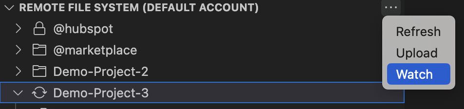
* Select the **folder** that you want to watch.
* Enter the destination path where the folder will live in HubSpot, then press **Enter**.

* The extension will display a **sync icon** next to the folder in the left sidebar to indicate that it's being watched.
* To end a watch, right-click the folder being watched, then select **End Watch**
**Please note:** only one file or folder can be watched at a time. To watch multiple files or folders simultaneously, you can instead watch the root directory or other parent directory.
### Delete and fetch files
To delete a file or folder from the account:
* Right-click the **file** or **folder** that you want to delete, then select **Delete**.
* You'll then be prompted to confirm whether you want to delete it. Click **Okay** to confirm the deletion.
To download a file or folder from the account to your local environment:
* Right-click the **file** or **folder** that you want to fetch, then select **Fetch**.
* You'll then be prompted to select the folder that you want to download it to.
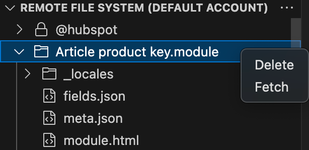
### Create new files
To generate scaffolded files for new CMS assets in VS Code:
* In the left sidebar, click the **Explorer icon** to view your working directory.
* Right-click the **File explorer panel** and select one of the **New** options:
* **New template:** generates a new global partial, page, partial, or section template with boilerplate content.
* **New module:** generates a new module with boilerplate content.
* **New Serverless Function folder:** generates a `.functions` folder that contains boilerplate `serverless.js` and `serverless.json` files. You can add another serverless function to the folder by right-clicking the **folder**, then selecting **New serverless function**.
## HubL Language support
To enable HubL language support in your files, configure your VS Code file association settings:
* In VS Code, open the command prompt by pressing `cmd` + `shift` + `p`.
* Search for and select **Preferences: Open User Settings**.
* Choose the scope of your settings by clicking either the **User** or **Workspace** tab.
* In the settings search bar, search for **files.associations**.
* Click **Add item**, then add the following item-value pairs:
* `*html`: `html-hubl`
* `*css`: `css-hubl`
### Supported HubL syntax
When developing with HubL, the extension offers the following [HubL syntax](/docs/cms/reference/hubl/operators-and-expression-tests) support:
* **Inline HubL linting:** checks your HTML, CSS, HTML + HubL, and CSS + HubL files for HubL-related errors and displays them inline.
* **HubL syntax highlighting:** supports HubL syntax highlighting in the files associated through your VS Code language mode settings. Learn how to [set your file associations](#add-hubl-file-associations) below.
* **Statement wrapping:** supports `{% %}`, `{# #}`, and `{{ undefined.undefined }}` [delimiters](/docs/cms/reference/hubl/operators-and-expression-tests#types-of-delimiters).
* **Block comment toggling:** create HubL comments by pressing `cmd` + `/`.
* **Autocomplete:** offers autocomplete suggestions for supported HubL tags, filters, expression tests, and functions. [Learn more about autocomplete](#autocomplete-reference) below.
* **Emmet** **for HTML + HubL files:** allows [Emmet](https://code.visualstudio.com/docs/languages/emmet) abbreviation and snippet expansions for HTML + HubL files. Learn how to [enable Emmet support](#enable-emmet-for-html-hubl-files) below.
* **IntelliSense suggestions:** enables [IntelliSense](https://code.visualstudio.com/docs/editing/intellisense#:~:text=You%20can%20trigger%20IntelliSense%20in,name%20to%20limit%20the%20suggestions.) suggestions when in snippet placeholders. Learn how to [enable IntelliSense Suggestions](#enable-intellisense-suggestions) below.
### Enable Emmet for HTML + HubL files
To enable [Emmet](https://code.visualstudio.com/docs/languages/emmet) support for abbreviations and snippet expansion in `html-hubl` files, map `html-hubl` to `html` in your Emmet settings:
* In VS Code, open the command prompt by pressing `cmd` + `shift` + `p`.
* Search for and select **Preferences: Open User Settings**.
* Choose the scope of your settings by clicking either the **User** or **Workspace** tab.
* In the settings search bar, search for **Emmet: Include Languages**.
* Click **Add item**, then add the following item-value pair: `html-hubl`: `html`.

### Enable IntelliSense suggestions
To enable [IntelliSense](https://code.visualstudio.com/docs/editing/intellisense#:~:text=You%20can%20trigger%20IntelliSense%20in,name%20to%20limit%20the%20suggestions.) suggestions when in snippet placeholders:
* In VS Code, open the command prompt by pressing `cmd` + `shift` + `p`.
* Search for and select **Preferences: Open User Settings**.
* Choose the scope of your settings by clicking either the **User** or **Workspace** tab.
* In the settings search bar, search for **Editor** **Suggest: Snippets Prevent Quick Suggestions** and ensure that the checkbox is **cleared**.
* Then, in the settings search bar, search for **Editor Parameter Hints Enabled** and ensure that the checkbox is **selected**.
### Autocomplete reference
The HubSpot extension enables quick access to snippets that map to support HubL tags, filters, expression tests, and functions. To access autocomplete suggestions, you'll need to use the following prefixes:
* [Expression tests](/docs/cms/reference/hubl/loops): type the **test name** alone, then pres **Enter**. For example, typing `div` produces `divisibleby`.
* [Filters](/docs/cms/versions-deprecations/deprecated/hubl/filters-functions): type `|` followed by the **filter**, then press **Enter**. For example, typing `|se` produces `|selectattr('attr', exp_test)`.
* [Functions](/docs/cms/reference/hubl/functions) and [tags](/docs/cms/reference/hubl/tags/related-blog-posts): type `~` followed by the **function** or **tag**, then press **Enter**. For example, typing `~hub` produces `hubdb_table_rows(${table_id}`.
* [HubL supported variables](/docs/cms/reference/hubl/variables-macros-syntax): type the **variable name** alone, then press **Enter**. For example, `content.ab` produces `{{ content.absolute_url` `}}`.
* [Module fields](/docs/cms/reference/fields/overview): in JSON files, type the **field type**, then press **Enter**. For example: `ri` produces:
```json theme={null}
// typing ri > Enter produces:
{
"name": "richtext_field",
"label": "Rich text field",
"required": false,
"locked": false,
"type": "richtext",
"inline_help_text": "",
"help_text": "",
"default": null
}
```
### Other snippets
Other snippets you can generate with the VS Code extension include:
| Snippet prefix | Description | Example |
| -------------- | -------------------------------------------------------------------------------------------------------------------- | -------------------------------------------------------------------------------------------------- |
| `otrue` | Generates `overrideable=True` for HubL tags. | `overrideable=True` |
| `ofalse` | Generates `overrideable=False` for [HubL tags](/docs/cms/reference/hubl/tags/related-blog-posts). | `overrideable=False` |
| `for` | Returns a basic [for loop](/docs/cms/reference/hubl/if-statements). | `{% for iterable in dict %}``{{ iterable }}``{% endfor %}` |
| `if` | Returns a basic [if statement](/docs/cms/reference/hubl/functions). | `{% if {condition} %} do_something {% endif %}` |
| `elif` | Returns an [else if](/docs/cms/reference/hubl/functions#using-elif-and-else) statement to be used within an if statement. | `{% elif {condition} %}` |
| `else` | Returns an [else](/docs/cms/reference/hubl/functions#using-elif-and-else) statement to be used within an if statement. | `{% else %}` |
| `hubldoc` | Returns a boilerplate HTML + HubL document. | |
| `hublblog` | Returns boilerplate blog markup. | |
The extension also offers autocomplete for file paths when used with the HubL tags and parameters below. To access file path autocompletions, start typing the **HubL tag** or **parameter** followed by a **quotation mark**.
* `{% include "... %}`
* `{% import "... %}`
* `{% tag_name path="... %}`
* `{% extend "... %}`

**Please note:** autocomplete will not pull in [HubSpot default module](/docs/cms/reference/modules/default-module-versioning) file paths.
## Enable extension beta features
To enable HubSpot VS Code extension beta features:
* In VS Code, open the command prompt by pressing `cmd` + `shift` + `p`.
* Search for and select **Preferences: Open User Settings**.
* Choose the scope of your settings by clicking either the **User** or **Workspace** tab.
* In the settings search bar, search for **HubSpot: Beta** and select the **checkbox**.
## Telemetry
HubSpot for VS Code collects user data in order to improve the extension’s experience. You can [review HubSpot’s privacy policy here](https://legal.hubspot.com/privacy-policy). Additionally, you may opt out of data collection by changing the setting for global telemetry in VS Code. To read more about VS Code and telemetry, including disabling telemetry reporting, [please read the official VS Code documentation](https://code.visualstudio.com/docs/configure/telemetry).
## Contribute
This extension is open source and HubSpot welcomes contributions as well as issues for feature requests and bug reports. For more information about contributing, see the [contributing docs](https://github.com/HubSpot/hubspot-cms-vscode/blob/master/CONTRIBUTING.md) to get started.
# Developer Tooling Overview
Source: https://developers.hubspot.com/docs/developer-tooling/overview
Streamline your HubSpot development workflow with utilities for the command line, environment and account configuration, IDE integration, and automated CI/CD through GitHub Actions.
## Local development
HubSpot local development tools for command line operations, environment configuration, testing, and IDE integration.
Get started by installing the HubSpot CLI, which provides essential commands for building, deploying, and managing your HubSpot projects and more.
Download and use the HubSpot VS Code extension, which provides HubL syntax highlighting and autocomplete, configuration file validation, and more.
Install HubSpot's local development MCP server for AI-assisted coding, debugging, and project management in your IDE.
Create test accounts with various HubSpot subscriptions to simulate customer environments and ensure feature compatibility.
Configure profiles in a project to dynamically apply environment-specific variables at build time for seamless testing and deployment.
## Third-party tools
Third-party services to integrate with your project and HubSpot account.
Learn how to set up GitHub Actions on the new developer platform.
# APIs by tier
Source: https://developers.hubspot.com/docs/developer-tooling/platform/apis-by-tier
View which HubSpot APIs are available for each product and subscription tier.
HubSpot API availability varies by product (Marketing Hub, Sales Hub, etc.) and subscription tier (Free, Starter, Professional, Enterprise). Use the table below to check which APIs you can access based on your current subscription. Rate limits also differ by tier — learn more in the [API usage guidelines](/docs/developer-tooling/platform/usage-guidelines).
**Please note:**
This notice period applies to developer products released to general availability. For beta and developer preview products, we’ll continue to update those regularly as we learn more about them. In certain situations, such as those related to security or privacy, we may shorten that 90 day timeframe.
As an example of correctly handling non-breaking changes, you can safely write (in pseudo code here) `if err.code === 500 then retry` but you should not write `if err.message === "Uh oh, something went wrong" then retry`. By asking yourself the question "if HubSpot makes a change listed as non-breaking, will this negatively impact the user experience?", you can write code that will be easier to maintain and create a more reliable app.
## REST APIs
Below, learn about what changes are breaking for incoming and outgoing RESTful APIs (e.g., contacts API and webhooks).
**Breaking changes**
* Removing an endpoint
* Removing a field from the response (a “field” in this case is a JSON key/value pair)
* Removing an option from a field in the request - If a request field could previously accept two String values, and we remove the ability to accept one of those, that would be a breaking change
* Adding a new required field, header, or parameter in the request
* Renaming a field
* Changing the data type of a field
* Changing field lengths past industry standard data limits (int, long, etc.)
* Changing error response code or category
* Changing auth types
* Restricting scope
* Reduce API limits
* Making validation more stringent
* Changing the default sort order
* Significantly increase the size of a response (10x)
**Non-breaking changes**
* Changing the error message
* Adding a new option to a response (e.g., adding a new possible return value to a string field)
* Adding a new optional input parameter
* Property labels changing - Labels can be changed by HubSpot, application providers, and even customers. Integrations should not rely on property labels for their functionality.
## HubL
Below, learn about what changes are considered breaking for HubL (e.g., the `hubdb_table_rows` function or `escape` filter).
**Breaking changes**
* Removing a filter, function, variable or tag
* Adding a new required argument
* Changing the order of an argument
* Change the data type of a field in a module/theme field JSON
* Reduce the number of times a function can be invoked on a page
**Non-breaking changes**
* Adding a new optional argument
* Adding a new function, filter, variable or tag
## Embedded content
Below, learn about what changes are considered breaking for embedded content (e.g., forms and CTAs).
**Breaking changes**
* Adding or removing class names
* Changing the timing or execution of custom form events (e.g. `onFormSubmit`)
* Changing the timing or structure of global form events
**Non-breaking changes**
* Add an optional setting for customizing the behavior of the embed
## JavaScript SDK
Below, learn about what changes are considered breaking for JavaScript SDK (e.g., the calling SDK).
**Breaking changes**
* Removing an operation
* Requiring a new argument to a function or field in an object that is passed to the function
* Changing order of required parameters
* Changing data type returned
**Non-breaking changes**
* Adding a new function
## Snowflake Data Share
Occasionally, there will be changes to the schema that describes the data share. Any change that makes querying a share fail due to changing an existing schema object is considered a breaking change.
For example, renaming a table is a breaking change for the [Snowflake Data Share integration](https://knowledge.hubspot.com/reports/query-hubspot-data-in-snowflake) because queries referencing the former name of the table will fail after the rename. In this case, HubSpot will add a new table with the same data to the share so that you can begin using the new name. The old table will continue to exist until the end of the 90 day notice period.
Below, learn about what changes are considered breaking for the Snowflake Data Share.
**Breaking changes**
* Removing or renaming the database schema
* Removing or renaming a table or view
* Removing or renaming a column
* Changing a column's datatype
* Column nullability
**Non-breaking changes**
If a change is listed as a non-breaking change, it will be added to the schema with no notice given. For example, adding a new column to the schema.
This means that queries accessing shares should be as specific as possible when referencing schema objects. For example, you should always qualify tables by specifying the database schema they belong to. It also means that you shouldn’t use the `SELECT *` clause in your queries, because that might break when a new column is added.
The following are examples of non-breaking changes:
* Adding to the database schema
* Adding a table or view
* Adding a column
* Changes to objects and their properties (e.g., the data within the `objects` and `object_properties` tables and views)
# API usage guidelines and limits
Source: https://developers.hubspot.com/docs/developer-tooling/platform/usage-guidelines
Learn about the different API and developer feature limits in HubSpot.
HubSpot closely monitors usage of all APIs to ensure a quality experience for every user. All app and integration developers must comply with the [HubSpot Acceptable Use Policy](https://legal.hubspot.com/acceptable-use) and [API Terms](https://legal.hubspot.com/hs-developer-terms). While HubSpot reserves the right to change or deprecate the APIs over time, updates will always be provided in advance through the [Developer Changelog](https://developers.hubspot.com/changelog).
## Authentication and security
For optimal security, all apps must use HubSpot’s [OAuth protocol](/docs/apps/developer-platform/build-apps/authentication/overview#oauth) directly, or use your app's static auth token if you're building an [app installed in a single account](/docs/apps/developer-platform/build-apps/app-configuration#distribution). Apps are responsible for storing time-to-live (TTL) data and refreshing user access tokens in accordance with this protocol. When an access token is generated, it will include an `expires_in` parameter indicating how long it can be used to make API calls before refreshing. `Unauthorized (401)` requests are not a valid indicator that a new access token must be retrieved.
## Checking API usage
### Apps built on version 2025.2 and 2026.03 of the developer platform
The following APIs have limits that are unique from or stricter than the general limits. Refer to each associated guide for more information.
* [Associations API](/docs/api-reference/latest/crm/associations/associate-records/guide#limits)
* [CRM Search API](/docs/api-reference/latest/crm/search-the-crm#limits)
* [GraphQL API](/docs/cms/start-building/features/data-driven-content/graphql/query-hubspot-data-using-graphql#query-complexity-and-account-limits)
### Publicly distributed OAuth app limits
For [legacy public apps](/docs/apps/legacy-apps/public-apps/overview), and apps on the latest versions of the developer platform (2025.2 and 2026.03) using [OAuth authentication](/docs/apps/developer-platform/build-apps/authentication/overview#oauth) [distributed](/docs/apps/developer-platform/build-apps/app-configuration#distribution) via the HubSpot marketplace, each HubSpot account that installs your app is limited to 110 requests every 10 seconds. This excludes the [CRM Search API](/docs/api-reference/latest/crm/search-the-crm).
The [API limit increase add-on](https://legal.hubspot.com/hubspot-product-and-services-catalog#Addons) does not increase the limits of [legacy public apps](/docs/apps/legacy-apps/public-apps/overview) nor apps on the latest versions of the developer platform (2025.2 and 2026.03) using [OAuth authentication](/docs/apps/developer-platform/build-apps/authentication/overview#oauth) that are [distributed](/docs/apps/developer-platform/build-apps/app-configuration#distribution) via the HubSpot marketplace.
### Privately distributed app limits
The limits in the table below apply to [legacy private apps](/docs/apps/legacy-apps/private-apps/overview), as well as apps on the latest versions of the developer platform (2025.2 and 2026.03) with a [distribution](/docs/apps/developer-platform/build-apps/app-configuration#distribution) set to `private`. Note that for these privately distributed app types:
* The burst limit, detailed in the *Per 10 seconds* column below, applies individually per app.
* The daily limit, detailed in the *Per day* column below, is shared across all apps within the same HubSpot account.
| | **Product Tier** | **Per 10 Seconds** | **Per Day** |
| --------------------------------------------------------------------------------------------------------------------------- | ------------------------------------------------------------ | ------------------ | ------------------------------------------------------------------------------------------------------------------------------------- |
| Privately distributed apps | (Any Hub) not be logged in HubSpot. If you want to store these exempted requests, you'll need to log these requests externally.
* A high number of requests may result in `5xx` errors. These can be addressed the same as you would [`429` errors](#rate-limit-error-responses).
## App and account limits
The following limits apply for creating legacy apps, webhook subscriptions, and CRM extension settings.
* You can create up to 100 [legacy public apps](/docs/apps/legacy-apps/public-apps/overview) per developer account.
* You can create up to 20 [legacy private apps](/docs/apps/legacy-apps/private-apps/overview) per HubSpot account.
* You can create up to 1,000 [webhook subscriptions](/docs/api-reference/latest/webhooks) per app.
* You can create up to 25 CRM extension settings per [legacy public app](/docs/apps/legacy-apps/public-apps/overview).
## API-specific limits
Some features and APIs have more limits that are listed below. Additional limis for each API can also be found on an API's associated guide (e.g., the [exports API](/docs/api-reference/latest/crm/exports/guide#limits)).
### Timeline event limits
[Timeline events](/docs/api-reference/legacy/crm/extensions/timeline/guide) in a legacy public app are subject to the following limits:
* You can create up to 750 timeline event types per public app.
* You can create up to 500 properties per timeline event type.
* Each serialized event instance has the following size limits:
* 500 bytes for the event instance ID
* 510 KB per property/token
* 1 MB in total size for the event instance
### Custom event limits
[Custom events](/docs/api-reference/latest/events/send-event-data/guide) are subject to the following limits:
* There is a limit of 500 unique event definitions per account.
* There is a limit of 30 million event completions per month.
* The send custom event completions endpoint supports up to 1250 requests per second.
* The custom event completion batch endpoint supports batches of 500.
Consult the other custom event restrictions in the [API guide](/docs/api-reference/latest/events/send-event-data/guide#limits).
## Service limits
Learn more about service limits and pricing on [HubSpot's Product & Services Catalog](https://legal.hubspot.com/hubspot-product-and-services-catalog).
## Rate limit error responses
Any app or integration exceeding its rate limits will receive a `429` error response for all subsequent API calls. Requests resulting in an error response shouldn’t exceed 5% of your total daily requests. If you plan on listing your app in the [HubSpot Marketplace](https://ecosystem.hubspot.com/marketplace/apps), it must stay under this 5% limit to be certified.
The `429` response will have the following format:
```json theme={null}
{
"status": "error",
"message": "You have reached your daily limit.",
"errorType": "RATE_LIMIT",
"correlationId": "c033cdaa-2c40-4a64-ae48-b4cec88dad24",
"policyName": "DAILY",
"requestId": "3d3e35b7-0dae-4b9f-a6e3-9c230cbcf8dd"
}
```
The `message` and `policyName` will indicate which limit you hit (either daily or secondly).
The **daily** limit resets at midnight based on your [time zone setting](https://knowledge.hubspot.com/account-management/change-your-language-and-region-settings).
The following table details the rate limit headers included in the response of each API request to HubSpot, subject to the exceptions listed below the table.
| **Header** | **Description** |
| ------------------------------------------- | ------------------------------------------------------------------------------------------------------------------------------------------------------------------------------------------------------------------------------------------------------------------------------------ |
| `X-HubSpot-RateLimit-Daily` | The number of API requests that are allowed per day. Note that this header is not included in the response to API requests authorized using [OAuth](/docs/apps/developer-platform/build-apps/authentication/oauth/working-with-oauth). |
| `X-HubSpot-RateLimit-Daily-Remaining` | The number of API requests still allowed for the current day. Note that this header is not included in the response to API requests authorized using [OAuth](/docs/apps/developer-platform/build-apps/authentication/oauth/working-with-oauth). |
| `X-HubSpot-RateLimit-Interval-Milliseconds` | The window of time that the `X-HubSpot-RateLimit-Max` and `X-HubSpot-RateLimit-Remaining` headers apply to.For example, a value of 10000 would be a window of 10 seconds. |
| `X-HubSpot-RateLimit-Max` | The number of requests allowed in the window specified in `X-HubSpot-RateLimit-Interval-Milliseconds`.For example, if this header had a value of 100, and the `X-HubSpot-RateLimit-Interval-Milliseconds` header was 10000, the enforced limit would be 100 requests per 10 seconds. |
| `X-HubSpot-RateLimit-Remaining` | The number of API requests still allowed for the window specified in `X-HubSpot-RateLimit-Interval-Milliseconds`. |
* The `X-HubSpot-RateLimit-Secondly` and `X-HubSpot-RateLimit-Secondly-Remaining` headers are still included and will still have accurate data, but the limit referenced by these headers is no longer enforced and these two headers should be considered deprecated.
* Responses from the search API endpoints will not include any of the rate limit headers listed above.
You can also check the number of calls used during the current day using [this endpoint](/docs/api-reference/latest/account/account-information/guide).
## Address rate limit issues
The sections below detail two possible ways you can reduce the volume of API traffic if you repeatedly hit your API request limit. If you're running into the `TEN_SECONDLY_ROLLING` limit, you should throttle the requests that your app is making to stay under that limit. In addition to throttling the requests, or if you're running into the daily limit, check out the suggestions below.
If you find that you're still hitting the call limits after looking through these suggestions, please post on HubSpot's [developer forums](https://community.hubspot.com/t5/HubSpot-Developer-Support/ct-p/developers). You should include as many details as possible about the APIs you're using, how you're using them, and which limit you're hitting.
### Use batch APIs and cache results when possible
If your site or app uses data from HubSpot on each page load, that data should be cached and loaded from that cache instead of being requested from the HubSpot APIs each time. If you're making repeated calls to get settings from your account for a batch job (such as getting your object properties, owners, or settings for a form), those settings should also be cached when possible.
### Use webhooks to get updated data from HubSpot
If you have a HubSpot Marketing Enterprise subscription, you can use webhook actions in workflows to have data for contact records sent to your system. Webhooks can be triggered as an action in any workflow, so you can use any workflow [starting conditions](https://knowledge.hubspot.com/workflows/understand-contact-based-workflow-types) as the criteria to have contact data sent to your system. More details about using webhooks can be found [here](https://knowledge.hubspot.com/workflows/how-do-i-use-webhooks-with-hubspot-workflows) and example webhooks data is [here](/docs/api-reference/legacy/automation/workflows/guide). Webhook calls made via workflows do not count towards the API rate limit.
# Developer platform and API versioning
Source: https://developers.hubspot.com/docs/developer-tooling/platform/versioning
Learn about the changes released for each version of HubSpot's developer platform and REST APIs
HubSpot developer projects and REST APIs are versioned based on when they were released. This enables you to access updated functionality while ensuring any new features don't break any features you've released on a previous version.
## Platform and API version schedule
not expect ongoing stability and are highly advised to upgrade to the most *Current* version.
The release schedules for APIs and the developer platform are illustrated in the tabs below:
The following sections provide more details on the availability and features of each API and developer platform version.
## API versioning
Starting from March 30th 2026, HubSpot's REST APIs follow a date-based version standard, based on the release schedule detailed above. Instead of the previous semantic versioning scheme, such as v1, v2, v3, or v4, versions are tied to release dates:
* REST APIs in beta include the next release date, suffixed by `-beta` (e.g., `/2026-09-beta/`).
* The latest API version includes a URL prefix that's formatted as `/YYYY-MM` (e.g., `/2026-03/`).
* All legacy APIs using semantic versions (e.g., v4, v3, v2, and v1) are still supported and available at their previous URLs.
All APIs can be accessed in the **APIs** [tab](/docs/api-reference/latest/overview) in the top left, where you can use the version picker to navigate between API versions.
Current | Available as of March 30th, 2026. Supported | Released on Sept 2, 2025. Sunset | This version was sunset on August 1, 2026. Sunset | This version was sunset on October 1, 2025, and attempts to upload projects at this version will fail. To continue building and deploying, upgrade to a newer version of the [developer platform](/docs/apps/developer-platform/build-apps/migrate-an-app/overview). |
| `2023.1` Sunset | Initial release of the developer platform. This version is no longer available as of March 31, 2024. Attempts to upload projects at this version will fail. |
#### Changes in 2026.03
The latest version of the developer platform re-introduces full serverless function support for project-built apps, which was not previously supported for `2025.2` apps.
Learn more about how to add [serverless functions](/docs/apps/developer-platform/add-features/serverless-functions/overview) to an app on version `2026.03`, or [migrate an older app](/docs/apps/developer-platform/build-apps/migrate-an-app/migrate-to-the-latest-platform-version) to `2026.03`.
If you opt to migrate a legacy private app or public app to version `2026.03`, you won't be able to downgrade back to a previous version after the migration process is complete.
Learn more about [migrating your app](/docs/apps/developer-platform/build-apps/migrate-an-app/overview) to `2026.03`.
#### Changes in 2025.2
Version `2025.2` of the developer platform introduced a number of new [features](/docs/apps/developer-platform/overview#features), a streamlined build-and-deploy process, and other productivity tools to help you build powerful integrations with HubSpot.
Learn more about how to [build an app](/docs/apps/developer-platform/build-apps/create-an-app), edit your [app configuration](/docs/apps/developer-platform/build-apps/app-configuration), manage your [app in HubSpot](/docs/apps/developer-platform/build-apps/manage-apps-in-hubspot), and how to install the [latest version](/docs/developer-tooling/local-development/hubspot-cli/install-the-cli) of the HubSpot CLI.
More details are available in the [developer platform overview](/docs/apps/developer-platform/overview).
#### Changes in 2025.1 (sunset)
Version `2025.1` increases the minimum version of Node.js to v20 for serverless functions, app functions, and endpoint functions.
#### Changes in 2023.2 (sunset)
This version was sunset on October 1, 2025. If you have a project that's still on `2023.2`, you can continue building it by [migrating](/docs/apps/developer-platform/build-apps/migrate-an-app/overview) to the latest version of the developer platform.
For posterity, below are the changes included for version `2023.2`.
The following changes have been made for serverless function configuration (`serverless.json`):
* Previously, serverless functions in projects supported two types of functions: app and API endpoint. App functions have been updated to support public URLs for making API requests, so you no longer need to build these as separate types.
* With this update, the `runtime` and `version` fields have also been removed.
* This version uses Node18, and lower versions cannot be specified.
**Previous serverless function configuration**
```js theme={null}
{
"runtime": "nodejs18.x",
"version": "1.0",
"appFunctions": {
"functionName": {
"file": "function1.js"
}
},
"endpoints": {
"path/to/endpoint": {
"file": "githubUserFunction.js",
"method": ["GET", "POST"]
}
}
}
```
**Updated serverless function configuration**
```js theme={null}
{
"appFunctions": {
"functionName": {
"file": "function1.js",
"endpoint": {
"path": "path/to/endpoint",
"method": ["GET"],
}
}
}
}
```
`2023.2` projects now support asynchronous functions. Callbacks are no longer supported in this version.
To update your serverless functions to use async:
* Add `async` to the function definition.
* Remove the callback (sometimes referred to as `sendResponse`), and use return statements to return response.
* Use `await` and `try`/`catch` instead of promise chaining.
* Return the desired response or throw an error.
Before:
```js theme={null}
const hubspot = require("@hubspot/api-client");
exports.main = myFunction = (context = {}, sendResponse) => {
const { hs_object_id } = context.propertiesToSend;
const userId = context.parameters.userId;
const hubspotClient = new hubspot.Client({
accessToken: process.env["PRIVATE_APP_ACCESS_TOKEN"],
});
const properties = {
name: "newName",
};
const SimplePublicObjectInput = { properties };
const objectType = "myObject";
const objectId = hs_object_id;
const idProperty = undefined;
hubspotClient.crm.objects.basicApi
.update(objectType, objectId, SimplePublicObjectInput, idProperty)
.then(res => {
sendResponse(res);
})
.catch(err => {
console.error(err);
sendResponse(err);
});
};
```
After:
```js theme={null}
const hubspot = require("@hubspot/api-client");
exports.main = async (context = {}) => {
const { hs_object_id } = context.propertiesToSend;
const userId = context.parameters.userId;
const hubspotClient = new hubspot.Client({
accessToken: process.env["PRIVATE_APP_ACCESS_TOKEN"],
});
const properties = {
name: "newName",
};
const SimplePublicObjectInput = { properties };
const objectType = "myObject";
const objectId = hs_object_id;
const idProperty = undefined;
try {
const res = await hubspotClient.crm.objects.basicApi.update(
objectType,
objectId,
SimplePublicObjectInput,
idProperty
);
return res;
} catch (err) {
console.error(err);
return err;
}
};
```
Whereas previously you would refer to private app access tokens with `context.secrets.PRIVATE_APP_ACCESS_TOKEN`, you'll now use `process.env` rather than `context.secrets`. For example:
```js theme={null}
// Include HubSpot node API client
const hubspot = require("@hubspot/api-client");
exports.main = async (context = {}) => {
// instantiate HubSpot node API client
const hubspotClient = new hubspot.Client({
accessToken: process.env["PRIVATE_APP_ACCESS_TOKEN"],
});
//your function
return response;
};
```
Version `2023.2` increases log size from 4KB to 256KB and guarantees logs to be in order of execution. You can also take advantage of improved in-app logging, such as log tracing.
# Node
Source: https://developers.hubspot.com/docs/developer-tooling/sdks/node
# Php
Source: https://developers.hubspot.com/docs/developer-tooling/sdks/php
# Python
Source: https://developers.hubspot.com/docs/developer-tooling/sdks/python
# Ruby
Source: https://developers.hubspot.com/docs/developer-tooling/sdks/ruby
# Use Postman collections to make API requests to HubSpot
Source: https://developers.hubspot.com/docs/developer-tooling/third-party-tools/postman
Learn how to configure Postman to interact with HubSpot APIs.
[Postman](https://www.postman.com/) is a third-party API client that provides pre-built collections for all major HubSpot APIs that are immediately ready to use once you configure your authentication for your HubSpot account. This guide will walk you through how to access Postman collections for HubSpot APIs, authenticate your API calls, and send requests to efficiently develop and test your apps.
Before you proceed, you'll need a free [Postman account](https://identity.getpostman.com/signup) to access the HubSpot API collections.
## Access Postman collections for HubSpot APIs
The [HubSpot public API workspace](https://www.postman.com/hubspot/hubspot-public-api-workspace) in Postman includes API collections for most of the latest versions of the HubSpot REST APIs. You can use these collections to explore endpoints, test requests, and kickstart your development.
To browse the HubSpot API Postman collections, navigate directly to the [HubSpot Public API workspace](https://www.postman.com/hubspot/hubspot-public-api-workspace) within Postman. In the workspace, all available API collections will be grouped by product (e.g., the CRM API collections, the CMS API collections, etc).
To preview or use a HubSpot API collection in your own workspace:
* Log in to your [Postman account](https://identity.getpostman.com/) or sign up for a [new account](https://identity.getpostman.com/signup).
* In the same browser session, navigate to the HubSpot API guide for a given endpoint, such as the [contacts API guide](/docs/api-reference/latest/crm/objects/contacts/guide), then click the **Postman collection** link at the top of the page.
## Set up a basic action
To set up GitHub Actions, you'll first create the GitHub secrets used for connecting the repository to your HubSpot account, then create a workflow file that runs the HubSpot project action:
* In your GitHub repository, [create repository secrets](https://docs.github.com/en/actions/how-tos/write-workflows/choose-what-workflows-do/use-secrets#creating-encrypted-secrets-for-a-repository) for the following HubSpot details, which you'll later reference in your workflow file:
* `HUBSPOT_ACCOUNT_ID`: the ID of your HubSpot account.
* `HUBSPOT_PERSONAL_ACCESS_KEY`: your [personal access key](https://app.hubspot.com/l/personal-access-key).
* In your local HubSpot project, create a `.github/workflows/` directory if one doesn't already exist, then create a `main.yml` file within it. You can give the file any name you'd like, as long as it uses the `.yml` or `.yaml` extension.
* Paste the following code into the file:
```yml .github/workflows/main.yml theme={null}
on:
push:
branches:
- "main"
env:
DEFAULT_ACCOUNT_ID: ${{ secrets.HUBSPOT_ACCOUNT_ID }}
DEFAULT_PERSONAL_ACCESS_KEY: ${{ secrets.HUBSPOT_PERSONAL_ACCESS_KEY }}
DEFAULT_CLI_VERSION: "8.0.0" # Optional
jobs:
deploy:
runs-on: ubuntu-latest
steps:
- name: Checkout
uses: actions/checkout@v4
- name: Upload to HubSpot
uses: HubSpot/hubspot-project-actions@v1.1.0
```
| Key | Description |
| ------ | ----------------------------------------------------------------------------------------------------------------------------------------------------------------------------------------------------------------------------------------------------------------------------------------------------------------------------------------------------------------------------------------------------------------------------------------------------------------------------------------------------------------------------------------------------------------------------------------------------------------------------------------------------------------- |
| `on` | Configures the workflow to trigger on any push to the `main` branch. You can replace `main` with your default branch name as needed. |
| `env` | Stores your GitHub secrets as environment variables so the action can authenticate with your HubSpot account. Specifies a version of the CLI to use for workflow execution. By default, a predetermined stable version is used. When specifying a version, it's recommended to use a version number (e.g., `"8.0.0"`) rather than `"latest"` or `"next"` to prevent new releases from impacting your CI/CD pipeline. **Please note:** never set the `HUBSPOT_ACCOUNT_ID` or `HUBSPOT_PERSONAL_ACCESS_KEY` secret values directly in this file. Authentication-related values should only be stored as GitHub secrets. |
| `jobs` | Defines a `deploy` job, which uses HubSpot project actions to validate and upload the project to your HubSpot account. For more information about each action, check out the [hubspot-project-actions repository](https://github.com/HubSpot/hubspot-project-actions#available-actions). |
* With your action defined, push your changes to GitHub.
Moving forward, every push to the `main` branch will trigger an upload to your target HubSpot account. You can [verify that the workflow ran successfully](#verify-workflow-success) by checking your workflow logs in GitHub and reviewing the project's build and deploy logs in HubSpot.
## Set up multi-environment workflows
If you want to deploy your HubSpot project to separate environments (e.g., a QA account for testing and a production account for live deployments), you can combine HubSpot's [config profiles](/docs/developer-tooling/local-development/build-with-config-profiles) with multiple workflows.
In this type of setup, the config profiles let you define environment-specific settings in your project, including which HubSpot account to target. By pairing each profile with its own workflow file, you can control which HubSpot account gets updated based on which branch you push to. For example:
* **QA workflow:** when you push to the `qa` branch, deploy the project to your test HubSpot account.
* **Production workflow:** when you push to `main`, deploy the project to your production HubSpot account.
A push is one of many available workflow triggers. Learn more in [GitHub's documentation](https://docs.github.com/en/actions/reference/workflows-and-actions/events-that-trigger-workflows).
### Define config profiles
Before configuring your workflows, create a config profile for each environment you want to target. See [build with config profiles](/docs/developer-tooling/local-development/build-with-config-profiles) for setup instructions.
For a standard two-environment setup, you might create:
* A `qa` profile targeting your test HubSpot account
* A `prod` profile targeting your production HubSpot account
After defining config profiles in your project, commit the `hsprofile.*.json` files to your repository. Each workflow references its profile by name and resolves it from these committed files at upload time.
### Create GitHub secrets for each environment
In your GitHub repository, create a pair of secrets for each environment. Each pair should contain the account ID and personal access key for that environment's HubSpot account. Each environment's account ID secret must match the `accountId` defined in that profile's `hsprofile.*.json` file.
For example:
* For a `qa` profile targeting account 12345:
* `HUBSPOT_QA_ACCOUNT_ID` = `12345`
* `HUBSPOT_QA_PERSONAL_ACCESS_KEY` = ``
* For a `prod` profile targeting account 67890:
* `HUBSPOT_PROD_ACCOUNT_ID` = `67890`
* `HUBSPOT_PROD_PERSONAL_ACCESS_KEY` = ``
### Create a workflow file for each environment
In your project, create a dedicated workflow file for each environment. Each workflow targets a different branch and passes the profile name along with its credentials as explicit `with` inputs to the `project-upload` sub-action, as shown below.
**Please note:** when using profiles, you must pass credentials as `with` inputs to the `project-upload` action. The `env` variable approach used in the [basic setup](#set-up-a-basic-action) does not propagate correctly when using profiles.
**QA workflow:** deploys the project to your test HubSpot account when changes are pushed to the `qa` branch.
```yml deploy-qa.yml theme={null}
on:
push:
branches:
- "qa"
jobs:
deploy:
runs-on: ubuntu-latest
steps:
- name: Checkout
uses: actions/checkout@v4
- name: Upload to HubSpot (QA)
uses: HubSpot/hubspot-project-actions/project-upload@v1.1.0
with:
profile: "qa"
account_id: ${{ secrets.HUBSPOT_QA_ACCOUNT_ID }}
personal_access_key: ${{ secrets.HUBSPOT_QA_PERSONAL_ACCESS_KEY }}
```
**Production workflow:** deploys the project to your production HubSpot account when changes are pushed to the `main` branch.
```yml deploy-prod.yml theme={null}
on:
push:
branches:
- "main"
jobs:
deploy:
runs-on: ubuntu-latest
steps:
- name: Checkout
uses: actions/checkout@v4
- name: Upload to HubSpot (PROD)
uses: HubSpot/hubspot-project-actions/project-upload@v1.1.0
with:
profile: "prod"
account_id: ${{ secrets.HUBSPOT_PROD_ACCOUNT_ID }}
personal_access_key: ${{ secrets.HUBSPOT_PROD_PERSONAL_ACCESS_KEY }}
```
With this setup, every push to `qa` triggers a deployment to your test account, and every push to `main` triggers a deployment to your production account. You can extend this pattern by adding additional workflow files for other environments, each with their own branch trigger, secrets, and profile name.
## Verify workflow success
To verify that your workflows have run successfully, you can review the workflow run history in GitHub as well as the project build and deploy logs in HubSpot.
When [viewing workflow run history in GitHub](https://docs.github.com/en/actions/how-tos/monitor-workflows/use-workflow-run-logs#viewing-logs-to-diagnose-failures), you can view the details of each action defined in the workflow to ensure it ran as expected.
You can also open a project from the terminal by running `hs project open` from within the project directory. Learn more about [project commands](/docs/developer-tooling/local-development/hubspot-cli/project-commands).
* Click the **Builds & Deploys** tab.
Builds triggered by GitHub Actions are attributed with the commit message and SHA, distinguishing them from manual uploads.