The Accordion component renders an expandable and collapsable section that can contain other components. This component can be helpful for saving space and breaking up extension content.
import { Accordion, Text } from "@hubspot/ui-extensions";
const Extension = () => {
return (
<>
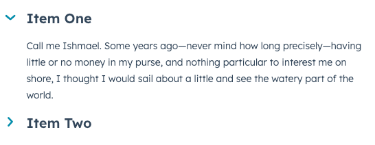
<Accordion title="Item One">
<Text>
Call me Ishmael. Some years ago—never mind how long precisely—having little or no money in my purse, and
nothing particular to interest me on shore, I thought I would sail about a little and see the watery part of
the world.
</Text>
</Accordion>
<Accordion title="Item Two">
<Text>Second inner text</Text>
</Accordion>
</>
);
};
Props
| Prop | Type | Description |
|---|
children Required | | |
title Required | | |
defaultOpen | | |
disabled | | |
onClick | | |
open | | |
size | | |
testId | | |
Last modified on January 28, 2026