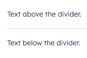
The Divider component renders a grey, horizontal line for spacing out components vertically or creating sections in an extension. Use this component to space out other components when the content needs more separation than white space.
import { Divider, Text } from "@hubspot/ui-extensions";

const Extension = () => {
  return (
    <>
      <Text>Text above the divider.</Text>
      <Divider />
      <Text>Text below the divider.</Text>
    </>
  );
};
Props
| Prop | Type | Description |
|---|
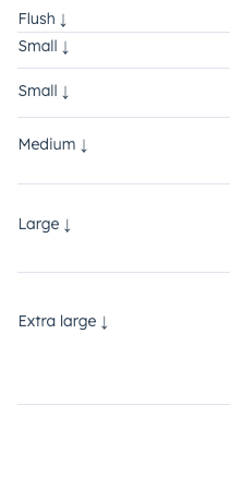
distance | 'flush' | 'extra-small' | 'small' (default) | 'medium' | 'large' | 'extra-large' | The space between the divider and the content above and below it. |
Variants
Using the distance prop, you can set the amount of padding above and below the divider. Values range from 'extra-small' to 'extra-large' ('small' by default).
Guidelines
- DO: use dividers to group similar components together.
- DO: consider when a new card or component might be needed, rather than using a divider.
- DON’T: use two dividers in a row without content between them.
Last modified on January 28, 2026