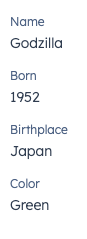
The DescriptionList component renders pairs of labels and values. Use this component to display pairs of labels and values in a way that’s easy to read at a glance. It also contains a DescriptionListItem subcomponent.
- Label: describes the information being displayed.
- Value: the information to display, contained in a
Text component.
Props
<DescriptionList> props
<DescriptionListItem> props
Variants
By default, list items will be stacked vertically. You can use the direction prop to stack them horizontally.
Usage examples
- Display easy to scan information for a sales rep to use on a call.
- Highlight the most recently updated properties on a company record.
Guidelines
- DO: keep copy succinct, ideally one word each for the label and value.
- DO: use the horizontal orientation for horizontal layouts, and vertical orientation for column layouts.
- DON’T: use this component to display long strings of text.
- DON’T: use this component for lists that you want to be editable in the UI.
Last modified on March 29, 2026