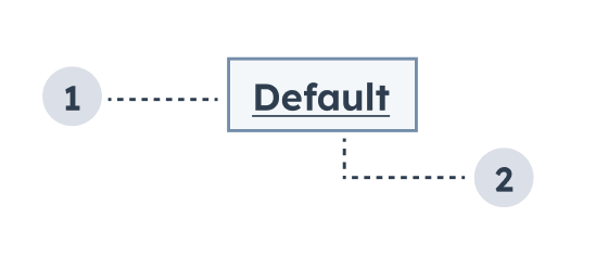
The Tag component renders a tag to label or categorize information or other components. Tags can be static or clickable for invoking functions.
- Variant: the color of the tag.
- Tag text: the text that communicates the tag’s purpose.
Props
Variants
Using the variant prop, you can choose from one of five tag colors:
default (default): for general tagging and labeling.success: for indicating or confirming the success of an action.warning: for indicating something that might be time-sensitive or of importance.error: for indicating error or failure.info: for conveying general information.
Alignment
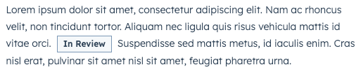
Using the inline prop, you can set a tag to align side-by-side with surrounding text. Below are examples of inline tags next to single-line text and multi-line text.
Usage examples
- Use a
default tag to indicate that a customer is active.
- Use a
success tag to indicate that an item in a to-do list has been completed.
- Use a
warning tag to indicate that a deal is expiring soon.
- Use an
error tag to indicate that an error happened when trying to sync a specific property in a table.
Guidelines
- DO: make tag text concise and clear.
- DO: ensure that tag variants are used consistently across the extension.
- DON’T: use tags in place of buttons or links.
- DON’T: rely on color alone to communicate the tag’s meaning. Ensure that tag text is clear and helpful.
Last modified on March 30, 2026