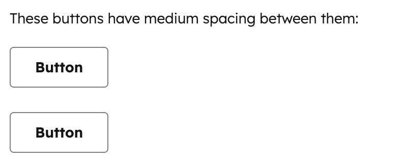
Use the Spacer component to add vertical space between components. This component is intended for one-off use in situations where other layout components like Flex don’t fully provide the spacing you need. You can use this component in tandem with the AutoGrid, Flex, Box, and Inline components to manage extension layout.
For consistent spacing between multiple components, use the Flex component with the direction="column" and the gap props instead. Flex automatically applies uniform spacing between children, which makes layout easier to maintain. Props
Distances
The size prop controls how much vertical space is rendered. Each size maps to a consistent spacing value from the HubSpot design system:
extra-small / xs: minimal spacing for tightly grouped elements.small / sm: default spacing suitable for most use cases.medium / md: moderate spacing for separating related content sections.large / lg: generous spacing for creating clear visual breaks.extra-large / xl: maximum spacing for major section divisions.
Spacer vs. Flex
For most layouts, you should use Flex with direction="column" and a gap value instead of Spacer, as it provides uniform spacing between all children without needing to manually insert Spacer components.
Use Spacer for situations where you need non-uniform spacing or a one-off adjustment:
Guidelines
- DO: use
Spacer for one-off vertical spacing adjustments where you need different spacing at a specific point.
- DO: use the smallest
Spacer size that creates adequate visual separation.
- DON’T: use multiple
Spacer components when Flex with gap would achieve the same result more cleanly.
- DON’T: use
Spacer for horizontal spacing. Use Flex with direction="row" and gap instead.
- DON’T: use
Spacer when a Divider would better communicate the separation between sections.
Last modified on September 11, 2026