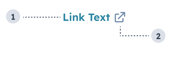
The Link component renders a clickable hyperlink. Use links to direct users to a web page, another part of the HubSpot app, or use them as buttons.
- Link text: text that describes where the link leads.
- External link icon: included when setting
external to true. and indicates that the link will open in a new tab. Automatically included when the link leads to a page outside of the HubSpot app.
Props
Variants
Using the variant prop, you can set the following styling:
'primary': the default blue (#0091ae).
'light': a white link that turns to a lighter shade of blue on hover (#7fd1de).
'dark': a darker shade of blue (#33475b).
'destructive': a red link (#f2545b).
Usage examples
- Use the default
'primary' variant when you want to link to another page or contact record in HubSpot.
- Use the
'light' variant when you want to include a link on a dark background.
- Use the
'dark' variant to include a link in an alert.
- Use the
'destructive' variant when the link results in an action that can’t be undone by the user, such as deleting contact property information.
Guidelines
- DO: space out links so that users can tell when they’ll be navigation to a different place.
- DO: make link text concise and contextual.
- DO: use the
'destructive' variant sparingly and only when the action can’t be undone.
- DO: always open links to pages outside of the HubSpot app in a new tab (
external: true).
- DON’T: crowd multiple links together.
- DON’T: use the
'dark' variant outside of alerts.
Last modified on March 29, 2026